
In today’s Divi tutorial, we’re going to show you how you can use the new row alignment options in Divi to your advantage. We’ll be combining the row alignment options with other built-in design options to give you an idea of what is possible with Divi’s Advanced Design Options. The example that we’ll show you how to recreate contains absolutely no additional code, which means anyone of any skill level can achieve this design.
Let’s get started!
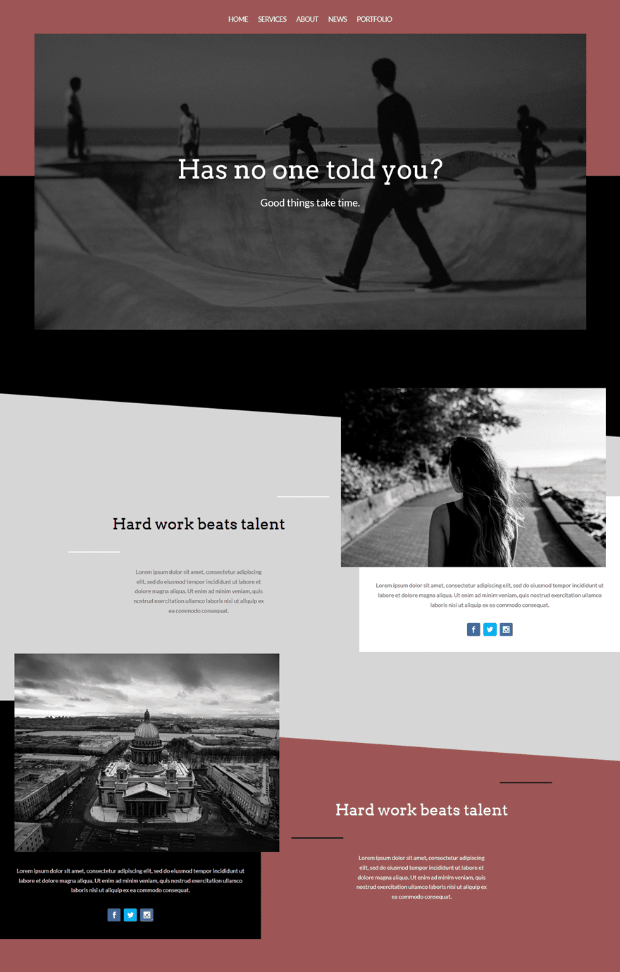
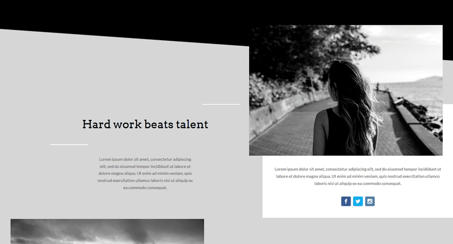
Design Preview
Here is a quick peek at what we’ll be creating today (on desktop):
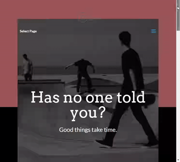
And here is how the design will look on mobile:
How to Creatively Use Divi’s New Row Alignment Options
Subscribe To Our Youtube Channel
Theme Customizer Settings
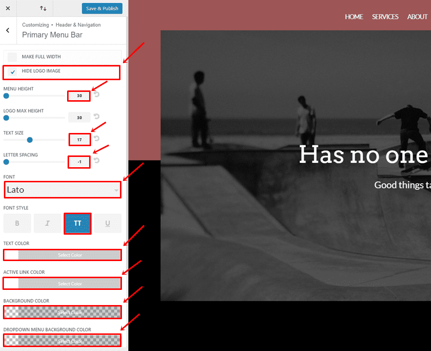
As you can notice, we’ve also matched the primary menu with the layout. To modify your primary menu bar, go to your WordPress Dashboard > Appearance > Customize > Header & Navigation > Primary Menu Bar > And make the following changes:
- Hide Logo Image: Enable
- Menu Height: 30
- Text Size: 17
- Letter Spacing: -1
- Font Style: Uppercase
- Text Color: #FFFFFF
- Active Link Color: #FFFFFF
- Background Color: rgba(255, 255, 255, 0)
- Dropdown Background Color: rgba(255, 255, 255, 0)
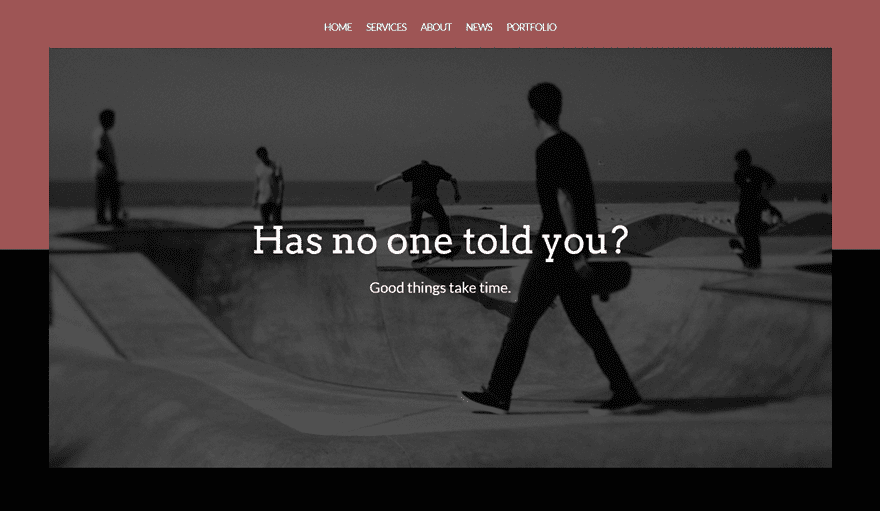
Hero Section
Once you’ve modified your primary menu, it’s time to get started with the layout. The first things you’ll need to do is add a new page, switch over to the Visual Builder and add a new standard section. This first section is going to be our hero section and looks like this:
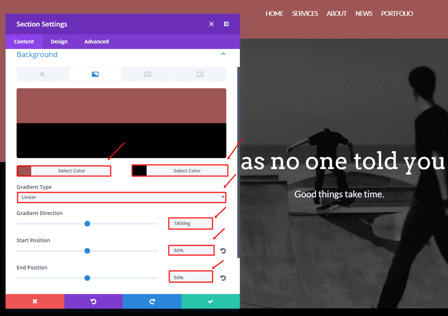
Section Settings
Gradient Background
Once you’ve added the standard section, you can add a gradient background to it:
- First Color: #9e5555
- Second Color: #000000
- Gradient Type: Linear
- Gradient Direction: 180deg
- Start Position: 50%
- End Position: 50%
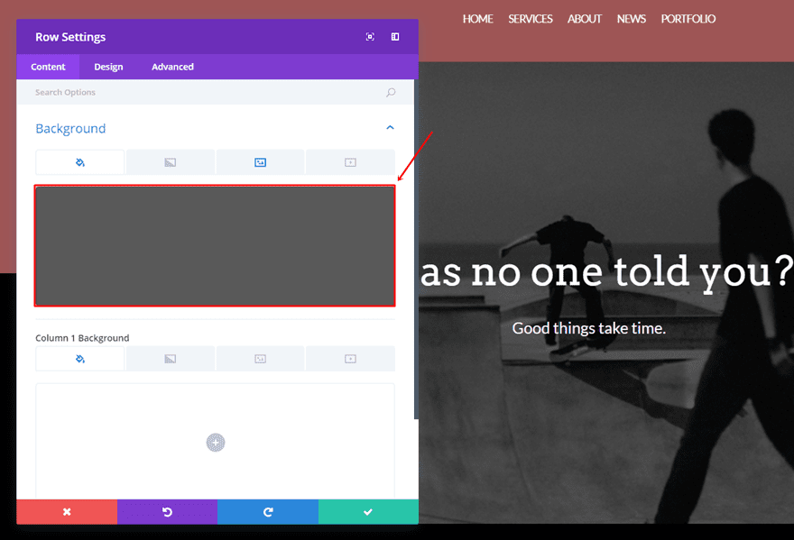
Row Settings
Color Overlay
Then, add a one-column row to that section and open its settings. The first thing we’ll need to do is add a color overlay. You can choose how dark you want your image to be by selecting a dark gray color. In this case, we’ve used ‘#595959’.
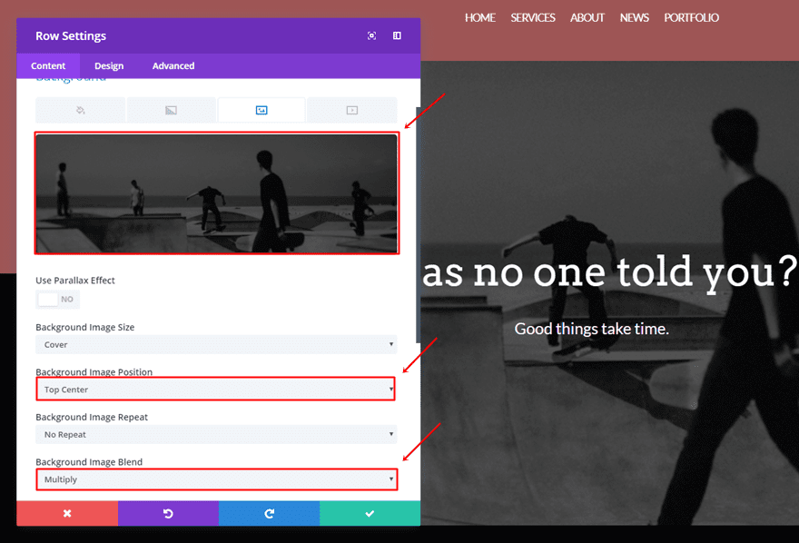
Background Image
The next thing we’ll need to do is add a background image to the one-column row and make the color overlay apply. To mix the color overlay and the background image, choose ‘Multiply’ as your Background Image Blend.
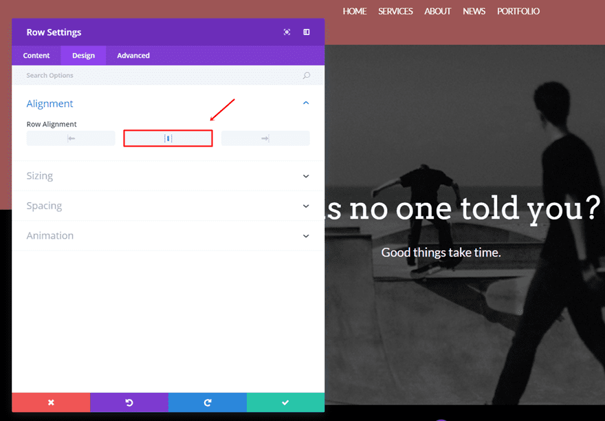
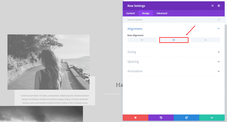
Center Row Alignment
Like most websites, we’re going to choose a center row alignment for the hero section.
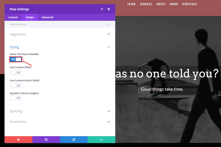
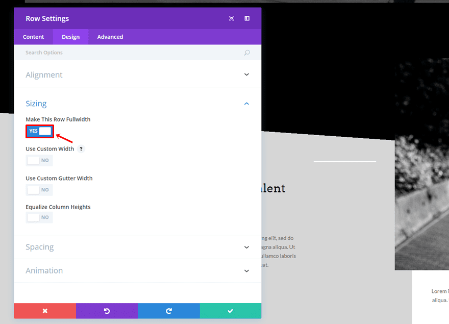
Make Row Fullwidth
We also want our row to be fullwidth, so we’re going to enable that option within the Sizing subcategory of the Design tab.
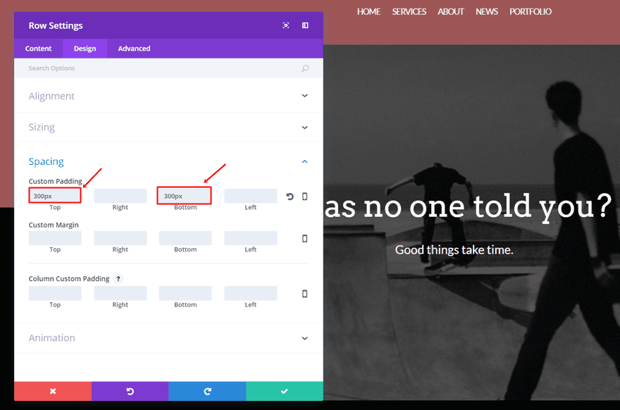
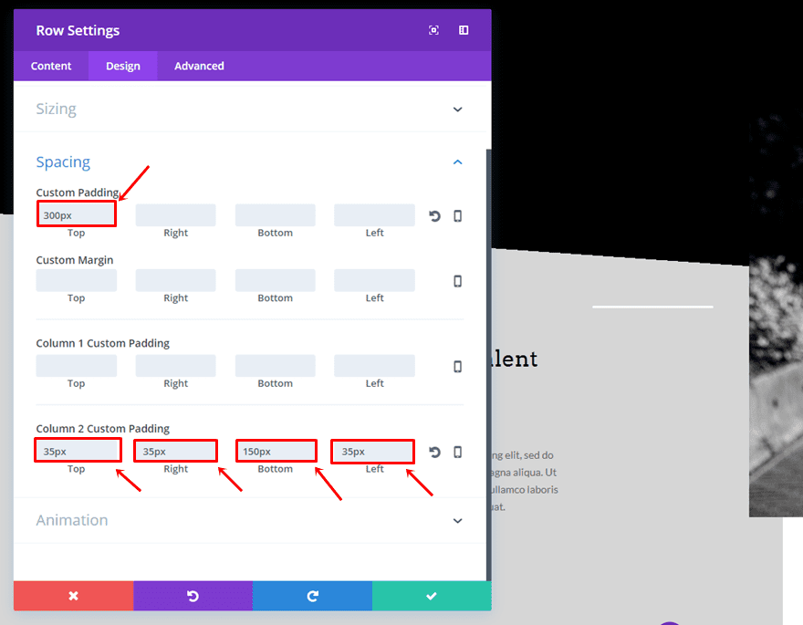
Custom Padding
The last thing we’ll need to do within the row settings is add a custom padding of ‘300px’ to the top and bottom.
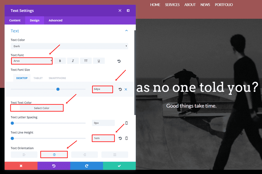
First Text Module
Once we have all the settings in place, we’re going to add the first Text Module to the row. Choose the text you want to appear in the Content tab and move on to the Design tab. Within the Design tab, make sure the following settings apply to the Text subcategory:
- Text Font: Arvo
- Text Font Size: 64 (Desktop), 47 (Tablet), 33 (Phone)
- Text Color: #FFFFFF
- Text Line Height: 1em
- Text Orientation: Center
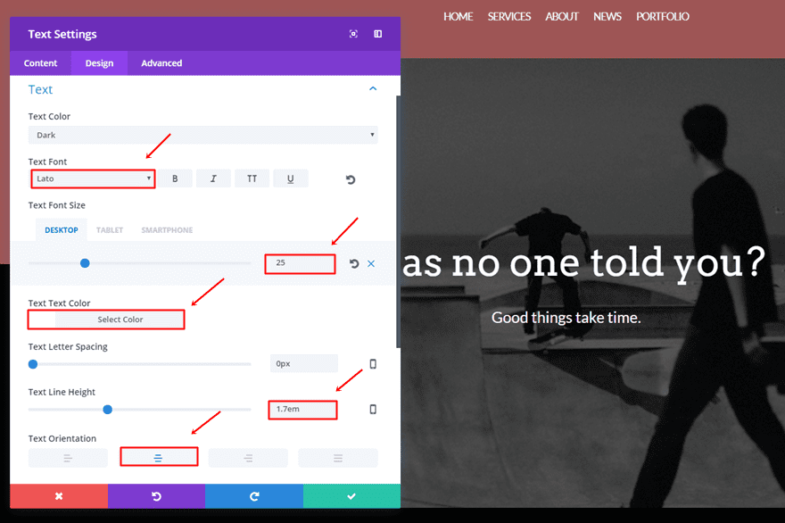
Second Text Module
Then, add another Text Module. The second Text Module contains, instead, the following settings:
- Text Font: Lato
- Text Font Size: 25 (Desktop), 18 (Tablet), 16 (Phone)
- Text Color: #FFFFFF
- Text Line Height: 1.7em
- Text Orientation: Center
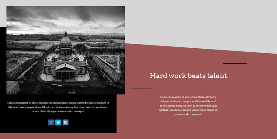
Second Section
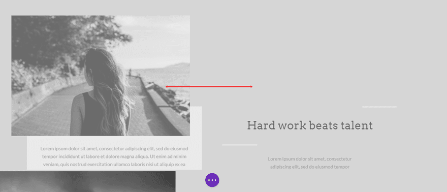
Once the hero section is done, we can go over to the second section. For this section, we’ll be using the right row alignment instead of the center one in combination with custom margin and column backgrounds to create a beautiful effect. We’ll need to create two row versions within this section: the desktop version and tablet/phone version. This will ensure that the design looks stunning on all kinds of screens.
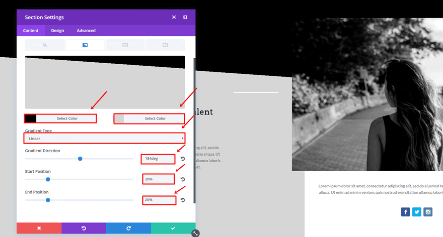
Section Settings
Gradient Background
After you have added a second section, add the follow gradient background to it:
- First Color: #000000
- Second Color: #d6d6d6
- Gradient Type: Linear
- Gradient Direction: 184deg
- Start Position: 20%
- End Position: 20%
Add Desktop Row
Then, you can go ahead and add a first two-column row to it; this row will be the desktop version. Luckily, we’ll be able to reuse most of it for the tablet/mobile version as well.
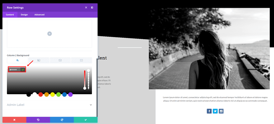
Row Settings
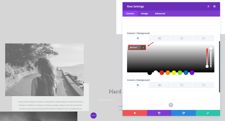
Column Background
Within the Content tab, add ‘#FFFFFF’ as the background color of the second column.
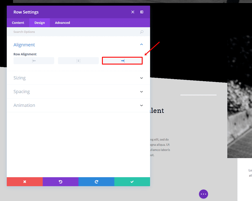
Right Row Alignment
Move on to the Design tab and select a right row alignment.
Make Row Fullwidth
Next, open the Sizing subcategory and enable the ‘Make This Row Fullwidth’ option.
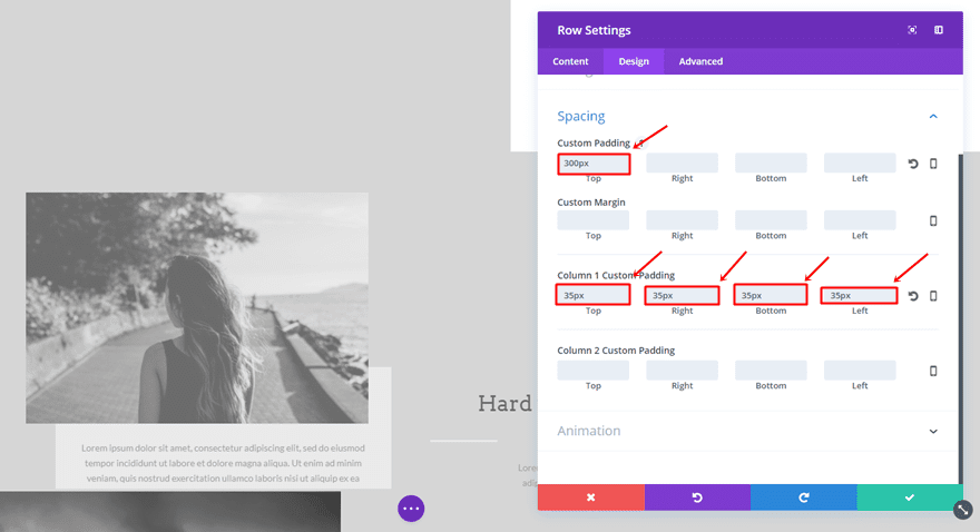
Custom Padding
The last thing you’ll need to do in the row settings is add a top padding of ‘300px’ to the row and the following padding to the second column:
- Top: 35px
- Right: 35px
- Bottom: 150px
- Left: 35px
Column 1
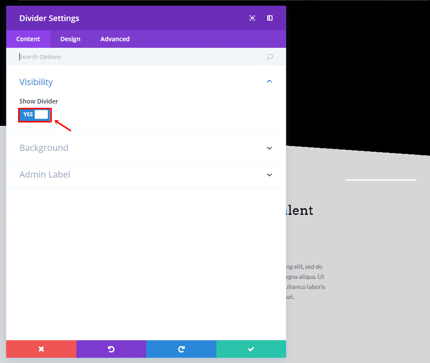
First Divider Module
For the first column, we’re going to start by adding a Divider Module. Within the Visibility subcategory of the Content tab, enable the ‘Show Divider’ option.
Move on to the Design tab and select ‘#FFFFFF’ as the divider color.

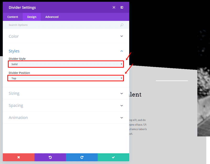
Then, choose ‘Solid’ as the Divider Style and ‘Top’ as the Divider Position within the Styles subcategory.
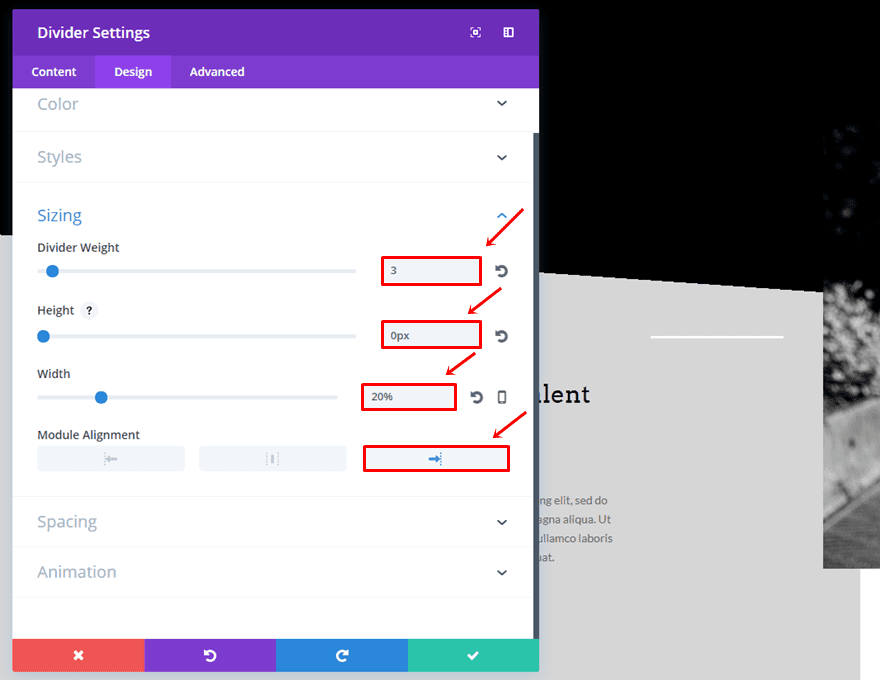
The last thing you’ll need to do within the Design tab of the Divider Module is make the following adjustments to the Sizing subcategory:
- Divider Weight: 3
- Height: 0px
- Width: 20%
- Module Alignment: Right
First Text Module
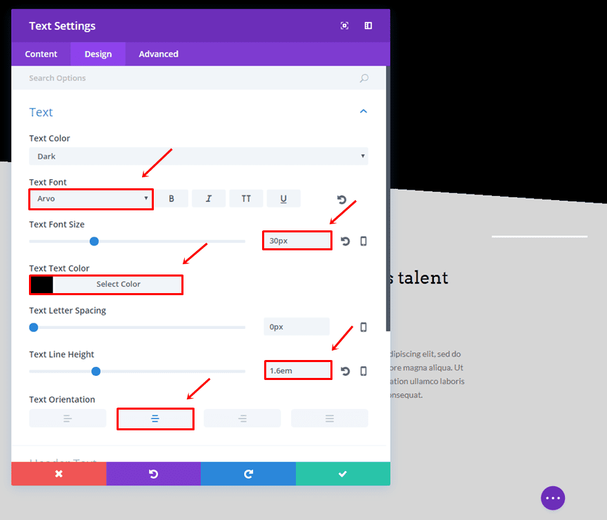
Right below the Divider Module, add the first Text Module and use the following settings within the Text subcategory of the Design tab:
- Text Font: Arvo
- Text Font Size: 30px
- Text Color: #000000
- Text Line Height: 1.6em
- Text Orientation: Center
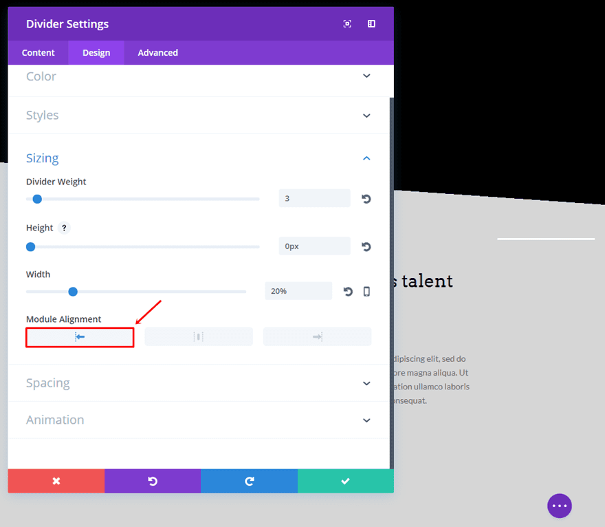
Clone First Divider Module & Change Alignment
Clone the Divider Module we’ve created and position it right below the first Text Module. The only thing that has to be changed is the Module Alignment in the Sizing subcategory. Instead of having it on the right side, choose the left.
Second Text Module
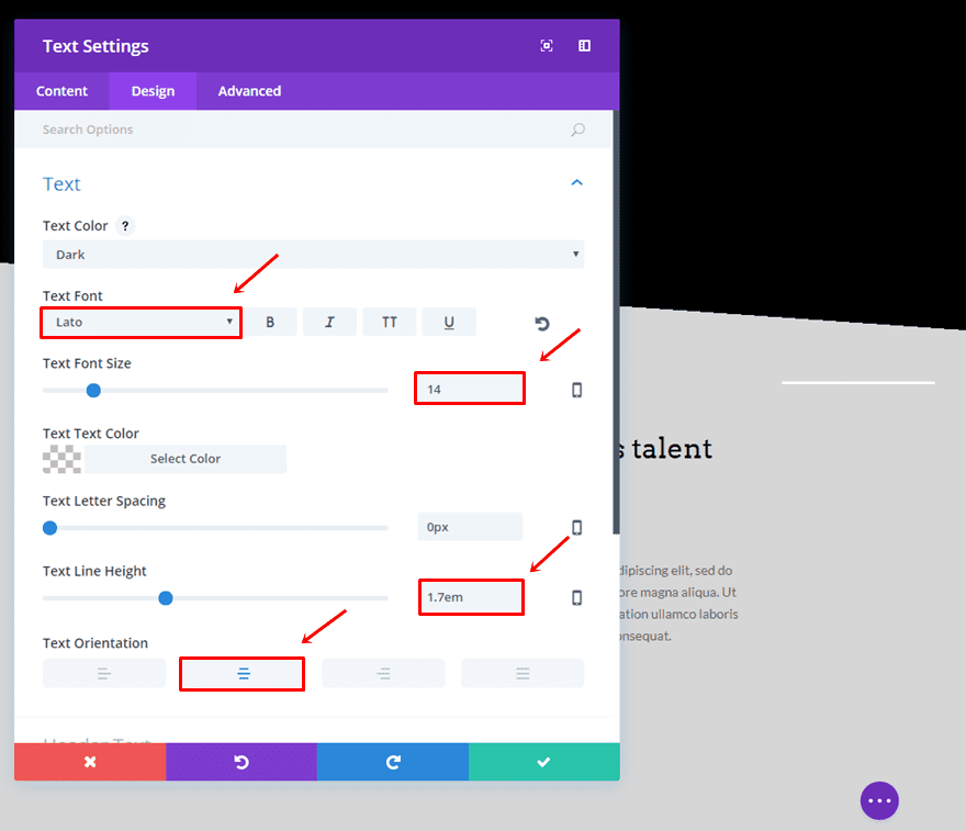
The last thing you’ll need to add to the first column is another Text Module with the following settings:
- Text Font: Lato
- Text Font Size: 14
- Text Line Height: 1.7em
- Text Orientation: Center
Column 2
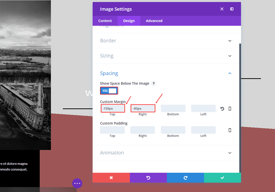
Image Module
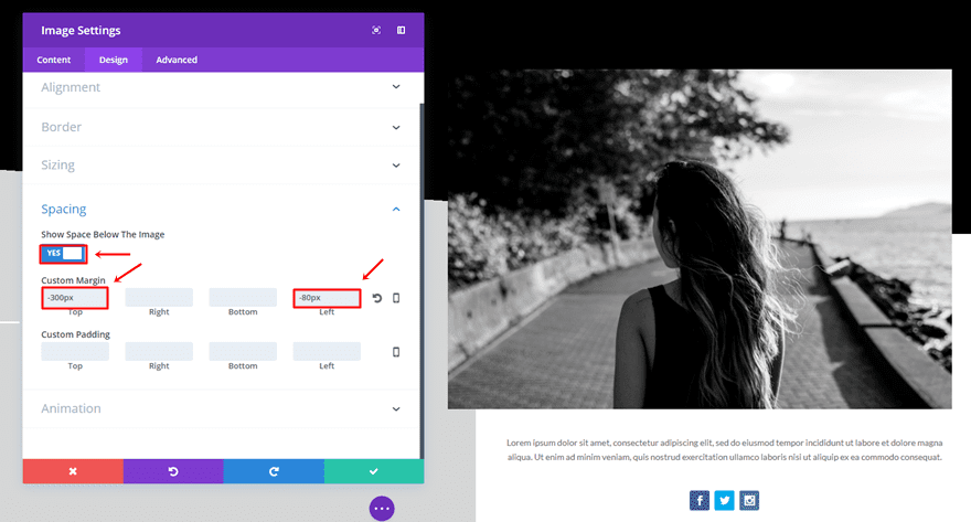
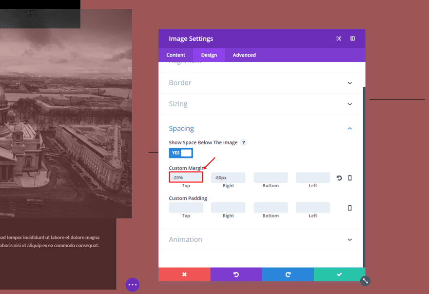
The first thing you’ll need to add to the second column is an image Module with the following settings within the Spacing subcategory of the Design tab:
- Show Space Below The Image: Yes
- Top Margin: -300px
- Left: -80px
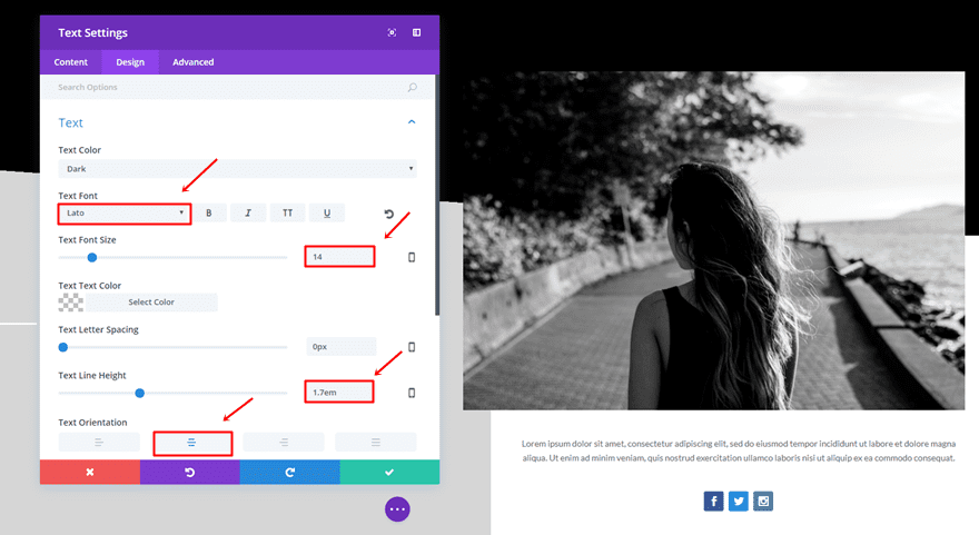
Text Module
Then, add a Text Module right below the Image Module and choose the following settings within the Text subcategory of the Design tab:
- Text Font: Lato
- Text Font Size: 14
- Text Line Height: 1.7em
- Text Orientation: Center
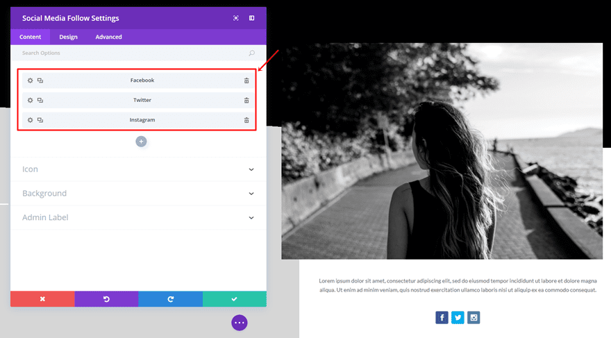
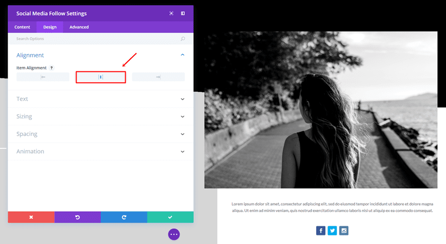
Social Media Follow Module
The last thing you’ll need to add to the second column is a Social Media Follow Module. Add as many social icons as you want and make sure you select ‘Center’ as the Item Alignment within the Design tab.
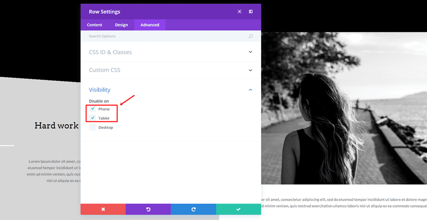
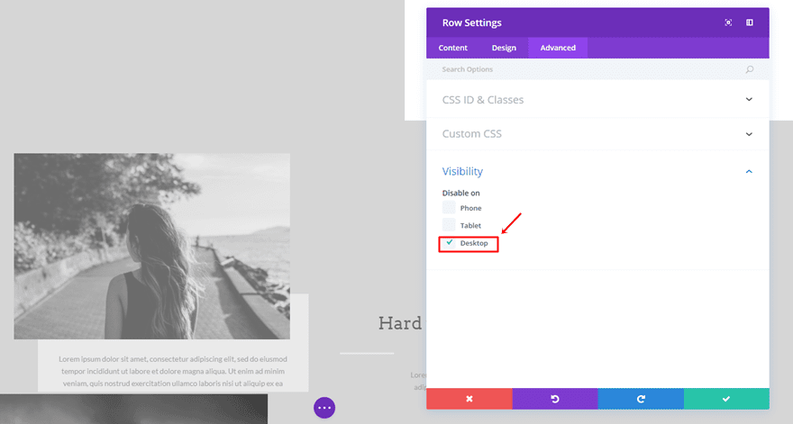
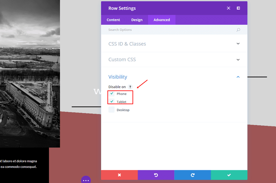
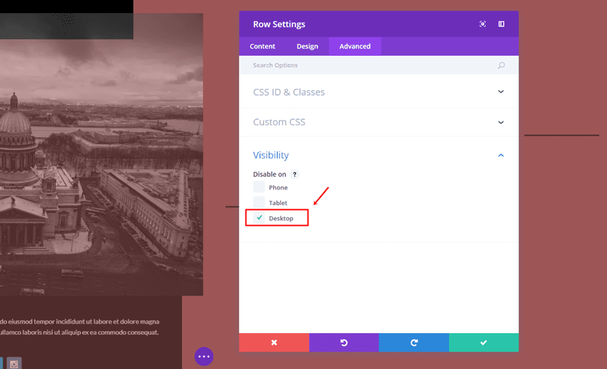
Disable on Tablet & Phone
Once all that’s done, you can go ahead and disable the row on Phone & Tablet.
Add Mobile Row
Clone Desktop Row
Now that we’ve already made the Desktop version, making the Mobile version will go a lot quicker. Clone the Desktop row and follow the next steps.
Switch Columns
Start by switching the modules that are located in both columns.
Column Background Color
Afterwards, remove the background color of the second column and place it in the first column instead.
Column Padding
Instead of having the Custom Padding in the second column, we’ll need to have it in the first column. Besides, the bottom padding isn’t ‘150px’ but ’35px’ like the top, right and left padding.
Use Center Row Alignment
Then, we’ll also have to change the row alignment into ‘Center’.
Disable on Desktop
Last but not least, make sure the row is disabled on Desktop.
Third Section
The third section is going to be really similar to the second one. Creating this section will be easy since we can take over most of the settings of the second section and make some adjustments. Once you’ve completed all the steps, you’ll be able to witness the following result:
Section Settings
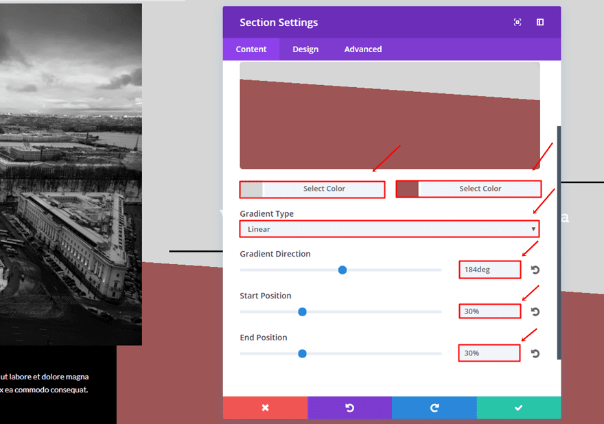
Gradient Background
Add a new standard section and use the following gradient background:
- First Color: #d6d6d6
- Second Color: #9e5555
- Gradient Type: Linear
- Gradient Direction: 184deg
- Start Position: 30%
- End Position: 30%
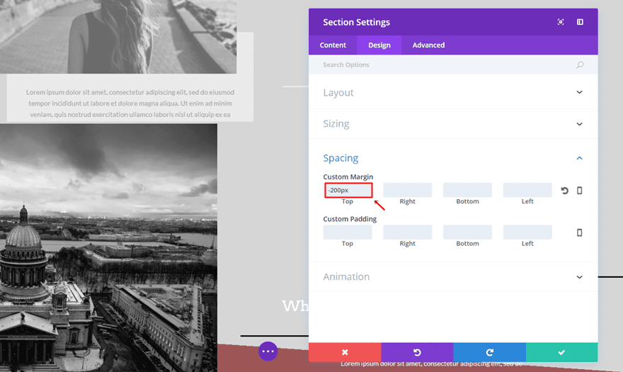
Custom Margin
Then, add a custom margin of ‘-200px’ as well.
Desktop Row
Same way of working counts for the third section; we’re going to make a desktop and tablet/phone version.
Clone Desktop Row of Second Section
Start by cloning the Desktop row of the previous section. Most of the settings are the same and we’ll go over the changes that need to be made.
Switch Columns
One of the changes we need to make is switching the modules that are located in both columns.
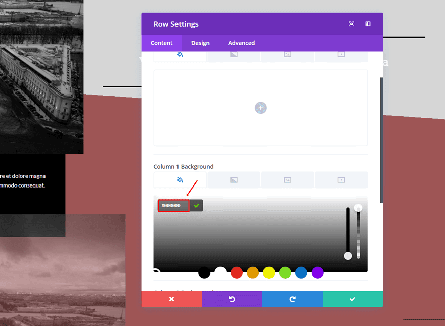
Column Background Color
Then, we’ll also need to remove the second column background color and add ‘#000000’ as the first column background color.
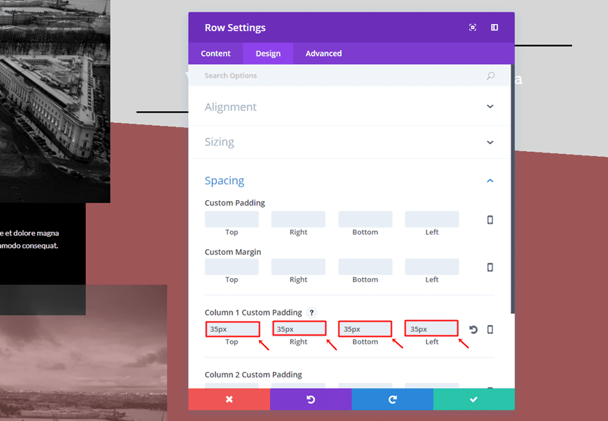
Column Padding
Delete the Column 2 Custom Padding and use ’35px’ for the top, right, bottom and left custom padding of the first column.
Use Left Row Alignment
Also, change the row alignment from right to left.
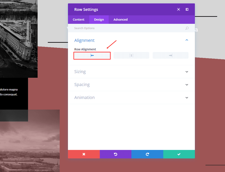
Image Module Custom Margin
The spacing subcategory of the Image Module will need some changes as well:
- Top: -150px
- Right: -80px
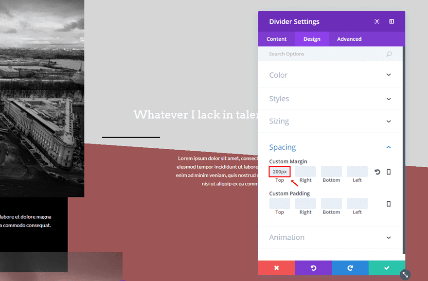
First Divider Module Custom Margin
Next, add a top margin of ‘200px’ to the first Divider Module within the second column.
Use Opposite Colors
As you can notice; the use of colors is the opposite of the second section. Go ahead and change all the font colors into ‘#FFFFFF’ and the divider colors into ‘#000000’.
Disable on Tablet & Phone
Although the row is already disabled on tablet and phone (because of the clone), you can go to the Visibility subcategory if you want to make sure.
Mobile Row
Clone Previous Desktop Row
For the Mobile version, clone the Desktop row you’ve just created and make the changes that follow in the next part of this post.
Use Center Row Alignment
Open the row settings and change the Row Alignment to center.
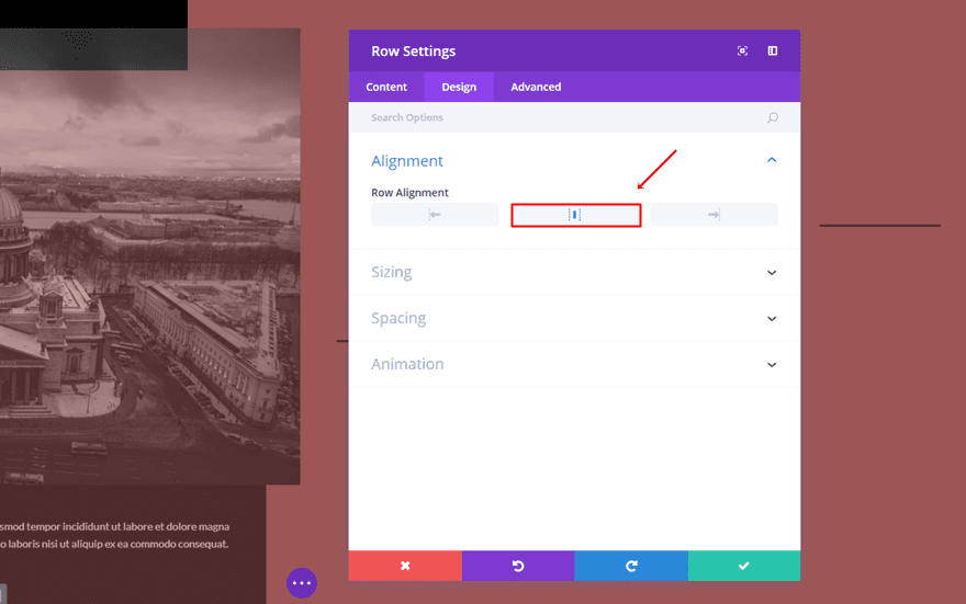
Image Module Custom Margin
Another thing you’ll need to do is change the top margin of the Image Module into ‘-20%’.
Disable on Desktop
Last but not least, make sure that this last row is disabled on desktop.
Result
By following this tutorial step by step, you should be able to achieve the following result on desktop:
And the following result on mobile:
Final Thoughts
In this post, we’ve shown you how you can creatively use the different alignment options of rows within the Divi Builder. People learn the most by doing, that’s why we’ve provided you with an example which we showed you step by step how to create. If you have any questions or suggestions; feel free to leave a comment in the comment section below.
Be sure to subscribe to our email newsletter and YouTube channel so that you never miss a big announcement, useful tip, or Divi freebie!


Really nice tutorial, so many possibilities now !
Hey,
I love the way this looks and really wanted to create it for a seamless about me page. Unfortunately I get through the tutorial and I do not have an ALIGNMENT option on my design pages.
I have chosen update on my divi builder is there something I am suppose to do?
Thank you!
Hi Mak, wonderful job!
I´m surprised how fast everything loads on your page, every time you upload an image or even you create new section, everything pops up on your screen, so could you tell what speed internet connection are you using and how much memory your computer is using to go that fast?
Many thanks
We design in localhost. I, for example use Windows with a platform XAMPP = windows, Apache, MySQL, PHP, Perl (and WordPress)
The X refers to the operating system of your machine that can be Windows (WAMPP), Linux (LAMPP), Mac (MAMPP).
Then your local test domain can call it whatever you want: localhost, mak-dev, etc.
Another way (somewhat slower) would be to install on your PC a virtual machine like VirtualBox and install your entire web server from scratch. It is an operating system running inside another. Which can be an accurate image (for test) of your production VPS.
I’m looking forward to giving this a go! Thank you for such clear instruction.
WOW very nice Thanks for inspirational,thank you
A lot of new usefull features. Great! 🙂 I used rows, sections, modules minus margins etc. on websites with previous Divi version. It was hard to complete, specially for mobile but effect was very satisfying. Looks great specially with collage type of layout.
This is great – I had no idea that this effect could be achieved so simply! Thank you!
Thanks for your amazing effort in putting this post together!
Truly inspirational.
I certainly appreciate it, thank you.
Another great tutorial to achieve different designs. Thanks a lot, Mak/ET!
nice options…, also request you to create options where we can add family tree [Genealogy] modules on our sites using divi.
which is the most trending topic and no plugins are available… hope you will this request will be considered…
This looks so great! Thanks so much for the tutorial!!
If it wasn’t for Divi we’d still only be using Squarespace. Since the release of Divi 3.0 we’ve created some of our best websites to date and these new features have blown open the door to many more creative possibilities. Thank you!
Great Inspiration – Thank´s a lot !