
If you’re offering membership deals on your website, it’s important to make sure people will notice them on your website. To give you a headstart, we’re going to provide you with a stunning membership showcase that you can recreate step by step using Divi and its built-in options only. We’re combining a beautiful section background with Blurb Modules that showcase membership deals and a separate button that takes your visitors to the right page.
Preview
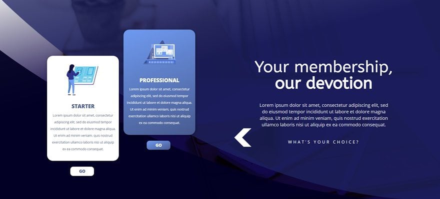
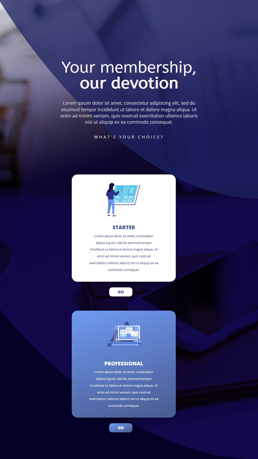
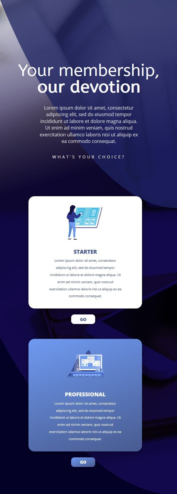
Before we dive into the tutorial, let’s take a quick look at the design we’ll recreate on different screen sizes.
On Desktop
On Tablet
On Mobile
Download This Tutorial’s Files
To lay your hands on the free images files, you will first need to download it using the button below. To gain access to the download you will need to subscribe to our newsletter by using the form below. As a new subscriber, you will receive even more Divi goodness and a free Divi Layout pack every Monday! If you’re already on the list, simply enter your email address below and click download. You will not be “resubscribed” or receive extra emails.

Add a New Section
Gradient Background
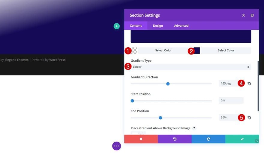
Start by creating a new page or opening an existing one and switching over to the Visual Builder. Once you do, add a new section, open the section settings and apply the following gradient background to it:
- Color 1: rgba(255,255,255,0)
- Color 2: #150a56
- Gradient Type: Linear
- Gradient Direction: 165deg
- End Position: 36%
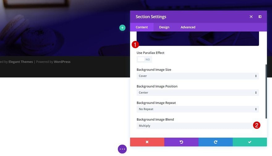
Background Image
Open the background image tab next, upload the ‘home_office-39.jpg‘ image you can find in the downloaded folder and apply ‘Multiply’ as your Background Image Blend.
Dividers
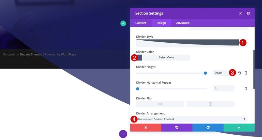
The next thing we’ll do is add our section dividers. We’ll use both a top and bottom divider to create the nice background effect. Start by opening the Top tab and apply the following settings to it:
- Divider Color: rgba(30,35,96,0.75)
- Divider Height: 700px
- Divider Arrangement: Underneath Section Content
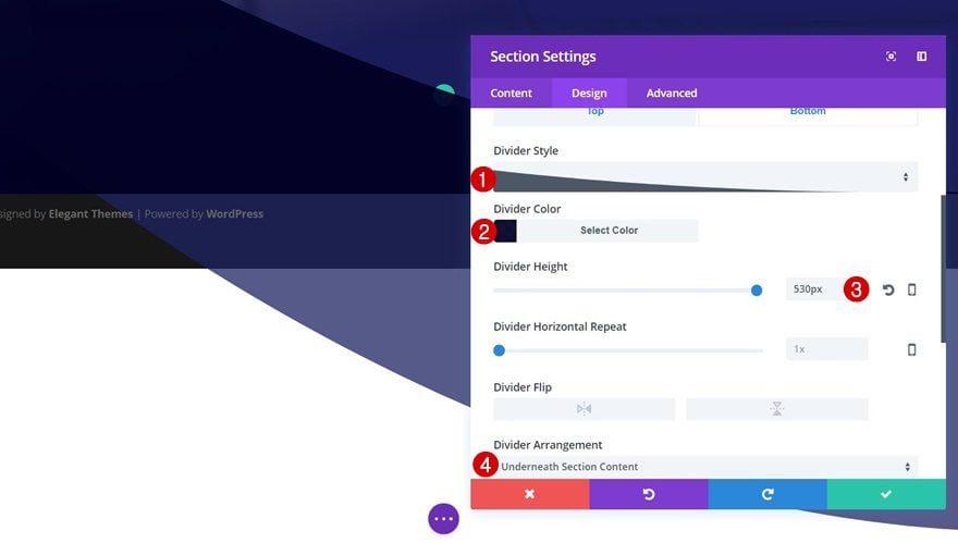
Then, switch over to the Bottom tab and make the following changes:
- Divider Style: Find in List
- Divider Color: rgba(2,0,35,0.93)
- Divider Height: 430px
- Divider Arrangement: Underneath Section Content
Spacing
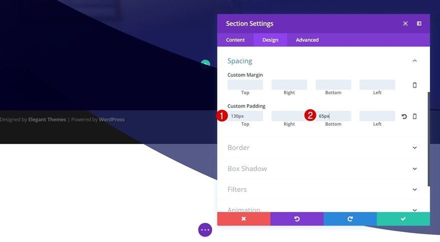
We’ll create some extra space at the top and bottom of the section by adding the following custom padding:
- Top Padding: 130px
- Bottom Padding: 65px
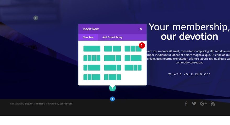
Add First Row
Column Structure
Now that we’ve made all the desired changes to our section, we can start adding the first row. The column structure we need is the following:
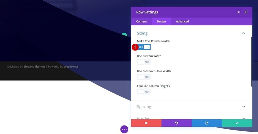
Sizing
Before adding any modules, we’re going to make a small modification to the row’s default settings. Open the Sizing subcategory within the Design tab and enable the ‘Make This Row Fullwidth’ option.
Add Title Text Module to Column 2
Text Settings
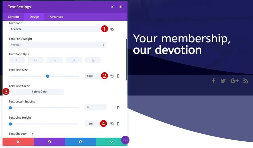
Now we can start adding our modules! We’ll only use the second column of this row. Add a title Text Module that contains the following text settings:
- Text Font: ABeeZee
- Text Size: 56px
- Text Color: #f9f9f9
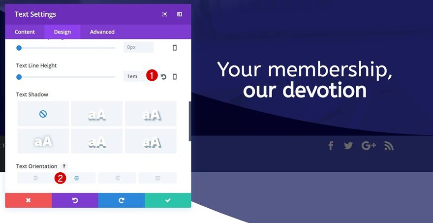
- Text Line Height: 1em
- Text Orientation: Center
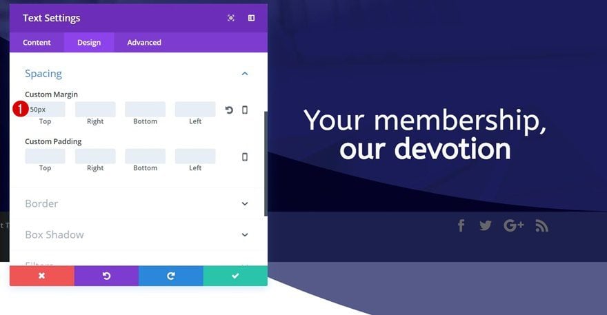
Spacing
We’ll need some space at the top as well. That’s why we’re adding ’50px’ to the top margin.
Add Description Text Module to Column 2
Text Settings
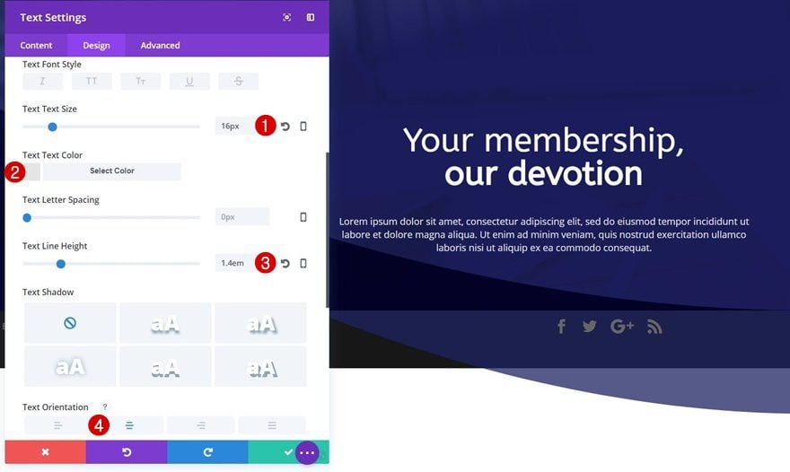
Right below the previous Text Module, go ahead and add a new one for your description. Once you add your content, apply the following text settings to it:
- Text Size: 16px
- Text Color:
- Text Line Height: 1.4em
- Text Orientation: Center
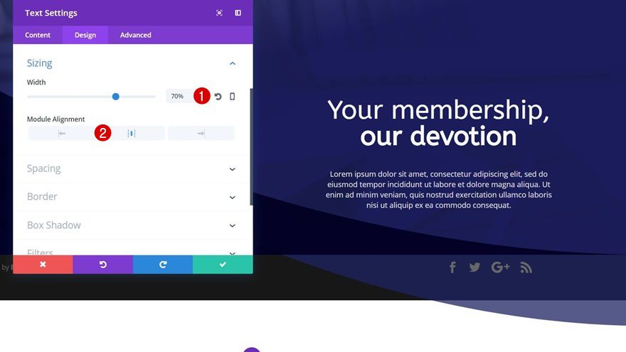
Sizing
We’ll also change the Width of this Text Module into ‘70%’ and enable center Module Alignment.
Add CTA Text Module to Column 2
Text Settings
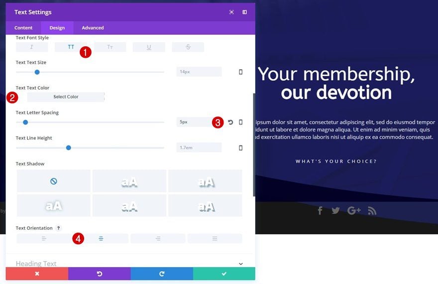
Once you’re done with the description Text Module, go ahead and add a CTA Text Module right below it and apply the following text settings to it:
- Text Font Style: Uppercase
- Text Color: #ffffff
- Text Letter Spacing: 5px
- Text Orientation: Center
Add Arrow Image Module to Column 2
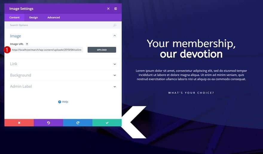
Upload Image
The last module we’ll need to add to this row is an Image Module. Upload the ‘arrow.png‘ image which you can find in the downloaded folder.
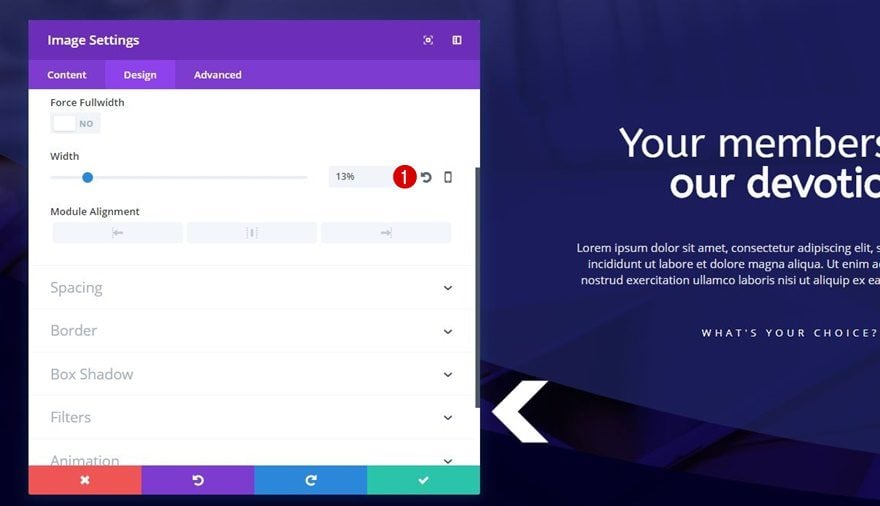
Sizing
Change the width of this image to ‘13%’ next.
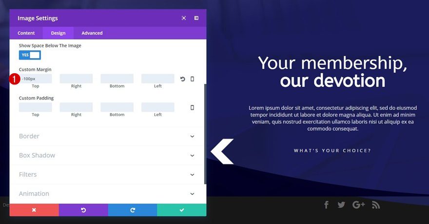
Spacing
We want this arrow to appear at the same height as our CTA Text Module. That’s why we’ll add ‘-100px’ to the top margin as well.
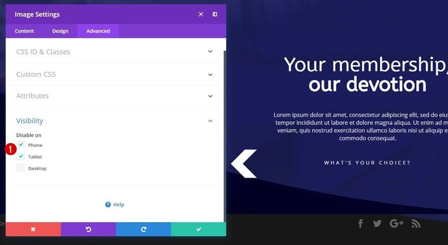
Visibility
Lastly, we’ll disable this Image Module on tablet and phone since it won’t match those screen sizes.
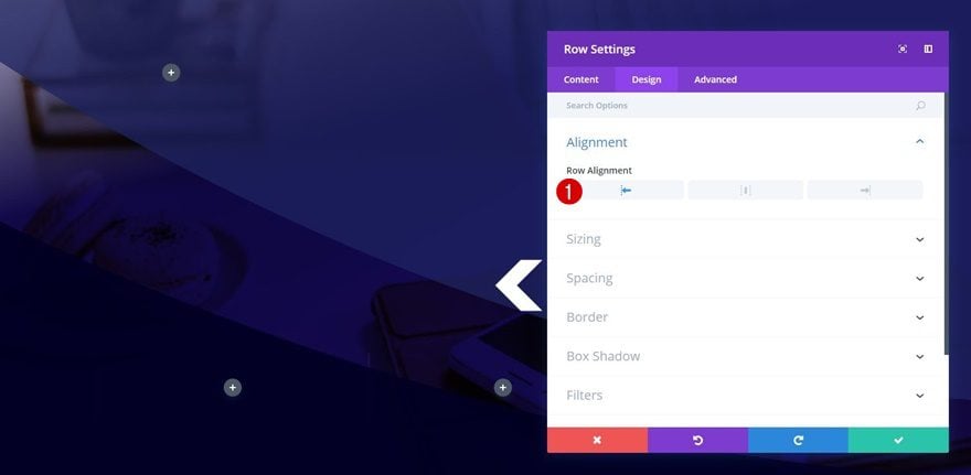
Add Second Row
Column Structure
For the membership deals, we’ll need to add another row using the following column structure:
Row Alignment
Before adding any modules, we’re going to apply a left Row Alignment.
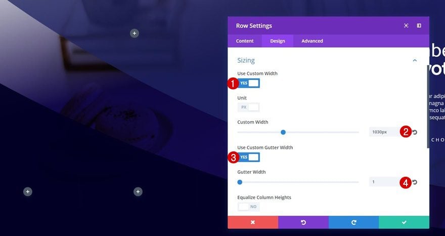
Sizing
And we’ll also make some modifications to the Sizing subcategory:
- Use Custom Width: Yes
- Custom Width: 1030px
- Use Custom Gutter Width: Yes
- Gutter Width: 1
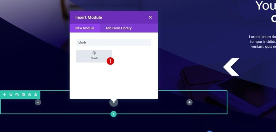
Add Blurb Module to Column 2
Add Text
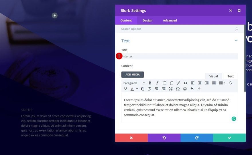
To showcase a membership deal, we’ll use a Blurb Module in combination with a Button Module. Start by adding a Blurb Module to the second column of your row and add the content of choice.
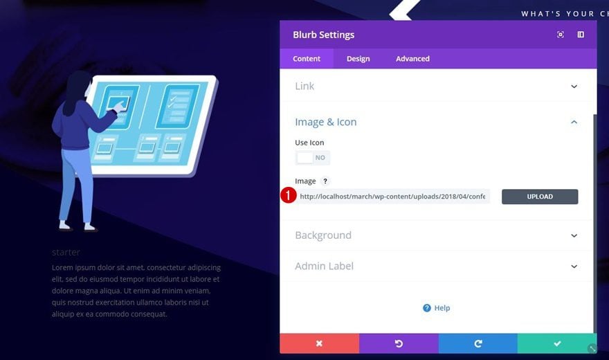
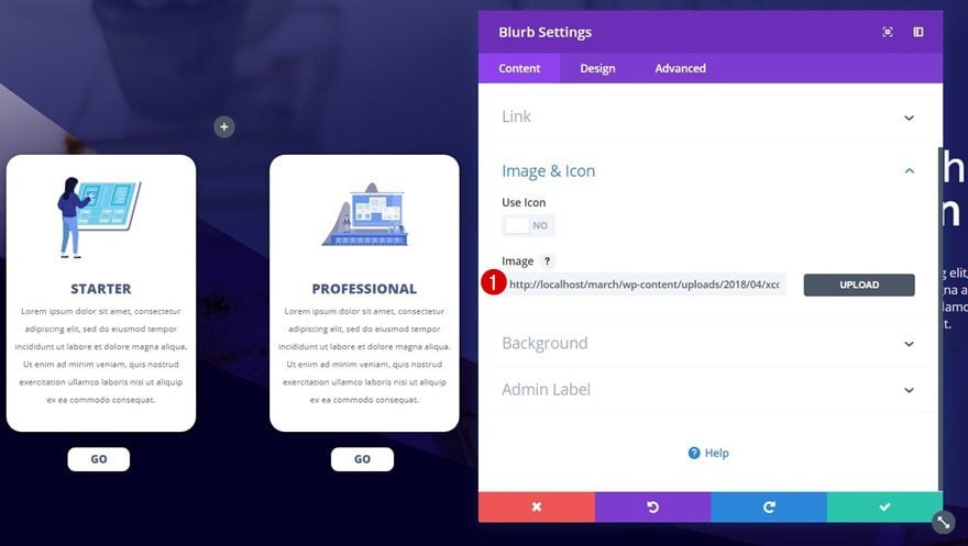
Upload Image
Next, upload the ‘conference_illustration_05.png‘ image which you can find in your downloaded folder.
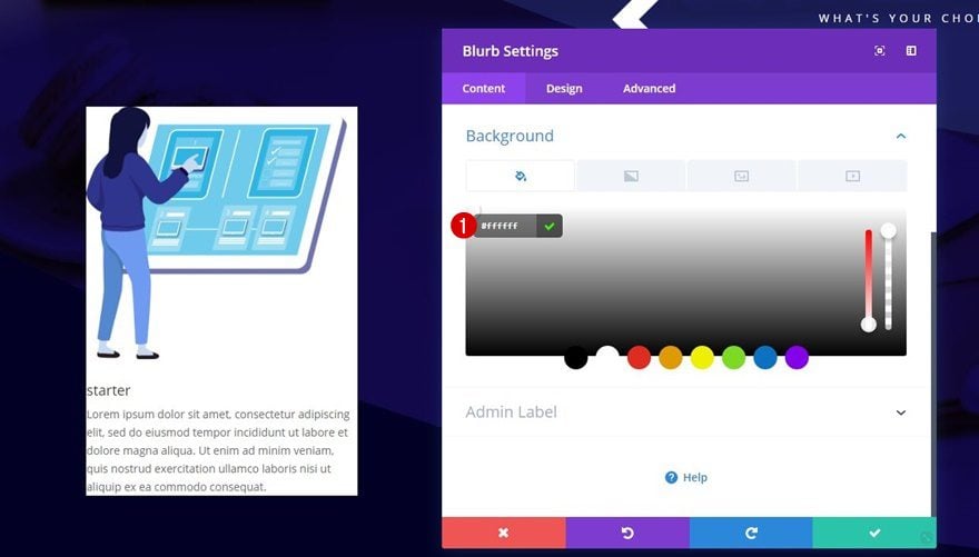
Background Color
Then, use ‘#ffffff’ as the background color of your Blurb Module.
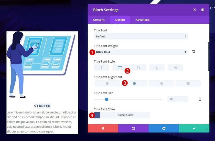
Title Text Settings
We’ll need to make some modifications to the title of our Blurb Module next:
- Title Font Weight: Ultra Bold
- Title Font Style: Uppercase
- Title Text Alignment: Center
- Title Text Color: #485B90
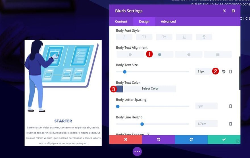
Body Text Settings
We’ll also change the body text settings:
- Body Text Alignment: Center
- Body Text Size: 11px
- Body Text Color: #485B90
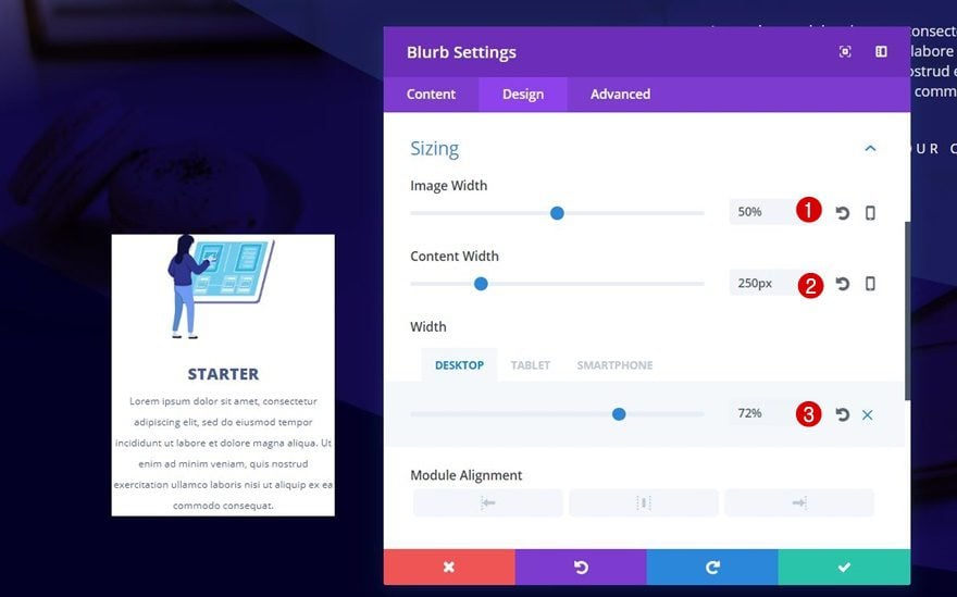
Sizing
Continue by opening the Sizing subcategory and make the following changes:
- Image Width: 50%
- Content Width: 250px
- Width: 72% (Desktop), 50% (Tablet), 99% (Phone)
We’re not using ‘100%’ for phone that would make it inherit tablet’s ‘50%’ otherwise.
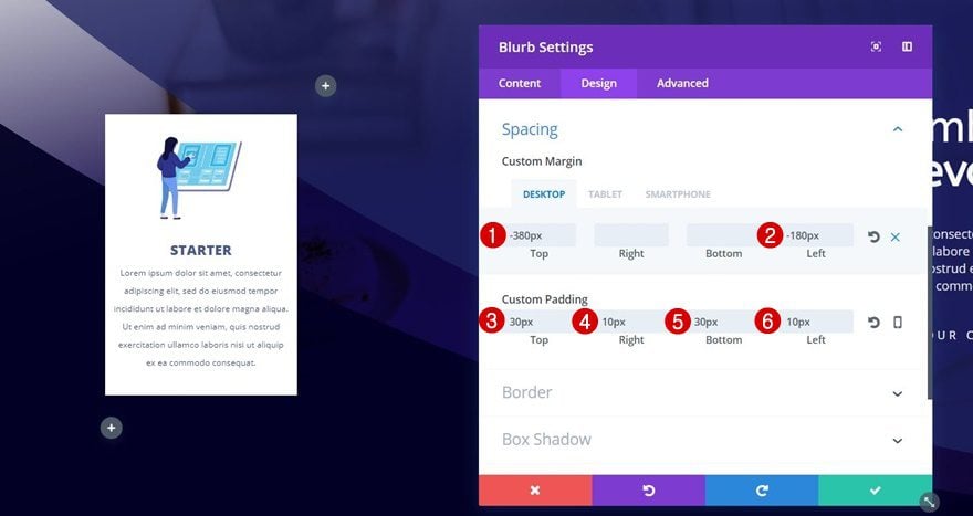
Spacing
The spacing of the Blurb Module is a very important part of this tutorial. We’re going to negative top and left margin on desktop to push the Blurb Module to the left and make it overlap with the previous row. We’ll also add some custom padding to create a better-looking result:
- Top Margin: -380px (Desktop), 0px (Tablet & Phone)
- Left Margin: -180px (Desktop), 35% (Tablet), 20% (Phone)
- Top Padding: 30px
- Right Padding: 10px
- Bottom Padding: 30px
- Left Padding: 10px
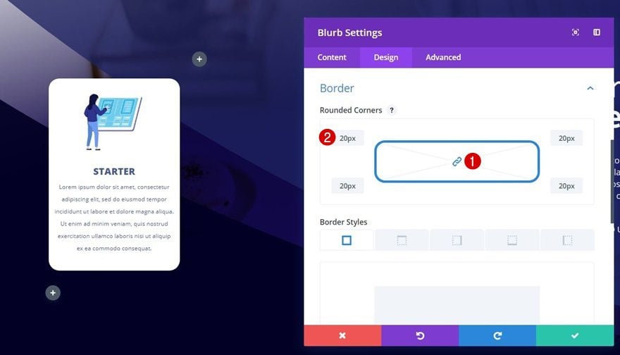
Border
Next, we’re going to add ’20px’ to each one of the corners within the Border subcategory.
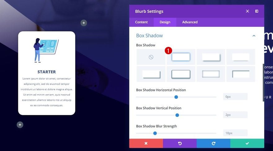
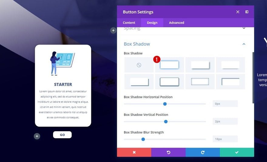
Box Shadow
And to top it off, we’ll enable the first box shadow option.
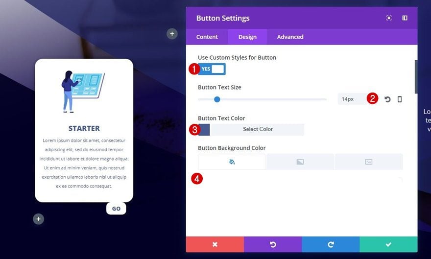
Button Settings
Right below the Blurb Module you’ve added to the second column, add a Button Module. After adding the CTA to your button, apply the following button settings to it:
- Use Custom Styles for Button: Yes
- Button Text Size: 14px
- Button Text Color: #485B90
- Button Background Color: #ffffff
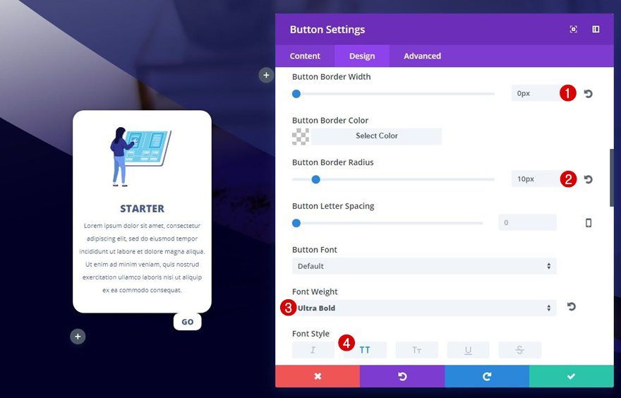
- Button Border Width: 0px
- Button Border Radius: 10px
- Font Weight: Ultra Bold
- Font Style: Uppercase
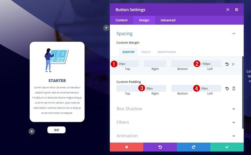
Spacing
Since we’ve pushed the Blurb Module to the left (on desktop), we’ll need to do the same for the Button Module.
- Top Margin: 20px
- Bottom Margin: 50px (Tablet & Phone)
- Left Marign: -100px (Desktop), 53% (Tablet), 50% (Phone)
- Right Padding: 30px
- Left Padding: 30px
Box Shadow
We’ll add the first box shadow option to this Button Module as well.
Change Image & Text
Now, clone the Blurb Module and Button Module of your second column and place both of them in the third column. We’re using the same image for this Blurb Module as we did for the Blurb Module that is located in the first column.
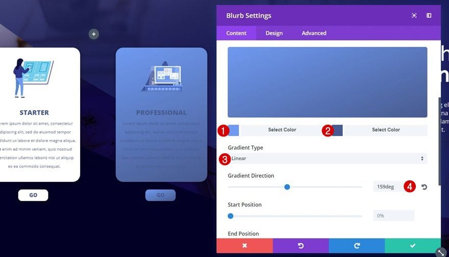
Remove Background Color & Add Gradient Background
Open the settings of both modules individually, remove their background color and add the following gradient background:
- Color 1: #6F9AF1
- Color 2: #485B90
- Gradient Type: Linear
- Gradient Direction: 159deg
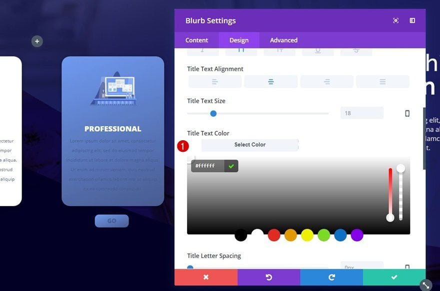
Change Text Colors of Both Modules
Change the text colors of both modules into ‘#ffffff’ as well.
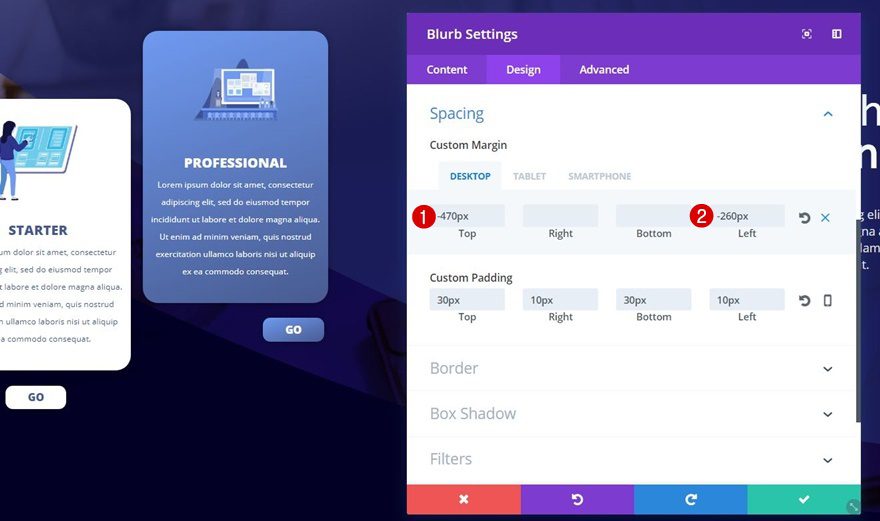
Change Spacing of Blurb Module
Then, go to the Spacing subcategory of your Blurb Module and modify the custom margin:
- Top: -470px (Desktop), 0px (Tablet & Phone)
- Left: -260px (Desktop), 35% (Tablet), 20% (Phone)
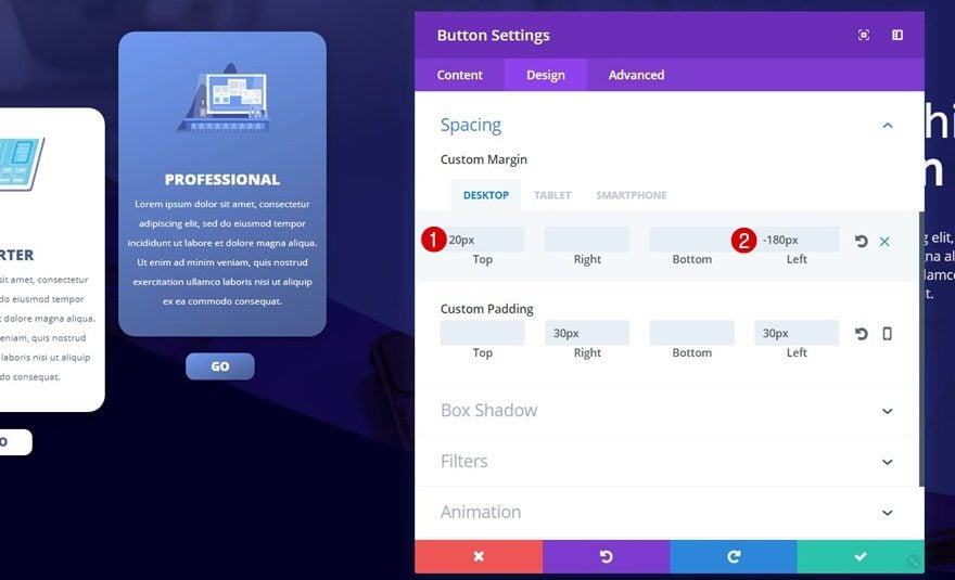
Change Spacing of Button Module
And last but not least, we’ll need to modify the Button Module’s custom margin as well:
- Top Margin: 20px
- Left Margin: -180px (Desktop), 53% (Tablet), 50% (Phone)
Preview
Now that we’ve gone through all the steps of this tutorial, let’s take a final look at the result on different screen sizes.
On Desktop
On Tablet
On Mobile
Final Thoughts
In this tutorial, we’ve shown you how to creatively highlight your membership deals in a section. We’ve combined a beautiful color palette with a stunning section background and we’ve used blurb modules and button modules to create the membership showcase. If you have any questions or suggestions, make sure you leave a comment in the comment section below!


Great work and godd idea download the files. Thankyou for this tutorial.
Very nice article Donjete, ty for sharing the files too
Thanks!