")
Sliders have always been really popular in web design. One of their biggest advantages is the fact that visitors can swipe through them on mobile devices. Nowadays, swiping is the new clicking, so it goes without saying that including sliders can help improve the mobile user experience visitors have on your website. When building a website with Divi, you can easily add the Slider Module to any row or section you’re working on. And with a bit of creativity and experimenting, you can achieve stunning web designs.
One of the things you can do is create a mobile walkthrough with the Slider Module. You can add as many slides as you want and the walkthrough will look equally as good on desktop and tablet, although it’s initially designed for mobile devices. In this post, we’ll recreate a stunning example from scratch and offer the section for download at the end of it.
Let’s get to it!
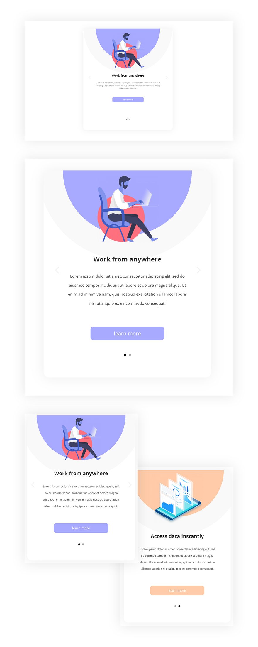
Preview
Before we dive into the tutorial, let’s take a quick look at the outcome we’ll recreate on different screen sizes.
Static
GIF
Let’s Start Recreating!
How to Create Mobile Walkthroughs with Divi’s Slider Module
Subscribe To Our Youtube Channel
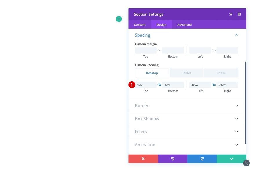
Add New Section
Spacing
Let’s start creating! Add a new page or open an existing one and add a new regular section to it. Open the section settings and add some custom padding values that match the different screen sizes.
- Top Padding: 4vw (Desktop), 5vw (Tablet), 3vw (Phone)
- Bottom Padding: 4vw (Desktop), 5vw (Tablet), 3vw (Phone)
- Left Padding: 30vw (Desktop), 18vw (Tablet), 3vw (Phone)
- Right Padding: 30vw (Desktop), 18vw (Tablet), 3vw (Phone)
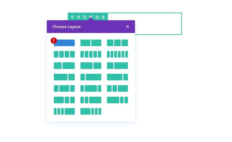
Add New Row
Column Structure
Continue by adding a new row to the section using the following column structure:
Gradient Background
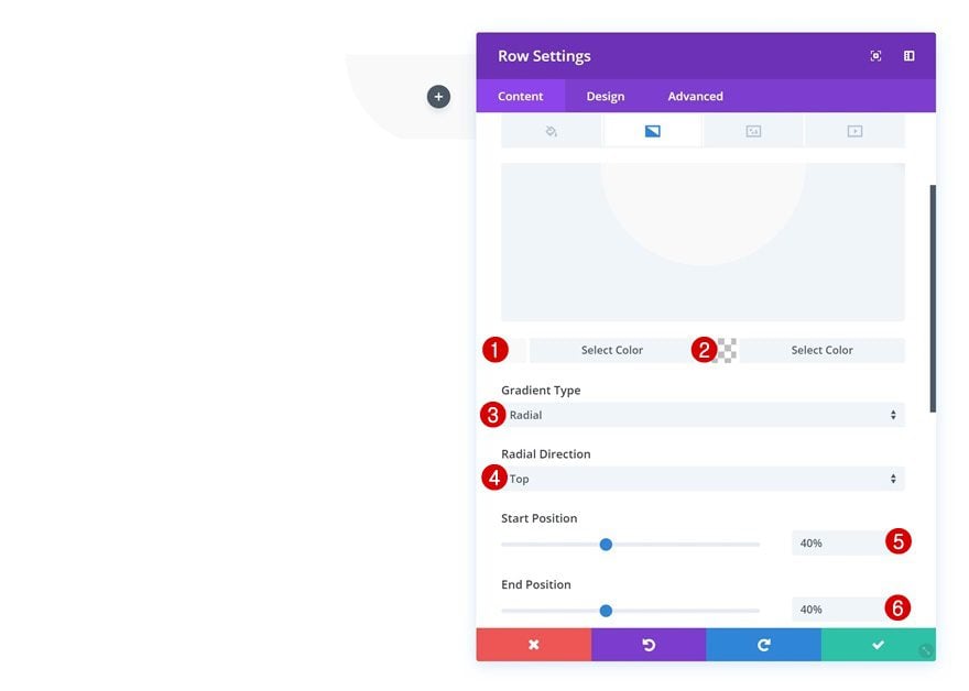
Without adding any modules yet, open the row settings and add a radial gradient background.
- Color 1: #f9f9f9
- Color 2: rgba(255,255,255,0)
- Gradient Type: Radial
- Radial Direction: Top
- Start Position: 40%
- End Position: 40%
Sizing
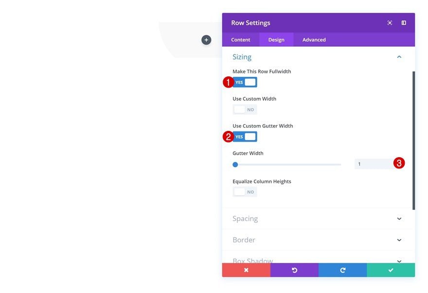
Continue by going to the sizing settings of the row and remove all the space between columns.
- Make This Row Fullwidth: Yes
- Use Custom Gutter Width: Yes
- Gutter Width: 1
Spacing
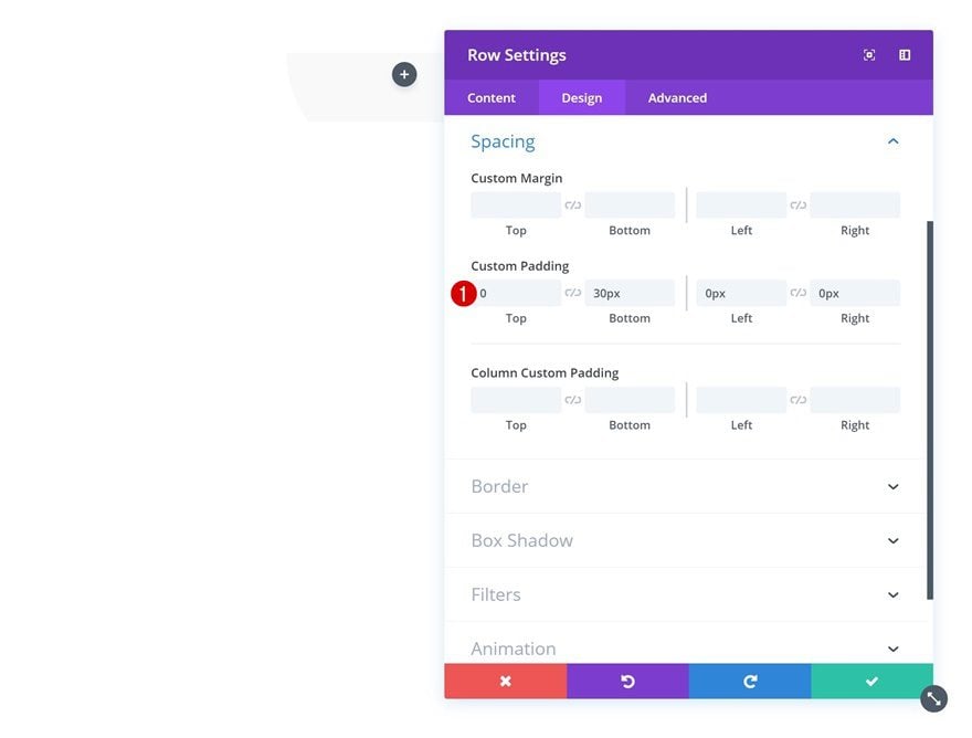
We’re also adding some bottom padding to the row.
- Bottom Padding: 30px
Border
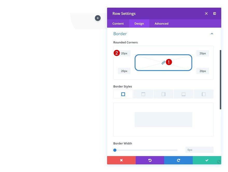
Next, add ’20px’ to each one of the corners in the border settings.
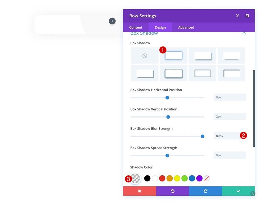
Box Shadow
Last but not least, add a subtle box shadow to the row to create some depth on the page.
- Box Shadow Blur Strength: 80px
- Shadow Color: rgba(0,0,0,0.07)
Add Slider Module
Change Background Color
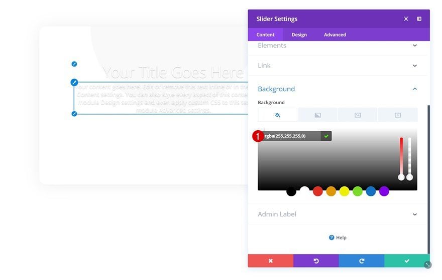
Once you’re done modifying the row settings, you can go ahead and add a Slider Module. Open the module’s settings and modify the background color. All the changes you make in the design tab will automatically apply to all slides you add afterward.
- Background Color: rgba(255,255,255,0)
Text Settings
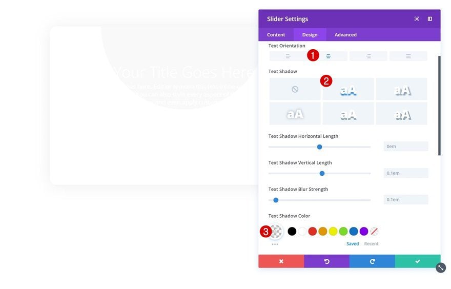
Then, go to the design tab and change the text settings.
- Text Orientation: Center
- Shadow Color: rgba(0,0,0,0)
Body Text Settings
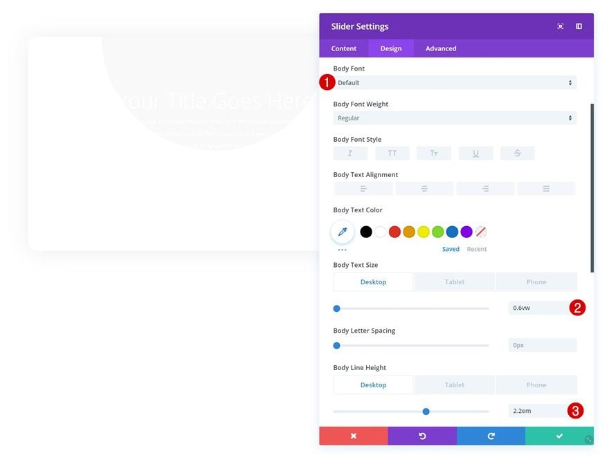
Modify the body text settings next.
- Body Font: Default (Open Sans)
- Body Text Size: 0.6vw (Desktop), 1.5vw (Tablet), 2.4vw (Phone)
- Body Line Height: 2.2em (Desktop), 2.3em (Tablet), 2.4em (Phone)
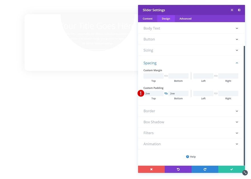
Spacing
Add some custom top and bottom padding too.
- Top Padding: 2vw
- Bottom Padding: 2vw
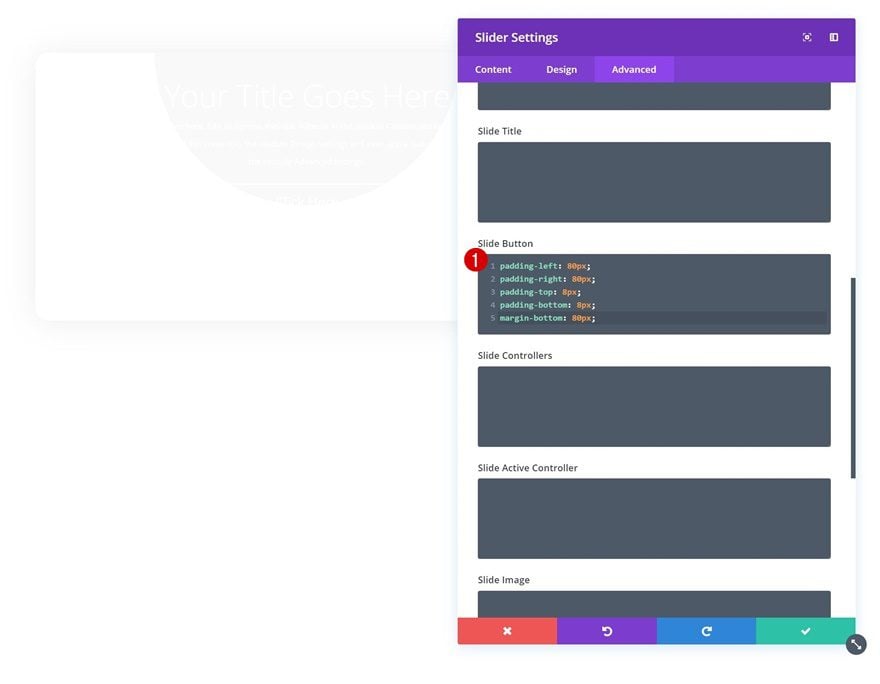
Button Custom CSS
We’ll also need to add some custom padding and margin values to the button of the Slider Module in particular. Because this element is combined with different elements in each slide, you’ll have to add the padding and margin manually using CSS code in the advanced tab.
padding-left: 80px;
padding-right: 80px;
padding-top: 8px;
padding-bottom: 8px;
margin-bottom: 80px;
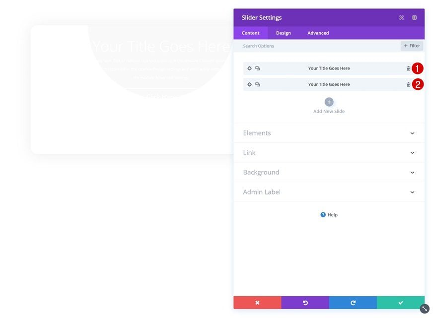
Remove Active Sliders
Once you’re done modifying all the general slide settings, you can go ahead and remove the active slides that are already there. Instead of using these ones, we’re going to create one from scratch in the next part of the post. This will help us modify and customize everything faster.
Customize First Slide
Customize Content in Content Box
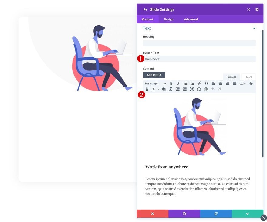
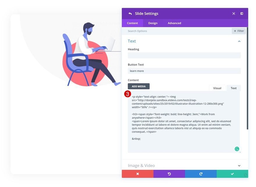
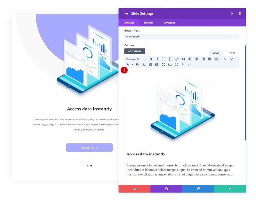
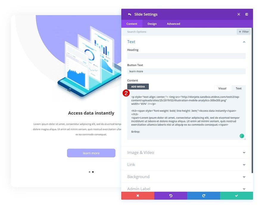
Add a new slide to the Slider Module and start customizing the content in the content box. In the print screens below, you’ll notice that we’re adding the image to the content box instead of to the image settings. This will allow us to place the image above the written content. You can find the illustrations that we’ve used by going to the Graphic Illustrator Layout Pack post and downloading the images at the end of it. We’re also adding and styling an H3 title in the content box instead of the title field to have it show up exactly where we want to.
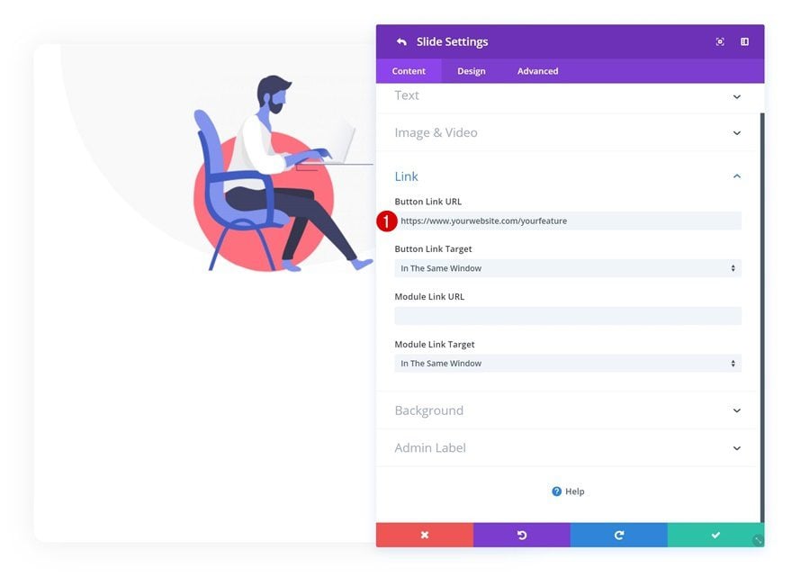
Button Link
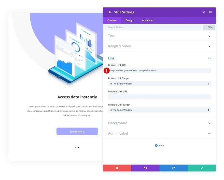
Continue by going to the link settings and add a link to the button that’ll redirect visitors to a more detailed page about the slide in question.
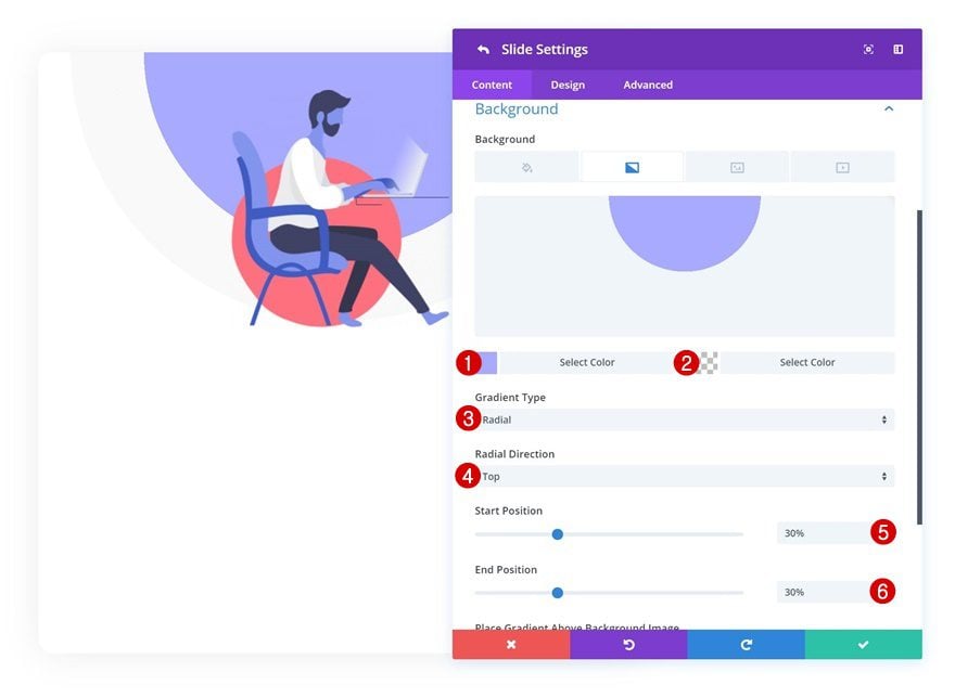
Gradient Background
Then, add a gradient background using the following settings:
- Color 1: #aaacff
- Color 2: rgba(255,255,255,0)
- Gradient Type: Radial
- Radial Direction: Top
- Start Position: 30%
- End Position: 30%
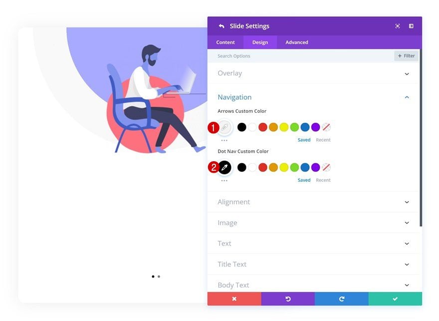
Navigation
Modify the text settings next.
- Arrows Custom Color: #f4f4f4
- Dot Nav Custom Color: #000000
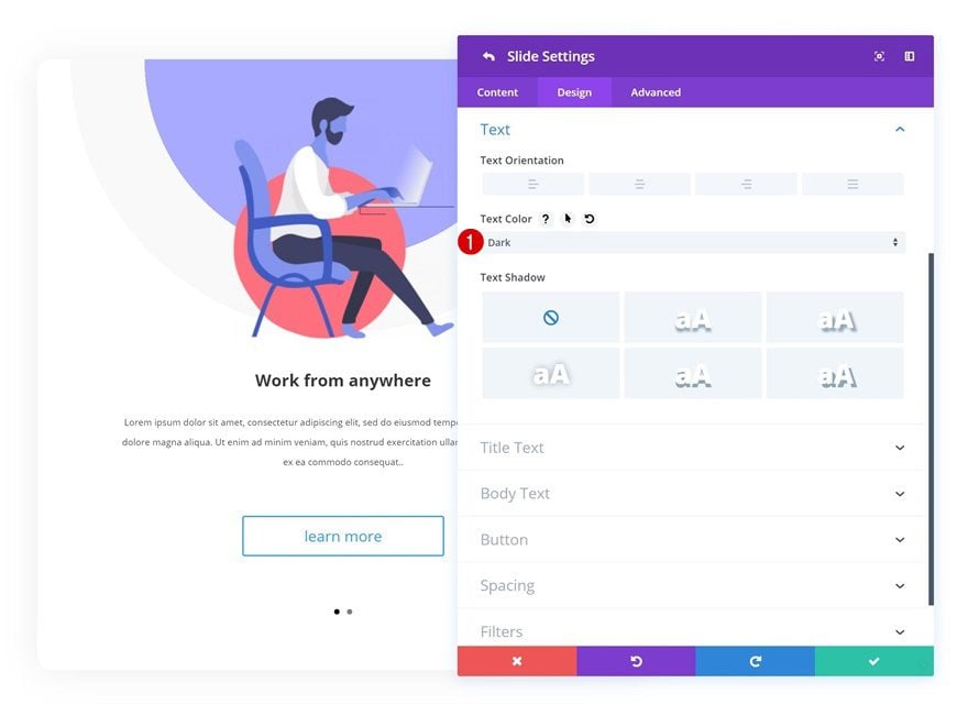
Text Settings
And change the text color in the text settings of the slide.
- Text Color: Dark
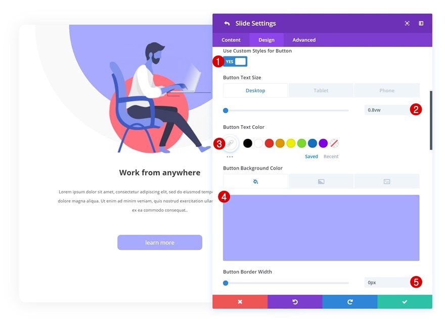
Button
Last but not least, modify the button to make it look exactly the way you want to.
- Use Custom Styles for Button: Yes
- Button Text Size: 0.8vw (Desktop), 2vw (Tablet), 3vw (Phone)
- Button Text Color: #ffffff
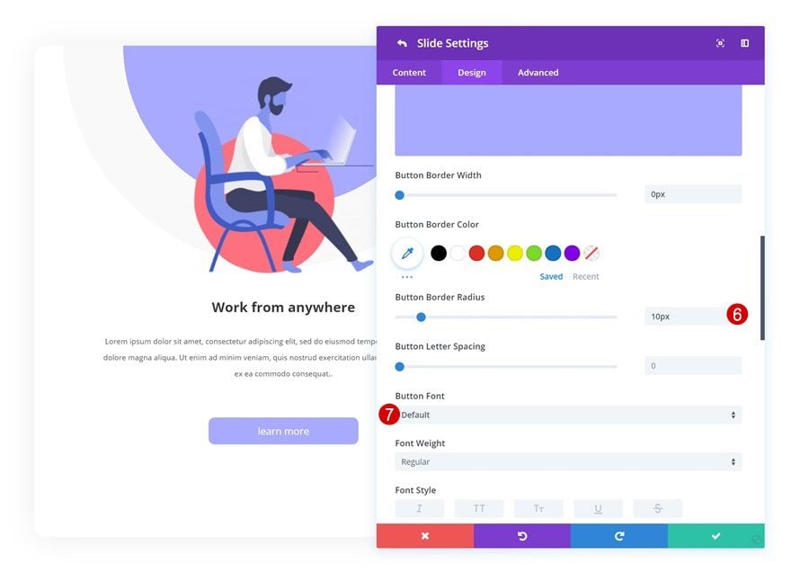
- Button Background Color: #aaacff
- Button Border Width: 0px
- Button Border Radius: 10px
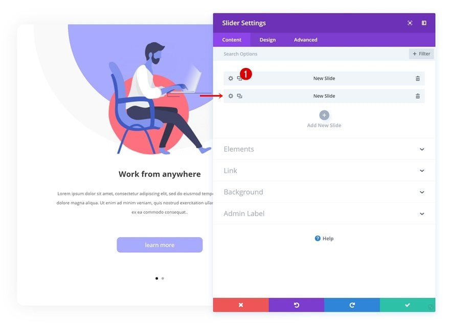
Clone Slide as Many Times as Needed
Once you’re done creating and customizing the first slide, you can go ahead and clone the slide up to as many times as you want. You’ll need to make some manual modifications to each one of the duplicates.
Change Content in Content Box
The first thing you’ll need to change is the content in the content box. This includes the image/illustration that is being used. You can find both illustrations that were used in this tutorial by going to the Graphic Illustrator Layout Pack post and downloading the images at the end of it.
Change Link
Change the button link as well.
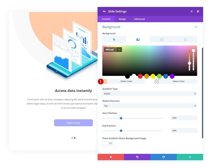
Modify Gradient Background
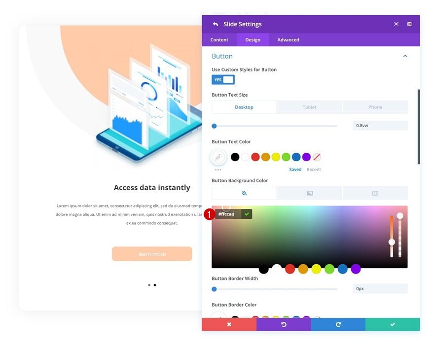
You can also customize the color palette of each duplicate slide by changing the first gradient color.
- Color 1: #ffccaa
Change Button Background Color
Use that same color to change the button background color. Repeat these steps for each one of the duplicates you create and you’re done!
- Button Background Color: #ffccaa
Download The Mobile Walkthrough Section for FREE
To lay your hands on the free mobile walkthrough section, you will first need to download it using the button below. To gain access to the download you will need to subscribe to our newsletter by using the form below. As a new subscriber, you will receive even more Divi goodness and a free Divi Layout pack every Monday! If you’re already on the list, simply enter your email address below and click download. You will not be “resubscribed” or receive extra emails.

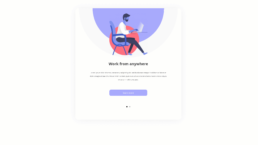
Preview
Before we dive into the tutorial, let’s take a quick look at the outcome we’ll recreate on different screen sizes.
Static
GIF
Final Thoughts
In this post, we’ve shown you how to use Divi’s Slider Module to create a gorgeous mobile walkthrough. Although it was initially designed for mobile screen sizes, it looks equally as good on tablet and desktop. You can use this approach to create all kinds of slide sections on your website and seamlessly interact with your visitors. We hope this tutorial inspires you to get creative with Divi’s Slider Module. If you have any questions or suggestions, make sure you leave a comment in the comment section below!


Very nice.
I have some clients that I need to give step by step instructions. This looks like it might work very well. They can step through a process without having to scroll down through pages. They can just swipe forward and back through screen shots and instruction.
very useful thank you!
Gifs are more and more common. thank you
Thank you for the tutorial. Divi is obviously the best WordPress framework on the market.