
Divi’s Divider Module provides several methods to create interesting dividers. One of the most interesting and unique is the ability to create gradient dividers. In this post, we’ll discuss how to create gradient dividers with the Divi Divider Module. We’ll look at how the gradient dividers work and see three examples to help you create your own.
Let’s get started!
Preview
Desktop Gradient Divider Example One
Phone Gradient Divider Example One
Desktop Gradient Divider Example Two
Phone Gradient Divider Example Two
Desktop Gradient Divider Example Three
Phone Gradient Divider Example Three
How to Create Gradient Dividers with Divi’s Divider Module
There are several ways to create a divider with Divi’s Divider Module. By default, the module displays a divider line. We can disable this and use the module’s Background settings to create a divider that we can style with the module’s Background options. This includes colors, gradients, images, etc. Rather than showing the divider, we’ll style the divider’s container and create a styled divider.
Hide Divider
The process is simple. First, add a Divider Module to your layout and then hide the divider in the content tab.
Divider Background
Next, select the type of background you’d like to display in the Background settings in the Content tab. For this post, we’ll focus on the Background Gradient settings.
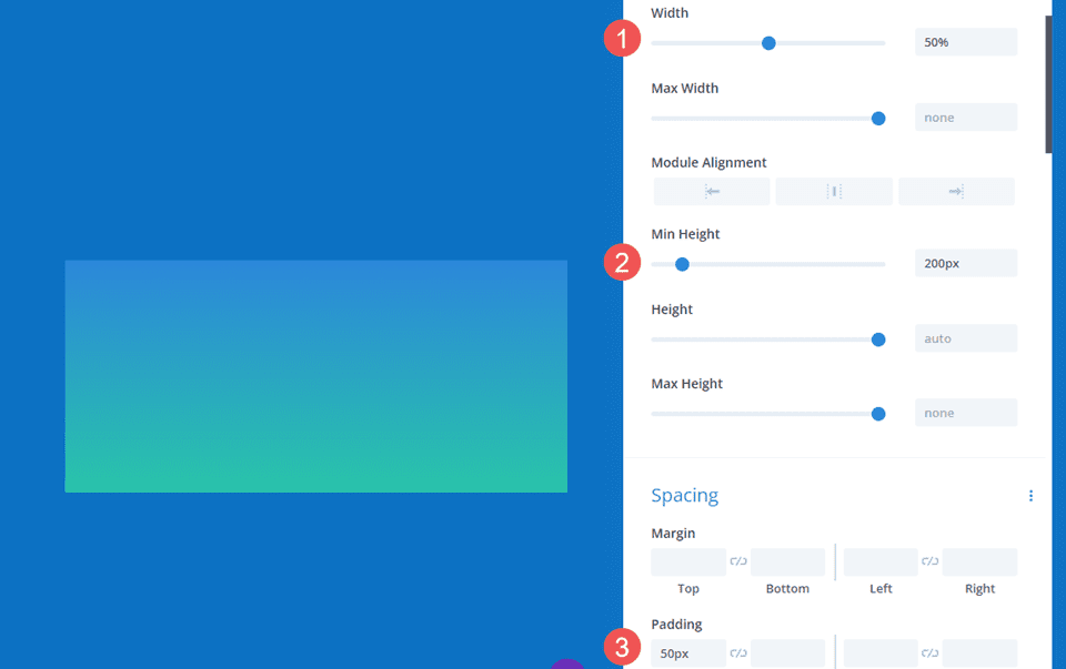
Add Sizing and Spacing
Use the Sizing and Spacing options in the Design tab to control the height and width of the divider’s container to create a styled divider in just about any size or shape. Utilize width and height, max width and max height, module alignment, and top and bottom padding to create the size you want.
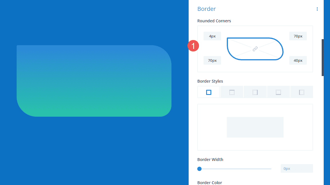
Add Border Radius
Add Border options, such as Border Radius, to further style the shape. You can adjust the corners together or independently to create interesting shapes. You can also add Border Width, Styles, etc., to create a unique design.
Gradient Divider Examples
Now, let’s create three gradient dividers using the concepts we just discussed.
Gradient Divider Example One
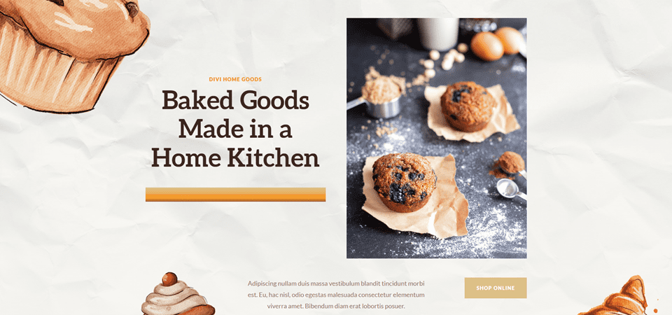
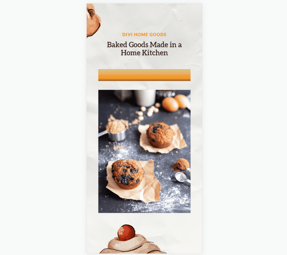
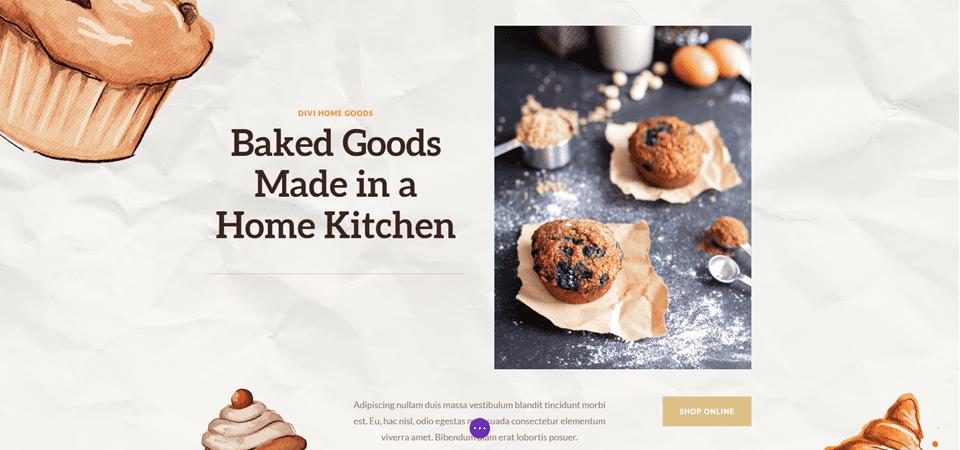
For our first gradient divider, we’ll use the landing page from the free Home Baker Layout Pack that’s available within Divi. The artwork in this layout pack has strong dark outlines with sharp gradients, all in shades of brown. We’ll mimic this with our gradient using colors from the layout pack.
For our first example, we’ll use the Divider Module that is already in place in the hero section. This one is simple, but it adds a lot visually.
For reference, here’s the layout before we add the Divider Module.
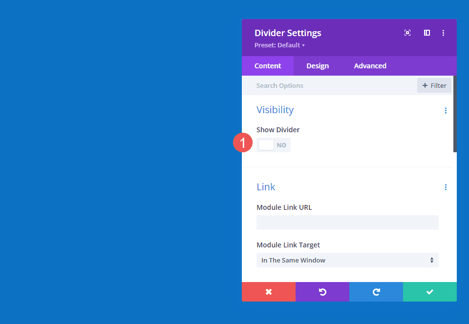
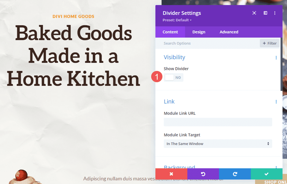
Visibility
In the Divider Module’s Visibility settings, select No for Show Divider.
- Show Divider: No
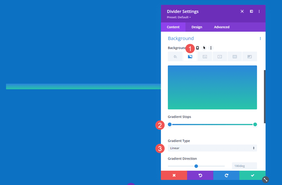
Gradient
Scroll down to Background and select the Background Gradient tab. For this one, we’ll add five Gradient Stops. We’ll leave the rest of the gradient settings at their defaults. Here are the settings for each Gradient Stop.
Set the first Gradient Stop to 0px and its Color to #dcc087.
- First Gradient Stop: 0px, #dcc087
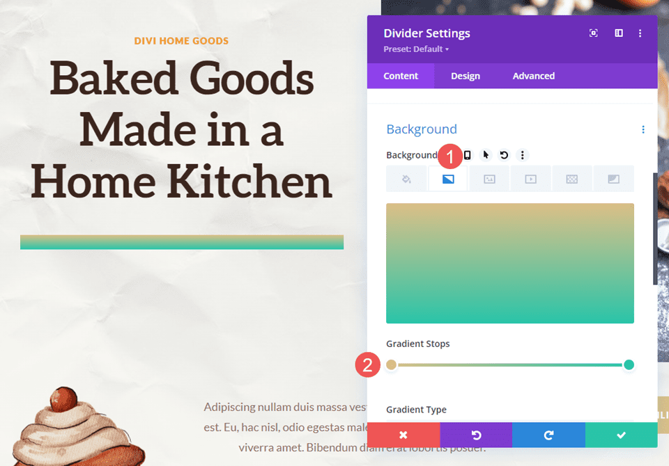
Place the second Gradient Stop at 16px and its Color to #e6b060.
- Second Gradient Stop: 16px, #e6b060
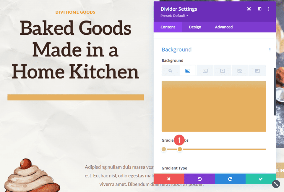
Place the third Gradient Stop at 22px and its Color to #f19d33.
- Third Gradient Stop: 22px, #f19d33
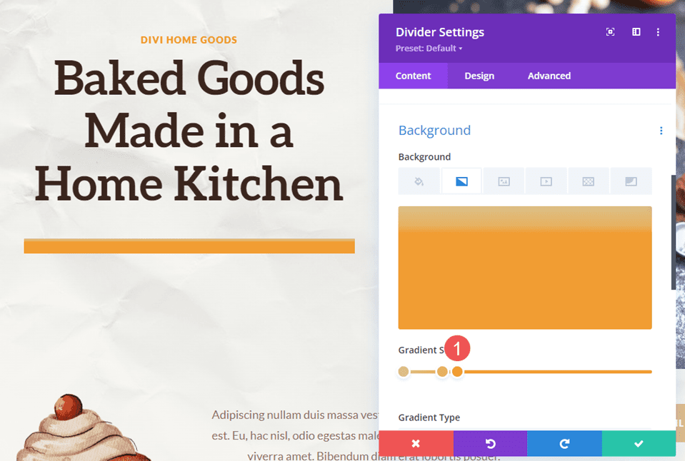
The fourth Gradient Stop almost sits on top of the third Gradient Stop. Place it at 31px and set its Color to #f49826.
- Fourth Gradient Stop: 31px, #f49826
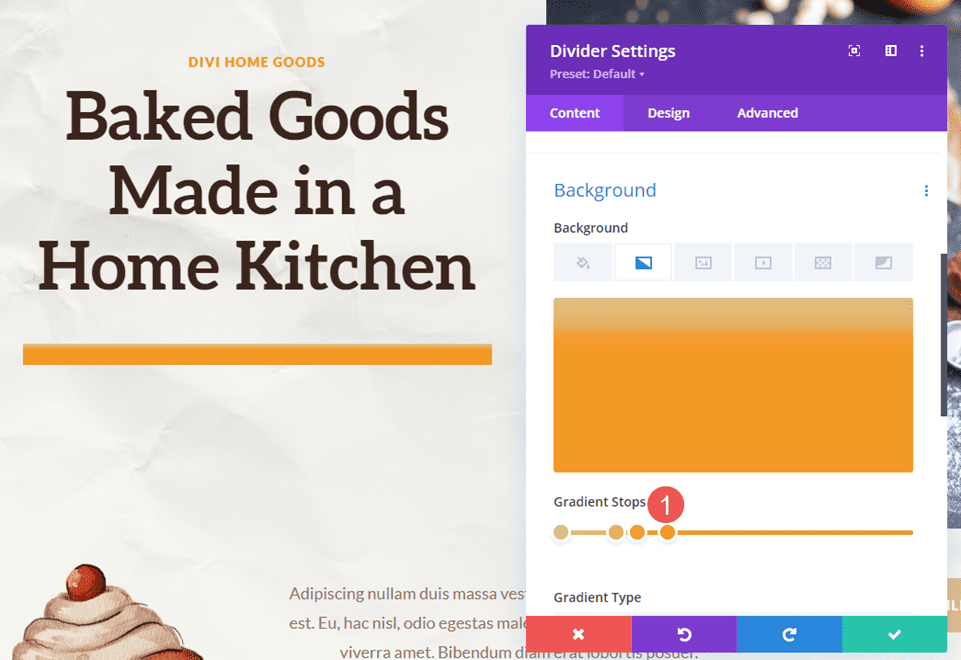
Set the last Gradient Stop at 48px and its Color to #3b261e.
- Fifth Gradient Stop: 48px, #3b261e
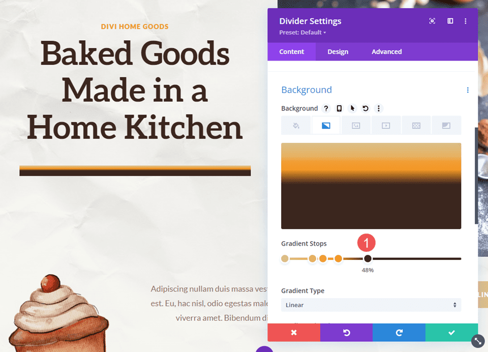
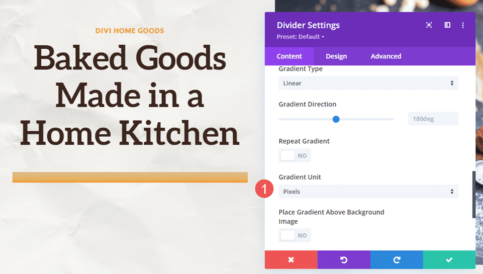
Change the Gradient Unit to Pixels. We now have the colors we’re looking for. Now, we just need to optimize the size.
- Gradient Unit: Pixels
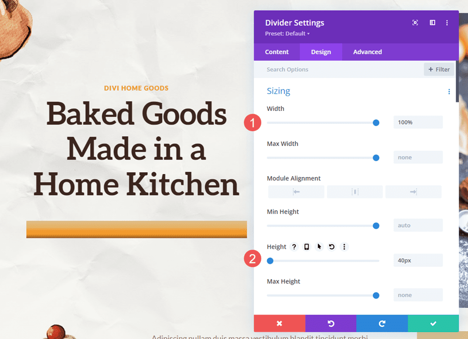
Sizing
Next, go to the Design tab. Under Sizing, set the Width to 100%. Set the Height to 40px for all three device sizes. Close the module and save your settings.
- Width: 100%
- Height: 40px
Gradient Divider Example Two
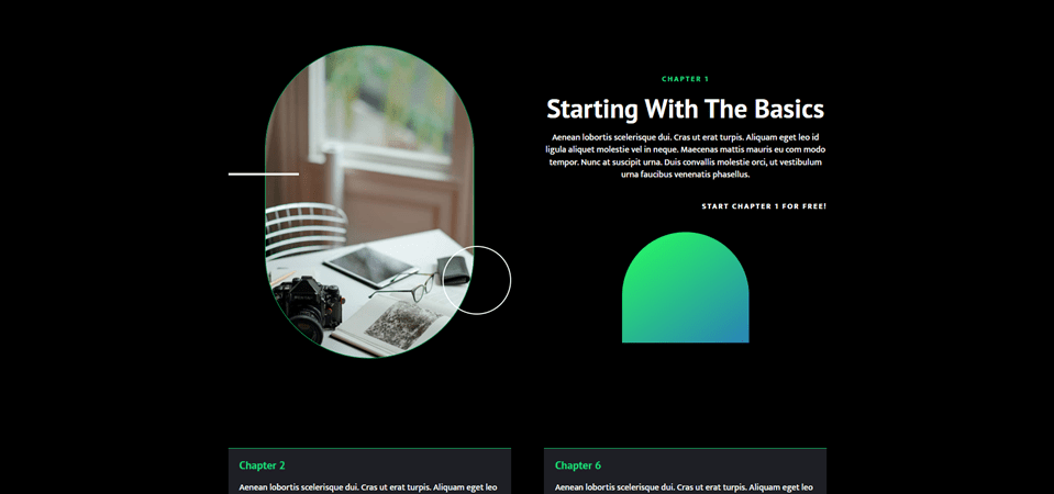
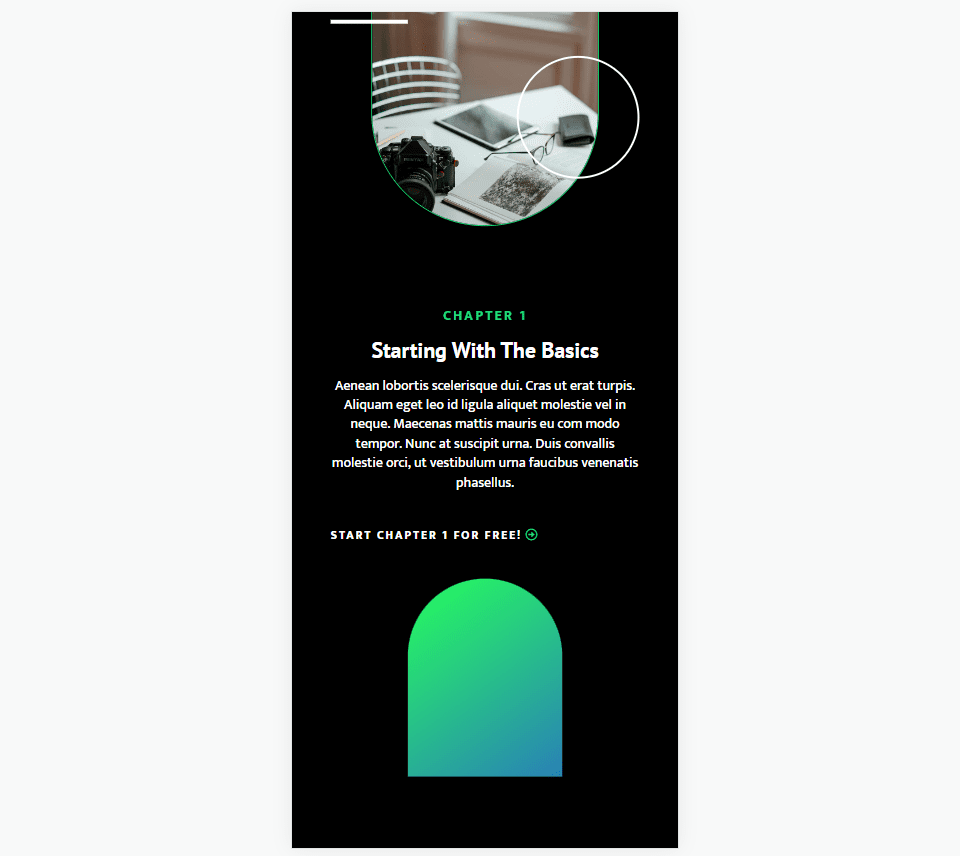
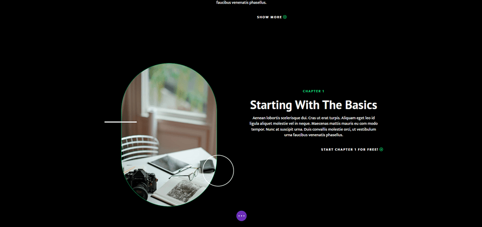
For our second gradient divider, we’ll use the landing page from the free Online Course Layout Pack that’s available within Divi. This one includes lots of rounded edges and even has a circle with a gradient that overlaps an image.
We’ll use this as our starting point for the design and create a new gradient divider. We’ll add a new Divider Module to the Chapter 1 section just to add a graphic.
For reference, here’s the layout before we add the Divider Module.
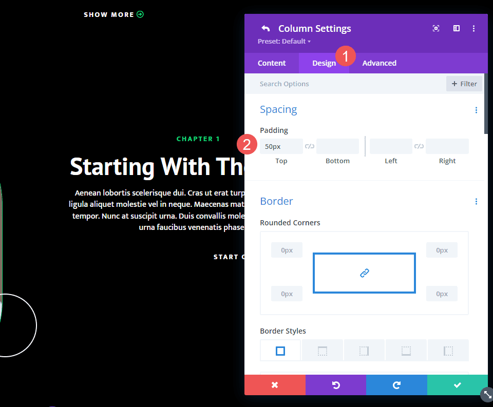
Right Column Spacing
First, open the Column settings that contain a description of the first chapter. This is the Right Column in the Row. Go to the Design settings and scroll down to Spacing. Change the Top Padding from 100px to 50px.
- Top Padding: 50px
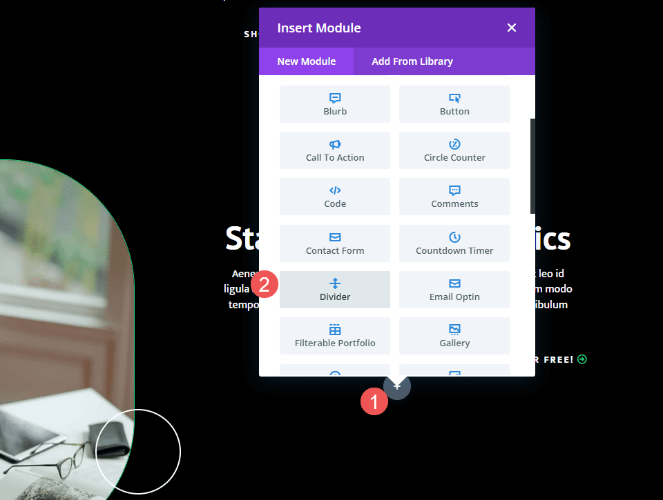
Add a Divider Module
Next, add a new Divider Module under the Button Module for the chapter description.
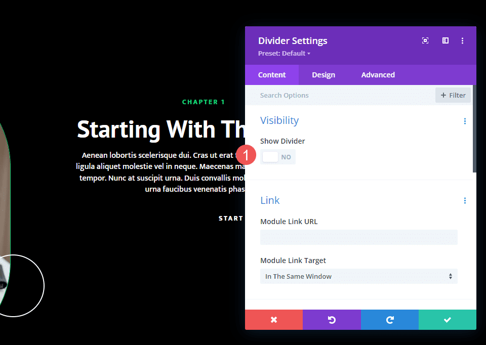
Visibility
Open the Divider Module’s Visibility settings and select No for Show Divider.
- Show Divider: No
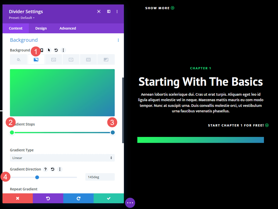
Gradient
Next, scroll down to Background and select the Background Gradient tab. This one has two Gradient Stops. Change the Gradient Direction to 145deg.
- First Gradient Stop: 0px, #26ff5c
- Second Gradient Stop: 100px, #2981b6
- Gradient Direction: 145deg
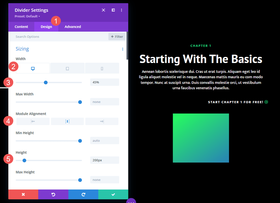
Sizing
Next, select the Design tab. Under Sizing, change the Width for desktops to 45%. Change tablets to 24vw and phones to 40vw. Change Module Alignment to Center. Set Height to 200px for all devices.
- Width: 45% desktop, 24vw tablet, 40vw phone
- Module Alignment: Center
- Height: 200px
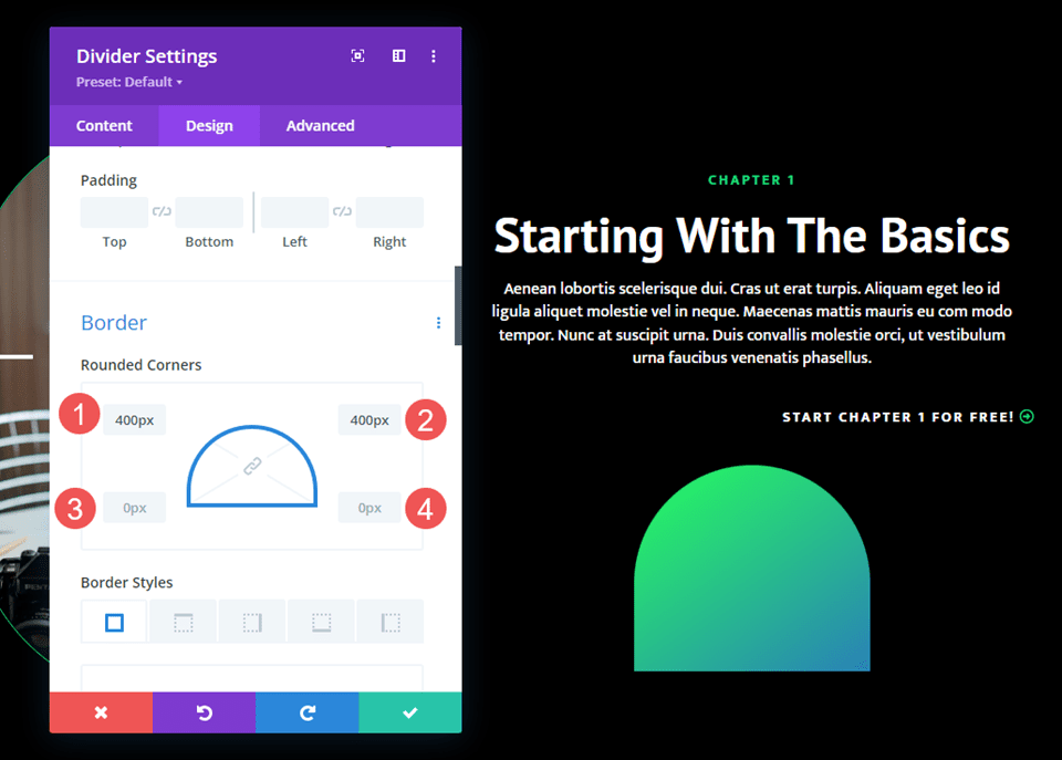
Border
Next, scroll down to Border. We’ll create an arched shape that mimics the images in the layout. Change the Rounded Corners to 400px for the Left and Right Top and 0px for the Left and Right Bottom. Close the module and save your settings.
- Rounded Corners top left, top right: 400px
- Rounded Corners bottom left, bottom right: 0px
Gradient Divider Example Three
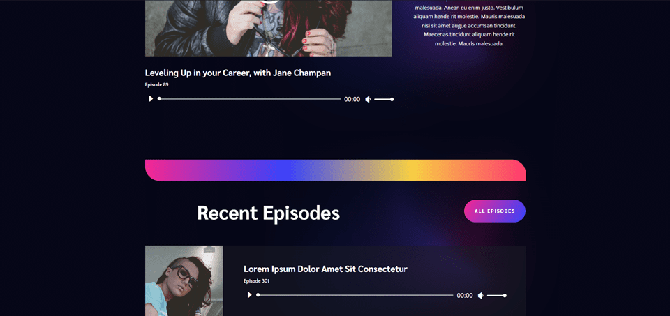
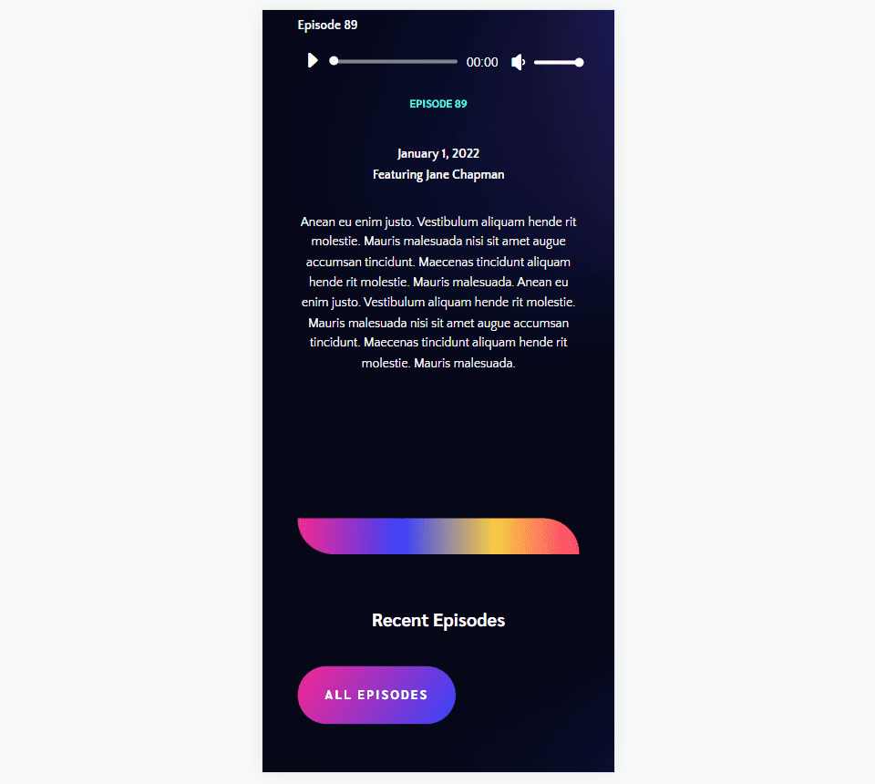
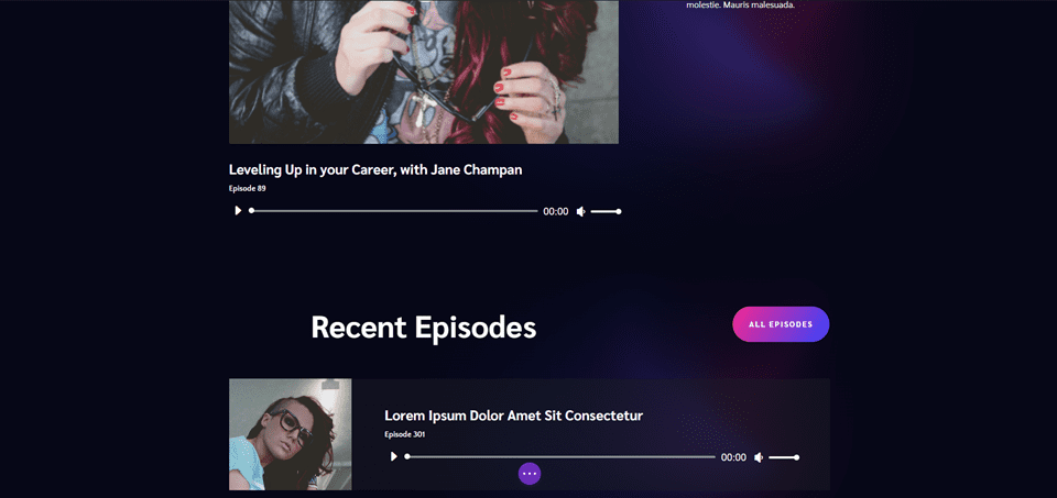
For our third gradient divider, we’ll use the landing page from the free Podcaster Layout Pack that’s available within Divi. This one has lots of gradient shapes throughout the layout that are made with images and dividers.
We’ll create a gradient divider with the design cues from those images and other elements. It will combine multiple gradients into one. Our divider will separate the featured episodes from the recent episodes.
For reference, here’s the layout before we add the Divider Module.
New Row
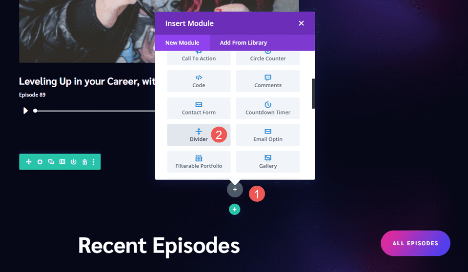
First, add a new Row above the title. This is where we’ll add the Divider Module.
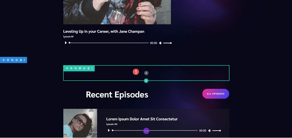
Add Divider Module
Next, add a Divider Module to the Row.
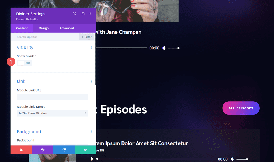
Visibility
In the Visibility settings, select No for Show Divider.
- Show Divider: No
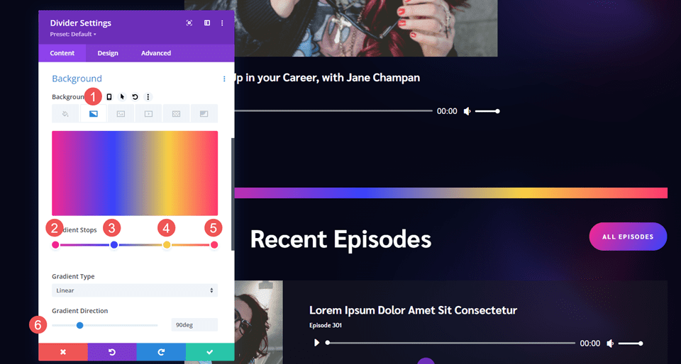
Gradient
Scroll down to Background and select the Background Gradient tab. For this one, we’ll use four Gradient Stops. Set the Direction to 90deg.
- First Gradient Stop: 0px, #f52791
- Second Gradient Stop: 38px, #3742fb
- Third Gradient Stop: 70px, f7d043
- Fourth Gradient Stop: 100px, #fe386f
- Direction: 90deg
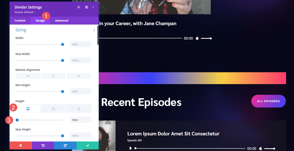
Sizing
Next, go to the Design tab. Under Sizing, set the Height to 60px for desktops, 50px for tablets, and 40px for phones.
- Height: 60px desktop, 50px tablet, 40px phone
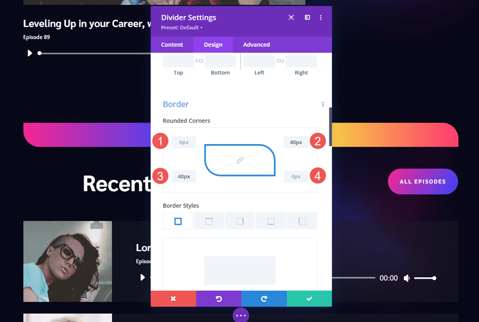
Border
Next, scroll down to Border. Set the Rounded Corners to 0px Top Left, 30px Top Right, 30px Bottom Left, and 0px Top Right. This creates a style that matches the email optin section. Close the module and save your settings.
- Top Left: 0px
- Top Right: 40px
- Bottom Left: 40px
- Bottom Right: 0px
Results
Desktop Gradient Divider Example One
Phone Gradient Divider Example One
Desktop Gradient Divider Example Two
Phone Gradient Divider Example Two
Desktop Gradient Divider Example Three
Phone Gradient Divider Example Three
Ending Thoughts
That’s our look at how to create gradient dividers with Divi’s Divider Module. The gradient option in the Divider Module works great for creating unique gradient dividers. Utilizing the sizing, spacing, and border corner options provides us with the tools to create gradient dividers in many sizes and shapes. With just a few simple settings, we can create unique gradient dividers that are sure to stand out from the crowd.
We want to hear from you. Do you create gradient dividers with Divi’s Divider Module? Let us know about your experience in the comments.


Leave A Reply