
Creating clean, professional layouts is a cornerstone of effective web design, and equal column heights contribute to a balanced layout. Whether you’re displaying products, services, or portfolio items, columns that align perfectly boost user experience. In Divi 4, equal columns were possible, but Divi 5 brings a lot more to the table.
In Divi 5, the integration of its Flexbox Layout System improves the process, offering a simpler, more flexible way to create equal column heights. This post will guide you through creating clean, balanced layouts. Let’s dive in!
Equal Column Heights In Divi 4
In Divi 4, achieving columns with equal heights was straightforward but limited. A toggle enabled all columns within a row to match the height of the tallest column. This feature was a lifesaver for maintaining visual consistency, but it had limitations that often required workarounds.
Subscribe To Our Youtube Channel
The equal height effect in Divi 4 was applied to the column containers, meaning that background colors, images, or borders had to be set at the column level. This approach didn’t extend to the modules within the columns, which could lead to awkward gaps. For example, a button underneath a short text module in one column would leave awkward space below it, while a button beneath a longer text module in another column filled it, creating an unbalanced look.
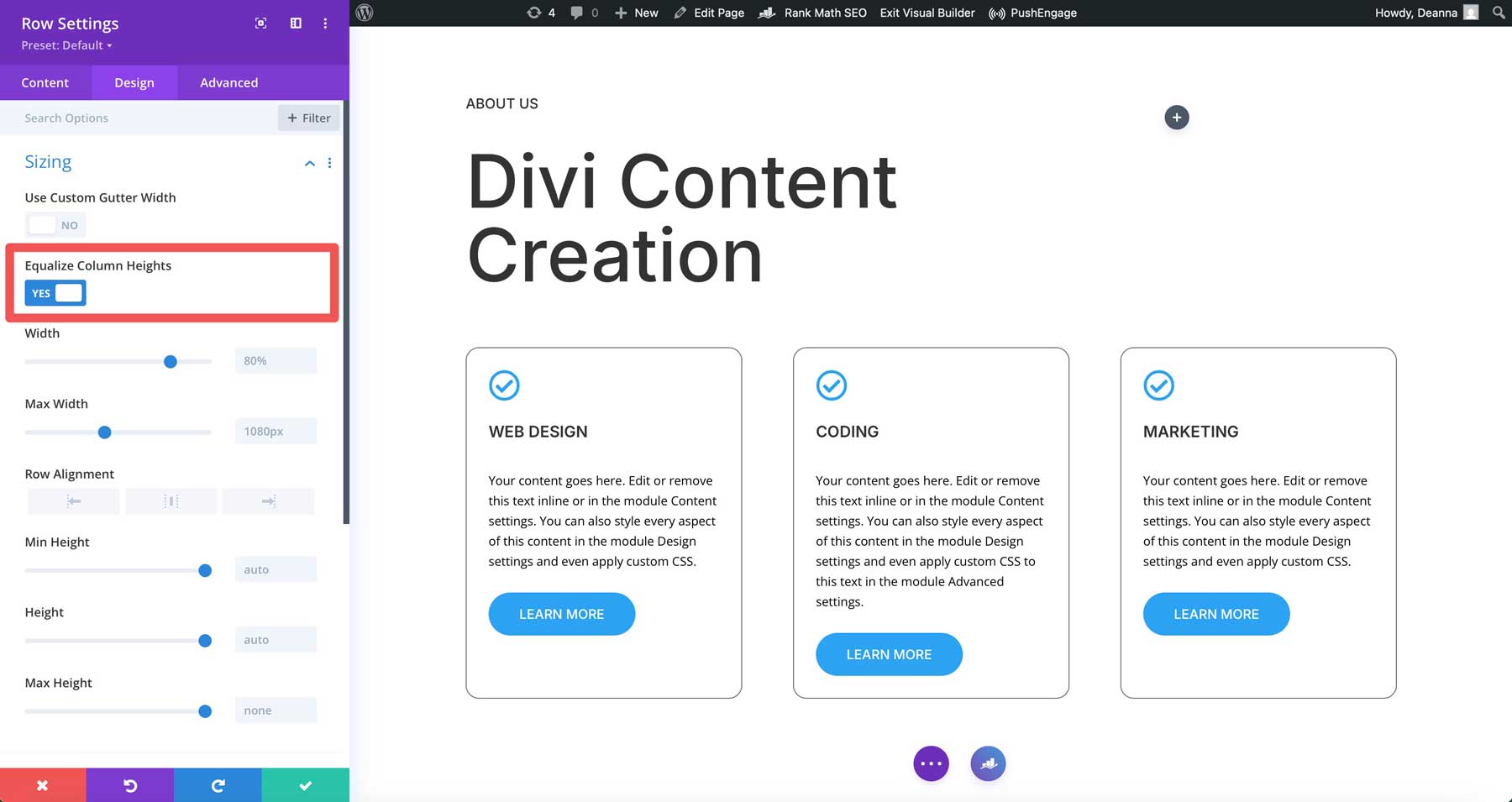
When designers wanted more control, such as aligning module content vertically or adjusting spacing, custom CSS was often necessary. This posed a challenge, especially for beginners, as they had to dive into Divi’s custom CSS fields to achieve polished results. For example, if you wanted buttons to align to the bottom of the column in Divi 4, you’d have to use CSS to achieve it.
How Flexbox In Divi 5 Addresses Equal Columns
Flexbox is seamlessly integrated into Divi 5, making creating equal column heights easier to achieve. Unlike Divi 4’s toggle-based option, Divi 5 leverages Flexbox to provide built-in controls that make designing web pages easier.
With Flexbox, you can automatically stretch columns to match the tallest one while offering precise alignment options for both columns and their content. This eliminates the need for custom CSS, making advanced layouts possible for every Divi user, for beginners and professionals alike. Divi 5’s Flexbox Layout System allows designers to easily create consistent, professional designs.
How To Create Equal Column Heights In Divi 5
Creating columns with equal height in Divi 5 is a breeze thanks to its Flexbox integration. In the steps below, we’ll demonstrate how to set things up and ensure that everything lines up perfectly.
Step 1: Create Your Design
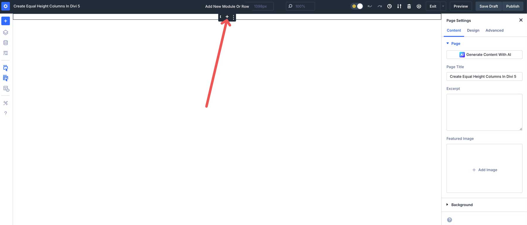
Open the Visual Builder on a new or existing page. Click the black + icon to add a new row.
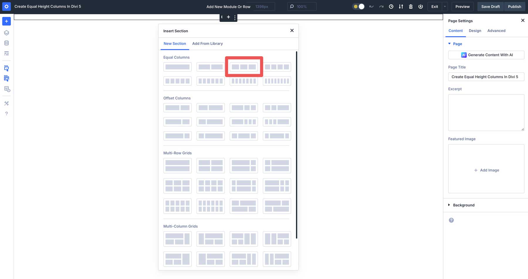
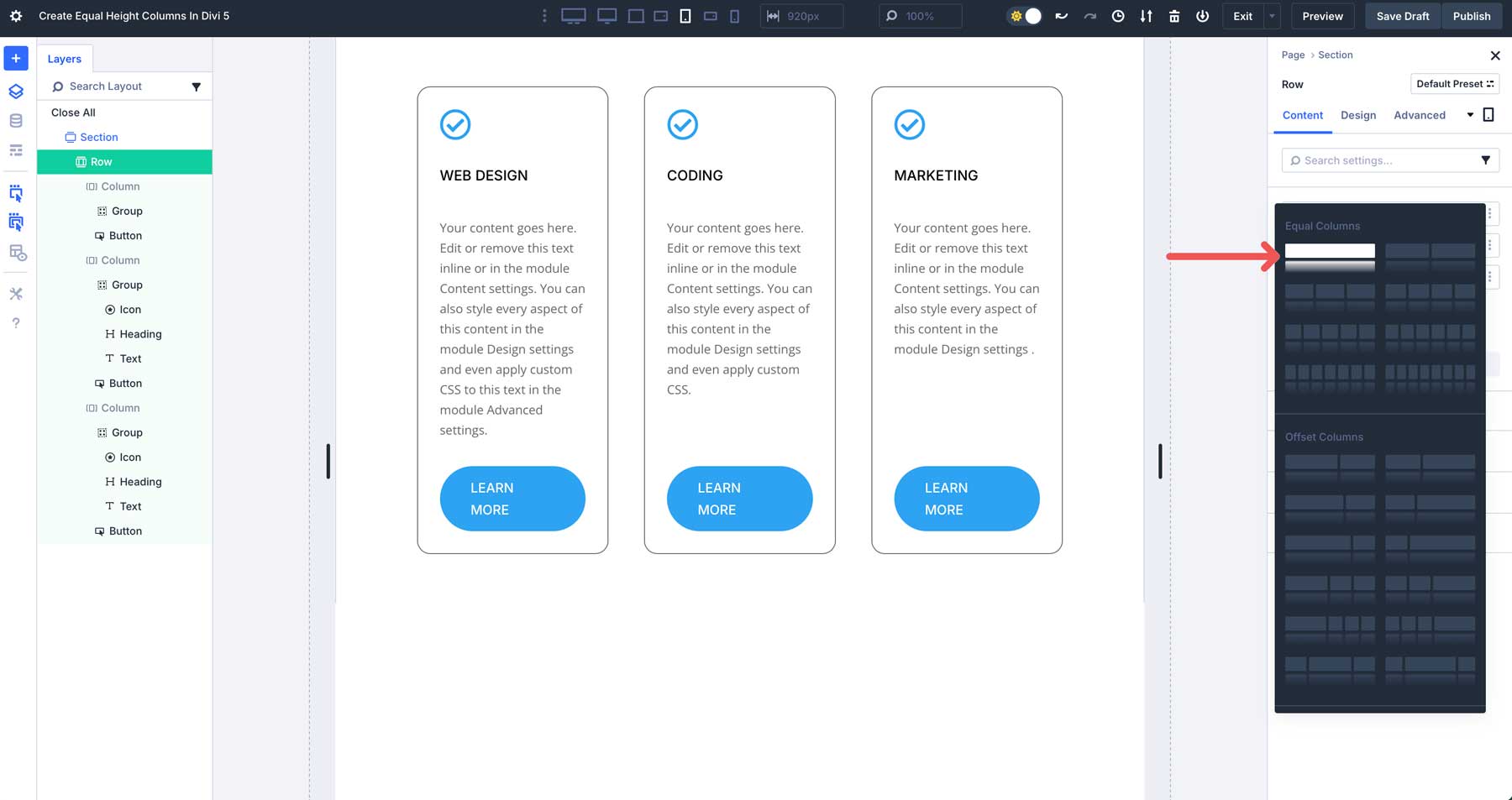
When the New Section dialog box appears, select the three-column layout under Equal Columns.
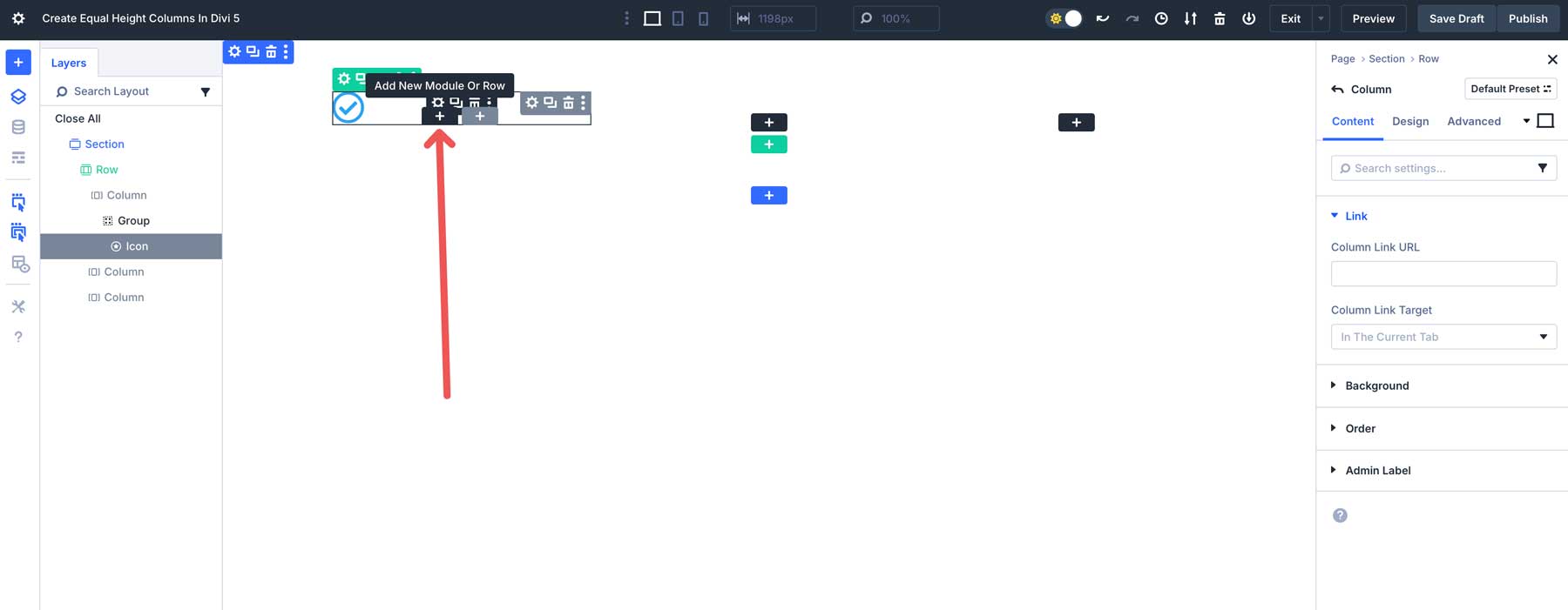
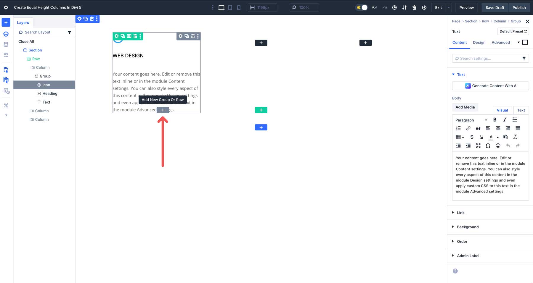
Add a Group Module in the first column.
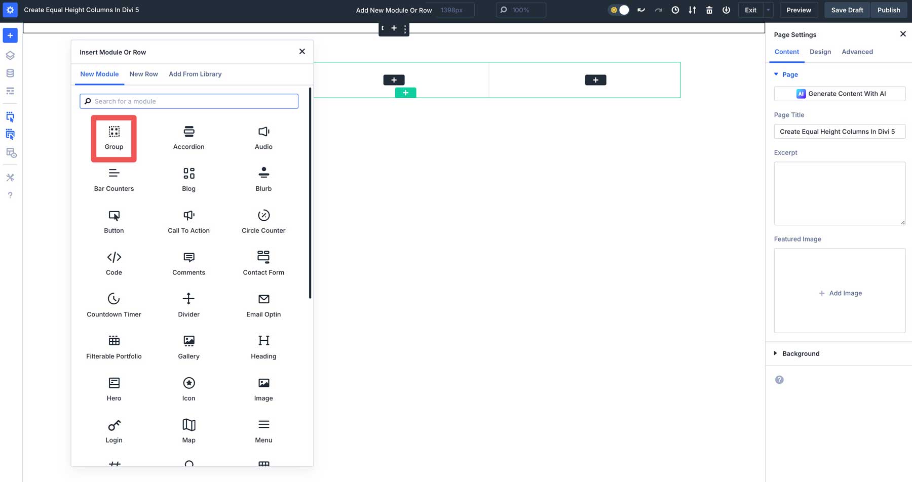
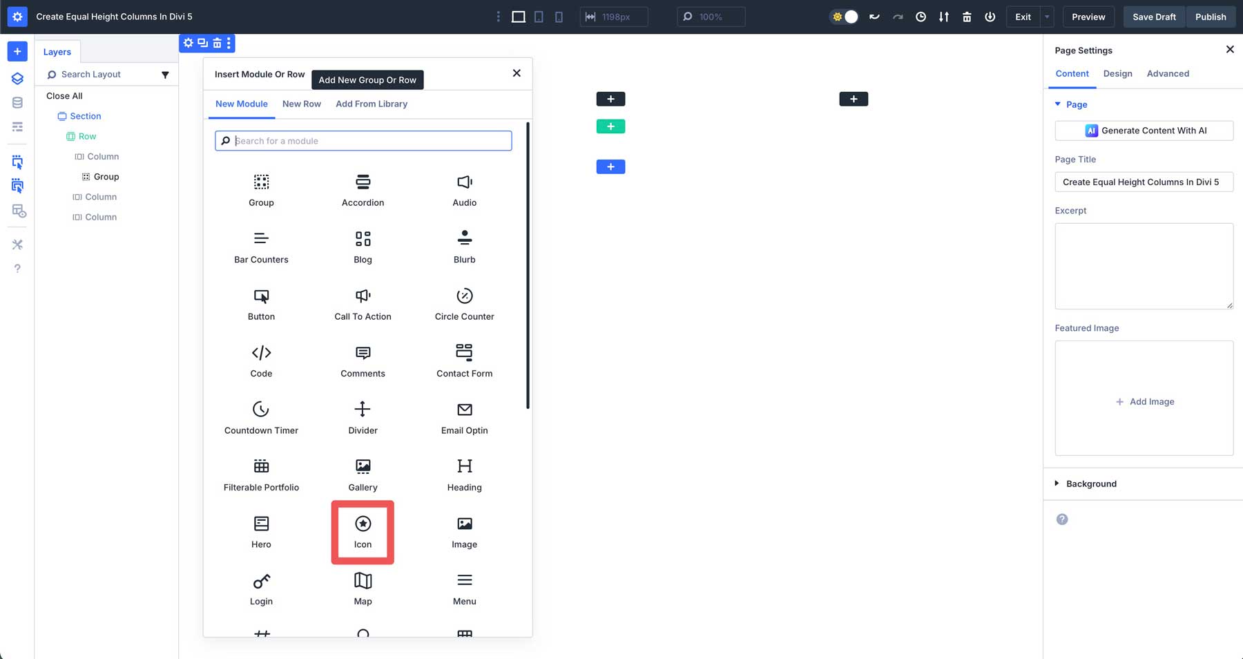
Next, add an Icon Module into the Group module in the first column.
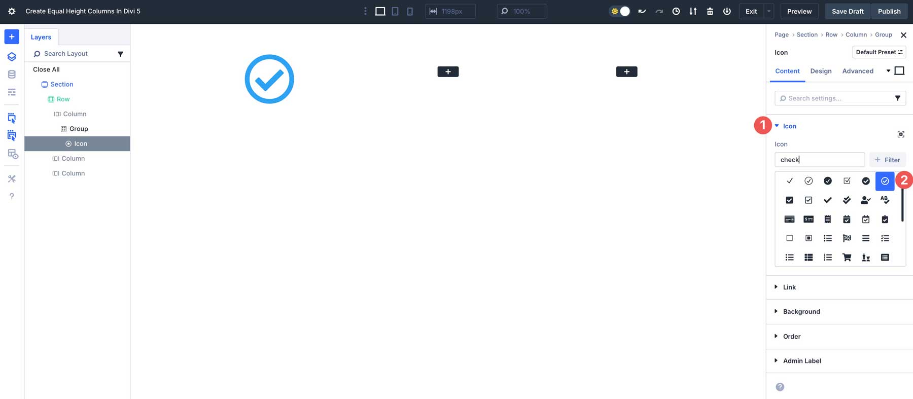
Select the check icon in the content tab.
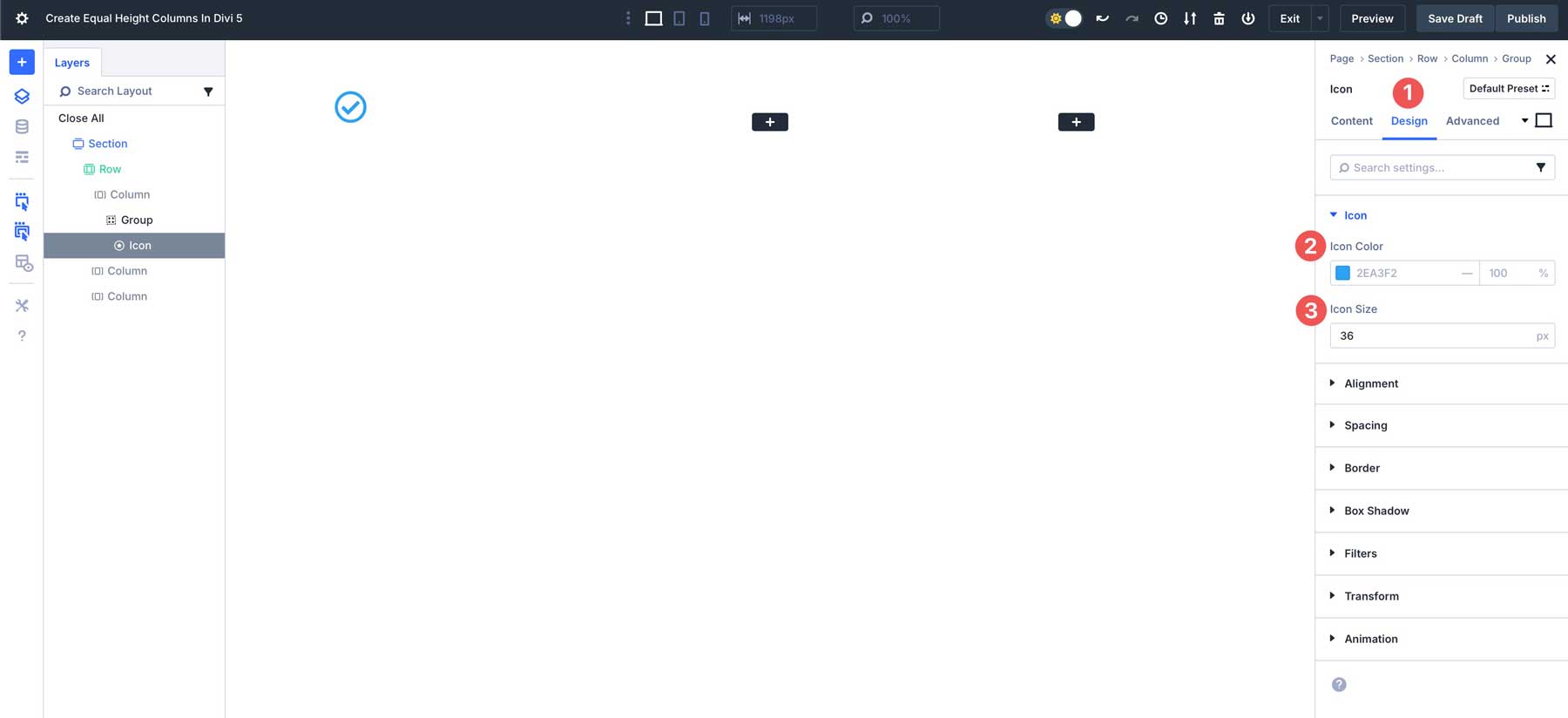
In the Design tab, set the icon color to #2EA3F2 and the icon size to 36px.
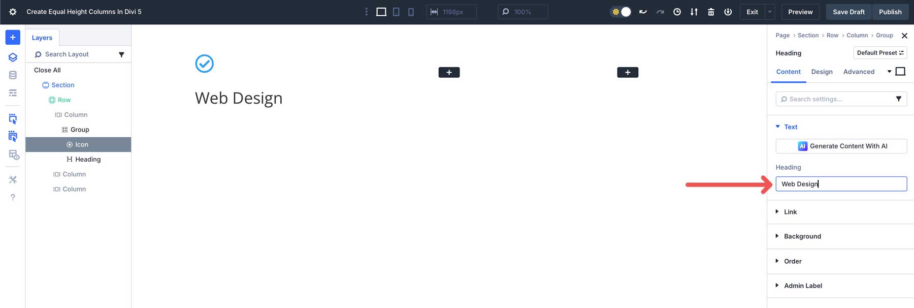
Next, add a Heading Module underneath the Icon module. Be sure to add the heading to the group module by clicking the black + icon instead of the gray one.
Type Web Design as the title in the Content tab.
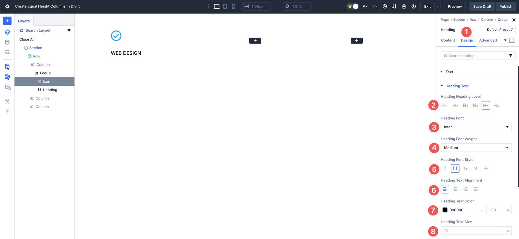
In the Design tab, choose H5 as the Heading Level, Inter as the Heading Font, and Medium as the Heading Font Weight. Set the Heading Font Style to uppercase, Heading Text Alignment to left, the Heading Text Color to #000000, and keep the Heading Text Size at the default size of 16px.
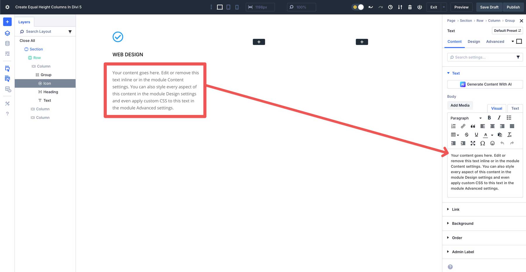
Next, add a Text Module under the heading inside the Group module. You can leave the settings as is.
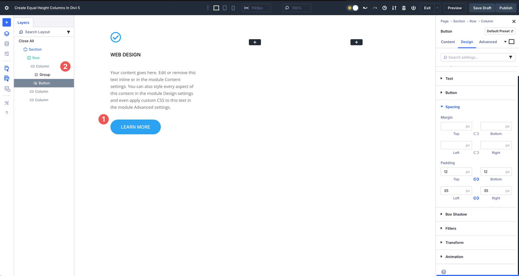
We will add a Button Module for the final module in the column. However, instead of adding it to the Group module, we’ll add it underneath it. This will allow us to create equal column heights, but align the button to the bottom, making the design more cohesive.
Click the Design tab, and assign your desired style settings to the button module. Check your button to ensure it’s outside the Group module by looking at the Layers View in the left-hand menu. When complete, the button should look like the screenshot below — left-aligned with a blue background and white text.
Step 2: Duplicating Columns
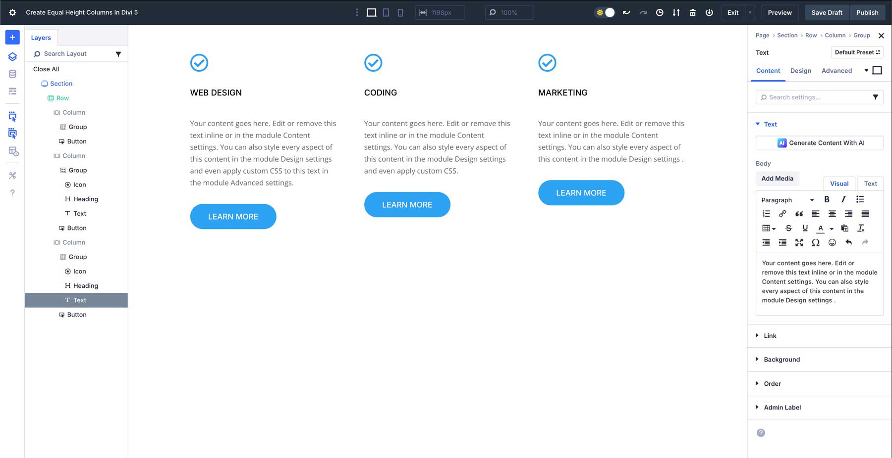
Once the first column is filled with content, we’ll copy the content from the first column into the second and third columns and make a few changes. You can delete the second and third columns and duplicate the first, or copy and paste the Group module and button into the second and third columns.
Next, change the Heading title in the 2nd column to Coding, and the Heading title in the 3rd column to Marketing. We’ll also delete some of the content in the Text module in the 2nd column so we can demonstrate how Divi 5 handles Flexbox with varying content lengths. As you can see, the columns are uneven.
Before we move on to the next step, click into the first column and add 25px spacing to all sides of our column.
We’ll also add a 15px Border Radius and a 1px Border Width with #666666 as the color.
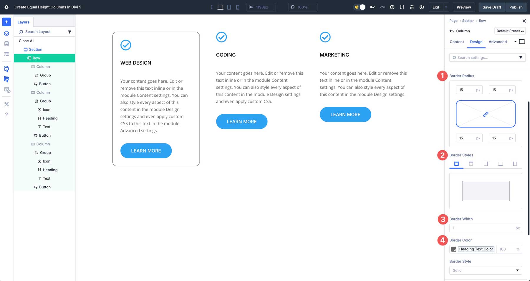
The last step in designing our row is to copy the design attributes from the 1st column and paste them into the remaining columns. Right-click on the first column and select Copy Item Styles. Next, right-click on the 2nd column and select Paste Item Style. Repeat this action for the 3rd column as well.
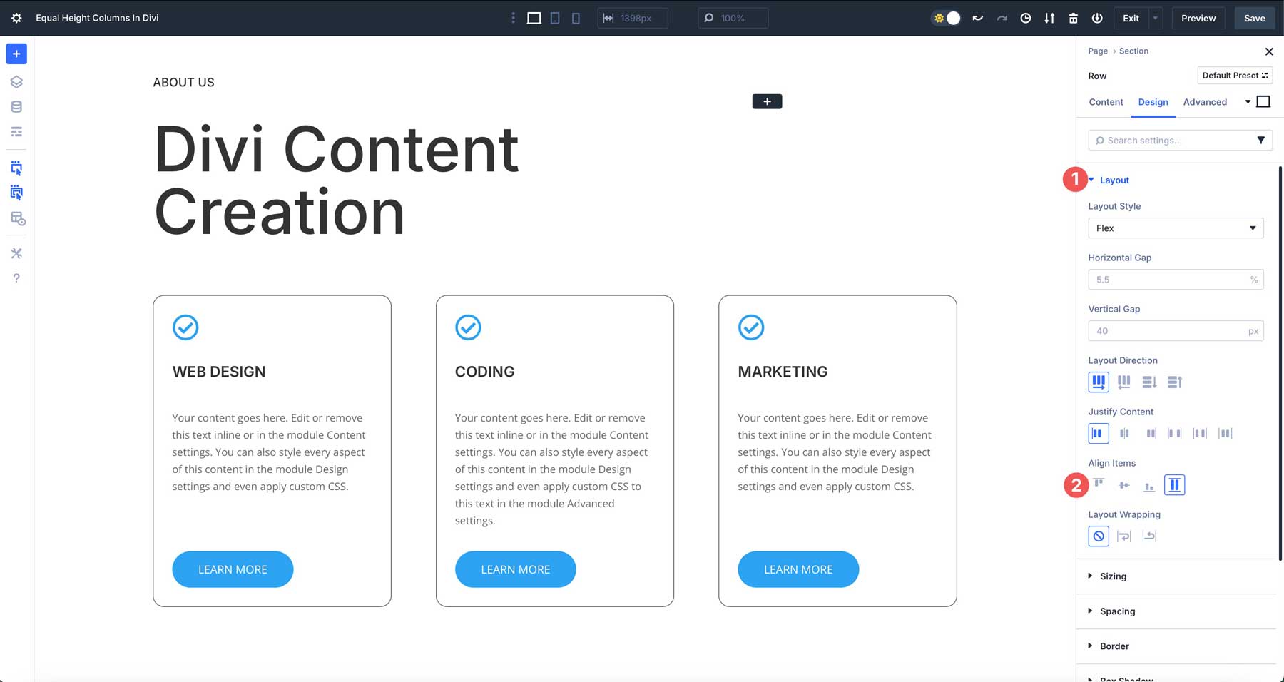
Step 3: Configure Flexbox Settings For Equal Heights
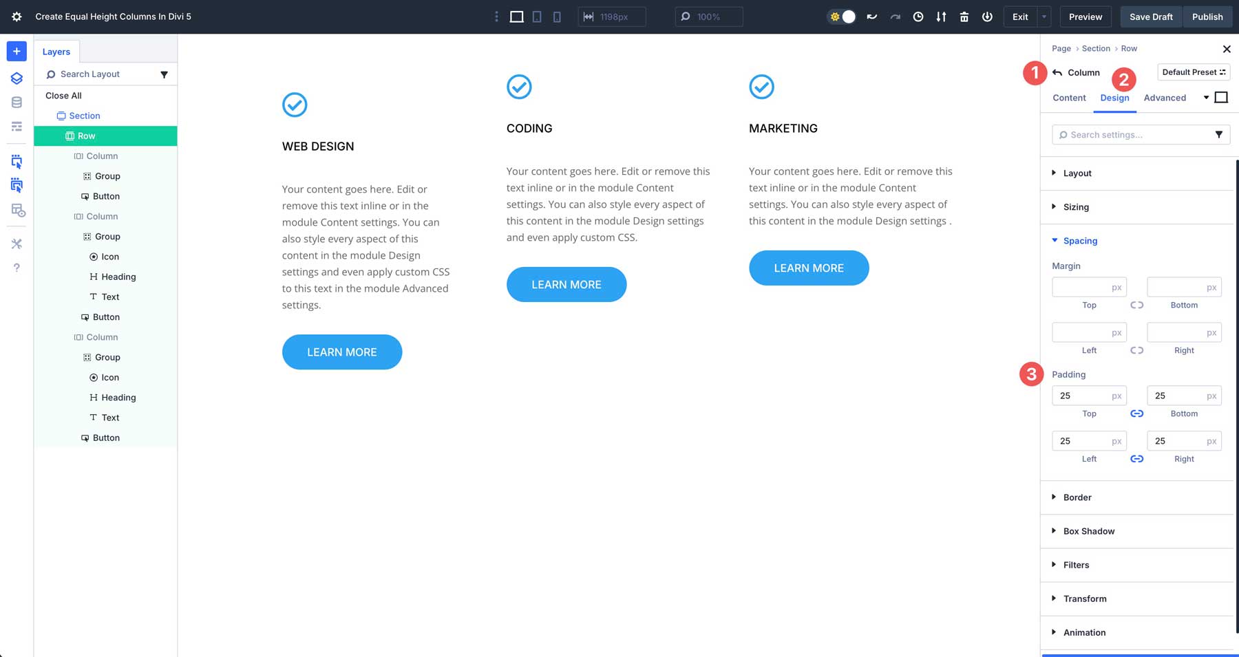
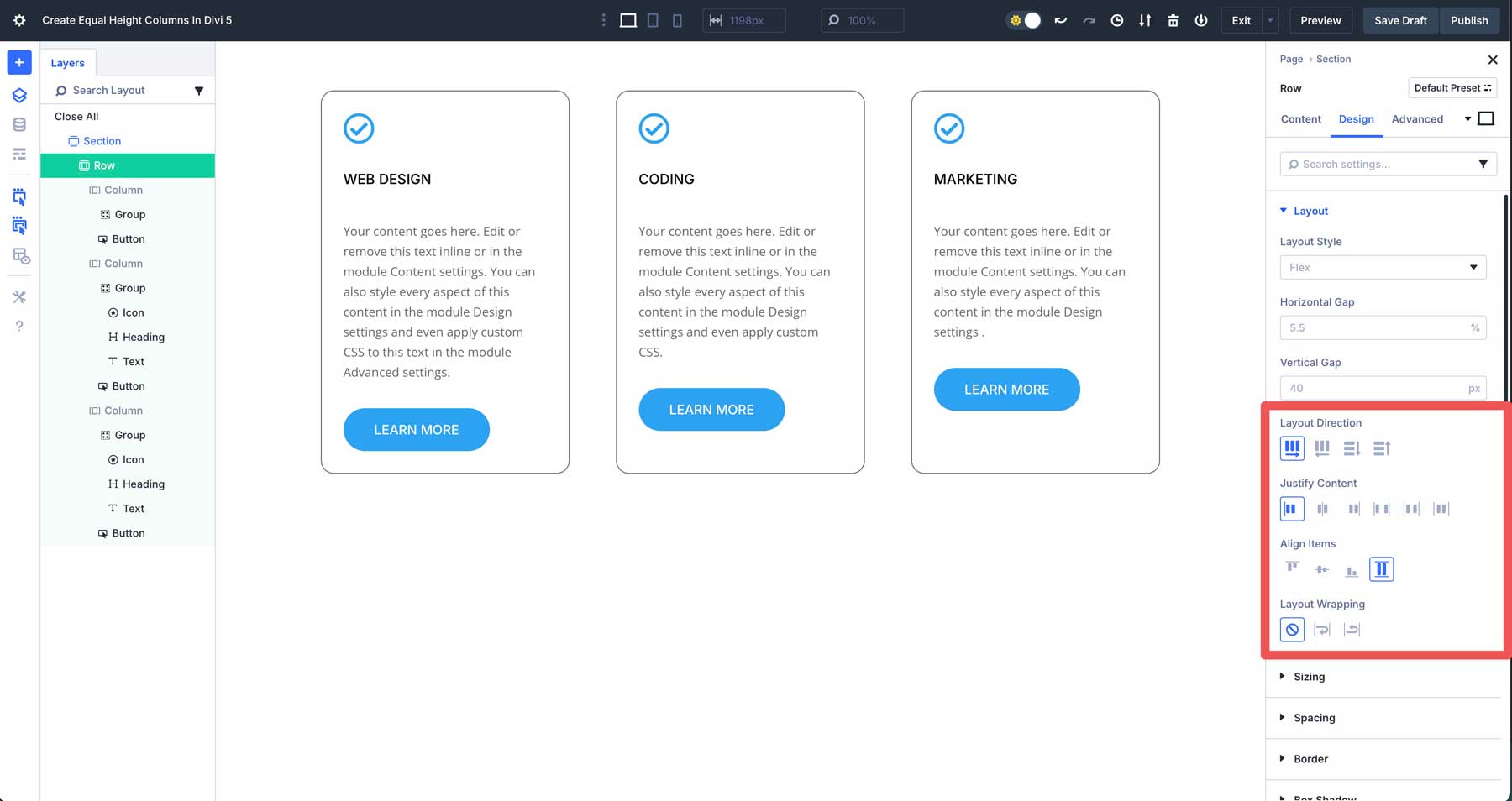
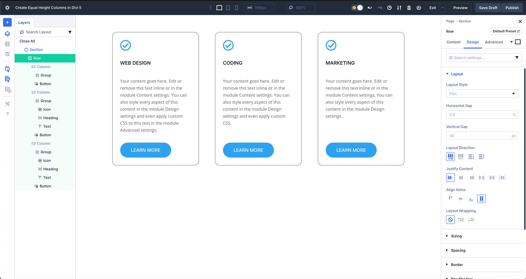
Next, we’ll need to configure our Flexbox settings for the row. Divi 5 integrates Flexbox controls into its layout system, moving beyond Divi 4’s Equalize Column Heights toggle. Navigate to the Design tab for the row and ensure that Flex is selected under Layout.
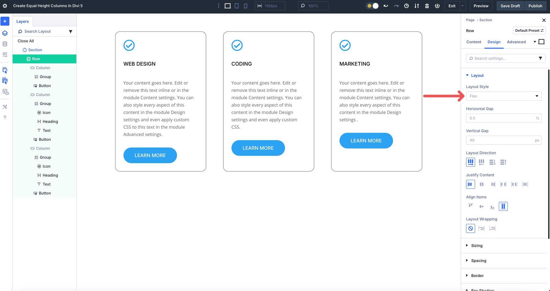
Next, ensure that row is selected under Layout Direction, start under Justify Content, and Stretch is selected under Align Items. This will tell Divi 5 to keep the column structure, align all items within the row to the left, and fill the available space within the parent container.
Next, click on the settings for the first column. Click the Layout dropdown menu to reveal its settings in the Design tab. By default, Flex will be selected under Layout. In the Layout Direction field, select column. Under Justify Content, select space between. Align all items to the start (left), and leave Layout Wrapping set to No Wrap.
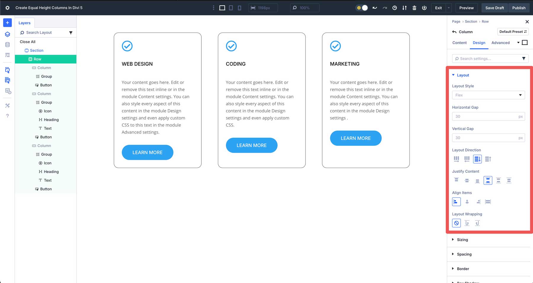
Repeat the steps above for the 2nd and 3rd columns. You can also use the copy/paste or extend features to apply the same settings to the remaining columns of the row.
All modules within the Group will be stretched to fill the available space, and the buttons outside the Group will be aligned to the bottom.
Step 4: Test Responsiveness
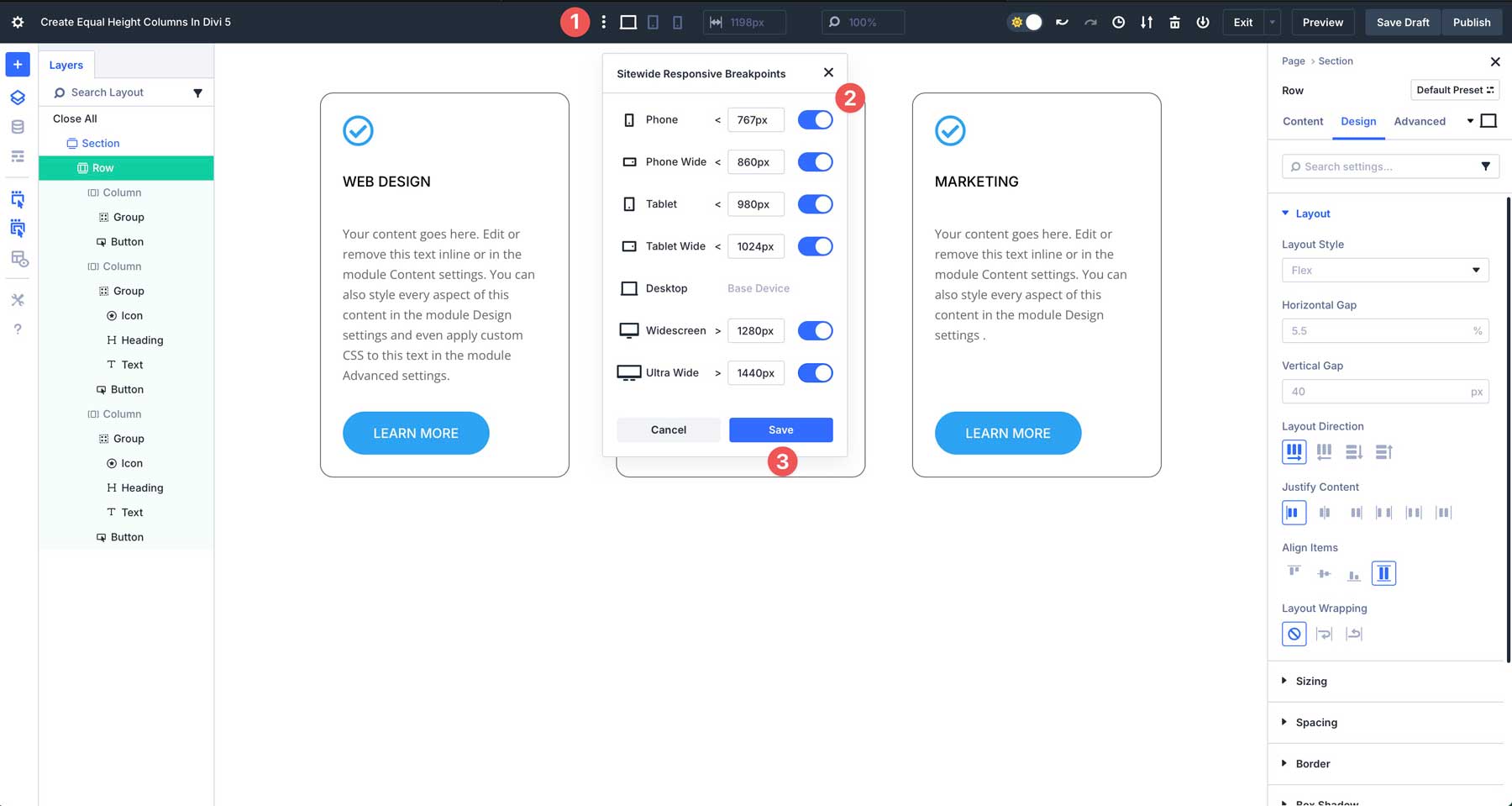
Divi 5’s Customizable Responsive Breakpoints make it easy to ensure your equal column heights look great on all devices. Use the responsive view toggles to preview your layout in the Visual Builder. By default, there are three breakpoints. However, Divi 5 now has 7, which can easily be enabled by clicking the ellipsis menu in the toolbar at the top of the Visual Builder. Enable the breakpoints you’d like and click Save to apply them.
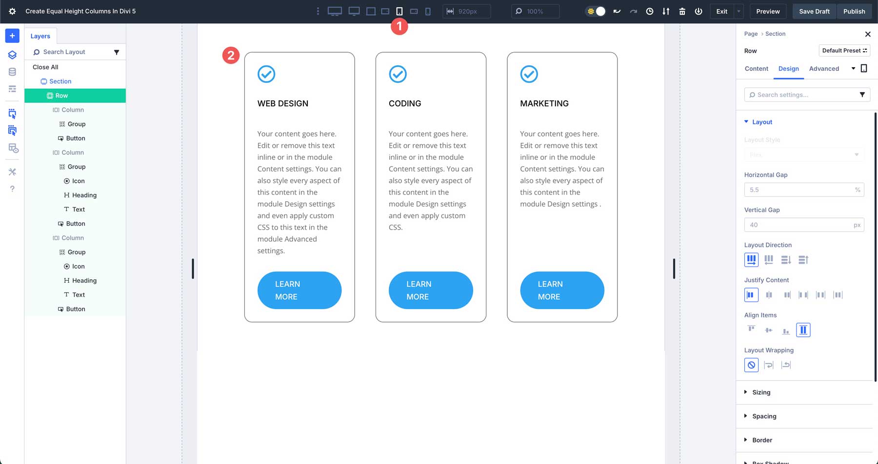
Click to preview your layout in the Tablet View. As you can see, Flexbox keeps the columns stacked side-by-side.
You can change the column structure to allow columns to stack vertically on smaller devices. While in the tablet breakpoint, click the Content tab for the row. Click Change Column Structure.
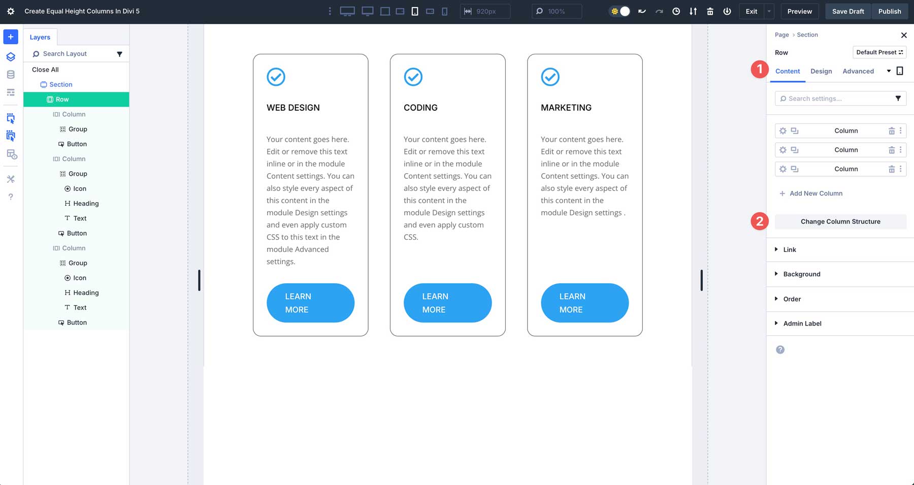
When the dialog box appears, click to enable the single row under Equal Columns. This will change the 3-column row to a single column on tablet and mobile devices, while preserving the 3-column structure on desktops.
When you preview the changes across all breakpoints, you’ll see how Divi transitions the layout for small screens.
By automating height alignment, designers can focus on creativity rather than technical fixes, making it easier to build professional sites in a fraction of the time. Divi 5’s Flexbox Layout System also supports better content organization through Module Groups, making aligning modules without custom CSS easier than ever.
Common Use Cases
Divi 5’s Flexbox system makes creating equal column heights versatile and effective for various use cases. Below are some common ways where Divi 5’s Flexbox system shines:
1. Product Listings
In e-commerce layouts, product cards often vary in content length due to titles or descriptions. With Divi 5’s Flexbox, you can create a grid of product cards where each column maintains equal height, ensuring a clean and professional appearance. For example, a product with a brief description aligns perfectly with one featuring a longer description. Divi 5’s Flexbox system allows you to avoid awkward gaps and create a cohesive experience that fosters user trust and engagement.
2. Featured Sections
Service or feature sections are a good fit for Divi’s Flexbox system. Flexbox in Divi 5 ensures all modules within a row have equal column heights, creating a balanced and polished look. Whether displaying team bios, services, or feature highlights, equalized columns make your web pages easy to scan, improving user experience.
3. Portfolio Grids
A portfolio grid is the perfect use case for Flexbox, especially for freelancers displaying their work. Flexbox ensures that gallery items like images align uniformly, even with different aspect ratios. You can use a Group module, assign a background image to it, and adjust the spacing accordingly. This creates a tidy, professional grid that showcases your work consistently, making it ideal for photographers, designers, or agencies aiming to impress potential clients.


Get Familiar With Divi 5’s Flexbox Feature Today
Divi 5’s Flexbox Layout System marks a significant leap forward from Divi 4’s way of equalizing column heights, transforming how Divi users create equal columns. Where Divi 4 relied on a rigid, background-dependent method that often required custom CSS for refinement, Divi 5 harnesses Flexbox to deliver intuitive controls and seamless responsiveness. The result is a more efficient system that removes the need for custom CSS workarounds and allows Divi users to easily build polished professional layouts.
Are you ready to elevate your Divi websites? Dive into Divi 5’s Flexbox settings and experiment with the creative possibilities they unlock. Share your comments below or connect with us on our social media channels to share your thoughts about our new Flexbox feature.


Leave A Reply