
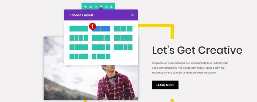
Websites exist to make engagement between companies or individuals and their website visitors happen more easily and effectively. The most effective way for a website to indicate which action they’d like visitors to take is what’s called a Call to Action (CTA). When you combine CTAs with a nice design, you can get an even better response from your visitors.
In this Divi tutorial, we’ll be showing you how to create a vibrant CTA section using Divi and Photoshop. You can use this design on any website by changing the images and colors that are being used.
- 1 Result
- 2 How to Create a Vibrant CTA Section for Your Next Project with Divi
-
3
Create Border Images with Photoshop
- 3.1 Create New Photoshop File
- 3.2 Add Background Color to Layer
- 3.3 Add Layer Mask
- 3.4 Create a Rectangle Shape with Stroke
- 3.5 Rasterize Layer
- 3.6 Select Rasterized Layer + Click on Mask
- 3.7 Use Black Brush Tool on Shape
- 3.8 Hide Rasterized Layer
- 3.9 Select Mask & Remove Piece of Right Border
- 3.10 Save Desktop Image for Web
- 3.11 Drag Saved Image to Photoshop
- 3.12 Rotate Image
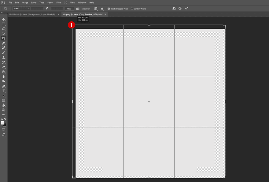
- 3.13 Increase Crop
- 3.14 Save Tablet & Phone Image for Web
- 4 Recreate Desktop Version
- 5 Recreate Tablet & Phone Version
- 6 Result
- 7 Final Thoughts
Result
Before we dive into the tutorial, let’s take a quick look at the final result.
On Desktop
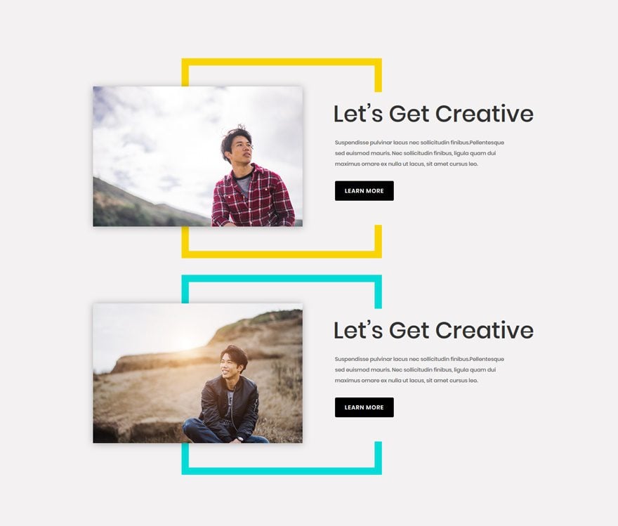
On Tablet
On Phone
How to Create a Vibrant CTA Section for Your Next Project with Divi
Subscribe To Our Youtube Channel
Create Border Images with Photoshop
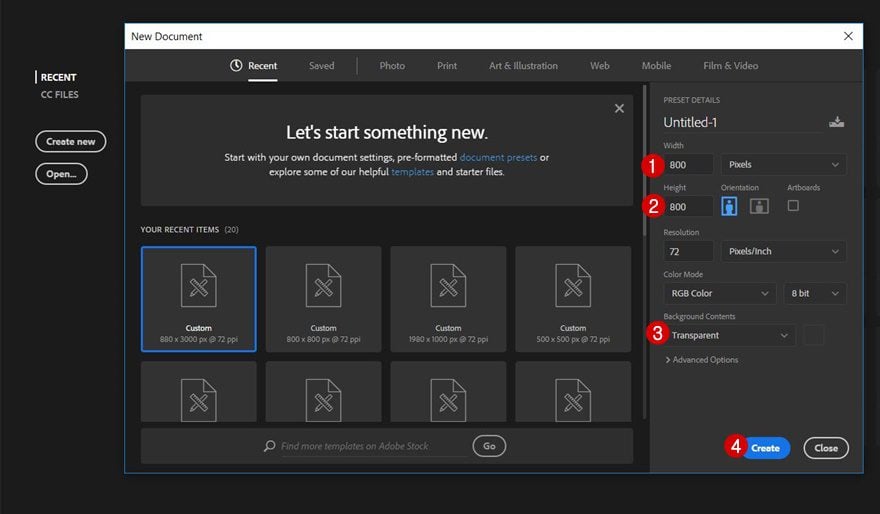
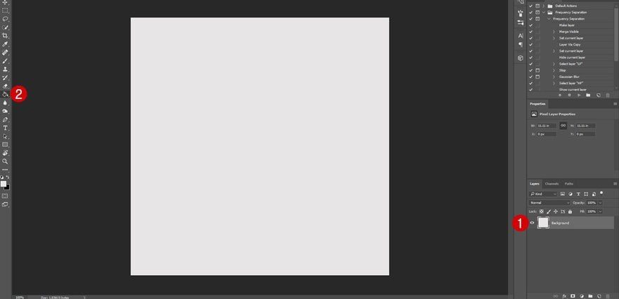
Create New Photoshop File
In the first part of this tutorial, we’ll create two images that we’ll use throughout the Divi tutorial. Start off by creating a new Photoshop file and use 800 for the width and height. Then, choose ‘Transparent’ for the Background Contents and click on the create button.
Add Background Color to Layer
Next, give the layer you’re on ‘#F3F2F2’ as its background color using the paint bucket tool. If you’re planning on using another background color for your section within Divi, use that color instead.
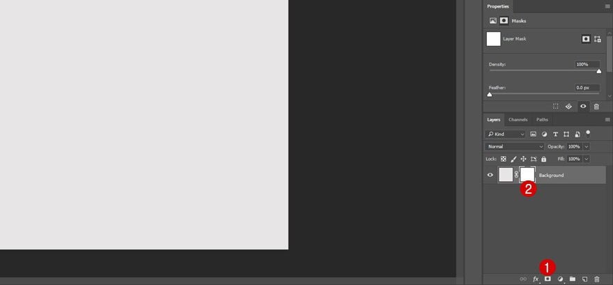
Add Layer Mask
Continue by adding a layer mask to the layer you’ve just given a color.
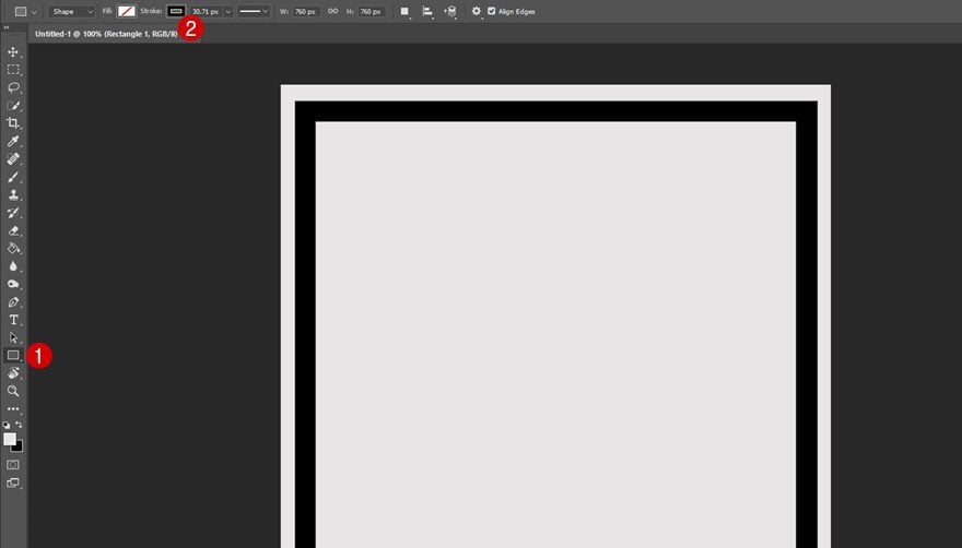
Create a Rectangle Shape with Stroke
Then, add a square shape using the Rectangle Tool while keeping shift pressed. This rectangle will need no fill and a black stroke of ’30px’.
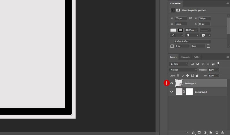
Rasterize Layer
The rectangle you’ve just added will need to become transparent. That way, once you add the image to the Divi Builder, you can choose which color appears in the transparent part. To start this process, rasterize the layer containing the rectangle.
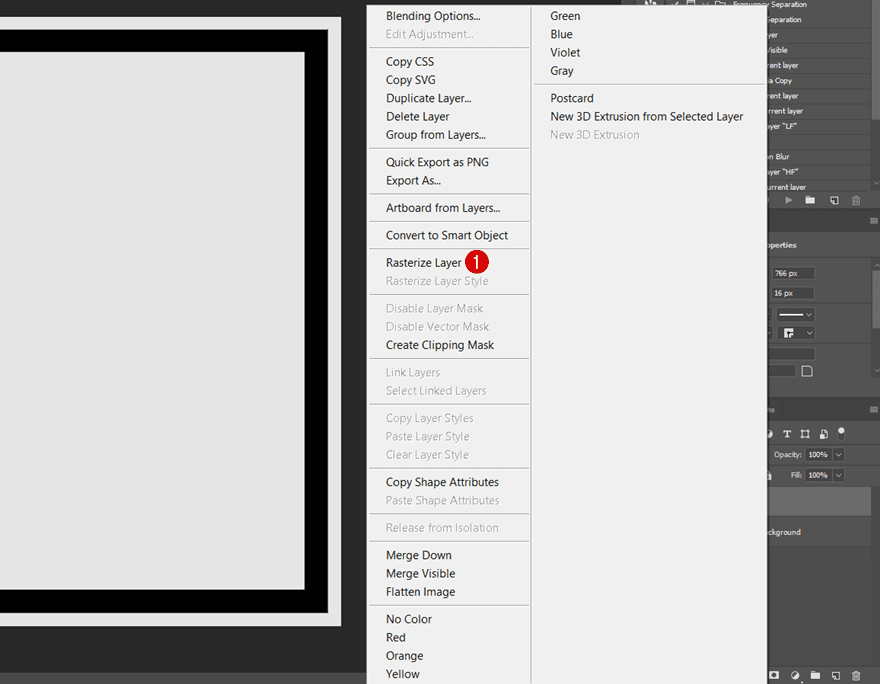
Select Rasterized Layer + Click on Mask
Then, press control/command + click on the rasterized layer and select the layer mask of the background layer.
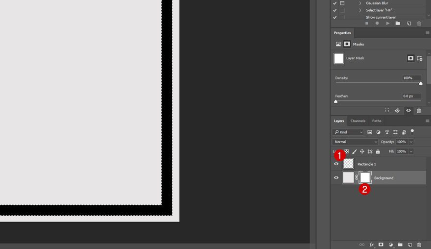
Use Black Brush Tool on Shape
While having the layer mask selected, use a black brush to go over the rectangle shape you’ve created. This will remove the shape from the layer mask.
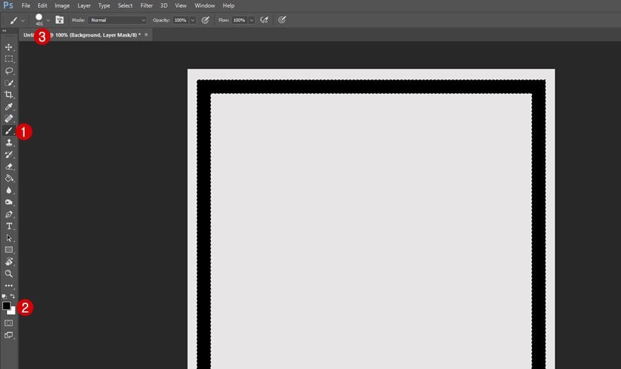
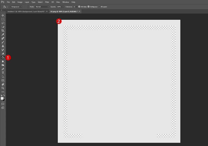
Hide Rasterized Layer
Now that you’ve gone over the rectangle with a black brush, that part of your layer mask will become transparent. But of course, you’ll need to hide the rasterized layer to see the result.
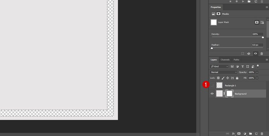
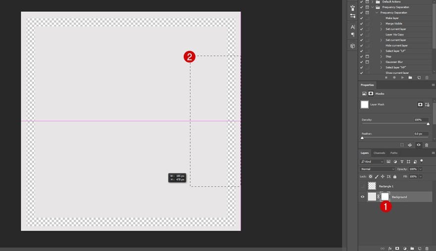
Select Mask & Remove Piece of Right Border
The next step you’ll need to take is to remove a part of the transparency of the right side of your rectangle. To do that, select the layer mask, use the selection tool on the part you want to remove and simply press delete on your keyboard.
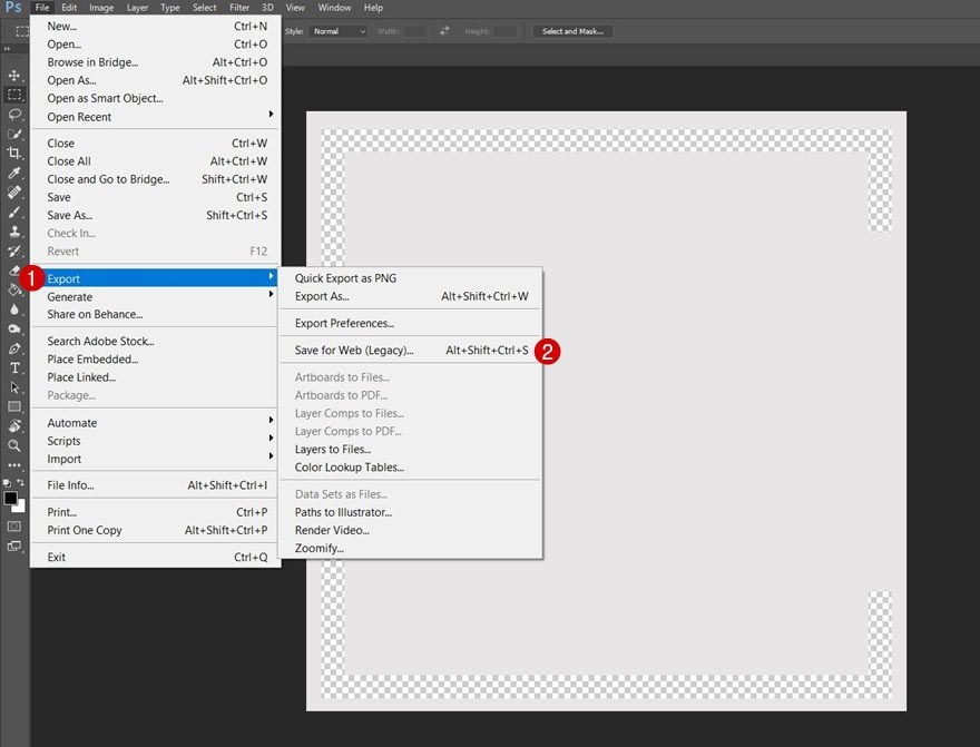
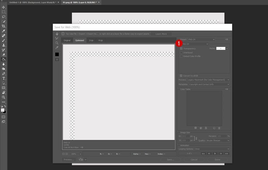
Save Desktop Image for Web
Your desktop version is now done. The only thing left to do is saving it by going to File > Export > Save for Web and making sure the file you’re exporting is PNG.
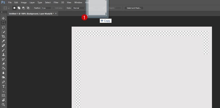
Drag Saved Image to Photoshop
We’re going to save ourselves some time and make some modifications to the image we’ve just saved so we can use it for tablet and phone as well. Start by dragging the image you’ve saved to Photoshop.
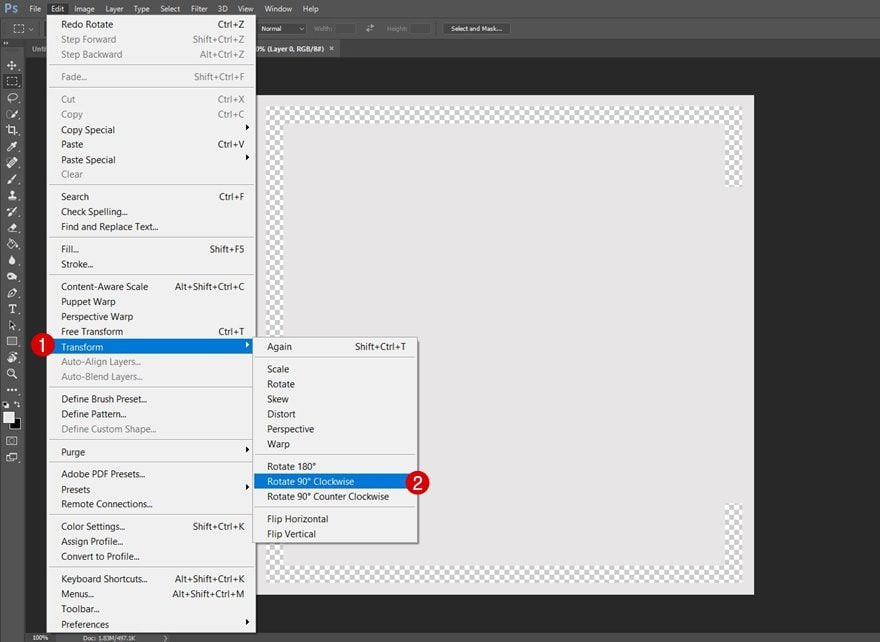
Rotate Image
Then, rotate the image by going to Edit > Transform > Rotate 90° Clockwise.
Increase Crop
Increase the crop of your image a little bit as well. This will just help you make sure the image doesn’t get cut off by the screen size once you use it for your website.
Save Tablet & Phone Image for Web
And save this new image as a PNG as well.
Recreate Desktop Version
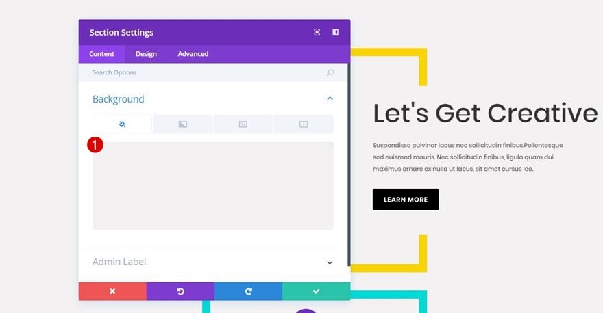
Create New Section
Background Color
Now that we have the two images we need to make the Divi design work, we can start building the CTA section. To do that, create a new standard section on a new or existing page using ‘#f3f2f2’ as the background color for it.
Add New Row
Column Structure
Continue by adding a two column row to the section you’ve just created.
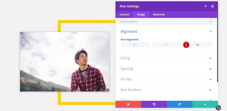
Alignment
For this row, we’re going to use right alignment within the Alignment subcategory of the Design tab.
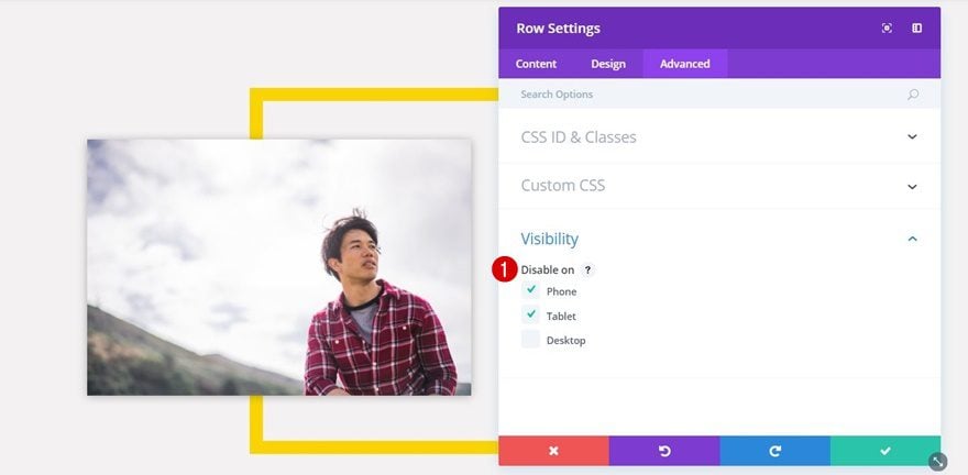
Visibility
Lastly, we’ll need to disable the row for phone and tablet. Later in this tutorial, we’ll create a new version that will match the screen size of tablets and phones instead.
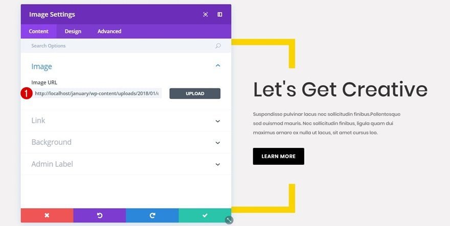
Add Border Image Module
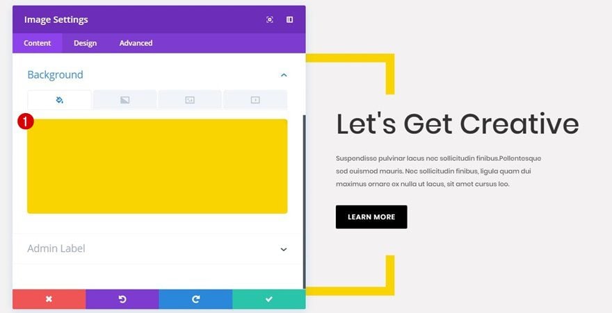
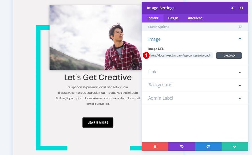
Upload Image
Once you’re done with your row settings, add an Image Module to the first column of your row. Upload the desktop image file you’ve created in the Photoshop part of this post.
Background Color
Because of the transparency within the image file, you can now choose a color for your rectangle without having to make the change within Photoshop. You can reuse the same image and just assign a different background color to it. In this case, we’re using ‘#f9d400’.
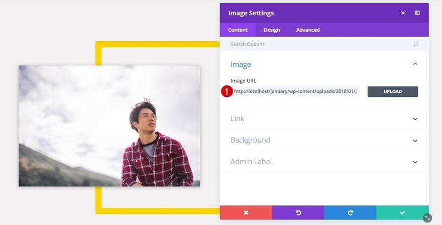
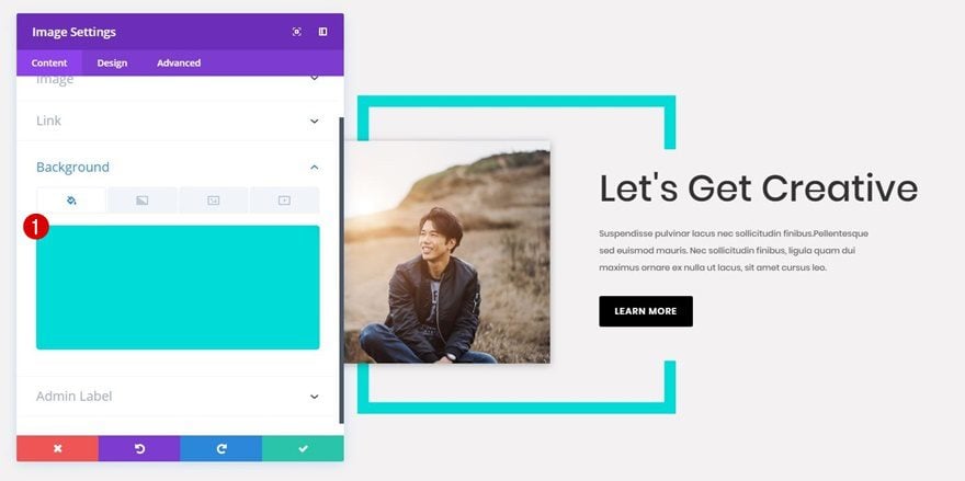
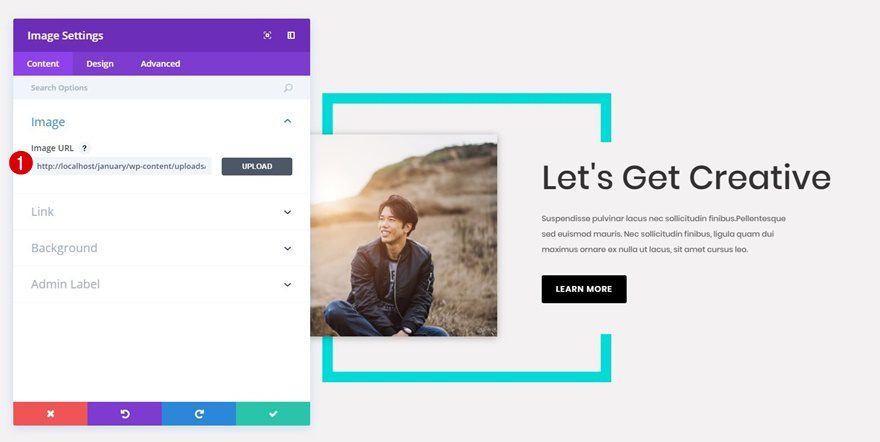
Add Image Module
Upload Image
Right below the Image Module containing the rectangle, add another Image Module. Upload a rectangle image to make the design work.
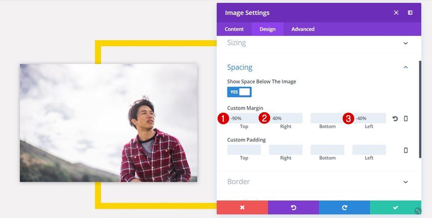
Spacing
To make this Image Module overlap with the previous one, use the following settings for the Spacing subcategory:
- Top: -90%
- Right: 40%
- Left: -40%
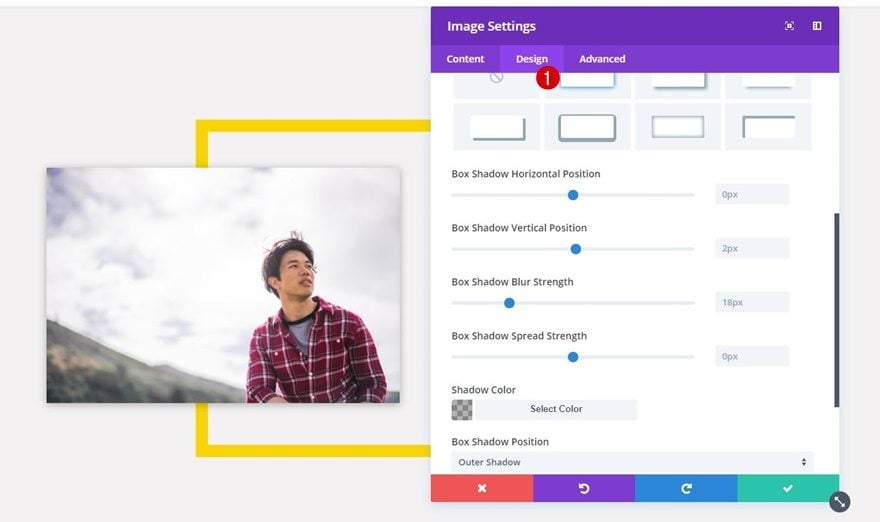
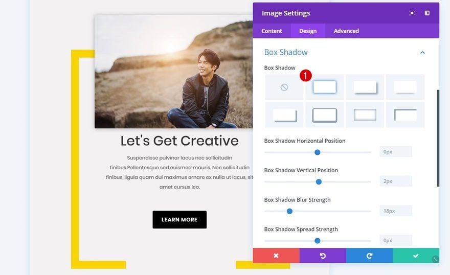
Box Shadow
Lastly, select the first option within the Box Shadow subcategory to add a subtle box shadow to your image.
Add Title Text Module
Text Settings
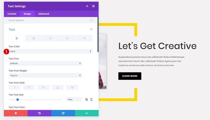
Now, you can choose whether you use a Call to Action Module or two Text Modules in combination with a Button Module. We’re going to choose the last option to create our example. Add a first Text Module to the second column of your row and choose ‘Dark’ as the Text Color within the Text subcategory.
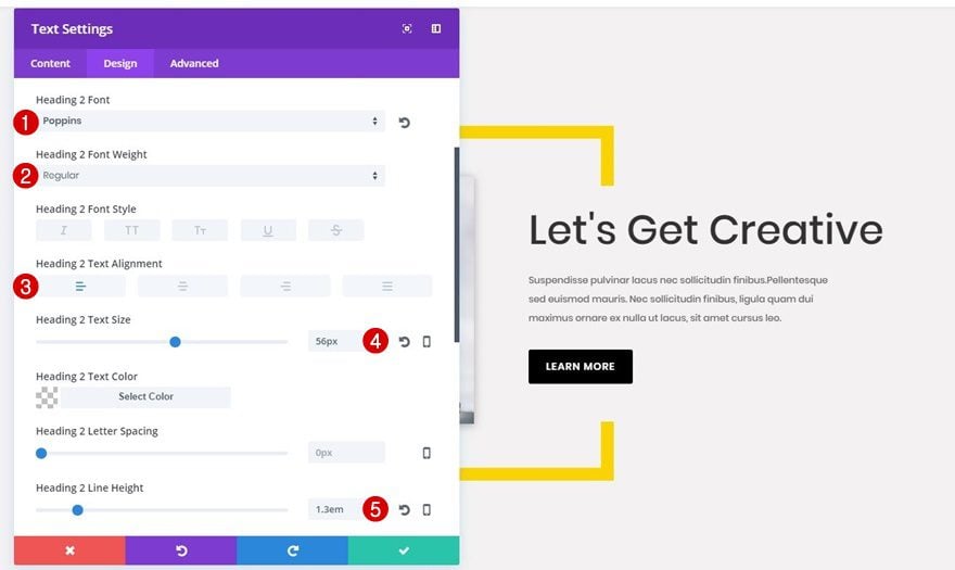
Heading Text Settings
Then, open the Heading Text subcategory and apply the following changes to it:
- Heading Font: Poppins
- Heading Font Weight: Regular
- Heading Text Size: 56px
- Heading Line Height: 1.3em
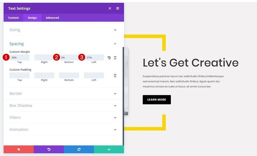
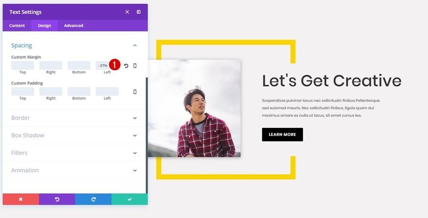
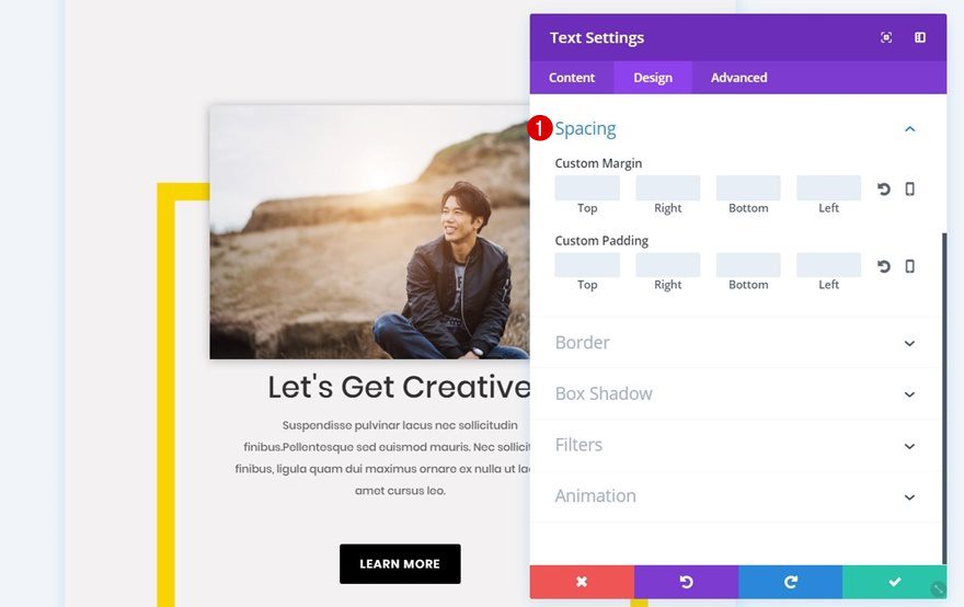
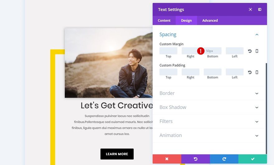
Spacing
Lastly, you’ll need to add some custom margin to your Text Module that will allow the text to appear right within the square Image Module:
- Top: 30%
- Bottom: 2%
- Left: -37%
Add Body Text Module
Text Settings
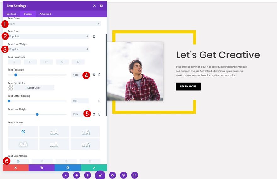
Right below the Text Module you’ve added, go ahead and add another Text Module. Use this one to share the description of your CTA section. Move on to the Design tab and apply the following changes to the Text subcategory:
- Text Color: Dark
- Text Font: Poppins
- Text Font Weight: Regular
- Text Size: 13px
- Text Line Height: 2em
Sizing
Next, open the Sizing subcategory and use ‘83%’ for the Width.
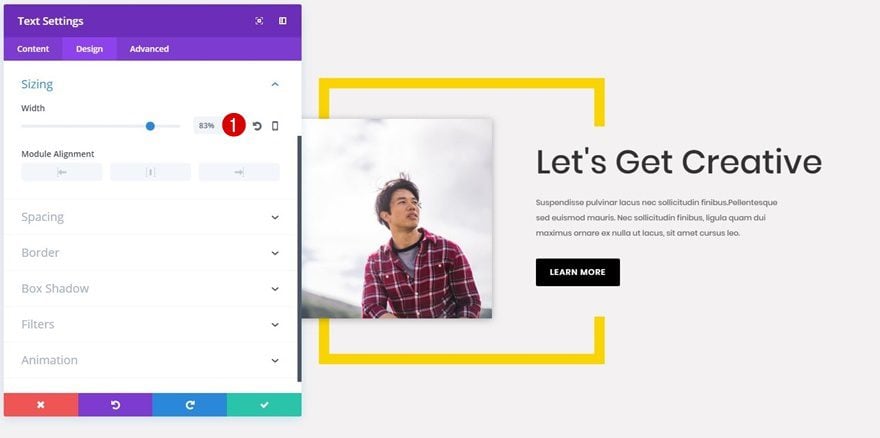
Spacing
Lastly, add ‘-37%’ to the left margin of your body Text Module as well. That way, the Text Module will appear right below the previous Text Module within the rectangle Image Module.
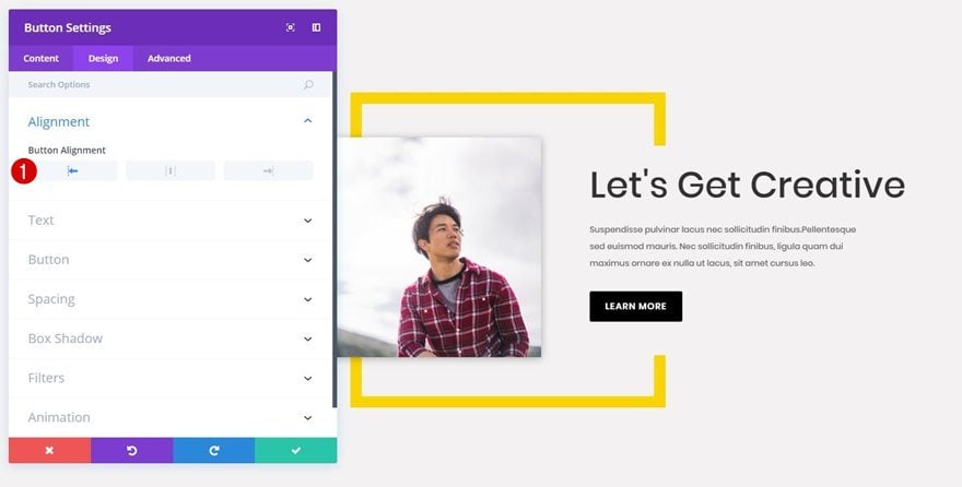
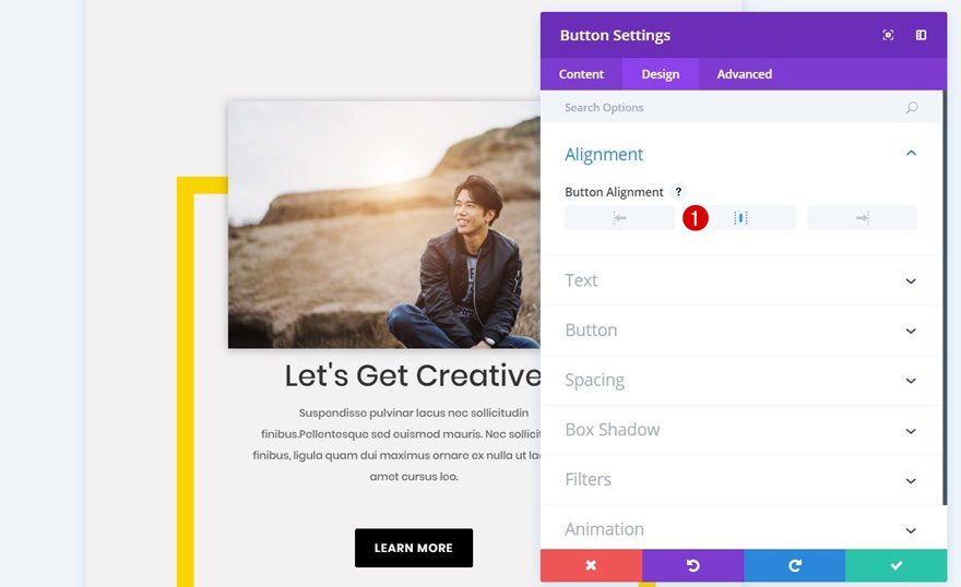
Button Alignment
Last but not least, you’ll need to add a Button Module to the second column of your row. This Button Module requires a left Button Alignment within the Design tab.
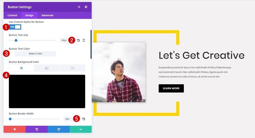
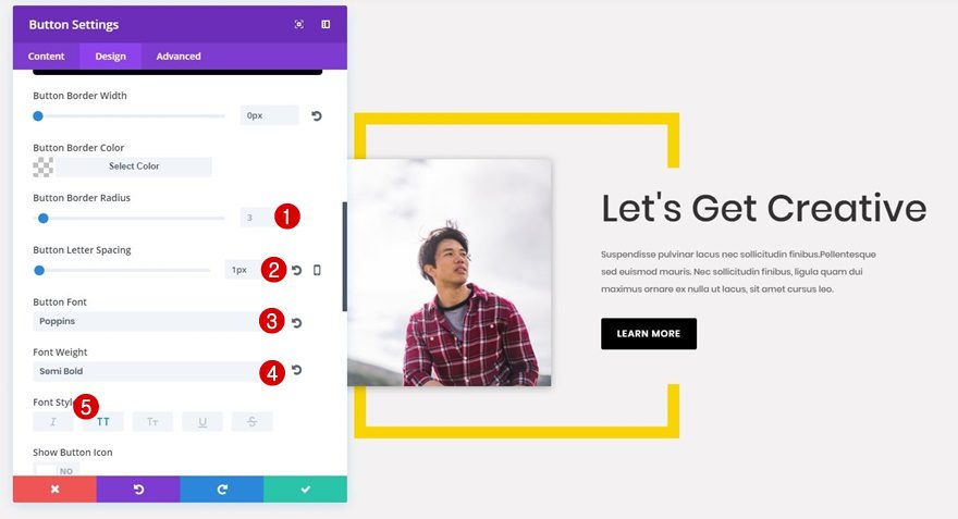
Button Settings
Then, open the Button subcategory and apply the following changes to your button:
- Use Custom Styles for Button: Yes
- Button Text Size: 14px
- Button Text Color: #ffffff
- Button Background Color: #000000
- Button Border Width: 0px
- Button Border Radius: 3
- Button Letter Spacing: 1px
- Button Font: Poppins
- Font Weight: Semi Bold
- Font Style: Uppercase
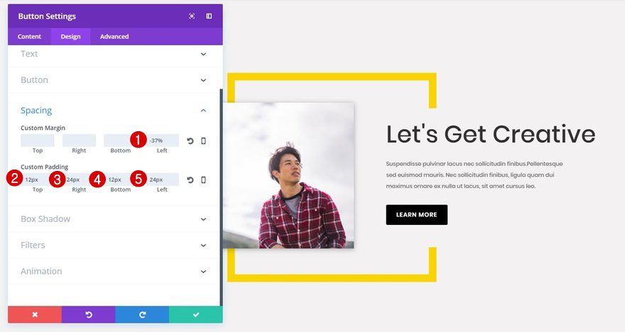
Spacing
Lastly, apply the following spacing to your button to make it fit with your Text Modules:
- Left Margin: -37%
- Top Padding: 12px
- Right Padding: 24px
- Bottom Padding: 12px
- Left Padding: 24px
Clone Row
Change Background Color Border Image Module
Now, clone the row you’ve just created and change the background color of the border Image Module into ‘#00dbd7’ or any other color.
Change Image Module
Likewise, you can also change the image within the second Image Module to create two CTAs that differ.
Recreate Tablet & Phone Version
Add New Row
Column Structure
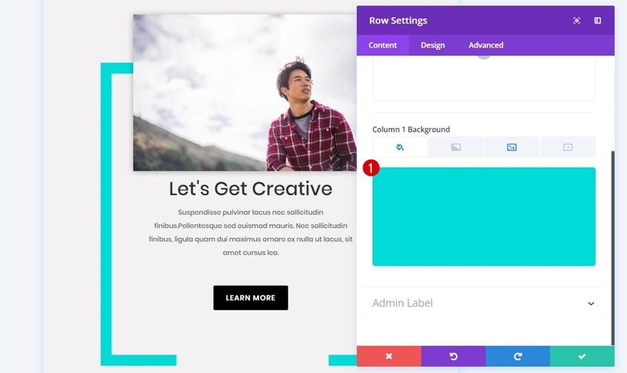
Now that we’ve created the desktop version let’s move on to the version for tablet and phone. The first thing you’ll need to do is add a one-column row to your section.
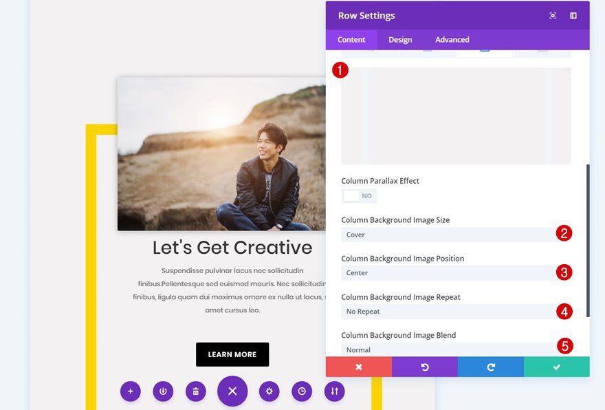
Column 1 Background Image
Then, open the row settings and choose the square image file you’ve created for tablet and phone in the Photoshop part of this tutorial as the background image of the column. Along with the image, use the following settings:
- Column Background Image Size: Cover
- Column Background Image Position: Center
- Column Background Image Repeat: No Repeat
- Column Background Image Blend: Normal
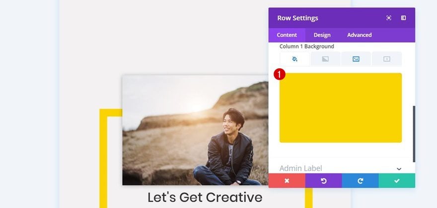
Column 1 Background Color
Add a background color to the first column as well. In this case, we’re using ‘#f9d400’.
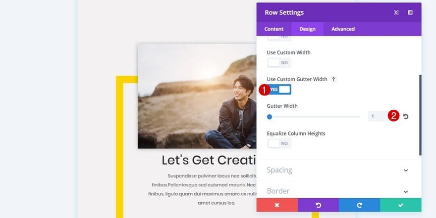
Sizing
Next, open the Sizing subcategory within the Design tab of your row, enable the ‘Use Custom Gutter Width’ option and use a Gutter Width of ‘1’.
Spacing
To keep some space between this row and the next row you’ll create, add ’70px’ to the bottom margin within the Spacing subcategory.
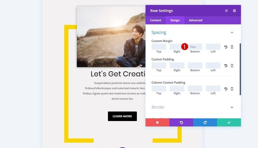
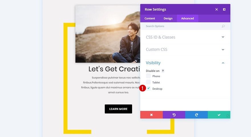
Visibility
Lastly, disable this row on desktop.
Add Image Module
Upload Image
The first module you’ll need to add to your row is the Image Module.
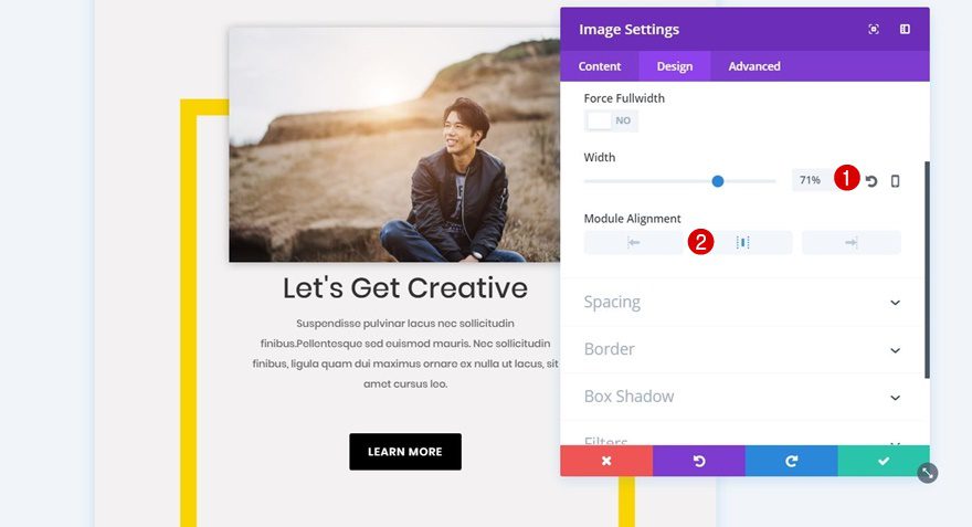
Sizing
After choosing the image you want to appear, move on to the Design tab, open the Sizing subcategory and use the following settings for it:
- Width: 71%
- Module Alignment: Center
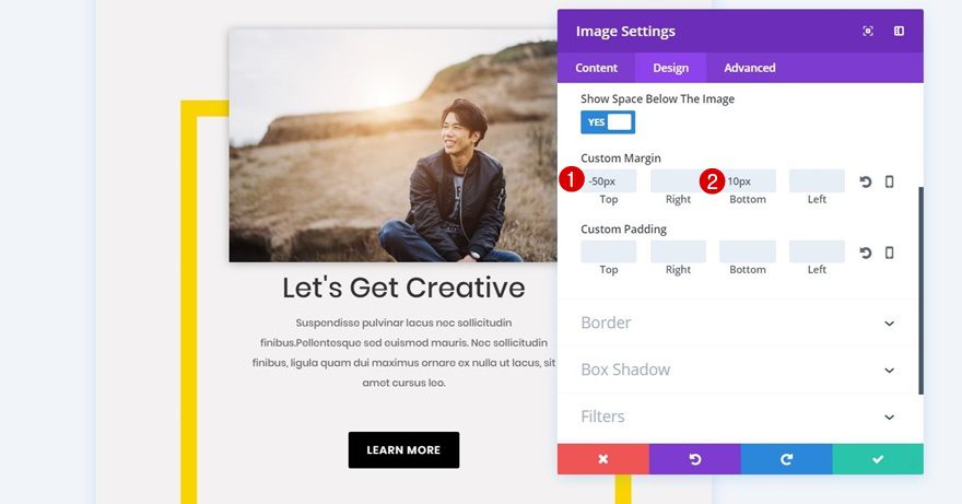
Spacing
We want this Image Module to overlap with the square background image. For that, we’re going to use the following custom margin for the Image Module:
- Top: -50px
- Bottom: 10px
Box Shadow
Lastly, we’ll apply some Box Shadow to this Image Module as well. We’re going to use the first option in the row without making any changes to the default values.
Change Text Size & Text Orientation of Title Text Module
Clone the Text Modules and Button Module of the desktop section and place them right below the Image Module you’ve just created. You’ll need to make some additional settings to match the tablet and phone screen size, though. The first changes you’ll need to make to the Heading Text Subcategory of the first Text Module are the following:
- Heading Text Alignment: Center
- Heading Text Size: 36px

Remove Spacing of Title Text Module
While editing the title Text Module, open the Spacing subcategory and remove all of the custom margin that’s present.
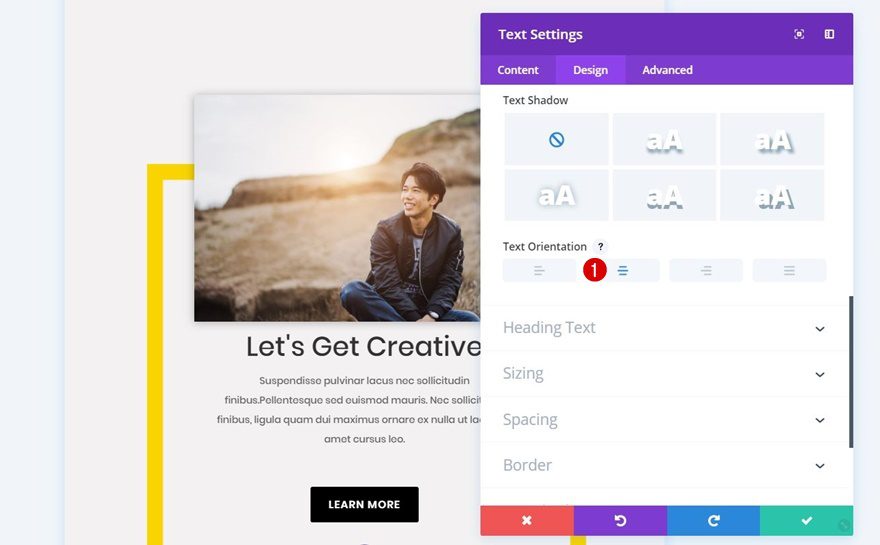
Change Text Orientation of Body Text Module
Next, open the body Text Module and change the Text Orientation to ‘Center’ within the Text subcategory.
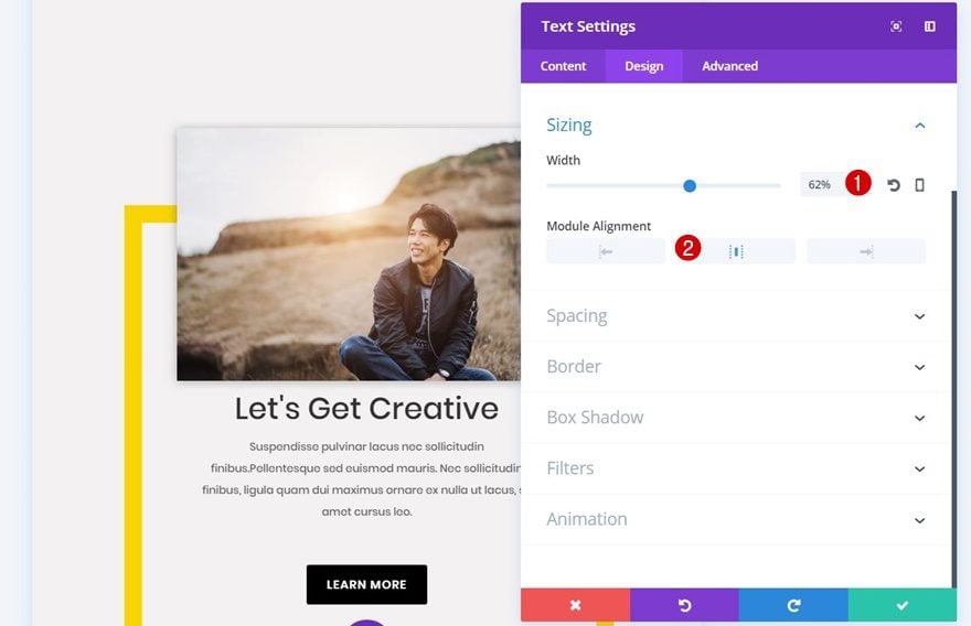
Change Sizing of Body Text Module
The Sizing subcategory of this Text Module will need some modifications as well:
- Width: 62%
- Module Alignment: Center
Change Spacing of Body Text Module
Lastly, the only value within the Spacing subcategory that is needed is ’50px’ for the bottom margin.
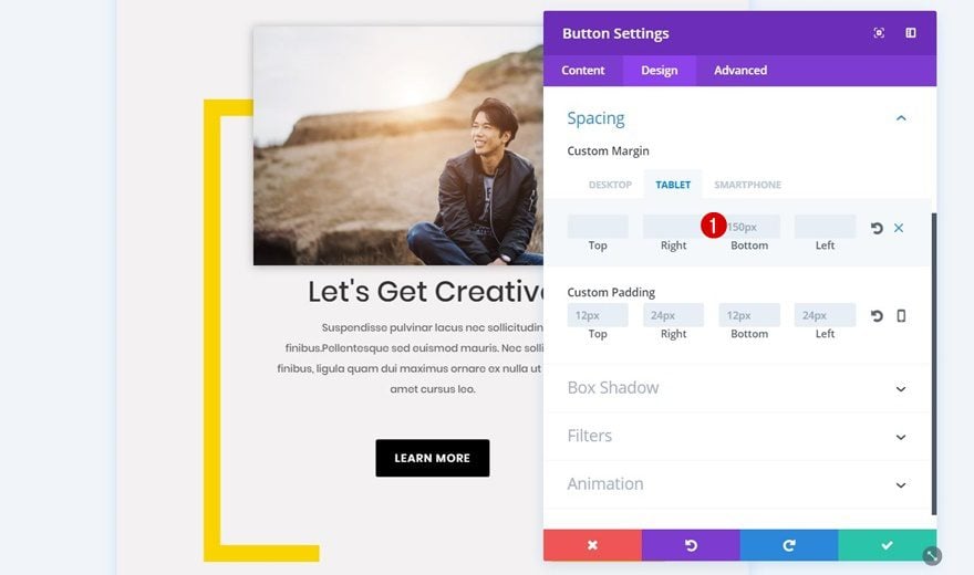
Change Alignment of Button Module
The Button Module is the last module we’ll need to change. The first thing you’ll need to do is change the Button Alignment into ‘Center’.
Change Spacing of Button Module
Then, make sure ‘150px’ bottom margin is the only value you use for the custom margin of your Button Module.
Clone Row
Change Column 1 Background Color
Now that you have the first row in place, you can clone it and change the column 1 background color into ‘#00dbd7’ or any color of your preference.
Change Image Module
Change the image within your Image Module within your row as well to create two unique calls to action for tablet and phone.
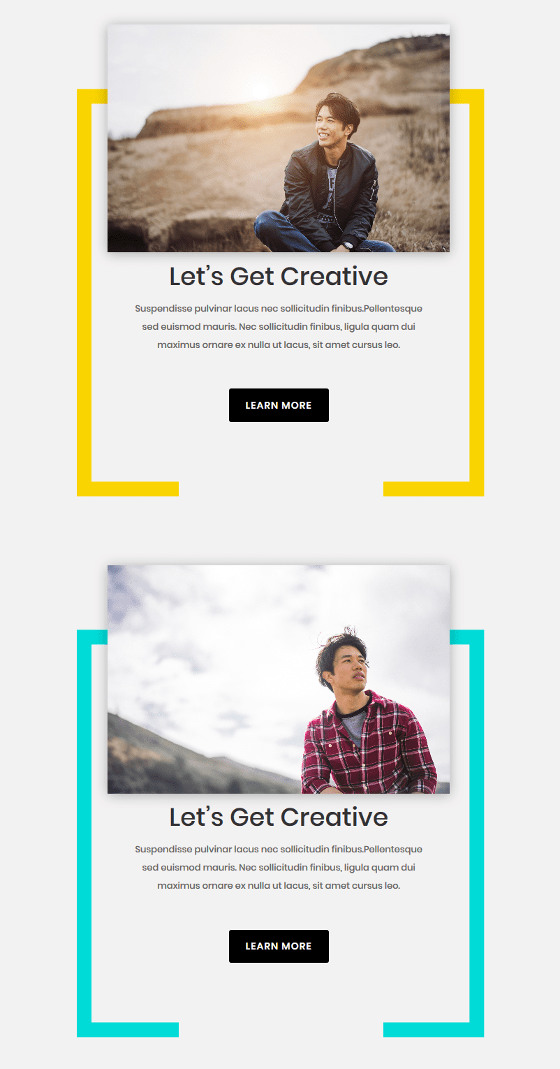
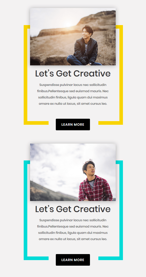
Result
Now that we’ve gone through all of the steps, let’s take a final look at the result on different screen sizes.
On Desktop
On Tablet
On Phone
Final Thoughts
This tutorial shows you how to create a vibrant CTA section by combining Divi’s built-in options and Photoshop. You can use the CTA section that’s been recreated within this tutorial for any website. If you have any questions or suggestions, make sure you leave a comment in the comment section below!


This was fantastic, thank you so much for creating and sharing! I will have to give it a go but I’ll try to do each row as opposites so it flows on the PC side to my customisation, should be easy enough to just reverse your instructions.
I know you said to use whichever picture as long as it’s a rectangle, may I ask what size were the pictures you used (the bread one and the cutting board)?
I have a lot of trouble learning the correct sizes for images so I am curious what you used because it flowed so well.
Thank you again so very much for sharing this amazing small (small to pro users, not so much for me as a newbie) but powerful tweak.
Thank you for the tutorial and for the photoshop files.
I have an issue. If you check my website (https://elementsdive.com/cursos/), in the page I have created the CTA section with ypur photoshop files there is a thin line same background color than the photoshop image. I do not know why and how I can fix it.
Looking fordward for your reply
Thanks
Amazing, thank you for the tutorial!
What a beautiful CTA.. stands out in the right way.
If I may offer a suggestion, please create tutorials for individuals who do not know how to use the product. I found your YouTube tutorial to be too fast and skipping steps (that the user is assumed to know how to perform), and the text tutorial is missing steps as well.
I totally agree that the tutorial was too fast and skipped steps. I’ve been using Photoshop for many years but the instructions seem to be missing something, at least in the early stages of this tutorial because that’s as far as I got. After creating the background layer and adding a mask, when I create a rectangle, I see no way to give it a stroke and transparent background. The rectangle in your example created a “rectangle” layer. Not on mine. If I select the mask and make the rectangle, I get a black box.
I finally figured out you have to select “shape” rectangle. Only then, I got the option to set a stroke of 30px and no fill. The default was set on “pixel” rectangle.
This is truly gorgeous. I went on and added this CTA section to my blog. Everything works and looks well when in editor (both desktop and mobile view) but the live mobile versions tested on my own mobile device looks .. scrambled. I guess I’ll have to open a ticket about this.
There is another thing I’d like to point out here and it’s about the downside of using 2 separate modules for the desktop and mobile version. Besides having the same content twice on the same page (each module version will be shown twice in the HTML code), it will interfere with the proper functioning of many plugins that “read” the blog post such as Table of Content – that will pick up the same heading twice and the popular AMP plugin that will show in “plain text” the same content twice.
An easy-to-say but hard-to-do fix would be to create one single module and only change the settings to match the desktop/mobile browser versions.
Hey Jessica. Check out my reply to Martina Hahn’s comment with another approach to the tablet & phone version.
How can we get the shape file if we don’t have photoshop? Can you please send me the file?
I’d be happy to send it to you. Please, send an email to donjete at live dot be.
hello,
4 hours… and not the same result.
If you have a look on https://www.ilfuturosicuro.it/home2/
it is fine on desktop and tablet but not on cellphone. On Phone the SIDE-colors are not visibile.
I tried also to make a larger border (I think I tried 5 different sizes) to make it fit but it did not.
I also tried to “play” with margins, spacings…
After trying all I restard (first I followed the video guide, than the text guide and I think there is one difference) but it does not work well on cellphones.
I also looked at it with different Browsers.
What can I do?
What I think that is missing in the guide:
the picture SIZE and the SIZE when you insert the picture (inserting a images you can choose the size you are filling in the picture).
Thanks
Martina
The column background is indeed affected by some of the elements (width of the image for instance). To avoid this I’d recommend another approach which I tested out:
– Create the image for tablet & phone in Photoshop without adjusting the crop (only changing the rotation)
– Using the same method for tablet and phone as for we did for desktop:
Instead of using a column background + color, add a new Image Module to your row with the square image file, add a background color to the Image Module and make sure it’s the first module within your row. Lastly, make sure the Image Module with the landscape image (your second module in the row) has a top margin of -120% for both tablet and phone. No need to modify the settings of the other modules that you’ve already created for this tablet & phone version.
Wonderful.
I will definitely use this on my blog.
Thanks.
Thank you for your positive comment, Neha! 🙂
with the row alignment right, this doesn’t look for pc and big screens like 2k or higher
You have a point, Dimitris. In that case, it might be better to opt for center row alignment.
The design is great Donjete but it is not responsive. If center then with smaller screens it cuts from the left side. Would be nice if you could add some media queries
Great tutorial – thanks.
Is there a way to get it centered on desktop?
Not sure if I’ve done something wrong. but my desktop version is off to the right, while yours looks centered.
https://www.screencast.com/t/q7xAwfxOnx3
You’re welcome, Anthea! You can, instead, use center row alignment in the Alignment subcategory within the Design tab of your row.
Thanks for the inspiration!
You’re welcome, Laura! 🙂
How can we get the shape file if we don’t have photoshop? Can you please send me the file?
I’d be happy to send it to you. Please, send an email to donjete at live dot be.
Design looks really good. Always good to see how to do new designs. Much appreciated.
But .. as other comments say … any possibility of giving a link for members where they download the already formatted files?
It would save lots of work and be greatly appreciated by members.
Hi Donjete Vuniqi
Thanks for this CTA. It looks so inviting and interesting that a customer would want to click on it just out of curiosity. I would definitely try this out.
Glad to hear you like it, Shane! 🙂
Where can we get the file for the people who don’t have Photoshop?
I’d be happy to send it to you. Please, send an email to donjete at live dot be.
I really need to try this one. Very informative and well explained
Thank you, Jessica!
thank you for good tutorial. may i know whether this layout available for download anywhere?
I love it! Thanks for this new inspiration and for showing us more ways to use our ever-versatile Divi Builder! I appreciate that you’ve taken time to create both, the easy to follow video and the detailed steps.
Thanks for the positive feedback, Desirée (love the name btw) 🙂
Good job.
I will definitely use this on my blog soon.
Thanks
Glad you like it & thanks for the comment 🙂
Anyone sharing the photoshop file?
Very nice, but I would like to suggest you include the word Photoshop in your blog titles if it Photoshop dependant.
Thanks for the tip, John 🙂
Same process with Gimp or PaintShop pro.
I wish when they give us 900 steps to format a module they would supply the module for download. Why not? It’s not secret sauce as they are giving all the steps.
Great tutorial. Could you re-explain this step?
“Select Rasterized Layer + Click on Mask
Then, press control/command + click on the rasterized layer and select the layer mask of the background layer.”
I’m using CS6 and it’s not selecting the rectangle as shown in the illustration.
Glad you like it, Chris! Once you create the rectangle and rasterize this layer, press control + click on that same layer. Once you do that, you’ll see that the borders of the rectangle you’ve created will be selected. While having this selected, click on the layer mask of your background layer and continue the steps as mentioned in the blog post. You can also take a look at the video tutorial included in this post which may help 🙂
While I love the look, I dread all the steps. I wish resellers would offer pre-formatted modules for sale. That would be so much easier than layout packs and would be easy to knock out. I would buy this for $10. It would save me time. Right?
Thank you.
The point here is to teach you something new so that you can apply it any way you want. Just buying this doesn’t expand your skillset. I’d say showing us how is far more valuable as a budding designer.
Stunning
Thanks, Márcio!
Excellent suggestion full of imagination.Thx
I would like to ask you some advice: to set margin and padding for mobile it is advisable to use the measurement in pixels or in percentage? Thank you
You’re welcome, Guiseppe!
I usually tend to use pixels for modules when they don’t influence the entire design. But in cases like these, where we make certain modules overlap, I use percentage to make it look good on different screen sizes.
i love your voice