
Custom headers set your site apart, especially when millions of other websites are built with the same WordPress theme or template. This tutorial demonstrates how to create a custom header in Divi 5. You can download this header and 19 others if you’d like to study or use them on your own builds.
Otherwise, this post provides a step-by-step guide on how to use Divi’s Flexbox layout system to build this layout.
-
1
How To Create A Site Header With Divi’s Flexbox
- 1.1 Step 1. Build The Structure
- 1.2 Step 2. Size Column One For The Logo
- 1.3 Step 3. Column Two Layout Settings
- 1.4 Step 4. Inside First Nested Row, Adjust Sizing For Columns
- 1.5 Step 5. Configure The Utility Row’s Column Layout
- 1.6 Step 6. Make The Search Module Absorb Free Space
- 1.7 Step 7. Finishing Styles
- 1.8 Step 8. Finish With A Responsive Pass
- 2 Download 20 Flexbox Headers For Divi 5
- 3 Download For Free
- 4 Build Your Flexbox Headers In Divi 5 Today
How To Create A Site Header With Divi’s Flexbox

Here is the key idea. A flex layout has two levels of control:
- Parent containers define direction, gaps, wrapping, and alignment for the whole layout.
- Child items define whether they grow, shrink, or have other sizing options.
Parent controls live under Design > Layout. Child sizing lives under Design > Sizing. Get the parent right first. Then dial in layouts with child-level options.
Now, for the fun part: let’s recreate this layout, step by step.
Step 1. Build The Structure
When building a section layout, the first step is to determine the structure. Without knowing (or figuring out the structure), you will have a hard time getting things to come together. With practice, this becomes more or less second-nature.
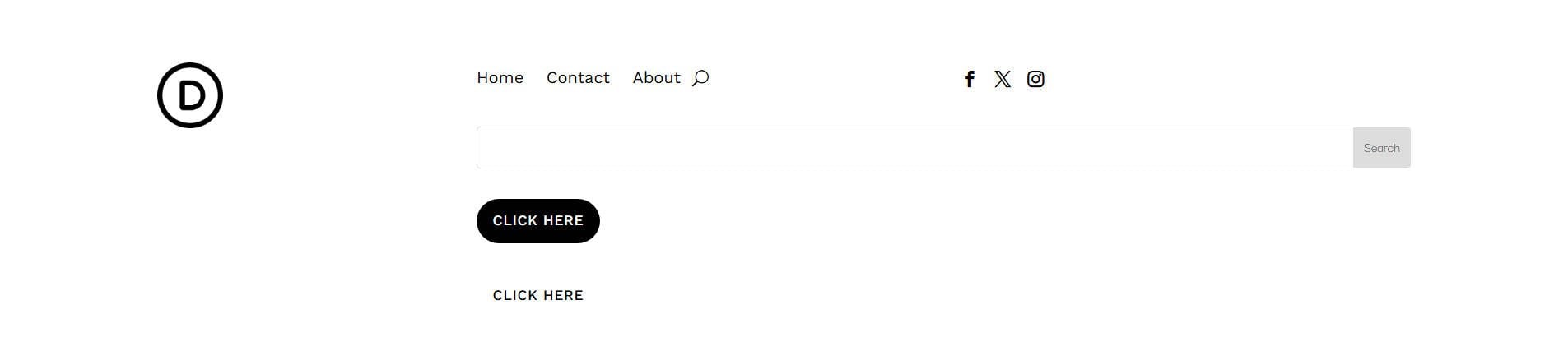
To recreate this heading, there are a few levels of structure to note. First is the highest layers: a Section, with a Row, and two Columns in that row (we’ll worry about layout specifics later, but note the structure now.
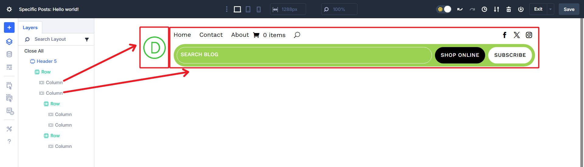
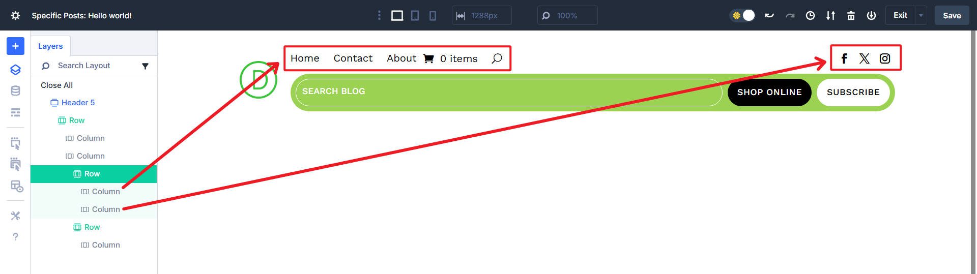
Inside that second column, we see two nested rows. The first row holds one column for the menu and another column for the social icons.
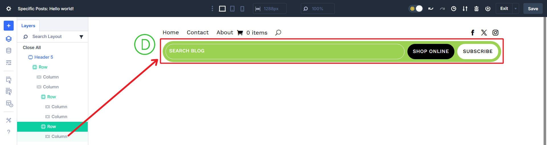
There’s another row with a single column that holds the Search and Button Modules.
Now that we understand the structure, we can create a blank page with the needed raw elements. Add a Section to your header template. Add an offset Row structure with two columns.
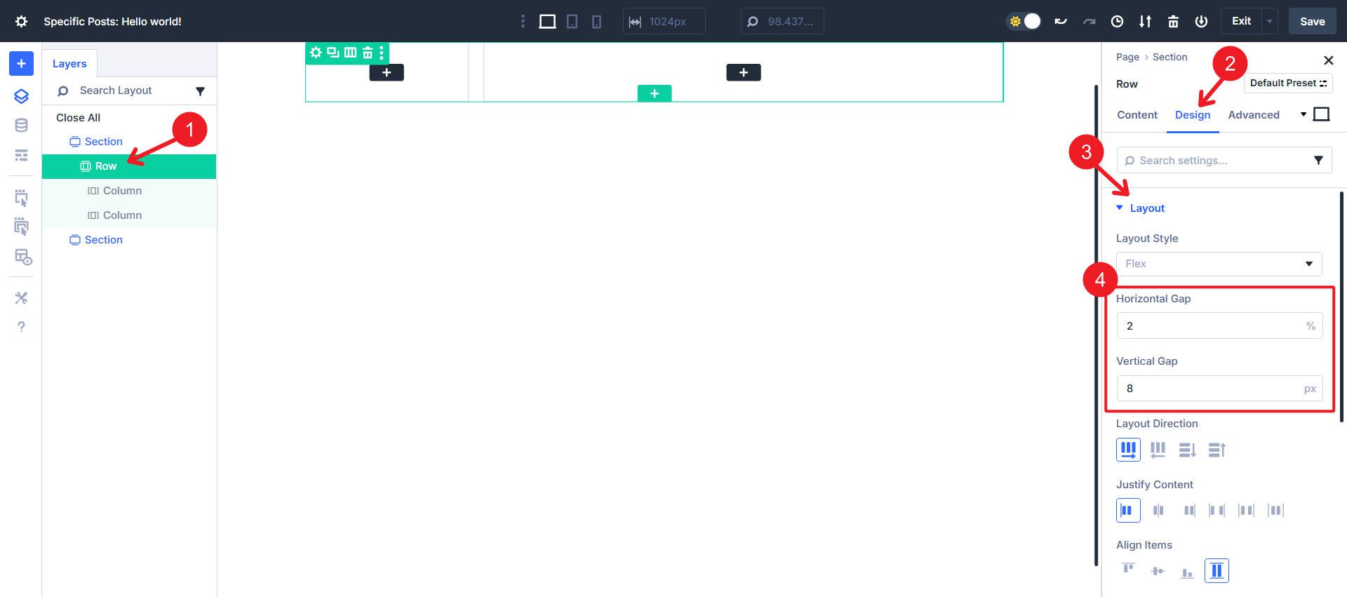
Open the Row, go to Design > Layout, and set the flex Horizontal Gap to 2% and the Vertical Gap to 8px. Everything else should retain default settings.
To further flesh out the structure, we will add two Nested Rows inside column 2.
At this point, we will finish adding the needed columns and modules. Nested row 1 gets two columns, and nested row 2 gets just the one.
With the structure in place, we can now start fine-tuning the layout using Flexbox controls at each level.
I’ve styled each of my modules so that we can focus solely on building this using Flex. Download the layout from the linked post above if you want the exact styles.
Step 2. Size Column One For The Logo
Select Column 1. Open Design > Sizing. Ensure Column Class shows No Column Class. Go to the second column, and set the column class to Fullwidth.
Step 3. Column Two Layout Settings
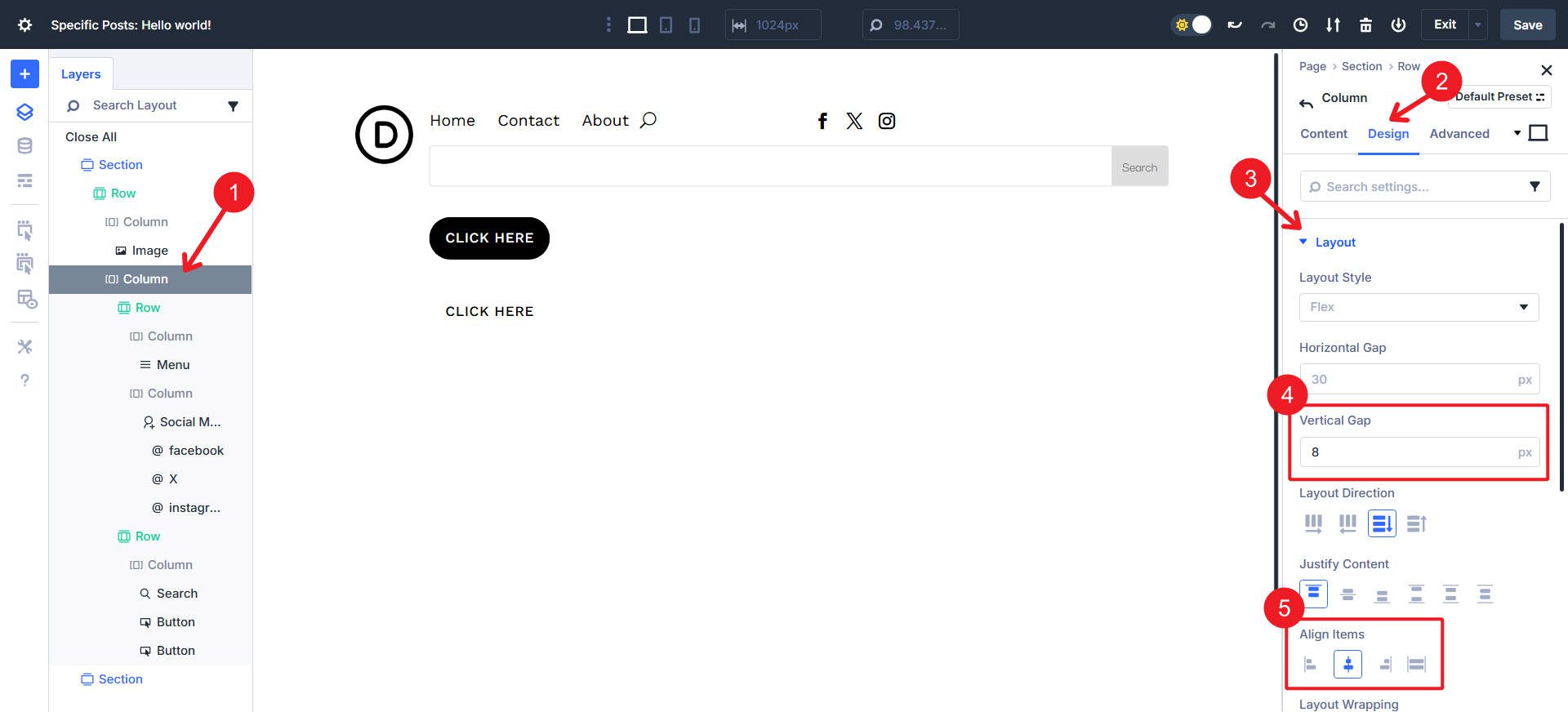
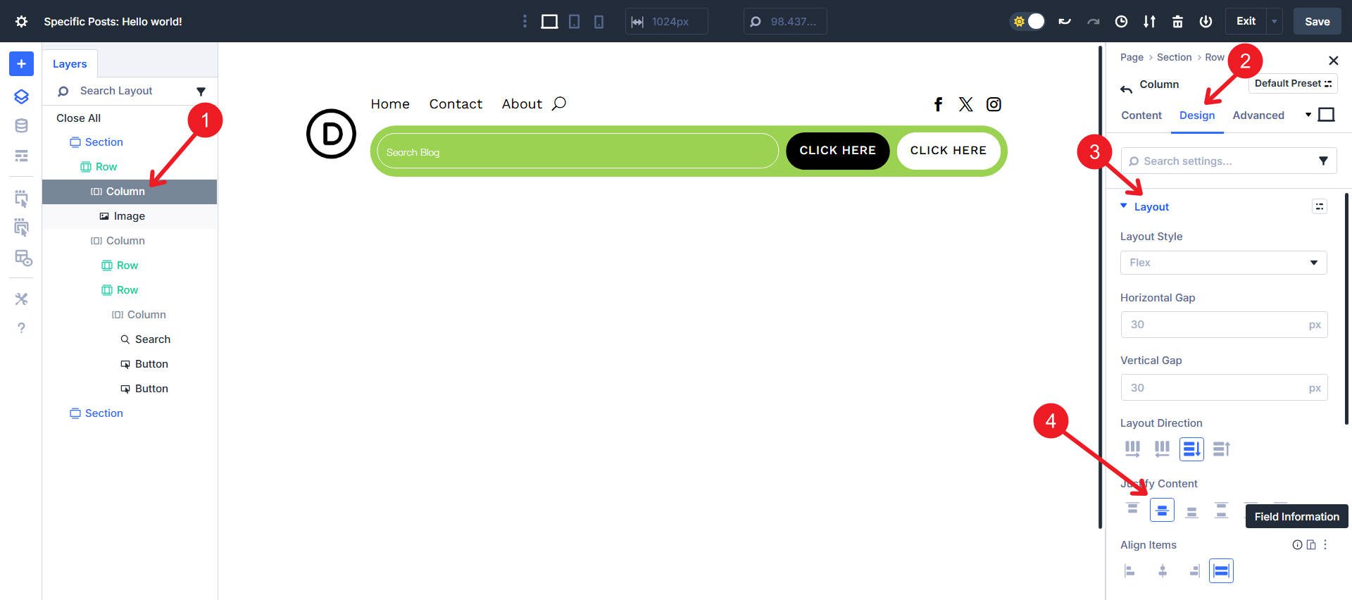
Select Column 2. Open Design > Layout. Confirm the Horizontal Gap shows 30px, and the Vertical Gap shows 8px. Keep the Layout Direction as vertical stack and Justify Content at the default. Lastly, set Align Items to Center on the cross-axis.
Step 4. Inside First Nested Row, Adjust Sizing For Columns
Select Column 1 inside Nested Row #1. Open Design > Sizing. Choose Grow To Fill and change Column Class to No Column Class. Select Column 2 and open Design > Sizing to set column class to No Column Class and make sure only Shrink to Fit is selected. This will make the first column with the menu take most of the space, pushing the social icons to the right.
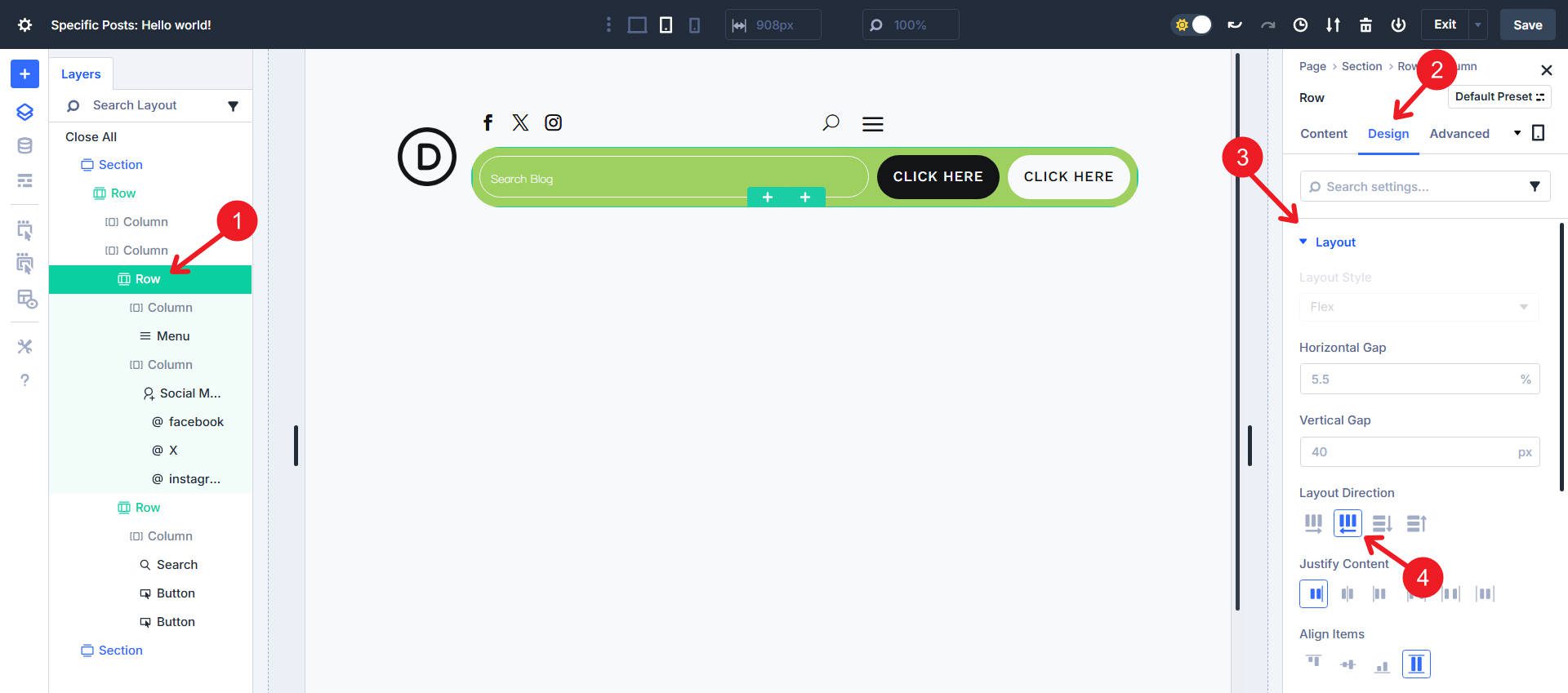
Step 5. Configure The Utility Row’s Column Layout
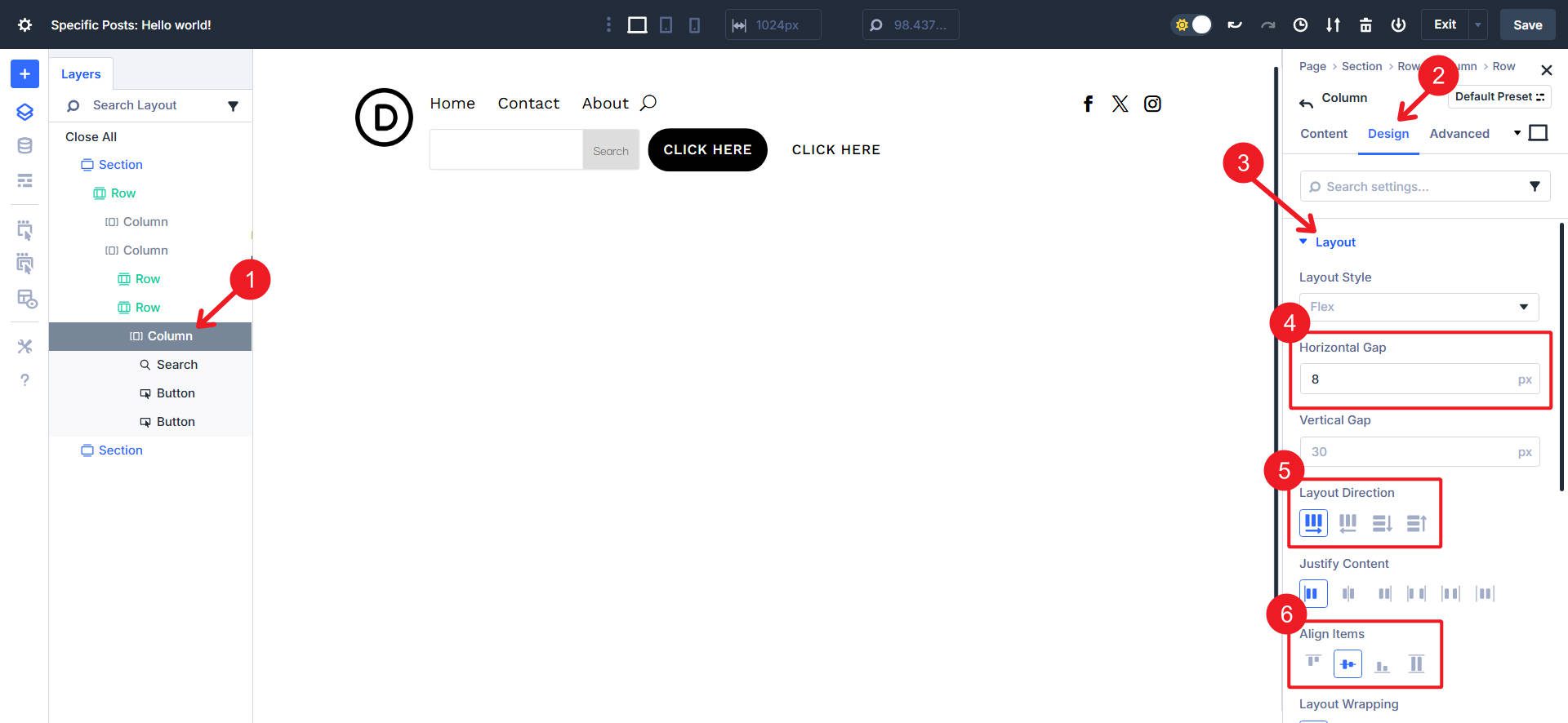
Inside Nested Row #2, find its only Column and open Design > Layout. Set Horizontal Gap to 8px and set the Layout Direction to Row. You can also set Align Items to Center.
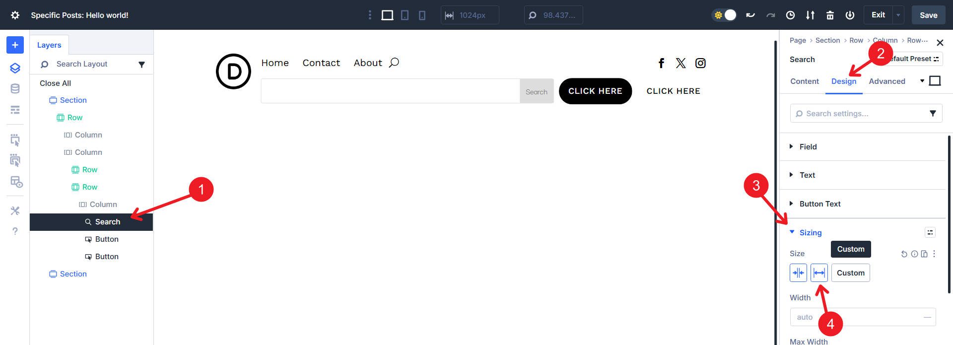
Step 6. Make The Search Module Absorb Free Space
There are three modules inside this utility row. Open the Search module. Go to Design > Sizing and set it to Grow To Fill. Leave both Buttons at the default size. The Search will now expand to fill the unused width in the column.
Step 7. Finishing Styles
Open Nested Row #2 and give it a background color of #9bd252. Then open Border styles to add rounded corners with clamp(20px, 3vw, 65px). Lastly, add 8px padding around all sides.
To style the Search Module like our example, set the Placeholder Text to #ffffff, the Fields Text Color to #ffffff, and set the Button and Border Color to #9BD252. Additionally, give it a Border Radius of 100vh.
Then give it a “Search Blog” placeholder and toggle off the Show Button.
We’ll vertically center the logo by going to its parent column and setting Justify Content to Center.
Step 8. Finish With A Responsive Pass
Switch to Tablet view using the Top Menu Bar. If you don’t like how the hamburger menu is not on the right side, you can reorder the modules for better flow.
Then, we can resize the columns and adjust which column gets to Grow to Fill. Switch to tablet, make the column with the social icons Grow to Fill, and adjust the Column Class to No Column Class. Then, go to the column with the Menu Module, turn off Grow to Fill, and set it to No Column Class as well.
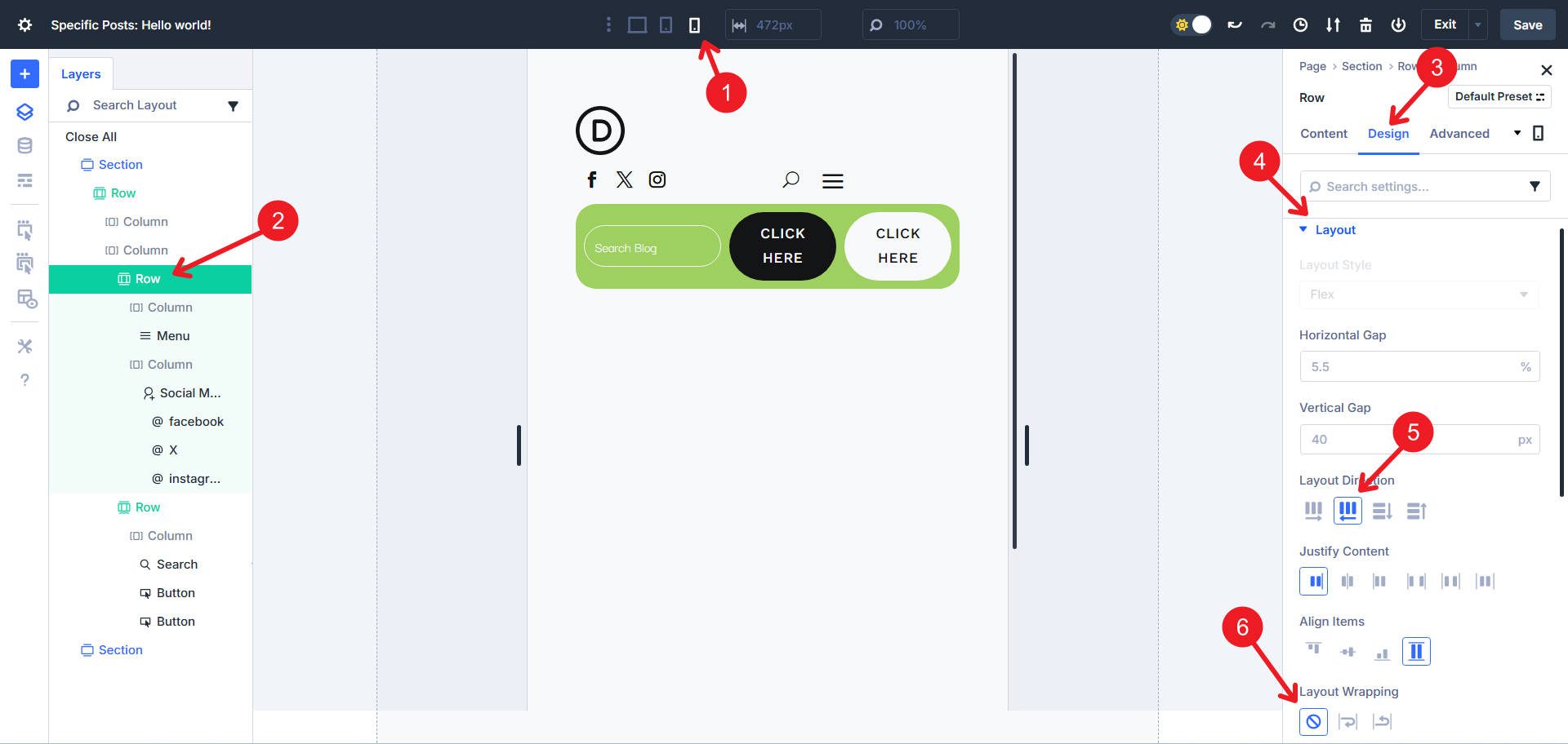
Lastly, there is a lot of work to do at the mobile breakpoint. Make the first nested row have a Layout Direction of Row Reverse (if it isn’t already) and ensure it is set to No Wrap.
Then, we will again adjust the column sizes to set them both to No Column Class and to have only the column with the social icons Grow to Fill.
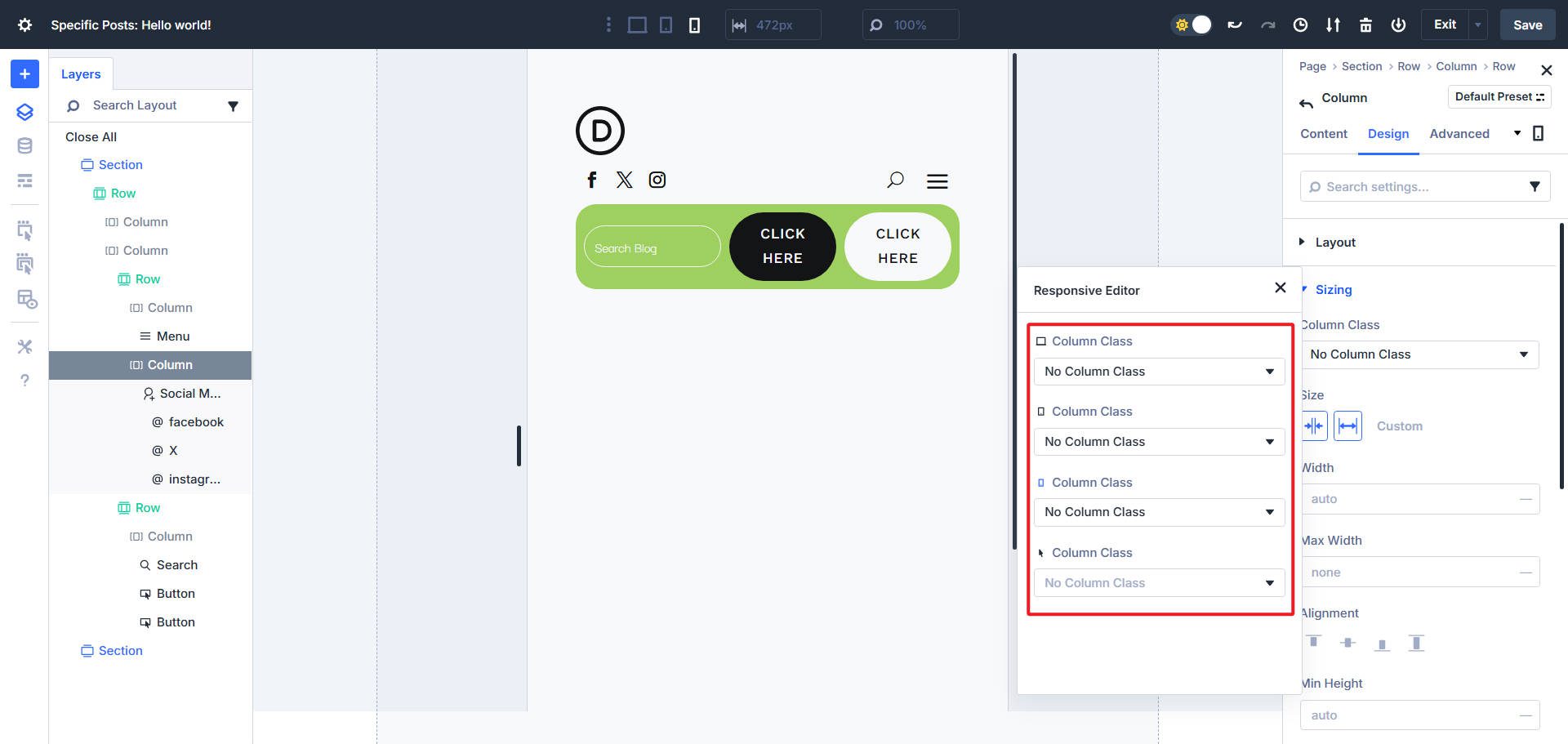
We could have completed this step above if we had used the Responsive Editor, which is a good reason to become familiar with it. With it, you can adjust the same Design settings across multiple breakpoints in a single view.
Finally, we’ll break the utility nested row into two flex rows by allowing it to Wrap. Then, make the search Module a Width of 100%. If you prefer, you can Justify Content to the Center.
Download 20 Flexbox Headers For Divi 5
Get all 20 Flexbox headers for free, including both Default and Prestyled versions. Each header is ready to import into your Divi Library and use in the Theme Builder. Just download and start building.

Build Your Flexbox Headers In Divi 5 Today
Use this header as a starting point for your experiments. Add a sticky state for the desktop. Add an announcement strip above the main row. Try building this with a few containers by replacing some Nested Rows and their columns with Groups.
Mastering Flexbox in Divi 5 takes some practice. There are habits that you would use in a Block layout that aren’t best practices in a Flex layout. But you get a new universe of potential when you make the switch (when you are ready).
Flex is just one of dozens of new features and improvements that Divi 5 users are using today.


Leave A Reply