
Every week, we provide you with new and free Divi layout packs which you can use for your next project. For one of the layout packs, we also share a use case that’ll help you take your website to the next level.
This week, as part of our ongoing Divi design initiative, we’re going to show you how to create a swipe menu bar for your website using the Mortgage Broker Layout Pack. This is a great way to add interaction to your website. You’ll have the same user experience across all screen sizes and you can use this technique for any kind of website you’re building.
Let’s get to it!
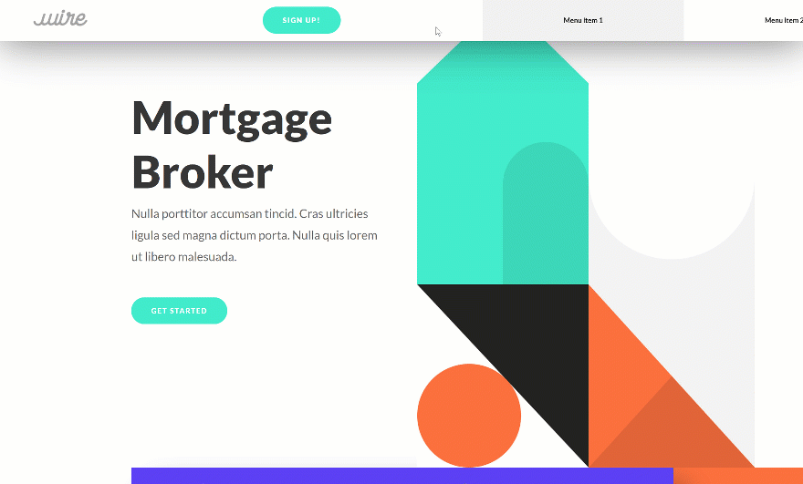
Preview
Before we dive into the tutorial, let’s take a quick look at the outcome across different screen sizes.
Desktop
Mobile

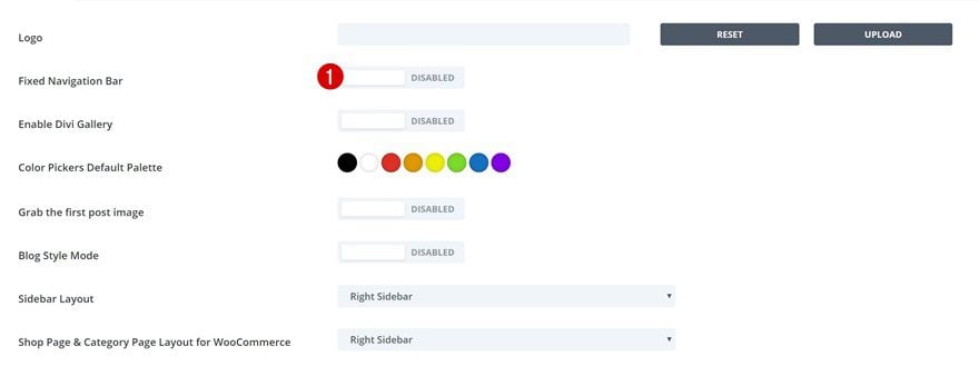
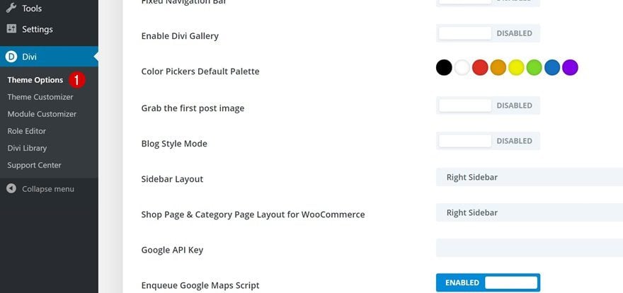
Go to Divi Theme Options
Let’s get started! The first thing you’ll need to do is go to the Divi theme options on your WordPress website.
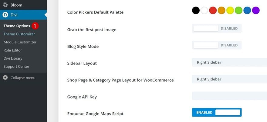
Here, we’re going to disable the fixed navigation bar. We need to disable this option in order to completely get rid of the primary menu bar on our page later on this tutorial.
- Fixed Navigation Bar: Disabled
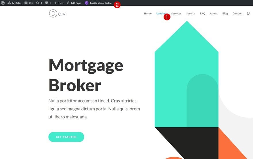
Enable Visual Builder on Mortgage Broker Layout Pack Landing Page
Continue by going to the page you’ve created using the Mortgage Broker Layout Pack‘s landing page and enable the Visual Builder.
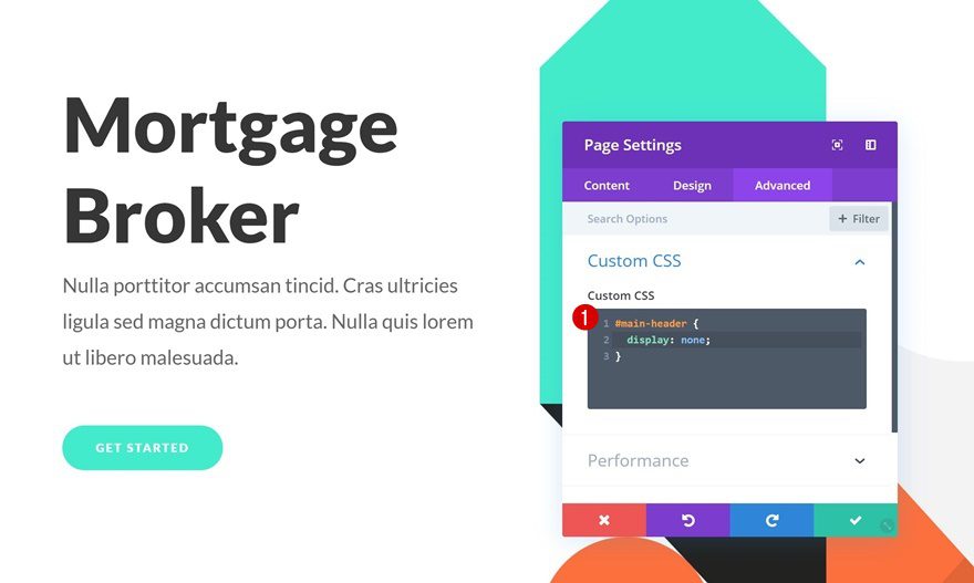
Open Page Settings
We’re going to hide the primary menu bar on our page by adding some CSS code. To add this code, open the page settings.

Then, go to the advanced tab and place the following lines of CSS code in the Custom CSS box:
#main-header {
display: none;
}
Adding this code will help prevent the primary menu bar from showing up on the page.
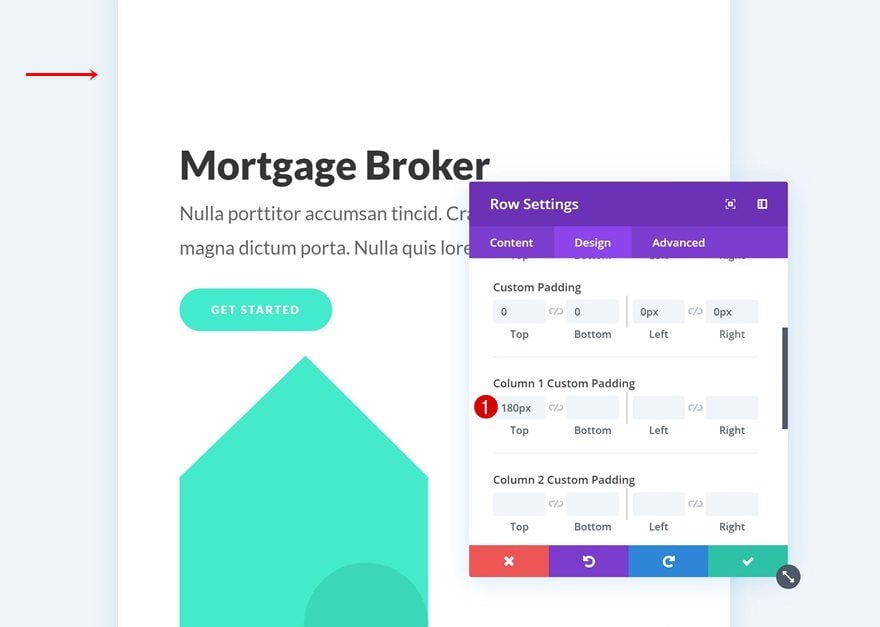
Make Sure There’s Enough Top Padding in Hero Section Across All Screen Sizes
Now that we’ve gotten rid of the primary menu bar on our page, we can start adding the swipe menu bar instead! The first thing you’ll need to do is make sure that there’s enough padding at the top of your page so the swipe menu bar won’t overlap any existing content. For the Mortgage Broker Layout Pack’s landing page in particular, that means making sure the column 1 custom padding remains ‘180px’ across all screen sizes.
- Top Padding: 180px
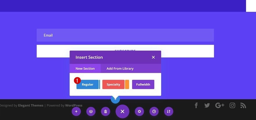
Add New Regular Section to Bottom of Page
Time to start creating the custom swipe menu bar! Add a regular section to the bottom of your page.
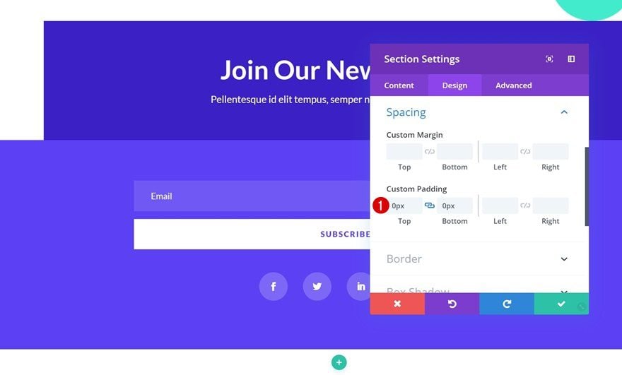
Spacing
Open the section settings and remove all the default top and bottom padding.
- Top Padding: 0px
- Bottom Padding: 0px
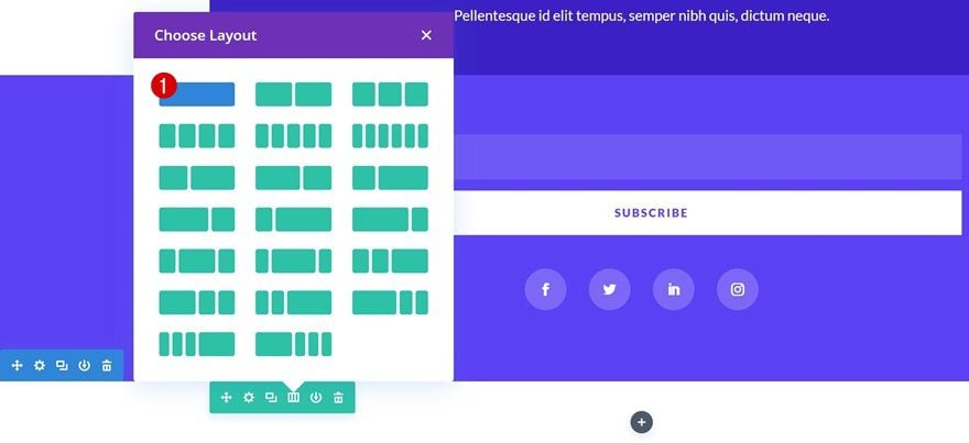
Add Row
Column Structure
Continue by adding a new row using the following column structure:
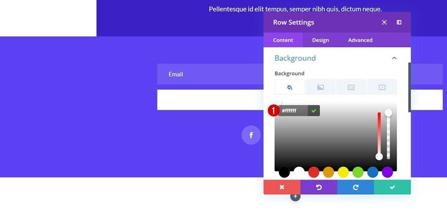
Background Color
Open the row settings and change the row background color into white.
- Background Color: #ffffff
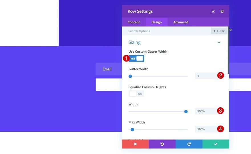
Sizing
Then, open the row settings and change the sizing settings to allow the row to take up the entire width of the screen:
- Use Custom Gutter Width: Yes
- Gutter Width: 1
- Width: 100%
- Max Width: 100%
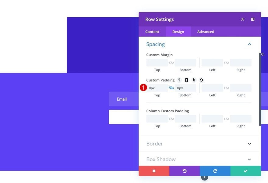
Spacing
Remove all top and bottom padding next.
- Top Padding: 0px
- Bottom Padding: 0px
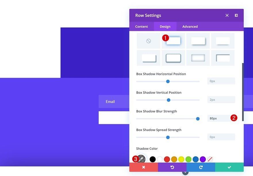
Box Shadow
And to make sure there’s enough depth between the swipe menu bar and the page itself, we’re going to add a box shadow.
- Box Shadow Blur Strength: 80px
- Shadow Color: rgba(0,0,0,0.55)
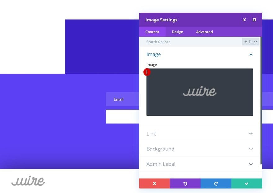
Add Image Module
Upload Company Logo
Time to start adding all the modules we want to show up in the swipe menu bar, starting with an Image Module. Upload your logo using an image file with 226px width and 100px height.
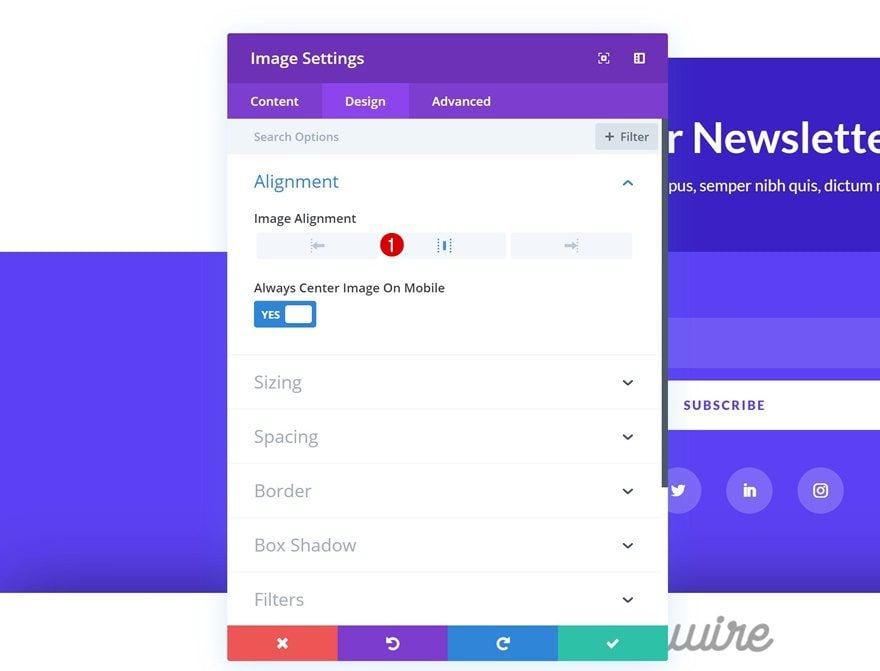
Alignment
Then, go to the design tab of the Image Module and change the image alignment.
- Image Alignment: Center
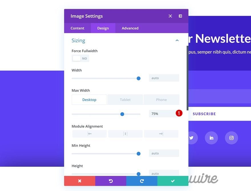
Sizing
Change the sizing settings of the image next.
- Max Width: 75% (Desktop), 100% (Tablet & Phone)
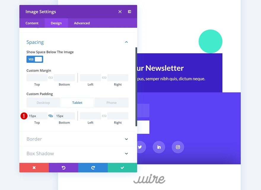
Spacing
And add some custom top and bottom padding to the image as well.
- Top Padding: 15px (Tablet), 25px (Phone)
- Bottom Padding: 15px (Tablet), 25px (Phone)
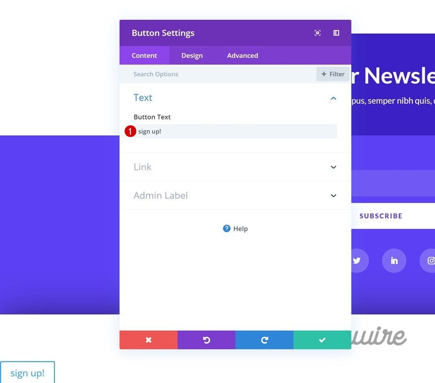
Add Copy
The second module we need is a Button Module. Add some copy of your choice.
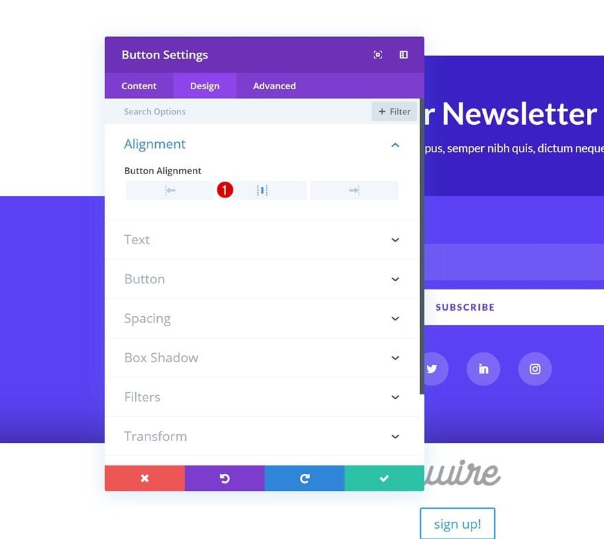
Alignment
Then, go to the design tab and change the button alignment.
- Button Alignment: Center
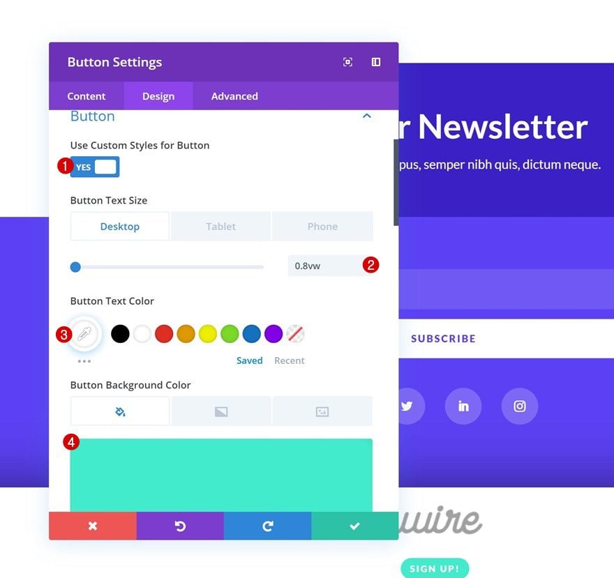
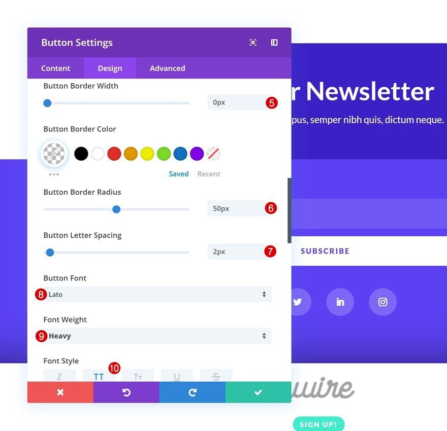
Button Settings
Modify the appearance of the button next.
- Use Custom Styles for Button: Yes
- Button Text Size: 0.8vw (Desktop), 1.4vw (Tablet), 2.1vw (Phone)
- Button Text Color: #ffffff
- Button Background Color: #40eccc
- Button Border Width: 0px
- Button Border Radius: 50px
- Button Letter Spacing: 2px
- Button Font: Lato
- Font Weight: Heavy
- Font Style: Uppercase
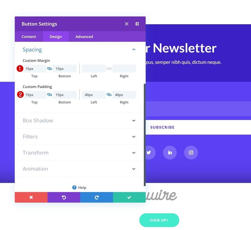
Spacing
And create the shape you want using custom margin and padding values.
- Top Margin: 15px
- Bottom Margin: 15px
- Top Padding: 15px
- Bottom Padding: 15px
- Left Padding: 40px
- Right Padding: 40px
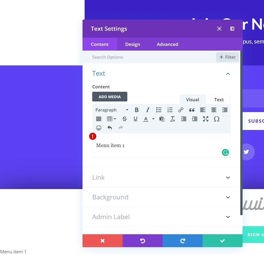
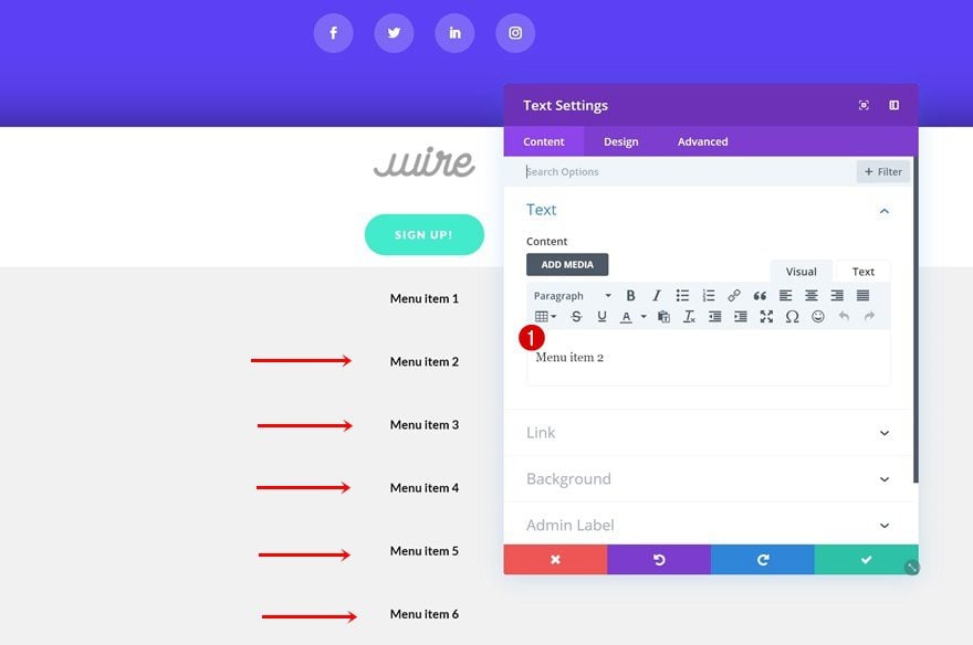
Add Text Module #1
Add Menu Item to Content Box
The next module we need in our swipe menu bar is a Text Module. Here, we’re going to add the page title to the content box.
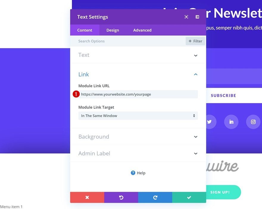
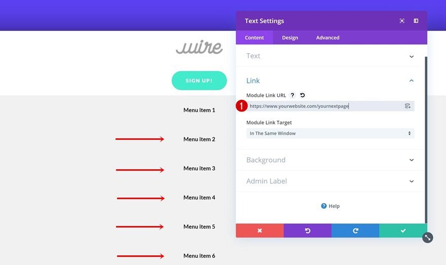
Add Link
Move on to the link settings and add the correct link to the Text Module.
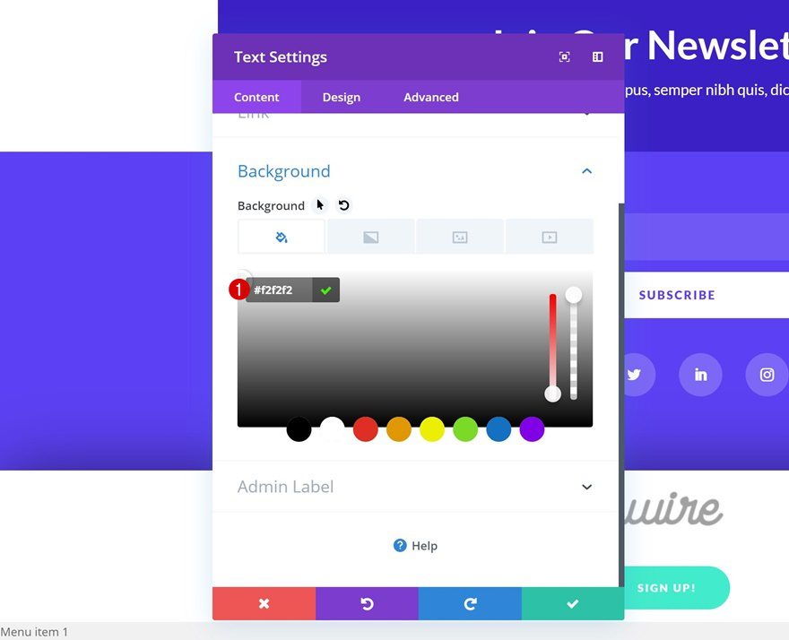
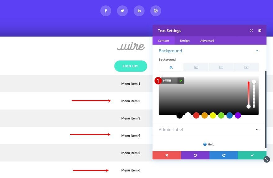
Background Color
Modify the background color next.
- Background Color: #f2f2f2
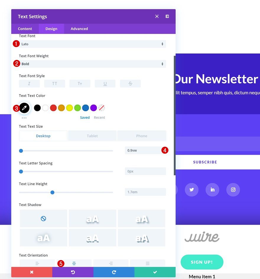
Text Settings
Then, change the text settings.
- Text Font: Lato
- Text Font Weight: Bold
- Text Color: #000000
- Text Size: 0.9vw (Desktop), 1.9vw (Tablet), 2.4vw (Phone)
- Text Orientation: Center
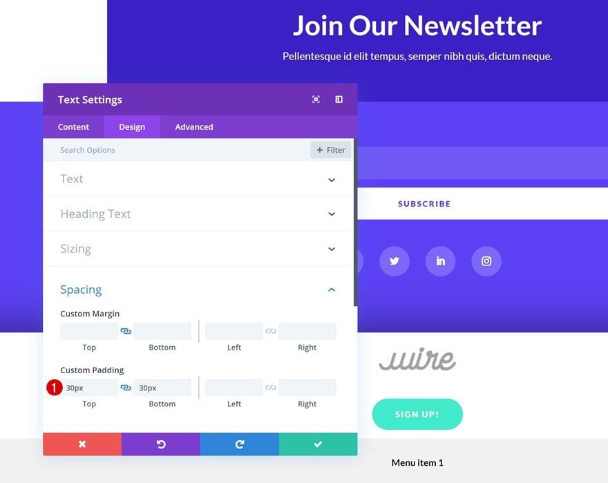
Spacing
And add some custom top and bottom padding to the module as well.
- Top Padding: 30px
- Bottom Padding: 30px
Clone Text Module x5 Times
Once you’re done modifying the Text Module, you can go ahead and clone it 5 times.
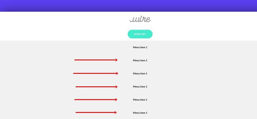
Change Copy
Make sure you change the page title in each one of these duplicates.
Change Links
Along with the links.
Change Background Colors
Modify the background colors of the second, fourth and sixth menu item next.
- Background Color: #ffffff
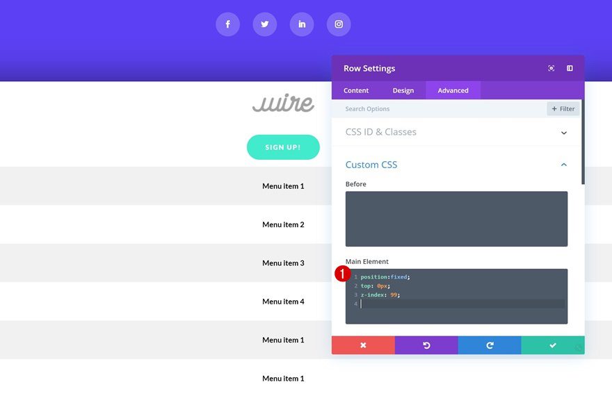
Add Custom CSS to Row
Main Element
Now, to make sure the swipe menu bar sticks to the top of the page, we’ll need to add a few lines of CSS code to the main element of the row.
position:fixed;
top: 0px;
z-index: 99;
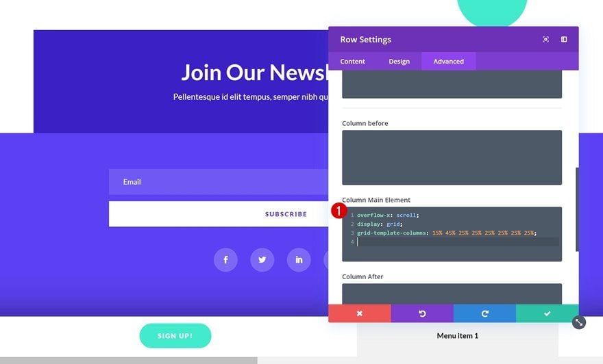
Column Main Element
We’re also turning the column into a grid that allows us to scroll. The percentages that you can see in the CSS code below indicate how much space each one of the modules takes up in the grid. You can modify these values if you want your grid to look differently.
overflow-x: scroll;
display: grid;
grid-template-columns: 15% 45% 25% 25% 25% 25% 25% 25%;
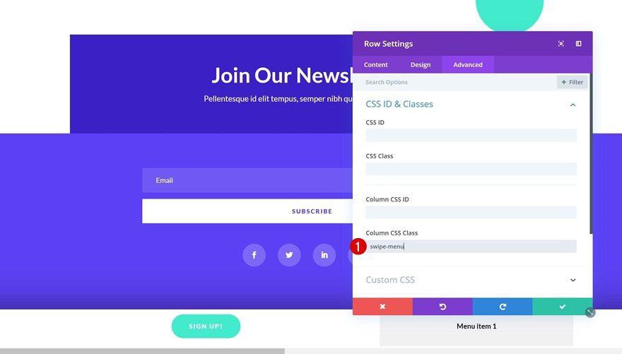
Column CSS Class
And to get rid of the scrollbar, we’re going to add a CSS class to the row as well.
Remove Scrollbar
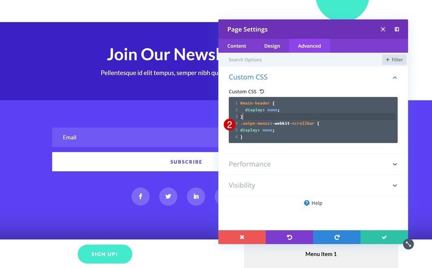
On the Page
You can remove the scrollbar on the page itself by opening the page settings and adding the following lines of CSS code to the Custom CSS box:
.swipe-menu::-webkit-scrollbar {
display: none;
}
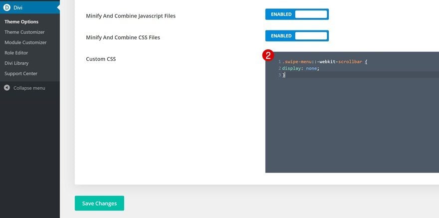
On Entire Website
If you don’t want to repeat the same step of hiding the scrollbar on each page individually, you can also go to the Divi theme options and make the CSS code apply to the entire website by scrolling down the general tab and adding the following lines of CSS code to the Custom CSS box:
.swipe-menu::-webkit-scrollbar { display: none; }
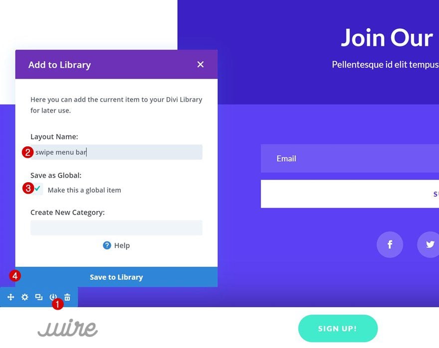
Save as Section as Global Item
Once your swipe menu bar is functioning properly, you can save it to your Divi library as a global item and use it on other pages as well!
Preview
Now that we’ve gone through all the steps, let’s take a final look at the outcome across different screen sizes.
Desktop
Mobile
Final Thoughts
In this post, we’ve shown you how to create a swipe menu bar for any website you creating using Divi. This is a great technique for adding another dimension to your website. This tutorial is part of our ongoing Divi design initiative, where we try to put something extra into your design toolbox each and every week. If you have any questions or suggestions, make sure you leave a comment in the comment section below!


The::-webkit-scrollbar is not supported in Firefox. This feature will not work in the Firefox browser for desktop or Firefox browser for smartphones or in Edge.
It is supported in Chrome, Safari, and Safari for iOS.
It has very poor cross browser support. I like the idea as I’m all for breaking rules and taking design risks with UI, but with it not being well supported, I wouldn’t recommend doing it.
Do you think this type of menu bar is the wave of the future for mobile pages? I’m trying to take my site to the next level, but don’t wanna go too far too fast and turn-off my traffic, which leans towards 40’s and 50 years in age range.
Good job ! arfff I must have done a mistake, scroll bar still appears on mozilla et automatic scroll on hover doesn’t work on chrome 🙁 any idea. Mobile is really fine !
I’m experiencing the same. Still see scrollbar on Firefox and doesn’t scroll on Chrome.
Thank you for the share. I tried this, and it works.
This is nice. I would probably want an arrow on the left and right of this menu so users know that it’s scroll-able?
But well done on this. I’m keeping it in my bag of tricks!!
So beautiful, fun and modern! Looove it! Especially for the mobile version. Thanks a lot, Donjete! That was a unique idea!
Well done!
As stated by Chris I think an arrow at either end or some indication that there is more menu than what is visible
Nice. I’d probably want an arrow on the left or right edge for indicating the off-screen options, but, options are always good…
Nice tutorial! Would it be possible to do this without changing settings for the main menu? I would like to create a secondary navigation to use above the content on few of my pages with exactly this feature.
What indication does the user have to know to swipe? As this is not a normal interaction, I presume there has to be something or the user will presume only the menus that show as being what is available.
Is the a bounce showing menu motion?
very nice how the blog and the articles???
It would be really helpful if you could provide a link to a live page that integrates the feature being described above. This comment seems to apply to many of the features you post about.
I looked at the post but am not sure exactly how the feature would work on an actual page.
You do a very good job of explaining how to create it but the perfect finish would be an actual page with that feature.
It looks like it exists because the article has pictures of it.
So much for UX.
Have to agree. While the idea looks good, in terms of usability it’s not great. On desktop you need to know about holding down the shift key on the keyboard to scroll horizontally and if you click to drag you hit the navigation links.
Could this have left/right arrows so if it’s not that evident it’s swipeable the user could still use it? like a carousel?
Only way I could think of indicating that this requires the user to actually swipe is by adding pseudo elements on either side of the actual parent, without allowing it to move along with the actual swiping bar. Using the :before and :after to add arrows on either side that is positioned the same way as the bar without being super obtrusive.