
Sidebars can be great, but they can also be a waste of space. That’s why creating a sliding push sidebar can be a perfect option for those looking to have a sidebar that doesn’t distract the user from the main content of the page. Moreover, this kind of a sidebar gives the user the option to see or hide the sidebar whenever they want.
The sliding push effect does is unique in that the sidebar slides in from the left side of the page while simultaneous pushing (or squeezing) the main content of the page in order to fit the sidebar in the viewport. In short, it slides the sidebar and pushes the page.
Once the sidebar is built, it becomes a versatile tool for all types of applications, including menus and forms.
Let’s get to it!
Sneak Peek
Here is a quick look at the design we’ll build in this tutorial.
Download the Layout for FREE
To lay your hands on the sliding push sidebar layout from this tutorial, you will first need to download it using the button below. To gain access to the download you will need to subscribe to our newsletter by using the form below. As a new subscriber, you will receive even more Divi goodness and a free Divi Layout pack every Monday! If you’re already on the list, simply enter your email address below and click download. You will not be “resubscribed” or receive extra emails.

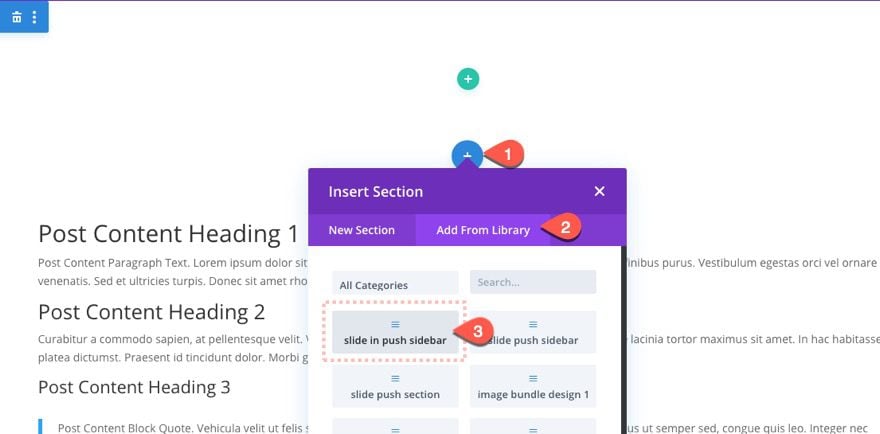
To import the section layout to your Divi Library, navigate to the Divi Library.
Click the Import button.
In the portability popup, select the import tab and choose the download file from your computer.
Then click the import button.

Once done, the section layout will be available in the Divi Builder.
To add it to a page or template, you will need to add a new section and choose the section layout from the library.
Let’s get to the tutorial, shall we?
What You Need to Get Started
To get started, you will need to do the following:
- If you haven’t yet, install and activate the Divi Theme.
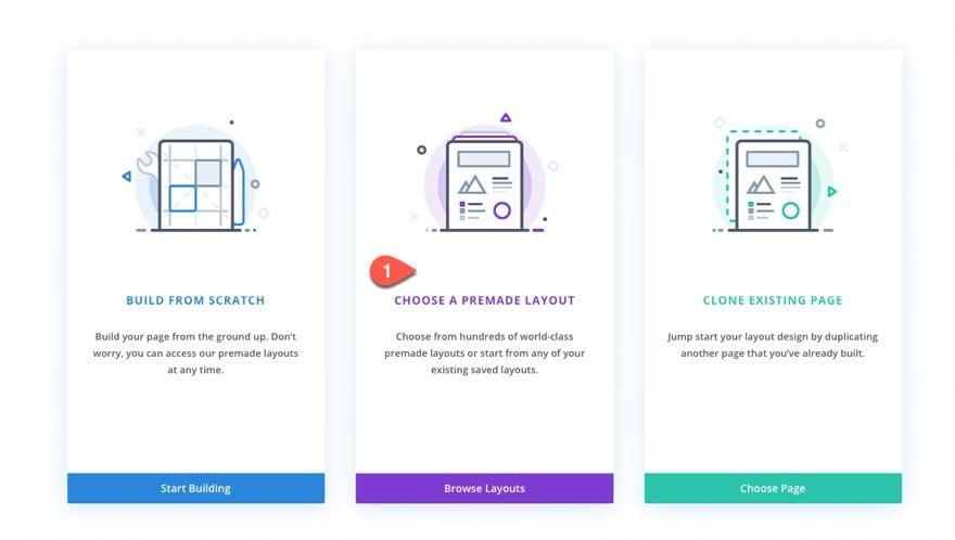
- Create a new page in WordPress and use the Divi Builder to edit the page on the front end (visual builder).
- Choose the option “Choose a Premade Layout”.
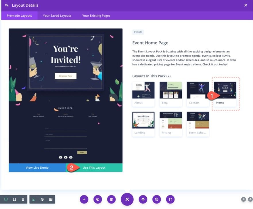
- Choose the Event Layout Pack and click to use the Event Home Page layout.
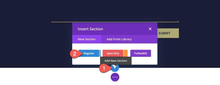
To create the Sliding Push Sidebar, we are going to need to use a new regular section. We will size and position the section to become a fixed sidebar that opens when clicking a button, pushing (and squeezing) the main content area on the right to make room for the sidebar.
Building the Section
First, let’s add a new regular section to the page.
Then move the section at the top of the page.

Section Settings
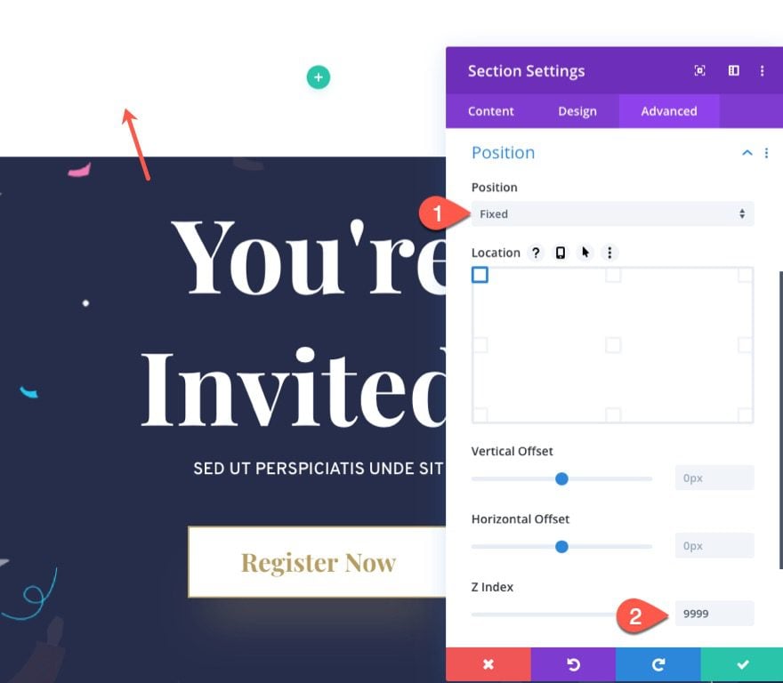
Open the section settings and update the position to be fixed as follows:
- Position: Fixed
- Z Index: 9999
Under the design tab, update the size and spacing as follows:
- Width: 350px (desktop and tablet), 100% (phone)
- Height: 100%
- Padding: 100px top, 0px bottom
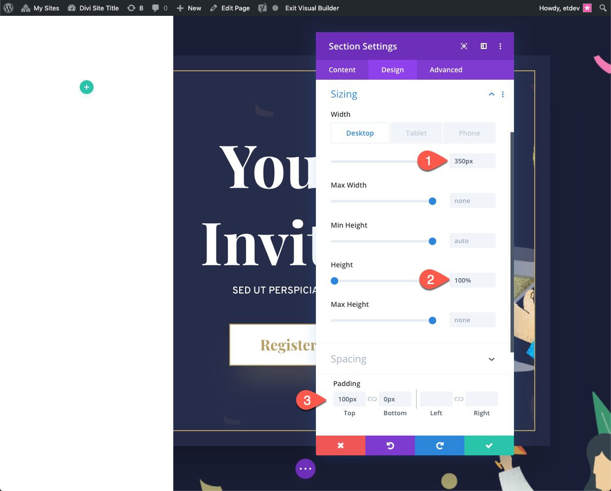
The padding is to make room for the header at the top of the page.
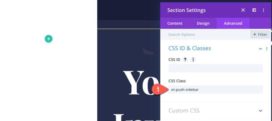
Next, under the advanced tab, give the section a CSS Class:
- CSS Class: et-push-sidebar
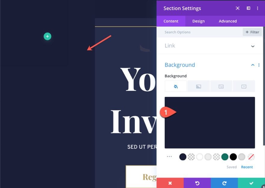
Once the css class is in place, give the section a background color:
- Background Color: #1a1e36
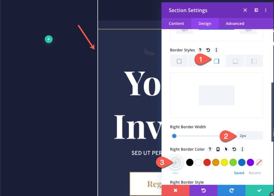
To create a more noticeable separation, go back to the design tab, and add a right border.
- Right Border Width: 2px
- Right Border Color: #eeeeee
That takes care of the section which serves as the main container for our sidebar. Now its time to start building the two buttons that we will use to toggle the sidebar open and then closed.
There will be two buttons used to toggle the sidebar. The first button will be an “X” icon that will close the mobile version of the sidebar after it is opened. The “X” will be built using a blurb module. The second is the main toggle button which we’ll build using a blurb module that is rotated with vertical text and positioned absolutely adjacent to the sidebar/section.
Let’s get to it.
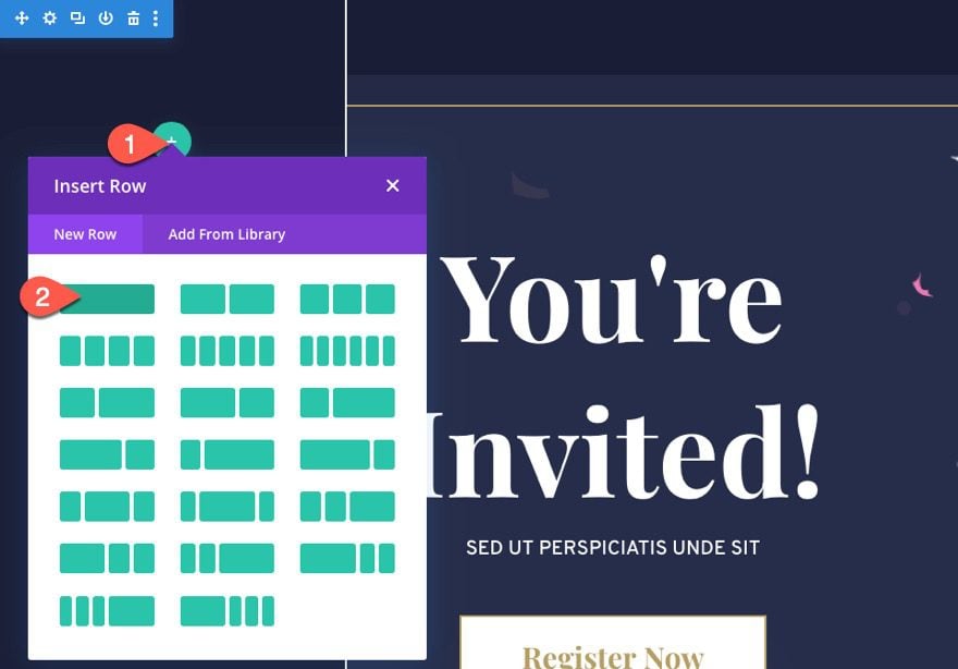
Creating the Row for the Buttons
Create a new one-column row inside the section/sidebar.
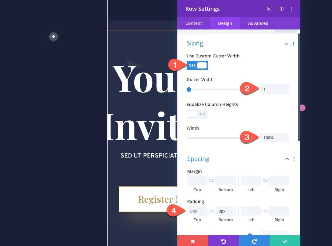
Open the row settings and update the following:
- Gutter Width: 1
- Width: 100%
- Padding: 0px top, 0px bottom
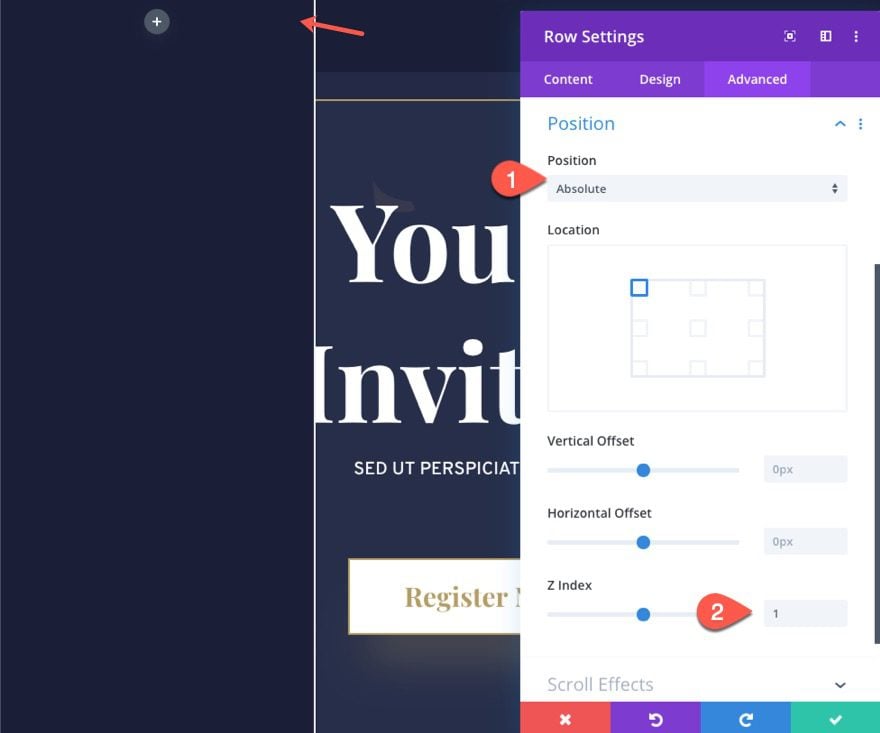
Under the Advanced tab, update the position options as follows:
- Position: Absolute
- Z Index: 1
Creating the “X” Close Icon
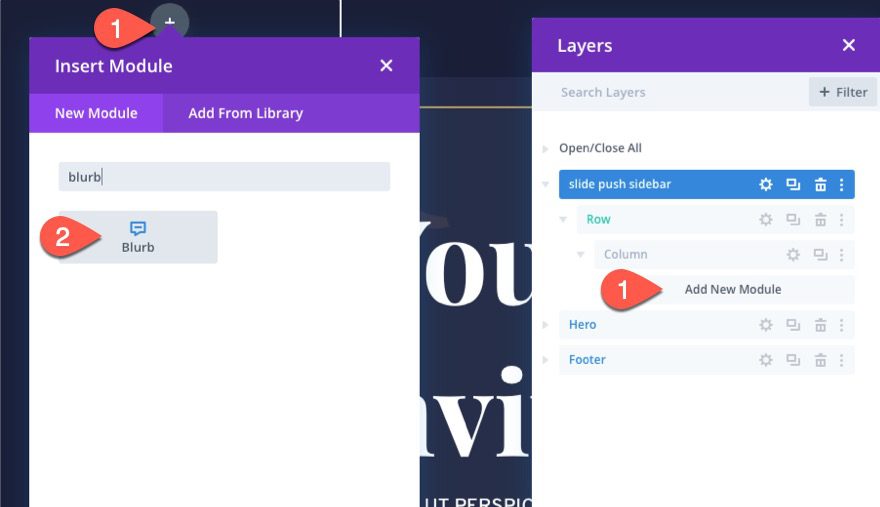
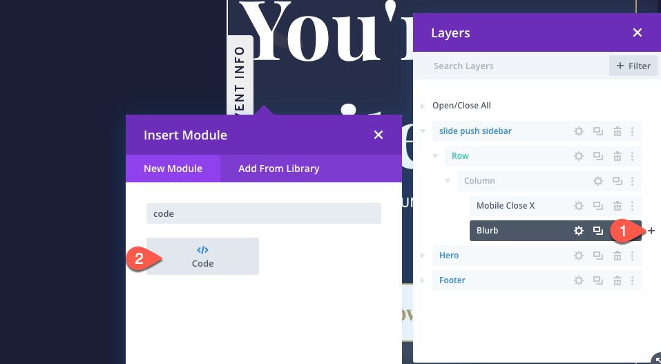
To create the “X” Close Icon, add a blurb module to the row. It may be easier to add a new module using the Layers modal because things will be a little difficult to click.
Content
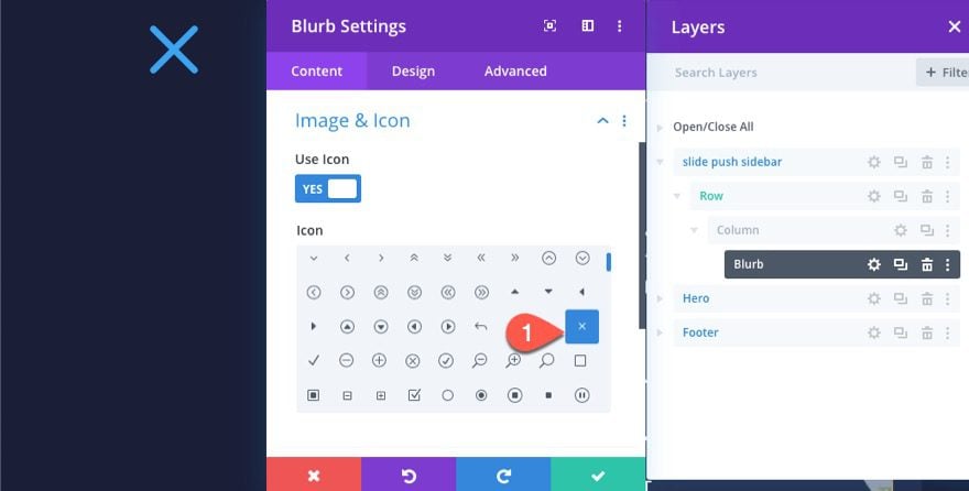
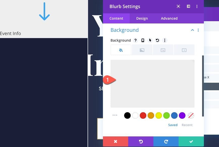
Then open the blurb settings. Under the content tab, take out the title and body content and add the X icon to the blurb.
- Use Icon: YES
- Icon: x (see screenshot)
Design
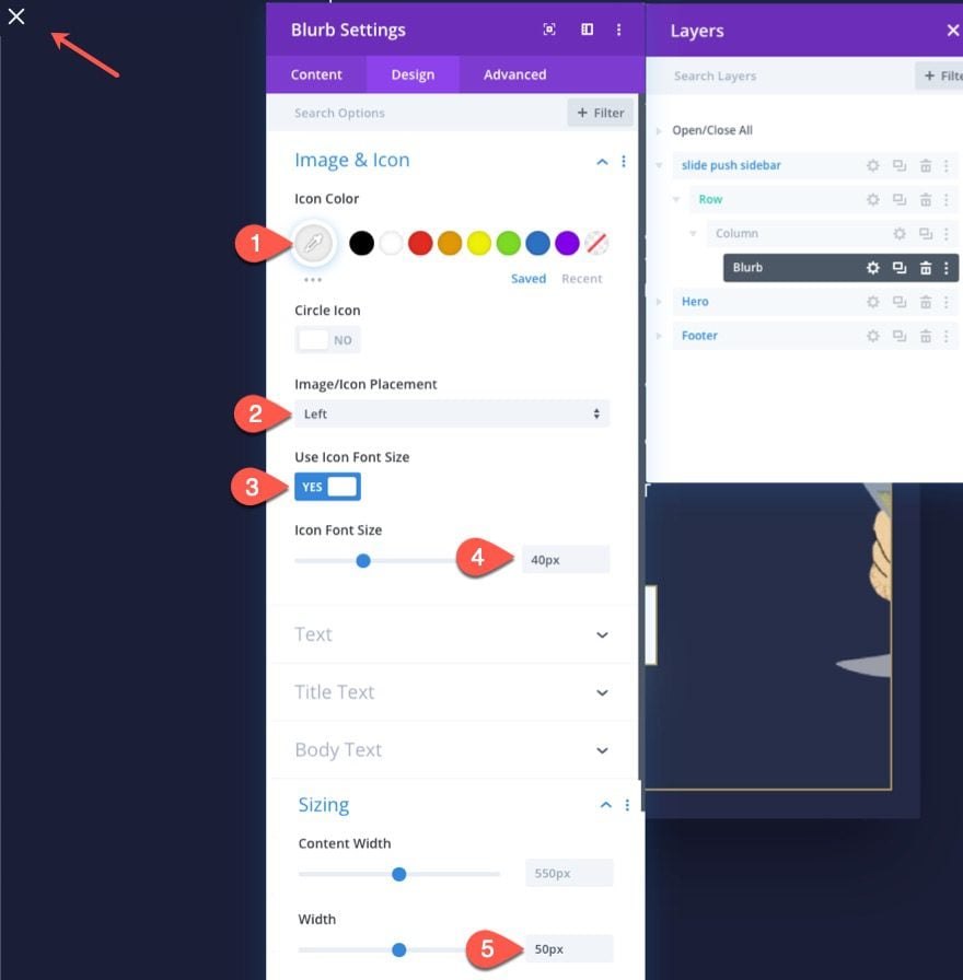
Under the design tab, update the following:
- Icon Color: #eeeeee
- Image-Icon Placement: Left
- Use Icon Font Size: YES
- Icon Font Size: 40px
- Width: 50px
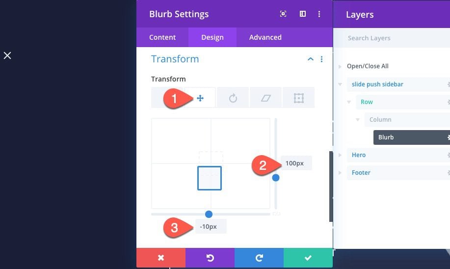
Next, bring the icon down a bit by adding the following transform translate property:
- Transform Translate X : 100px
- Transform Translate Y : -10px
Advanced
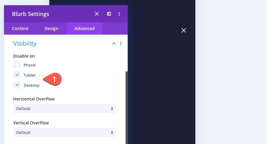
Under the Advanced tab, disable the blurb on tablet and desktop so that we only see it on phone display.
- Disable On: tablet and desktop
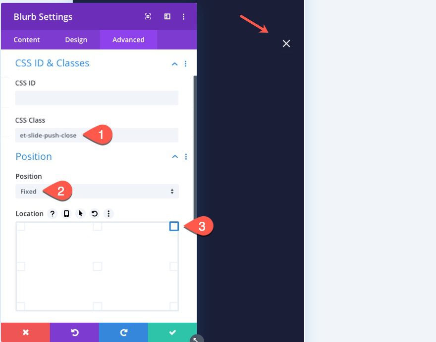
Then add a CSS Class to the blurb and give it a fixed position so that it stays in view when scrolling through sidebar content on phone display.
- CSS Class: et-slide-push-close
- Position: Fixed
- Location: Top Right
That takes care of the “X” Close Icon button.
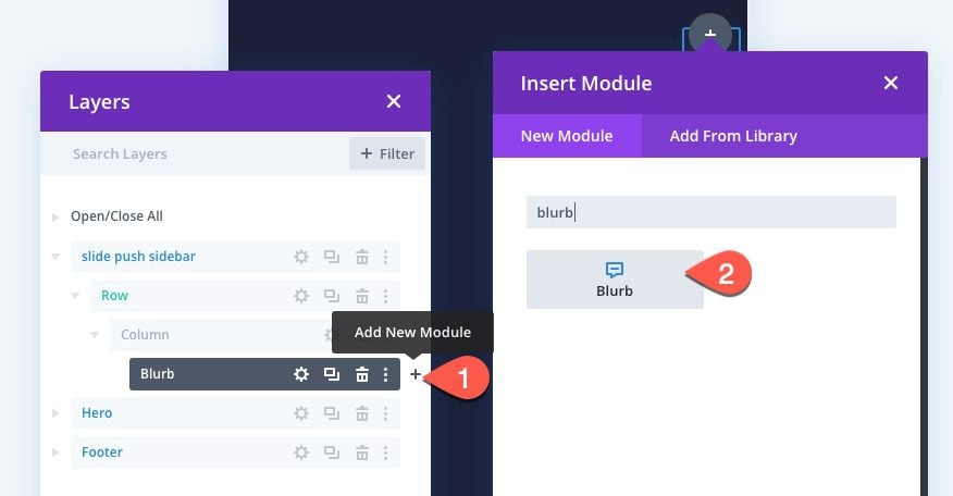
Creating the Main Sidebar Toggle Button
To create the Main Sidebar Toggle Button, add a blurb module under the existing “X” icon blurb.
Content
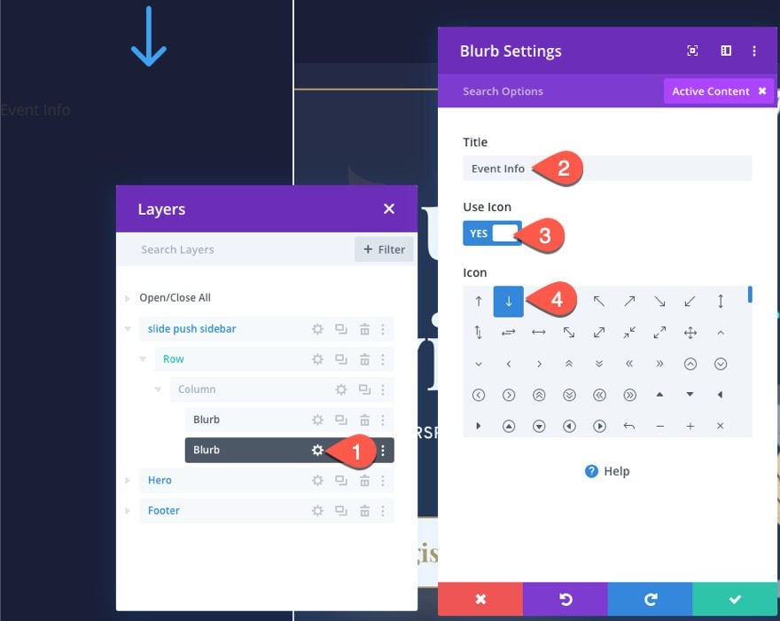
The update the Title and click to use the down arrow icon.
- Title: Event Info
- Use Icon: YES
- Icon: down arrow (see screenshot)
Next, add a background color to the blurb.
- background color: #eeeeee
Design
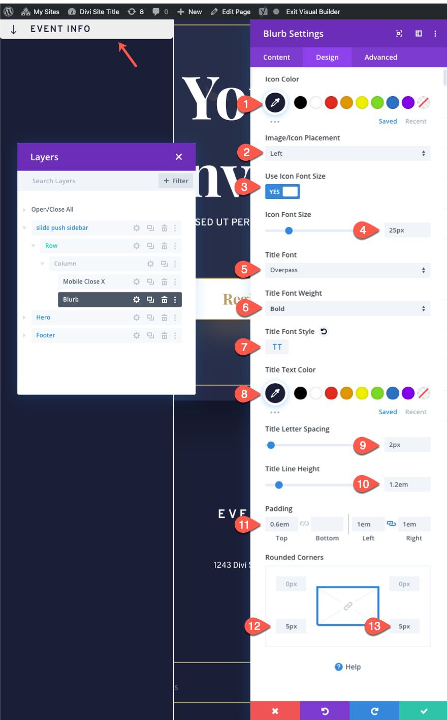
Under the design tab, update the following:
- Icon Color: #1a1e36
- Image/Icon Placement: Left
- Use Icon Font Size: YES
- Icon Font Size: 25px
- Title Font: Overpass
- Title Font Weight: Bold
- Title Font Style: TT
- Title Text Color: #1a1e36
- Title Letter Spacing: 2px
- Title Line Height: 1.2em
- Padding: 0.6em top, 1em left, 1em right
- Rounded Corners: 5px on bottom two corners
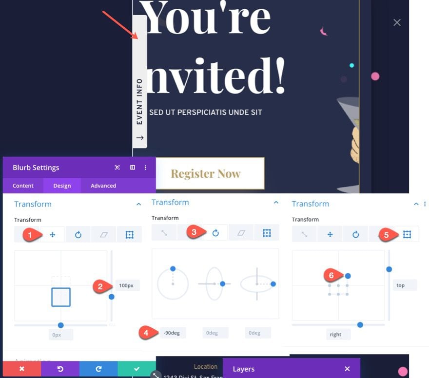
To position and rotate the blurb outside of the section, use the transform options as follows:
- Transform Translate Y : 100px
- Transform Rotate Z : -90deg
- Transform Origin: top right
Advanced
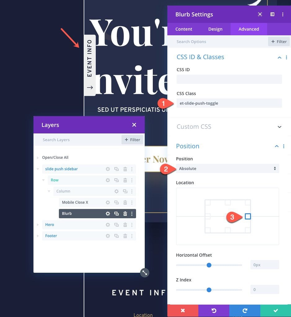
Under the Advanced tab, update the following:
- CSS Class: et-slide-push-toggle
- Position: Absolute
- Location: Right Center
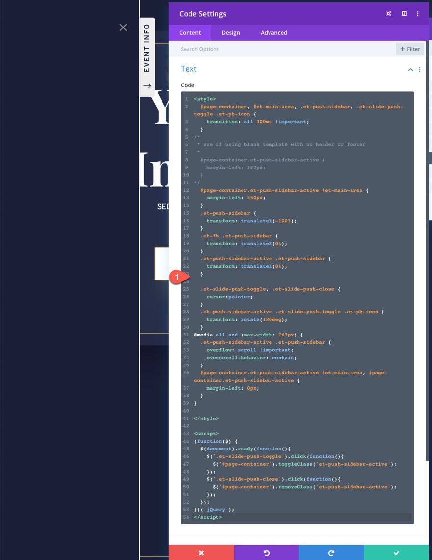
Adding Custom Code with a Code Module
Once the two buttons are complete, we are ready to add the custom code that will provide the sliding push functionality we need for the sidebar.
To add the code, first, add a code module to the same column.
Then paste the following code into the code module.
<style>
  #page-container, #et-main-area, .et-push-sidebar, .et-slide-push-toggle .et-pb-icon {
    transition: all 300ms !important;
  }
/*
 * use if using blank template with no header or footer
 *
  #page-container.et-push-sidebar-active {
    margin-left: 350px;
  }
*/
  #page-container.et-push-sidebar-active #et-main-area {
    margin-left: 350px;
  }
  .et-push-sidebar {
    transform: translateX(-100%);
  }
  .et-fb .et-push-sidebar {
    transform: translateX(0%);
  }
  .et-push-sidebar-active .et-push-sidebar {
    transform: translateX(0%);
  }
  .et-slide-push-toggle, .et-slide-push-close {
    cursor:pointer;
  }
  .et-push-sidebar-active .et-slide-push-toggle .et-pb-icon {
    transform: rotate(180deg);
  }
@media all and (max-width: 767px) {
  .et-push-sidebar-active .et-push-sidebar {
    overflow: scroll !important;
    overscroll-behavior: contain;
  }
  #page-container.et-push-sidebar-active #et-main-area, #page-container.et-push-sidebar-active {
    margin-left: 0px;
  }
}
</style>
<script>
(function($) {
  $(document).ready(function(){
    $('.et-slide-push-toggle').click(function(){
      $('#page-container').toggleClass('et-push-sidebar-active');
    });
    $('.et-slide-push-close').click(function(){
      $('#page-container').removeClass('et-push-sidebar-active');
    });
  });
})( jQuery );
</script>
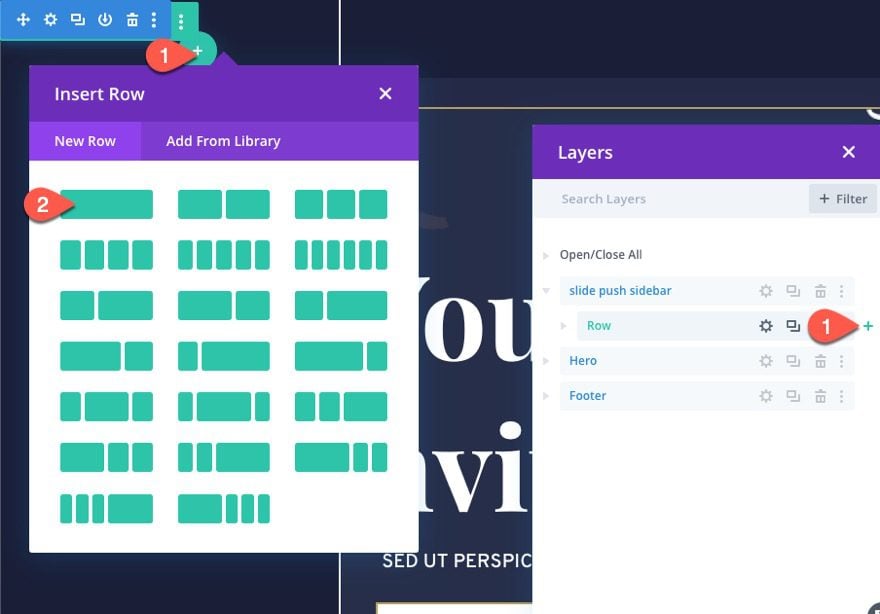
The first row we created was for the buttons and code that make the sidebar function. This next row will be for the sidebar content.
To create the sidebar content row, add a new one-column row under the first row in the sidebar/section.
Row Settings
Open the settings of the new row and udpate the following:
- Width: 100%
- Height: 100%
- Padding: 5% top, 5% bottom, 5% left, 5% right
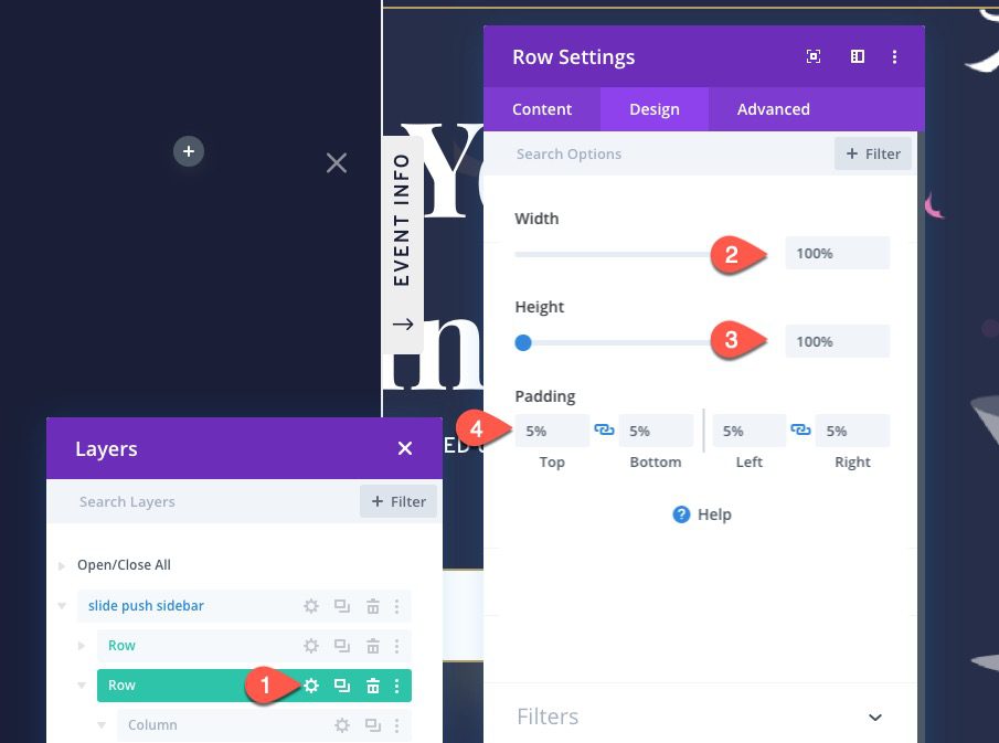
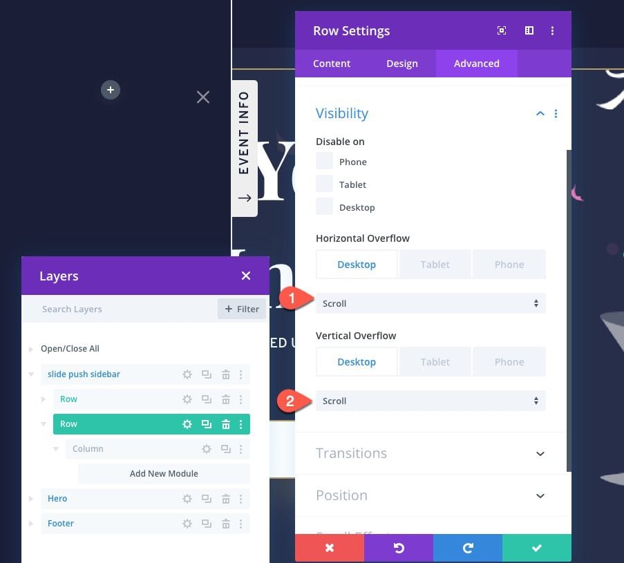
Under the Advanced tab, update the overflow options as follows:
- Horizontal Overflow: scroll (desktop and tablet), auto (phone)
- Vertical Overflow: scroll (desktop and tablet), auto (phone)
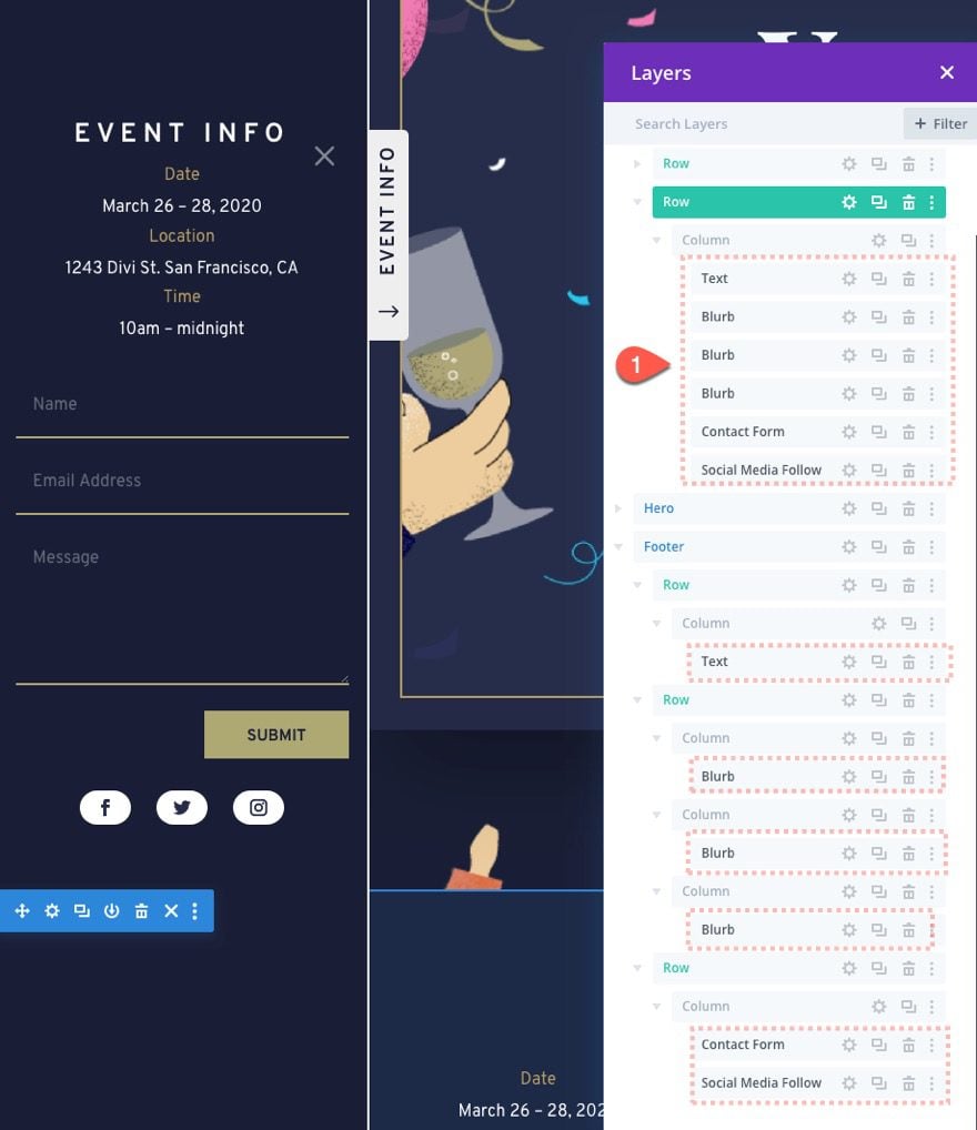
Now that your sidebar is ready, all you need to do is add any module to the second row in the sidebar as needed. For this example, I’m just copying modules from the event home page layout and pasting them in the column of the row.
Final Result
Check out the final result on the live page.
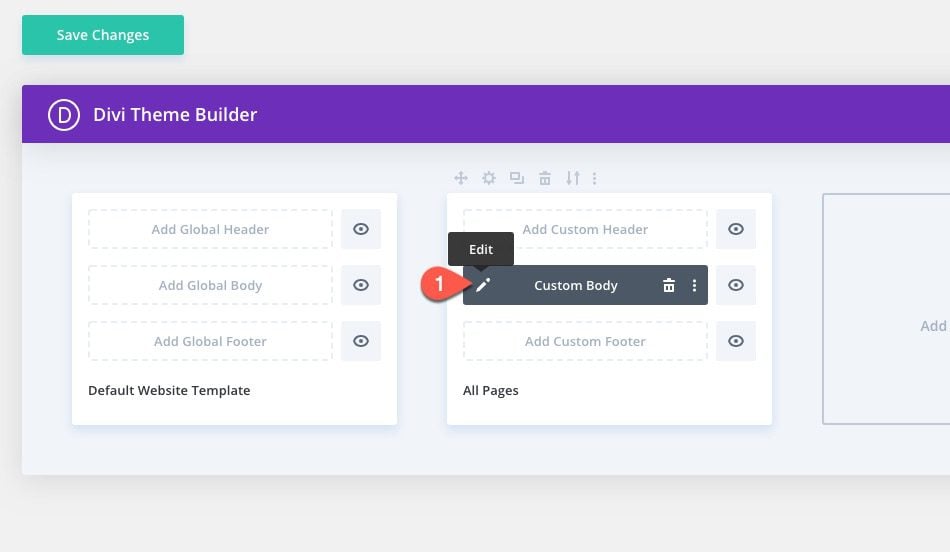
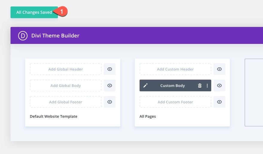
If you would like to use this sidebar on all of your pages by default, you will need to add the sidebar/section to a page template using the Divi Theme Builder.
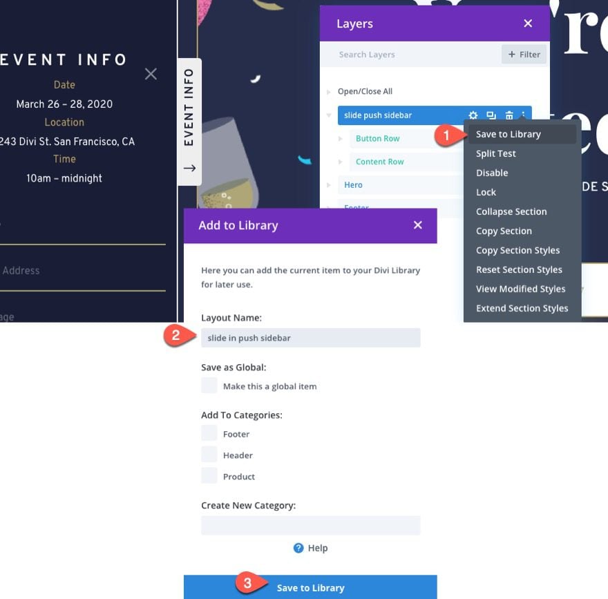
Save Section Layout to Divi Library
To do this, first, save the section that was used to create the sidebar to the Divi Library. You can do this by clicking the three dots on the sidebar in the layers modal, add the layout name, and saving it to the library.
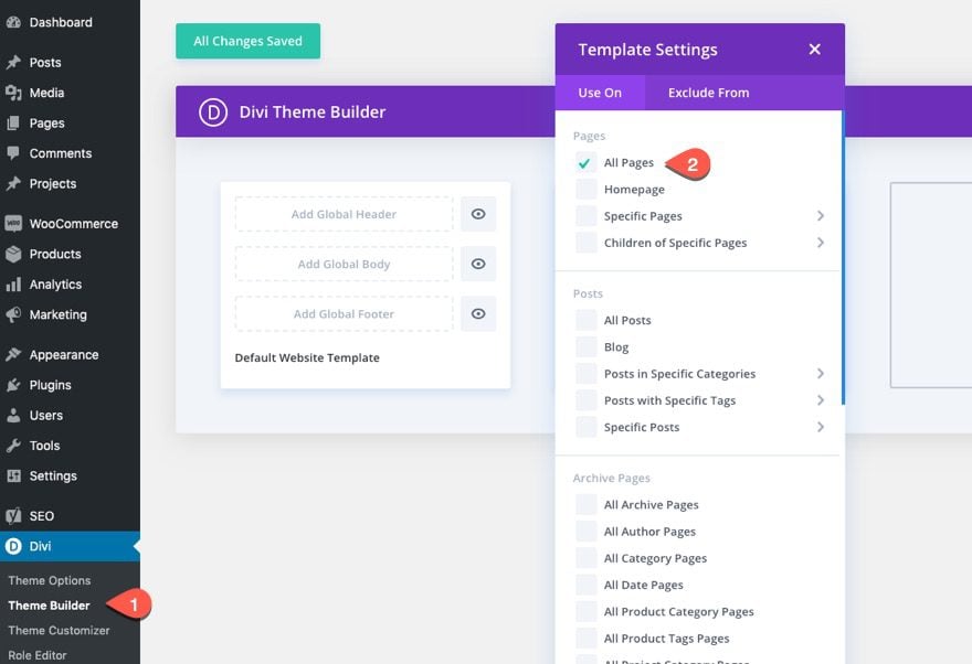
Create a New Page Template
Next, go to the theme builder and create a new template and assign that template to all pages.
Next, click to edit the page template.
Inside the template layout editor, add a new fullwidth section.
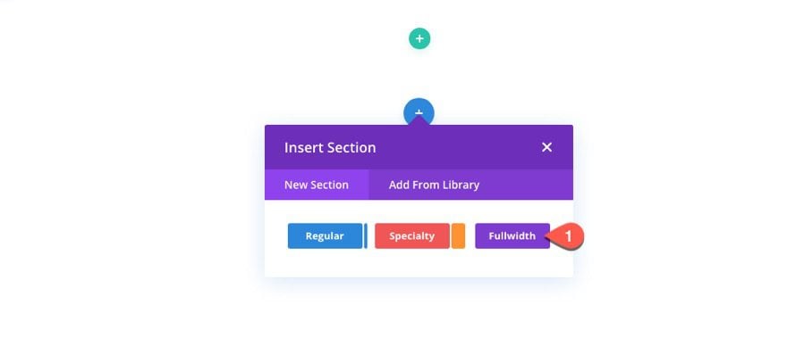
Then insert a Fullwidth Post Content module to the section.
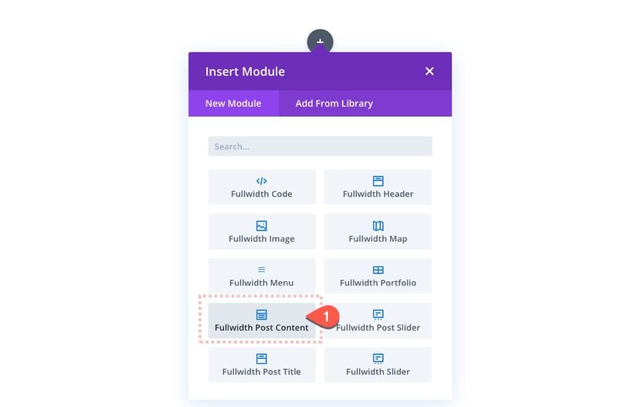
Next click to. create a new section above the fullwidth section. Then click the Add from Library tab and select the Sliding Push Sidebar section layout from the library.
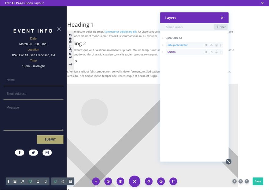
Once done, you can edit the sidebar however you need using the body layout editor.
Save Theme Builder Settings
Make sure to save the changes to the theme builder.
Now all of your pages will have the sidebar.
Final Thoughts
A sliding push sidebar is a perfect option for those of you looking for the best of both worlds – a sidebar that stays at the forefront without taking away from (or distracting) the main content of the page. Feel free to use it for all kinds of things like registration forms, email opt-ins, menus, and much more.
I look forward to hearing from you in the comments.
Cheers!


This is fantastic, I am trying to figure out how to make this work in reverse – where it starts opened and then you use the button to close it.
I’ve tried to set the class to et-push-sidebar-active without any luck, but I’m thinking there’s a change in the jquery that would resolve that.
Making these changes to the CSS section was able to accomplish what I was attempting. Mobile needs updates to that starts closed still
.et-push-sidebar {
transform: translateX(0);
}
.et-fb .et-push-sidebar {
transform: translateX(-100%);
}
.et-push-sidebar-active .et-push-sidebar {
transform: translateX(-100%);
it all worked good, but the tab is not clickable. It doesn’t open. I used the download and checked if all the css classes are all in there, but I couldn’t find what’s wrong.
Hey there, I just came across this and it works when I am logged into the site, but it isn’t visible when not logged in.
Any idea why that may be?
Thanks!
Thank you for the great post!
Have an issue on mobile. The toggle only works once then you have to refresh the page as the button disappears.
I love this post. Thanks Jason! How difficult would it be to have the button and flyout on the right hand side instead of the left?
Not difficult if you understand how it is being built. You would need to position the fixed sidebar section on the top right location. Position the tab/toggle with a left location. And update the custom CSS…
Replace this…
  #page-container.et-push-sidebar-active #et-main-area {
    margin-left: 350px;
  }
with this…
  #page-container.et-push-sidebar-active #et-main-area {
    margin-right: 350px;
  }
And replace this…
  .et-push-sidebar {
    transform: translateX(-100%);
  }
with this…
  .et-push-sidebar {
    transform: translateX(100%);
  }
That should get you close.
Thank you, very nice! However, I seem to be getting scrollbars at the left and bottom of the sidebar/ Any thoughts on how to fix this?
probably because the toggle button is overflowing on mobile. Is that what you are referring to? If so you can hide the toggle when the sidebar is active with custom css.
Hi,
Can a menu module be added with this approach?
Tom,
This should help with that… https://www.elegantthemes.com/blog/divi-resources/how-to-create-a-vertical-navigation-menu-or-header-for-your-divi-website
Thanks for creating a such a masterpiece.
You’re very welcome, Abhishek!
Very nice, thx!
Mobile close is to hard to click, hope you can fix it.
Sorry… Update the Row with the X button to have a Z Index: 12
That should fix it.
Hy Divi Team
You guys are awesome. One thing I am missing for a long time is that divi does not allow “custom animations” on any module. We have to enable divi built-in animation. And then Our custom animation will only run after the divi built-in animation has run. If I disable divi animation from animation menu. My custom animation will not run at all. (For example, I want run “slide-in-bottom-left” custom animation on text. If I disable divi animation, my animation or code for animation will not run at all. If I enable divi animation then my custom animation will only run after divi built-in animation is completed).
Divi team, many people would like to use custom javascript animations on like text and images. So pls make this feature available to us ASAP.
And Last but not least pls allow us to add code in images module like we can in text module (e.g <div, h1, p (here we can add our own code) similarly make it available in images so we can manipulate image from there by putting required tag and attributes to it.
I hope I tried to make it easy and clear to understand for you guys.
Regards,
Shehzad Asif
Front End Developer
I was looking for some good sidebar to add to one of my blogs website. Thanks for sharing the complete dive guide of sidebar. Easy to understand, full explanation.
Awesome!
thanks, very useful
I wish you would implement and show how to use it for a long menu, say list of a book’s chapters for example that each line is a link to a chapter.
Thanks
Avi,
You can easily add your own anchor links in there… https://www.elegantthemes.com/blog/divi-resources/create-a-fixed-sidebar-with-smooth-scrolling-anchor-links-with-divi
For some reason when I added this as a test, I am unable to find the close button. After I refreshed, it showed up.
But the main problem persisting is once I close or swipe the slide it to the left, It doesn’t show up again in mobile. I have to refresh.
The open button disappear once you hit the close button and cant open it again without refreshing the page. Changed the z-index of the row to 1001 but still no luck. Can you please upload the fixed library section?
Sorry about that. I fixed the layout in the download.
Hi, The open/close toggle still closes until refresh on mobile. I used the downloaded layout! Are you sure it’s fixed? Otherwise, what settings must I change?
Thanks!
Sorry about that. I’m unable to recreate this on my end. I’ll look into some more. It might be an issue with Z Index not being high enough on the “X”.
Great post! I am having this issue as well, however. Were you able to find a fix?
See my reply to Tom. Was that the issue you are referring to?