
Now that you can use woo modules in Divi, the only limit is your imagination. Every dynamic woo module is customizable like all other modules inside the builder. In this post, we’ll show you how to recreate a creative block design for your product pages. The dynamic modules are grouped into a creative set that stands out from the dark background. You can also download the JSON file for free!
Let’s get to it.
- 1 Preview
- 2 Download The Responsive Block Design for FREE
- 3 Download For Free
- 4 1. Add / Open WooCommerce Product
-
5
2. Recreate the Responsive Block Design
- 5.1 Add New Section
- 5.2 Add Row #1
- 5.3 Add Woo Breadcrumb
- 5.4 Add Woo Image
- 5.5 Add Row #2
- 5.6 Column 1 Settings
- 5.7 Column 2 Settings
- 5.8 Add Text Module to Column 1
- 5.9 Add Woo Title to Column 1
- 5.10 Add Woo Description Title to Column 1
- 5.11 Add Woo Additional Info to Column 2
- 5.12 Add Row #3
- 5.13 Column 1 Settings
- 5.14 Add Woo Price to Column 1
- 5.15 Add Woo Add To Cart to Column 2
- 6 Preview
- 7 It’s a Wrap
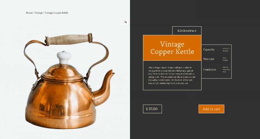
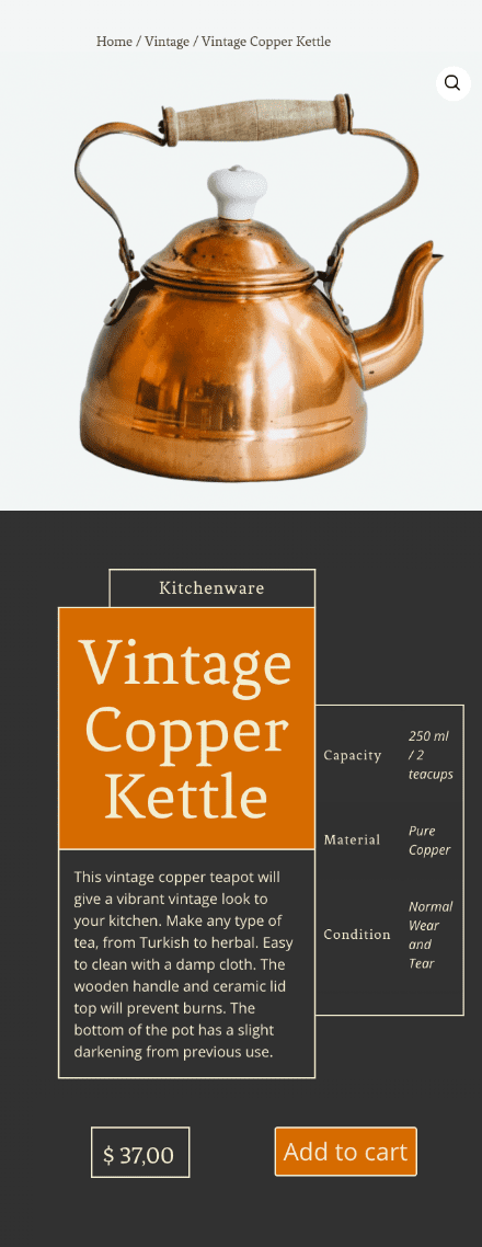
Preview
Before we get started, let’s take a look at the design across different screen sizes.
Desktop
Mobile
Download The Responsive Block Design for FREE
To lay your hands on the free responsive block design, you will first need to download it using the button below. To gain access to the download you will need to subscribe to our newsletter by using the form below. As a new subscriber, you will receive even more Divi goodness and a free Divi Layout pack every Monday! If you’re already on the list, simply enter your email address below and click download. You will not be “resubscribed” or receive extra emails.

Subscribe To Our Youtube Channel
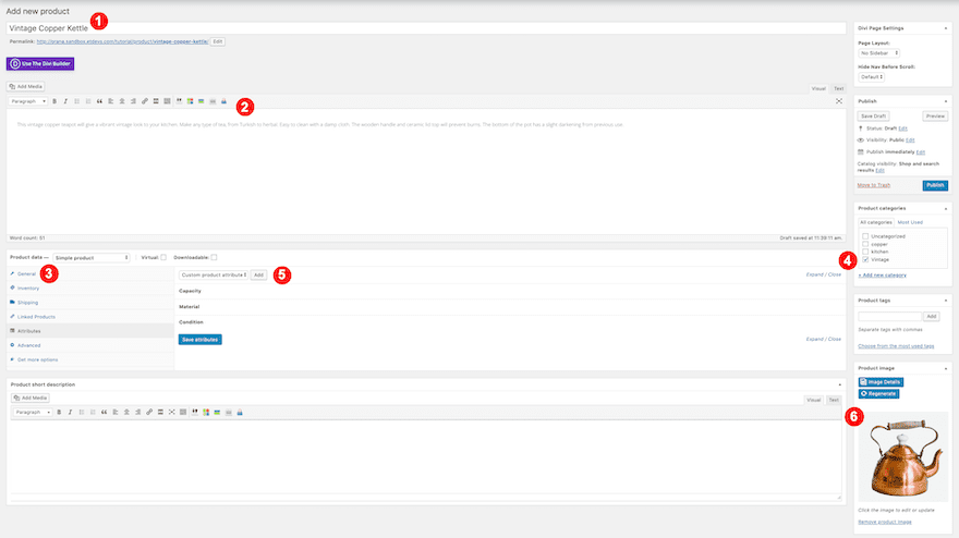
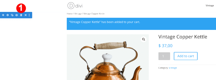
1. Add / Open WooCommerce Product
Product Details
Open up an existing product or create a new one. To recreate this block style design, you’ll need to have the following information filled in:
- Title
- Description
- Price
- Category
- Attributes
- Featured Image
The attributes tab is where the information for the woo additional information module is pulled from. To add this information, click on the attributes tab and create three custom attributes as follows:
- Attributes:
- Capacity: 250ml / 2 teacups
- Material: Pure Copper
- Condition: Normal Wear and Tear
The featured image must have the same color background as the color in the design.
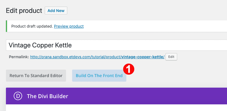
Enable Divi Builder & Modify Page Settings
When all product details are filled in, go ahead and enable the Divi Builder. Change the page layout to ‘Fullwidth’.
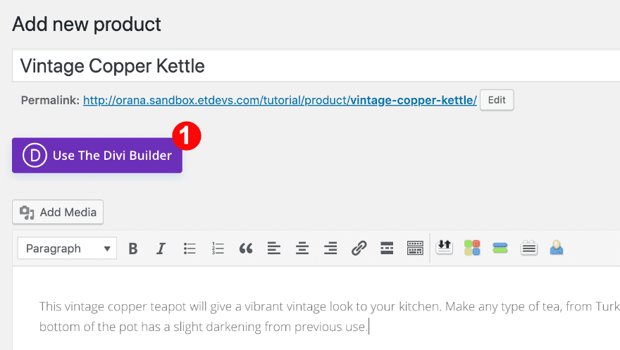
Switch to the Visual Builder
Continue by switching over to Visual Builder.
Delete Default Product Section
Since we are creating a custom product page, go ahead and delete the default woo product section.
2. Recreate the Responsive Block Design
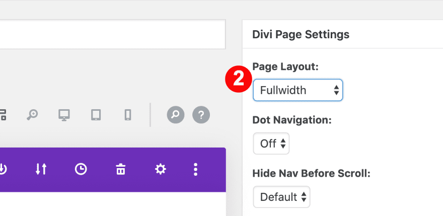
Add New Section
Background
The first step to recreate the design is to add a new section. Add a gradient background across different screen sizes.
- Background: Gradient
- Color 1: Light Gray #f2f6f5
- Color 2: Almost Black #313131
- Direction:
- Desktop: 90%
- Tablet + Phone: 180%
- Start + Finish:
- Desktop: 50%
- Tablet: 40%
- Phone: 30%
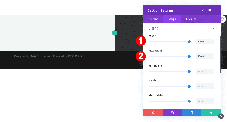
Sizing
Adjust the section’s sizing settings.
- Width: 100%
- Max Width: 100%
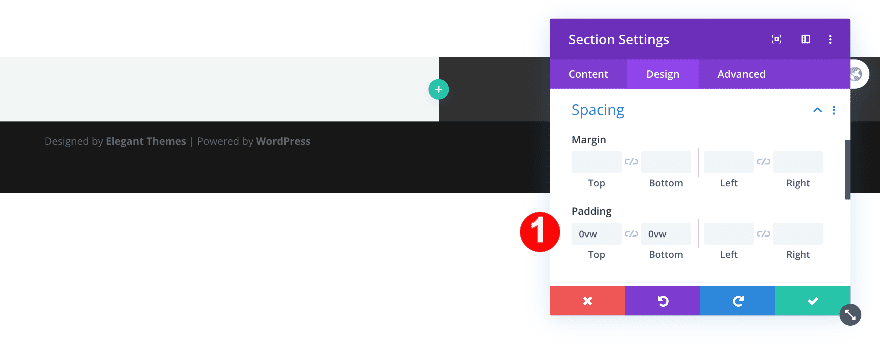
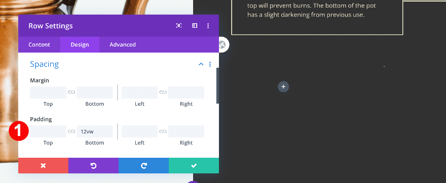
Spacing
Remove the default top and bottom padding too.
- Top + Bottom Padding: 0vw
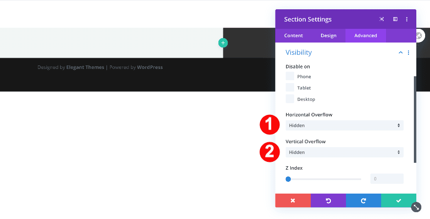
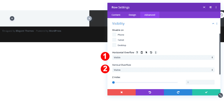
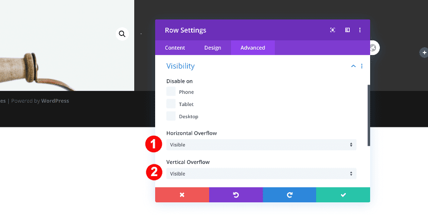
Visibility
Finally, adjust the section’s overflows.
- Vertical + Horizontal Overflow: Hidden
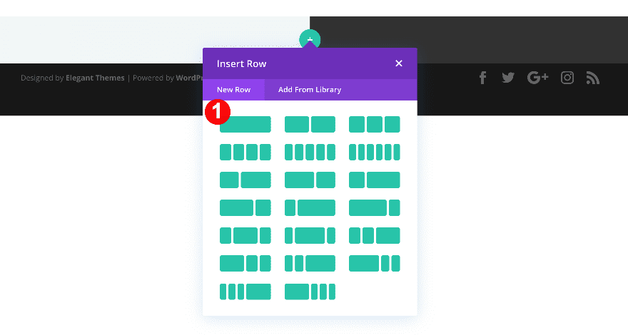
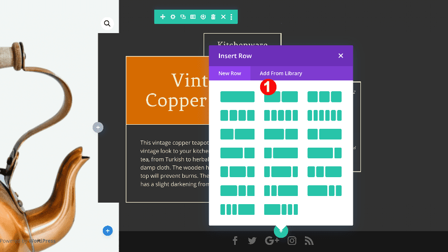
Add Row #1
Column Structure
After setting up the section, add the first row with one column.
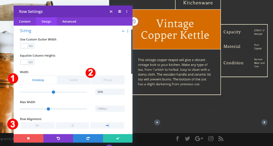
Sizing
In the design tab, adjust the sizing for different screen sizes.
- Width:
- Desktop: 50%
- Tablet + Phone: 100%
- Max Width: 100%
- Row Alignment: Left
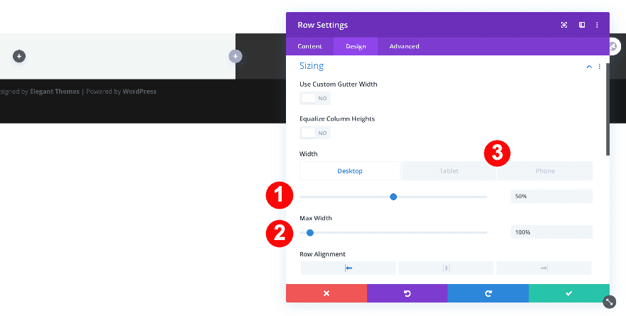
Visibility
Finally, set the horizontal and vertical overflow to visible.
- Horizontal + Visible Overflow: Visible
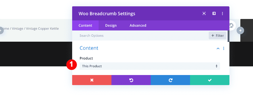
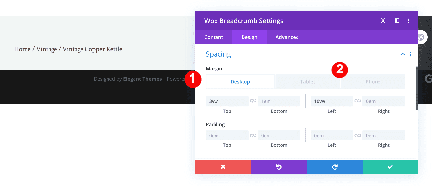
Content
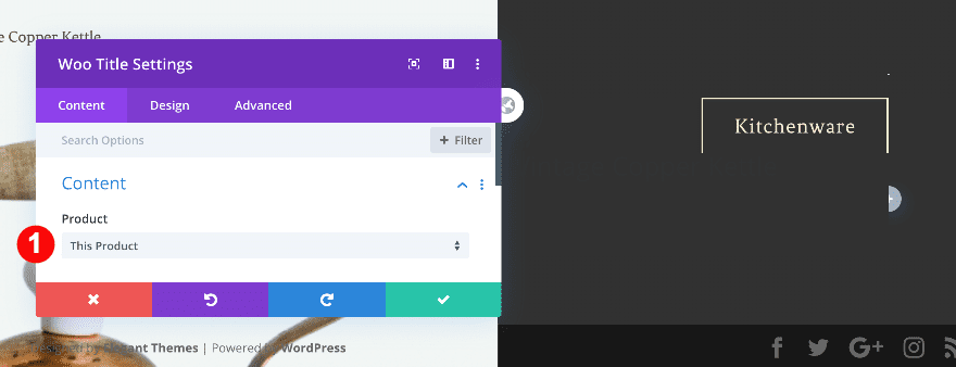
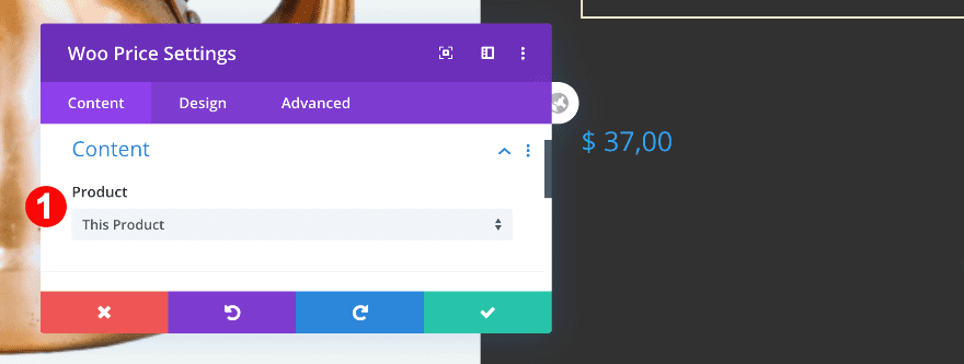
Add the first module, the woo breadcrumb module. Select ‘This Product’.
- Product: This Product
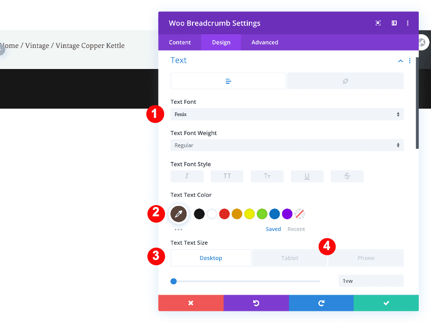
Text
In the design tab, style the text as follows.
- Text Font: Fenix
- Text Color: Brown #594239
- Text Size:
- Desktop: 1vw
- Tablet: 2vw
- Phone: 3vw
Spacing
Add some spacing values for different screen sizes.
- Top Margin: 3vw
- Left Margin:
- Desktop: 10vw
- Tablet + Phone: 20vw
Add Woo Image
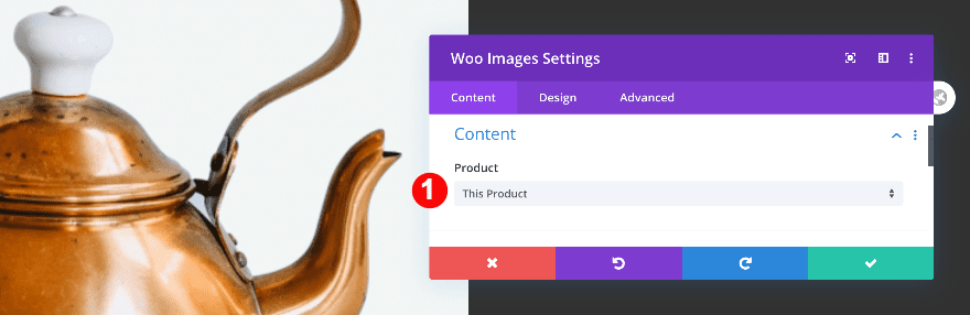
Add Content
Now it’s time to add the product image with a Woo Image module. In the content tab, choose ‘This Product’.
- Product: This Product
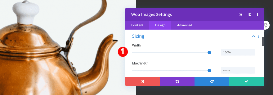
Sizing
Continue by adjusting the sizing of the module.
- Width: 100%
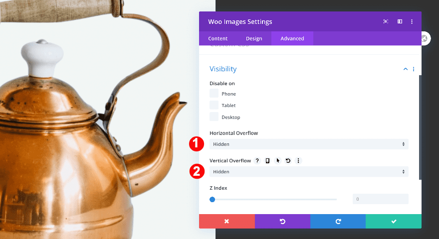
Visibility
Finally, hide the overflow.
- Horizontal + Vertical Overflow: Hidden
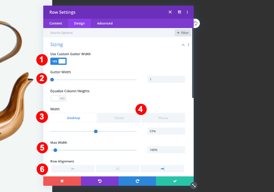
Add Row #2
Column Structure
Add a second row with two columns.
Sizing
First, adjust the sizing.
- Gutter Width: 1
- Width:
- Desktop: 53%
- Tablet + Phone: 53%
- Max Width: 100%
- Alignment: Right
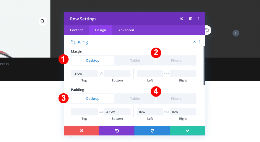
Spacing
Then, the spacing values.
- Top Margin:
- Desktop: -47vw
- Tablet + Phone: 0vw
- Left Margin:
- Tablet: -5vw
- Phone: -8vw
- Bottom Padding:
- Desktop + Tablet: 4.1vw
- Left Padding:
- Desktop: 0vw
- Tablet: 16vw
- Phone: 12vw
- Right Padding:
- Desktop: 0vw
- Tablet: 0vw
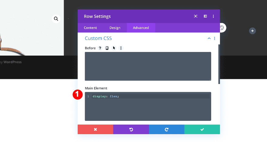
Custom CSS
In the Advanced tab, add some custom CSS.
- Main Element CSS:
- display: flex;
display: flex;
Visibility
Finally, set the overflows to visible.
- Horizontal + Vertical Overflows: Visible
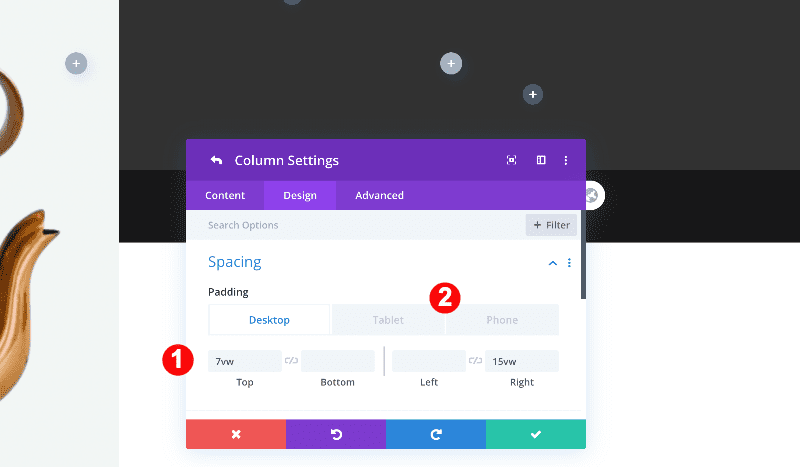
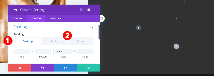
Column 1 Settings
Spacing
Before adding any modules, adjust the spacing values in column 1.
- Left Padding: 4vw
- Right Padding: 0vw
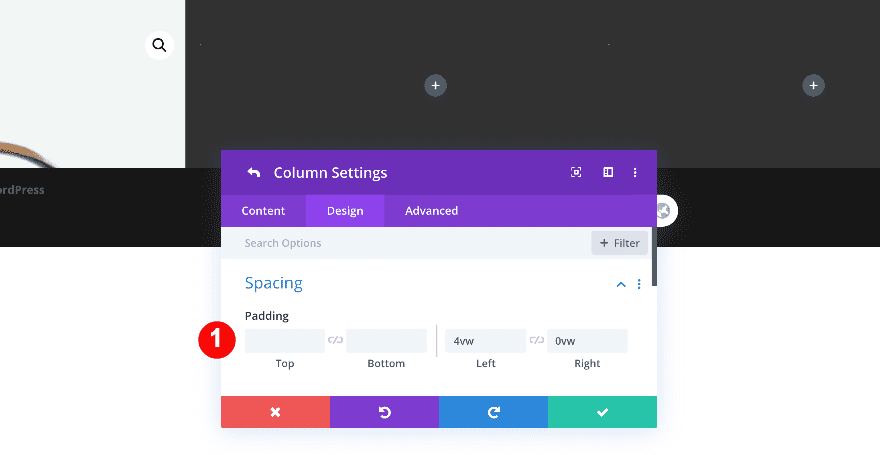
Column 2 Settings
Spacing
Adjust the column 2 spacing values too.
- Top Padding:
- Desktop: 7vw
- Tablet: 17vw
- Phone: 28vw
- Right Padding:
- Desktop + Tablet: 15vw
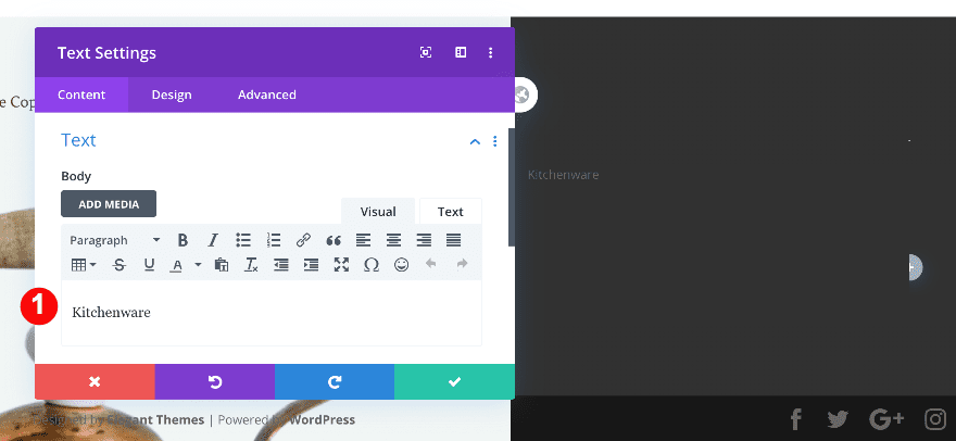
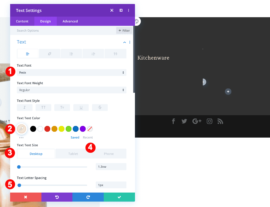
Add Text Module to Column 1
Add Content
Now it’s time to add the modules. Start with a text module. Insert descriptive content for the product.
Text
Then, style the text.
- Font: Fenix
- Color: #f2eed0
- Size:
- Desktop: 1.3vw
- Tablet: 2.6vw
- Phone: 3.8vw
- Letter Spacing: 1px
- Alignment: Center
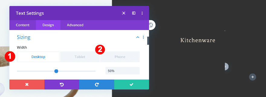
Sizing
Adjust the sizing of the module for different screen sizes.
- Width:
- Desktop: 50%
- Tablet: 60%
- Phone: 80%
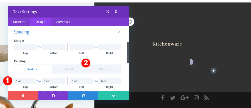
Spacing
Also, adjust the spacing values as follows.
- Top + Bottom Padding: 1vw
- Left + Right Padding: 1vw
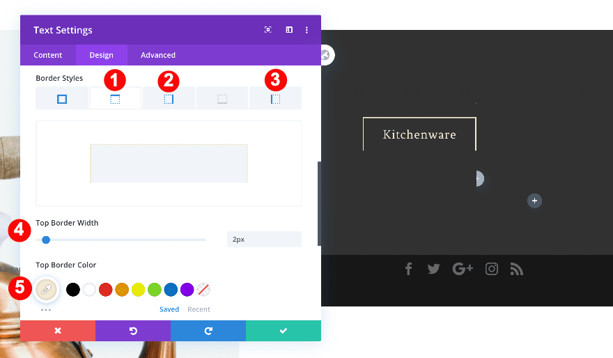
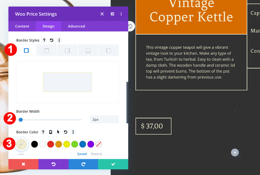
Border
Add a border to the module accordingly.
- Border Styles: Top + Left + Right
- Border Width:
- Top + Left + Right: 2px
- Border Color:
- Top + Left + Right: Cream #f2eed0
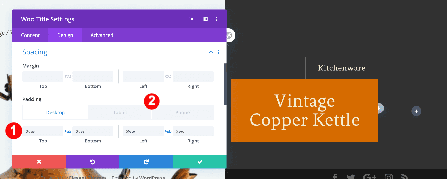
Add Woo Title to Column 1
Add Content
Now, add a woo title module and choose ‘This Product’ in the content tab.
- Product: This Product
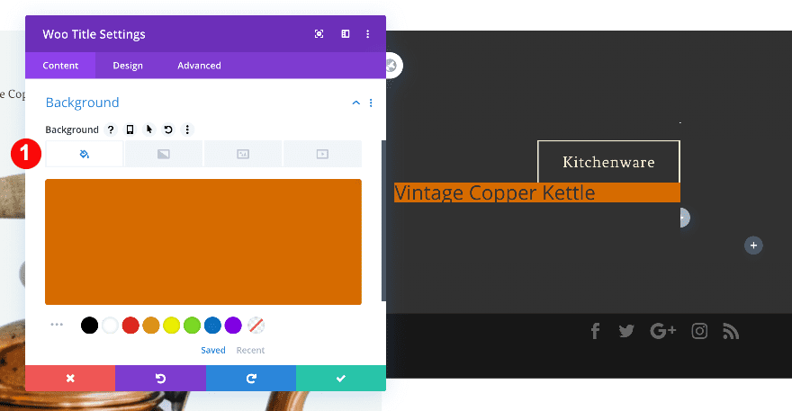
Background
To style the module, add a dark orange background.
- Background: Color
- Color: Copper Orange #d66b00
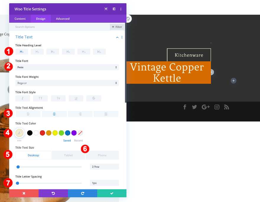
Title Text
Then, modify the heading text settings.
- Title Heading Level: H1
- Font: Fenix
- Color: Cream #f2eed0
- Size:
- Desktop: 2.9vw
- Tablet: 7.8vw
- Phone: 13.9vw
- H1 Letter Spacing: 1px
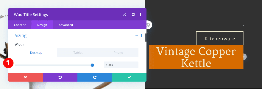
Sizing
Additionally, adjust the sizing of the module
- Width: 100%
Spacing
Then, add some padding values.
- Top + Bottom Padding:
- Desktop: 2vw
- Tablet: 3vw
- Phone:4vw
- Left + Right Padding:
- Desktop: 2vw
- Tablet: 3vw
- Phone:4vw
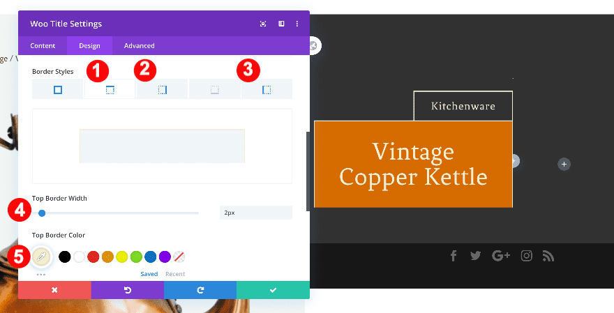
Border
Finally, add a border as follows.
- Border Styles: Top + Left + Right
- Border Width:
- Top + Left + Right: 2px
- Border Color:
- Top + Left + Right: Cream #f2eed0
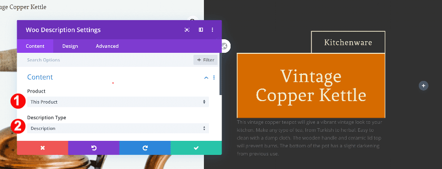
Add Woo Description Title to Column 1
Add Content
Below the title, add a woo description module. In the content tab, choose ‘This Product’.
- Product: This Product
- Description Type: Description
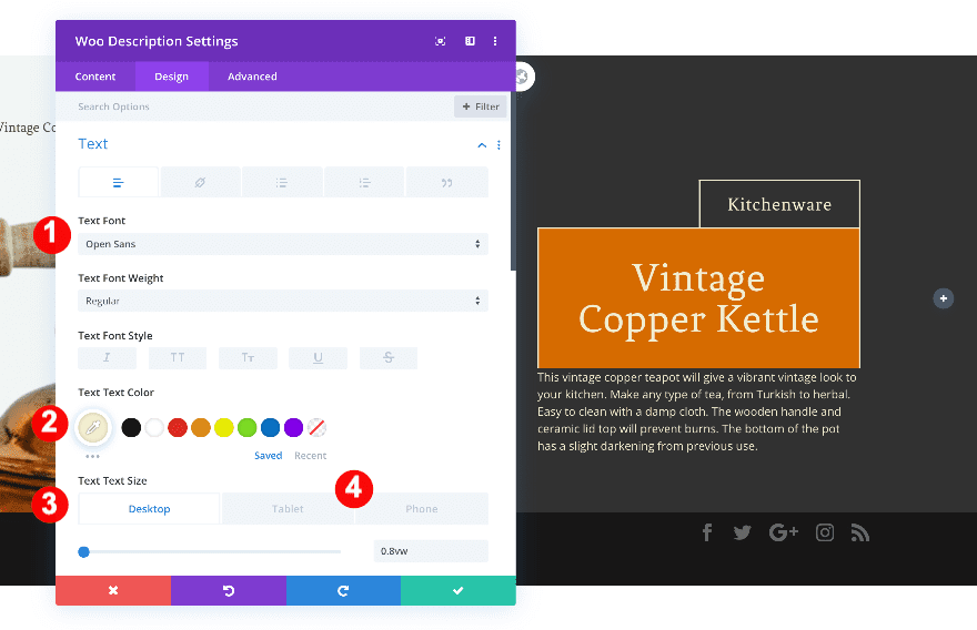
Text
Then, style the text.
- Font: Open Sans
- Color: Cream #f2eed0
- Size:
- Desktop: 08vw
- Tablet: 2vw
- Phone: 3vw
Sizing
Also, adjust the sizing.
- Width: 100%
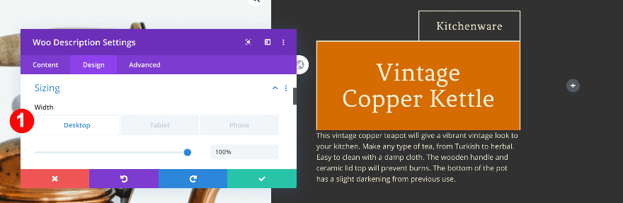
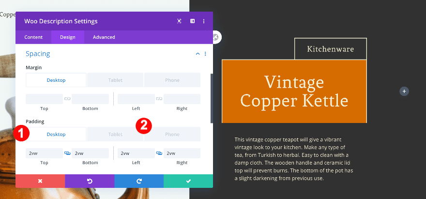
Spacing
Likewise, adjust the spacing.
- Top + Bottom Padding:
- Desktop: 2vw
- Tablet + Phone: 3vw
- Left + Right Padding:
- Desktop: 2vw
- Tablet + Phone: 3vw
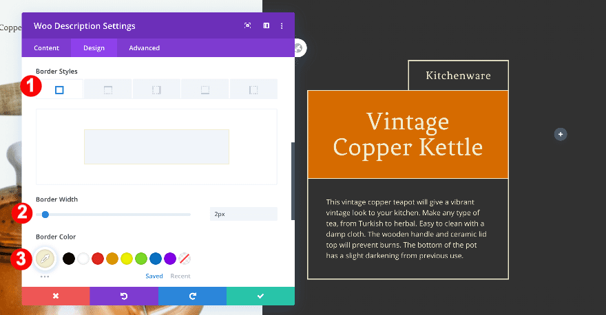
Border
Similar to other modules, add a border.
- Border Styles: All four borders
- Width: 2px
- Color: Cream #f2eed0
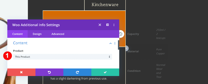
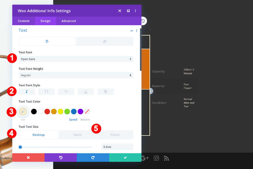
Add Woo Additional Info to Column 2
Add Content
Now it’s time to add the custom attributes with the woo additional info module. In the content tab, choose ‘This Product’.
- Product: This Product
Text
Change the text settings as follows.
- Font: Open Sans
- Style: Italic
- Color: Cream #f2eed0
- Size:
- Desktop: 0.6vw
- Tablet: 1.6vw
- Phone: 2.2vw
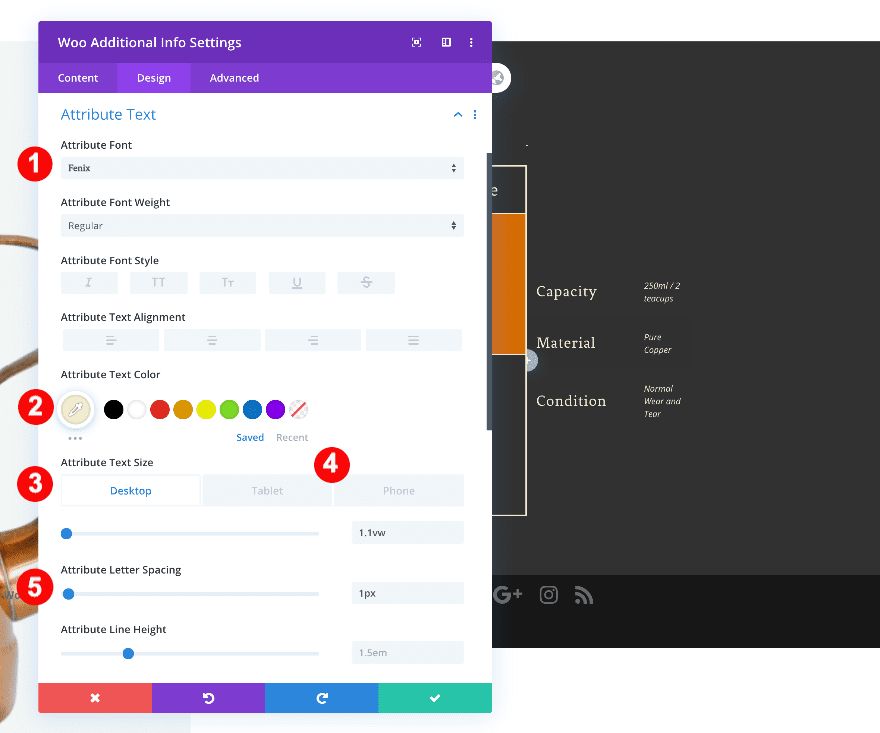
Attribute Text
Then, style the attribute text accordingly:
- Font: Fenix
- Color: Cream #f2eed0
- Size:
- Desktop: 1.1vw
- Tablet: 2vw
- Phone: 3vw
- Spacing: 1px
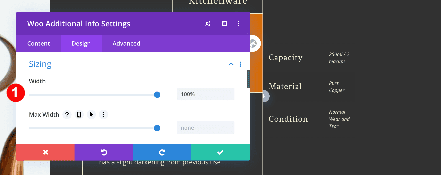
Sizing
Also, adjust the sizing.
- Width: 100%
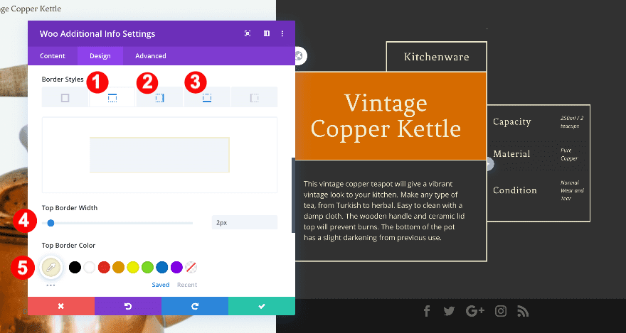
Border
And finally, add a border.
- Border Styles: Top + Right + Bottom
- Border Width:
- Top + Right + Bottom: 2px
- Border Color:
- Top + Right + Bottom: Cream #f2eed0
Add Row #3
Column Structure
Add the third row, with two columns.
Sizing
Before adding modules, adjust the sizing of the row for different screen sizes.
- Width:
- Desktop: 50%
- Tablet: 87%
- Phone: 93%
- Alignment: Right
Padding
Also, adjust the padding.
- Bottom Padding: 12vw
Column 1 Settings
Spacing
Continue by adjusting the padding in the first column.
- Left Padding:
- Desktop: 5vw
- Tablet + Phone:12vw
Add Woo Price to Column 1
Add Content
Now, add the price of the product using the woo price module. In the content tab, choose ‘This Product’.
- Product: This Product
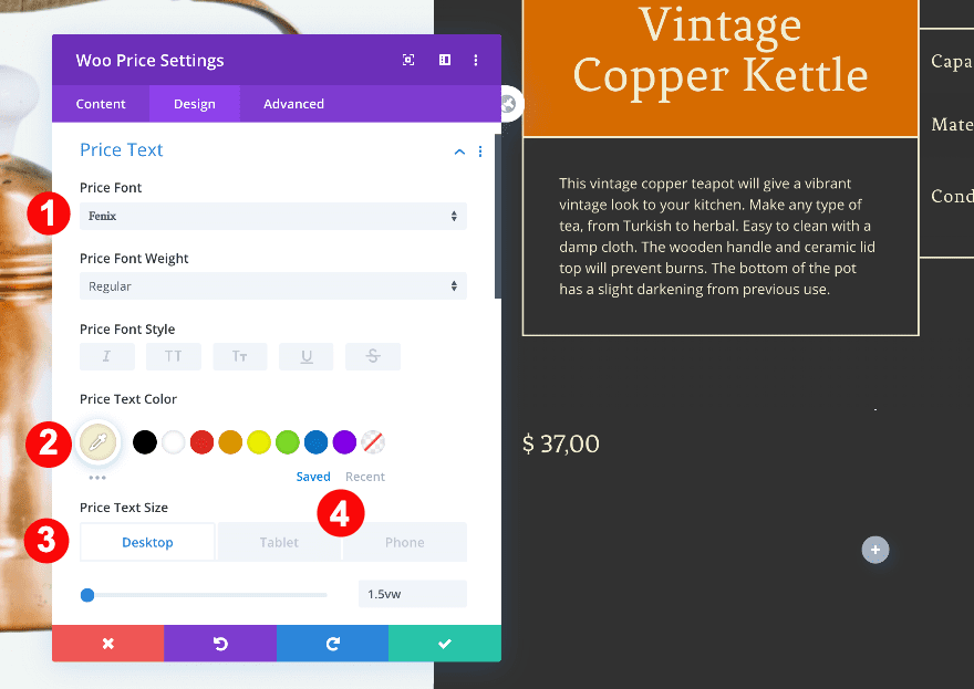
Price Text
Then, style the text accordingly.
- Font: Fenix
- Color: Cream #f2eed0
- Size:
- Desktop: 1.5vw
- Tablet: 3.5vw
- Phone: 5vw
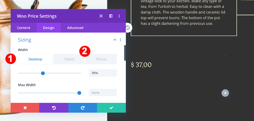
Sizing
Also, adjust the sizing of the module.
- Width:
- Desktop: 39%
- Tablet: 45%
- Phone: 54%
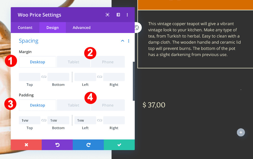
Spacing
Adjust the spacing as well.
- Top Padding:
- Desktop: 1vw
- Tablet: 2vw
- Phone: 3v2
- Bottom Padding:
- Desktop: 1vw
- Tablet + Phone: 2vw
- Left Padding:
- Desktop: 1vw
- Tablet + Phone: 2vw
- Right Padding:
- Tablet + Phone: 2vw
Border
Finally, add the border.
- Border Styles: All four sides
- Width: 2px
- Color: Cream #f2eed0
Add Woo Add To Cart to Column 2
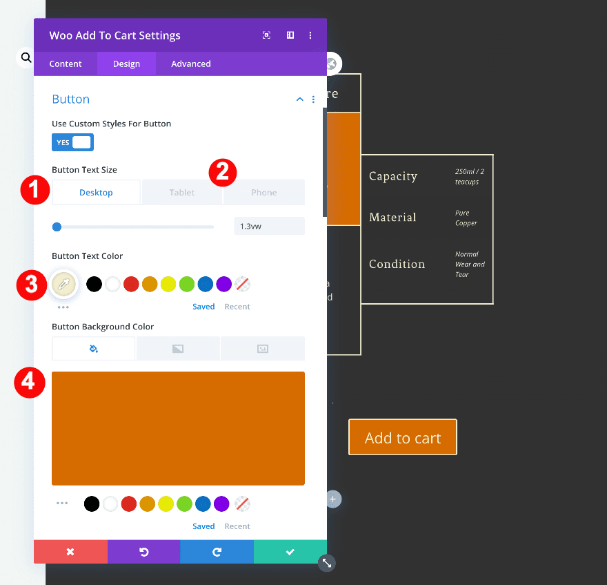
Add Content
The final module is a woo add to cart module. In the content tab, choose ‘This Product’.
Button Styles
Style the button as follows.
- Custom Styles: Yes
- Button Text Size:
- Desktop: 1.3vw
- Tablet: 3.5vw
- Phone: 5vw
- Text Color: Cream #f2eed0
- Background Color: Copper Orange #d66b00
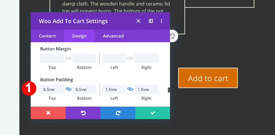
Button Padding
Then, add some padding values to the button.
- Top + Bottom Padding: 0.5vw
- Left + Right Padding: 1.5vw
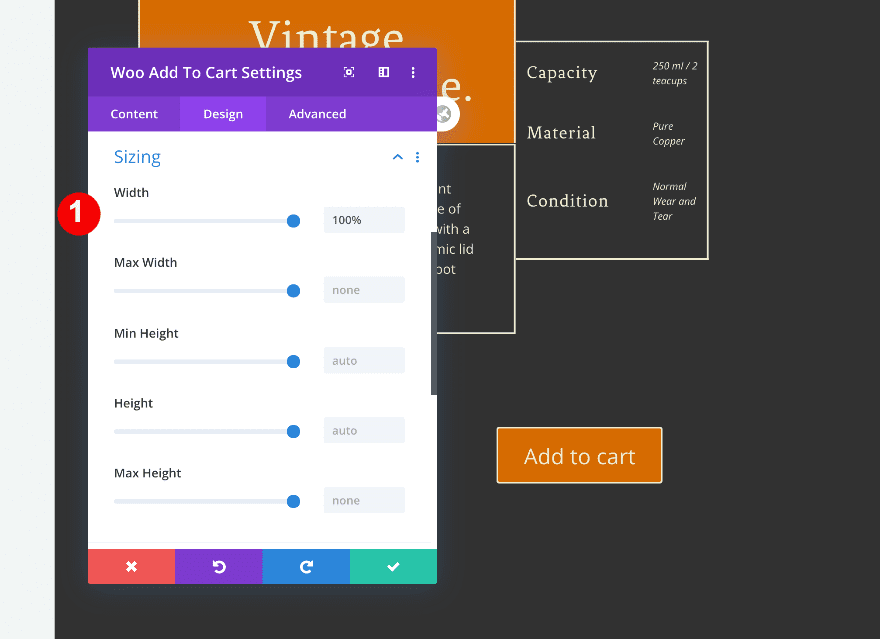
Sizing
Last but not least, adjust the sizing of the module and you’re done!
- Width: 100%
Preview
Let’s take a final look at the outcome across different screen sizes.
Desktop
Mobile
It’s a Wrap
That’s it! If your content is longer or shorter than the one in this tutorial, it might disrupt the spacing of the blocks. All you have to do is adjust the column settings so they fit better in the composition. We hope this tutorial inspires you to create more amazing Divi designs. Let us know in the comments if you have any questions.


Is Divi 4.0 required? Will older versions not allow the deletion of the standard WooCommerce modules?
Thanks
First, I like the design.
One little niggle about the importing of design elements with Divi. Having two ways that aren’t interchangeable is a bit annoying. In some tutorial posts you import through the Divi Library in others you can do it directly into the current post. it would be nice if there was a consistant approach taken here.
That’s not very useful as a product page template with ‘kitchenware’ inserted as non-dynamic text. Shouldn’t that somehow be pulled from the product details. Like a category or tag?
I’m sure that’s possible John-Pierre.
That’s a really nice design Orana. I’m really glad about the latest 4.0 update!