
Hamburger icons have become synonymous with menus. The three stacked horizontal lines represent the idea of a list and have been nicknamed “hamburger” for it’s obvious similarities. Divi uses the hamburger icon to toggle your main menu on mobile and on certain header styles like “slide in” and “fullscreen”.
Today I’m going to show you how to use a hamburger icon to toggle a mega menu on click. This is a great solution for those sites with lots of menu options. The hamburger icon keeps the header clutter free. Plus the organized 4 column layout of the mega menu allows users to find what they need quickly and efficiently.
The Before and After
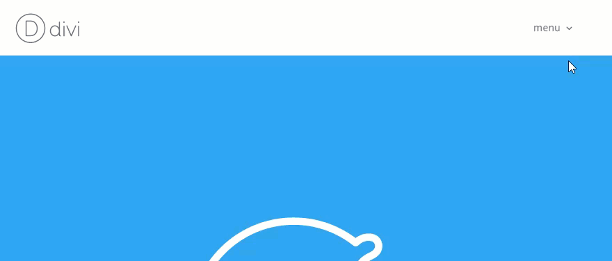
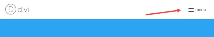
By default, the mega menu works by hovering over the main parent menu link:
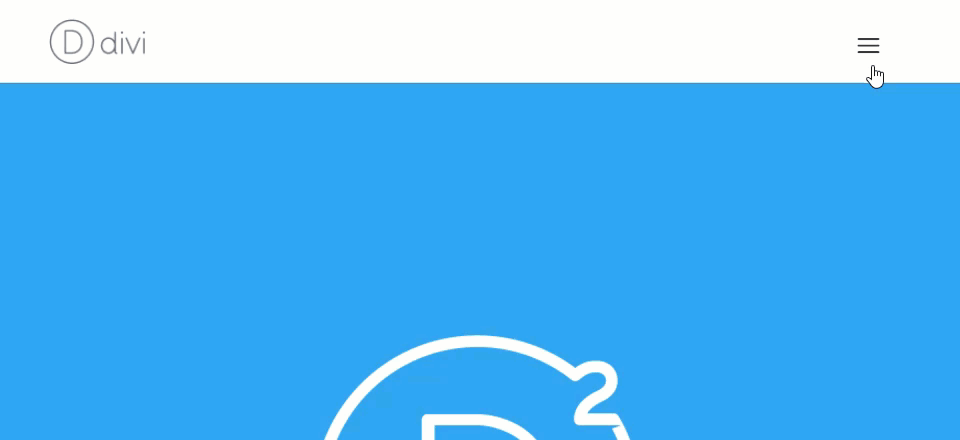
After implementing the new design and functionality, the mega menu only shows when you click the hamburger icon.
Implementing the Design with Divi
Subscribe To Our Youtube Channel
First you need to create a mega menu or change your current menu into a mega menu. This part is pretty simple.
From the wordpress dashboard, go to Appearance → Menus. Click Create New Menu and give your menu a name.
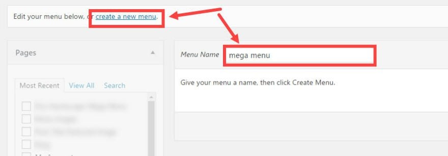
Click Create Menu
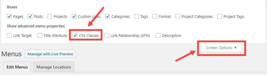
Make sure to activate the CSS Classes menu property by clicking the Screen Options tab at the top right of Menus screen and checking CSS Classes..
Now you can add your menu items to the new menu you created.
First, let’s add the menu item that will serve as our hamburger icon. This menu item will be the parent of all the other menu items.
To make this menu item, create a custom link with the following settings:
URL: http://#

Navigation Label: <div class="hamburger"></div>

CSS Classes: mega-menu
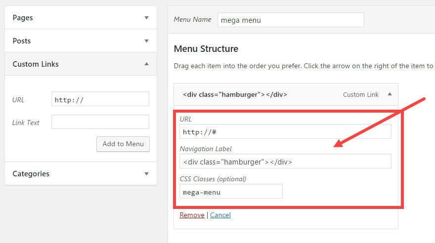
The URL is simply a hashtag(#) because this menu item will not be linking to any certain page. We will be using this menu item to deploy our mega menu on click.
The navigation label has some simple html code (a div with a class of “hamburger”). This will be what we use to show our hamburger icon using Custom CSS.
The CSS class “mega-menu” is what deploys the mega menu functionality. This css class should only be applied once to the main parent menu item and not to any of the sub items.
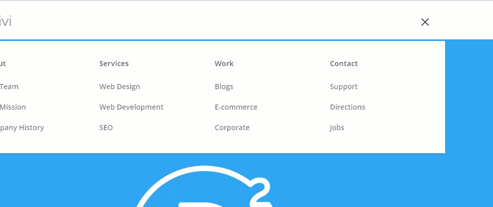
Now it is time to add the menu items that will make up your mega menu. For this example I’m using the following parent and sub menu items under the main mega menu item:
- Mega Menu Hamburger Icon Link
- About Us
- Our Team
- Our Mission
- Company History
- Services
- Web Design
- Web Development
- SEO
- Our Work
- Blogs
- E-commerce
- Corporate
- Contact Us
- Support
- Directions
- Jobs
- About Us
Now organize/drag the four menu items (each with three sub items of their own) to become sub items of the main parent Mega Menu link.
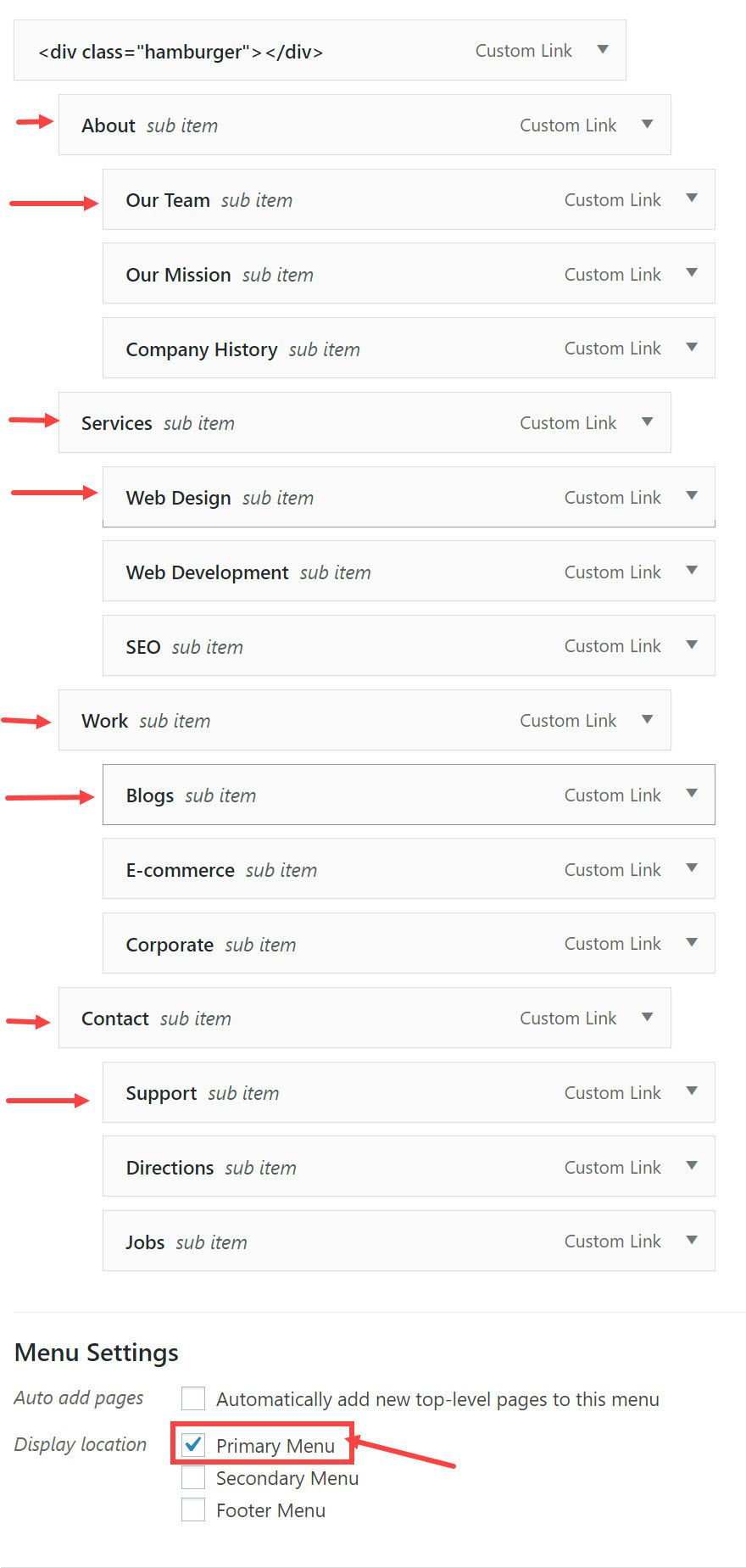
When you are finished organizing the menu, make sure to check Primary Menu under Menu settings.
Save Menu
Now that your mega menu is created, we need add some jQuery to make our mega menu show when clicking the icon instead of when hovering (which is the default). To do this go to Theme Options → Integration and add the following script into the “Add code to the head of your blog” section:
<script>
/*** Open menu itmes with children on click not hover ***/

(function($) {

jQuery(document).ready(function() {
jQuery('#top-menu li.mega-menu > a, #et-secondary-nav li.mega-menu > a').click(function(e) {
e.preventDefault();

jQuery(this).parent().toggleClass('show-submenu');
});
});

jQuery(document).click(function(e) {
if(!$(e.target).closest('.show-submenu').length) {
jQuery('.show-submenu').removeClass('show-submenu');
}
});

})(jQuery);
</script>
Adding Custom CSS
While you are in Theme Options, under General Settings, add the following Custom CSS:
/*** hides sub-menu on hover ***/
#et-top-navigation #top-menu li.et-hover ul.sub-menu { display: none!important; }

/*** shows submenu on click ***/
#et-top-navigation #top-menu li.show-submenu ul.sub-menu { display: block!important; visibility: visible!important; opacity: 1!important; }

/*** Hide hamburger menu item on mobile ***/
.et_mobile_menu .mega-menu >
 a{display:none;}


#top-menu .mega-menu > a, #et-secondary-nav .mega-menu > a {padding-bottom: 24px !important;}

/**** hide down arrow ****/
#top-menu .mega-menu > a:first-child:after, #et-secondary-nav .menu-item-has-children > a:first-child:after {display: none;}

/*** show hamburger icon ***/
.hamburger:before {
    font-family: "ETmodules" !important;
    font-weight: normal;
    font-style: normal;
    font-variant: normal;
    -webkit-font-smoothing: antialiased;
    -moz-osx-font-smoothing: grayscale;
    line-height: 0.6em;
    text-transform: none;
    speak: none;
    position: relative;
    cursor: pointer;
    top: 0;
    left: 0;
    vertical-align: -11px;
    padding-right: 3px;
    font-size: 32px; /*change size of icon here*/
    content: "\61"; /*change icon here*/
    color: #333; /*change color of icon here*/
}

/*** displays the "x" close icon ***/
.show-submenu .hamburger:before {
    content: "\4d"; /*change x icon here*/
}
That’s it!
Now go and check out your results
More Customization Options
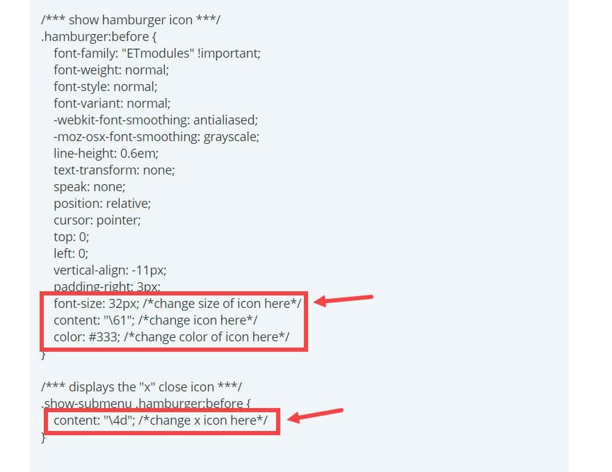
The CSS you entered has comments throughout so that you can make changes to your hamburger icon style. Here is where you can find the two main sections of CSS to style your icon:
Changing the Hamburger Icon
Divi comes with a variety of font icons you can use for your site. If you would like to change the hamburger icon for a different style, all you would need to do is find and edit the line of CSS labeled with the comment “change icon here”:
content: "\61"; /*change icon here*/
Here are the different content values for the different hamburger icons. Simply replace “\61” with one of the following:
 Square Icon menu – \62
 Circle Icon Menu – \63
 ul Icon – \64
 ol Icon – \65
 Square Menu Icon Dark – \e056
 Circle Menu Icon Dark – \e057
Changing the “X” Icon
If you are using the different hamburger menu icon, you should change the the “x” icon to match the design. Simply find find the following css:
/*** displays the "x" close icon ***/
.show-submenu .hamburger:before {
    content: "\4d";
}
Replace “\4d” with one of the following content values:
 Circle Close Menu Icon – \51
 Circle Close Menu Icon Dark – \e051
This is what the mega menu hamburger icon looks like with complimentary dark circle icon styles in place:
Changing the Color of Your Hamburger Icon
If you want to change the color of your hamburger icon, edit this line of CSS labeled “change icon color”:
Color: #333; /*change icon color here*/
Changing the Size of Your Hamburger Icon
If you want to change the size of your hamburger icon, edit this line of CSS labeled “change icon size here”:
Font-size: 32px; /*change size of icon here*/
Adding a Label to Your Hamburger Icon
It is easy to add a label to your icon. Simply go back to Appearance → Menus and edit the very top menu item that you gave the “mega-menu” class. In the navigation label text box, add your label text inside the div. For this example, I added the label “menu”.
<div class=”hamburger”>menu</div>
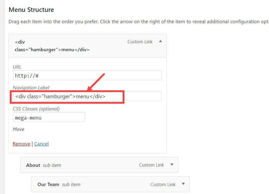
Now your hamburger has a label next to it.
Responsive?
Mega menus only work on screen sizes wider than 980px. For screen size under 980px (tablets and smartphones), the menu will switch to the default mobile menu.
Final Thoughts
If you like mega menus and are looking to create a clean and minimalist design for your header, adding a hamburger icon to display your mega menu is a great solution. Now your users can see all of your navigation links at once with a simple click.
Plus, Divi’s built-in font icons make it easy to customize your hamburger icons using css, without having to create icons from scratch.
You also can add images to your mega menus to create even more standout mega menus.
That’s it!
I hope you enjoy this feature. Looking forward to hearing from you in the comments.


Hello,
I’m having a weird issue with the mega-menu. When it’s displayed and I move the mouse from the bottom upwards, it flickers.
Any idea why?
Hi Jason, thanks for tutorial,
I was keen to try this but have one problem/question:
I followed the steps, added a new menu called “hamburger” with sub menu items:
URL: http://#
Navigation Label: menu
CSS Classes: hamburger
Than I added jQuery:
/*** Open menu itmes with children on click not hover ***/
(function($) {
jQuery(document).ready(function() {
jQuery(‘#top-menu li.hamburger > a, #et-secondary-nav li.hamburger > a’).click(function(e) {
e.preventDefault();
jQuery(this).parent().toggleClass(‘show-submenu’);
});
});
jQuery(document).click(function(e) {
if(!$(e.target).closest(‘.show-submenu’).length) {
jQuery(‘.show-submenu’).removeClass(‘show-submenu’);
}
});
})(jQuery);
Ana at the end Custom CSS:
/*** hides sub-menu on hover ***/
#et-top-navigation #top-menu li.et-hover ul.sub-menu { display: none!important; }
/*** shows submenu on click ***/
#et-top-navigation #top-menu li.show-submenu ul.sub-menu { display: block!important; visibility: visible!important; opacity: 1!important; }
/*** Hide hamburger menu item on mobile ***/
.et_mobile_menu .hamburger >
a{display:none;}
#top-menu .hamburger > a, #et-secondary-nav .hamburger > a {padding-bottom: 24px !important;}
/**** hide down arrow ****/
#top-menu .hamburger > a:first-child:after, #et-secondary-nav .menu-item-has-children > a:first-child:after {display: none;}
/*** show hamburger icon ***/
.hamburger:before {
font-family: “ETmodules” !important;
font-weight: normal;
font-style: normal;
font-variant: normal;
-webkit-font-smoothing: antialiased;
-moz-osx-font-smoothing: grayscale;
line-height: 0.6em;
text-transform: none;
speak: none;
position: relative;
cursor: pointer;
top: 0;
left: 0;
vertical-align: -11px;
padding-right: 3px;
font-size: 32px; /*change size of icon here*/
content: “\63”; /*change icon here*/
color: #0091d8; /*change color of icon here*/
}
/*** displays the “x” close icon ***/
.show-submenu .hamburger:before {
content: “\4d”; /*change x icon here*/
}
Might be your Navigation Label:
Menu
I put the word menu in the middle but you can put whatever or leave it blank.
My comment here didn’t show the HTML around the word Menu… guessing yours got stripped as well. Sorry.
Hello
With the divi 100, we can create wonderfull hamburger menu. I have made one on my last website https://stylistme.com/
But I wish to place it on top left. How to do ?
Thx
Great article! I used it differently as I put it as the secondary menu and labeled it “Site Menu” – however, when I applied your addition of adding a label, I lost the icon completely, musta done something wrong… Going to go check that out –
Thanks again, keep the great info coming!
Hi Jason,
I was keen to try this but have some problems/questions:
1-Because I have 8 “main items” in my menu can I somehow force it to always display as a vertical cascading menu rather than have it display with 4 main menu items in each of 2 rows? In other words, I’d prefer to have a vertical cascading menu (i.e. the mobile menu) for all device screen widths.
2-When I select a “main item” that has submenu items it goes to a blank page > about:blank so how can I stop this?
3-When an submenu item is select the menu stays open. How can I automatically close the menu after an item is selected?
Hey Adam,
1 – Are you asking to make your mega menu one column? If so you could try adding this css to make the columns fullwidth:
#top-menu li.mega-menu > ul > li {
    width: 100%;
}
2. All the links (including the main items with submenu items) are treated as links to actual pages so you should have urls for those as well.
3. I’m afraid that would be a question for our support team.
Thanks for reaching out. Hope that helps.
Whaaa?!
So by the same procedure, can I add other icons instead of the “hamburguer” (why no call it burguer) for instance the world icon?
Hi Jason
When I click on the “hamburger icon” it only open new pages
about:blank
Hi Again Jason.
I have found out what was missing.
Great!
Thanks Jason,
This is great!
I’d love to know how to put a label alongside my mobile menu hamburger.
Hurri,
I’ve included instructions for this in the tutorial “Adding a Label to Your Hamburger Icon”. Thanks.
Hi Hurri. Try this :
.mobile_menu_bar::after {
content: “MENU”;
position: relative;
padding: 10px 15px 10px 15px;
background-color: #005789;
color: #FFFFFF !important;
cursor: pointer;
}
Great, this is perfect timing, thanks Jason ! 🙂
I have just completed my first Divi megamenu, and these extra adjustments will come in handy. In particular, the ‘click to open’ is useful to prevent the menu from collapsing again if your cursor strays from the menu dropdown.
Great tutorial, I’ll have to give it a try!
Great tip and article would surely implement on my next project
Thanks a bunch!
I’m sorry but I disagree with this kind of menus. Remember, no bad navigation: https://www.elegantthemes.com/blog/divi-resources/8-common-web-design-errors-to-avoid-at-all-costs-how-divi-can-help
Thanks for a good article, Jason. I’m sure you and others here realize there’s a bit of controversy around this. A cursory web search of “hamburger icon usability” returns many articles for and against. I hope to offer some reasonable perspective here. In short, a variety of usability gurus have found that the hamburger icon alone is not very usable and, furthermore, should not be used on desktop/laptop-width screens.
First, the icon itself – while fairly common – is not easily understood or accurately interpreted by most users. That will improve over time, but even current research shows it’s largely misunderstood. Even in our own experience where I work (a major healthcare education company), in our usability studies fewer than 20% of users knew what it was – unless it had a label of “Menu” below or beside it. Thanks for including instructions on labeling it: This is not just a good idea, it’s essential.
Second, it diminishes visibility of options and can work against users. Site visitors expect to see their options when they land on a full-width site. Most users do not come to a website to take in the aesthetics or visual splendor (unless that’s the focus of the content). Rather, they arrive to complete a task or find something useful to them. Hiding most or all options behind a hamburger makes it harder for users to discover them. Menu tabs can be thought of as separate “Call To Action” buttons, so keeping the visible (and at a reasonable amount and clearly labeled) makes a positive difference.
Above all, remember the axiom: “You are not the user.” We should all design with the target user in mind and less so with our personal (or client’s) design tastes in mind. We should prototype early and test with sample users (or actual customers of our client) without leading or demoing and see what their usage tells us – on this or any other design change.
No question, the hamburger icon is here to stay on mobile, and in time it may gain acceptance on all websites. For desktop sites, they’re not only unnecessary but more likely to work against the site owner’s goals. Even Nielsen-Normal Group comes right out and says, “Do not use hidden navigation (such as hamburger icons) in desktop user interfaces.” (https://www.nngroup.com/articles/hamburger-menus/). So long as they’re used on mobile sites if necessary, labeling them as “Menu” helps the user succeed.
Joe,
Thank you for this. I agree with you that this should not be something to use for most sites. Users expect to see a traditional navigation menu (a high converting standard for sure) and they should see one. This modification was requested by our community for less common uses. I have found it useful in some cases like landing pages where the primary goal is clicking a CTA and not the navigation.
Grammar Nazi alert!
“nicknamed “hamburger” for it’s obvious similarities.”
Argh! No apostrophe required for possessive form. Should read ‘its’.
Great article! 😉