
Divi and its new sticky position options open the door for many new and exciting design possibilities. In this tutorial, we are going to show you how to combine Divi’s sticky position options with smooth scrolling anchor links to create an accordion-like way to index and navigate your page. Building it is really easy with Divi’s built-in options so there is no need for extra CSS or other code. Once done, you will have a unique way to organize your page and boost the user experience on desktop and mobile.
Let’s get started!
- 1 Sneak Peek
- 2 Download the Layout for FREE
- 3 Download For Free
- 4 What You Need to Get Started
- 5 Creating the Sticky Row
- 6 Styling the Sticky Row
- 7 Creating the Sticky Heading Text
- 8 Styling the Sticky Heading Text
- 9 Creating the Mock Page Content
- 10 Duplicating the Section as Needed for More Sticky Page Headings and Content
- 11 Adding Anchor Links to the Sticky Page Headings
- 12 Final Result
- 13 Final Thoughts
Sneak Peek
Here is a quick look at the design we’ll build in this tutorial.
Here you can see the sticky page headings stick at the top and bottom of the browser window and stack on top of one another like an accordion.
Here you can see that clicking on one of the sticky headings will jump (using smooth scrolling anchor links) to that section of the page also like an accordion.
Here is the functionality on mobile as well.
Download the Layout for FREE
To lay your hands on the designs from this tutorial, you will first need to download it using the button below. To gain access to the download you will need to subscribe to our newsletter by using the form below. As a new subscriber, you will receive even more Divi goodness and a free Divi Layout pack every Monday! If you’re already on the list, simply enter your email address below and click download. You will not be “resubscribed” or receive extra emails.

To import the section layout to your Divi Library, navigate to the Divi Library.
Click the Import button.
In the portability popup, select the import tab and choose the download file from your computer.
Then click the import button.

Once done, the section layout will be available in the Divi Builder.
Let’s get to the tutorial, shall we?
What You Need to Get Started

To get started, you will need to do the following:
- If you haven’t yet, install and activate the Divi Theme.
- Create a new page in WordPress and use the Divi Builder to edit the page on the front end (visual builder).
- Choose the option “Build From Scratch”.
After that, you will have a blank canvas to start designing in Divi.
Creating the Sticky Row
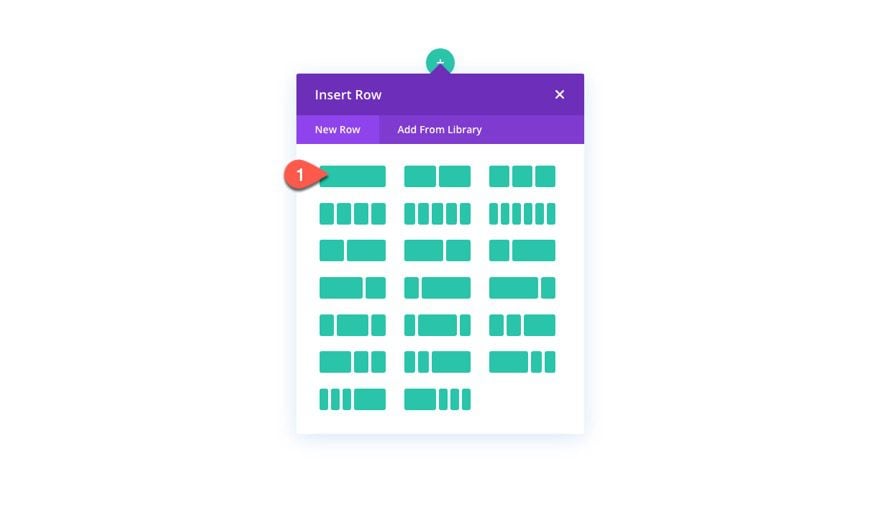
For starters, let’s create our sticky row. To do that, add a one-column row to the default section.
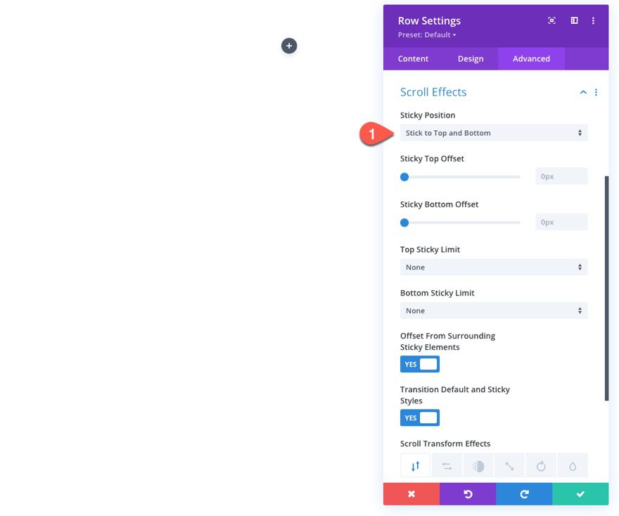
Open the row settings. Under the Advanced tab, update the sticky position as follows:
- Sticky Position: Stick to Top and Bottom
This will cause the row to stick at the top of the browser window as the user scrolls down and then stick to the bottom of the browser window as the user scrolls up.
Styling the Sticky Row
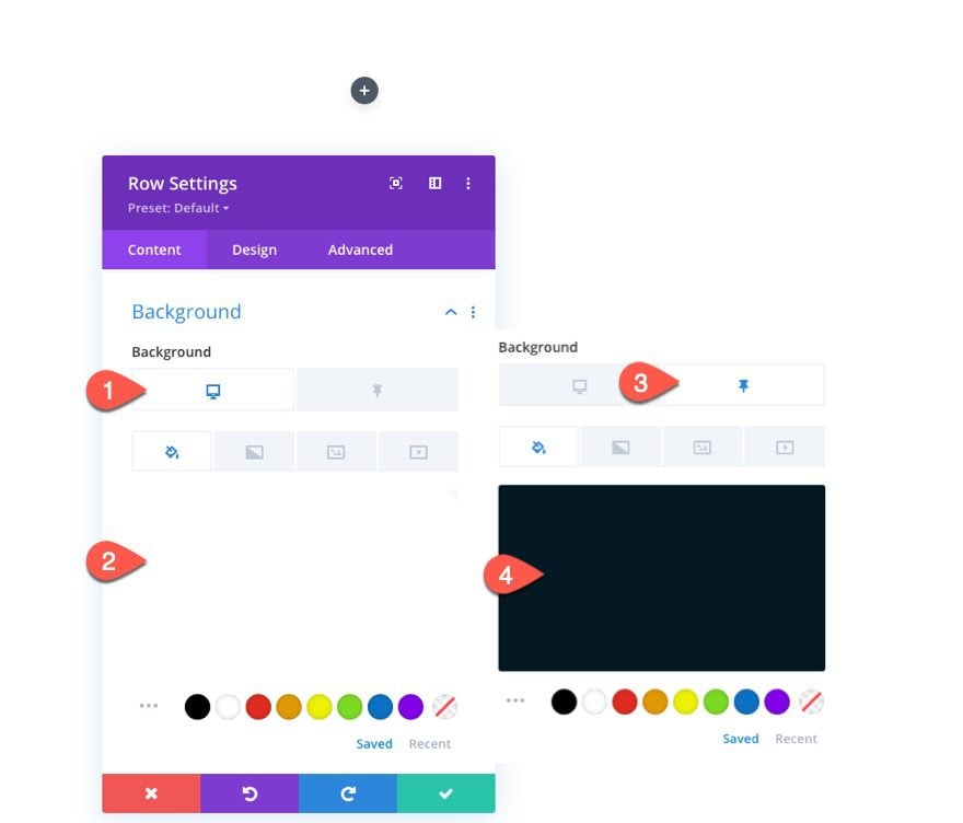
Now the the sticky position is in place, we can start styling the row using the built in sticky style option which allows you to give the element a specific style whenever the sticky position is in effect (or stuck). For the row, we want the background to change to a dark color whenever it is in the stuck position. To do this, open the row settings and update the following:
- Background Color (desktop): #ffffff
- Background Color (sticky): #051923
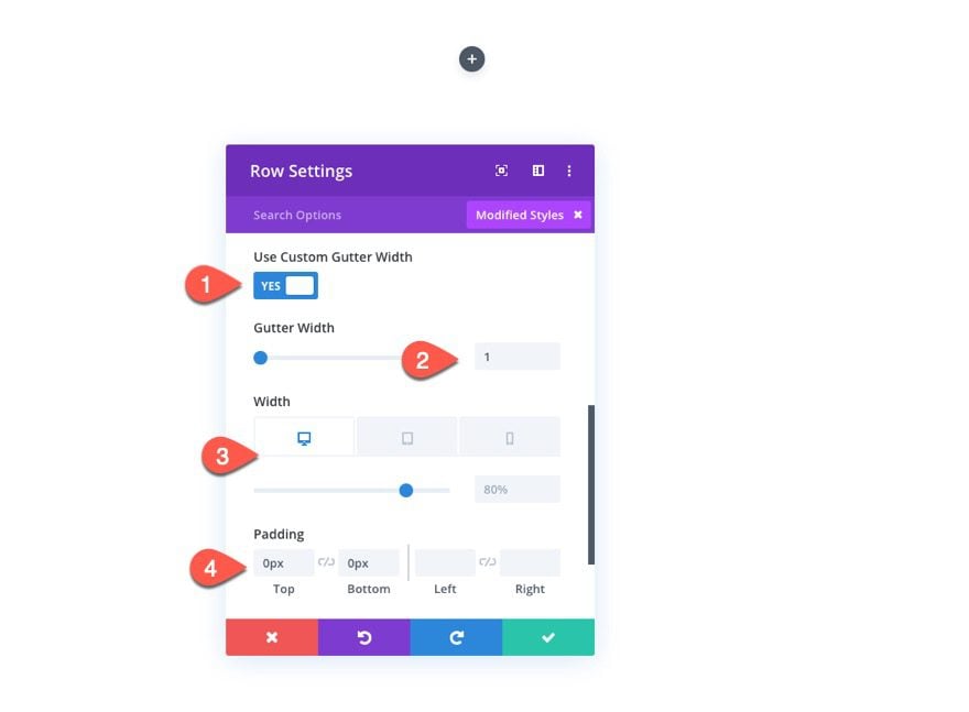
Under the design tab, update the following:
- Use Custom Gutter Width: YES
- Gutter Width: 1
- Width (tablet and phone): 100%
- Padding: 0px top, 0px bottom
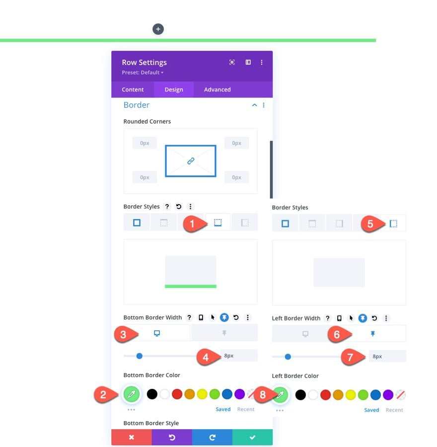
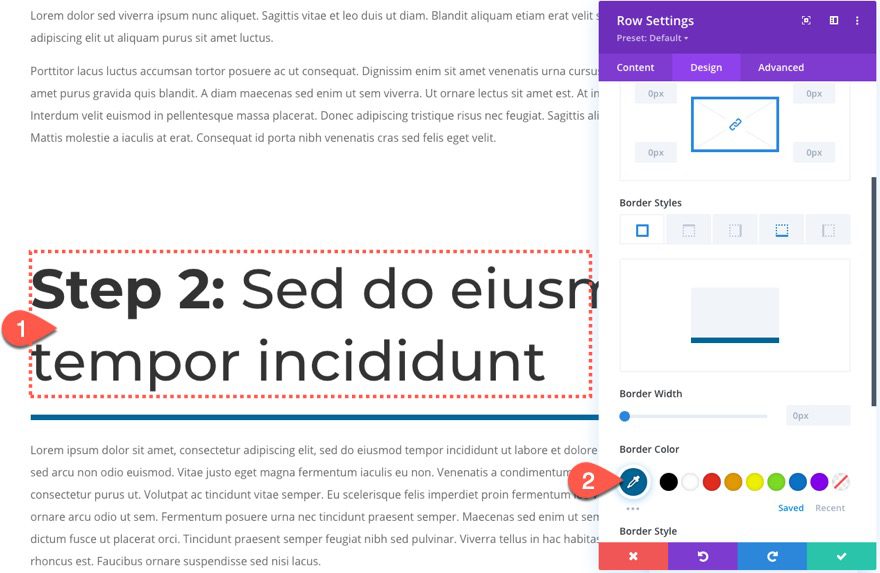
Next, we want to give a bottom border to the row to serve as a divider line between the heading and the content below. And, once the row is in the sticky position, we want to show a left border instead.
Under the border option toggle, update the following:
- Border Color: #6eeb83
- Bottom Border Width (desktop): 8px
- Bottom Border Width (sticky): 0px
- Left Border Width (desktop): 0px
- Left Border Width (sticky): 8px
Creating the Sticky Heading Text
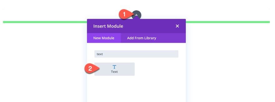
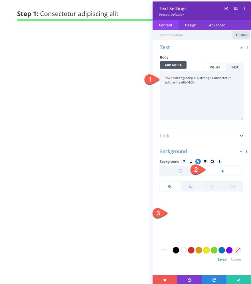
To create the page heading text, add a new text module to the row.
Then paste the following HTML in the body content.
<h2><strong>Step 2:</strong> S<span>ed do eiusmod tempor incididunt</span></h2>
And update the background color on hover as well…
- Background Color (hover): rgba(255,255,255,0.2)
This will make it more obvious that the headings are clickable for the user.
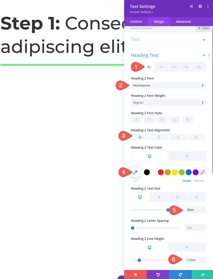
Styling the Sticky Heading Text
Under the design tab, update the following:
- Heading 2 Font: Montserrat
- Heading 2 Text Alignment: Left
- Heading 2 Text Color (desktop): default (or black)
- Heading 2 Text Color (sticky): #ffffff
- Heading 2 Text Size: 80px (desktop), 22px (sticky), 28px (phone)
- Heading 2 Line Height: 1.3em (desktop), 1em (sticky)
Then update the padding as follows:
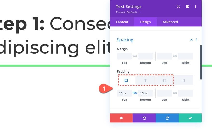
- Padding (desktop): 15px top, 15px bottom
- Padding (sticky): 10px top, 0px bottom, 20px left
- Padding (tablet and phone): 15px top, 15px bottom, 15px left, 15px right
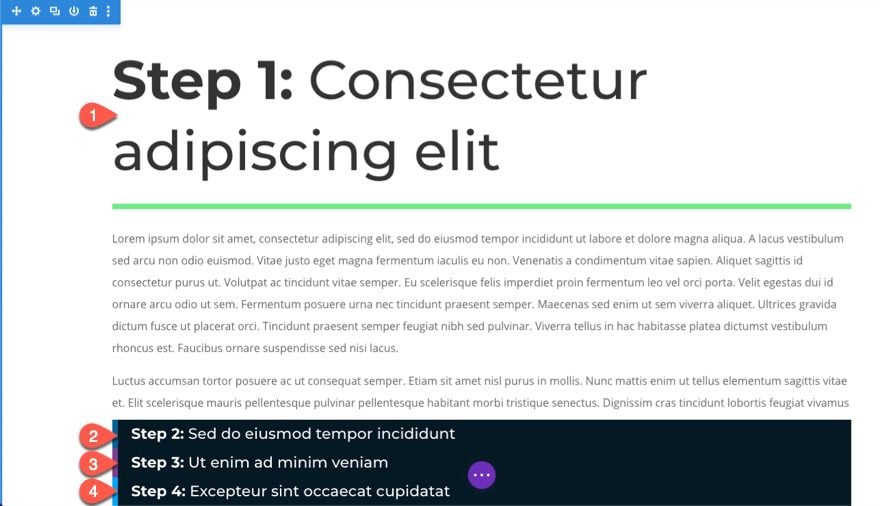
Creating the Mock Page Content
Once the sticky row is in place, we can add another row that will contain some mock page content under the heading. To do this, create a new one-column row under the sticky row.
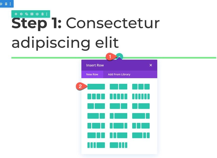
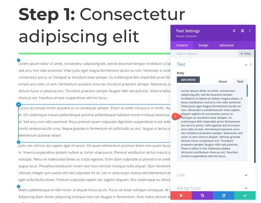
Then add a new text module to the row and paste in some mock content.
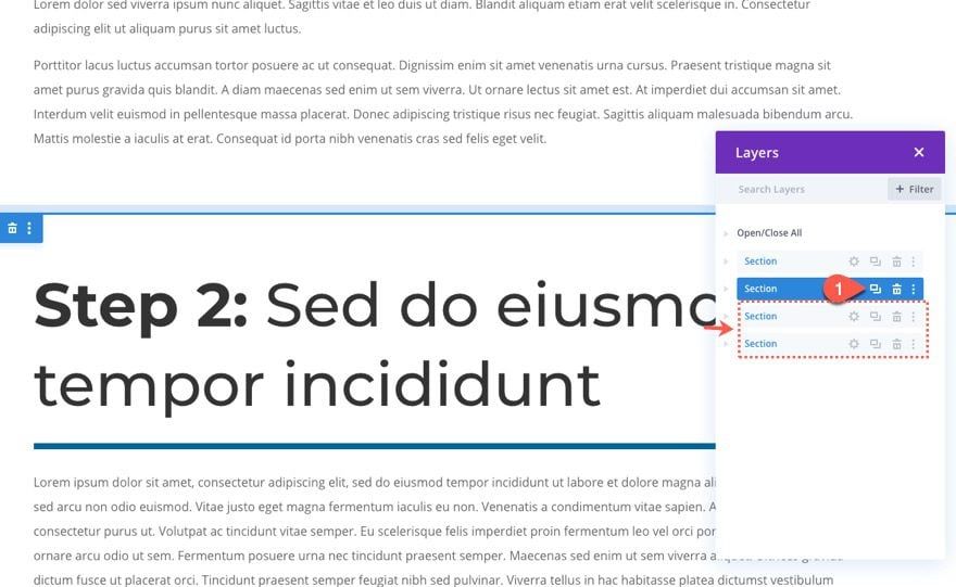
Duplicating the Section as Needed for More Sticky Page Headings and Content
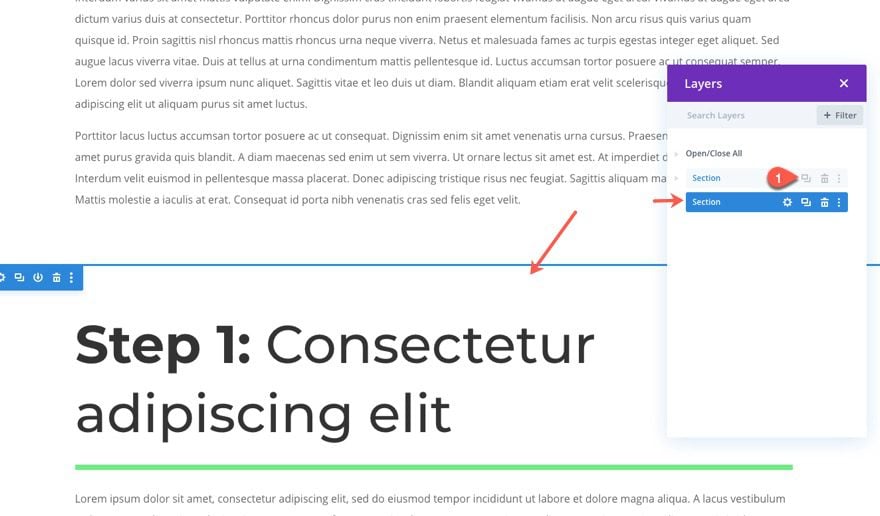
At this point, you have the basic design in place to create additional page sections with sticky headings simply by duplicating the section.
Duplicate Section
To create another section, duplicate the existing section that contains the sticky row/heading and the row of mock content. This will speed up the development process of creating the next section of the page.
Update the Text Content and Row Border Color
In the duplicate section, update the text inside the text module and then update the color of the border under the row settings.
Repeat as Needed
Continue to duplicate the section and update the text content and row border color as needed. For this example, we are going to duplicate the section another two more times to give us a total of four sticky page headings that will make up the accordion.
Adding Anchor Links to the Sticky Page Headings
Right now, the functionality will allow the user to scroll down the page and have the headings stick at the top and bottom much like an accordion. Now we want to make the headings clickable so that, when the user clicks on one of the sticky headings, the user will be brought to that section of the page. This is done using anchor links.
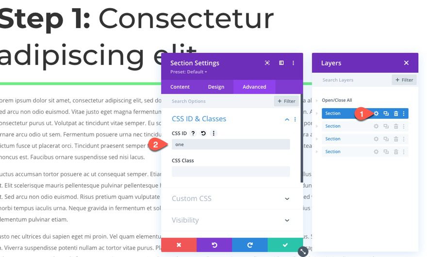
To add an anchor link, we first need to add a CSS ID to the section we want the link to jump to.
Add Section 1 CSS ID
Open the settings for the section and add the following CSS ID:
- CSS ID: one
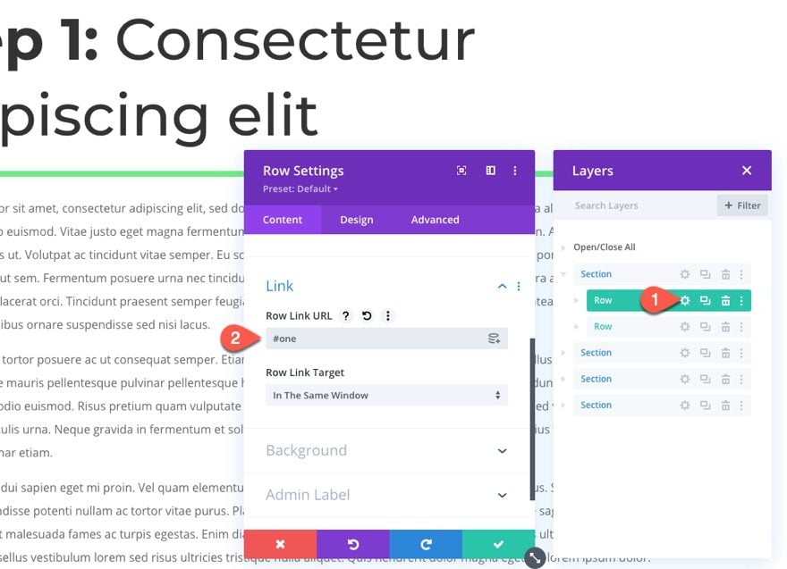
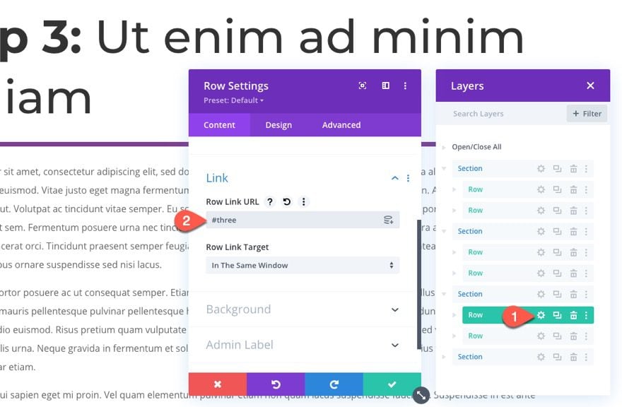
Then open the settings for the sticky row and add the following row link URL:
- Row Link URL: #one
Now when the user clicks on the row/heading, the page will jump to this first section.
Add Section 2 CSS ID
Next, we need to add the anchor link for the second heading.
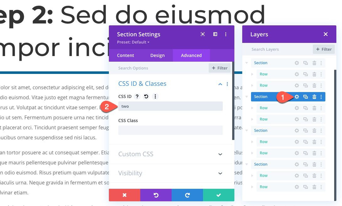
Open the second section settings and add the following CSS ID:
- CSS ID: two
Add Section 1 Sticky Row Link URL
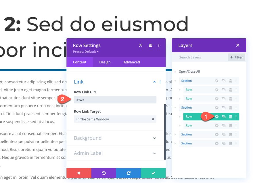
Then open the settings for the sticky row inside the second section and add the row link URL:
- Row Link URL: #two
Add Section 3 CSS ID
Next, we need to add the anchor link for the third heading.
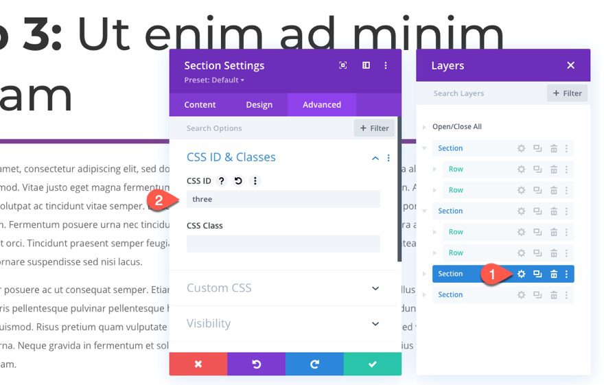
Open the third section settings and add the following CSS ID:
- CSS ID: three
Add Section 1 Sticky Row Link URL
Then open the settings for the sticky row inside the third section and add the row link URL:
- Row Link URL: #three
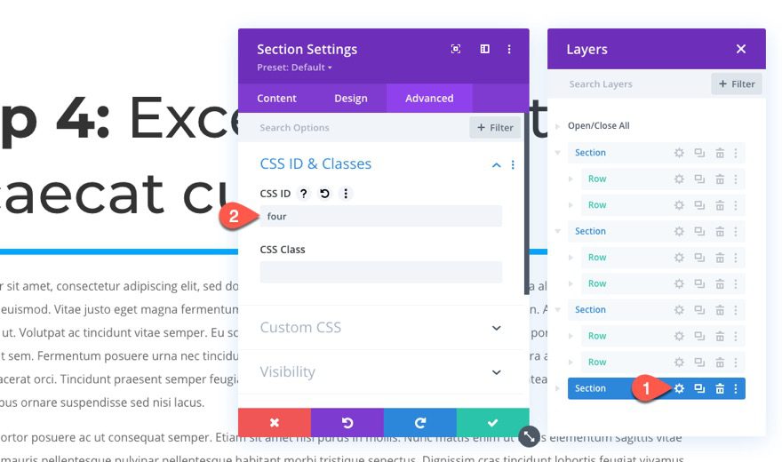
Add Section 4 CSS ID
Finally, we need to add the anchor link for the fourth heading.
Open the fourth section settings and add the following CSS ID:
- CSS ID: four
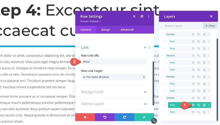
Add Section 1 Sticky Row Link URL
Then open the settings for the sticky row inside the fourth section and add the row link URL:
- Row Link URL: #four
Final Result
Here you can see the sticky page headings stick at the top and bottom of the browser window and stack on top of one another like an accordion.
Here you can see that clicking on one of the sticky headings will jump (using smooth scrolling anchor links) to that section of the page also like an accordion.
Here is the functionality on mobile as well.
Final Thoughts
This design uses the sticky position option in a unique way. Not only do the page headings remain visible as the user scrolls, but each heading is also clickable, taking the user to that specific section using anchor links. The result is much like an accordion for your entire page. This design would definitely come in handy for indexing long-form content or for creating a user-friendly one-pager.
I look forward to hearing from you in the comments.
Cheers!


Hey Jason,
You simply explained everything about accordion & placements. It feels great that I learned something new today. Thanks alot.
Regards
Manish
Awesome!
Hi Jason,
I was having a prolem creating Accordion first, but now you cleared everything with this post. Really thankful to you.
Regards,
Pankaj
Awesome! Glad it helped.
Hi Jason,
Very great article for accordion items.
Thank you
You’re welcome, Atul!
Hi this is great, but while on a mobile device if I open up my mobile menu and scroll down the menu, the H2 and paragraph text from the first section will overlap the menu (while not sticky’d). Then it will go back underneath the mobile menu once it is back in a sticky state.
I thought it was a z-index issue but have not had any lucky adjusting this value for the H2 and paragraph modules. The issue also does not appear when I use ‘Inspect Element’ on my browser. I am viewing it on an iPhone 8. Any suggestions would be appreciative.
Zack,
Sorry this is still an issue. Have you tried adjusting z-index on the sticky row (not the module) on both the desktop and sticky state? Also try to increase the z index of the mobile header via external CSS.
Try setting the top and bottom sticky limit to the body area for each sticky row. Haven’t tested it thoroughly but this may solve the issue.
Hi Jason, I attempted changing the Sticky limit to body area and this did not resolve the overlapping text with the mobile menu while not sticky’d. If anyone resolves this please let me know, it is a fantastic design otherwise.
Good idea Jason!
Thats why we love to use digital devices
these designs work.
Thank you
Thank you, JoostHeikoop!