
Card carousels look deceptively simple: a row of cards, some navigation controls, and a bit of motion. But getting the structure, spacing, responsive behavior, and active-state styling right takes more work than it seems. With Divi 5, you can build this layout natively without relying on a workaround or extra plugin.
Divi 5’s Group Carousel module was built for layouts like this. Once you understand how Groups, carousel settings, and responsive controls work together, building a polished card carousel becomes much more straightforward. In this guide, we’ll go from setup to styling to responsive refinement, with a few best practices that will save time as your carousel grows.
What A Card Carousel Is
A grid shows everything at once, which can become unwieldy when you have a lot of information to display. A single-item slider goes the opposite direction, hiding too much behind one focal point.
A card carousel sits between those two patterns. It shows enough content to provide context while keeping the layout compact. In practice, it is a row of cards that visitors can move through using arrows, dots, drag, or swipe gestures.
Each card usually groups related content such as an image, a heading, supporting text, and a button. Only some of those cards are visible at a time, while the rest remain off canvas until the carousel advances.
The format also adapts well across screen sizes. A desktop layout might show three or four cards at once, while tablet and phone views often reduce that to one or two. That makes card carousels useful for product highlights, team members, portfolio items, services, testimonials, and post loops.
The Group Carousel Module In Divi 5
The Group Carousel module is Divi 5’s built-in way to create multi-item carousels and sliders. Each slide is a Group, and each Group acts like a flexible container that can hold the modules your card needs, such as an image, heading, text, button, icon, rating, price, or dynamic content.
Because each slide is just a Group, you are working with the same design system and modules you already use elsewhere in Divi 5. That means the card structure can follow the content instead of forcing the content into a rigid template.
That Group-based structure also shapes how styling works. In the carousel’s Design tab, you can style inactive Groups and Active Groups separately. This makes it easy to keep a consistent baseline style across all cards and then add extra emphasis to the card currently in focus using filters, transforms, shadows, borders, or backgrounds applied in one place.
Building A Card Carousel In Divi 5
A strong result starts with a few structural decisions early on. Once those are in place, the rest of the build gets faster and cleaner.
Set Up The Row And Insert The Group Carousel Module
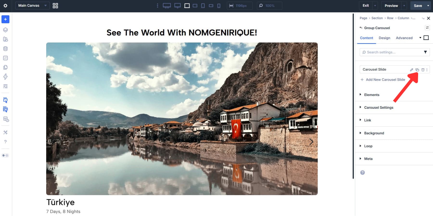
Start with a single-column row, open the module panel, and add the Group Carousel module. Divi 5 inserts it into the column with one Group already inside. That Group becomes your first card, and the rest of the carousel builds from there.
There are two setting groups worth reviewing right away in the Content tab. Under Elements, you can toggle arrows and dot navigation on or off depending on how you want people to move through the carousel. If arrows are enabled, you can also choose a different icon when the default chevron does not fit the design.
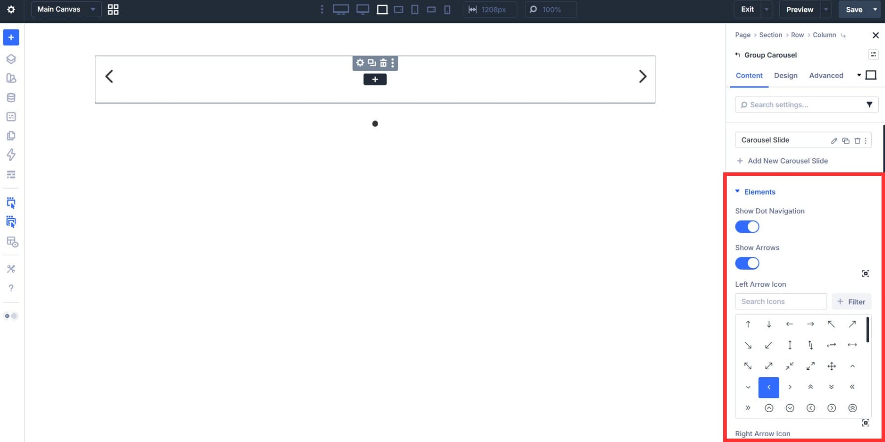
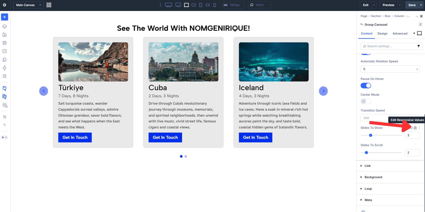
Under Carousel Settings, set the interaction pattern for the carousel. You can enable Automatic Rotation if the design calls for movement, but use it deliberately. For content-heavy cards, manual navigation is often easier to scan. Slides to Show, Slides to Scroll, and Transition Speed should be chosen based on the amount of content in each card and how dense you want the layout to feel.
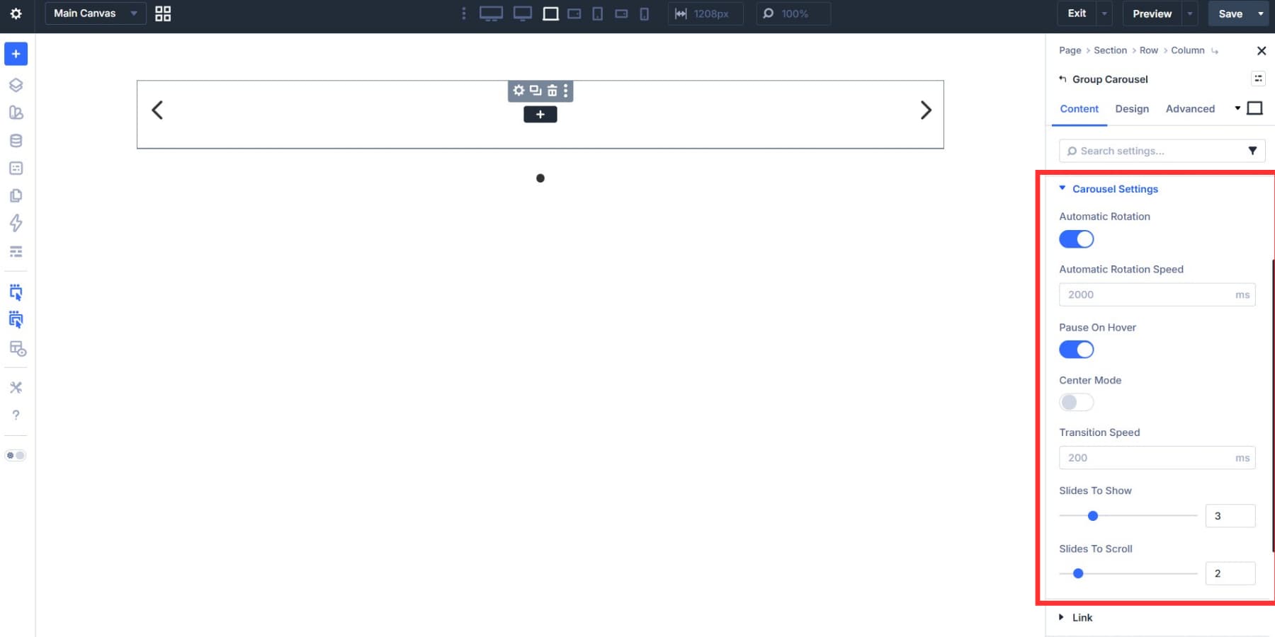
Center Mode keeps the active card centered, with adjacent cards partially visible on either side. It works well when you want to spotlight a single card and hint that more content is available.
If your goal is to show three full cards in a straightforward row, leaving Center Mode off usually makes more sense.
Build The First Card Carefully
The first card becomes the template for the rest of the carousel, so the time you spend here pays off across every duplicate. Add the modules your card needs inside the first Group: Image, Heading, Text, Button, or any other combination that suits the content.
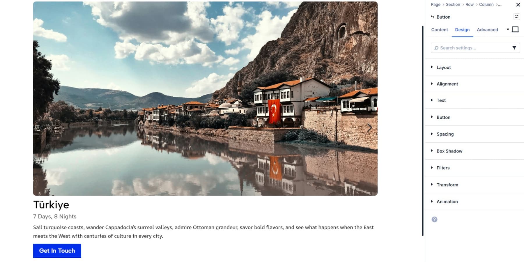
A team card might only need a photo and a name. A product card may need an image, title, short description, price, and CTA. The structure should follow the job of the card.
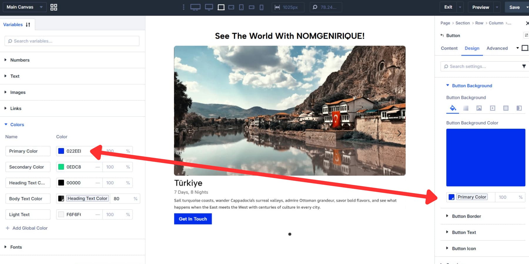
As you style the modules inside the card, use Design Variables or Presets for colors, typography, spacing, and radius values instead of hardcoding them. That keeps the carousel aligned with the rest of your site and makes future changes much faster.
One practical tip: avoid over-styling the Group too early. Get the card content structure right first, then handle shared card styling at the carousel level.
Duplicate And Populate The Remaining Cards
Once the first card is built, duplicate that Group to create the rest of the carousel. Each duplicate keeps the structure and styling of the original, so you are only swapping content rather than rebuilding the layout from scratch.
Then open each duplicate and replace the image, heading, body copy, button text, and link as needed. That is the main advantage of getting the first card right.
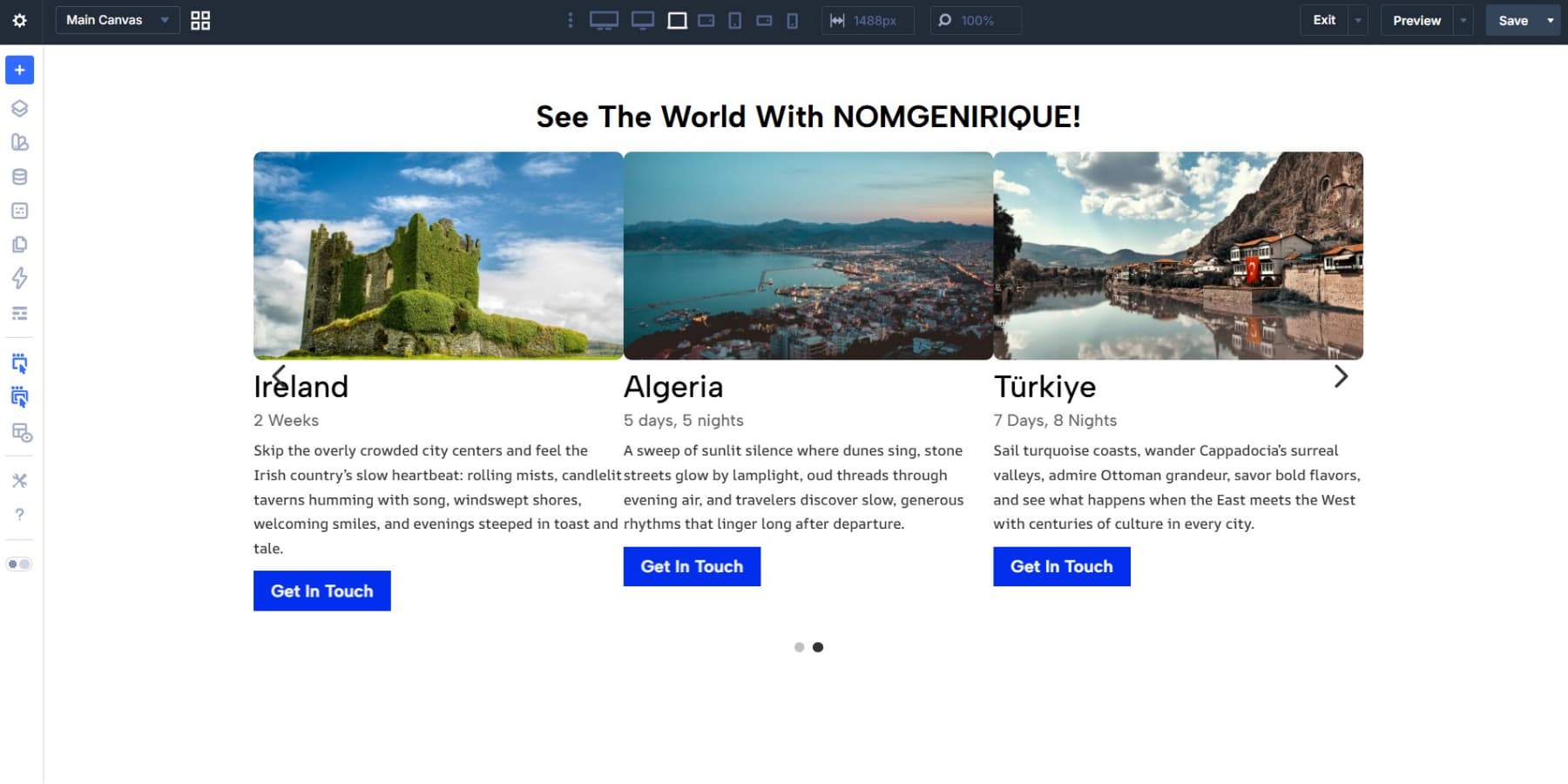
If you are building a larger carousel, rename each Group using its Admin Label. Clear labels such as “Card 1: Feature” or “Card 3: Pricing” make it much easier to manage the carousel later.
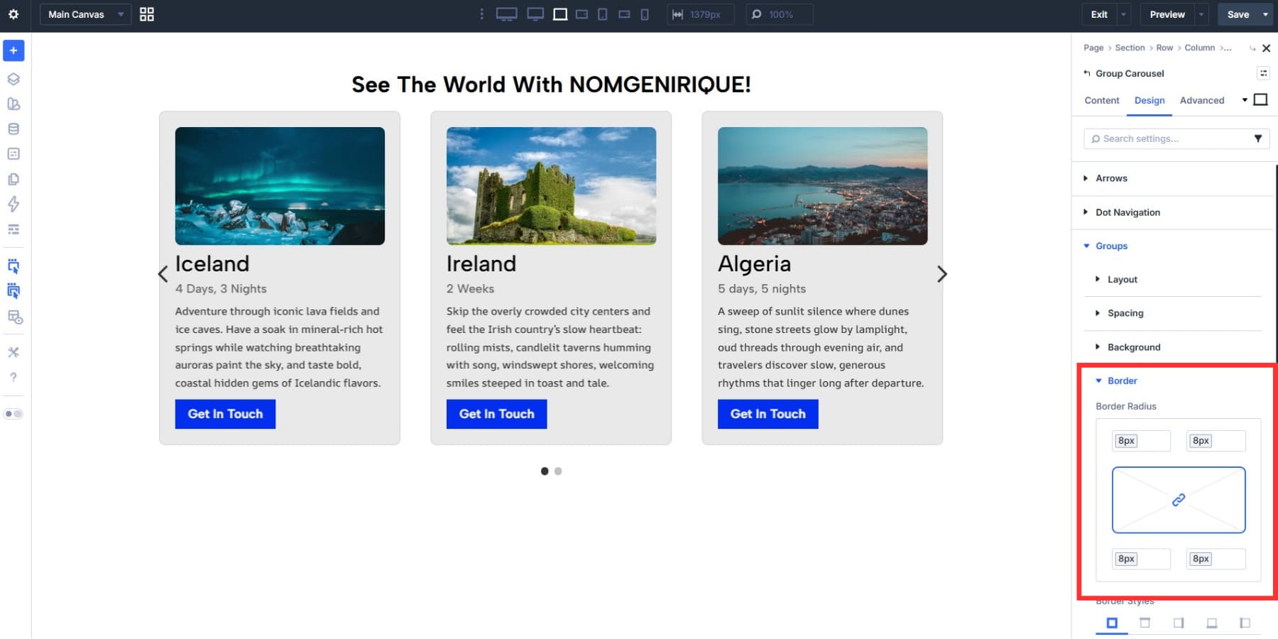
Style The Carousel At The Group Level
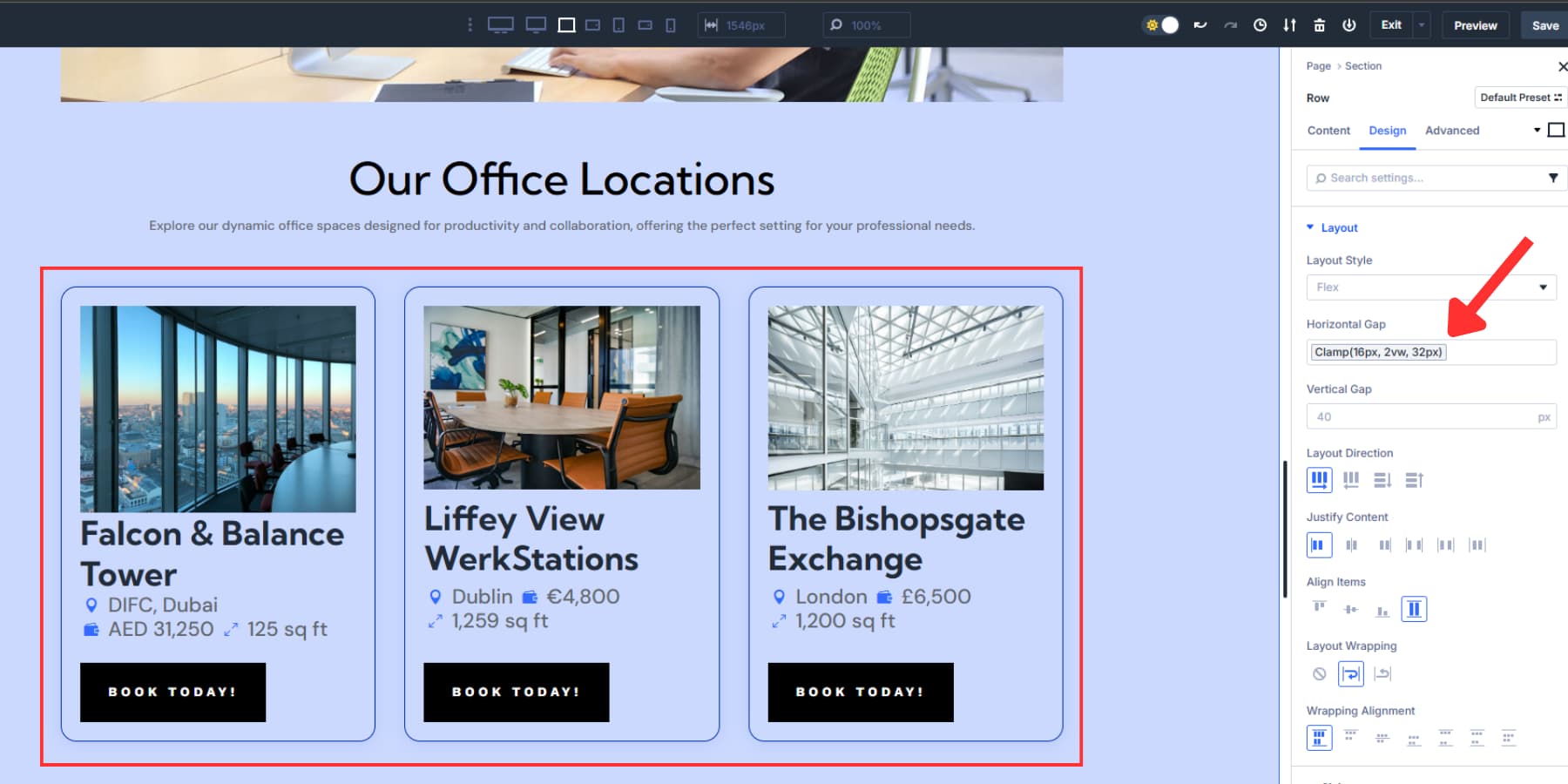
Styling the carousel at the Group level is usually more efficient than opening each card individually for shared design changes. Inside the Group Carousel module, go to the Design tab and expand Groups. This is where you can apply shared styles to the inactive cards across the entire carousel.
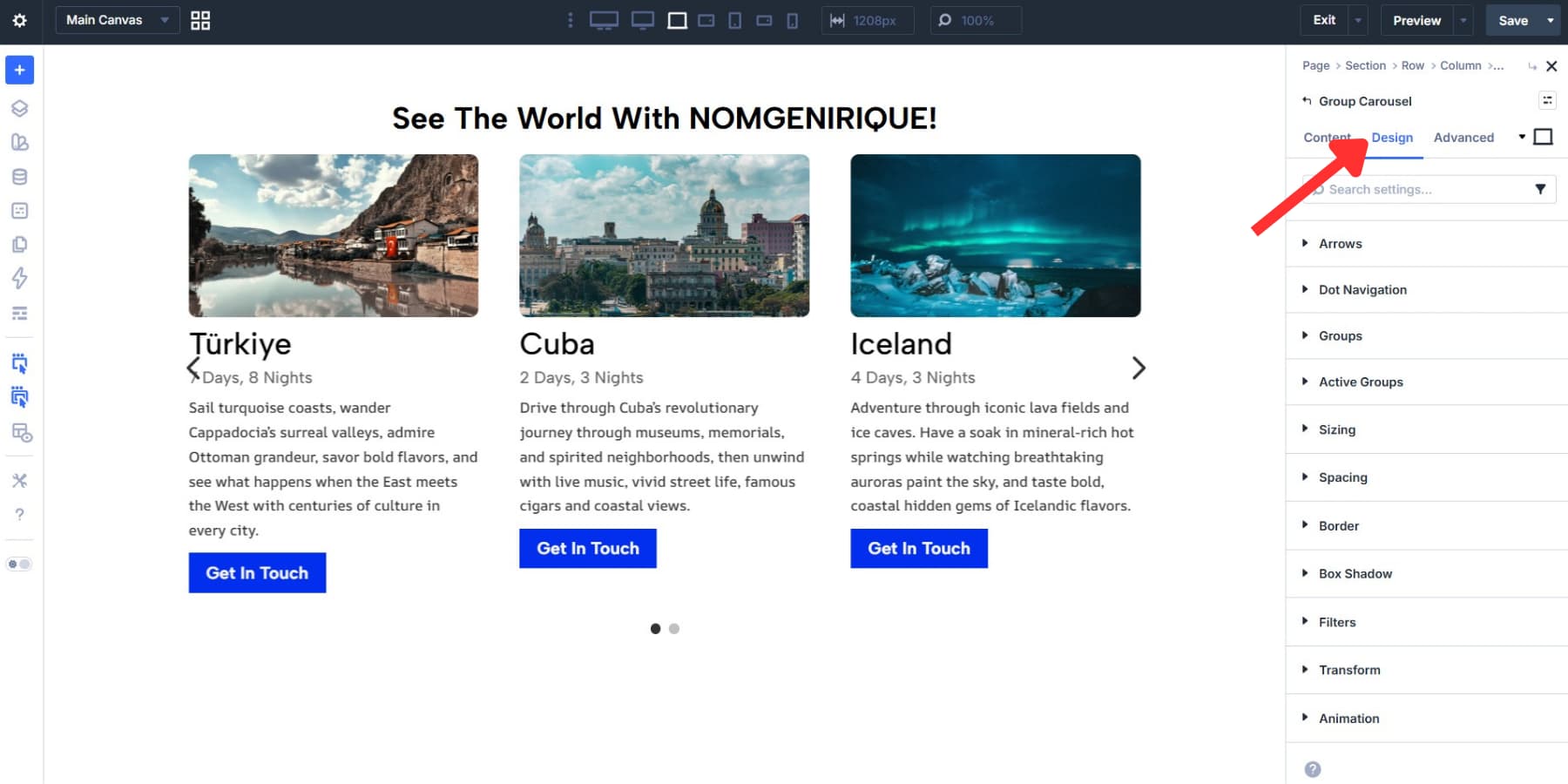
Here you can set Background, Spacing, Sizing, Borders, Box Shadows, Filters, and Transforms for all Groups at once.
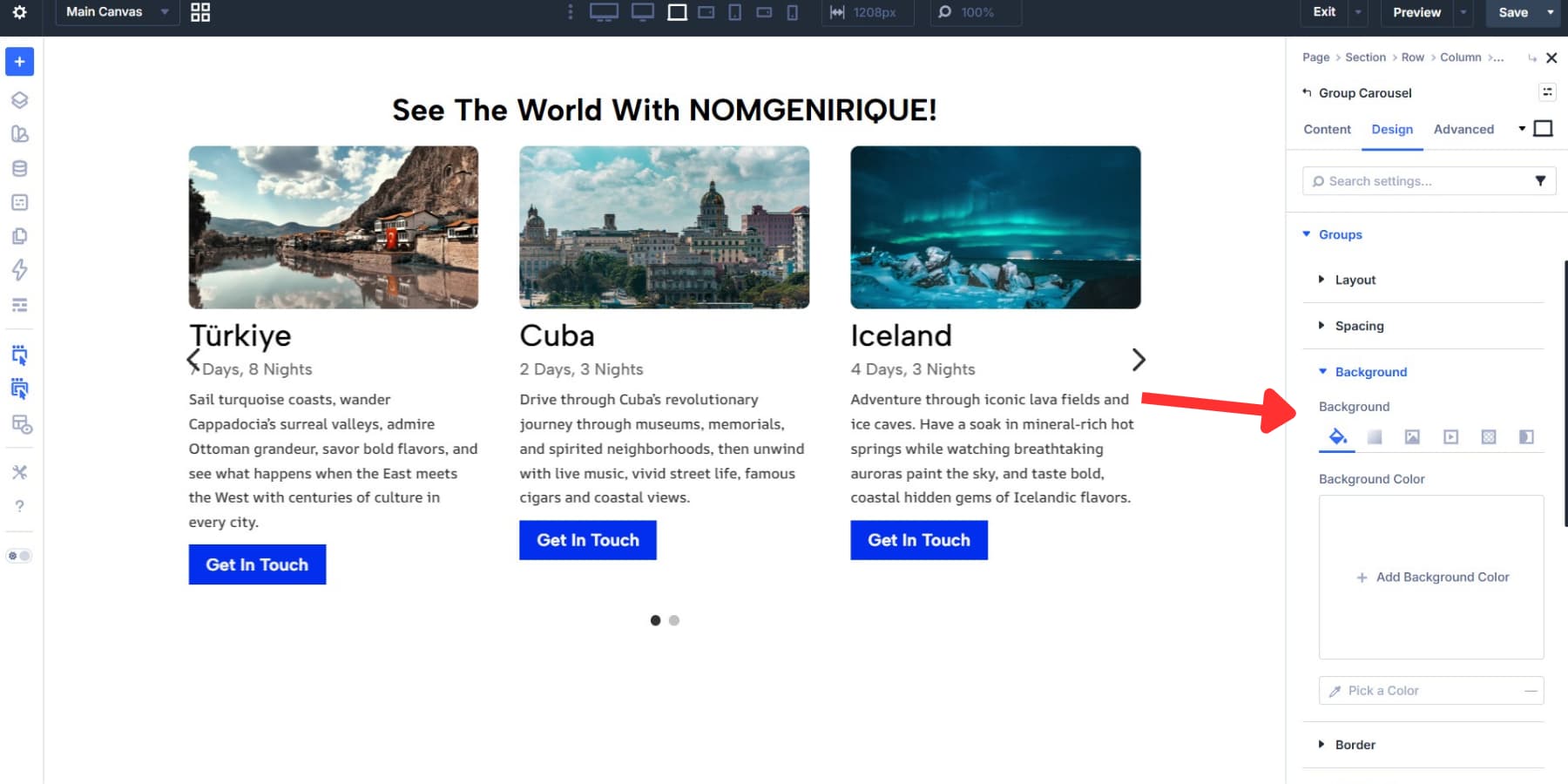
Use margin to control the space between cards and padding to control the internal spacing inside each card.
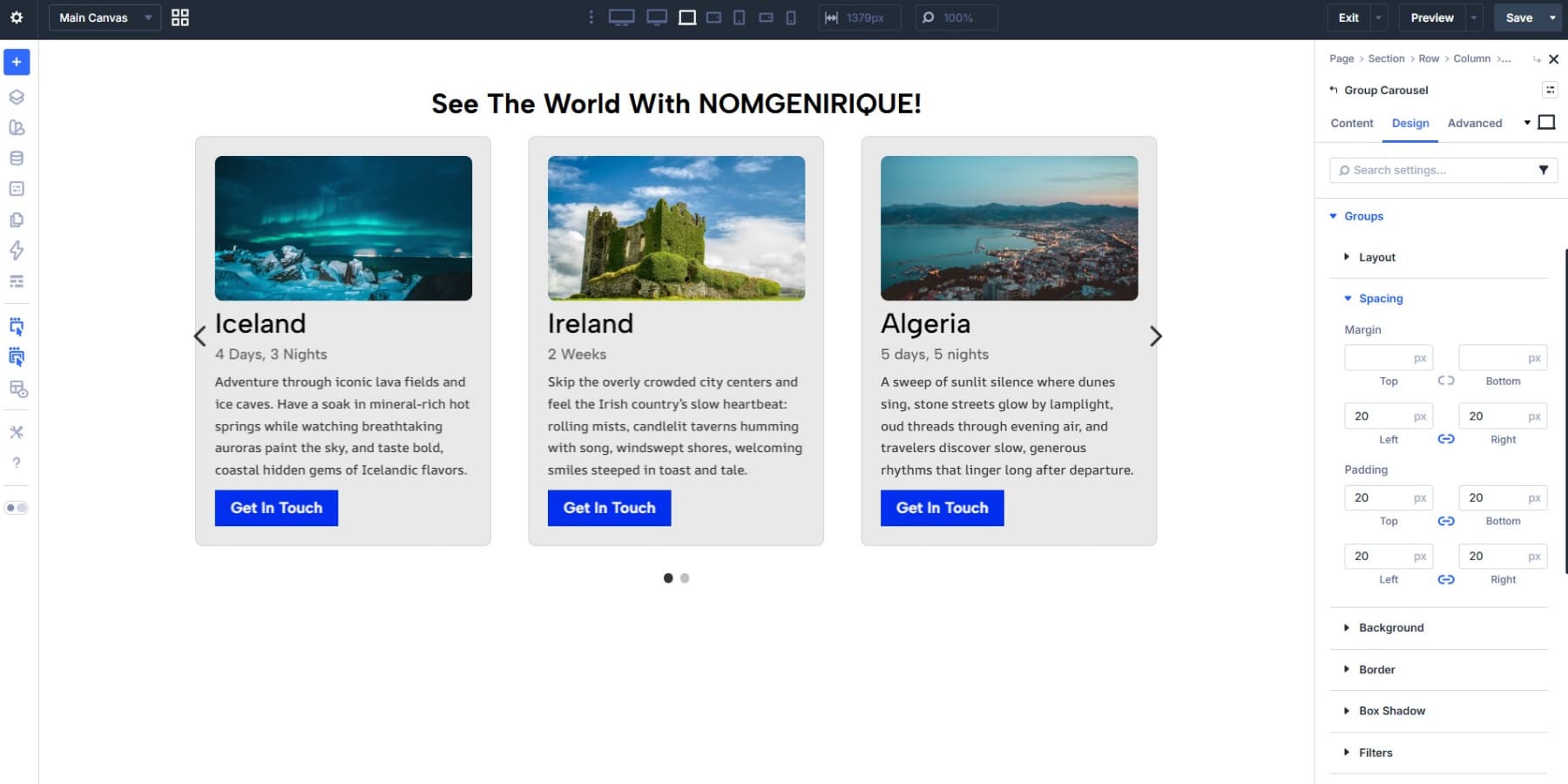
Borders and box shadows help create separation between cards, especially when your carousel sits on a busy background. As with the individual module styling, Design Variables are a better long-term choice than fixed values.
A useful best practice here is to standardize card height as much as possible. If one card has much more copy than the others, the carousel can look uneven. Keeping headlines, body copy, and button placement relatively consistent improves the visual rhythm.
Style Active Groups Separately
Groups define the baseline appearance of every card. Active Groups let you add emphasis to the card currently in focus.
Active Groups include many of the same styling controls as Groups, including Background, Filters, Transforms, Box Shadow, and Borders. Anything you set here only affects the active card, while the Groups settings continue to define the inactive cards.
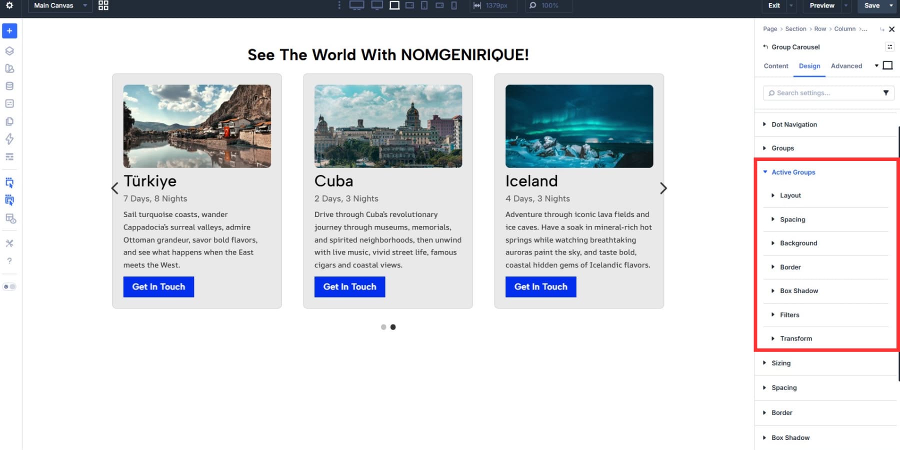
A subtle scale increase, stronger shadow, full saturation, or higher contrast is often enough. The goal is to guide attention, not make the active card feel disconnected from the rest of the set.
Center Mode pairs especially well with Active Group styling because the focused card always sits in the visual center of the row.
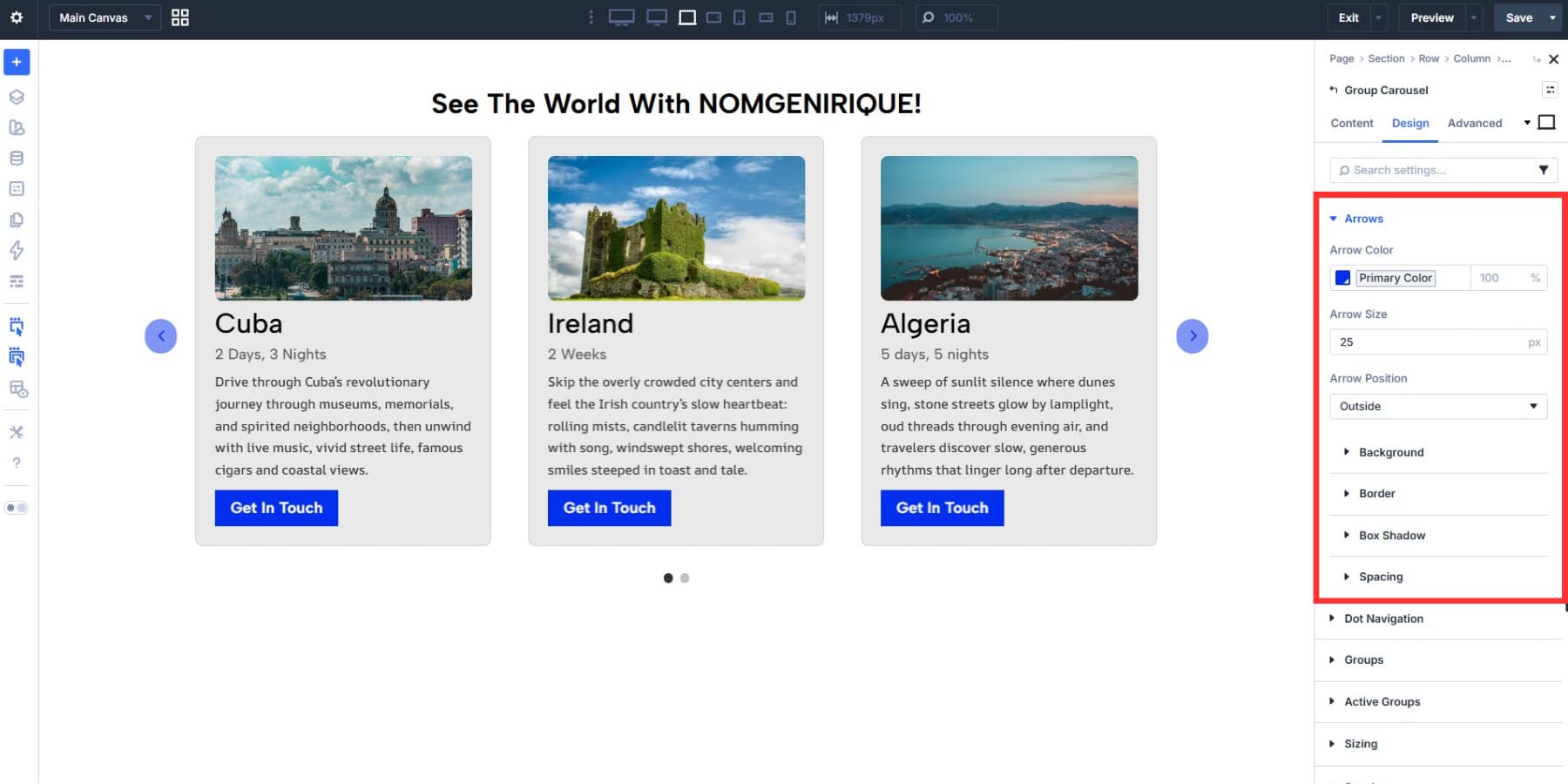
Design Navigation Controls
Arrow styling lives under Design > Arrows, where you can adjust color, size, and position. Outside is often the cleanest placement for card carousels because it keeps the controls near the content without covering it.
Dot Navigation gives you controls for position, alignment, size, and color.
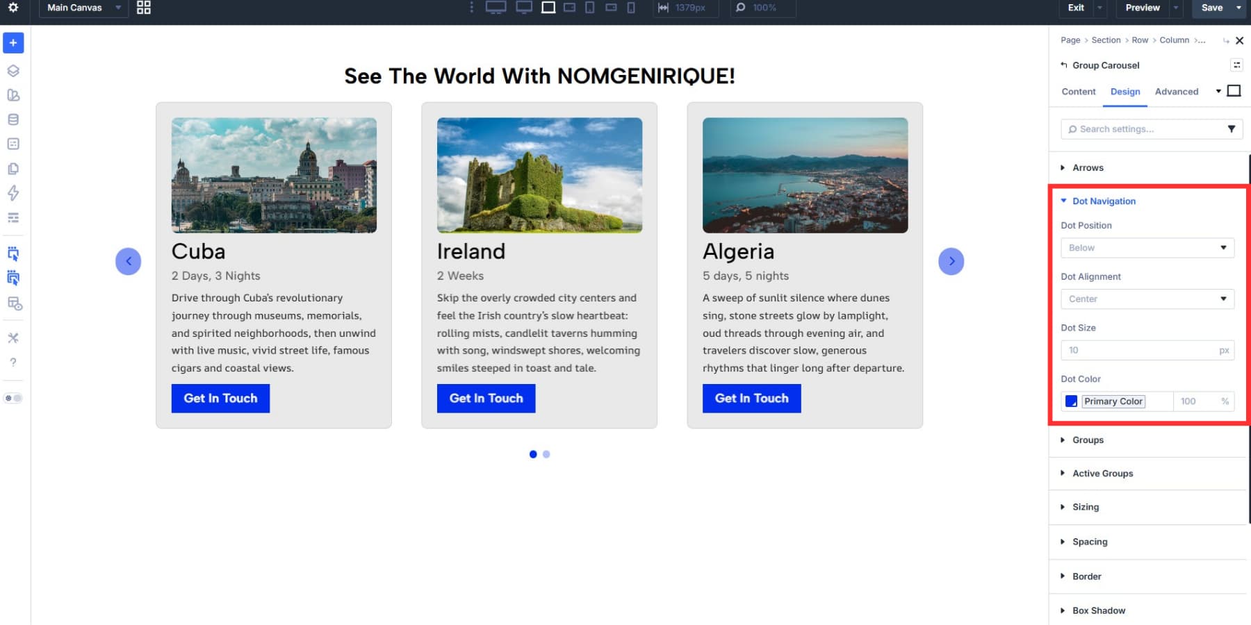
When both arrows and dots are enabled, keep them visually secondary to the cards themselves. They should support navigation, not compete with the content.
Make The Carousel Responsive
A card carousel may span the full row on desktop, but it nearly always needs adjustments at smaller screen sizes. Divi 5’s Responsive Editor makes this easier by letting you edit values by breakpoint from one interface.
Slides to Show is usually the first setting to revisit. A layout that looks balanced at three cards on desktop may need two on tablet and one on phone. You may also need to reduce spacing, adjust heading size, or shorten copy.
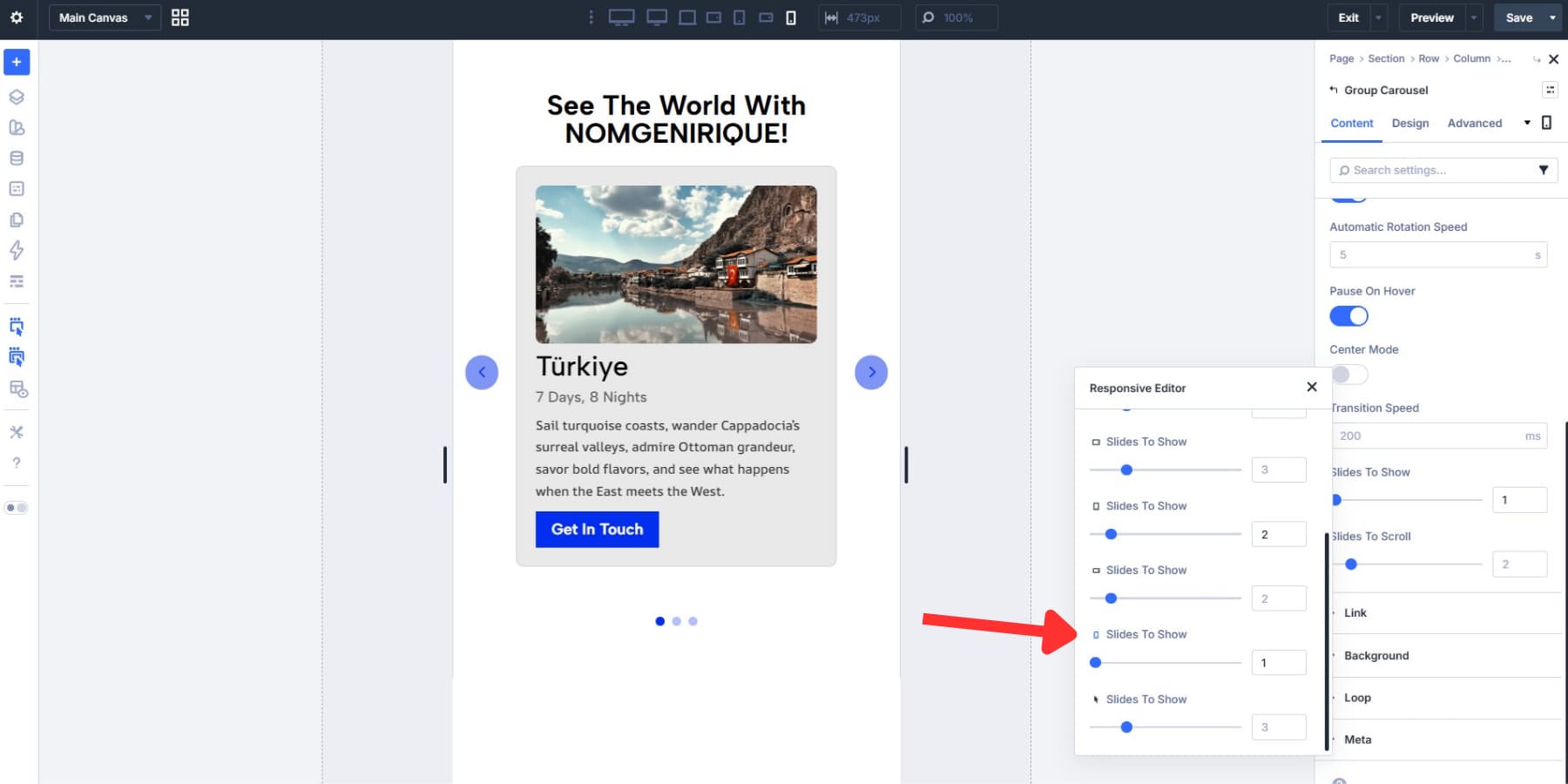
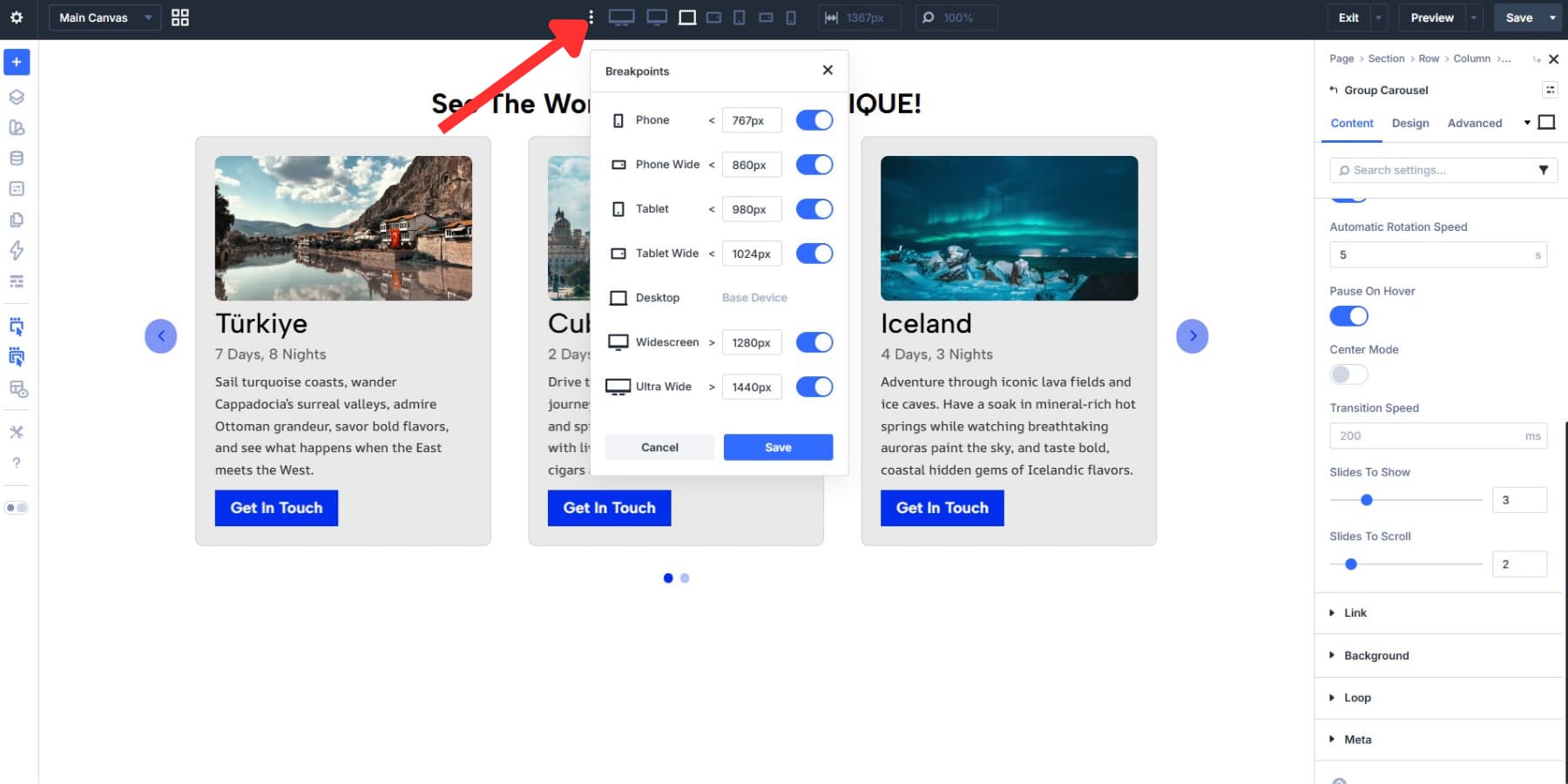
Divi 5 enables three breakpoints by default and supports up to seven customizable breakpoints when you need more granular control.
Card heading size, body copy, image ratio, and internal spacing are all worth checking at every breakpoint. Divi 5 also supports Advanced Units, including functions like clamp(), which can help create more fluid spacing and type scales.
Clamp() lets values scale fluidly between a minimum and maximum size as the viewport changes, instead of jumping between fixed values at each breakpoint. We cover that in more depth in our full clamp() guide.
One more practical tip: test swipe behavior and button taps on a real phone before publishing. A carousel that looks correct in the builder can still feel cramped if tap targets are too small or cards sit too close together.
Optional: Create A Dynamic Carousel
Static carousels work well when the content changes infrequently. But if you are displaying posts, products, listings, team members, or other repeatable content, building the carousel dynamically is the better long-term option.
Modules inside a Group can use dynamic content, which makes it possible to pull in post titles, featured images, prices, custom fields, and more.
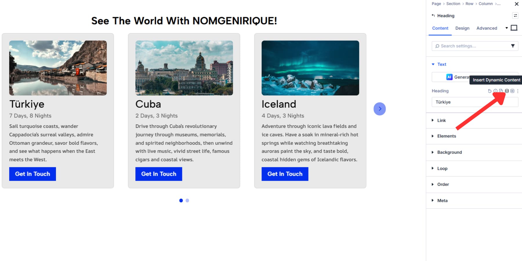
The Group Carousel also works with Divi 5’s Loop Builder. Instead of building every card by hand, you create one card template and repeat it across posts, products, team members, or custom post types. The result is a carousel that stays current as your WordPress content changes.
If you want to take the carousel further, we cover the full setup in our custom post type carousel loop tutorial.
Try Building Carousels In Divi 5 Today!
A card carousel can solve layout problems that a static grid or single-slide slider cannot. With Divi 5‘s Group Carousel module, you can build the structure natively, style inactive and active cards separately, refine the layout responsively, and connect the whole thing to your design system using Variables and Presets.
And if the content needs to stay fresh, pairing the Group Carousel with dynamic content and the Loop Builder turns it into more than a visual pattern. It becomes a maintainable part of your site architecture. Get started with Divi 5 and build card carousels that look polished, stay flexible, and scale cleanly.


Leave A Reply