
Every week, we provide you with new and free Divi layout packs which you can use for your next project. For one of the layout packs, we also share a use case that’ll help you take your website to the next level.
This week, as part of our ongoing Divi design initiative, we’re going to show you how to create a stunning blurb menu that expands once you hover or click it. We’ll first start off by going through some general steps. We’ll continue by adding menu items using Blurb Modules and we’ll finish off by allowing you to choose between a hover or click effect.
Let’s get to it!
- 1 Preview
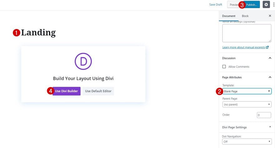
- 2 1. Create Blank Page & Upload Sightseeing Landing Page
- 3 2. Add New Regular Section to Bottom of Page
- 4 3. Make Sure All Section Menu Content is Created Using Vw & Fits into 100 Viewport Height Across All Screen Sizes
- 5 4. Make Section Sticky
- 6 5. Pick a Method: A) Menu On Hover or B) Menu On Click
- 7 Preview
- 8 Final Thoughts
Preview
Before we dive into the tutorial, let’s take a quick look at the outcome across different screen sizes.
Hover Modus
Desktop
Mobile
Click Modus
Desktop
Mobile
1. Create Blank Page & Upload Sightseeing Landing Page
Add New Blank Page & Enable Divi Builder
The first thing you will need to do is create a new blank page. Give your page a title and switch over to Divi Builder.
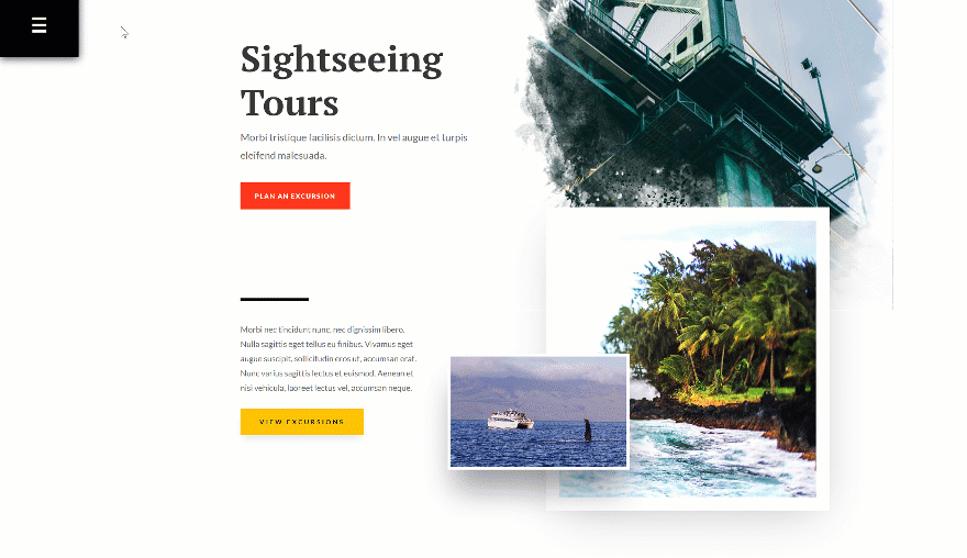
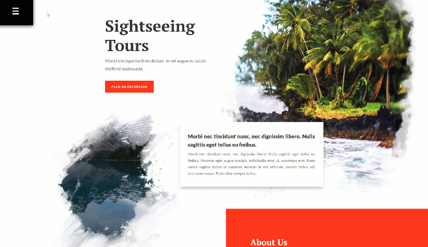
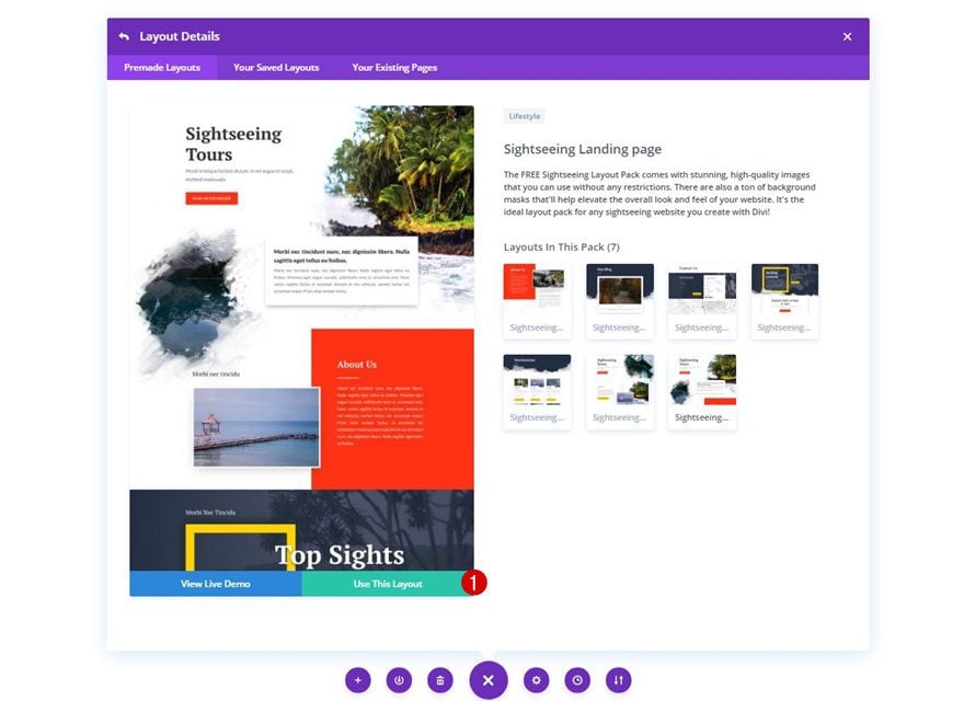
Upload Sightseeing Landing Page
Once you’ve enabled the Divi Builder, upload the Sightseeing Layout Pack’s landing page layout.
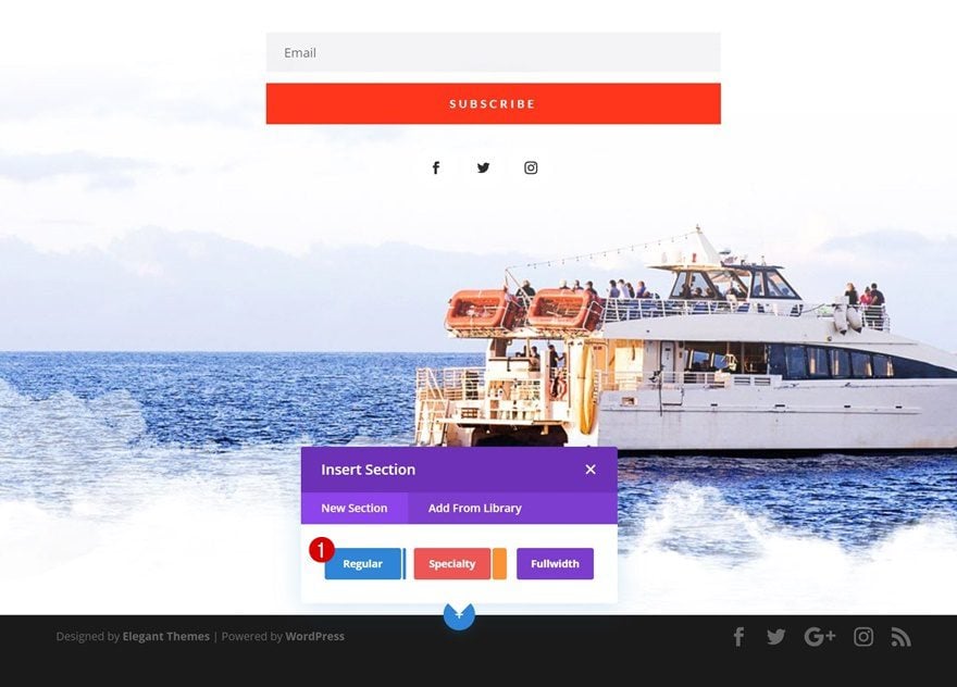
2. Add New Regular Section to Bottom of Page
Once the primary menu bar is hidden, we can start adding the blurb menu. To do that, we’re going to add a new regular section to the bottom of our page.
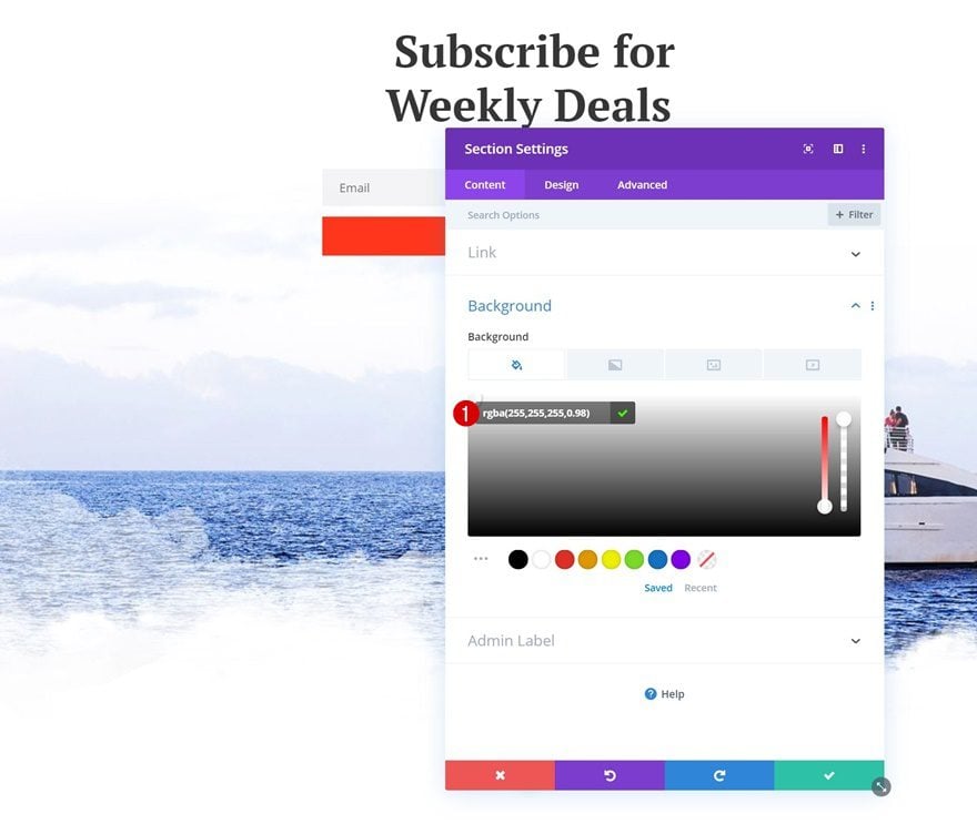
Background Color
Open the section settings and add a slightly transparent white background color.
- Background Color: rgba(255,255,255,0.98)
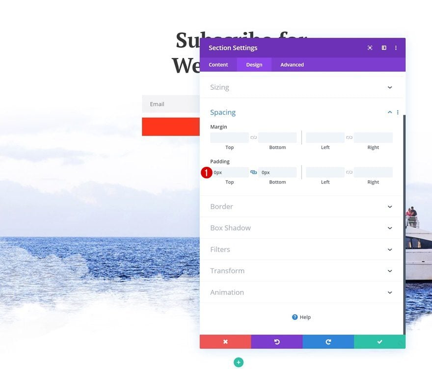
Spacing
Move on to the design tab and remove all default top and bottom padding of the section.
- Top Padding: 0px
- Bottom Padding: 0px
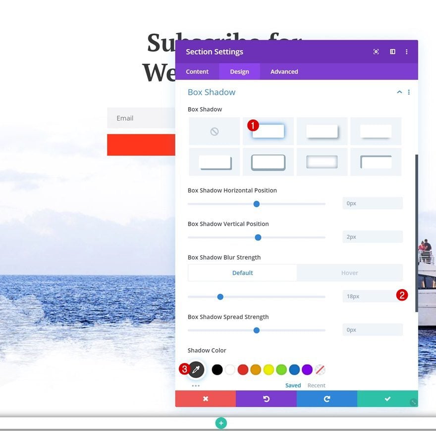
Default Box Shadow
Add a box shadow to the section next.
- Box Shadow Blur Strength: 18px
- Shadow Color: #383838
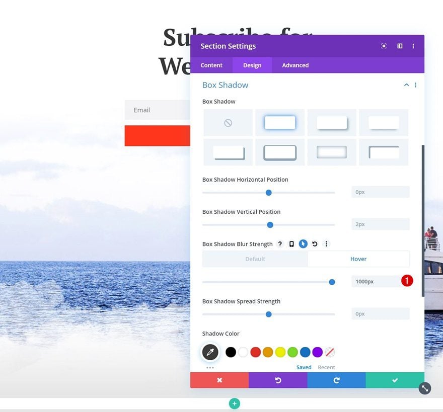
Hover Box Shadow
And change the box shadow blur strength on hover.
- Box Shadow Blur Strength: 1000px
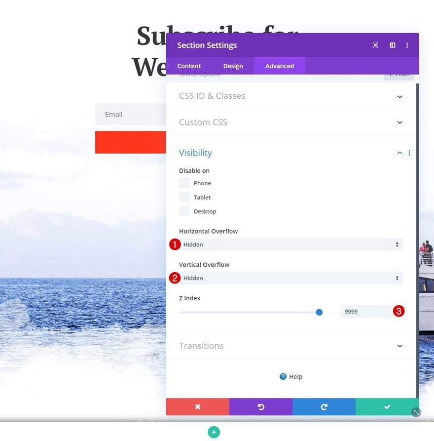
Hide Section Overflows & Increase Z Index
We’ll be using the section sizing settings to make this technique work, but to make sure nothing exceeds the section container, we’ll need to hide the overflows. We’re also increasing the Z Index to make sure the section stays on top of the rest of the page.
- Horizontal Overflow: Hidden
- Vertical Overflow: Hidden
- Z Index: 9999
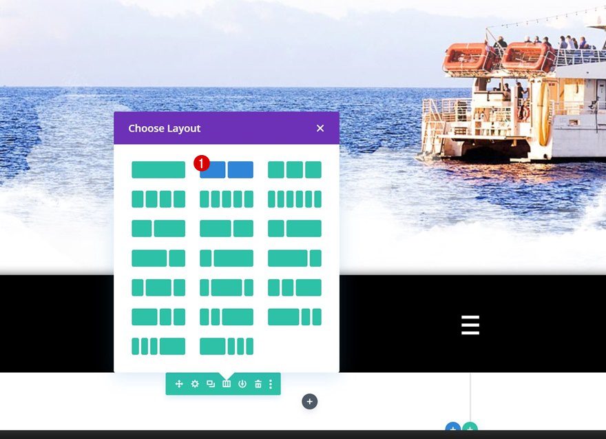
Add Row #1
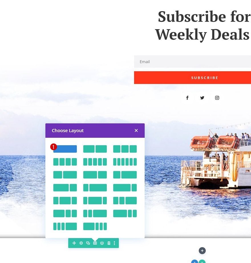
Column Structure
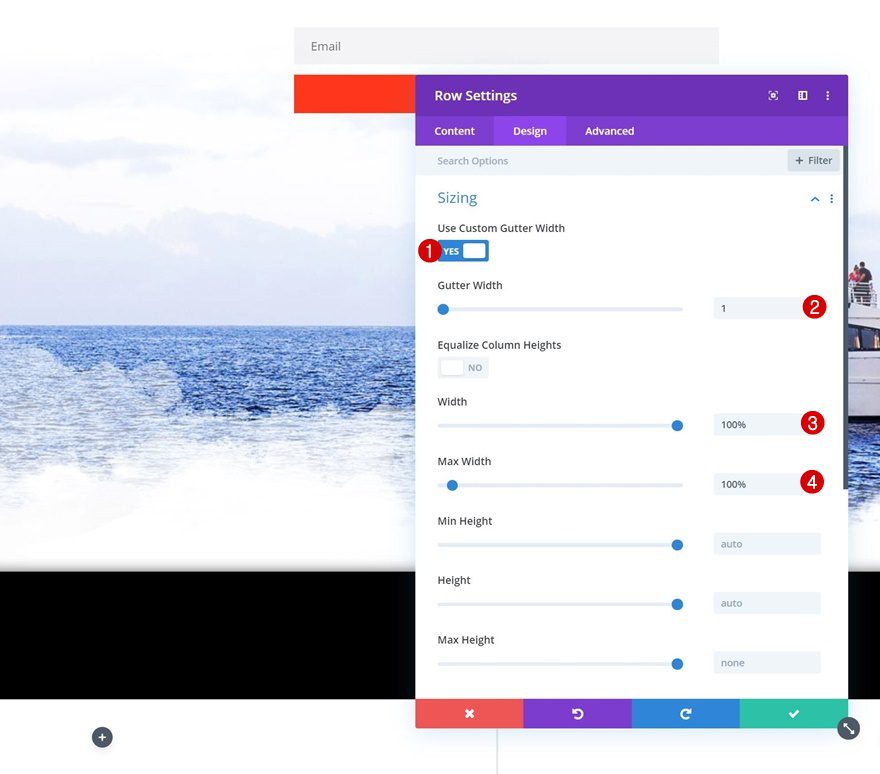
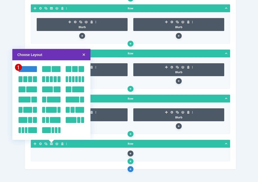
Once you’ve completed the basic section settings, it’s time to add all the content you want to show up in the menu. You can create any design you want using Divi’s design elements and built-in options, but you have to make sure it all fits into a ‘100vh’ height across all screen sizes. To accomplish that, we’re going to use the viewport width unit throughout the building process and tweak the values across different screen sizes. Start by adding a new row to your section using the following column structure:
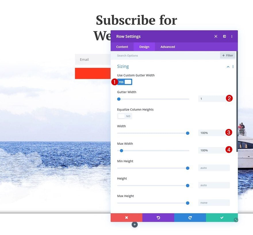
Sizing
Without adding any modules yet, open the row settings and make sure it takes up the entire width of the section.
- Use Custom Gutter Width: Yes
- Gutter Width: 1
- Width: 100%
- Max Width: 100%
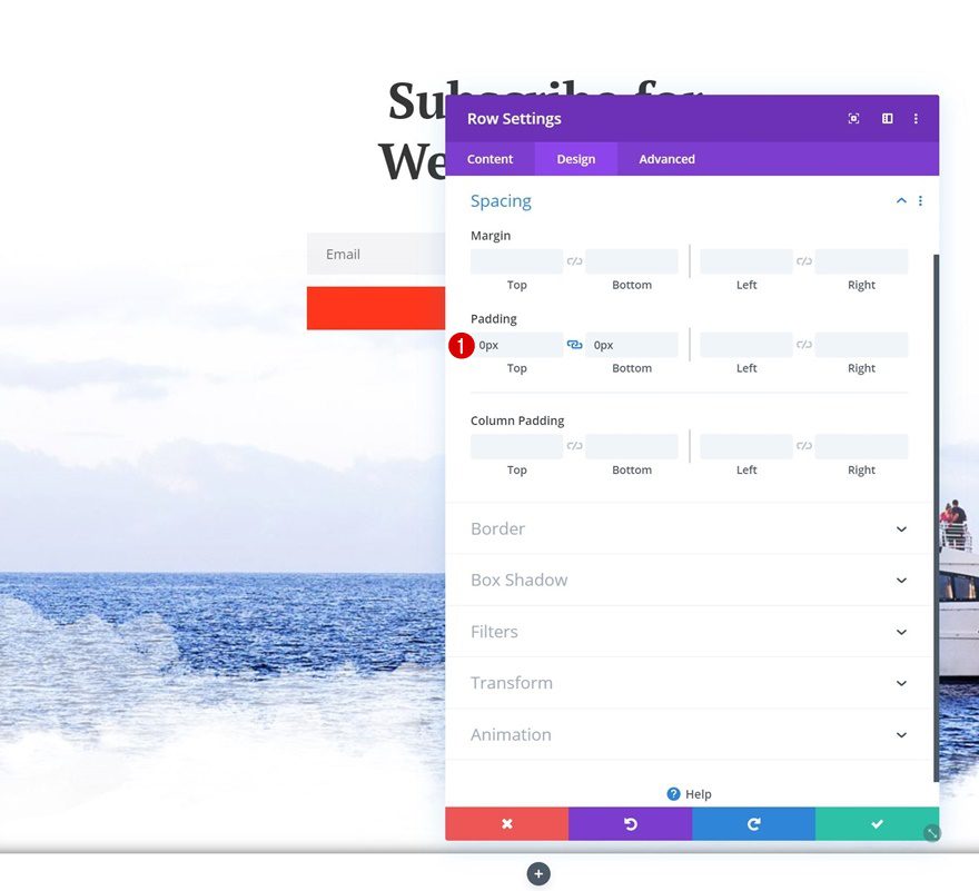
Spacing
Move on to the spacing settings and remove all default top and bottom padding.
- Top Padding: 0px
- Bottom Padding: 0px
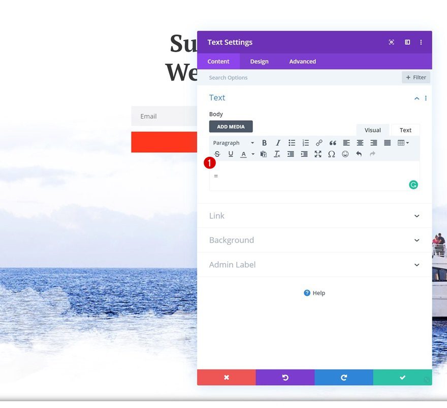
Add Text Module to Column
Add Symbol
Continue by adding a Text Module to the row’s column. Add the ‘=’ symbol to the content box or feel free to use any other symbol of your choice.
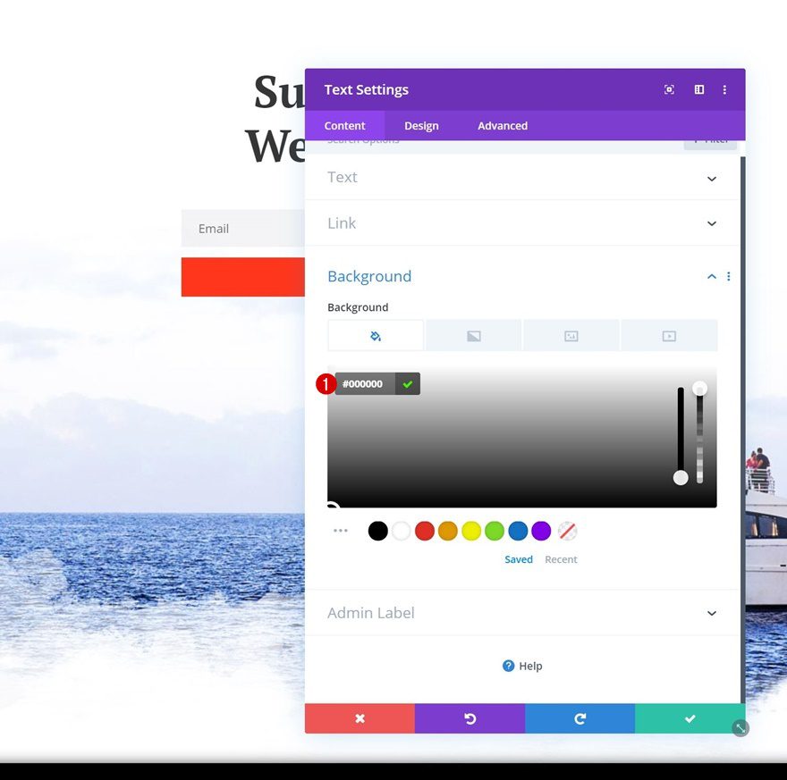
Background Color
Change the background color of the module next.
- Background Color: #000000
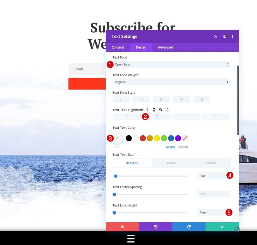
Text Settings
Move on to the design tab and change the text settings as well.
- Text Font: Open Sans
- Text Alignment: Center
- Text Color: #ffffff
- Text Size: 3vw (Desktop), 5vw (Tablet), 7vw (Phone)
- Text Line Height: 1em
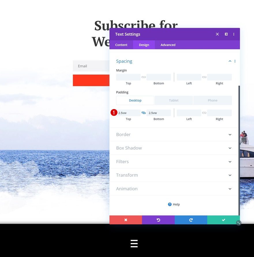
Spacing
We’re also adding some space to the top and bottom of the module using the following custom padding values:
- Top Padding: 2.5vw (Desktop), 3.5vw (Tablet), 5vw (Phone)
- Bottom Padding: 2.5vw (Desktop), 3.5vw (Tablet), 5vw (Phone)
Add Row #2
Column Structure
Continue by adding a second row using the following column structure:
Sizing
Without adding any modules yet, open the row settings and allow the row to take up the entire width of the screen.
- Use Custom Gutter Width: Yes
- Gutter Width: 1
- Width: 100%
- Max Width: 100%
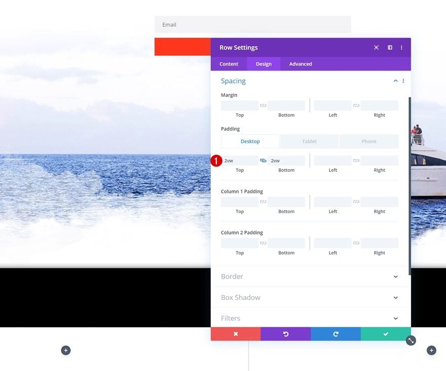
Spacing
Move on to the spacing settings and add some custom top and bottom padding next.
- Top Padding: 2vw (Desktop), 4vw (Tablet), 6vw (Phone)
- Bottom Padding: 2vw (Desktop), 4vw (Tablet), 6vw (Phone)
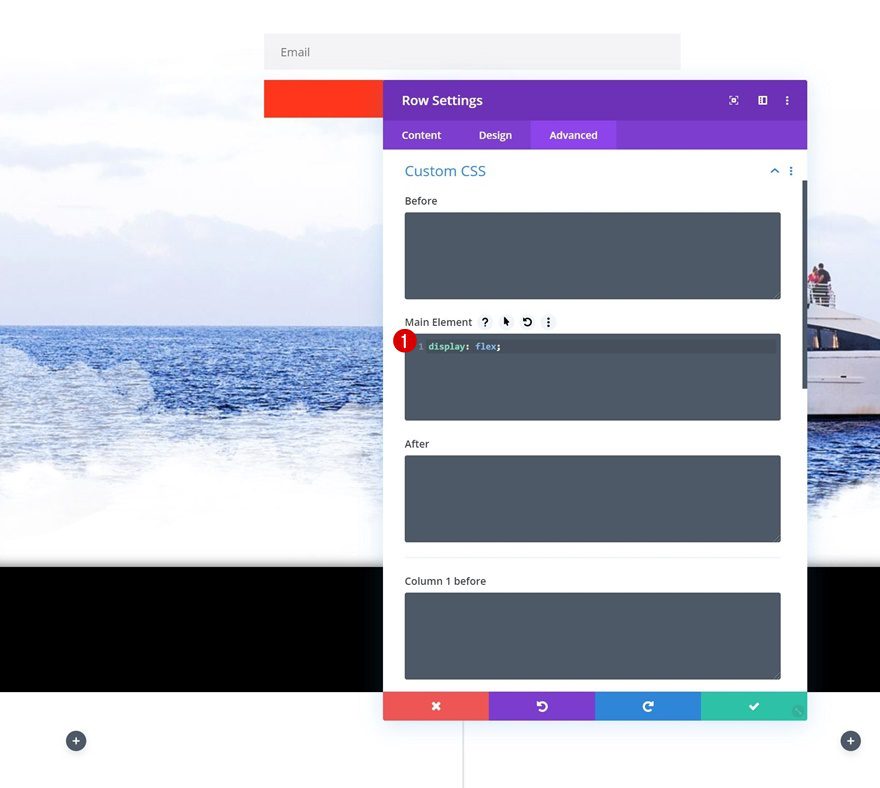
Display
To make sure both columns remain next to each other on smaller screen sizes, we’re going to add one single line of CSS code to the main element of the row.
display: flex;
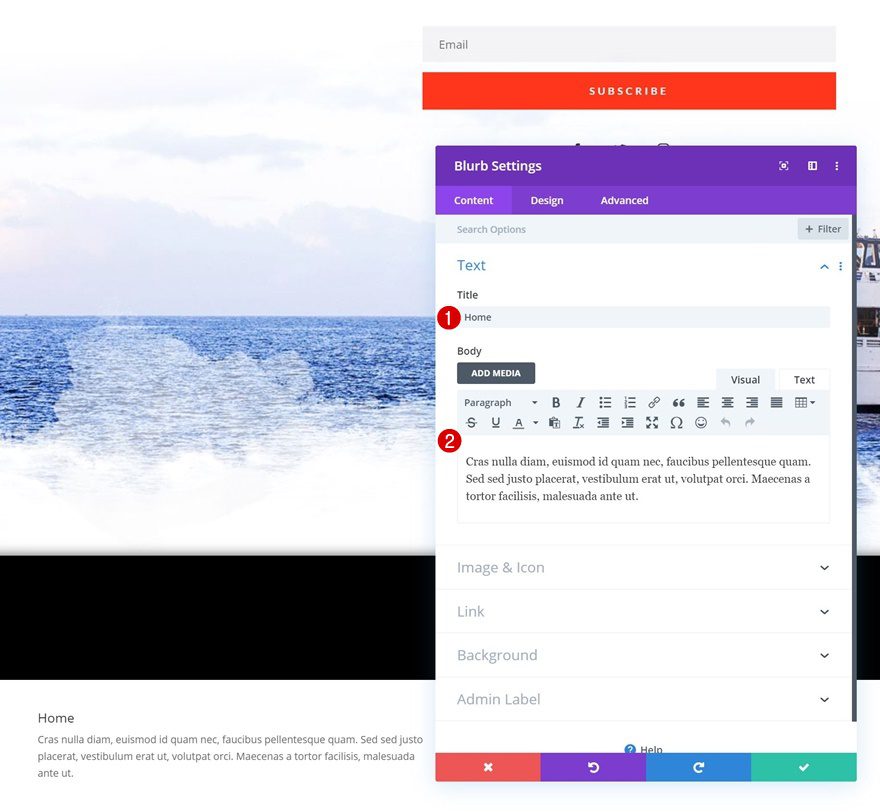
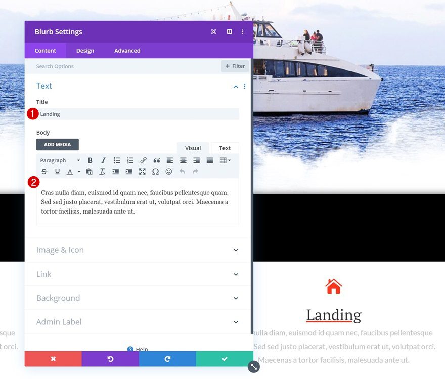
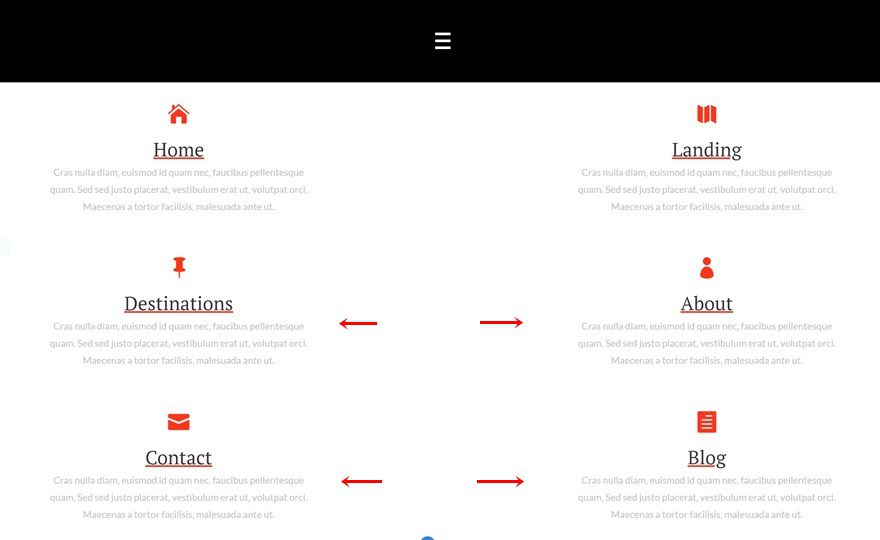
Add Blurb Module to Column 1
Add Content
Time to start adding the menu items! Add a new Blurb Module to the first column of the row and enter some content of your choice.
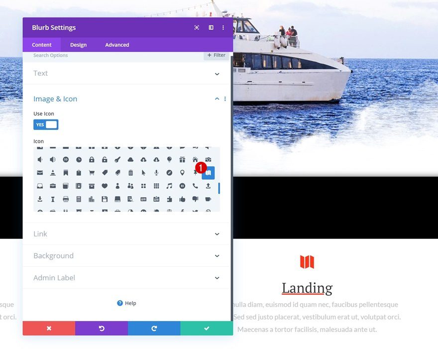
Select Icon
Choose an icon next.
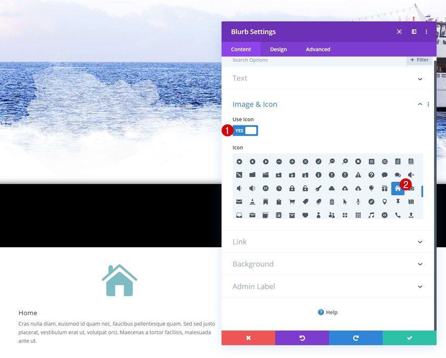
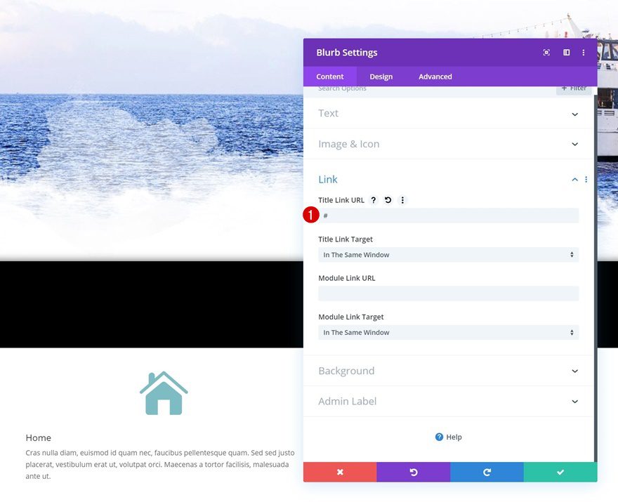
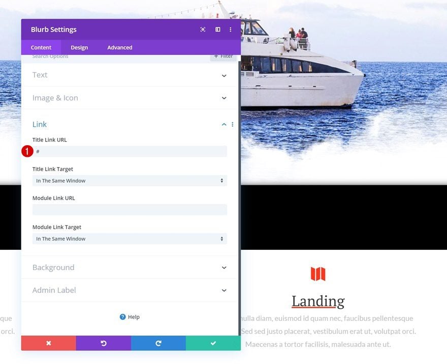
Add Link
And enter a page link that matches the menu item.
- Title Link URL: #
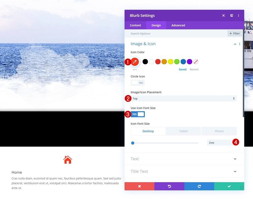
Icon Settings
Move on to the design tab and change the icon settings accordingly:
- Icon Color: #ff3314
- Icon Placement: Top
- Use Icon Font Size: Yes
- Icon Font Size: 2vw (Desktop), 3vw (Tablet), 4vw (Phone)
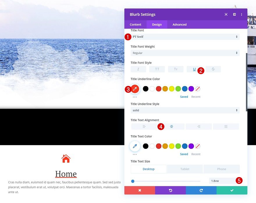
Title Text Settings
Modify the title text settings as well.
- Title Font: PT Serif
- Title Font Style: Underline
- Title Underline Color: #ff3314
- Title Text Alignment: Center
- Title Text Size: 1.8vw (Desktop), 2.3vw (Tablet), 3.3vw (Phone)
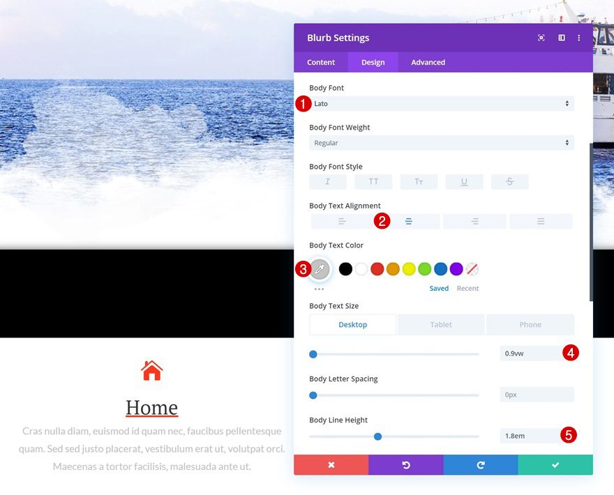
Body Text Settings
Then, change the body text settings.
- Body Font: Lato
- Body Text Alignment: Center
- Body Text Color: #c6c6c6
- Body Text Size: 0.9vw (Desktop), 1.7vw (Tablet), 2.1vw (Phone)
- Body Line Height: 1.8em
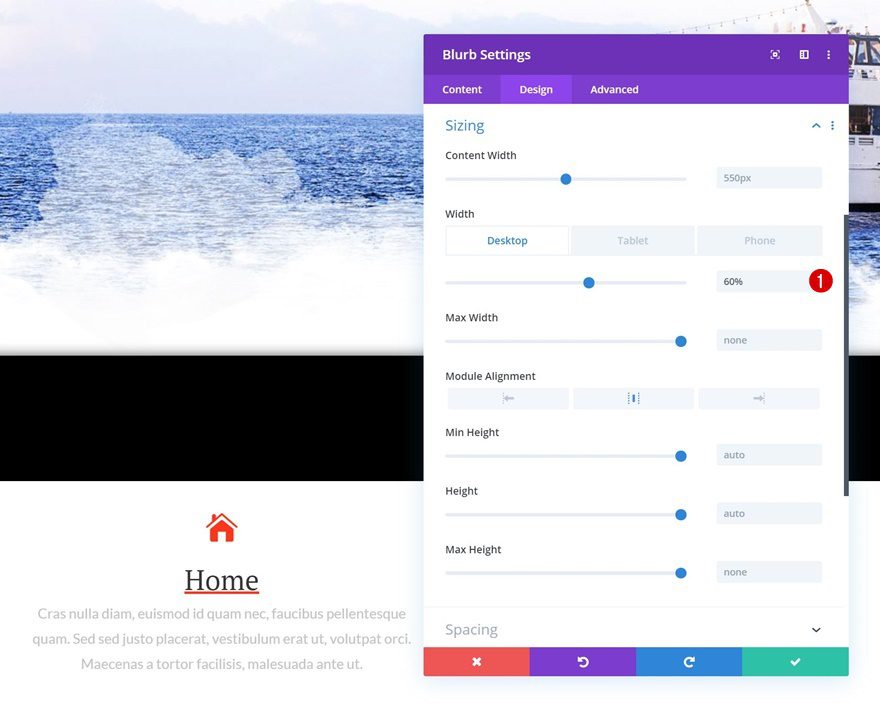
Sizing
And change the width of the module across different screen sizes using the following values:
- Width: 60% (Desktop), 65% (Tablet), 80% (Phone)
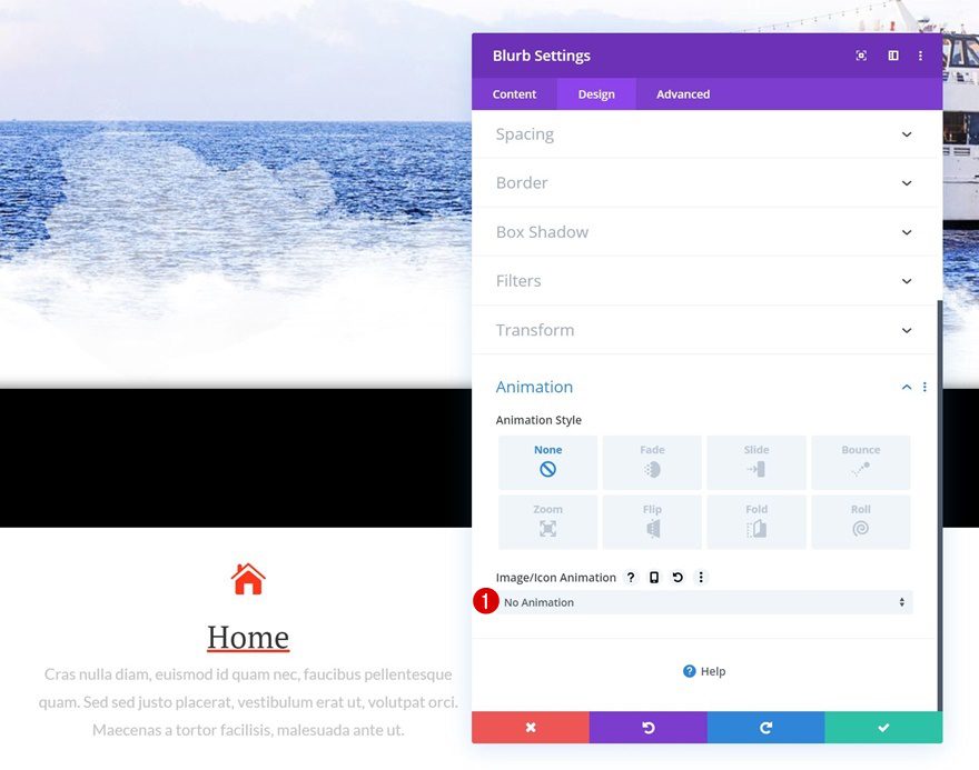
Animation
We’re also removing the icon animation in the animation settings.
- Icon Animation: No Animation
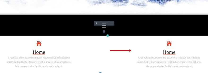
Clone Blurb Module & Place Duplicate in Column 2
Once you’ve completed the Blurb Module, you can clone it and place the duplicate in the second column of the row.
Change Copy
Make sure you change the copy.
Change Icon
Along with the icon.
Change Link
And the page link that matches the new menu item.
Clone Row Twice
Once you’ve completed both Blurb Modules in the row, you can clone the entire row twice.
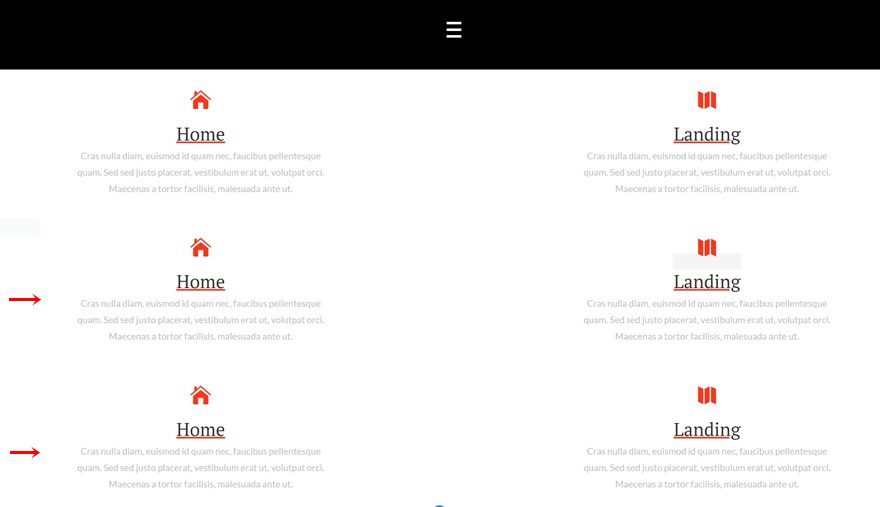
Change Copy, Icon & Link for Each Blurb Duplicate Individually
Make sure you change the copy, icon and link for each one of the blurb menu items individually.
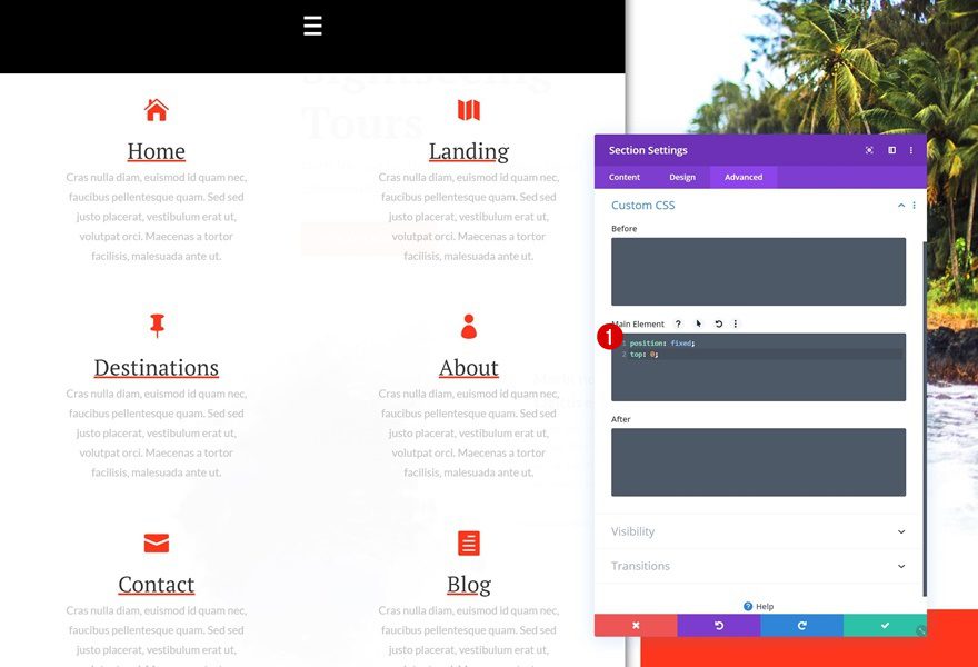
4. Make Section Sticky
Default
Once you’ve added all the elements you want to show up to your section, you can make the section stick to the top left of your page by adding the following two lines of CSS code to the main element of the section:
position: fixed;
top: 0;
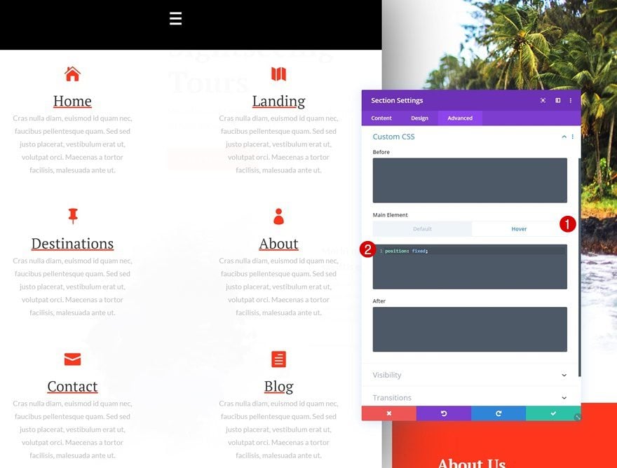
Hover (Important!)
Enable the hover option on the main element of the section and make sure the section remains sticky in this state as well.
position: fixed;
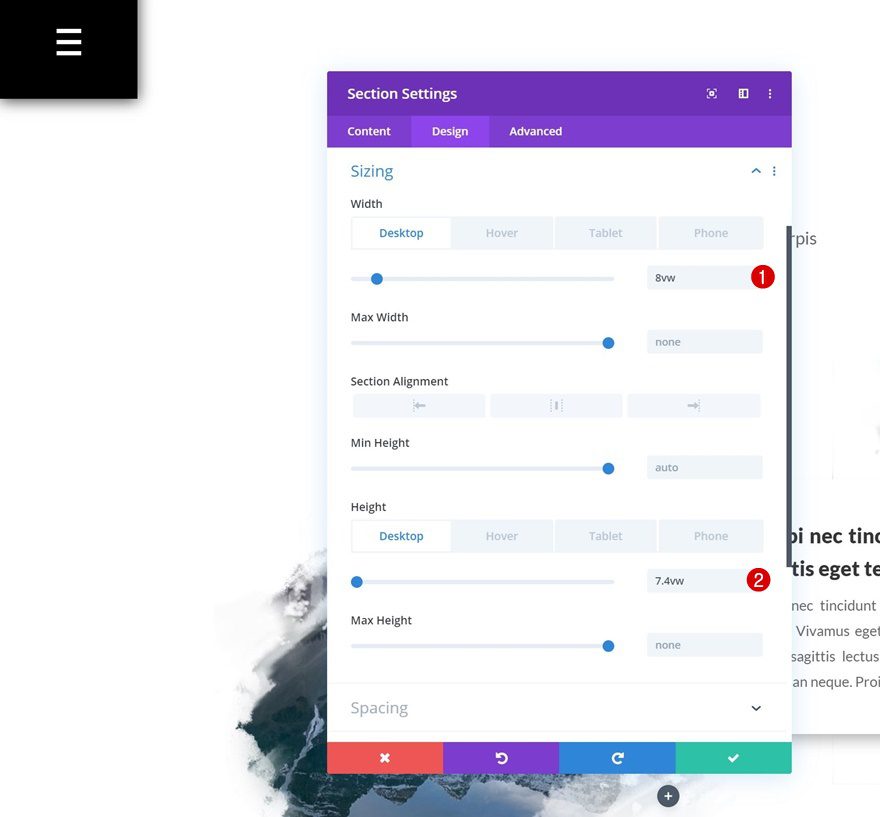
Default Section Sizing
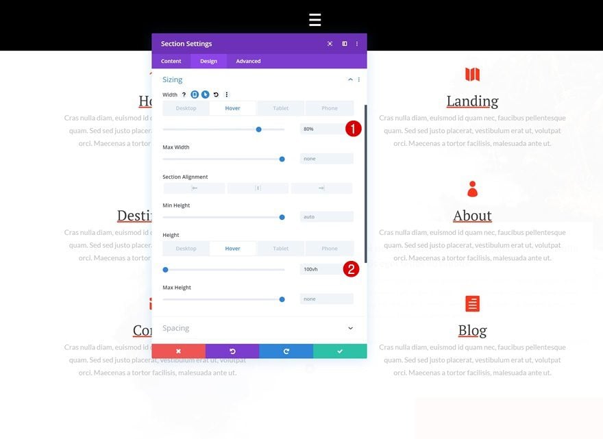
In the next part of the tutorial, you’ll need to pick a preferred method; a menu on hover or click. The hover menu will behave like a click menu on smaller devices. If you decide to choose the hover option, open the section settings again, go to the sizing settings and change the width and height of your menu accordingly:
- Width: 8vw (Desktop), 12vw (Tablet), 20vw (Phone)
- Height: 7.4vw (Desktop), 12vw (Tablet), 16vw (Phone)
Hover Section Sizing
Modify the values on hover to create an expanding menu.
- Width: 80%
- Height: 100vh
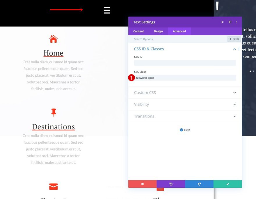
Add CSS Class to Text Module
If you want a menu that opens on click only, you’ll have to open the Text Module containing the menu symbol. Go to the advanced tab and add a custom CSS class.
- CSS Class: fullwidth-open
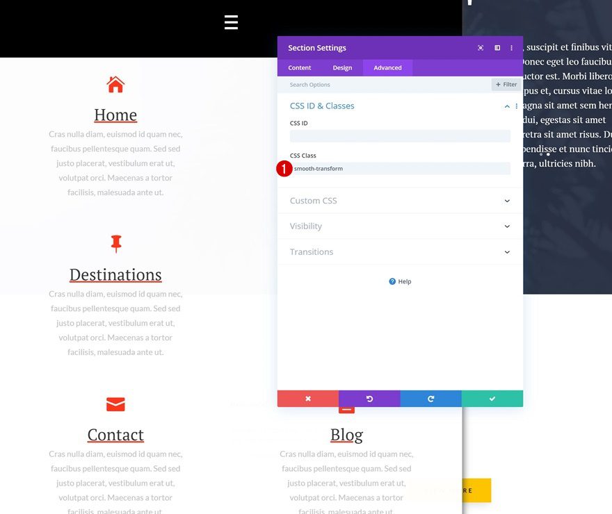
Add CSS Class to Section
Open the section settings next and add a different CSS class.
- CSS Class: smooth-transform
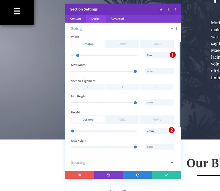
Section Sizing
We’re modifying the width and height of our section next.
- Width: 8vw (Desktop), 12vw (Tablet), 20vw (Phone)
- Height: 7.4vw (Desktop), 12vw (Tablet), 16vw (Phone)
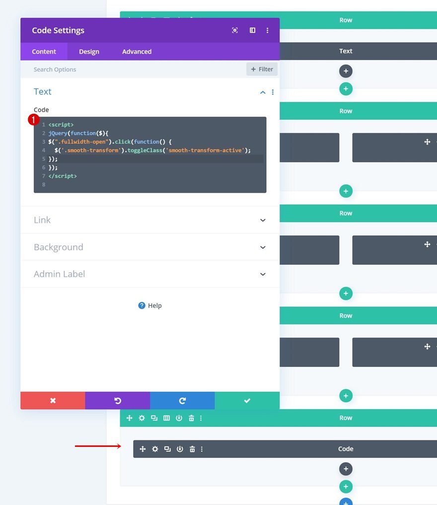
Add Code to Page
Add New Row to Bottom of Section
Now, to create the toggling effect, we’re going to need a bit of JQuery and CSS code. Start by adding a Code Module to a new row at the bottom of your section.
Add Code Module to Section & Insert JQuery Toggle Code
Copy the following lines of JQuery code and paste them to the code box:
<script>
jQuery(function($){
$(".fullwidth-open").click(function() {
 $('.smooth-transform').toggleClass('smooth-transform-active');
});

});
</script>
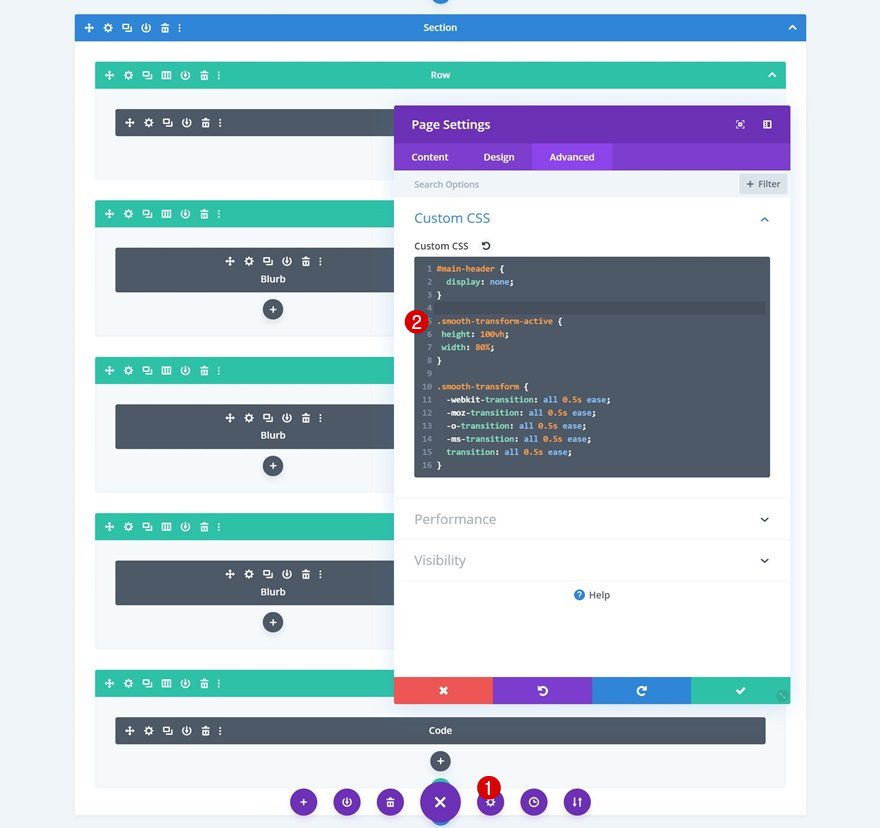
Add Custom CSS Code to Page Settings
Last but not least, open the page settings next and add the following lines of CSS code:
.smooth-transform-active {
height: 100vh;
width: 80%;
}

.smooth-transform {
-webkit-transition: all 0.5s ease;
-moz-transition: all 0.5s ease;
-o-transition: all 0.5s ease;
-ms-transition: all 0.5s ease;
transition: all 0.5s ease;
}
Preview
Now that we’ve gone through all the steps, let’s take a final look at the outcome across different screen sizes.
Hover Modus
Desktop
Mobile
Click Modus
Desktop
Mobile
Final Thoughts
In this post, we’ve shown you how to create a beautiful blurb module that expands on click/hover (depending on your preference). This is a great way to add extra interactivity to your menu while maintaining a responsive outcome across all screen sizes. If you have any questions or suggestions, make sure you leave a comment in the comment section below!
If you’re eager to learn more about Divi and get more Divi freebies, make sure you subscribe to our email newsletter and YouTube channel so you’ll always be one of the first people to know and get benefits from this free content.


Better with a Json
I’m curious if one could use a regular page template instead of the blank page, to retain the standard site menu, with this “mobile blurb menu” only being allowed to present on mobile devices, and then disable the built-in mobile menu via:
@media only screen and (min-width: 981px){
#main-header div#et_mobile_nav_menu {
display: none;
}
}
x1000
A JSON PLEASE!!!
I posted the download file on DiviBin
“upload the Sightseeing Layout Pack’s landing page layout”
Hello…
Just curious why for this type of tutorial you start with a layout pack? The “unused” content of the layout pack makes the tutorial somewhat more distracting to follow along including the screen captures. Would it not be easier for the user to follow along if you started with a blank layout? That way users would not have to scroll through all of the content that the layout pack adds. It would also allow them to export and reuse the tutorial content easier without exporting unwanted layout pack content.
Thanks
My guess would be to show that the menu stays fixed in place. Kinda hard to test that without being able to scroll.
hi Donjete, that’s really an effort !presenting new way to a neatly design page! what about original menu, we need to disable it, if you choose to use the blurb menu?
thank you
Just want to flag something with the Sightseeing layout pack, and you can see this in the screenshot above. All of the pages are labeled as Sightseeing in the download interface and not Landing, Home, Blog, Contact etc.
Great and helpful. A JSON would help a lot!
Great! your all WordPress theme and plugin I am using your divi theme
Another great presentation is there any way to let us download it instead of building it (not that it is a problem to follow however saving time )
Any way we can export this say we can take a look at it?
Thansk!
That looks fantastic, thanks ET!
VERY cool idea. No JSON?
Also, why is the comment box so low on the page?