
If you’re currently working on your website’s hero design inside Divi, you might be looking for some interesting ways to add an effect on scroll. With Divi’s sticky options, a ton of design possibilities are possible. In today’s tutorial, we’ll highlight one of those possibilities. We’ll show you, step by step, how to cover your section on scroll while applying effortless sticky styles to it as well. In the first part of the tutorial, we’ll focus on creating the design, and in part two we’ll move on to the sticky settings that are needed! You’ll be able to download the JSON file for free as well.
Let’s get to it.
- 1 Preview
- 2 Download The Layout for FREE
- 3 Download For Free
-
4
1. Create Design Structure
- 4.1 Add New Section
- 4.2 Add Row #1
- 4.3 Column 1 Settings
- 4.4 Column 2 Settings
- 4.5 Add Text Module #1 to Column 1
- 4.6 Add Divider Module to Column 1
- 4.7 Add Text Module #2 to Column 1
- 4.8 Add Row #2
- 4.9 Add Image Module to Column 1
- 4.10 Add Divider Module to Column 1
- 4.11 Add Text Module to Column 1
- 4.12 Add Text Module to Column 2
- 5 2. Apply Sticky Effects
- 6 Preview
- 7 Final Thoughts
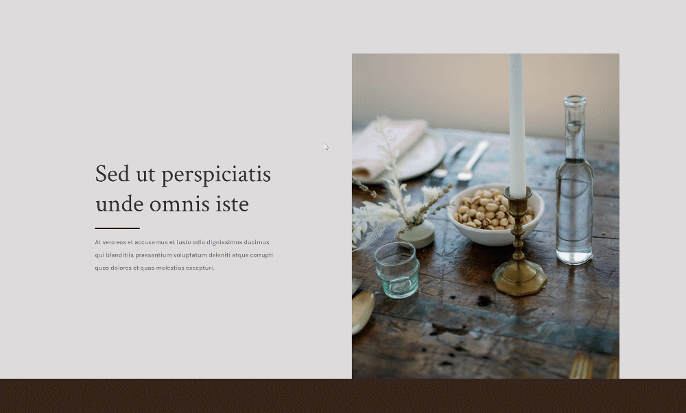
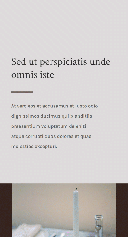
Preview
Before we dive into the tutorial, let’s take a quick look at the outcome across different screen sizes.
Desktop
Mobile
Download The Layout for FREE
To lay your hands on the free layout, you will first need to download it using the button below. To gain access to the download you will need to subscribe to our newsletter by using the form below. As a new subscriber, you will receive even more Divi goodness and a free Divi Layout pack every Monday! If you’re already on the list, simply enter your email address below and click download. You will not be “resubscribed” or receive extra emails.

1. Create Design Structure
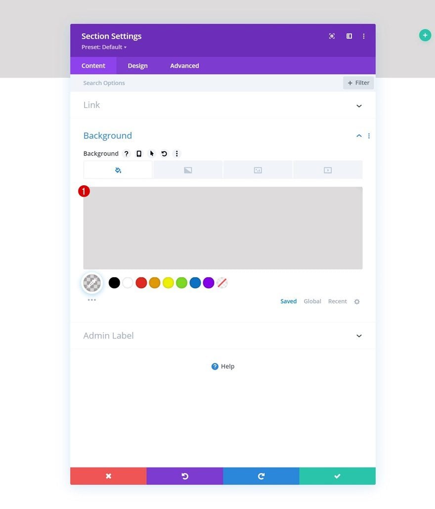
Add New Section
Background Color
In the first part of the tutorial, we’ll focus on creating the design. In part two, we’ll apply the sticky effects. Create a new page or open an existing one and add a new section to it. Open the section settings and apply a background color.
- Background Color: rgba(53,44,43,0.17)
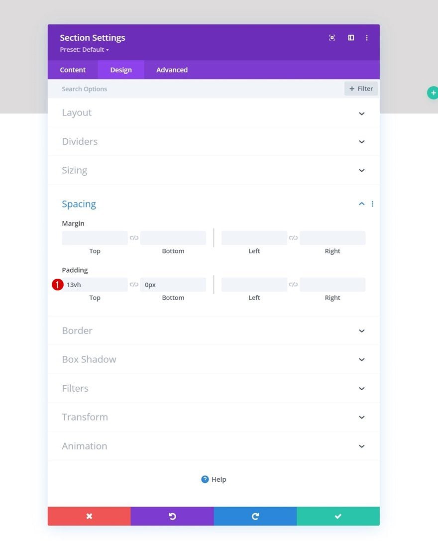
Spacing
Move on to the section’s design tab and change the spacing values as follows:
- Top Padding: 13vh
- Bottom Padding: 0px
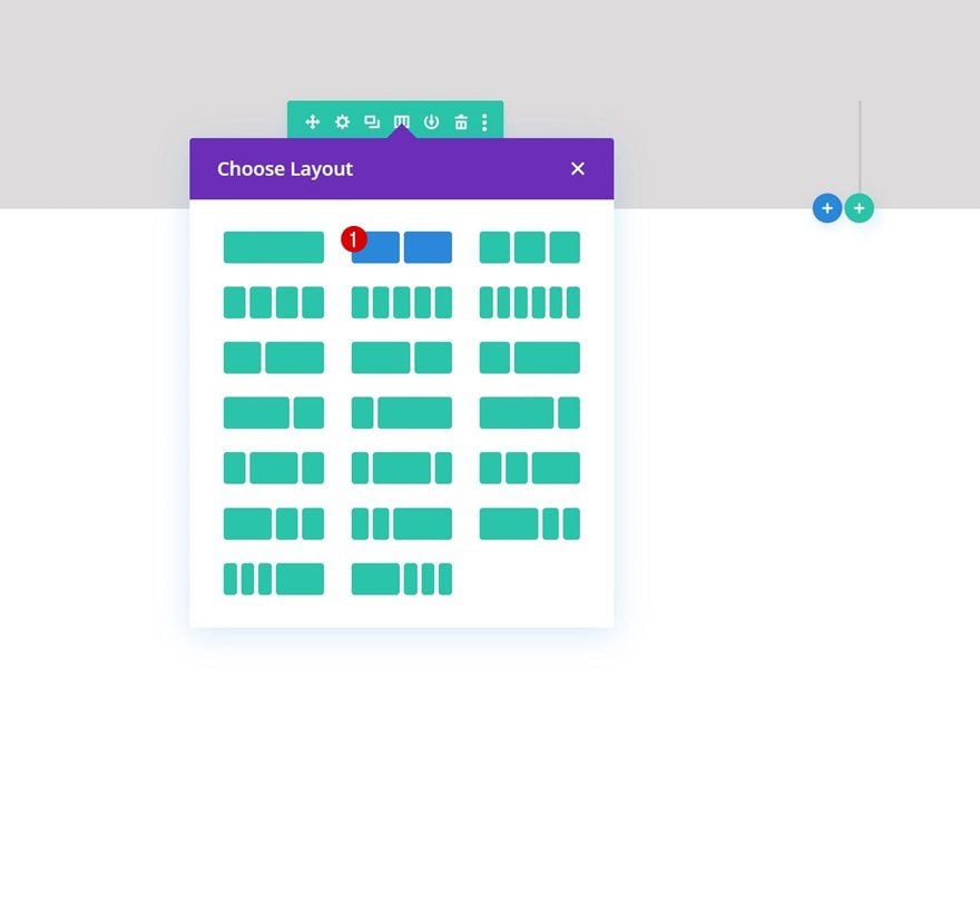
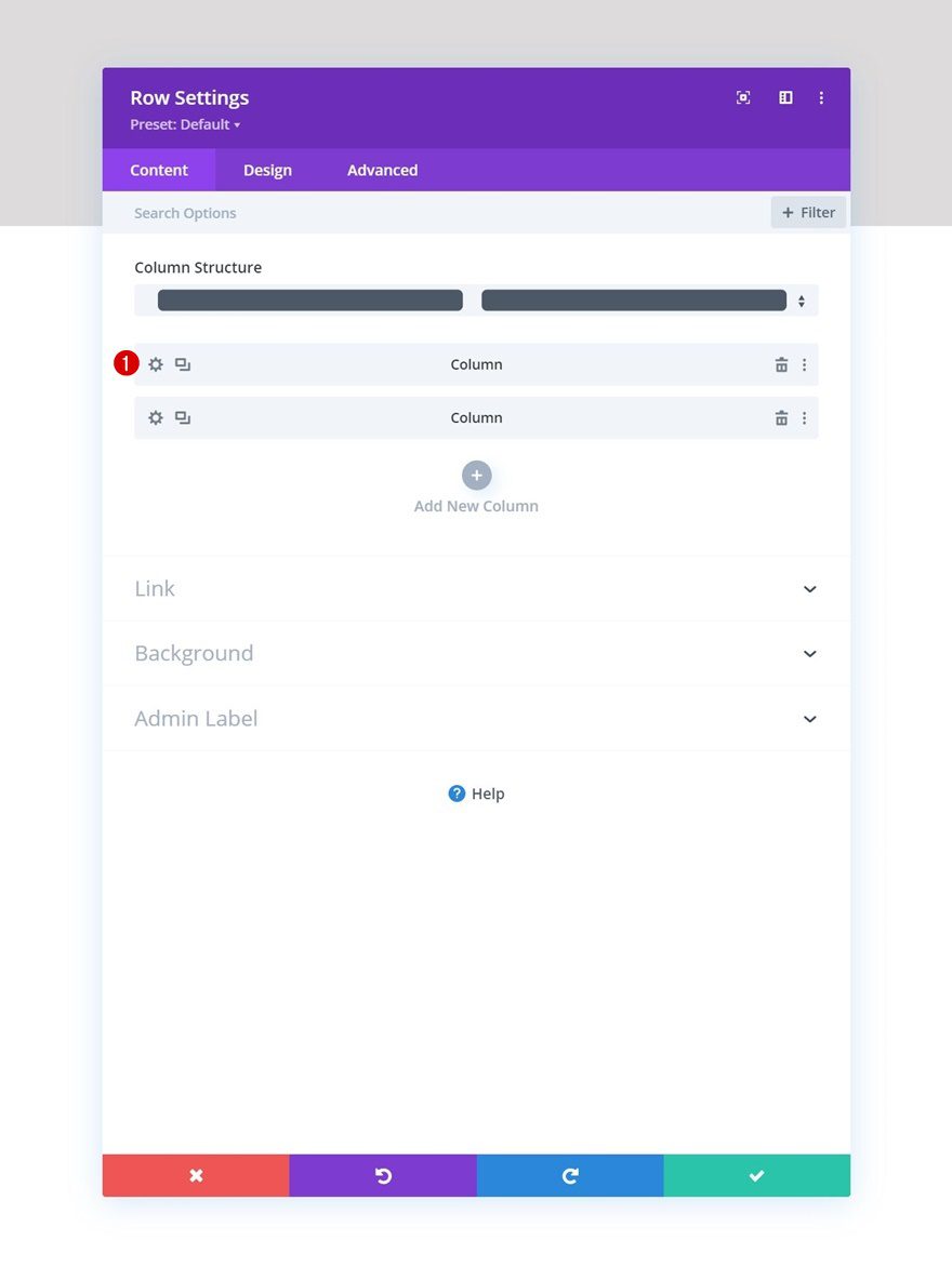
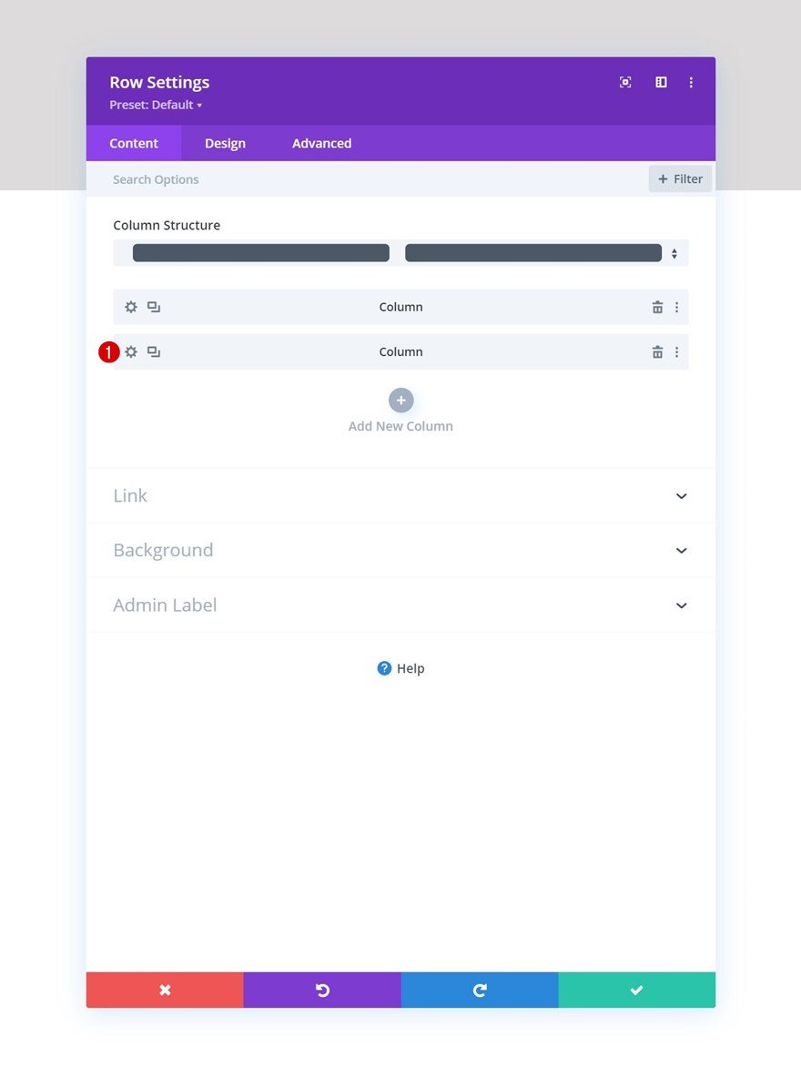
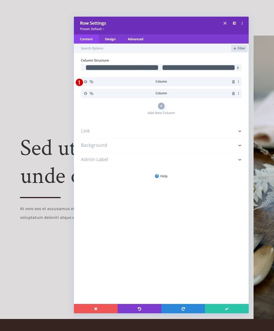
Add Row #1
Column Structure
Continue by adding a new row using the following column structure:
Sizing
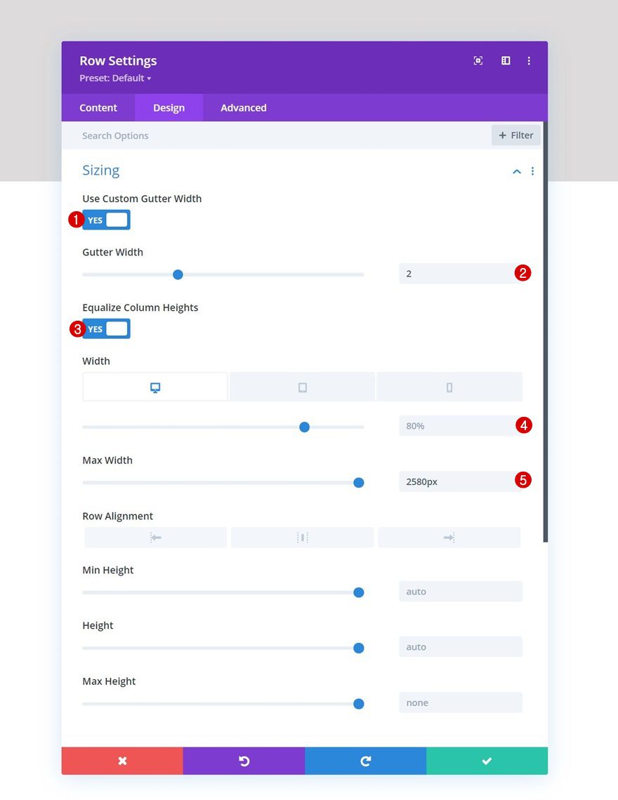
Without adding modules to it, open the row settings, move on to the design tab and change the sizing settings accordingly:
- Use Custom Gutter Width: Yes
- Gutter Width: 2
- Equalize Column Heights: Yes
- Width:
- Desktop: 80%
- Tablet & Phone: 90%
- Max Width: 2580px
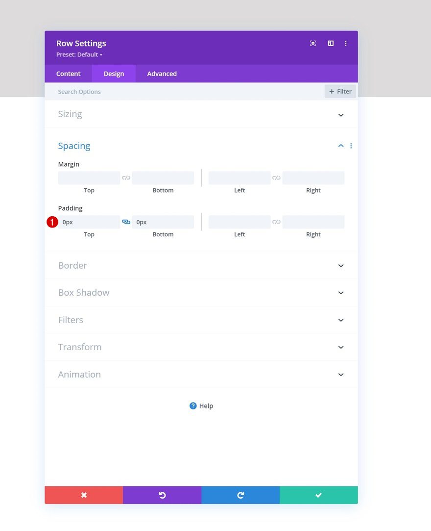
Spacing
Remove all default top and bottom padding next.
- Top Padding: 0px
- Bottom Padding: 0px
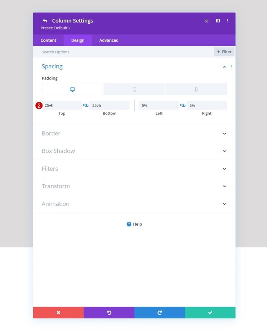
Column 1 Settings
Spacing
Then, open the column 1 settings and change the spacing settings as follows:
- Top Padding:
- Desktop: 25vh
- Tablet & Phone: 10vh
- Bottom Padding:
- Desktop: 25vh
- Tablet & Phone: 10vh
- Left Padding: 5%
- Right Padding: 5%
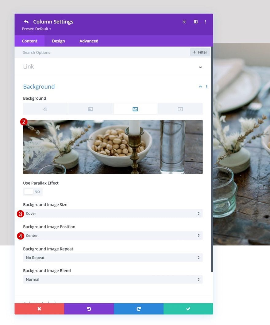
Column 2 Settings
Background Image
Next, open the column 2 settings and upload a background image of your choice.
- Background Image Size: Cover
- Background Image Position: Center
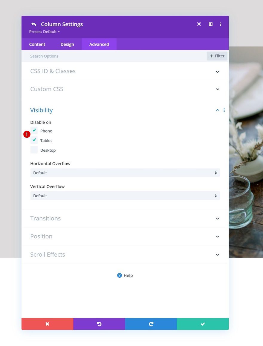
Visibility
To make sure this works on smaller screen sizes, we’ll hide the second column in the advanced tab for tablet and phone.
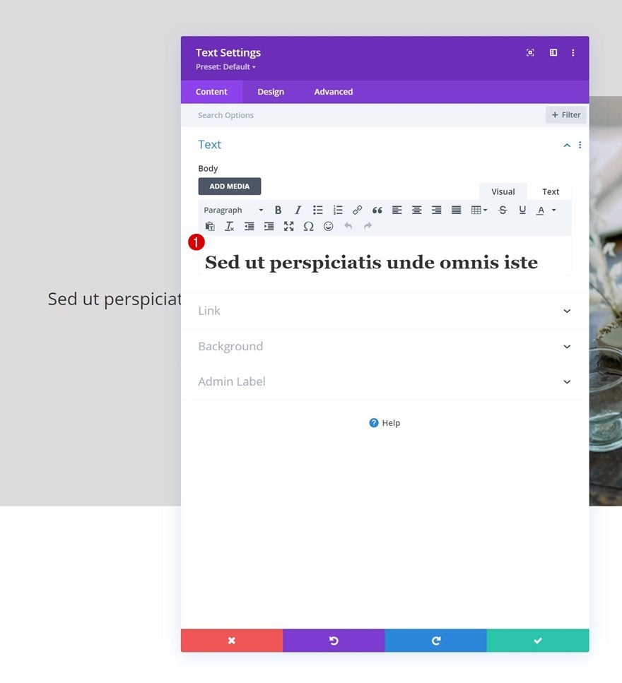
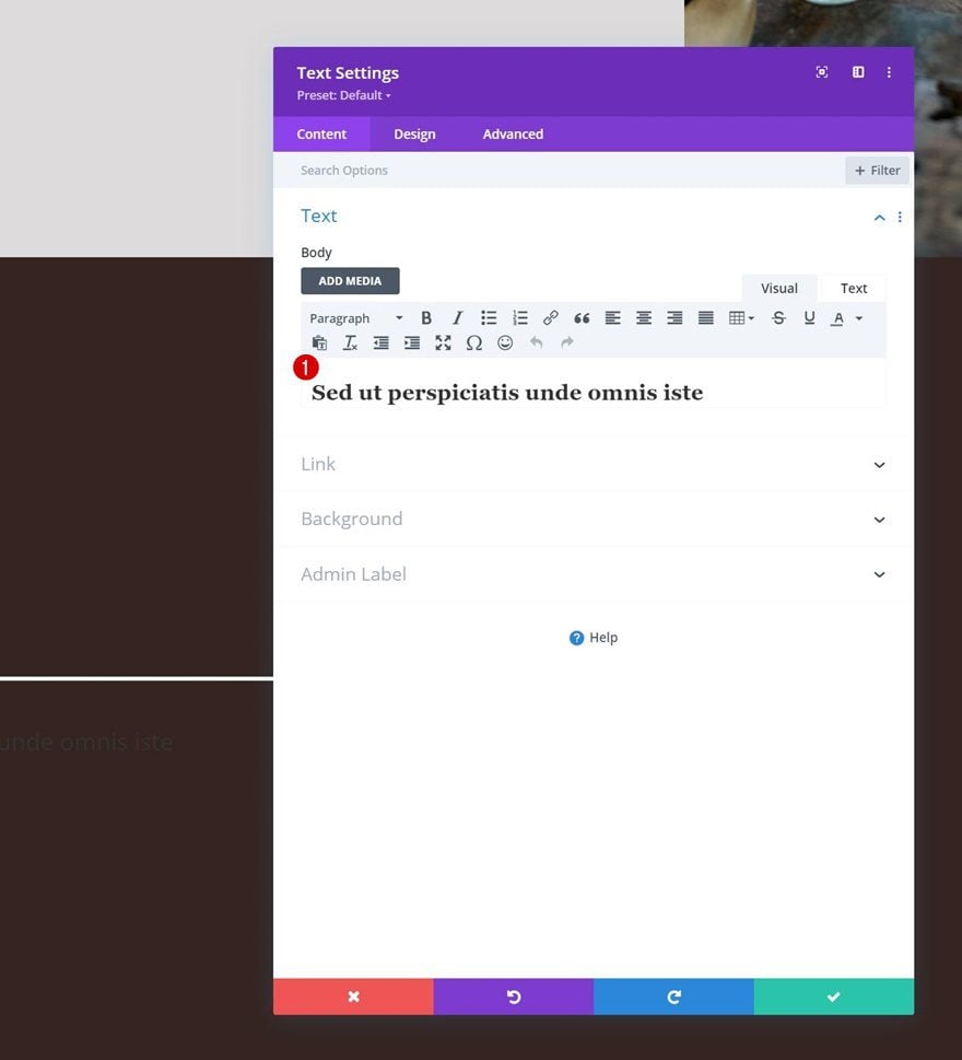
Add Text Module #1 to Column 1
Add H1 Content
Time to add modules, starting with a first Text Module in column 1. Add some H1 content of your choice.
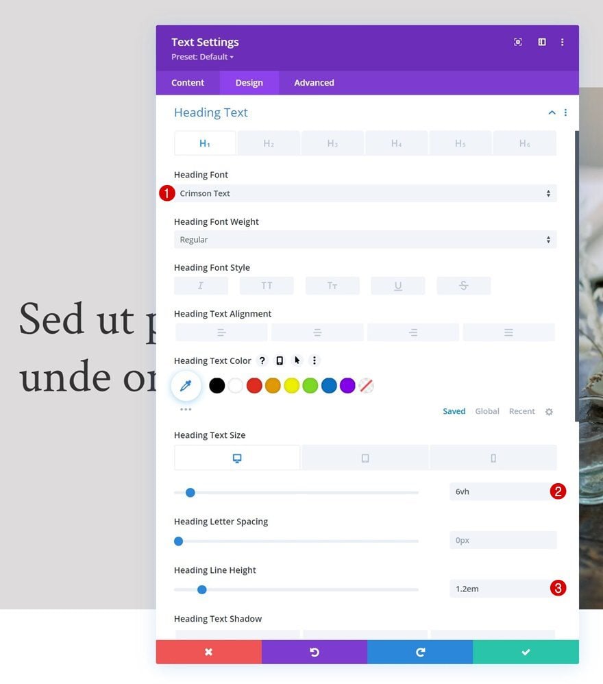
H1 Text Settings
Move on to the module’s design tab and change the H1 text settings as follows:
- Heading Font: Crimson Text
- Heading Text Size:
- Desktop: 6vh
- Tablet: 50px
- Phone: 40px
- Heading Line Height: 1.2em
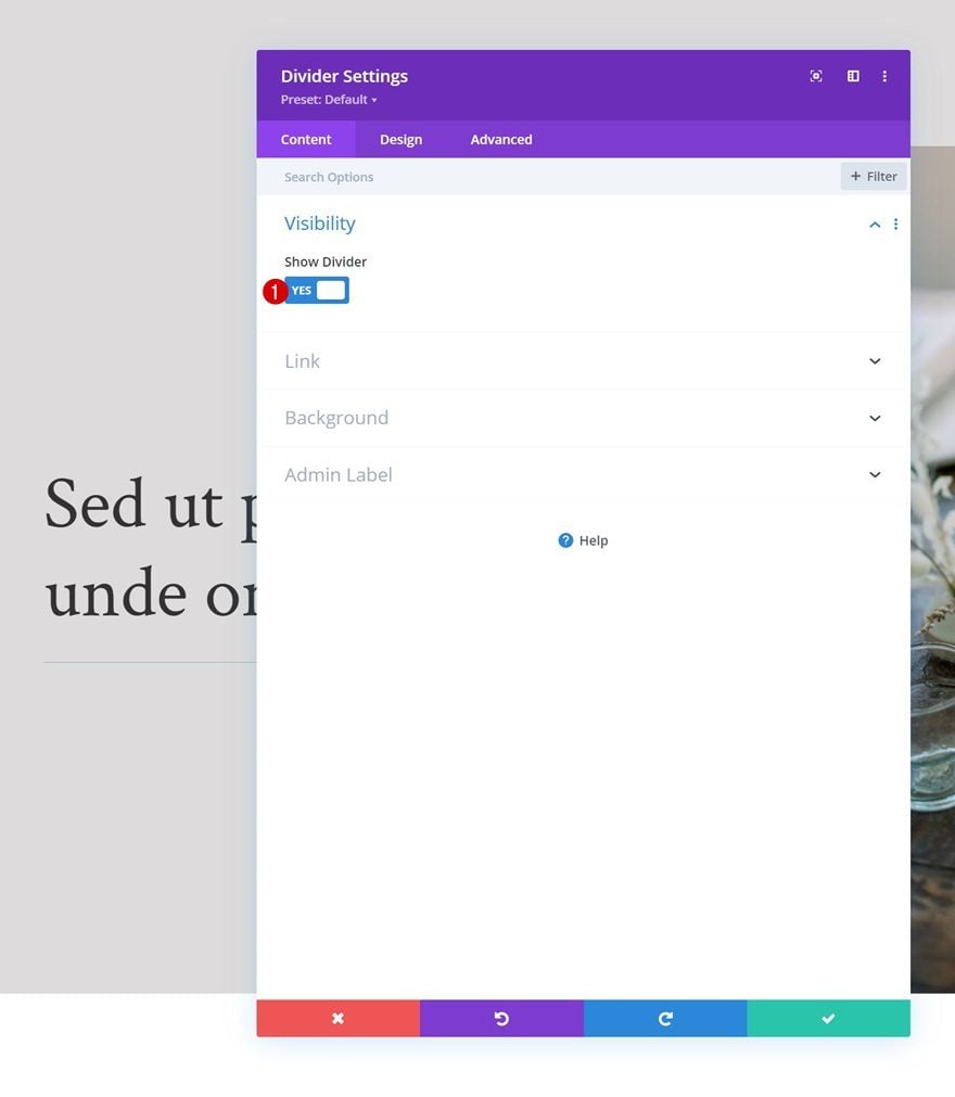
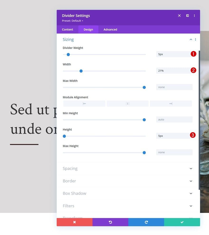
Add Divider Module to Column 1
Visibility
Next, we’ll add a Divider Module to column 1. Make sure the “Show Divider” option is enabled.
- Show Divider: Yes
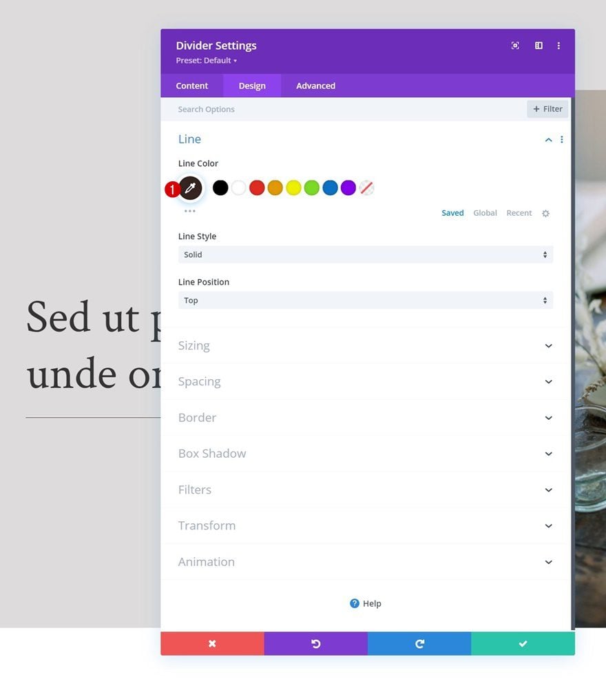
Line
Move on to the module’s design tab and change the line settings.
- Line Color: #35241f
Sizing
Modify the sizing settings too.
- Divider Weight: 5px
- Width: 21%
- Height: 5px
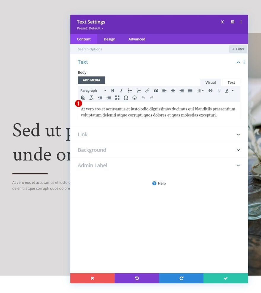
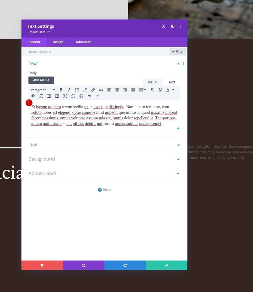
Add Text Module #2 to Column 1
Add Description Content
The next and last module we need in column 1 is another Text Module. Add some description content of your choice.
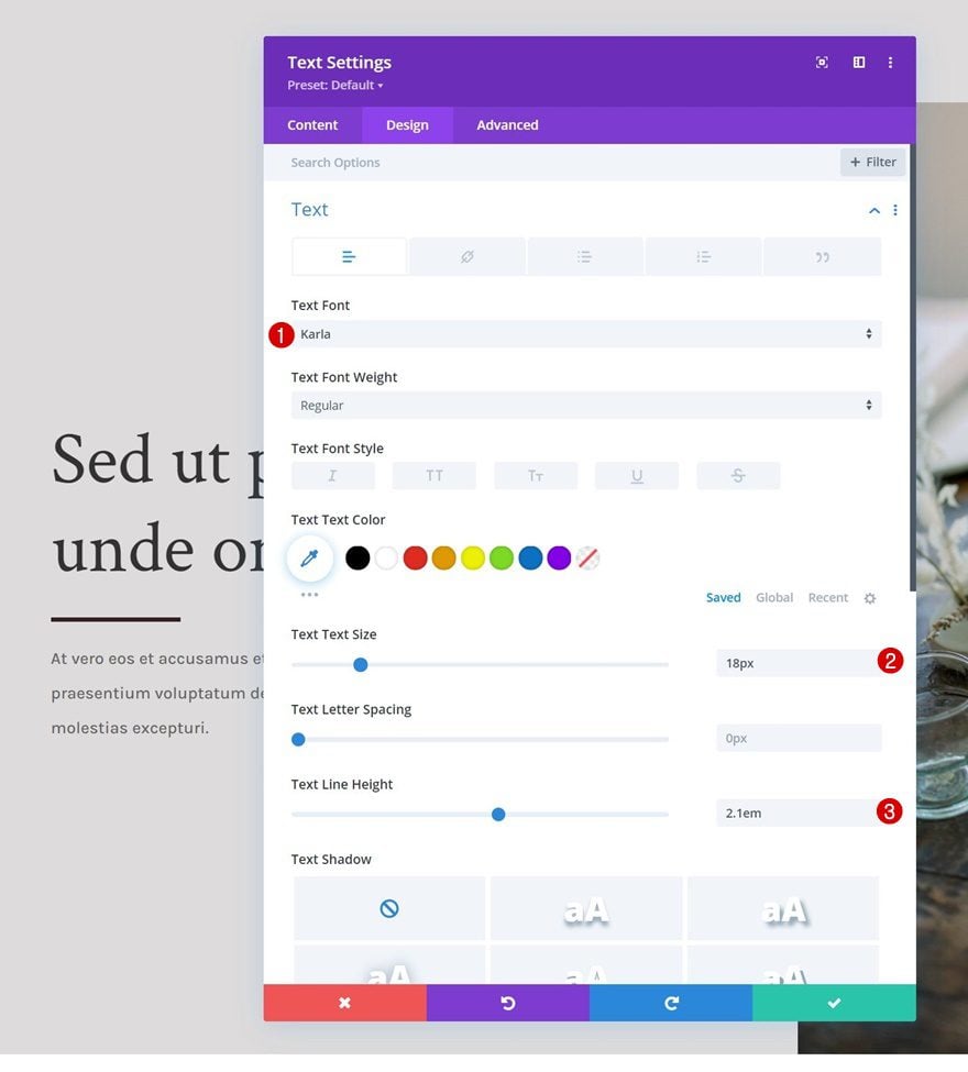
Text Settings
Change the module’s text settings as follows:
- Text Font: Karla
- Text Size: 18px
- Text Line Height: 2.1em
Add Row #2
Column Structure
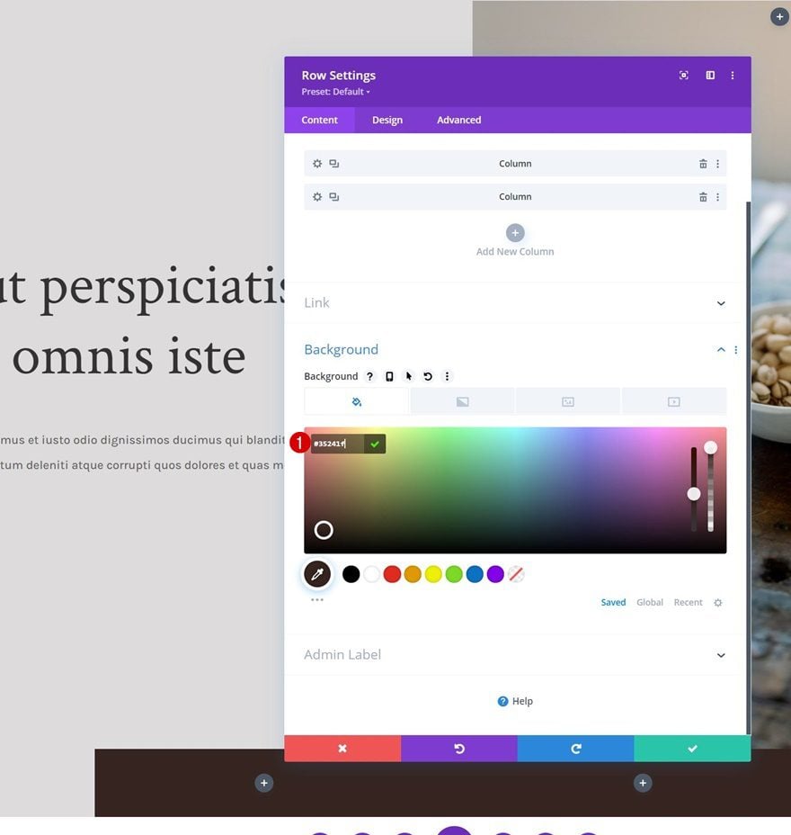
To make this effect work, it’s important that you include a new row below the first one, inside the same section. This row will need a background color and enough height and width so the first row can fit below it. For this design, we’re using the following column structure:
Background Color
Next, we’ll add a background color.
- Background Color: #35241f
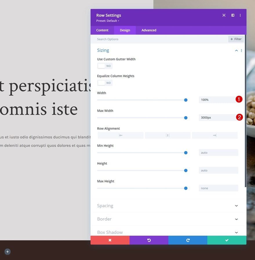
Sizing
We’re modifying the sizing settings too.
- Width: 100%
- Max Width: 3000px
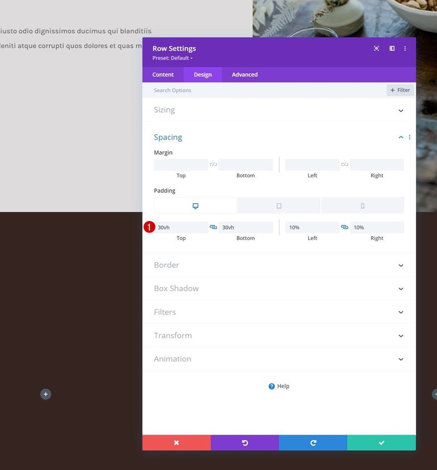
Spacing
Along with the spacing settings.
- Top Padding:
- Desktop: 30vh
- Tablet & Phone: 0vh
- Bottom Padding: 30vh
- Left Padding: 10%
- Right Padding: 10%
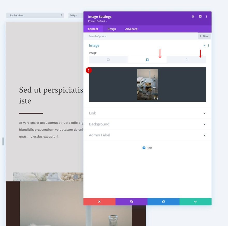
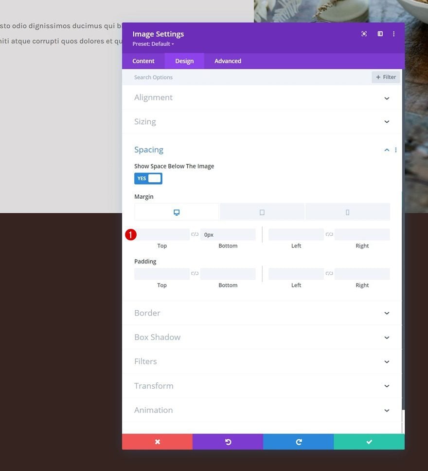
Add Image Module to Column 1
Upload Image (Tablet & Phone Only)
Then, we’ll add an Image Module to the first column. This module will replace the image that’s used inside the first row on smaller screen sizes. Use an image for tablet and phone only.
Spacing
Move on to the module’s design tab and change the bottom margin as follows:
- Bottom Margin:
- Desktop: 0px
- Tablet & Phone: 50px
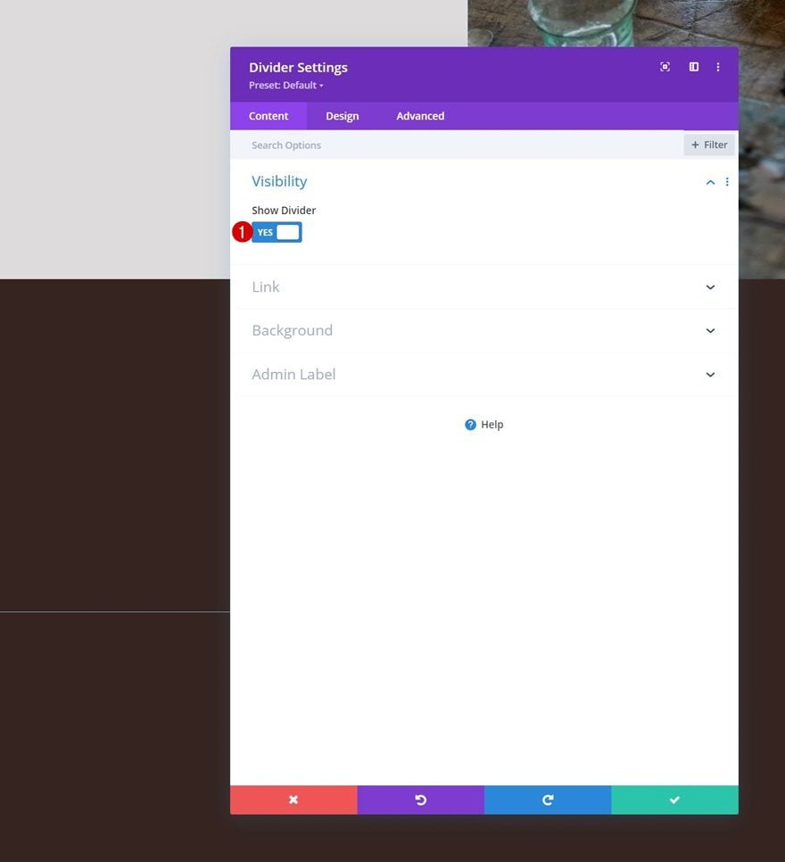
Add Divider Module to Column 1
Visibility
Then, add a Divider Module below the Image Module and make sure the “Show Divider” option is enabled.
- Show Divider: Yes
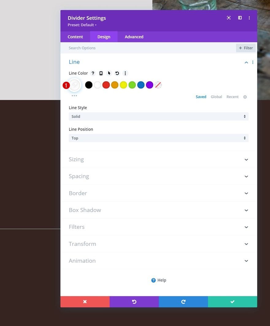
Line
Move on to the module’s design tab and change the line color.
- Line Color: #ffffff
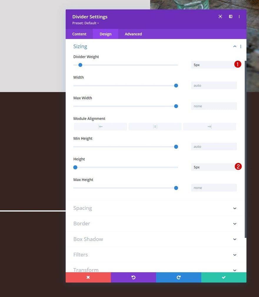
Sizing
Change the sizing settings too.
- Divider Weight: 5px
- Height: 5px
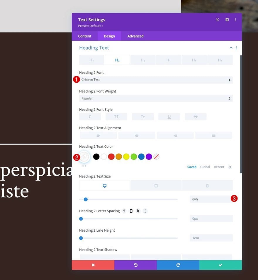
Add Text Module to Column 1
Add H2 Content
Then, add a Text Module with some H2 content of your choice.
H2 Text Settings
Modify the H2 text settings as follows:
- Heading 2 Font: Crimson Text
- Heading 2 Text Color: #ffffff
- Heading 2 Text Size:
- Desktop: 6vh
- Tablet: 50px
- Phone: 40px
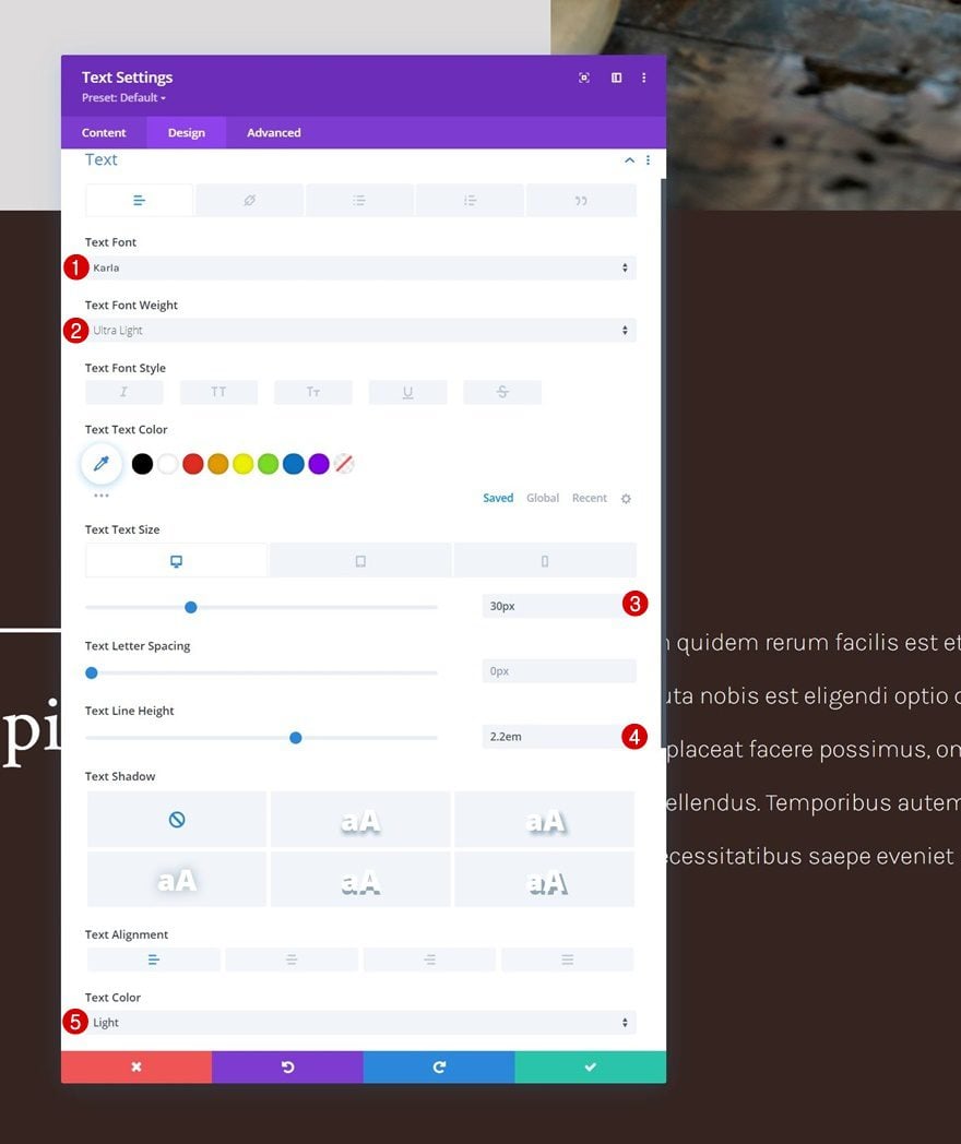
Add Text Module to Column 2
Add Description Content
In column 2, the only module we need is a Text Module with some description content.
Text Settings
Change the module’s text settings as follows:
- Text Font: Karla
- Text Font Weight: Ultra Light
- Text Size:
- Desktop: 30px
- Tablet & Phone: 18px
- Text Line Height: 2.2em
- Text Color: Light
2. Apply Sticky Effects
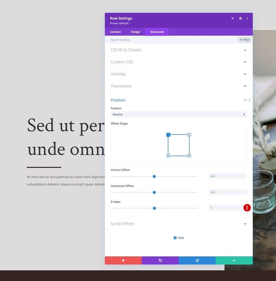
Change Row Z Index Values
Row #1
Now that we’ve set up the foundation of our design, we can focus on some additional steps needed to create the hero cover effect. Start by opening the first row’s settings and change the z index in the advanced tab.
- Z Index: 1
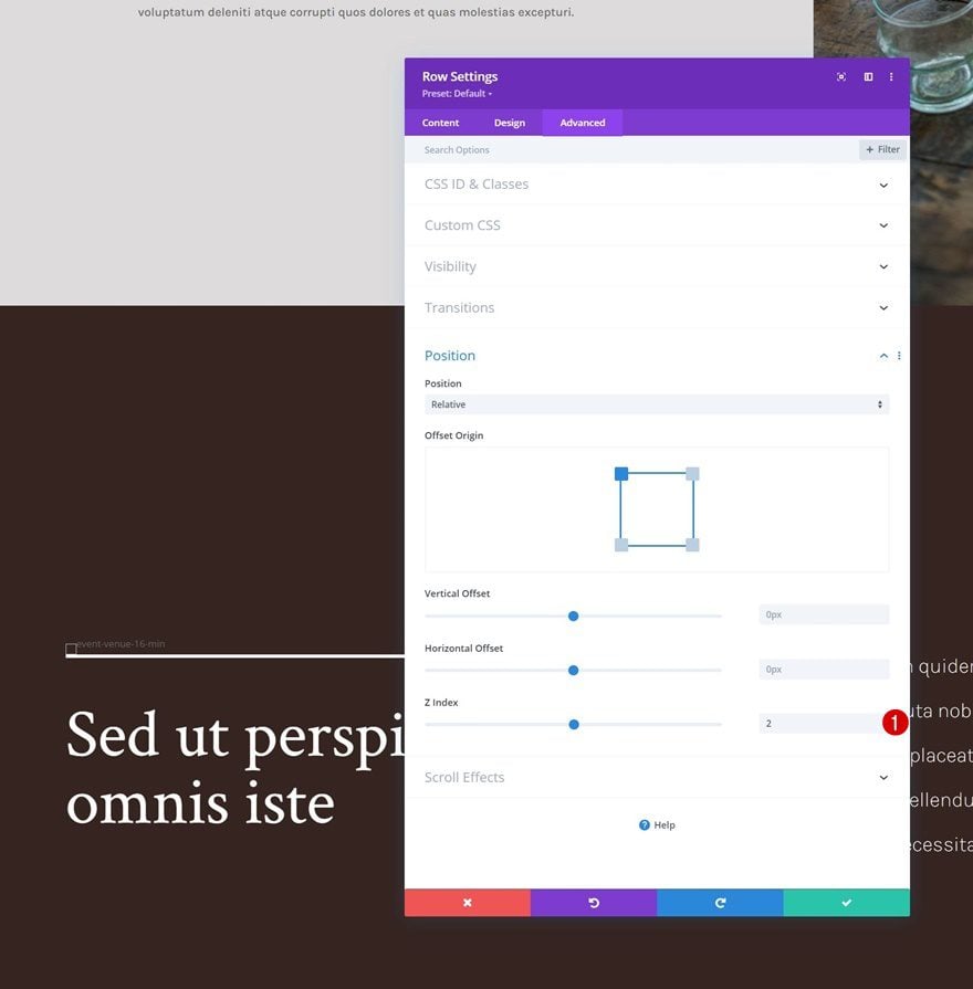
Row #2
Change the second row’s z index too. This value needs to be higher than the first row’s.
- Z Index: 2
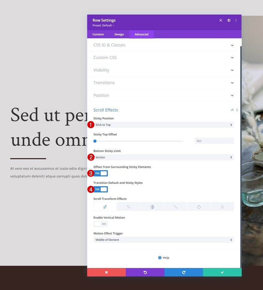
Turn Row #1 Sticky
Next, open the first row’s settings again and apply a sticky effect to the advanced tab. It’s important that you make sure the bottom sticky limit is set to section.
- Sticky Position: Stick to Top
- Bottom Sticky Limit: Section
- Offset From Surrounding Sticky Elements: Yes
- Transition Default and Sticky Styles: Yes
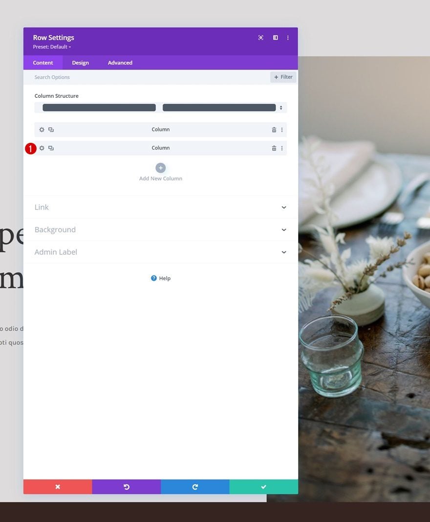
Column 1 Sticky Settings
Sticky Background Color
Now that the row has been turned sticky, we can start applying some sticky styles to the child elements of the row. Start by opening the column 1 settings and apply the following sticky background color:
- Sticky Background Color: #edeaea
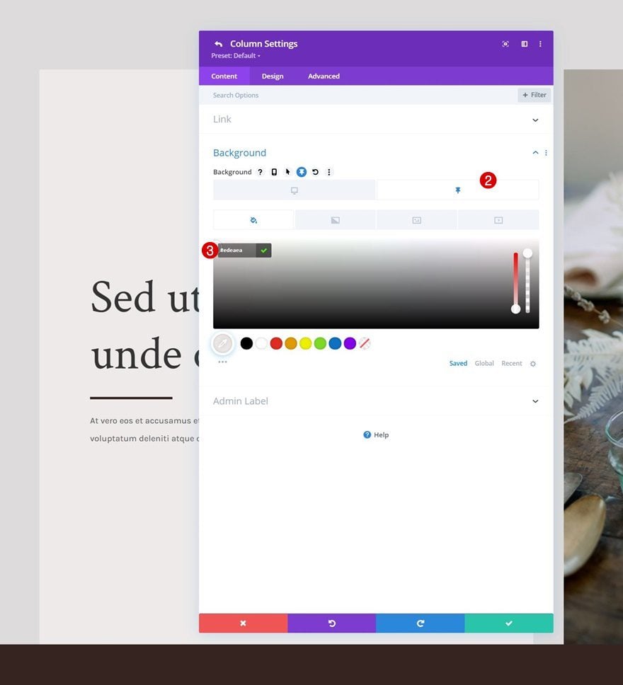
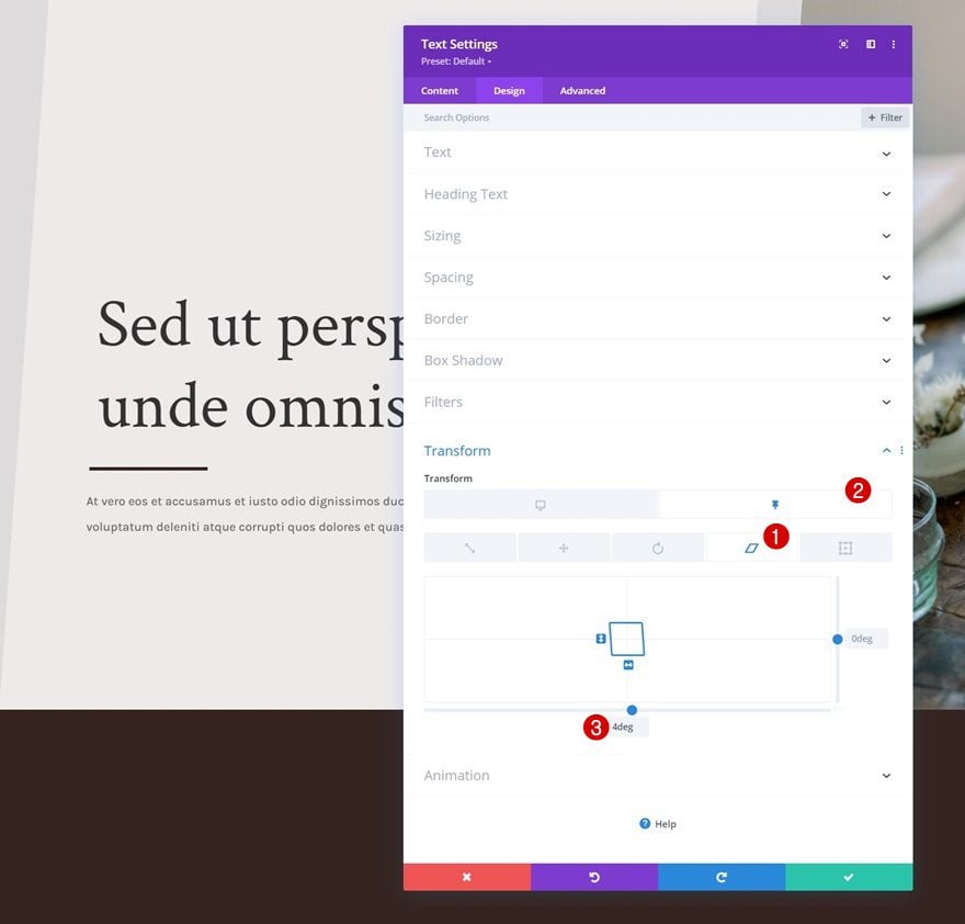
Sticky Transform Skew
Then, navigate to the design tab and apply the following sticky skew value:
- Sticky Bottom Skew: -4deg
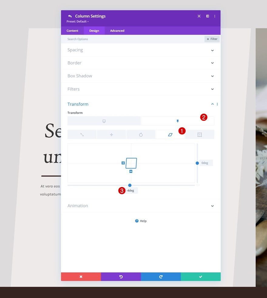
Column 2 Sticky Settings
Sticky Transform Skew
On to column 2, there, we’ll use the same sticky skew value in the transform settings.
- Sticky Bottom Skew: -4deg
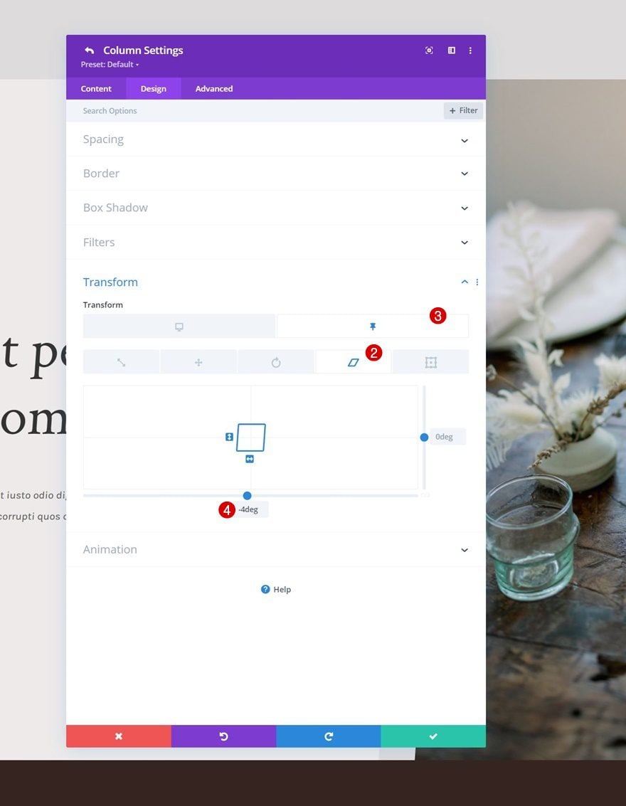
Text Module Sticky Transform Skew (x2)
And we’ll complete the design and effect by changing the bottom skew to 4 deg for both Text Modules in column 1 in a sticky state. This will even out the negative sticky column skew value.
- Sticky Bottom Skew: 4deg
Preview
Now that we’ve gone through all the steps, let’s take a final look at the outcome across different screen sizes.
Desktop
Mobile
Final Thoughts
In this tutorial, we’ve shown you how to get creative with your hero design inside Divi. More specifically, we’ve shown you how to cover your hero section on scroll and apply sticky styles to it at the same time! In the first part of the tutorial, we focused on creating the design, and in part two, we applied the sticky settings that were needed to achieve the effect. You were able to download the JSON file for free as well! If you have any questions or suggestions, feel free to leave a comment in the comment section below.
If you’re eager to learn more about Divi and get more Divi freebies, make sure you subscribe to our email newsletter and YouTube channel so you’ll always be one of the first people to know and get benefits from this free content.


Very Good! =O