The way you present your CTA inside a page you design can have a big impact on how your visitors take action. You can go about it the most frequently used way, by using the button format with copy in the middle, but you can get creative with it as well. In today’s tutorial, we’ll show you a creative way to include a call to action in your Divi design. We’re going to include hover-animated corner button arrows to be exact. Once an arrow is hovered, the arrow direction will change alongside the style. You will be able to download the JSON file of this design for free as well!
Let’s get to it.
- 1 Preview
- 2 Download The Layout for FREE
- 3 Download For Free
-
4
Let’s Start Recreating!
- 4.1 Add New Specialty Section
- 4.2 Add Text Module #1 to Column 1
- 4.3 Add Text Module #2 to Column 1
- 4.4 Add Row #1 to Column 2
- 4.5 Column 1 Settings
- 4.6 Add Text Module #1 to Column 1
- 4.7 Add Divider Module to Column 1
- 4.8 Add Text Module #2 to Column 1
- 4.9 Add Text Module #3 to Column 1
- 4.10 Add Blurb Module to Column 1
- 4.11 Reuse Column 1
- 4.12 Reuse Row
- 5 Preview
- 6 Final Thoughts
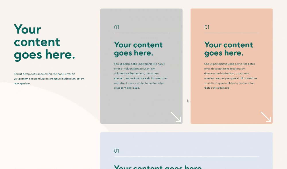
Preview
Before we dive into the tutorial, let’s take a quick look at the outcome across different screen sizes.
Desktop
Mobile
Download The Layout for FREE
To lay your hands on the free layout, you will first need to download it using the button below. To gain access to the download you will need to subscribe to our newsletter by using the form below. As a new subscriber, you will receive even more Divi goodness and a free Divi Layout pack every Monday! If you’re already on the list, simply enter your email address below and click download. You will not be “resubscribed” or receive extra emails.

Let’s Start Recreating!
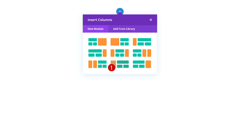
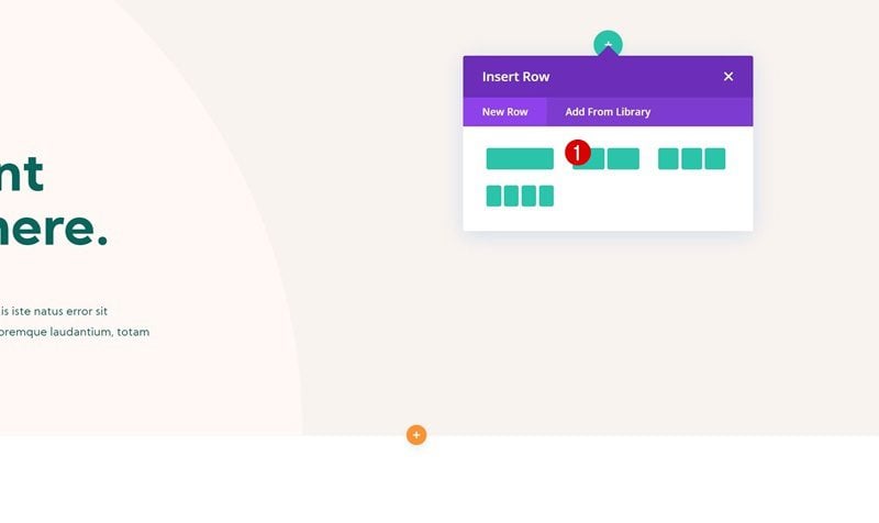
Add New Specialty Section
Add a new specialty section to the page you’re working on. Select the following column structure for it:
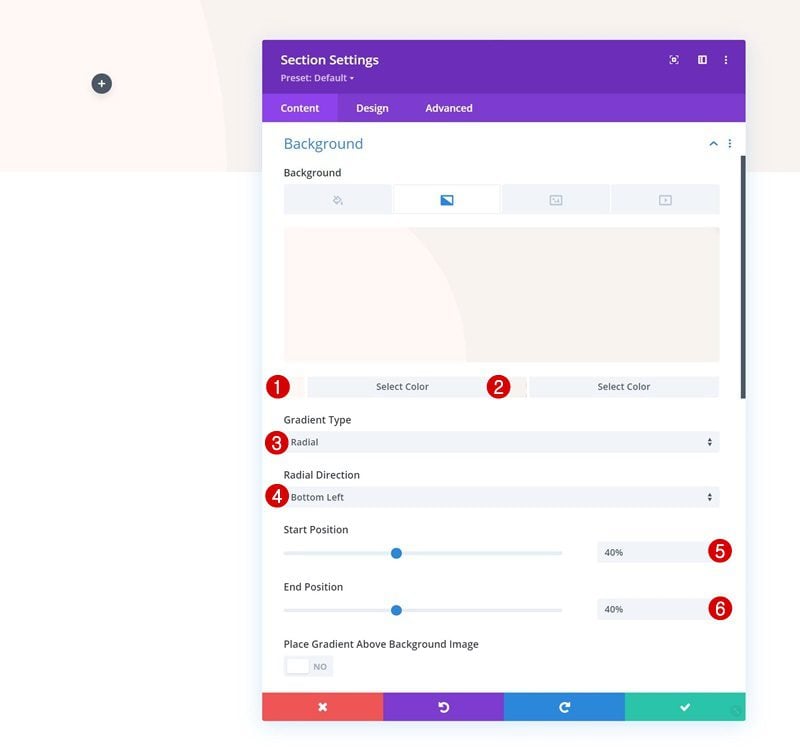
Gradient Background
Open the section settings and apply the following gradient background:
- Color 1: #fff8f5
- Color 2: #f9f3ef
- Gradient Type: Radial
- Radial Direction: Bottom Left
- Start Position: 40%
- End Position: 40%
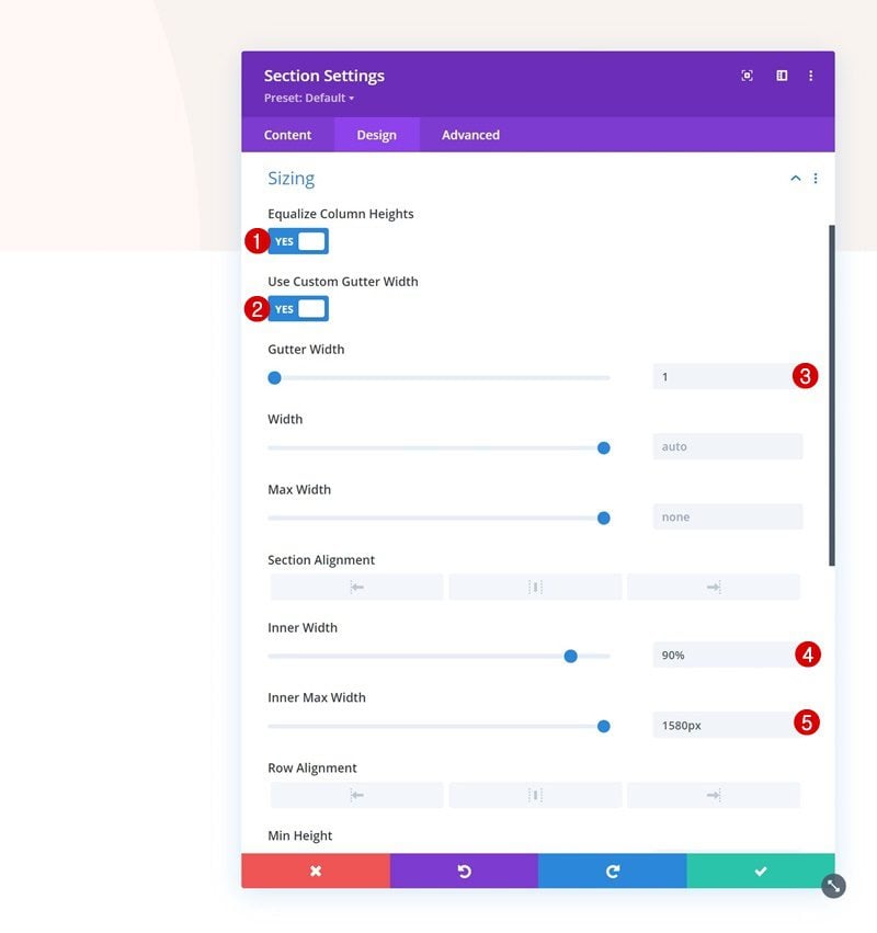
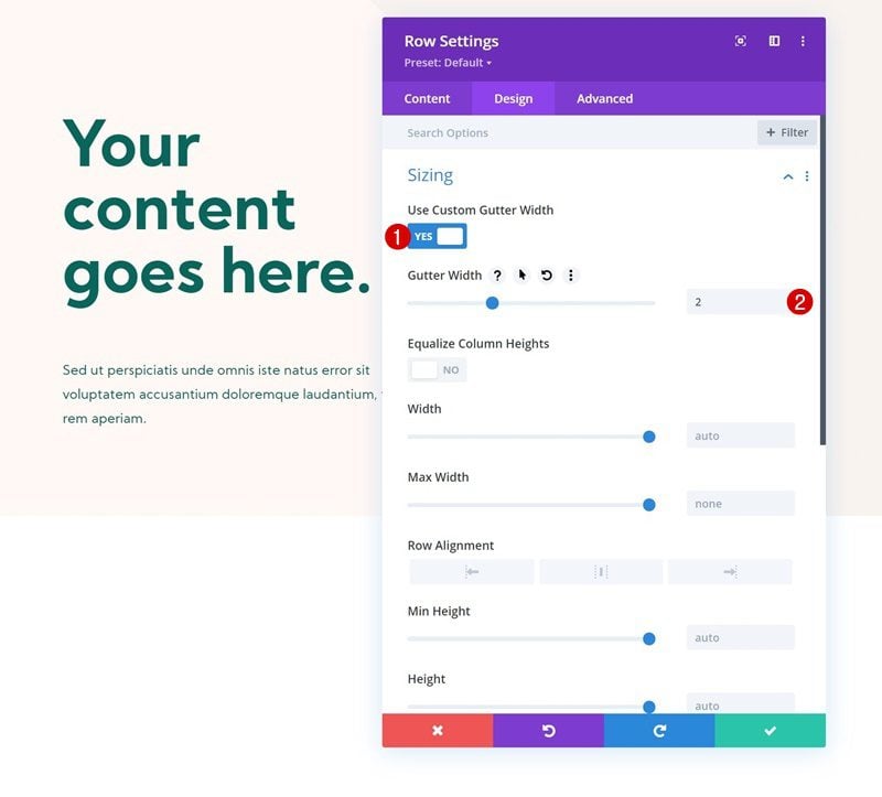
Sizing
Move on to the section’s design tab and change the sizing settings as follows:
- Equalize Column Heights: Yes
- Use Custom Gutter Width: Yes
- Gutter Width: 1
- Inner Width: 90%
- Inner Max Width: 1580px
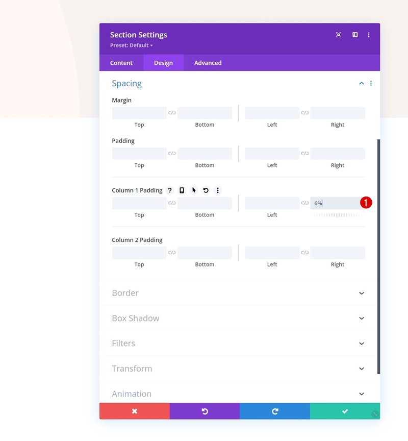
Spacing
Then, go to the spacing settings and add some right padding to column 1.
- Column 1 Right Padding: 6%
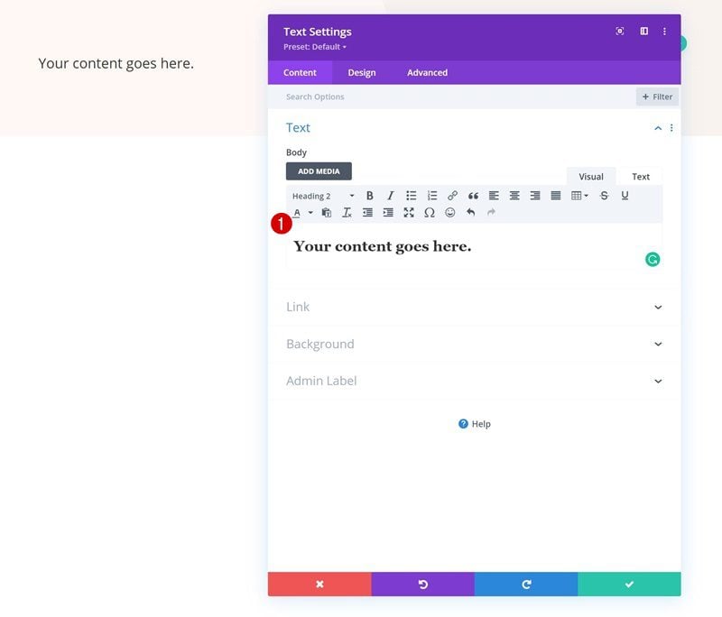
Add Text Module #1 to Column 1
Add H2 Content
Time to add modules, starting with a Text Module in column 1. Add some H2 content of your choice.
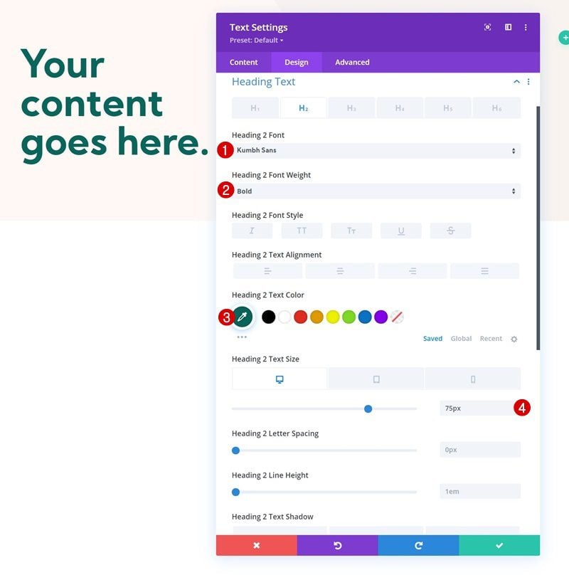
H2 Text Settings
Style the module’s H2 text settings as follows:
- Heading 2 Font: Kumbh Sans
- Heading 2 Font Weight: Bold
- Heading 2 Text Color: #08665c
- Heading 2 Text Size:
- Desktop: 75px
- Tablet: 60px
- Phone: 45px
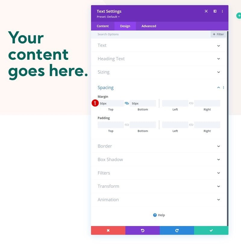
Spacing
Add some top and bottom margin next.
- Top Margin: 50px
- Bottom Margin: 50px
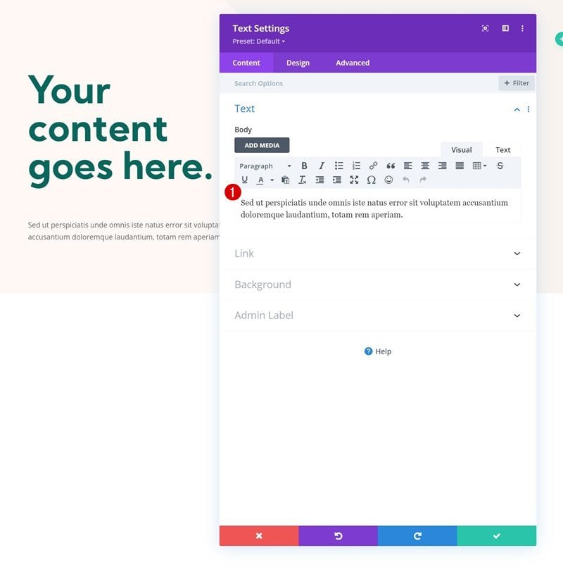
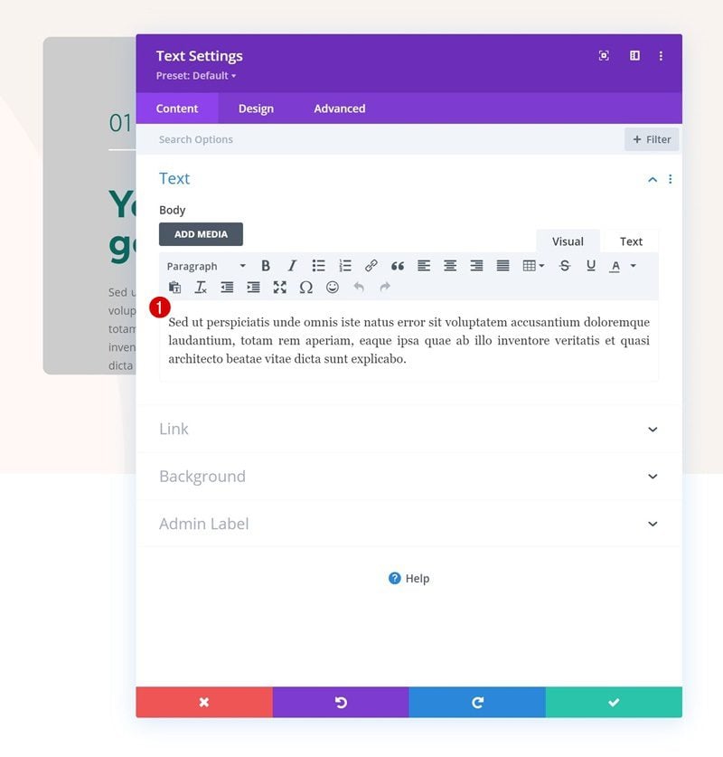
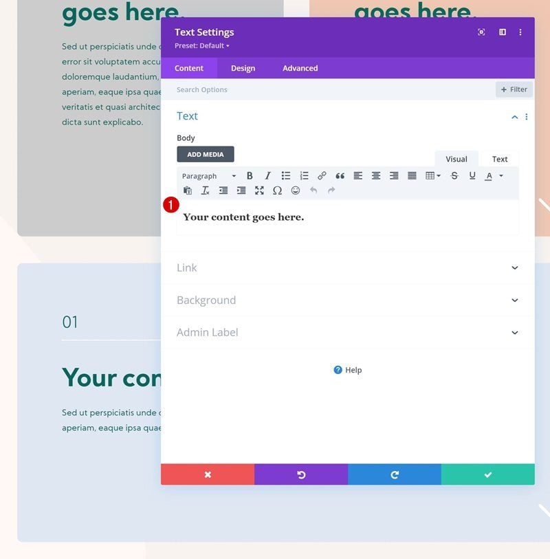
Add Text Module #2 to Column 1
Add Description Content
Add another Text Module below the previous one with some description content of your choice.
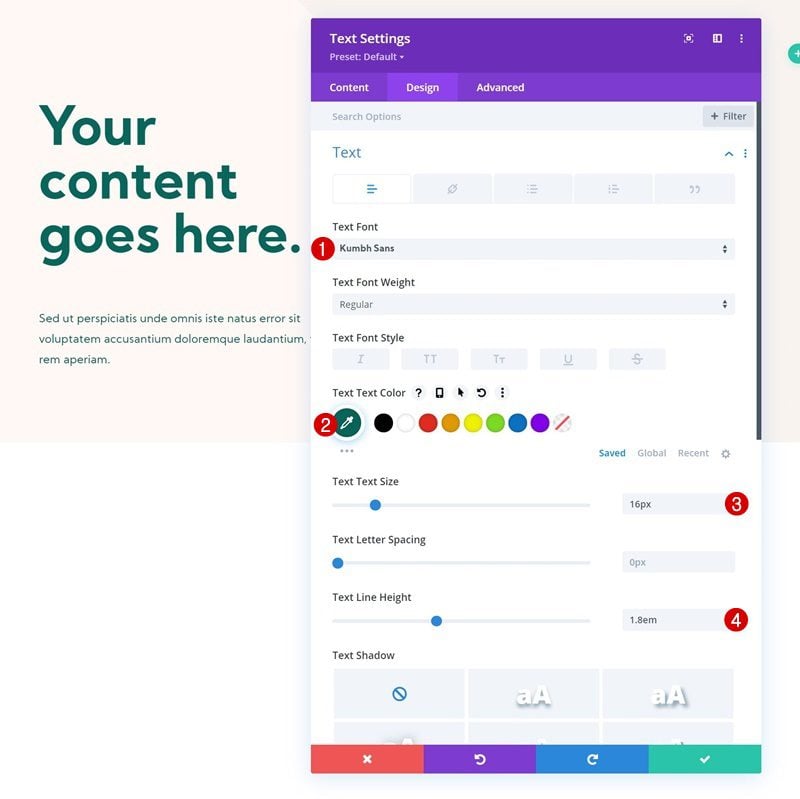
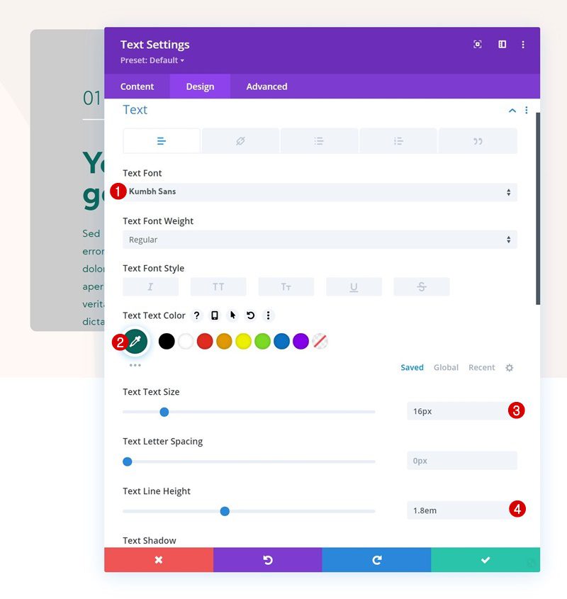
Text Settings
Change the module’s text settings as follows:
- Text Font: Kumbh Sans
- Text Color: #08665c
- Text Size: 16px
- Text Line Height: 1.8em
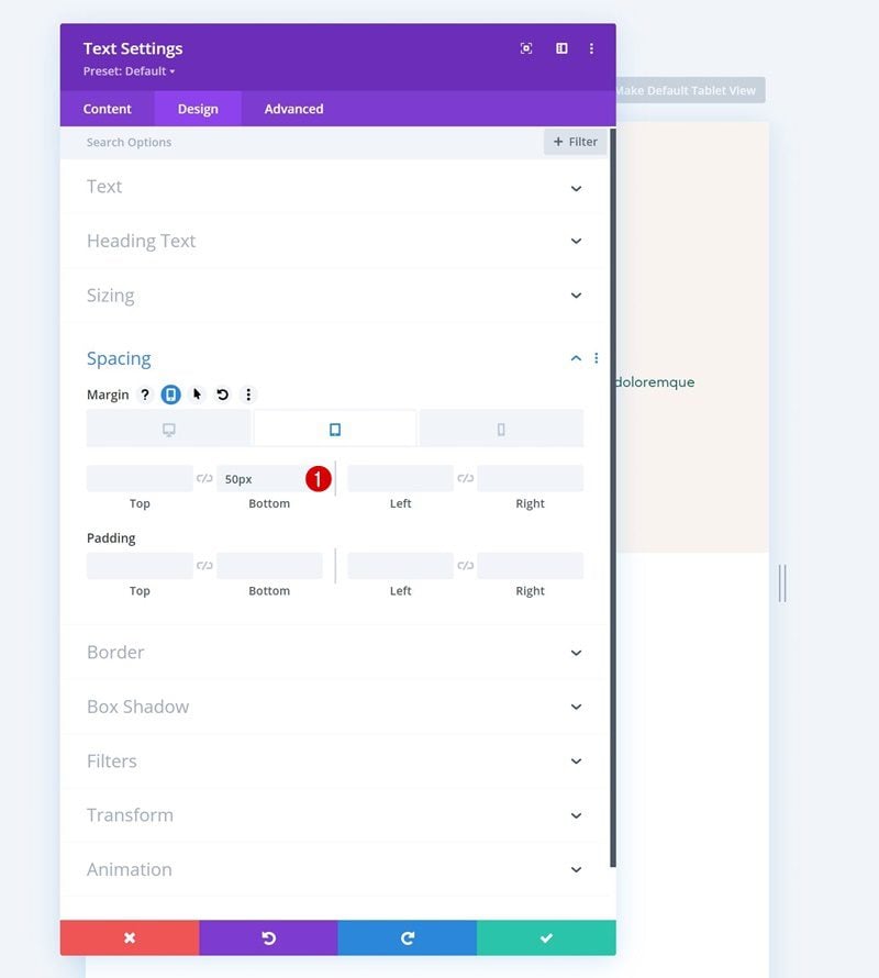
Spacing
Add some bottom margin on smaller screen sizes as well.
- Bottom Margin:
- Desktop: /
- Tablet & Phone: 50px
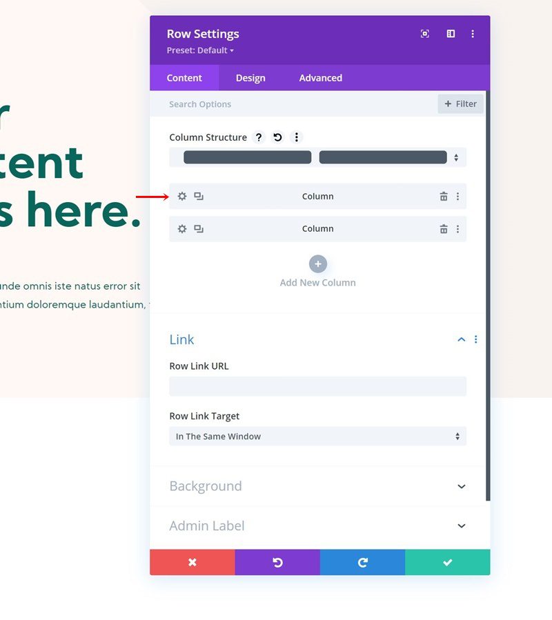
Add Row #1 to Column 2
Column Structure
On to the section’s second column. There, add a first row using the following column structure
Sizing
Without adding modules yet, open the row settings and change the sizing settings as follows:
- Use Custom Gutter Width: Yes
- Gutter Width: 2
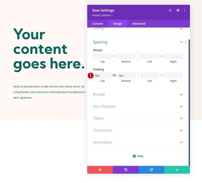
Spacing
Remove all default top and bottom padding next.
- Top Padding: 0px
- Bottom Padding: 0px
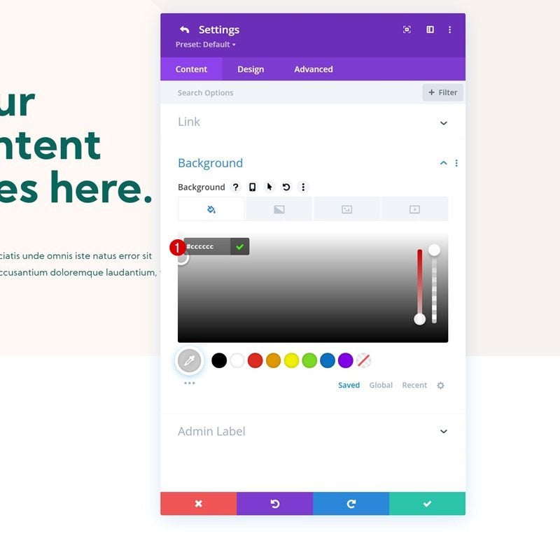
Column 1 Settings
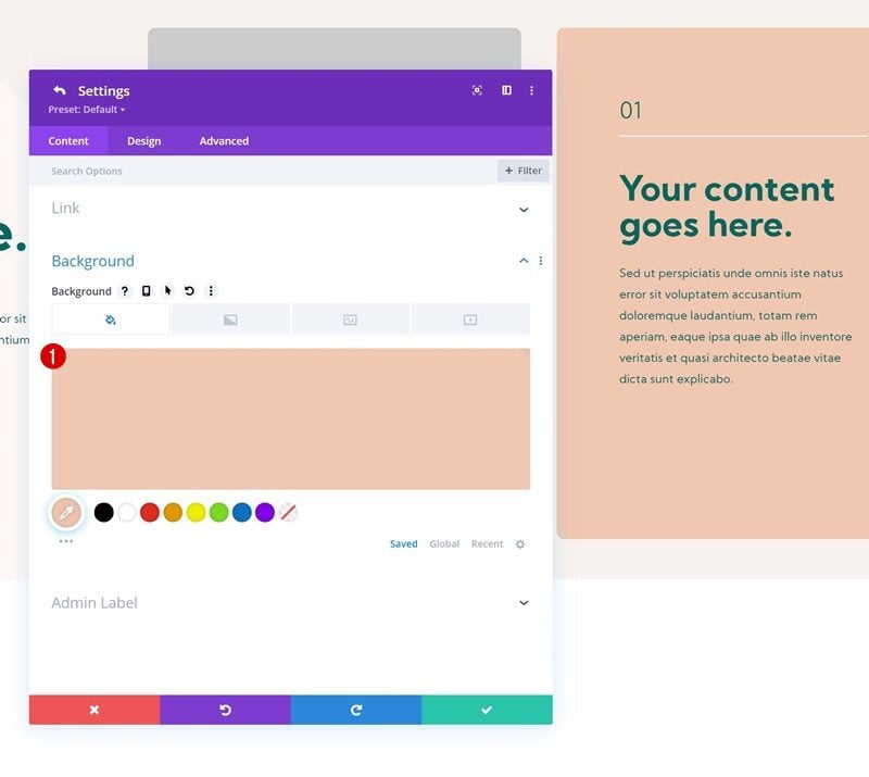
Background Color
Then, open the column 1 settings and apply a background color of your choice.
- Background Color: #cccccc
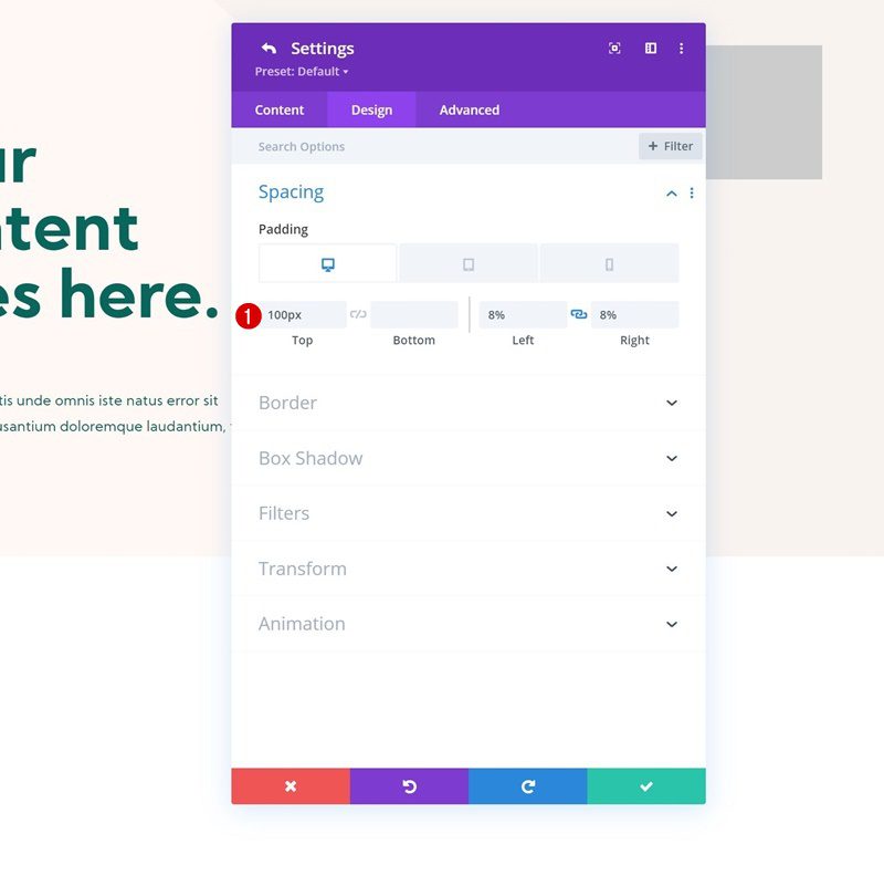
Spacing
Move on to the column’s spacing settings and use the following responsive values:
- Top Padding:
- Desktop: 100px
- Tablet & Phone: 70px
- Left Padding:
- Desktop & Tablet: 8%
- Phone: 10%
- Right Padding:
- Desktop & Tablet: 8%
- Phone: 10%
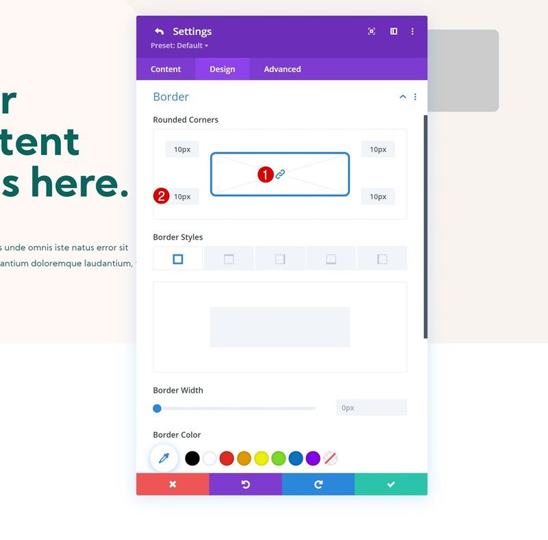
Border
Add some rounded corners to the border settings as well.
- All Corners: 10px
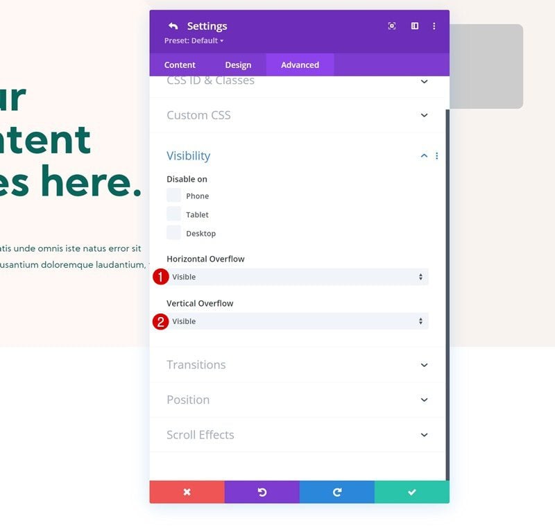
Visibility
Complete the column settings by settings the overflows to visible in the advanced tab.
- Horizontal Overflow: Visible
- Vertical Overflow: Visible
Add Text Module #1 to Column 1
Add Content
Time to add Modules, starting with a first Text Module in column 1. Add some content of your choice.
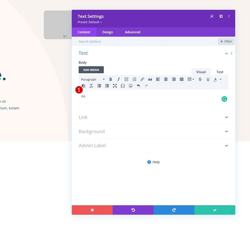
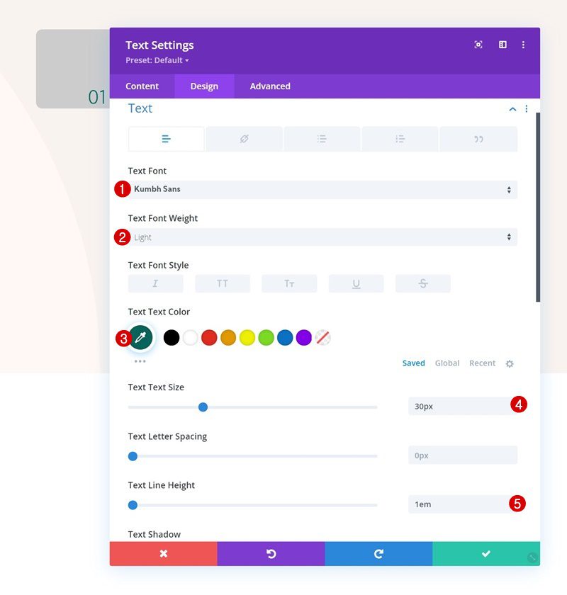
Text Settings
Change the module’s text settings:
- Text Font: Kumbh Sans
- Text Font Weight: Light
- Text Color: #08665c
- Text Size: 30px
- Text Line Height: 1em
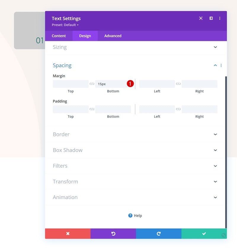
Spacing
Apply some bottom margin as well.
- Bottom Margin: 15px
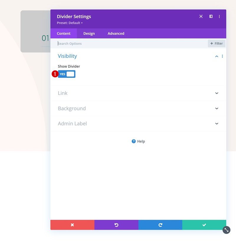
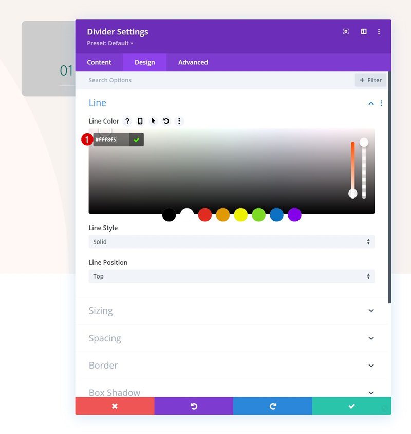
Add Divider Module to Column 1
Visibility
Then, add a Divider Module. Make sure the “Show Divider” option is enabled.
- Show Divider: Yes
Line
Move on to the module’s design tab and change the line color.
- Line Color: #fff8f5
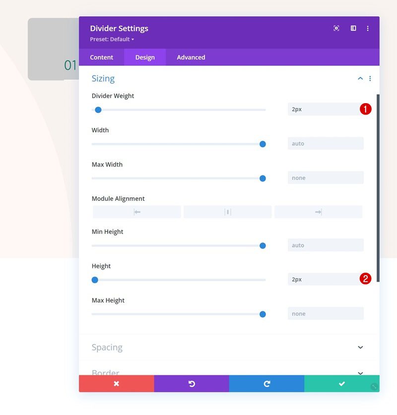
Sizing
Modify the sizing settings as well.
- Divider Weight: 2px
- Height: 2px
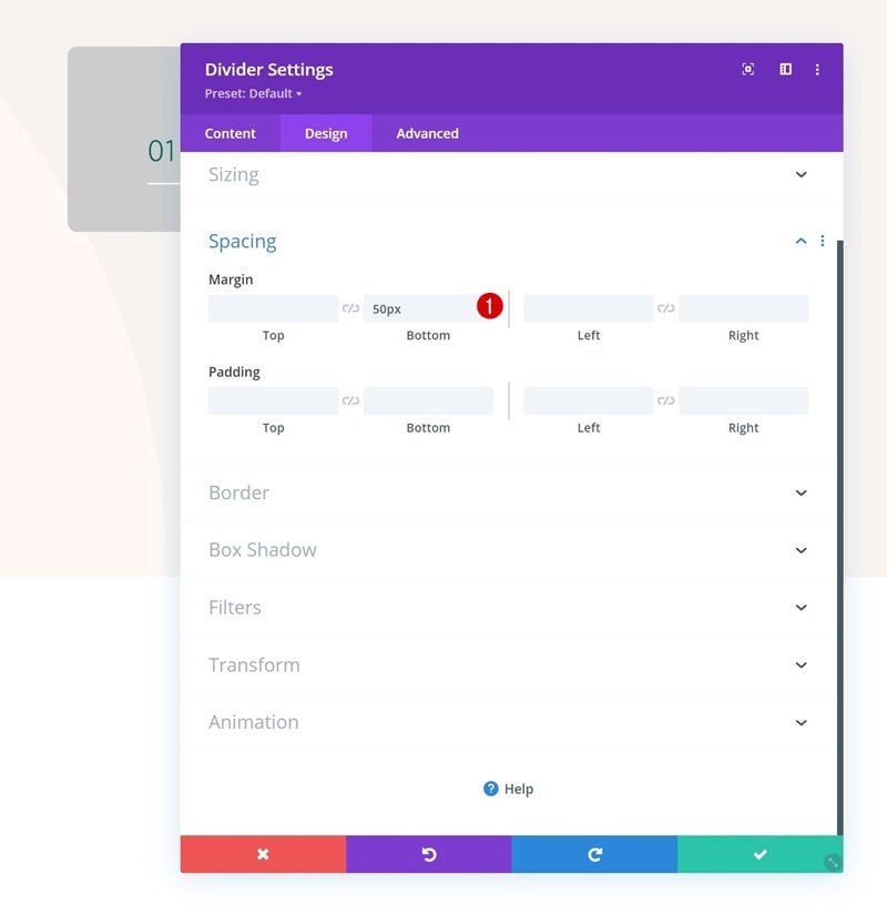
Spacing
Add some bottom margin too.
- Bottom Margin: 50px
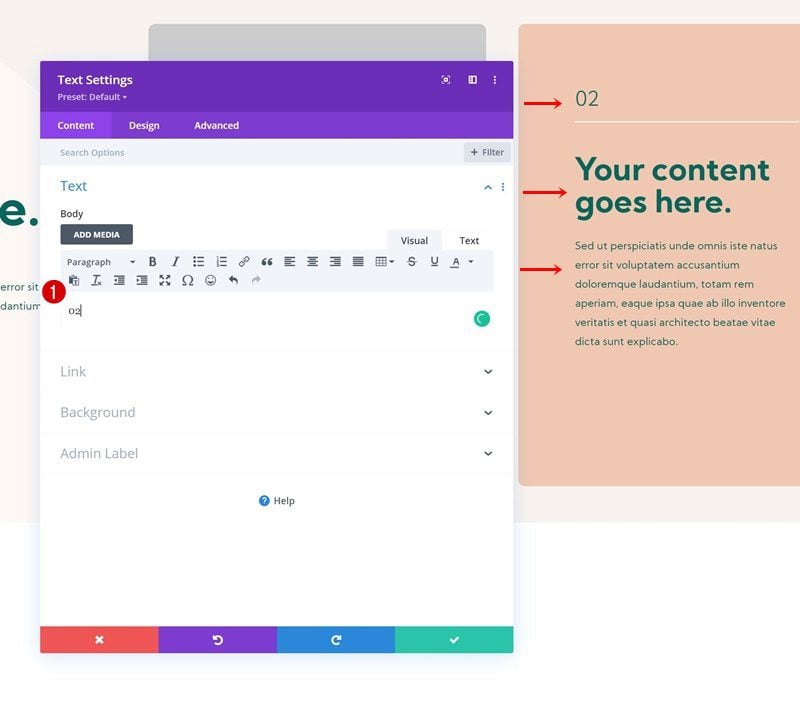
Add Text Module #2 to Column 1
Add H3 Content
Add another Text Module to column 1. Use some H3 content of your choice.
H3 Text Settings
Move on to the module’s design tab and change the H3 text settings as follows:
- Heading 3 Font: Kumbh Sans
- Heading 3 Font Weight: Bold
- Heading 3 Text Color: #08665c
- Heading 3 Text Size:
- Desktop: 48px
- Tablet: 38px
- Phone: 32px
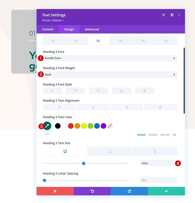
Spacing
Use some bottom margin as well.
- Bottom Margin: 15px
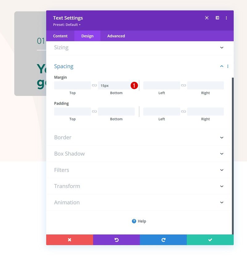
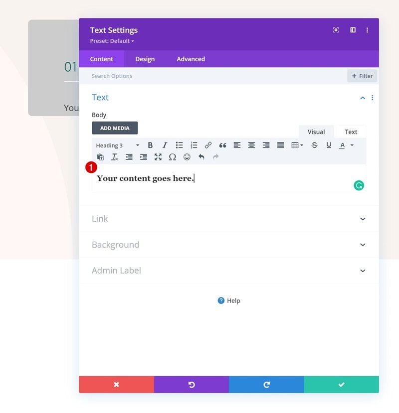
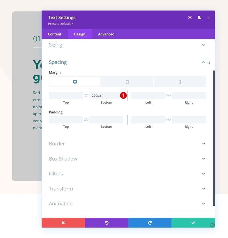
Add Text Module #3 to Column 1
Add Content
Add the last Text Module to column 1 with some description content of your choice.
Text Settings
Change the text settings accordingly:
- Text Font: Kumbh Sans
- Text Color: #08665c
- Text Size: 16px
- Text Line Height: 1.8em
Spacing
Include some bottom margin as well.
- Bottom Margin:
- Desktop: 200px
- Tablet & Phone: 150px
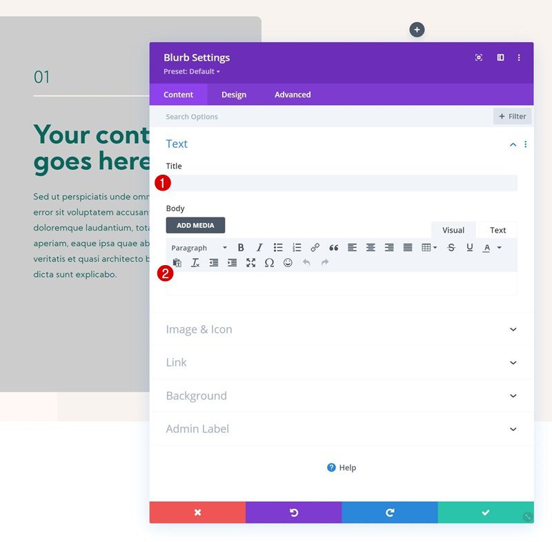
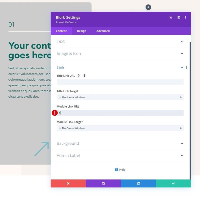
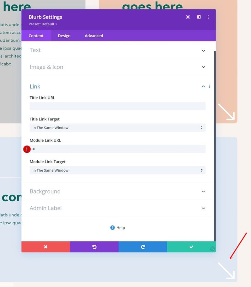
Add Blurb Module to Column 1
Leave Content Boxes Empty
On to the last module we need in this column, which is a Blurb Module. Leave the content boxes empty.
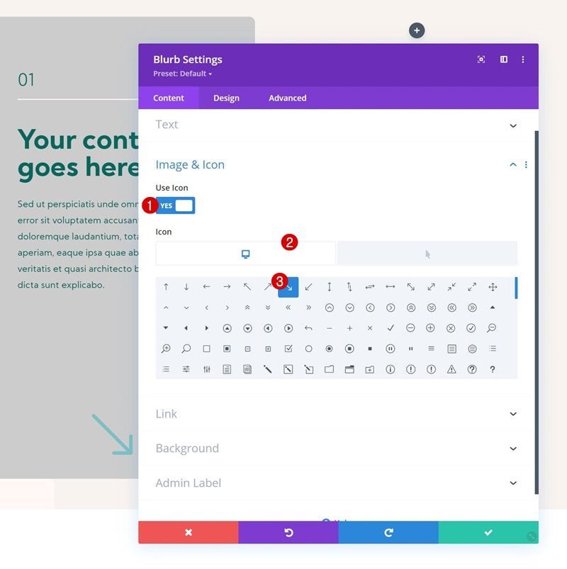
Default Icon
Select the arrow icon next.
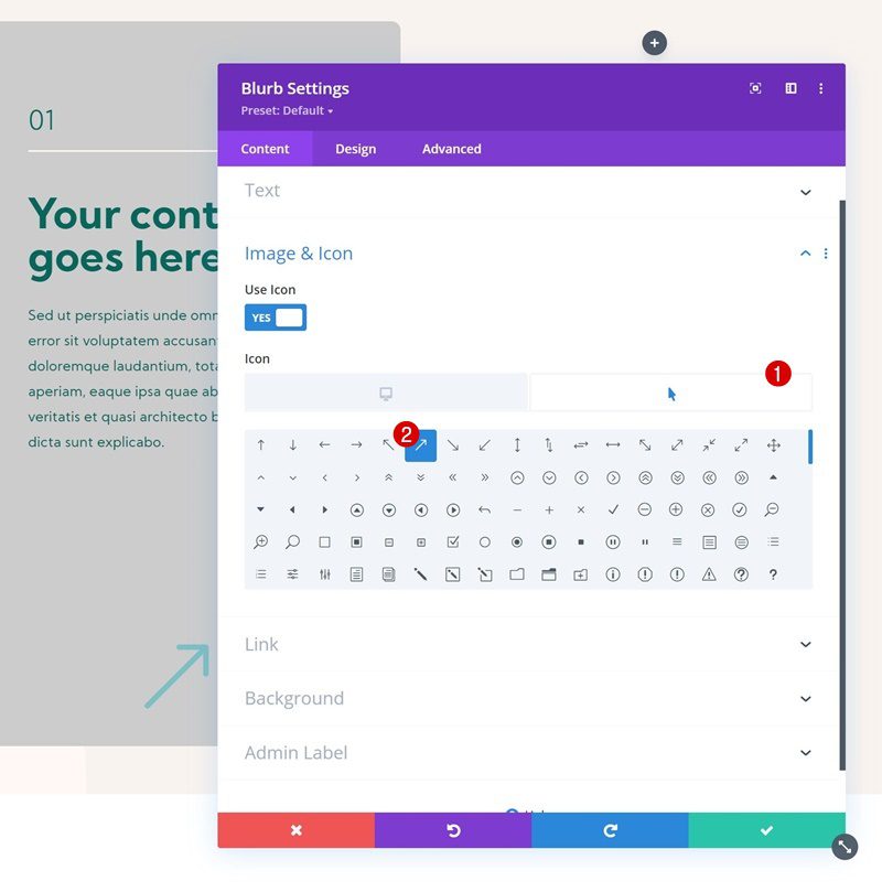
Hover Icon
Change the icon on hover.
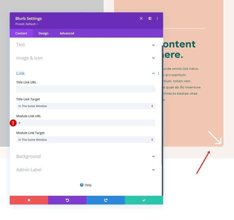
Add Link
Use a link for this module as well.
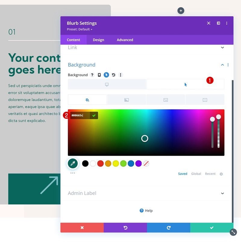
Hover Background Color
Then, add a hover background color.
- Hover Background Color: #08665c
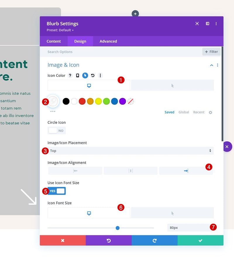
Default Icon Settings
Navigate to the design tab and change the icon settings as follows:
- Icon Color: #ffffff
- Image/Icon Placement: Top
- Image/Icon Alignment: Right
- Use Icon Font Size: Yes
- Icon Font Size: 80px
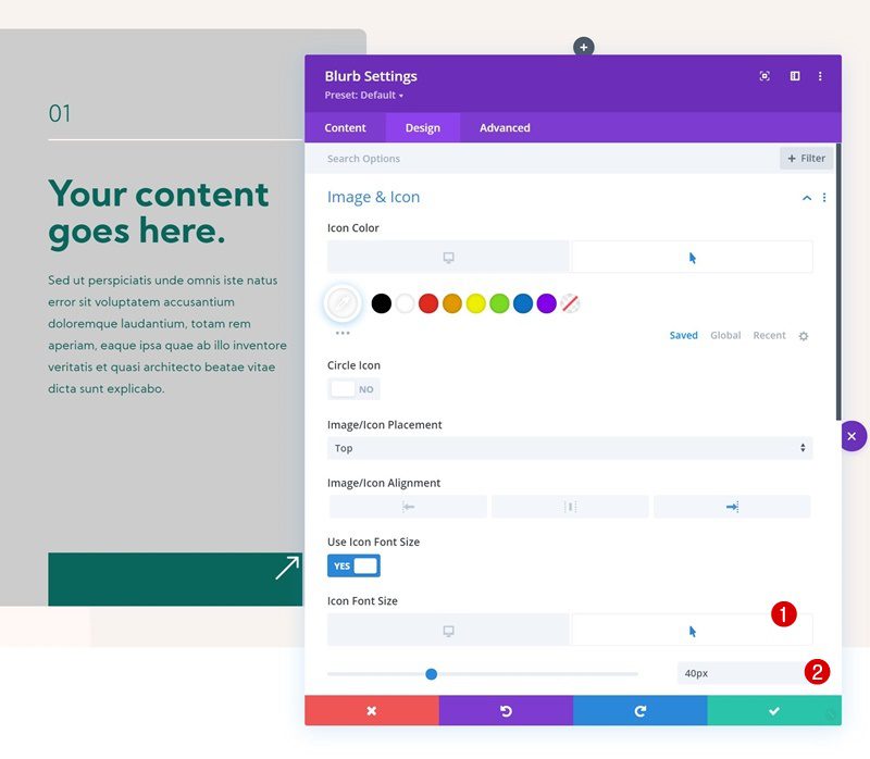
Hover Icon Settings
Modify the icon font size on hover.
- Hover Icon Font Size: 40px
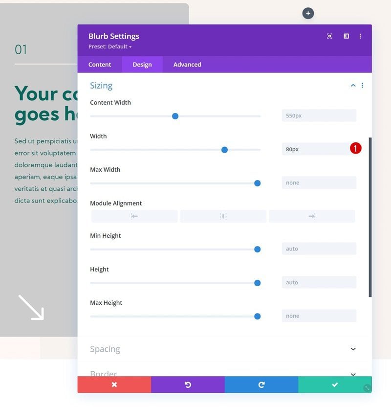
Sizing
Then, add some width to the sizing settings.
- Width: 80px
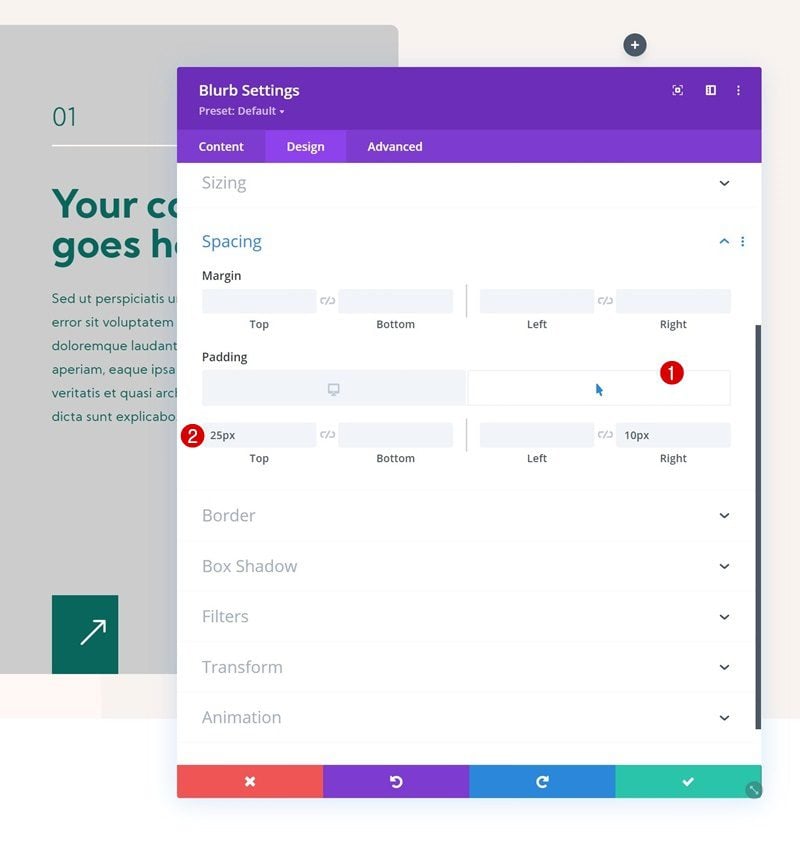
Hover Spacing
Modify the top and right padding on hover.
- Hover Top Padding: 25px
- Hover Right Padding: 10px
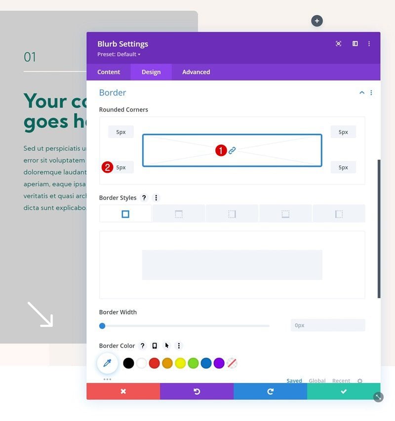
Border
Include some rounded corners in the border settings as well.
- All Corners: 5px
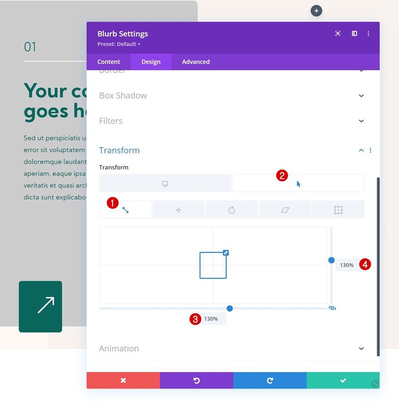
Hover Scale
Then, use the transform scale option on hover.
- Hover Both: 130%
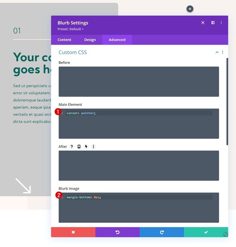
Main Element & Blurb Image CSS
Next, navigate to the advanced tab and use the following line of CSS code for the main element:
cursor: pointer;
Use this line for the Blurb Image css box:
margin-bottom: 0px;
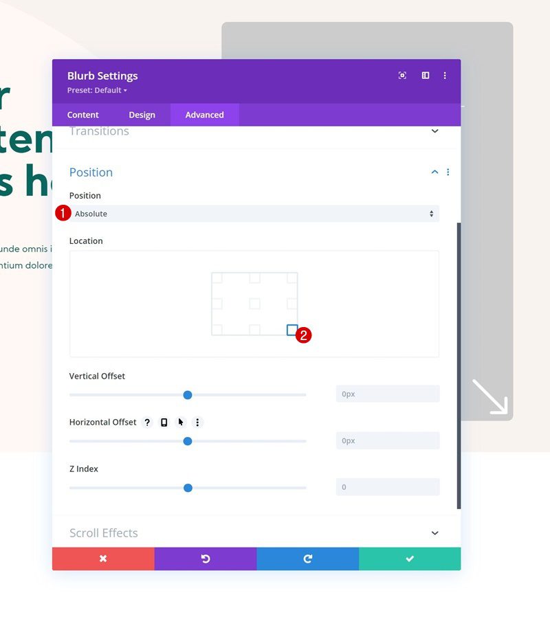
Position
Complete the module settings by repositioning it in the position settings:
- Position: Absolute
- Location: Right Bottom
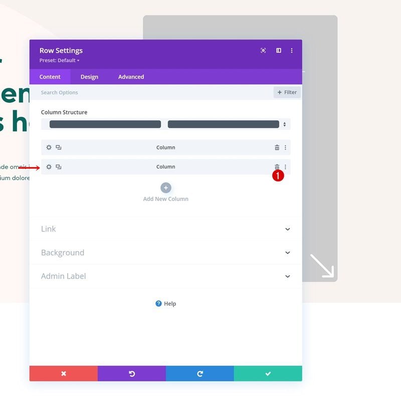
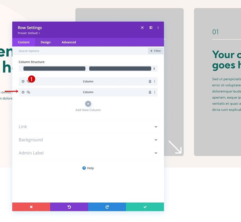
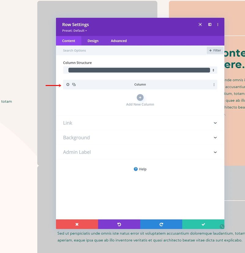
Reuse Column 1
Remove Column 2
Once you’ve completed the first column, you can reuse it for the second. To do that, remove the second column first.
Clone Column 1
Then, clone the first.
Change Column 2 Background Color
Of course, you’ll need to make some changes to the duplicate column, starting with the background color.
- Column 2 Background Color: #f0c7b1
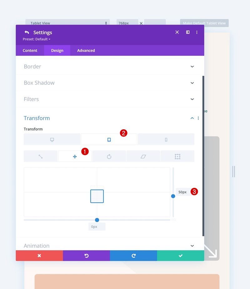
Add Transform Translate to Column 2
We’re adding a transform translate value on smaller screen sizes as well.
- Right:
- Desktop: /
- Tablet & Phone: 50px
Change Duplicate Content
Make sure you change all duplicate content.
Change Blurb Module Link
Complete the duplicate column by changing the link inside the Blurb Module.
Reuse Row
Once you’ve completed the first row and its columns, you can clone the entire row.
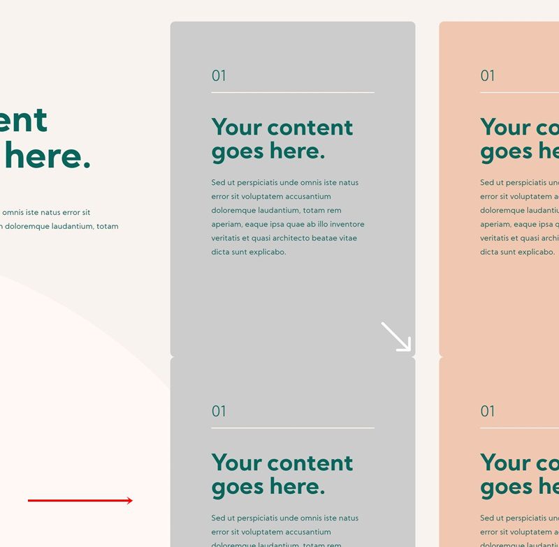
Remove Column 2
Delete the second column inside the row settings.
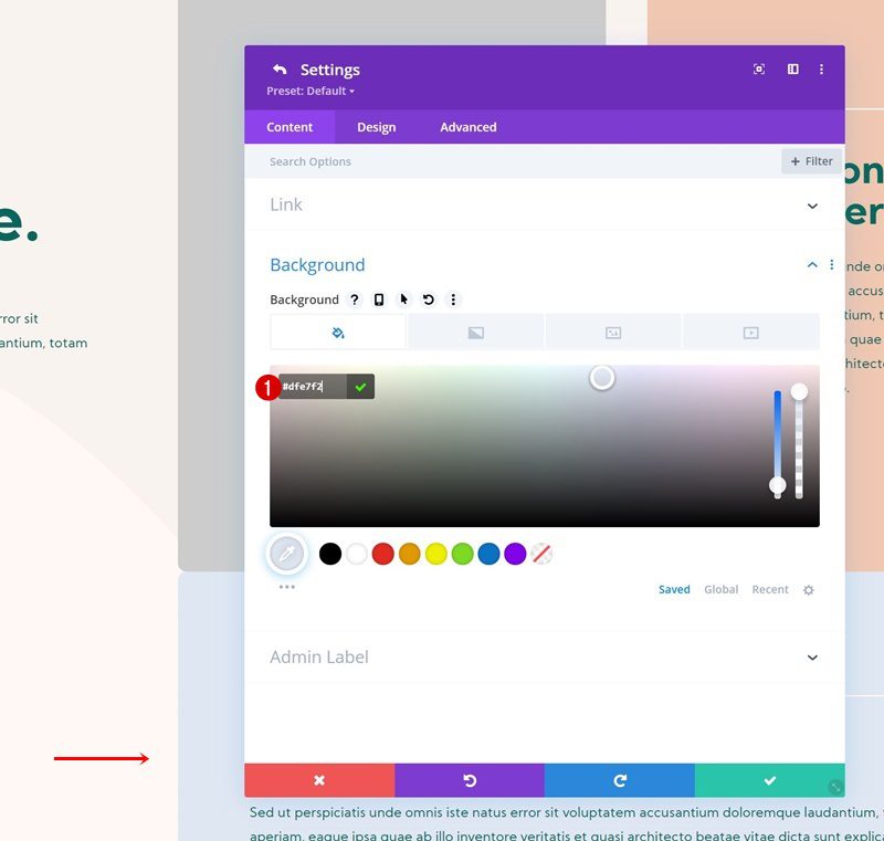
Change Column Background Color
Then, change the remaining column’s background color.
- Column Background Color: #dfe7f2
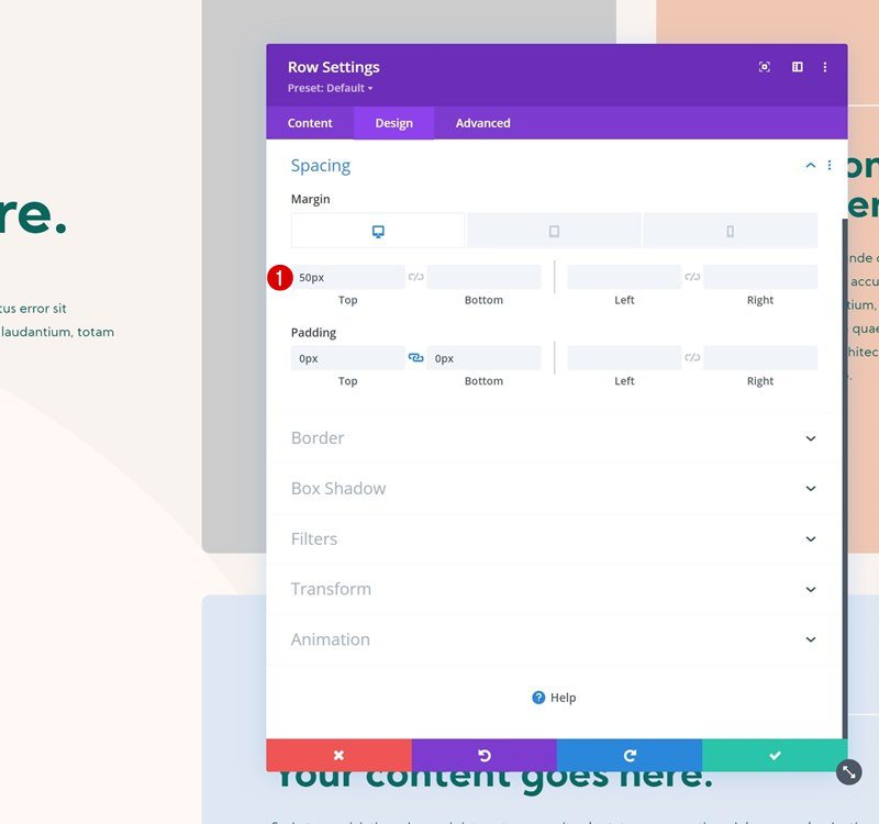
Add Top Margin to Row
Go back to the general row settings and add some responsive top margin.
- Top Margin:
- Desktop: 50px
- Tablet & Phone: 100px
Change Duplicate Content
Then, change all duplicate content in the column.
Change Blurb Module Link
Complete the tutorial by changing the link inside the Blurb Module. That’s it!
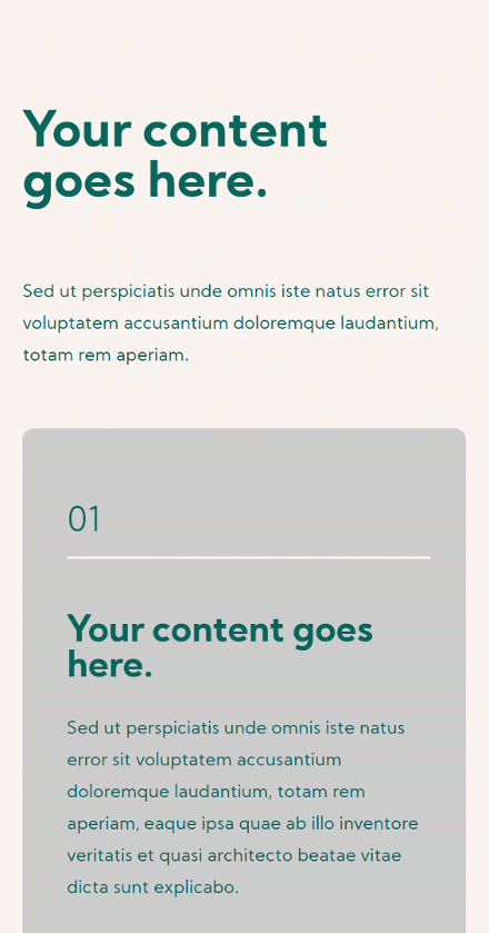
Preview
Now that we’ve gone through all the steps, let’s take a final look at the outcome across different screen sizes.
Desktop
Mobile
Final Thoughts
In this post, we’ve shown you how to get creative with your CTAs. More specifically, we’ve shown you how to add hover-animated corner button arrows. This approach helps you keep a clean look and feel when designing a section with multiple CTAs. It adds an extra level of interaction too. You were able to download the JSON file for free. If you have any questions or suggestions, feel free to leave a comment in the comment section below!
If you’re eager to learn more about Divi and get more Divi freebies, make sure you subscribe to our email newsletter and YouTube channel so you’ll always be one of the first people to know and get benefits from this free content.


Thank you so much Vuniqi. watching youtube videos for a hours but don’t find any video for this particular problem. Finally, you give me solutions.