
On almost every website you visit, elements pop up and stick to the page. Cookie warnings and opt-ins, email signups, and chat boxes. We all tend to ignore them at some point, becoming blind to whatever the website is trying to tell us. We just click the X without reading. But that doesn’t mean these sorts of elements can’t be useful nor have a place. With Divi, you can easily create a floating about card that adds value to your site, unobtrusively explaining who you are and what your brand does. Let’s see how easy it is.
- 1 Preview
- 2 1. Create a Page Template
-
3
2. Add Floating Card
- 3.1 Add a New Section and Row
- 3.2 Add a Blurb Module
- 3.3 Adjust Section and Row Settings
- 3.4 The Blurb Module Content
- 3.5 Set the Background Color
- 3.6 Choose a Card Image
- 3.7 Shape the Card Corners
- 3.8 Text Alignment
- 3.9 Style the Floating Card’s Title Text
- 3.10 Style the Card’s Text
- 3.11 Sizing the About Card
- 3.12 Spacing for the Blurb
- 3.13 Add Box Shadow
- 3.14 Adjusting Responsive CSS
- 3.15 Fix and Float the Card with Position Setting
- 4 Final Results
- 5 Conclusion
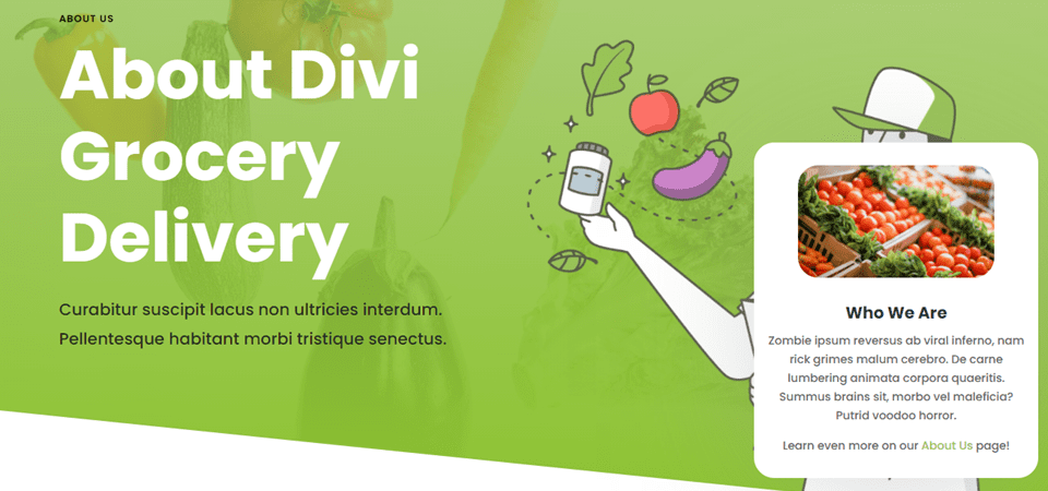
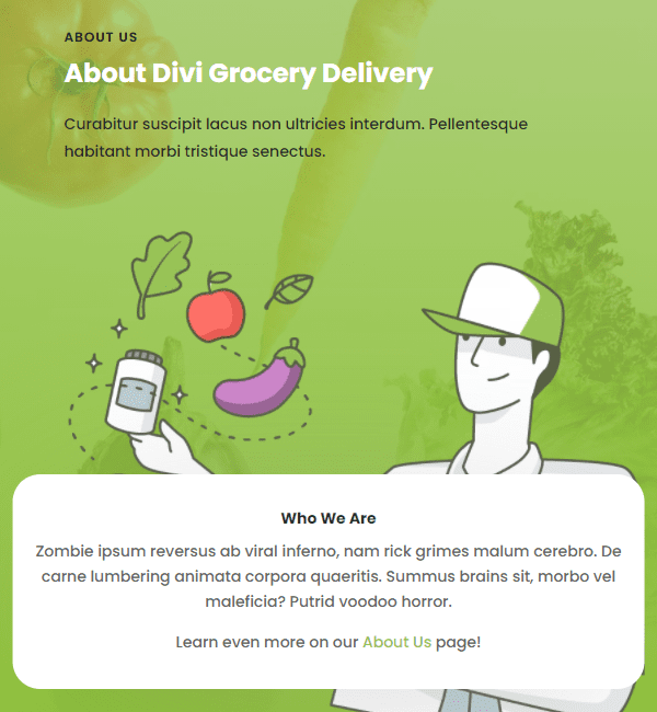
Preview
Desktop
Mobile
1. Create a Page Template
The first thing you want to do is decide what pages you want to include this floating about card. You might want it on each and every page of your website, or you might only want it on specific landing pages. Either way, you can use the Divi Theme Builder to set it up. Either as a global template or a template that applies to only certain pages.
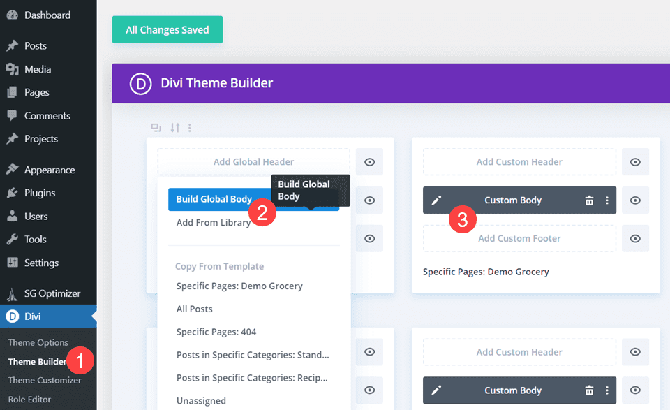
Use the Theme Builder to Create the Template
To start, go to Divi – Theme Builder in your WordPress dashboard. Choose the Custom Body section of the pages to which you want to apply the floating about card or the Global Body to apply it everywhere.
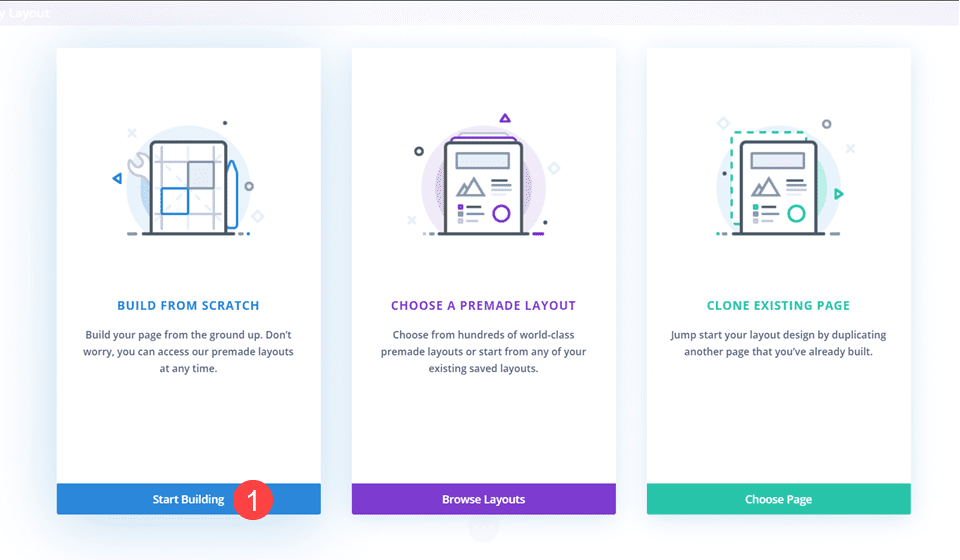
Once you’ve loaded the Divi Visual Builder, choose Start from Scratch when given the choice.
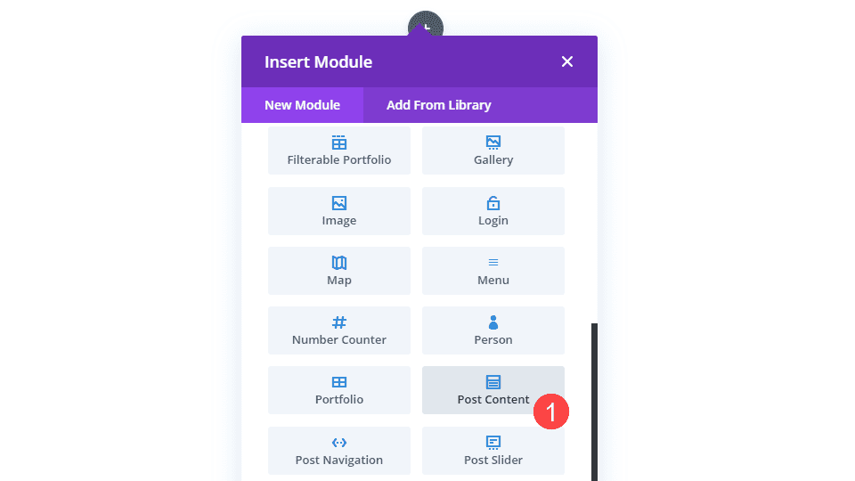
Add a 1-Column Row and Post Content Module
And then choose a single-column row when prompted.
Next, you want to choose the Post Content module. This is an example of our dynamic content feature. The module displays the accompanying design built inside the Divi page itself, meaning that this module will show different content for different pages with this template. For blog posts, it will be the blog content. For shop pages, it will be the products. And for individual pages, the custom content you’ve made using Divi.
Adjust Section and Row Spacing
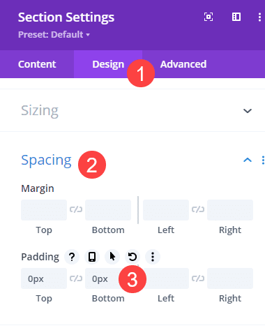
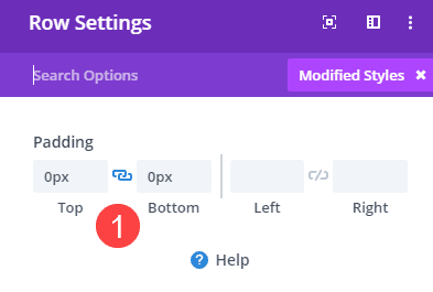
With those in place, we need to make a couple spacing adjustments. Go into the Section settings (blue border in the Divi builder) and remove all top and bottom padding. You do this under the Design tab, the Spacing heading, and then setting 0px to Top and Bottom under Padding.
Save your changes and enter the Row settings. Again, set the Top and Bottom Padding to 0px.
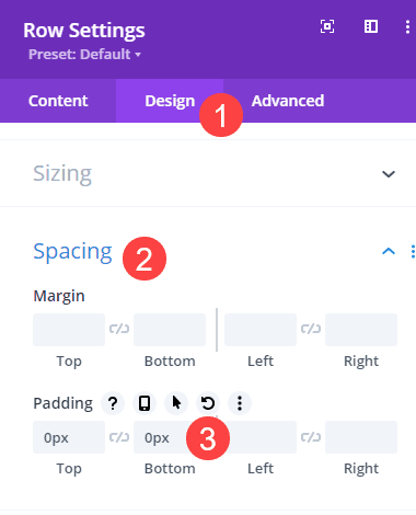
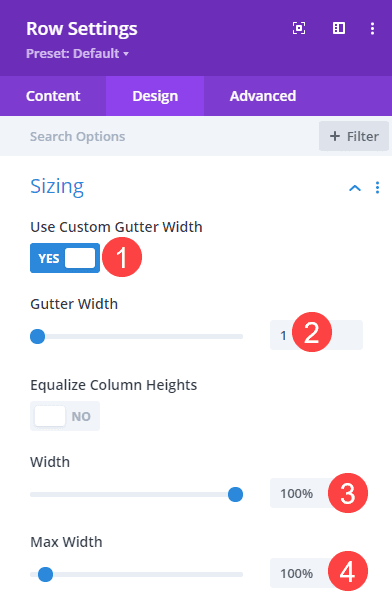
Next, find the Sizing heading and toggle Use Custom Gutter Width on and set its value to 1. Next, set Width and Max Width to 100%.
With the prep done, let’s get into making the floating about card!
2. Add Floating Card
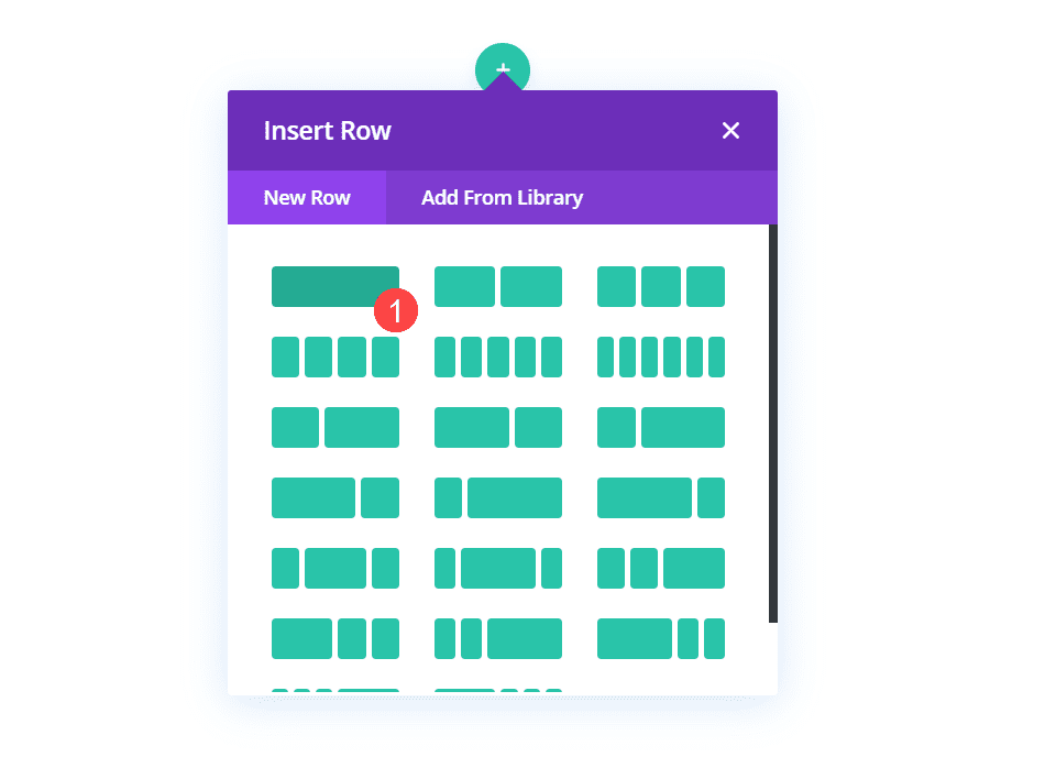
Add a New Section and Row
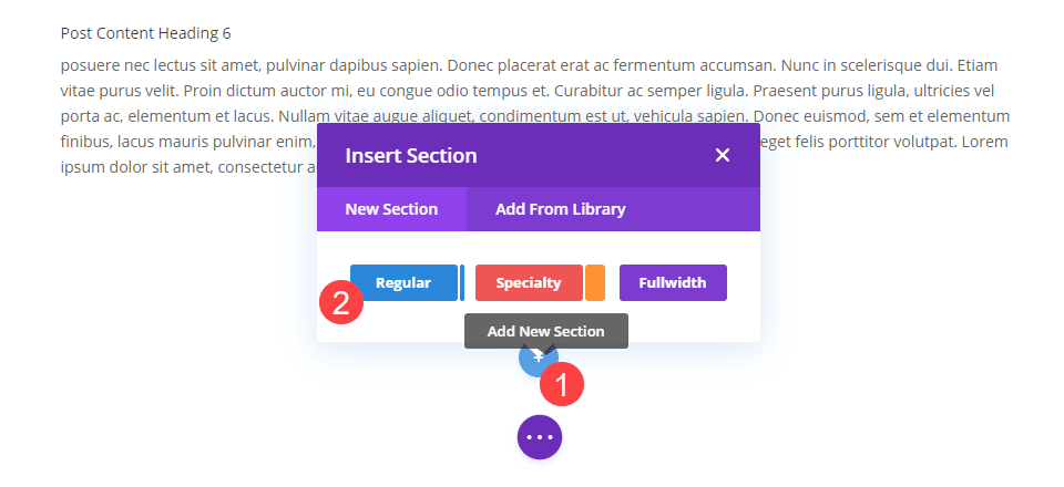
First, you will want to add a new section. Do this by scrolling to the bottom of the page and clicking the blue + circle and choosing Regular when prompted for the type of section.
Add a Blurb Module
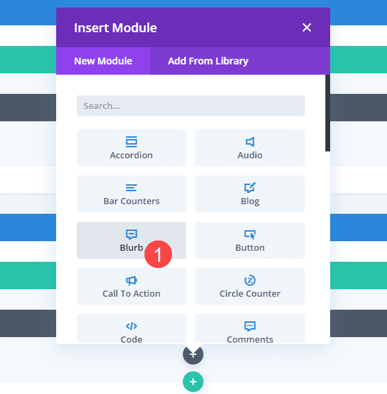
This will be the section that’s dedicated to the floating card. Inside, we want to add another single-column row. And inside that, we want to use a Blurb module for the floating card itself. The Divi Blurb module might be the most versatile module in the builder, so we want to take advantage of what it offers for this feature.
Adjust Section and Row Settings
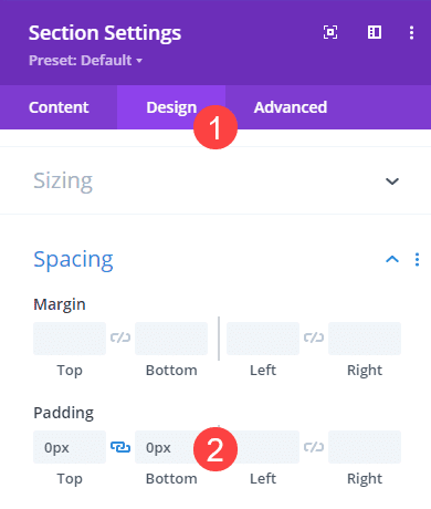
With that in place, we need to adjust the padding and positioning of this row and section. So first, go into the Section settings and set the Top and Bottom Padding to 0px under Display – Spacing.
Then, under the Advanced tab, find the Position heading. Set the Z Index to 12. The higher the number, the further “front” the section and its contents will sit. And since it’s a floating card, we want it to float on top of all the other elements.
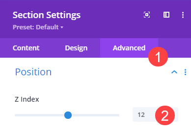
Finally, go into the Row settings and set its padding on Top and Bottom to 0px once more.
The Blurb Module Content
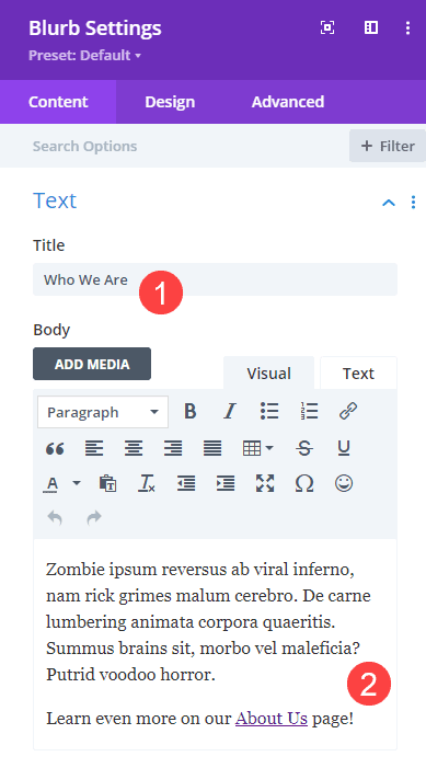
Now it’s time for us to style the card itself. Enter the Settings for the Blurb module. Since it’s an element that describes your business, you will want to have a brief mention of what your company or brand does. Because this is an example post, we filled it with some zombie-flavored lorem ipsum. You can set the title and body content under the Content tab.
Set the Background Color
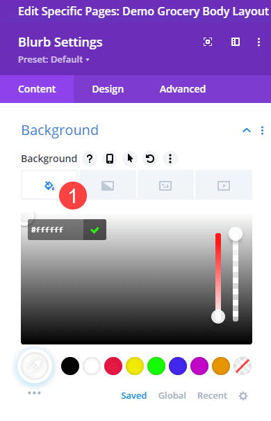
You obviously want the floating card to visually match your site, so choosing the right background color matters a lot. We are going with #ffffff (white). The Content tab houses this, too, and you will find it under Background heading and the Paint Can.
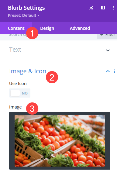
Choose a Card Image
The Blurb module gives you the option to include an image or an icon for the module, and we want an image that represents our company. Again, under the Content tab, find Image and Icon and simply upload the image that works for your module.
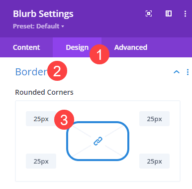
Shape the Card Corners
Next, go into the Design tab and into the Border heading. Find the Rounded Corners options and set each corner at 25px. This will smooth out the sharp, squared edges without changing the shape of the overall card.
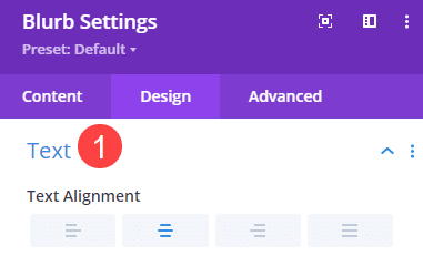
Text Alignment
Under the Text heading, set the Text Alignment to center.
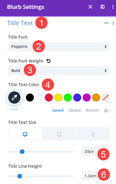
Style the Floating Card’s Title Text
The title text that you set earlier defaults to H4. To style it, go into the Title Text heading, choose the H4 tab, and change the following Title options:
- Font: Poppins
- Font Weight: Bold
- Text Color: #22303f
- Text Size: 20px
- Line Height: 1.3em
Then, we need to go into the Responsiveness settings and change the size of the title for mobile devices. Change the Title Text Size to 14px.
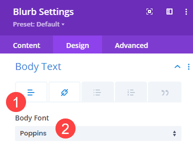
Style the Card’s Text
Next, navigate to Body Text and change the Body Font to Poppins to match the title font.
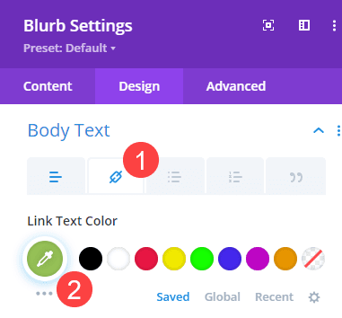
Then click on the Link tab (chain icon) and swap the Link Text Color to a complimentary color for your site. We chose #97c357.
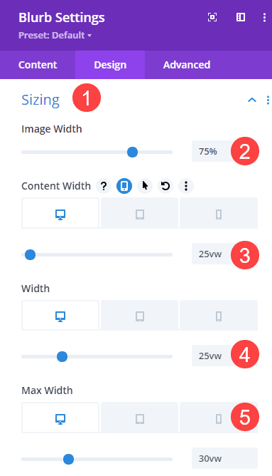
Sizing the About Card
Under the Sizing heading, add the following values to these settings:
- Image Width: 75%
- Content Width: 25vw
- Width: 25vw
- Max Width: 30vw
Under the responsiveness settings, adjust the following values:
- Content Width: 90vw
- Width: 90vw
- Max Width: 95vw
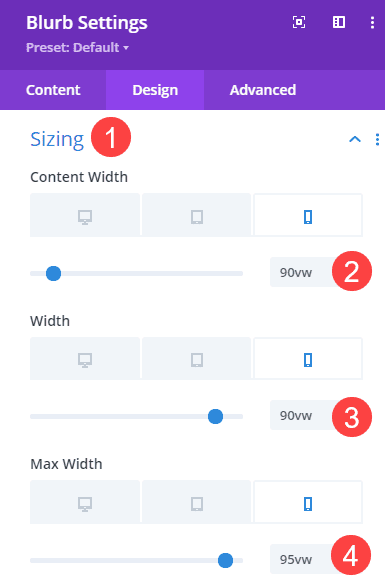
These values will make sure the card takes up the entire width of the screen on mobile devices because a floating card in the corner is typically impossible to read.
Spacing for the Blurb
The Spacing heading is a quick fix, where you need to set the Left Margin to 0px, the Top and Bottom Padding to 2vw, and the Left and Right Padding to 1vw.
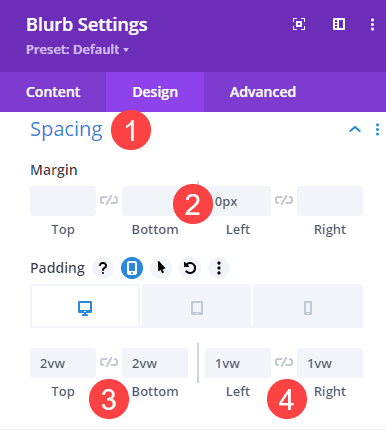
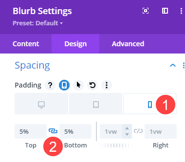
For responsive settings, only the Top and Bottom Padding will change. We will set these at 5%.
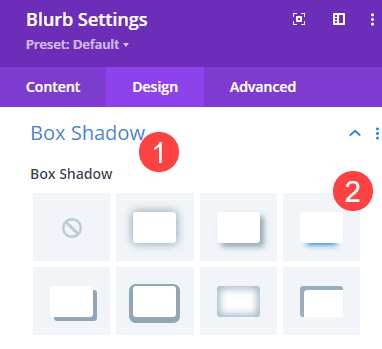
Add Box Shadow
Because the floating about card is going to stay fixed in its location, we want it to look as though it’s actually floating above your content. This effect is simple enough by adding a basic box shadow to the module. This option can be found under Box Shadow, and we chose the basic bottom shadow.
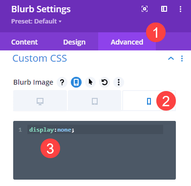
Adjusting Responsive CSS
Now is the fun part. We are moving into the Advanced tab where we will make the floating card affix itself to the page. To do this, our first step is to turn off the image we added for desktop. Images in the Blurb module can really affect size and usability on mobile, plus it’s something else for the page to load.
So we want to add display:none; under the mobile-only Blurb Image field under Custom CSS.
Fix and Float the Card with Position Setting
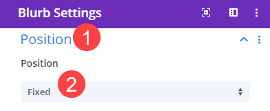
Finally, we are going to position the card where we want it to float. First, we want to head to the Advanced tab and scroll to Position. Select Fixed from the dropdown menu.
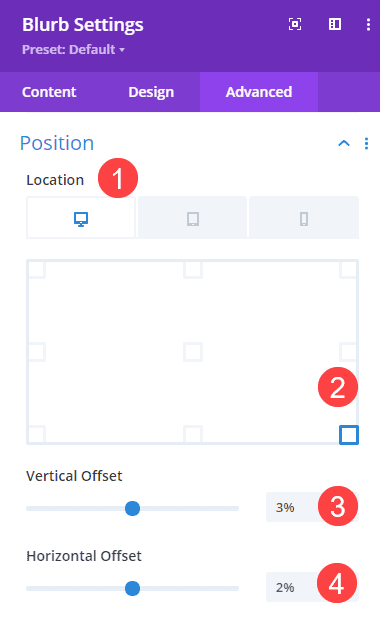
Next, find the Location options. This is the point on the screen where the floating card will stay. For desktop, we want it to be in the lower corner of the screen. So we click the square that correlates with that. We also want it to be slightly offset from the window border, so we will change the Vertical Offset to 3% and Horizontal Offset to 2%.
Next, we want to create a different location and offset for mobile. Above, we set the width of the card to stretch the entire width of the screen. With that in mind, we will change the Fixed Location to the bottom-center so the card will just float at the bottom of the screen at all times.
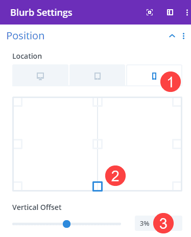
Additionally, we are only going to change the Vertical Offset for mobile. Set this value to 3%. There is no need for horizontal offset because it’s the width of the mobile screen and centered.
Final Results
When everything is set properly and adjusted for your personal site, the final product should look similar to this.
Desktop
Mobile
Conclusion
With Divi’s powerful options and intuitive interface, you can design and affix a floating about card on your site in no time. By letting your users know who they’re dealing with from the beginning, you’re bound to garner some brand loyalty.
What have you used floating cards for on your websites? Let us know in the comments!


Hello.
A very interesting resource.
Would it be possible to add an X to close the card?
Thanks.