

Gravity Forms is one of the most popular tools for building contact forms, multi-page applications, and lead forms in WordPress. Previously, adding one to a Divi page relied on a shortcode, while matching its fields, buttons, and validation states to the surrounding design often required custom CSS. Divi 5 adds a native Gravity Forms Module to the Visual Builder, allowing you to select an existing form, preview it, and style its output with Divi’s design settings.
In this post, we’ll explore what the module does and show you how to add, configure, style, and test a Gravity Form across breakpoints. We’ll also explain how to import the downloadable example layouts.
Let’s get started.
What Is The Gravity Forms Module?
The Gravity Forms Module is a native Divi 5 integration for forms created with Gravity Forms. Once the plugin is installed and active, the module appears in the Visual Builder. Add it like any other module, select a form in its settings, and preview the result on the page.
The module removes the need to place a Gravity Forms shortcode in a Code Module. It handles the embed and provides a live preview, allowing you to design the page around the actual form.
The form’s structure and behavior still live in Gravity Forms. Create its fields, conditional logic, notifications, confirmations, and other functional settings in the plugin.
Use the Divi module to choose where that form appears and control how its output looks on the page.
Its design settings cover form text, fields, buttons, validation messages, and paging controls. This gives you control over the form’s empty, interactive, error, and multi-page states without leaving the Visual Builder.
Key Advantages
The primary advantage is a cleaner workflow. You can place and style an existing form through one module instead of moving between a shortcode, CSS, and the front end to check each change.
The live preview also reveals long labels, stacked fields, button placement, and multi-page controls while you work. You can preview validation and confirmation messages, then style them so they feel connected to the rest of the design.
The result is a more consistent experience across contact forms, lead forms, applications, and other Gravity Forms layouts.
Before You Start
A few things need to be in place before the Gravity Forms Module appears and works as expected.
First, install and activate Gravity Forms. The Divi module depends on the plugin and does not appear in the module list when Gravity Forms is inactive.
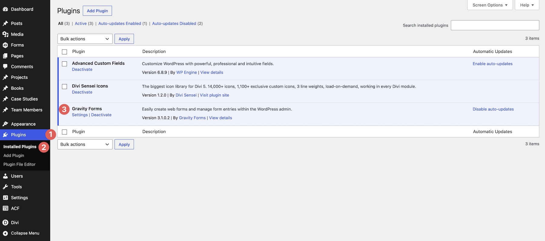
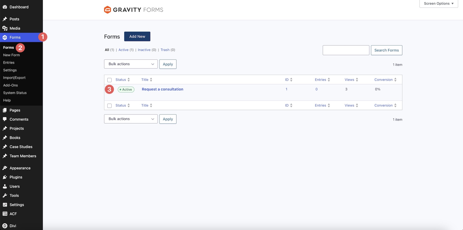
Build the form in Gravity Forms before styling it in Divi. Add the required fields and configure its conditional logic, notifications, and confirmations. The Divi module embeds the form but does not create its fields.
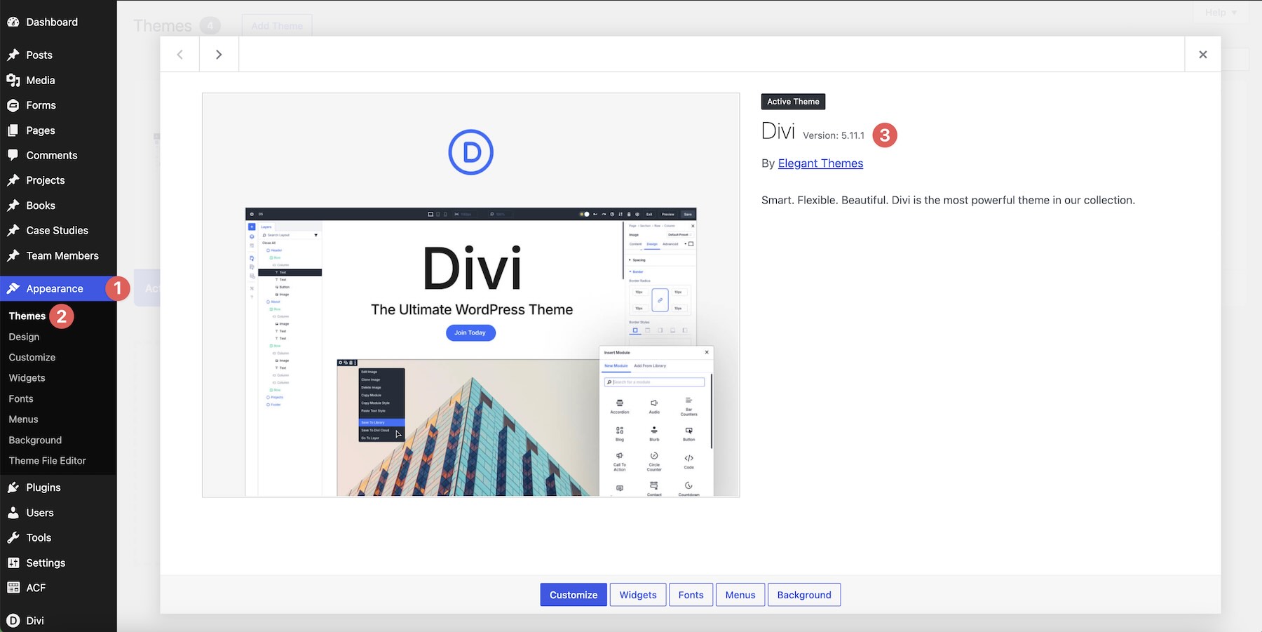
The native Gravity Forms Module shipped with Divi 5.11, so update Divi before looking for it in the Visual Builder.
Finally, choose the form you plan to use before styling. Working with the actual field structure is faster than designing around one form and replacing it with a substantially different one later.
How To Use The Gravity Forms Module
1. Add The Module
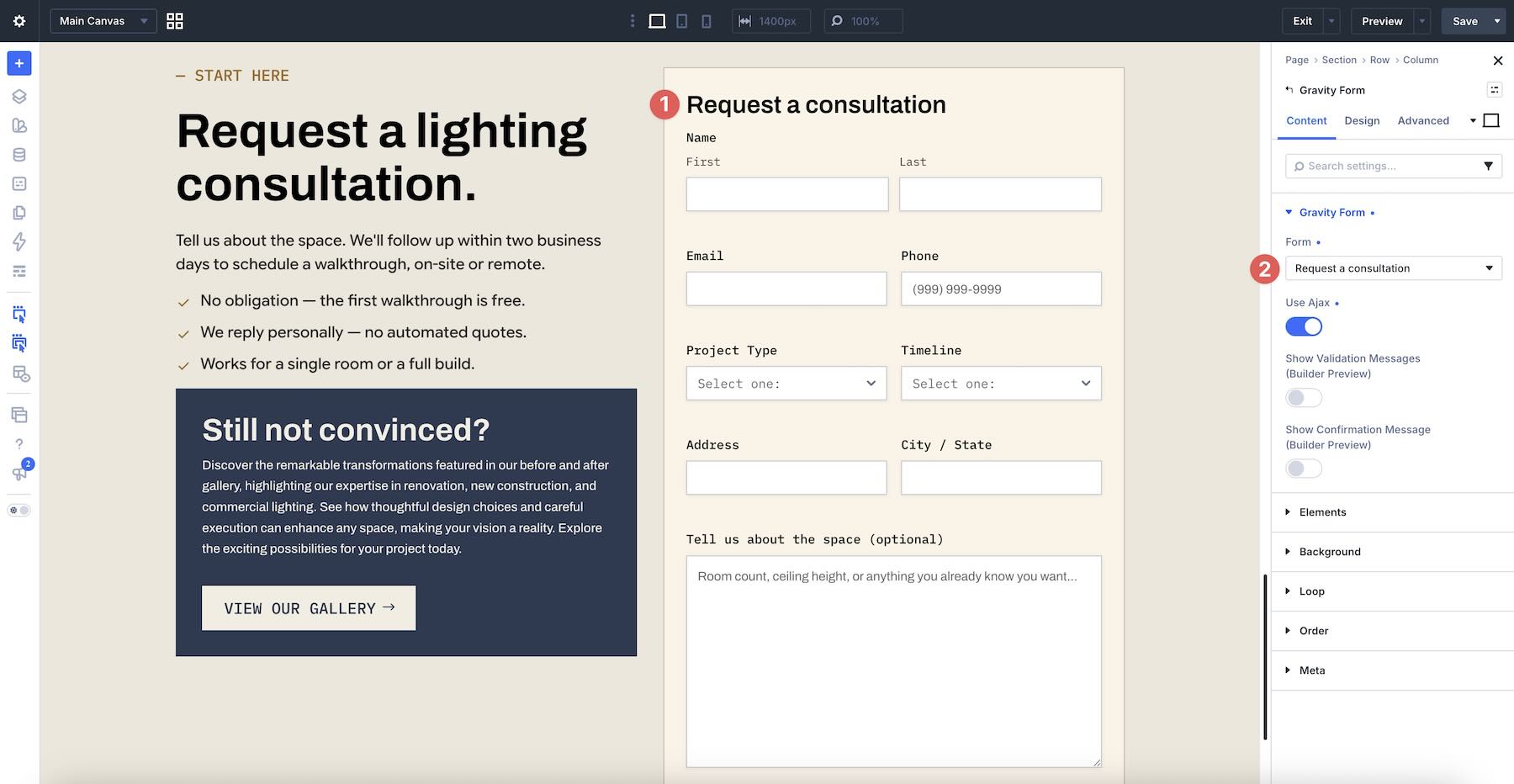
Create a page or open an existing one in the Visual Builder, then add the Gravity Forms Module to a Section.
In the module’s Content tab, open the Gravity Forms option group. Use the Form field to select one of your existing forms.
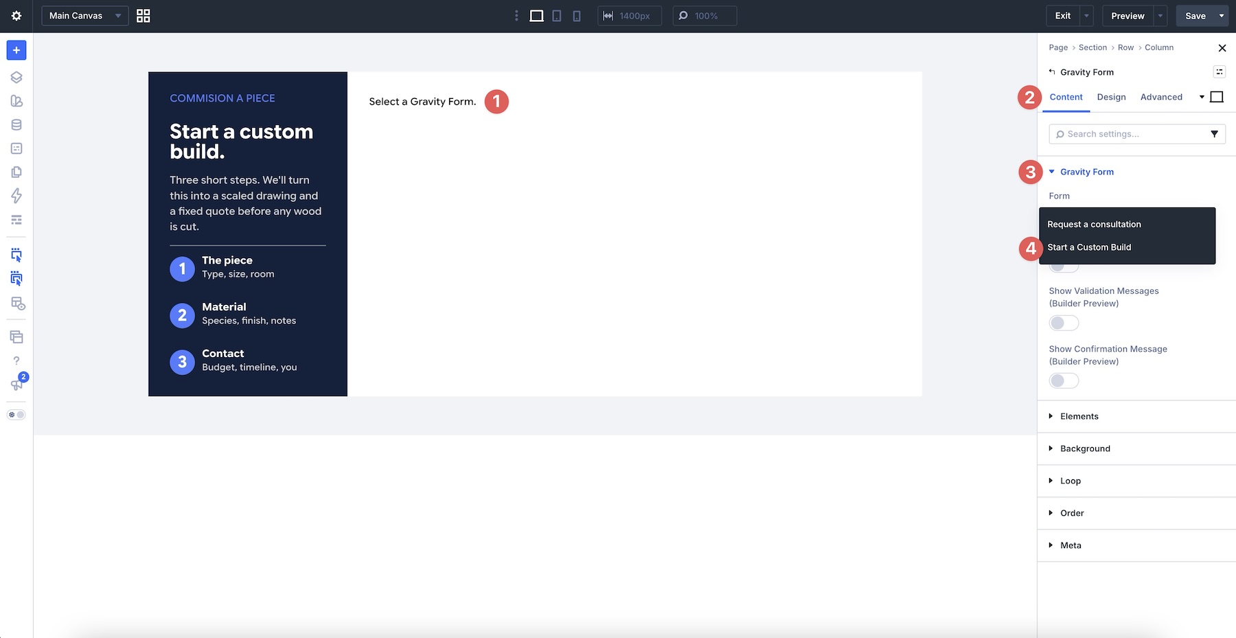
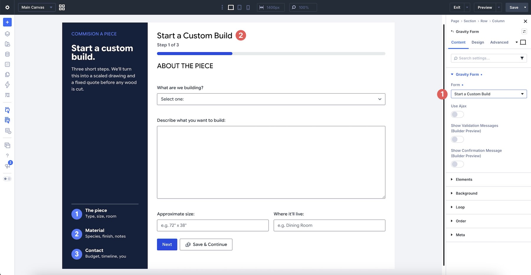
Check the Canvas to confirm that the form renders correctly.
2. Configure The Settings
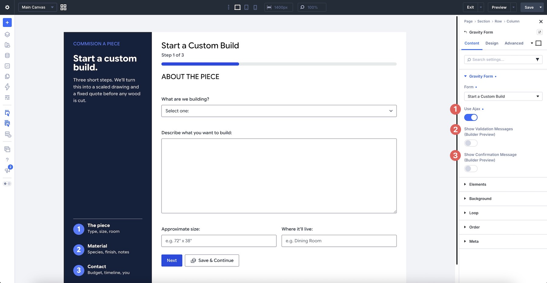
In the Content tab, choose whether to enable Ajax. While styling, enable the Validation and Confirmation message previews so you can see and design those states inside the Builder.
3. Style The Form
Open the Design tab and begin with Title Text. Adjust its font, weight, size, color, line height, and other available settings.
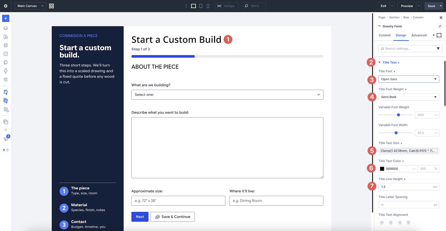
Use the Description Text, Section Heading Text, and Sub-Label Text groups to style the form’s supporting text.
Open the Input group to style input, label, and placeholder text, control Spacing, and adjust the background, border, and shadow. Divi’s form field editing modes also let you design hover and focus states, making the active field easier to identify.
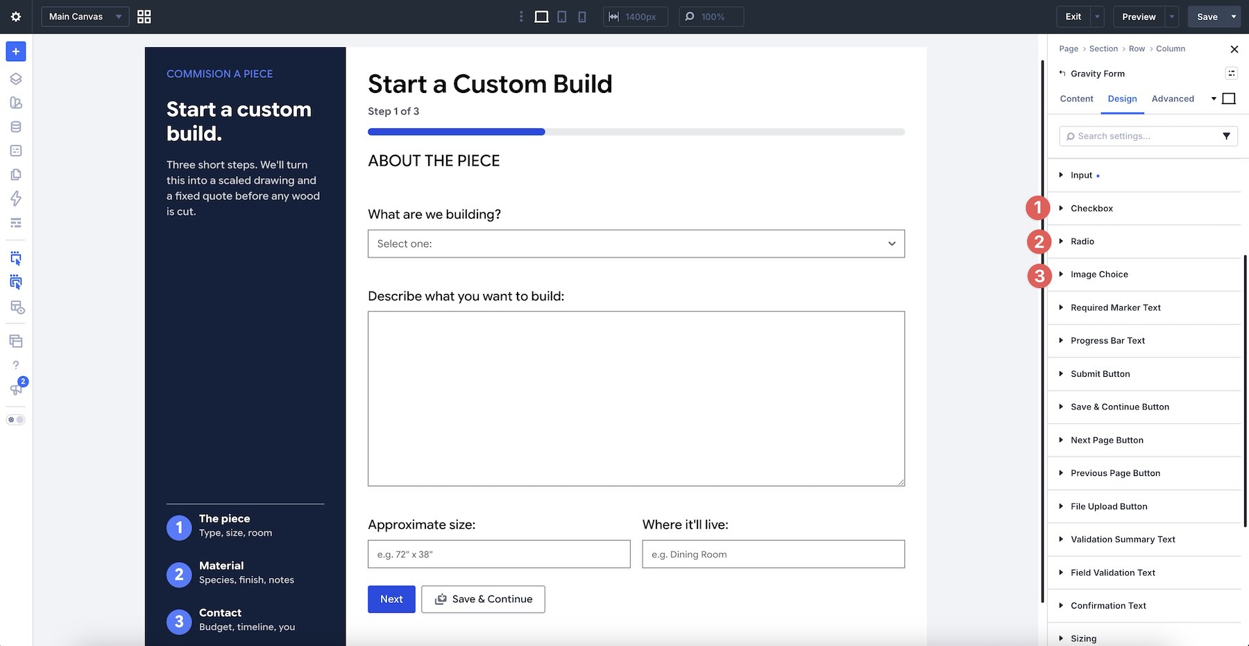
If the form includes checkboxes, radio buttons, or image-based choices, style them through their corresponding option groups. Checked-state editing can help distinguish selected choices from unselected ones.
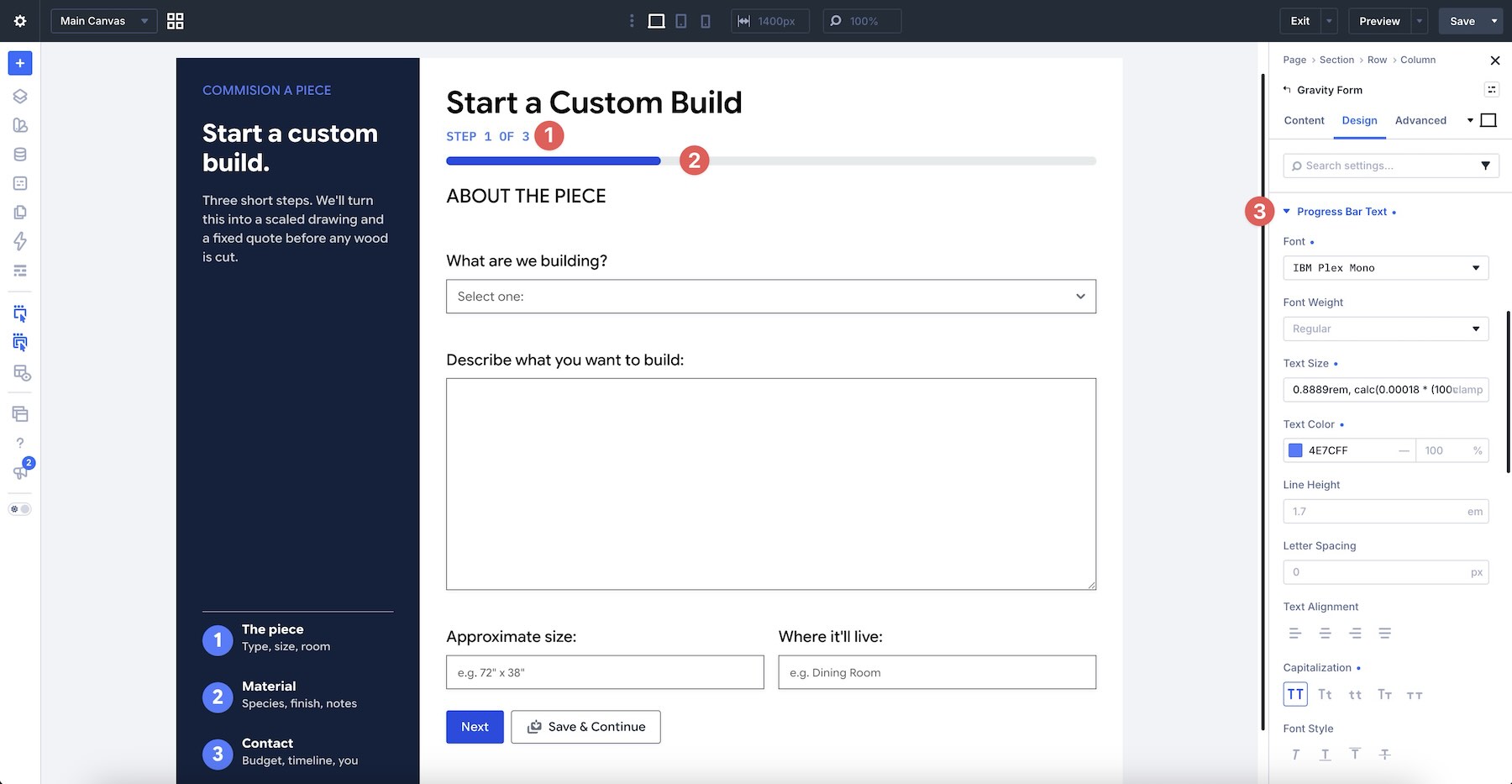
For multi-page forms, use the Progress Bar Text group to style the text associated with the progress indicator.
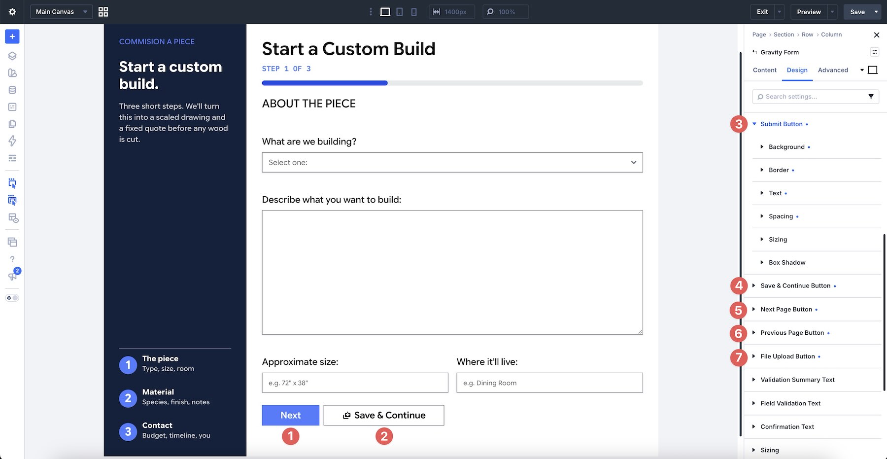
The Submit Button group is available for every form. Save & Continue, Next Page, and Previous Page apply to multi-page forms, while File Upload styles the upload control when that field is present.
Use Validation Summary Text, Field Validation Text, and Confirmation Text to style the module’s feedback messages. Keep the message previews enabled while designing so you can see the result.
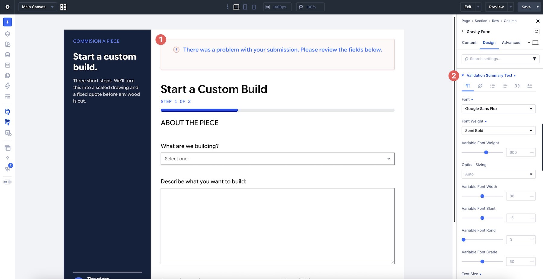
4. Test For Responsiveness And Function
Switch the Builder to Tablet and Phone views and check the form at each breakpoint.
Look for wrapped labels, stacked columns, undersized buttons, and inconsistent padding. On multi-page forms, move through every step and confirm that the paging controls remain easy to tap.
Finally, submit the form on the front end. Confirm that required fields validate, error messages remain readable, conditional fields behave correctly, and the confirmation state fits the layout.
After testing, you can reuse the module or its field presets elsewhere, select another form, and review the output for any differences in field structure.
Tips And Best Practices
These practices will help keep Gravity Forms layouts consistent, responsive, and reliable.
Build The Form First
Finish the fields, labels, required settings, conditional logic, notifications, and confirmation before styling. The module styles the markup Gravity Forms generates, so structural changes may require another design review.
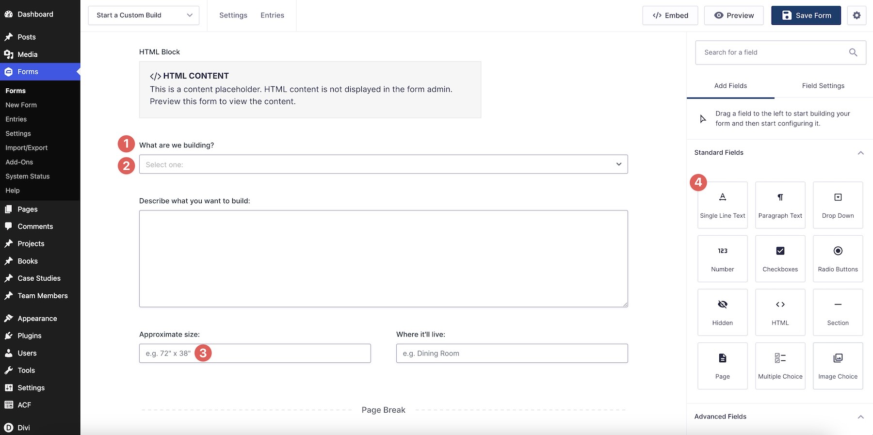
Style Hover, Focus, And Checked States
The empty form is only one state. Define hover and focus styles for fields and buttons, and checked styles for radios and checkboxes. Then review validation and confirmation messages so every stage feels connected to the same design.
Use Design Variables And Presets For Repeated Values
Store repeated colors, spacing, radii, and border widths as Design Variables. You can also create field presets for inputs, radios, and checkboxes so forms across multiple modules share the same base design.
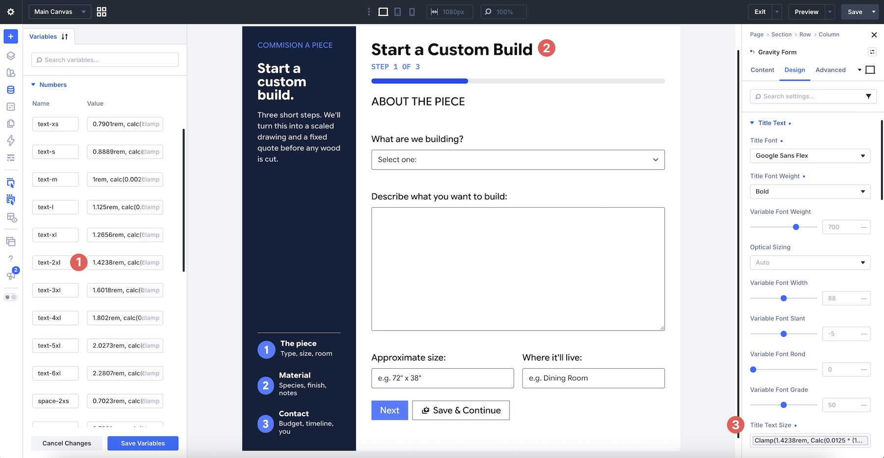
Test The Form On The Front End
Builder previews are useful, but they do not replace a real submission. Send an entry and confirm that validation, file uploads, conditional fields, notifications, and confirmations work as expected. Test every page of a multi-page form on desktop and mobile.
Download And Install The Files
We’ve created two Section layouts based on the examples in this post. The downloadable zip includes three JSON files: one Gravity Forms – ALL.JSON file containing both layouts and two individual files.

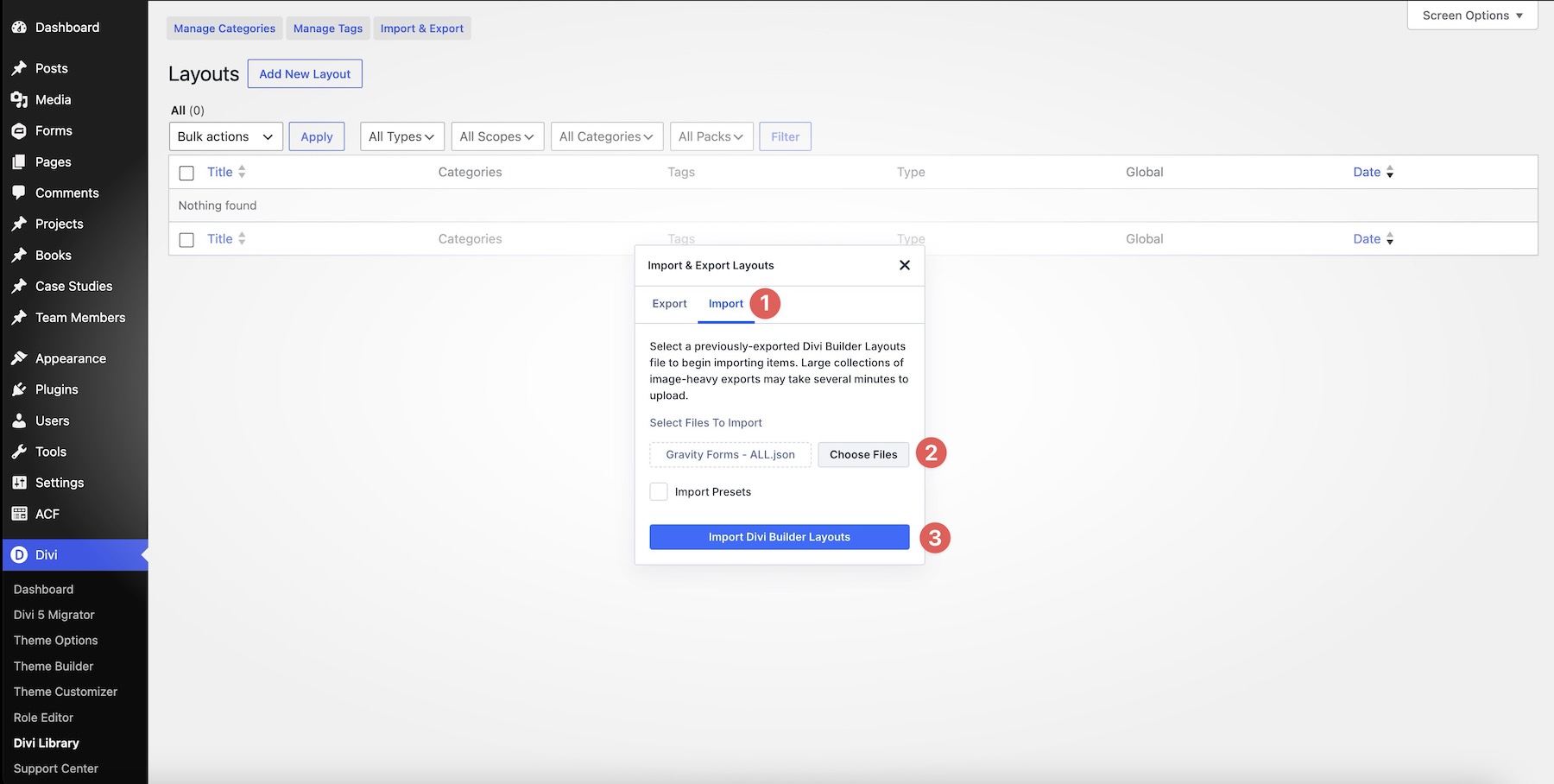
Go to Divi > Divi Library and click Import & Export.
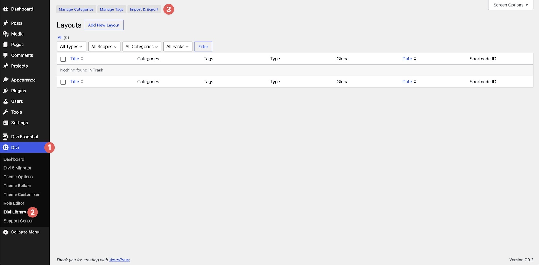
Select the Import tab, choose a JSON file from your computer, and click Import Divi Builder Layouts.
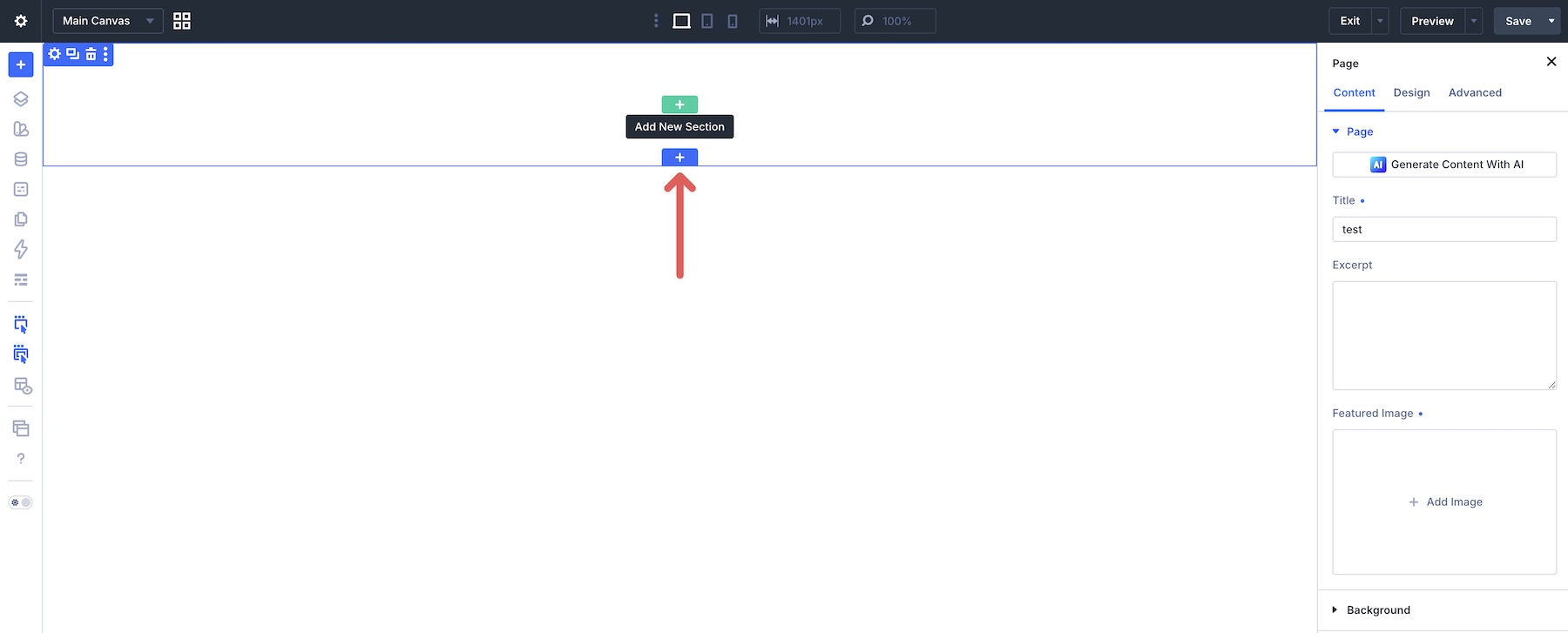
Create a page or open an existing one in the Visual Builder, then click the blue + icon to add a Section.
Open the Add From Library tab, choose a layout, and click Use This Section.
Open the Gravity Forms Module in the imported Section. In the Gravity Forms group under the Content tab, select a form and confirm that it loads correctly.

Gravity Forms Now Belongs In The Builder
You no longer need a shortcode to add a Gravity Form to a Divi 5 page. Add the Gravity Forms Module, select an existing form, style its output in the Visual Builder, and test it across breakpoints and submission states.
For a head start, download the example layouts and import one into Divi. Select your form, adjust its colors and Spacing, and review every field and message before publishing. Make sure Divi and Gravity Forms are up to date so the integration is available and works as expected.
Tell us how the Gravity Forms Module works for you in the comments or on our social media channels. Your feedback helps us improve future modules and features.











Is there a plan to integrate Ninja Forms as well?
Hey, Mark! ?
There aren’t any current plans for a native Ninja Forms module for Divi 5.
However, it would be a useful addition alongside the new Gravity Forms integration, so we’ll make sure this gets passed along as a feature request. ?
So glad Gravity Forms is now integrated. Thank you! Just one missing setting, and that is to hide the form title.
Great stuff! Happy to see this new module and Divi support.
Please add a setting to not show form title please. For now I’m still using the shortcodes because of this.
Great, the FluentForms module is missing.
Still under development. Keep eyes open for the release