

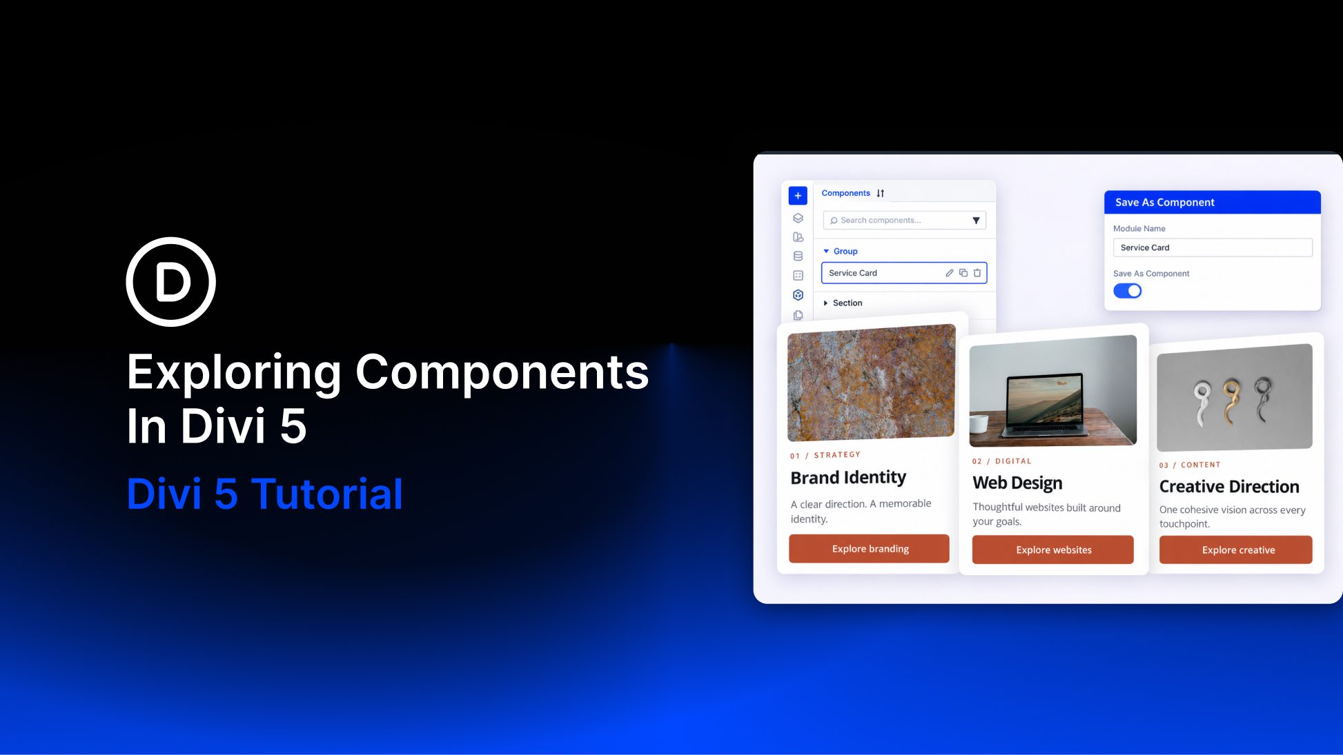
Components in Divi 5 let you reuse a design, update it from one saved source, and choose which content each use can change.
We’ll build three service cards for Brand Identity, Web Design, and Creative Direction. They share their spacing, image frames, typography, and button design, while each card has its own photo, title, description, and link.
We’ll save one card Group as a Component, then customize its connected copies. You’ll also learn how to reset local values, detach elements, and manage the saved source.
- 1 What Are Components In Divi 5?
- 2 Understand Shared Settings And Local Content
- 3 Before You Start
- 4 Download And Import The Starter Layout
- 5 Download For Free
- 6 Prepare The Service-Card Example
- 7 How To Create And Use A Service Card Component
- 8 Reset A Local Value To The Source Default
- 9 Connect A Compatible Existing Card
- 10 Detach One Element Or The Entire Component
- 11 Manage Your Component Sources
- 12 Where Components Are Most Useful
- 13 Tips For A Clear Component Workflow
- 14 Build Reusable Designs With Components
What Are Components In Divi 5?
A Component is a reusable element with a shared source stored in the Divi Library. It can be a single module or a larger element containing several modules, such as a Group, row, or section.
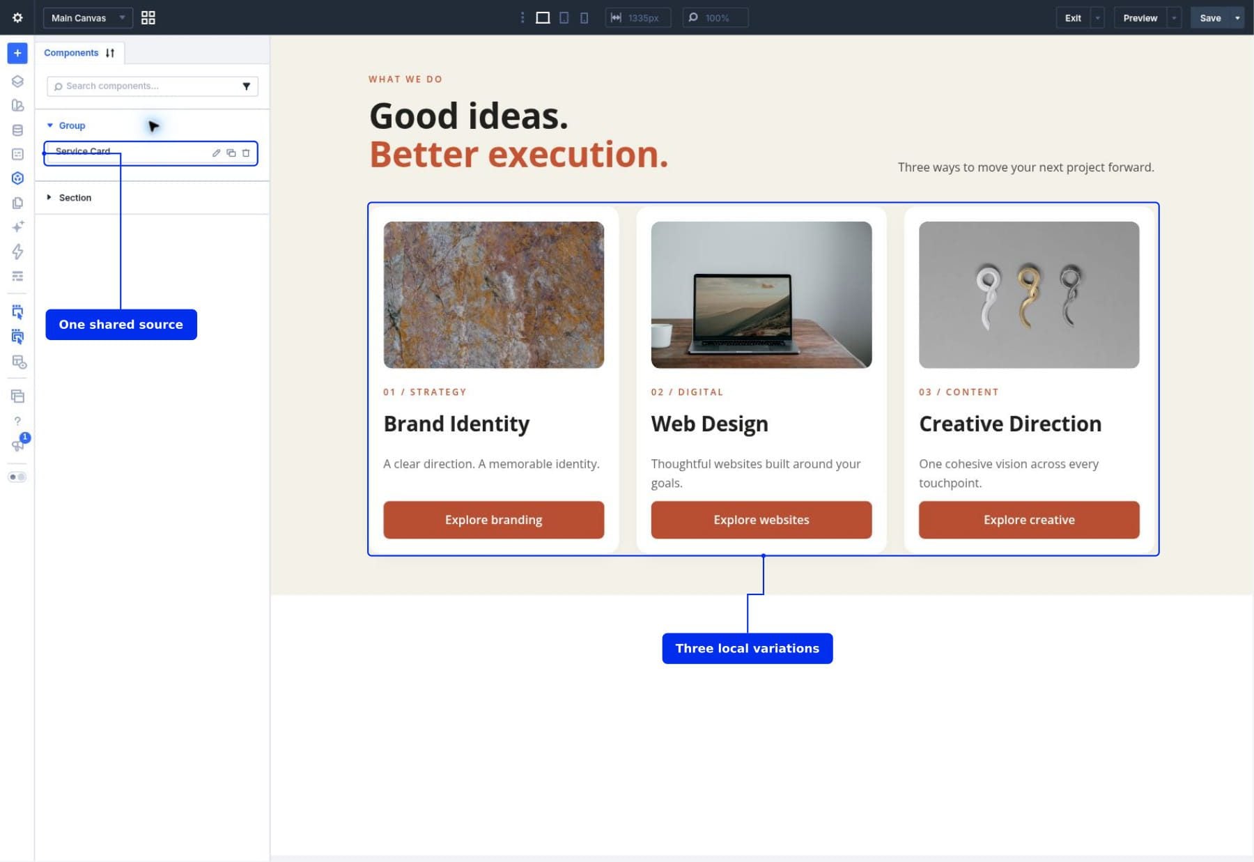
Each use of that Component on a page is an instance. Think of the source as the design you maintain and the instances as its connected uses throughout your website.
For our service cards, the source will control the card structure, padding, rounded corners, image proportions, typography, and button design. Each instance will be allowed to change its image, category, title, description, button label, and destination.
The Evolution Of Global Elements
Components extend Divi’s global elements with more granular control over synchronization inside nested layouts. You can expose a Heading module’s text inside a reusable card while keeping its font, size, and color managed by the source.
This makes one reusable design suitable for several content variations. You don’t need a separate Component for Brand Identity, Web Design, and Creative Direction when their cards share the same structure.
Components, Presets, And Variables
Divi’s reusable design tools have different roles:
- Components reuse elements and layouts, including their structure and synchronized settings.
- Presets reuse collections of settings, such as a heading style or button design.
- Design Variables reuse individual values, such as a brand color or spacing measurement.
You can use presets and variables inside a Component. For example, a button preset can supply its styling while the Component lets each instance use different button text. Our guide to using Design Variables with Presets explains the styling foundation.
Before saving the first card, let’s distinguish the two editing contexts you’ll use throughout this tutorial.
Source editing gives you the complete settings for the reusable design. First select the module you want to change, then choose Edit Component from the Component menu beside its name. The source editor includes Component Settings and bottom Save and Cancel controls. Purple styling appears in both source and instance editing, so use those controls to check your editing context.
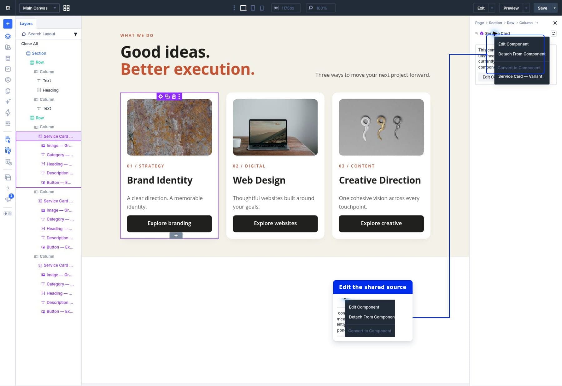
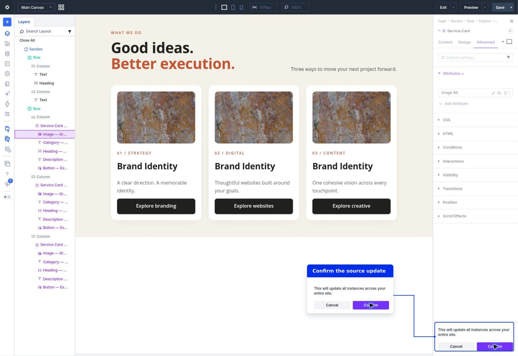
You use this mode to change the shared card design and decide which fields can be edited locally. Saving a source change asks you to confirm that it will update instances across your website. Check the source name before confirming.
Edit An Instance To Change Its Allowed Fields
Opening a connected instance shows the fields its source allows you to edit locally. A Heading might show only its Content tab, for example, because its typography stays under source control.
To return from source editing, save and confirm any source changes, then close its settings window with the X. Select the child module in the page instance again. You don’t need to detach it to edit an allowed content field.
Select the relevant child module to find its local fields. The outer Group might have no editable settings even though its Image, Heading, Text, and Button modules contain editable content.
Changing the Web Design card’s title in instance mode changes that card. Editing the source’s heading typography changes the synchronized typography across its connected instances.
Editable Fields Inherit Until You Override Them
Making a field editable allows customization; it doesn’t immediately give every instance a separate value. The field can continue inheriting its source default until you enter a local override.
Our source card starts with the title Brand Identity. A newly inserted instance can inherit that title. Changing one instance to Web Design gives that instance its own heading while leaving the source and other instances unchanged.
Resetting the local field removes its override and restores inheritance. This is different from typing the current source text manually: an inherited field continues following future source changes.
Before You Start
Use a Divi 5 installation that includes Components and open a page in the Visual Builder. You can follow along with a service card you already have or build the starting Group described below.
We’ll use Layers to select the correct containers and modules. Click its stacked-layers icon in the left builder sidebar, then use the arrows beside each layer to expand its children. If these controls are new to you, our guide to adding and organizing elements explains the builder’s section, row, column, and module hierarchy.
Download And Import The Starter Layout
Download the starter layout to follow along with the same design. It contains three ordinary service-card Groups, with no Components or Slots. We’ll create the Component connections during the tutorial.

- Create a blank practice page and open it in the Divi Visual Builder.
- Open the Page Menu and choose Import to open the page’s Import & Export window.
Select the starter file and choose the import settings for your blank practice page:
- Click Choose File and select components-starter-layout.json.
- On this blank practice page, leave Replace Existing Content checked. Leave Download Backup, Import Presets, Import Components, and Import To New Canvas unchecked.
- Click Import Layout. When the cards appear, save the page with the builder’s top-right Save button.
Use the page’s import controls for this file. The Component export and import controls covered later manage saved sources separately.
Use a blank page for this replacement import. If you need to preserve an existing design, export a backup first or enable Import To New Canvas to import onto a separate canvas.
The imported layout contains Brand Identity, Web Design, and Creative Direction as standalone cards. Keep all three until step 3, which explains when to remove the second and third Groups and replace them with connected instances.
Prepare The Service-Card Example
The starter contains three ordinary service-card Groups. Each holds an Image, category Text, Heading, description Text, and Button module.
In Layers, expand the first card Column and find the Brand Identity Group. We’ll save this Group as our Component. Its background, spacing, and module styling will be shared; the section introduction and three-column row remain ordinary page elements.
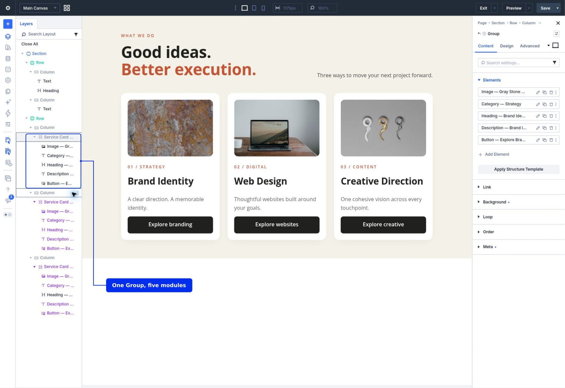
If you imported the starter, continue to step 1. For your own design, finish one card Group first; our equal column heights guide covers aligning cards of different lengths.
How To Create And Use A Service Card Component
We’ll save the Brand Identity Group as our source and make its content fields locally editable. Then we’ll insert it into the other two columns and customize those instances. Keep their visual settings synchronized so all three cards share one maintained design.
Terminology: A field is one setting, such as Heading text or Button Link URL. Making it locally editable allows an instance to use its own value. It does not detach the module or make its other settings independent.
1. Save The Card Group As A Component
Open Layers in the builder sidebar. Expand the service section, its card row, and the first column. Select the Group that contains the Brand Identity card’s five modules.
Click the Group’s layer to open its settings. At the top of that window, click the menu beside the element name and choose Save As Component.
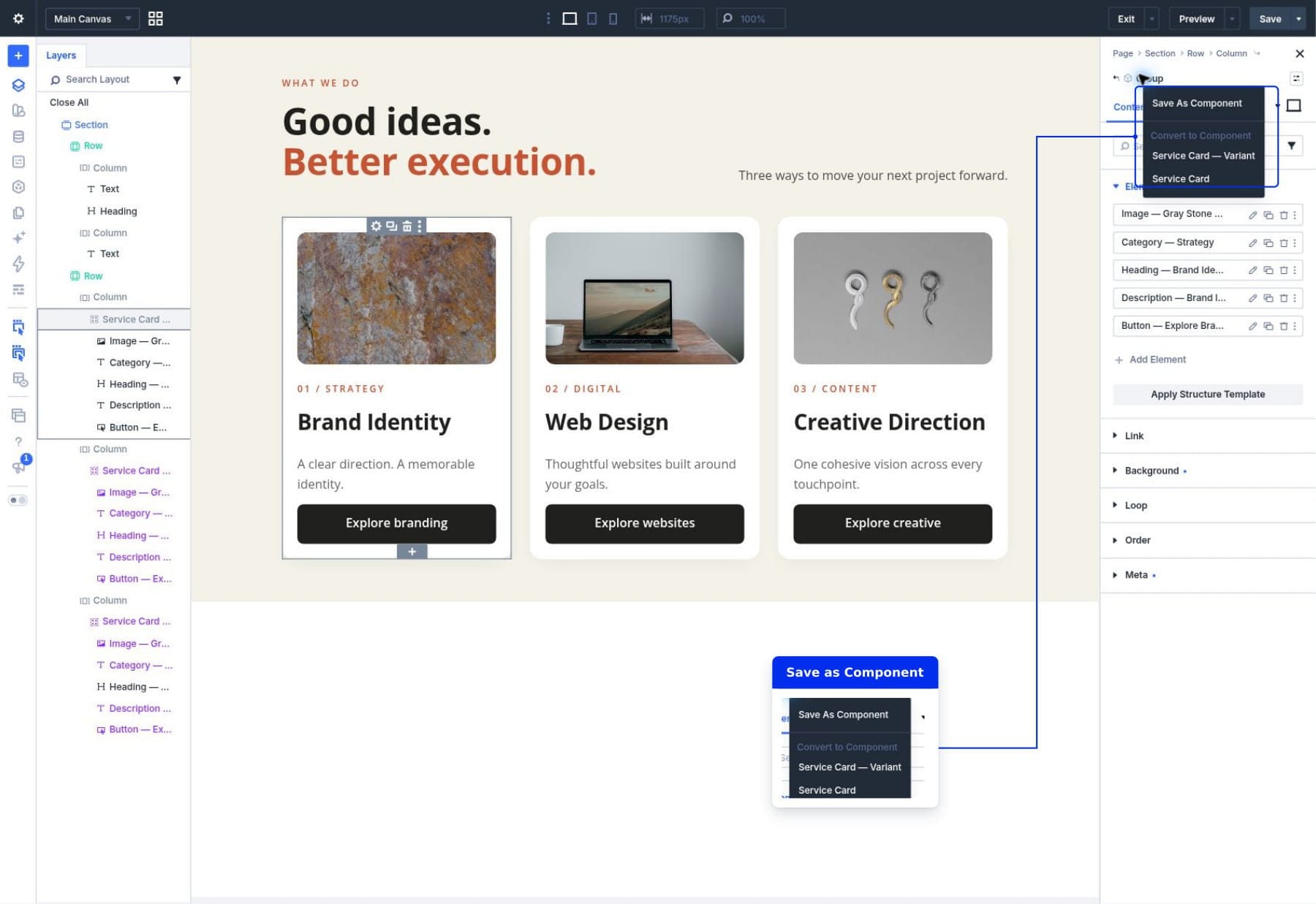
In the Library window, name the item Service Card and keep Save As Component enabled. Save the Group as one reusable item; you don’t need to save its child modules as separate Library items for this tutorial.
Click Save To Library. Divi creates the shared source and connects the Group already on the page to it.
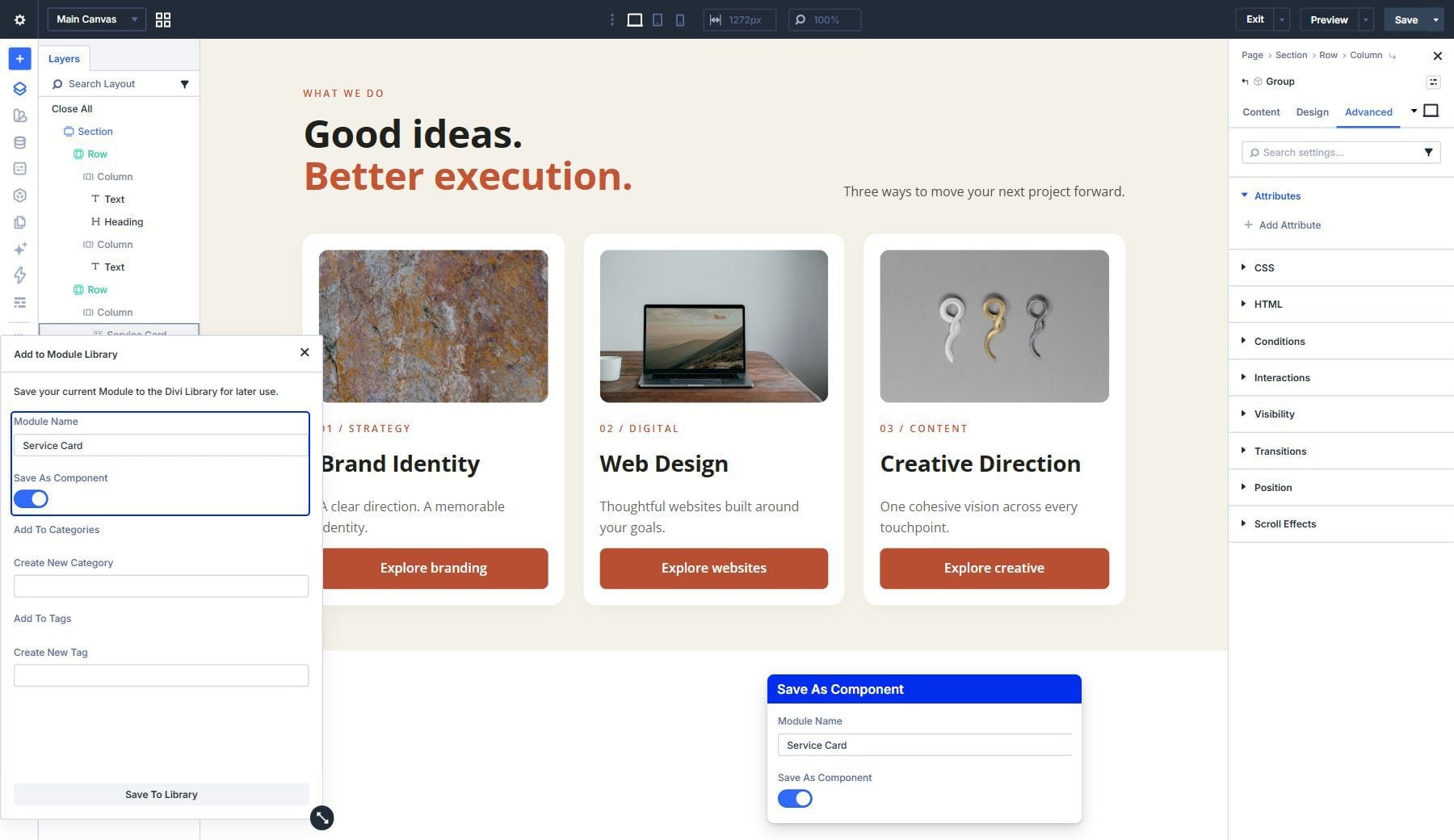
Be sure you selected the Group. Saving the entire section would also include the introduction and surrounding card layout, which is a larger reusable element than we need here.
2. Make The Card’s Content Editable
In Layers, select the Image module inside the first card Group. Open its Component menu and choose Edit Component, then expand Content > Image. You are now editing that module’s source settings.
When you select another module in Layers, check its editing context again. That selection opens the module’s page-instance settings. Save and confirm each source change before moving to another module, then choose Edit Component for the next module. This keeps the synchronization controls available for every field you need to expose.
Use the synchronization control beside the Image field, labeled Make this field editable on component instances. Hover over the field to reveal its controls. This allows each card to replace its photo while retaining the source’s image styling.
After enabling local editing, the control offers Use the source component value for this field. Leave that option untouched; clicking it would synchronize the field again. The screenshot shows the field with local editing enabled.
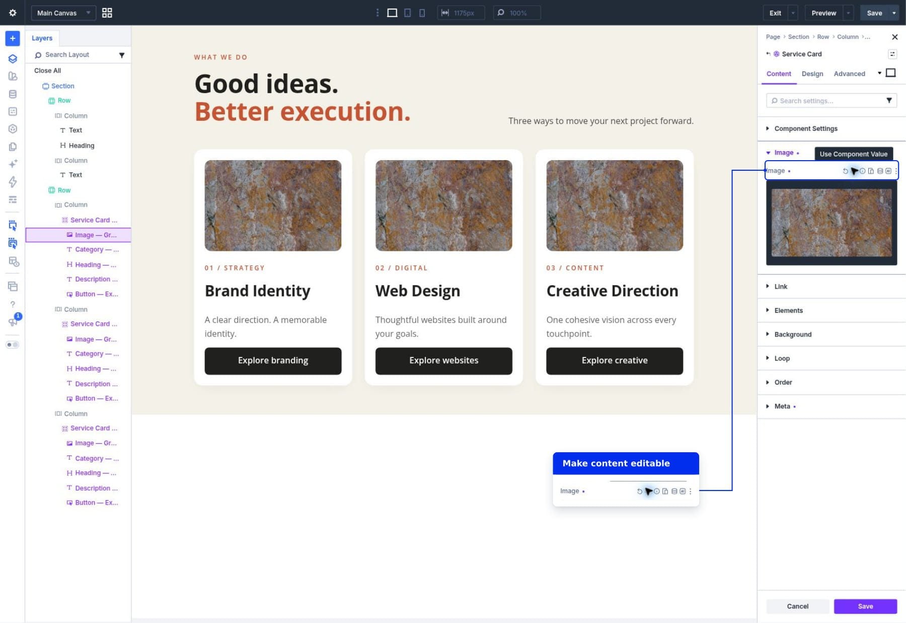
Alt text describes a photo for people using screen readers. Our example sets it through Custom Attributes, so each replacement photo needs a matching description.
In the source Image module, open Advanced > Attributes. If an alt attribute already exists, click its settings icon. Otherwise, click Add Attribute and create one with these settings:
- Admin Label: Image Alt.
- Target Element: Image.
- Attribute Name: alt.
- Attribute Value: A description of the source photo.
The label identifies this attribute in the builder; the alt name gives it its function. Keep one alt attribute for the Image element.
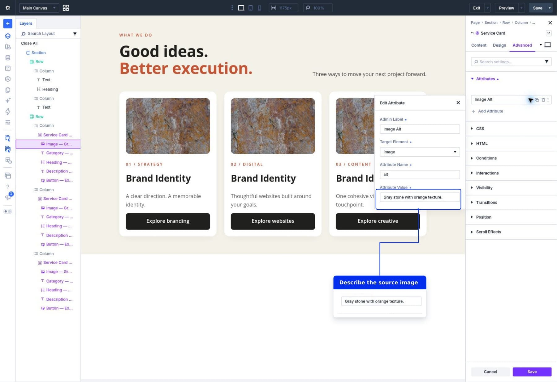
Close the Edit Attribute window using its X. Back in the Image module’s Attributes settings, make the Attributes collection editable on instances. This control belongs to the collection, not to the Attribute Value inside the smaller editing window.
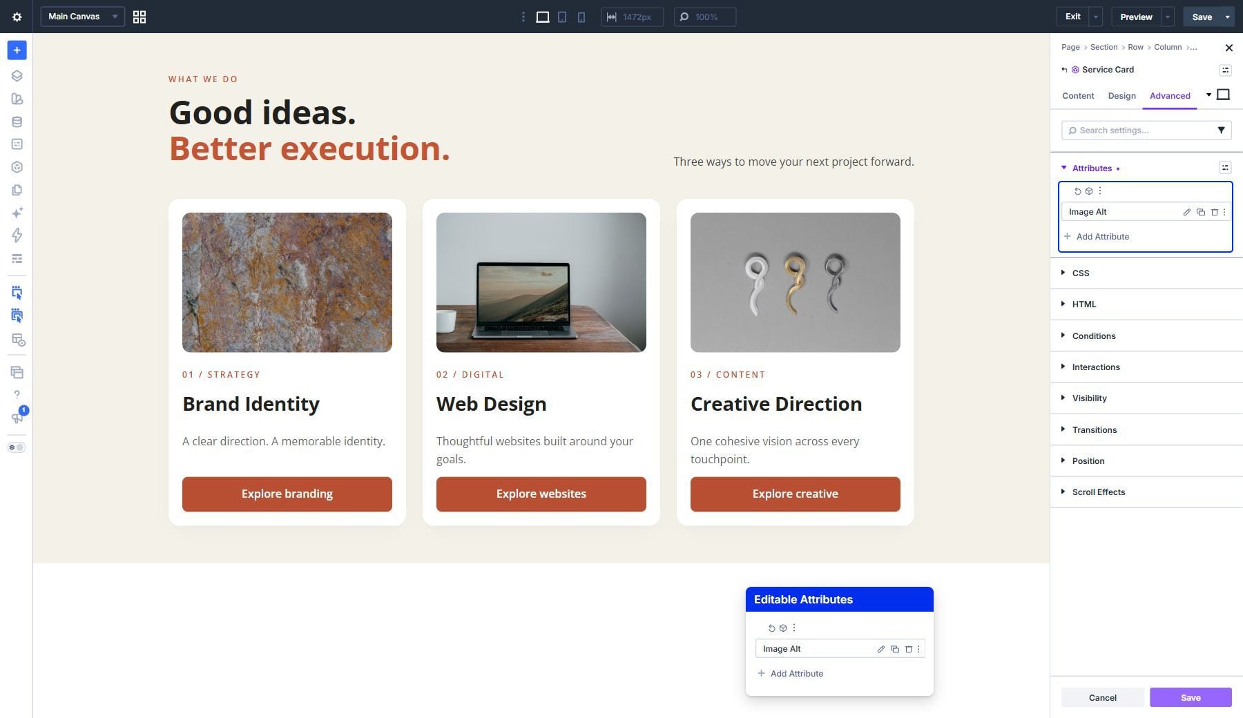
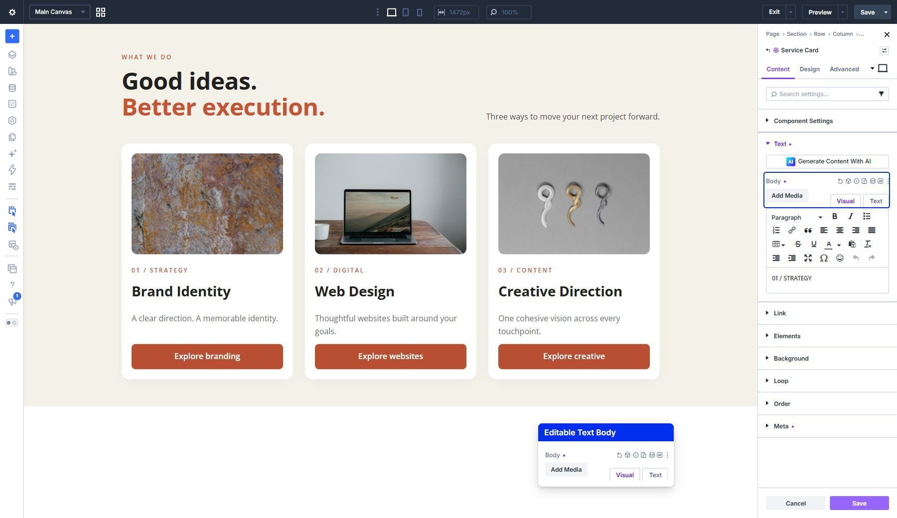
Save and confirm the Image module’s source changes using the bottom Save button. Next, select the category Text module in Layers and choose Edit Component from its Component menu. Open Content > Text and make Body editable using the same synchronization control.
Body is the Text module’s content editor. Use its Visual tab to enter ordinary text, or its Text tab to inspect HTML. Save and confirm this source change before selecting the next module.
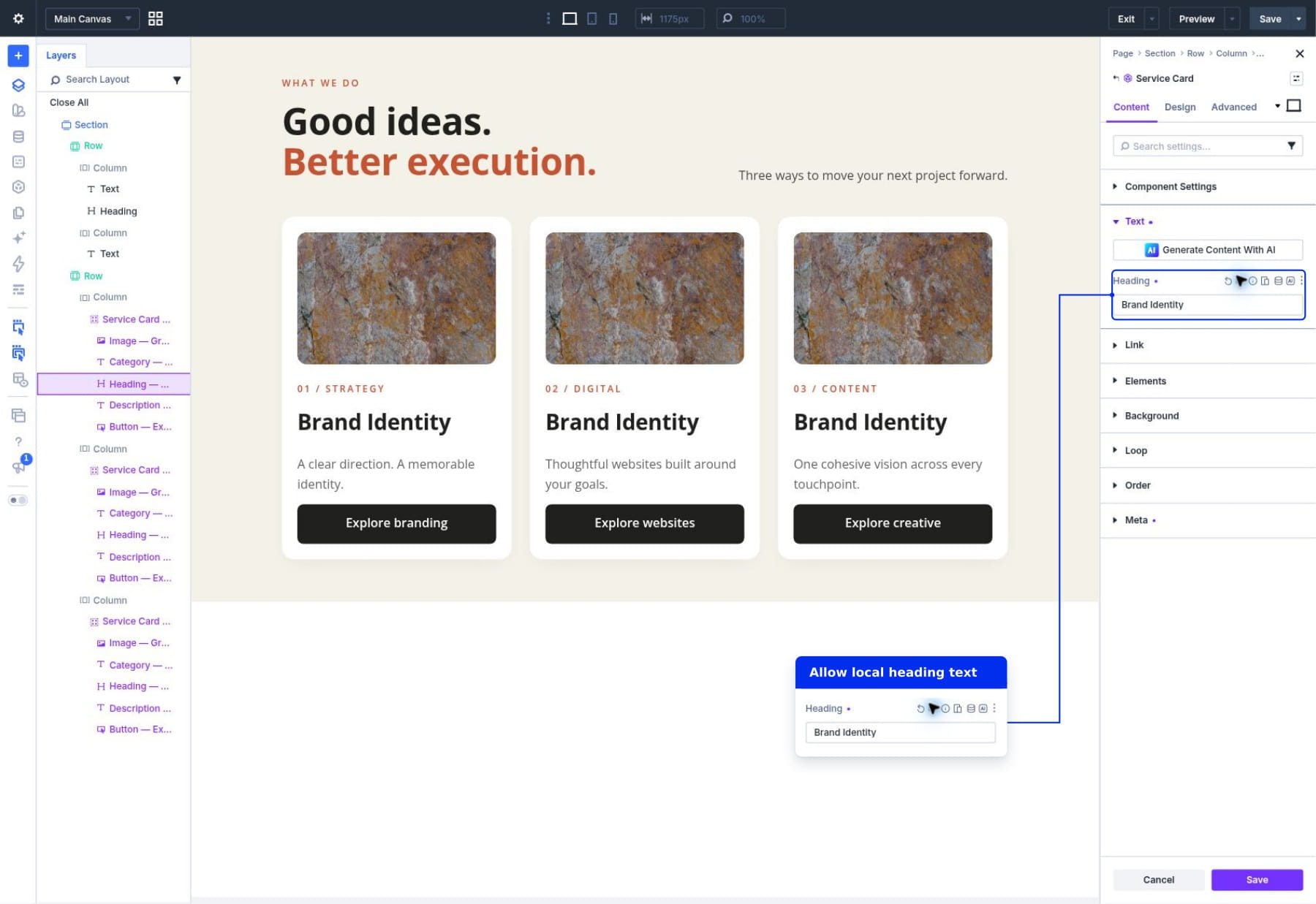
Select the Heading module in Layers, choose Edit Component, and open Content > Text. Make its Heading field editable, then save and confirm the source change.
Select the description Text module, choose Edit Component, and make its Body field editable under Content > Text. Save and confirm before selecting the Button module. In that module’s Edit Component settings, expose Button Text under Content > Text and Button Link URL under Content > Link.
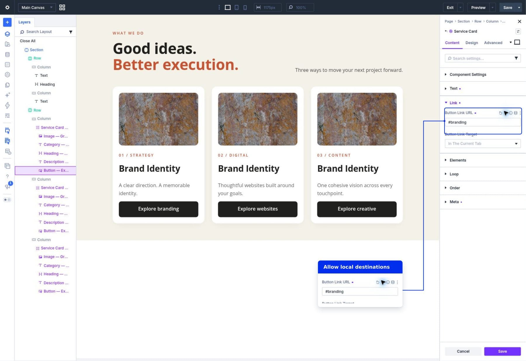
You should now have these locally editable fields:
- Image: Image and the Attributes collection containing Image Alt.
- Category Text: Body.
- Heading: Heading.
- Description Text: Body.
- Button: Button Text and Button Link URL.
Leave the Group’s background, padding, corners, shadow, and layout synchronized. Keep image proportions, typography, and button styling synchronized too. We want different content inside the same card design.
Save the Button module’s source changes with the bottom Save button, then click Confirm when Divi explains that the update affects instances across your website. This saves the two Button fields you just made editable.
3. Insert Another Card From The Library
Close the Component source settings after saving and confirming. If you imported the starter layout, remove the ordinary card Groups from the second and third columns in Layers. Keep the columns themselves and the first card Group that you saved as the Service Card Component.
Select the now-empty second card Column, open Content > Elements, and click Add Element. In the picker, choose Add From Library and find Service Card in My Library.
Start with the Column’s insertion control, rather than one inside the first card Group. The new Group belongs directly inside its own column.
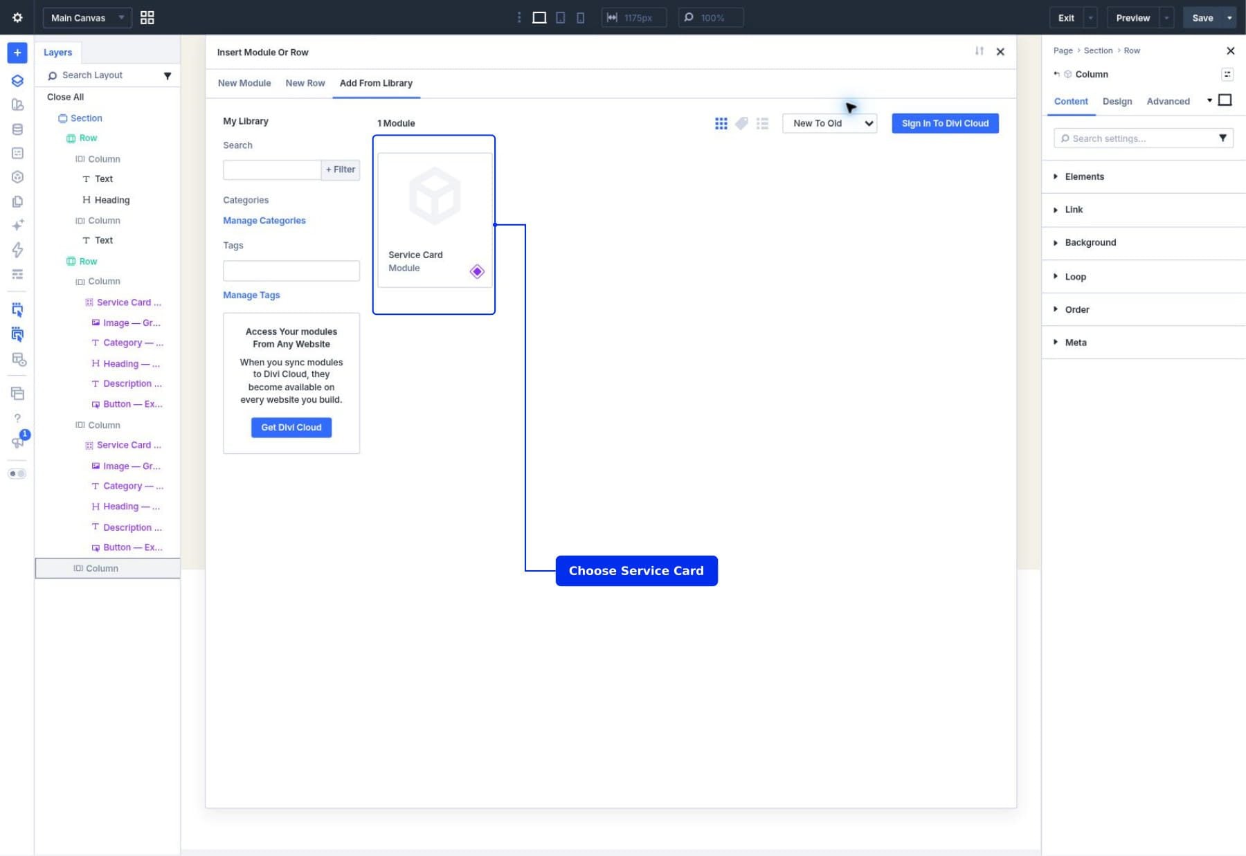
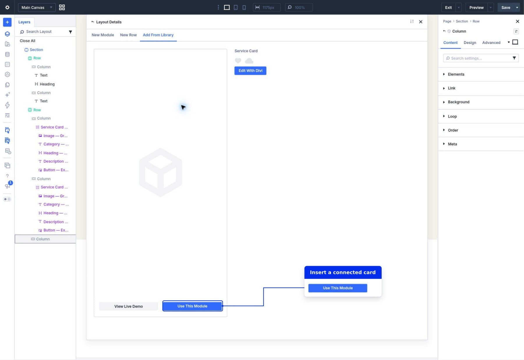
Open the item’s details and click Use This Module. The saved Group and its five child modules are inserted together as another instance of Service Card.
Repeat this in the empty third column. Keep one card Group per column. The optional conversion workflow below explains how to connect a compatible ordinary Group instead of replacing it.
You can also duplicate a connected Group on the page for another instance. A page duplicate carries its current local values, so review and change those values for the new service. Duplicating an instance keeps it connected to the same source.
4. Customize The Web Design Card
Select the Image module beneath the second card Group in Layers. The layer labels may still use the source’s Brand Identity names; use their position beneath the second Column to identify the Web Design card. You should be editing the page instance, without choosing Edit Component. Under Content > Image, click Edit on the image preview. Choose a suitable website or laptop photo from your Media Library, or use Insert From URL, then click Insert Into Page. Keep the image frame inherited from the source.
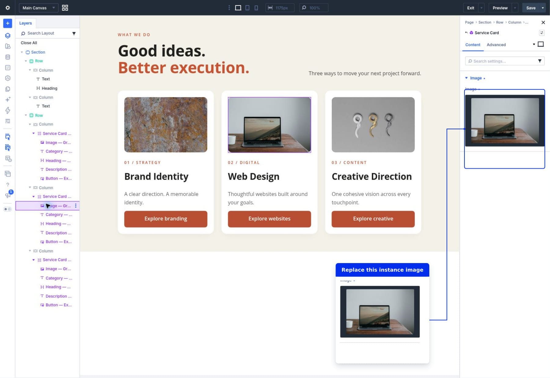
For its alt text, open Advanced > Attributes. If Image Alt is listed, click its settings icon and change Attribute Value to describe the new photo. If no entry is listed, click Add Attribute, choose alt, and use these settings:
- Admin Label: Image Alt.
- Target Element: Image.
- Attribute Name: alt.
- Attribute Value: A description of the replacement photo.
Close the attribute window after editing. Keep only one alt attribute targeting Image; remove any duplicate entry before continuing.
For a laptop photo, use a description such as Laptop on a wooden table displaying a mountain landscape. Choose words that describe your own replacement image.
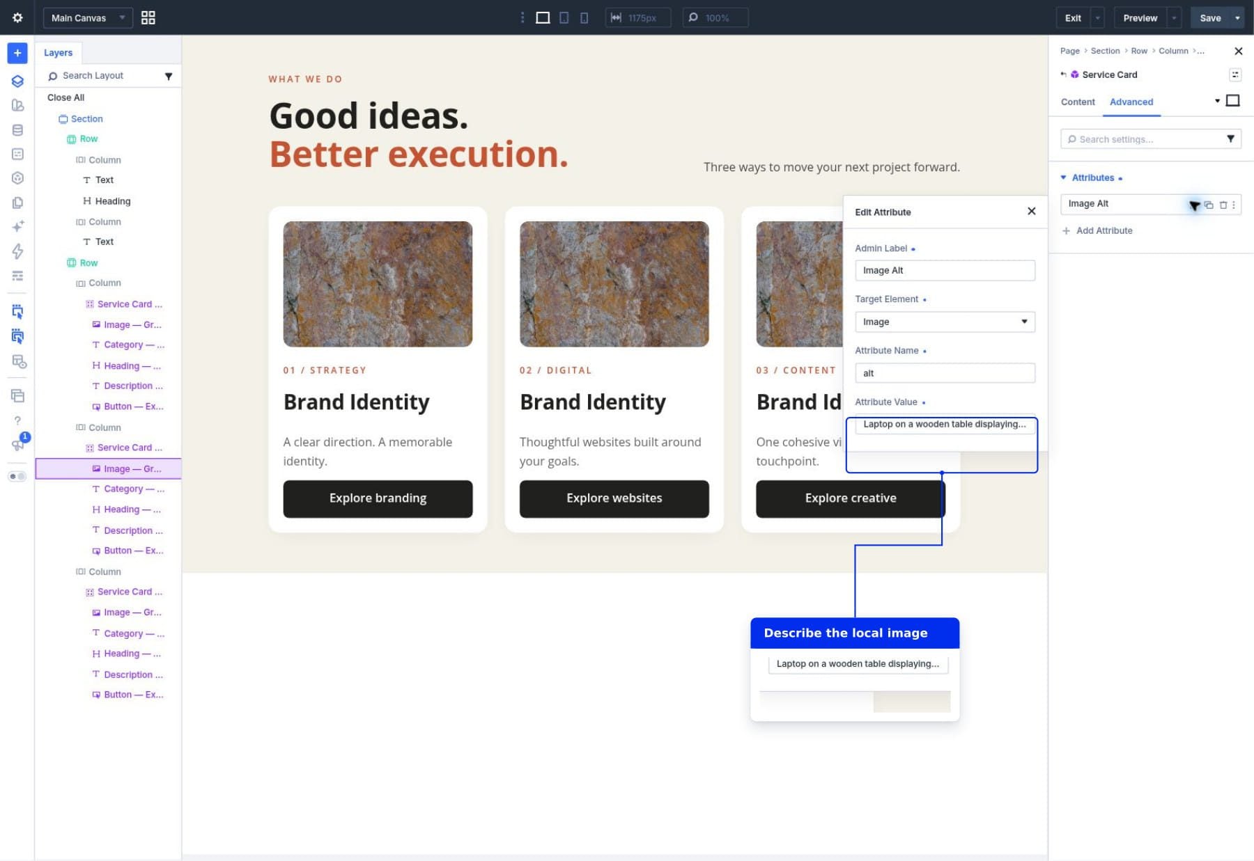
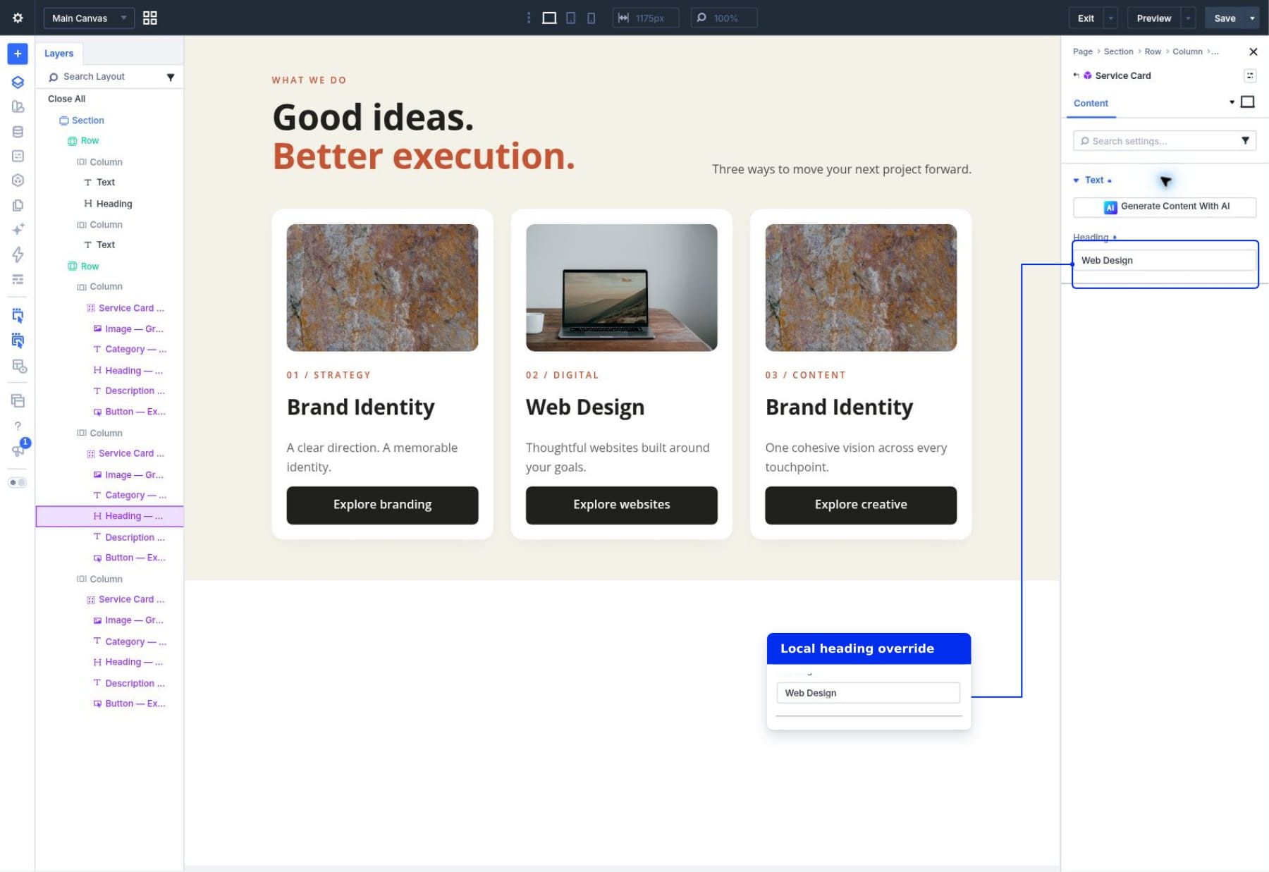
Select the category Text module and enter 02 / DIGITAL in Body. Then select its Heading module and enter Web Design in Heading.
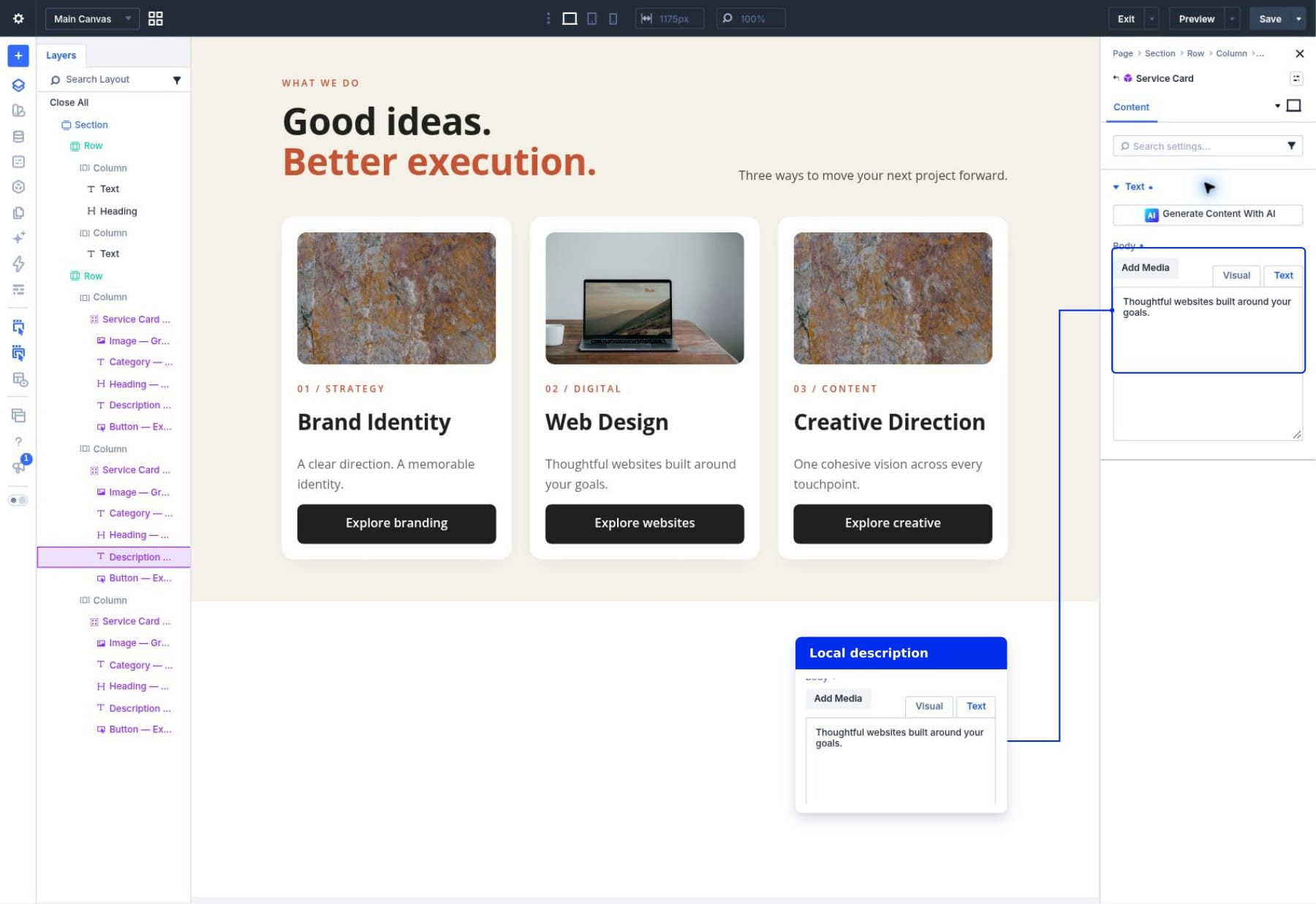
Select the description Text module and enter Thoughtful websites built around your goals. in Body.
Select the Button module and enter Explore websites in Button Text. Open Link and enter your actual Web Design service page URL in Button Link URL. If you use an anchor, make sure its matching ID exists on the page.
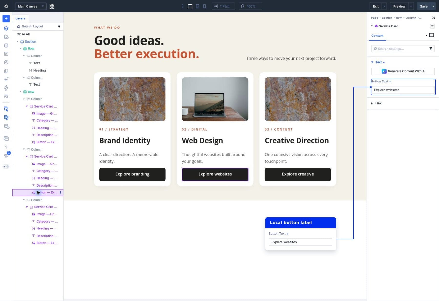
Our demonstration uses #web-design with a matching anchor on the page. Use your service page’s URL for a card that should open another page. If you want the same anchor behavior, follow our anchor links tutorial to create its destination first.
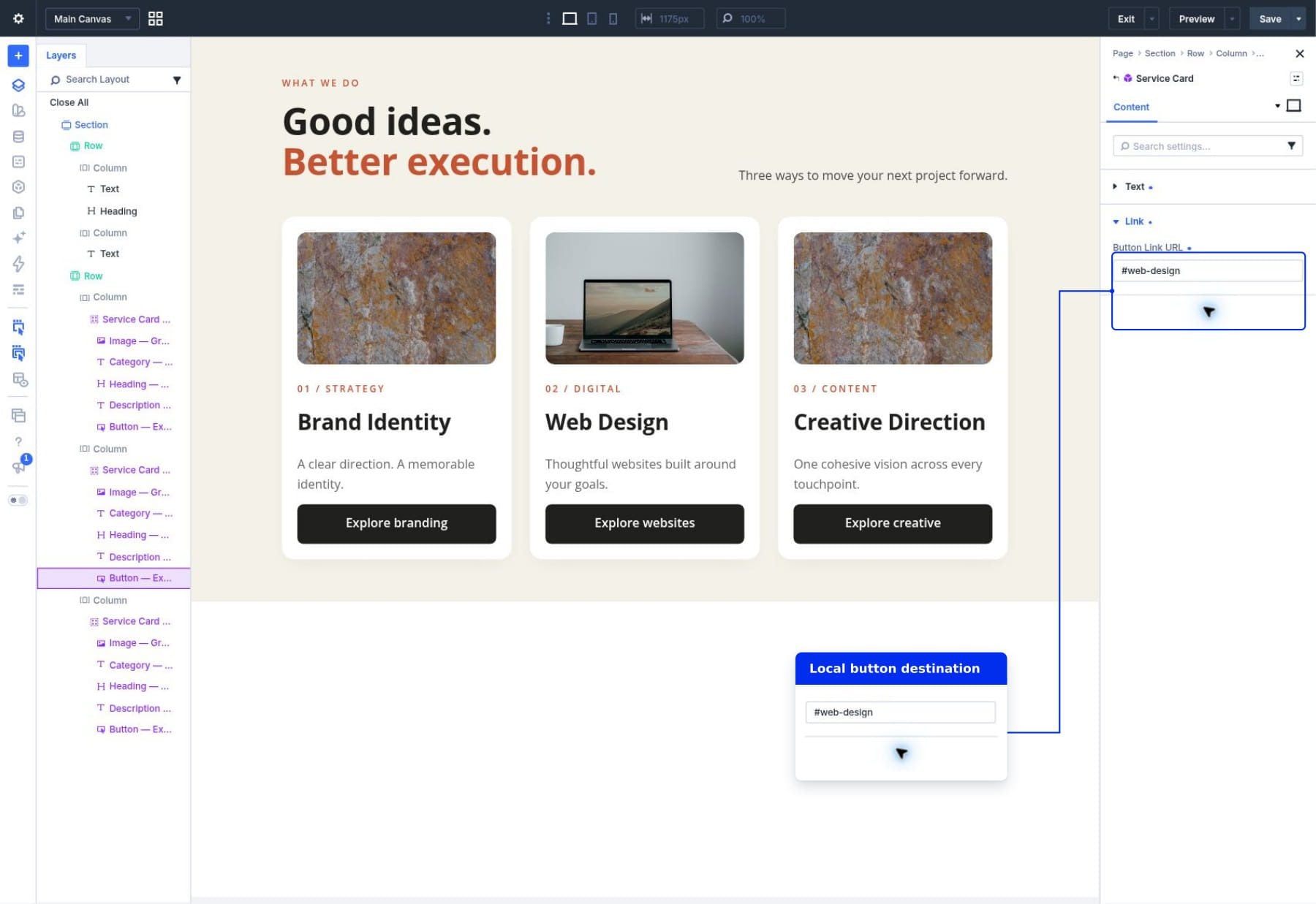
These values belong to the second instance. Its settings window shows the locally editable Heading field, while the card’s shared design stays connected.
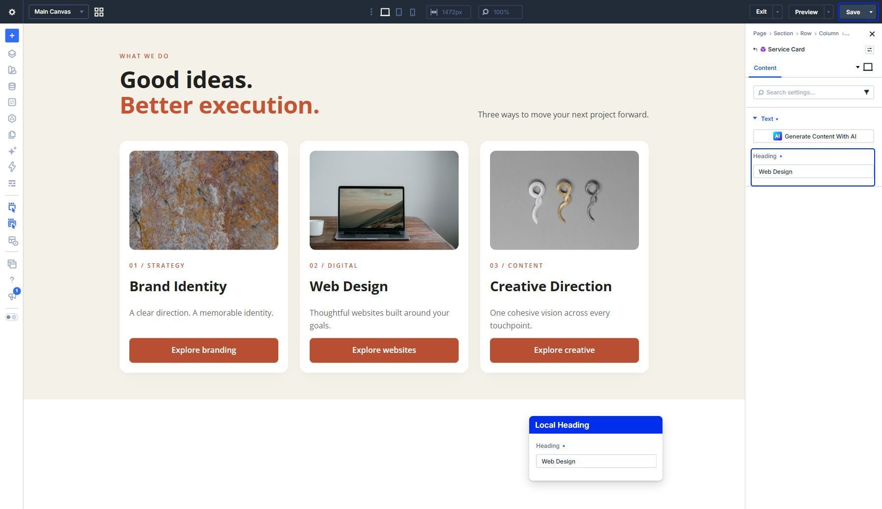
Close the module settings using the X and click Save at the top right of the builder to save the page. You don’t use the source’s confirmation dialog for these local changes.
5. Customize The Creative Direction Card
Repeat the instance-editing process for the third card, using these values:
- Image: A different photo appropriate to creative work, with its own descriptive alt text.
- Category: 03 / CONTENT.
- Heading: Creative Direction.
- Description: One cohesive vision across every touchpoint.
- Button Text: Explore creative.
- Button Link URL: Your Creative Direction service page.
The first card can keep the source defaults for Brand Identity. The second and third cards now demonstrate local content variations inside the same shared design.
Save the page again after customizing the third card. There are two save operations in this workflow:
- Source changes: Use Save at the bottom of the Component editor, then confirm the site-wide update.
- Page changes: Use Save at the top right of the builder to retain instance content and the page layout.
Select a connected card’s Button module in Layers, then choose Edit Component from that module’s Component menu. Change its shared button background from charcoal to a burnt orange that matches the section’s accent color.
Open Design > Button > Background and set the button background color to #B94F32. Keep this design field synchronized. Save and confirm the source update.
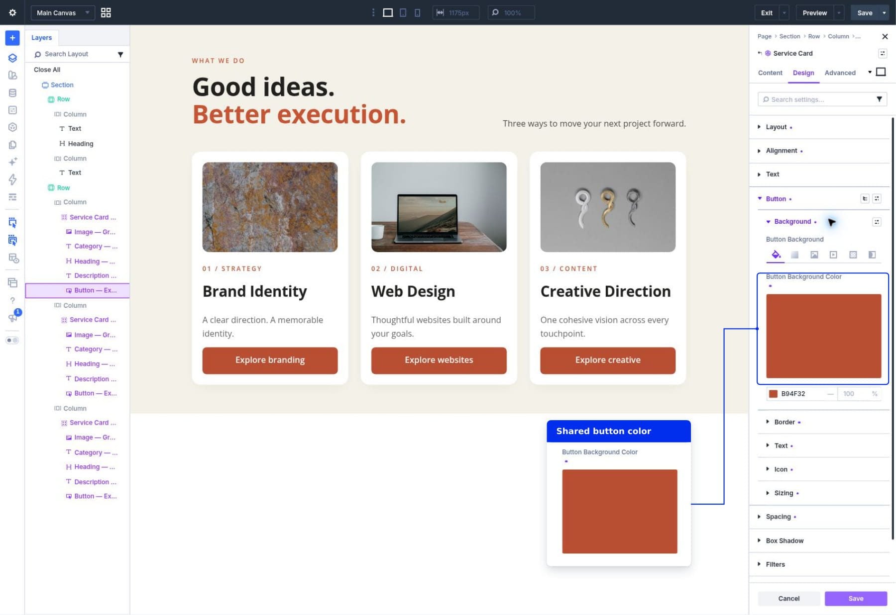
All three connected cards now receive the same button styling. Their local content and button URLs stay intact because those fields allow instance editing and retain their overrides.
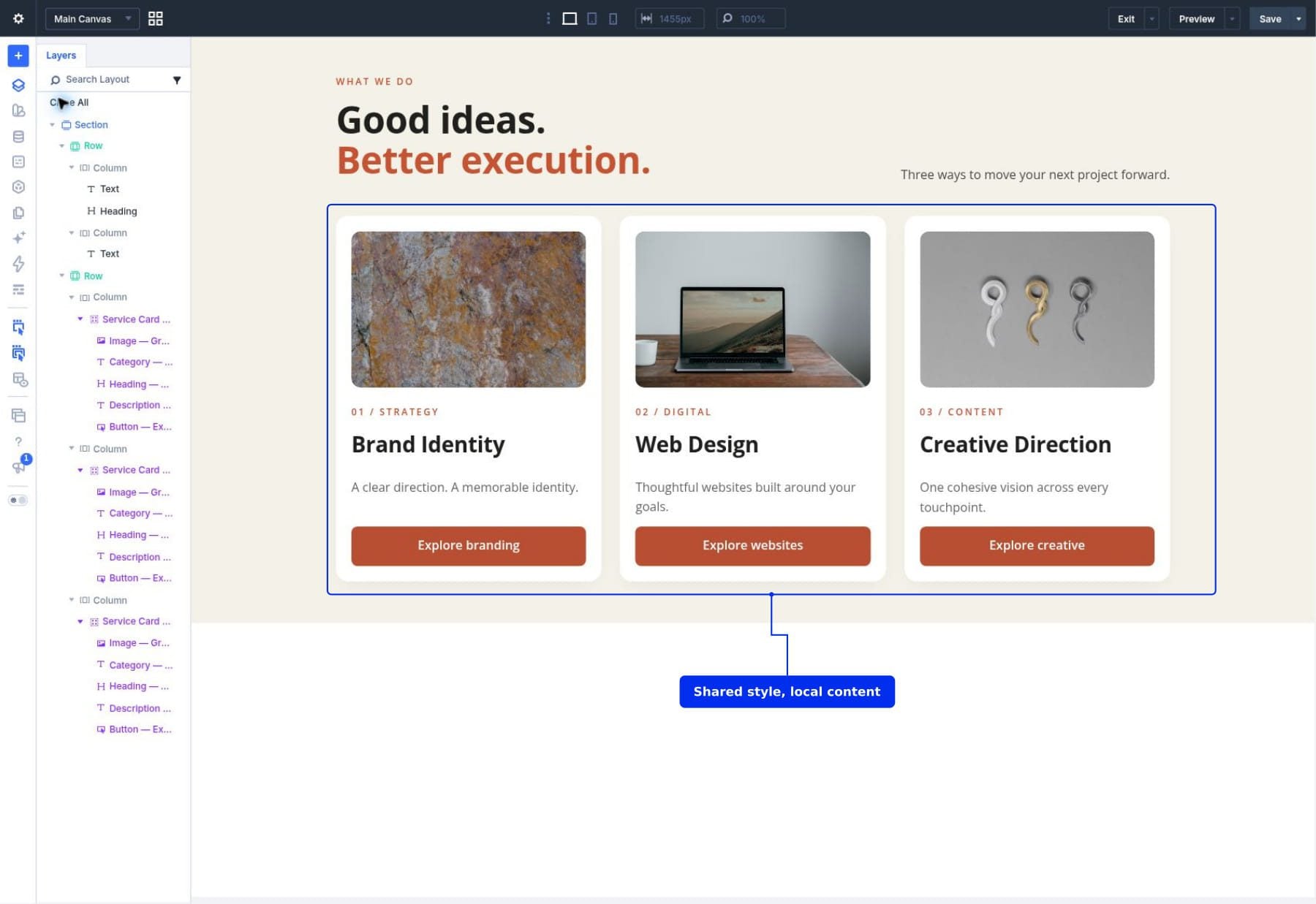
You can now update the shared card design without editing each service’s content again.
7. Check Tablet And Phone Layouts
Use the builder’s tablet and phone previews to inspect the complete section. Our card row stacks into one column on smaller screens, and each Group fills its available column width.
The row’s responsive column arrangement belongs to the surrounding page layout. The card’s padding, image frame, and typography belong to its Component. Check both when adapting this example to another page.
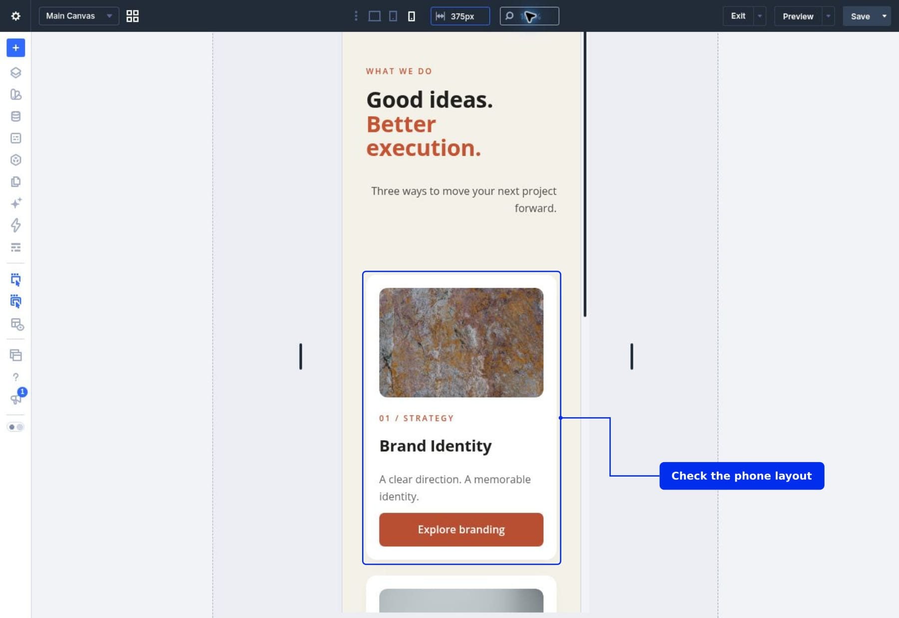
Check for unexpected text wrapping using each card’s actual content; the source’s shortest default text won’t reveal every spacing problem. Save responsive source changes through the Component controls, then save any page layout changes on the page.
Reset A Local Value To The Source Default
An instance override is useful when a card needs different content. If you later want that field to follow the source again, reset it.
- Open the Web Design card’s Heading module in instance mode.
- Expand Content > Text and find Heading.
- Use the field’s Reset control.
- The heading returns to the source’s Brand Identity default.
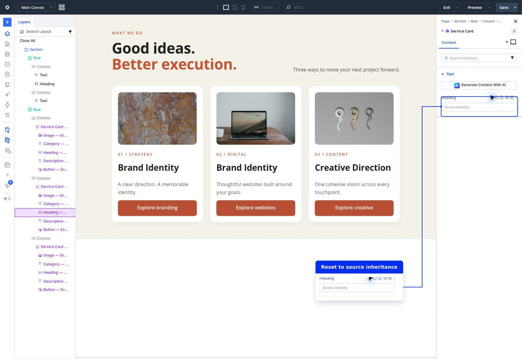
The field now inherits future source changes. For this tutorial, enter Web Design again to restore the service-specific title before saving the page.
Changing a source field back to synchronized is a broader action. It makes the source authoritative for that field across connected instances, so review existing local content before changing synchronization rules.
Connect A Compatible Existing Card
You may already have several ordinary service-card Groups on a page. Divi can offer an existing Component as a conversion choice when the selected element has a compatible structure.
- Select the ordinary Group you want to connect.
- Open the menu beside its name in the settings window.
- Under Convert To Component, choose Service Card.
- Review every locally editable field and replace any content that adopted a source default.
- Save the page.
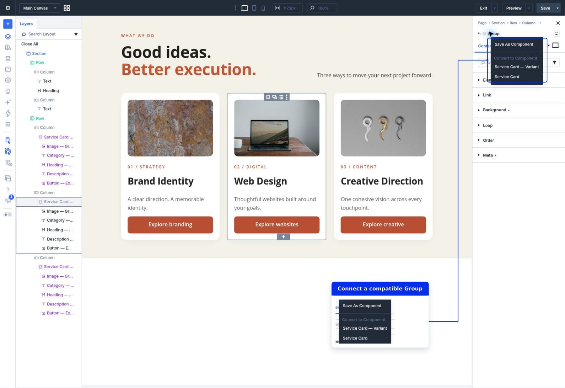
Conversion connects the Group to the chosen source. Review every editable field afterward, including the image and button URL. A value from the ordinary Group may adopt the source default instead of becoming a local override. If the source is not offered, insert it from the Library and transfer your content into its editable fields.
Detach One Element Or The Entire Component
Detaching is useful when an element needs to become independently editable. Choose the smallest scope that suits the change.
Detach A Child Module
For example, suppose only the Creative Direction heading needs different typography. Right-click its Heading module in Layers and choose Detach From Component.
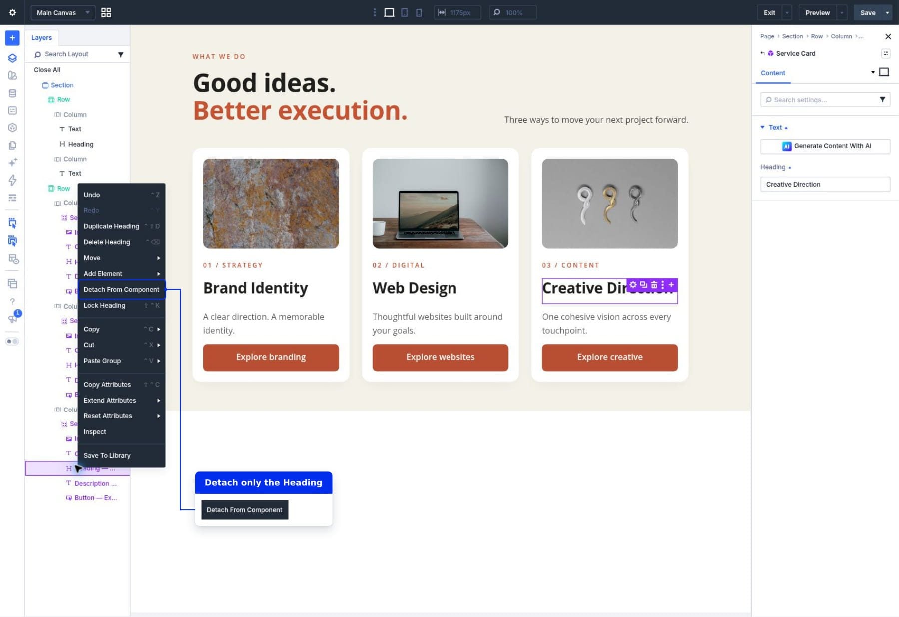
That Heading becomes locally editable with its full settings, including Design and Advanced. The rest of the card stays connected to Service Card.
To reconnect the same child module, right-click it and choose Attach To Component. Review the result, since reconnecting returns synchronized settings to the source’s control.
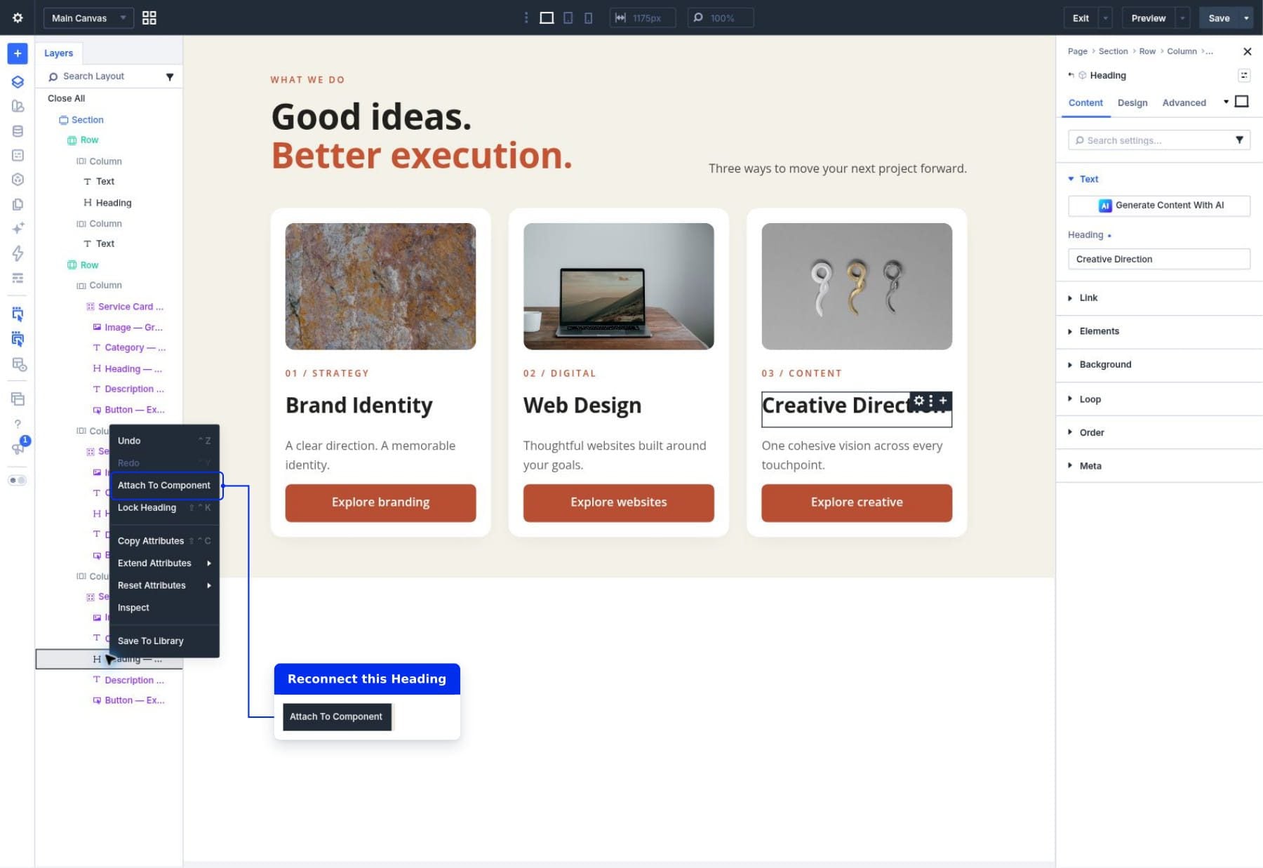
Detach The Whole Card
Right-click the outer card Group and choose Detach Component to make the entire card an ordinary page element.
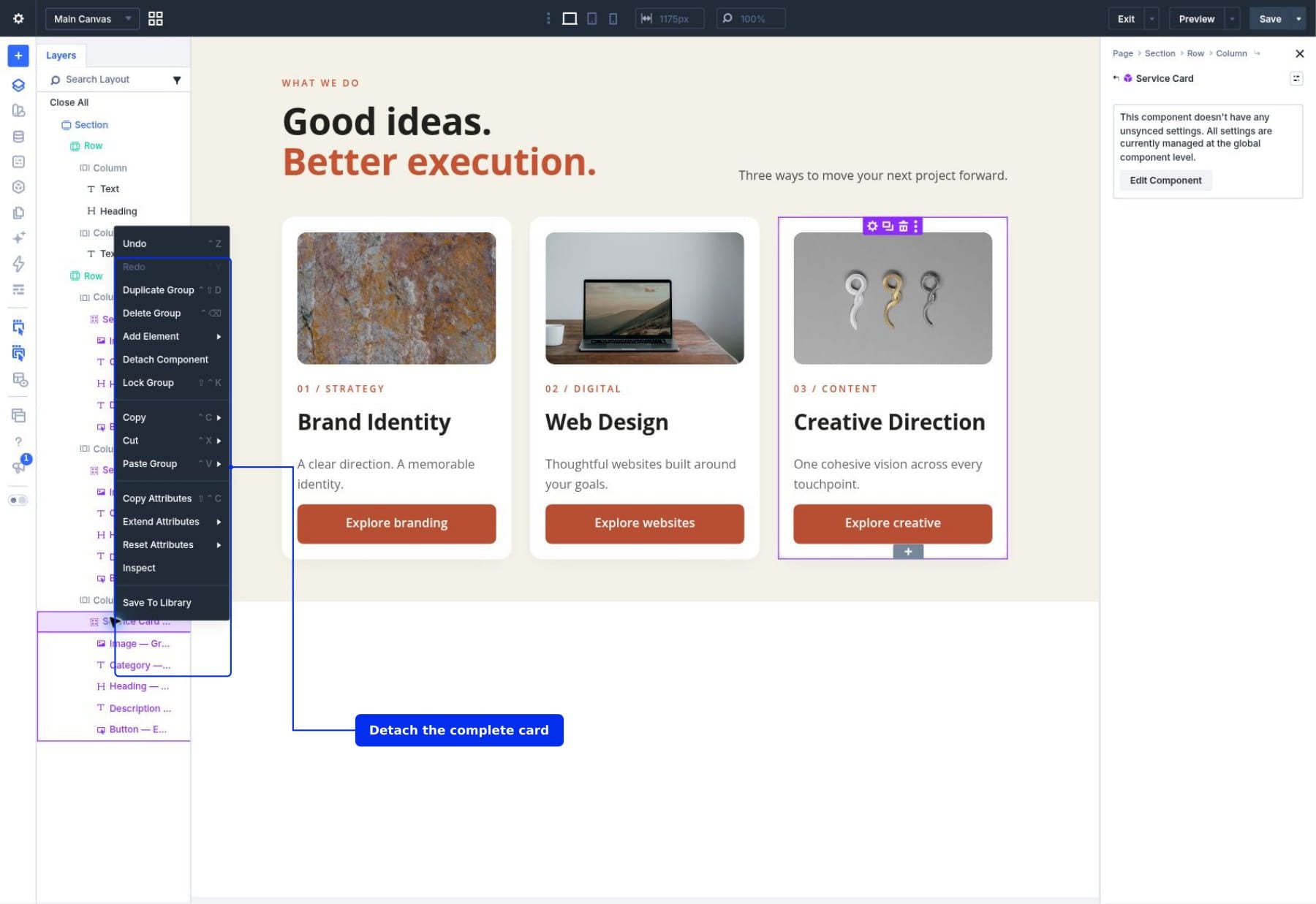
The detached card keeps its current appearance and content, but future source updates no longer maintain it. Use this for an intentional one-off design. Keep recurring cards connected when they should continue sharing updates.
Manage Your Component Sources
Open the Components panel from the builder sidebar to manage saved sources. This is different from Layers: Layers shows elements on the current page, while Components lists reusable sources.
Name And Preview The Source
Choose Service Card to edit its source. Under Component Settings, give it a descriptive title. Use the preview icon beside the source title in its settings header to inspect the saved design and default content.
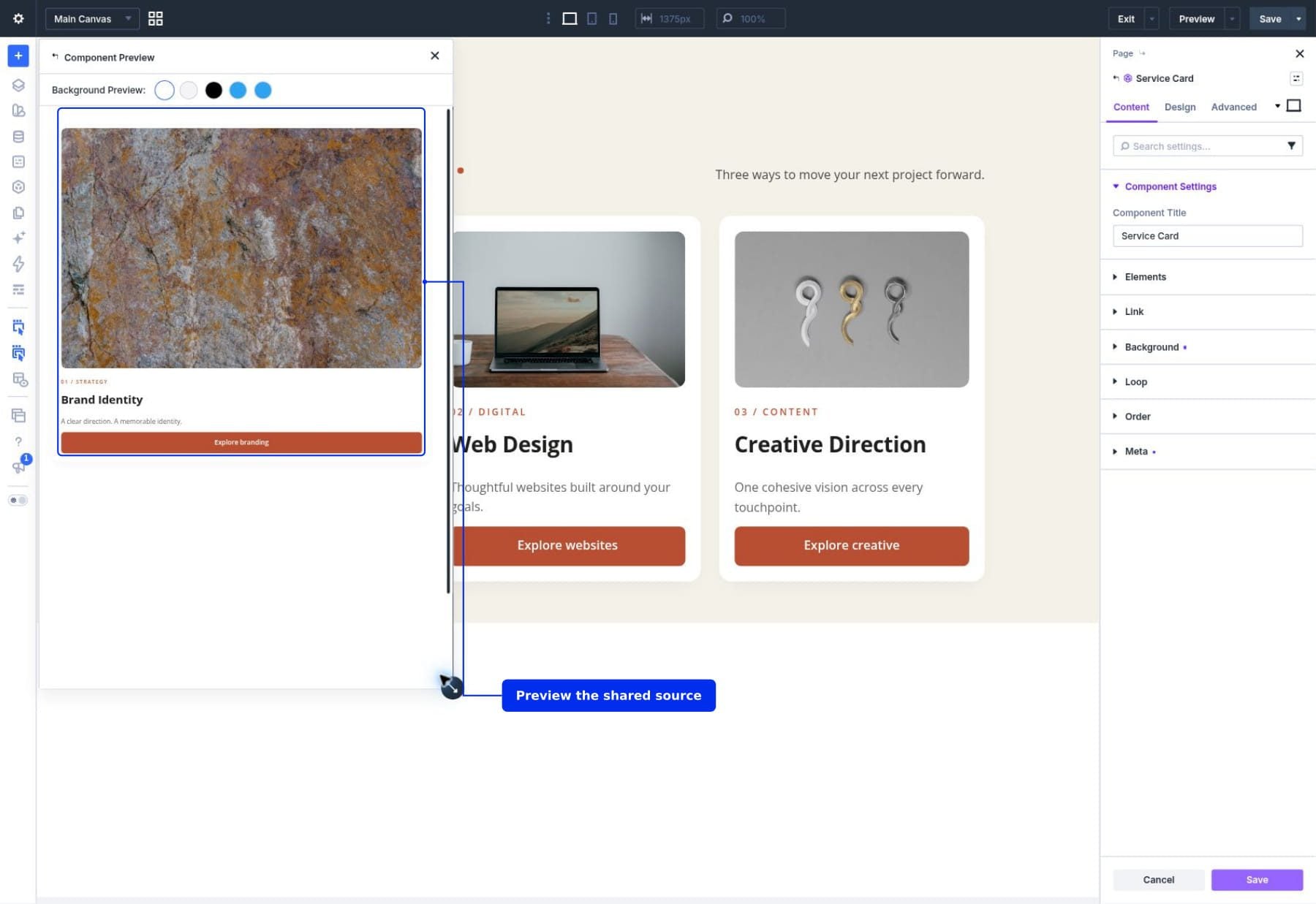
A Library title identifies the reusable source. A local heading such as Web Design identifies a particular card’s content. Changing one does not require changing the other.
Duplicate A Source For A Separate Design
Use the source’s Duplicate control in the Components panel when you want a separate reusable design. Rename the copy, for example Service Card — Variant, and save it.
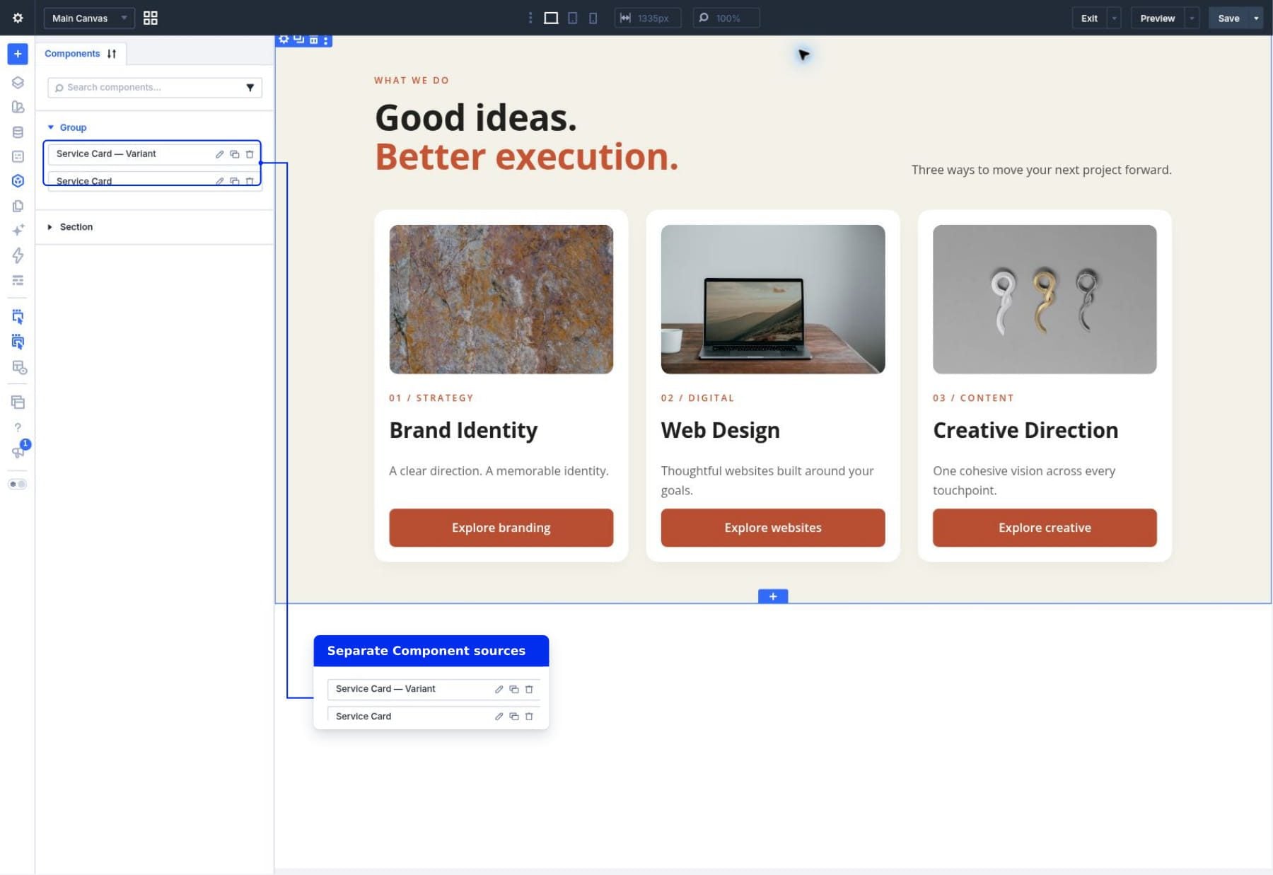
Duplicating the source creates another Component you can maintain independently. Duplicating an instance on a page creates another connected use of the same source. Choose between them based on whether the new card should share future design updates.
Export And Import Components
Open Import & Export from the Components panel. In Export, give the file a recognizable name, such as Service Card Collection, and click Export Components to download the JSON file.
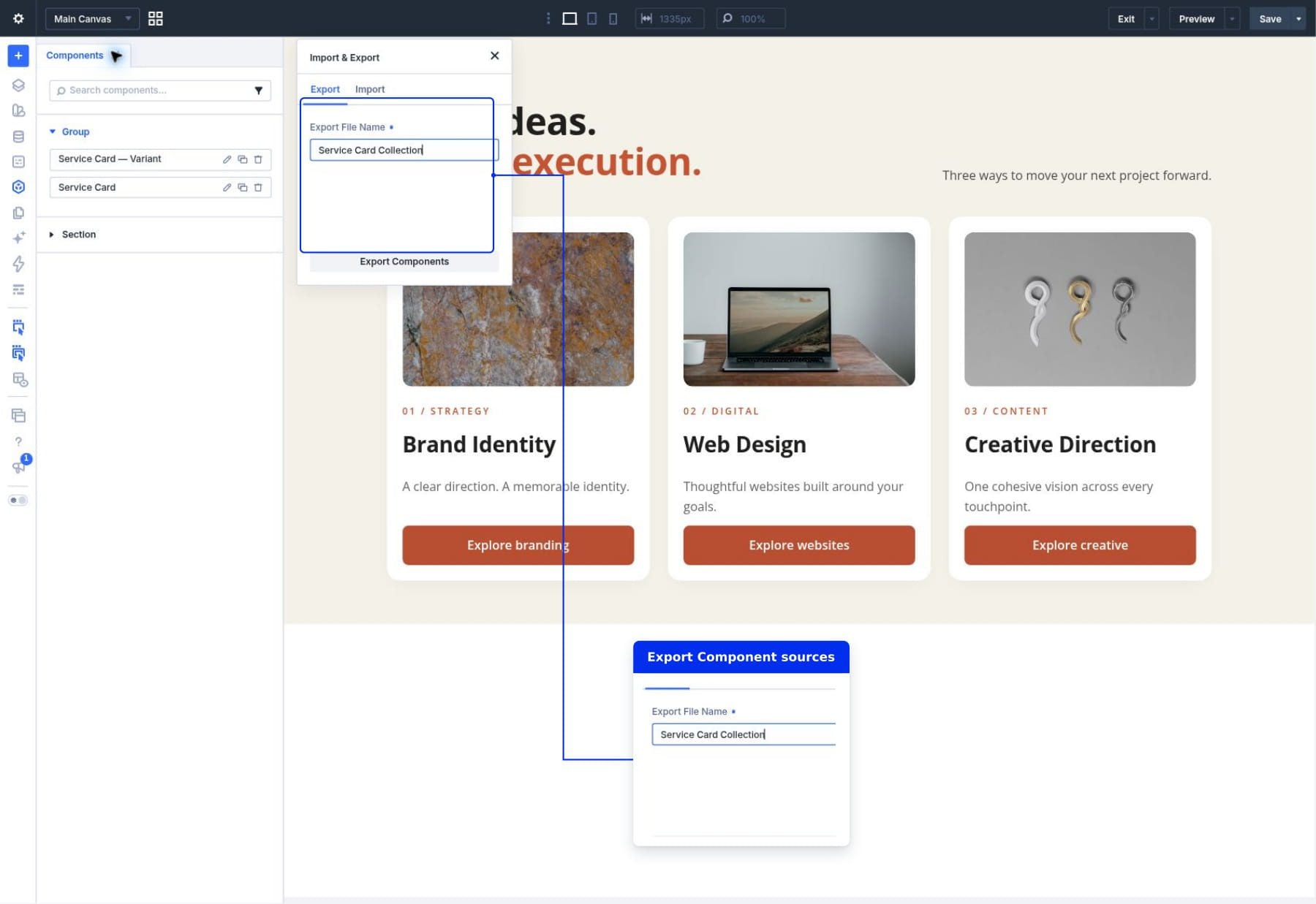
On the destination site, open the same window’s Import tab, choose the exported file, review the Import Presets option, and click Import Components. Including presets is relevant when the exported designs depend on them.
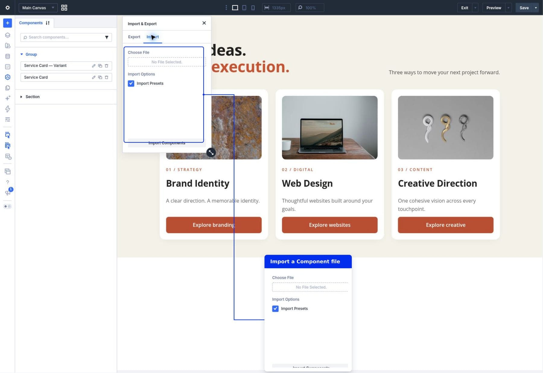
Review the imported design on the destination site, including images and links. Component portability and Design Variable portability are separate parts of moving a complete design system.
Where Components Are Most Useful
The service card is one practical example. The same approach works whenever several uses should share a structure while allowing selected content to vary:
- Team cards: Shared photo framing and typography with different names, roles, and biographies.
- Testimonials: Shared quote styling with different quotations and customer details.
- Promotional sections: Shared layout and button design with different headlines, images, and destinations.
- Pricing cards: Shared visual structure with editable plan names, prices, and descriptions.
- Reusable page sections: A maintained section design with carefully chosen local content fields.
Components can also be part of a wider system using presets and variables. Our guide to building a design system with nested and stacked presets covers the styling side of that workflow.
Tips For A Clear Component Workflow
- Finish one useful example first. Resolve spacing, button design, and responsive behavior before reusing it widely.
- Expose the fields that should vary. For these cards, that means content and destinations while the card design stays shared.
- Keep source defaults useful. A newly inserted instance should give you a sensible starting point.
- Check the editing context. Source changes affect connected uses; instance changes affect the selected use’s editable fields.
- Review synchronization changes. Returning a field to source control can replace local values.
- Give each image accurate alt text. Replacing a photo also requires checking its description.
- Test the longest real content. A design that fits Brand Identity still needs to accommodate Creative Direction.
- Save both contexts when necessary. Confirm source updates, then save page-specific content and layout changes.
Build Reusable Designs With Components
Our three service cards share their layout, image frames, spacing, typography, and button styling. Their images, titles, descriptions, and destinations can vary. One source update maintains their common design while each card continues presenting its own service.
Start with an element you already repeat, save it as a Component, and make its variable content editable. For more background, read the Components release announcement, or explore the rest of Divi’s website-building tools.











Leave A Reply