
One of Divi 5’s new features is Composable Settings, which lets you enable additional design option groups for module sub-elements directly inside the Visual Builder. Instead of being limited to a fixed set of controls, you can add the settings you need to elements such as titles, buttons, images, icons, and body text without relying on custom CSS for common styling gaps.
In this post, we’ll explain what Composable Settings are, why they matter, how they work, and how to use them more effectively in real projects. We’ll also cover practical use cases and workflow tips so you can build faster while keeping your settings organized.
Let’s get started.
What Are Composable Settings?
Composable Settings allow you to enable additional design option groups for a module’s sub-elements, such as the title, button, image, icon, or body text inside a module like Blurb or Testimonial. In earlier versions of Divi, each sub-element came with a fixed set of design controls. In Divi 5, you can expand those controls on demand by hovering over a sub-element option group in the Visual Builder and clicking the Toggle Options icon.
After you enable an option group, it appears instantly as a nested settings group inside that sub-element panel. This gives you more control exactly where you need it while keeping the interface cleaner by default.
Composable Settings improve Divi’s design workflow in several meaningful ways. They reduce the need for CSS workarounds for many sub-element styling tasks, make the builder more consistent by exposing familiar option groups in more places, and help you work faster by letting you add controls only when you need them. For beginners, that means more flexibility without code. For experienced users, it means less friction and more precision inside the builder.
Key Features
- More Control for Sub-Elements: Enable additional design option groups for sub-elements such as buttons, titles, images, icons, and body text.
- On-Demand Options: Click the Toggle Options icon to enable only the settings you need for a specific sub-element.
- Clean Nested Groups: Enabled options appear as nested settings groups directly inside the relevant sub-element panel.
- Preset Support: Enabled option groups can be saved in presets, making it easier to maintain styling consistency across your site.
- Less Need for CSS: Many adjustments that previously required custom CSS can now be handled directly in the builder.
In the past, modules had a fixed set of design settings. For example, you could style a Blurb title’s text, but you couldn’t easily apply things like a background, border, box shadow, or spacing controls specifically to that title.
Composable Settings remove much of that rigidity. By enabling additional option groups for individual sub-elements, you can create more advanced module designs without depending on custom code for routine styling tasks.
How To Use Composable Settings In Divi 5
Using Composable Settings in Divi 5 is straightforward. Here’s a simple walkthrough to help you get started.
Open any module in the Visual Builder that you want to customize. For example, you might enable additional settings for the Quote Icon inside a Testimonial module.
Head to the Design tab and expand the Quote Icon menu. Hover over the option group to reveal the Toggle Options icon.
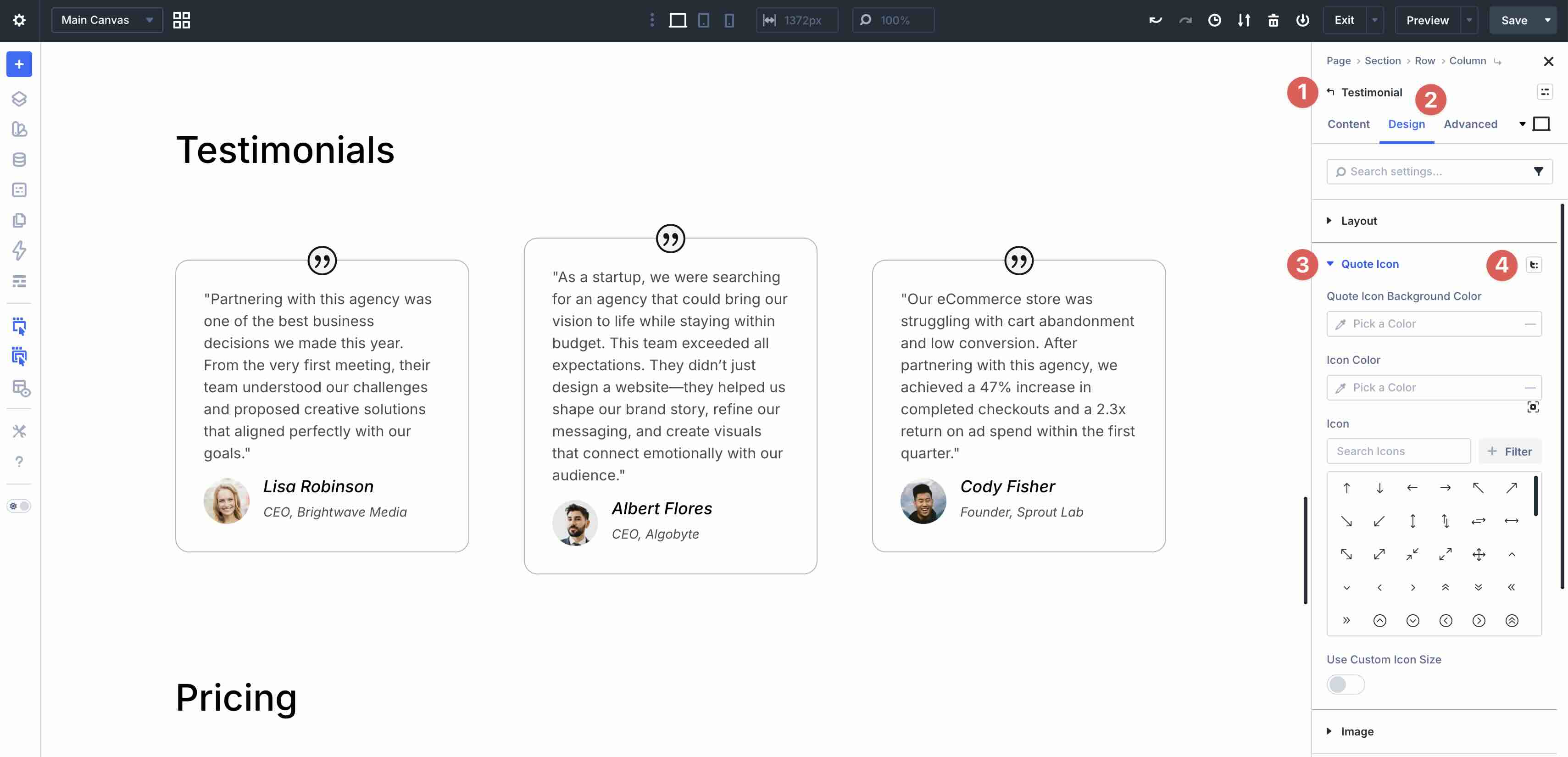
Click the icon to view additional option groups that are not currently enabled for that sub-element.
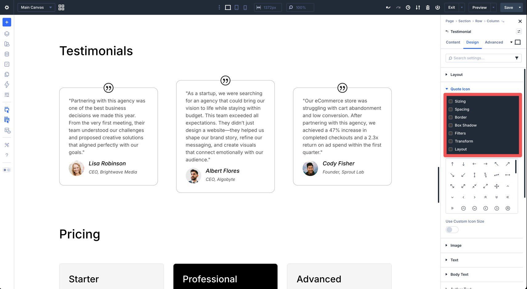
Enable the option groups you want by checking the corresponding boxes.
Once enabled, those option groups will appear as nested settings inside the Quote Icon panel.
From there, you can adjust settings such as spacing, border, box shadow, filters, transforms, and more, depending on which option groups you enabled for that sub-element.
This makes it much easier to customize individual parts of a module without resorting to workarounds.
Design Examples
Composable Settings are more than a UI improvement. They make it easier to build more refined, custom-looking designs with native controls. Here are a few practical ways to use them.
1. Precision Spacing For Blurb Titles
By default, adjusting the space around a title often meant tweaking line height or using custom CSS. With Composable Settings, you can apply spacing controls directly to the title itself.
For example, if you want a Blurb Title to have extra bottom spacing to separate it from the Body Text, open the Title Text option group, click Toggle Options, and enable Spacing. You can then add bottom padding or margin directly to the title without affecting the rest of the module.
Composable Settings also make it easier to style buttons inside modules such as Call To Action and Pricing Table. Instead of relying on CSS for extra visual emphasis, you can enable the relevant option groups for the module’s button and style it directly in the builder.
For example, you can enable additional settings for the Button sub-element and use them to make a featured pricing button stand out more clearly from surrounding content.
3. Team Member Image Effects
The Person module is useful for team pages, but sometimes the image needs more individual styling than the default settings allow. With Composable Settings, you can treat the image as a more independent design element.
For example, you can enable additional option groups such as Sizing, Spacing, Border, Box Shadow, Filters, or Transform for the Image sub-element. This gives you more control over the photo’s presentation without affecting the rest of the module.
4. More Consistent Styling Across Repeated Modules
One of the most practical advantages of Composable Settings is that they work well with presets. If you regularly style the same sub-elements across multiple modules, you can enable the needed option groups once in a preset and reuse that setup throughout your site.
This is especially helpful for repeated module patterns such as team sections, blurbs, testimonials, pricing tables, and CTAs, where design consistency matters and repetitive setup slows down your workflow.
Tips And Best Practices
To get the most from Composable Settings, it helps to use them strategically. They add flexibility without forcing every possible option into the interface at once, so a little restraint keeps your workflow fast and organized.
Only Enable What You Need
One of the biggest advantages of Divi 5’s interface is that it stays cleaner by default. Since Composable Settings are enabled on demand, you only need to turn on the option groups you actually plan to use. If you no longer need a specific group, you can disable it to reduce clutter and keep the editing experience focused.
Combine Them With Presets
If you frequently enable the same option groups for the same kinds of modules, save that setup in a preset. This way, each module using the preset starts with the same sub-element option groups already enabled, which can save time and improve consistency across your design system.
Check Responsive Views Early
Because Composable Settings let you apply spacing, sizing, borders, transforms, and other adjustments directly to sub-elements, it’s smart to review your design across devices early in the process. Divi 5’s Customizable Responsive Breakpoints make that easier. A sub-element that looks balanced on desktop may need different spacing or sizing on tablet and phone.
Use Composable Settings To Reduce CSS Debt
A practical way to get more value from this feature is to use it wherever it replaces simple CSS overrides you would otherwise add to a site. The fewer minor styling fixes you push into custom CSS, the easier your projects are to maintain later, especially when handing them off to clients or teammates.
Unlock More Design Flexibility With Divi 5
Composable Settings in Divi 5 are more than just a new feature. They reflect a broader shift toward a more flexible, modular, and intuitive design system inside the builder. By letting you enable additional design option groups for specific sub-elements, Divi 5 gives you more control without overwhelming the interface from the start.
Whether you’re adding precise spacing to a title, refining the styling of a button, or giving a team photo more visual polish, the controls you need are now easier to access and easier to reuse.
If you haven’t already, download the latest Divi 5 release, experiment with Composable Settings, and see how much more you can do without custom code.


Leave A Reply