
Ultimate Multipurpose Divi Wireframe Kit comes with over 2000 layout designs that can be used in a wide variety of applications throughout your website. The wireframes give you the basic layout and functionality you’ll need for any given section, then you can easily use Divi’s module settings to modify the design to your liking.
This wireframe kit can be extremely useful if you build sites using Divi and want a pack of layouts that will help you design quicker, while still giving you full control over the styling. In this post, we’ll take a closer look at the layouts in the Ultimate Multipurpose Divi Wireframe Kit to help you decide if it’s the right product for you.
Let’s get started!
Installing Ultimate Multipurpose Divi Wireframe Kit
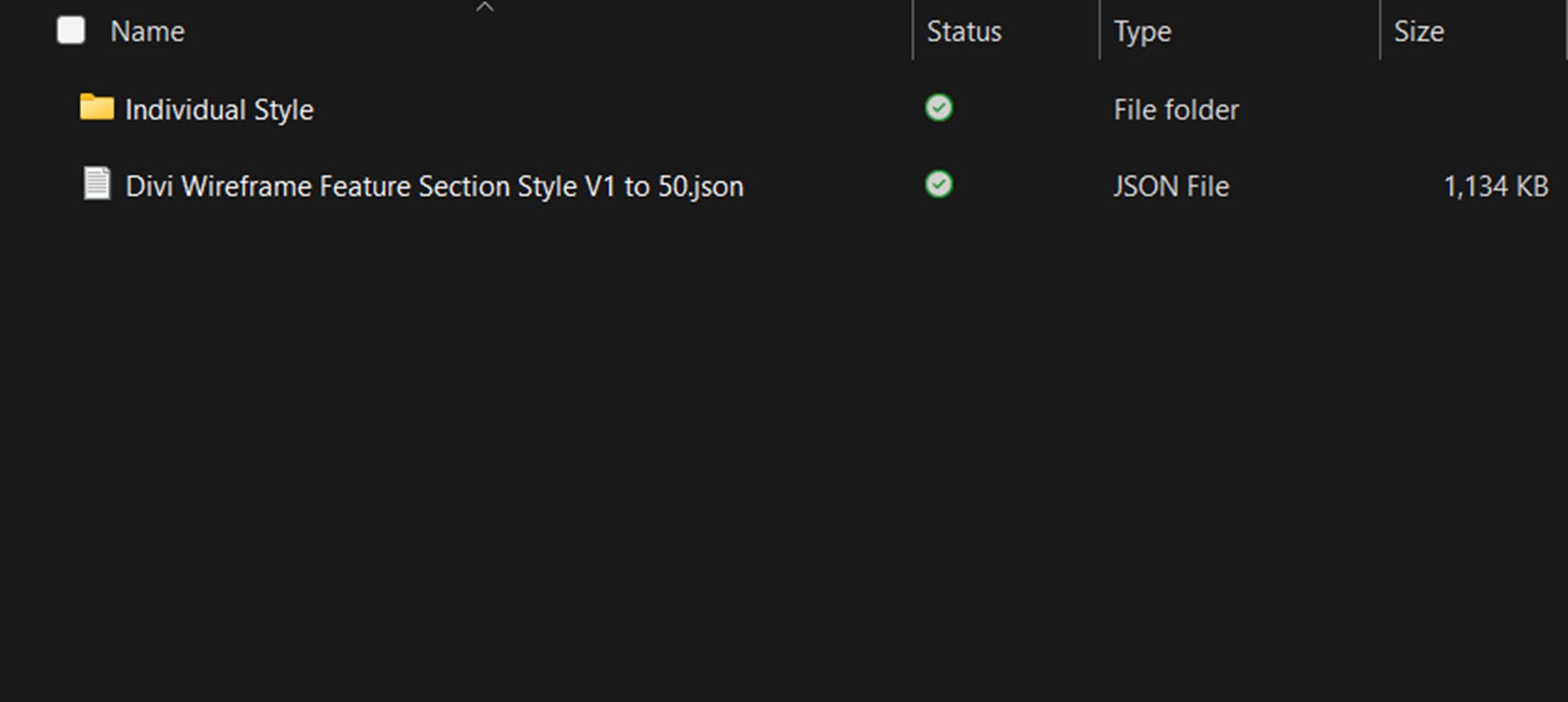
Ultimate Multipurpose Divi Wireframe Kit comes as a .ZIP file containing Divi Library .json files. The wireframes are organized by layout type.
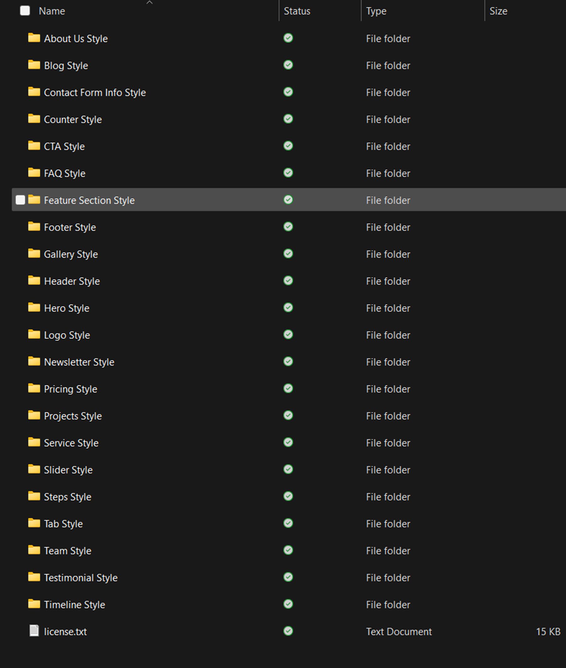
The folders for each layout type include a Divi Library file containing all of the styles and a folder with individual files for each style.
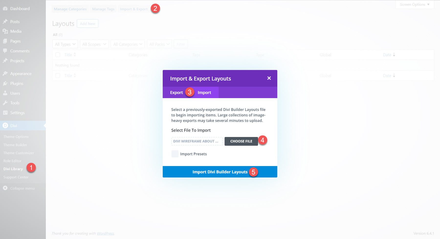
To install the layouts, start by unzipping the .ZIP file for the wireframe kit in your file manager. Then, open your WordPress dashboard and navigate to the Divi Library page. Click Import & Export at the top, then select the Import tab. Choose a .json layout pack file to import, then select Import Divi Builder Layouts.
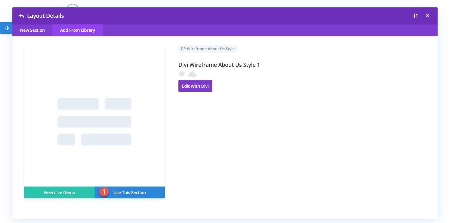
Once the layout has been imported, open your page in the Divi Builder. Click the blue plus icon to add a new section, then select Add From Library.

Locate the layout you want to use, then click the Use This Section button to load the layout on your page.
Ultimate Multipurpose Divi Wireframe Kit Layouts
The Ultimate Multipurpose Divi Wireframe Kit comes with layouts for just about any section you would want to add to your site. The layouts utilize all of the different modules that come with Divi, so you are sure to find a wireframe layout that includes the functionality you are looking for. Each type of layout in the Wireframe Kit includes 20-100 different styles. Let’s take a look at a few layouts from each section included in the Ultimate Multipurpose Divi Wireframe Kit.
Section Layouts
First, let’s take a look at the section layouts. Once imported, any of these layouts can be added to your page designs through the Divi Library.
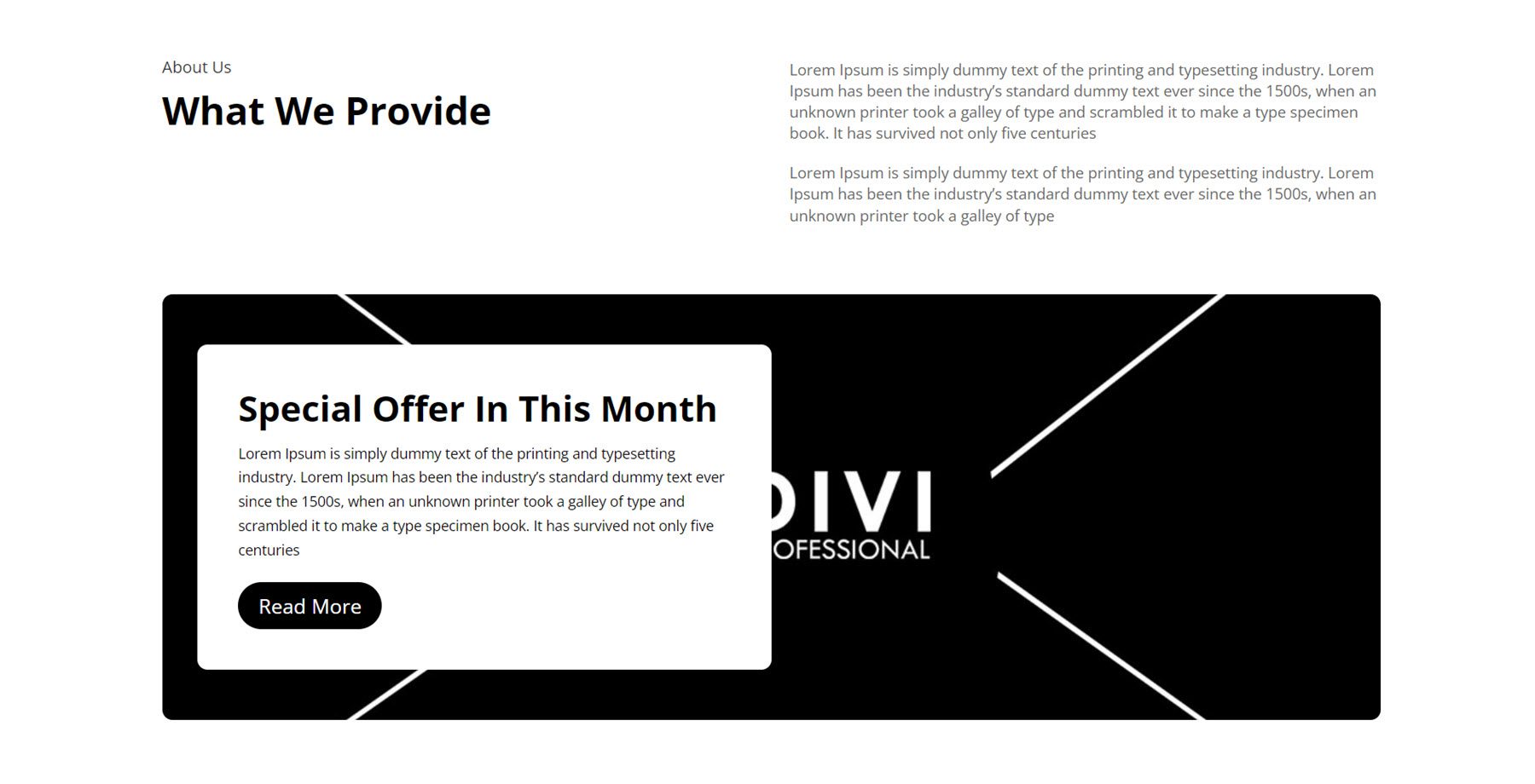
About Us
The About Us section is a great place to highlight key features of the company and display a visual element such as an image or video.
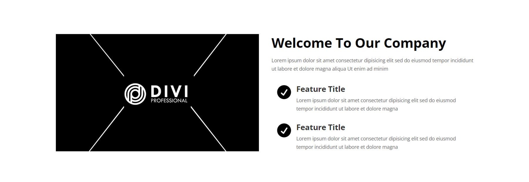
Style 1 features a large image on the left with some welcome text and two blurbs for feature highlights. The blurbs feature icons with a fade-in effect.
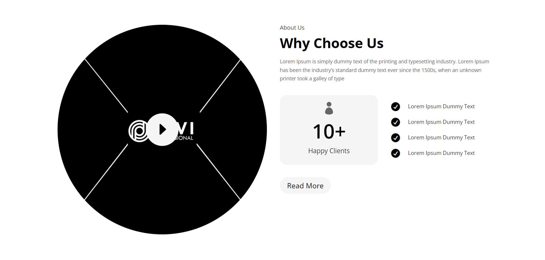
The next layout is Style 13, an interesting layout with a large circular image on the left and an icon in the middle that can be linked to a video or another page. On the right, there is some introduction text, followed by a number counter representing happy clients and some features marked with an icon on the right. The read more button can guide the user to a new page.
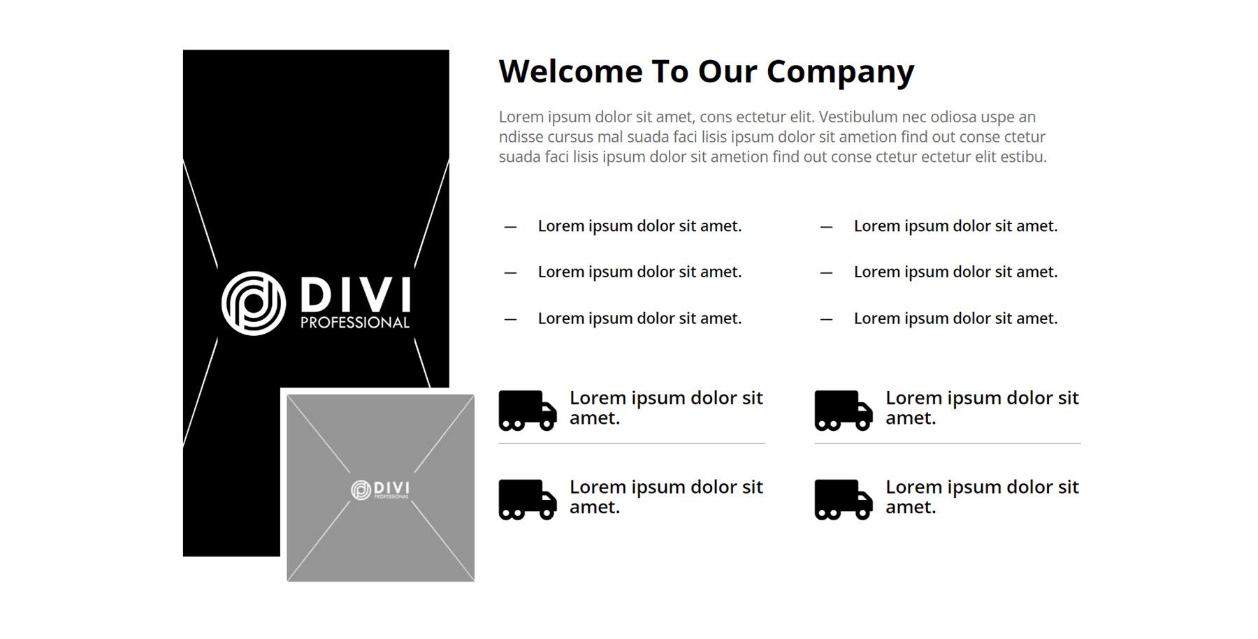
The final About Us section we’ll look at is Style 43. It features one tall image and a smaller image overlaid on the left. On the right is some introduction text, followed by some key highlights in blurb icons.
Blog
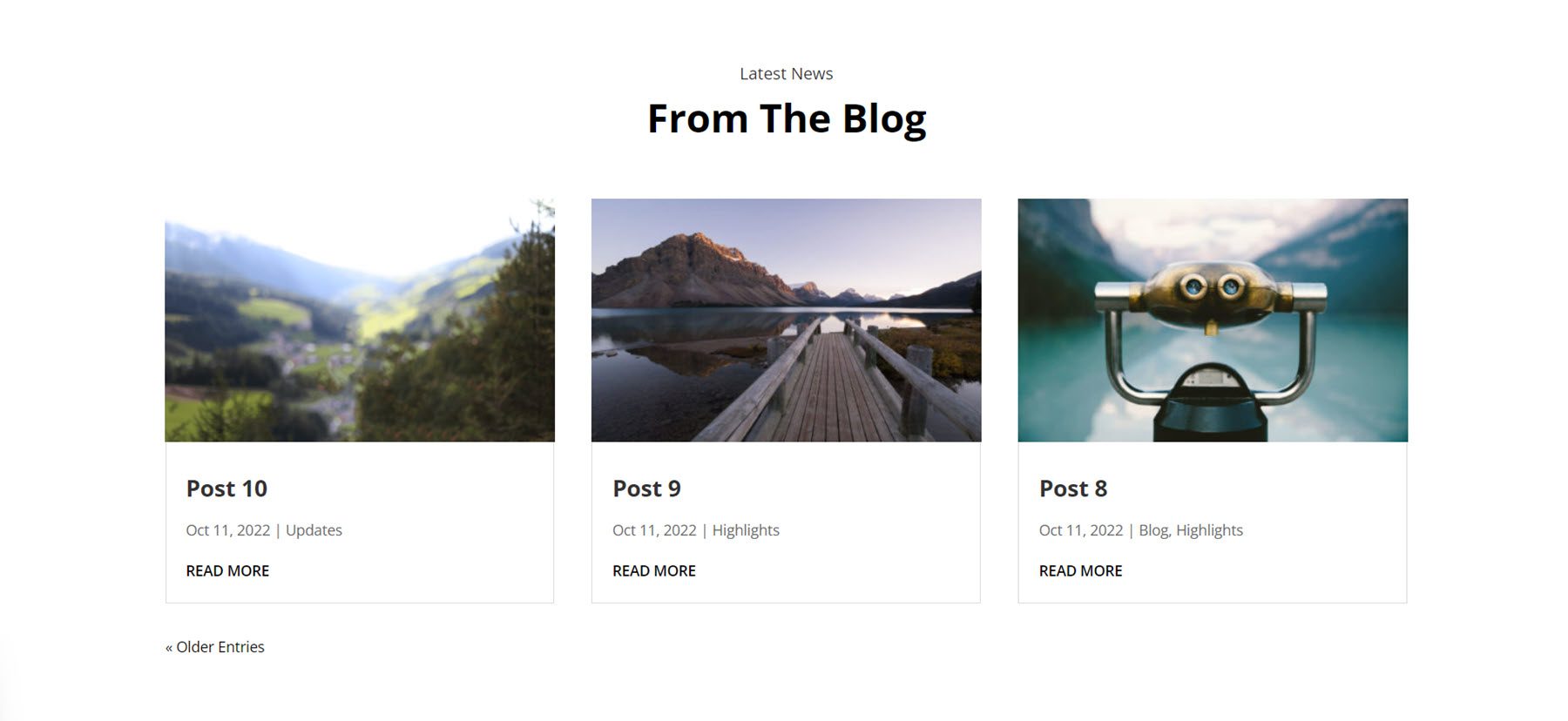
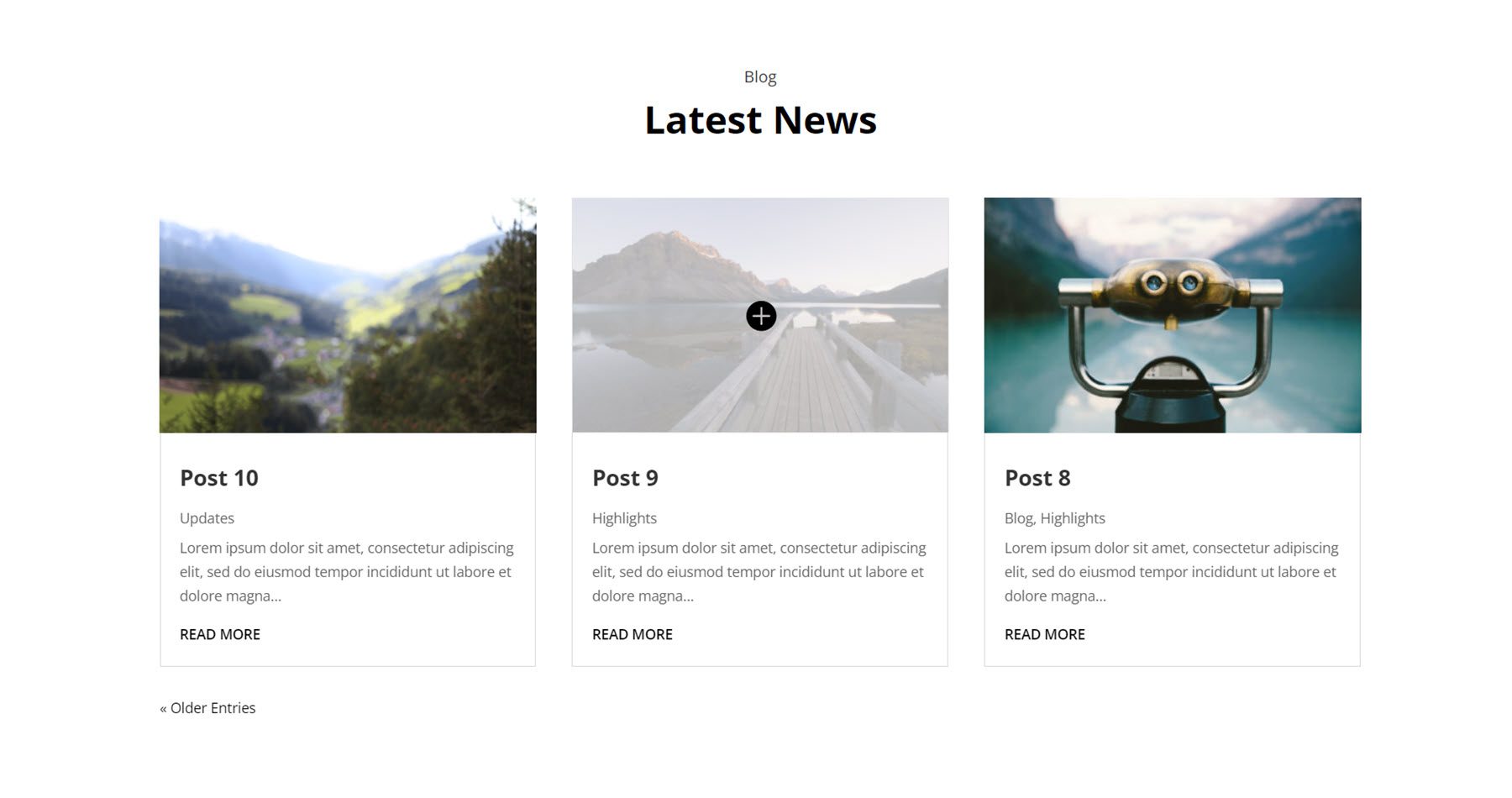
The blog module allows you to display a collection of posts anywhere on your site. First, let’s take a look at Blog Style 2. It is a card-style design with three blog posts. Each post has a featured image, followed by the post title, date, category, and a read more button.
Blog Style 4 is similar to the one above, but it doesn’t display the date and instead shows a short excerpt from each post. On hover, a light overlay and an icon appear over the featured image.
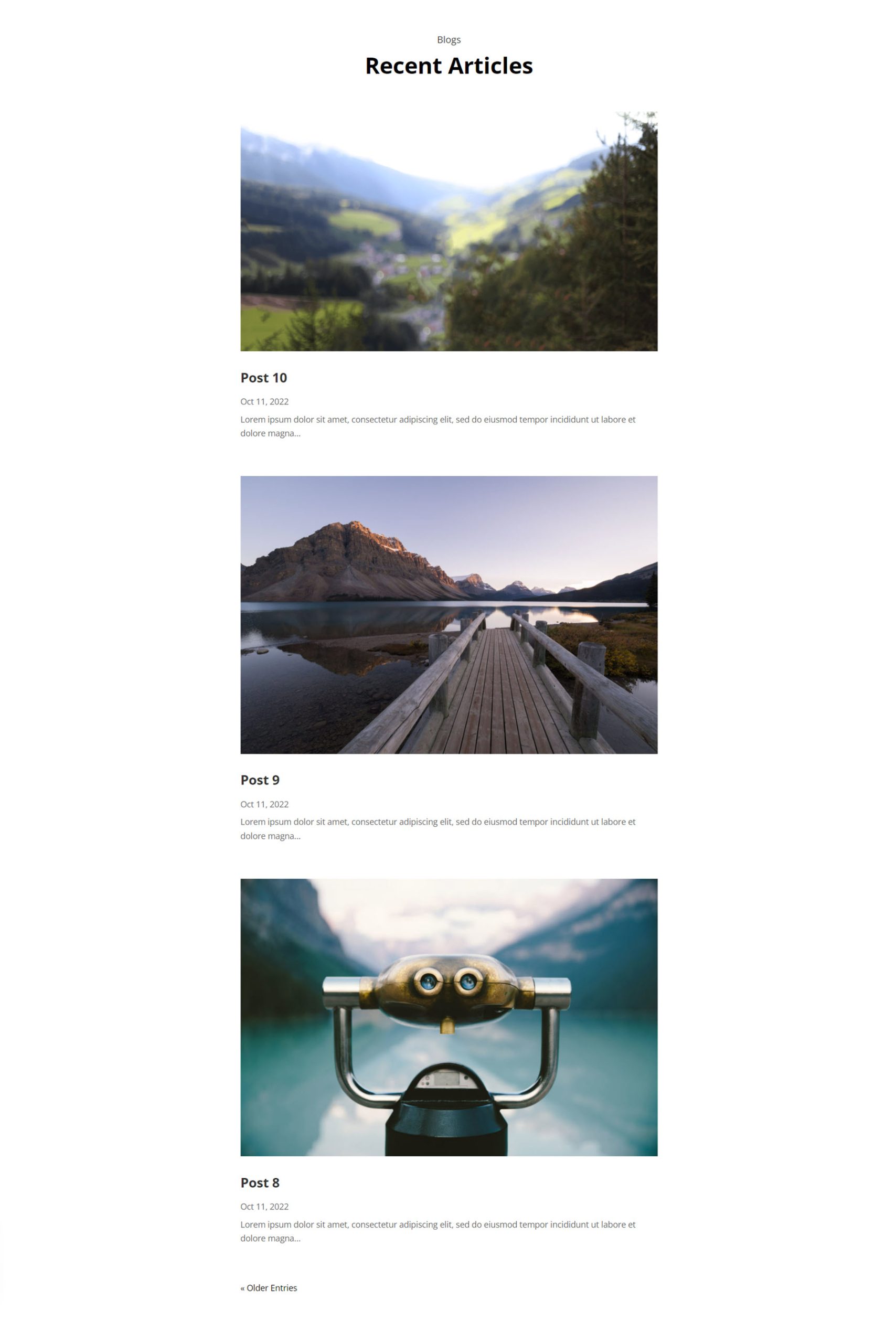
In Blog Style 19, the posts are displayed in a list format, with one post displayed after another. The images for each post are displayed full-width, followed by the post title, date, and excerpt.
Contact Form Info
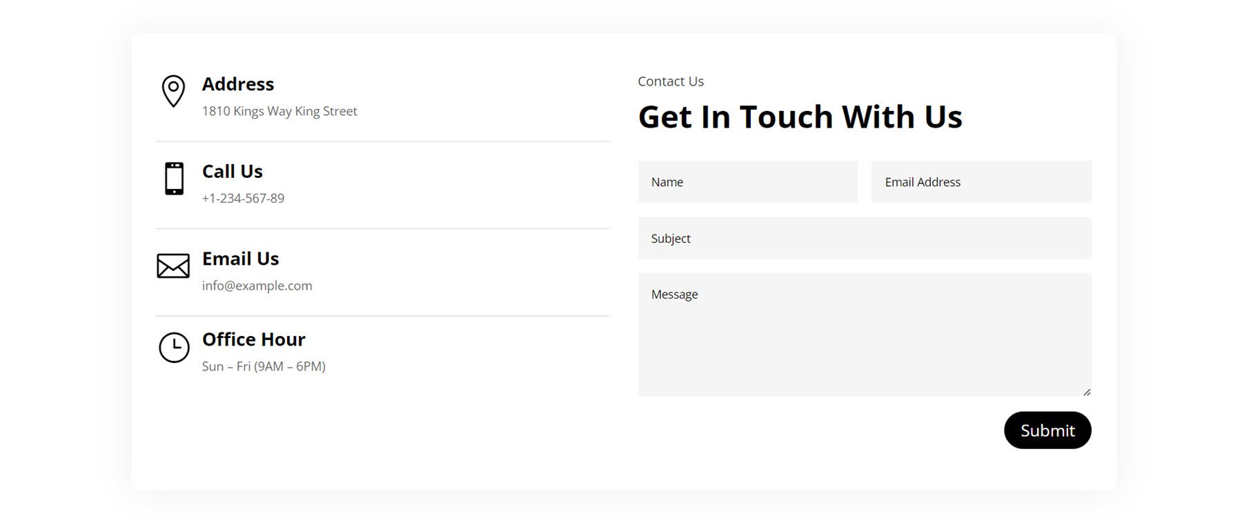
These sections primarily feature contact information, contact forms, and maps. Here is Style 9, it features blurb sections with icons for information such as the address, phone number, email, and hours. On the right is a contact form.
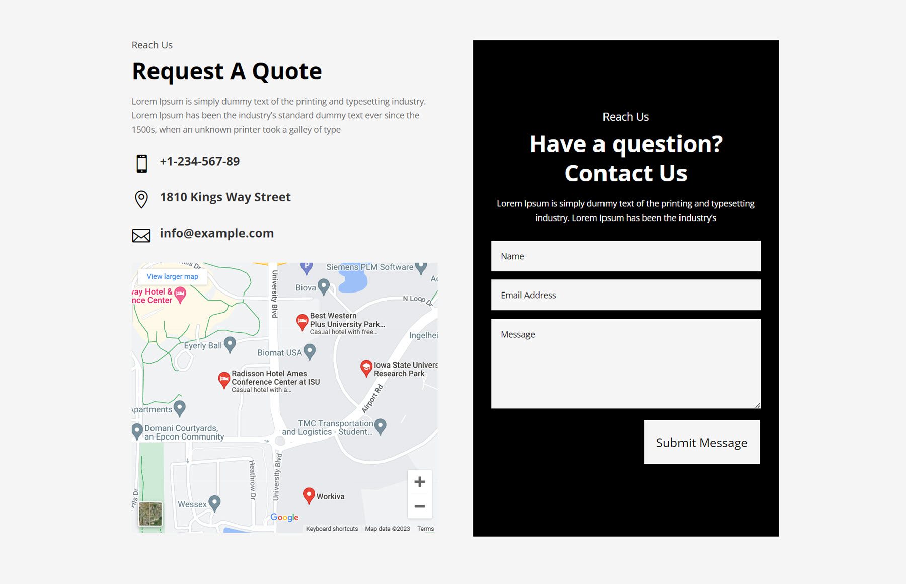
In Style 22, there is a section for some introduction copy, followed by some icons representing contact information and a map. On the right is a contact form on a black background.
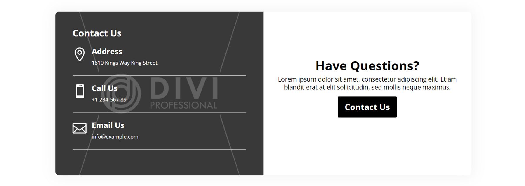
Next, Style 40 features a block-style layout with a box shadow around the row. On the left, an image is set as the background for the column and there are some blurb modules with icons representing contact information. On the right is a heading and some copy, then a Contact Us button.
Counter
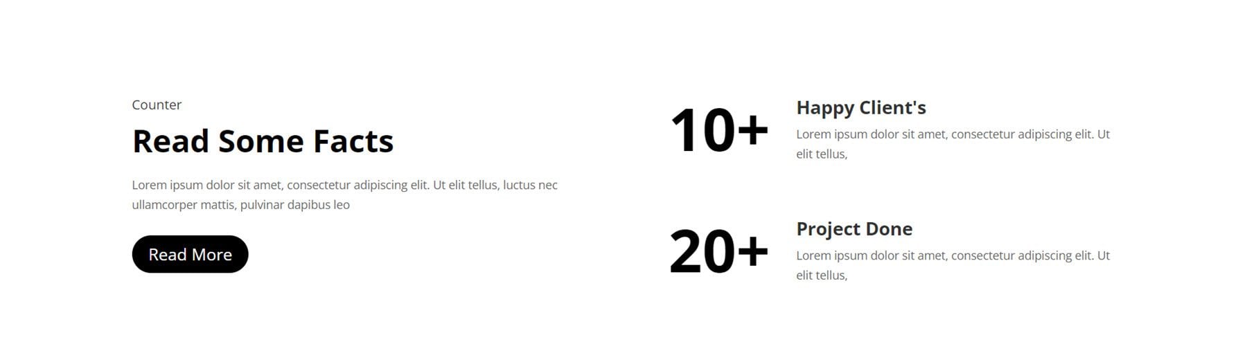
The first counter we’ll look at is Style 2. It has a subheading and heading on the left, followed by some copy and a read more button. On the right. Two number counters with large numbers are displayed alongside some description text.
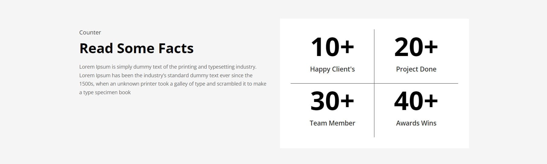
Counter Style 12 is displayed on a grey background with description text on the left. On the right, four number counters are displayed on a white background with the description of each number below.
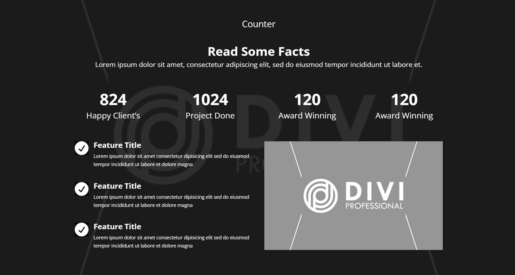
Counter Style 100 has many different elements to it. The layout features a large image as the background with a dark overlay. At the top are two headings and a line of copy, then, four number counters with descriptions. Below this, three blurb modules highlight features on the left with an image on the right.
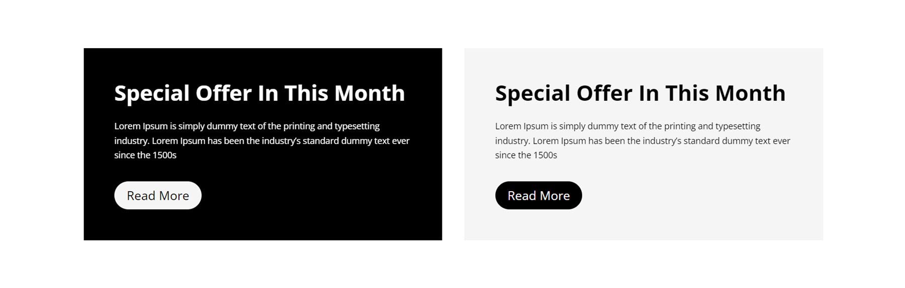
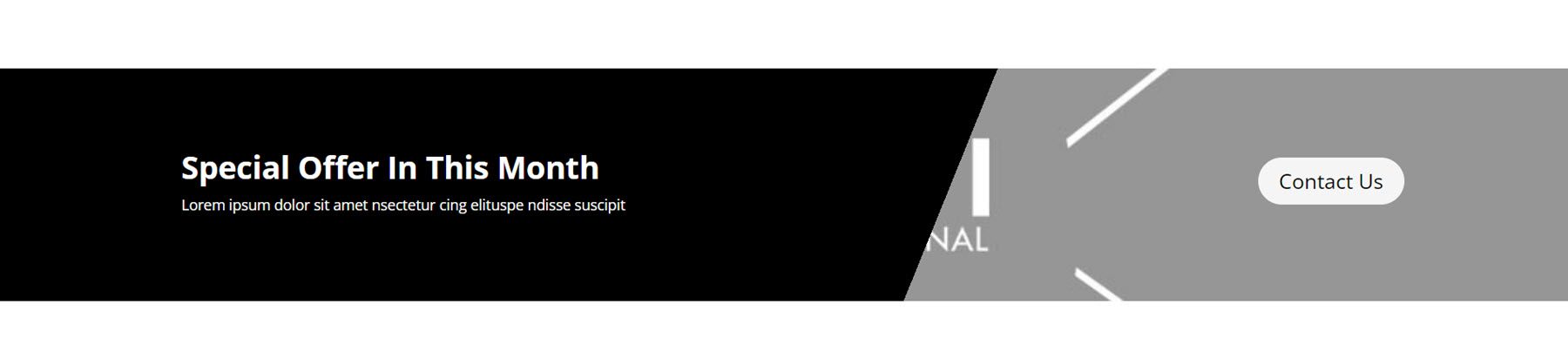
CTA
CTA sections are great for calling attention to a special offer, sales page, or any other action you want users to take. Style 3 features an image background with a dark overlay. On the left is a short subheading followed by a large heading text. On the right is the body copy, followed by a read more button.
CTA Style 9 features two different boxes, one dark and one light. Each feature has a heading, body text, and a button.
Next, CTA Style 19 has a banner-style layout, with a dark-angled section on the left with text and an image on the right with a button.
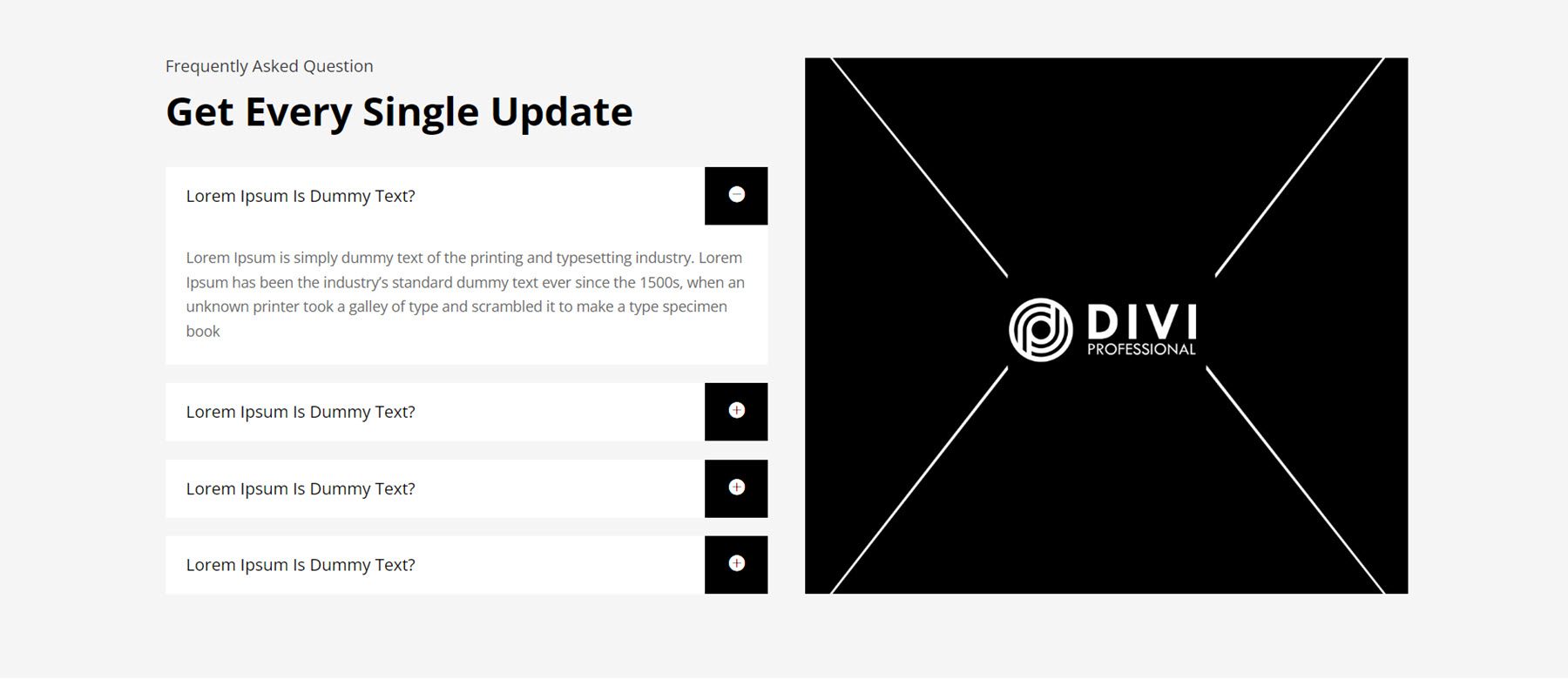
FAQ
Adding a FAQ section to your site can help you communicate important information to your website visitors and reduce the amount of repetitive inquiries you may receive. FAQ Layout Style 6 has FAQ accordions on the left underneath some heading text. On the right is a large image.
For the next layout, we’ll take a look at FAQ Style 31. It has four FAQ accordions in the left column, followed by a list of services with icons in the middle. On the right is an image with text surrounded by a border.
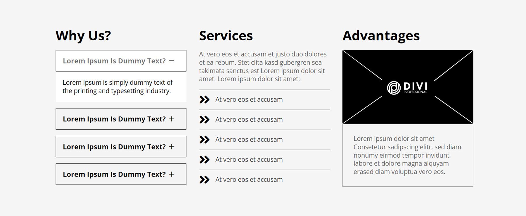
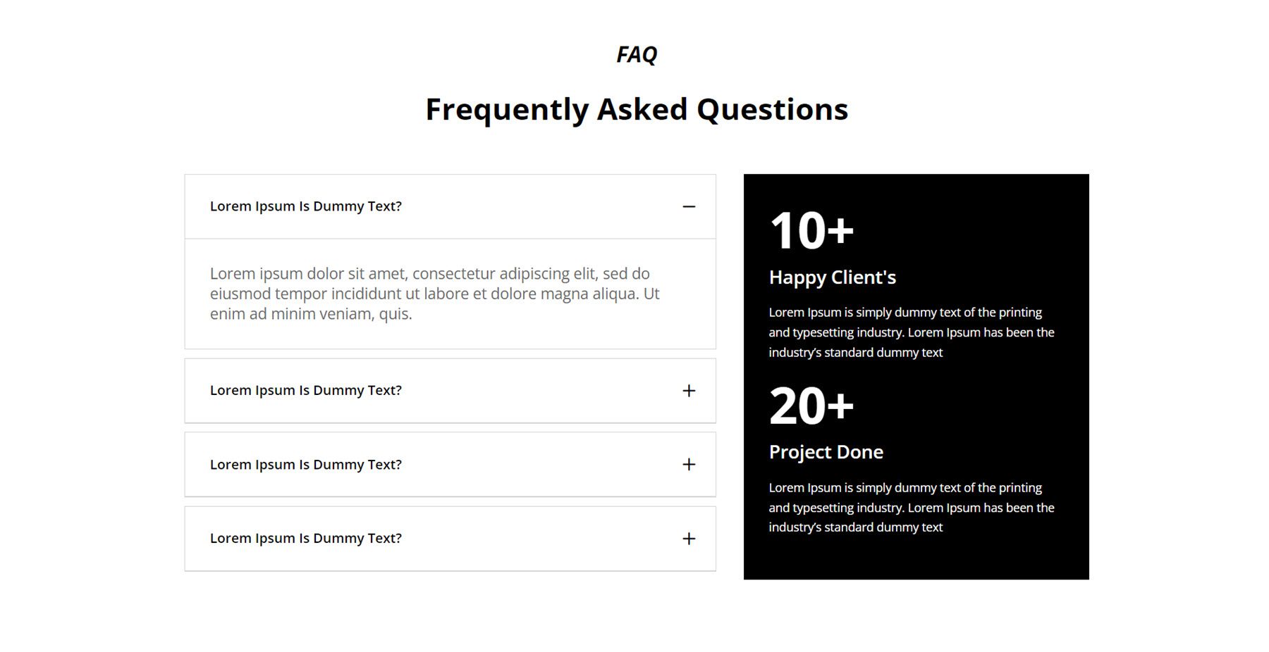
The last FAQ section we’ll look at is number 87. It features the FAQ items on the right, with two number counters and description text on the right on a black background.
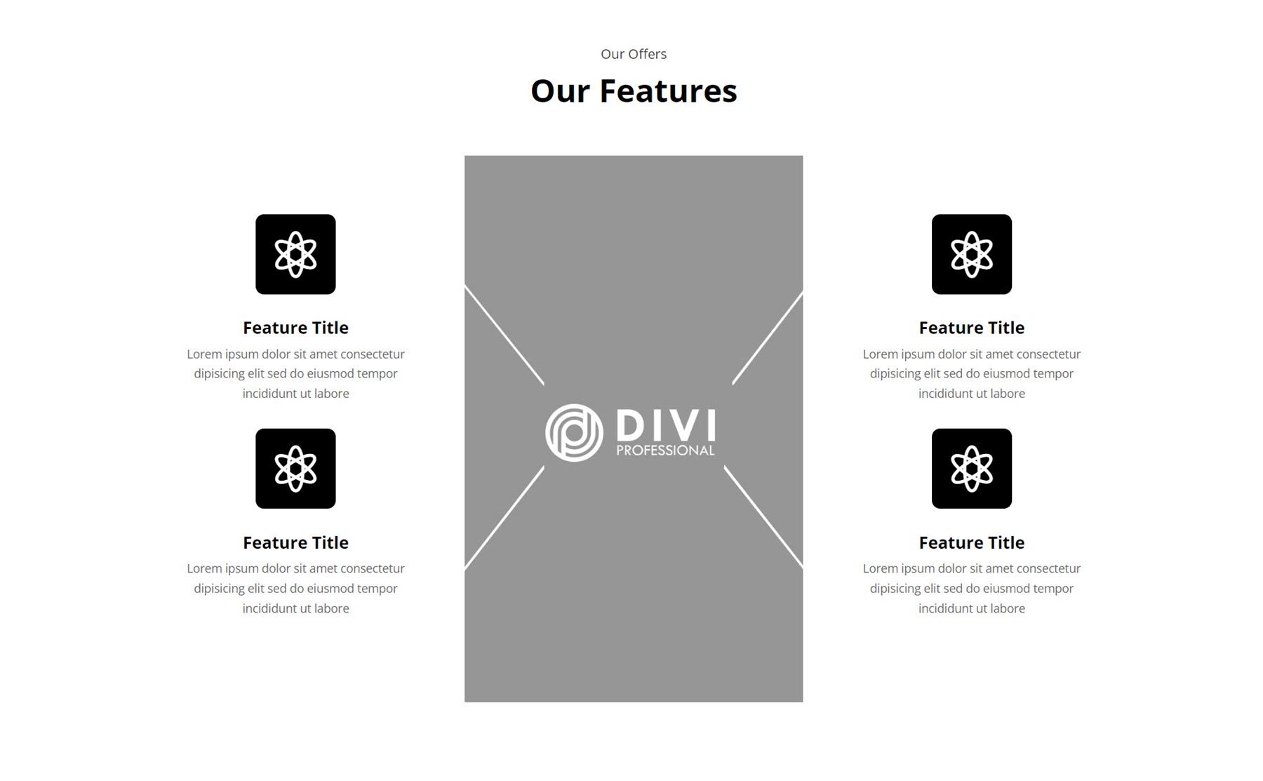
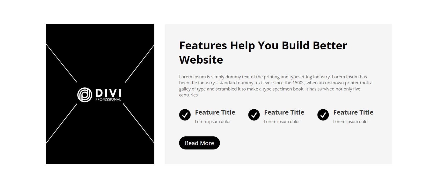
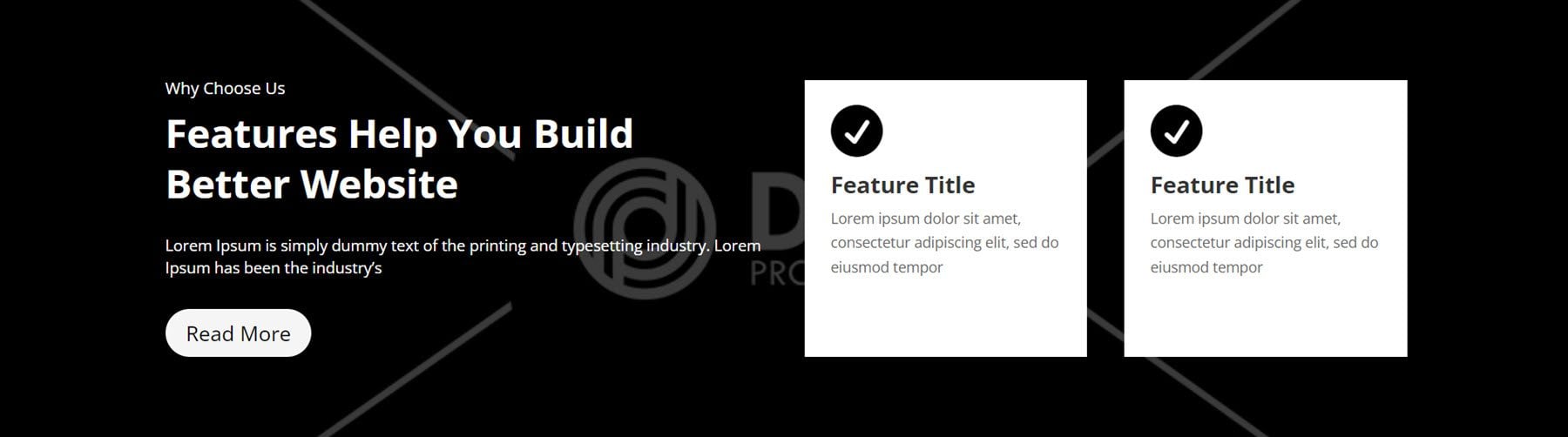
Feature Section
The feature sections are very versatile layouts. As the name suggests, you can use them to highlight features of your service or product. You can also use the layouts to showcase different services, display a list of pages, or highlight key points with icons.
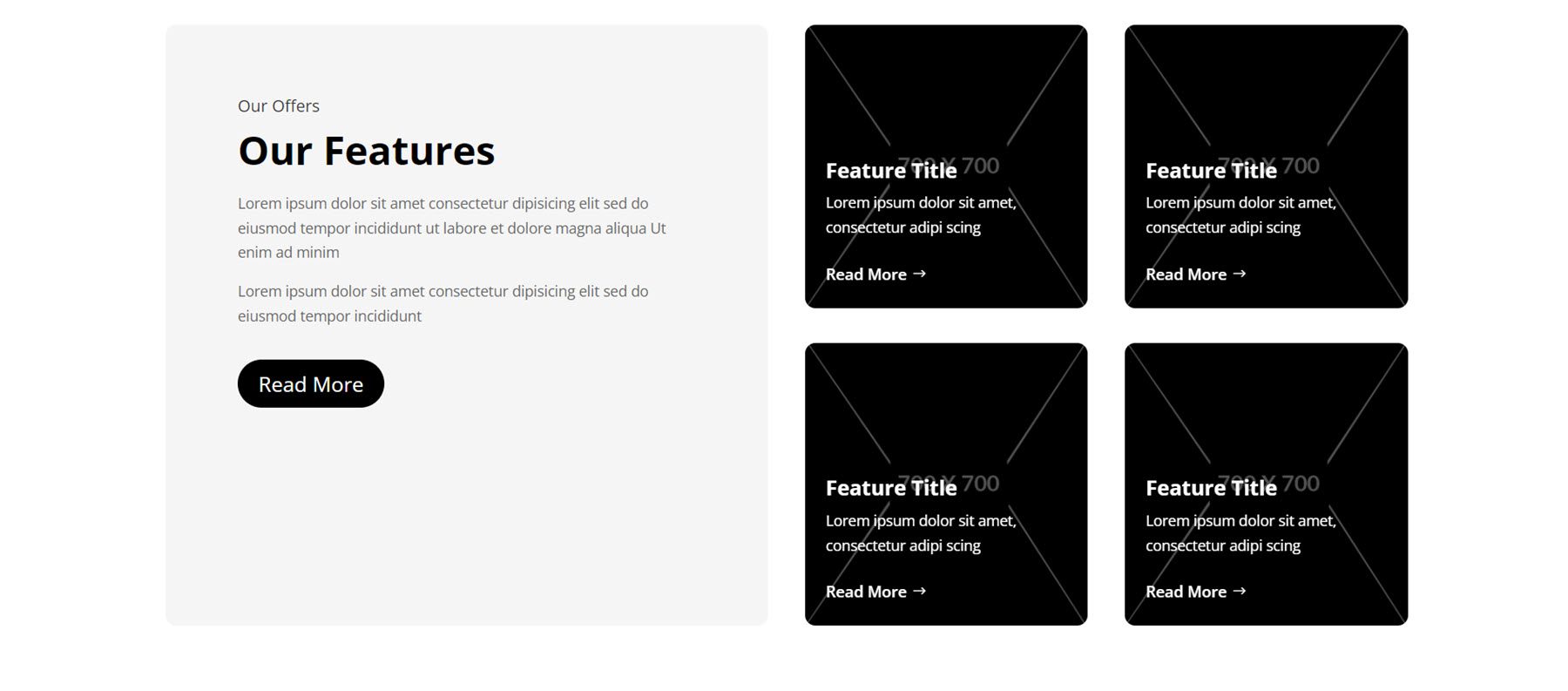
Here is the first example, feature section Style 7. This layout has a card-style layout with rounded corners. On the left, we have some title and body copy followed by a button. Then, there are four cards each with a background image and a dark overlay on the right. On each card is a feature title, description text, and a read more button.
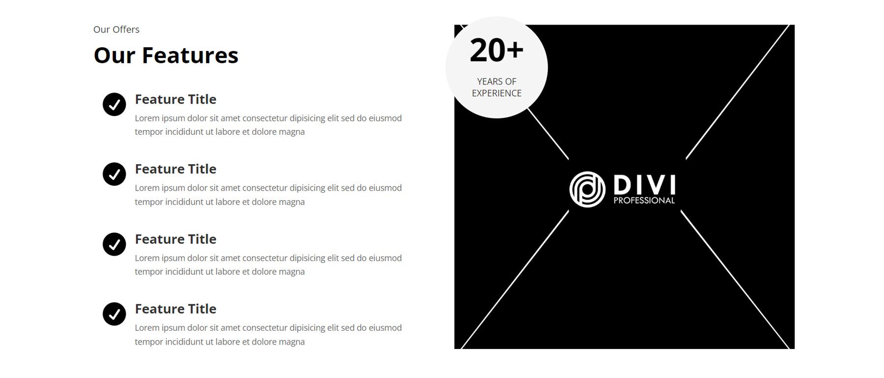
Next, Style 11 lists four features alongside icons on the left. On the right, there is a large image overlaid with a circle displaying a number counter and description.
Style 21 is an interesting design, with a title at the top, a tall image in the center, and two blurb modules on either side with a feature title and description.
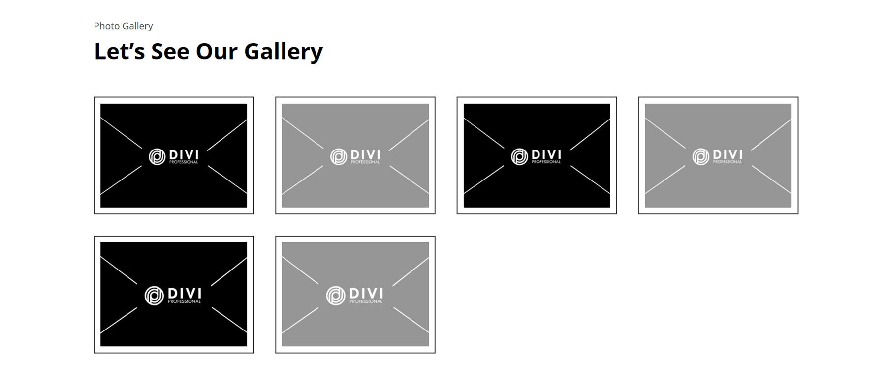
Gallery
The gallery layouts share a lot of similarities, with some differences in hover effects. Here is Style 4, the image expands on hover.
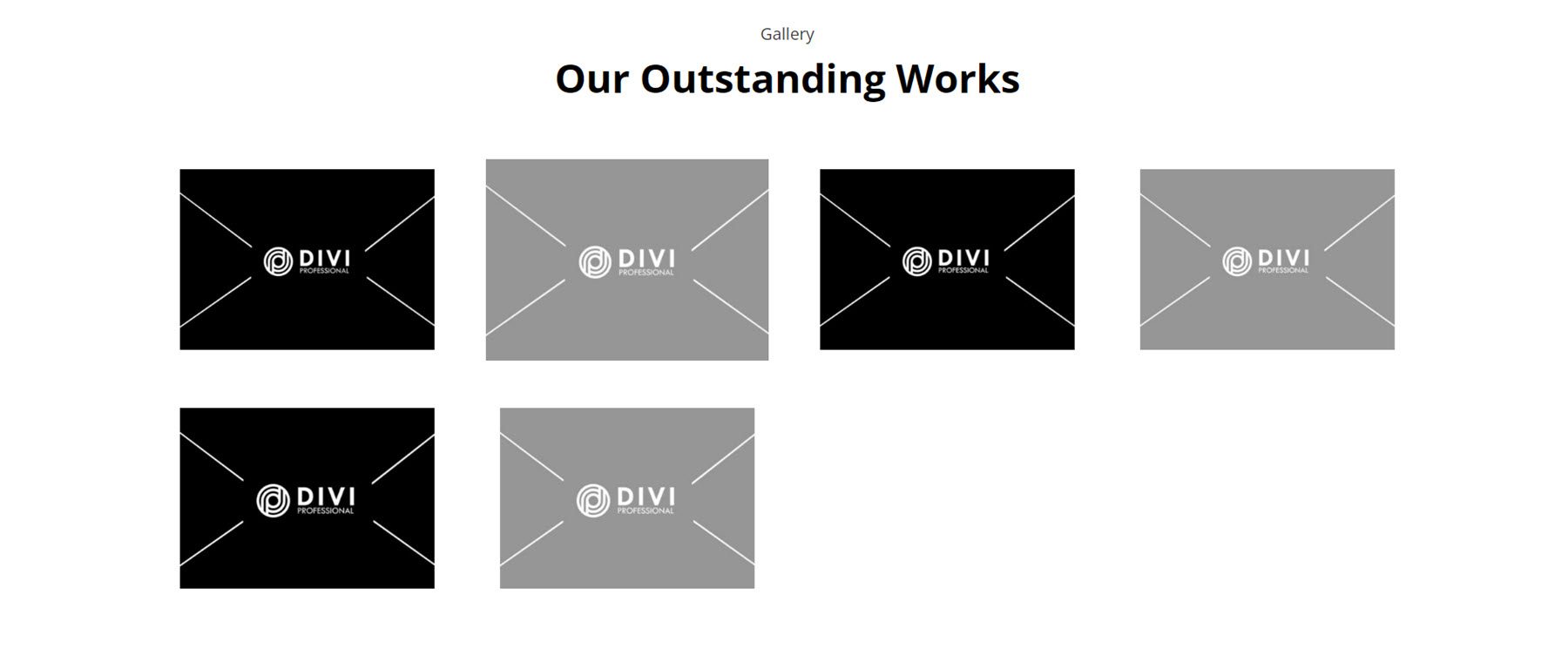
In Style 11, the gallery images are displayed in a single slider.
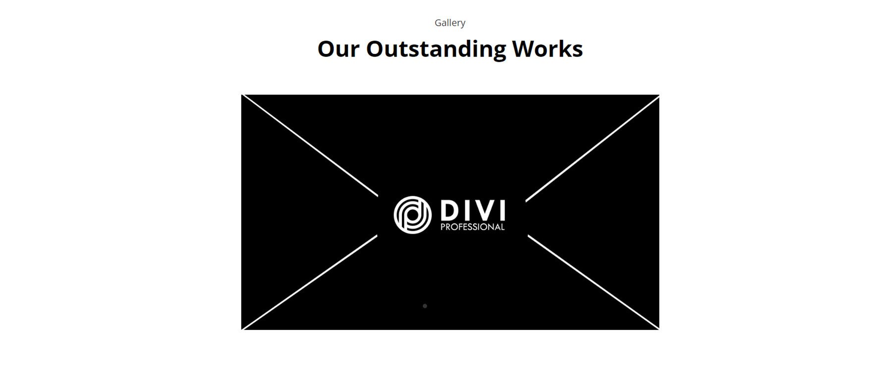
Finally, Gallery Style 14 features a border around each image.
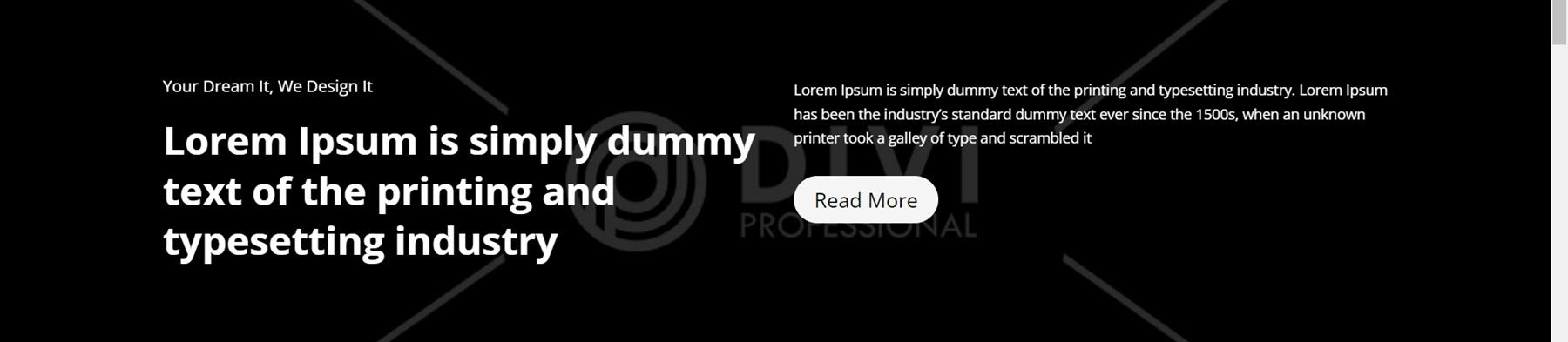
Hero
Hero sections are useful for highlighting special offers, features, and key pieces of information about your business. Style 3 features a text section with a header and subheader on the left and body content on the right. Below that is a call to action section with a title, body text, and a read more button on a large image background.
For Hero Style 5, features are highlighted with a text section with header and body text, followed by some blurbs that highlight features and a read more button. On the left is an image.
Hero Layout 17 features a large image as a background. On the left is a subtitle, title, body text, and a read more button. On the right are two features highlighted with an icon, on a white background.
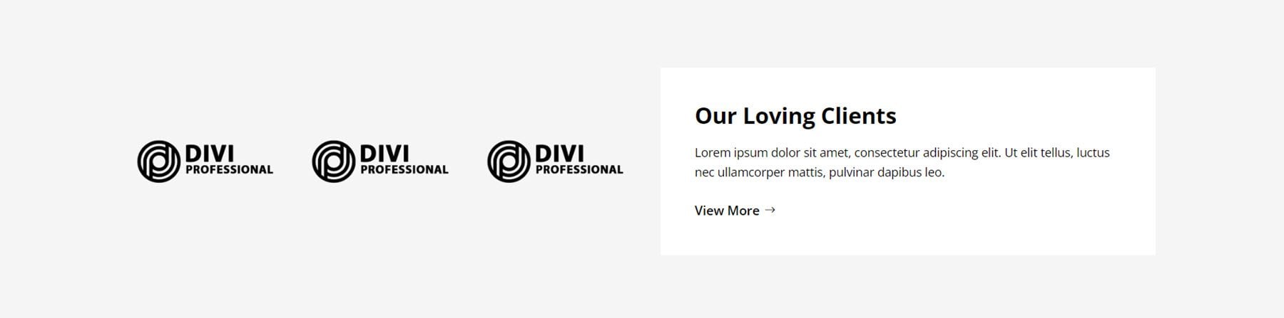
Logo
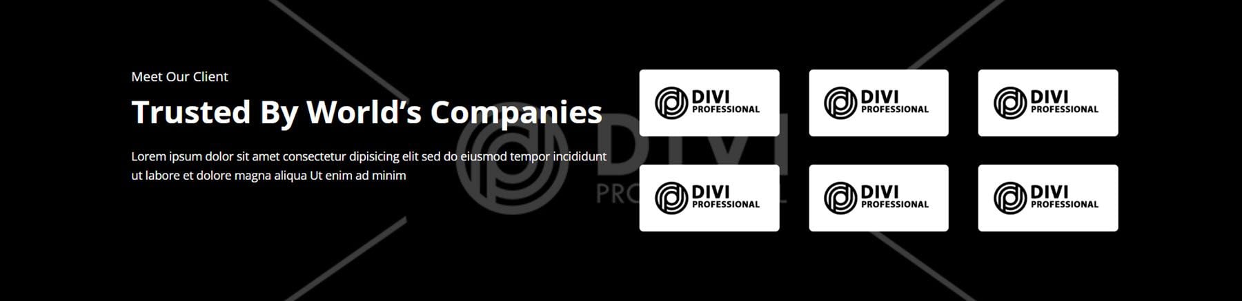
You can display logos of clients you’ve worked with on your website to build trust and credibility with your website visitors. Logo Style 4 features three logos on the left and a white box on the right with a title, body text, and a view more button.
In Logo Layout 7, the header, subheader, and description text are on the left, on a large image background that spans the full width of the section. On the right, six logos are displayed on white backgrounds.
Logo Layout 11 is a relatively simple layout with four logos displayed on a grey background. In this layout, the logo size increases on hover.
Newsletter
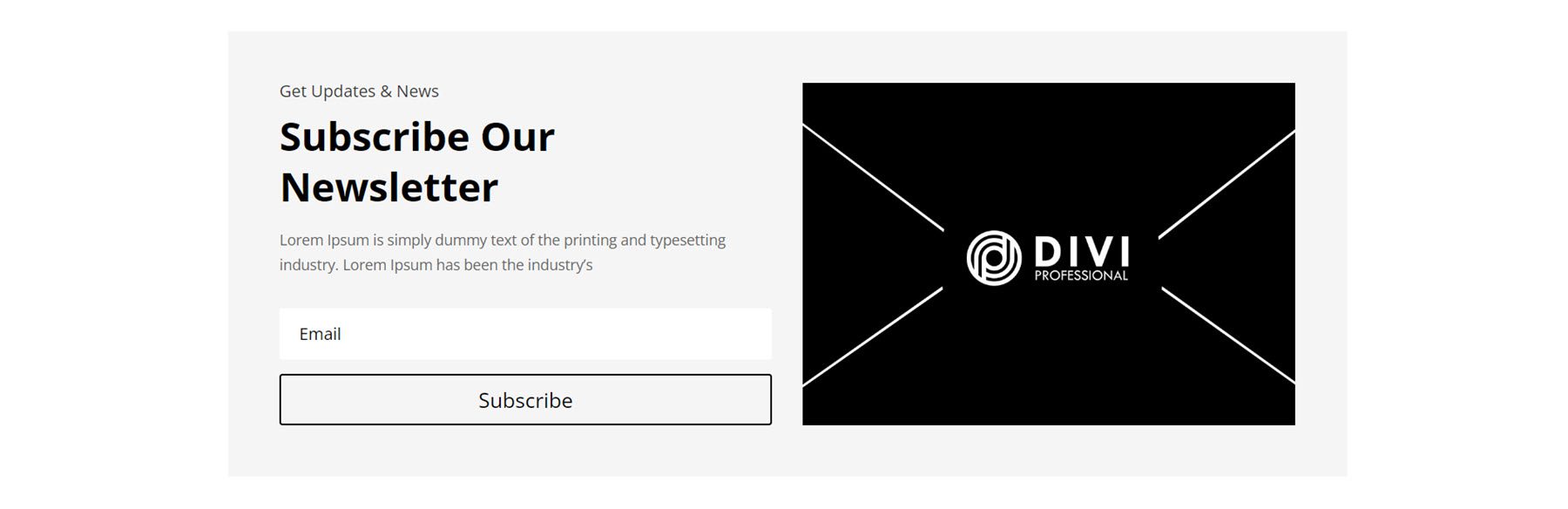
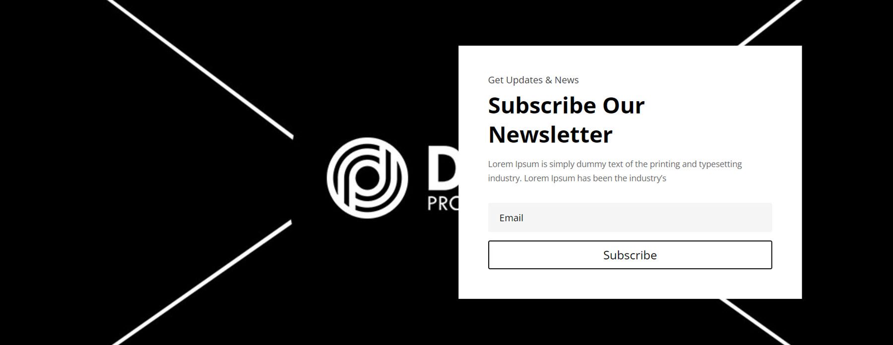
Next is the newsletter section. The first layout we’ll take a look at is Style 4. It has some introduction text on the left, followed by the newsletter sign-up form. On the right, there is an image. The section is on a light grey background.
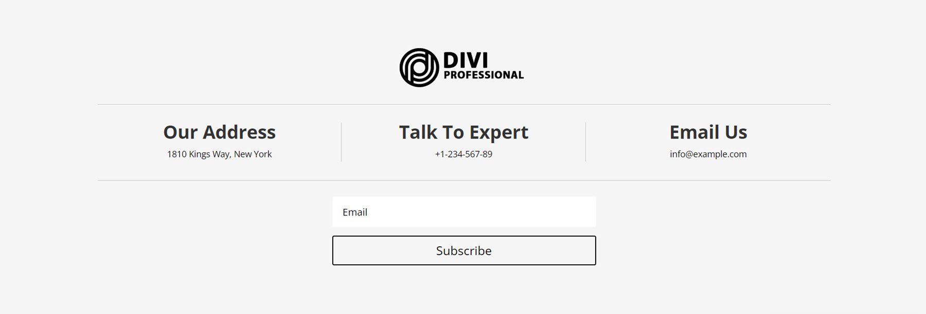
Style 10 can work great as part of a footer layout. It features a logo at the center, followed by three columns of contact information with thin divider lines. Below this is the newsletter sign-up form.
Newsletter Style 12 is laid out with a full-width image set as the background. On the right side, the newsletter copy and sign-up form appear on a white background.
Pricing
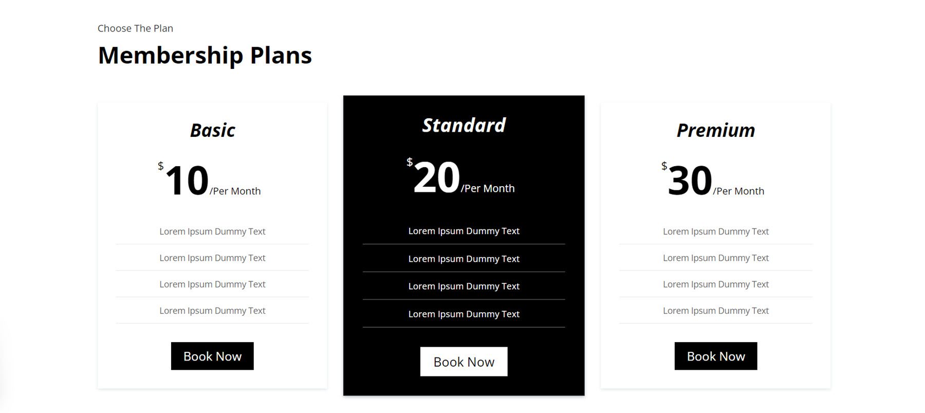
In Pricing Layout Style 3, there are three columns with the price listed in a large font size at the top. Features are highlighted below, with a divider line in between. At the bottom of each column is a Book Now button. The price box increases in size on hover.
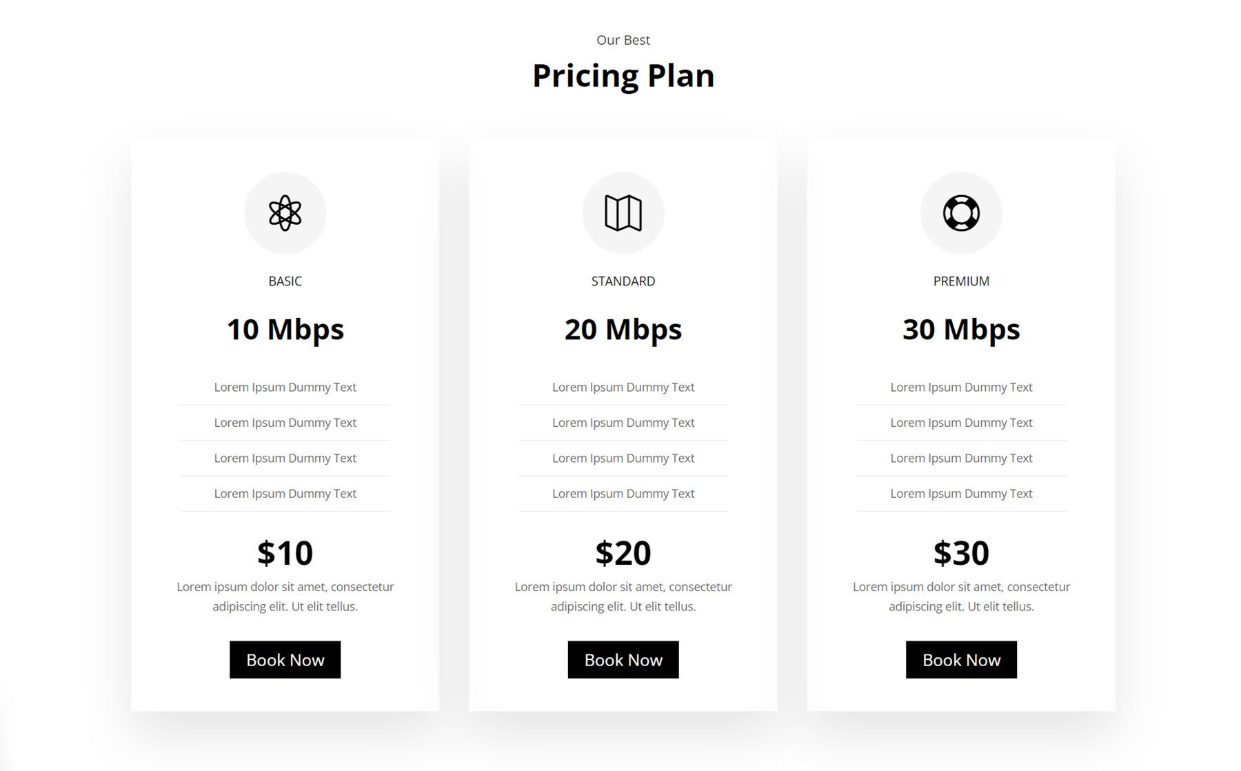
Style 14 features an icon at the top of each pricing column. Below is the title and subtitle for each tier, then features separated by divider lines. The price is listed below, followed by some description text and a button.
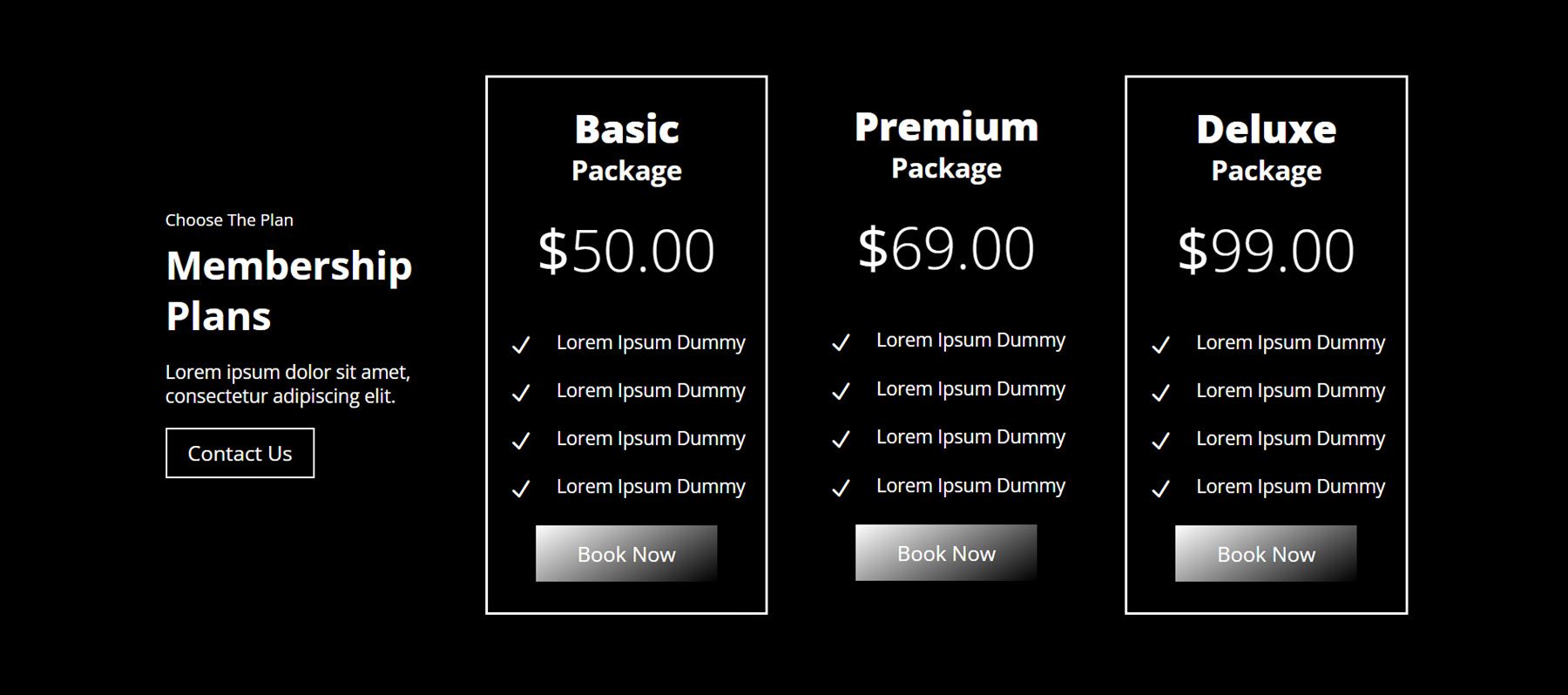
For Pricing Layout Style 37, the text is displayed in the leftmost column alongside a Contact Us button. On the right are three columns of pricing details. At the top is a heading, followed by the price, some features highlighted with an icon and a book now button. The layout is placed on a dark background, and the buttons feature a greyscale gradient effect.
Projects
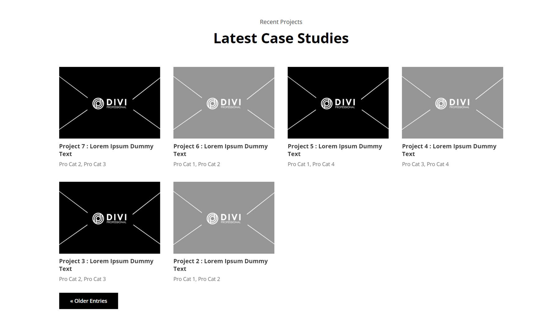
With the projects section layouts, you can display your featured projects in several different ways. First, let’s take a look at Style 2. It uses a standard layout with the featured image of each project, followed by the title, and then the categories. A button at the bottom left corner allows you to navigate to older entries. On hover, a dark overlay appears over the image.
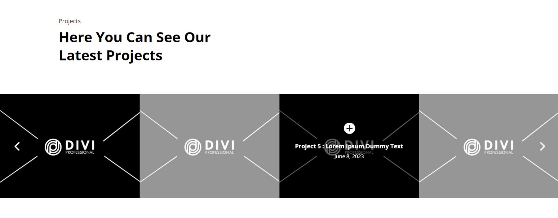
Next, Project Style 5 features four projects with the images displayed in a seamless row. On hover, a dark overlay appears along with a plus icon and the project information.
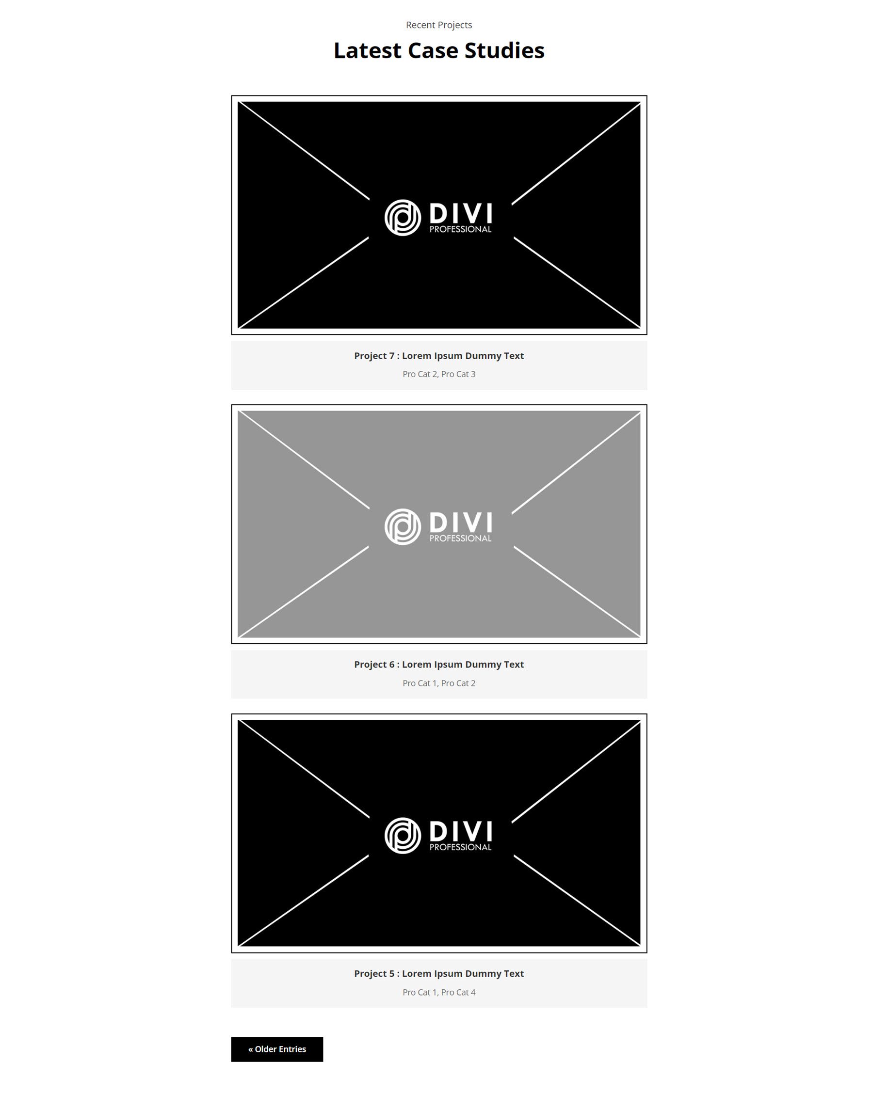
In Style 18, projects are laid out in a single column, one after another. With this layout, you can guide your visitor through viewing one portfolio item at a time. Each item has a large featured image with a black border. Below, the project details are listed on a grey background.
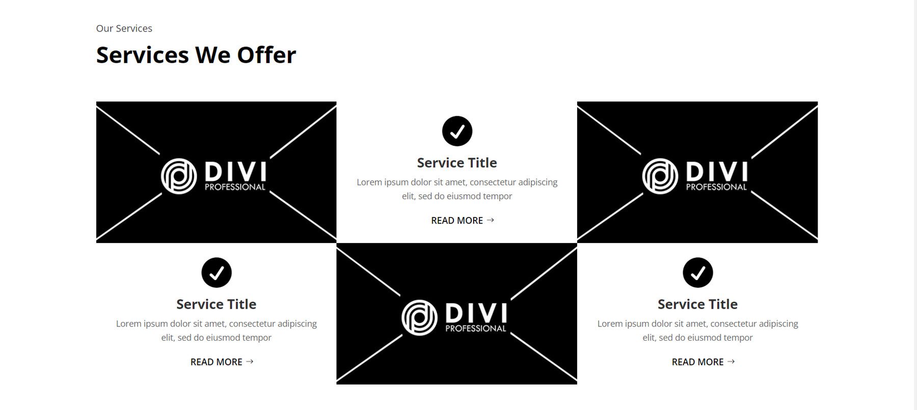
Service
Now let’s take a look at the service layouts, where you can showcase the variety of services you offer and give important details about your services.
First is Service Style 11. The services and images are organized in an alternating layout. Each service item is displayed with an icon and a read more button.
Service Style 79 has four boxes with rounded corners, each box with a title and body text. Each box has a black circle at the top with a number. On hover, the box moves up and the background turns red.
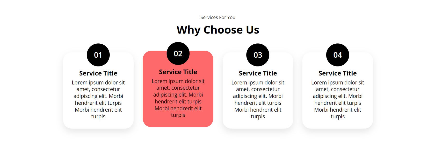
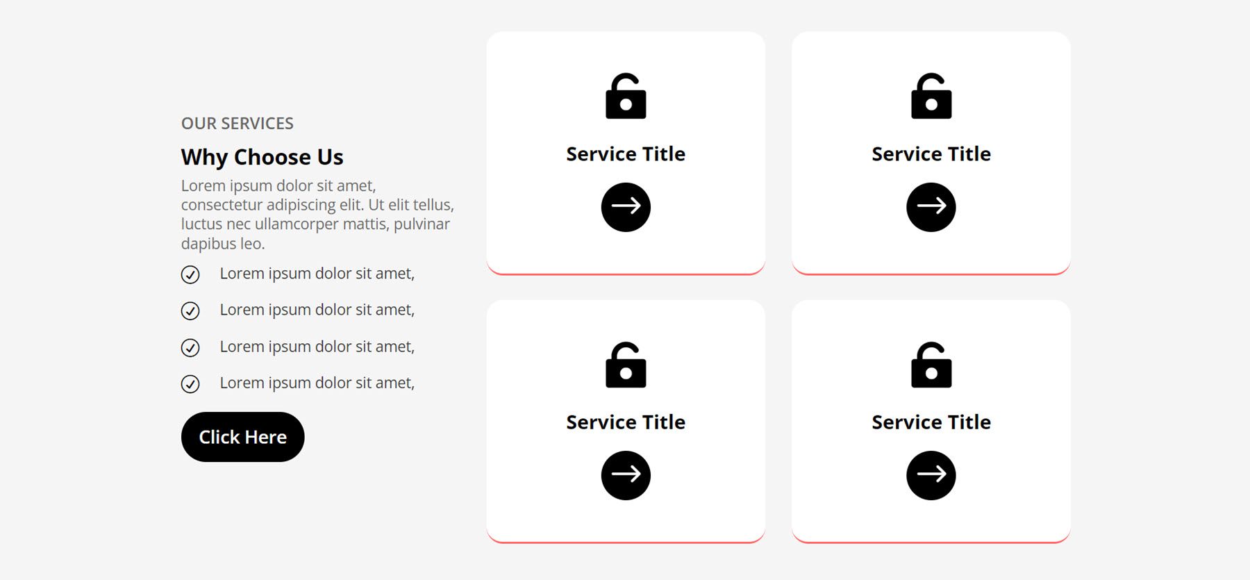
In Style 92, the left column features a title and subtitle, body text with details, four blurbs with check icons, and a Click Here button. On the right, there are two columns with service boxes. Each box has a large icon, a heading, an arrow button, and a bottom border.
Slider
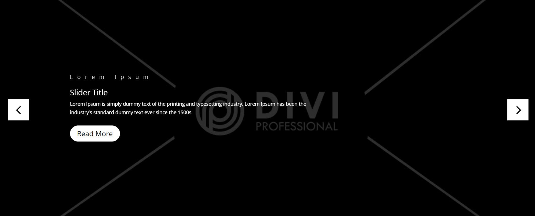
Next up, slider layouts. First is Slider Layout 3. It is a full-width slider with a large background image for each slide. On the slide itself, there is a subheader, header, body text, and a read more button aligned to the left.
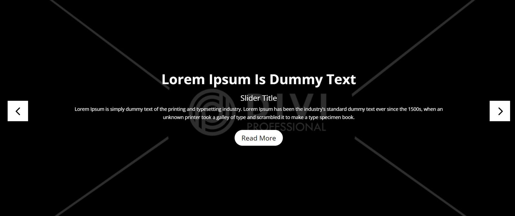
Next, Slider Style 8 has a similar layout, but the heading text is large and the content is aligned to the center.
Finally, Slider 14 has center-aligned content surrounded by border lines on the top and the bottom. The slider uses a pill-shaped indicator for the active slide instead of a standard circle, adding subtle design flair to the layout.

Tab
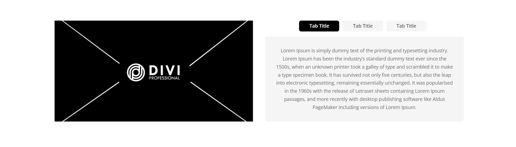
Tabs are a great way to condense and organize information on a page. Let’s take a look at Style 1. It features an image on the left, with the tabs on the right. The tab titles are centered, with a black background for the active tab.
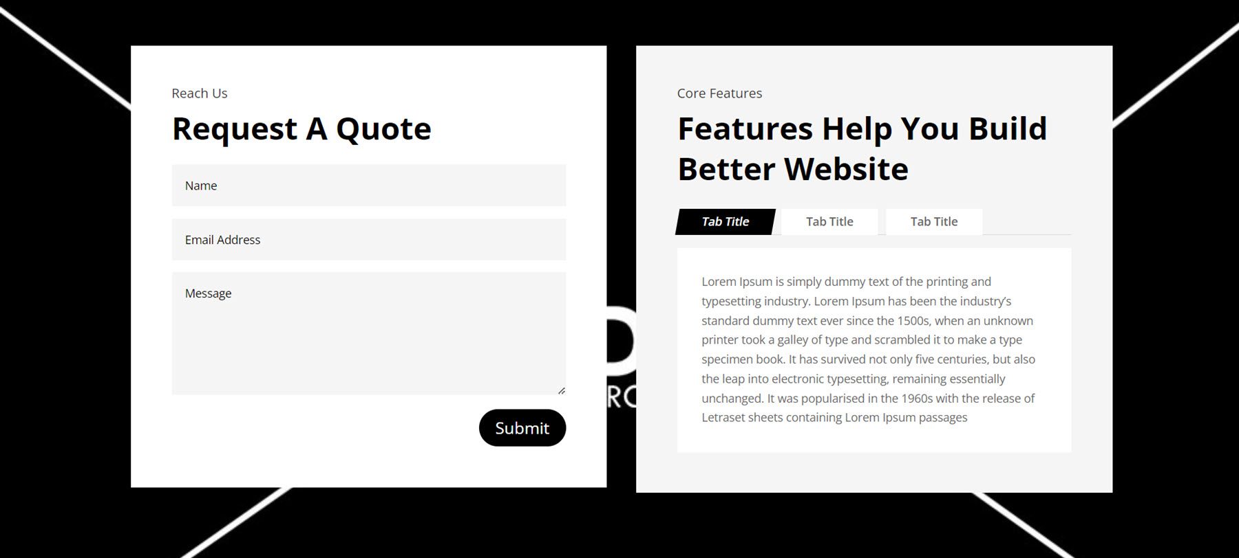
Next, Tab Style 9 features a full-width image background. On the right is a contact form on a white background. On the left is some heading text, followed by the tab section. When selected, the tab title container has angled sides and a black background.
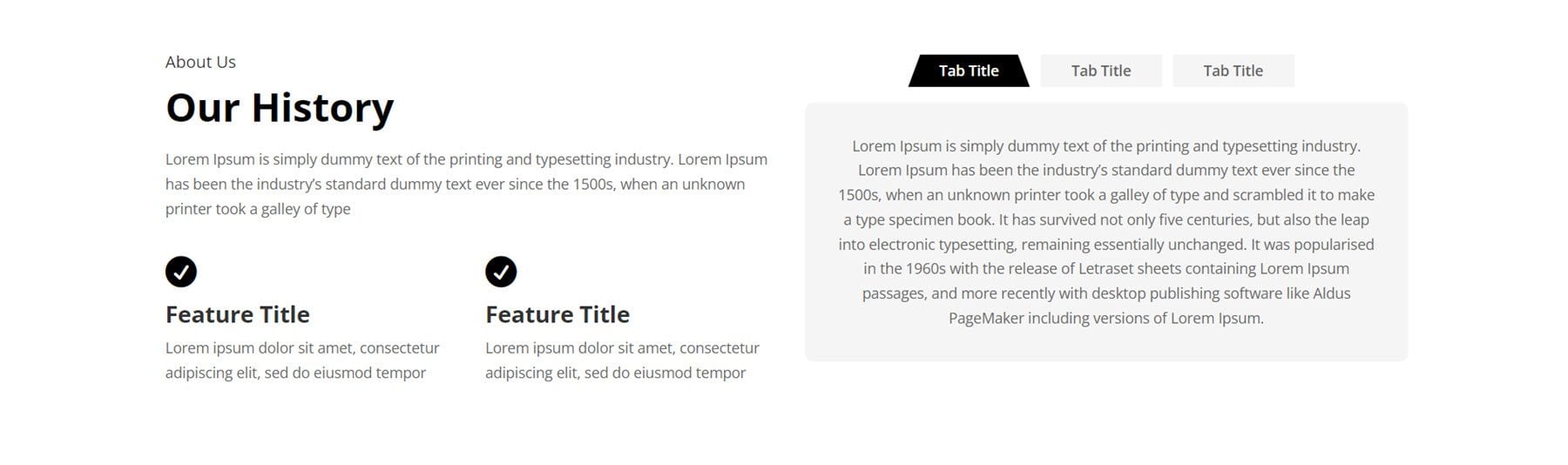
For the last tab section, we’ll take a look at Style 12. It has some text on the left, along with two blurbs with icons to highlight features. The tab module is on the right, with a grey background. When selected, the title container has angled edges and a black background.
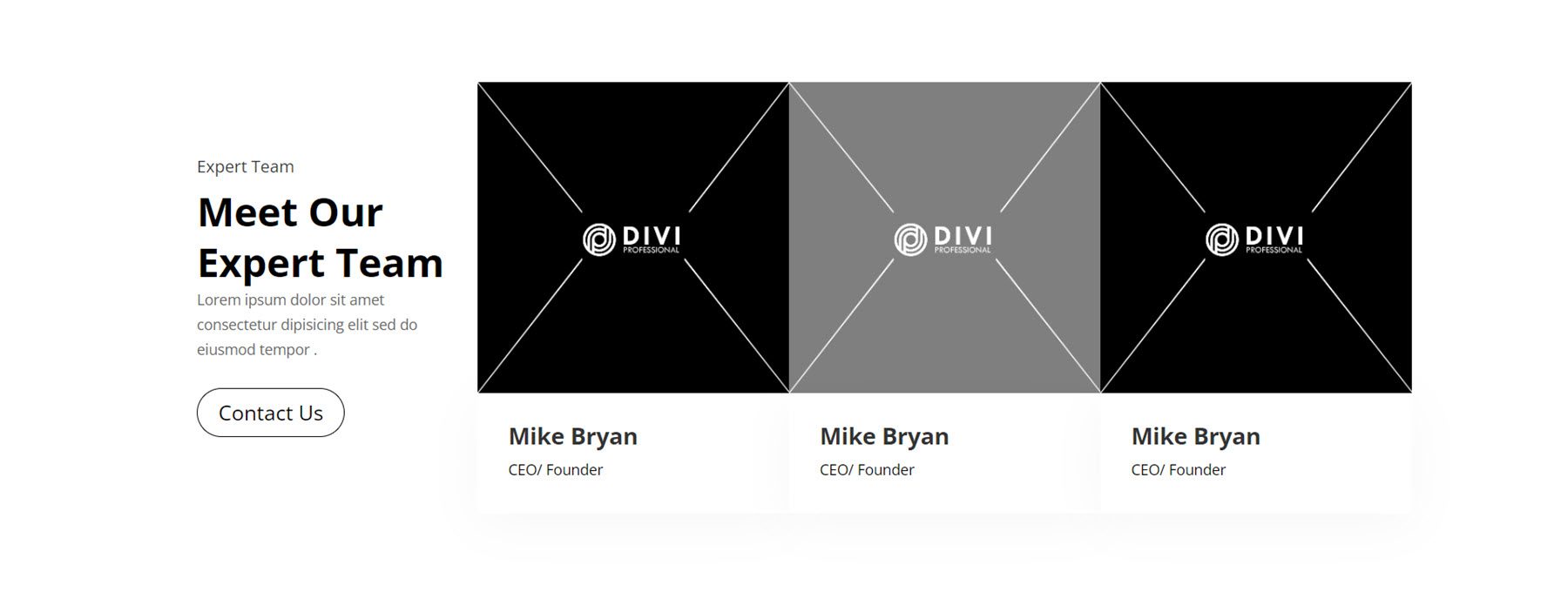
Team
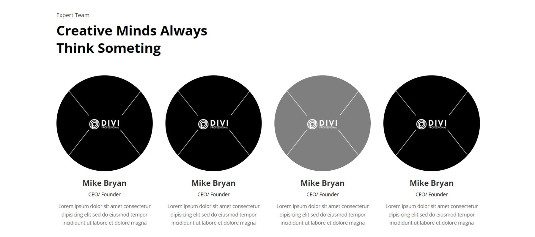
The Ultimate Multipurpose Divi Wireframe Kit comes with many different ways for you to show off your team members. Let’s start by taking a look at Style 11. This layout features round images, followed by the name, job title, then description. On hover, a grey overlay appears over the image.
Next up, Team Layout 34. This one uses a grey background and displays team members within a card-style layout with rounded corners. Each team member features an image, followed by the name, job title, and social media links.
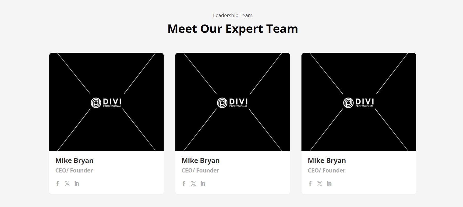
Finally, Team Style 42. In the first column on the left, there is some text and a Contact Us button. On the right are the team members, displayed seamlessly. Each person has an image, followed by their name and job title. On hover, a grey overlay appears over the image.
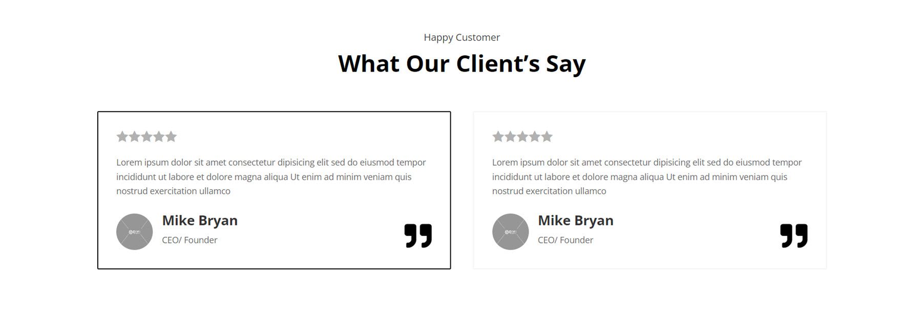
Testimonial
Testimonials are an excellent way to build trust with website visitors and demonstrate your qualifications. In Testimonial Style 10, there are two testimonial boxes, each with a star rating, testimonial text, an author image, author name, author job title, and a quote icon at the bottom right corner.
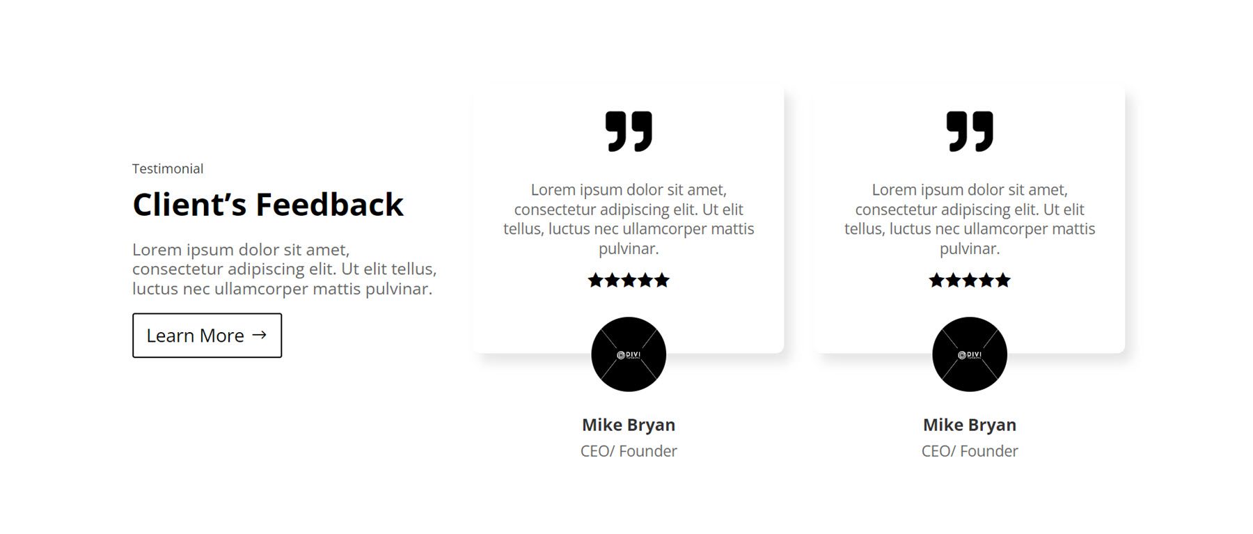
Testimonial Style 32 features a Client Feedback heading with some copy and a button on the left. On the right are two testimonial boxes with a large quote at the top, followed by the quote and star rating. The author’s image is displayed over the bottom edge of the box, followed by the author’s name and job title.
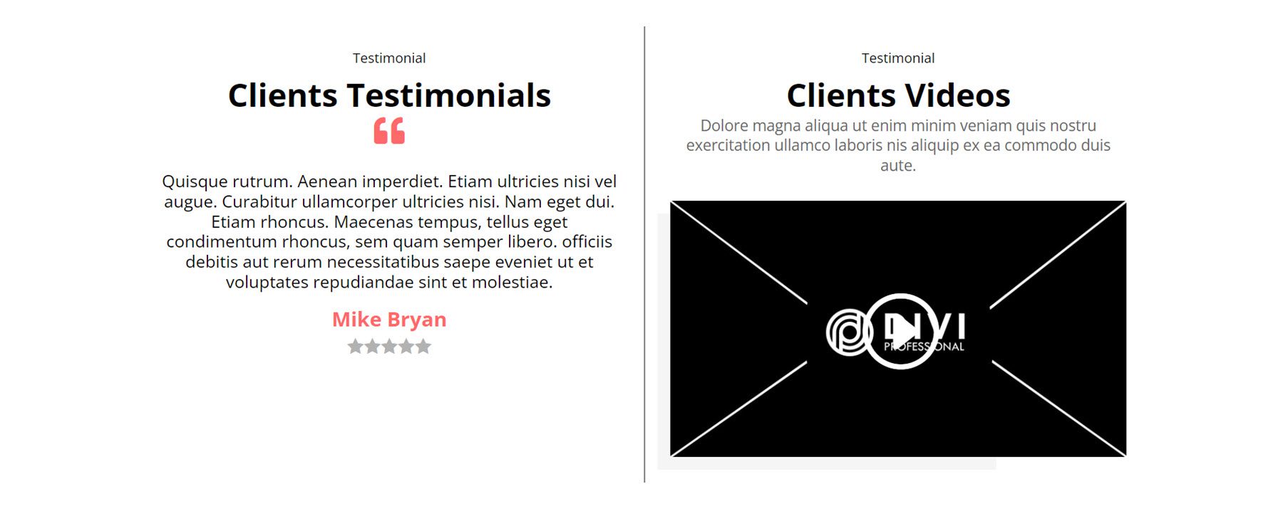
This is Style 97. In this layout, a client testimonial is located on the left, with a quote icon and a star rating. On the right, separated by a divider line, is a video module for client videos. This could be an interesting way to add a more interactive and compelling testimonial to your website.
Timeline
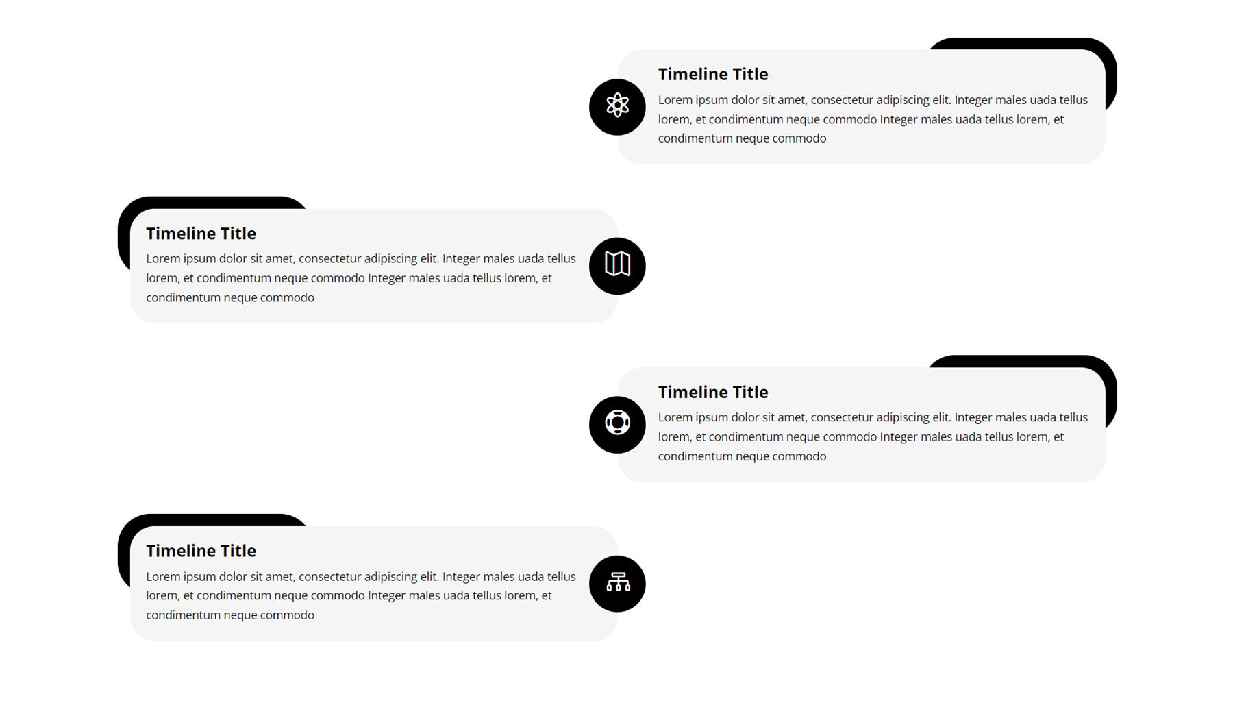
The final layout style we’ll take a look at is timelines. These can be great ways to display a sequence of events or display the history of your business, for example. The first style we’ll take a look at is Timeline Style 6. It features an icon for each timeline item, centered on the page. The alignment of each item alternates from right to left. Each item features a title and description text, along with the icon which is on a black background. Each item also features a black shape offset from the top corner, which adds some design interest to each item.
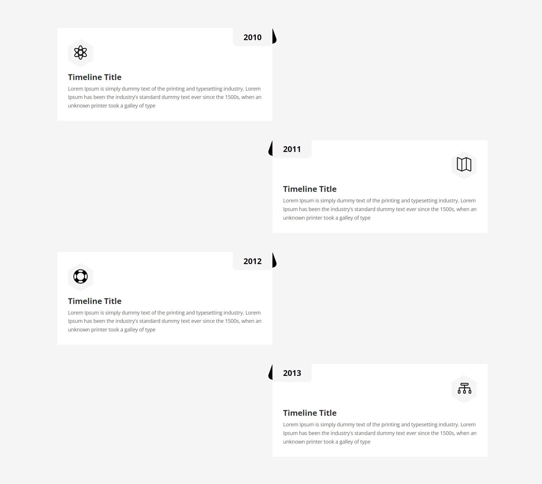
Next, Timeline Style 10 also uses an alternating layout, with the year marked in the top corner at the center of the page for each item. Each timeline item also features an icon, title, and description text.
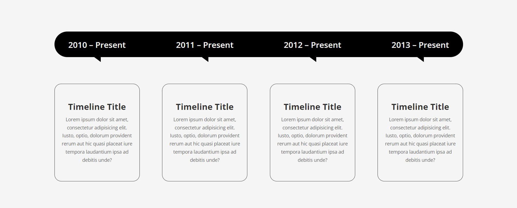
Finally, Timeline Style 18 uses a black bar with rounded corners at the very top, indicating the date for each item below. The individual timeline items feature a title and description and are surrounded by a thin border and rounded corners.
Divi Theme Builder Layouts
Ultimate Multipurpose Divi Wireframe Kit also comes with some layouts that can be added to the Divi Theme Builder to style the header and footer for your website. Let’s take a closer look.
Header
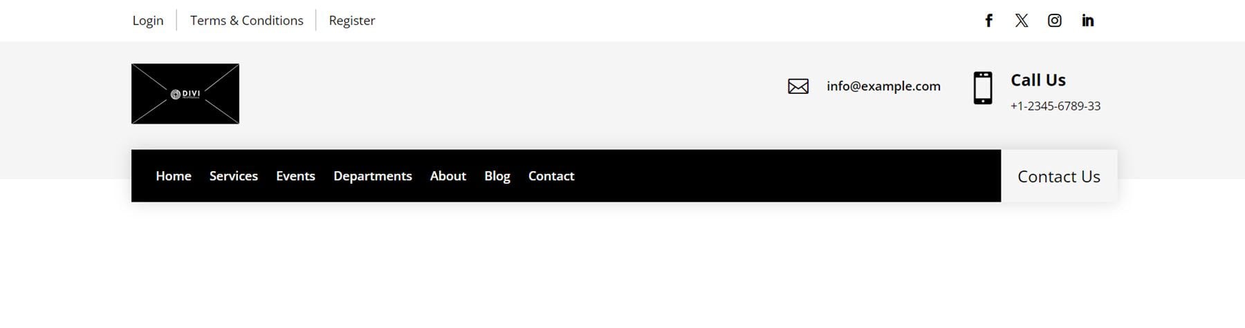
The first header style we’ll take a look at is Header Style 7. It features a white bar at the top with some links on the left and social media icons on the right. Below this, on a grey background, is the logo, email address, and phone number. Then, there is a black bar that contains the menu and a Contact Us button.
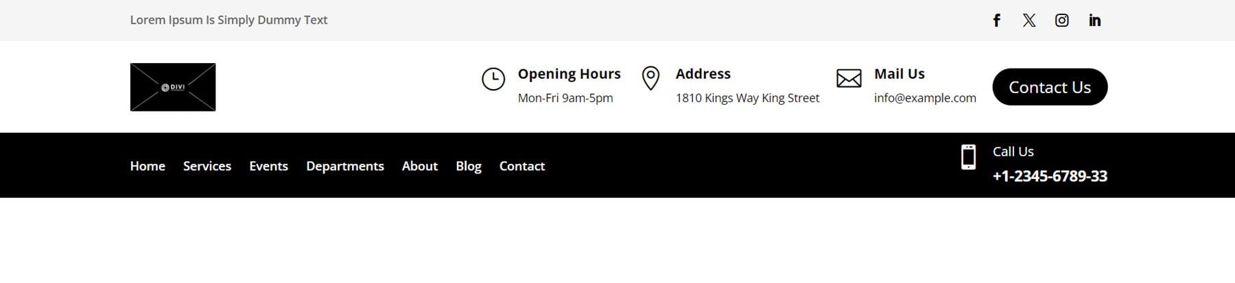
Next, Header Style 11 starts with a grey bar at the very top containing a short line of text and social media links. Next, on a white background, is the logo as well as three blurbs with icons that display the hours, address, and contact information. This section also contains a Contact Us button. Finally, the black bar contains the menu and a blurb with the phone number information.
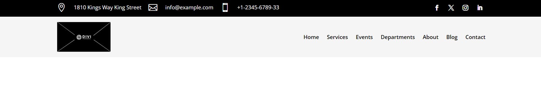
Finally, Header Style 20 opens with a black bar containing contact information alongside icons and social media links. Then on the grey background below, there is a logo and a menu module.
Footer
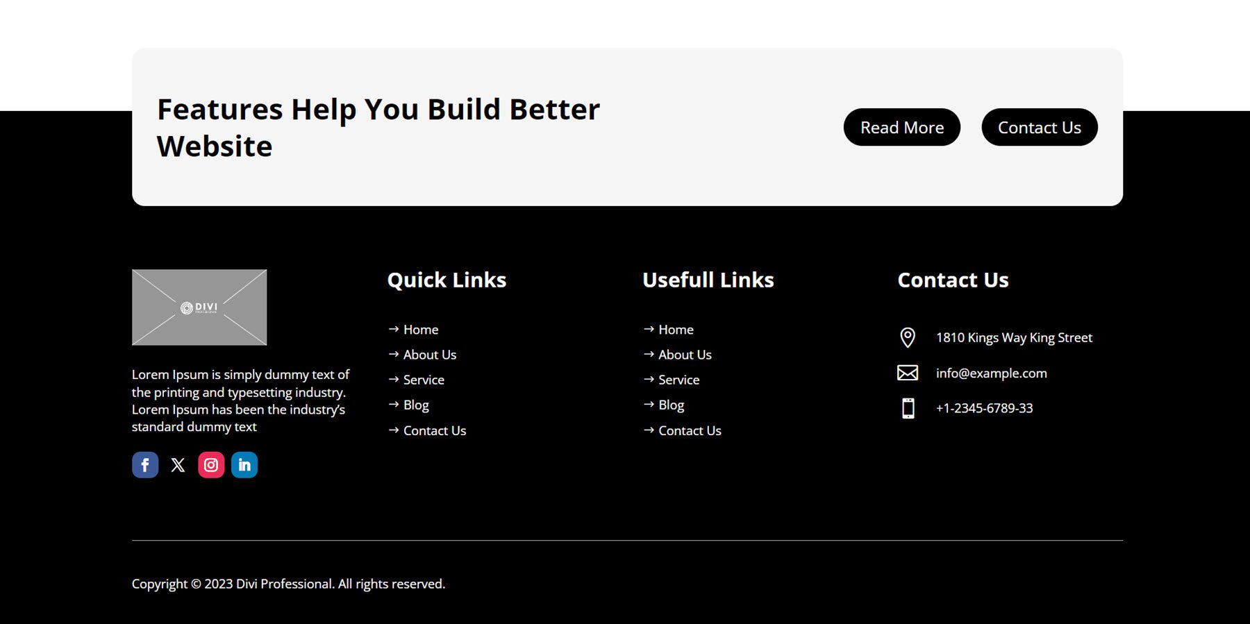
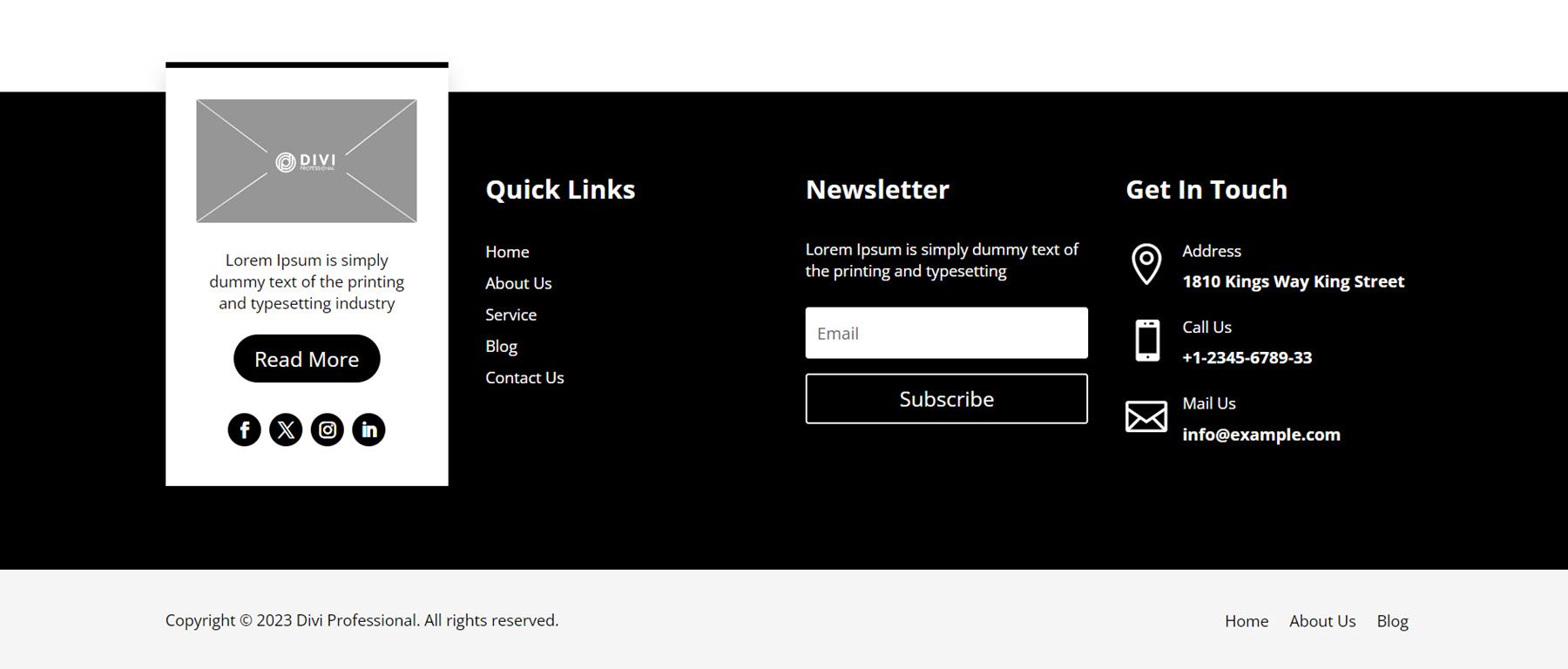
First, let’s take a look at Footer Style 6. It has a unique design with a call to action section containing some copy and two buttons at the very top of the footer. Below, the primary footer section contains a column with a logo, description text, and social media icons. Then, two columns with navigation links. On the right, contact information is displayed along with icons for each item. There is a divider line below these items, followed by some copyright text for the site.
Footer Style 15 starts off with a row containing an image or logo, the address, an email address, and a phone number, along with icons for each of the contact items. The items in this first row are separated by thin divider lines along the bottom and in between items. Below this section, there is an about us section with some text and social media links, two columns with links to site pages, and a newsletter sign-up form. At the very bottom, there is a black bar that contains the copyright information for the site.
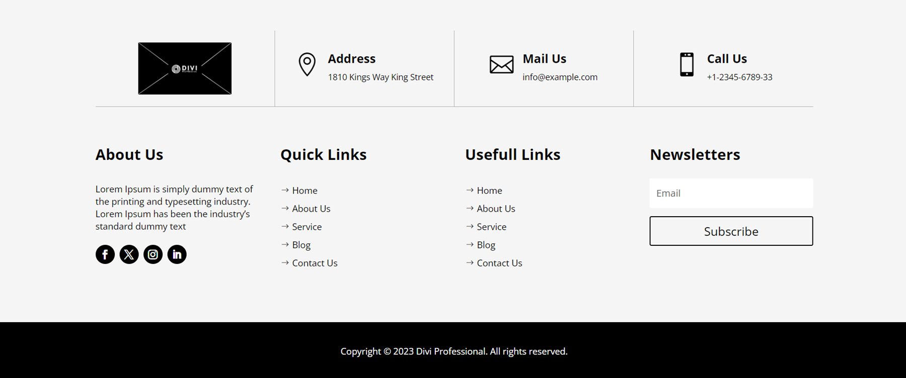
In Footer Style 18, the first column features a block with a white background sticking out above the top of the black footer section. This block highlights an image or logo, some description text, a read more button, and social media links. To the right of this is a Quick Links column with links to some pages, then a newsletter sign-up column, and finally, a Get In Touch column with blurbs that feature contact information such as the address, phone number, and email. Below the primary footer section is a sub-footer strip with a grey background, featuring the copyright text and three page links.
Where to Purchase Ultimate Multipurpose Divi Wireframe Kit
Ultimate Multipurpose Divi Wireframe Kit is available to purchase from the Divi Marketplace. It costs $9.00 for unlimited website usage and lifetime updates. The price also includes a 30-day money-back guarantee.
Final Thoughts
Ultimate Multipurpose Divi Wireframe Kit comes with 22 different layout types and over 1000 unique styles that can be used to build layouts for your website quickly. Because the designs in the kit are wireframes, they are not overly styled and can be used as the basic structure for any type of site you may want to create. Everything is created with Divi modules, so it is easy to open the module settings and apply styling to transform the wireframes into fully styled sections for your design. If you build websites and want a solution that can help you jumpstart the process while still leaving the design direction up to you, the Ultimate Multipurpose Divi Wireframe Kit might be an excellent option.
We would love to hear from you! Have you used the Ultimate Multipurpose Divi Wireframe Kit? Let us know what you think about it in the comments!


I just purchased the Wireframe kit. One question. Where can I find a visual reference of all of the json files? Thank you.
You can check them in the demo page created by the author of this Marketplace product: https://diviwireframekit.com/preview-of-webkits/
The Divi Wireframe kit is like a wholesome package for setting up the website elegantly and beautifully. The Counter Style 100 seems to me to be the most amazing feature that has elegant pre-defined CSS settings.
Once it’s purchased and installed, where can I see the actual layout so I know which one to use?