
It’s time again for our monthly Divi Showcase where we take a look at 10 amazing Divi websites made by our community members. Each month we showcase the best Divi websites that were submitted from our community and today I want to share with you the top ten websites for the month of September. Throughout the post, I’ll point out some of my favorite design features that draw me to each of the websites.
I hope you like them!
Divi Design Showcase: New Submissions from September 2018
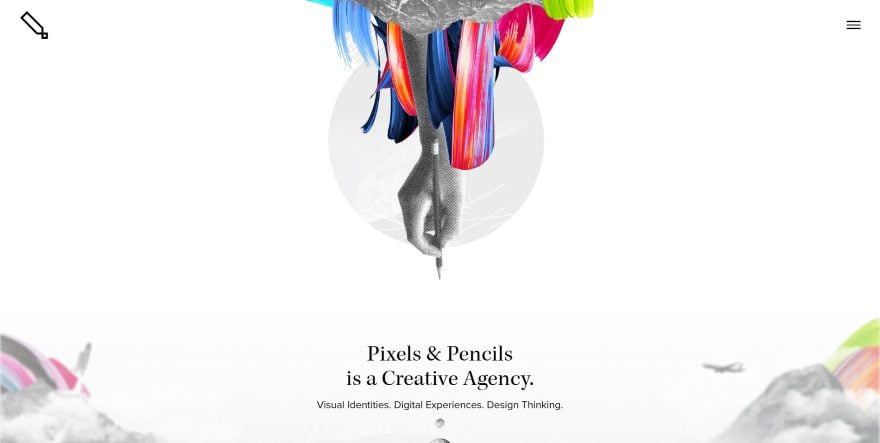
1. Pixels and Pencils
This website was submitted by Tyler Diaz. A nice full-screen header showcases what this site is about using graphics and color along with interesting designs. The next section shows client logos with a button to learn more. A featured work section displays projects as cards with images, text, button, and shadow effects. I love the last section, which shows another set of graphics with a simple call to action and social buttons placed within an angled section. The work page displays larger versions of the projects cards, with each one taking the visitor to a simple and elegant project detail page. I also love the simplified use of color and graphics.
2. Andrea Masotti
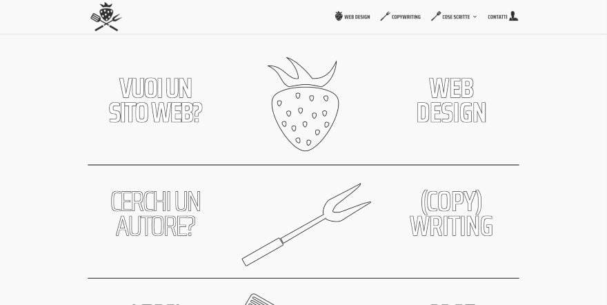
This website was submitted by Andrea Masotti. This site makes interesting use of Divi’s modules. Three rows show three columns that include text on the far right and left and a graphic in the center. The text and the graphics use black outlines with white for color that blends with the background. Each row is separated by a black line. Hovering over just the row turns all of its elements black. Hovering over a specific element within the row changes its color to red (for text) or red and blue (for the graphics). The red and blue graphics are used as header elements for the portfolio pages. This website is an excellent example of how something simple can make a big statement.
3. Adriano Alfaro
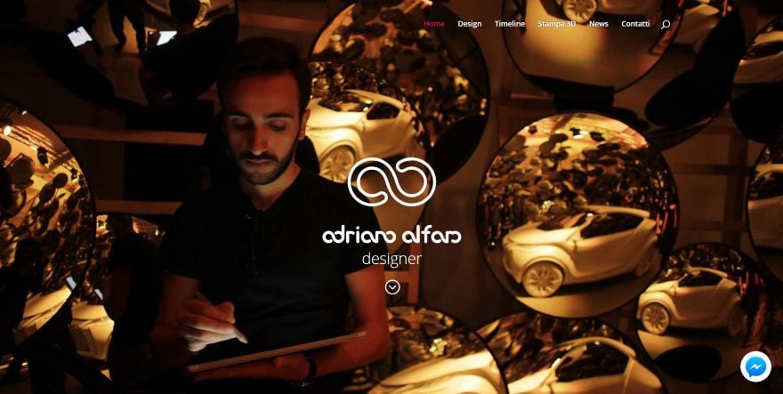
This website was submitted by Adriano Alfaro. It displays a full-screen header with a title and description followed by a short about section with social follow so you can know instantly what the site is about and engage with the designer. Blurbs with large icons, descriptions, and links show the services. The next several sections are my favorite. They display an image on one side and text on the other in full-width and include links to the portfolio. They alternate sides as you scroll. A video background plays behind an award with quote and CTA. I love the portfolio page, which displays wall-to-wall images of clickable projects. The individual project pages are where this site really shines. They are a beautiful example of modern layout design. Be sure to look at the Fiat page.
4. Emily Merchant
This website was submitted by Emily Merchant. This one creates an interesting header using a CTA. The CTA is created with an image, border, type of work provided, title, and buttons. Three images sit under this. They include a title in an overlay. Hovering changes their color and shows a border, creating an elegant project page CTA. An about section is created with a quote and text. Another portfolio CTA draws graphics as you scroll to it. The portfolio page creates a multi-column layout with each image having its own overlay colors and continuing the hover effects.
5. INTROAMERICA

This website was submitted by Vincent Valentino. This one makes great use of bold colors and parallax effects. The full-screen header starts the site with a nice background that showcases the text and buttons. A section that shows what they do displays a topographical map with jagged edges to separate it from a section of blurbs, which display blocks with shadow effects. I love the sections with case studies. An image of the complete design is shown in the background while overlapping text and an image scroll over in parallax. Recent projects are displayed within a multi-column layout. This site makes excellent use of a one-page design.
6. Weather Station
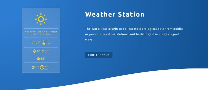
This website was submitted by Pierre Lannoy. This is the website of an app. It keeps the design simple and makes great use of color. I especially like the blue backgrounds with a subtle gradient that’s used throughout the design. A wavy section separation sets the header apart while benefits are shown with images and text modules. The site also makes good use of number counters, which actually display useful stats of downloads and public installs. Just under this is a section that shows the ratings of the app and includes graphics of the star-rating. Testimonials are clean and include shadow effects. I also like the blog page, which displays images as cards in two columns with a box shadow, a title, and a button. Hovering shows a blue overlay with an excerpt from the post. The latest post is shown full-size in a single column. The individual posts also use box shadow effects and include post navigation and comments modules.
7. Goodimalist
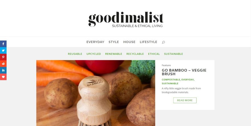
This website was submitted by Daragh Wallace. This site focuses on a blog layout. It displays an extra-large header to show the logo front and center. Under this is two navigation menus: the main topics are placed in the primary menu, and sub-topics are placed within a secondary menu with a slightly smaller font in green. A featured post shows an image to the left side, and the title, categories, excerpt, and read more button to the right side in a smaller box. Together they take the full-width of the content area. Following this is a blog section with 9 posts in three columns. The posts display the featured image, title, categories, short excerpt, and a button. The writer in me loves the full-width section showing the definition of the website’s title. The blog posts also keep a clean design with the featured image, text, a CTA, an image slider, a video (for some of the posts), and a blog section with three posts. This site is a great example of a clean blog design.
8. Jerrix

This website was submitted by Jeroen Rotty. It uses some of my favorite colors (I’m from Tennessee, and I’m partial to orange). The header uses parallax with a CTA. A styled section separator helps create the white-space for the next section, which provides ‘about’ information with a link and circled photo. Services are shown with large two-color icons that utilize the orange highlights and hover effects. Screenshots of recent work also use hover effects and include a shadow box effect. The portfolio page continues the recent work design. Clicking on one takes you to the website itself so you can see the work firsthand. The WordPress page displays the benefits in two columns and includes hand-drawn graphics throughout the page. I love the colors on this site.
9. Mothers at Risk
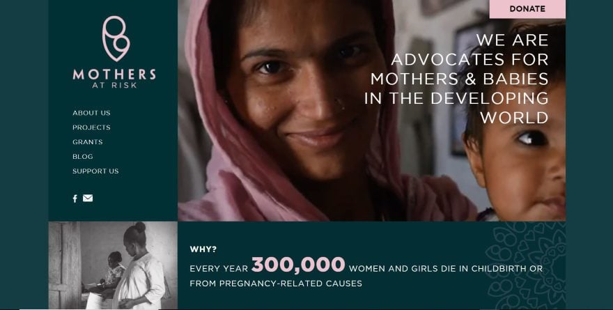
This website was submitted by Swag Design Factory. It uses a boxed design with a multi-column layout. The header displays the logo, menu, and social follow buttons vertically to one side with a video and tagline on the other side. An image and information section uses the same row layout but alternates the image and text. Several two-column sections show an image with an overlapping button and text with CTA. A full-width testimonial utilizes the site’s logo and colors to blend perfectly. The individual blog posts display a background pattern with the title and social follow buttons for the header followed by the post and sidebar, which are styled to match the site. I love the dark green and pink highlights used throughout the site.
10. Wems Wireless

This website was submitted by Philip Wantling. It utilizes branded colors (orange and green) with images of electronics (with the same branded colors) to describe this business website. This is seen in the full-screen header and throughout the site. Four images in two columns link to the various products. I love the CTA that provides an animation with title and button. It overlaps the previous section (of client logos) and is accompanied by a set of blurbs to describe the benefits. CTA’s for demos use standout ribbons in the corners of the images. The products are shown with multi-column layouts that lead to product links. The individual product pages also include some sweet Divi styling for the product descriptions and page background patterns. This site makes great use of layout design and color.
In Conclusion
That’s our 10 best community Divi website submissions for the month of September. These sites look amazing and as always we want to thank everyone for your submissions!
If you’d like your own design considered please feel free to email our editor at nathan at elegant themes dot com. Be sure to make the subject of the email “DIVI SITE SUBMISSION”.
We’d also like to hear from you in the comments! Tell us what you like about these websites and if there is anything they’ve done you want us to teach on the blog.
Featured Image via Koksharov Dmitry / shutterstock.com


I love in number two how the object changes state when you hover over it. How did they implement this?
Hi Tricia,
sorry to be this late on answering. In order to change the state of those objects the trick is having multiple objects, one for each “state”. Those objects are images of the same size: an outlined strawberry, a black strawberry, a colored strawberry. You stack all the 3 images in a column and then you have to add some custom CSS in order to set a position:absolute for 2 of those 3 images, so taht 2nd and 3rd ones will overlap together with the first, just as Photoshop layers do in an image file.
Then, again via CSS, you hide 2 of them and show a 3rd one based on events: hovering of the row (the black berry displays), or hovering of that specific column containing the berries (the colored berry displays).
The CSS code is not that much, probably a dozen properties to be used and set, and CSS3 is worth the time you could spend on figuring out how it works and what you can accomplish with it (with always en eye at compatibility issues). If you’re already skilled, you just have to try and play with it!
And now, most of the work you can do with Divi new hover features.
Enjoy and have fun!
Andrea
Dear Divi team,
thank you for selecting my website! I really appreciated the comment about it, you really digged in every aspect of the design.
Thanks, thanks, thanks!
Adriano
Hi Randy, and thank you for the mention!
Working with Divi is such a big pleasure for me, and that’s why I develop and design with it every time I can (every other time, I spend huge amounts of time wondering why “they” cannot set up builders and shortcodes and overall logic the way Divi and its builder do!).
Cheers and “ciao”!
Awesome. Thanks for the mention.
Nice collection of sites my favs
2 & 8- creativity 7 for creativity and content and 10 for content
Thank you Geochick!
Andrea
Thanks for the shout-out guys. We’re really happy with what we’ve created, and Divi was a key part of getting this thing live.
– Goodimalist
DOPE! This has been one of the best showcase of Divi websites in a long while. I mean a long while…I can honestly say that I like at least half of the website on this list.
My top favorites:
Pixels and Pencils
Intro America
Mothers At Risk
Hello, Randy.
Thanks for new suggestions. I have been watching these kind of posts for a long time and I always wonder if these homepages are really online?!
I don’t want to be a know-it-all, but no matter what the pages look like, their performance values certainly won’t get them ahead in the ranking >> never ever. Loading times between 5-17 seconds, Google scores far below green and FirstByteTimes beyond horizon are simply unacceptable.
That’s why I personally can’t take the creators of these pages really seriously. ALL my customer pages reach on Google 100/100 with 0200 FBT, and a loading time of round about 3 seconds an a rendering time of 0800.
I apologize for my direct words, but it leaves me stunned. And those who claim now that performance is not important – Sorry, but they have no idea ..
Keep going – best – Eric
You are right. However, these sites can be optimized without changing the looks. I think ET is showing what can be done visually. Optimization can still be accomplished.
Dear Eric,
Could you tell what tools you use to test the performance of your websites?
Hi Eric,
thank you for your hints. I can only speak on behalf of myself and my website but indeed my site is online and alive. This said, it’s true I’m not worrying at all – in this particular case only – about performances, SEO and SERP rankings. The reason why is the way “it all works” in Italy in a field – copywriting and web designing – where unfortunately no potential customer will ever rely on web search to find a professional but, instead, of what that “friend of a friend” could suggest… 🙂
We are kinda the middle-age of IT.
This said, thank you again for your notes.
PS: You should be fair, though. A large page with lots of content, animations and request cannot be as fast as a small one. The 100/100 still show whether the web designer has excluded all possibilities of compression, etc. . From there it is already an indicator for how much work behind the scenes took place.
Hey Genius.
I use two tools because each provides important information.
1. https://www.webpagetest.org
This is the most accurate one for me.
There I see the LOAD TIME, FIRST BYTE & START RENDER:
Of course I choose the server which is closest to my location.
2. https://developers.google.com/speed/pagespeed/insights
The Google Tool to see if I reach the 100/100.
The grotesque thing about the configuration is that sometimes you have to decide if you want to be one second faster or if you prefer to reach 100/100 on Google. One doesn’t always include the other. I personally like the 100/100, because you can also show this to your customers. . . (smile)
Here are some of my customer pages, where you can have a look at the results.
https://www.galabau-poscher.de/
https://www.ck-boote-service.de/
Eric