
It’s that time again for our monthly Divi Showcase, where we take a look at ten awesome Divi websites made by our community members. Each month we showcase the best Divi websites that were submitted from our community and today we want to share with you the top ten websites for the month of November. Throughout the post, I’ll point out some of my favorite design features that draw me to each of the websites.
I hope you like them!
Divi Design Showcase: New Submissions from November 2019
1. Atelier 1318
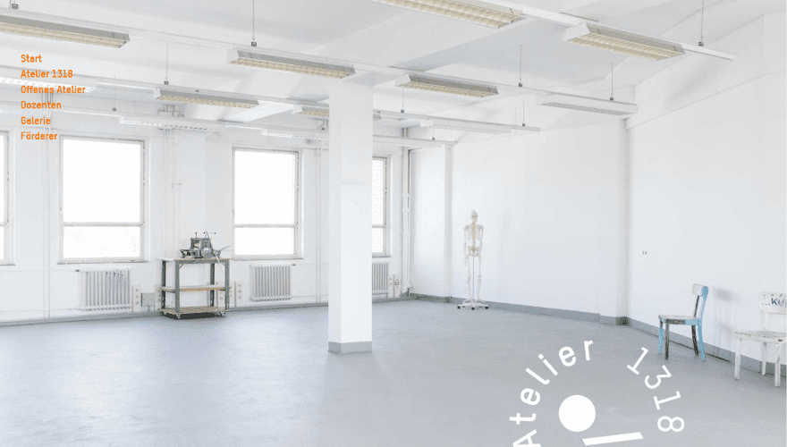
This site was submitted by Judith Augustin. This is a one-page design. The navigation menu for the sections is a list of vertically-aligned text that floats as you scroll. The hero section displays a full-screen background image in true parallax with an animated circling logo in the bottom right corner that overlaps the next section. Lots of sections provide information and links. Background colors alternate between black and white with several sections containing styled titles and numbers as introductions to the classes. Work is shown within a gallery slider that displays the description on hover. The images in the galleries open a tab where you can see the image on Instagram.
2. Tech Legal
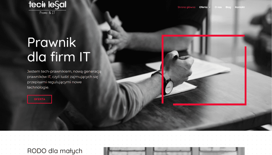
This site was submitted by Aleksandra Palecka. This one uses lots of bold red for the highlights. The hero section shows a background image in black-and-white with a CTA on one side and a line-drawn box in red on the other with two open corners. It’s amazing how much visual appeal something this simple provides to the layout. The next several sections have a background with a dot pattern that fades away as you scroll. These sections show several CTAs surrounded by black-and-white photos with red highlights. Highlights include images with red overlays, dividers, a line-drawn box, and buttons. This same box design is used to number the bullet points. The red overlay is also used to create a call CTA. I love the use of red in this one.
3. The Ridge Community Church
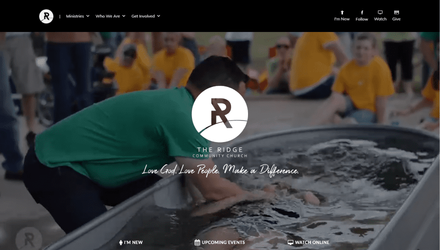
This site was submitted by James Smith. It plays a full-screen background video with a large logo and the tagline in the overlay. The mega-menu is placed on the left while the right includes social follow links and a few CTAs with icons above the text. Links appear at the bottom of the video and include hover overlays. A welcoming section displays an embedded video and an event with a link to see more of both. Events are displayed as cards within a slider. The events themselves on the Events page are displayed as custom post types with more in the sidebar. Beliefs are shown within accordions. I like the red highlights in this one.
4. Alight Media
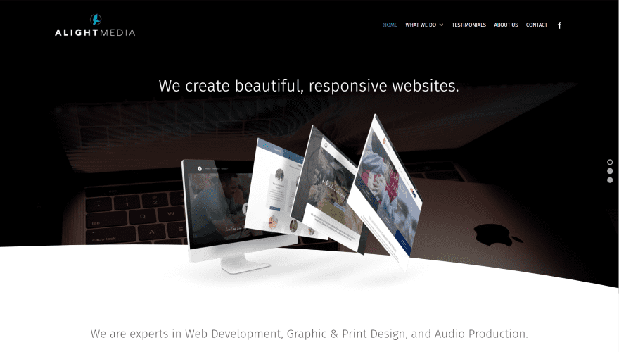
This site was submitted by James Smith. The hero section displays a full-width slider with a curved divider and styled verticle navigation. Several slides have images that overlap the divider. Services are shown within blurbs and include two-color custom icons. The mega-menu includes the same icons with the same titles as the blurbs. Another slider shows off the recent projects. This slider has a curved divider on top and displays the slides with rounded corners. A smaller slider shows client logos within blocks of color that’s just dark enough to stand apart from the background. The services pages display examples with a gallery grid.
5. Doctor Life Health
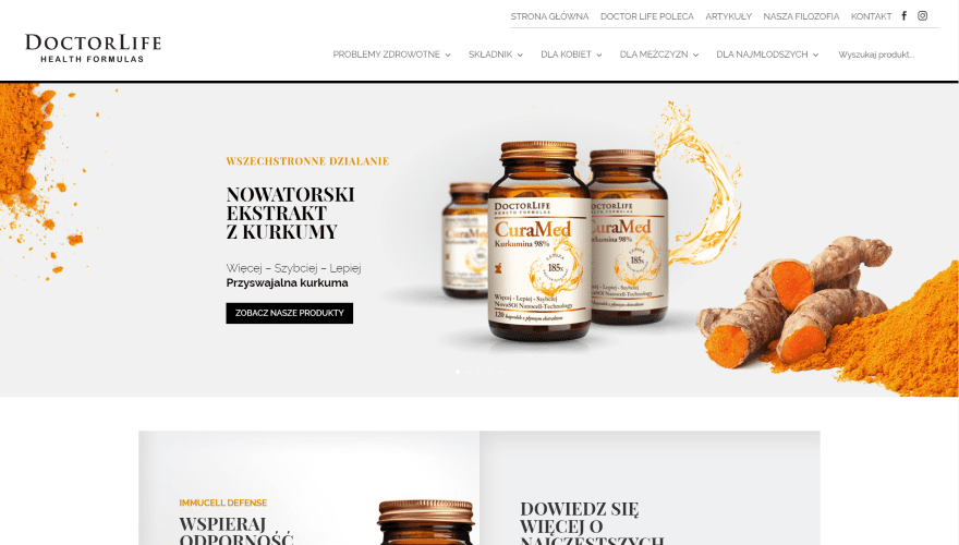
This site was submitted by Oskar Kopec. Products and a CTA are displayed within a full-width slider in the hero section. The slides include background images along the sides that make the images stand out. The next section shows a couple of CTAs to various products. These CTAs have a shadow that points inward, making them stand apart from each other even though they’re connected. The next couple of sections shows the products as smaller images within sliders. An information section shows images with descriptions in the overlays. The articles page shows images for categories with box shadows and includes titles and descriptions.
6. Jointly Media
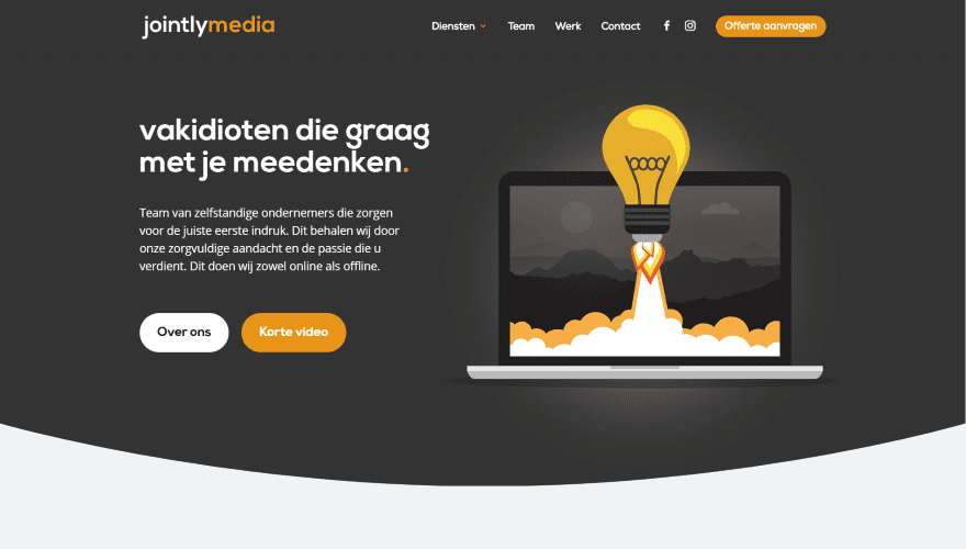
This site was submitted by Robin Kesting. It uses lots of bold yellow for icons, links, buttons, and more. Several backgrounds have curved dividers while many of the rows and modules have box shadows to stand out. The hero section shows a CTA to one side and a graphic on the other. An introduction is provided with an embedded video and a styled block of text. A set of numbered blurbs shows the benefits of using them. The numbers are placed behind the titles. It also includes a styled gallery that opens the image on Instagram, toggles to build the FAQ, a styled newsletter form, and a styled footer with an overlapping button.
7. Bishopton Dog Walking Services
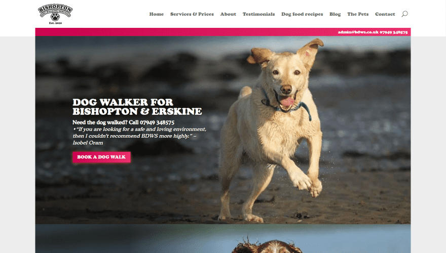
This site was submitted by Jamie Shanks. The header adds a bar to the top of the first image with a clickable email and phone number. The rest of the page is a series of almost full-screen images. The images show dogs at play and include CTAs and other information in the overlays. The areas where the text is placed is darkened. The styled contact form is also placed over a background image. This image is darkened even more, but it allows the center to show through. The blog displays posts within cards and includes a box shadow for the read more buttons. The blog category pages include a search feature. It even includes a graphic of a paw pointing upward for the back-to-top button.
8. IWOOD
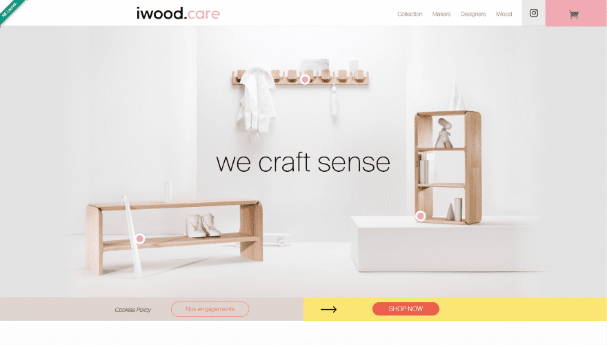
This site was submitted by Julien Ferla. The menu includes blocks of color to highlight the CTAs. It has an interesting hero section that’s actually fun to play with. The title text and background image move in reaction to your mouse. Three circled (two-color) dots remain in place. Each of the dots is placed over one of the items in the image and they reveal the name of the items on hover. A slim section provides links to the policies and shop. Following this are several large sections of text. The text includes several words in pink and sections of text are divided from each other with alternating dividers. Large sections about the products show text, images, and sliders. They include slim CTA’s that match the one under the header. This one makes elegant use of text and color.
9. Cody Goodin
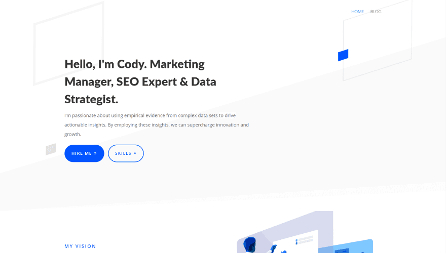
This site was submitted by Nicole Marie Zinnanti. This site uses lots of white space and a minimal design to present a clean layout. The hero section includes a CTA on one side over a patterned background. The next section shows a graphic on one side and a CTA on the other. I especially like the skills section. It shows the skills in two columns that alternate. Each has a two-color icon for each of the segments with the title and description under them. The skills are then listed on the other side in a different type of font. An About section finishes the site with a styled divider and graphic. The custom footer places links on both sides.
10. Elsebeth Egholm
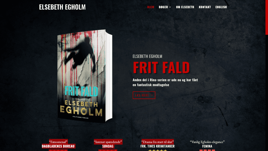
This site was submitted by Rikke Ekelund. The hero section shows a patterned background image in parallax with an image of a book and a CTA over a set of reviews in the overlay. Other books are shown within an alternating layout with links to read more. A section about the author shows the information on one side with a link to read more and an image on the other. All of the contact information is placed over a full-screen photo of the author. I like the pages for the books. They show the book on one side and a description on the other, both over a dark background that helps set the tone of the book. The site includes a styled back-to-top button and a styled slider bar on the right. I love the red highlights.
Conclusion
That’s our 10 best community Divi website submissions for the month of November. These sites look amazing and as always we want to thank everyone for your submissions!
If you’d like your own design considered please feel free to email our editor at nathan at elegant themes dot com. Be sure to make the subject of the email “DIVI SITE SUBMISSION”.
We’d also like to hear from you in the comments! Tell us what you like about these websites and if there is anything they’ve done you want us to teach on the blog.
Featured Image via Mascha Tace / shutterstock.com


Hey, i am using right now flatsome but somewhere its stocked with design and i saw many times divi is best for design but it seems hard to me.please suggest can i use it in a better way i am not sharing right now website because few people think its spammer and i am not that.
Great looking sites but 95% of them fail miserably when it comes to achieving decent scores in GTMetrix. Loading times of over 7 seconds and one was over 24 seconds for fully loaded time. The Google Page speed results were even worse most had horrible mobile scores 0/100, 3/100 etc. and most were under 50/100 for desktop. I would have to assume with the amount of effort that went into these sites that they did not overlook these issues. So are these designers all struggling to get decent scores with Divi? Does the issue lie mainly with the theme (bloat), lack of optimization, thoughts?
Divi is not the fastest that is a thing. But Google pagespeed is not the best to check the speed. If you have a cookie notice your score goes down a lot because “your website is not optimized for mobile”. Divi needs to make the core a lot smaller and more optimized (bloat).
Hey,
This very nice template. I want to implement it in my blog. My Question is Do it support in AMP View?
Could you please help me to implement it without affecting my AMP Traffic.