
It’s that time again for our monthly Divi Showcase, where we take a look at ten amazing Divi websites made by our community members. Each month we showcase the best Divi websites that were submitted from our community and today we want to share with you the top ten websites for the month of June. Throughout the post, I’ll point out some of my favorite design features that draw me to each of the websites.
I hope you like them!
Divi Design Showcase: New Submissions from June 2020
1. Preston Smiles
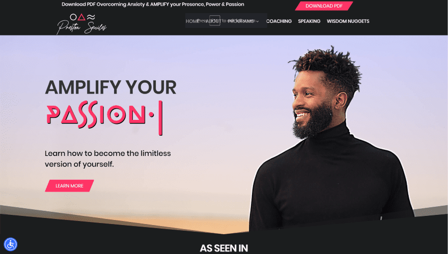
This site was submitted by Christian Mauerer. The hero section displays animated text with a typing effect using a fancy font and a CTA on one side and the subject of the background image on the other. Scrolling reveals a logo slider showing media the company has been seen in. A CTA for books displays logos of online stores in the middle with arrows pointing to the outside edges with photos of the books. The books move toward the center as you scroll. A section about the site owner displays a large photo on the left and information on the right. The photo scrolls faster as you scroll down the page to see a gallery of images that overlap each other. Several sections include styled videos. I especially like the testimonials section, which shows a large image of the owner, testimonials from Facebook, and photos from events.
2. WebDevXd
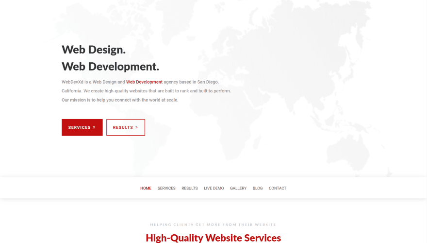
This site was submitted by Steph from Web Dev Xd. A CTA displays on the left with red buttons over a background image of a map of the world and a white overlay. A full-width menu sits under this section and sticks to the top as you scroll. The next section displays an example of work within a computer screen on one side and a description on the other, each using the branded red and white colors. Services are shown within blurbs with red icons. The projects section shows images that are stacked. The images zoom out and the images in the back move to the sides on hover. A section for deliverables uses a red background with blurbs displaying text and icons in white. The title sits vertically to the side. The footer displays a post slider and several widgets over a red background.
3. Muni
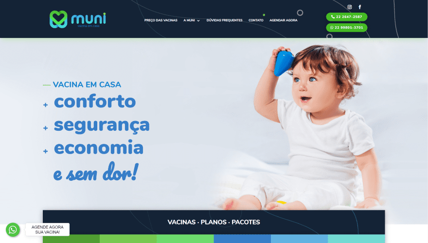
This site was submitted by Lethicia Diniz. It uses blue and green colors and font styles that match perfectly with the genre. The header displays stacked buttons for CTAs. The hero section includes a background image with the subject on one side and large bullet points on the other. Plans are shown as blocks of text with different colored backgrounds that zoom on hover. I like the full-screen CTA that’s built with layers. It displays a photo to one side, a title that covers the second two-thirds, a list of benefits to the other side, and a large box that overlaps the other two with a blue background and patterns with the CTA itself. A testimonial slider displays with a background pattern to the far right. The footer displays two rows. The first has CTAs to read more that are in different colors and sizes, contact information, and then the bottom row displays widgets. The two rows display over a parallax background pattern.
4. SAMCARA
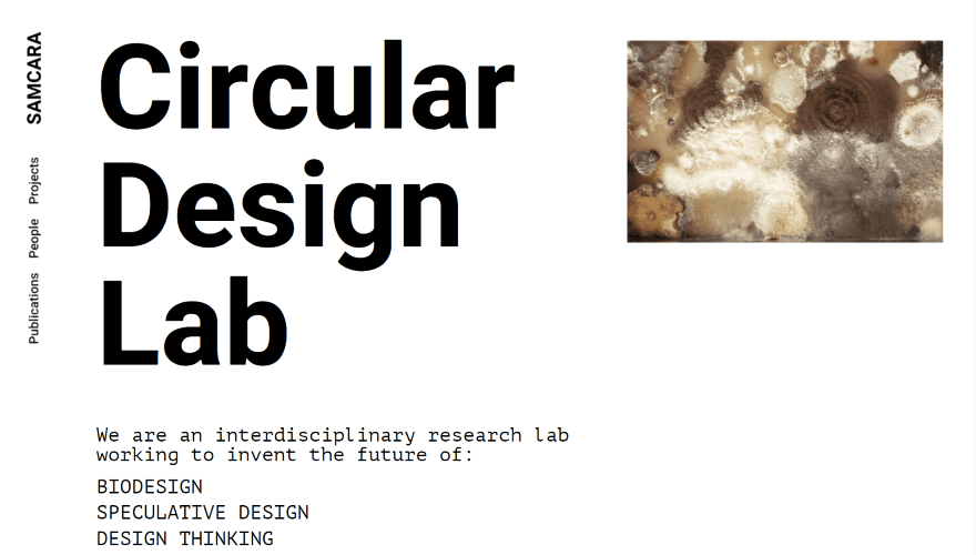
This site was submitted by Xavier Ferré. The navigation menu displays vertically on the left and remains on screen as you scroll. The hero section displays the site title in huge fonts followed by a list of services and a clickable contact CTA on one side and a small image on the other. Information is provided in two large cards with different background colors and image positions. Both overlap the next section that displays a larger stylized basketball court from above with a similar design as the first two cards. More cards follow this and are introduced with a large column of text. This section includes a contact form and a list of collaborators. Blog posts are introduced with a styled arrow that zooms into place as you scroll. The blog section also leads the reader into the login form.
5. Buffer Insurance

This site was submitted by Sean Turner. The site makes excellent use of color and images. The hero section displays two background images. The larger side has a blue overlay and the smaller side has a green overlay. A foreground image is placed where the two meet and is placed over a background in the shape of a shield. A CTA is placed on the other side. The foreground also includes shapes in patterns that appear throughout the site. The next section displays services in large boxes with the same designs. The next two sections display tall blurbs to one side and an image on the other in an alternating layout over a background image with white or blue overlays. The blurbs display bullets. The images use the same shield as the hero section. A full-width post slider shows the title and text of the most recent posts. It also includes a mega menu with text links.
6. Curlee
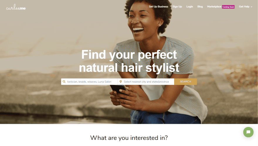
This site was submitted by Anthea A. Ancalade. The hero section displays a full-screen background image with a search box in the center that lets you select a location or use your current location. Services are displayed with images that include titles and overlays next to a CTA. Featured styles are displayed within a 6-column slider and include an image, title, star rating, and location. The slider includes both arrow and dot navigation. Clicking one of the styles takes you to its product page. New styles are displayed in 6 columns, but without the slider. The blog section displays the two most recent posts and places a line under the posts with a link to see more under the line. Tutorials from the blog are placed in three columns and follow the same design. It also includes an Instagram feed with 6 columns and 2 rows and a footer with a styled email form.
7. Typogenia
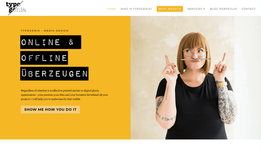
This site was submitted by Eugenia Janakow. It uses lots of bold yellow within the graphics. Titles are created as if they were made with a label maker, making the backgrounds black and the text white with a 3D look. A CTA is placed in the middle of the menu. The hero section displays a split-screen with a CTA on the left and an image on the right. A CTA uses a hand-drawn graphic that animates on scroll and hover. Information about the site owner displays a circled image with a CTA to read more. I especially like the testimonials section. It displays reviews from Google complete with star ratings and a clickable graphic that takes you to the About page. Services are shown within blurbs and include large hand-drawn graphics. The blog uses the branded yellow for meta, and the contact form uses it for the background of the entire section.
8. Bushcrafter
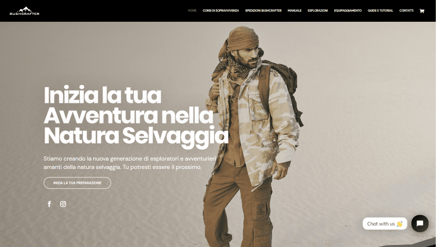
This site was submitted by Simone Talamo. The hero section displays a full-screen image with the subject in the center. The foreground displays a tagline with a CTA and social buttons. Several full-width sections follow a similar design. Each section has a jagged separator that works perfectly for the genre. The next section displays large images for information with text and icons in the overlay. Most have dark backgrounds or blend into dark backgrounds. One for a manual displays the book cover along with the text. The latest blog posts display the posts as cards with box shadows. The footer displays products with their names, images, star ratings, and prices. The course pages follow the same design and adds a countdown timer and styled toggles.
9. KWALT Digital
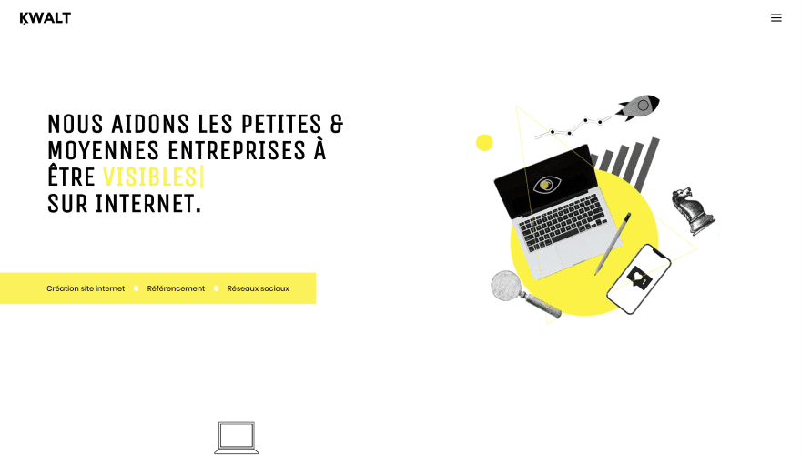
This site was submitted by Nicolas Peigner. This one has lots of interesting animations, styled text, graphics, and arrows throughout the site. Yellow is used as the branded color and it’s used in creative ways. The hero section displays text on one side with a typing effect. A bar sits under this and lists the services. On the right side are several independent graphical elements that hover and respond to the cursor. The next section displays a title with an animated graphic on one side and simple CTA’s on the other. The latest work follows this and presents screenshots of work over backgrounds of different colors and patterns. A section explaining the benefits places blurbs to one side with two-color icons. An image sits on the other side and leads the reader to the blurbs. A simple testimonial slider is placed over a dark gray background to stand out.
10. Exploruns
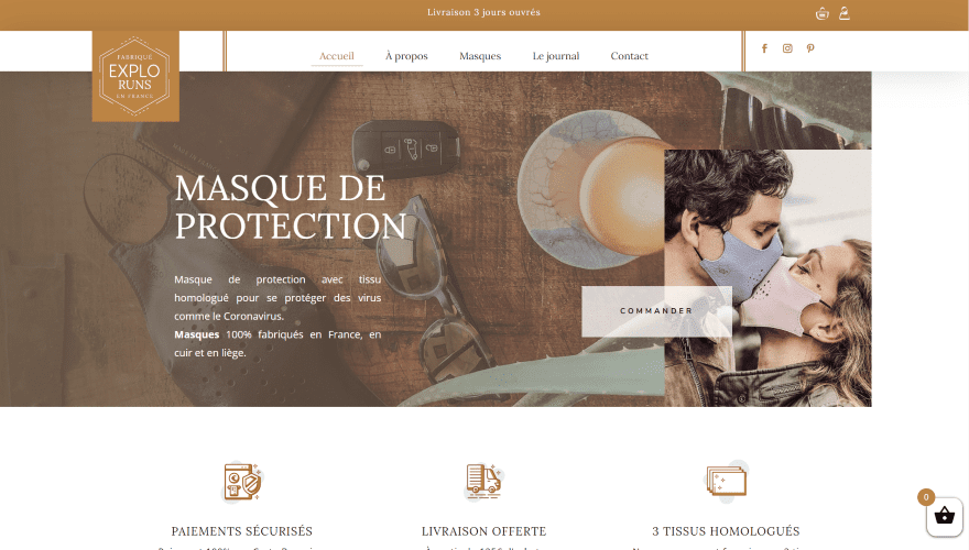
This site was submitted by Ava Charpentier. It uses lots of shades of tan for branded colors. The top bar disappears on scroll, the logo overlaps the header and hero section, and the header includes hover animations. The main image displays the title, description, and button to place an order. Another image is placed as a window on the hero image in true parallax. Information is displayed with blurbs with custom graphics. Products are shown with a background color behind the top of the product image. A similar background design is used for the blog section. A CTA to read about the company displays text on one side and an image on the other. Testimonials are presented as cards with the quote at the top with a white background and the name at the bottom with a tan background. The site also includes an Instagram feed and a custom footer with hover animation.
In Closing
That’s our 10 best community Divi website submissions for the month of June. These sites look amazing and as always we want to thank everyone for your submissions!
If you’d like your own design considered please feel free to email our editor at nathan at elegant themes dot com. Be sure to make the subject of the email “DIVI SITE SUBMISSION”.
We’d also like to hear from you in the comments! Tell us what you like about these websites and if there is anything they’ve done you want us to teach on the blog.
Featured Image via domonku / shutterstock.com


All of them are of nice design…
Well done, guys and gals…
But:
My vote is for # 4 and # 8.
They are really nice and stylish.
A great current overview! I find # 7 Typogenia really well done, very clear and the loading time is also very fast!
All very good and impressive, well done for your hard work – +1.
Well as the world knows that Elegant themes are perfect for their sites. These all are just awesome and I would like to vote for #7 and #9.
Thanks