
When you decide to create a one-pager, the navigation user experience becomes entirely different. Although people aren’t meant to leave the page, you do want to make their stay user-friendly. That’s why most one-pagers use in-page anchor links. You can place these anchor links in a traditional top menu or choose side navigation instead. In this tutorial, we’re going to show you how to create a beautiful column side-navigation design for your page using Divi and its new columns options. We’ll fit all the elements into a 100 viewport height to create a fullscreen experience. You’ll be able to download the JSON file for free as well!
Let’s get to it.
- 1 Preview
- 2 Download The Column Side Navigation Layout for FREE
- 3 Download For Free
-
4
Let’s Start Recreating!
- 4.1 Create New Blank Page
- 4.2 Add New Section
- 4.3 Add New Row
- 4.4 Column 1 Settings
- 4.5 Column 2 Settings
- 4.6 Add Menu Item Text Module to Column 1
- 4.7 Clone Menu Item Twice
- 4.8 Add Divider Module to Column 1
- 4.9 Clone Divider Module
- 4.10 Add Social Media Follow Module to Column 1
- 4.11 Add Image Module to Column 2
- 4.12 Add Title Text Module to Column 2
- 4.13 Add Divider Module to Column 2
- 4.14 Add Body Text Module to Column 2
- 4.15 Add Button Module to Column 2
- 4.16 Clone All Modules in Column 2 Twice & Place in Same Order
- 4.17 Hide Scrollbar & Add Smooth Scroll
- 5 Preview
- 6 Final Thoughts
Preview
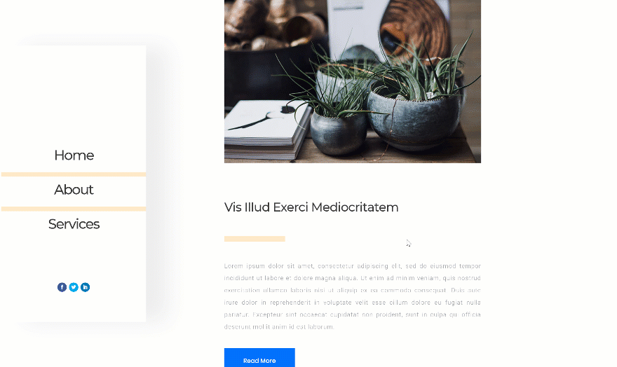
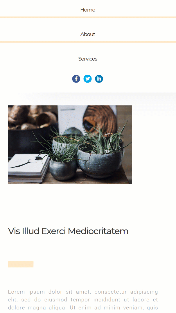
Before we dive into the tutorial, let’s take a quick look at the outcome across different screen sizes.
Desktop
Mobile
To lay your hands on the free column side navigation layout, you will first need to download it using the button below. To gain access to the download you will need to subscribe to our newsletter by using the form below. As a new subscriber, you will receive even more Divi goodness and a free Divi Layout pack every Monday! If you’re already on the list, simply enter your email address below and click download. You will not be “resubscribed” or receive extra emails.

Let’s Start Recreating!
Subscribe To Our Youtube Channel
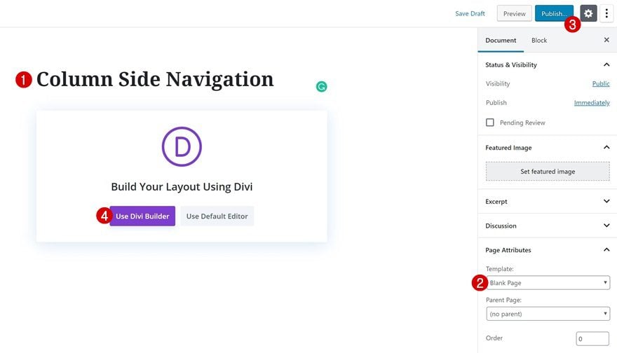
Create New Blank Page
The first thing you will need to do is create a new blank page. Once you do, switch over to Visual Builder.
Add New Section
Background Color
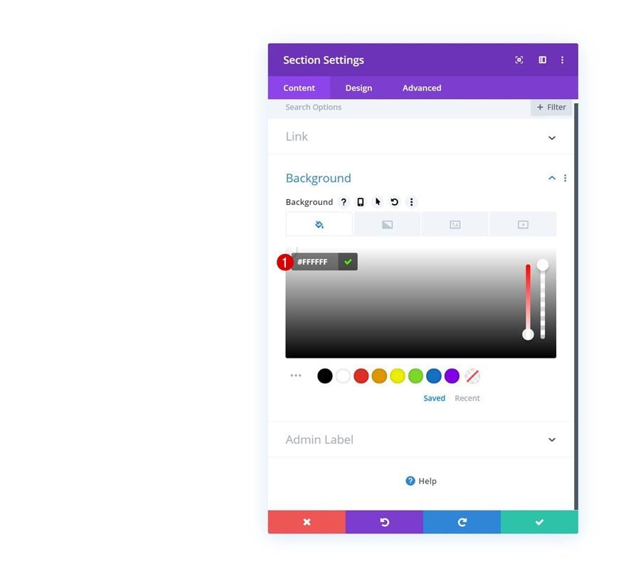
We’re going to fit all our page content into one section, one row and two columns. Add a new regular section to your page with a white background color.
- Background Color: #FFFFFF
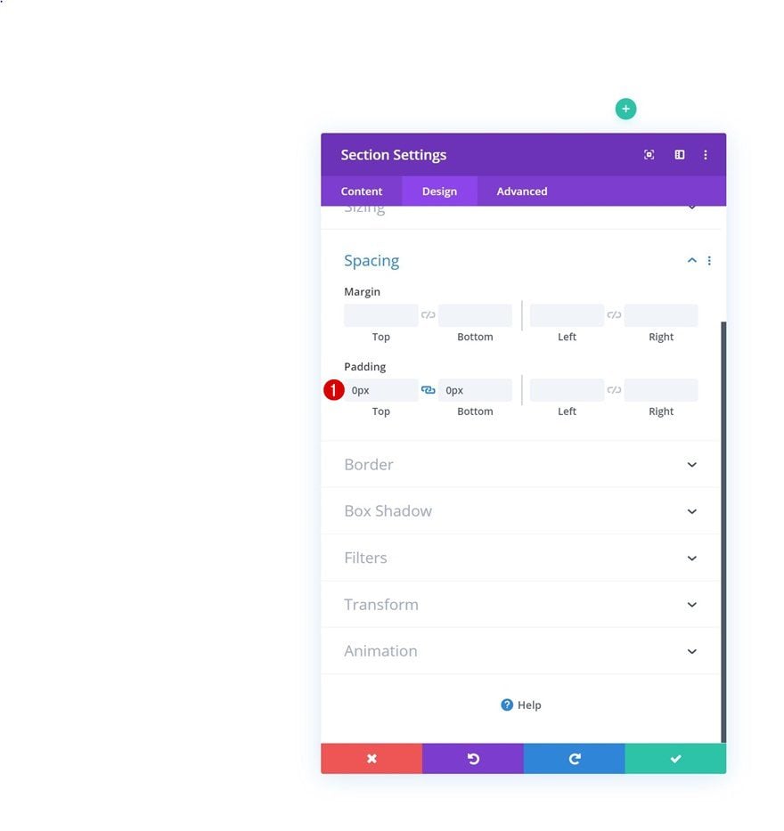
Spacing
Remove all default top and bottom padding of the section.
- Top Padding: 0px
- Bottom Padding: 0px
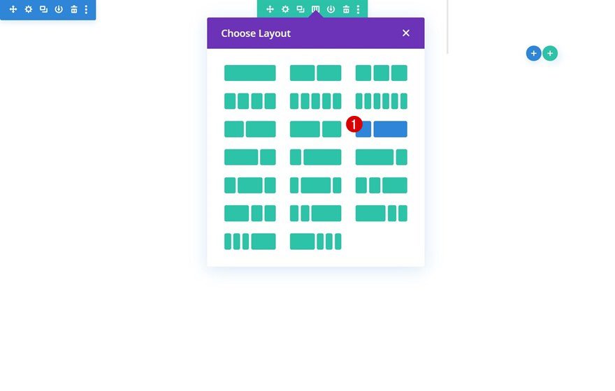
Add New Row
Column Structure
Continue by adding a new row using the following column structure:
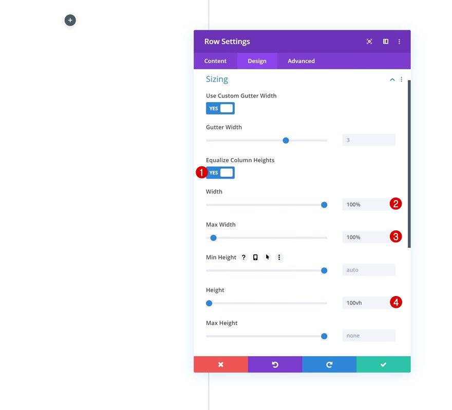
Sizing
Without adding any modules yet, open the row settings and change the sizing settings accordingly:
- Equalize Column Heights: Yes
- Width: 100%
- Max Width: 100%
- Height: 100vh
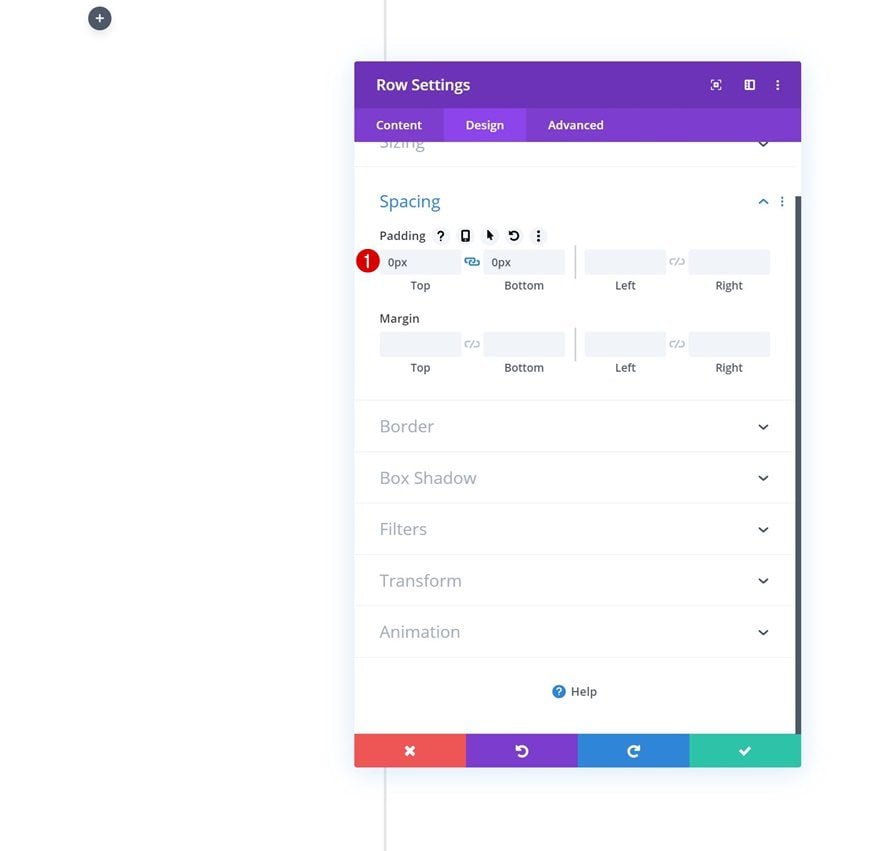
Spacing
Move on to the spacing settings and remove all default top and bottom padding.
- Top Padding: 0px
- Bottom Padding: 0px
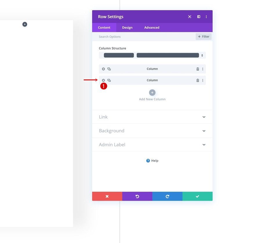
Column 1 Settings
Once you’ve completed the general row settings, open the column 1 settings.
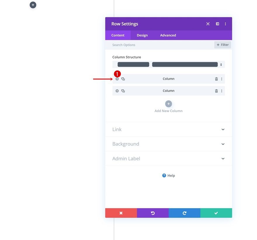
Background Color
Add a white background color.
- Background Color: #FFFFFF

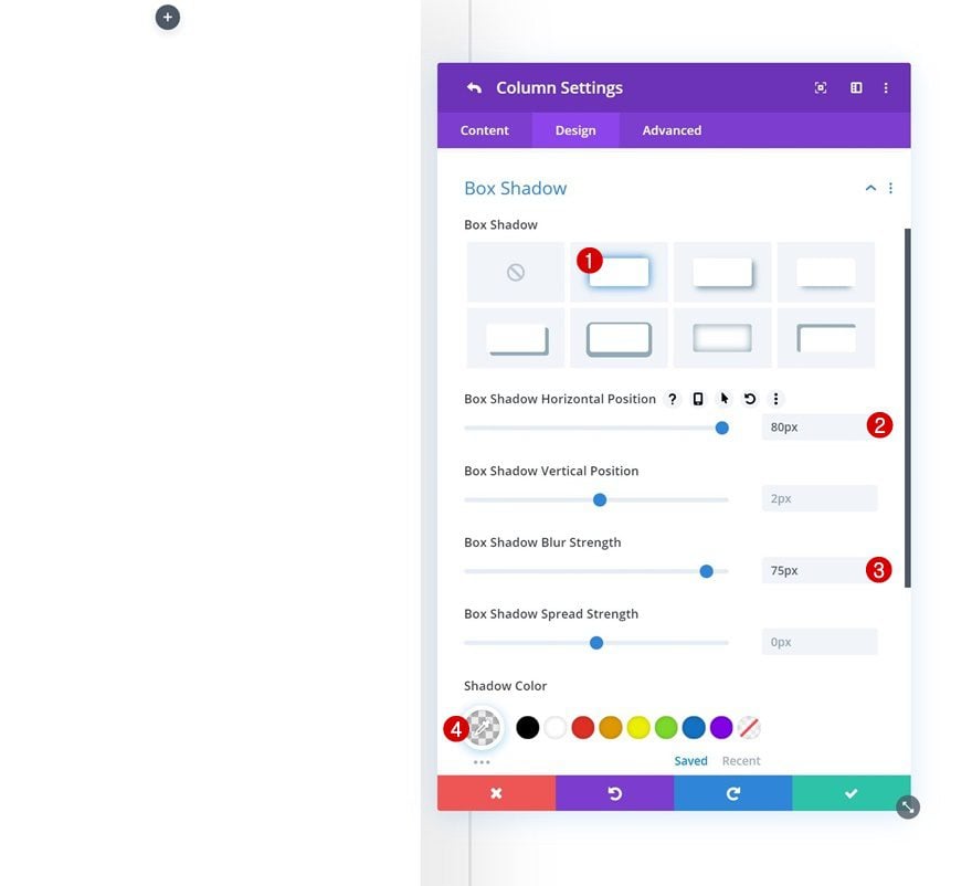
Box Shadow
Along with a subtle box shadow.
- Box Shadow Horizontal Position: 80px
- Box Shadow Blur Strength: 75px
- Shadow Color: rgba(0,0,0,0.07)
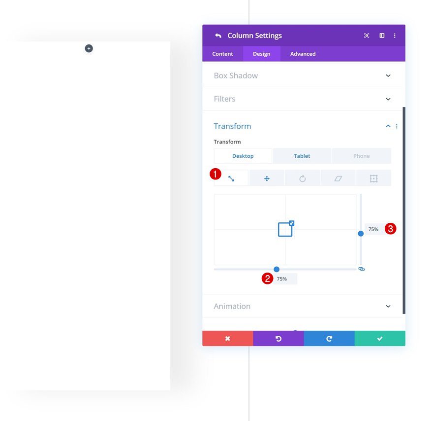
Transform Scale
We’re also shrinking the size of the column on desktop.
- Bottom: 75% (Desktop), 100% (Tablet & Phone)
- Right: 75% (Desktop), 100% (Tablet & Phone)
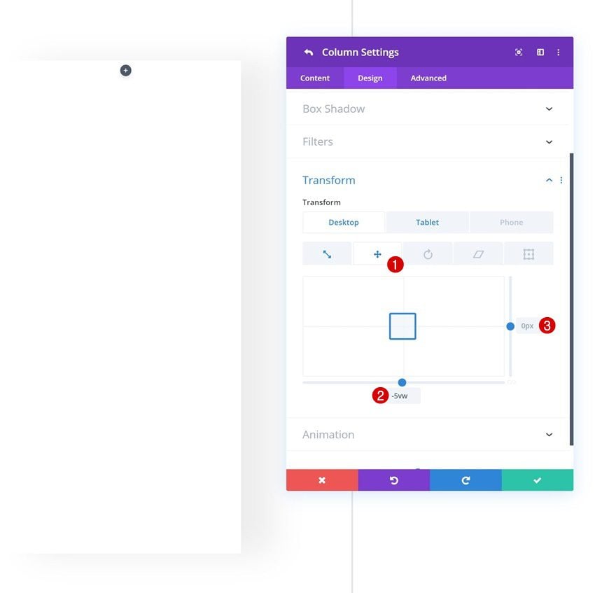
Transform Translate
Change the position of the column using some custom transform translate settings next.
- Bottom: -5vw (Desktop), 0px (Tablet & Phone)
- Right: 0px
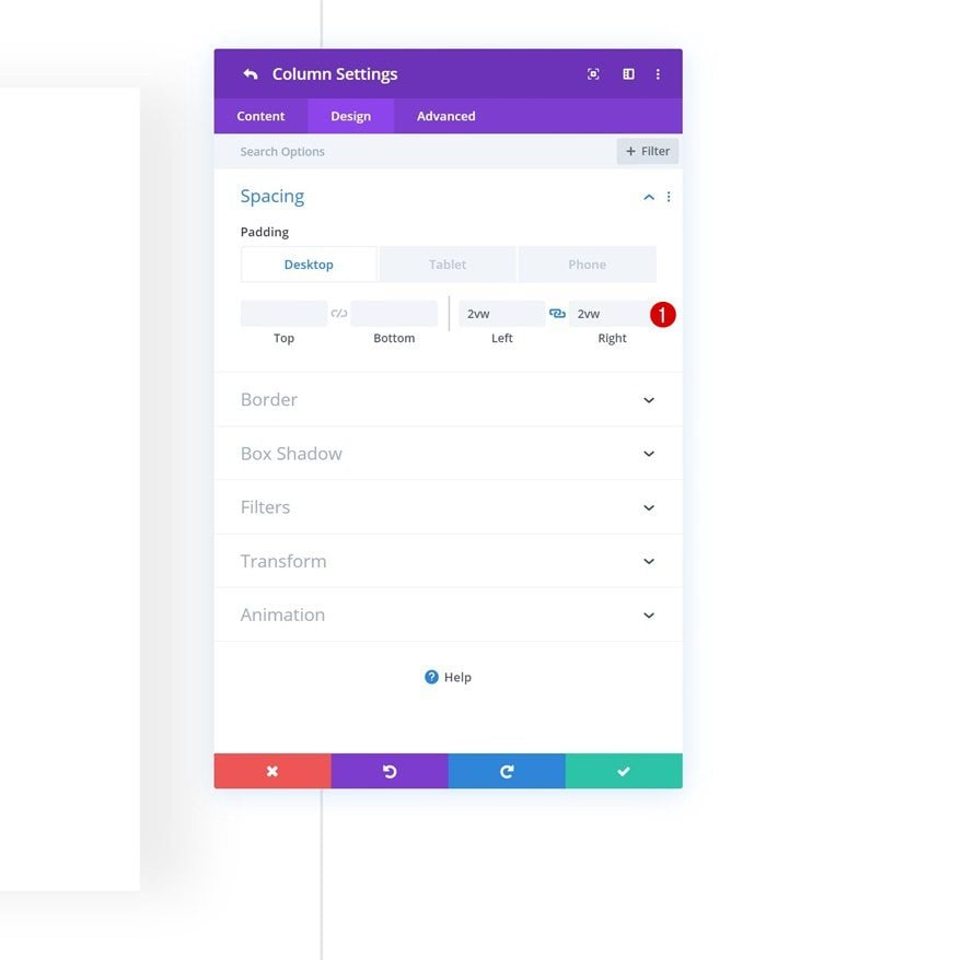
Column 2 Settings
Continue by opening the column 2 settings.
Spacing
Move on to the design tab and add the following left and right padding values across different screen sizes:
- Left Padding: 2vw (Desktop), 4vw (Tablet), 5vw (Phone)
- Right Padding: 2vw (Desktop), 4vw (Tablet), 5vw (Phone)
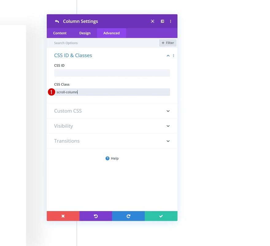
CSS Class
Later on the post, we’ll add a smooth scroll and hide the scrollbar. In order to do that, we’ll need to add a custom CSS class to the column.
- CSS Class: scroll-column
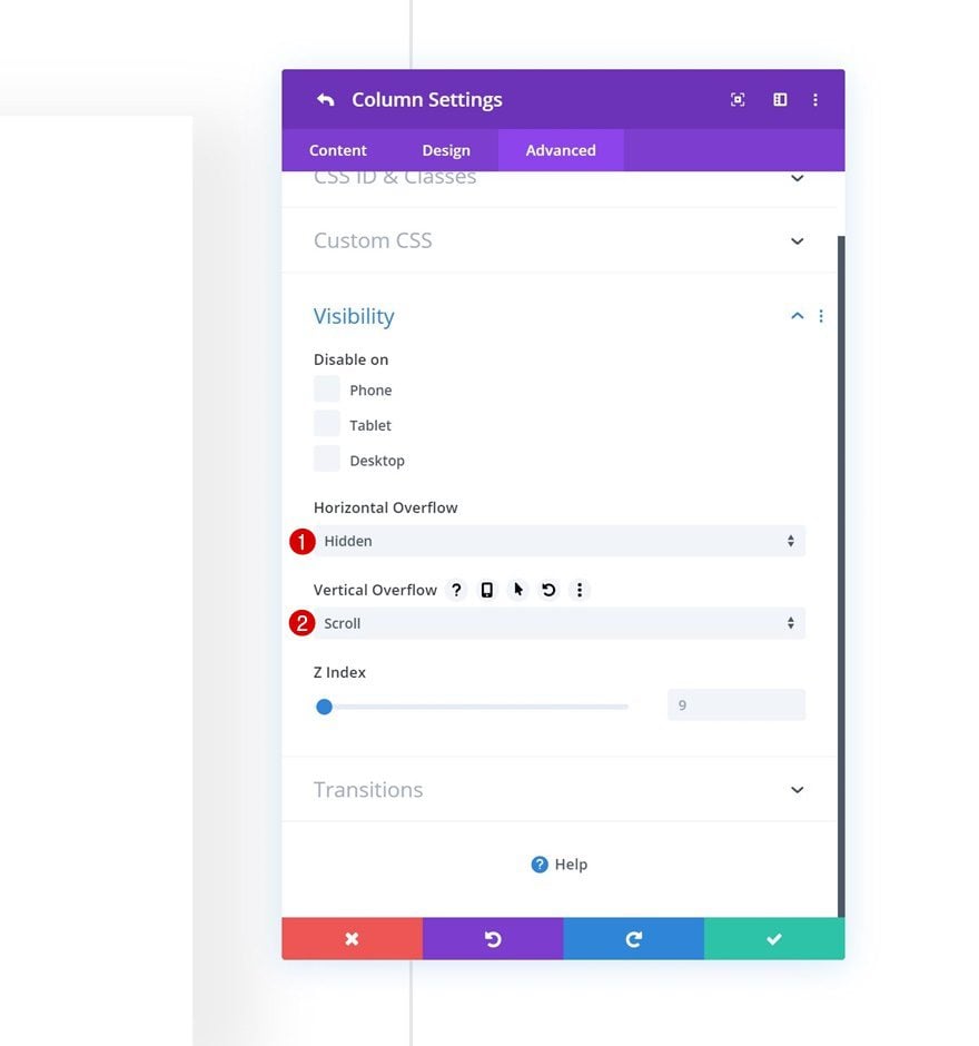
Visibility
The modules we add in the second column will represent our page content. To allow scrolling, we’ll change the overflow settings.
- Horizontal Overflow: Hidden
- Vertical Overflow: Scroll
Add Copy
Lets’ start adding modules! Add a first menu item Text Module to column 1 with some content of your choice.
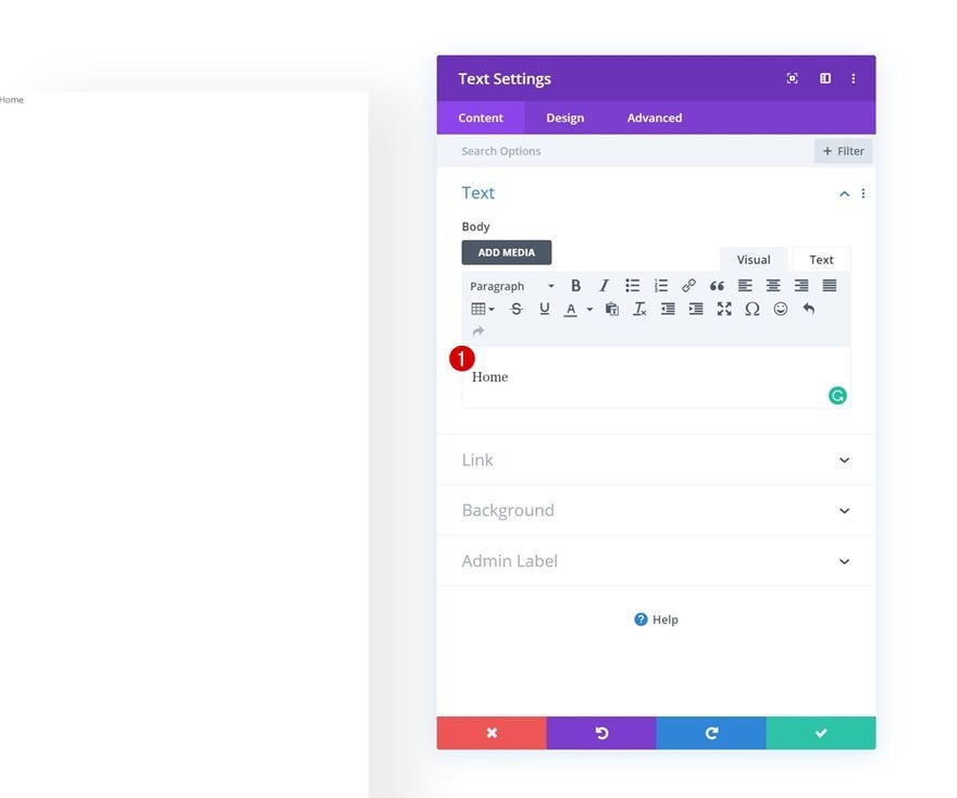
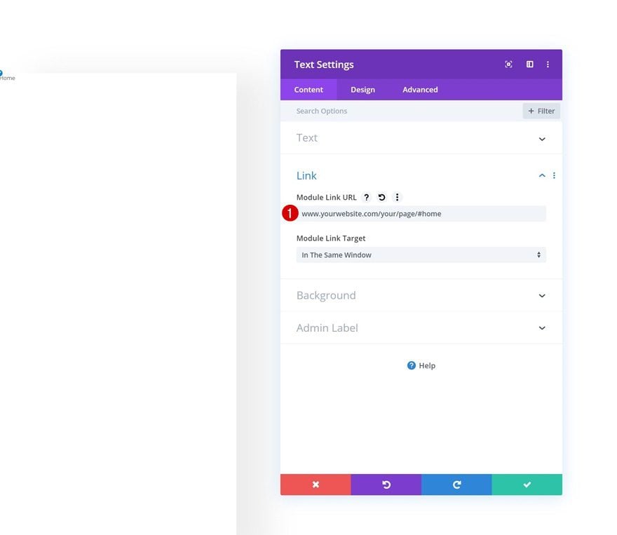
Add Link
Add an anchor link to the menu item.
- Module Link URL: www.yourwebsite.com/yourpage/#home
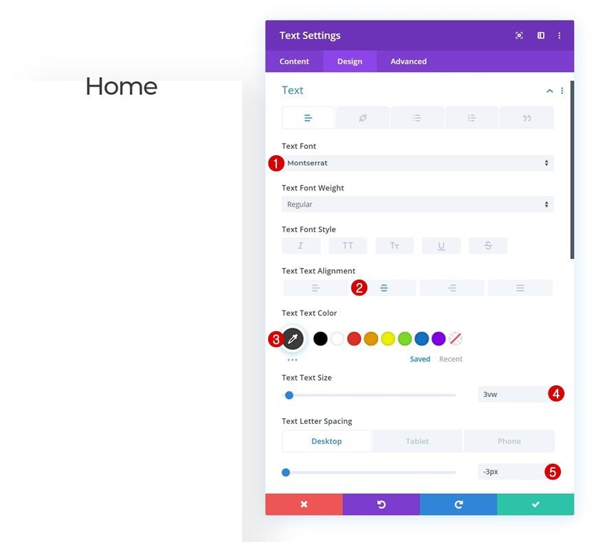
Text Settings
Move on to the design tab and change the text settings accordingly:
- Text Font: Montserrat
- Text Alignment: Center
- Text Color: #383838
- Text Size: 3vw
- Text Letter Spacing: -3px (Desktop), -2px (Tablet), -1px (Phone)
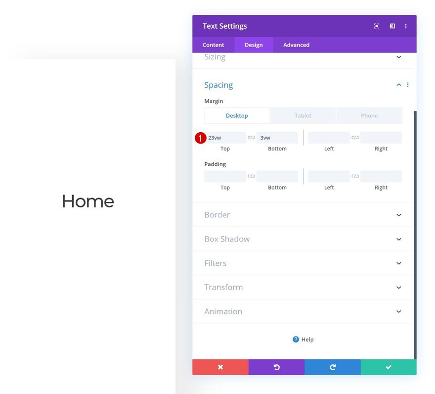
Spacing
Add some custom top and bottom margin values next.
- Top Margin: 23vw (Desktop), 3vw (Tablet & Phone)
- Bottom Margin: 3vw (Desktop), 2vw (Tablet), 1vw (Phone)
Once you’ve completed the first menu item, clone it twice.
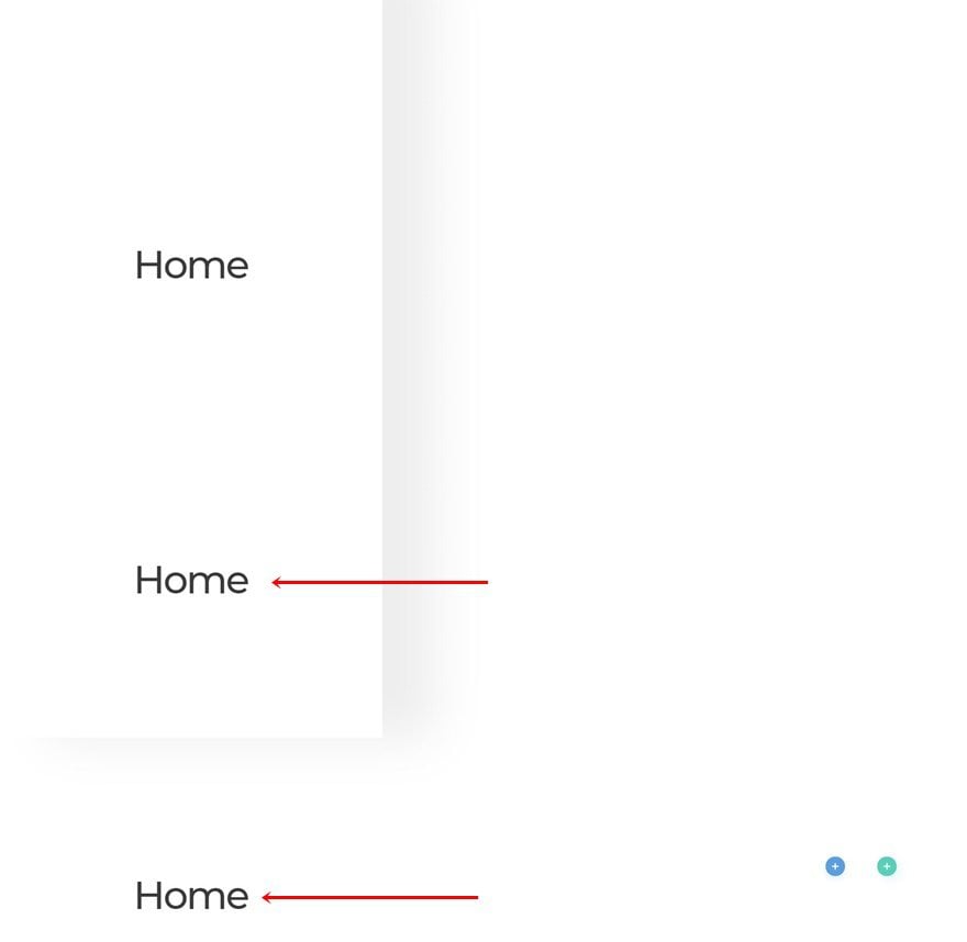
Change Content of Both Duplicates
Change the menu item content of both duplicates.
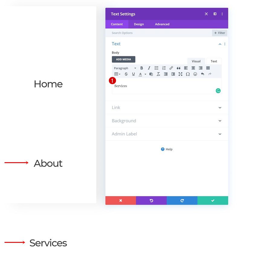
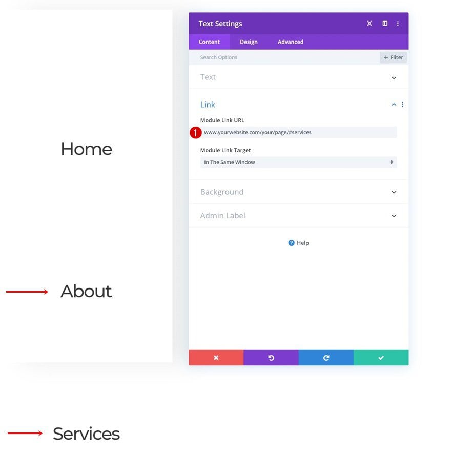
Change Links of Both Duplicates
Along with the anchor links.
- Duplicate 1: /#about
- Duplicate 2: /#services
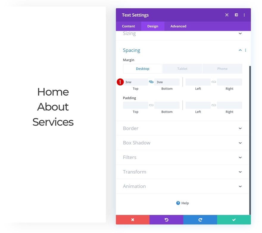
Change Spacing of Both Duplicates
Complete the duplicates by changing the spacing values accordingly:
- Top Margin: 3vw (Desktop), 2vw (Tablet), 1vw (Phone)
- Bottom Margin: 3vw (Desktop), 2vw (Tablet), 1vw (Phone)
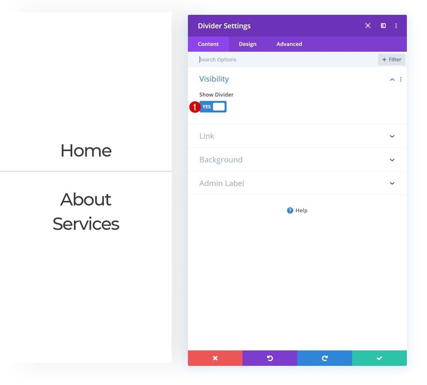
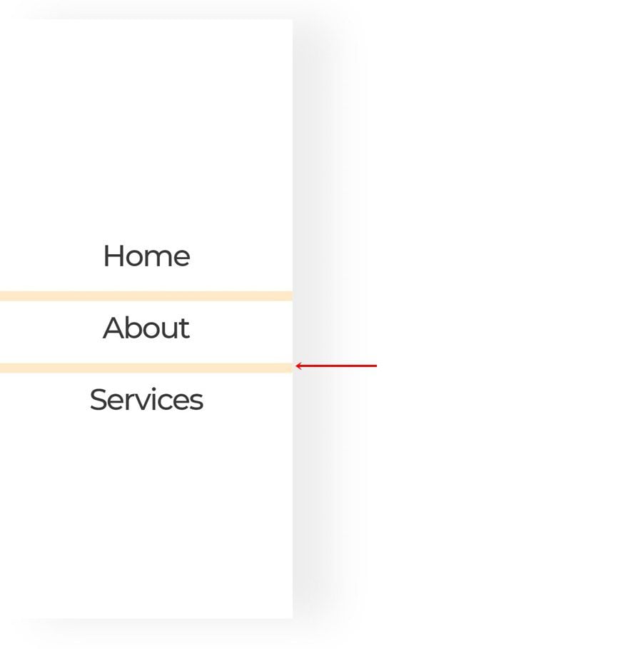
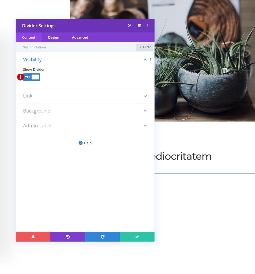
Add Divider Module to Column 1
Visibility
Add a Divider Module right between the first and second Text Modules in column 1. Make sure the ‘ Show Divider’ option is enabled.
- Show Divider: Yes
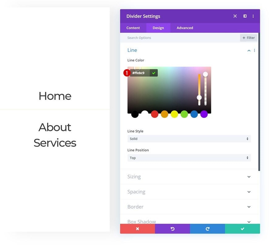
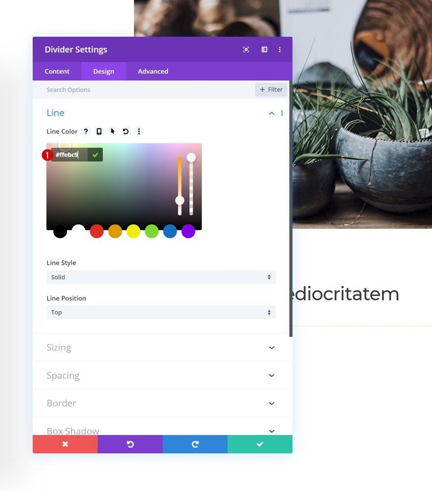
Line
Change the line color next.
- Line Color: #ffebc9
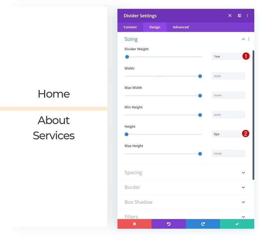
Sizing
Along with the sizing settings.
- Divider Weight: 1vw
- Height: 0px
Clone Divider Module
Clone the Divider Module and place the duplicate below the second Text Module.
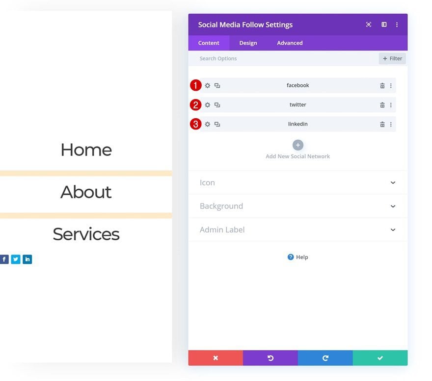
Add Social Networks
The next and last module we need in column 1 is a Social Media Follow Module. Add the social networks of your choice.
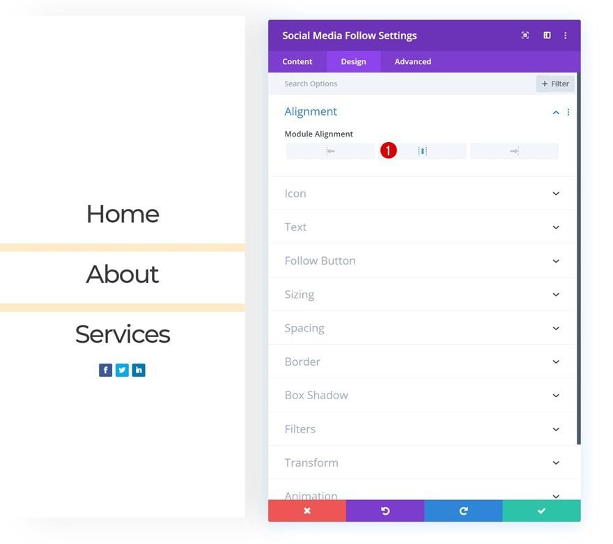
Alignment
Then, go to the design tab and change the module alignment.
- Module Alignment: Center
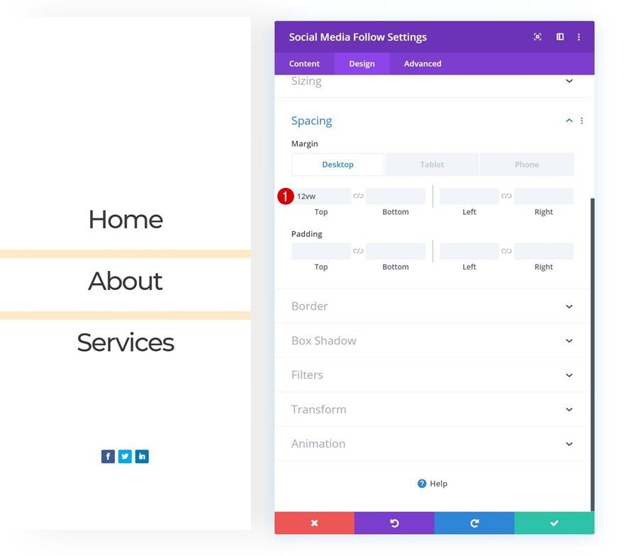
Spacing
Modify the margin values next.
- Top Margin: 12vw (Desktop), 5vw (Tablet & Phone)
- Bottom Margin: 3vw (Tablet & Phone)
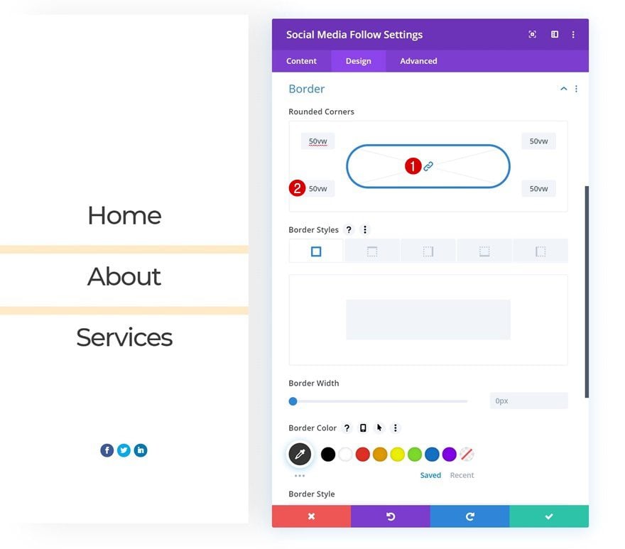
Border
And add ’50vw’ to each one of the corners to create a circular shape.
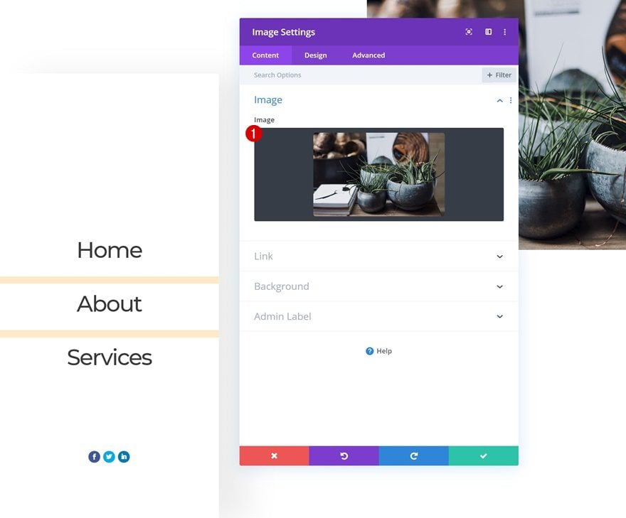
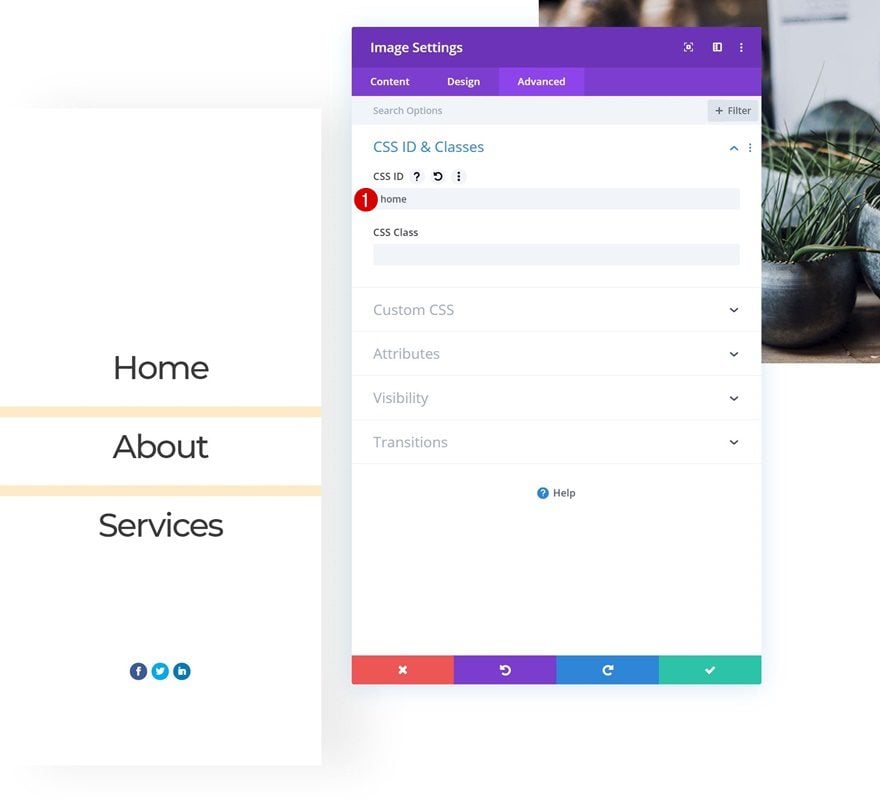
Add Image Module to Column 2
Upload Image
On to the second column! Add all the modules you want but don’t forget to add a CSS ID to each module you want an anchor link to refer to. If you want to recreate the exact design that was shown in the preview of this post, start by adding an Image Module and upload an image of your choice.
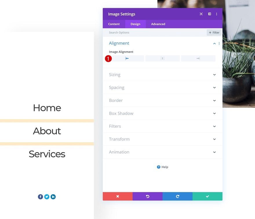
Alignment
Move on to the design tab and choose left image alignment.
- Image Alignment: Left
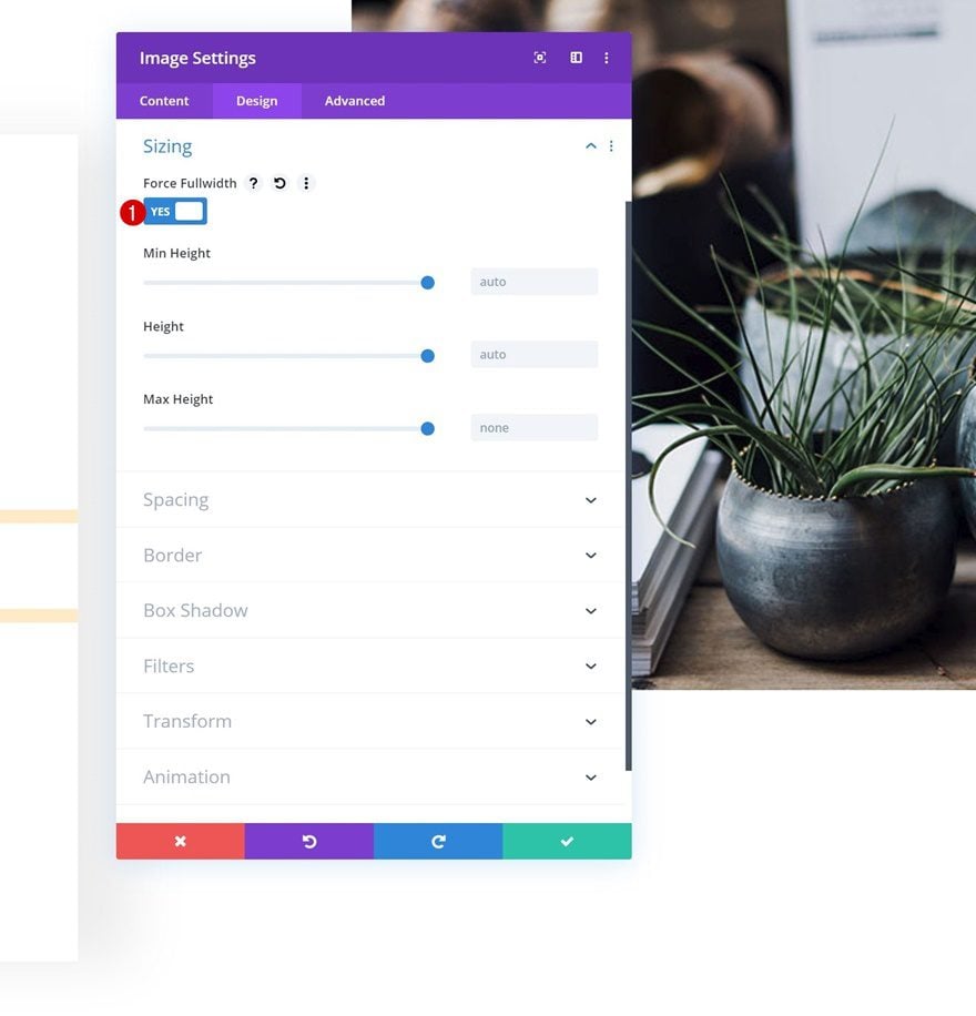
Sizing
Change the sizing settings next.
- Force Fullwidth: Yes
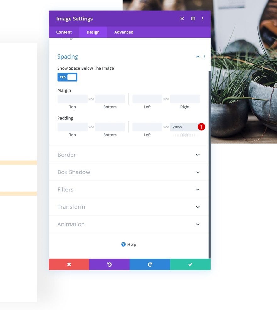
Spacing
And add some right padding.
- Right Padding: 20vw
CSS ID
Lastly, go to the advanced tab and add the first CSS ID. Make sure this matches the first menu item’s anchor link.
- CSS ID: Home
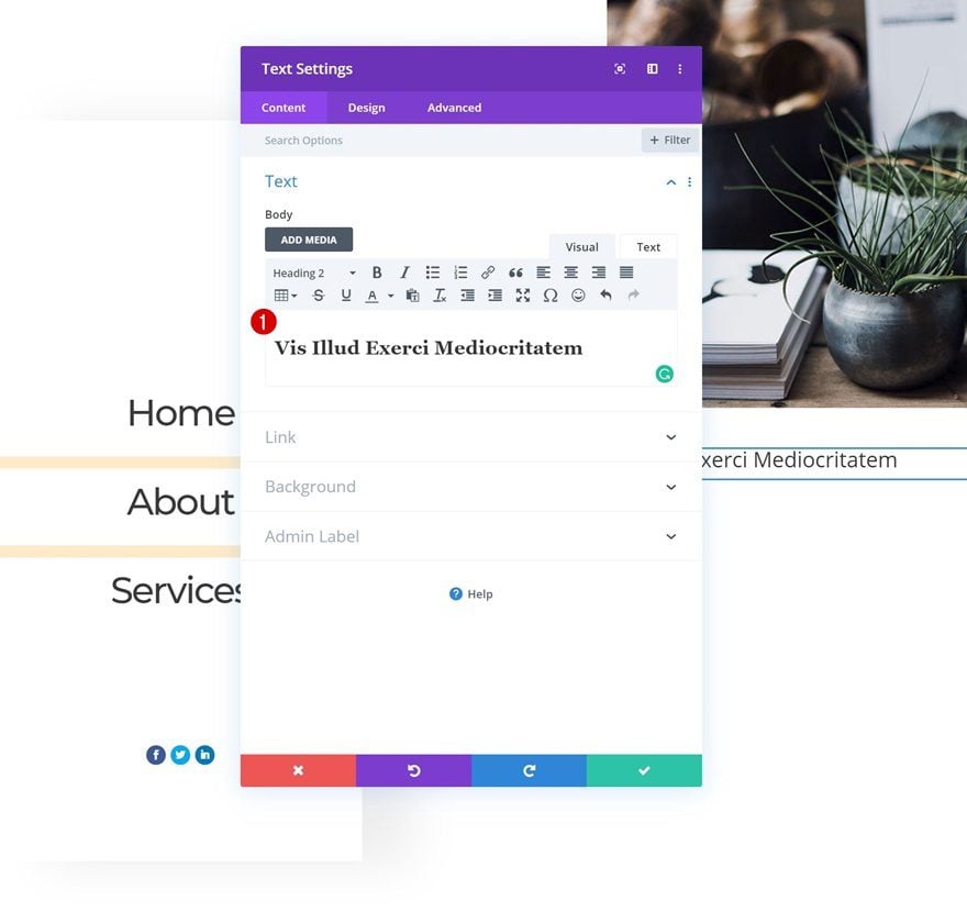
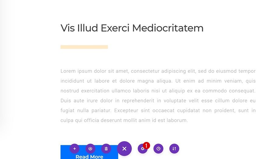
Add Title Text Module to Column 2
Add H2 Content
On to the next module, which is a Text Module. Enter some H2 content of your choice.
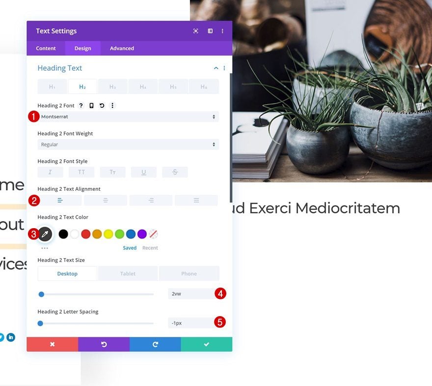
H2 Text Settings
Move on to the design tab and change the H2 text settings accordingly:
- Heading 2 Font: Montserrat
- Heading 2 Text Alignment: Left
- Heading 2 Text Color: #383838
- Heading 2 Text Size: 2vw (Desktop), 4vw (Tablet), 5vw (Phone)
- Heading 2 Letter Spacing: -1px
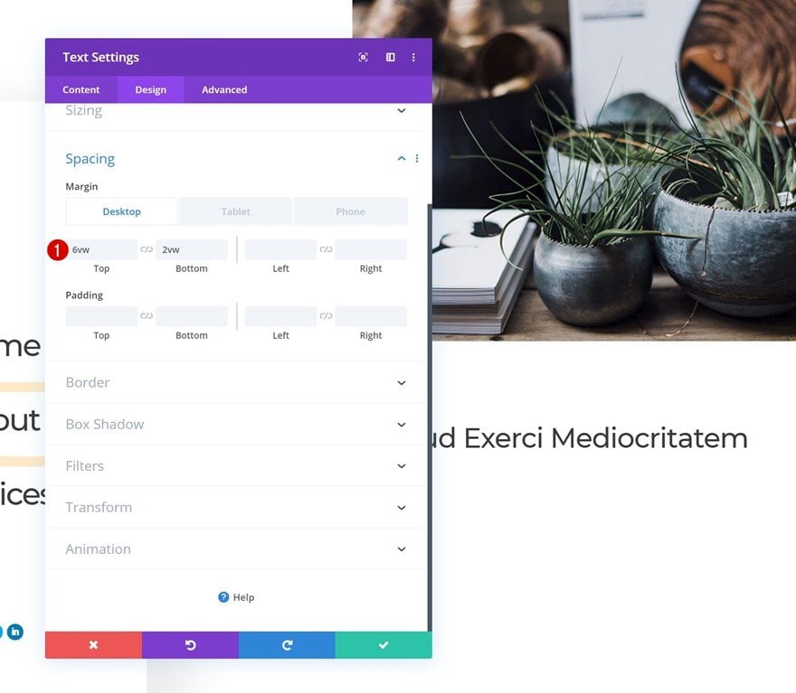
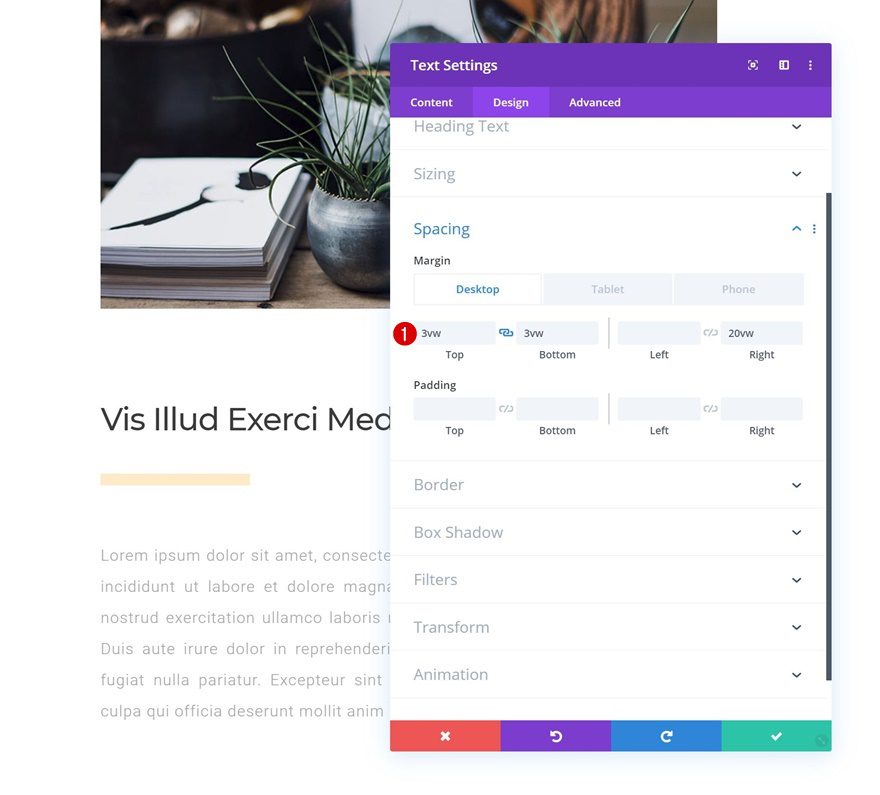
Spacing
Add some custom margin values next.
- Top Margin: 6vw (Desktop), 10vw (Tablet), 12vw (Phone)
- Bottom Margin: 2vw (Desktop), 4vw (Tablet), 6vw (Phone)
Add Divider Module to Column 2
Visibility
The next module we need is a Divider Module. Make sure the ‘Show Divider’ option is enabled.
- Show Divider: Yes
Line
Modify the line color.
- Line Color: #ffebc9
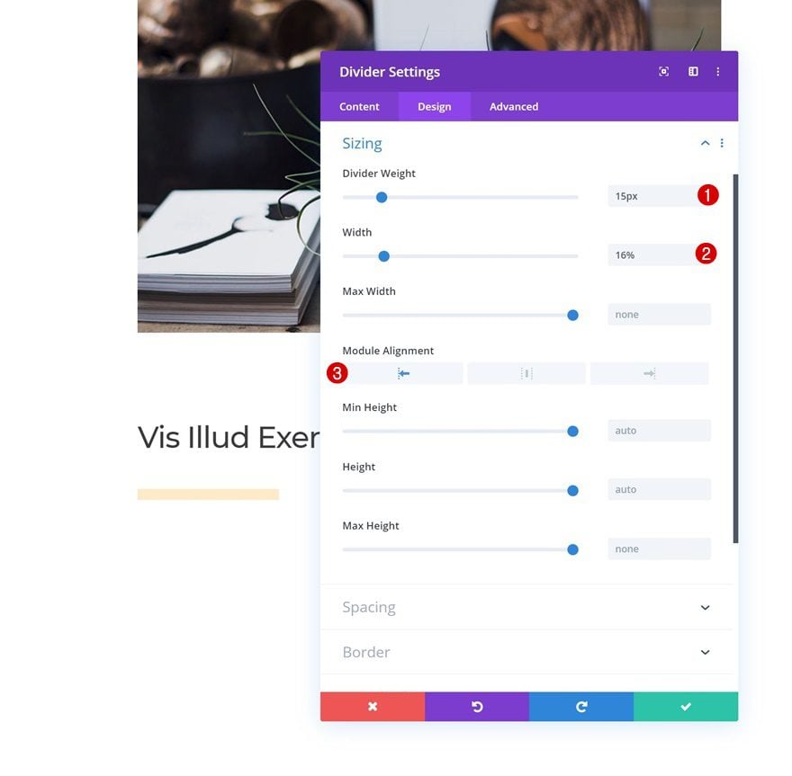
Sizing
And change the sizing settings accordingly:
- Divider Weight: 15px
- Width: 16%
- Module Alignment: Left
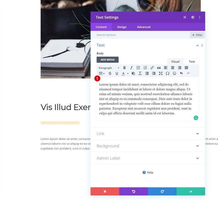
Add Body Text Module to Column 2
Add Content
Add another Text Module to the second column with some paragraph content of your choice.
Text Settings
Move on to the design tab and change the text settings accordingly:
- Text Font: Roboto
- Text Alignment: Justify
- Text Color: #a8a8a8
- Text Size: 1vw (Desktop), 2vw (Tablet), 3vw (Phone)
- Text Letter Spacing: 1px
- Text Line Height: 2vw (Desktop), 3.5vw (Tablet), 4.5vw (Phone)
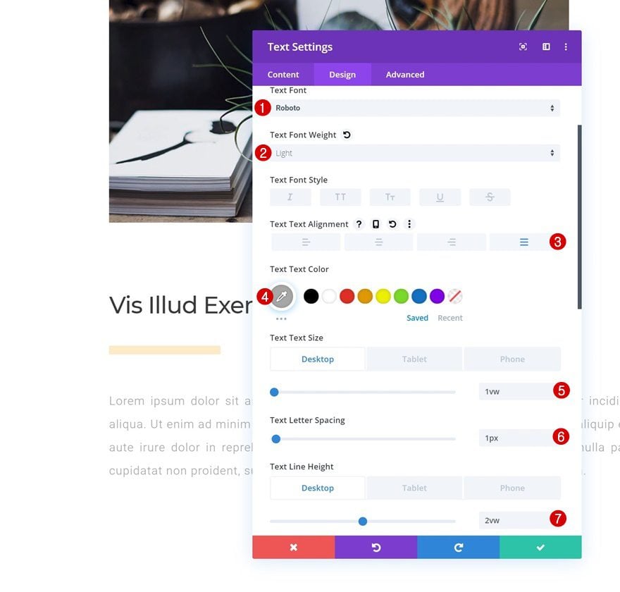
Spacing
Add some custom spacing values next.
- Top Margin: 3vw (Desktop), 5vw (Tablet), 7vw (Phone)
- Bottom Margin: 3vw (Desktop), 5vw (Tablet), 7vw (Phone)
- Right Margin: 20vw (Desktop & Tablet), 5vw (Phone)
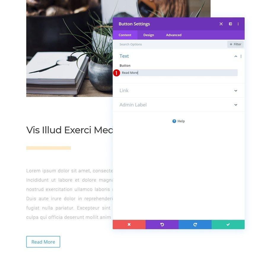
Add Content
Continue by adding a Button Module with some copy of your choice.
Alignment
Select left button alignment in the design tab.
- Button Alignment: Left

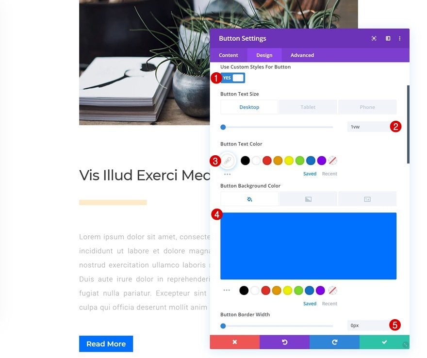
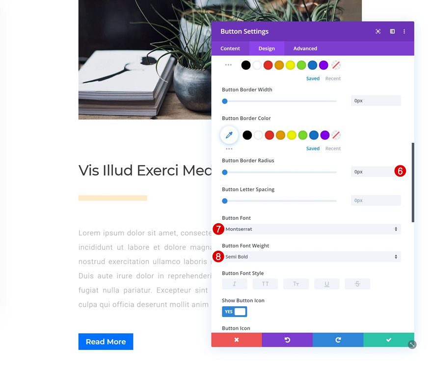
Button
Change the button settings accordingly:
- Use Custom Styles For Button: Yes
- Button Text Size: 1vw (Desktop), 2vw (Tablet), 3vw (Phone)
- Button Text Color: #ffffff
- Button Background Color: #0072ff
- Button Border Width: 0px
- Button Border Radius: 0px
- Button Font: Montserrat
- Button Font Weight: Semi Bold
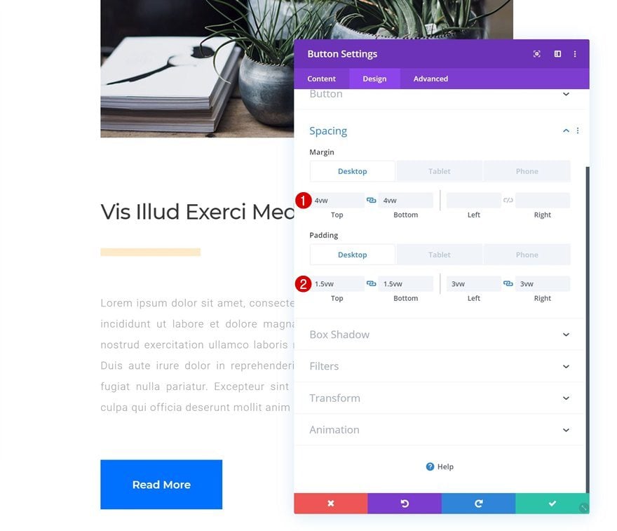
Spacing
And play around with the spacing values as well.
- Top Margin: 4vw (Desktop), 6vw (Tablet), 8vw (Phone)
- Bottom Margin: 4vw (Desktop), 6vw (Tablet), 8vw (Phone)
- Top Padding: 1.5vw (Desktop), 3vw (Tablet), 4vw (Phone)
- Bottom Padding: 1.5vw (Desktop), 3vw (Tablet), 4vw (Phone)
- Left Padding: 3vw (Desktop), 6vw (Tablet), 8vw (Phone)
- Right Padding: 3vw (Desktop), 6vw (Tablet), 8vw (Phone)
Clone All Modules in Column 2 Twice & Place in Same Order
Once you’ve completed all modules in column 2, you can clone them twice and place them in the right order.
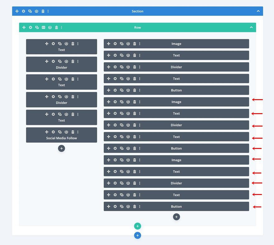
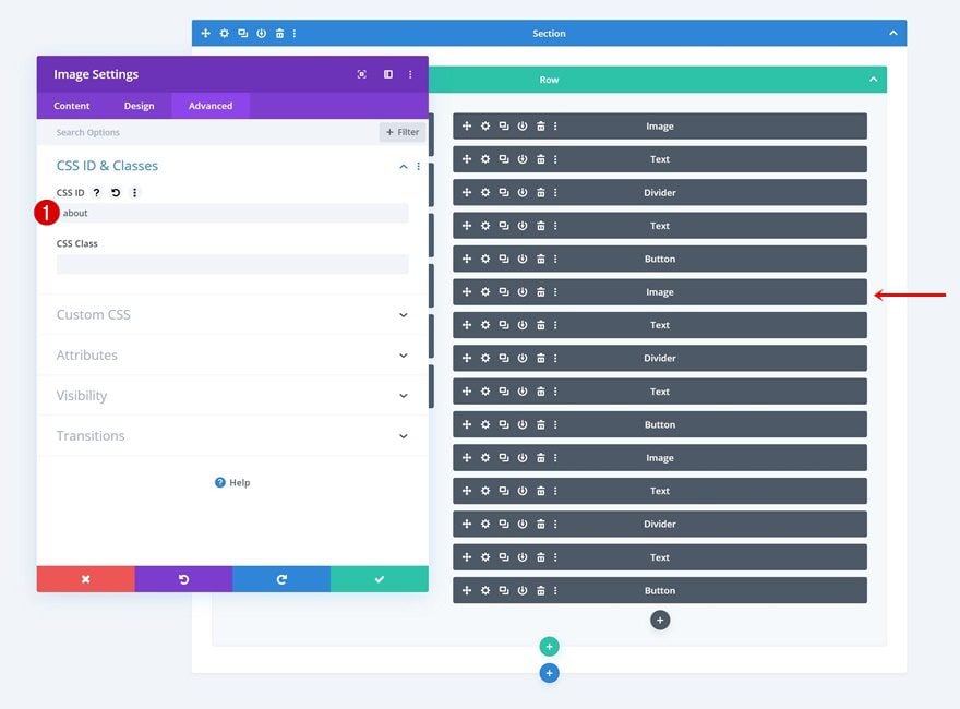
Change Duplicate Image Module #1 CSS ID
Change the CSS ID of the first duplicate Image Module.
- CSS ID: about
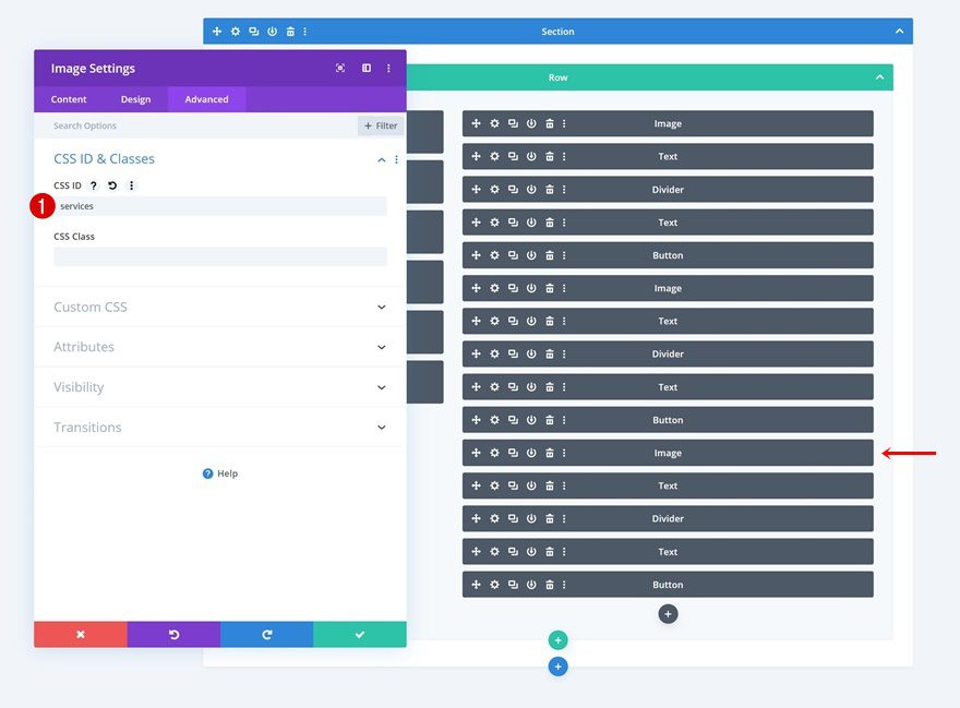
Change Duplicate Image Module #2 CSS ID
Do the same for the second duplicate Image Module.
- CSS ID: services
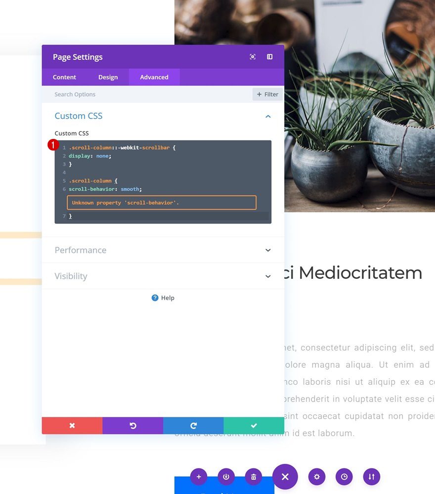
Hide Scrollbar & Add Smooth Scroll
Open Page Settings
Now, to create a smooth scroll effect and hide the column 2 scrollbar, we’re going to add a few lines of CSS code. Open the page settings.
Add Custom CSS
Then, go to the advanced tab and add some CSS code. Once you’ve completed this step you’re done!
.scroll-column::-webkit-scrollbar {
display: none;
}

.scroll-column {
scroll-behavior: smooth;
}
Preview
Now that we’ve gone through all the steps, let’s take a final look at the outcome across different screen sizes.
Desktop
Mobile
Final Thoughts
In this post, we’ve shown you how to create beautiful column side navigation for your one-pager with Divi’s new column options. This is a great way to add anchor links to your page that’ll help improve your website’s user experience. If you have any questions or suggestions, make sure you leave a comment in the comment section below!
If you’re eager to learn more about Divi and get more Divi freebies, make sure you subscribe to our email newsletter and YouTube channel so you’ll always be one of the first people to know and get benefits from this free content.


This looks superbe and is exactly what I need for a new project.
Does it work only with blank page or is it possible to have a top menu, too?