
Yesterday, we used Divi’s visual builder to set up a home page for your podcast that will absolutely impress your listeners, but what if they want to dig deeper into your show?
They’ll head to the beautiful archives and show notes pages I’m going to teach you how to make today.
Today’s Final Products: Show Notes and Archives Pages
The pages themselves are designed to complement the homepage, but not mirror its elements directly.
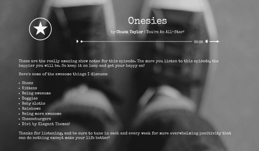
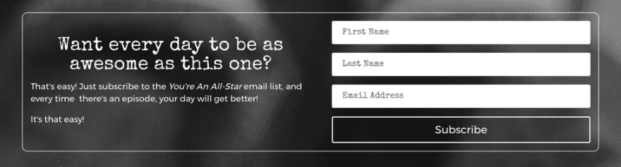
On the show notes page, I wanted to make sure any visitor would be able to listen to the episode directly in their browser, see the highlights and links for that particular episode, and have an opportunity to sign up for your email list.
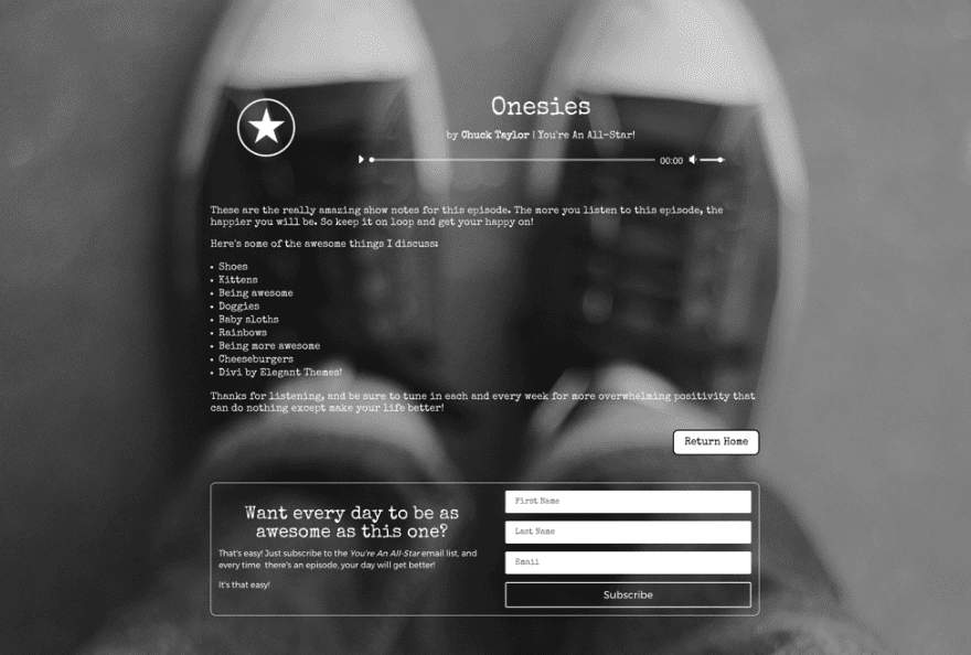
The archive page is equally as simple-yet-functional as the show notes page. Archives pages have one purpose: for your users to quickly and easily see your back catalog. That’s exactly what this page does. With a quick excerpt about the show, your listeners will be able to scan through your show to find exactly the topic they want to listen to.

Assets You’ll Need
Like yesterday, you’re going to need some high-res background images. The two I used are in this collection on Unsplash (which also includes the backgrounds from yesterday’s homepage). I edited them to be grayscale in Preview, but any image editing software will be able to either apply a black-and-white/grayscale effect or let you move the saturation slider down to 0.
Your life will also be a tiny bit easier if you have already built the homepage because you’ll be using some of the same styling.
That’s it, so let’s get to building!
Building the Show Notes Page
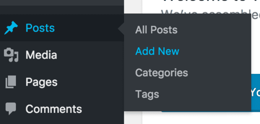
The show notes are just “posts” in WordPress, so navigate to your dashboard and go to Posts –> Add New.
You’ll do this each time you want to create a show notes page for an individual episode of your show. Title it what you want and set the URL slug to something simple (so your listeners remember it after your episode ends).
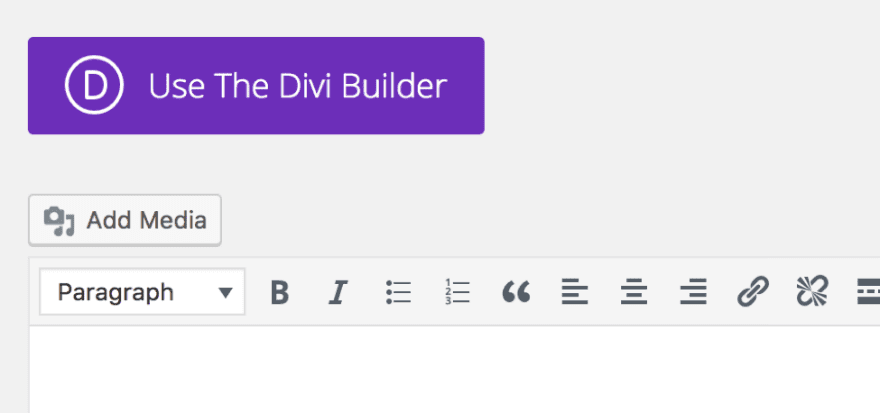
First, make sure that you click “Use The Divi Builder.”
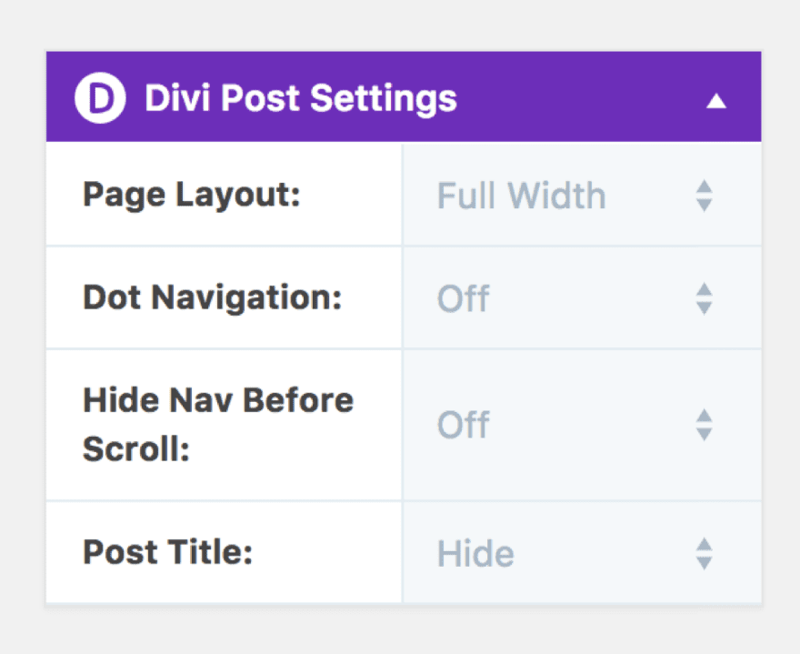
That should open up the next set of options we need. In the right-hand side of the page, set the post to “Full Width” because we are not going to use a sidebar for our show notes. And set the Post Title to “Hide” so that the metadata like author, comments, and date for the post itself doesn’t show up.
Then you’ll want to enter the Visual Builder and be presented by a delightfully blank web page.
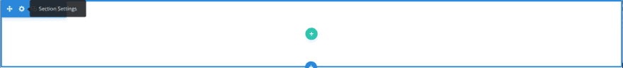
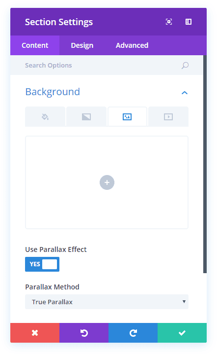
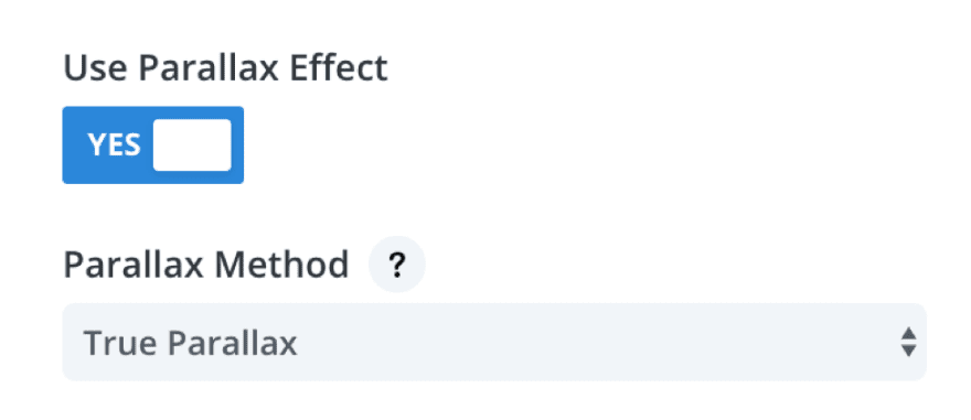
The first thing you’ll want to do is click the gear icon in the blue section in the upper-left corner of the page to enter the section settings.
From there, upload your background image. Scroll a bit further down into the settings and turn Use Parallax Effect on. Leave the Parallax Method to the default “True Parallax.”
Save those settings, and you should see something like this:
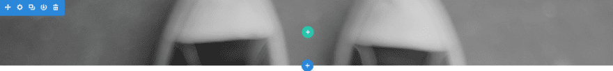
Not exactly what was in the final product up above, is it? We are going to have to stretch it out a bit by adding the content to the page.
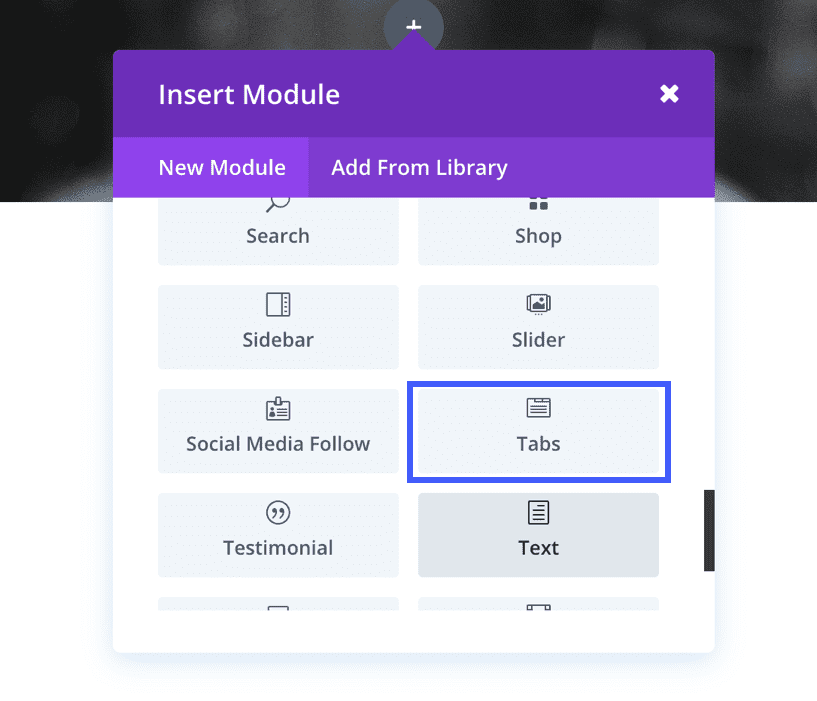
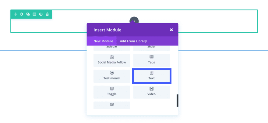
Click the green + and insert a single column row (the one in the upper left corner).
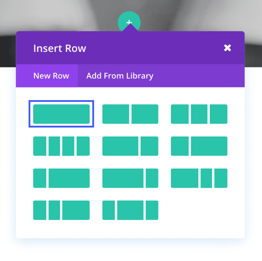
Next, you’ll be glad you already did yesterday’s homepage. As soon as you pick your row, you’ll be greeted by a window asking you to pick an element. You’re going to select the podcast player that we saved yesterday by clicking on “Add From Library.”
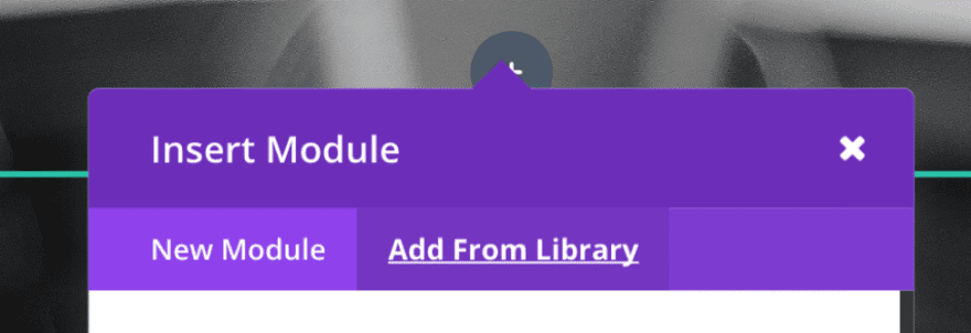
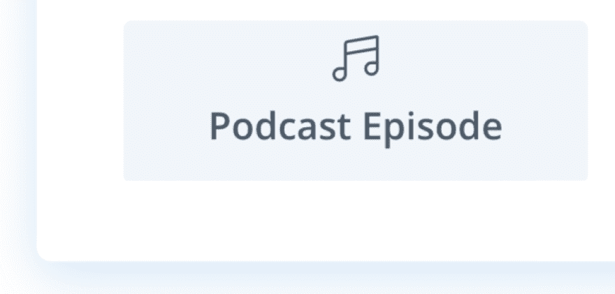
I had named mine simply “Podcast Episode,” but if you chose something different, make sure you pick it.
Badabing-badaboom, you have a podcast episode added to your show notes page like magic.
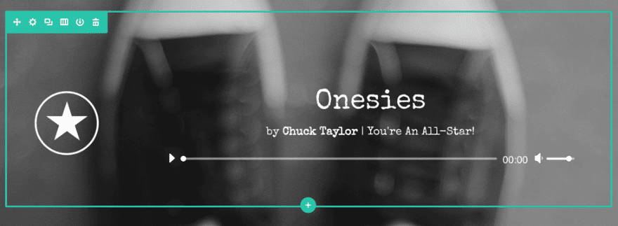
Keep in mind that you will have to edit the title and media (and potentially episode art) for each new show notes page. What you just added is an exact copy of what you had saved.
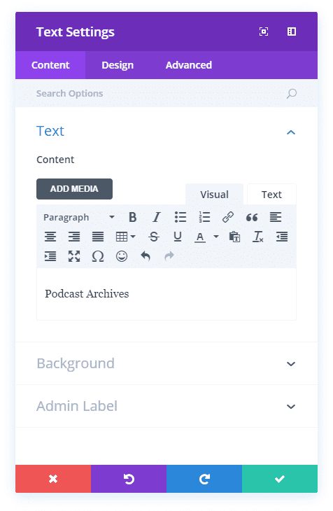
Your actual show notes will go directly under the podcast player, so hover your mouse over the player and hit the black +. Scroll down until you see the text module. Add it to the page.
Under the Content tab in Text Settings, enter your notes into the WYSIWYG editor and head over to the Design tab.
In the Design tab, update the following options:
Text Color: Light
Text Orientation: Left
Text Font: Special Elite
Text Font Size: 20px
Text Text Color: #ffffff
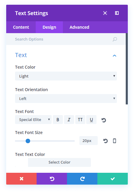
Save it, and you should see a shiny new text block and a page that’s similar to this.
We’re reaching the home stretch for the show notes page–only two elements to go. Click the black + again, and add the button template you saved yesterday.
Instead of taking users to the archives like the one yesterday will do, this one is going to return them to the home page. Navigate to the button’s settings page and set the URL to a simple backslash.
Why not have it go to /home or something similar? Well, using only a backslash will take your user to whatever the front page of your website is, no matter what. And since you’re on the same site, even moving domains won’t affect the button. It will always return home. Which is exactly what you want it to do!
Go through and fill out the rest of the button’s settings. Have it open in the same window, change the button text to “Return Home” (or whatever you like), and the button alignment to “Right” (both to keep it out of the way of the content, and to make it stand out against the content). The Design tab’s styling should have been imported from the Divi Library.
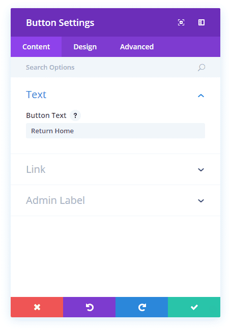
You will have a nice navigation button now, and I suggest adding it to your Library so you can use it on multiple pages.

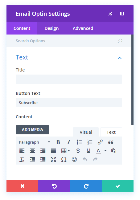
And finally, let’s set up the email signup so we can get those sweet, sweet email addresses to keep users updated with news about the podcast.
For this, we want a whole new, single-column row. So click the green + and get that into place. Then add an Email Optin module from the dropdown. Just like yesterday, navigate to the module settings and enter whatever title you want to display as well as any call-to-action text you want in the WYSIWYG editor.
Also, add whatever text you want for the button itself. I chose the totally unique “Subscribe.”
Pick your email service provider and list ( remember from yesterday that the full module won’t show up on the page when it’s live if you don’t choose a list).
Change the background RGBA to transparent.
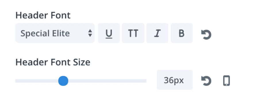
Under the Design tab, set the Header Font to “Special Elite” and the size to 36px.
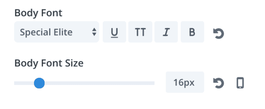
You will also set the Body Font to “Special Elite” and size to 16px.
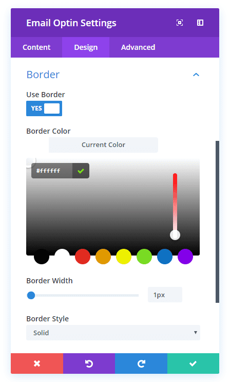
Unlike almost everything else for this site, we do want to use a border for the Email Optin module. So move “User Border” over to yes, and set the color to #ffffff, and the Custom Padding to be 15px on all sides.
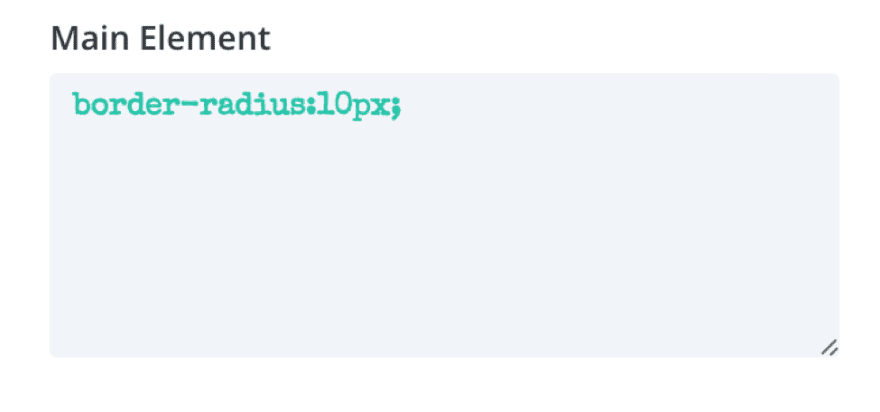
When that’s done, move into the Advanced tab and add this to the Main Element under Custom CSS to round the module’s corners:
border-radius:10px;
Save your work, and you’ve got an email optin!
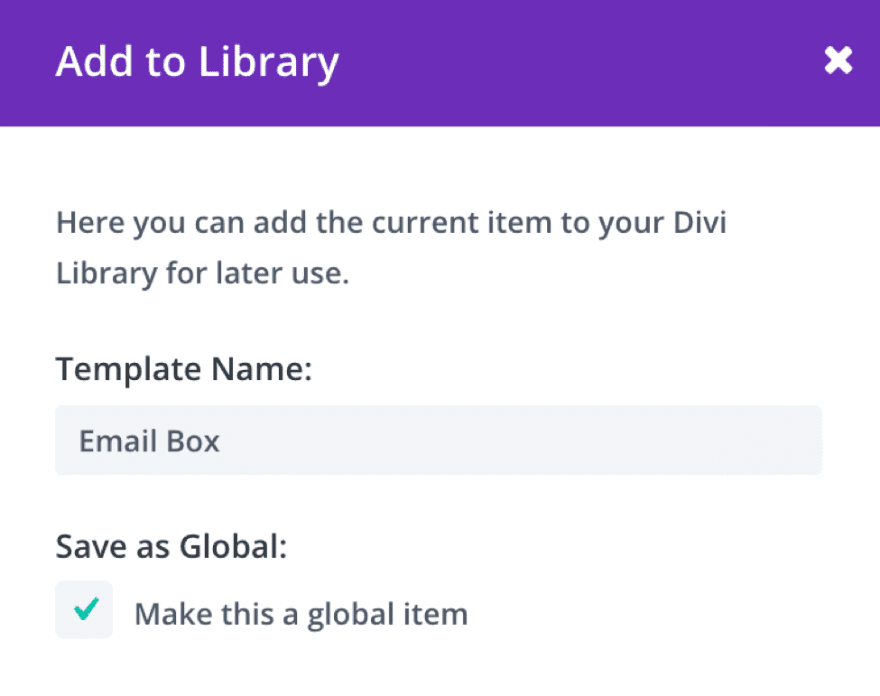
The only other thing your show notes page requires is to save this module for use on other pages. Since you want your email optins to be consistent across the site, we are going to save this as a global item. Click your “Add to Library Button” when you mouse over the module, and make sure you check the box “Make this a global item.”
Now you have a single element that you can use across multiple pages. And if you make any changes to it, they will be reflected in all of the instances, unlike the podcast player and button above where each module can be changed individually.
And there, my friends, is your Show Notes page template! I also suggest saving the whole page to your Library so you can just import it and change the elements you need to for each episode.
Now…onward to the Archives! The finish line is in sight!

Building your Archives Page
Head to your WordPress dashboard and navigate to Add New Page, name it (mine is “Archives”), and open up the Divi Visual Builder. Easy peasy.
Once you’re there, add a new single-column row with a text module.
Navigate to the settings and enter your page title in the WYSIWYG editor.
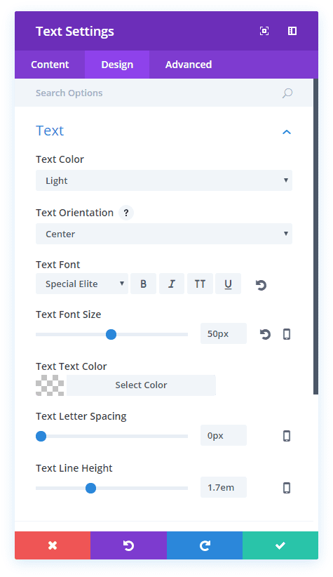
In the Design tab, set the Text Color to Light and Orientation to Center. Set the font to “Special Elite” and the Font Size to 50px.
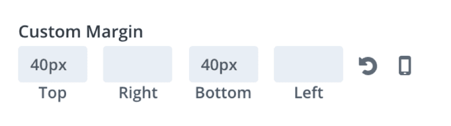
To make the text look good on mobile, be sure to change the top and bottom margins to 40px.
Save your work, and–brace yourself–get ready to add a background to the Archives! Open the settings in the blue + box, and select your background image and set the parallax like you did for the Show Notes. Again, I made this one grayscale using Preview.
Under the Design tab, set the top and bottom padding to 55px and 176px respectively so the whole page allows for the parallax effect to be seen no matter how many posts you have in your archives.
Why 176px instead of 175? Because I’m a rebel, that’s why.
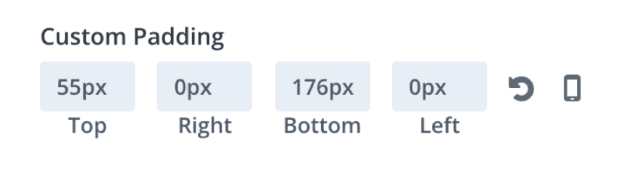
You’ll see this when you save your work:
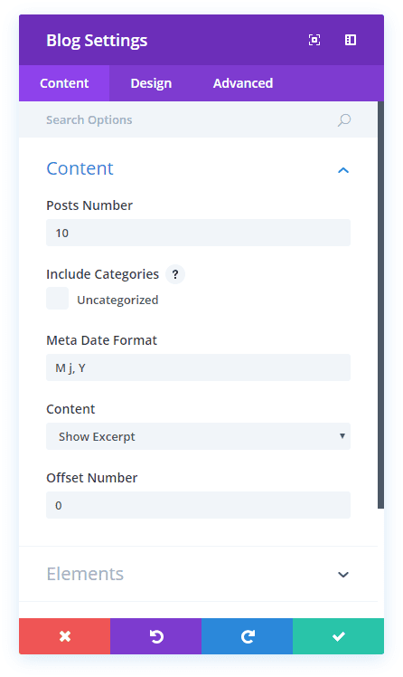
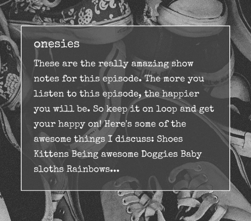
Next, add a new single-column row, only this time, insert a Blog module. This will display whatever WordPress Loop you set, and we just want it to be Excerpts and Titles so your listeners know what to expect.
Head to the settings and update the options in the Content tab as follows:
Post Number: 10 (or whatever you think looks the best for your site–it will paginate after this number is displayed)
Content: Show Excerpt (because we want the user to click through and listen to the episode in the player)
Show Featured Image: YES
Grid Tile Background Color: rgba(73,73,73,0.72)
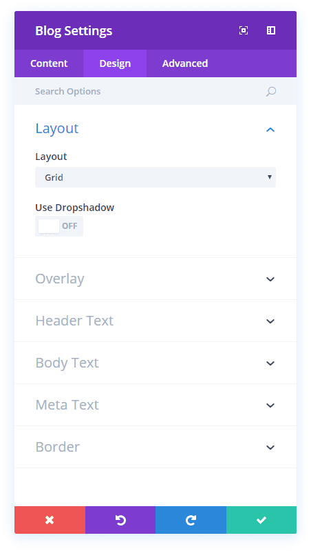
In the Design tab, update the following options:
Layout: Grid
Header Font: Special Elite
Header Text Color: #ffffff
Body Font: Special Elite
Body Text Color: #ffffff
Meta Font: Special Elite
Meta Text Color: #ffffff
Use Border: YES
Border Color: #ffffff
Border Width: 1px
Border Style: Solid
When that’s all set, you have one last bit of styling to do. The grid itself has sharp, square corners in each box, and we want to get a 10px border radius so that it will match the rest of the site.
Navigate to your WordPress Dashboard –> Divi –> Theme Options, and then scroll all the way down to Custom CSS. Add this code into the box to round the corners of the individual excerpt boxes:
.et_pb_post {
 border-radius: 10px;
}
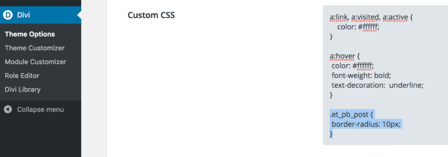
Keep in mind that “.et_pb_post” is the CSS Class that Divi uses to adjust those boxes as a whole.
After that, save all your work.
The only thing left to do is add the Return Home button from your library, and you’ll be done. Click the black + to add it to the same row as your Blog module.
Hot diggity dog, you just finished setting up your Archives page.
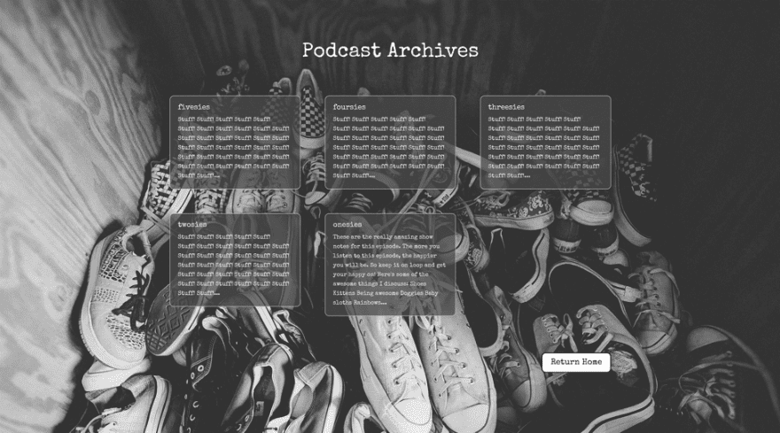
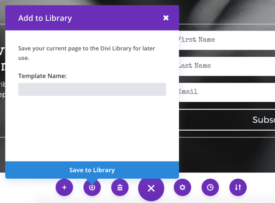
Congrats! You just finished setting up your Archives page. Save your Archives page as a template by clicking on the purple + at the bottom of the screen, and you can check another item off your bucket list–because between yesterday and today, you just created a fully functional podcast player, homepage, archive, and template for individual shownotes.
In Conclusion
And that’s it! Thanks for following along with my two podcast page tutorials. You can catch the first one How to Create a Beautiful Podcast Page with Divi at this link. If you have any questions or comments feel free to leave them below and I’ll do my best to answer them!


Hey, how come I don’t get ET blog updates in my inbox anymore? I generally look forward to receiving ET articles.
This is great stuff, BJ. Thanks very much!
Thank you! I’m glad you liked it 😀