
The Header Layout Pack from Divi Life is a set of headers for the Divi Theme Builder that can be styled to fit well with any Divi website. The headers stand out from the crowd with new styling added with code. The layout pack includes six header designs with three styles for each. In this article, we’ll look at the header layout pack to help you decide if fits your needs.
Importing the Divi Life Header Layout Pack
Before using the layouts with the Divi Theme Builder, you’ll need to import them to your Divi Library. Fortunately, this is a simple and straightforward process:
- Download and unzip the layouts to a folder on your computer.
- Go to Divi > Divi Library in the WordPress dashboard menu.
- Select Import & Export at the top of the screen.
- Select Import in the popup, select Choose File, and navigate to the layout you want to upload (select ALL-Divi-Life-Header-Templates if you want to upload all of them at once.
- Click Import Divi Builder Layouts and wait for the upload to complete.
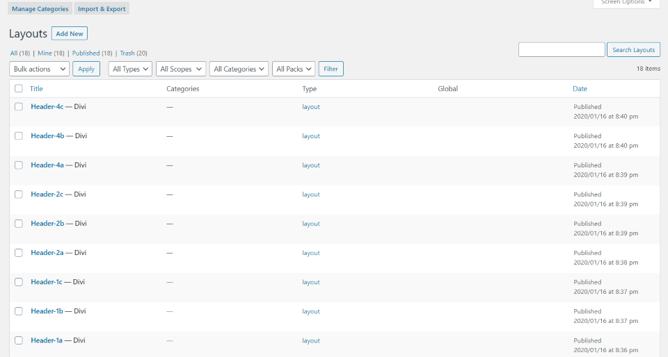
The layouts will now be available in your library. In the example above, I selected to upload all of the templates. The Theme Builder now has access to all of the layouts. You’ll only need to make code and menu adjustments to Header 1. The rest work as they are.
Creating a Global Header in the Divi Theme Builder
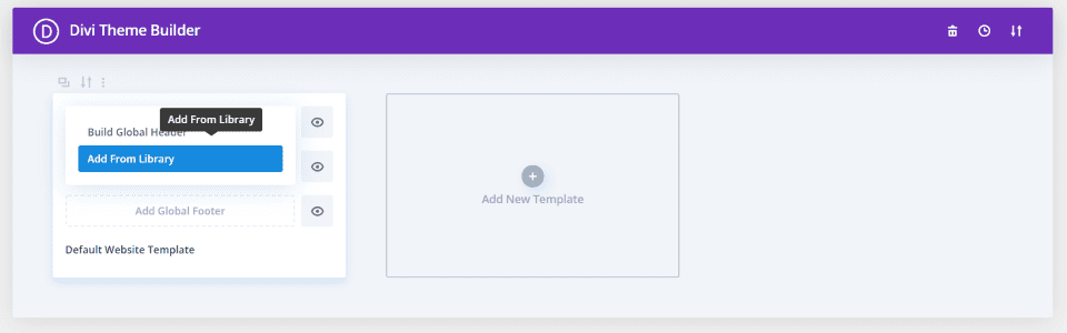
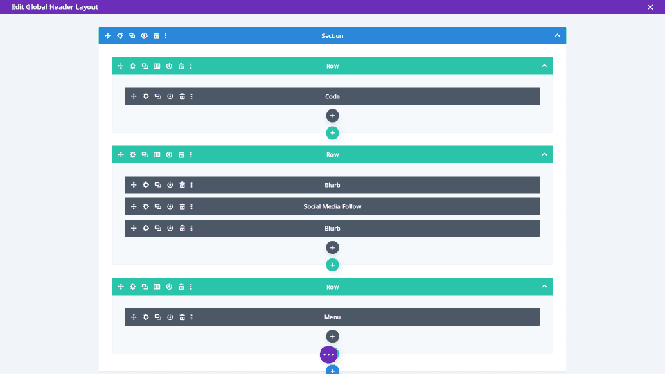
Open the Divi Theme Builder and click to add a global header. Select Add From Library.
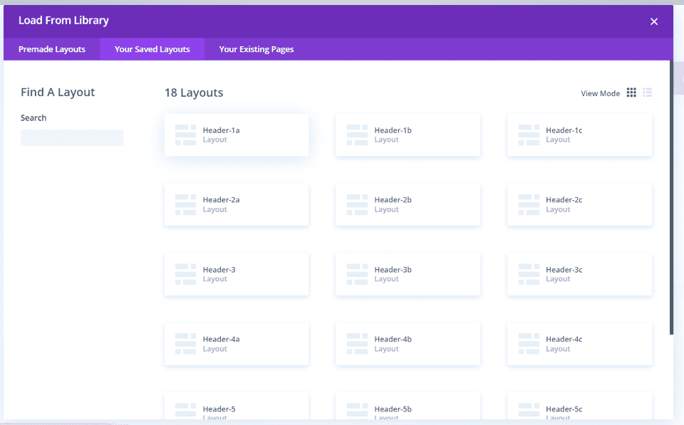
Select the tab called Your Saved Layouts and choose the layout you want. Wait for it to import.
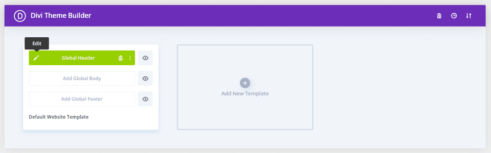
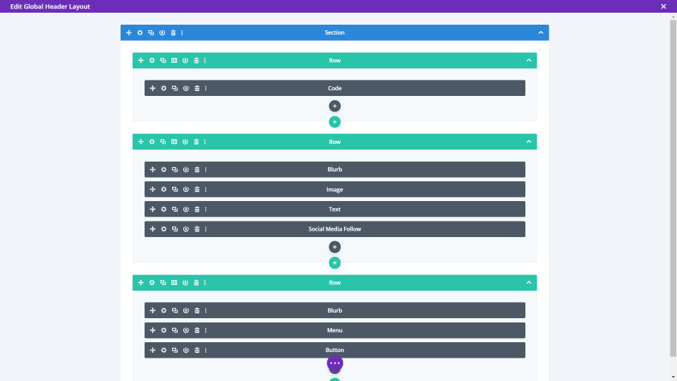
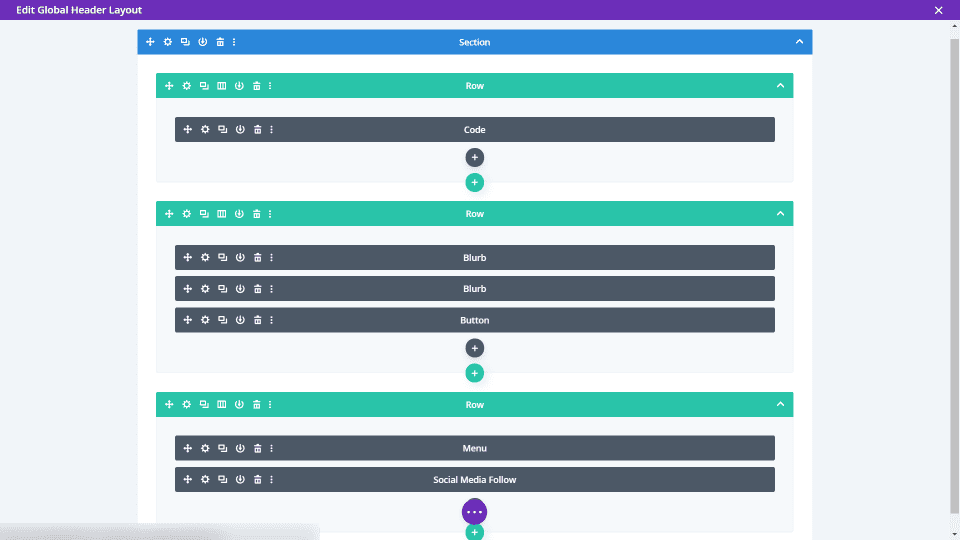
Click the edit icon to customize the layout.
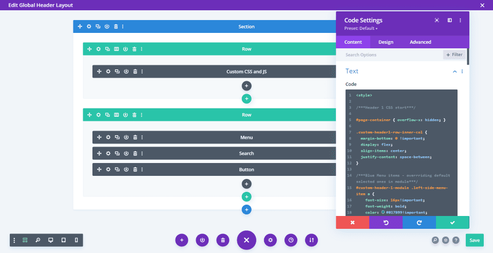
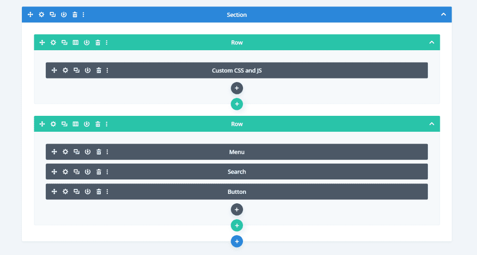
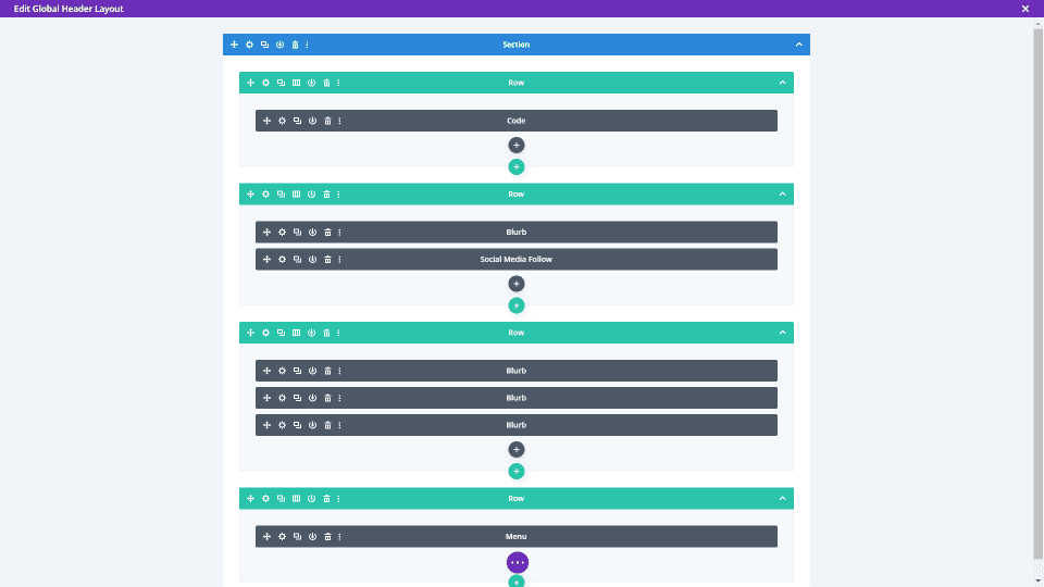
I’ve selected Header-1-a. This shows the layout in the wireframe view. It includes a code module with custom CSS and JS. Many of the modules include Class ID’s for the custom CSS. Some of the code may not run in the theme builder preview. I recommend viewing the header on the front-end.
If you want to make changes and you don’t want the header to display until the changes are made, then you might consider creating a test page and assigning the header to that page before making it a global header.
Changing the Content and Styling
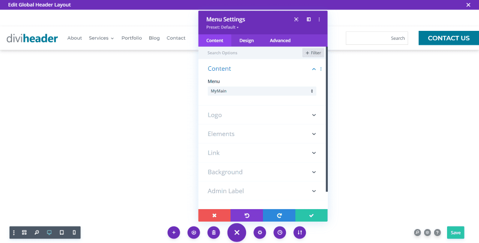
Next, you just need to choose your menu, add your logo, and customize the colors to match your website. The header uses the standard modules, so this works like any header. I’ve selected my menu in the example above.
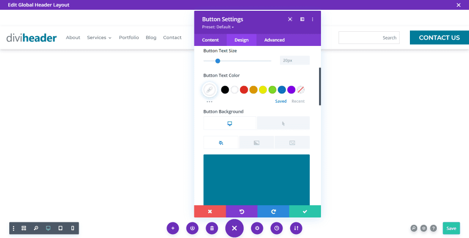
The button already uses custom styles. Simply add your designed colors and fonts. Click to save the changes.
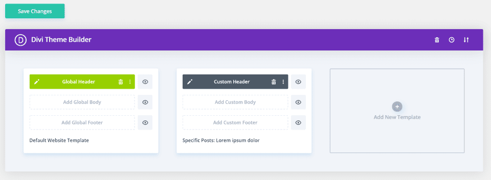
Also, make sure to save the changes on the main screen. I’ve added a version of the header to a specific post so I can test the header before dropping it into the default website template and making it global.
Header Examples
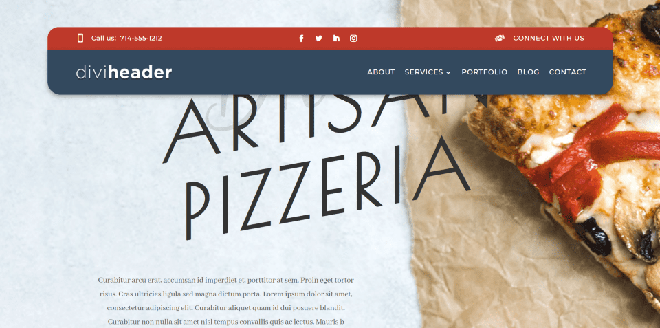
Here’s a look at how the templates look with my test site. The 6 layouts have a pre-styled light, dark, and bright colored version. This makes it easier to choose a header that fits your design and then tweak it to your needs. They also have buttons that change color on hover.
We’ll look at a mix of them with different background colors and screen sizes. I’m using the home page and landing page layouts from the Pizzeria layout pack.
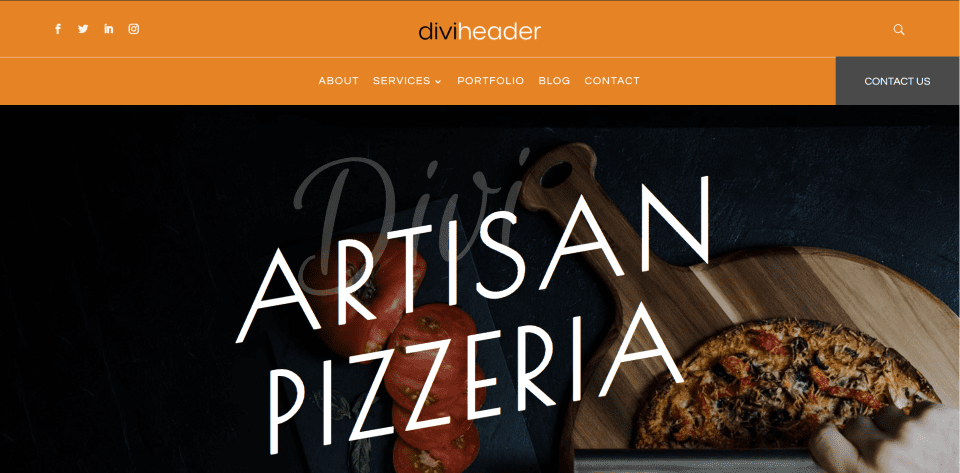
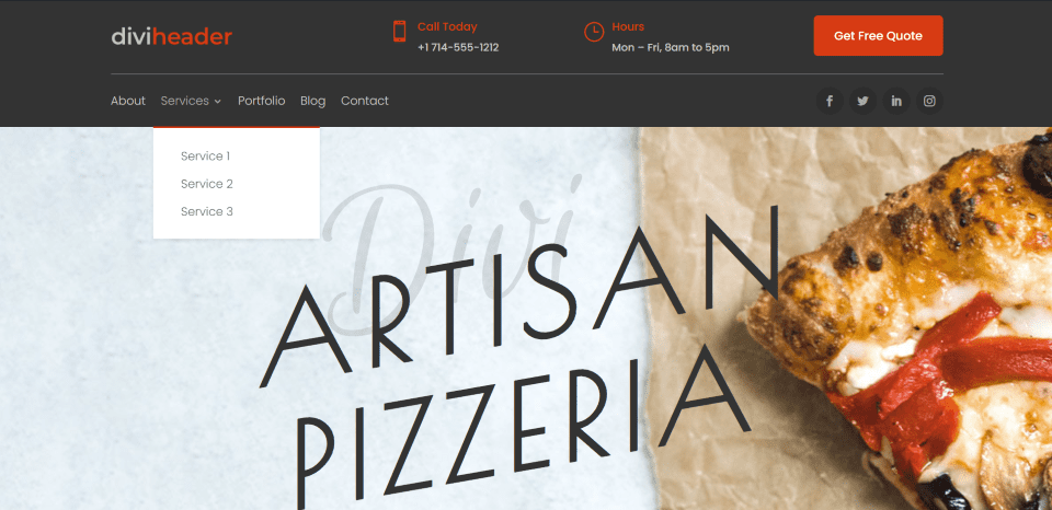
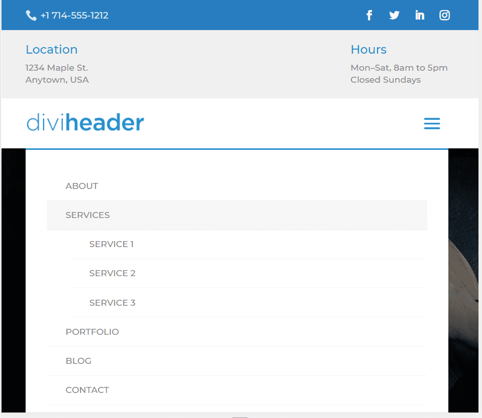
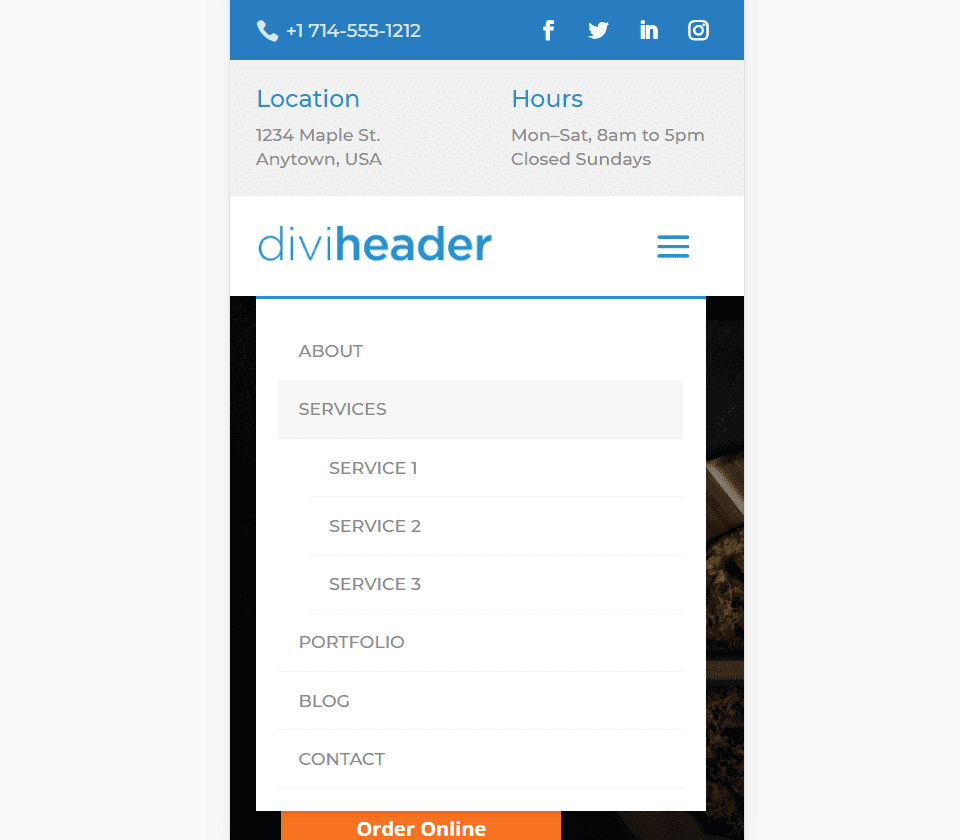
Header 1 Layout
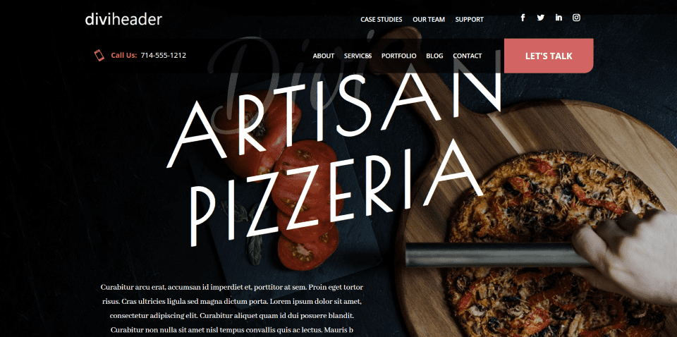
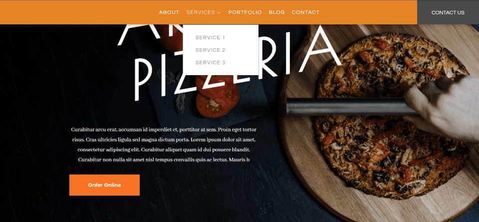
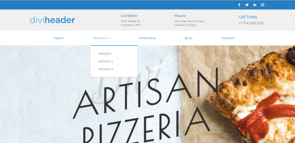
Header 1 includes a code module, menu, search, and a button to create the CTA.
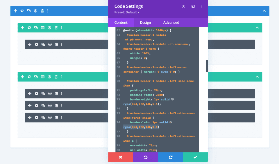
The import process doesn’t keep the values correctly, so three lines in the CSS will need to be changed.
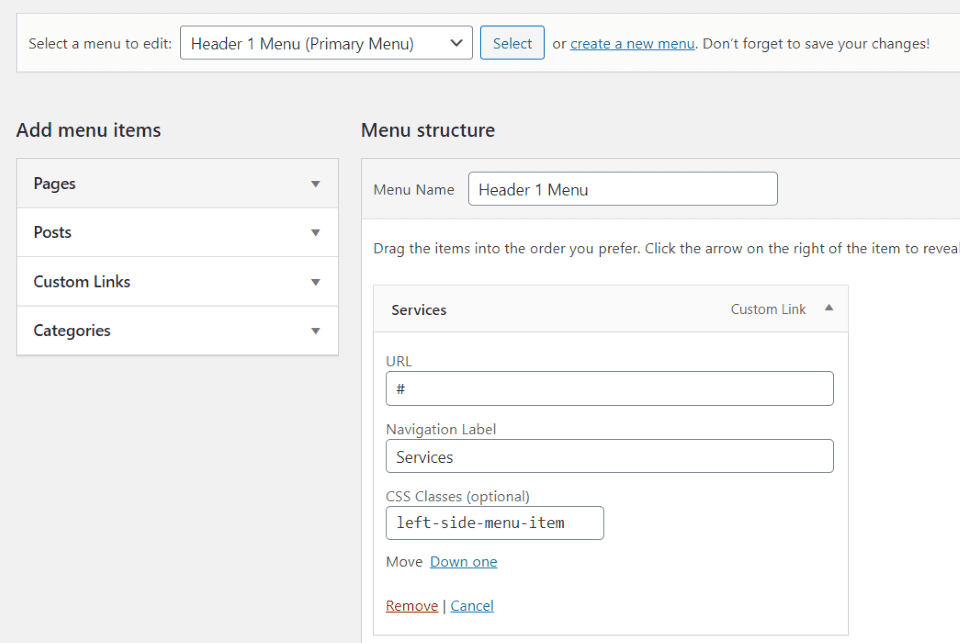
Also, the menu will need to be renamed and the CSS class will need to be added to the menu. Fortunately, all of these adjustments are easy to do. The instructions are in the documentation. This is the only time I needed the documentation during this review.
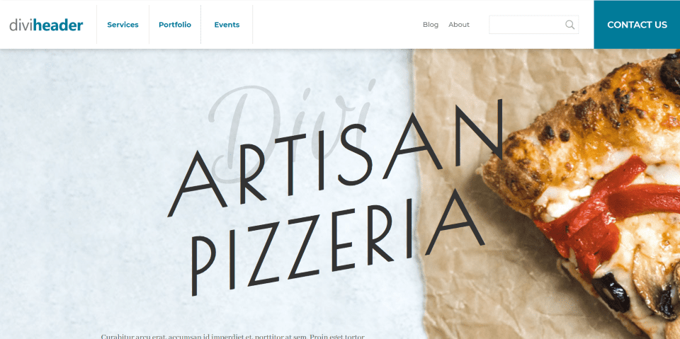
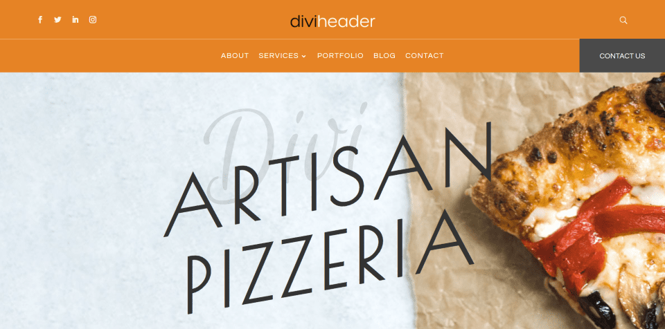
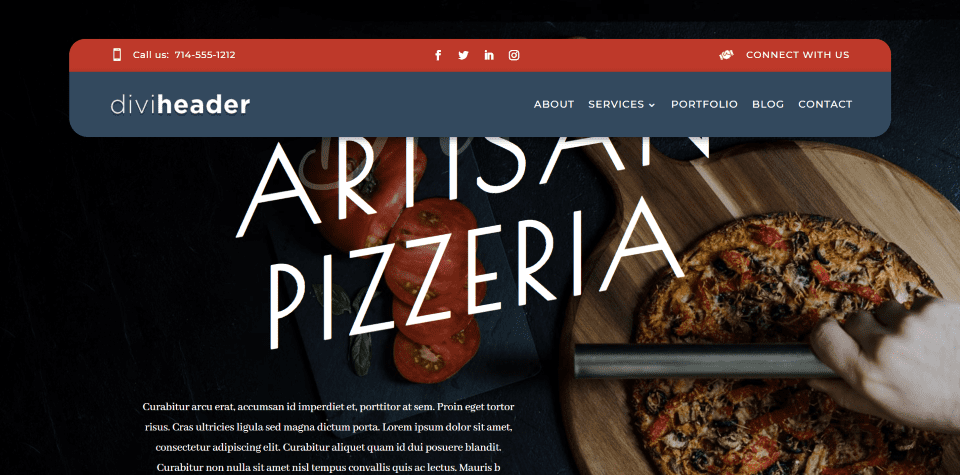
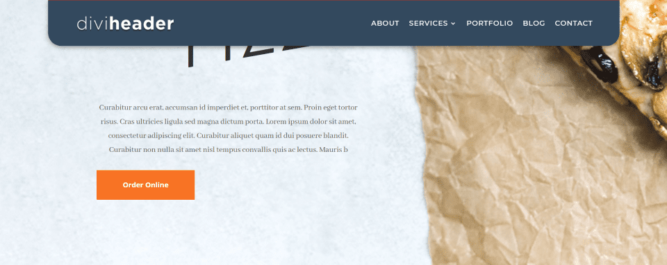
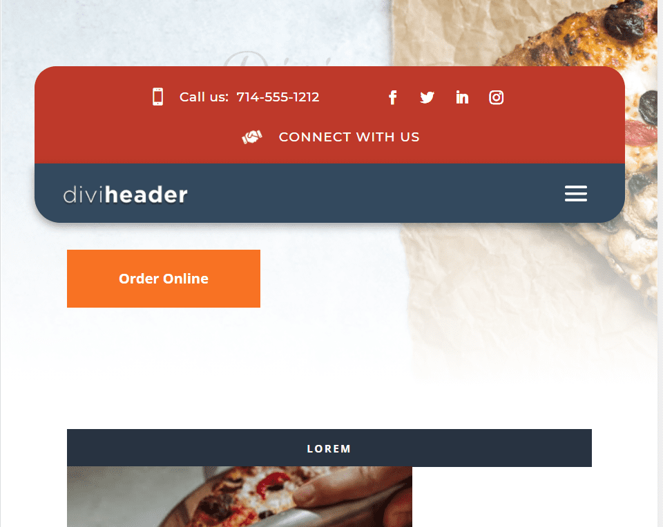
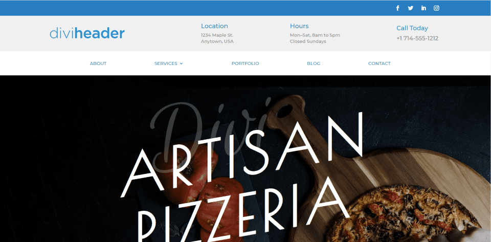
The result is an elegant menu with dividing lines for the main three menu items placed on the left, the rest of the menu placed on the right, a search box with an icon inside the search field, and a large CTA button. Here’s how it looks with the light background. A shadow separates the header from the page.
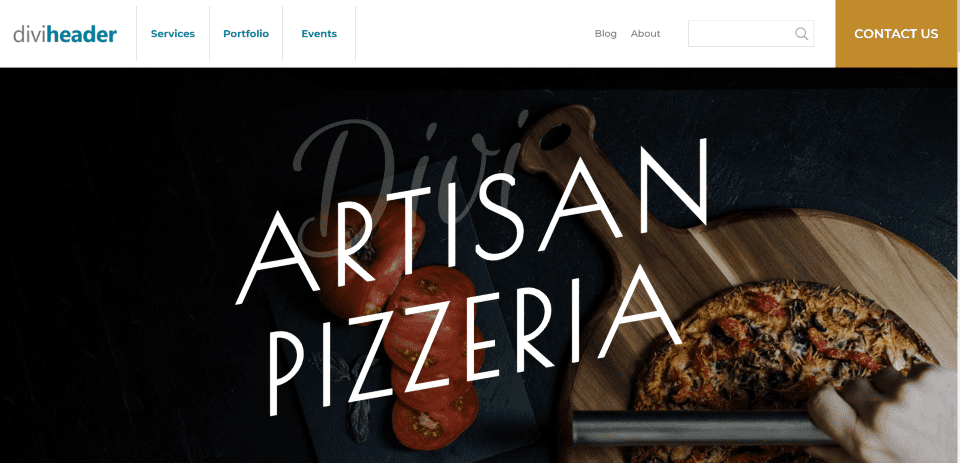
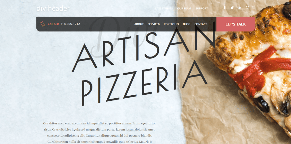
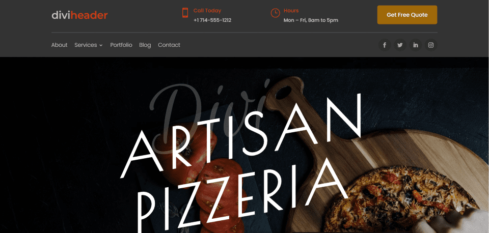
Here’s the dark background. I’m hovering over the CTA to show that it changes color.
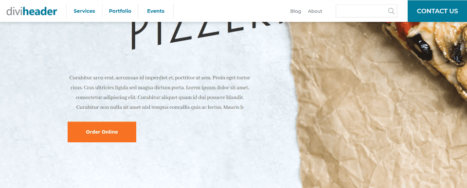
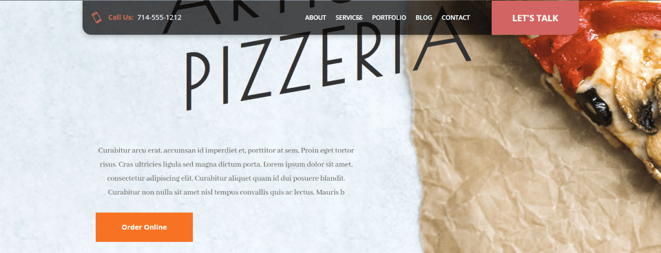
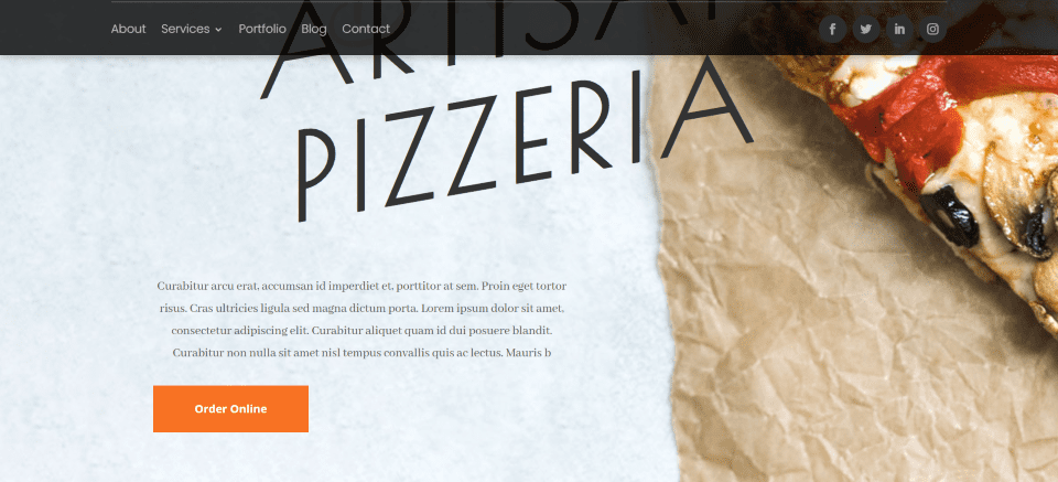
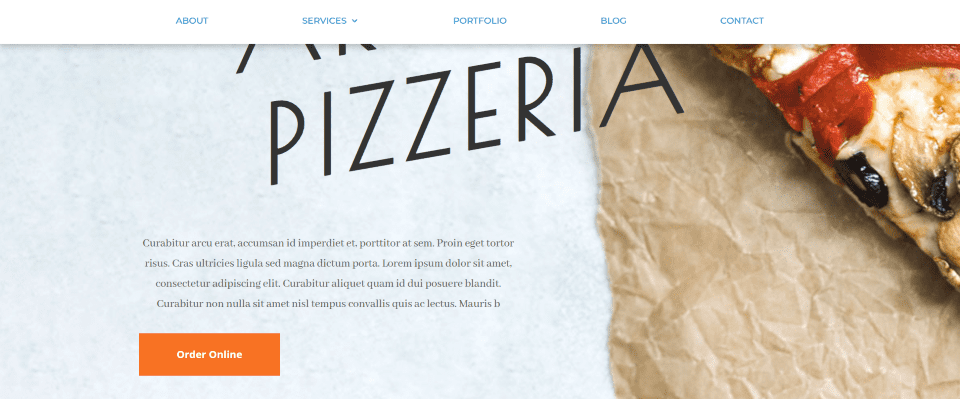
The header reduces in height as you scroll. The elements remain the same size.
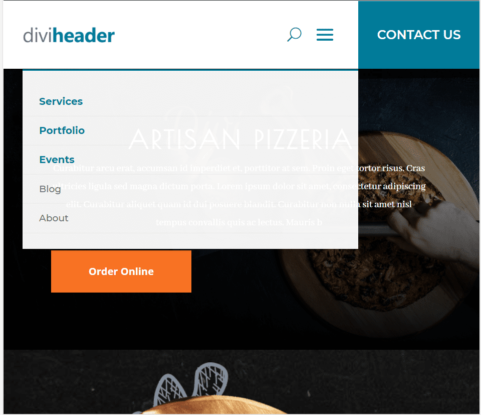
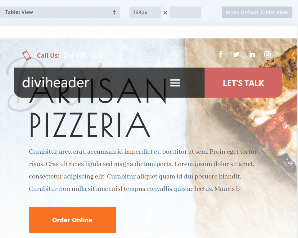
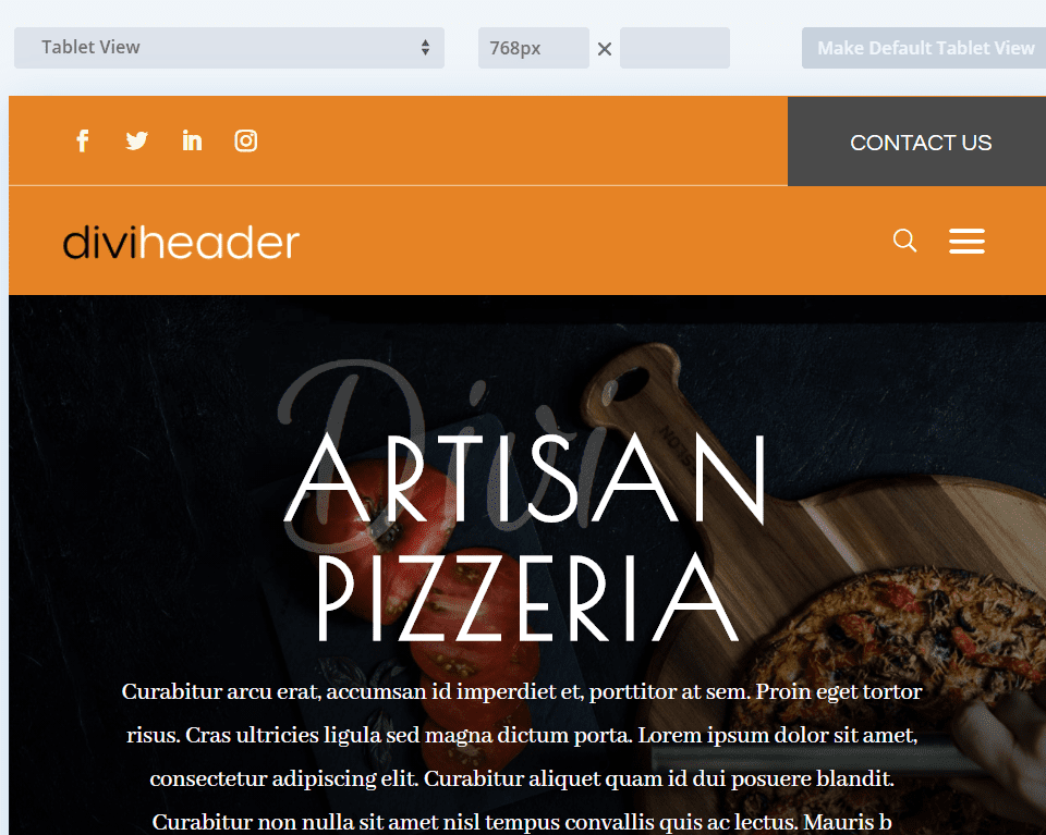
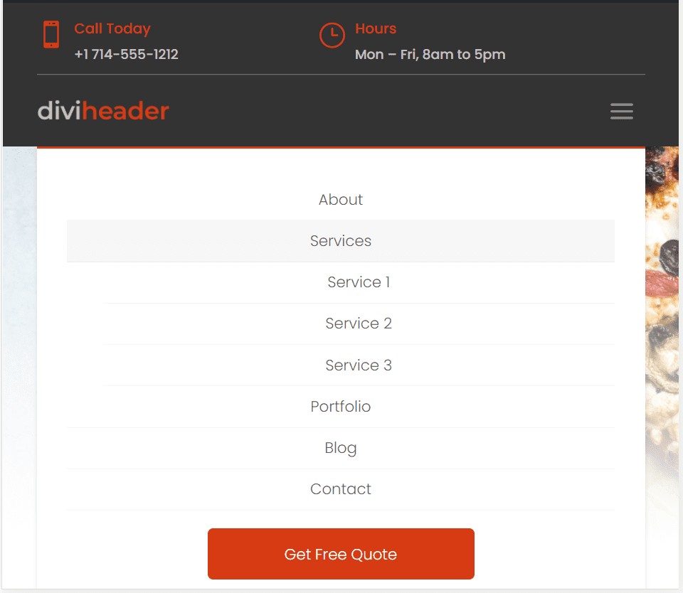
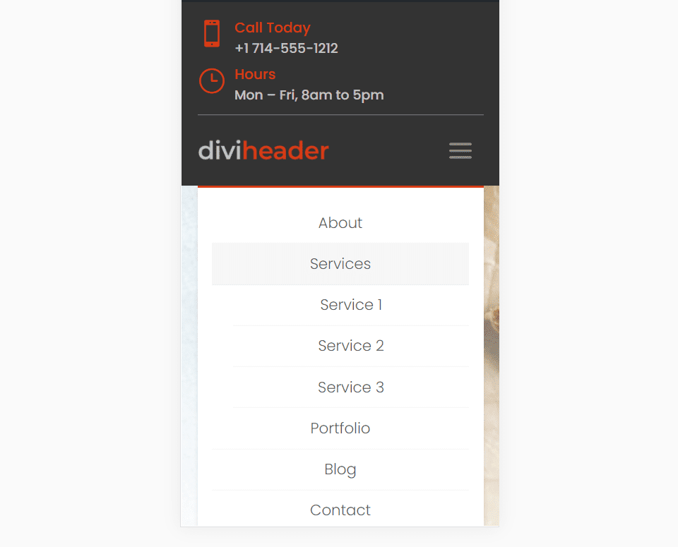
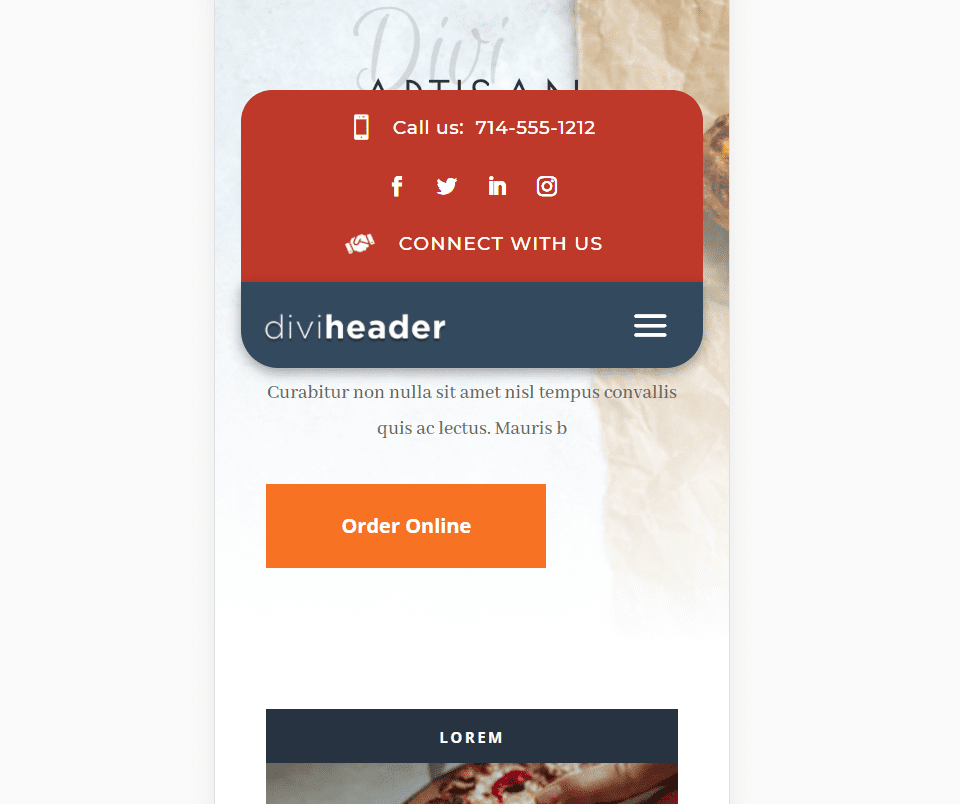
Here’s the tablet view. The menu items are placed within the dropdown menu. The three items with the CSS class include styling that makes them stand out from the rest.
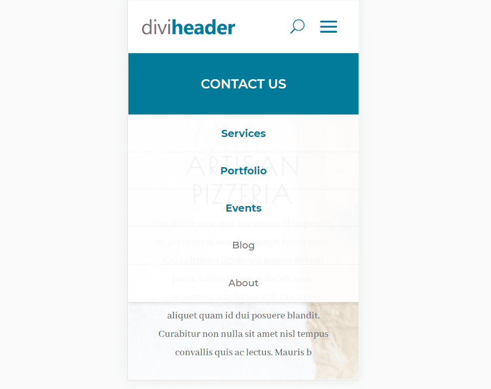
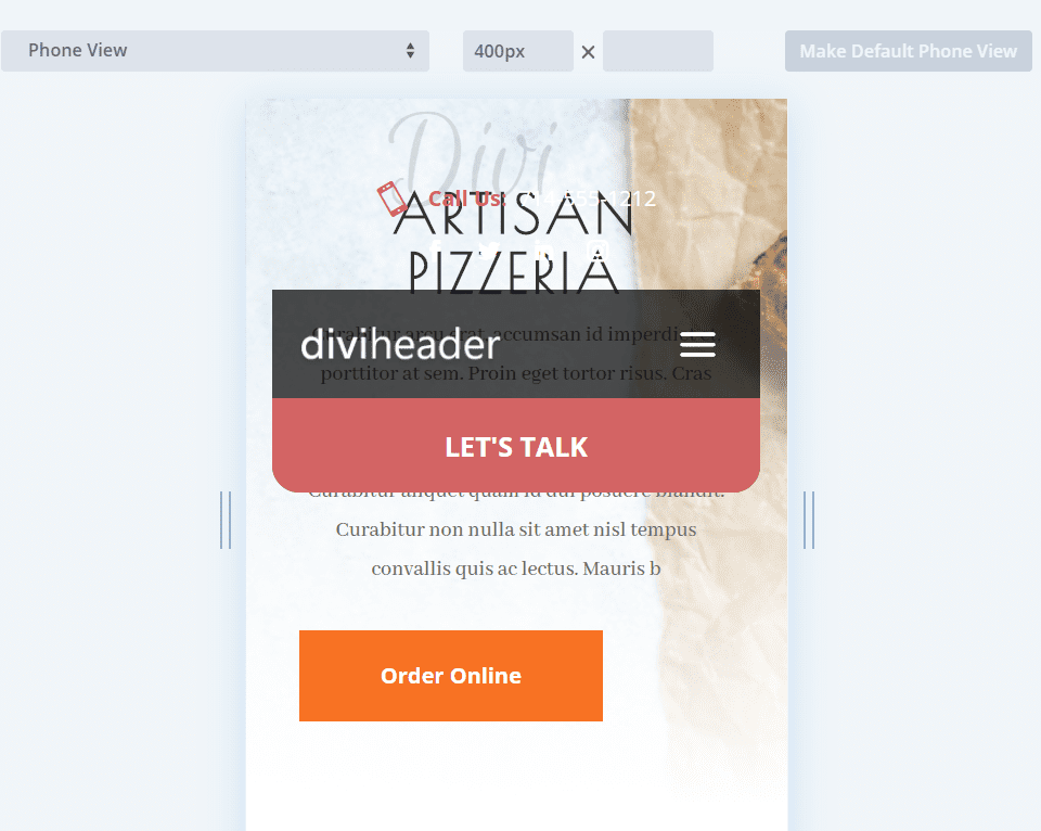
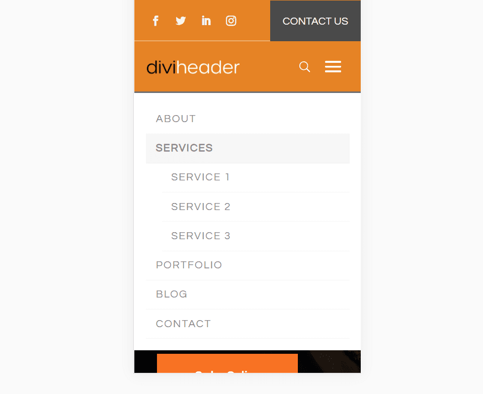
The phone view stacks the CTA under the logo and also retains the styling for the items with the CSS class.
Header 2 Layout
Header 2 uses a code module with CSS and JS, blurb, image, text, social media, menu, and button modules.
This is Header 2A. Here’s how it looks on a dark page. The header doesn’t cover the full-width of the site. The top menu is transparent and includes social buttons. The bottom has the CTA and contact information. The phone number is clickable.
Here’s the design on a light page. I like how this CTA stands out.
After scrolling, the top menu scrolls with the page, and the bottom menu sticks to the top.
Here’s the tablet view. The top menu scrolls with the page while the bottom menu sticks.
Here’s the phone view. The CTA is stacked under the menu. The header scrolls away with the page.
Header 3 Layout
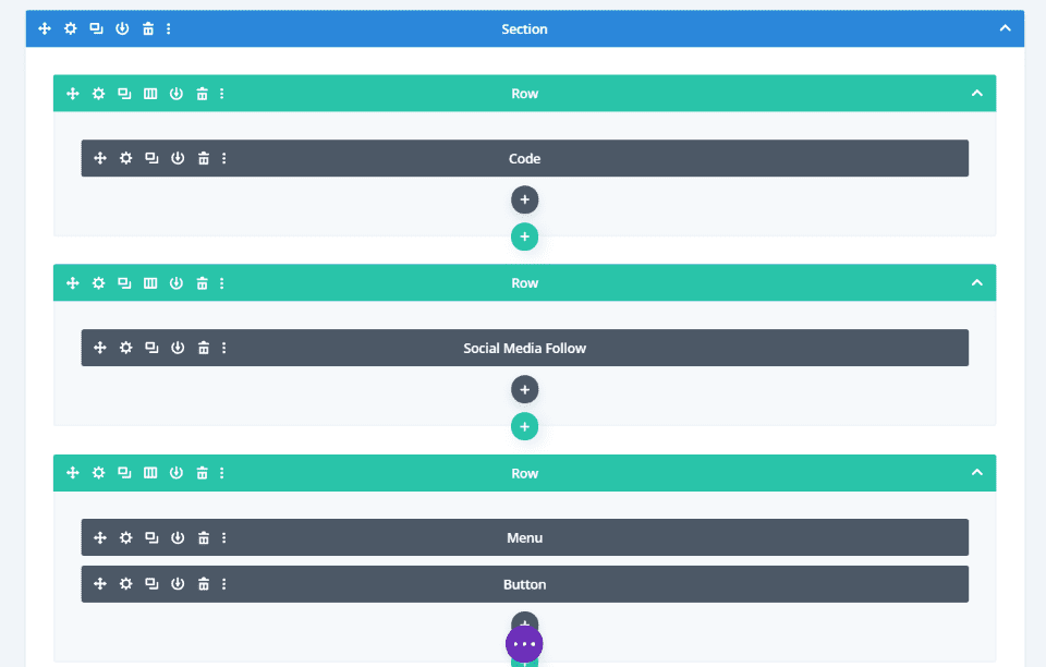
The modules for header 3 include code, social media follow, menu, and a button.
Here’s Header 3B with a light background. The top section includes social buttons and search, while the bottom section adds the CTA.
Here’s how it looks against a dark background.
The top menu scrolls away with the page while the bottom menu sticks to the top of the screen.
Here’s the tablet view.
Here’s how the phone view stacks the elements.
Header 4 Layout
Header 3 includes code, several blurbs, a button, menu, and social media follow modules.
Here’s Header 3C against a light background. The top includes the contact information and CTA, while the bottom shows the social buttons.
Here’s how it looks with a dark background. The original colors look great with this background. I’m hovering over the CTA in this example.
Here’s how this one looks after scrolling. The top section scrolls with the site and the bottom section sticks.
This is the tablet view.
The phone view stacks the elements.
Header 5 Layout
Header 5 includes a code module, a couple of blurbs, social media follow, and menu modules.
Here’s Header 5C against a dark background. The top includes a clickable phone number, social buttons, and a link to the contact form. The red and dark gray stand out nicely.
It also looks nice on the light background. The box shadow is more noticeable.
The top half of the menu continues to scroll as the bottom half sticks to the top of the screen.
Here’s the tablet view.
This is the phone view. I like the way the content of the top section stacks.
Header 6 Layout
Header 6 includes a code module, 4 blurbs, a social media follow module, and a menu module.
This is Header 6B against a dark background. This one has three sections: the top includes social buttons, the middle includes contact information, and the bottom has the menu links.
Here’s the header against a light background.
The top 2 sections of the header scroll away and the bottom section is sticky. It adds a box shadow to the bottom menu when it sticks to the top of the screen.
Here’s the tablet view. It moves the phone number to the top.
Here’s the design in the phone view.
Purchase
The Header Layout Pack is available from Divi Life for $49 (on sale for $5 through the rest of the year). It for use on unlimited sites for you and your clients and includes access to all future updates. It also includes support and documentation.
Ending Thoughts
The Header Layout Pack for the Divi Theme Builder is an interesting set of layouts. The CSS and JavaScript add styling that isn’t normally available in a header. This helps make the header have a much different look than the standard headers. Since each design has multiple pre-styled options, it’s easy to find something to fit your website without having to make a lot of modifications. The styling already fits with the free Divi layouts from ET.
The headers do look professionally designed and I found them easy to use. I’ve only looked at a few of them. Working with Header 1 is the only layout that requires complicated steps. It’s not that difficult if you read the instructions (guess how I know). Just keep in mind that it does require more steps than the others.
If you’re interested in professionally designed headers for the Divi Theme Builder, The Header Layout Pack from Divi Life is worth a look.
We want to hear from you. Have you tried the Header Layout Pack from Divi Life? Let us know what you think about it in the comments.
Featured Image via PureSolution / shutterstock.com


It’s a really great deal… Expecting more design to come and one more important we missed off-canvas mobile menu slide in and out design. Hope they will check this message and work on it too. Thanks
$5 for this pack is an absolute steal. I do not know why anyone would not get this pack!
Thanks for this detailed post on the header layout pack Randy.
The screenshots help a bunch.
Sincerely – Bill