
Over the past few weeks, the new Divi transform options have helped spark our creativity. One of the best things about the transform options is the visual “pop” that comes with using it. With just a few tweaks, you can change the overall user experience of any module, row, section or page you’re working on.
In this post, we’re going to show you how to combine these awesome transform options with Divi’s hover options. More precisely, we’re going to make our copy “pop”. The five examples we’ll cover are very general, which means you can use them for a wide variety of use cases. The main purpose of this tutorial is to introduce you to the potential of transform and hover options when combined.
Let’s get to it!
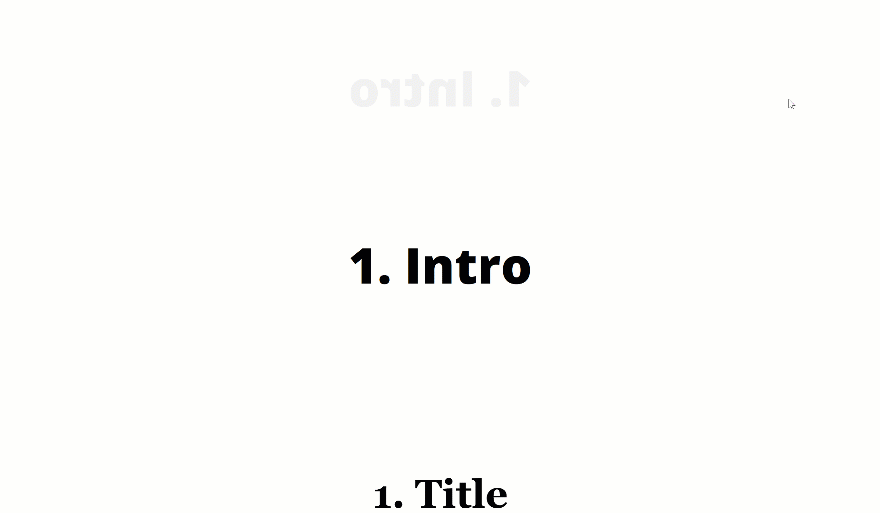
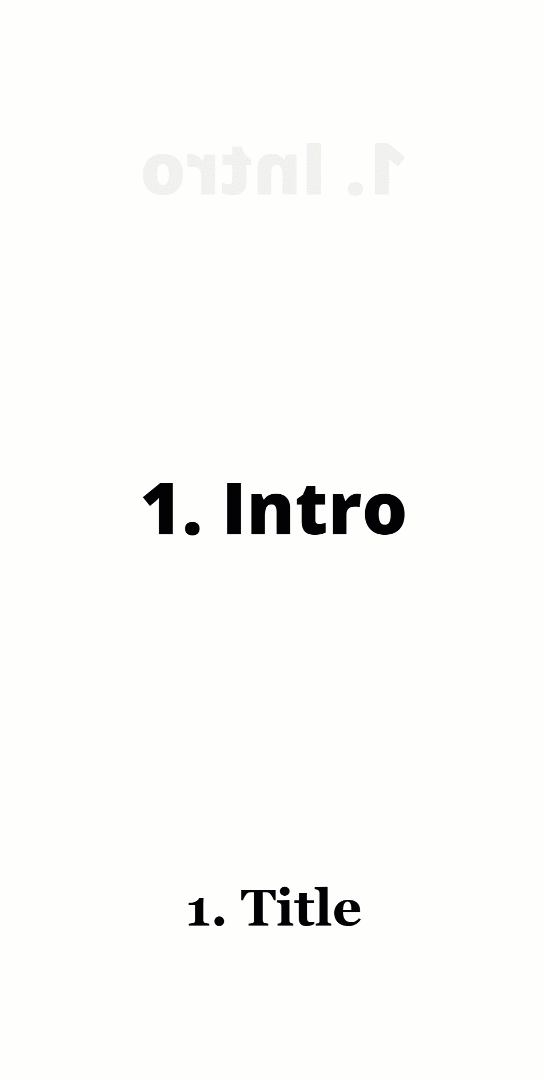
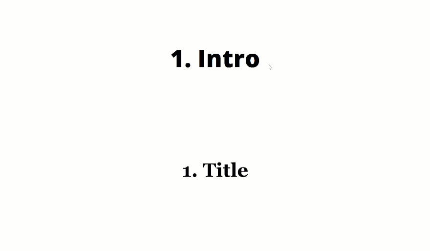
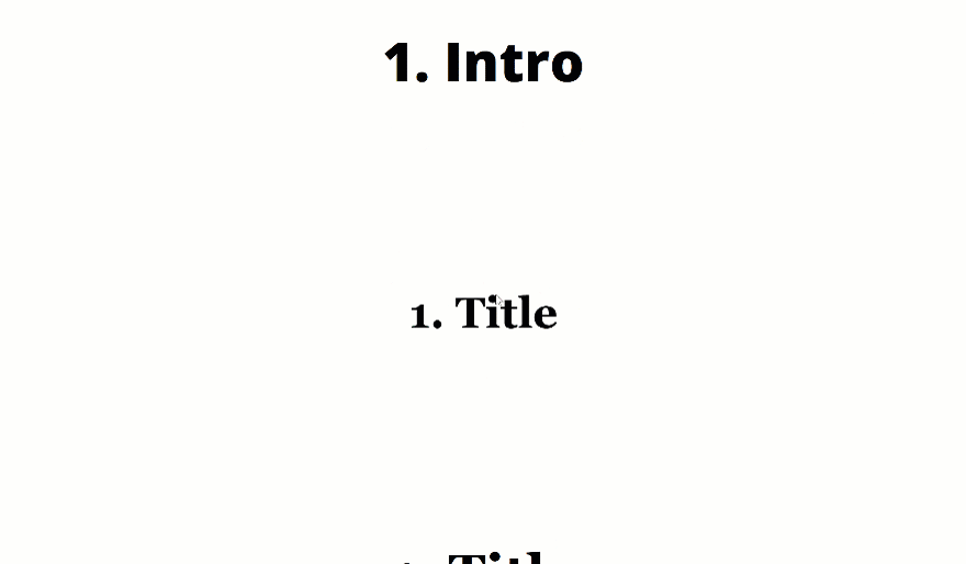
Preview
Before we dive into the tutorial, let’s take a quick look at the outcome of all five examples across different screen sizes. Remember that the effects will be triggered on hover for desktop and on click for tablet and phone.
Desktop
Mobile
Download The Examples for FREE
To lay your hands on the free examples, you will first need to download them using the button below. To gain access to the download you will need to subscribe to our newsletter by using the form below. As a new subscriber, you will receive even more Divi goodness and a free Divi Layout pack every Monday! If you’re already on the list, simply enter your email address below and click download. You will not be “resubscribed” or receive extra emails.

Subscribe To Our Youtube Channel
General Steps
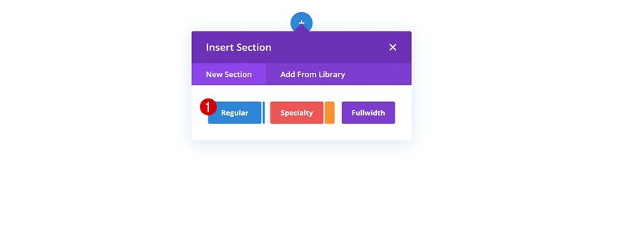
Add New Section
Before we dive into the different examples, we’ll go through some general steps that are the same for each one of the examples. Add a regular section to a new or existing page.
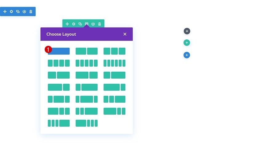
Add New Row
Column Structure
Continue by adding a new row using the following column structure:
Add Text Module to Column
Add Content
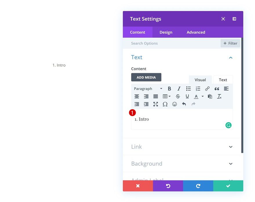
Add a Text Module with some content of your choice.
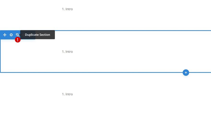
Clone Section Four Times
Clone the section four times if you’re planning on recreating each one of the examples in this post.
Recreate Example #1

Default Text Settings
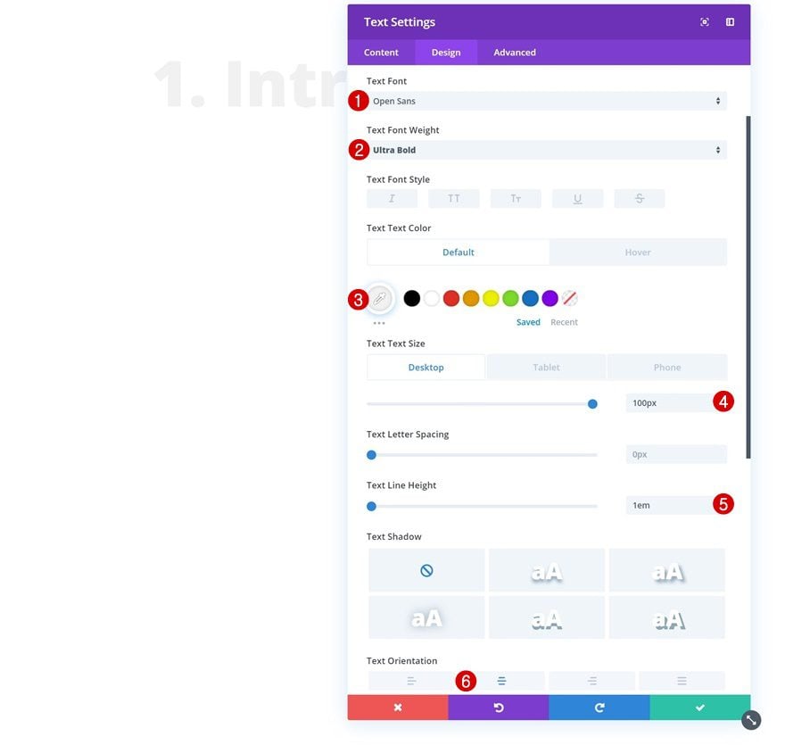
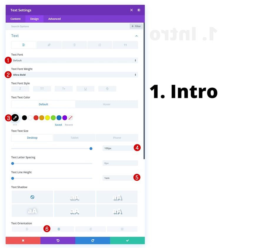
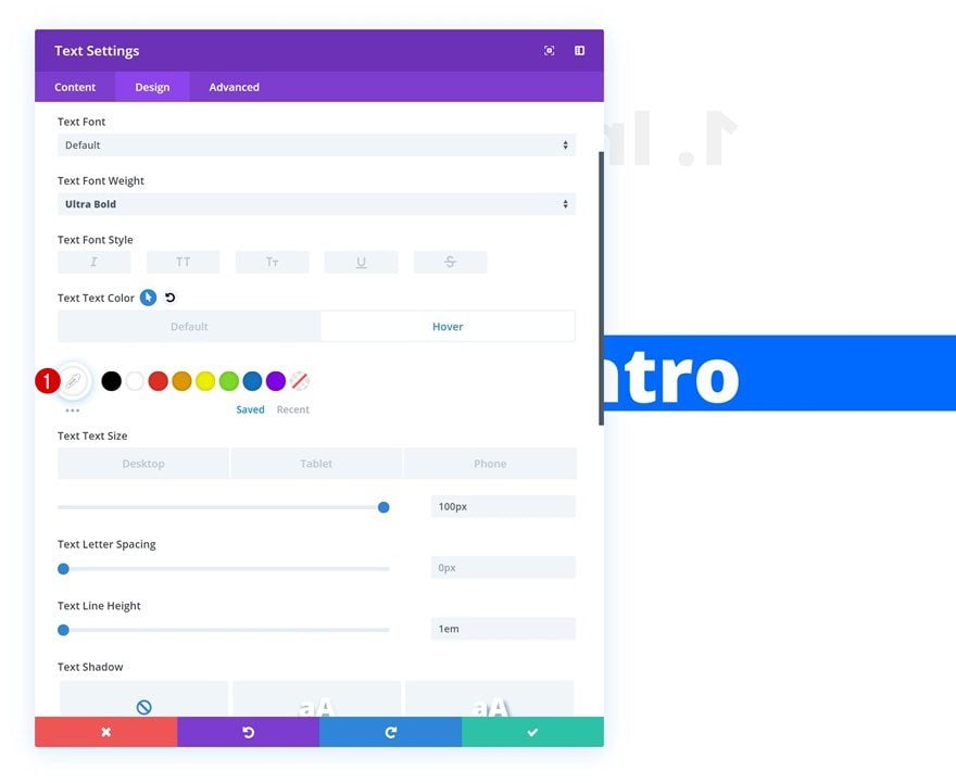
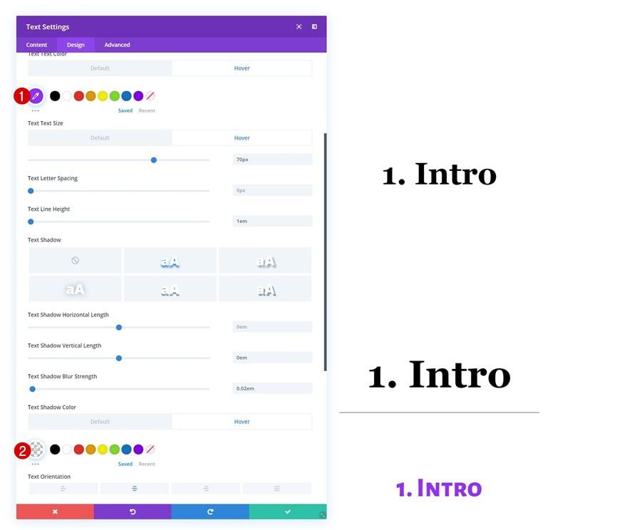
Let’s start recreating the first example! Open the Text Module, go to the design tab and modify the text settings.
- Text Font: Open Sans
- Text Font Weight: Ultra Bold
- Text Color: #f2f2f2
- Text Size: 100px (Desktop), 80px (Tablet), 70px (Phone)
- Text Line Height: 1em
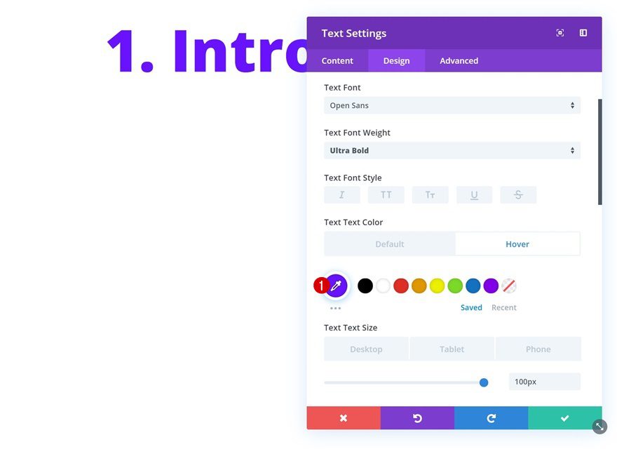
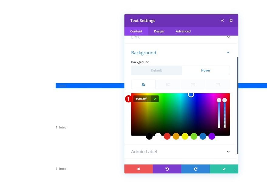
Hover Text Settings
Modify the text color on hover.
- Text Color: #680aff
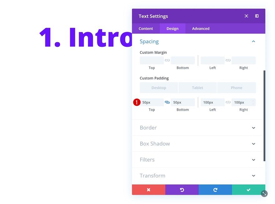
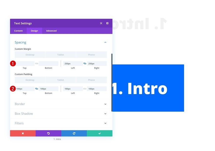
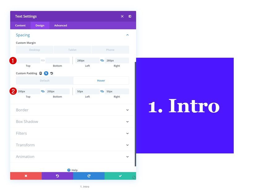
Spacing
Then, go to the spacing settings and add some custom padding values across different screen sizes:
- Top Padding: 50px
- Bottom Padding: 50px
- Left Padding: 100px (Desktop), 50px (Tablet & Phone)
- Right Padding: 100px (Desktop), 50px (Tablet & Phone)
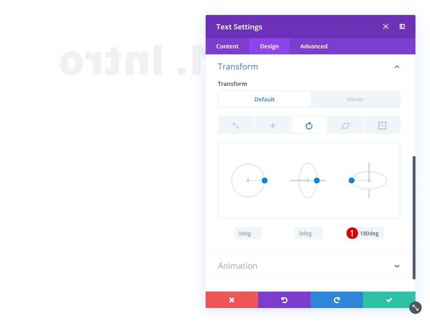
Default Transform Rotate
We’re going to mirror the text by adding the following input to the transform rotate option of our Text Module:
- Right: 180deg
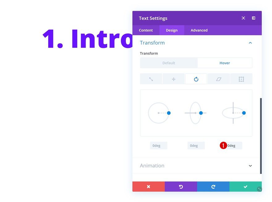
Hover Transform Rotate
To bring back the module to normal, we’ll remove the input on hover.
- Right: 0deg
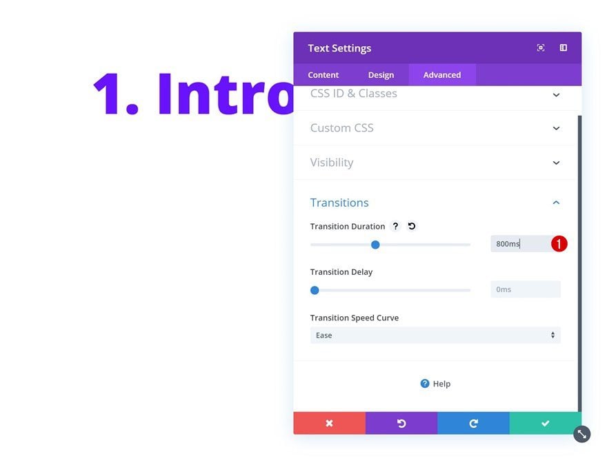
Transitions
To create a smooth transition, we’ll also increase the transition duration in the advanced tab.
- Transition Duration: 800ms
Recreate Example #2
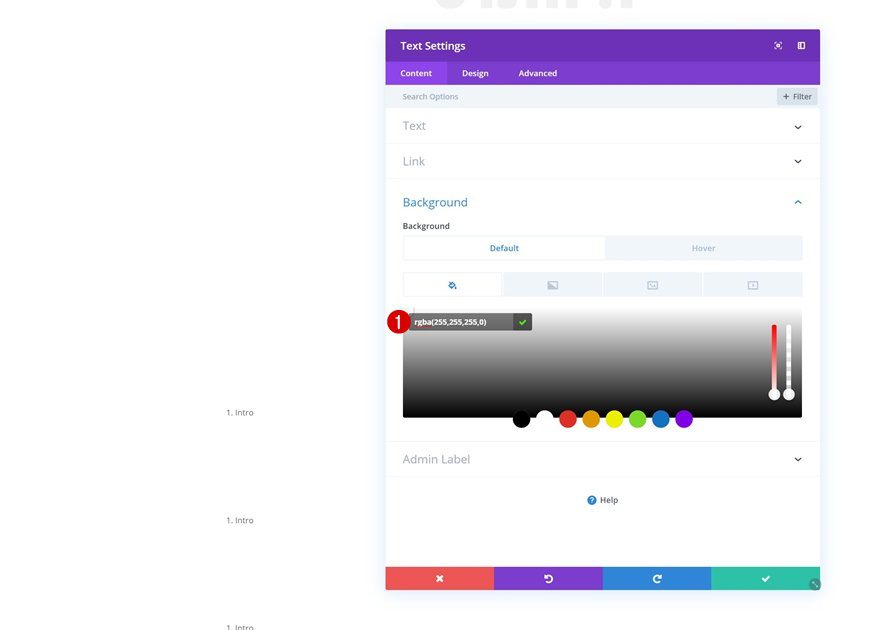
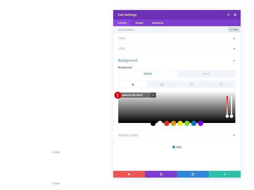
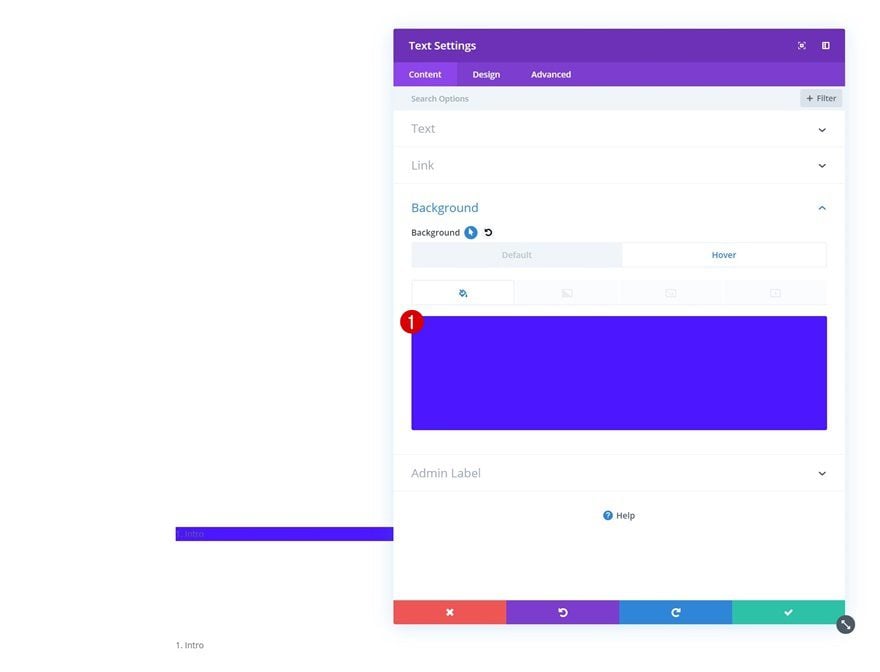
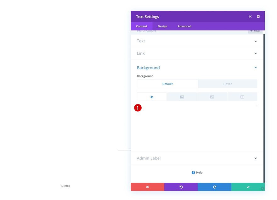
Default Background Color
On to the next example! Add the following default background color:
- Background Color: rgba(255,255,255,0)
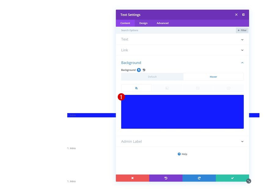
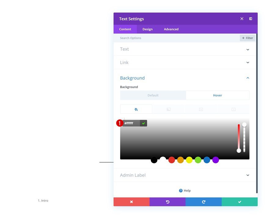
Hover Background Color
Modify the background color on hover
- Background Color: #006aff
Default Text Settings
Move on to the design tab and change around the text settings next.
- Text Font: Open Sans
- Text Font Weight: Ultra Bold
- Text Color: #000000
- Text Size: 100px (Desktop), 80px (Tablet), 70px (Phone)
- Text Line Height:
Hover Text Settings
Use another text color on hover:
- Text Color: #ffffff
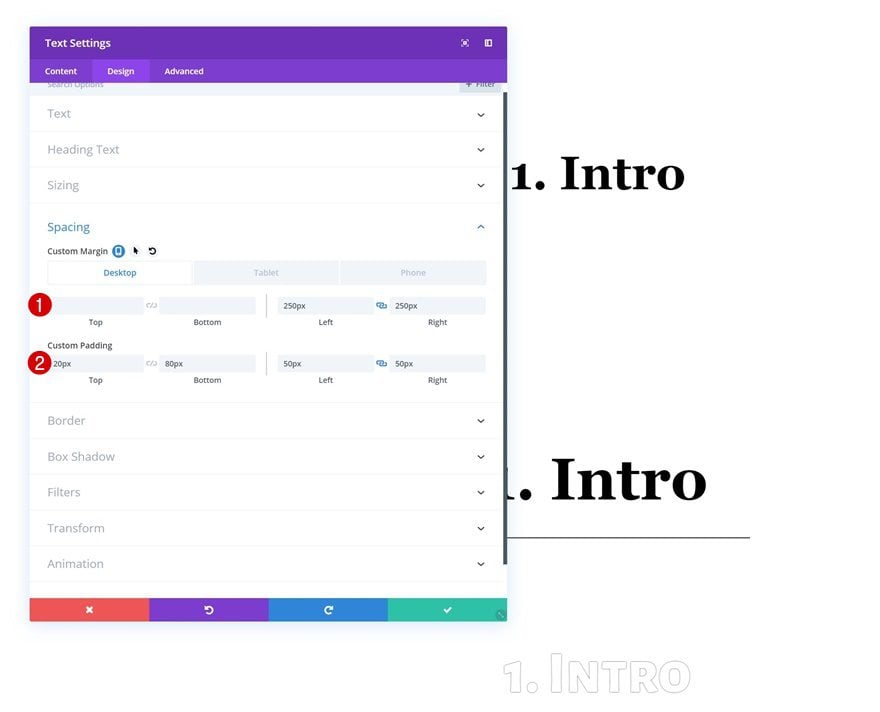
Spacing
Then, go to the design tab and shape the module using custom margin and padding values.
- Left Margin: 250px (Desktop), 50px (Tablet), 20px (Phone)
- Right Margin: 250px (Desktop), 50px (Tablet), 20px (Phone)
- Top Padding: 100px
- Bottom Padding: 100px
- Left Padding: 100px (Desktop & Tablet), 30px (Phone)
- Right Padding: 100px (Desktop & Tablet), 30px (Phone)
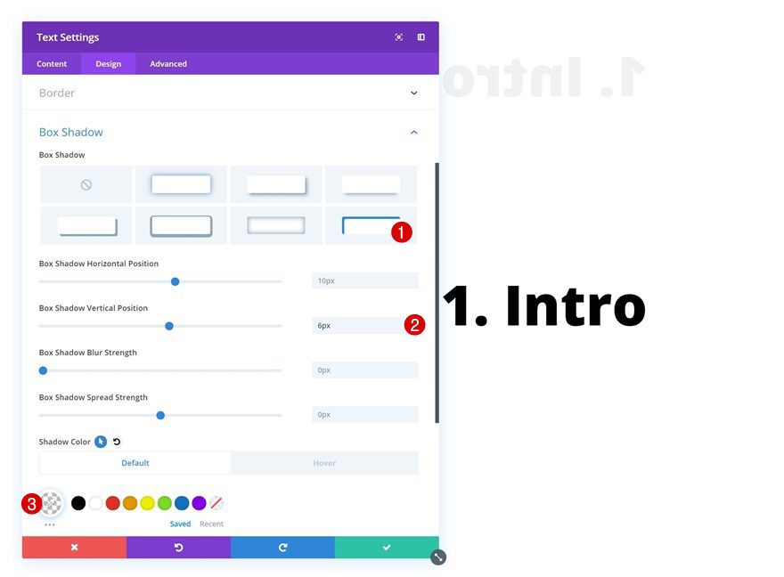
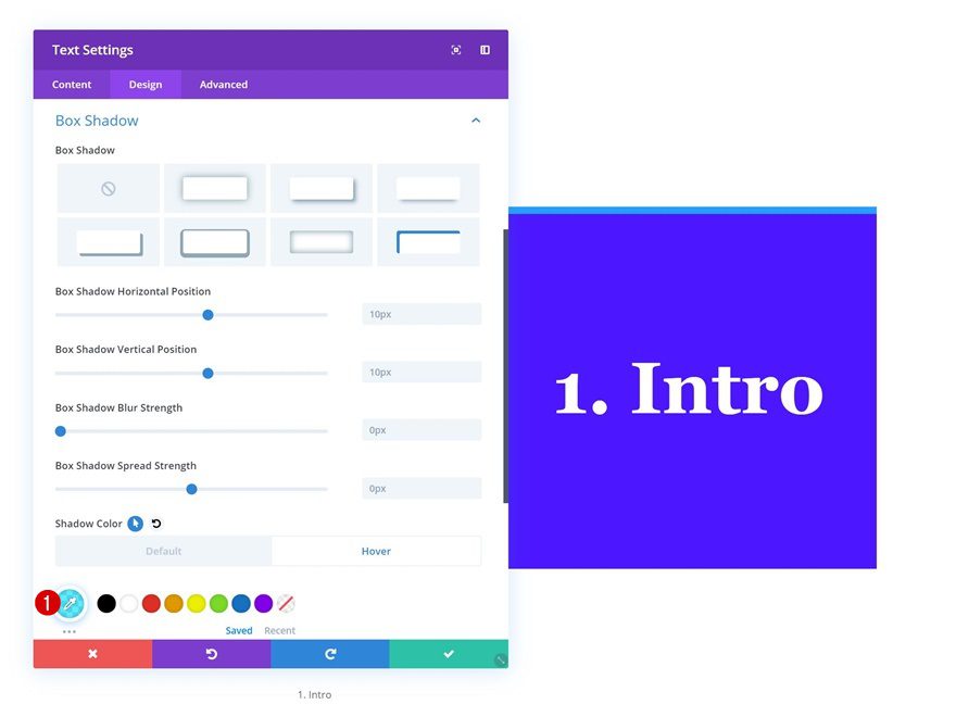
Default Box Shadow
We’re adding box shadow as well. We don’t want the box shadow to show up in the default state. That’s why we’ll use an entirely transparent shadow color.
- Box Shadow Vertical Position: 6px
- Shadow Color: rgba(237,240,0,0)
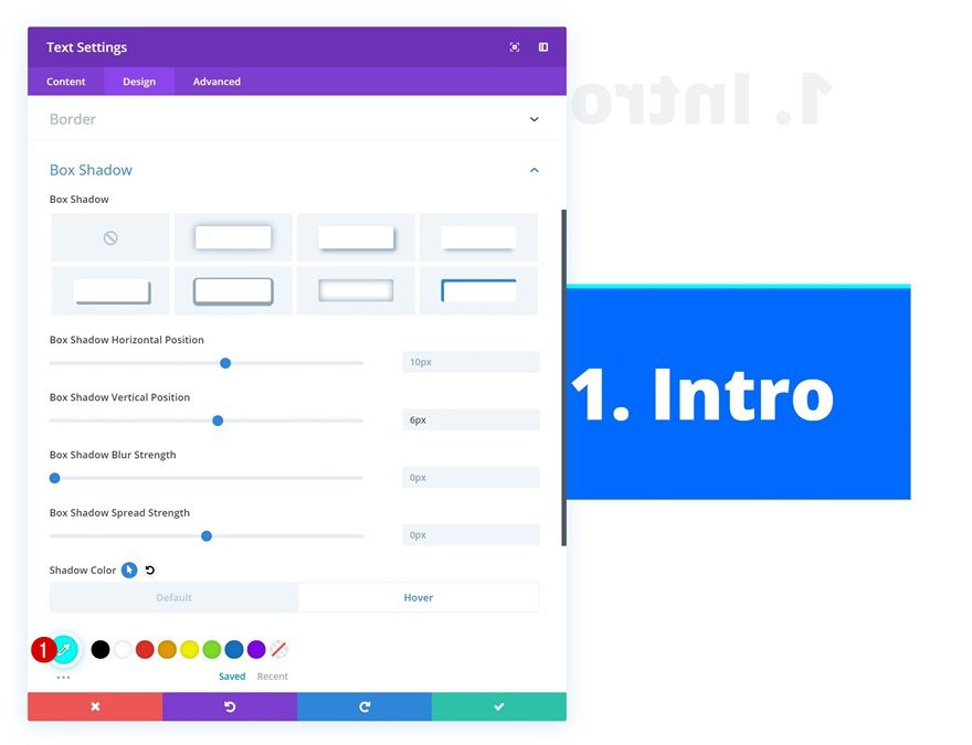
Hover Box Shadow
Modify the shadow color on hover for it to show up.
- Shadow Color: #00fff6
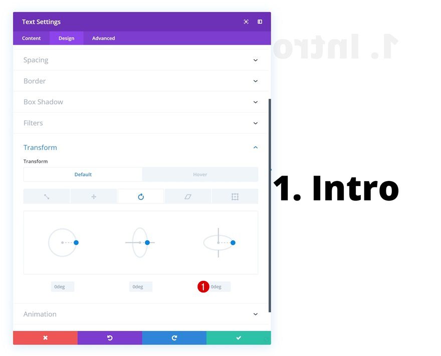
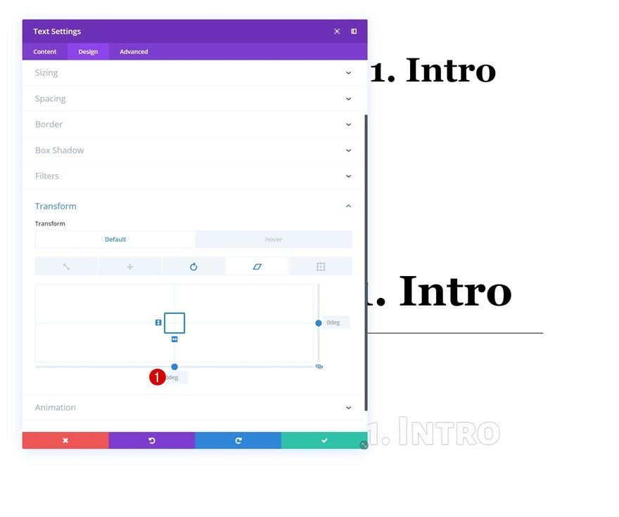
Default Transform Rotate
Move on to the transform settings and make sure the right input in the transform rotate settings remains 0 degrees by default.
- Right: 0deg
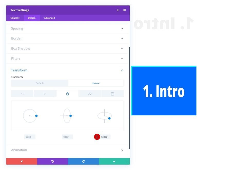
Hover Transform Rotate
Modify this value on hover.
- Right: 47deg
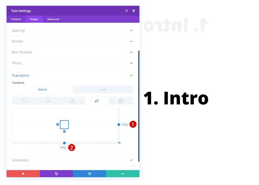
Default Transform Skew
Continue by making sure the default transform skew settings are the following:
- Right: 0deg
- Bottom: 0deg
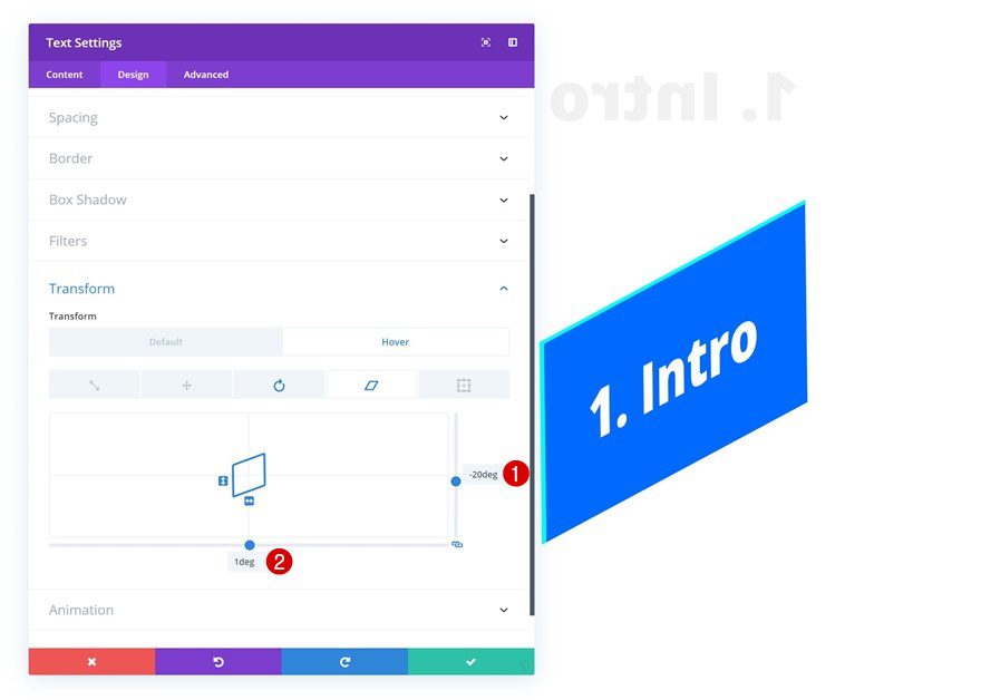
Hover Transform Skew
Modify the values on hover.
- Right: -20deg
- Bottom: 1deg
Recreate Example #3
Default Background Color
On to the third example! Change the default background color using the following color code:
- Background Color: rgba(255,255,255,0)
Hover Background Color
Modify the background color on hover.
- Background Color: #0a16ff
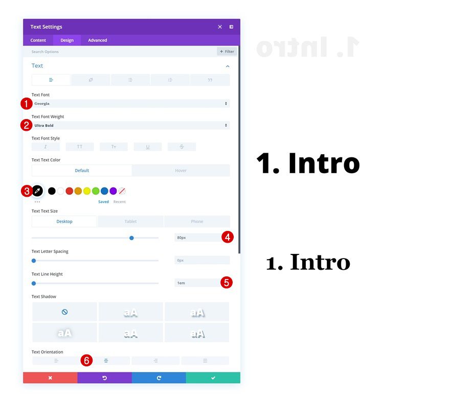
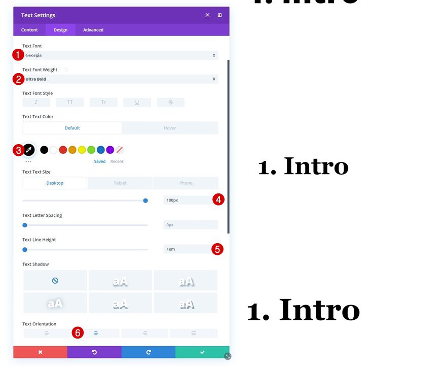
Default Text Settings
Move on to the design tab and change the text settings.
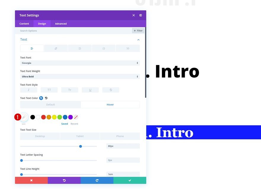
- Text Font: Georgia
- Text Font Weight: Ultra Bold
- Text Color: #000000
- Text Size: 80px (Desktop), 60px (Tablet), 50px (Phone)
- Text Line Height: 1em
- Text Orientation: Center
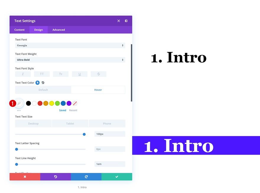
Hover Text Settings
Modify the text color on hover.
- Text Color: #ffffff
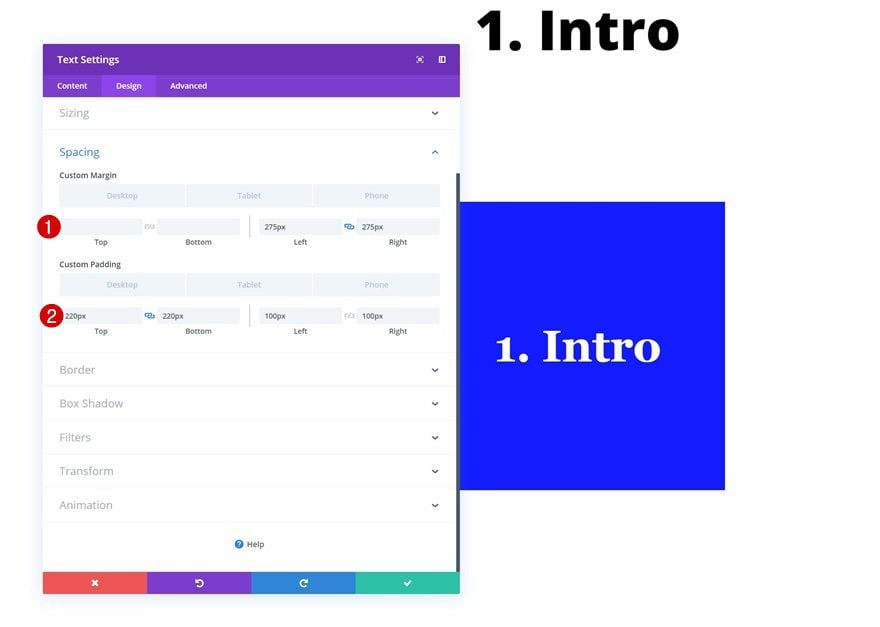
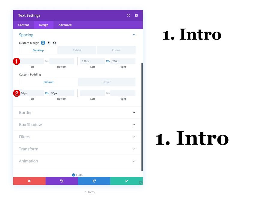
Spacing
Then, go to the spacing settings and shape the module using custom margin and padding values.
- Left Margin: 275px (Desktop), 50px (Tablet), 20px (Phone)
- Right Margin: 275px (Desktop), 50px (Tablet), 20px (Phone)
- Top Padding: 220px (Desktop & Tablet), 170px (Phone)
- Bottom Padding: 220px (Desktop & Tablet), 170px (Phone)
- Left Padding: 100px (Desktop & Tablet), 50px (Phone)
- Right Padding: 100px (Desktop & Tablet), 50px (Phone)
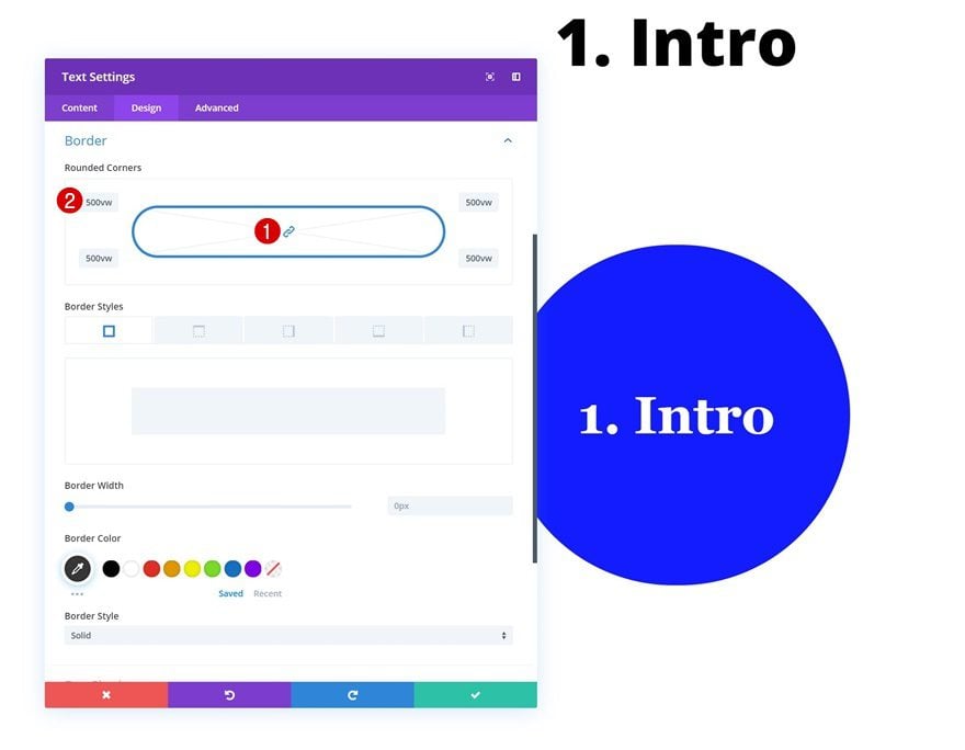
Border
Move on to the border settings and create a circle by adding ‘500vw’ to each one of the corners.
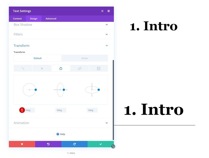
Default Transform Rotate
Make sure that the left value in the transform rotate settings remains 0 degrees.
- Left: 0deg
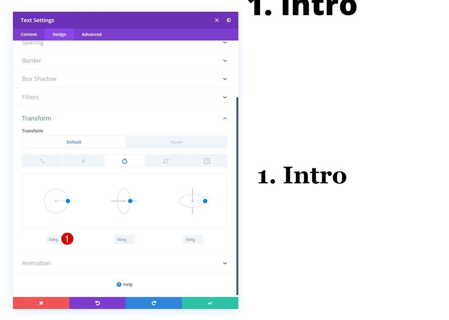
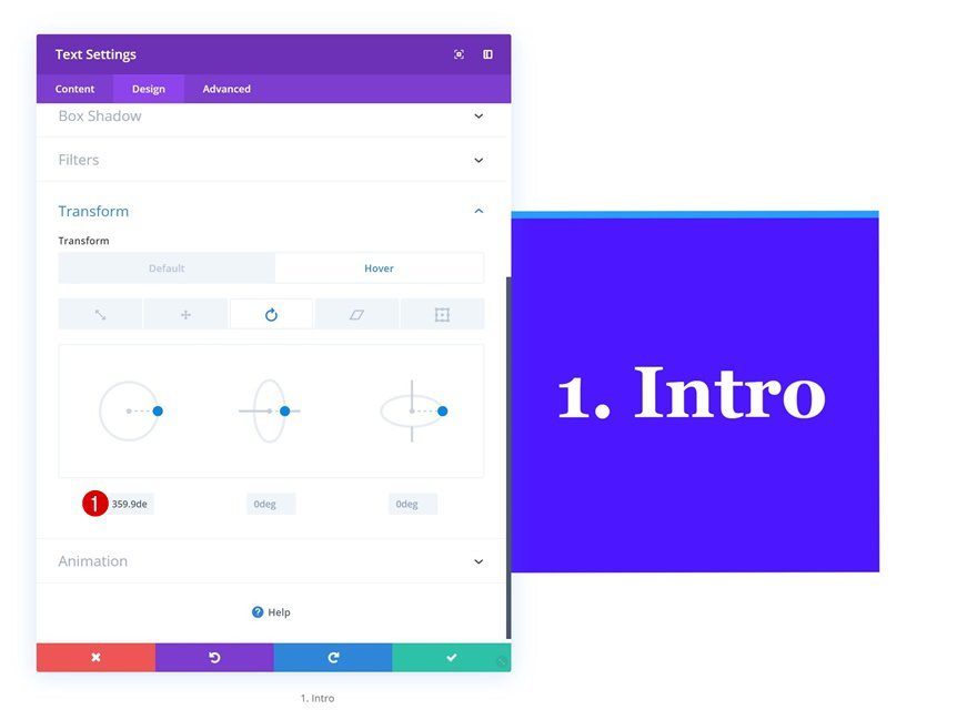
Hover Transform Rotate
And modify this value on hover using the following input:
- Left: 359.9deg
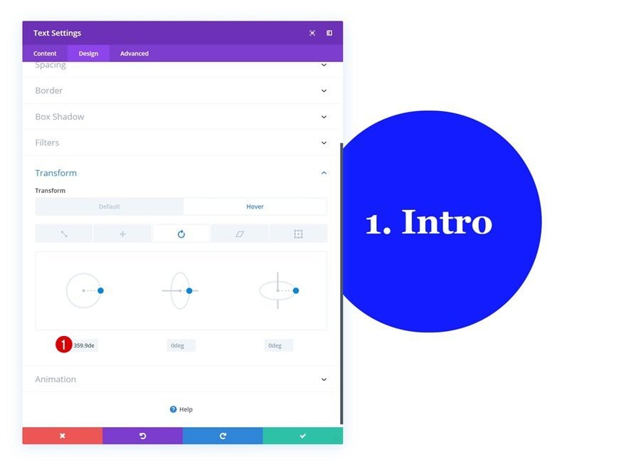
Transitions
Lastly, make sure the transition happens smoothly by increasing the transition duration in the advanced tab.
- Transition Duration: 800ms
Recreate Example #4
Default Background Color
On to the fourth example! Use the following background color:
- Background Color: rgba(255,255,255,0)
Hover Background Color
Modify the background color on hover.
- Background Color: #4b0fff
Default Text Settings
Move on to the design tab and change the text settings accordingly:
- Text Font: Georgia
- Text Font Weight: Ultra Bold
- Text Color: #000000
- Text Size: 100px (Desktop), 80px (Tablet), 70px (Phone)
- Text Line Height: 1em
- Text Orientation: Center
Hover Text Settings
Change the text color on hover.
- Text Color: #ffffff
Default Spacing
Shape the Text Module using custom margin and padding values:
- Left Margin: 280px (Desktop), 50px (Tablet), 0px (Phone)
- Right Margin: 280px (Desktop), 50px (Tablet), 0px (Phone)
- Top Padding: 50px
- Bottom Padding: 50px
Hover Spacing
Modify the values on hover.
- Top Padding: 200px
- Bottom Padding: 200px
- Left Padding: 50px
- Right Padding: 50px
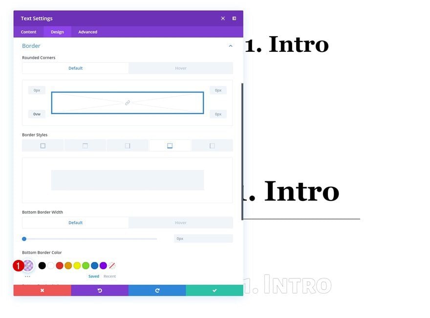
Default Border
We’re also adding a bottom border to the Text Module.
- Bottom Border Width: 1px
- Bottom Border Color: #000000
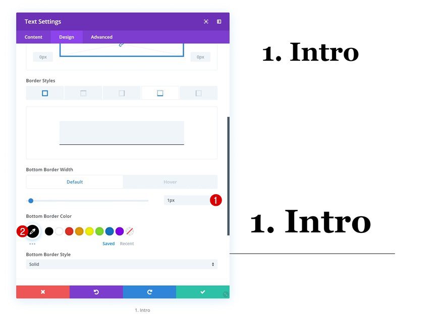
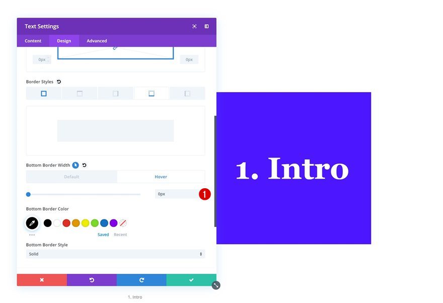
Hover Border
Which we’ll remove on hover.
- Bottom Border Width: 0px
Default Box Shadow
Continue by adding a box shadow with an entirely transparent shadow color.
- Shadow Color: rgba(0,0,0,0)
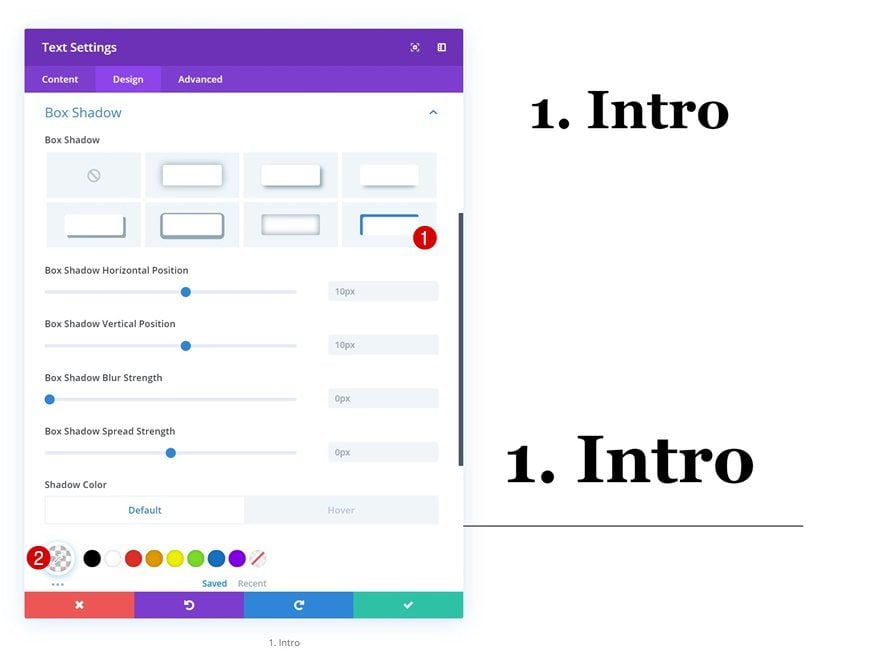
Hover Box Shadow
Change the shadow color on hover to allow the box shadow to show up.
- Shadow Color: rgba(10,226,255,0.67)
Default Transform Rotate
Move on to the transform rotate settings and make sure the left input is 0 degrees.
- Left: 0deg
Hover Transform Rotate
Change the value on hover.
- Left: 359.9deg
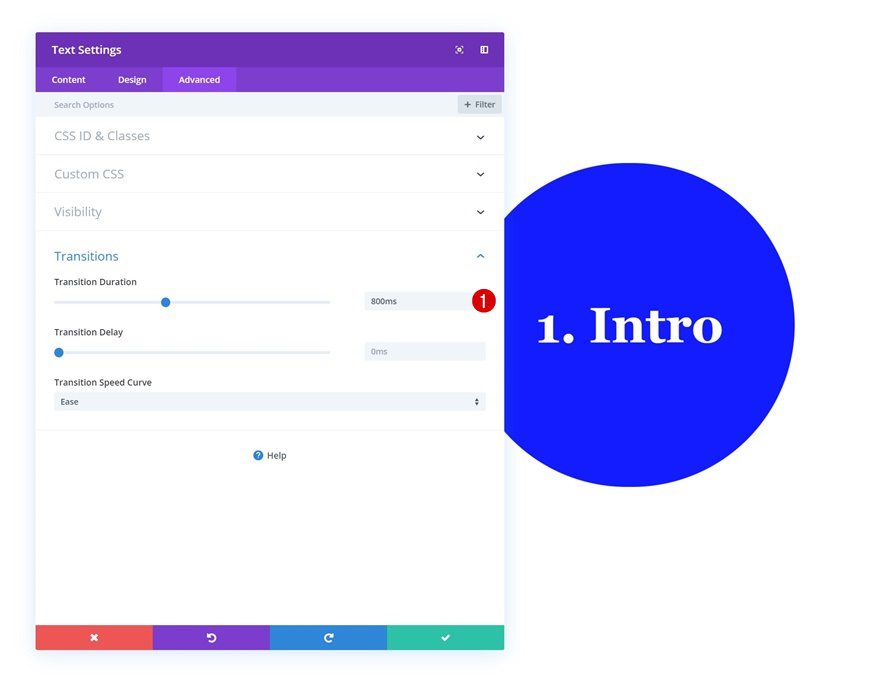
Transitions
And increase the transition duration in the advanced tab.
- Transition Duration: 800ms

Recreate Example #5
Default Background Color
On to the next and last example! Add the following background color to the Text Module:
- Background Color: rgba(255,255,255,0)
Hover Background Color
Modify the background color on hover.
- Background Color: #ffffff
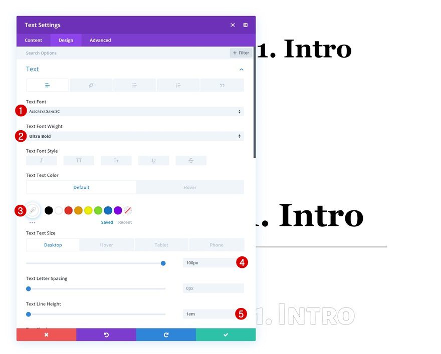
Default Text Settings
Move on to the design tab and change the default text settings.
- Text Font: Alegreya Sans SC
- Text Font Weight: Ultra Bold
- Text Color: #ffffff
- Text Size: 100px (Desktop), 80px (Tablet), 70px (Phone)
- Text Line Height: 1em
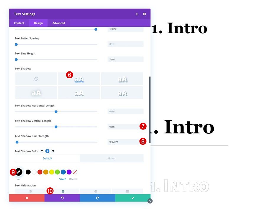
- Text Shadow Vertical Length: 0em
- Text Shadow Blur Strength: 0.02em
- Text Shadow Color: #000000
- Text Orientation: Center
Hover Text Settings
Modify some settings on hover.
- Text Color: #952bff
- Shadow Color: rgba(0,0,0,0)
Spacing
Continue by going to the spacing settings. Add some custom margin and padding values.
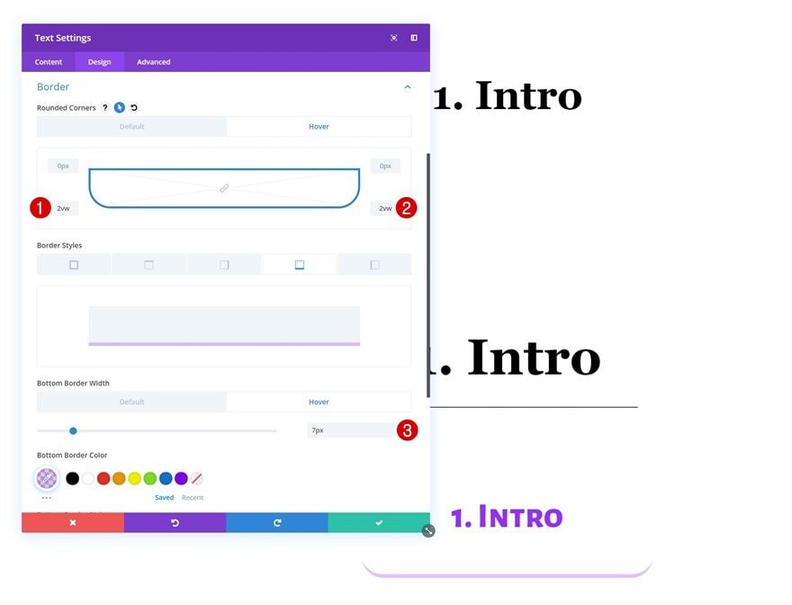
Default Border
Along with a bottom border.
- Bottom Border Width: 0px
- Bottom Border Color: rgba(149,43,255,0.29)
Hover Border
Allow the bottom border to show up by increasing the width on hover.
- Bottom Border Width: 7px
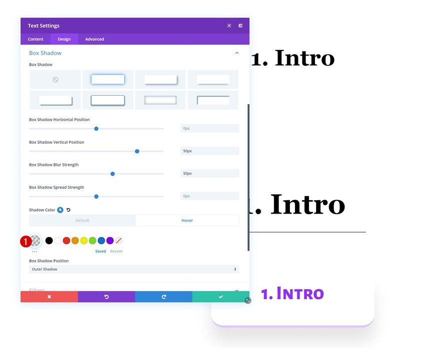
Default Box Shadow
Add a box shadow using the following settings next:
- Box Shadow Vertical Position: 50px
- Box Shadow Blur Strength: 50px
- Shadow Color: rgba(255,255,255,0)
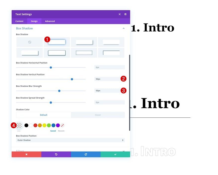
Hover Box Shadow
And change the shadow color on hover.
- Shadow Color: rgba(0,0,0,0.1)
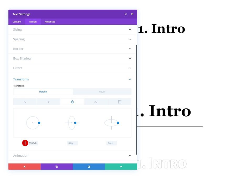
Default Transform Rotate
Move on to the transform rotate settings and change the left value.
- Left: 359.9deg
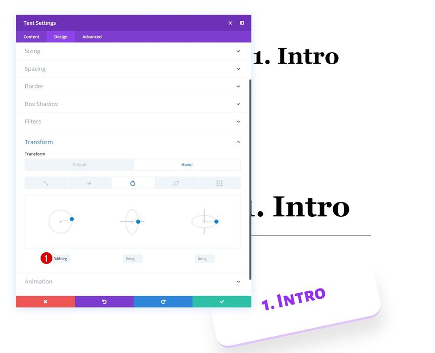
Hover Transform Rotate
Modify that same value on hover.
- Left: 348deg
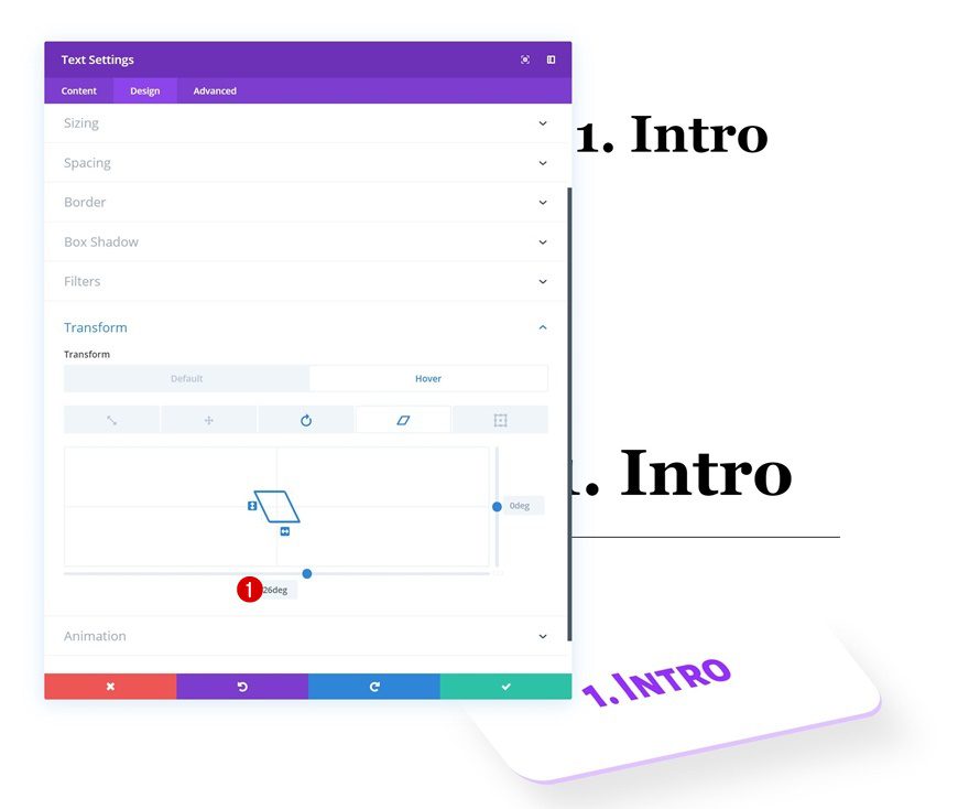
Default Transform Skew
Make sure the bottom transform skew value remains 0 degrees.
- Bottom: 0deg
Hover Transform Skew
And change this value on hover.
- Bottom: 26deg
Preview
Now that we’ve gone through all the steps, let’s take a final look at the outcome across different screen sizes.
Desktop
Mobile
Final Thoughts
In this post, we’ve shared 5 different ways to make your copy pop with Divi’s transform and hover options. At the beginning of this tutorial, you were also able to download the entire layout for free. If you have any questions or suggestions, make sure you leave a comment in the comment section below!
If you’re eager to learn more about Divi and get more Divi freebies, make sure you subscribe to our email newsletter and YouTube channel so you’ll always be one of the first people to know and get benefits from this free content.


When read post buttons are clicked ET chat pops up. Only way to read more of post is to click image of post.
This is great – thank you…