
Divi and its new column layouts have freed up some exciting possibilites for unique page designs. And with the support of up to six columns, you can really explore new designs for an image gallery. In this use case tutorial, I’m going to show you how to design three unique layouts for your images. I think you will be surprised by how easy these layouts are to design. And, hopefully, they will give you some new ideas to explore.
Let’s get started.
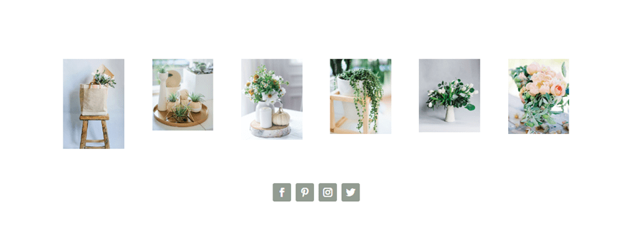
Sneak Peek
Page Setup
So to get started, create a new page, give your page a title, and deploy the Visual Builder. Select the option “Choose a Premade Layout”. In the load from library popup, select the Florist layout pack and then load the Florist Gallery page layout to your page.
Once the page is loaded, you are ready to begin.
Image Gallery Design #1
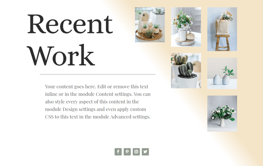
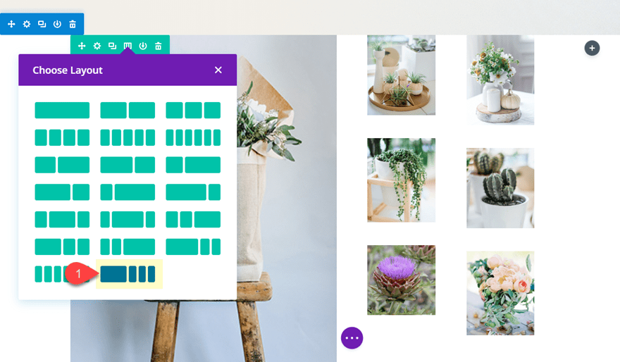
For this first design, I’m going to use the 1/2 1/6 1/6 1/6 column layout. With this layout, I’m going to stagger images in the three columns on the right so that they create a triangular shape. This will serve as a great complimentary visual for my large text content on the left.
To start, duplicate the entire section containing the current image gallery photos. We need the extra copy of that section for our next design.
After that, change the column layout of your row to the 1/2 1/6 1/6 1/6 column layout by clicking the “choose layout” icon in your row menu.
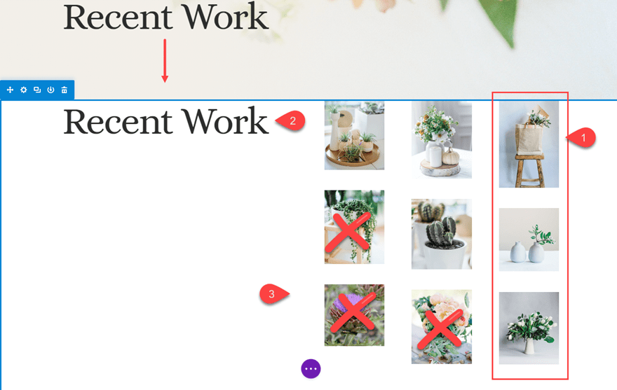
After the column change, you are going to have three large images in the left column. Drag those over to the far right column which is currently empty. You should have three columns with three images in each with the left column empty.
Copy the text module in the header section above and paste it in the left column.
Then delete the bottom two images in the second column and the very bottom image in the third column. This will group the images in a triangle shape.
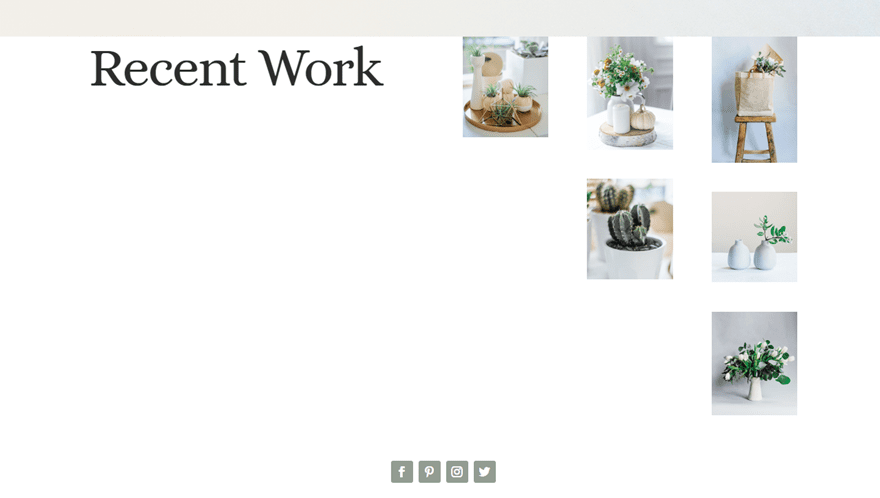
This is what it should look like so far.
Next, update the row settings as follows:
Custom Width: 80%
Gutter Width: 2
Custom Padding: 3vw Top, 3vw Bottom
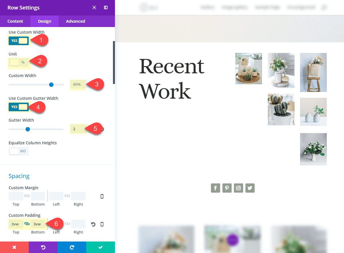
Save settings.
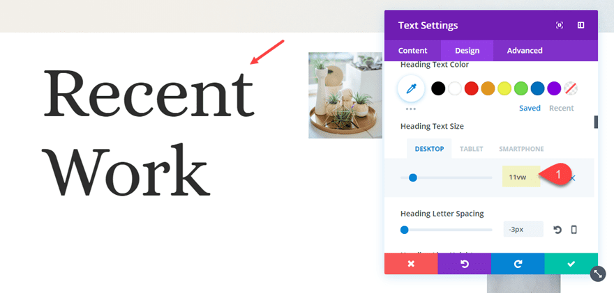
Then open the text module settings and increase the Heading text size to 11vw.
Then add a divider module directly under the text module and give it the following settings:
Color: #dddddd
Divider Weight: 4px
Height: 2vw
Custom Margin: 5vw Left, -10vw Right
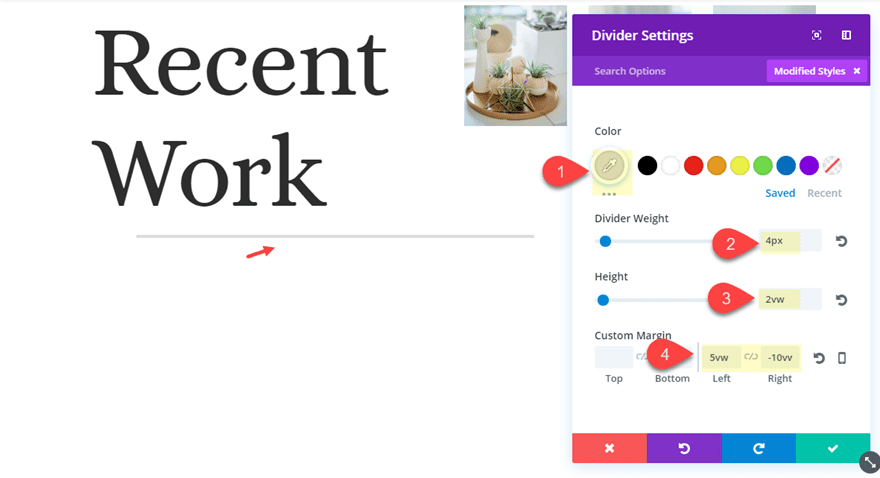
The negative right margin pulls the divider into the open space left in the second column so that the design feels more balanced.
Save Settings.
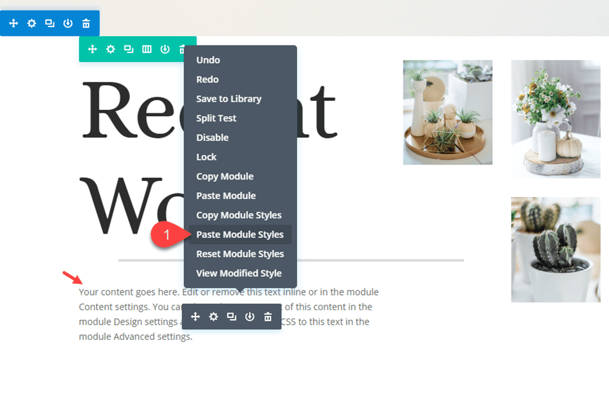
Now create a new text module under your divider line. Then use the right click options to copy the module styles of the text module you first added and then past the module styles into the new text module.
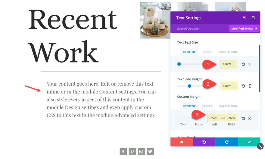
After that, open the new text module settings and update the following:
Text Text Size: 1.8vw (desktop), 18px (tablet)
Text Line Height: 1.6em
Custom Margin (desktop): 7vw Left, -9vw Right
Custom Margin (tablet): 0vw Right
Similar to what we did with the divider, the negative right margin pulls the text module over to the right to help balance out the design and line up nicely under the divider.
Setting the text to a vw length value will make sure the text scales nicely on different desktop browsers. Setting the text size to 18px on tablet will make sure the text doesn’t show up too small on mobile.
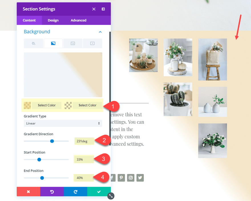
For the last step, give your row a background gradient to help frame the triangular grid of images on the right of your page. Open the section settings and update the following:
Background Gradient Left Color: rgba(236,213,163,0.61)
Background Gradient Right Color: rgba(255,255,255,0)
Gradient Direction: 231deg
Start Position: 33%
End Position: 0%
Here is the final design.

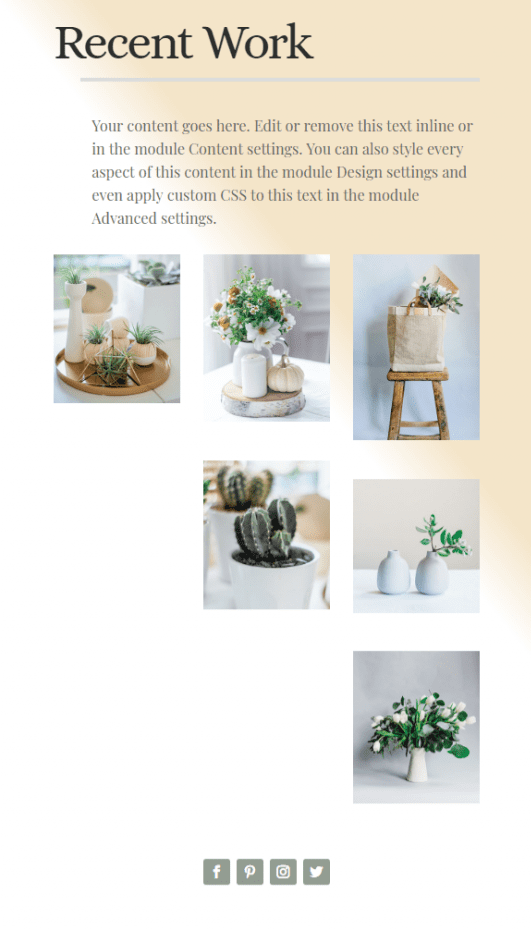
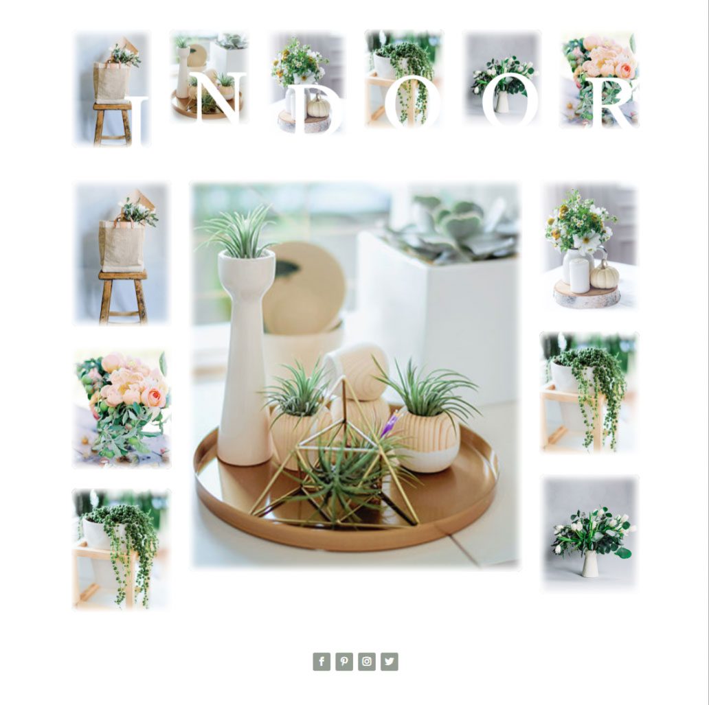
Image Gallery Design #2
For this next image gallery design, we are going to use the duplicated section of our original layout we created earlier. But before we start editing the section, duplicate it again so we can use it for our next design.
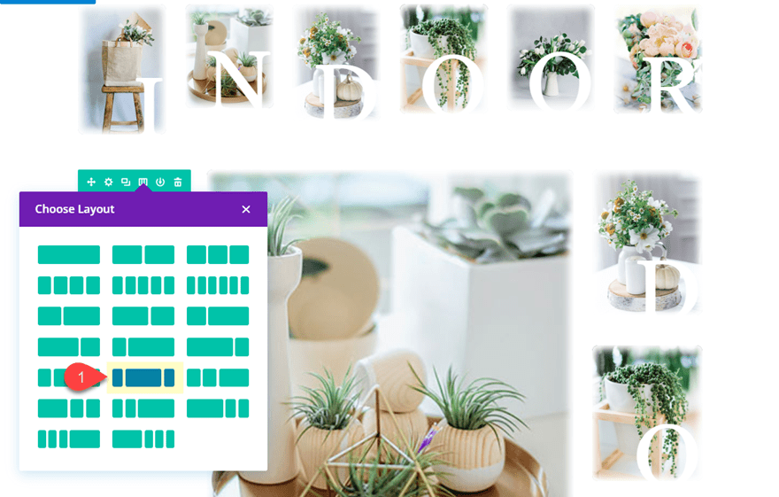
After you duplicate the section, change the column layout to a six-column layout.
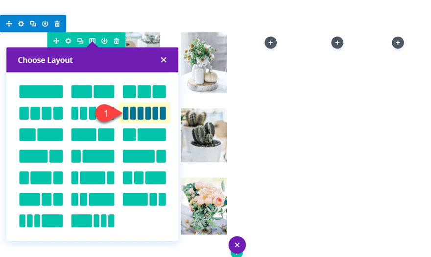
Then drag three of the images from the first three columns into each of the empty columns on the right. Then delete the remaining images in the first three columns so that you have only one image in each of the three columns.
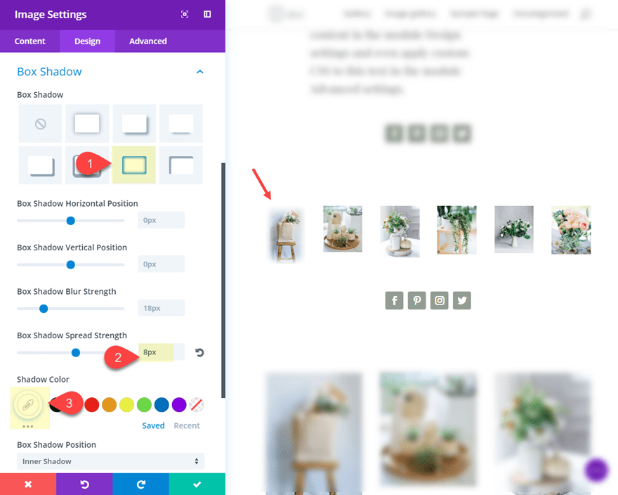
Now add a white inner box shadow that blends nicely with the white background to create a dream-like effect over your image.
Box Shadow: see screenshot
Box Shadow Spread Strength: 8px
Shadow Color: #ffffff
Then add a 10px rounded corners to the image.
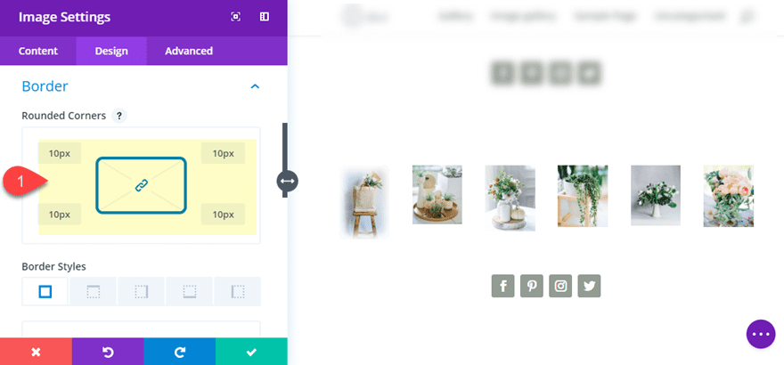
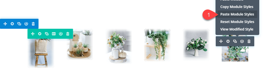
Now that you have your first image designed, copy the module styles and paste them to each of the remaining image modules.
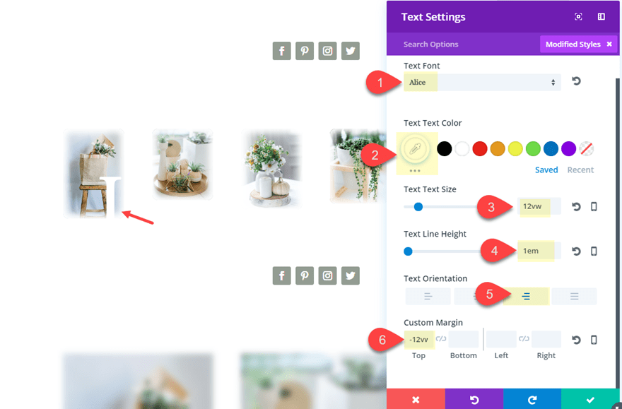
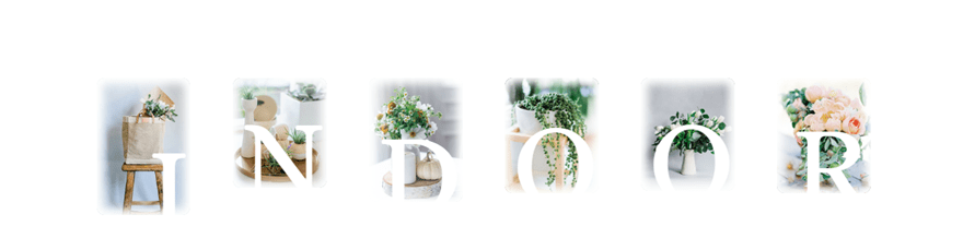
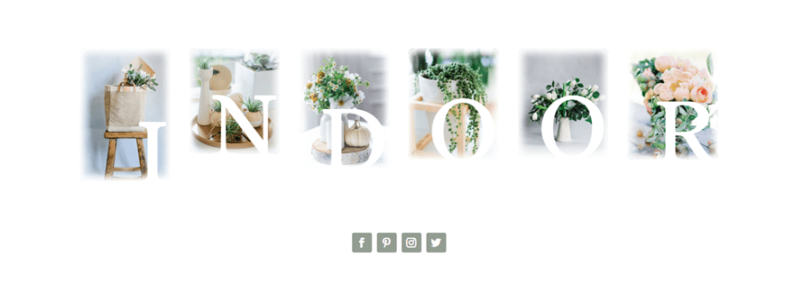
Overlapping Letters on Each Images
The six columns allow us to add overlap a letter on each of our images to spell out a word (like “INDOOR”). To do this, add a text module under the image in the first column and put a capital letter “I” in the content box.
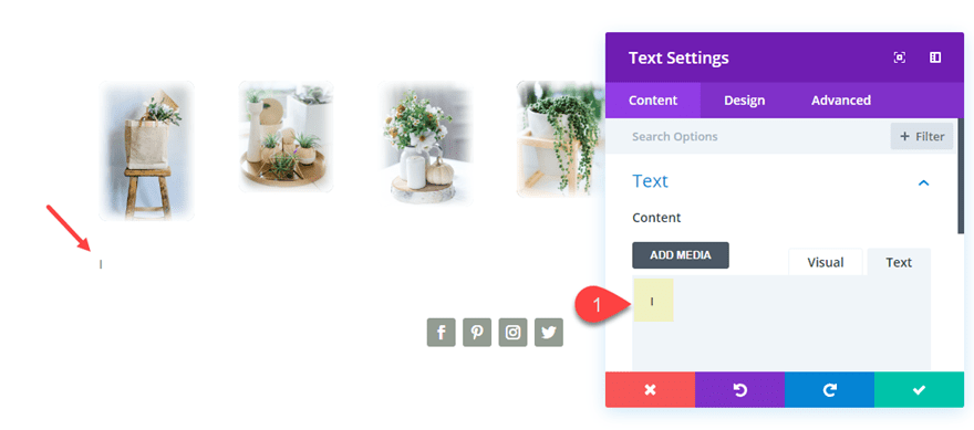
Next update the design settings as follows:
Text Font: Alice
Text Text Color: #ffffff
Text Text Size: 12vw (desktop), 18vw (tablet), 150px (smartphone)
Text Line Height: 1em
Text Orientation: right
Custom Margin: -12vw (desktop), -20vw (tablet), -160px (smartphone)
Notice the custom margin values set for mobile devices. The smartphone view requires a px length unit because it needs to accommodate for the breakpoint from a smaller tablet to smartphone. When using the vw length unit for text, it is always a good idea to switch to px unit on mobile devices because the screen size becomes too small and unpredictable.
Now that we have our first text module finished, copy the text module and paste it under each of the remaining images. Then update each letter so that the word “INDOOR” is spelled out across all six images.
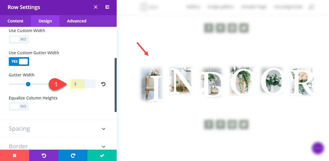
Lastly, update your row settings with a custom gutter width of 2.
This is what the design looks like so far.
Because of the overlapping text, the image is only clickable on the top portion to deploy the lightbox effect. So this design may be best as strictly a design element instead of a traditional gallery. But you can always do without the text.
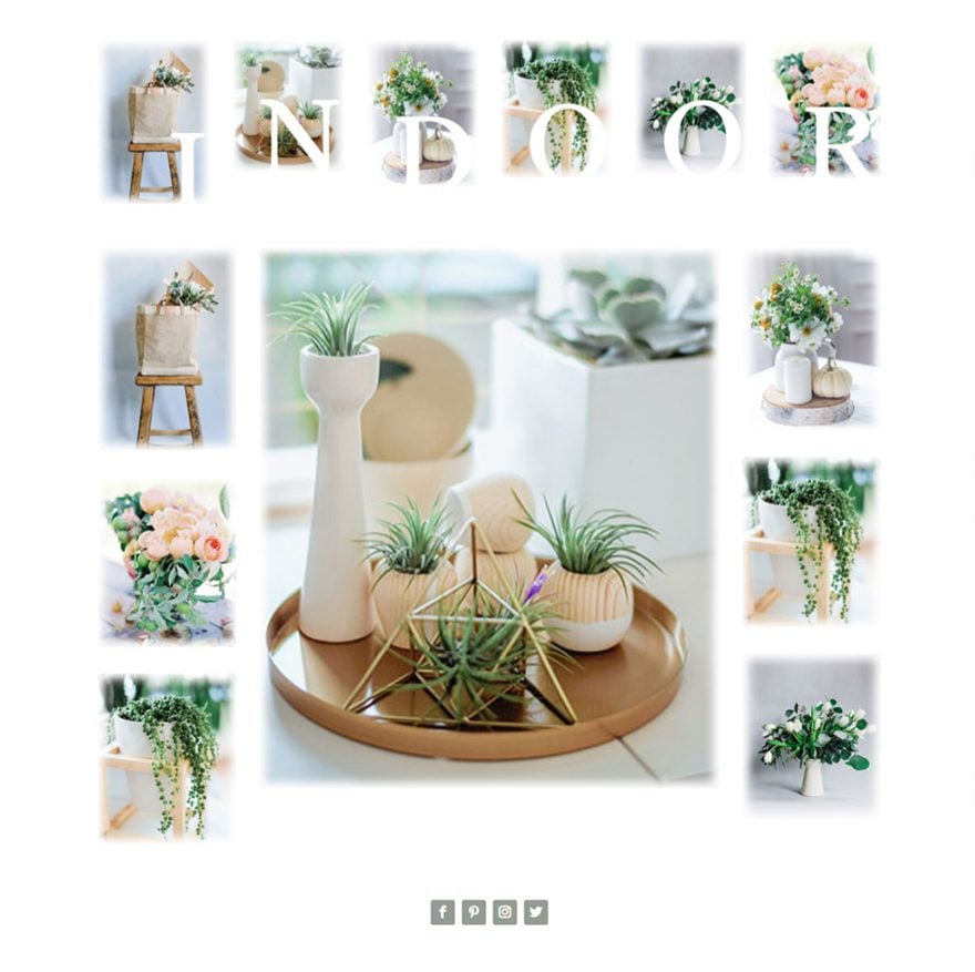
Additional Image Gallery Layout
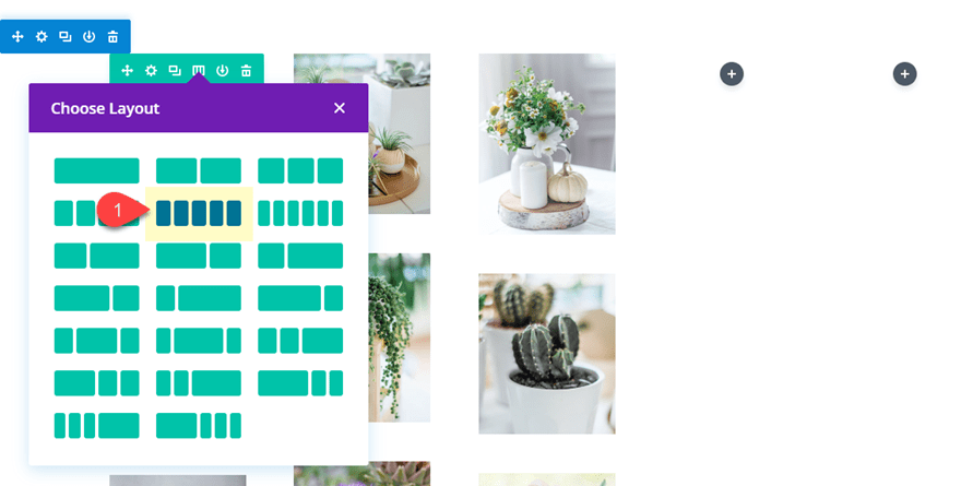
Now you can easily create an additional image gallery under the current row with a new column layout. This will look really nice with the images that spell out “INDOOR” serving as a decorative title for the images below.
To create the additional gallery of images, duplicate the row and give it the 1/5 3/5 1/5 column layout.
Now delete all the text modules under each image. And make sure the first and third column each have three images to balance out the gallery.
Here is the final design.
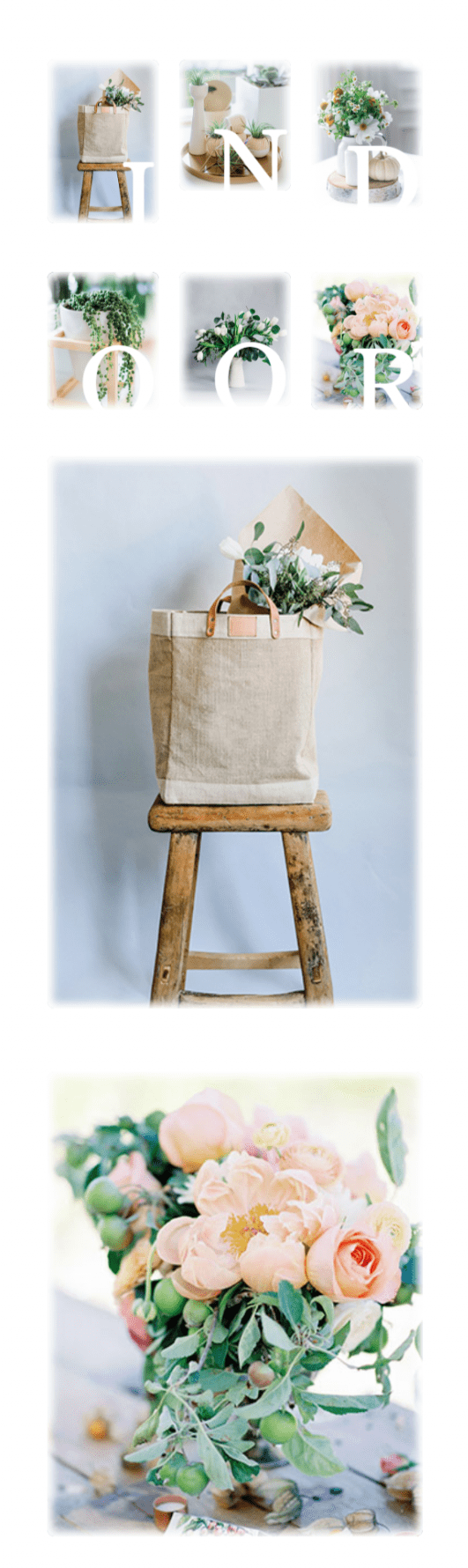
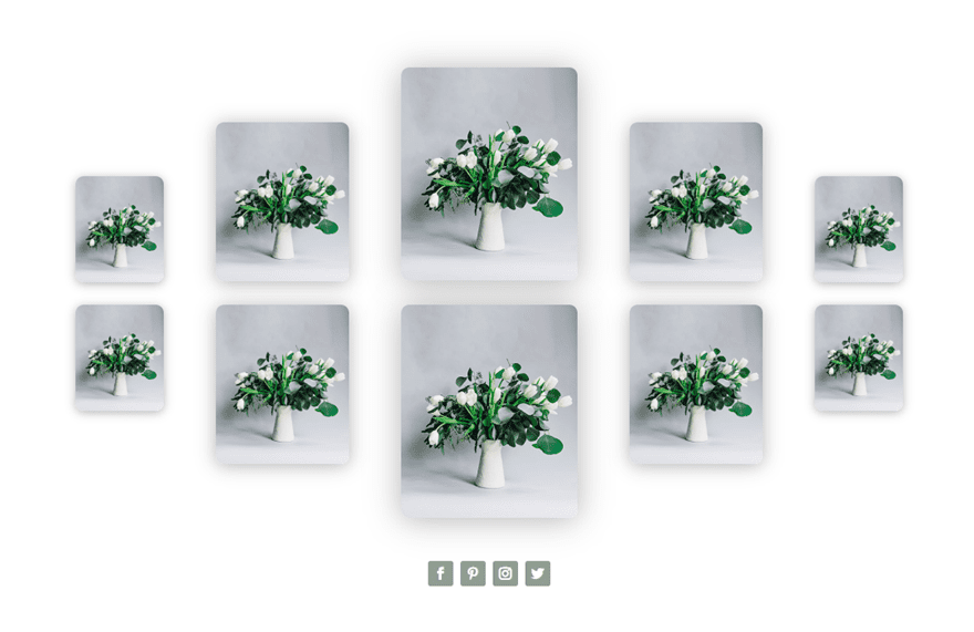
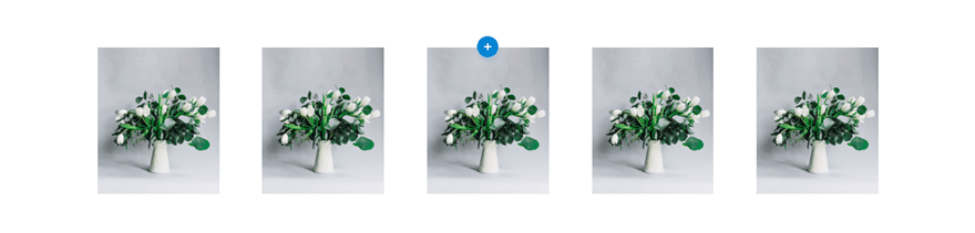
Image Gallery Design #3
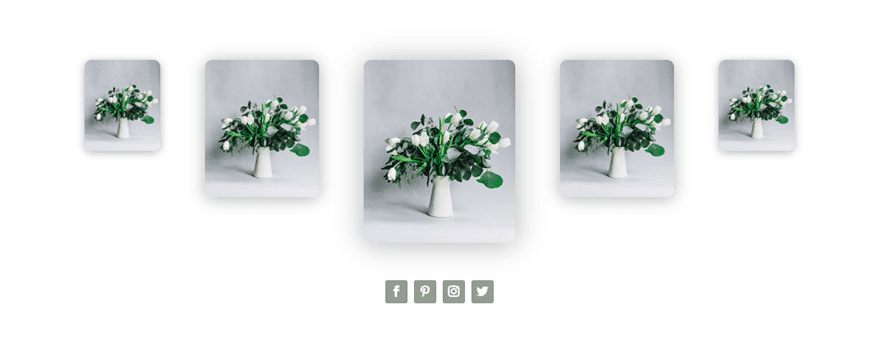
For this next design, I’m going to use the five-column layout. Then I’m going to get creative with the sizing and box shadow effects to give the appearance the images get bigger in the center column and smaller in the outer columns.
To do this, go to the duplicated section of the original layout. Then update the column layout to a five-column layout.
This design works best with images that have the exact same dimensions so that the design is symmetrical. For this example, you can just use one image from the existing images in the layout and then copy and paste it into each of the five columns. Delete the rest of the images you don’t need.
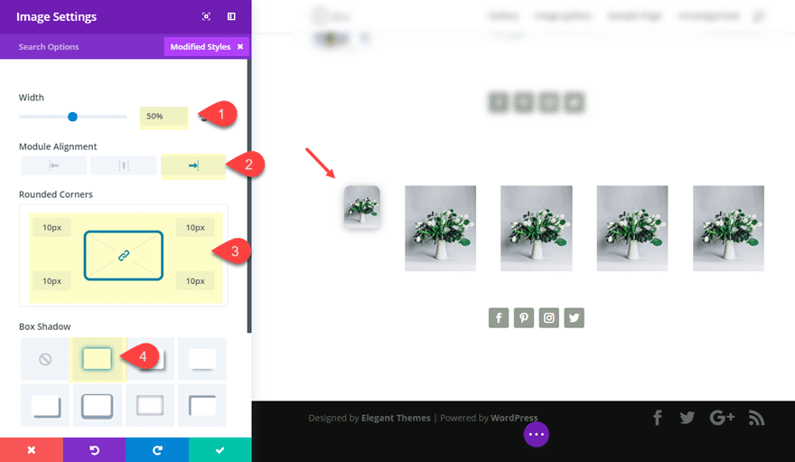
Now update the image settings for the image in the first column as follows:
Width: 50%
Module Alignment: Right
Rounded Corners: 10px
Box Shadow: see screenshot
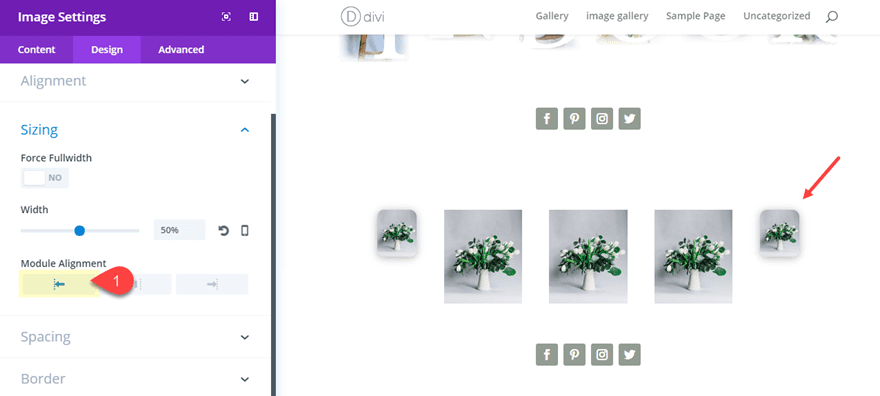
Now copy the module styles and paste them into the image in the far right column. Then update that image to have a module alignment of left (instead of right).
Now update the settings for the image in the second column as follows:
Width: 75%
Module Alignment: Center
Rounded Corners: 10px
Box Shadow: see screenshot
Box Shadow Blur Strength: 36px
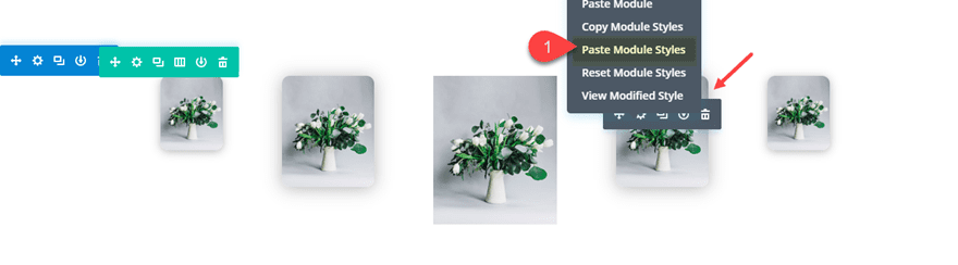
Save settings. Then paste the module styles over to the image in the fourth column.
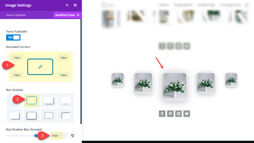
Now it’s down to the image in the center column. Update the image settings as follows:
Width: 75%
Module Alignment: Center
Rounded Corners: 10px
Box Shadow: see screenshot
Box Shadow Blur Strength: 63px
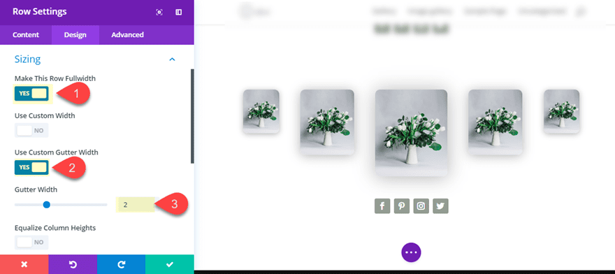
Finally, to give the images more breathing room, update the row settings as follows:
Make This Row Fullwidth: YES
Gutter Width: 2
Now let’s check out the design so far.
Stacking Another Row of Images for Symmetry
Another thing you could do with this design is duplicate the row and give the top row images a custom padding as follows:
column one image custom padding: 5vw top
column two image custom padding: 10vw top
column four image custom padding: 10vw top
column five image custom padding: 5vw top
Here is the result.
Final Thoughts
Exploring the new column layouts is a lot of fun and the three designs in this tutorial are only the tip of the iceberg. And these image galleries can easily be replaced with other modules to create unique layouts for featured services, videos, and more.
I look forward to hearing from you in the comments.


Ok but not great.
i can load a premade layout in a page, no matter that is made the rest of my site myself? I mean, that does`nt change?
I think those custom padding will be
column one image custom padding: 10vw top
column two image custom padding: 5vw top
column four image custom padding: 5vw top
column five image custom padding: 10vw top
Hope you need to update this post. This tutorial was amazing.
You are right! I will update the post. Thanks
In all honesty this isn’t really a gallery tutorial but another layout example. If it were a real gallery tutorial it would focus on customizing the actual Gallery module.
As nice as these tutorials are, it would be much better if ET just improved the Gallery module which users have been asking for years. Tutorials such as these are nice, but ultimately don’t add much to Divi users, because they are essentially workarounds to problems that improved functionality would solve.
Much like the recent update to columns, the previous tutorials to add more than 4 columns is now useless information. If ET has a task list of updates that will improve the experience and change how we work, then it would probably be best to avoid tutorials that offer band-aid solutions to long-term solutions in the works.
Totally agree with this! Why on earth can’t Divi just implement a gallery module to allow tiled galleries rather than lengthy and complex tutorials about layout. This is far too much effort and only gives limited options.
WordPress.com allows a tiled gallery instantly and this looks infinitely better than chopped off images just set out in rows.
The lack of ability to create a tiled gallery to allow different sized pictures to retain their size and be automatically grouped together (see WordPress.com) is my number one issue with Divi.
agree. The gallery options are so limited in DIVI that I am beginning to look like an ammeter even though I have been in this business for close to 20 years.
I am an artist living in one of the top 100 art towns in the US and I have little to offer my community. I tend to steer them to SquareSpace, and customize with CSS instead of using DIVI.
I really would have thought this would have grown with time. So many updates, so little that matter to many of us.
Maybe you need more designers and artists on your staff.
Please know that I appreciate all of your hard work, but there are some requests in galleries and blog layouts that I have seen asked for over the past 5 years that seem to be lost or ignored.
Very nice designs!
The only thing missing here is the actual gallery feature that allows you to open an image in a light box and then browse through all images on the page.
Would be awesome if the standard image module had an option to indicate it should be included in a browsable gallery (if the ‘open in lightbox’ option is enabled).
This is great for desktop, but none of these really work for mobile devices unfortunately.
Last week I followed a tutorial by a well known Divi developer. The tute was great but I asked if we could have json files to download. The request was made and for busy people like myself it saved hours of development time. Just a thought!
Would be a perfect time for a video to show this off ;P
There will be a livestream on FB and YouTube demonstrating this in about 45 minutes.