
Divi and its built-in Overflow Options make it super simple to add overflow css properties (ie. visible, hidden, scroll) to any element on the page. This is helpful for creating unique designs and scrollable content with ease. In this post, I’m going to go through what these overflow options actually do. And, I’ll walk through three helpful ways to use overflow on your own Divi site.
Let’s get started.
Understanding Divi’s Overflow Options
Divi’s overflow options allow you to set the css overflow property of an element to one of the following values:
- Default – The default value is visible (see below).
- Visible – The overflowing content will remain visible and not become clipped when extending outside the box. Since this is the default setting in Divi, you will rarely need to select it.
- Scroll – Overflowing content will be hidden, but users will be able to scroll through the hidden content either vertically or horizontally.
- Hidden – Overflowing content outside the box will be hidden (without the ability to scroll)
- Auto – This option will engage scroll functionality whenever necessary (ie. the content extends beyond the box). This would come in handy for designs with a set height or width that need to have scrolling capabilities on smaller browsers.
Divi has an overflow option for both horizontal and vertical overflow allowing you to set different property values for each. This comes in handy for when you want to add vertical scroll functionality to an element but you don’t want a scrollbar to appear horizontally as well.
Here are a few quick illustrations taken from the designs in this tutorial to help you understand how overflow options work.
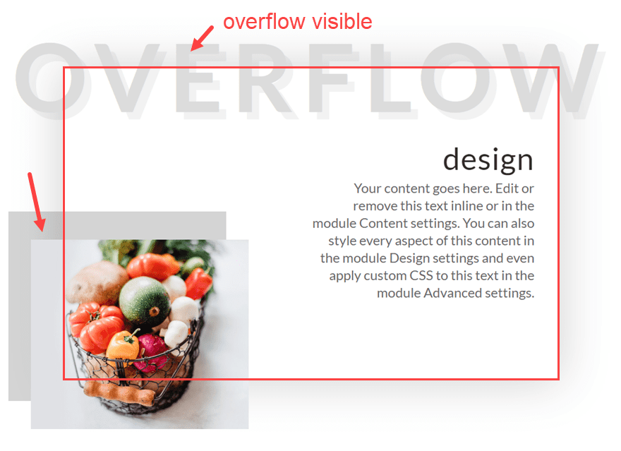
Overflow Visible (default)
In this example, the content that has been positioned outside of the row container remains visible, which is the default setting for all elements in Divi.
Once you add the overflow hidden property to the row, the content outside of the box becomes clipped and hidden from view entirely.
Overflow Scroll
Using overflow scroll allows you to hide the content outside the box container (much like overflow hidden). The main difference is that a scroll bar appears allowing the user to scroll through the content that exists beyond the limits of the container.
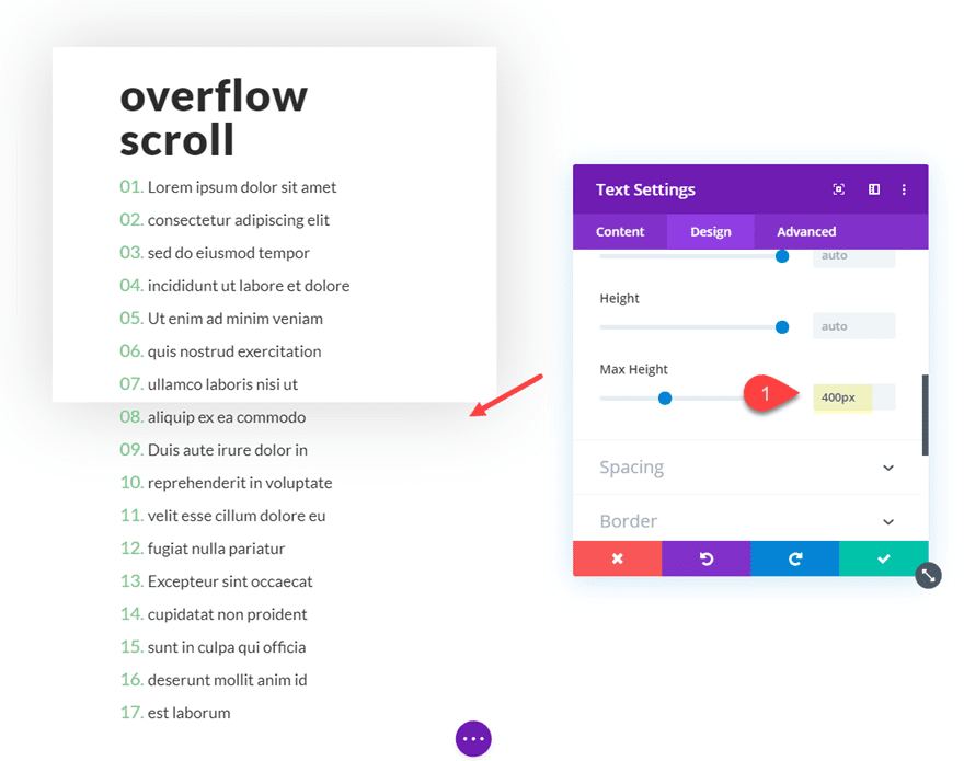
For example, here is a text module with a height of 400px. The content of the text module extends beyond the text module but remains visible by default.
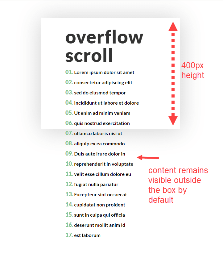
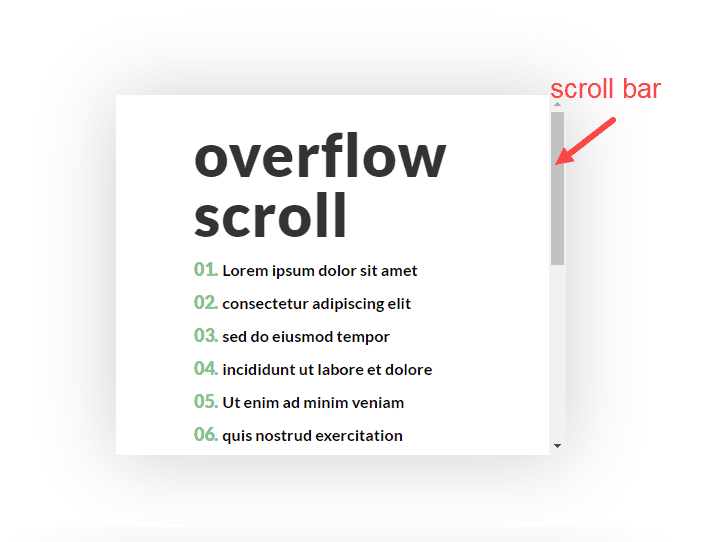
But once you add the vertical overflow scroll property to the text module, the scroll bar appears allowing the user to scroll through the hidden content.
Now that you understand the overflow options a little better, let’s dive in to building some working examples of helpful ways to use them in real life.
Subscribe To Our Youtube Channel
3 Helpful Ways to Use Divi’s Overflow Options in Divi
To understand how to use the overflow hidden property, we are going to create a quick example design with overflowing text and an overflowing image. Then we will see how the design changes when setting our row to overflow hidden.
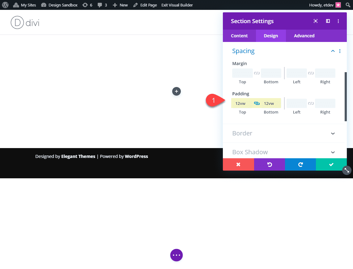
First, create a regular section with a one column row. Before we start adding modules, let’s give the section the following padding:
Custom Padding: 12vw top, 12vw bottom
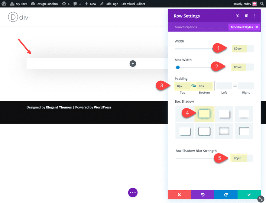
Then update the row settings as follows:
Width: 80vw
Max Width: 80vw
Padding: 0px top, 0px bottom
Box Shadow: see screenshot
Box Shadow Blur Strength: 80px
Then add a text module to the row and update the following text module settings:
First add an h2 heading in the content box as follows:
<h2>Overflow</h2>
Then update the design settings as follows:
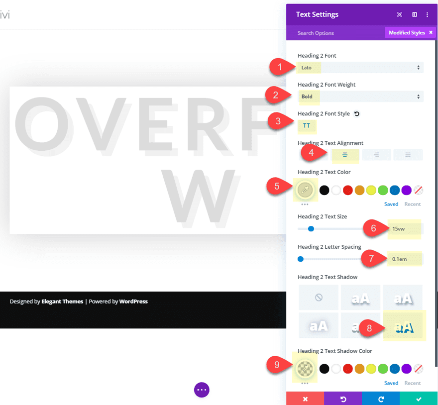
Heading 2 Font: Lato
Heading 2 Font Weight: Bold
Heading 2 Font Style: TT
Heading 2 Text Alignment: center
Heading 2 Text Color: #dddddd
Heading 2 Text Size: 15vw
Heading 2 Letter Spacing: 0.1em
Heading 2 Text Shadow: see screenshot
Heading 2 Text Shadow Color: rgba(0,0,0,0.05)
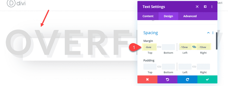
Now, to make the text overflow the row content area, we need to use custom margins. Add the following custom margin to the text module to make it overflow above the row (vertically) and on each side of the row (horizontally).
Margin: -6vw top, -10vw left, -10vw right
Next, add another text module below the one you just created and update the following:
Content:
<h3>design</h3>
<p>Your content goes here. Edit or remove this text inline or in the module Content settings. You can also style every aspect of this content in the module Design settings and even apply custom CSS to this text in the module Advanced settings.</p>
(By the way, code snippets like this are a great way to take advantage of the overflow scroll option.)
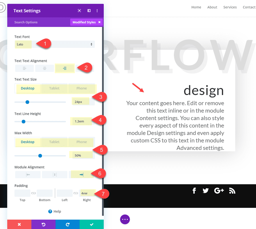
Text Font: Lato
Text Text Alignment: right
Text Text Size: 24px (desktop), 16px (phone)
Text Line Height: 1.3em
Max Width: 50%
Module Alignment: right
Padding: 4vw right
Now, let’s add an image that overflows outside the row. Create a new image module below the two text modules and then upload an image of your choice.
Then update the image settings as follows:
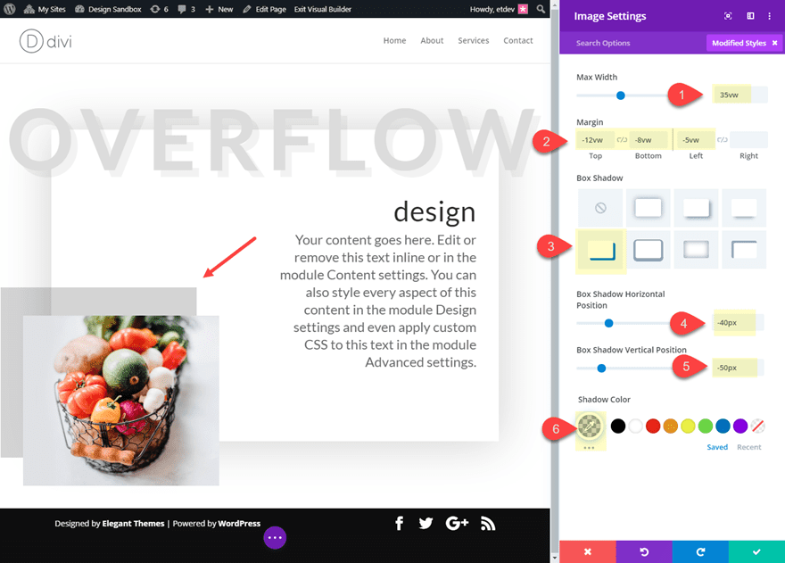
Max Width: 35vw
Margin: -12vw top, -8vw bottom, -5vw left
Box Shadow: see screenshot
Box Shadow Horizontal Position: -40px
Box Shadow Vertical Position: -50px
Shadow Color: rgba(0,0,0,0.17)
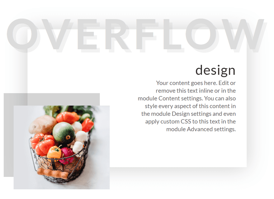
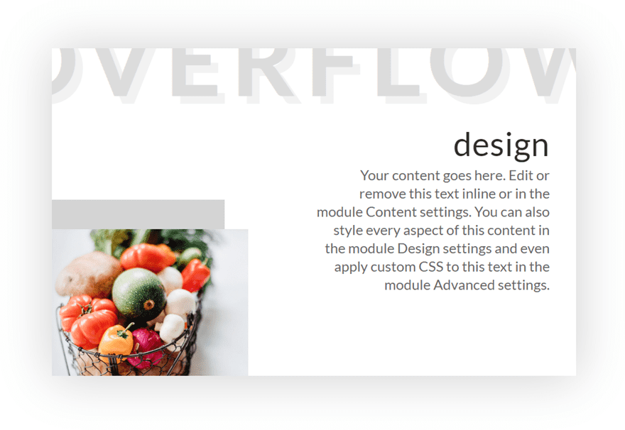
Design with Row set to Overflow Visible (default)
Now let’s check out the design keeping our row overflow set to visible (the default).
As you can see, this default overflow visible options is great for creating some beautiful and modern designs.
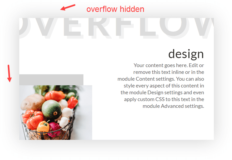
Design with Row set to Overflow Hidden
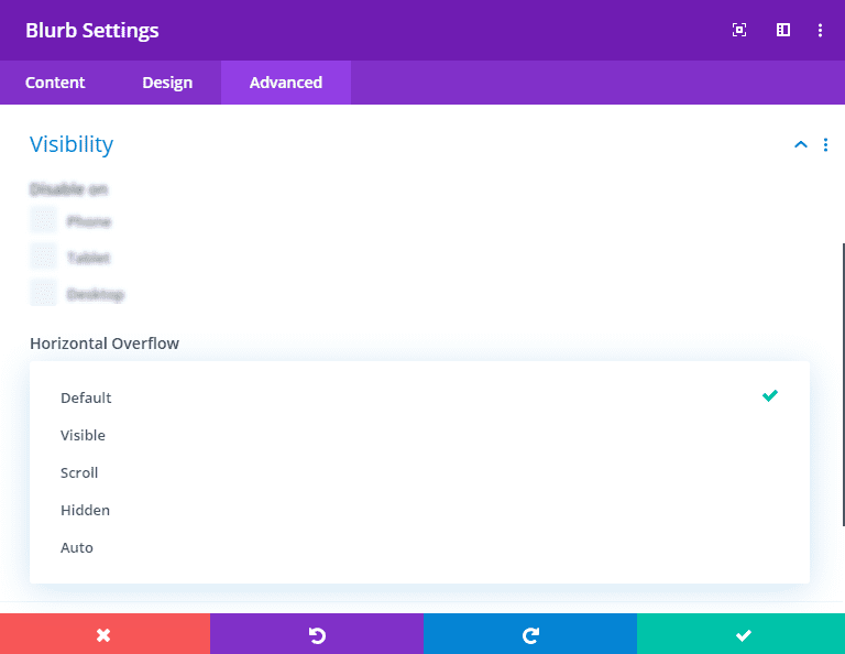
Now let’s see what happens when we use the Overflow Hidden property for the row. Open the row settings and update the following:
Horizontal Overflow: hidden
Vertical Overflow: hidden
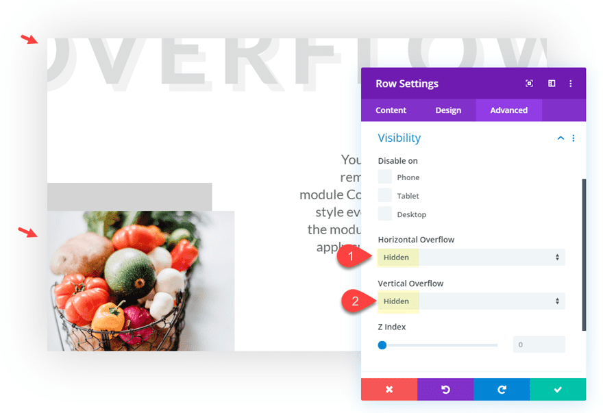
Here is the result.
As you can see, the overflowing content (the top heading and the image) is now clipped and hidden to create a unique design. And with this setup, you can easily take advantage of the transform options to scale and move the elements around to get the design just right.
#2 Using Overflow Scroll to Allow Users to Scroll Through Content Vertically
This next example introduces vertical overflow scroll. This overflow option comes in handy for adding scrollable content to lists of links or resources. You can turn any module or row into a container for scrollable content. Here’s how to do it with a text module.
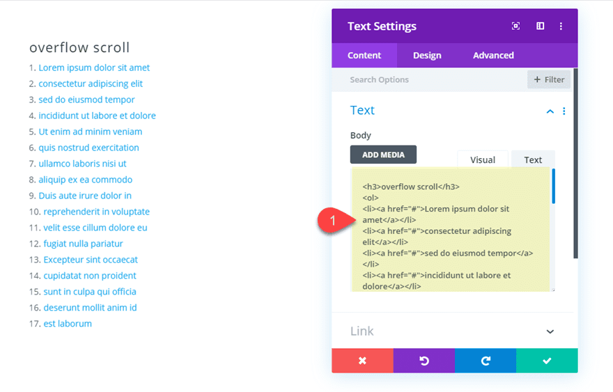
Create a regular section with a one-column row. Then add a text module with the following content:
<h3>overflow scroll</h3>
<ol>
<li><a href="#">Lorem ipsum dolor sit amet</a></li>
<li><a href="#">consectetur adipiscing elit</a></li>
<li><a href="#">sed do eiusmod tempor</a></li>
<li><a href="#">incididunt ut labore et dolore</a></li>
<li><a href="#">Ut enim ad minim veniam</a></li>
<li><a href="#">quis nostrud exercitation</a></li>
<li><a href="#">ullamco laboris nisi ut</a></li>
<li><a href="#">aliquip ex ea commodo</a></li>
<li><a href="#">Duis aute irure dolor in</a></li>
<li><a href="#">reprehenderit in voluptate</a></li>
<li><a href="#">velit esse cillum dolore eu</a></li>
<li><a href="#">fugiat nulla pariatur</a></li>
<li><a href="#">Excepteur sint occaecat</a></li>
<li><a href="#">cupidatat non proident</a></li>
<li><a href="#">sunt in culpa qui officia</a></li>
<li><a href="#">deserunt mollit anim id</a></li>
<li><a href="#">est laborum</a></li>
</ol>
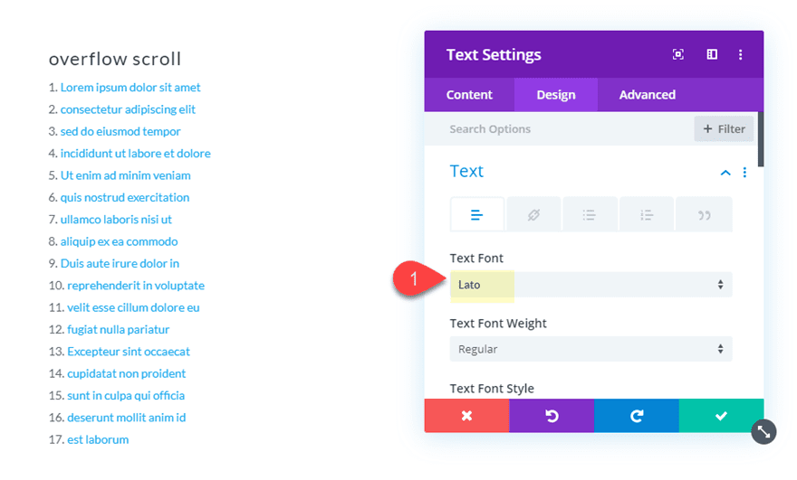
Then update the text module design settings as follows:
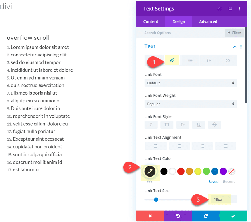
Text Font: Lato
Link Text color: #333333
Link Text Size: 18px
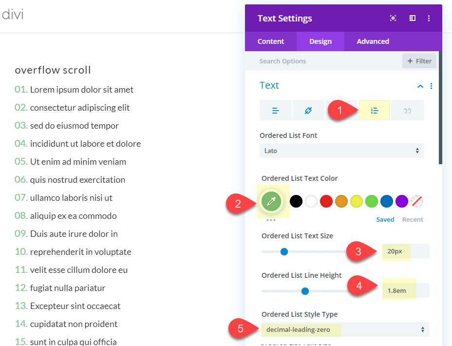
Ordered List Text Color:
Ordered List Text Size: 20px
Ordered List Line Height: 1.8em
Ordered List Style Type: decimal-leading-zero
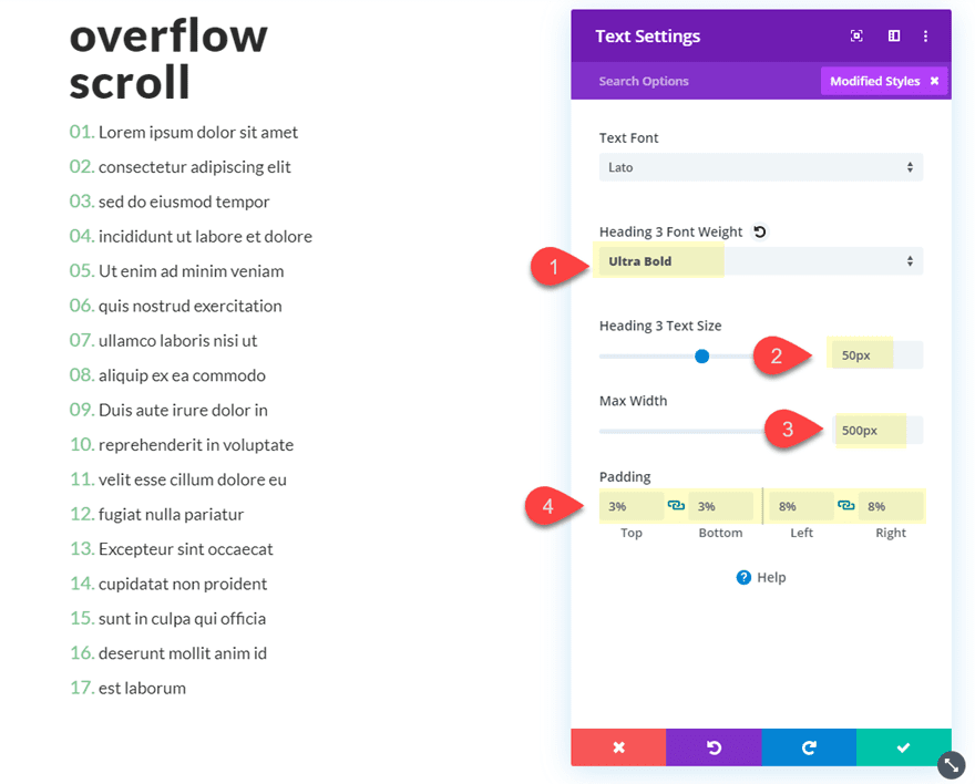
Heading 3 Font Weight: Ultra Bold
Heading 3 Text Size: 50px
Max Width: 500px
Padding: 3% top, 3% bottom, 8% left, 8% right
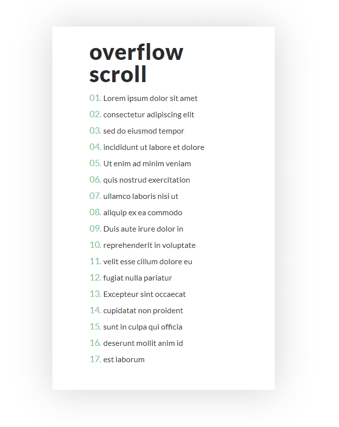
Here is what the text module looks like before we give in a height and overflow scroll.
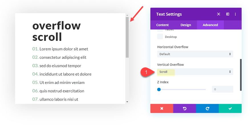
Now, update the text module with a max height of 400px. Since the default overflow value for the text module is visible, you will notice the text overflowing below the module.
All we need to do now is set the vertical overflow to scroll as follows:
Vertical Overflow: scroll
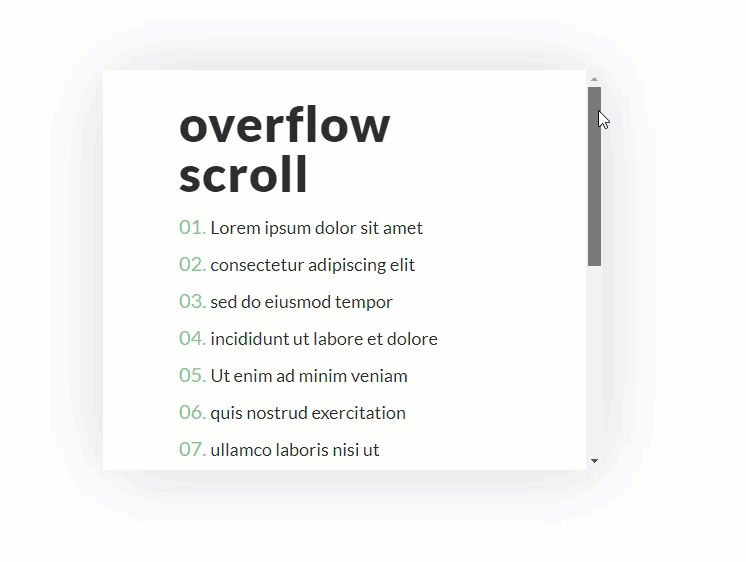
Here is the final design.
For more examples on how to use vertical overflow scroll on your Divi site, check out these posts:
- How to Create a Scroll Gallery Mockup with Divi’s New Overflow Options
- How to Design a Scrollable Recent Posts Widget Area in Divi
#3 Using Overflow Scroll to Allow Users to Scroll Through Content Horizontally
Using overflow scroll for horizontal scrolling is another way to keep your content accessible from one concise location. Plus, it is also a great way to incorporate side-swiping functionality on mobile without a plugin.
To show you how to do it, we are going to build a quick example together.
First, create a regular section with a one column row.
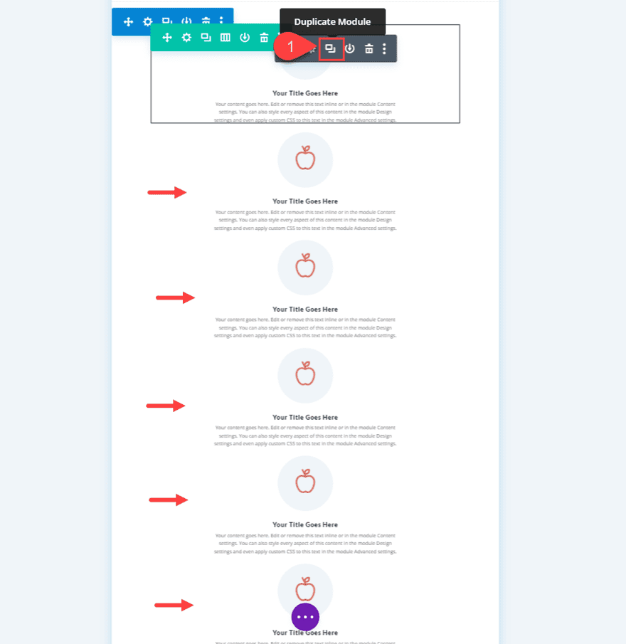
Then add a blurb module to the row.
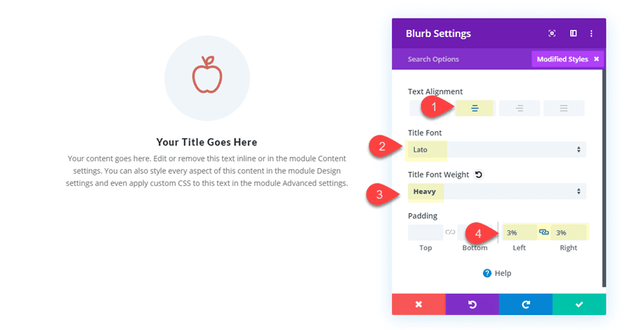
You can replace the default image with a new image or icon. Then update the design settings with a few tweaks:
Text Alignment: center
Title Font: Lato
Title Font Weight: Heavy
Padding: 3% left, 3% right
Duplicate the blurb module 5 times so that you have a total of 6 blurbs in your row column.
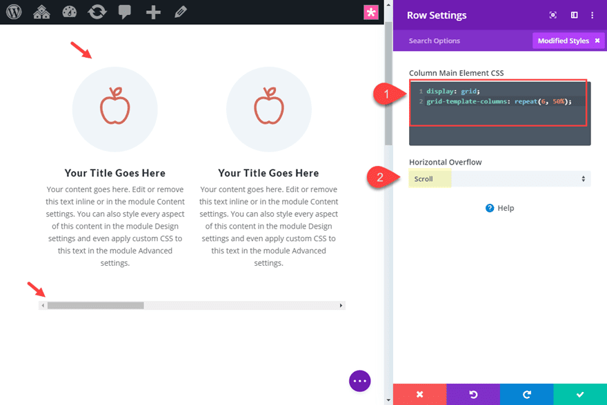
Then update the row settings with the following custom CSS to the Column Main Element.
display: grid;
grid-template-columns: repeat(6, 50%);
This will give your column of blurbs into a horizontal grid layout with 6 columns each with a width that is 50% of the container (or in this case the row). This means that two blurbs/columns will occupy the space inside the row. The other 4 modules will extend outside the row to the right side. This is where the overflow scroll property comes in handy. Update the following overflow option:
Horizontal Overflow: Scroll
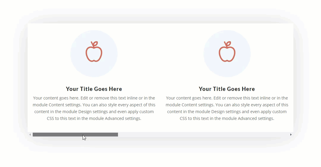
Now you can adjust the width of the row as needed and the two blurbs will always line up nicely. Here is the final design.
I added a box shadow to the row so you can see the box of content a bit better. Notice how two blurbs will display initially until the user scrolls to the right.
For more info, check out the full post on creating horizontal swipe cards.
Final Thoughts
Overlapping elements and positioning elements outside of the typical grid layout is becoming more common these days. Mostly, this is done purely for design purposes. Understanding how to use Divi’s overflow options will help you understand how to hide or show content outside of a container to create these unique designs. And, understanding overflow scroll will also come in handy for adding scrollable content to your website.
I hope this article has helped shed some light on the overflow property and how you can use it for your next Divi project.
I look forward to hearing from you in the comments.
Cheers!


I don’t know what all this is about.
I just use a module with a text editor, select the appropriate scroll in the visibility, and adjust the height/width to the size I want (carefully adjusting so a line of copy isn’t split in half), and I’m good to go.
Blurb heights, etc, are adjusted by setting your maximum heights in all your blurbs in that row to the same number.
If there’s a blog on this, I missed it. I just figured it out on my own. So I may not have it all right or doing it the easiest way. But it seems to work.
Great tutorial! How would I equalize the blurb heights in your 3rd example?
Thanks Jason, it was very helpful to see the technical solution, not just read about it.
adding Header and Footer to Divi anyone?… please?… ‘(
Ohh, nice article, thx Jasnon
Bam! Solid tut, but best part for me was I didn’t know there were ORDERED LIST STYLING options in the text module! Thank you!!
Awesome! Then you should check out this post on list styles with the text module. https://www.elegantthemes.com/blog/divi-resources/unleashing-the-power-of-divis-text-module-for-creative-list-designs
Although since the options harmony update, these list styling options are available for all modules.
Please xcuse my type 😉
Please make tutorials on how to copy New elegant themes designs such as Blog page,Primary Menu etc.
Please….
We will definitely do some of those. Stay tuned…