
Swiping through content is something almost everyone does on a daily basis. It has basically become second nature so it goes without saying that adding it to your website can help improve the overall user experience. In this post, we’ll show you how to create endless horizontal swipe cards that are mainly focused on mobile and tablet devices, where touch is involved. Although this is a mobile-first tutorial, the outcome will work great on desktop as well. People can use the scrollbar that’ll be included or ‘swipe’ left and right using their touchpad.
Let’s get to it!
Preview
Before we dive into the tutorial, let’s take a quick look at the outcome on different screen sizes.
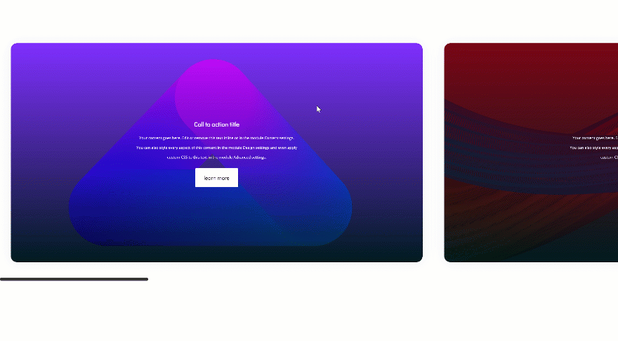
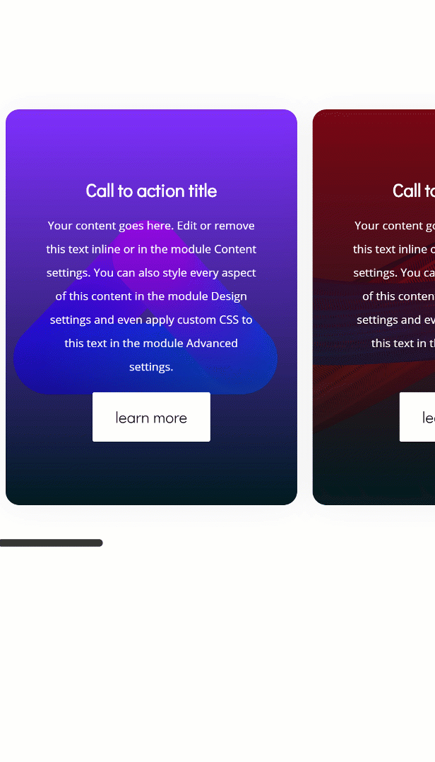
Example 1: One-Column Row
Desktop
Mobile
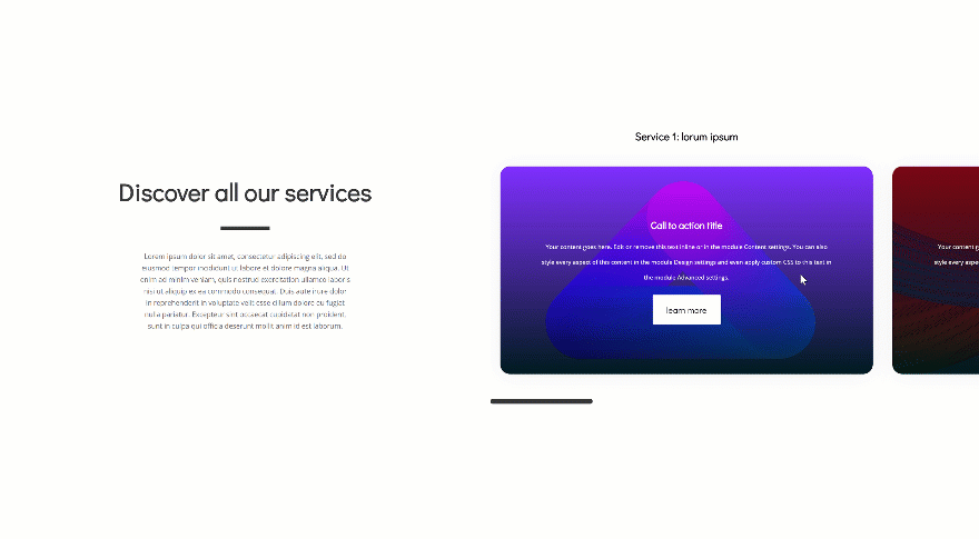
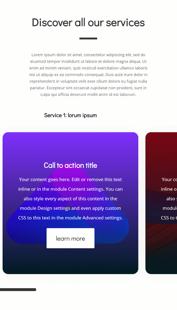
Example 2: Two-Column Row + Multiple Modules in ‘Swipe Column’
Desktop
Mobile
Approach
- To create this beautiful effect, we’ll need to transform an entire vertical column into a horizontal swipe/scroll grid mechanism using just a few CSS code lines
- Using a vertical column for this mechanism (and turning it into a horizontal grid) will allow you to add as many swiping cards as you want, you get to determine how many columns there get to be
- In other words; you’ll add modules downwards and the swipe/scroll mechanism will place hem in a horizontal column
- For the first example, we’ll use a one-column row
- This will allow the swipe mechanism to take up the entire width of the screen
- The second example, on the other hand, turns only one of two columns into a swipe/scroll mechanism and leaves the other column in its static state
- We’ll also show you how to add multiple modules to a ‘column’ of the swipe/scroll mechanism
- Once you understand the approach, you’ll be able to literally create any kind of design you want and have it be part of the swipe/scroll mechanism that you can see in the GIFs above
- You can find all of the fluid background images that we’ll use by going to the ‘Download 10 FREE Fluid Section Background Images for Divi‘ post
Subscribe To Our Youtube Channel
Recreate Example #1
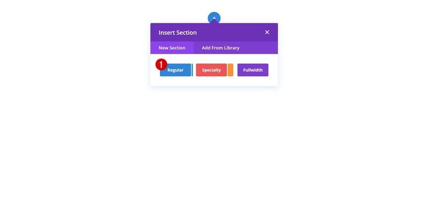
Add New Section
Let’s start creating the first example! Add a new section to the page you’re working on.
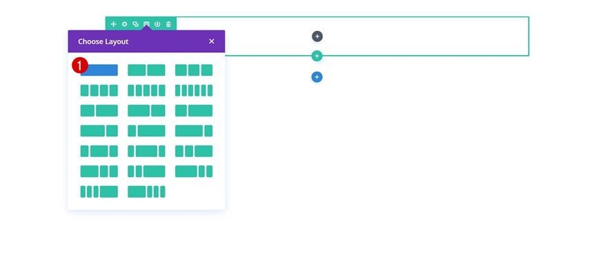
Add New Row
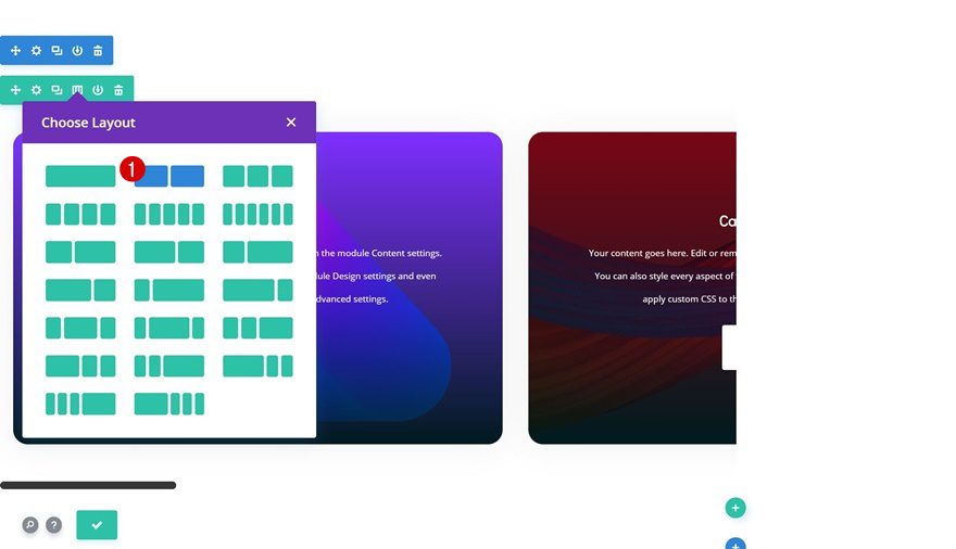
Column Structure
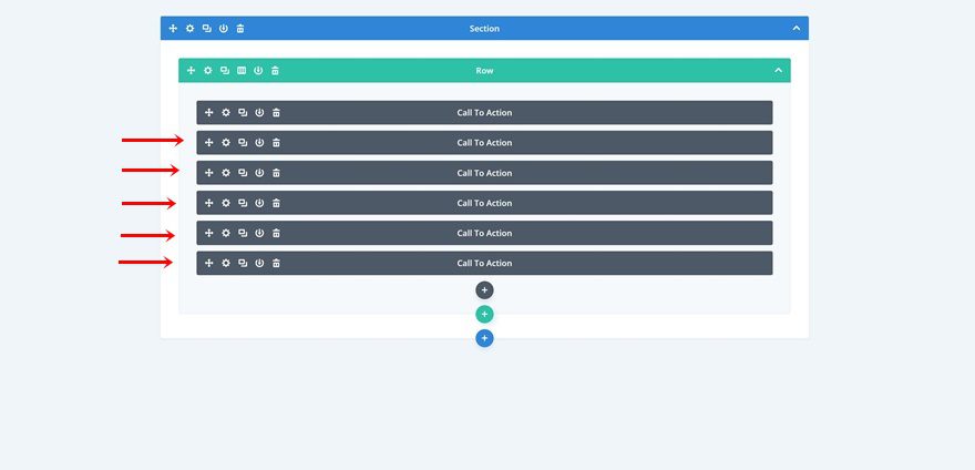
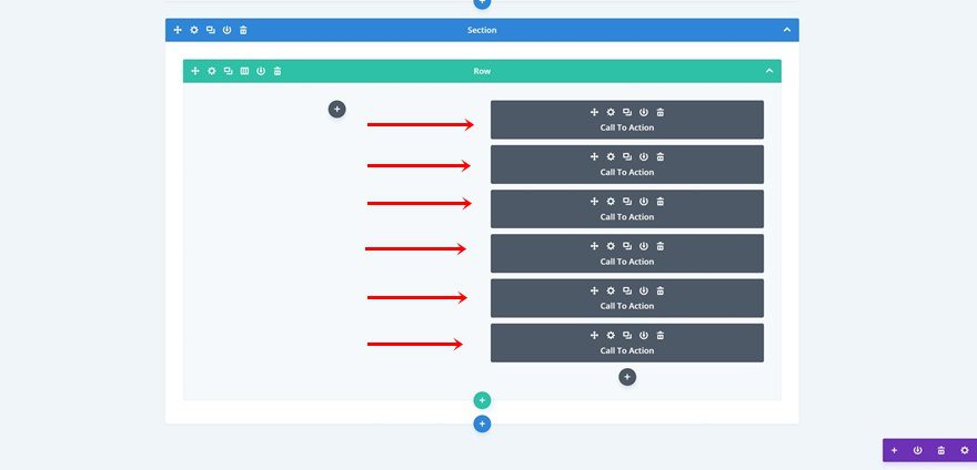
Then, add a row with one column. We’re going to turn this entire column into a swipe/scroll mechanism.
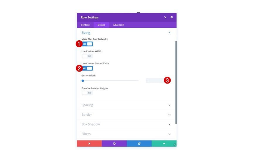
Sizing
Without adding any modules yet, open the row settings and go to the sizing settings. Here, we’re going to remove all the space between the section, row, and column. In other words, the column will take up the entire width of the screen.
- Make This Row Fullwidth: Yes
- Use Custom Gutter Width: Yes
- Gutter Width: 1
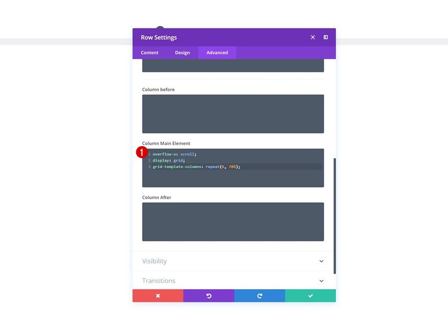
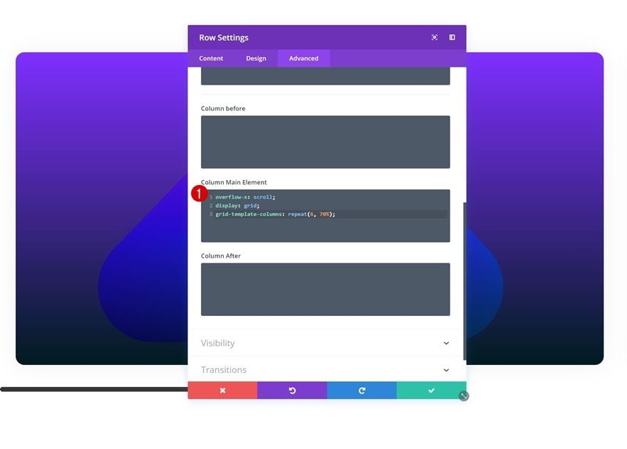
Column CSS Code
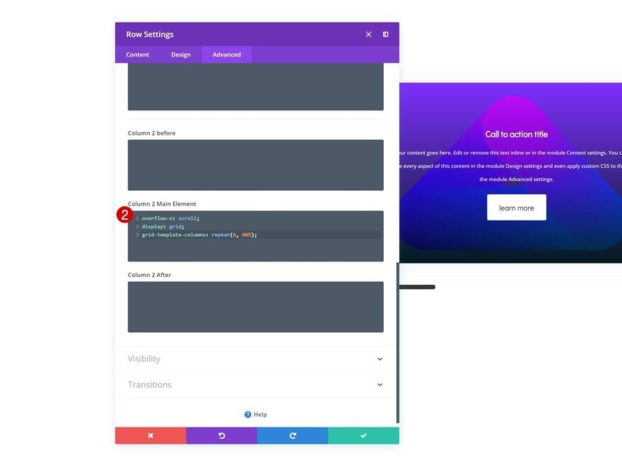
As mentioned before, we’re turning the column itself into a swipe/scroll grid mechanism. To do that, we’ll need three lines of custom CSS code, which you can find below. Go ahead and add these to the Column Main Element in the advanced tab of the row.
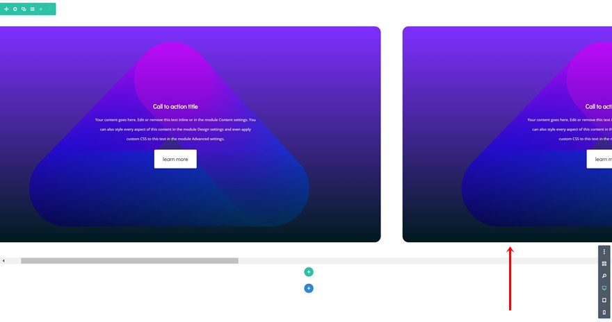
overflow-x: scroll;
display: grid;
grid-template-columns: repeat(6, 70%);
The first line of CSS code enables scrolling/swiping. The second line turns the column into a horizontal grid. And the third line of CSS code defines the grid. We’re basically saying that we want 6 columns that’ll each have a width of 70%. Depending on the number of swiping cards you want to show up in the swipe/scroll mechanism, you’ll have to modify the values. So, say for instance you want 10 different swipe cards to be part of the mechanism and you want to increase the width of each column to 90%, you’ll have to use the following line of CSS code instead:
grid-template-columns: repeat(10, 90%);
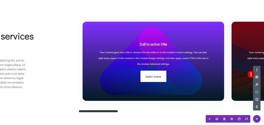
Add CTA Module to Column 1
Add Content
Once you’re done modifying the row settings, go ahead and add a CTA Module to the column. Add some content of your choice.
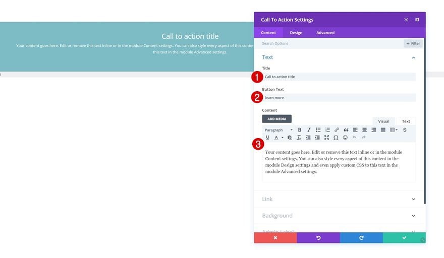
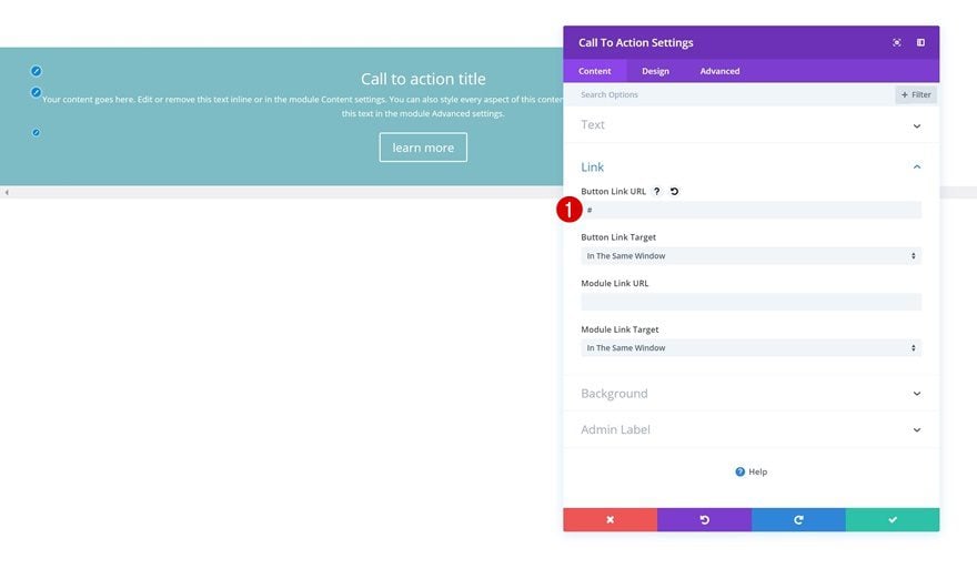
Link
You’ll also need to add a button link URL to have the button show up in the module.
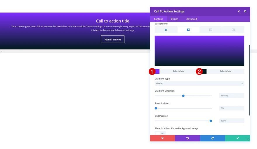
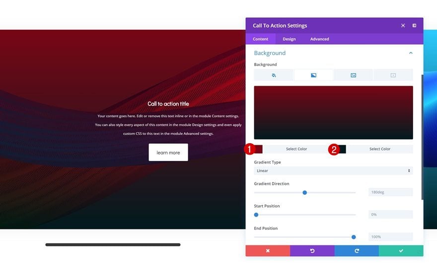
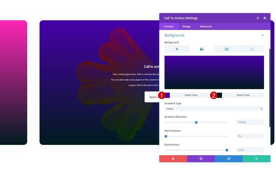
Gradient Background
Continue by adding a gradient background.
- Color 1: #802bff
- Color 2: #001519
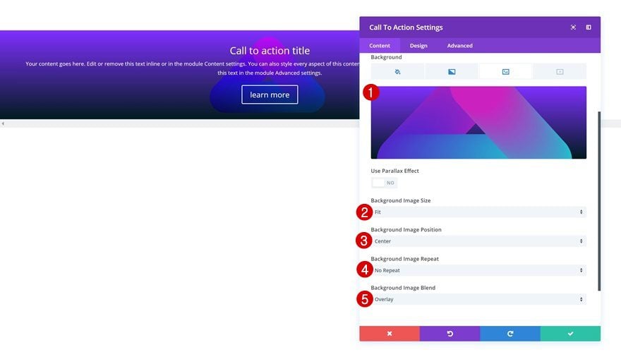
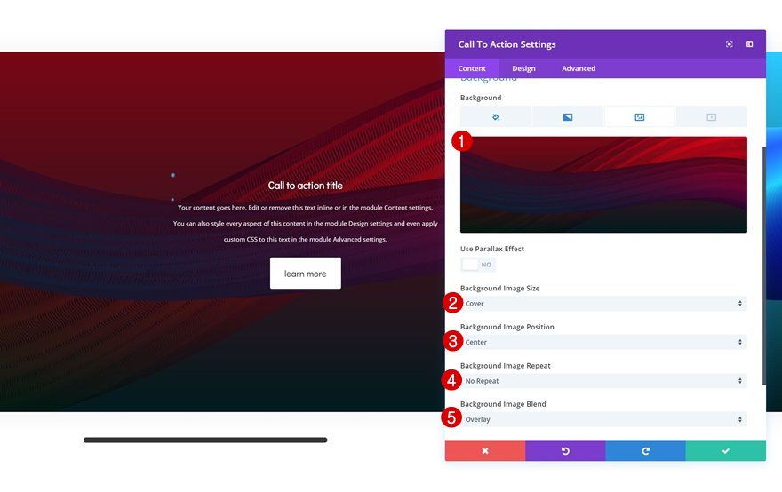
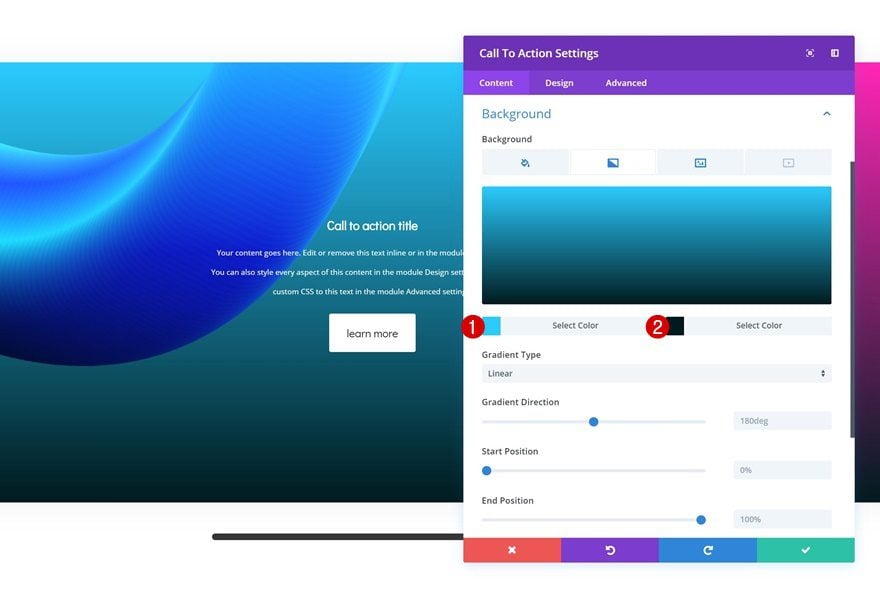
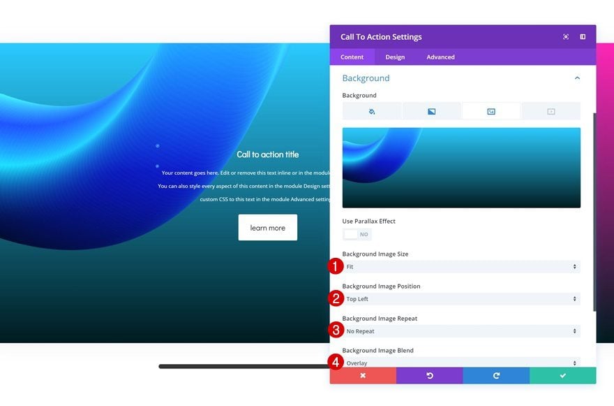
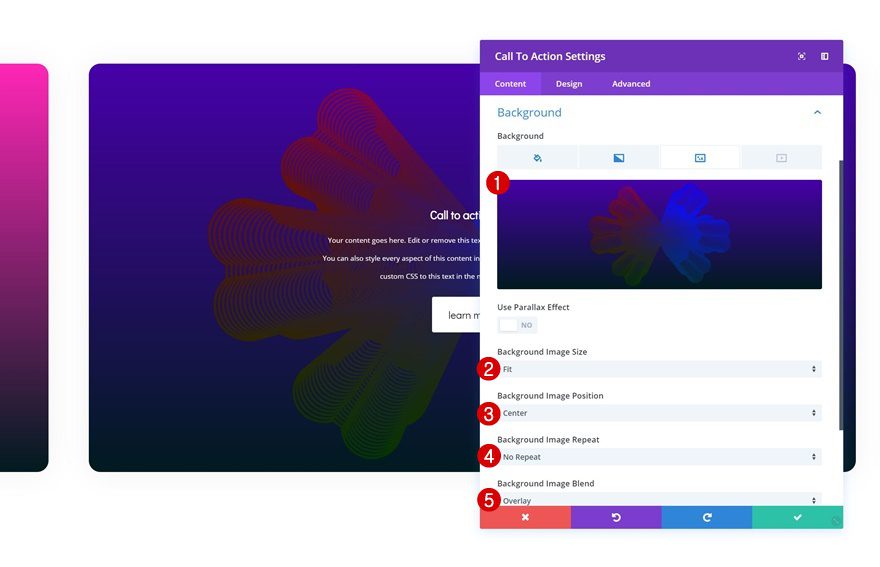
Background Image
In the approach section of this post, we mentioned that we’ll use the fluid background images that you can download for free by going to this post. Once you’ve downloaded the fluid background images, search for the ‘fluid-style-2.png‘ image file and upload it to the background image tab. Modify the background image settings accordingly:
- Background Image Size: Fit
- Background Image Position: Center
- Background Image Repeat: No Repeat
- Background Image Blend: Overlay
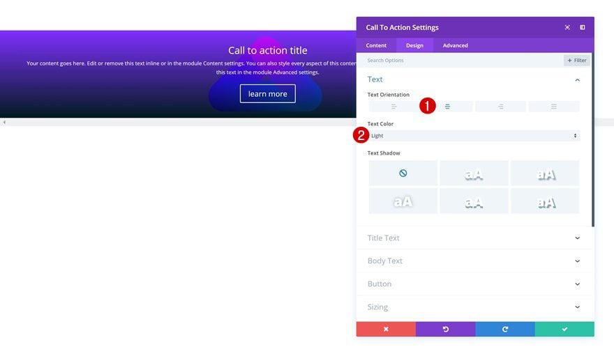
Text Settings
Move on to the design tab and make sure the following text settings apply:
- Text Orientation: Center
- Text Color: Light
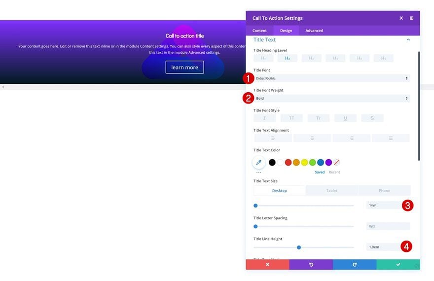
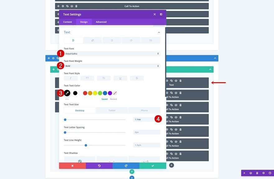
Title Text Settings
Modify the title text settings next.
- Title Font: Didact Gothic
- Title Font Weight: Bold
- Title Text Size: 1vw (Desktop), 2.5vw (Tablet), 4vw (Phone)
- Title Line Height: 1.9em
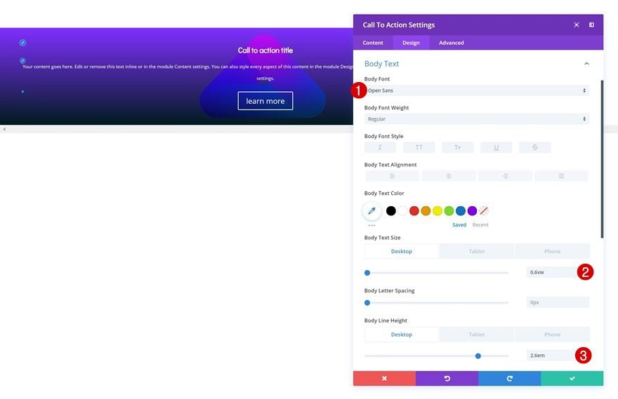
Body Text Settings
Along with the body text settings.
- Body Font: Open Sans
- Body Text Size: 0.6vw (Desktop), 1.3vw (Tablet), 2.5vw (Phone)
- Body Line Height: 2.6em (Desktop & Tablet), 2.1em (Phone)
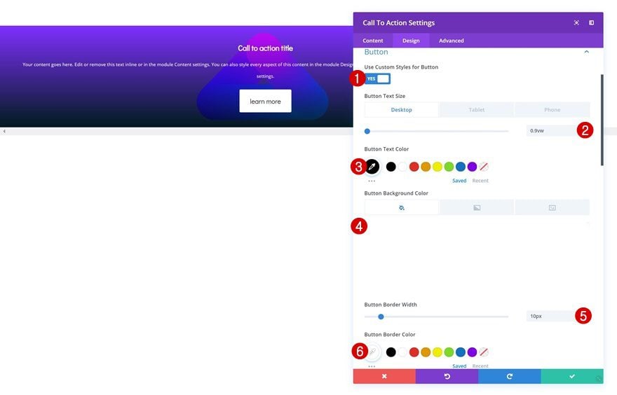
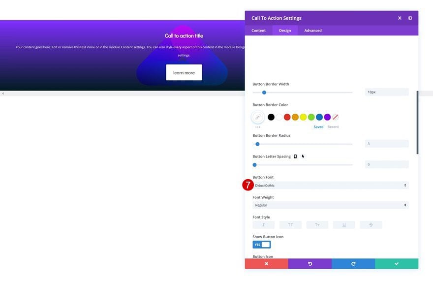
Button Settings
We’re changing the appearance of the button in this module as well.
- Use Custom Styles for Button: Yes
- Button Text Size: 0.9vw (Desktop), 2.1vw (Tablet), 3.5vw (Phone)
- Button Text Color: #000000
- Button Background Color: #ffffff
- Button Border Width: 10px
- Button Border Color: #ffffff
- Button Font: Didact Gothic
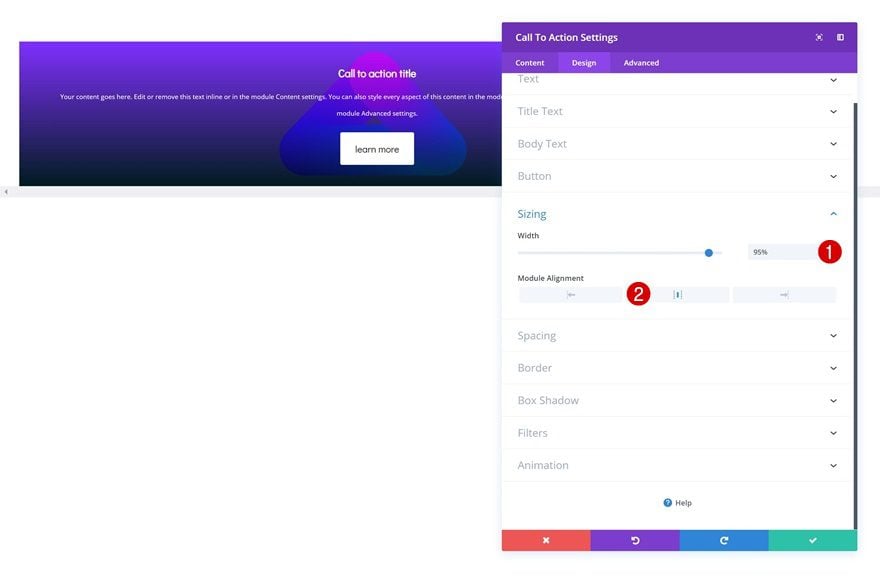
Sizing
It’s also important to slightly decrease the width of the CTA Module in the sizing settings. This will make sure that there’ll always be a gap between this module and whichever module comes next in the swipe/scroll mechanism.
- Width: 95%
- Module Alignment: Center
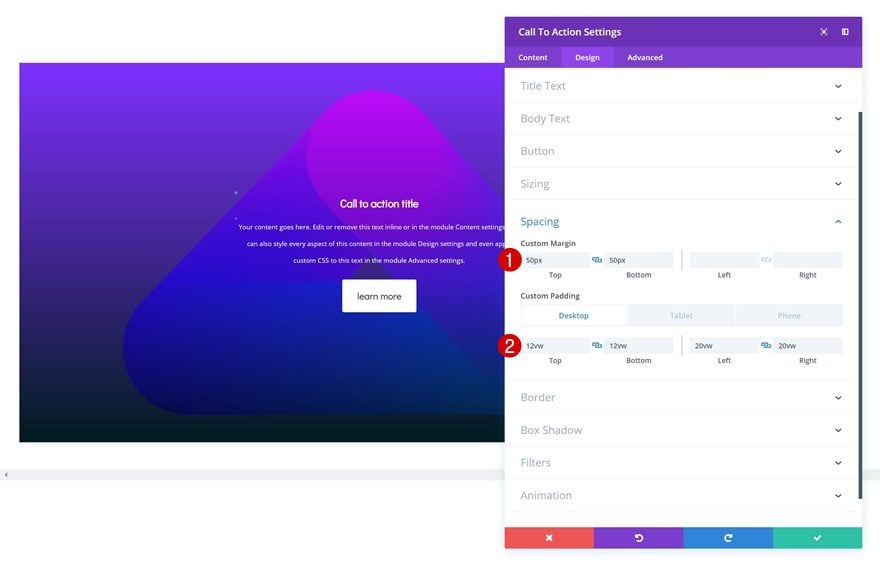
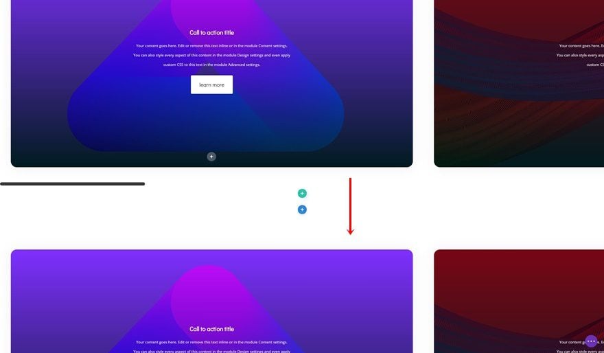
Spacing
Of course, we want everything to look great across all different screen sizes. That’s why we’ll add various custom padding values in the spacing settings.
- Top Margin: 50px
- Bottom Margin: 50px
- Top Padding: 12vw (Desktop), 5vw (Tablet), 14vw (Phone)
- Bottom Padding: 12vw (Desktop), 5vw (Tablet), 14vw (Phone)
- Left Padding: 20vw (Desktop), 3vw (Tablet), 8vw (Phone)
- Right Padding: 20vw (Desktop), 3vw (Tablet), 8vw (Phone)
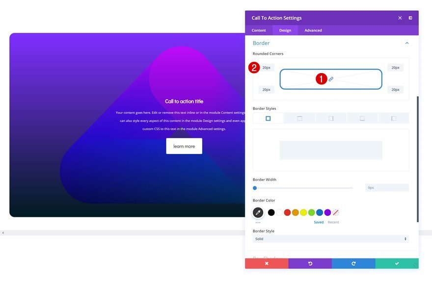
Border
Last but not least, we’re also adding ’20px’ to each one of the corners of the module.
Clone CTA Module as Many Times as You Want
Once you’re done customizing the CTA Module, you can go ahead and clone the module up to as many times as you want.
Change Gradient Background & Background Image of Duplicate 1
Change the gradient background of the first duplicate.
- Color 1: #7a010d
- Color 2: #001519
And use the ‘fluid-style-9.png‘ background image instead.
- Background Image Size: Cover
- Background Image Position: Center
- Background Image Repeat: No Repeat
- Background Image Blend: Overlay
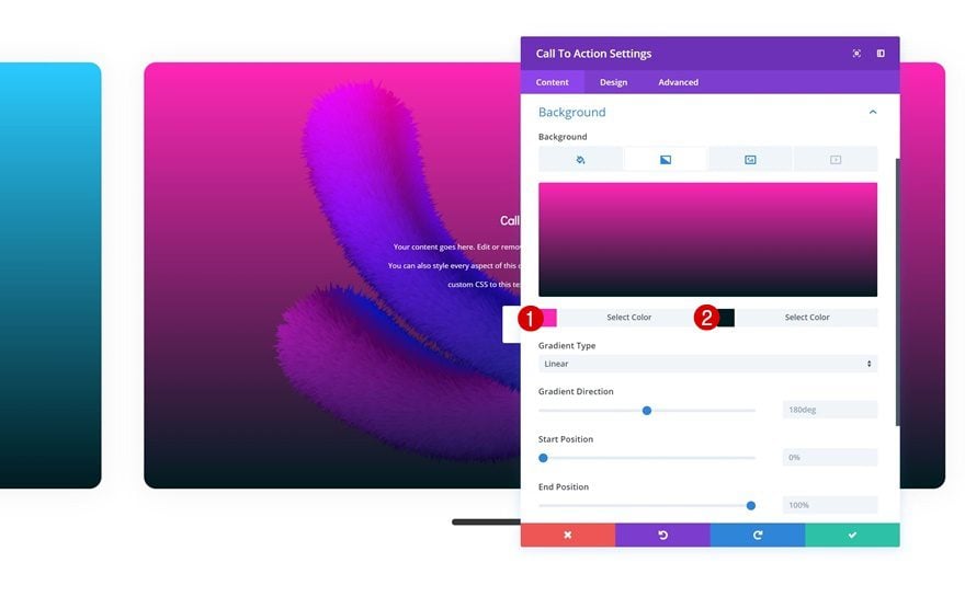
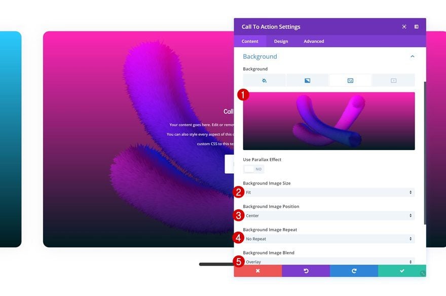
Change Gradient Background & Background Image of Duplicate 2
Change the gradient background of the second duplicate next.
- Color 1: #26ccff
- Color 2: #001519
Upload the ‘fluid-style-10a.png’ image file as the background image.
- Background Image Size: Fit
- Background Image Position: Top Left
- Background Image Repeat: No Repeat
- Background Image Blend: Overlay
Change Gradient Background & Background Image of Duplicate 3
Change the gradient background of the third duplicate.
- Color 1: #ff21b8
- Color 2: #001519
Upload the ‘fluid-style-6.png‘ background image.
- Background Image Size: Fit
- Background Image Position: Center
- Background Image Repeat: No Repeat
- Background Image Blend: Overlay
Change Gradient Background & Background Image of Duplicate 4
Change the gradient background of the fourth duplicate.
- Color 1: #4400aa
- Color 2: #001519
Use ‘fluid-style-4.png‘ as the background image.
- Background Image Size: Fit
- Background Image Position: Center
- Background Image Repeat: No Repeat
- Background Image Blend: Overlay
Change Gradient Background & Background Image of Duplicate 5
Change the gradient background of the last duplicate.
- Color 1: #ff2626
- Color 2: #001519
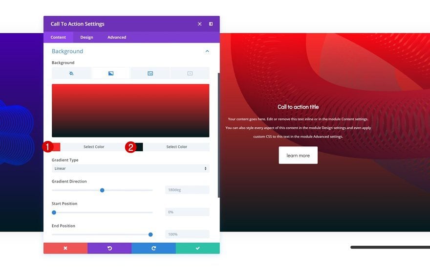
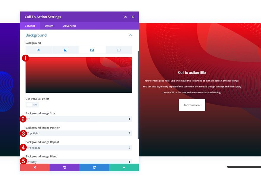
Use ‘fluid-style-7.png‘ as the background image.
- Background Image Size: Fit
- Background Image Position: Top Right
- Background Image Repeat: No Repeat
- Background Image Blend: Overlay
Adjust Column CSS to Number of Modules
We’ve mentioned this before but again, make sure that the CSS code matches the number of modules you have in your column.
Styling the Scrollbar
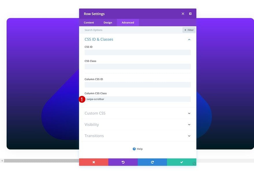
Add CSS Class to Column
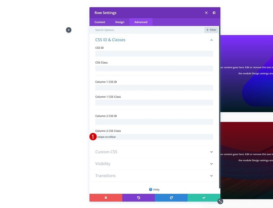
You can also style the scrollbar that comes with this swipe/scroll grid mechanism. Add the following CSS class to your column:
- Column CSS Class: swipe-scrollbar
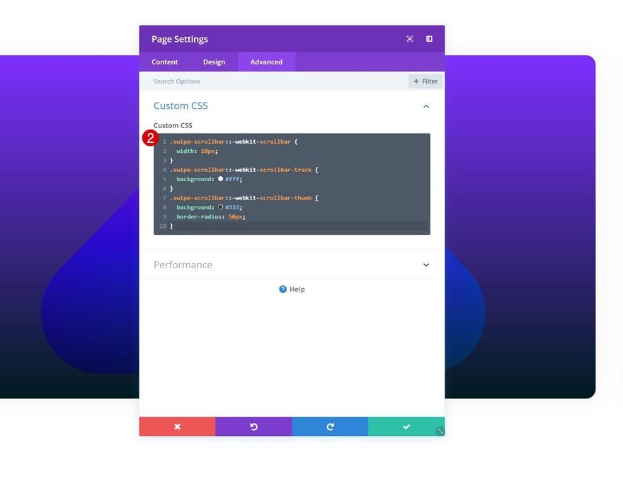
Add Custom CSS to Page Settings
Then, open the page settings, go to the advanced tab and add the following custom CSS code:
.swipe-scrollbar::-webkit-scrollbar {
width: 10px;
}
.swipe-scrollbar::-webkit-scrollbar-track {
background: #fff;
}
.swipe-scrollbar::-webkit-scrollbar-thumb {
background: #333;
border-radius: 50px;
}
Recreate Example #2
Clone Previous Section
On to the next example! Clone the section you’ve created in the previous part of this post.
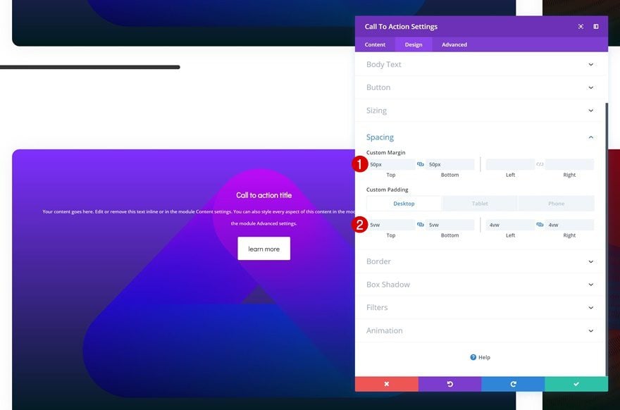
Change CTA Spacing Settings
Then, change the spacing settings of the first CTA Module.
- Top Margin: 50px
- Bottom Margin: 50px
- Top Padding: 5vw (Desktop & Tablet), 14vw (Phone)
- Bottom Padding: 5vw (Desktop & Tablet), 14vw (Phone)
- Left Padding: 4vw (Desktop), 3vw (Tablet), 8vw (Phone)
- Right Padding: 4vw (Desktop), 3vw (Tablet), 8vw (Phone)
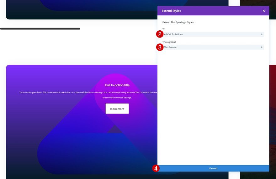
Extend Spacing Settings to All Modules in Column
Extend these new spacing settings by right clicking and clicking on ‘Extend Spacing Styles.
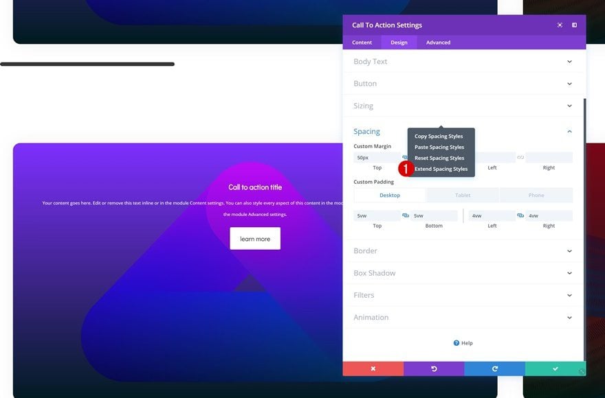
- To: All Call To Actions
- Throughout: This Column
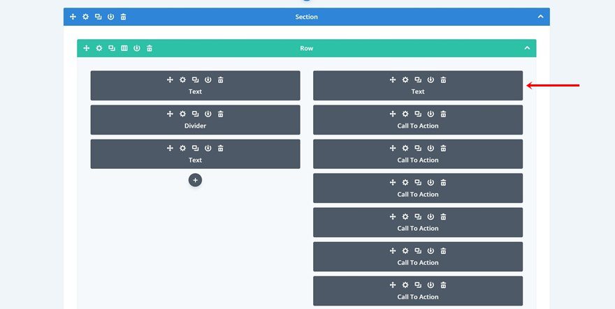
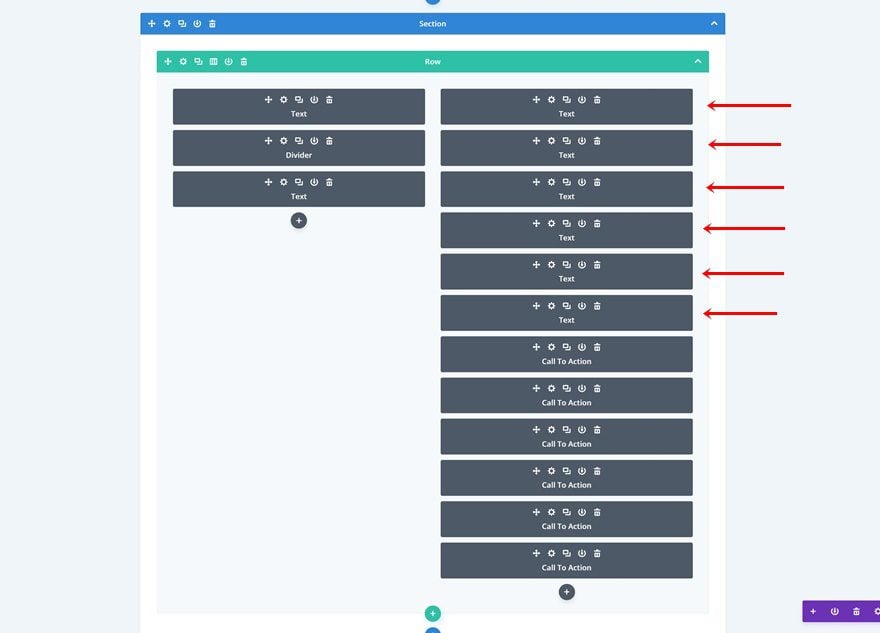
Change Column Structure
Continue by changing the column structure of the row.
Move Modules to Second Column
And place each one of the modules in the second column instead.
Move CSS to Second Column & Change Values
Since we’ve moved the modules from one column to the other, we’ll also need to do the same thing for the CSS code. Add the CSS class to column 2 instead.
- Column 2 CSS Class: swipe-scrollbar
Place the CSS code lines in Column 2 Main Element. We’re also changing the width of each column into ‘80%’.
overflow-x: scroll;
display: grid;
grid-template-columns: repeat(6, 80%);
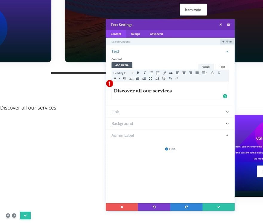
Add Title Text Module to Column 1
Add Content
Continue by adding a new Text Module to the first column. Add some H2 content of your choice.
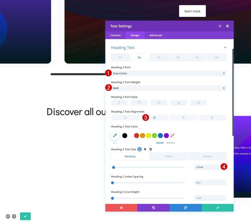
Heading Text Settings
Go to the design tab and modify the H2 text settings.
- Heading 2 Font: Didact Gothic
- Heading 2 Font Weight: Bold
- Heading 2 Text Alignment: Center
- Heading 2 Text Size: 2.5vw (Desktop), 5vw (Tablet), 6vw (Phone)
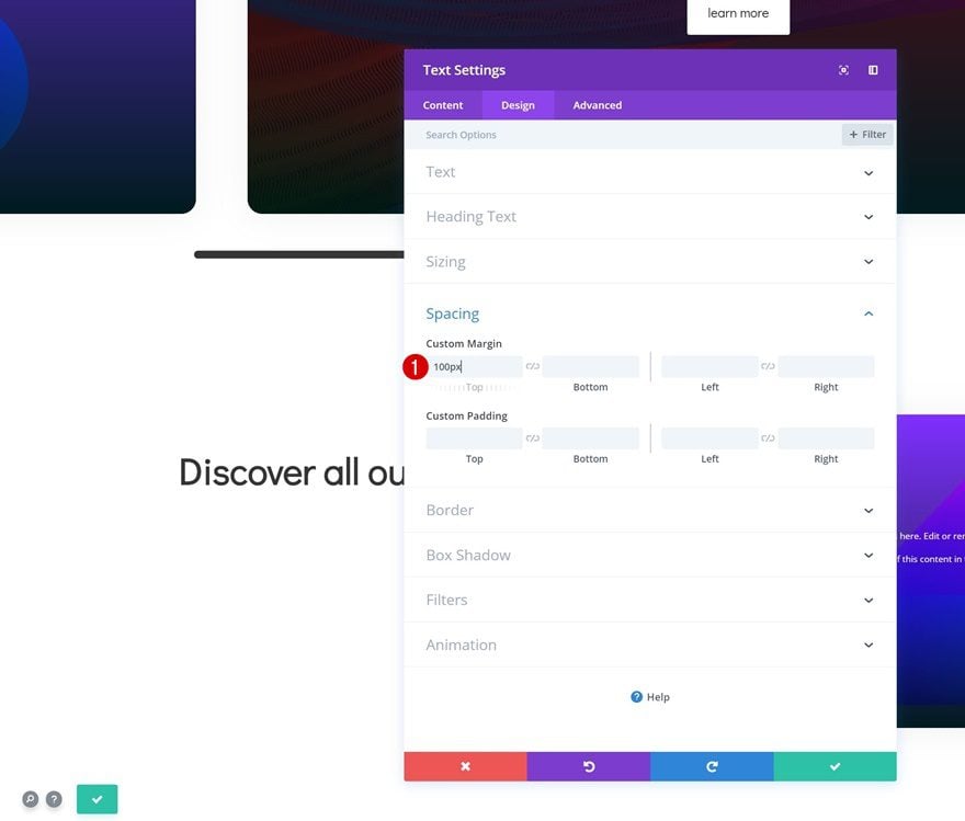
Spacing
Add some custom top margin as well.
- Top Margin: 100px
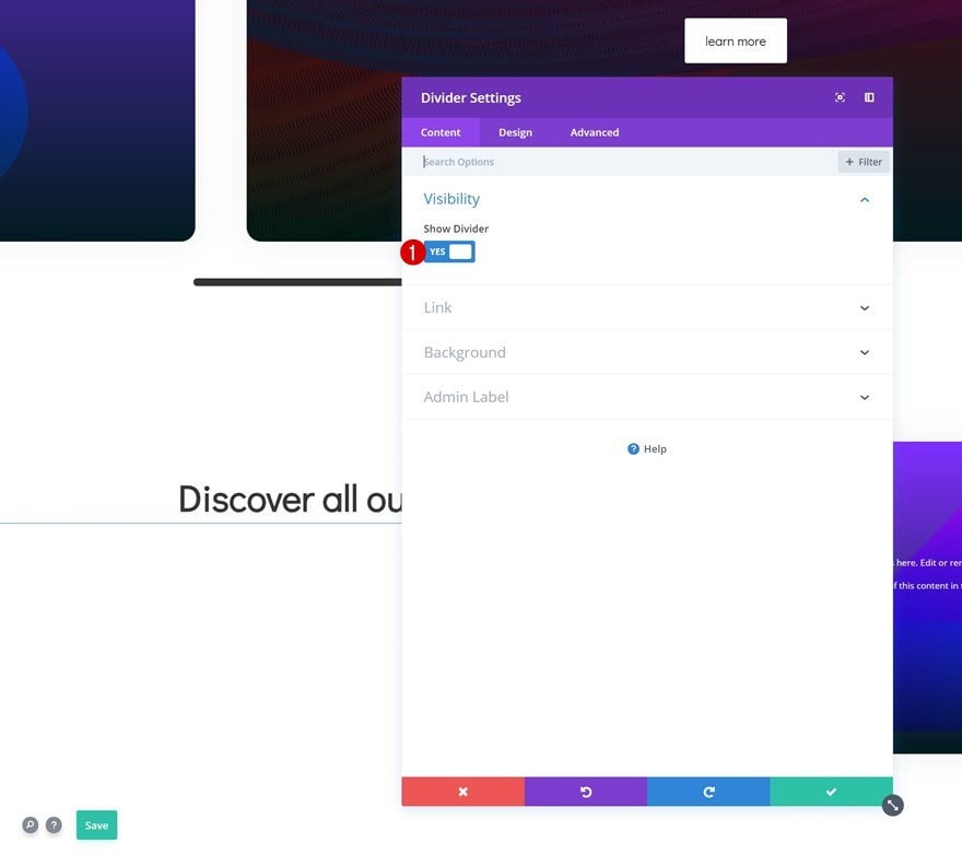
Add Divider Module to Column 1
Visibility
The next module we need in column 1 is a Divider Module. Make sure the ‘Show Divider’ option is enabled.
- Show Divider: Yes
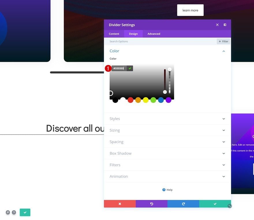
Color
Change the divider color next.
- Color: #333333
Sizing
Along with the sizing settings.
- Divider Weight: 7px
- Height: 0px
- Width: 10%
- Module Alignment: Center

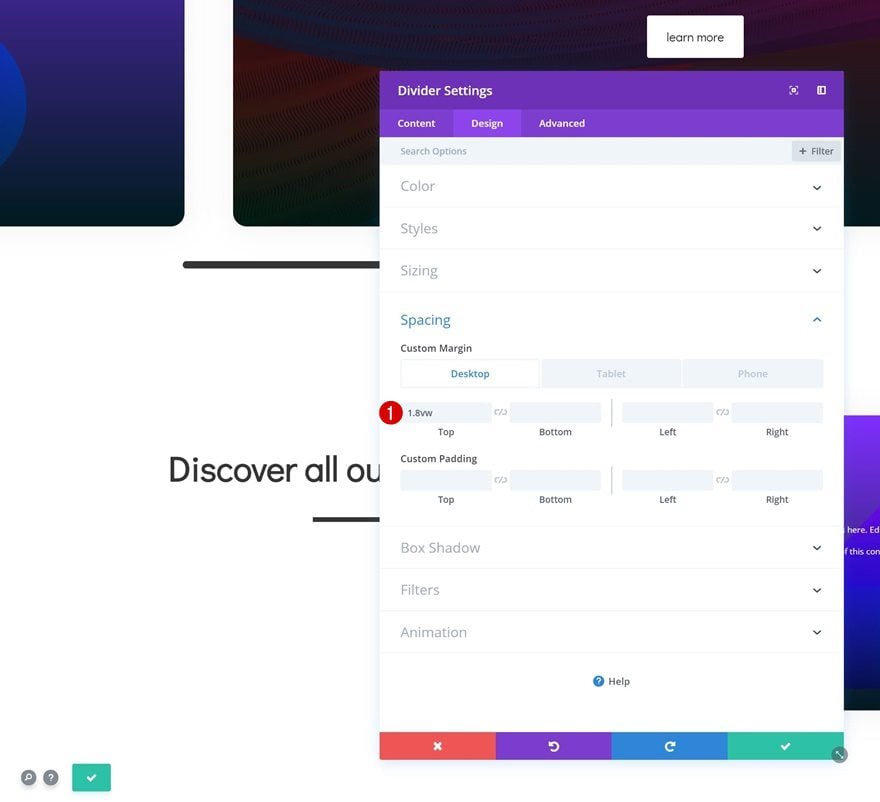
Spacing
Complete the Divider Module by adding some custom top margin across different screen sizes.
- Top Margin: 1.8vw (Desktop), 2.5vw (Tablet), 4vw (Phone)
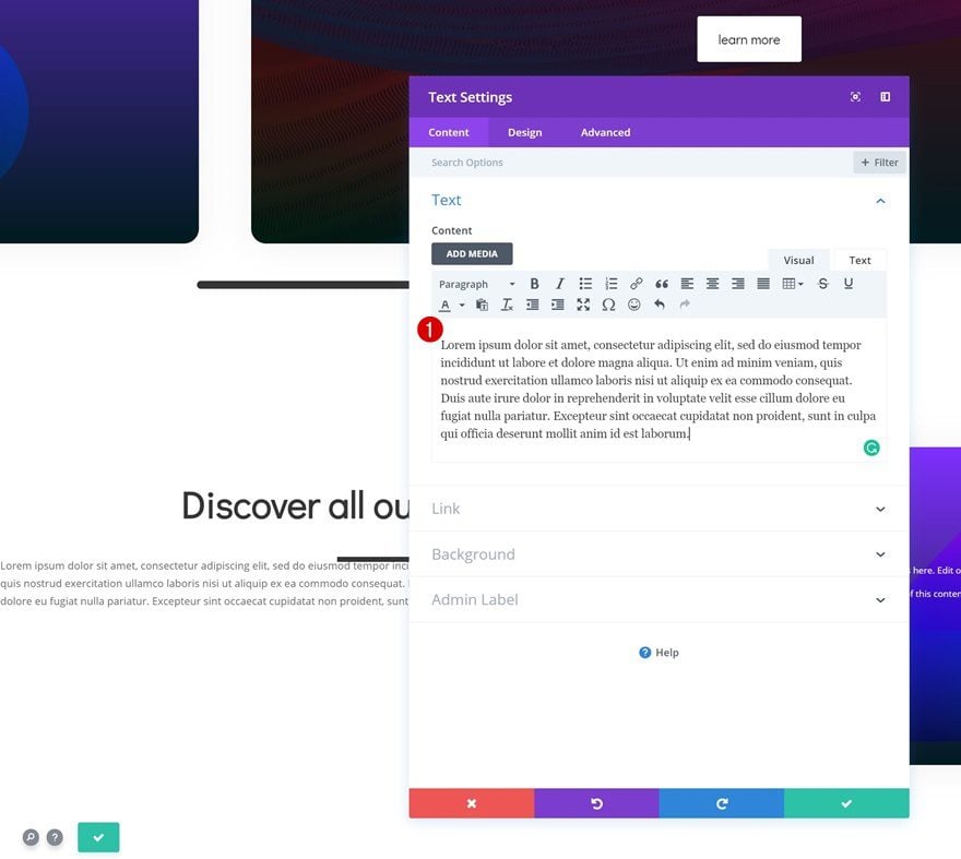
Add Body Text Module to Column 1
Add Content
The next and last module we need in the first column is a description Text Module. Add some content of choice.
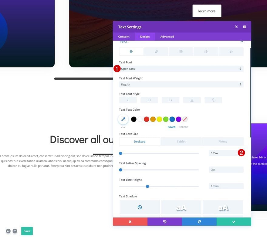
Text Settings
Continue by changing the text settings in the design tab.
- Text Font: Open Sans
- Text Size: 0.7vw (Desktop), 1.6vw (Tablet), 2.3vw (Phone)
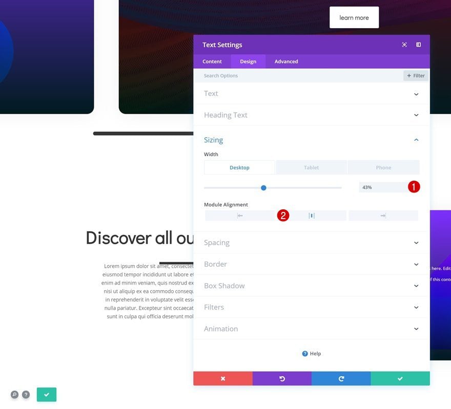
Sizing
Modify the sizing settings too.
- Width: 43% (Desktop), 68% (Tablet), 70% (Phone)
- Module Alignment: Center
Spacing
And add some custom top and bottom margin.
- Top Margin: 50px
- Bottom Margin: 50px

Switch over to Wireframe View
Once you’re done modifying all the modules in column 1, go ahead and switch over to wireframe view.
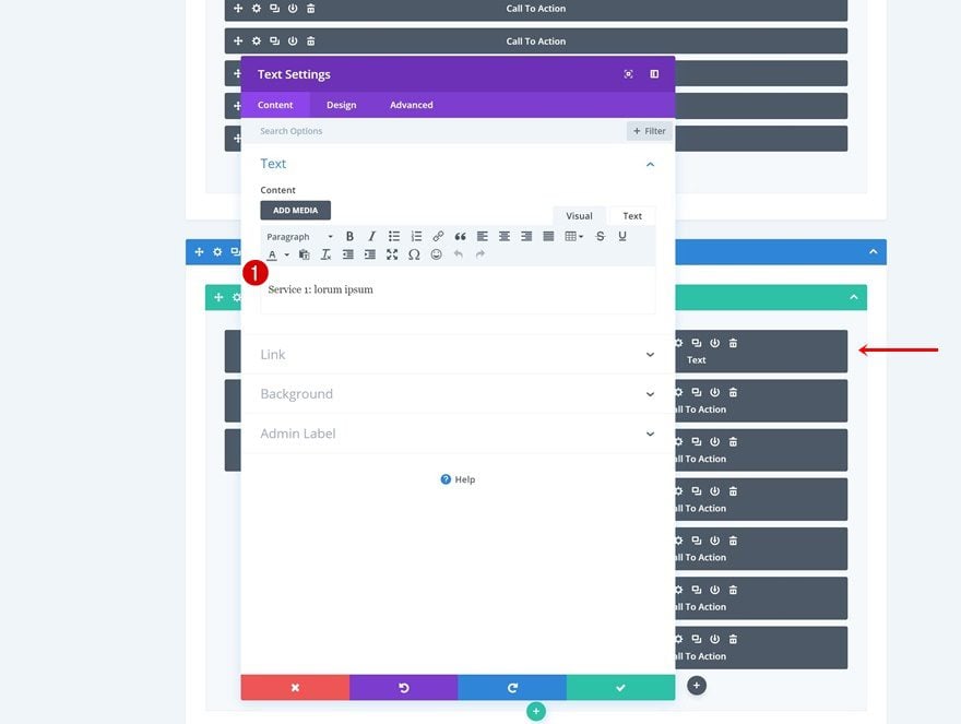
Add Text Module to Top of Column 2
Here, we’re going to add a Text Module to the top of the second column. The CSS code we’ve added has helped us create 6 different columns. This means that if you want two different modules to appear in each one of these 6 columns, you’ll need to have 12 modules in total. The module placement happens horizontally, so the first 5 modules you have in column 2 will appear next to each other. Then, the mechanism will switch to another row and add the remaining 6 modules.
Add Content
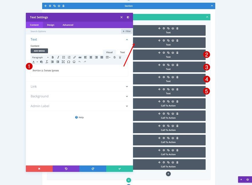
Open the new Text Module you’ve added at the top of the second column and add some content of choice.
Text Settings
Then, go to the design tab and modify the text settings.
- Text Font: Didact Gothic
- Text Font Weight: Bold
- Text Color: #000000
- Text Size: 1.1vw (Desktop), 3vw (Tablet), 3.5vw (Phone)
Clone Text Module 5x
Go ahead and clone this Text Module 5 times. Now, you’ll have 6 different Text Modules, this equals the number of CTA modules we have as well. So if you’re using 10 CTA Modules instead, you’ll need to add 10 Text Modules (or any other modules) to balance the column structure.
Change Content of Duplicates
Change the content of each one of the duplicates to match with the CTA Module that’ll appear below it and you’re done!
Preview
Now that we’ve gone through all the steps, let’s take a final look at the outcome on different screen sizes.
Example 1: One-Column Row
Desktop
Mobile
Example 1: Two-Column Row + Multiple Modules in ‘Swipe Column’
Desktop
Mobile
Final Thoughts
In this post, we’ve shown you how to create endless horizontal swiping cards using Divi. Creating these swiping cards will not only help you add an extra dimension to your website, but it’ll also help visitors navigate seamlessly through all the content your website has to offer. If you have any questions or suggestions, make sure you leave a comment in the comment section below!


Hi, this is great, fantastic really, but it refuses to work on Google Chrome desktop. Doesn’t seem to like horizontal scroll. Any ideas?
If it works on other browsers but only not on Google Chrome, it could be related to browser cache or browser extensions.
The best way to test it out is to try checking your page with Google Chrome incognito mode, if the horizontal swipe works there, it confirms the issue is due to cache or browser extension.
The first thing to try is to clear the browser cache, you can refer to this article on how to clear browser cache on Chrome:
https://support.google.com/accounts/answer/32050
If the issue persist after clearing the cache, I will suggest testing out your browser extensions. The best way to test browser extensions conflict is to disable them all and enabling it one by one, if the issue happen when a certain extension is enabled, that’s the one that caused the issue.
all are good, but the Call To Action cards are vertical, not horizontal, how we could solve this issue?
Hello! Great work!
It’s possible to make this effect with lateral right and left buttons?
Hello! Great work!
It’s possible to make this effect with lateral right and left buttons?
Hello,
I followed your great tutorial, really enjoying my slider,
However the Scroll Bar is not appearing on any Mobile Phone devices.
How would I go about fixing this issue.
Cheers,
Jaxon
This is awesome! You guys are the best 😀
Hi, thank you for this very useful tutorial. I was wondering whether it is possible to have an horizontal scroll with more than one module visible at the same time. I would like to display 4 modules next to each other and be able to horizontally scroll to see the next 4 ones etc…. Is that feasible as well?
I find that this works fine on desktop and tablets for latest Chrome and Safari on MacOS Sierra, OK with Chrome on Windows 10.
But unfortunately, does not work on inexpensive Samsung Luna Android phone (running latest 2019 updates)—simply scrolls everything vertically; and on Edge Windows 10, the horizontal scrolling works, but the overlay filter on the slides does not work—the background image is shown in the foreground with no overlay.
This is really good work. It’s a shame there is still such a variance in browsers in handling CSS. I’m often surprised how little this fact has changed over the past 10-15 years. Someday, maybe there won’t be browser-related issues with great methods such as this.
Totally agree, although I don’t think that should stop us from evolving along with the good browsers out there! 🙂
Hi Divination.
for mobile(s), how can you do for having a fluid swipe effect “A la Instagram” between the slides. My thumb is maybe short, the slide stops in the middle of the next one
did i missed some readings or scripts?
thanks for the answers (^^)b
link below is for mobiles/tablet only, I disabled it for desktop
I’ve used smooth scrolling and scroll snapping in the following tutorial, maybe it’ll help: https://www.elegantthemes.com/blog/divi-resources/how-to-create-an-entirely-horizontal-swipe-page-with-divi
GREAT tutorial, Donjete! Would you be able to incorporate pagination with this?
When swiping on phone do each swipe stop at the next card or will scroll length vary depending on the “power” of your swipe? Would be great if it stopped at the next card instead of potentially going past several of them. Also can these easily be done vertically if preferred?
Thanks, Tori! You probably could with some custom code, haven’t tried anything along those lines yet, unfortunately.
I tried it and it looks amazing!
Thank you!
You’re welcome, Birgitte. Nice to see people trying out the tutorials! 🙂
Is it possible to add blog posts on this?
Sure! You can use any module you want, including the blog module 🙂
Will this work on the portfolio module? Not sure where to put the css.
Hi,
It seems that overflow-x: scroll;
doesn’t work for me…. the modules are piled in top of each other.
Any suggestion ?
ok it looks like you are putting it on the main element when it should be placed on the main column Element.
Anyone know how to go about toggling a specific card via a link above (or below) the cards?
Of course someone can swipe or drag, but wondering about providing a shortcut to the desired info.
Thanks
Interesting. Assuming you have specific links to each single element (card), you could try giving each card an ID (the field above the CSS class) and linking the specific “Button” to that providing as target destination “#ID”. In theory thw browser should “Move” to the targeted element, but I have no idea wether it’s gonna scroll to it or simply move the focus to it but not showing (moving to) it.
I made a practice page to try this out, but I get the horizontal swipe. What am I doing wrong?
I’m here again to say that this is one of the best Elegant Themes’ tutorials! Every time you guys teach a way to create something amazing without plugin is a huge step for us to the next level. Thanks a bunch, please don’t punch. (I know, that rime was awful).
That’s awesome to hear, Elisandro! I hope our tutorials continue to amaze and help you! 🙂
Donjete, you have just blown my mind! WOW! That is so powerful! I thought you were going to use some jQuery and then, you come up with a CSS trick! Oh my goodness! I’m growing! Lol. Thank you so much!
Hi,
I would like something like this but not horizontal bar, I prefer 2 arrow left and right. Is it possible?
Hi Bence, having 2 arrows is obviously possible but definitely more tricky since you cannot get the feature with a few lines of CSS: you need some Javascript so that on each click onto the arrows, DOM elements are moved left or right of a specific amount of units (absolute or relative).
I agree. For desktop it is a bit more intuitive.
I agree. For desktop it is a bit more intuitive.
I love these step by step tutorials to show more of the Divi functionality!! NicE
Nice to hear, John! 🙂
If I create 100 cards, will they load dynamically or all at once?
They load the same way as if you were to place them below each other in one column, at once.
Nice question. I believe they will have to fully load to be shown all together unless you have some sort of lazy load settings set on a plugin. Not sure. Let’s see if someone helps us.
Only yesterday a client mentioned that sliding might be the thing for her new site…. I was looking at a different way, but totally loving this!!!!
Sorted ?
It’s always nice to see tutorials help make people’s work easier! 🙂
+1 Me too! I’m really happy to have this alternative without plugin. Again: I love when I here this two words “without plugin”. It feels like freedom.
Correcting: “I love when I hear* these* two words…”
That looks the business. Bon travail!
And a nice intro to using some of the extensive features of Grid.
Combining grids with Divi’s built-in options can result in a beautiful outcome! 🙂
Oh ! What a beautyful piece of code…
Thanks, Olivier! 🙂
Swiper/carousel for every Divi module should be default part of the builder, missing so much!
+1
I couldn’t agree more!
How to do this using just image modules?
OH YEAH!!!!!
Yeah!!! Haha 🙂
Happy you like it, Richard.
+1
Beatiful and easy. Thanks
You’re welcome! 🙂
Very Nice article. A lot of clients are asking to make this type of swiping modules. Will give this one a try!
Thanks!
That’s nice to hear, Victor! 🙂
OMG!! So beutiful!!
Happy you like it, Jeffo! 🙂