
The mobile app industry is as popular as ever and many apps have websites dedicated to them to show their features and benefits, and even provide a subscription service and online community. As you could imagine there are a lot of mobile app websites that are made with Divi. In this article we take a look at 15 examples of mobile app websites built with Divi to help inspire you for your next mobile app project.
These sites can help with inspiration for layout design, colors, fonts, images, navigation, product photography, product descriptions, case studies, CTA’s (call-to-action), and more. Some are stand-alone apps while others connect to other devices such as sensors. The websites are in no particular order.
1. Fat Map
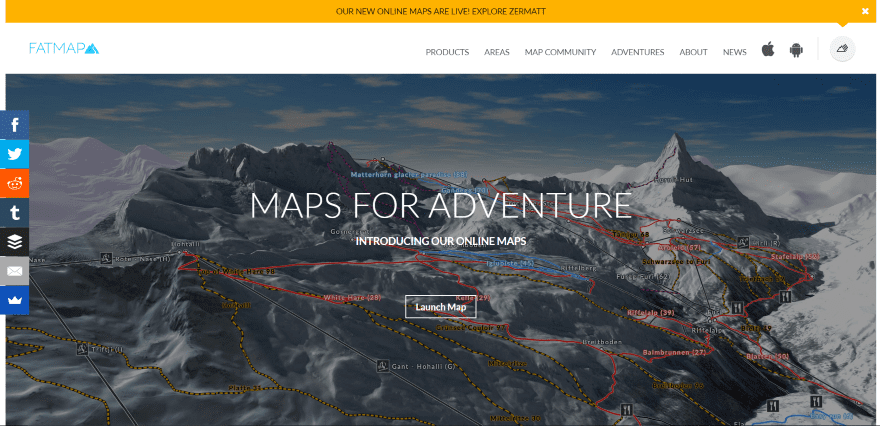
Fat Map displays a full-screen image with CTA in an overlay. A top message bar uses an arrow to point to a link in the menu. Scrolling shows a download CTA, large clean sections highlighting maps, an information section with short text and an image, media logos, image and text links to locations, a signup form over multiple images, and links to maps. The posts for each location uses full-screen images with text and 360 degree video to display the 3D maps. The site uses dark gray and white backgrounds and keeps the page clean.
2. FANSeye Sports
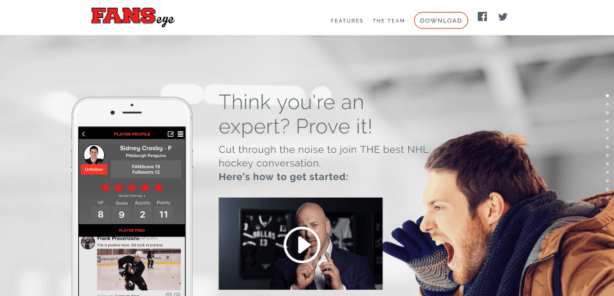
FANSeye Sports has a one-page design that includes a full-screen image with a slider, tagline, video, CTA’s, and social follow icons in true parallax. Following this are several two-column sections that highlight the features and display the app within sliders. A full-width slider shows media logos. A two-column section about Frank Provenzano displays information over a background pattern in parallax. Next is a section with team members, a full-screen image with CTA, subscription form, and contact info. The site uses branded colors, a CTA within the menu, and a vertical Back to Top button with text.
3. DragonFruit
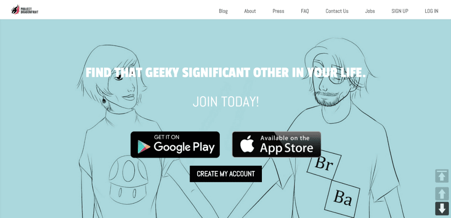
DragonFruit includes a full-screen drawing with tagline and CTA’s, an embedded image, a two-column section with information, a full-screen image slider with blurred background, a testimonial slider, CTA, and styled blog section. Arrow buttons remain on screen to navigate to the various sections of each page. The various pages use tabs and toggles to display information. Colors are chosen to appeal to the target audience.
4. Dclib

Dclib uses a one-page design that displays a full-screen image with tagline and CTA. Scrolling reveals a menu and large information section in three columns with large icons, an about section, the team with overlapping image, blog posts, and a contact form over an image. The blog posts use toggles to reveal the content. The content and product look to be in the “coming soon” phase but the layout is clean and uses lots of white space while icons use branded colors.
5. Black Box Performance Tracker
![]()
Black Box Performance Tracker uses a one-page design (except for the FAQ page) with a full-screen background with image and CTA. Scrolling reveals product images, a CTA over a parallax image, an information section that highlights the benefits with a CTA, and a contact form over a full-screen image. The menu also includes a CTA. The FAQ page displays information within accordions. The site uses branded colors and fonts.
6. hupla

hupla displays a full-screen image with overlay and tagline. Scrolling reveals another image with overlay and tagline in true parallax, three product information sections with alternating background colors, an email signup form over an image with overlay in parallax, and a social sharing CTA. The How it Works page displays the product within a 3D rotating slider using Slider Revolution. The site makes great use of colored backgrounds and overlays.
7. Quiver
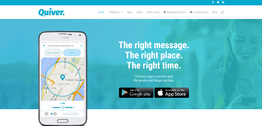
Quiver displays a full-width image with overlay in parallax, tagline, CTA, and overlapping product image. Scrolling shows a three-column about section, a section with a message and background image in parallax with overlay, slider with company logos, embedded video, fill-width section with signup form, and an image with overlay in parallax. The blog uses featured images with branded colors and has a clean design. The site makes great use of branded color and white-space.
8. GeoPro
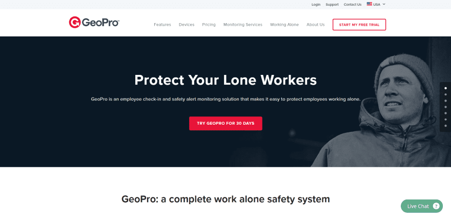
GeoPro includes a full-width image with CTA. Next is a section with a product description and images, an information section, a product breakdown using icons with branded colors, a two-column information section with alternating text and image with CTA, and overlapping logo with a list of benefits, and custom footer with CTA. The pages use a similar but shortened layout. A chat feature remains on screen. The menu includes a CTA. The site makes great use of product photography and clean layouts.
9. TimesUpp
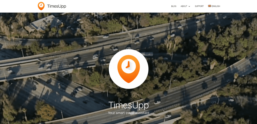
TimesUpp uses a full-screen background video with a logo and tagline in an overlay with CTA’s. Scrolling shows multiple sections with product images over short text with large headings that highlight the product features. Finally, a two-column section includes an image with CTA. The background video is relevant to the topic. The layout is clean and centers the information in a narrow column.
10. Yozio
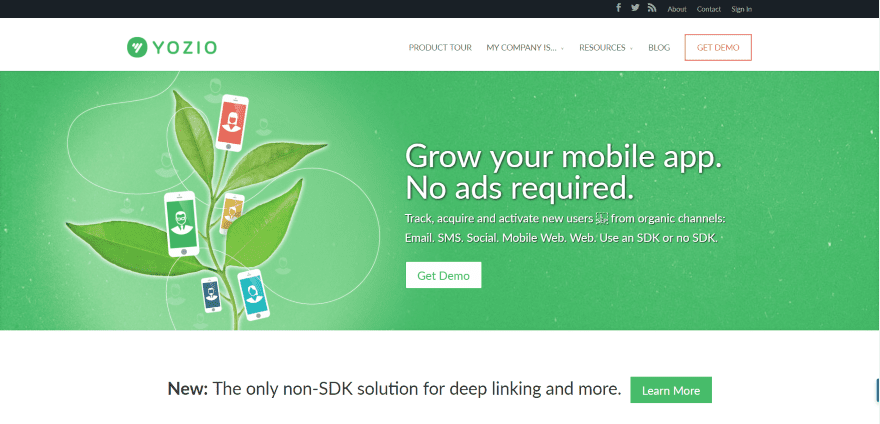
Yozio uses a full-width image with tagline, product description, and CTA. Next is a three-column section with links to customer case studies that includes logos and testimonials. A large two-column section shows text with alternating flat-design artwork followed by a CTA. The menu includes a CTA. The pages follow the same clean design and add full-width images with overlays. The site makes great use of color branding, image overlays, and clean layouts.
11. Prana
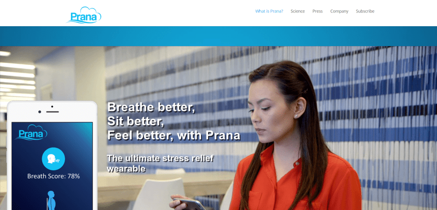
Prana displays a full-screen image over a blue background with tagline and product image. Following this is a section with media quotes along with their logos. The next section uses a dark background and highlights the product. Next is a series of embedded videos and images, a list of features with color-branded icons, and lots of vertically stacked information sections. The site makes excellent use of product photography and does a great job of separating the product information into readable sections.
12. MyWeatherCenter
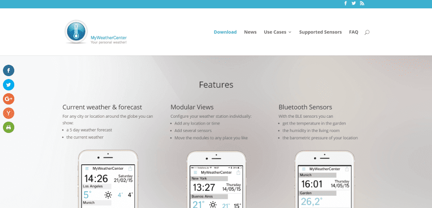
MyWeatherCenter displays a three-column section of features with product images in parallax over a gradient background. Next is a two-column section with CTA and testimonial, a four-column section with supported equipment and links to case studies, and a three-column blog section. The Supported Sensors page displays information within toggles. The site is simple and makes great use of branded color.
13. JouleBug
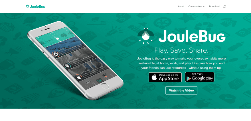
JouleBug shows a full-width image with product description and CTA, a full-width embedded video, image slider with images and information, full-width image with overlay and CTA, media links with icons, and CTA. The Subscriptions page displays the benefits, a video with testimonial, a table with the packages, and newsletter signup form. The sections are separated with images in parallax. The site makes great use of product photography and color branding.
14. Zonka Tablet Feedback
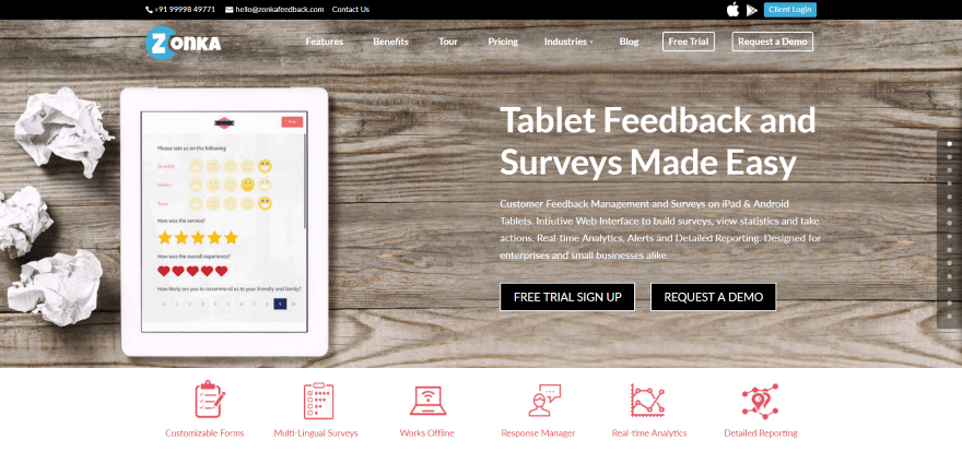
Zonka Tablet Feedback shows a full-screen image with product information and CTA and icons for each of the benefits. Following this is a section with download links, a features section with CTA, several sections with product details and images, case studies, an information section in parallax, a full-width CTA, a section in parallax detailing the types of customers that use the product with CTA, and a four-column footer with links. The menu includes two CTA’s. The site provides a lot of information while keeping the layout clean.
15. Muze
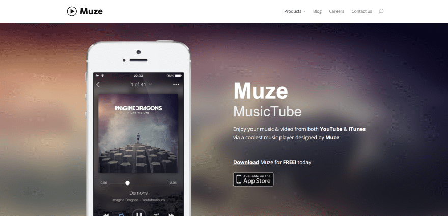
Muze uses a full-screen image over a blurred background with tagline and CTA. Scrolling reveals several sections with product images in true parallax between small information sections that detail the features followed by a full-screen CTA. The Careers page uses lots of full-screen images in parallax and a gallery. This CTA is placed over am image with a gradient overlay. This is a simple site that makes elegant use of product images and parallax.
Final Thoughts
These 15 examples of mobile app websites built with Divi go to show that Divi can be used to create interesting designs for any type of mobile app website, whether it’s just a simple brochure with links to the mobile shops or a site with pricing and case studies.
These sites a great for providing ideas for layouts, colors, use of images, video, navigation, and more. Mobile app websites are great for examples of showcasing products and also serve as great examples of product photography and case studies. These websites are sure to inspire you for your next mobile app design.
What are some of your favorite elements of these Divi mobile app sites? Let us know in the comments below!
Featured Image via 31moonlight31 / shutterstock.com


No Question, Divi is great Theme and literally can edit any part of the website in seconds. But would like to customize headers with more options as well. Feel like it’s little limited at the moment.
Hey Randy,I would love to make a site like Yozio.I like this site color selection.background image & catchy call to action button.really that site developer did an excellent job.Thanks for mobile app websites sample.really wonderful collection
Does anyone know how they made their sites into an App ? what tools/plugin they using ?
I love divi, i love the frameworks and am happy to be using it on my blog. Just Hoping they add more amazing stuff’s
I love these showcases… However, one thing that sticks out to me like a sore thumb is that I can tell that a website is using Divi. I don’t know why or what it is, but is there anyway to showcase websites that have used Divi as a framework and have maybe a greater level of customization added to it? Don’t get me wrong, I love Divi, but I tend to shy away from using it for some of my bigger, more creative projects since I tend to find that all the websites come out having some sort of Divi-ness to them 🙂
i am with you there. there are some generic outlines to the sites. it really catches me right away when the headers look like that. i think the dclib did a good job though of looking a little different. pretty good with the full width layout on most of the page and adding more custom designed options.
Christina I think you wish to see some thing like this http://www.appcare.co.in/ , which is also developed using divi tried to bring different look other than divi-ness.