

Restaurant websites often have some of the most elegant designs. With their use of branded colors and fonts, images, food menus, reservation systems, and even services such as catering, restaurants are always in need of unique and interesting websites. In this article we will look at 14 examples of Divi restaurant websites to help inspire you for your next Divi design.
Warning – these websites might make you hungry.
- 1 1. Tony Roma’s
- 2 2. Tutta’s Pizza
- 3 3. Casa Dorita
- 4 4. The Mexican
- 5 5. Mendocino Farms
- 6 6. Mokkabar
- 7 7. Rustic Chicken
- 8 8. Freshbox
- 9 9. Speakeasy Coffee Bar
- 10 10. Eat Thai Restaurant
- 11 11. El Torrero
- 12 12. Solstice Restaurant
- 13 13. Sugar Cakes Patisserie
- 14 14. Two Samuels
- 15 Final Thoughts
1. Tony Roma’s
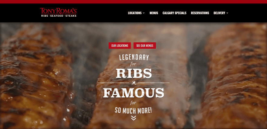
Tony Roma’s includes a full-screen image with CTA’s (call-to-action) in parallax. Scrolling shows a shadowed section with three clickable categories. Under this is an about section with information about the restaurant. Locations are displayed on individual pages with contact info, hours, a map, buttons to see the menu, and a button for the delivery service. The food menus are downloadable PDF’s. The Reservations page provides contact info for each of the locations. The site makes excellent use of color and background images.
2. Tutta’s Pizza
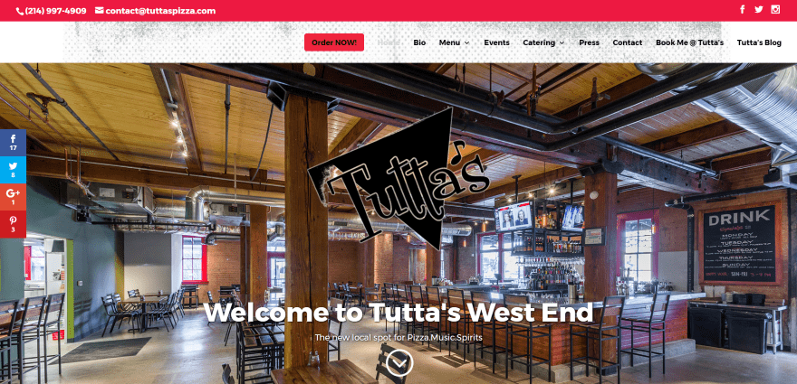
Tutta’s Pizza displays a full-screen image with logo in true parallax with an Order Now CTA in the menu- which displays over a background that disappears on scroll. Next is an about section with true parallax and an overlay, menu icons with hover animation, an Instagram feed, an event CTA, and a contact form. The food menu is displayed as images and text with a link to an online ordering system. The site uses interesting background patterns in its branding.
3. Casa Dorita
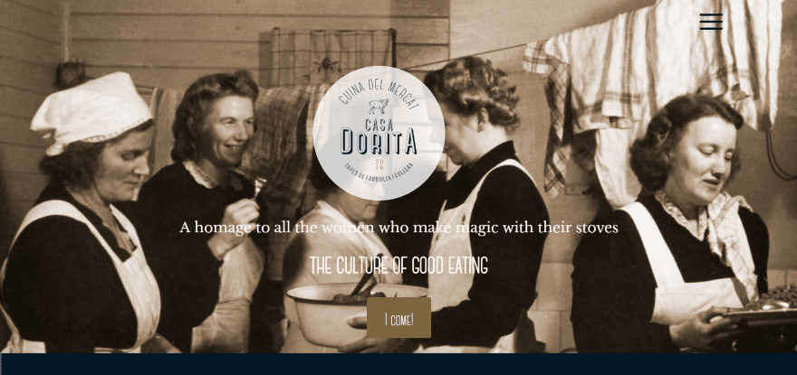
Casa Dorita includes a full-screen image with logo, tagline, and reservation CTA in true parallax. The next section provides information about the food with a link to the food menu. Next is an image slider with artwork, a split-screen section with info in parallax, a section with today’s special with a reservation CTA (which uses an embedded reservation system), a full-screen image slider showing the deli, and several other sections in parallax with more information about the deli, location info with map, and contact form. The food menu is provided as a downloadable PDF. The site makes good use of color and fonts.
4. The Mexican
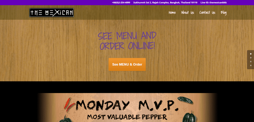
The Mexican uses a one-page design, displaying a full-width background with CTA, a post slider, a section with links to menu items as projects (clicking on them gives you a larger image), a section about the branding and the cantina, and a contact form with map. The food menu is an interactive ordering system that’s displayed in a modal. The food menu includes clickable sections to add items to your cart and lots of images of the dishes. This is one of the most interesting food menu systems that I’ve seen.
5. Mendocino Farms
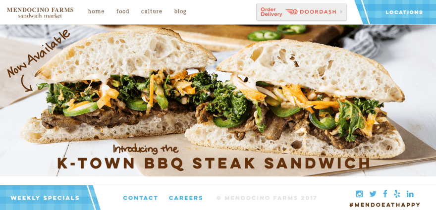
Mendocino Farms displays a full-screen post slider with top and bottom matching navigation menus that remain on screen. The menus include styled CTA’s. The menu-dropdowns display icons and text that match the branding. Scrolling reveals a tagline and three posts about the company with hover animation. The food menu displays a link to the PDF version followed by the online version which displays the menu within categories with an image, menu items, and prices. The menu design is one of the best I’ve seen. The Locations page looks like a blog page with the locations being the posts. The posts for the locations include an image slider, directions, reviews, parking info, and a map.
6. Mokkabar
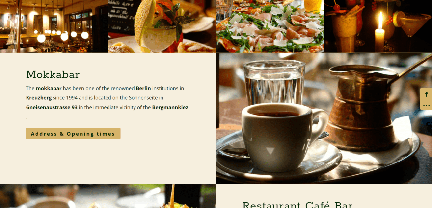
Mokkabar displays a multi-image layout with alternating text and CTA’s. Scrolling reveals a top menu, full-screen images of dishes, a two-column section with a food menu, a contact form in parallax, a full-width section with logo that works as a link back to the top, a map (that doesn’t auto-scroll), and blurbs for opening hours. The pages use the same layout and features. The Info page uses circle counters to show the number of seating for both inside and outside. The site makes great use of color, images, and fonts.
7. Rustic Chicken
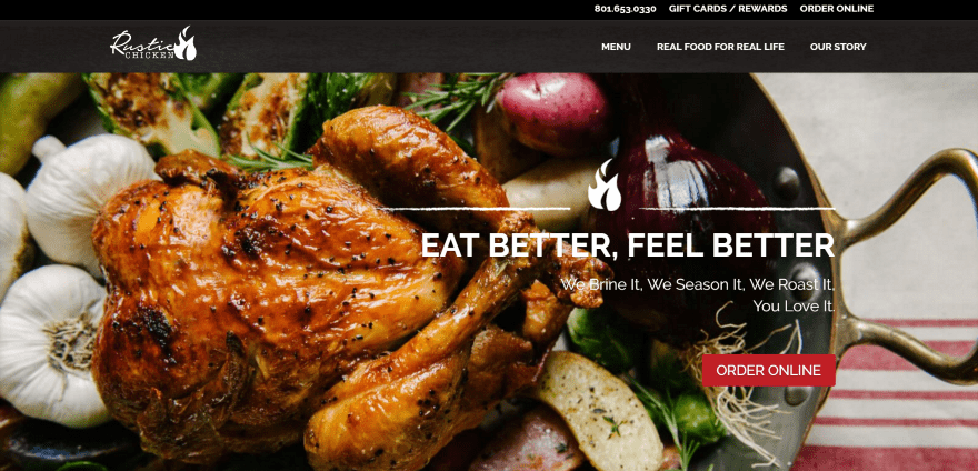
Rustic Chicken uses a full-screen image with CTA and one of the coolest sliders I’ve ever seen (displaying posts as overlapping cards using Accordion Slider). Next is a full-screen image with about info within overlays and a CTA. Following this is a two-column section with contact info and an image with an overlapping map as a link to locations, a full-width section with logo and menu, and a contact form. The food menu is displayed over nice background patterns that match the branding. The site is a great example for using color and images.
8. Freshbox
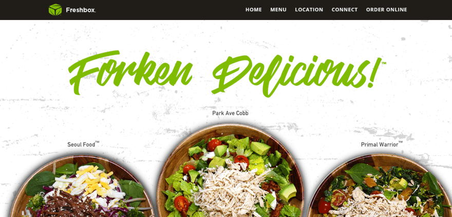
Freshbox has a full-screen image slider followed by a slim CTA with a clickable phone number. Following this is an about section that discusses the food and a section with icons, an information section in parallax, another section about the food, a full-width map without auto-scroll, and a custom footer with contact info and social links. The food menu is provided as a downloadable PDF. The site makes great use of branded color.
9. Speakeasy Coffee Bar
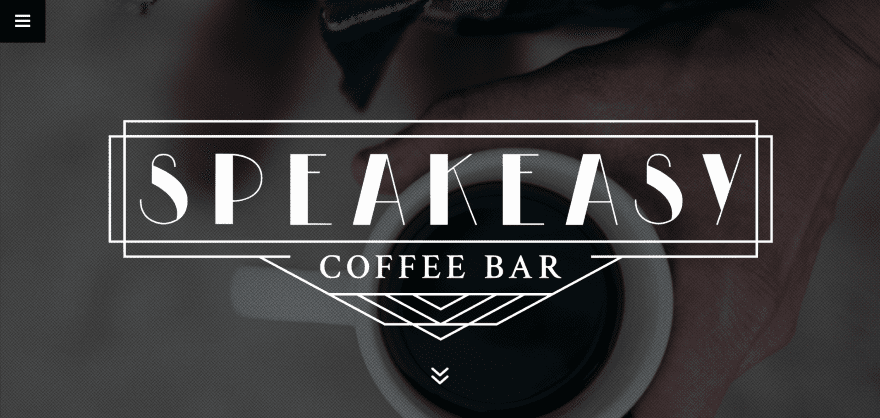
Speakeasy Coffee Bar uses a one-page design that includes a full-screen background image that zooms on the load and scrolls in the opposite direction on scroll. The next section shows icons with hours and links to the food menu and directions followed by a testimonial and a full-width social follow section. A two-column section shows a map with a box to type in your address to get directions. The food menu is displayed under this in two columns separated by category. This is a great example of branding in black and white.
10. Eat Thai Restaurant
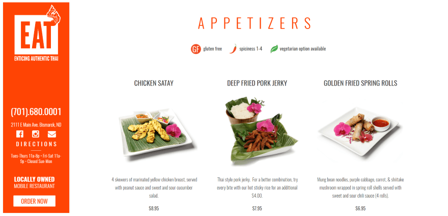
Eat Thai Restaurant uses a vertical menu that remains on screen as you scroll through the site. The menu has lots of clickable zones including the phone number, both the address and the word Directions that open Google Maps, social follow icons, and an Order Now CTA. The homepage displays the food menu with images, descriptions, and prices. The images are clickable and open in a gallery. Between the food categories is an order CTA with information. The footer displays a map with the restaurant’s logo. The site is simple without feeling like anything is missing. It makes excellent use of branded color and fonts.
11. El Torrero
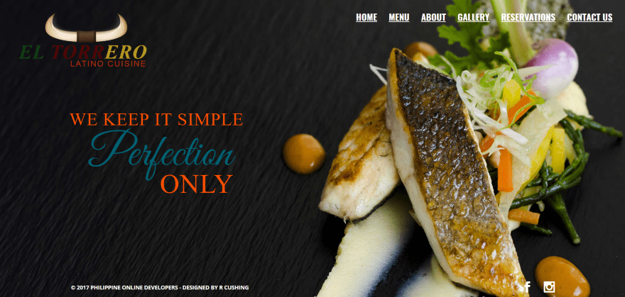
El Torrero has one of the most unique home pages on this list. It’s a series of full-screen images of the food with links to the items in the food menu. The next image is revealed as you scroll, but what’s interesting is the transition – the screen splits down the middle with one-half scrolling in one direction and the other half scrolling in the opposite direction. The food menu looks like scans of the printed menu. The reservation system includes a button to check for availability. The site makes excellent use of images. Also, I can’t stop watching the split-screen scroll.
12. Solstice Restaurant
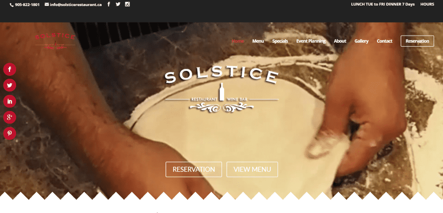
Solstice Restaurant displays a full-screen background video with logo, CTA’s, and section separator. The primary menu also includes a CTA. Following this is a section about specials, links to the menu, an embedded video, links to the blog and social feeds for Instagram and Facebook, and links for online ordering. It also includes an integrated reservation system, an image gallery, links to other websites where information about them can be found, and a full-width map without auto-scroll. The various sections of the pages are separated by full-width images in parallax with text labeling that section. The food menus are displayed in tables and have links to a downloadable version.
13. Sugar Cakes Patisserie
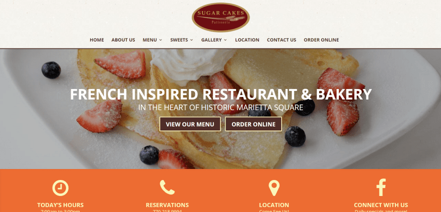
Sugar Cakes Patisserie includes a full-width image with tagline and CTA’s followed by clickable icons for hours, contact, location, and Facebook follow. A four-column section shows images for the four food menus with links. Following this is an about section with CTA, a full-width map with auto-scroll, and a footer with operating hours. The food menus are presented in tables with prices and are downloadable as PDFs. The site makes great use of images and branded color.
14. Two Samuels
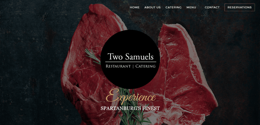
Two Samuels has a full-screen image with a logo and tagline overlay in parallax and CTA in the menu. Scrolling displays an about section, a section with circled images of the food with a link to the menu, a section about their catering service, a two-column section with text on one side and an image on the other about the chef in true parallax, blurbs with a link to the menu, a section with a link to make reservations, and hours and contact info in the footer. The food menu uses an elegant design with an image in the background. The site makes elegant use of color and fonts.
Final Thoughts
These 14 examples of Divi restaurant websites are excellent examples to show what can be done with Divi. You can create amazing designs for any type of restaurant website and include all of the necessary features including food menus, reservation systems, contact information, images, and more.
These sites a great for providing ideas for layouts, fonts, colors, photography, video, navigation, food menus, reservation systems, etc. They are sure to inspire you for your next restaurant design with Divi.
Since you’re looking for the best tools to build amazing restaurant websites, look into these restaurant plugins and food menu plugins that bring incredible features to your site regardless of theme.
What are some of your favorite elements of these Divi restaurant sites? Let us know in the comments below!
Featured Image via elenabsl / shutterstock.com


Tony Roma’s site is simply amazing. Loved it a lot.
By the way, other sites are equally good.
Randy, thank you very much for featuring Tutta’s Pizza! I had not read this post yet and the owner called me just now and asked if I had read the post yet. Both of us were super excited! Thanks again!
Thank you for using Solstice Website as it was a huge surprise as my company Double Deuce Social Media Marketing works exclusively with DIVI and it was able to bring the owners of the restaurants ideas to life.
Cheers
You’re welcome Ryan. That’s a nice design!
So inspired by those designs! Amazing how creative could be!
Thanks Jordan 🙂
Thanks for including Tony Roma’s Randy! I had lots of great graphics to work with thanks to Tony Roma’s corporate
You’re welcome Annemarie! That’s one of my favorites 🙂
Nice sites. I still can’t believe how much you can do with Divi. Well, that’s a lie. I do very much believe it. But I probably wouldn’t if I hadn’t tried it.
In terms of the old way of thinking as themes as “looks”, Divi is really more like a framework … with the child themes and then of course the page layouts (Google Divi page layouts everyone) helping out with a look to start with or to stick with.
Makes it really hard to think of why I might use another theme. Before Divi came along I was dead tired of figuring out foibles!
This is some great encouragement, but what would be even more awesome is some details on how some of the non-standard changes to Divi were made for those of us that are newer to the web design.
I like that idea Steve 😉
The Two Samuels is one of my favorit projects made with DIVI. It’s realy amazing typogrphy and pixel perfect. Congrats for author.
Thanks 🙂
Great examples. I like the vertical menu that stays on the left side of your screen as your scroll on Eat Thai Restaurant.
I agree! That vertical menu is cool!
Thanks for featuring the Mendocino Farms website, Randy! That was definitely one of my favorite Divi projects to date 🙂
And you were right, this article did make me hungry 🙂
You’re welcome Tim!