SAAS (Software as a Service) is a popular business model and as you could image SAAS systems needs websites to explain and demonstrate their services to potential clients. Fortunately there are a lot of SAAS websites built with Divi. In this article we take a look at 11 examples of SAAS websites built with Divi to help inspire you for your next SAAS project.
These sites can help with inspiration for layouts, color, images, product descriptions, embedded video, case studies, CTA’s (call-to-action), navigation, and more. Most are brochures with pricing tables. Many include chat and other communication systems. The websites are in no particular order.
1. Invoice Central
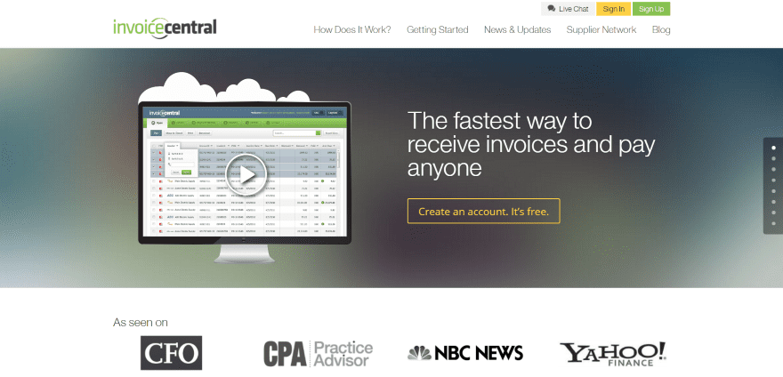
Invoice Central displays a full-width image with tagline and CTA, and a section with logos for media where the service has been featured. The image opens an embedded Vimeo video when clicked. The top menu include a chat button and sign-in/sign-up buttons. The next section shows the features with an overlapping section. A Getting Started section shows the process using icons. A scrolling ticker shows client logos. A testimonial slider displays testimonials with zoom animation followed by a CTA and footer with links. The site is a great example of using graphics and color.
2. Visual Planning
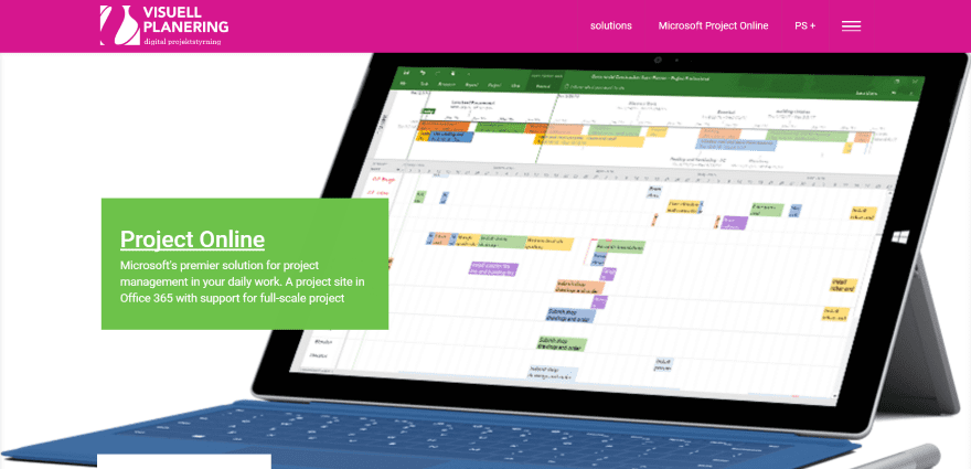
Visual Planning includes a full-screen post slider, a section that includes flat-designed images with links to the various SAAS options, and a two-column section with newsletter sign-up form and an event calendar. Following this is a section with blurbs describing the SAAS solutions, two CTA’s, and footer with links. The menu system includes clickable contact information and social links that match the color branding.
3. Traineaze
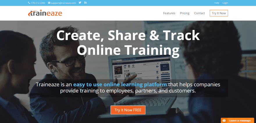
Traineaze uses a full-screen background image with information about the platform and a CTA. Scrolling reveals a section with icons that shows the benefits in just a few words. The next section uses alternating images and text to show details about the system. Following this is a section with pricing and a CTA, client testimonials with company logos, a section with awards and a CTA, and footer with contact and about info. The menu also includes a CTA. A Zendesk message box remains on screen. The site makes great use of color and images using a clean layout.
4. Altitude 365
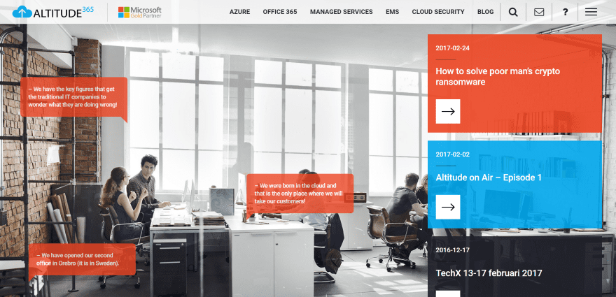
Altitude 365 uses a full-screen background image with animated overlays that come and go while providing information about the service. Links to blog posts appear on the right with different colored backgrounds. The menu includes multiple logos, an email link, a help link, and both a standard menu and hamburger menu. The hamburger menu includes clickable contact and social links. The next sections show a timeline of the process, a list of services, case studies with overlays, and an about section using a timeline with a link to more information. The blog page displays the last three posts in large blocks followed by a regular blog listing in four columns. The site has a clean layout and makes great use of color.
5. Formaliti
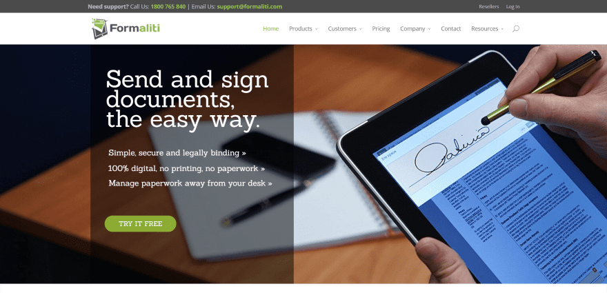
Formaliti displays a full-screen image with information and CTA in an overlay on one side. A small section provides a short description followed by a more detailed section with CTA and an embedded video, and a section with an image and information. Benefits are displayed with color-branded icons, while another section shows which plans each business sector benefits from. A testimonials section shows images with names and a link to see the testimonials and case studies. A CTA is placed over a particle background. The footer displays links with branded colors. The site makes great use of color and white-space.
6. Netsil
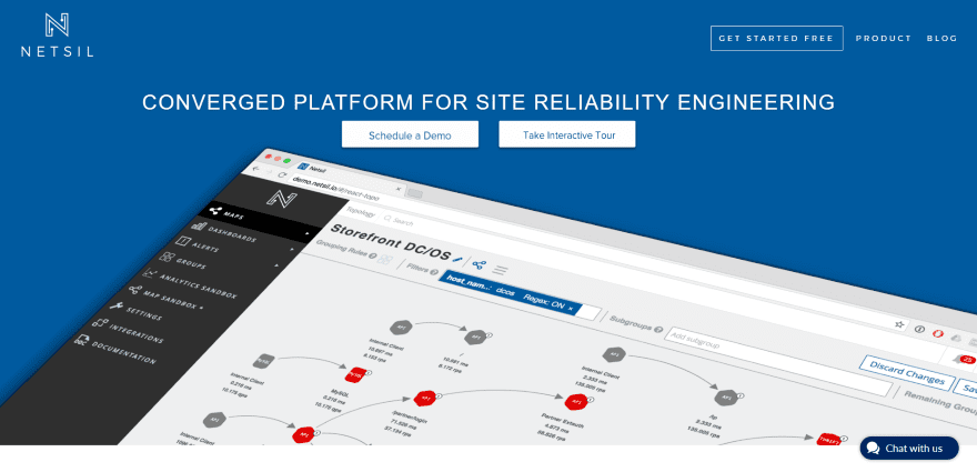
Netsil uses a full-screen image with a tagline and CTA’s. The menu also includes a CTA. Following this is an about section with a download link to a white paper, a section with blurbs about the services, and a section showing how it works including icons and a CTA. A blog section displays featured articles. A custom footer includes links and a sign-up form over a particle background. A chat button remains on screen. The sites makes great use of branded color and animation.
7. Kasisto
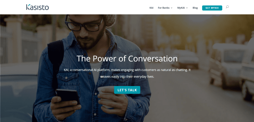
Kasisto uses a full-screen background image with a tagline and CTA in an overlay. The next section uses a background with icons with information, logo, and CTA in an overlay. Following this is a full-width image with overlay to demonstrate the product and list the features, a section showing an animation of the product working with CTA’s, a section with quotes from the media, a company statement over a background, and a footer with contact form. The site makes excellent use of color and images.
8. RankAbove
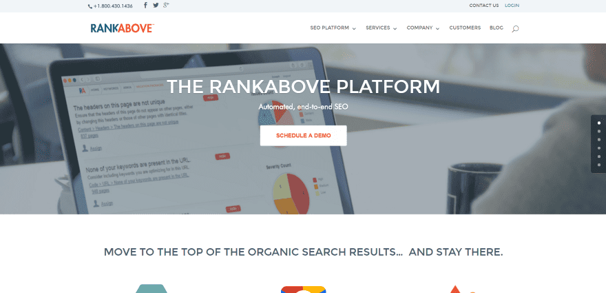
RankAbove uses a full-width image with tagline and CTA in an overlay. Scrolling displays blurbs with icons and CTA, a section with customer logos with link in an overlay over image of customer websites in true parallax, and a section with stats using circle counters and a flat-design graphic. A testimonial is displayed in an overlay over an image of the company in parallax. A section about the services uses circled images and a link. A large footer includes links and a contact form. Contact and login links are placed in the top menu. The site makes good use of overlays and parallax.
9. Ezypay
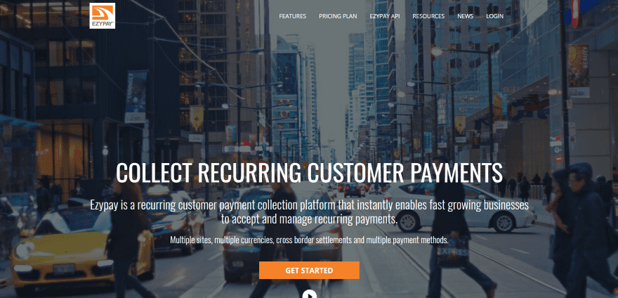
Ezypay uses a full-screen background image with information and CTA in an overlay. It even includes a video play button that plays a YouTube video in a modal window. Several sections display the product features with links to learn more. A full-width section includes a background image with a webinar CTA in an overlay. Inquiries are made through a full-width contact form. The footer includes links to the site in various languages. The Pricing page includes a country selector. The site makes good use of branded color.
10. vcita

vcita includes full-screen animated background with tagline and CTA. It also includes a CTA in the menu. Scrolling reveals several sections showing an animated demonstration of the app with bullet points and icons of the benefits in an alternating layout. Following this is a full-with CTA with contact info, testimonials, logos of platforms the system integrates with, a pricing table, and footer with links. The site makes excellent use of animation and branded color.
11. OpenRemote
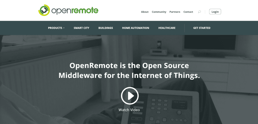
OpenRemote displays a full-screen image with a tagline and YouTube video link in an overlay. The video plays in a modal when the button is clicked. It includes a full-width menu under the logo that includes a separator line. The next section shows the steps in the process using icons. Following this is a section of blurbs about the services, a full-width testimonial slider over a background image, a section with news feeds and latest tweets, sliders for clients and awards, and a footer with links and search. The site makes great use of branded color.
Final Thoughts
These 11 examples of SAAS websites built with Divi are great examples that Divi being used to create interesting SAAS websites complete with detailed product information and benefits, pricing tables, case studies, embedded video, chat systems, and more.
These sites a great for providing ideas for layouts, colors, images, backgrounds, video, navigation, etc. SAAS websites are excellent for examples of showcasing products and also works as examples of product photography and case studies. These websites are sure to inspire you for your next SAAS design.
What are some of your favorite elements of these Divi SAAS sites? Let us know in the comments below!
Featured Image via venimo / shutterstock.com


Where is the documentation for the most complicated Menu design examples invoice central or altitud 365 ?
I wonder what kind of integration they are using. Features hooked up as a plugin for WordPress (PHP), or just a link in the menu to a separate application in eg. Java(Spring, JSP etc)?
I was wondering the same thing. I’d love to see an answer to this question.
I’m amazed. Never thought vCita was using Divi. It’s well customized. Thanks for the list!
Would be a good idea add a post about spanish sites that use Divi…
Very neat and interesting sites!
Nice themes… is there any design help on creating similar Header theme designs?