In today’s Divi tutorial, we’re going to share with you a glimpse of what you can do with the new options that have been added to Divi in the previous updates. More precisely; we’re going to share 10 interesting ways you can style the Divider Module with these new changes. The possibilities are truly endless, but this post might help you find the inspiration you need for your next project.
- 1 Sneak Peek
- 2 10 Fun Ways to Use The Divider Module with The New Divi Options
- 3 Create Reusable Section
- 4 Before Getting Started
- 5 1. The Blurred Triangle
- 6 2. The Color Shadow
- 7 3. The Gradient Series
- 8 4. The Rolling Circle
- 9 5. The Bracket
- 10 6. The Double Lines
- 11 7. The Bridge
- 12 8. The Elegance
- 13 9. The Subtleness
- 14 10. The Glow
- 15 Final Thoughts
Sneak Peek
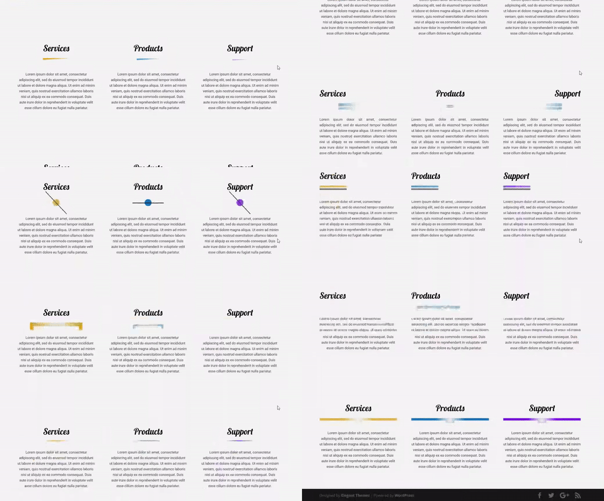
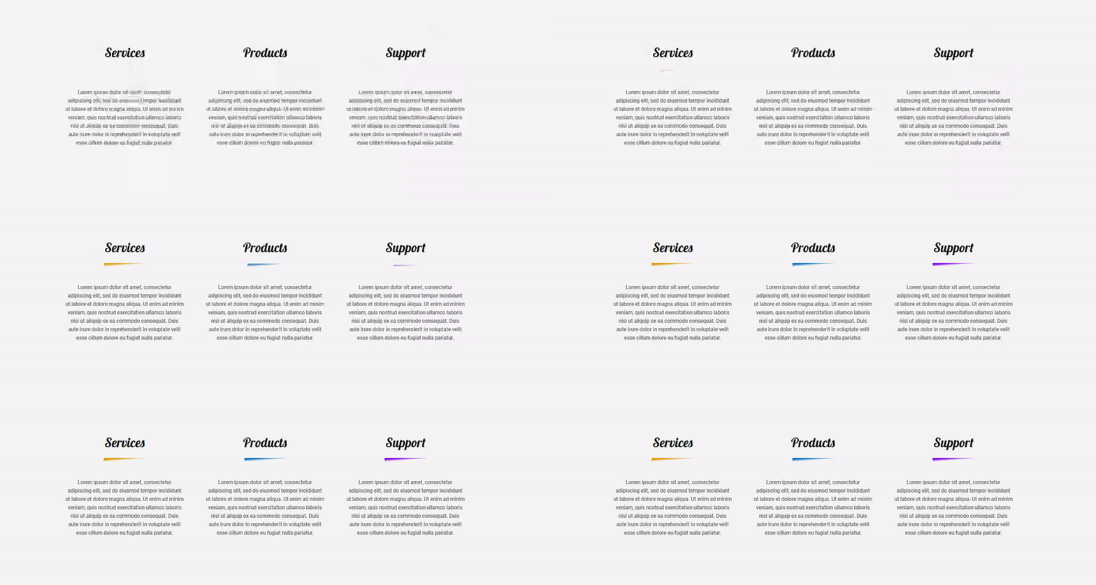
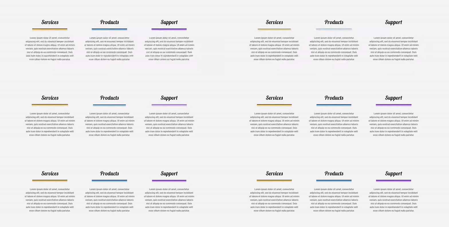
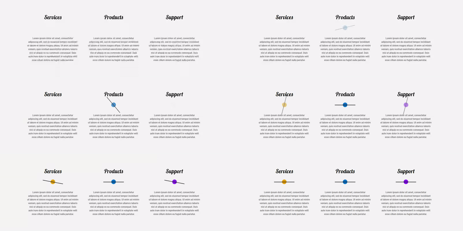
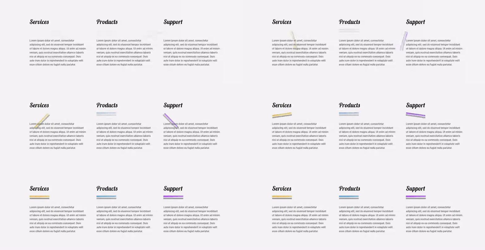
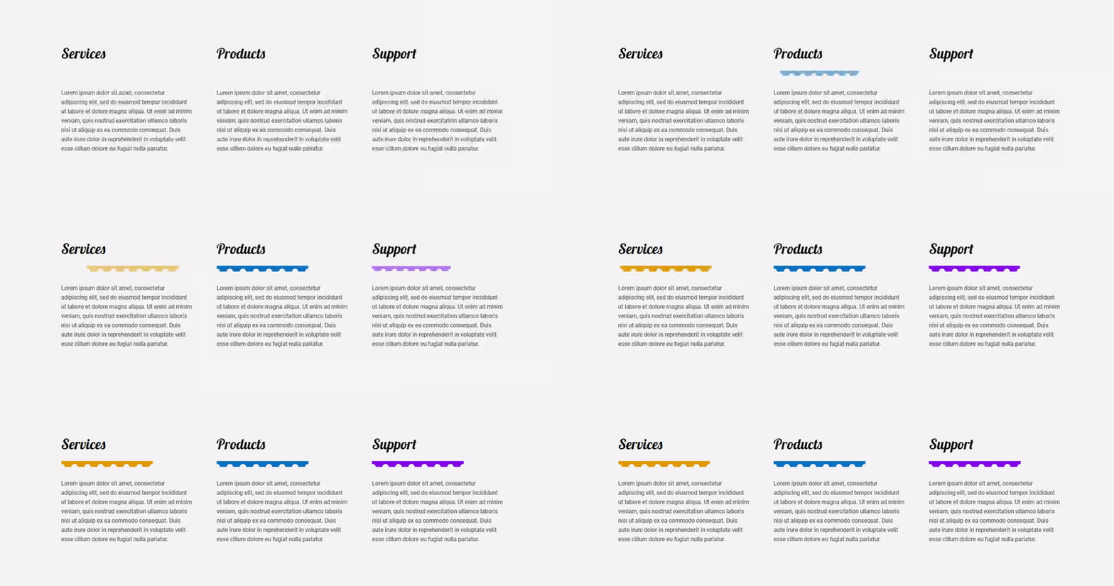
One of the best things about this tutorial is the fact that we’ll not be using any additional CSS (or code of any kind for that matter). All the examples we’ll be creating will only use the options that are included within the Divider Module. Let’s take a quick look at the dividers we’ll build before I show you how to create each on step by step:
10 Fun Ways to Use The Divider Module with The New Divi Options
Subscribe To Our Youtube Channel
Create Reusable Section
The first thing you’ll need to do is create the section that we’ll use throughout all 10 examples. Of course, you can use the dividers in other contexts as well, but by making this section first, you’ll have the opportunity to play around with your own Divi Builder and see which one you prefer.
Create New Page
Start by creating a new page in your WordPress dashboard, enabling the Divi Builder and opening the Visual Builder.
Create Section with Three-Column Row
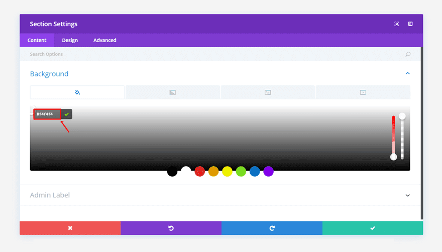
Once you’re on your new page, create a standard section and use a three-column row within that standard section. We’ve used ‘#f4f4f4’ as the section background color.
Add First Text Module
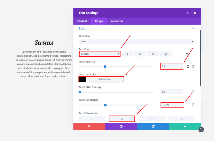
Then, add the first Text Module to the first column of the row. Open the settings, type down the text you want to appear and go to the Design tab. Within the Design tab, make the following changes to the Text subcategory:
- Text Font: Lobster
- Text Font Size: 35
- Text Color: #000000
- Text Line Height: 1.7em
- Text Orientation: Center
Add Second Text Module
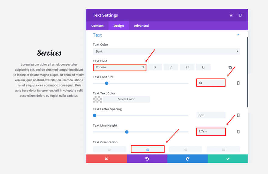
Once you’ve added the first Text Module, you can add another one right below it. Add the text you want to appear and go to the Design tab. Within the Design tab, make sure the following modifications apply:
- Text Font: Roboto
- Text Font Size: 14
- Text Line Height: 1.7em
- Text Orientation: Center
Clone Text Modules & Place in Other Two Columns
Once you’ve created these two text modules, you can put them in the other two columns of the row as well.

Before Getting Started
We’re going to share 10 fun ways you can style Divi’s divider module. Each one of the examples will have three dividers that are in harmony with one another. Most of the settings are the same for all three modules. We’ll start by showing you the settings that count for each one of them and continue by showing the changes you need to make to the other two dividers. So, every time you finish the first divider, clone it and place it in the other two columns. Once you’ve done that, you can make the modifications to the other two dividers.
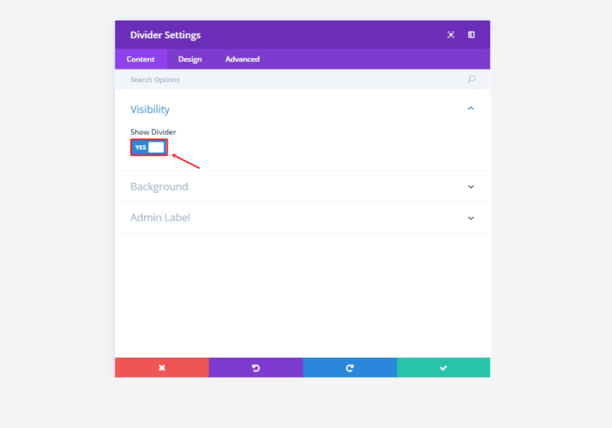
Note: For each one of the dividers, you’ll need to enable the ‘Show Divider’ option within the Content tab.
1. The Blurred Triangle
First Divider Module Settings
Content Tab
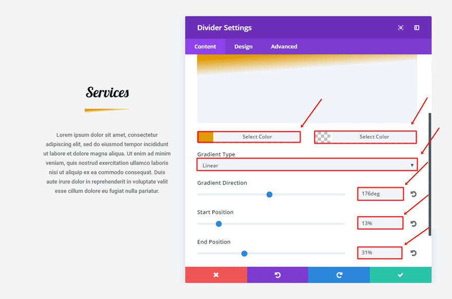
Within the content tab, we’re going to make use of the following background settings:
- First Color: #e09900
- Second Color: rgba(255,255,255,0)
- Gradient Type: Linear
- Gradient Direction: 176deg
- Start Position: 13%
- End Position: 31%
Design Tab
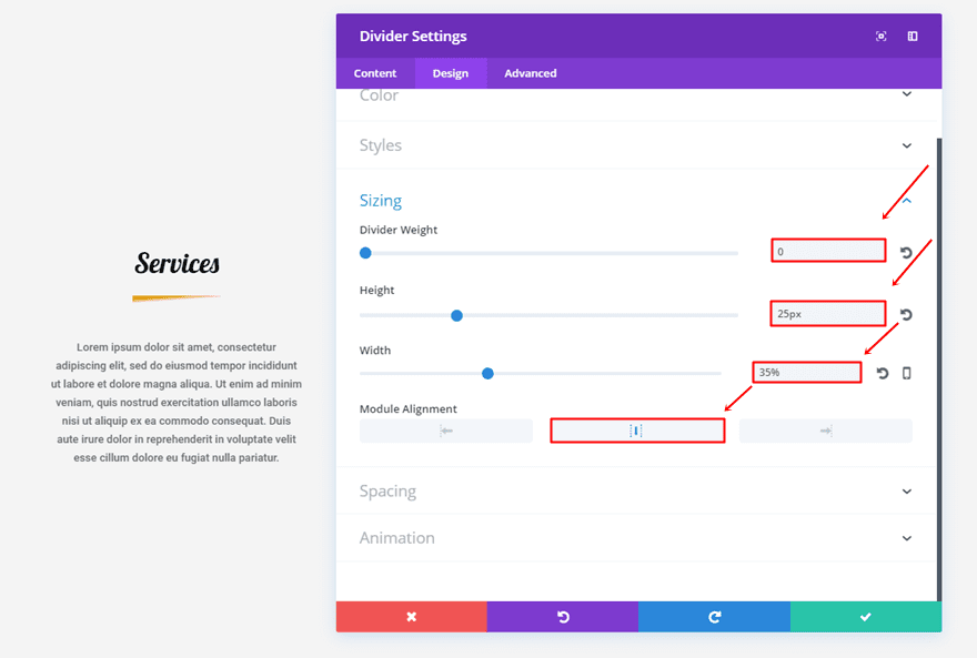
Move on to the Design tab and make sure the following settings apply to the Sizing subcategory:
- Divider Weight: 0
- Height: 25px
- Width: 35%
- Module Alignment: Center
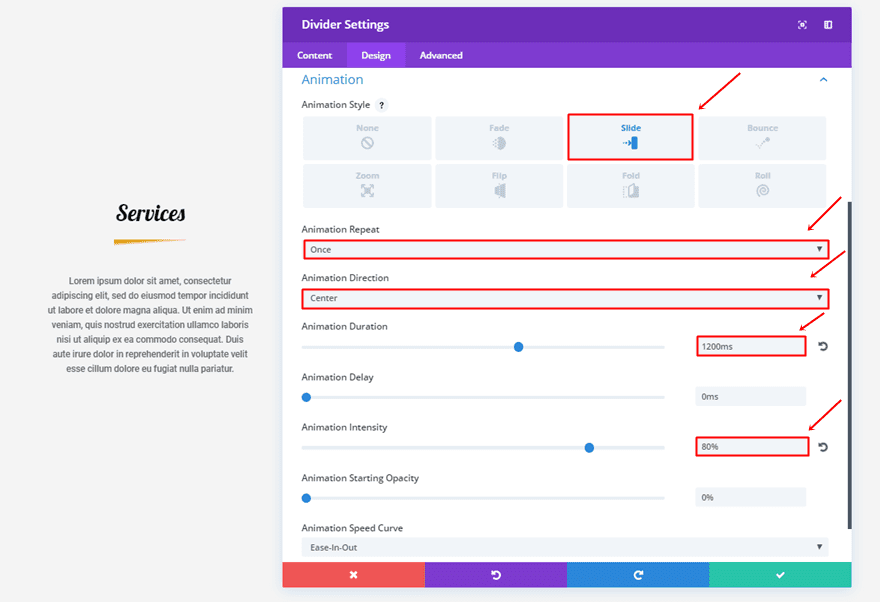
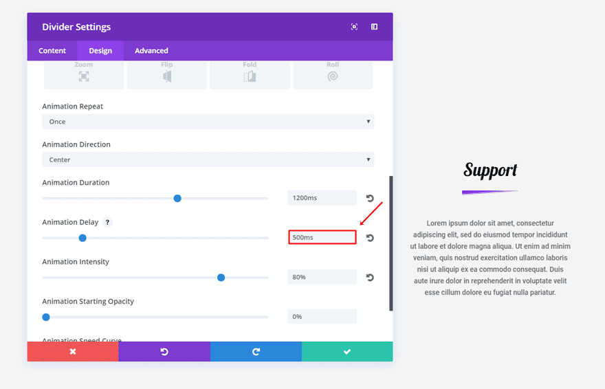
Scroll down the same tab and use the following animation settings in the Animation subcategory:
- Animation Style: Slide
- Animation Repeat: Once
- Animation Direction: Center
- Animation Duration: 1200ms
- Animation Intensity: 80%
Second Divider Module Settings
Content Tab
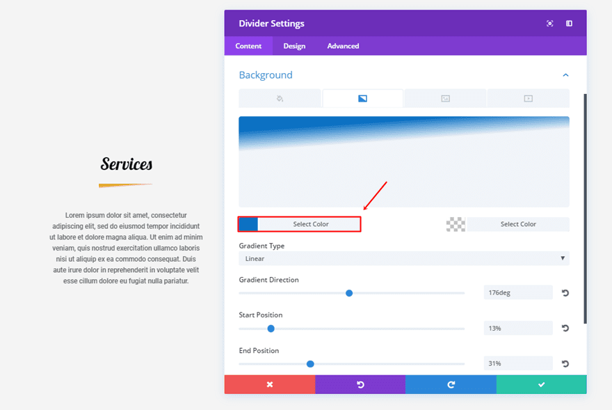
In the content tab, the only thing you’ll need to do is change the first gradient color into ‘#0c71c3’.
Design Tab
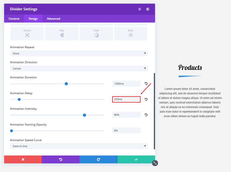
Next, you’ll need to add some animation delay of ‘250ms’ to the Animation subcategory.
Third Divider Module Settings
Content Tab
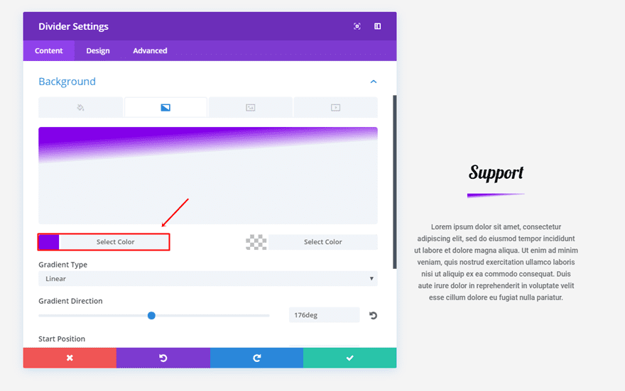
Change the first gradient color into ‘#8300e9’ for the last divider.
Design Tab
The animation delay you’ll need to add to the Animation subcategory of the last divider is ‘500ms’.
2. The Color Shadow
First Divider Module Settings
Content Tab
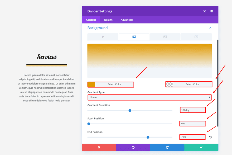
Use the following gradient background settings in the Content tab:
- First Color: #e09900
- Second Color: rgba(255,255,255,0)
- Gradient Type: Linear
- Gradient Direction: 180deg
- Start Position: 0%
- End Position: 72%
Design Tab
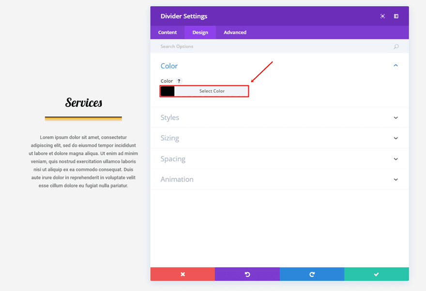
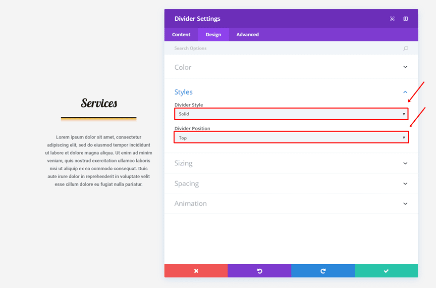
The first thing you’ll need to do within the Design tab is change the color of the divider into ‘#000000’.
Within the Styles subcategory of that same tab, use ‘Solid’ as the Divider Style and ‘Top’ as the Divider Position.
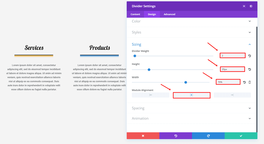
Continue scrolling down and make the following changes apply to the Sizing subcategory:
- Divider Weight: 2
- Height: 20px
- Width: 70%
- Module Alignment: Center
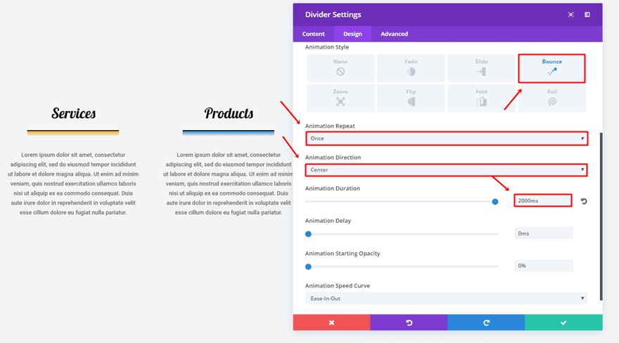
And lastly, use the following option settings for the Animation subcategory:
- Animation Style: Bounce
- Animation Repeat: Once
- Animation Direction: Center
- Animation Duration: 2000ms
Second Divider Module Settings
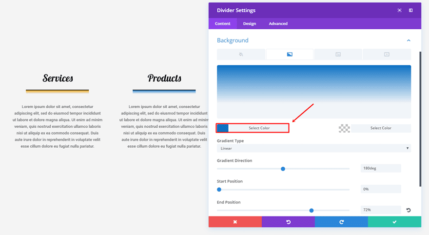
Content Tab
Change the first gradient color of the gradient background into ‘#0c71c3’.
Design Tab
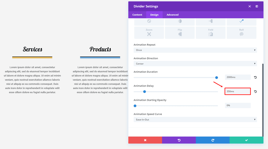
Within the Animation subcategory, add ‘350ms’ to the Animation Delay option.
Third Divider Module Settings
Content Tab
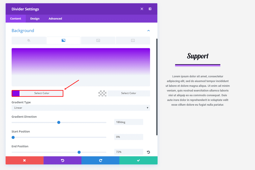
Make the same change to the third divider but use the ‘#8300e9’ color instead.
Design Tab
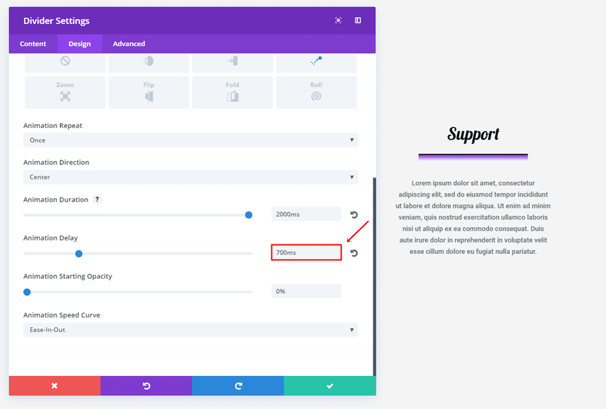
And lastly, add an animation delay of ‘700ms’.
3. The Gradient Series

First Divider Module Settings
Content Tab
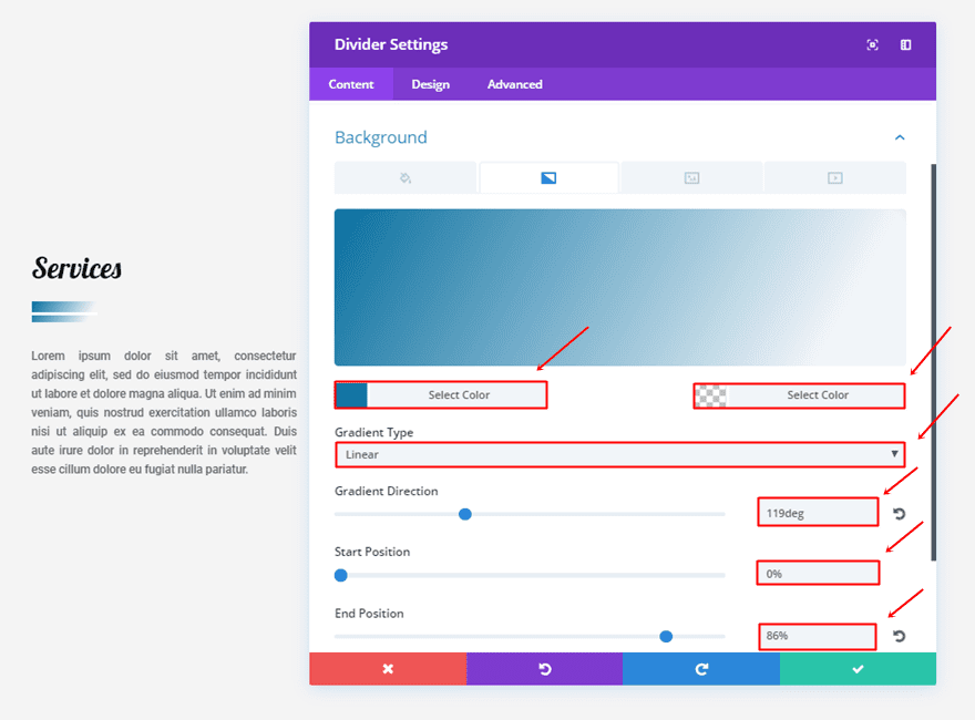
For the first divider, use the following gradient background settings:
- First Color: #0970a0
- Second Color: rgba(255,255,255,0)
- Gradient Type: Linear
- Gradient Direction: 119deg
- Start Position: 0%
- End Position: 86%
Design Tab
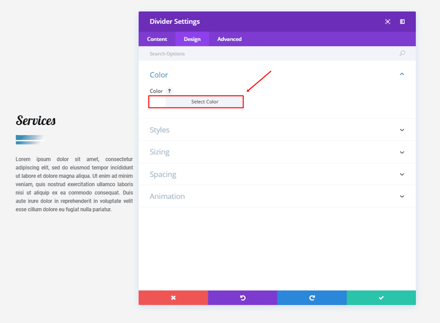
Within the Design tab, choose ‘#FFFFFF’ as the color of your divider.
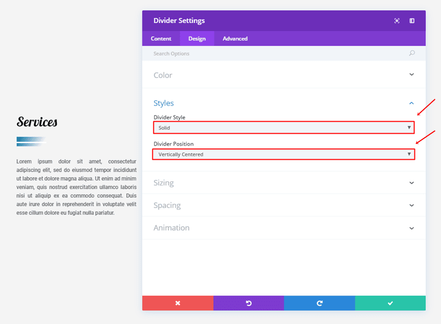
Next, make the following changes to the Styles subcategory:
- Divider Style: Solid
- Divider Position: Vertically Centered
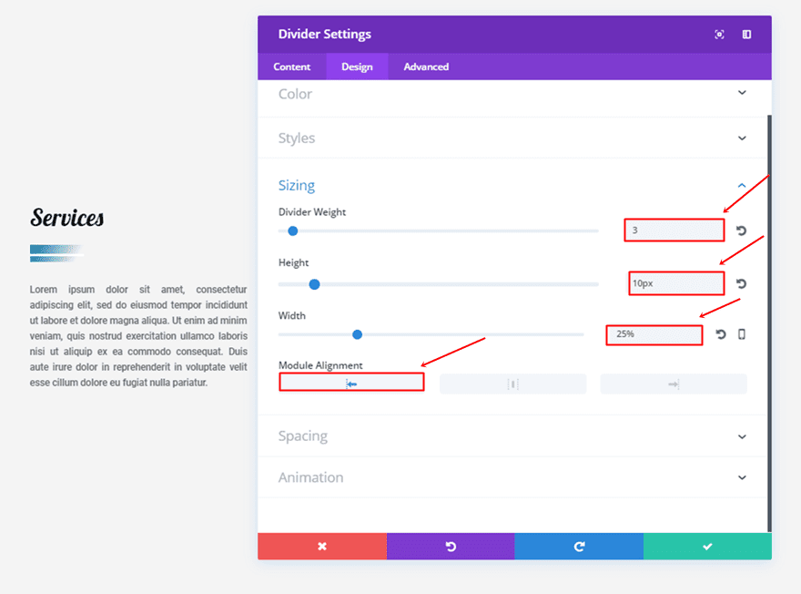
While still in the same tab, make sure the following settings apply to the Sizing subcategory:
- Divider Weight: 3
- Height: 10px
- Width: 25%
- Module Alignment: Left
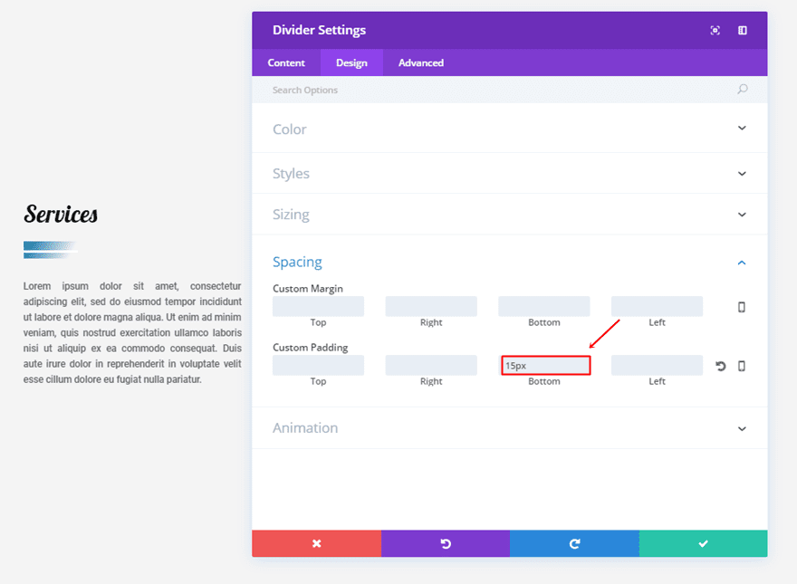
Add ’15px’ to the bottom padding within the Spacing subcategory as well.
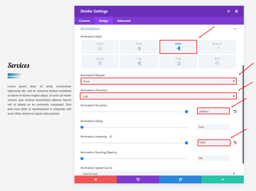
And lastly, use the following settings for the Animation subcategory:
- Animation Style: Slide
- Animation Repeat: Once
- Animation Direction: Left
- Animation Duration: 2000ms
- Animation Intensity: 100%
Second Divider Module Settings
Content Tab
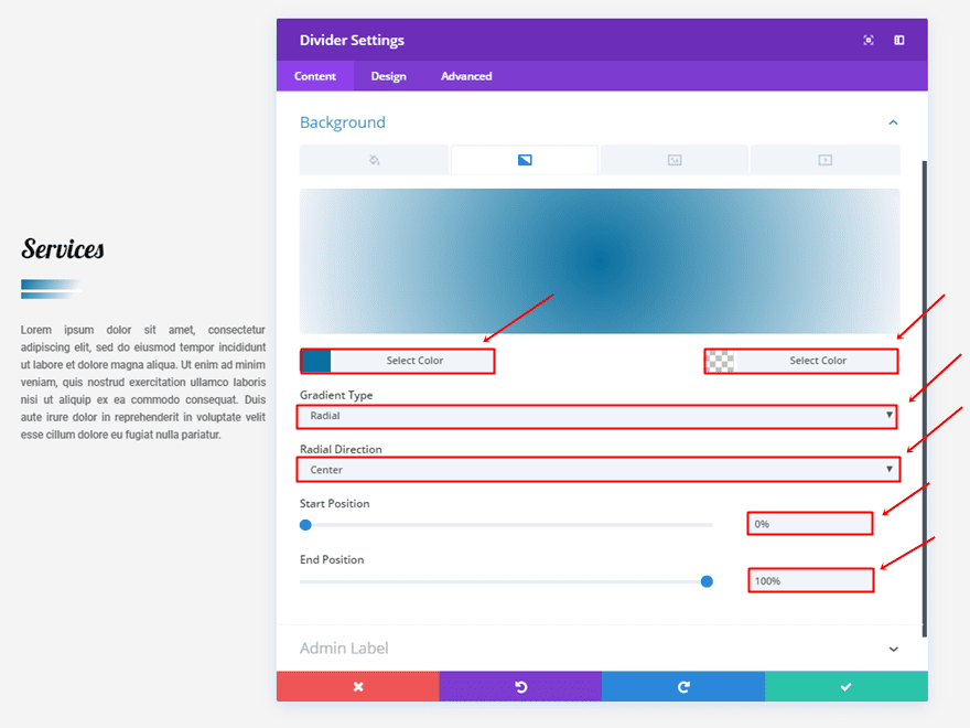
The gradient background settings for the second divider are slightly different:
- First Color: #0970a0
- Second Color: rgba(255,255,255,0)
- Gradient Type: Radial
- Radial Direction: Center
- Start Position: 0%
- End Position: 100%
Design Tab
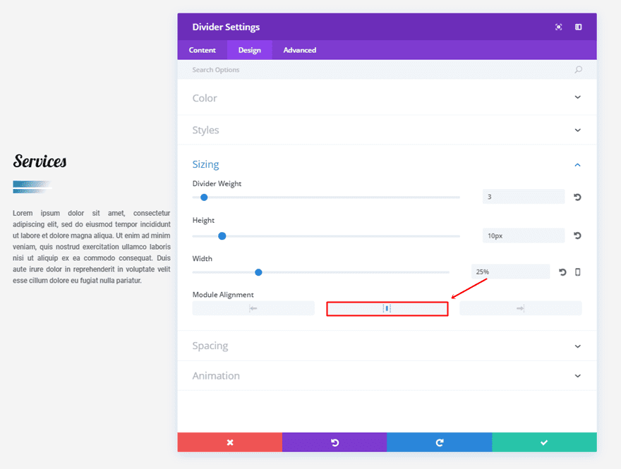
Within the Sizing subcategory, change the Module Alignment to center.
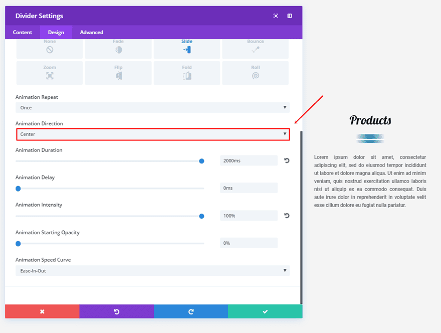
Lastly, centralize the Animation Direction as well.
Third Divider Module Settings
Content Tab
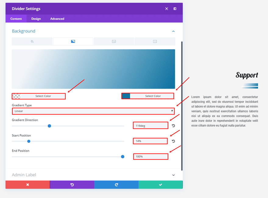
The third divider contains another gradient background as well:
- First Color: rgba(255,255,255,0)
- Second Color: #0970a0
- Gradient Type: Linear
- Gradient Direction: 119deg
- Start Position: 14%
- End Position: 100%
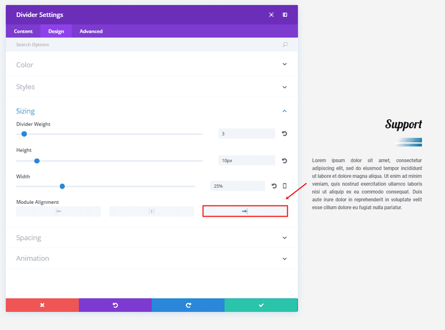
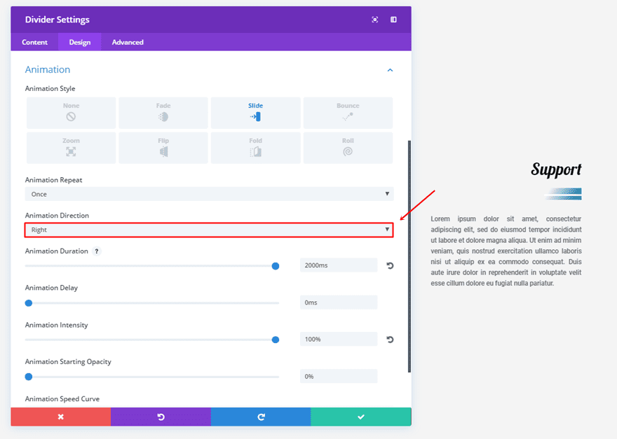
Design Tab
We’re going to make the same changes we made to the second divider but use right instead of center.
4. The Rolling Circle
First Divider Module Settings
Content Tab
Start by making the following gradient background settings apply:
- First Color: #e09900
- Second Color: rgba(255,255,255,0)
- Gradient Type: Radial
- Radial Direction: Center
- Start Position: 20%
- End Position: 21%
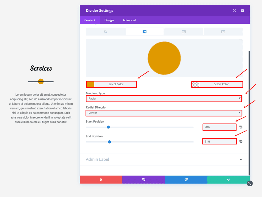
Design Tab
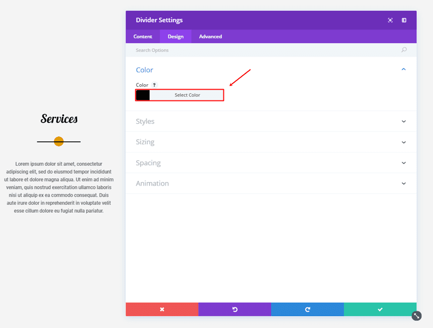
The first thing you’ll need to do in the Design tab is use the ‘#000000’ color for the divider.
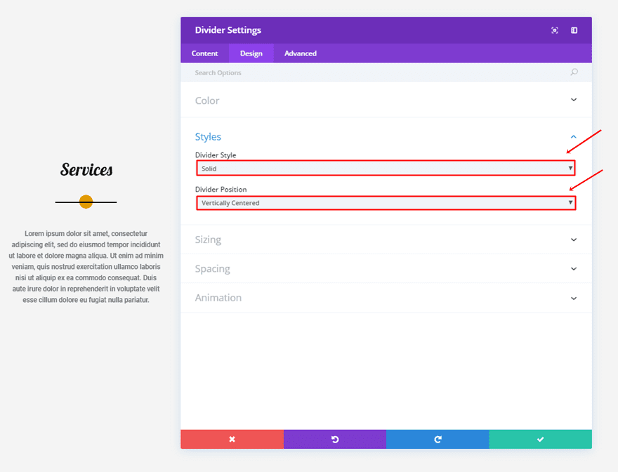
Then, select ‘Solid’ as your Divider Style and ‘Vertically Centered’ as your Divider Position.
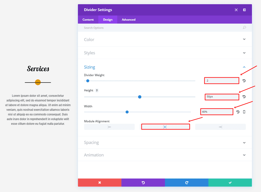
Moving on, make the following changes to the Sizing subcategory:
- Divider Weight: 2
- Height: 50px
- Width: 40%
- Module Alignment: Center
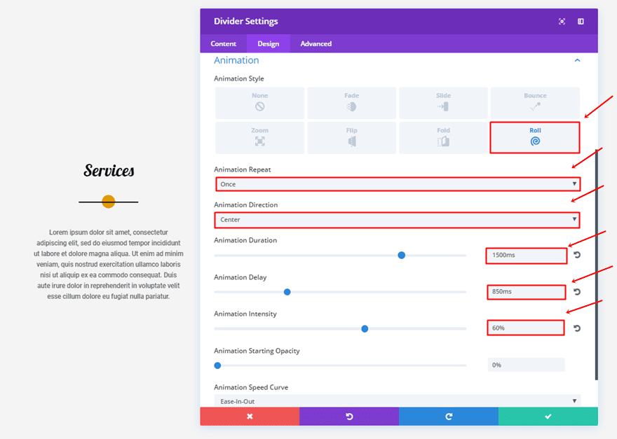
Lastly, the Animation subcategory will need the following settings:
- Animation Style: Roll
- Animation Repeat: Once
- Animation Direction: Center
- Animation Duration: 1500ms
- Animation Delay: 850ms
- Animation Intensity: 60%
Second Divider Module Settings
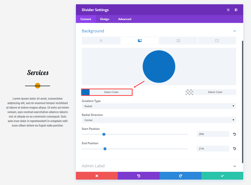
Content Tab
Change the first gradient color into ‘#0c71c3’.
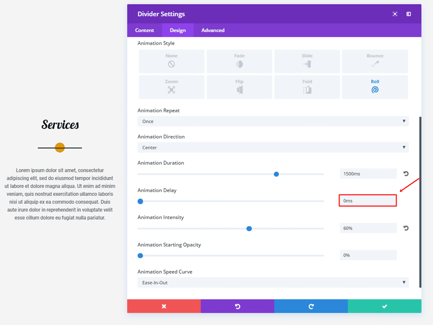
Design Tab
And change the Animation Delay to ‘0ms’.
Third Divider Module Settings
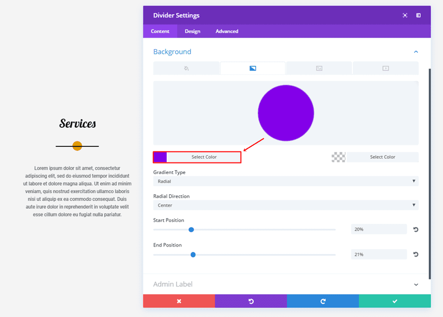
Content Tab
For the last divider, you’ll only need to change the first gradient background color into ‘#8300e9’.
5. The Bracket

First Divider Module Settings
Content Tab
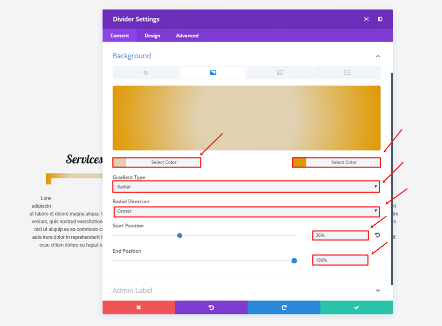
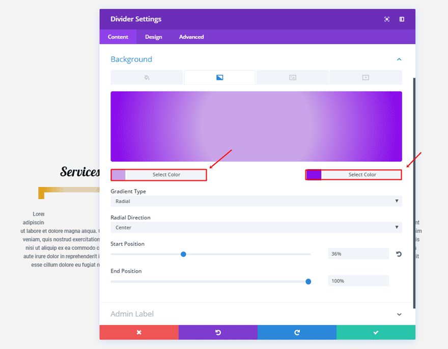
Use the following gradient background settings:
- First Color: #e0d1b1
- Second Color: #e09900
- Gradient Type: Radial
- Radial Direction: Center
- Start Position: 36%
- End Position: 100%
Design Tab
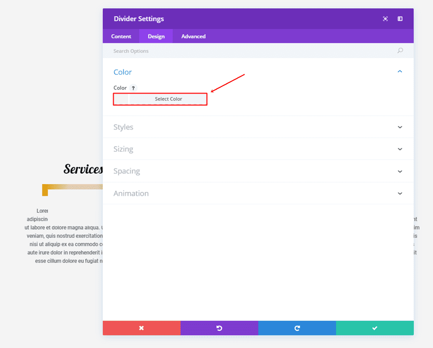
Make sure the color of the divider is the same as the section background color. In this case, that is ‘#f4f4f4’.
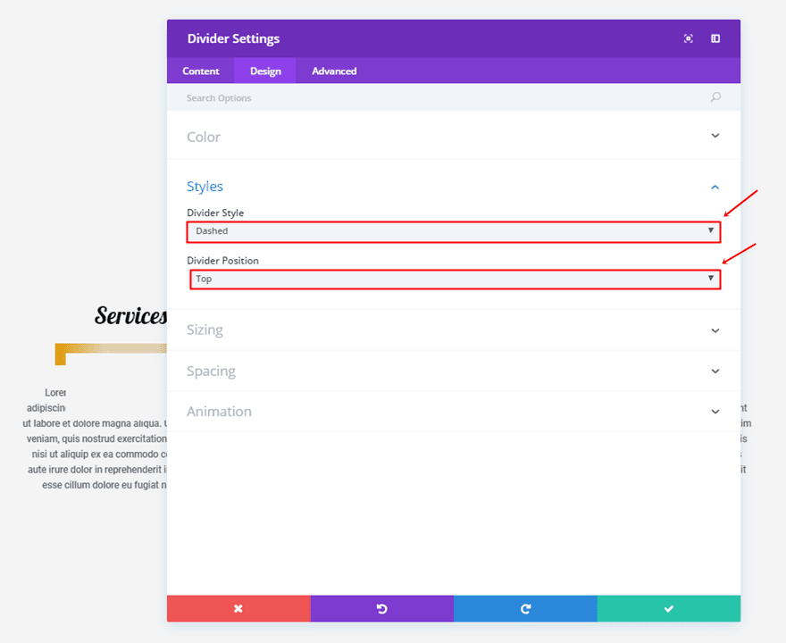
Scroll down the design tab and use ‘Dashed’ as your Divider Style and ‘Top’ as your Divider Position.
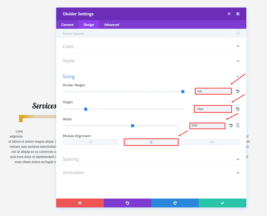
Make the following settings apply to the Sizing subcategory:
- Divider Weight: 100
- Height: 18px
- Width: 60%
- Module Alignment: Center
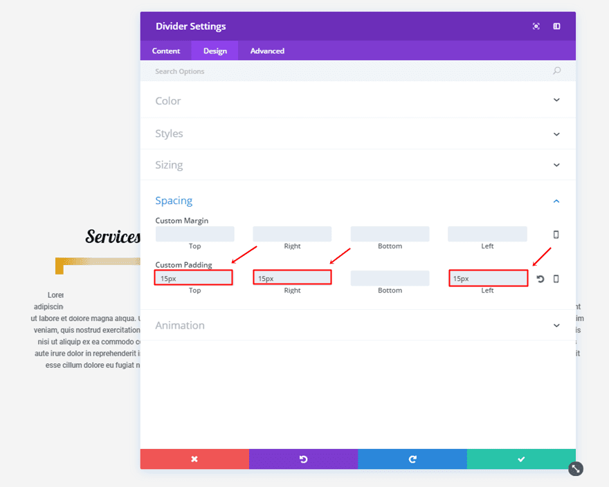
You’ll also need to add ’15px’ to the top, right and left padding.
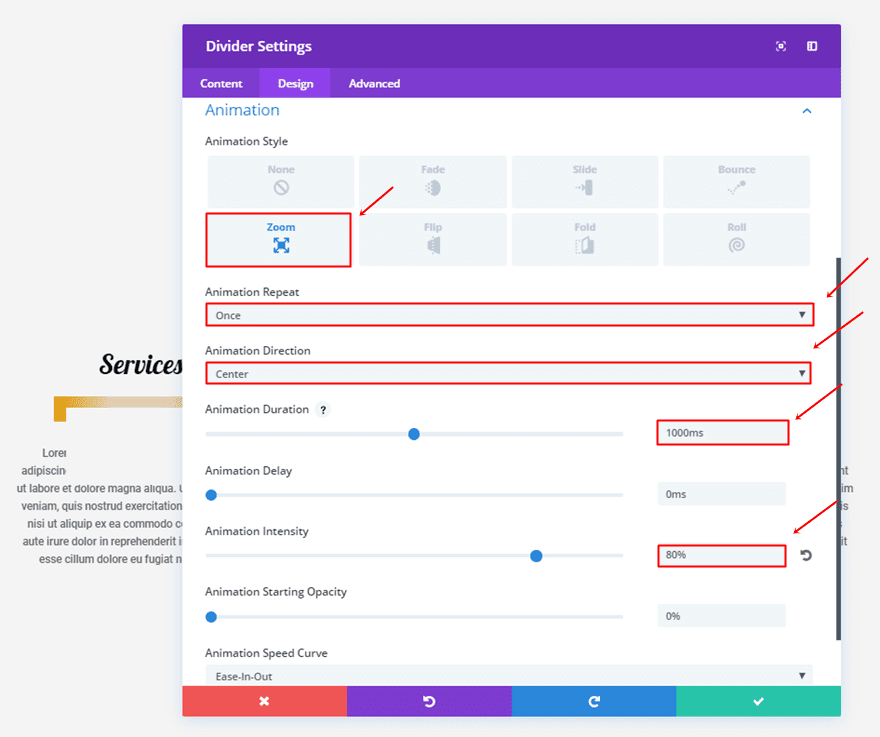
Lastly, use the following animation settings:
- Animation Style: Zoom
- Animation Repeat: Once
- Animation Direction: Center
- Animation Duration: 1000ms
- Animation Intensity: 80%
Second Divider Module Settings
Content Tab
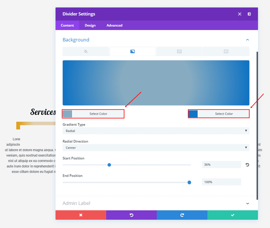
Change the colors of the gradient background into ‘#87acc1’ and ‘#0c71c3’.
Design Tab
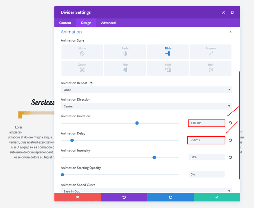
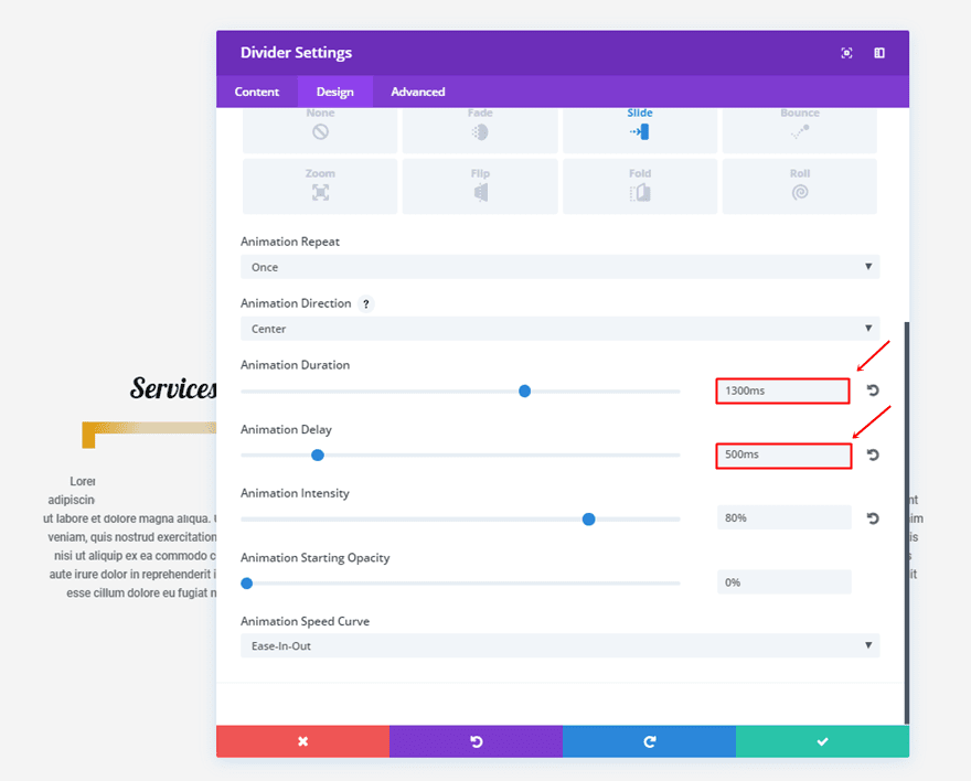
Next, change the Animation Duration to ‘1300ms’ and the Animation Delay to ‘250ms’.
Third Divider Module Settings
Content Tab
The gradient colors being used in the third divider are ‘#c9a4e8’ and ‘#8300e9’.
Design Tab
Change the Animation Duration to ‘1300ms’ and the Animation Delay to ‘500ms’.
6. The Double Lines
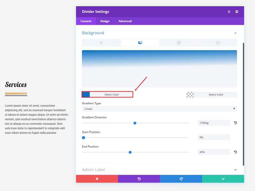
First Divider Module Settings
Content Tab
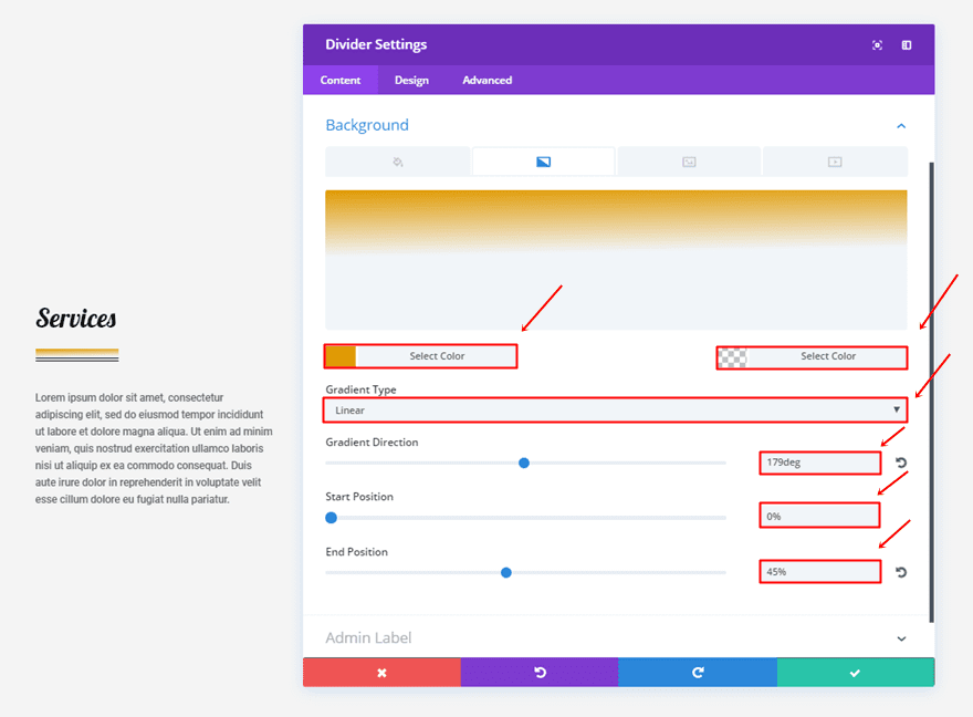
Apply the following gradient background settings:
- First Color: #e09900
- Second Color: rgba(255,255,255,0)
- Gradient Type: Linear
- Gradient Direction: 179deg
- Start Position: 0%
- End Position: 45%
Design Tab
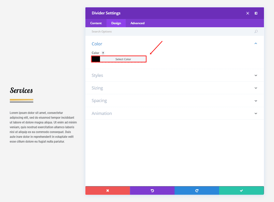
Choose ‘#000000’ as your divider color.
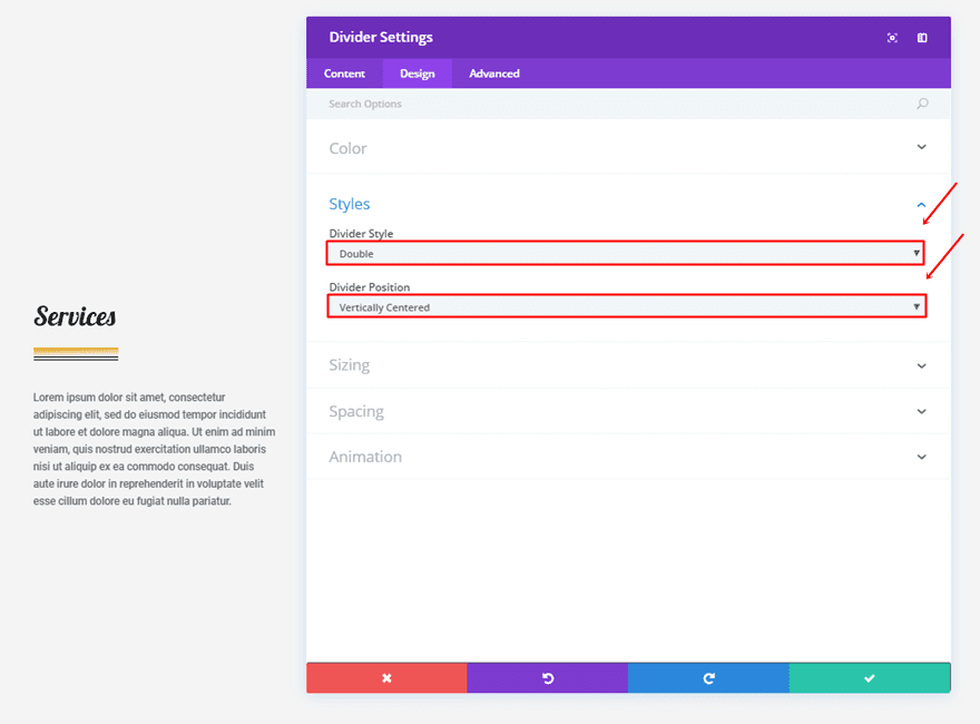
Within the Styles subcategory, use ‘Double’ as your Divider Style and ‘Vertically Centered’ as your Divider Position.
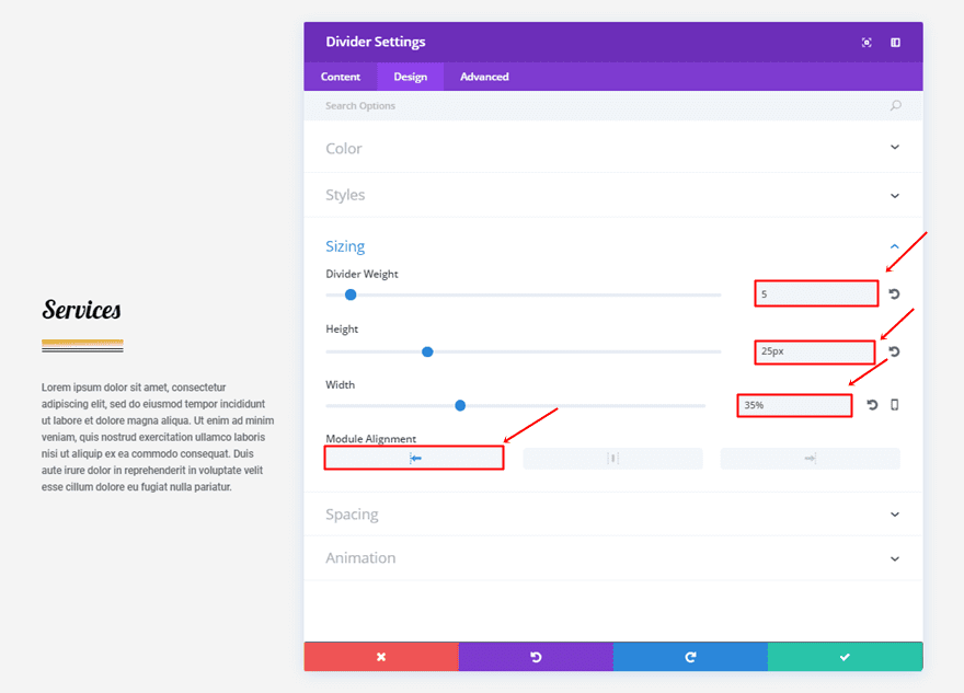
Moving on, use the following settings for the Sizing subcategory:
- Divider Weight: 5
- Height: 25px
- Width: 35%
- Module Alignment: Left
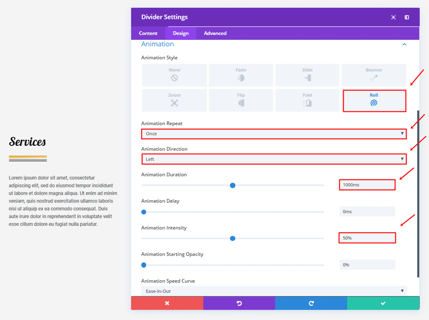
Lastly, use the following animation settings:
- Animation Style: Roll
- Animation Repeat: Once
- Animation Direction: Left
- Animation Duration: 1000ms
- Animation Intensity: 50%
Second Divider Module Settings
Content Tab
Change the first gradient color into ‘#0c71c3’.
Design Tab
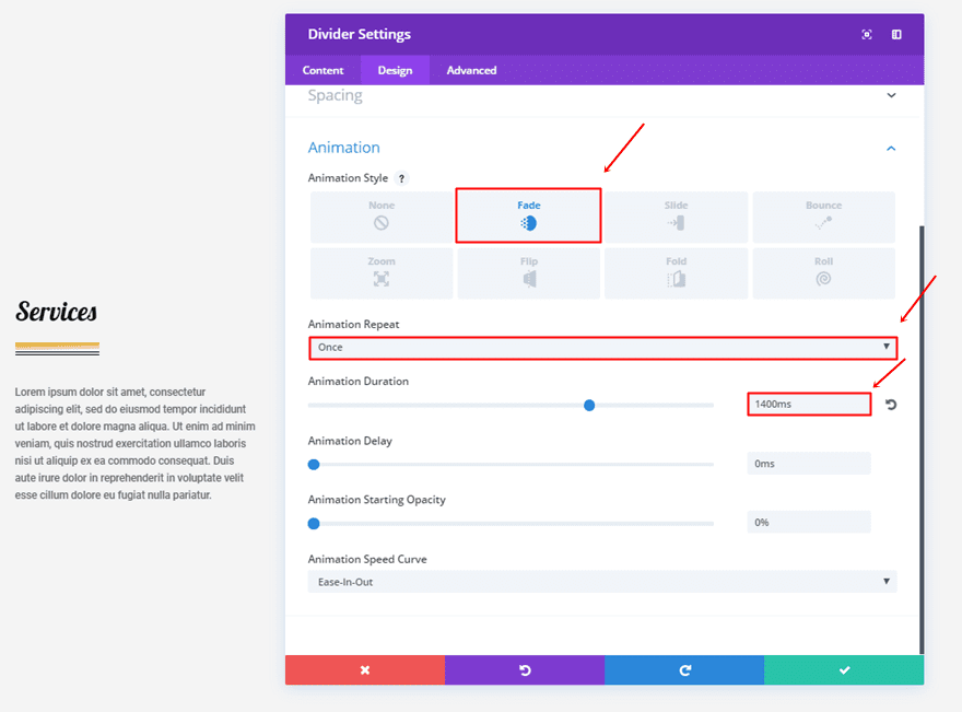
Next, use a different animation for the second divider:
- Animation Style: Fade
- Animation Repeat: Once
- Animation Duration: 1400ms
Third Divider Module Settings
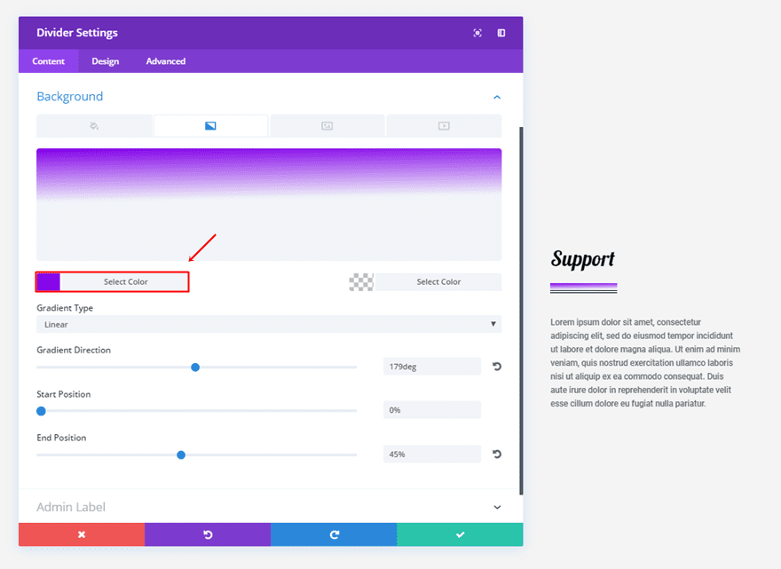
Content Tab
For the third divider, use ‘#8300e9’ as the first gradient background color.
Design Tab
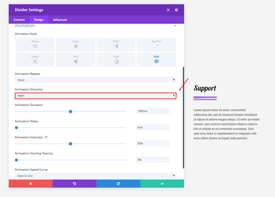
The only thing you’ll need to change in the Design tab is the Animation Direction, which is in this case ‘Right’.
7. The Bridge
First Divider Module Settings
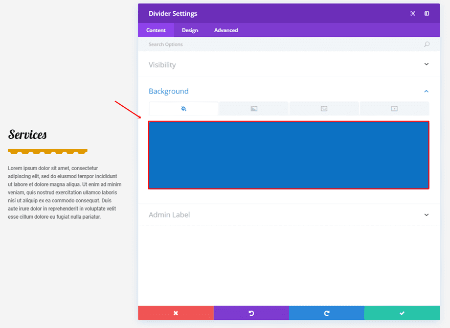
Content Tab
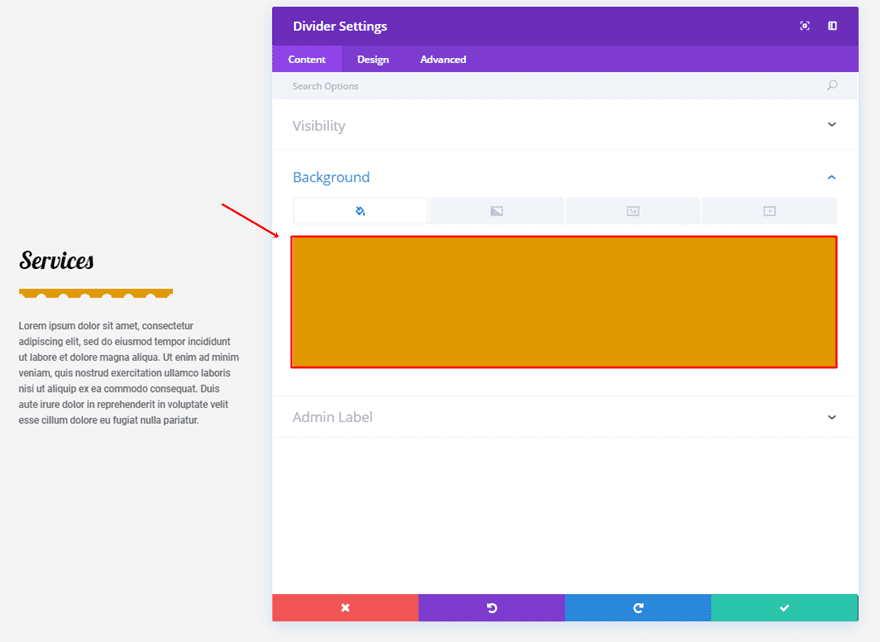
Start by assigning ‘#8300e9’ to the background.
Design Tab
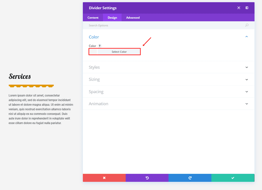
Continue by using the section background color as your divider color, which is in this case ‘#f4f4f4’.
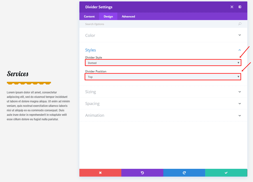
Next, use ‘Dotted’ as your Divider Style and ‘Top’ as your Divider Position.
Within the Sizing subcategory, use the following settings:
- Divider Weight: 15
- Height: 7px
- Width: 70%
- Module Alignment: Left
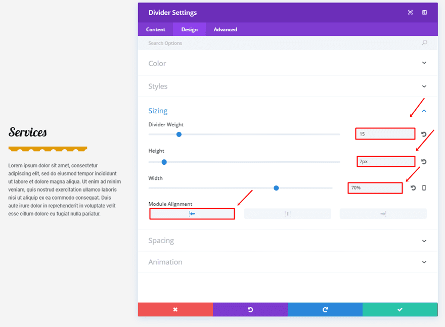
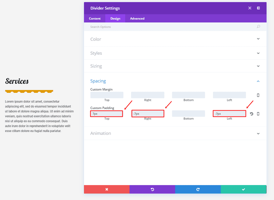
We’ll need some custom padding as well:
- Top Padding: 7px
- Right Padding: -7px
- Left Padding: -7px
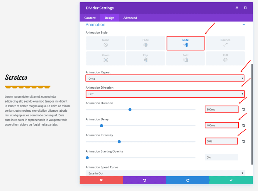
The animation we’ll be using has the following settings:
- Animation Style: Slide
- Animation Repeat: Once
- Animation Direction: Left
- Animation Duration: 800ms
- Animation Delay: 400ms
- Animation Intensity: 30%
Second Divider Module Settings
Content Tab
For the second divider, change the background into ‘#0c71c3’.
Design Tab
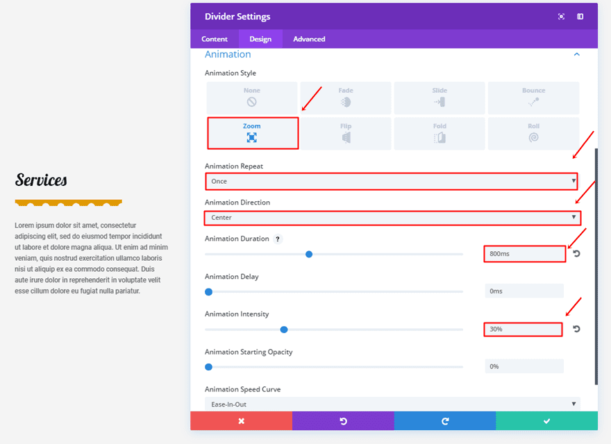
We’ll be using a different animation as well:
- Animation Style: Zoom
- Animation Repeat: Once
- Animation Direction: Center
- Animation Duration: 800ms
- Animation Intensity: 30%
Third Divider Module Settings
Content Tab
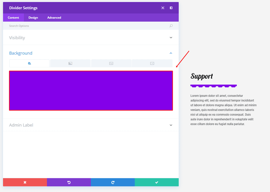
The third divider will use ‘#8300e9’ as its background color.
Design Tab
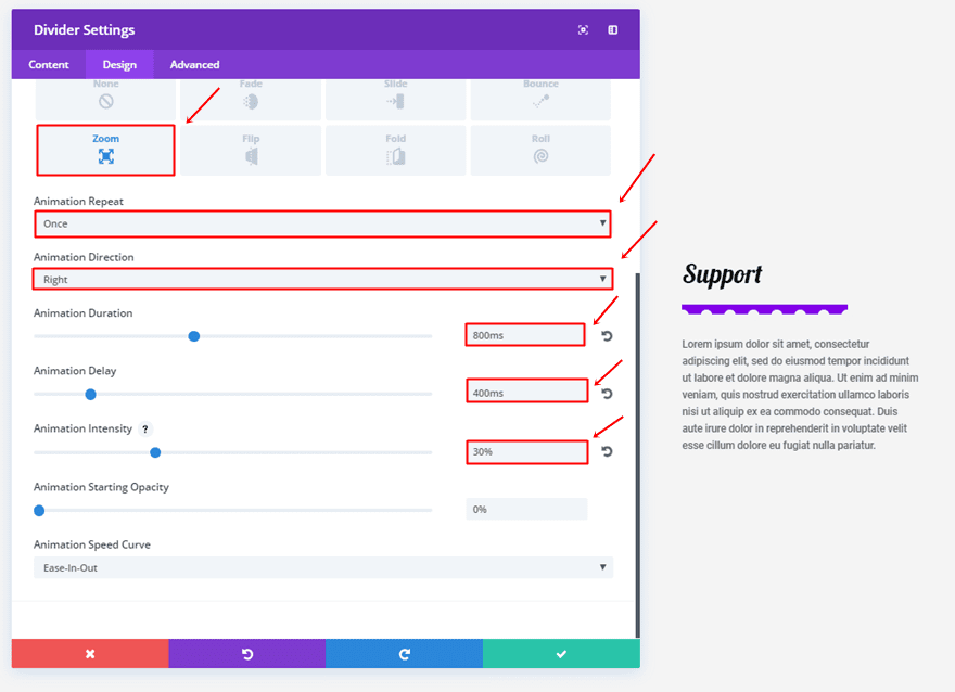
The animation for the third divider is slightly different as well:
- Animation Style: Zoom
- Animation Repeat: Once
- Animation Direction: Right
- Animation Duration: 800ms
- Animation Delay: 400ms
- Animation Intensity: 30%
8. The Elegance

First Divider Module Settings
Content Tab
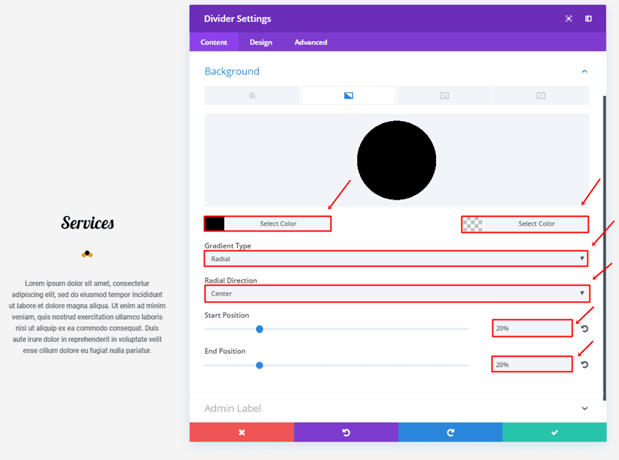
Start by adding the following gradient background to the first Divider:
- First Color: #000000
- Second Color: rgba(255,255,255,0)
- Gradient Type: Radial
- Radial Direction: Center
- Start Position: 20%
- End Position: 20%
Design Tab
Use the ‘#8300e9’ color for your divider.
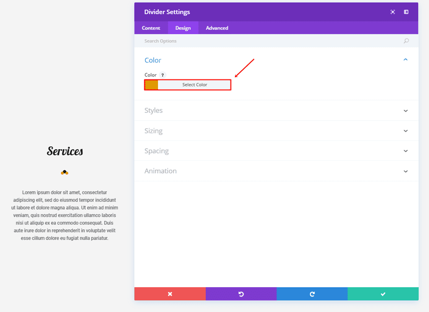
Next, use ‘dotted’ as your Divider Style’ and ‘Vertically Centered’ as your Divider Position.
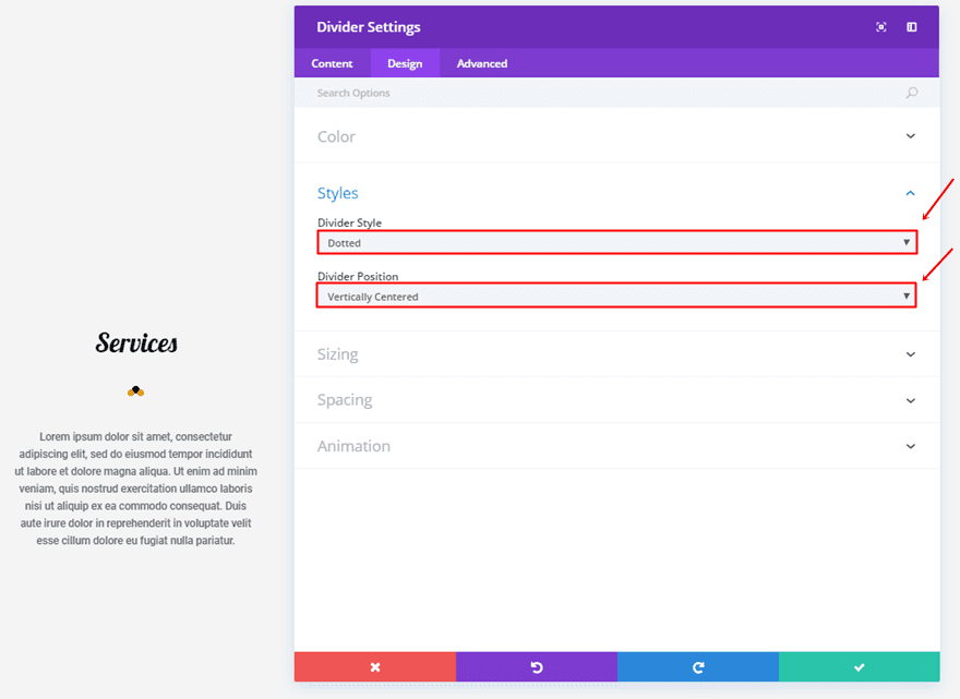
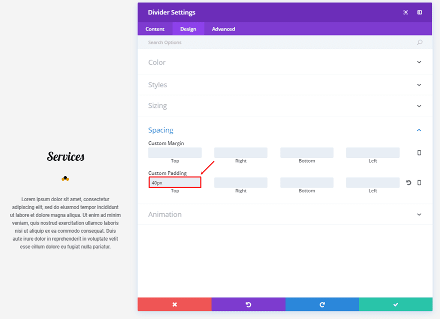
We’ll need a top padding of ’40px’ as well.
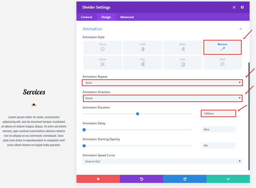
And an animation with the following settings:
- Animation Style: Bounce
- Animation Repeat: Once
- Animation Direction: Down
- Animation Duration: 1000ms
Second Divider Module Settings
Design Tab
For the second divider, change the color into ‘#0c71c3’.
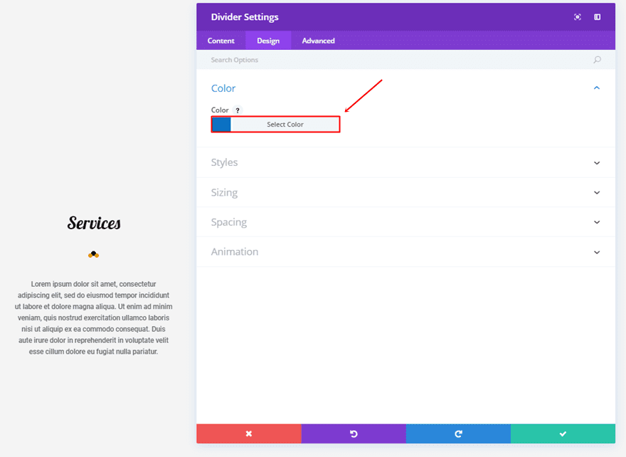
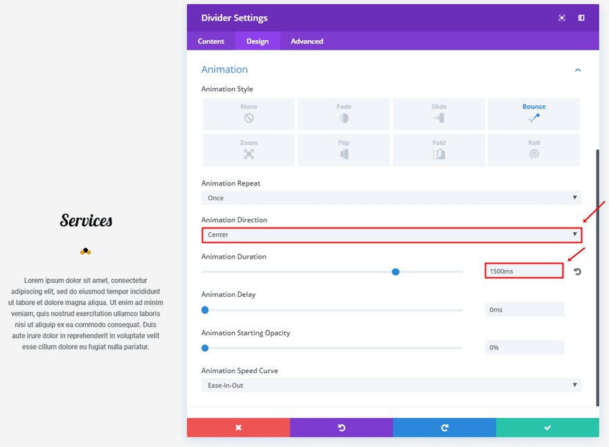
The animation will need some changes as well:
- Animation Direction: Center
- Animation Duration 1500ms
Third Divider Module Settings
Design Tab
The third divider will be using ‘#8300e9’ as its color.
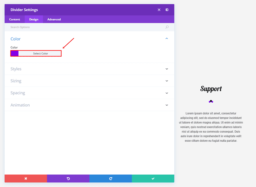
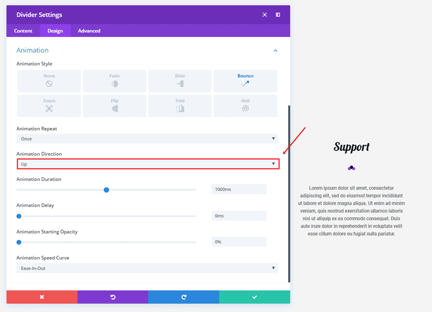
And will have ‘Up’ as its Animation Direction.
9. The Subtleness

First Divider Module Settings
Content Tab
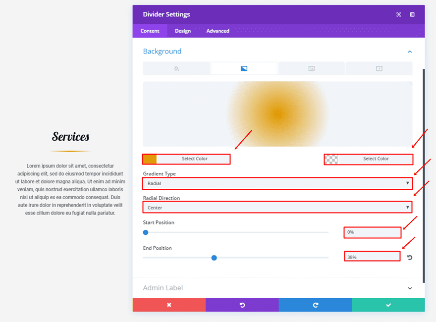
Choose the following settings for the gradient background:
- First Color: #8300e9
- Second Color: rgba(255,255,255,0)
- Gradient Type: Radial
- Radial Direction: Center
- Start Position: 0%
- End Position: 38%
Design Tab
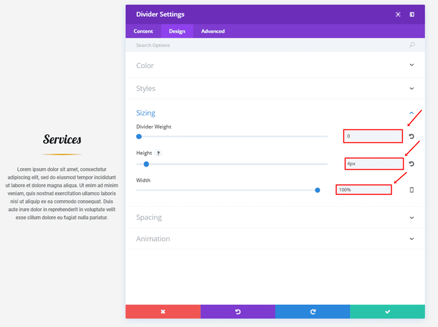
Within the Sizing subcategory, you’ll need the following settings:
- Divider Weight: 0
- Height: 4px
- Width: 100%
Lastly, the animation we’ll be using has the following settings:
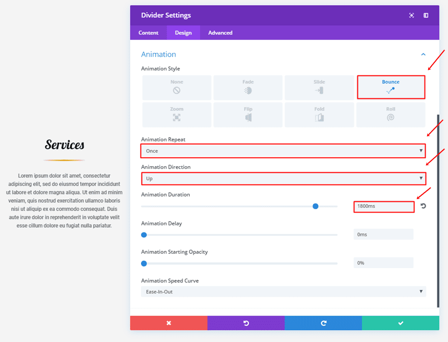
- Animation Style: Bounce
- Animation Repeat: Once
- Animation Direction: Up
- Animation Duration 1800ms
Second Divider Module Settings
Content Tab
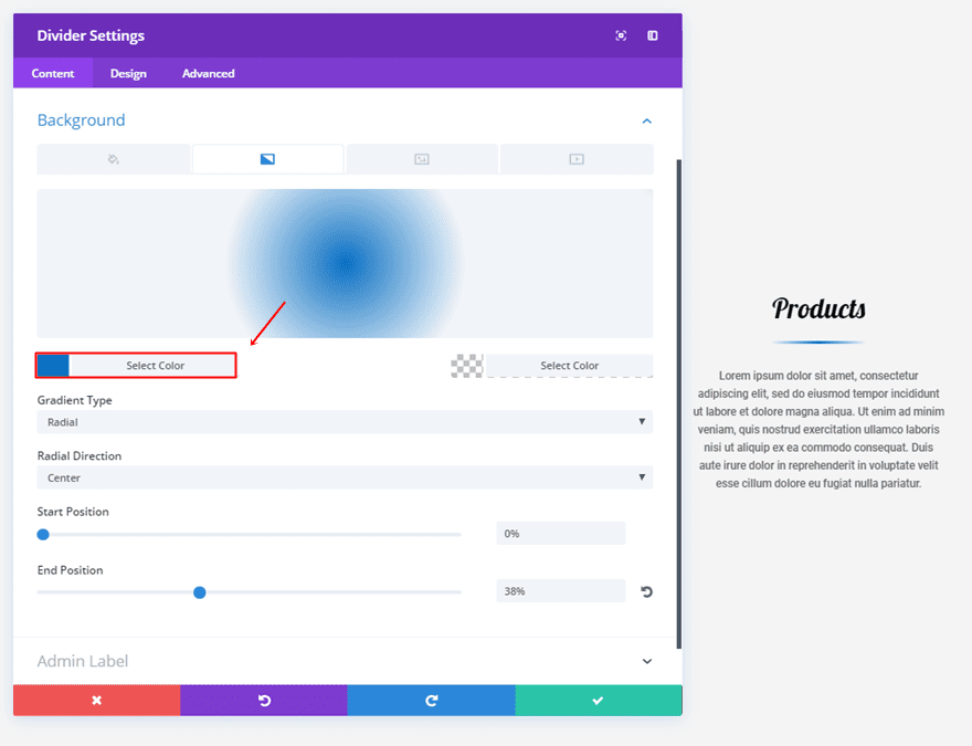
For the second divider, change the first gradient background color into ‘#0c71c3’.
Third Divider Module Settings
Content Tab
Make the same change to the third divider but use the ‘#8300e9’ purple color instead.
10. The Glow

First Divider Module Settings
Content Tab
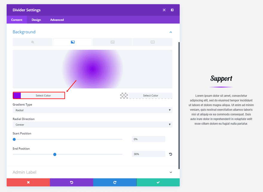
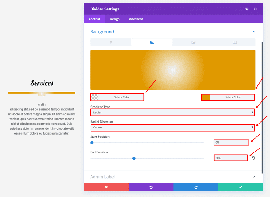
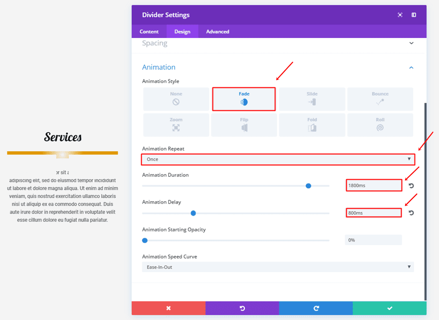
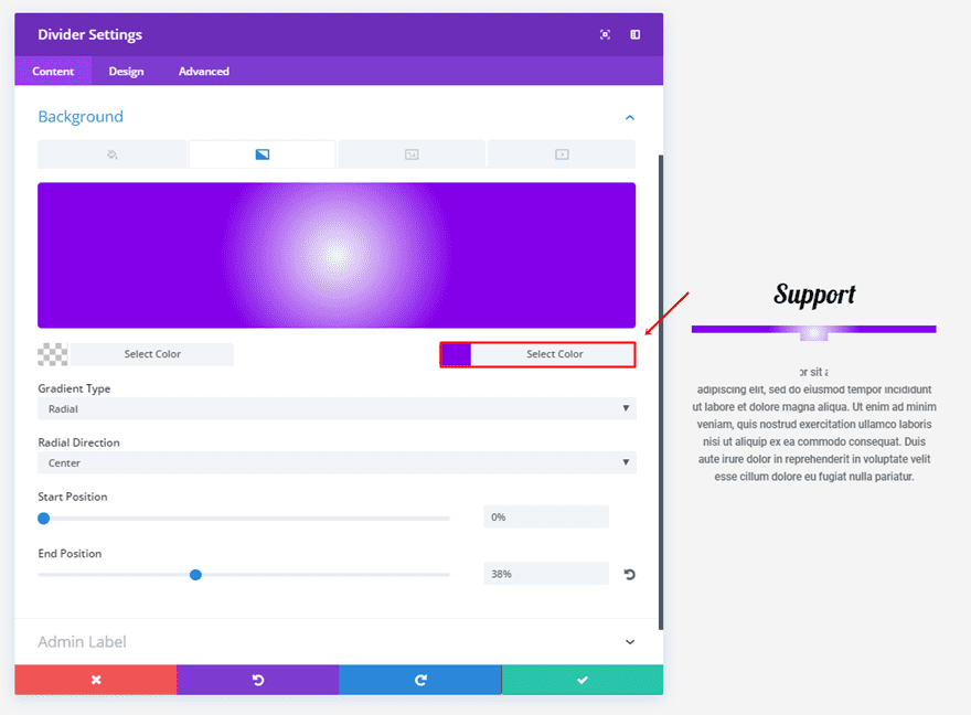
Make use of the following gradient background settings for the last series of dividers:
- First Color:
- Second Color:
- Gradient Type: Radial
- Radial Direction: Center
- Start Position: 0%
- End Position: 38%
Design Tab
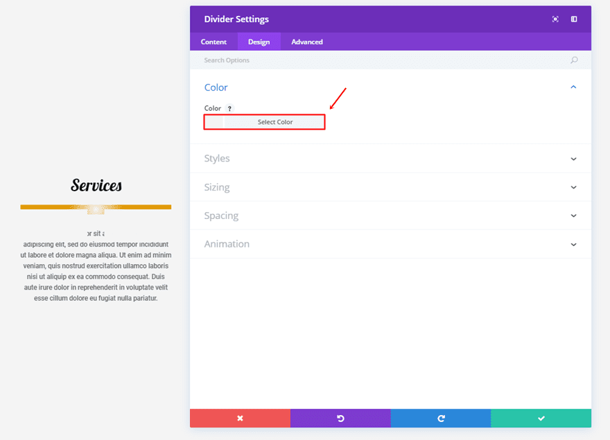
Choose the section background color as your divider color as well, in this case, it’s ‘#f4f4f4’.
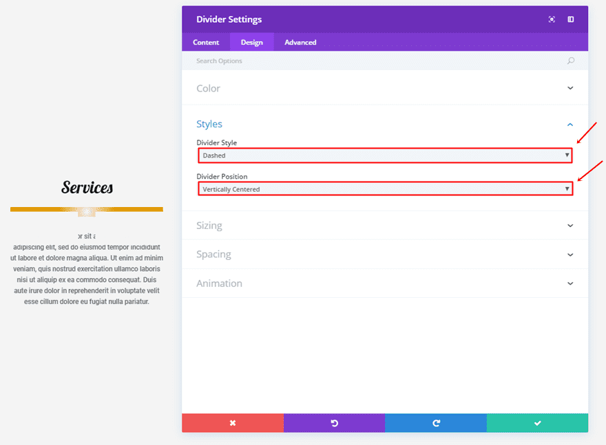
Next, use ‘Dashed’ as your Divider Style and ‘Vertically Centered’ as your Divider Position.
Within the Sizing subcategory, use the following settings:
- Divider Weight: 70
- Height: 20px
- Width: 100%
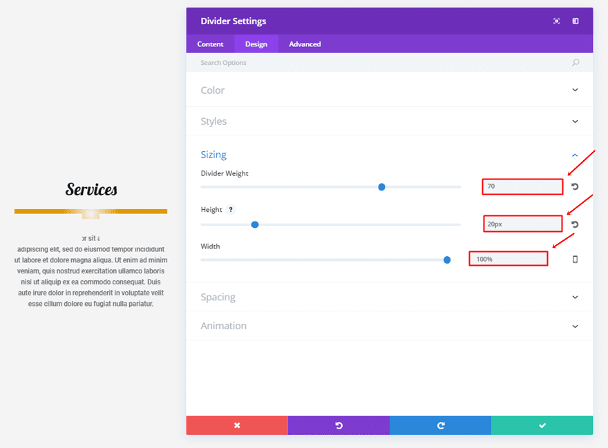
Lastly, we’ll be using an animation with the following options:
- Animation Style: Fade
- Animation Repeat: Once
- Animation Duration: 1800ms
- Animation Delay: 800ms
Second Divider Module Settings
Content Tab
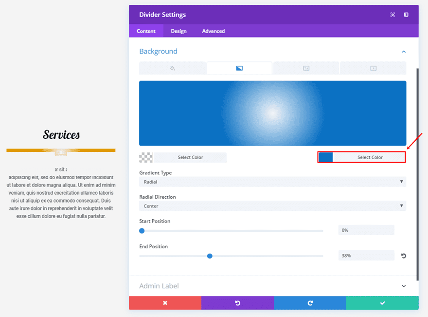
For the second divider, change the second gradient background color into ‘#0c71c3’.
Design Tab
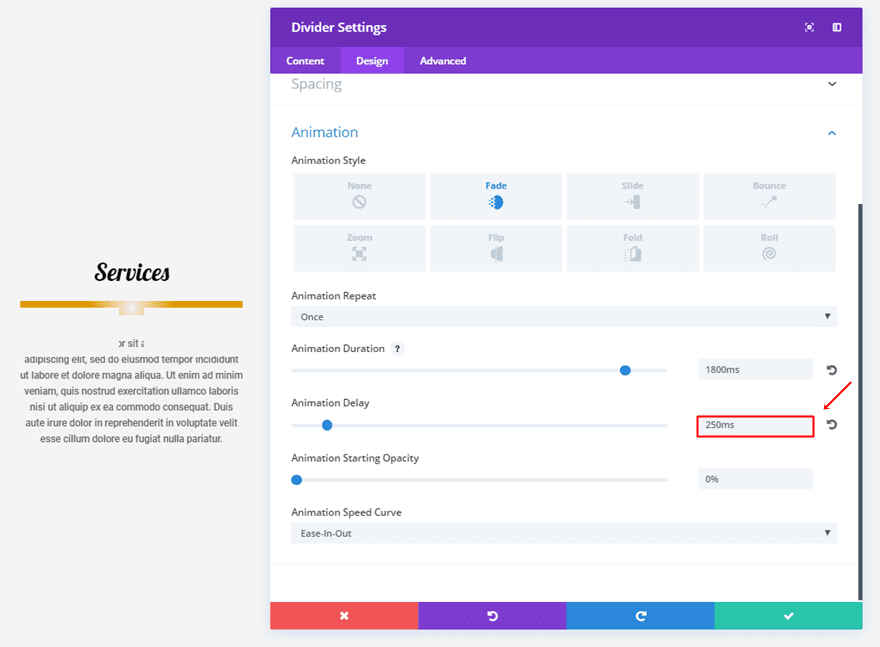
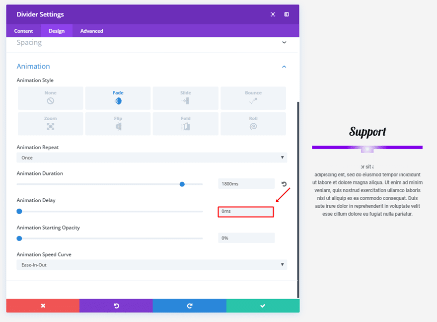
And add an Animation Delay of ‘250ms’.
Third Divider Module Settings
Content Tab
For the last divider, change the second gradient background color to ‘#8300e9’.
Design Tab
And finish off by putting the Animation Delay to ‘0ms’.
Final Thoughts
With the new Divi options, a lot of new creative things are possible with the built-in settings of each module. In this post, we’ve specifically shown you how these options can help you enhance your design through the Divider Module. If you have any questions or suggestions; make sure you leave a comment in the comment section below!
Be sure to subscribe to our email newsletter and YouTube channel so that you never miss a big announcement, useful tip, or Divi freebie!
Featured Image by VikiVector / shutterstock.com


Are these animations available for any of the other modules?
Really cool stuff, but I have issues with setting up 8. The Elegance… I think there is something missing in the instructions?
great post, thanks.
It is amazing, I am gonna use the first one!!!!!!
Awesome ideas – thank you so much for posting. How I wish if ET makes these effects available for download, alongwith the tutorials!!
Very well explain. I will try this at my blog.
Great work always.
I love Divi, it’s an absolute godsend, and your post explained it all very well.
I find these kinds of effects are extremely annoying (perhaps it’s just me, I am a little obsessive compulsive). When I have to deal with a website that has constantly jiggling elements I find myself scrolling to get them off screen.
Didn’t we figure this out back in the ’90’s?
I would prefer the team focus on getting the basics working right, so I don’t have to use a hundred lines of custom CSS!
It’s like the blink tag back in the good old days of Internet Explorer 2. Stuff like this is ok in small dozes but people remember when it comes to design “less is more”…
This is incredible! Thank-you for this tutorial. Was just starting to experiment with these new settings. Great example to follow.
Great as always.
Hello Donjete, as always an exceptional job in the post and another great competitive argument for DIVI
greetings and thanks from Asturias.
Absolutely brilliant.
Thanks
Is there a download ?
These are so cool! Thanks so much for posting this and please come back some more with ideas.
Nice, shows that there are lots possibilities and creative freedoms that can be taken with the divider module and the new animations.