
There are lots of websites out there with a focus on kids. Some provide entertainment for kids while others provide products, help, or services that benefit kids. As you could image there are several of these websites that were built with Divi. In this article we will cover 10 examples of kids websites built with Divi to help spark your imagination for your next Divi design.
Topics range from playgrounds to summer camps, and from business that help children to businesses owned by children. Others provide products such as books or DVDs. The websites are in no particular order.
1. Sword Summer Camp
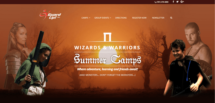
Sword Summer Camp displays a full-screen image with tagline in an overlay. Scrolling reveals three images in styled frames with links to pages. Following this is a section with media reviews, a contact form, a full-width image, a CTA and links to events, and a custom footer with artwork and menu. Registration is handled with an embedded form from FormSite. The mega-menu includes categories with icons and embedded videos and CTA’s. The site makes great use of images and fonts.
2. Frog Burps
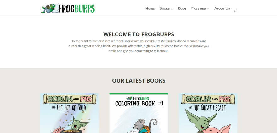
Frog Burps shows a welcome message followed by book covers from their latest books with links to see more information about each one. Scrolling shows a book cover with the title and part of the cover’s artwork in parallax. Following this is a blog section with hover effects and link to more posts, a CTA, and social links. The Short Stories page includes a countdown to the next post. The site uses branded colors and fonts.
3. kidzxplor
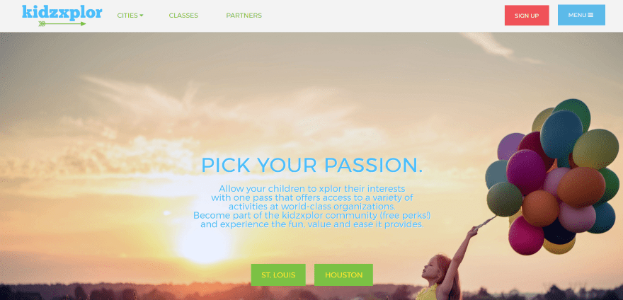
kidzxplor displays a full-screen image with CTA in an overlay in parallax. Scrolling reveals a small full-width bar with information and section styling. Next is an embedded video and three images with information about the experience. All of the activities are shown as clickable icons with labels. A testimonial is displayed with a large image and text to one side. Another section displays media logos with links to their articles. A small full-width section includes links to locations and apps. The menu includes a CTA.
4. Iesodo
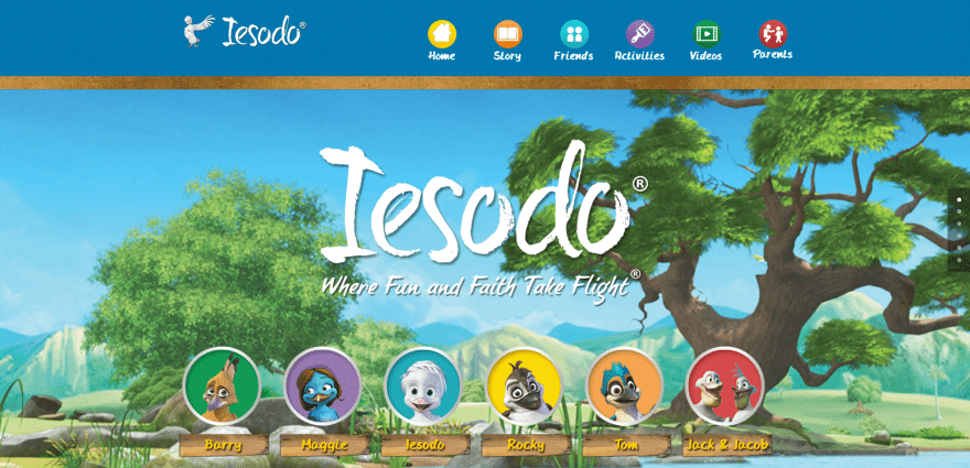
Iesodo includes a full-screen cartoon background image with logo, tagline, characters, and links to each character in parallax. The next section displays embedded videos and a DVD cover that links to a page. Next, each of the characters are shown in cards in overlays with links to their pages. An About section includes DVD covers with their topics and links. An Activity section provides graphical links to the activities with their topics. All of the sections include parallax over cartoon backgrounds and each are separated by a wooden windowsill graphic. The site makes great use of color and artwork and includes a background and icons within the primary menu.
5. Spartanburg Science Center
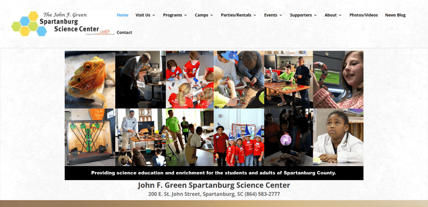
Spartanburg Science Center displays an image montage with company mission and contact information under the images. The next section includes four images with blurbs about programs offered. Upcoming events are shown as blog posts. The next section uses a full-screen image slider to show the activities. An image with text over a patterned background provides more information about the science center. Descriptions of the camps are placed within boxes over a parallax background. Payments are accepted through PayPal.
6. Youth Now Center
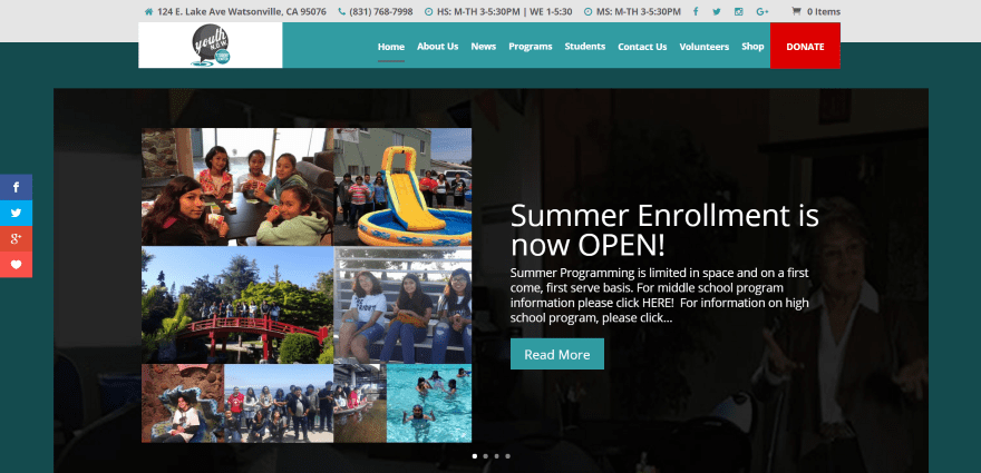
Youth Now Center displays a post slider over a dark green background. The menu includes a CTA and is unique in how it overlaps the top menu and first section, making it stand out while keeping it out of the way. The next section includes company information with a contact form. A section with links to programs is displayed over an image in parallax. A large image with text works as a CTA followed by CTA’s to volunteer and to learn more about sponsors. A blog section uses a sidebar with upcoming events and newsletter form. The next section shows the sponsors’ logos. The footer includes maps and contact info for each location.
7. Pop Bubble
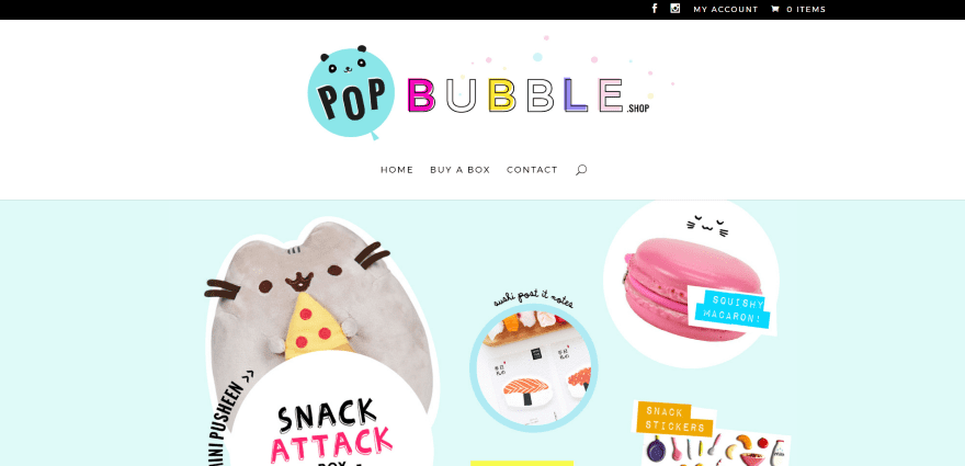
Pop Bubble uses a one-page design that displays a large centered logo over a full-width image of the products with overlapping CTA that includes an image of the box, detailed explanation, and button to purchase, which takes you to the shop that’s powered by WooCommerce. The next section includes a contact form where you can submit ideas or requests next to photos of the store owners within a styled background. Font colors match the site’s color branding. The site is simple and clean, providing a clear focus on the call to action.
8. Kula Mama
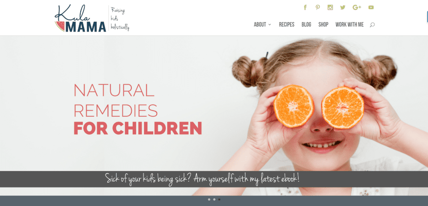
Kula Mama uses a full-screen post slider followed by a section with featured products with circled images and links to the shop. The two latest posts are shown with elegant images, post title, and read more buttons. A full-with email sign-up form uses an elegant font over a colored background that matches the site’s styling. An about section shows the site’s author within a circled image with button to read more, while the next section uses a work with me CTA over a colored background. The blog page displays an index to categories. The site makes excellent use of color and images.
9. WhiteIT
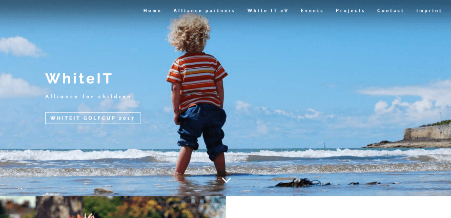
WhiteIT includes a full-screen image with logo, tagline, and CTA. Following this is a section with information about the company with CTA and an image in two columns. Next is a two-column section with an embedded video with CTA over a full-screen image. The next section includes a link to see their books over an image in parallax. Another CTA is shown in double-column followed by an event calendar in parallax, full-screen testimonial slider over a background image, an information section over a background image in parallax, stats, a blog section, and lots more. The footer includes social feeds. The site uses lots of images and parallax.
10. WinShape Lake Norman
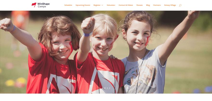
WinShape Lake Norman includes a full-screen image slider followed by a two-column section with information, a countdown timer, embedded video, and CTA. An image gallery demonstrates the skills that are emphasized and taught. The images open in a lightbox. The schedules are displayed within toggles over a parallax background image. Testimonials are placed individually in a multi-layout design within multi-colored boxes. The site is simple and uses branded color.
Final Thoughts
These 10 examples of kids websites built with Divi go to show that Divi can create amazing designs for any type of kids website including camps, books, DVD’s, museums, stores, and more.
These sites a great for providing ideas for layouts, fonts, navigation, colors, photography, video, calendars, products, and more. These websites are sure to spark your imagination for your next kids’ website design with Divi.
What are some of your favorite elements of these kids websites built with Divi? Let us know in the comments below!
Featured Image via Arak Rattanawijittakorn / shutterstock.com


As a former teacher and parent of two young children, I am always looking for new kid websites that are not only appropriate but also visually interesting. You guys nailed it!
Amazing sites built with Divi.
I didn’t even know it could be so amazing & powerful to build any kind of sites.
I’m going to check out its DEMO…
Thanks for sharing the Youth NOW project Randy. It was a lot of fun to build for a local program that I really support. Also can you tell it was based off of our Landscapes Child Theme 😀
Hi, I love the full-width slider and the blurb functionalities, especially on kids website as images and short and easy to understand descriptions are super important. I used almost all the elements you’ve mentioned above for my own kids site. As my site is more music-tailored, I also use the audio element quite extensively.
I am glad you are showing us these. Since I am currently building a website using DIVI for my own cartoon characters it is sometimes a bit frustrating to see only business related websites – focusing on elegance and not on childish layouts. Now I can see how others address the target group kids which is good for some inspirations.
My site is in German and I am doing a makeover. Instead of the DIVI slider I use “Layerslider WP” with rich features and a nicer backend. The possibilities are better especcially when you try to animate images over the backdrops etc.
But the rest is pure DIVI which I admire very much.
In case you visit my site remember that it is in makeover and it is in German
Awesome! I loved building the site that we did for a children’s museum in Chapel Hill, North Carolina named Kidzu Children’s Museum.
How can you not go wrong with a name such as frogburps.
I’m assuming you don’t really mean “not”!
LOL!