
Whether a client asks for a retro-futuristic design for their new site, an organization is promoting a STEM event in their local community, a science-fiction author requests a sleek book cover, or a new research firm needs a cutting-edge website to match their cutting-edge research, STEM and science fonts easily convey a sense of modernism, clean styling, and high-tech know-how. With any of the entries on this list, you will be able to put together the perfect design that makes readers feel right at home. Even if that home is in a galaxy far, far away.
Subscribe To Our Youtube Channel
1. TR2N
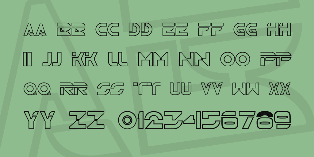
TR2N is reminiscent of the Disney cult classic Tron. This font is a capitals-and-numbers-only font that isn’t designed for long documents, but for headlines and attention-grabbing design work. The font is well-made and readable (for what it is), but is stylized so you have to keep that in mind. However, when it comes to science fonts (well, science-fiction ones), you can’t get much stronger than TR2N. Best of all is that the font is free for commercial use, so you don’t have to worry about anything in that regard.
2. Science
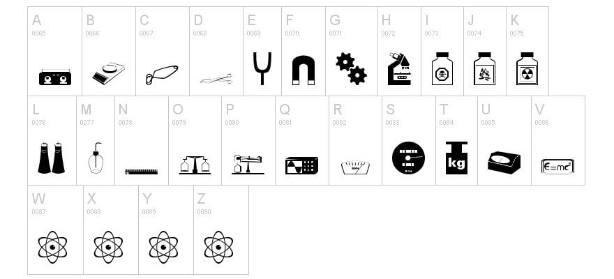
The aptly named Science font isn’t something you write with. Instead, it’s an icon font. Each letter on the keyboard corresponds to an icon of some kind of scientific symbol that would come in handy in pretty much every situation where you need a science or STEM font. Science includes magnets, gears, hazardous chemicals, scales, microscopes, atoms, and even an E=MC^2 plaque for good measure. (And a lot more than just those, too.) In other words: it’s good stuff that you should download.
3. HACKED
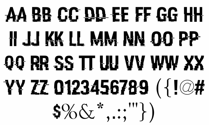
HACKED is almost the quintessential post-modern science font. Representative of the ubiquitous glitchy screen that indicates hacking in many forms of media, the font is well-designed and no matter what words or phrases you put together, always remains legible. The collection includes a number of symbols (and numbers, too). Though only two of the symbols have the signature hackey-glitch design. The hashtag and dollar-sign being the two. You can download HACKED at no cost. On top of that, you can freely use it in commercial projects.
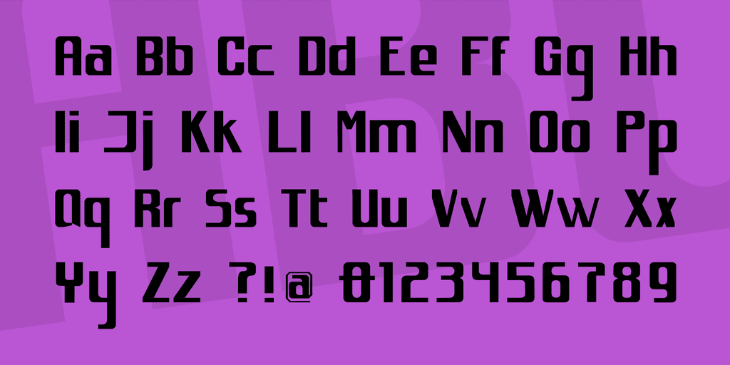
4. Primus
Primus is a font at home in any design or document that needs a futuristic slant. Great for both headlines and copy text, Primus is spaced well, has rounded edges on each character, and has kerning that utilizes whitespace effectively. It is perfect for signage in the real-world to advertise STEM events or in science-fiction media of all types. Primus is kind of the perfect science font for showing the clean and sleek future we all kind of hope is ahead of us.
5. Roddenberry
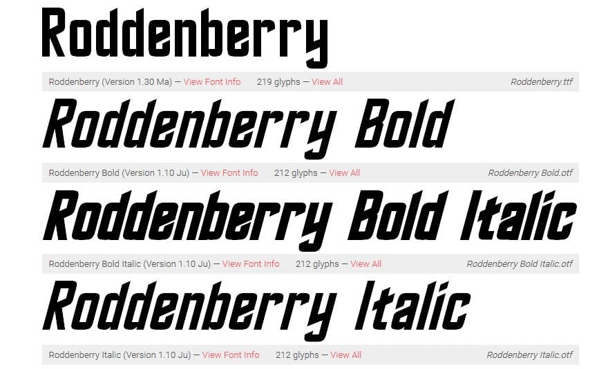
Modeled after the original Star Trek title font, Roddenberry deserves a spot on every computer even thinking about using a STEM-related font.
6. spacejunk:XL
When you need a font that both looks futuristic and slightly vintage at the same time, spacejunk:XL is a good option. A simple font, spacejunk:XL isn’t a monospaced font, so you can use it to make dynamic displays that attract readers’ attention without having to dig deep into Photoshop or Illustrator’s fine-tuning.
7. BPmolecules
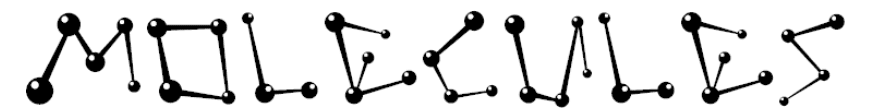
You can’t get much sciencier than BPmolecules. Anyone who looks at the font immediately recognizes the STEM overtones being conveyed to them. There are no lower-case glyphs in the collection, but if you’re using a font that mimics (and stylizes) molecular structure, you might not be so concerned with such things. You can use the font in commercial projects thanks to Creative Commons licensing, and actually includes Greek and Coptic glyphs that give you a lot more utility out of the typeface. You definitely want these 41 glyphs in your library.
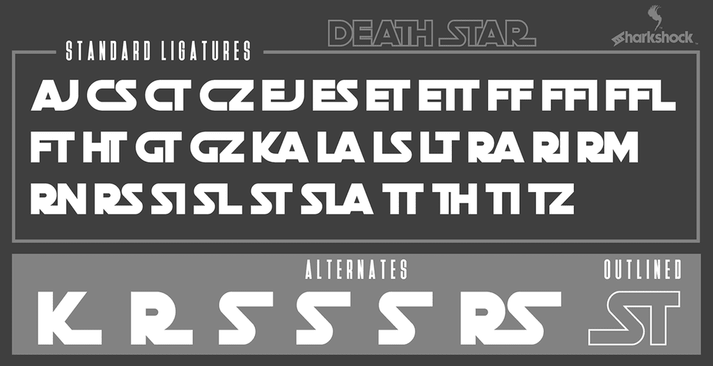
8. Death Star
 A long time ago, in a galaxy far, far away…
Sorry, we couldn’t resist. However, if you want a science font to evoke the Star Wars nostalgia in your audience, Death Star is the way to do it. One of the most interesting features of Death Star is the included ligature characters that give the vintage movie posters their iconic feel. The font is free to download; however, with a $15 donation (or purchase of a commercial license), you gain access to not only the regular version (blocked in), but the outline form as well. That is not a bad price for what amounts to two separate fonts that can really liven up any design that you want to be immediately recognizable.
9. Computer 7
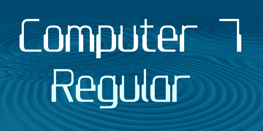
Computers in the 1980s had a unique styling for their typefaces. It wasn’t continued in later generations of computers (by default at least), but you can revisit the memories of the Apple IIe and Commodore 64 using Computer 7. Originally displayed in pixels, you get a lot more versatility out of Computer 7. This font is fantastic at creating headlines and large text displays that need to evoke retro computing, but because of its origins in actual computing for day-to-day use, you can very easily compose legible long-form documents in it. However, we suggest that you stick to more modern fonts for anything more than blocks of copy. Computer 7 can be downloaded for free for home use, but you will need to purchase a $24.95 license if you intend to use it commercially. It also comes with upper and lower-case characters, numbers, and symbols.
10. Science Project

Talk about a STEM font. One look at Science Project, and any viewer is taken back to high school science fairs with baking soda volcanoes, ant farms, homemade barometers, and precipitation jars. You won’t find the sleek lines or elegant kerning of some science fonts here. But you will find a hand-drawn font that can be used in nearly any project that needs to have a little more of an artistic or personal feel. Some science fonts can make a project feel sterile (on purpose). But Science Project goes the opposite way and evokes childhood and education in the best ways possible.
Wrapping Up
STEM is a broad field (well, multiple fields, actually). Finding the right science fonts for your clients or personal projects is important. Whether you need a clean and sleek font to display an up-and-coming research firm or a fundraiser for a high-school science club, we’re pretty sure that one of the 10 science fonts above will do the trick.
What kinds of projects do you use science and STEM fonts in?
Article featured image by pro500 / shutterstock.com


I believe we have to move forward to the new fonts as mentioned above. Conventional fonts are now outdated. I am not saying that the importance of those fonts have been downgraded but we have to update in regards of new fonts using in our website.
Roddenberry Bold and Roddenberry Italic look exactly the same in the sample.