The visual balance of a website has an instant (and usually instinctual) impact on the user’s experience. A balanced composition feels right and users tend to pick up on it right away. The use of symmetry and asymmetry are the basis of great visual balance.
Achieving symmetrical and asymmetrical balance in your web design is quite simple–in theory–but getting it right every time comes with practice. In this post we’ll take a look at principles of symmetry and asymmetry in design to get a better idea of how they work together to achieve visual balance.
Let’s get into it!
What is a Balanced Composition?
Visual balance makes people feel good when they see it. The difference between visual balance and visual imbalance is the feeling of comfort and contentment versus a feeling of aversion and discomfort. When something has a good visual balance, it instantly makes sense. It gives the sensation that nothing is out of place and that the composition is just as it’s supposed to be.
Symmetry and asymmetry are two design techniques which designers use to achieve visual balance in a composition. Symmetry and asymmetry are antonyms, therefore symmetric and asymmetric balance are the opposite of each other.
Let’s take a deeper look at the definition of each term.
What is Symmetry
Symmetry is a visual mathematical rule which states that if a line is drawn through the center of an image, both sides will be very similar if not identical. This line can be drawn horizontally, vertically or diagonally, therefore leading to horizontal symmetry, vertical symmetry, and diagonal symmetry. These three are considered as ‘reflectional symmetry’ because it’s like the image reflects itself.
Additionally, there are three other types of symmetry; radial, transrational and guide reflectional. You can use any of these four styles of symmetry to achieve a balanced composition.
Reflectional Symmetry
The most common type of symmetry is reflectional symmetry. The idea is that each side of the dividing line is almost identical to the other. For example, an apple cut in half or a butterfly with its wings open.
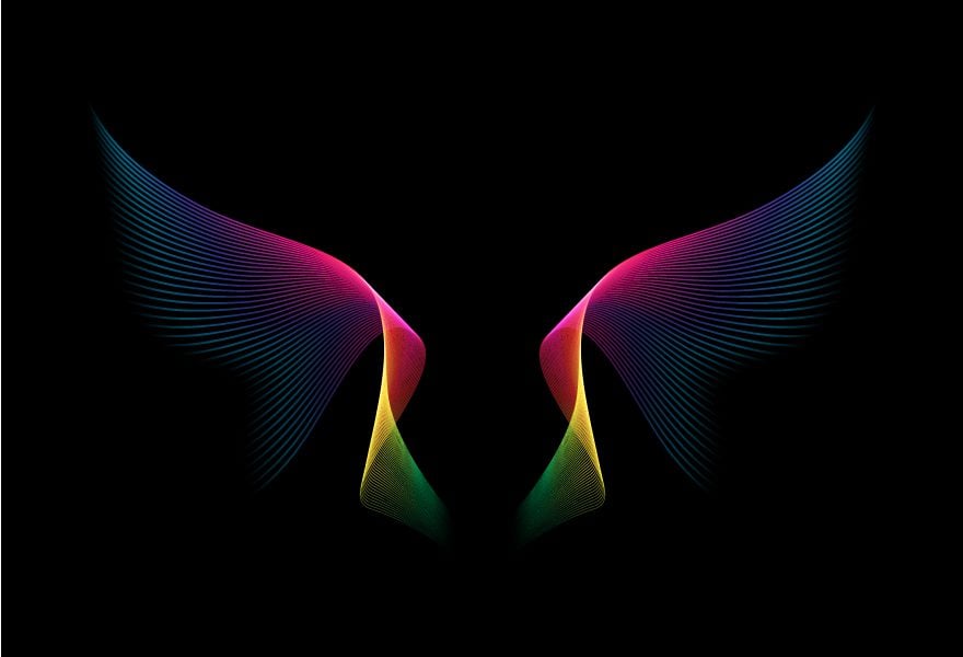
image via korkeng / shutterstock.com
Radial Symmetry
Radial symmetry repeats around a circular or radial shape. For example, mandalas and circular badges.
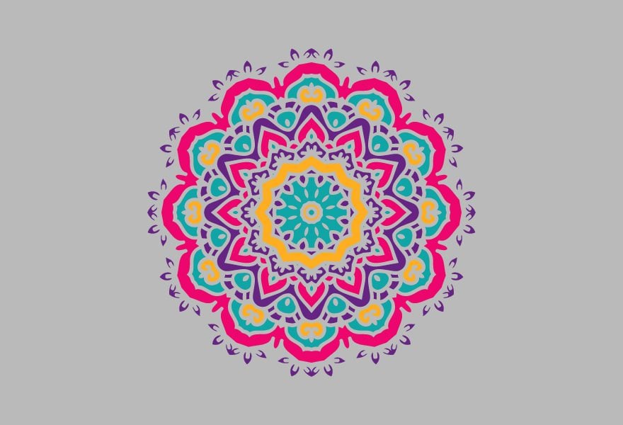
image via Devi108 / shutterstock.com
Translational Symmetry
Translational symmetry is when a shape is repeated over and over in a visual space. For example, a seamless pattern.
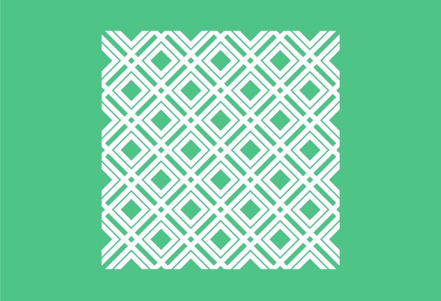
Image via andrykay / shutterstock.com
Guide Reflectional Symmetry
Guide reflectional symmetry is similar to reflectional symmetry but slid off on an axis. For example, footprints.
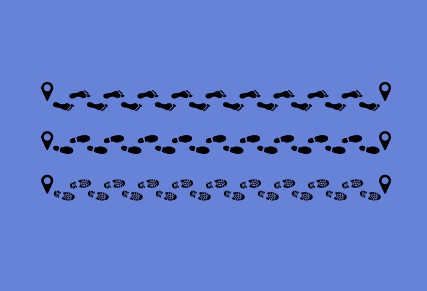
image via Mark Rademaker / shutterstock.com
What is Asymmetry
Asymmetry is essentially the opposite of symmetry. Visually, each side of the composition is different from the other. Unlike symmetry, which is a balanced visual technique from the start, asymmetry is harder to balance. The best way to understand how asymmetrical balance works is with the art of rock balancing. In the image below you can see a group of balancing rocks. The composition is not symmetric even though the rocks look perfectly balanced. Even if the sides aren’t equal to each other, the composition still evokes harmony and visual balance.

image via Vladnik / shutterstock.com
Due to how asymmetrical balance is harder to achieve, it’s also much more pleasant than a regular symmetrical balance. That’s why it’s not surprising that so many websites and magazines use asymmetrical layout to create a balanced composition.
Examples of Symmetric Balance in Web Design
Now we know what symmetry and asymmetry are, and how these techniques can help you achieve a visual balance. Let’s transport this knowledge to web design and look at some examples to inspire your own creations.
Polugar Russian Bread Wine
The landing for Polugar website uses reflectional symmetry to present their products in style. A bottle appears in the center and swirly shapes form on each side of it. Later, when you scroll, the symmetry expands as three bottles fill the screen and three blurbs at the bottom help you navigate. The product pages follow a symmetric grid with three columns and are very pleasing to the eye.

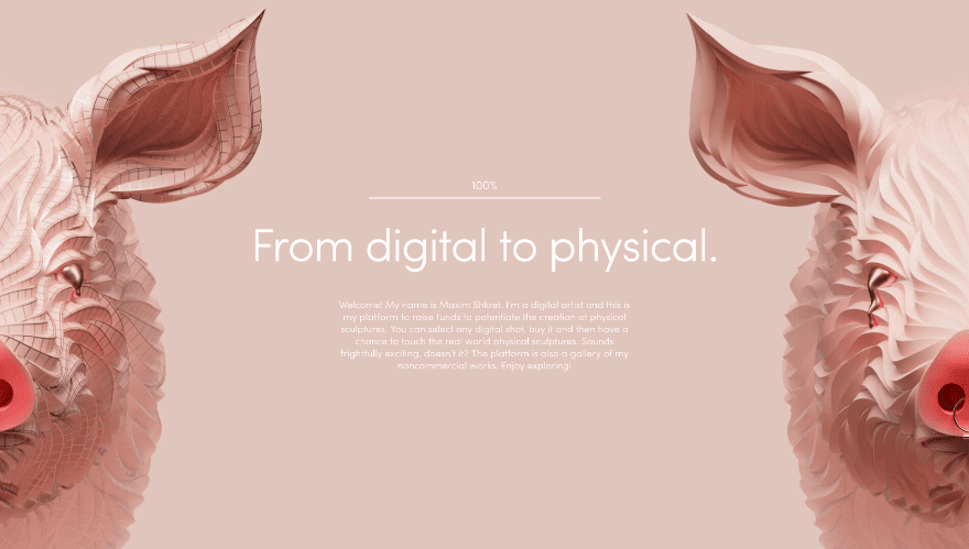
Max Shkret Artist Portfolio
This design portfolio website by Max Shkret also has reflectional symmetry in a slightly different way. The symmetry expands all the way to the edges. The rest of the website is symmetrical but not as perfect as the loading page.
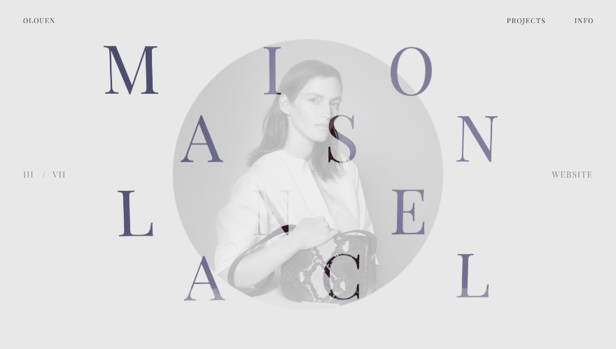
Olivier Ouendeno Web Design Portfolio
This portfolio website from designer Olivier Ouendeno is a great example of guide reflectional symmetry. It’s both horizontal and vertical, achieving a unique visual balance which almost looks like ordered chaos.
Examples of Asymmetric Balance in Web Design
Like I mentioned above, asymmetric balance is not as easy to achieve as symmetric balance. Nevertheless, when a web designer manages an asymmetric balance, the results are glorious. Let’s take a look at some examples of asymmetric balance in web design. These will definitely inspire your creative mind flow.
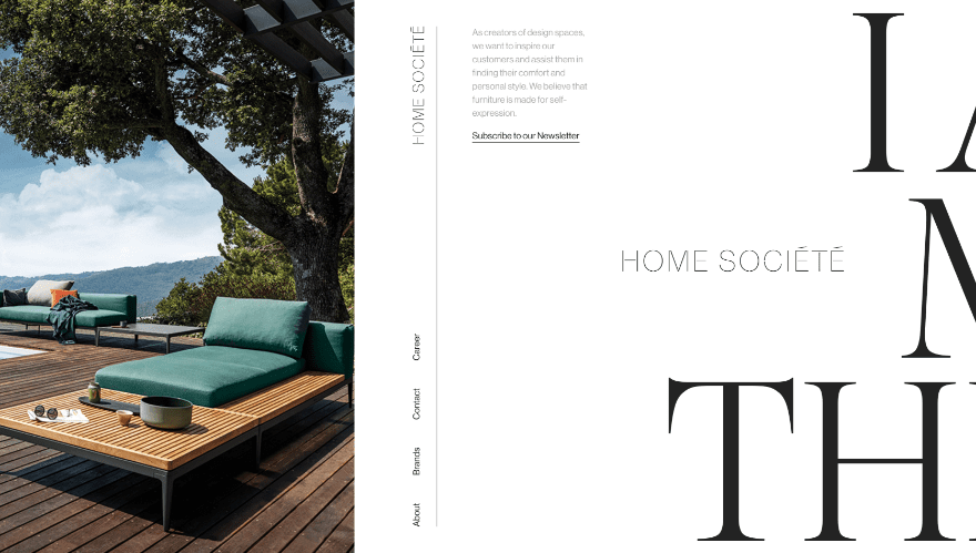
Home Sociētē Designer Website
When you first land on the Home Sociētē website, you are greeted by what looks like part of a magazine spread. A full-height image on the left frames a vertical menu. On the right are parts of a phrase is skinny serif type. This website looks pleasing at first sight but then when you use the horizontal scroll, it comes to life. The entire site has a flawless asymmetric balance throughout.
Headery CBD Oil
This site for Headery CBD Oil might look symmetric at first glance, but it’s actually the most subtle asymmetric balance possible. The product title is centered on the screen creating an initial symmetry but the dropper bottles are on the left. This leaves more empty space on the right. Curiously, the yellow chat button is what creates the balance.

Adjuvant Capital Website
The website for Adjuvant Capital uses a diagonal asymmetric balance which looks even better when the screen is smaller. The triangle to the right is a video and it balances out the block of text on the top left.

Divi Layouts With Symmetrical and Asymmetrical Balance
What do you think? Which technique is better for a visual balance, symmetric or asymmetric? I think both are pretty amazing. After looking at some inspiration, you must want to try out these visual balance techniques yourself. Thankfully, the Divi library has plenty of layouts to get you started.
Let’s take a look.
Cryptocurrency Layout – Symmetrical Balance
The Cryptocurrency Consulting layout has a nice reflective symmetric balance. The white button on the right stands out really well over the blue background because it forces a visual asymmetry to the overall symmetry.

Okape Juice Shop – Symmetrical Balance
Another beautifully symmetric layout from Divi is the Okape Juice Shop layout. Three bottles are centered on the screen to create the main symmetry. The rest of the layout maintains a subtle guide reflectional symmetry.

Chiropractic Services – Asymmetrical Balance
The new Chiropractic layout has a beautiful asymmetric balance. It has a large image on the left and an orange button on the right which balances out with the orange image box-shadow. Each section of the layout is set up with an asymmetric balance but when you scroll the entire thing it also feels like guide reflectional symmetry.

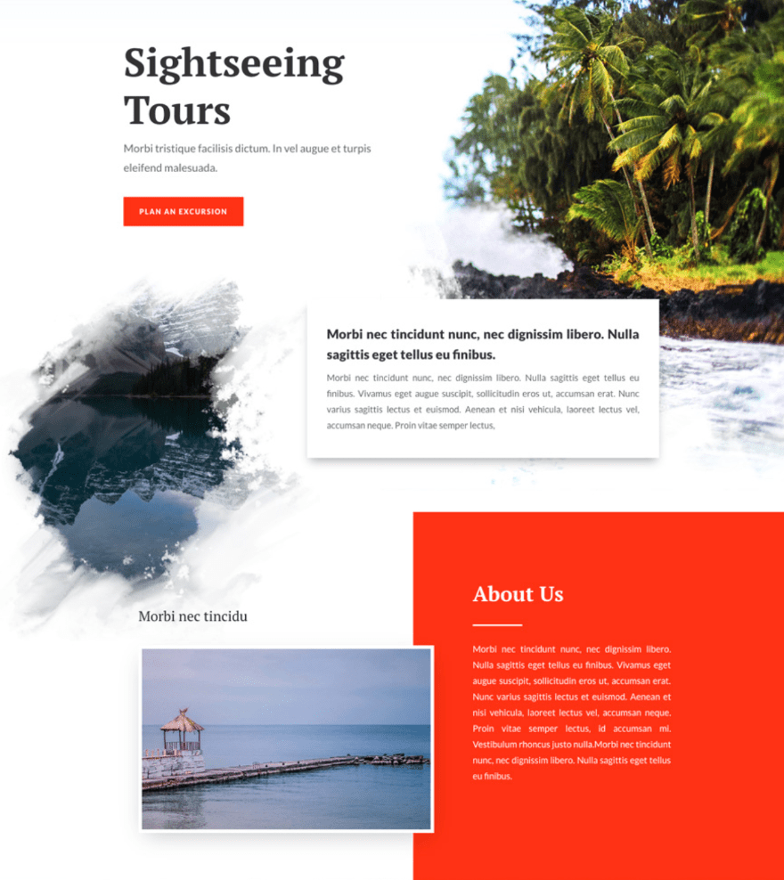
Sightseeing Tours – Asymmetrical Balance
This layout for Sightseeing Tours is the type of asymmetrical balance which looks like beautiful chaos. The visual balance is appealing due to the straight lines of the boxes intertwined with the blurry and choppy edges of the photos.
Your Turn to Design With Visual Balance
With all this visual inspiration, it’s your turn to apply symmetry and asymmetry to your designs. Remember the rules of symmetry and asymmetry and how a balanced composition can be achieved. Make sure your users want to stay on your site and navigate it with these techniques.
Featured Image via Flat art / shutterstock.com



Leave A Reply