
We’ve all been there…
A website you are designing looks great on your laptop, phone and tablet. But then someone shows you a screenshot of what the site looks like on their device and you just want to cry. What probably happened is that they are on a screen with a breaking point that you didn’t test your design for.
Responsive design is a no-brainer at this point in time. Your designs need to look right on any screen. If you’re a Divi users, you’ve already got a suite of practical tools to help you design responsively. Nevertheless, it’s always a good idea to check on the most viewports possible. Your best bet is to have one window with the Divi Builder and another with a responsive tool that you can refresh regularly.
Some people prefer to design “mobile-first”, others do it simultaneously and others design desktop first and then adjust for smaller screens. No matter your process, you need to have the right tools to check just how responsive your site is.
That’s why we’ve put together this list with some of the most practical responsive website design testing tools and sites. Try them out and see which one you are most comfortable with.
Let’s dive in.
Subscribe To Our Youtube Channel
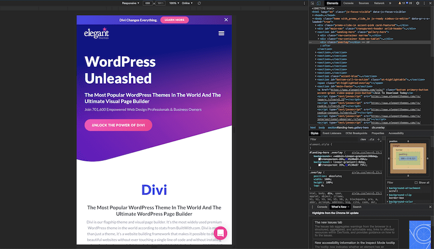
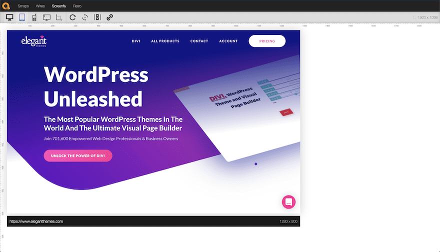
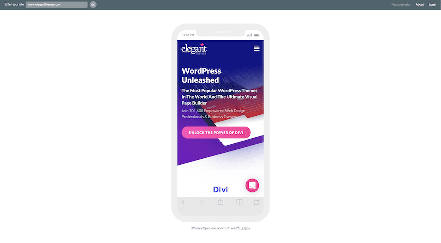
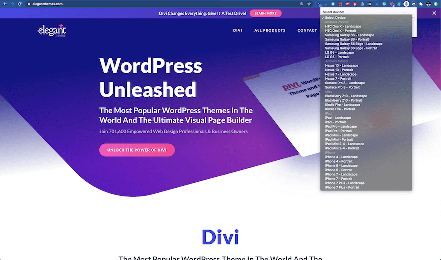
Inspect Tool on Chrome
The first responsive testing tool on the list is right inside your Chrome browser. The same tool you use to inspect a site’s code also has a feature to test screen sizes and viewports. Right-click on any website and click ‘Inspect’. Once the inspect window opens, you’ll see the icon for devices next to the button named ‘Elements.’ When you click on the devices button, your screen shows the website you’re on at different breakpoints.
You can input a specific size or simply grab and drag the corner of the window to change the breakpoint manually. This is great for checking how your design is adapting to the different viewports.
Responsive Test Tool
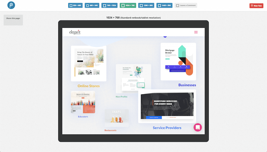
Responsive Test Tool is like most responsive testing websites, you can input the URL of the page you want to test into a search bar on the top of the screen. This particular tool has a long list of preset device sizes to choose from. If you need another size, you can choose the custom size measurements. When you want to check a change in the design, simply click on the ‘Check’ button to reload. There’s a button to toggle scrolling capabilities in the testing window and a ‘rotate’ button to check both vertical and horizontal layouts.
The developer behind this tool also created a grid system for responsive websites. You’ll find it in the lightbulb icon to the top right.
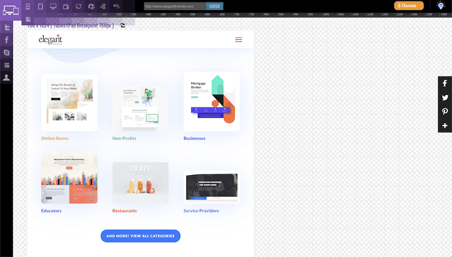
Responsive Design Checker
Responsive Design Checker is a site with a number of preset screen sizes and a custom size option. What this tool is missing in comparison to the tool above is the numbered ruler at the top of the screen and a rotate button. What it has in common is that the ‘Go’ button works in the same way, simply click it when you’ve made a change in the design and want to check the results.
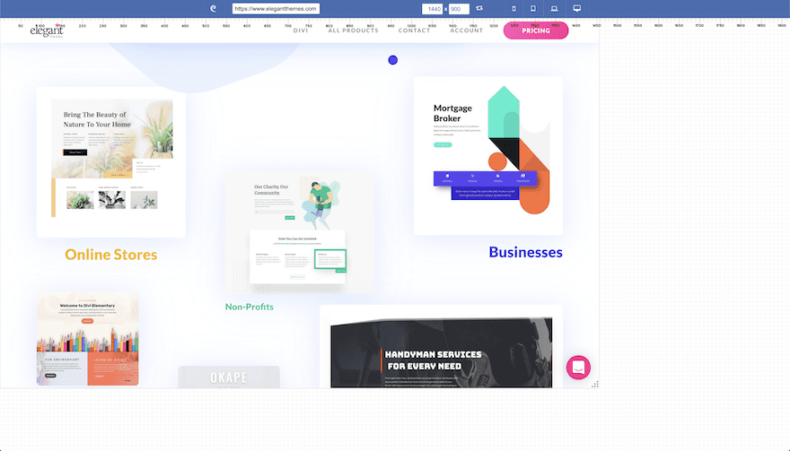
Design Modo
Design Modo is a website and email builder with a free responsive test tool as part of their site. This tool has all the things that the two above tools have plus a dragging button to see how the design changes as the viewport shrinks and expands. Of course, it also works as an ad and lead generation device for their main services. The only setback is that the measurements the tool shows are by resolution, not by the viewport. This can get a little confusing.
ScreenFly
Screenfly is another website with the same responsive testing features as the examples above, but the presets are a bit outdated. The last iPhone preset is the 7X. Nevertheless, the tool still works fine and has a custom size feature, rotate and refresh buttons and a scrolling toggle.
Responsinator
Responsinator is still one of the most popular responsive web design testing apps, probably because it looks so cool. When you add a URL, it shows the site in a number of different mobile devices in both vertical and horizontal layouts. This tool is practical for quick checks in the most common devices but it’s limited if you want to check all breakpoints.
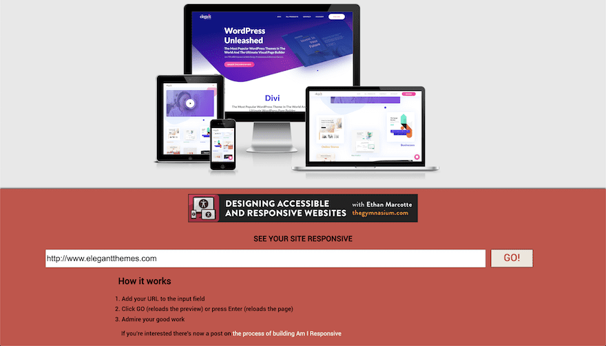
Am I Responsive
Am I Responsive is similar to Responsinator in that it shows the test site in a set number of devices. The upside for this tool is that you can screenshot the results and use it for your portfolio. Also, each screen is scrollable independently.
Pixeltuner
Pixeltuner is a site similar to Responsinator. The tool shows only 6 screen sizes but they are a good selection. With these six sizes, you can be pretty sure that you’ve covered all the bases. The only ones missing are the larger screen sizes above 1500 pixels.
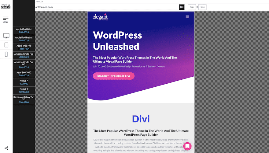
Responsive Web Design Tester
Responsive Web Design Tester isn’t a website, it’s a browser extension. You’ll find it in your browser’s extension or add-on library. The link below is for the Chrome extension but the tool works for Safari and Firefox as well. When you click on the extension icon you can choose from a list of presets and then the site opens in a new window at the viewport size you selected. The presets are a bit outdated but you’re able to add new devices and create your own preferred groups.
Wrapping Up Our List Responsive Design Testing Tools and Sites
When you design with Divi, you have the choice to adjust your layouts for desktop, tablet and phone screens. The options within Divi are super practical and can help get your layout looking perfect for any screen size. But it’s always in your best interest to use an extra tool that supports your responsive Divi designs.
Which tool do you use? Did we mention it here? We chose the tools on this list because they are all practical and easy to use. Some are better than others and the one you need depends on how complex your design is. Try them out until you find your favorite and let us know which one it is.
Featured Image via aurielaki / shutterstock.com


Leave A Reply