Since 2000, color experts at Pantone have annually chosen a Color of the Year. Their choice predicts trends in design and exemplifies the spirit of the upcoming year. Finding ways to incorporate it into your own web design could give your site a facelift for 2019.
In this article, we’ll discuss the 2019 Pantone Color of the Year, Living Coral. We’ll also share how it’s being used in web design to give you some ideas on how you could also employ it for your own designs.
Let’s take a look!
An Introduction to the 2019 Pantone Color of the Year: Living Coral
Pantone is a company offering color-related consulting services and products to fashion, product, and graphic designers. The company is considered “a leading source of color information through seasonal forecast trends”. It’s safe to say that Pantone’s opinion is an important one when it comes to color.
For the past twenty years, color experts at Pantone have selected a Color of the Year. 2018’s color was Ultra Violet, a striking choice after the more subtle tones selected across the preceding years. The Color of the Year is meant to not only predict design trends, but also draws upon the current social and cultural influences.

For 2019, Pantone has selected Living Coral, a bright and vibrant hue that gives off a lively air. The color speaks to our desire for authentic human connection in an age dominated by social media and technology. “Humanizing” and “spirited,” it lends energy and warmth to design.
How to Use Living Coral in Web Design (4 Key Strategies)
Living Coral already has a presence in web design. In the right hands, this “lighthearted” shade can pack a punch and make a bold statement alongside strong web design. Let’s see how you can leverage it.
1. Add Living Coral to Minimalist Design for a Pop of Color
For some, minimalist design brings to mind a black-and-white palette. On the contrary, utilizing a few colors to their maximum efficiency speaks more to the spirit of minimalism than affecting the design quality with a very narrow color scheme.
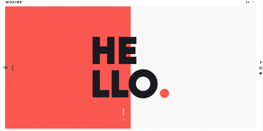
Using color in minimalism is about doing so to its fullest. Wokine’s home page shows how Living Coral can add a pop of color and a sense of surprise to an otherwise straightforward design. The site is still minimalist in its use of clean lines, space, and simplicity, but the use of color brings some excitement to the page.
If your site doesn’t have much color, consider adding a splash of Living Coral to brighten things up. Whether you incorporate it as boldly as our example or feature it in a more subtle way, this warm and inviting color can take your page from dreary to dreamy.
2. Feature Living Coral in Your Color Scheme
Using a color scheme creates consistency across your website and your brand, helps users determine content hierarchies, and can point out features such as a Call to Action (CTA). Plus, incorporating a variety of colors that work well together is just visually pleasing.

The Girlboss website uses a fun and youthful color scheme with a variety of pinks, greens, and blues. They’ve assigned a different color to each blog content category, so users familiar with the color scheme can quickly take in information about each article just by looking at the post tiles.
There are nearly infinite ways to incorporate Living Coral into a color scheme for your site. You could use one of the color schemes Pantone suggests, or create your own. Living Coral may have a large role in your color scheme, or a small one.
Regardless, this color tends to play well with others. It creates striking contrast when used with blues, evokes a sunset when placed alongside yellows and oranges, and has an earthy and natural feel when paired with greens or browns.
3. Let Living Coral Take Center Stage and Make a Statement
Of course, while using Living Coral in more subtle ways has its benefits, there’s nothing wrong with wowing users by giving it center stage. Featuring this color in your backgrounds would leave your site’s visitors with a strong impression.
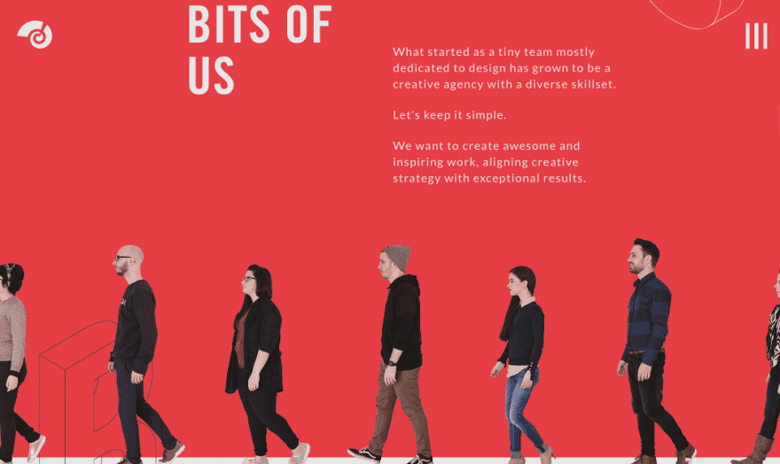
Living Coral creates a bold background for the About section of Kobu’s site. It’s striking, without overwhelming the team member photos at the bottom. Even though the color takes up most of the screen, it isn’t hard to look at and still gets across the most important information.
Theories of color psychology suggest that certain colors evoke particular feelings in us when we look at them. Likewise, Pantone’s description of Living Coral speaks a lot to how this color is tied to emotion.
Pantone’s color experts chose words like “authentic”, “sociable”, “engaging”, and “nurturing” to describe their Color of the Year. Using Living Coral in an About section to promote feelings of intimacy, authenticity, and openness could work in this site’s – or your site’s – favor.
4. Use Living Coral as an Accent Color to Point Out Important Features
Accent colors are key to any color scheme. Their role is to highlight features you want your users to pay attention to, such as a CTA, social media buttons, or links. Without an accent color, these features can sometimes get lost in the design of the rest of the site.
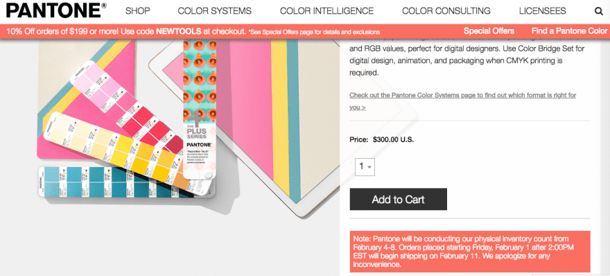
Pantone has chosen to go this direction themselves. They’ve used Living Coral to highlight the deal below the menu and a notice about their shipping availability. These features draw the eye and are sure not to go unnoticed, driving sales and informing shoppers of things they need to know.
If you want to draw special attention to an area of your site, whether it’s an announcement, a purchase button, or something else, choosing an accent color will help. Using it against a neutral background as Pantone has works well. You could also try pairing your accent with a contrasting color for a stronger kick.
Conclusion
Keeping advice from leading design experts is never a bad idea. With the insight and authority on color Pantone provides, using their 2019 Color of the Year in your web design could prove to be an advantageous detail.
In this article, we’ve explored Living Coral, the Pantone Color of the Year for 2019. We also looked at some examples of how it’s being used in web design, and discussed how you could implement these strategies for yourself:
- Add Living Coral to minimalist design for a pop of color.
- Feature Living Coral in a color scheme.
- Let Living Coral take center stage.
- Use Living Coral as an accent color to point out important features .
Do you have questions about about using the Pantone Color of the Year in your web design? Let us know in the comments section below!
Article thumbnail image: berry2046 / shutterstock.com.




Great color selection, although I think you missed out on turquoise which I have seen plenty of this year.
Excellent article.
While I sincerely respect the work and the thought you put into this, I have to say that not only will I never use this color, I would never put myself through the misery of browsing any site that used this color. I find it terribly offensive and can only be grateful that everyone is graciously allowed their own opinion and preferences.
To be honest, I would love to see 2019 be the year that all new websites allowed the user to define a base color or two colors of their own preference (from a Pantone Chart if that’s who is funding it). Then, the color of the year would reflect what the users chose, not what developers making design decisions out of turn have chosen.
Thanks again for your great article, I hope you aren’t offended by my comment, I honestly respect you and don’t mean to be rude.
Those are the good theme with fabulously color
We think so too, Cris!
I love using colors!!!
I need to be using more more bold colors in 2019.
Hopefully this article gives you some momentum. 🙂
like you
I used this color as the theme color of my WordCamp US 2018 talk
Morten, you are perpetually ahead of the curve, so I totally believe this.
What odds can you give us on 2020s’ Color of the Year, or should we wait until WordCamp US?
Excellent Sir giving your post the same information
Thanks, Mukul. 🙂
Colors are the ones that give life to the web. Thanks
They do indeed!
How about going the opposite way with:
Dead Coral Color of the Year 2043
I like this idea Richard. 😀