

A client hands you a logo, maybe a short brand guide, and a few approved hex codes. You open Divi 5, start building in the Visual Builder, and quickly realize the issue is not the layout. It is color variation.
A brand color on its own is rarely enough for a full website. You need lighter versions for backgrounds, darker versions for hover states, muted versions for borders, and transparent versions for overlays or shadows. Guessing those values by eye can make the design feel inconsistent fast.
Design Variables let you store reusable colors in Divi 5, but the Color Scale Generator inside Divi 5’s Variable Generator helps you create the supporting colors first. Starting from one source color, it can generate tints, shades, tones, and transparencies that stay relative to the original brand value using relative HSL filters.
This walkthrough covers that exact workflow: taking the brand colors you already have and turning each one into a usable Color Scale in Divi 5.
If you are starting from a single color and still need to create the broader palette around it, read starting from a single color and still need to create our tutorial on how to turn one brand color into an entire Divi 5 color palette first.
When The Full Palette Generator Isn’t The Right Starting Point
Divi 5 includes a broader palette generator for a different situation: when you are starting from one color and need to create a full set of primary, secondary, and accent colors, each with its own supporting variations.
That workflow is useful for greenfield projects where the brand palette is still being defined as part of the website build.
This tutorial is for the opposite situation. The client’s brand colors already exist. You do not need to generate new base colors or rethink the palette. You need lighter, darker, muted, and transparent variations of the exact colors you were given.
That is what the Color Scale Generator is for.
The same Variable Generator panel also includes Color Harmony, which can help if the client’s palette is missing a functional color you still need, such as a success, warning, or notice color. But when the source colors are already locked in, skip Color Harmony and start with Color Scales.
Opening The Color Scale Generator
Open the Variable Generator from the Design Variable Manager in the persistent left sidebar. Then use the Variable Type dropdown and choose Color Scales.
Once Color Scales is selected, click the generator icon to open the Color Scale Generator.
Two fields drive everything else on the panel: Source Color and Color Prefix.
Source Color is the exact brand color you were handed. Paste in the hex value from the client’s style guide, logo file, or an existing Color Variable already saved on the site. Every shade, tint, tone, and transparency generated afterward is calculated relative to this value.
Color Prefix labels the entire family of variables created from that color. Divi can default to the hex code, but a role-based name is much easier to use later. Names like primary-, secondary-, accent-, or brand-blue- make the variable list easier to scan inside the builder.
Tints, Shades, Tones, And Transparencies
The Color Scale Generator creates four types of variations from one source color. Each one has a different job in a real website design.
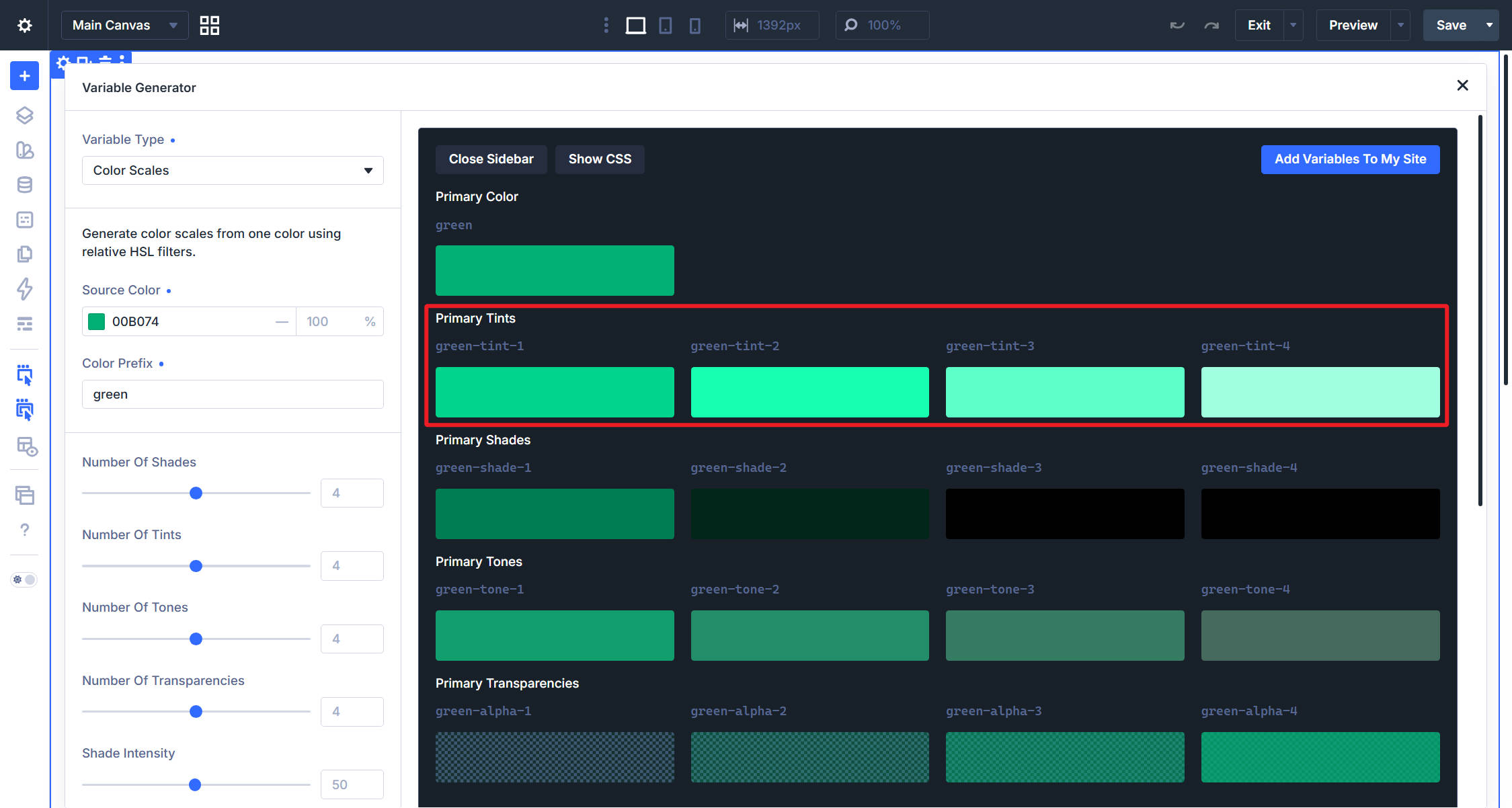
Tints are lighter versions of the source color. Use them for backgrounds, cards, callouts, badges, and areas where you want a subtle hint of the brand color without making the section feel too heavy.
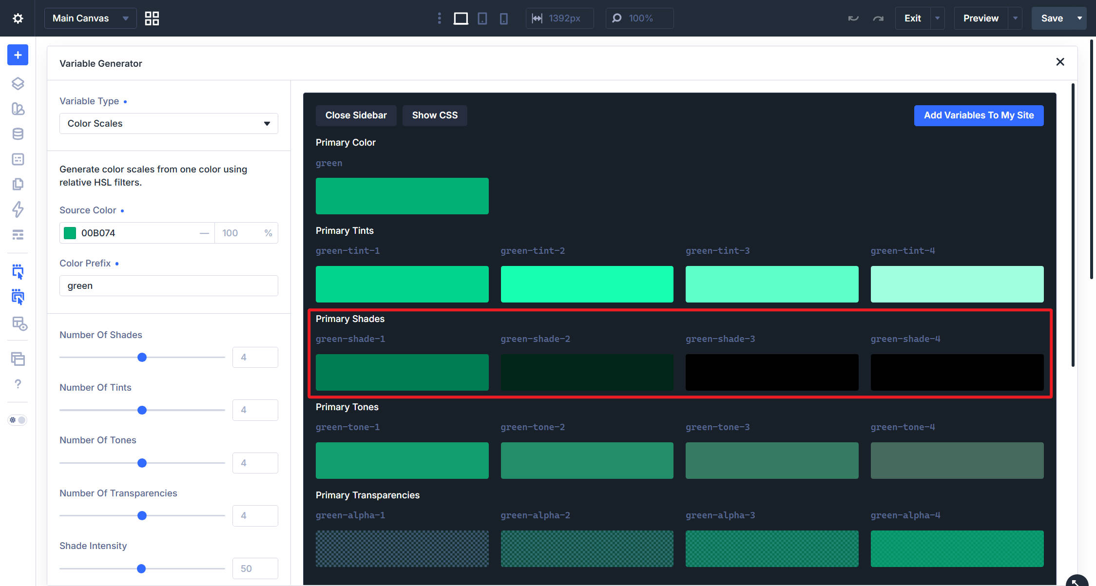
Shades are darker versions of the source color. They are useful for hover states, active states, darker buttons, emphasized links, and text that needs more contrast against a lighter color from the same scale.
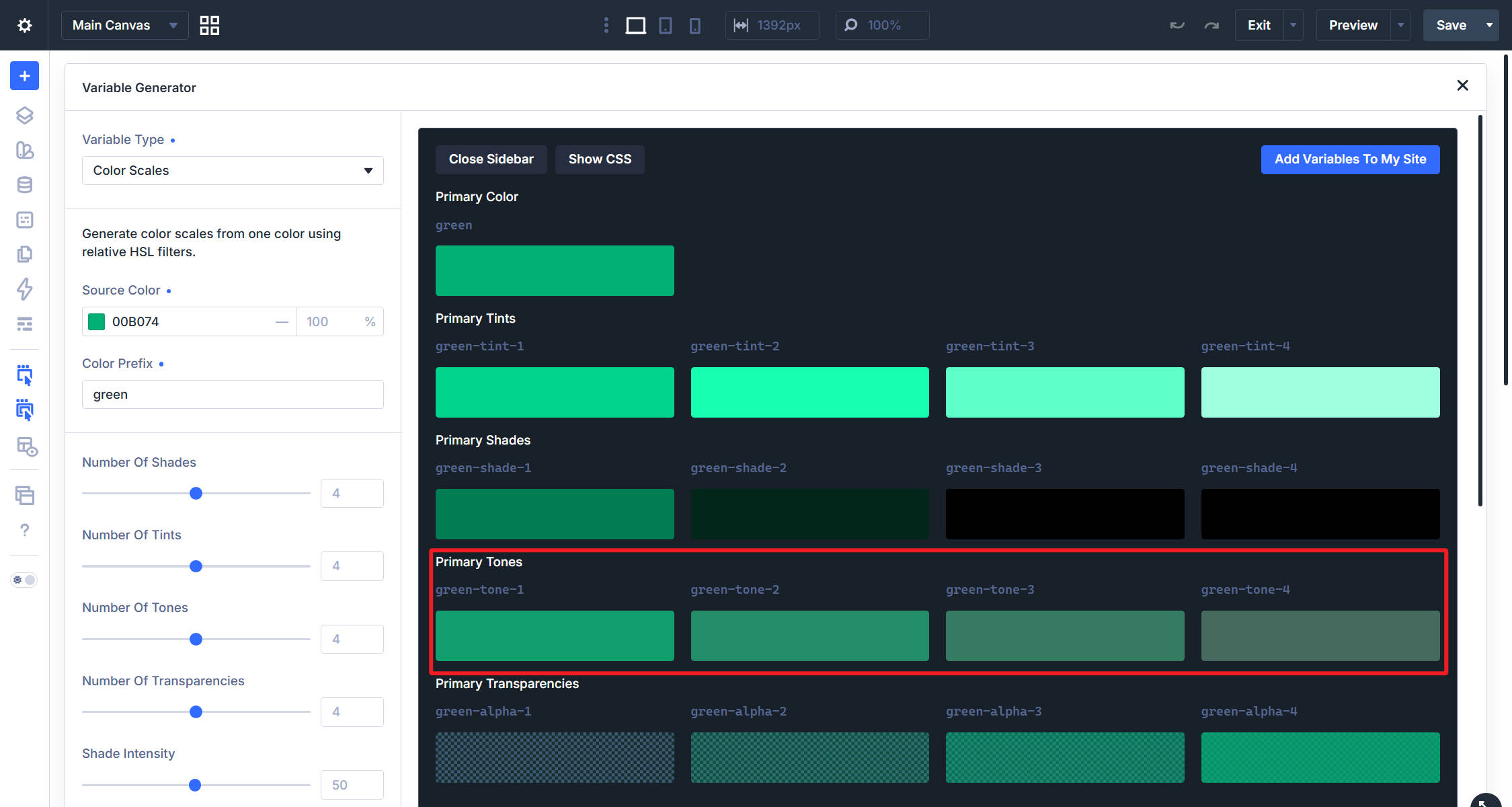
Tones are muted, desaturated versions of the source color. They work well for borders, dividers, secondary text, form outlines, and UI details that should feel related to the brand without competing with the main color.
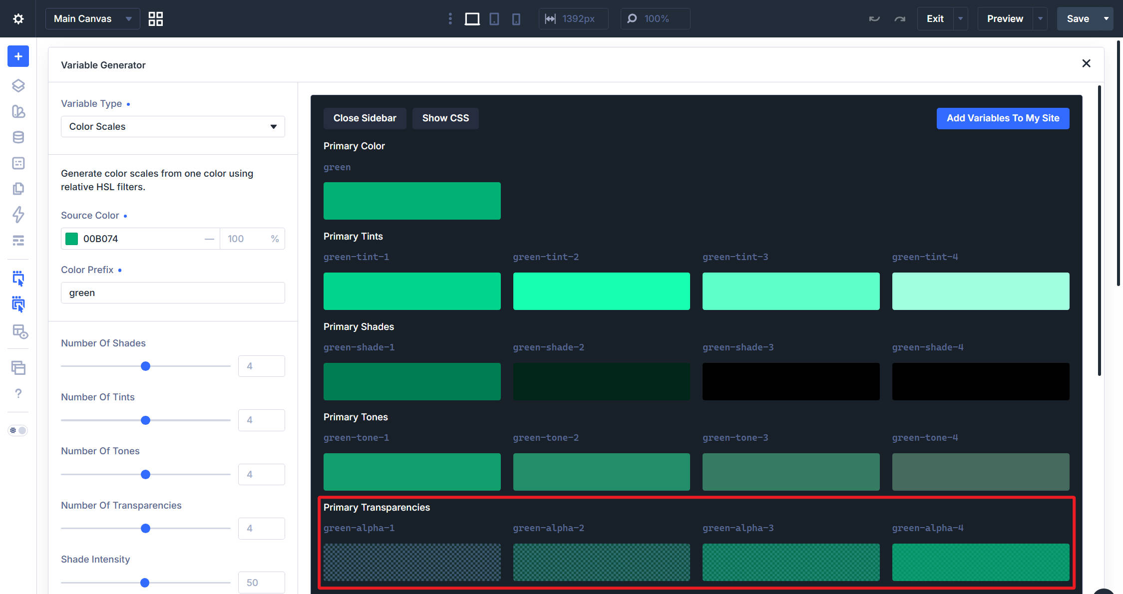
Transparencies are alpha variants of the source color at different opacity levels. Use them for overlays, image scrims, shadows, glows, and layered background effects that should pick up the brand color instead of using flat black or white.
Setting The Count And The Intensity
For each of the four variation types, two controls shape the final scale: count and intensity.
Number Of Tints, Number Of Shades, Number Of Tones, and Number Of Transparencies set how many steps Divi creates in each progression.
Four is a practical starting point for most builds. It gives you enough range for backgrounds, hover states, borders, and overlays without creating a long list of variables you may never use.
Tint Intensity, Shade Intensity, Tone Intensity, and Alpha Intensity control how far each progression moves away from the source color.
If the intensity is too low, the generated colors may look almost identical. If it is too high, the scale may jump too quickly to near-white, near-black, or very muted values. The useful range usually sits in the middle, where each step is visibly different but still connected to the source color.
Lower-numbered steps in the tint, shade, and tone progressions sit closest to the source color. Higher-numbered steps move further away from it. That means the highest tint is the lightest, the highest shade is the darkest, and the highest tone is the most muted.
Count and intensity work together. Count controls how many steps exist. Intensity controls how far the full progression stretches. More steps with the same intensity create smaller jumps between colors. Fewer steps create larger jumps.
Transparencies follow the opposite convention: the lowest-numbered alpha step is the most transparent, while the highest-numbered step approaches full opacity.
Naming Each Variation
Below the count and intensity controls, four more fields control the naming for each variation type: Tints Prefix, Shades Prefix, Tones Prefix, and Alpha Suffix.
Divi defaults these to labels like tint-, shade-, tone-, and alpha-. Those defaults work well, but you can rename them to match your team’s language. For example, you might use light-, dark-, neutral-, and transparent-.
The important part is consistency. If you generate scales for a primary, secondary, and accent color, use the same naming pattern for each one.
Combined with the Color Prefix field, the final variable name follows a predictable pattern:
Color Prefix + Variation Type + Step Number
For example, a primary color set to generate four tints creates primary-tint-1 through primary-tint-4. An accent color set to generate four transparencies creates accent-alpha-1 through accent-alpha-4.
Checking The Result Before Committing To It
The right side of the Color Scale Generator shows a live preview of every variation before you add it to the site. Each row shows the variable name it will create, along with a swatch that updates as you adjust the source color, count, intensity, and naming fields.
Use this preview to check whether the scale is useful before committing it to the Design Variable Manager. The tints should be light enough to use as backgrounds. The shades should be dark enough for hover states or contrast. The tones should feel muted but still related to the source color. The transparencies should give you enough range for overlays and shadows.
Show CSS reveals the CSS behind each generated variation, including the relative HSL values and calculations. This is useful as a reference, but it is not a required workflow step. Divi handles the calculations for you, so you do not need to copy, edit, or maintain that CSS by hand.
Adding The Variables To Your Site
When the preview looks right, click Add Variables To My Site.
Divi writes every variation currently shown in the preview into the Design Variable Manager, using the Color Prefix and naming pattern you defined. The new variables are then available throughout the Visual Builder.
Repeat the process for every brand color the client provided.
A typical handoff might include a primary color, a secondary color, and an accent color. Run each one through the Color Scale Generator separately and give each color family its own prefix. That keeps the generated variables organized by source color.
Using The Generated Colors In Your Designs
Once the Color Scale variables exist in the Design Variable Manager, they appear in color-enabled fields across the Visual Builder.
Open a Background Color, Text Color, Border Color, Box Shadow Color, or button color field, and select the generated color from the variable picker instead of typing a new hex value.
For example, a button can use the source primary color at rest and switch to primary-shade-3 on hover. A card can use primary-tint-1 as its background and primary-tone-2 for its border. A hero image can use primary-alpha-2 as an overlay.
These variables also work inside Option Groups and Element Presets. That means a border, shadow, background, or hover treatment built from a generated Color Scale variable can be saved once and reused across the site instead of rebuilt by hand.
A few places these variations are especially useful:
- Hover and active states: Use a darker shade for buttons, links, tabs, or interactive cards.
- Soft backgrounds: Use tints for cards, callouts, pricing blocks, and feature sections.
- Box shadows: Use a transparency variant of the brand color instead of defaulting to black.
- Overlays and scrims: Use alpha variants over images or video backgrounds to keep text readable.
- Borders and dividers: Use tones when you want separation without using full-strength brand color.
- Disabled or inactive states: Use muted tones to communicate reduced emphasis while staying inside the brand palette.
Turn Brand Colors Into Usable Color Scales
Brand colors handed down from a client do not always include the supporting range a real website needs. You may have the approved source colors, but you still need lighter backgrounds, darker hover states, muted borders, branded transparencies, and subtle UI details.
The Color Scale Generator solves that exact problem. It starts from the approved brand color, generates tints, shades, tones, and transparencies, previews the full scale, and stores the result as Design Variables ready to use across Divi 5.
Instead of guessing supporting hex values by eye, you get a structured Color Scale that stays tied to the source color and remains easier to reuse across the whole site.












Leave A Reply