
Responsive web design was first introduced to us by Ethan Marcotte in a 2010 post published on A List Apart entitled (as you might expect) Responsive Web Design.
In the very same year – in fact, just a few weeks earlier – the iPad became the first of the current wave of mobile tablet devices to be released to the public, changing the way we surf the web and communicate with each other forever.
Since then, responsive design has slowly become more widespread.
But for the vast majority of people using the web, the term means nothing. They just want websites to render properly on their device. They don’t want to click on tiny hyperlinks that may or may not take them to the page they wanted, and they certainly don’t want to wait while a page rammed with resource-heavy code and imagery takes way too long to download.
They want zippy, fast-loading pages that are easy to use, which is what you should get from responsive design.
And that, in a nutshell, is why you’re reading this. In this post we’re going to help you turn the should into will.
Mobile Responsiveness is Now a Ranking Factor
What’s brought everything to a head is Google’s announcement several months ago that the user-friendliness of sites on mobile devices will become a ranking factor.
Google made the announcement in February:
Starting April 21, we will be expanding our use of mobile-friendliness as a ranking signal. This change will affect mobile searches in all languages worldwide and will have a significant impact in our search results. Consequently, users will find it easier to get relevant, high quality search results that are optimized for their devices.
Despite this, April 21 came and went, and nothing much really happened. At least not yet. But you can guarantee that it’s only a matter of time.
The update is dubbed Mobilegeddon in SEO and online marketing circles. It’s also a big deal for businesses; in fact, it’s such an important update that it made the news in the US and the UK.
In today’s post I want to look at ways you can test your site – or your clients’ – to see if they’re effectively mobile responsive or not. And if they’re not, we’ll cover what you can do about it.
What Is Good Responsive Design?

Responsive design adapts fluidly to all screen sizes and resolutions
Quite simply, the goal of responsive design is to provide every user, no matter what device they’re using, with a consistently usable browsing experience.
In more specific terms, this means that all functions should work and behave the same way on each device. On your typical blog this could be everything from social sharing buttons, to mailing list sign-up forms, to navigation menus. Furthermore, content should be easily digestible, no matter what device the end user is browsing on.
Typically, there are four screen types:
- desktop,
- laptop,
- tablet, and
- smartphone.
The exact dimensions for each varies wildly across manufacturers. Your site should look the same on each variant. Figuring that out sounds like fun, right?
Do You Need a Responsive Website?
Quick answer: You certainly will do in the future. There’s no doubt at that. But do you need one now? Another quick answer: Almost certainly.
If you don’t spend much time looking at the data in Google Analytics, it’s a good time to remedy that – especially with regards to people visiting your site on a mobile device. From the data you can find out how many people visit your site using a mobile device. You can also discover how long they stick around and what kind of experience they’re having.
Depending upon how you’ve setup Analytics, you can also discover how many people using a mobile device convert to customers, join your mailing list or sign up for a free trial of your service or software.
To view the data, login to your Google Analytics account, select the site you want to review and navigate to Audience > Mobile > Overview.
Here you will see analytics for desktops, mobiles and tablets.
If your site is non-responsive, check out the data relating to how people interact with your site:
- Bounce Rate
- Pages/Session
- Avg Session Duration
- Goal Conversion Rate
If the numbers are significantly lower than the desktop stats, you have a serious issue on your hands. The data is telling you the people on mobiles and tablets are not having a good experience when they visit your site.
Which means that it’s time to do something.
Testing Your Site for Mobile Responsiveness
If you’re not that your site is mobile responsive, the first thing you must do is run a few tests. Thankfully, there are a lot of tools online that can help you to assess how a site looks and works on mobile devices.
We’ll come to some of those in a few seconds. But for now though, let’s perform the simplest tests of all.
If you’re on a desktop machine, go to the site you want to test, let it load, then make your browser screen narrower. As you do this, if the site has a responsive design, the elements from the web page will collapse down on top of each other, but you will still be able to see the whole page by virtue of scrolling.
If you’re using a mobile device, simply visit the site you want to test and see how it renders on your machine. If it looks like exactly the same as the desktop version but shrunk down, your site is not responsive.
How to Test Multiple Devices Using Online Emulators
It’s all very well running these two simple tests, but what about the plethora of machines out there? From iPads to Google Nexus’ to Samsung Galaxy smartphones? How does your site look on these?
Luckily, you don’t have to go out and spend a small fortune on every device on the market. Instead, use one of the emulator sites available to run your tests.
Let’s take a look at some of them.
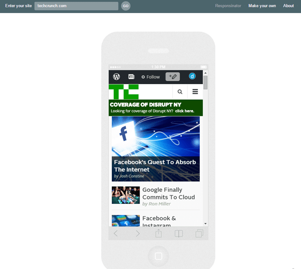
MobileTest.me
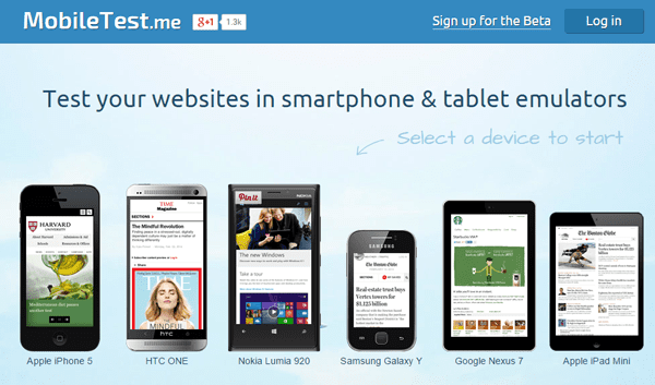
This one tests your site across six popular mobile device emulators, including the iPhone 5, HTC ONE and Google Nexus.
To test a site, click on the device you’re interested in and enter the URL of the site/page you want to test. Within a few seconds the emulator retrieves the page on the device. Not only that, the page links and other data remains active, so you can browse the site via the emulator.
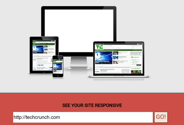
Responsinator
A nifty emulator that mostly focuses mainly on Apple devices, but also includes a couple of Android machines. Instead of having to test each device in turn, like the MobileTest.me, you just enter the test URL and scroll down the page.
As you do, you’ll see how it looks on popular devices in both portrait and landscape mode.
Am I Responsive
Same process here: enter the test URL to get the results. This time, you don’t scroll; you’ll see the results at the top of the screen for generic devices. If you click inside the screen of each one, you can scroll and use the site as normal.
Google’s Mobile Friendly Test
There’s one more worth mentioning: Google’s own tool.
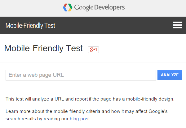
Use Google’s Mobile-Friendly Test.
What Next?
By this time you have an understanding of the importance of responsive design and know what your site looks like across multiple devices. But do you need to take action?
If your site works across all devices, you don’t need to do anything; just keep on working on improving your site for your current and future visitors.
If your site doesn’t work, you have three options:
- Convert the current design to responsive. This could well be more trouble than its worth.
- Use a mobile theme. This defeats the key responsive design principles of consistency and usability.
- Adopt a fresh mobile-responsive theme or design. While not the cheapest option, starting from scratch is arguably the only option that doesn’t represent a compromise of some kind.
Incidentally, it would be remiss of me not to mention that we make beautiful responsive themes, with no less than 21 to choose from.
Once you have the new theme installed, it’s time to test it. Here are three key considerations to bear in mind:
- Is it easy for users to navigate your site?
- Is the content easy to read?
- Is it easy for users to follow your Calls to Action?
Go through every part of your site as if you’re a user and fix any problems you find. If you’re using one of our themes and have come across an issue, just get in touch; we’d be happy to help.
Wrapping Up
I think the move by Google to ‘force’ people to adopt mobile responsive designs is long overdue.
For too, long large sites and big businesses have dragged their heels when it comes to switching. This potential loss in traffic and sales is a surefire signal for them to take action.
For freelance web designers and theme builders, you could be entering the busiest time of your career as the rush to comply gathers pace. How many clients do you have who are still using non-responsive designs? How many non-responsive sites are out there waiting for an update? I shudder to think! But one thing’s for sure: there’s plenty of business to be had, especially if you can clearly communicate just how important responsive design is.
If you need to ram the point home to your clients about the importance of responsive design and how their site looks compared to their competitors, the online emulators are great tools to use, and they should make selling your services a lot easier!
I hope that you found this post useful. I’d love to read your thoughts and experiences in the comments below.
Images by Ira Yapanda and Geanine87 / shutterstock.com


Will downloading Eleant Themes handheld plugin make my site user friendly on a smartphone?
Hi Melissa! Yes, that is exactly what Handheld is all about. However, I would recommend considering Divi as your theme of choice–which looks great across all devices, making a plugin like Handheld unnecessary.
You really did a very nice and interesting post. It’s very important to test the website for responsive design and make sure that everything looks good across multiple devices. You provided us a lot of options to test sites on different tools and compare results if it’s accurate. Thanks for sharing us your thoughts and I find it very effective.
i use the Divi Theme and while I love it I find that when I view it on mobile it seems a touch glitchy. Sometimes two scroll bars will appear on the right and the larger heading text doesn’t adjust to fit the screen. Instead it will just place the individual letters inline down the page. Does anyone know of a good way to fix this or should I just decrease the font size?
All valid points. Great article. I guess the challenge for large companies getting by with less-than-average website designs is achieving to the insight that it’s better to redo and do it right than throw in a couple of media queries and call it a day. The latter is the quick and dirty solution that you can show off in meeting rooms, imitating the all-to-familiar and often-performed user task of resizing the browser and going “aaaah”! ? The former approach is scary and seemingly expensive. It’s one of those “Follow the money” situations where organisations too often fail to see the connection between their website and the money.
Great info. Ive found that http://responsivedesignchecker.com/ is best for larger screens and we just use Googles Mobile Friendly Test tool for checking if Google identifies the site as Mobile friendly.
Awesome! My pages are mobile friendly. Great post, i check my blog immediately after read this article. Thanks for information.
Unfortunately, even google didn’t catch the problem I’m facing with the latest release of Divi. It’s not acting right. The text in my full width header just gets chopped off. I’d show y’all a pic if I could. Actually, you can see it on my test site here: testsite.debliz.com/responsiveness … The last tow pics show the uber NOT responsiveness I’m getting. And I can’t seem to get any response anywhere for my cries for help! Using Google’s own responsiveness “checker”, I put in my client’s URL http://www.mojologic.com.au/ … and it came back as being perfectly responsive! Except that it’s not. The text is chopped off on the right part of the screen on every page. 🙁 Try it for yourself and put my client’s link in… Any help would be soooo appreciated! I’m up to my neck with trying to figure this one out! :-/
I love ET and Divi as much as the next guy – don’t get me wrong. But I’d sure love to get some help on this.. been fighting with it for almost a week now….
Since I’ve signed up with ET, mostly for the responsive themes, will ET create new Divi child themes for all other non-responsive themes so not to be penalized by Googles new mobile friendly sites? If not then no sense in using or offering them to my clients.
Very interesting post. It’s just a bit disappointing and frustrating that your blog isn’t responsive 🙁
Hi Tom Ewer,
This is really a nice and informative blog post!
WordPress like other CMSs are good for making sites responsive with most working using themes. With WordPress especially, there are a lot of free themes available, and if you’ve got a theme which isn’t responsive, there’s always the option of creating a child theme and making it responsive.
Modern.ie is a tool that I often use, as well as Operas Mobile Emulator software to test a sites responsiveness as well of the old re-sizing the window technique (not the most reliable).
Hey Tom, I really appreciate your efforts. You have mentioned really effective and useful information in your post. Good work. Keep it up (y).
I’m wondering if this subject would be so popular if Google wouldn’t penalized for not responsible websites?
Hey thanks for mentioning the Am I Responsive tool. Just a note to anyone that decides to use it – it is not designed as a mobile/responsive testing tool. They are only iframes cleverly resized to force the correct device viewport.
The tool was made so that you could preview the site, move the devices around the screen in a different order and take a screenshot to send to clients to explain RWD (as I’ve done on http://responsivedesign.is/examples)
Use real devices for testing people, and fall back to Browser Stack or Chrome Developer tools when you don’t have them. Also you can check http://opendevicelab.com/ to find a real device lab near you.
Thorough article – personally I use Chrome Developer tools and MultiBrowser (nice to generate Responsive Screenshots locally that I can also save for future reference), with a final check just to make sure Google is happy, I use Google’s own Mobile friendly check in webmaster tools.
Great post! I use WP Touch because it is highly customizable and looks elegant on mobile.
Nice article, so important in the modern web era.
I use Developer Tools to check mobile responsiveness and other things.
1) Open website in Chrome
2) Right Click and select Inspect Element
3) Top Left next to elements on Menu Bar is a Mobile Phone Icon, Click this
4) Change device type from dropdown menu,
5) Change connection speed from dropdown menu
6) Refresh page
7) Voilà!
You can also resize the window now to any screen size which is shown now under the device type in orange.
Getting to grips with developer tools is vital to understanding the website you are building, every developer should do the best they can to understand how this works.
Most developers I have taught how to access the developer tools on Chrome get to grips with it by themselves in less than a week!
Happy building 🙂
Great article. Thanks!
Will ET be coming out with responsive versions of its existing themes that are currently not responsive?
How does your Divi theme stack up in the responsiveness stakes then?
good post.. responsive design is sure the way to go about any website nowadays
Hello. I’m the director of MobileTest.me.
Thanks for including us in your post.
Just wanted to let you know that in addition to the six devices mentioned here, there are over 100 devices available for users who sign up for the beta version.
Cheers
What a great post! I’ve been looking for tools like these! Thanks for publishing this!
As always some more invaluable information – Thanks again.
Does anyone know of a wordpress pluggin that will do a mobile friendly test? For example I would like people come to my site and check their own site?
Good points Tom!
Nowdays the standard require you to have responsive website.
Do you have any tips to make your old client convert into responsive web design?
Thanks
Very interesting article.responsive design improve user experience and plays important role on conversion.i like Google’s Mobile Friendly Test tool.i will try other tools asap! thanks for your useful stuff
“Your site should look the same on each variant.”
We don’t consider this a goal. For us, the goal is to make sure the site works well and looks good (but not necessarily the same) on all screen sizes.
I am testing responsive website on Google’s Mobile Friendly Test.
Excellent post whcih I will bookmark for reference. Just one little nit—I think you mispoke when you said “should look the same on each variant”. You want the page to adapt and display usable functionality on each variant, whch means changing the navigation display, image sizes and positions, etc.
Thanks for the article ! Yes… as soon as i heard that google was going to make this a ranking factor, i took my desktop, my tablet and 2 smartphones with me, and along with my wife we redesigned every pages, to make them look good on every browsers or hardware.
And now testing on every one of them is part of my update process. Whenever i update something (even the slightest change) on a page, you can be sure i have the tablet and the smartphone turned on.
How about an emulator for 27″ iMac displays or even larger? I had a problem with that recently.
Great post from ET, as usual.
It amazes me how much you guys give away in terms of knowledge and advice.
Whilst I’ve been designing websites for a few years now I never fail to read the posts from ET even if I “think” I already know all there is to know about the subject as I invariably pick up one or two tips along the way.
Thanks again guys for one of the truly great blogs out there and of course for your themes and plugins.
Always a pleasure.
Tom, you did a great job with writing this article, however there are few things I would like to add, if you don’t mind.
When you are building a website, and choose a design, usually you pick one that is already responsive. It is only necessary to check your website to see how it looks on mobile devices. Unfortunately the tools you mentioned above do not give any further information on your website, they only show if your site is mobile-friendly or not.
I like to use the Google PageSpeed Insights tool to see how my website performs on mobile and desktop as well. As speed is very important for mobile, you have to adjust your design to be lightweight and fast loading. The Google PageSpeed tool will give you hints on how to improve your site and make it to have the best performance and provide the best user experience.
I hope something can be carefully thought through and discussed about how a large or complex or e-commerce website can have a functional mobile version, without spending $25-50,000, and without incurring a Google penalty.
Otherwise thanks for the succinct and useful information.
From what I understood with Google’s changes. I thought that it was just going to be a factor in mobile searches and not on desktop searches. So sites like that should still get traffic from desktop computers. I could be wrong though.
Hi, thanks for the suggestions. We have used a few, but when you have JavaScript controlling the visual look of elements on a page, we’ve found that these options still don’t effectively represent the experience of a real test in the mobile device. Since JavaScript relies on the processor capability of the phone and browser, sometimes pages work great on a desktop computer’s emulator but really uncomfortable on the device itself.
The best option is to avoid as much JavaScript as possible–or at least the kind that affects components on a page. Flyouts or things that happen after touching something seem to be okay as long as the page is finished loading. Hope that helps. 🙂
Another option to use to make your site mobile (very small screens) friendly is ET’s HandHeld plugin. The only problem is people rush into it thinking that it will make their site responsive. What it actually does is switch the theme to a mobile one. This is not a bad thing, but it renders the site in a completely different fashion. So, the site owner should expect this and what improvements it might give in SE rankings.
I like to use Chrome’s Developer Tools when examining sites for mobile friendliness. There’s an emulation mode where you select a device and while viewing, you can change css and html to see what effect those changes give.
I’m am surprised there was no mention of this Elegant Theme plugin (Handheld) since it does work well with their themes. However you need to also install their Shortcodes plugins or re-create certain pages that are dependent on the ET shortcodes, and you cannot see it in an emulator, but need to use an actual mobile device to see the results.
Why not use the Web Developer extensions, on Firefox or Chrome?
In Firefox, I have the Web Developer toolbar visible. I just click on Resize>>View Responsive Layouts. It opens a new tab with different screen size views for mobile devices, and loads the site in each view.
I use that to quickly check a site, or specific pages on a site.
Thank for sharing this Michael, this sounds like a great tool to use to test sites I may be tweaking as I go along.
Thanks for sharing Tom!
its very useful information, here some more useful information exclusivetechnews.com/mobile-website-tutorial/
here is complete URL : http://exclusivetechnews.com/mobile-website-tutorial/
Other good tools:
• http://lab.maltewassermann.com/viewport-resizer
• http://beta.screenqueri.es
• http://breakpointtester.com
Thanks! a lot for sharing so useful information. Some of them we were already using, but you provided a lot option to pick and compare results.
Great work.
I find Screenify a great tool to use – http://quirktools.com/screenfly/
Great! Thank you Tom!!