

Welcome to Day 36 of our Divi 100 Marathon. Keep tuning in for 100 days in a row of awesome Divi resources as we count down to the amazing release of Divi 3.0 on the final day of the series!
While it’s true that Divi is a beautifully responsive WordPress theme “out of the box”, it’s also true that when using Divi to create a unique website for yourself or a client a fair amount of testing, tweaking, and fine-tuning will be absolutely necessary as the custom design you’re creating comes to life. If, that is, you want the final result to be a flawless responsive website that looks perfect on every device.
Having traversed this path many times for many clients I thought it would be beneficial to the Divi Community if I shared my design process and the lessons I’ve learned along the way. In the article below I’ve created a six step process that anyone using Divi can adopt or adapt to improve their responsive design workflow.
Let’s get started!
1. Know Their Business Goals Inside Out
For me this is where the real secret to successful responsive web design lies. I start with a pre-project questionnaire which forms the basis of an in-depth conversation about where they hope to take their business in the next five years. These are just a few of the questions we ask.
What is their current business mix? Are they expecting that to change?
What are their plans for expansion? Do they plan to introduce new products or content (ie. sell online, launch a podcast, build a directory) soon or in the near future?
One of the most important things I ask my clients to think about, is how they want their visitors to move through the website and what key points they want to get across on their home page before visitors move on. How they answer, will determine how we craft the home page.
Identify the key messages that need to be communicated on the home page, place them in order of importance and you are well on your way to creating a client-first web experience.
2. Look At The Stats
I’m addicted to Google Analytics because it helps complete your client’s business profile in so many ways. Low bounce rate? Their home page content is clearly working, so work out what they need to keep and what needs to go. Few returning visitors? People aren’t returning for a second look so maybe the product isn’t showcased well enough. Low dwell time? Perhaps the copy is confusing or not compelling enough.
Most importantly of all, Analytics can tell you which devices most visitors are using to visit a site. Most of my clients are photographers, working on large desktop Macs, so I know that my designs need to be flawless at that size. But most of their clients are visiting first on tablet and then returning a second time on a 15” laptop. This kind of intel is priceless and completely answers the question, for any project, about ‘mobile-first’ or otherwise.
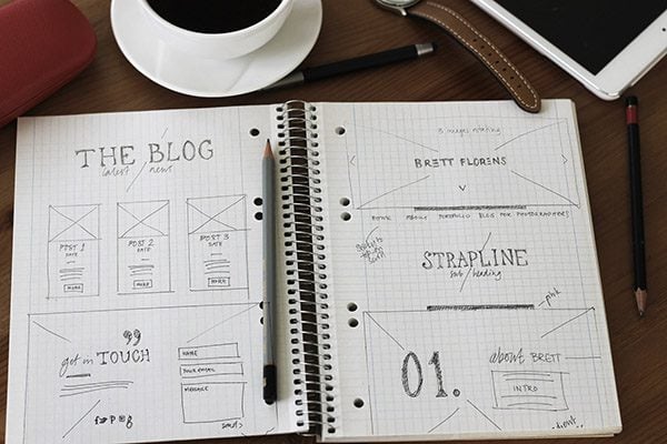
3. Sketch It Out
At this stage, you might be thinking about using a wire-frame to help nail down the basic structure of the site and how the pages might flow from one to the next. My starting point is always a trusty pencil and blank paper. It enables me to make a series of rough sketches, without committing too heavily to any particular design direction. I usually do this with the client until we’re agreed on the best home page layout.
After that, my next step depends on how technically complex the build is. If it’s straightforward and I have all of the copy and assets in place, as well as a detailed sitemap, I might dive straight into Divi.
If the design involves originating original UX details, I often use my current crush, Adobe CC Experience app, (http://www.adobe.com/uk/products/experience-design.html) to test animations and responsive layouts where content may be significantly altered on tablet or mobile. This gives your client the option to see what will appear above the fold (the bottom of the screen) on all devices.
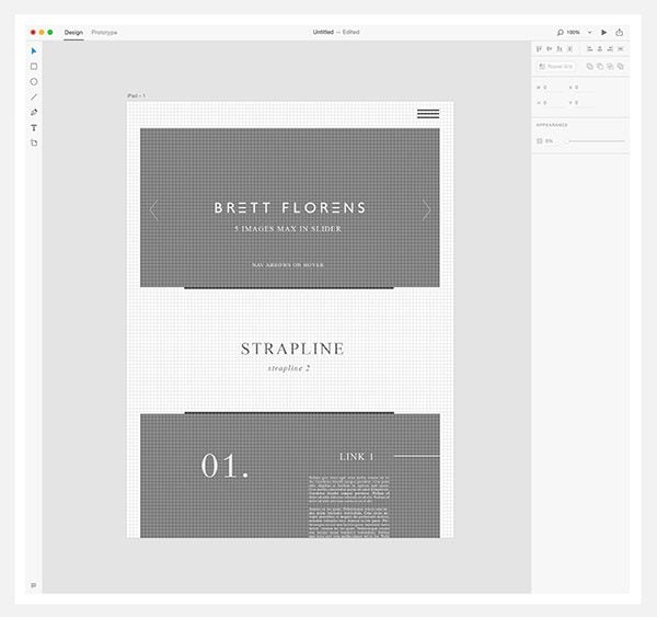
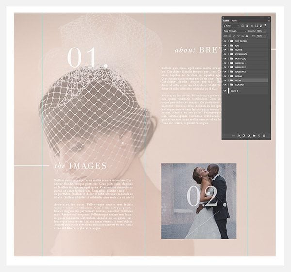
Most often, when a project requires complex graphic elements, I work in Photoshop to develop a detailed layered file. I’m a Photoshop fan because it eliminates the guesswork when it comes to developing assets you’ll be using in the finished site. In addition, you can quickly export groups of layers as trimmed png and jpeg files, speeding up your workflow massively.
My golden rule is to create a canvas for the resolution most commonly used by your target audience. In my case, I start with a typical 15” retina width of 2880px and I make sure I mark my centre point and standard stage with guide rules. For the record, the standard Divi site width is 1080px.
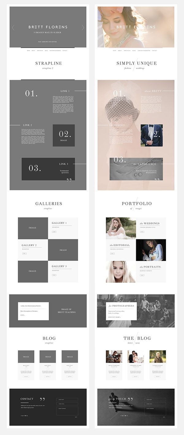
Group your layers together in folders for each section, so that you can easily adjust section heights and duplicate design features.
4. Test As You Go
One of the most useful features of Divi is the ability to save and reuse sections and layouts, making it easy to build out pages with similar structures very quickly. What you want to avoid at all costs, is duplicating layouts that still need some responsive tweaking. There is nothing worse than having to go through a dozen finished pages correcting the same issue over and over again.
To speed up your responsive workflow, I develop each section and test as I go, using the free online tool, Screenfly (http://quirktools.com/screenfly ). When I reach the end of a page, I test on real devices including Android, iPhone 5, iPhone 6 and iPad as well as a 27” monitor and 13” laptop. Obviously dragging your browser into an approximate shape works well enough but nothing beats real device testing.
Perfect your home page and you’ll find you can use and reuse those sections to form the backbone of the rest of your pages.
5. Tailor Your Content to the Device
The more responsive websites I build, the more I’m embracing hiding certain content, particularly when it comes to mobile. People who visit a site for the first time on mobile, tend to be looking for an overview. Sure, that’s a generalisation, but it means you should really focus on your client’s business goals and make sure that they can quickly and easily reach key areas with just one click.
Don’t forget that when using Divi, sections can easily be hidden on tablet and mobile, by checking just a couple of boxes.
6. Pay Attention to Detail
If you’re building with Divi, which does so much of the heavy lifting, you’re already well on your way to getting to grips with responsive design and when it comes to controlling the finer details across devices, this is where Divi comes into its own.
I particularly love how easy it is to tweak font sizes for tablet and mobile, as well as both padding and margin. Where I used to writes dozens of media queries, now I write none.
In Summary
Developing a solid planning process that identifies business priorities first and tackles potential problems before reaching the in-browser stage, will help you develop responsive sites with confidence and speed. Keep testing at every step of the design process and use Divi’s built-in Advanced Design Settings to get the results you want on each and every device.
Thanks for reading and please feel free to ask any questions you have for me or share lessons you’ve learned in the comments section below.
Also, be sure to subscribe to the Elegant Themes email newsletter and YouTube channel so that you never miss a big announcement, useful tip, or Divi freebie!
Divi 100 Day 36
The Countdown To Divi 3.0
This post is part of our Divi 100 marathon. Follow along as we post free Divi resources for 100 days in a row! This 100-day countdown will end with the game-changing release of Divi 3.0, including our brand new visual editor built from the ground up using React. Divi 3.0 will change the way you build websites with the Divi Builder forever!
Let the countdown begin.


Thanks for sharing this informative post. An effective responsive website design can offer a good user experience. So, the design is one of the most crucial aspects of responsive websites.
Hi Melissa, This is a wonderful article – thank you.
I am still really confused as to what size to set up a design. I have a 27″ retina iMac and I find it really difficult to design on this for a standard 1920 x 1080 screen. I’m never sure where the standard break points are.
Is there a good reference guide you could point me to as I am just about to start a new site.
Many thanks
Jennifer
Days ago I dreamed how to do my web design, and I found this example that made it happen.
My question is, how resolved using divi builder to put such a high background image, as we can see, in section 1 2 and 3 from about?, (the bride in background)…
Thanks
Nice post, Melissa! Still have to wait 60 days for 3.0 though, ugh!
Great article. Learn lot from the post. Thanks for the awesome share.
Melissa Love neatly explained and profound detailed.. I see most of dev now a days miss #1 and just design by following some similar market layouts.
Thanks for sharing Melissa,
While the information in this article is crucial for planning an developing a website I can’t help but feel like it doesnt quite touch on truly designing responsively. While there are mentions of tools and techniques, best practices etc for responsive websites the majority of your post seems to focus on how best to strategize a website build.
Just my 2 cents, again, really great info but maybe the title needs to be changed?
Great insight! Thank you Melissa!
Excellent article, thank you!!!
Hi Melissa, thank you for your enlightening post. One thing I struggle with is the preparation of the background images for full page headers, sliders and even section backgrounds, and especially when using either the css or js parallax effects.
I find I have to do a lot of trial and error to get these right, even then there’s the challenge of having them sit right from mobile all the way up to full page iMac 5k retina.
Have you had a similar experience? How did you solve it, or what techniques do you use? I’m guessing there’s a bit of section hiding going on?
I second that question, Melissa / ET! I find creating full width header background images very confusing. Some part of the image is always getting cut off depending on the device size, and the whole process feels so random. On top of that, trying to use different size images for different displays so as to not get unnecessarily clobbered on site speed is still confusing to me… Thanks for any assistance!
I agree that background images can be a struggle. I’ve settled on 1820px wide as the best compromise between quality and file size and I make sure I properly compress those images.
If the subject is going to be important in the background image (ie. It’s not an abstract background) then I make sure the focal point sits in the middle of the image and then I tweak the top and bottom padding on the image for each device.
I think it’s also important to explain to clients that cropping will occur and why it does. As long as they understand that parallax images work by cropping in order to reveal, they then have the right expectation about what can be achieved.
If I get a client who won’t accept any cropping when it comes to full width gallery sliders (and as most of my clients are photographers I get that quite often) then I use a plugin like Smart Slider Pro.
Thanks a lot Melissa for your super helpful response!
I’m building a sales page targeted at an average consumer, not your sophisticated “photographers, working on large desktop Macs.” Therefore, I wonder if your 1820px wide compromise might be unnecessarily high for me to follow, or would you consider that pretty standard these days? Unfortunately, I have no visitor data to guide me yet.
Also, is there a certain compressed image size you aim for? For example, having a rule that “no compressed image can be bigger than 100k” and perhaps a similar type of rule for the sum of images on a page?
I’m guessing that when you compress images, you insist on 100% quality images because of the sophistication and pride of the photography of your clientele. Should I commit to the same 100% quality or be willing to degrade the image quality to help reduce the image size?
Lastly, I read something that advised “On the mobile version of your website, you should not use large background images… You can override your desktop’s background style with CSS media queries” (they provided some code, and I would need to figure out how the heck I’m supposed to use it 🙂 ). Do you agree with this advice?
Thanks so much again Melissa!!! Much appreciated.
I actually feel that 1820px is the minimum size I can get away with for any site, not just for photographers. I try to keep all images under 200kb (for hero images) and 1200px gallery images even smaller.
I don’t tend to hide large background images on mobile. I do strip out non essential sections and information.
Thanks again Melissa, and by the way your Eddie Judd Photography Divi Makeover is stunning!
Hi,
It’s very informative article. You did very beautiful work. Keep post good article.
Hi Melissa, fantastic post to the newbie thanks so much! I was wondering, would you know where I could find a decent pre-project questionnaire like the one you use? Would be really helpful!
Hi Greg. I’ll stick it in a blog post over at The Design Space Co for you really shortly.
Ellesborough Manor
Butlers Cross
Couldn’t agree more on the recipe you provide in section 1.
Have always gotten the best client response when truly aligned with their goals. It’s so basic but so very important to understand what they are trying to accomplish.
Coming to the actual design a recurring challenge is that ‘technologically challenged’ clients tend to be very unsure what they actually are trying to accomplish online – and if it’s a conservative trade you’ll experience fear not sticking to the norm even if competitor websites are poorly designed. Some simply seem too busy to ‘care’ and most simply seem too far out of their comfort zone to actually dive in and take co-responsibility.
I have stopped trying to persuade clients if they don’t feel comfortable. This is not to say I won’t do the job or that I am not willing to change course – but imo being a designer also involves trusting your sense of direction – after all that’s why people hire you. Design is a process more than anything else… and the deeper the bond you develop with your client during the process the better the end product usually becomes.
So yeah – think the key is provided in your approach – do a thorough pre-design interview and if needed let them think a few key pointers through first before taking direction.
Cheers
Mads
Thank you Melissa
Thanks Melissa for the great article. I also think that point 1 is most important. Although it’s partly in that point, i believe it’s worth stating even clearer that you’re actually designing your clients website for your clients client and prospective clients and not just for your client – if you get my drift…
This is an excellent post. Thank you so much.
Just wondering, you mention that you write no media queries.
In regards to something like an h2, what module do you use to make the header responsive without utilizing a media query?
stop using absolutes (px, pt, cm etc) and instead use use elastic sizes (%, em, vw/vh etc.)
see http://www.w3schools.com/cssref/css_units.asp for more info and demo’s
You create beautiful work. Thank you for the good post.
Hi Mellisa.
One simple question, How much do you charge your client for this website?
I have a really simple system. I charge an amount I am happy with per day and then I tell the client how long the build will take in days.
We do the prep in advance and then I work on the project solidly until it’s finished. This site took me 5 full days. Feel free to email me if you’d like some actual figures.
Very good article. I am also a big fan of photoshop, cause I’m not only involved with design, but photography, also. However since I started using Divi, I quit making mockups in PS 🙂 It’s more natural for me to do it live and Divi is perfect to do the job!
About the resposiveness I started to move towards “fluid” website design more, then responsive. By fluid I mean using more often viewport calc. then precentages. I found it’s more readable on smaller devices, then just leaving the job relying on a type of device. But maybe it’s just mine point of “view” 😀 (unfortunately with all my love for Divi – it’s not equipped with such feature in origin)!
Once again, thanks for sharing, Melissa.
Great post. Thanks a lot for this amazing guideline.
Great article, thanks! I have been thinking of moving my site over to Divi, and this has answered some of my questions, think I’m a new convert…
Great post Melissa. Solid. =)
Cheers!
AHHHHHHHHHHHHHHHHHHHHHHHHHHHHHHHH this is the version that should post, I mistyped and sounded the exact opposite of the compliment I want
Just a blindingly great read for me. Thank you kindly ma’am.
Just a blindingly great read for me. Thank you kinda ma’am.
A really good article for new or experienced developers/designers. Some very useful tips in there too.
Thanks
I just got my subscription yesterday and I am very happy with it. Keep up the good work guys!
Thanks for sharing your workflow Melissa! And thanks for reminding me of Screenfly 🙂
I agree that getting to know your customer’s goals is crucial, and even though it makes sense it is often overlooked.
Regarding the mobile experience, I believe users do not want stripped-down versions but I do agree with the fact that they need to find info and perform actions easily. Luckily for us Divi is great at letting us make device-tailored experiences.
Oh and last but not least: I hear you regarding the dozens media queries … gone with the wind 🙂
I know. Don’t miss those old media queries!
The Design Space Co sure offers some beautiful designs,,
and thanks for the article,, keep up the good work.
Thanks so much!
This is a marvelous post. It’s made me realise how little I do in the planning stage, and how little information I give my clients before I start the design.
How does one use proper responsive images? Not just one image scaled, but srcset providing multiple images and the preferred one shown by breakpoint, without causing multiple http connections. Pretty new to WP and Divi, and want to provide what I’ve been able with other CMS systems.
One thing AJP is that DIVI allows for three breakpoints. One for desktop, one for tablet, one for mobile,
Your page one the back end could get pretty big but you could have one section just for desktop, one for tablet, one for mobile.
Useful tipps – thank you very much 🙂
Another great Divi 100 post thanks for you insight Melissa.
Thank you for an excellent post.
Two comments I would make are:
One, that understanding the customer journey through the website is critical. I certainly like clients to help us craft that map, but have found that not many are very savvy about what should happen. I find that many clients love to extol the virtues of their offerings (as they see them), but are often short on the crisp benefit statements that prospects need to see and don’t focus enough on what action is desired of the prospect. (That is, what is conversion for this client?)
Two, that the mobile UX has to be different than the desktop UX. You are so right that content has to go on a diet. But also user control is different on mobile devices, and the UX has to reflect that (e.g. no hover effects).
Thanks again for an excellent post.
Hi Melissa. Great article and always nice to see how others approach projects. Thanks for sharing
Thanks for this article I’m glad to see that this is very similar to my own process currently.
Thanks for having me on the blog!
The most important part in this article here in my opinion is point 1. Knowing their business goals. Over the years I’ve seen websites that have been built where the developer has created something as their own creative outlet and not paid enough attention to what the client wants. It’s a real skill to be able to do this. Listening is the most important skill here.
Thanks for another amazing article!
Thanks James. I think we’ve all done projects where we steer clients in the direction of a design we’re comfortable with, rather than listening to what they are really saying. I know I’ve been guilty of that at times. I’m really conscious now, to be really thorough about evaluating their overall business.
You’re absolutely right! It’s difficult to really hear what a client wants and then produce that. Especially when the client isn’t sure themselves and you need to work with them to produce something that works.
It’s something that I’m constantly working on and trying to improve and know that I will never be perfect but that I have improved over the last ten years.
Thanks again, Melissa!