
WordPress and Bootstrap are both popular platforms for web design that aren’t often considered as compatible. Bootstrap has grown to be a favorite CSS platform for developers because it makes it easy to build responsive websites. More than 70% of websites on the internet are designed with it. You can code anything you’d like into its responsive framework to create a unique website that’s mobile-friendly, right out of the box. With more than half of all users accessing the internet via a mobile device, it’s crucial to have a responsive site.
What if we told you that you can use Bootstrap and WordPress together? Well, you can. There are a few ways to use Bootstrap in WordPress, including WordPress Bootstrap plugins which can add Bootstraps blocks to the WordPress Editor. We’re going to cover all the ways to use Bootstrap in WordPress and show you how.
What is Bootstrap?
Bootstrap was created by two Twitter experts, Marc Otto and Jacob Thornton. With so many people accessing the internet by phone, they wanted to design a framework that would put mobile users first. Because of this, Bootstrap is widely popular with web developers. To accomplish mobile-first design, Bootstrap uses a grid system, or column structure, that adjusts page designs at certain breakpoints or screen resolutions.
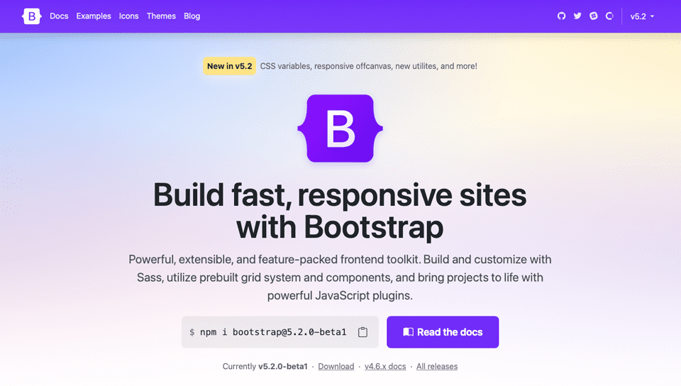
Bootstrap is made up of HTML, CSS & Javascript. It’s a free and open-source framework, which allows users to add any HTML or Javascript component that they wish. There are many Bootstrap developers who create components and sell them in several marketplaces to assist beginners in developing their websites. Like WordPress, Bootstrap is very popular and allows for some beautiful designs.
The Advantages of Using Bootstrap
In addition to being geared towards mobile devices, Bootstrap is fast. It is a CSS Framework which is different from a CMS. So there isn’t any bloat like you will find on some CMSs to slow your site down. Another advantage is browser capability. It works right out of the gate with Chrome, Safari, Firefox, and others. There isn’t any need to use webkit CSS rules to make Bootstrap work — making it an excellent choice for cross-browser compatibility. Also, the framework is easy to use. Anyone who knows CSS and HTML can work with Bootstrap. Lastly, there is a large community surrounding Bootstrap. Users are quick to share knowledge about features, coding, or any other related issue a new developer may need help with.
Ways to Use Bootstrap in WordPress
There are a few options if you want to use Bootstrap in your WordPress site. You can install the script manually, but you’ll need to do most of the coding on your own to bring it to life. Secondly, you can use a pre-made Bootstrap theme for WordPress. There are several out there to choose from, but by choosing this option, you are stuck with your site looking exactly like the theme. There won’t be many options to make it look less cookie-cutter unless you code your own page templates to change things up. And, lastly, you can use a WordPress plugin to build your site using Boostrap.
In recent years, WordPress developers have started releasing Bootstrap plugins that can be used within WordPress. These plugins are beginning to take hold, especially since the release of Gutenberg Blocks. By using a WordPress Bootstrap plugin, you can bring the best of both platforms together. Before we delve deeper into what you can do with these plugins, let’s expand a bit on the other option available to you to bring your Bootstrap project to life in WordPress.
Installing Bootstrap Manually
If you don’t want to use a plugin, you can always build your site with Boostrap manually. To do this, you’ll need to add a link reference to Bootstrap in the head of your WordPress site. You may need to add a code snippets plugin to do this depending on what theme you are running.
A CDN link to Bootstrap’s external stylesheet in your site’s header will look something like this:
<link href="https://cdn.jsdelivr.net/npm/[email protected]/dist/css/bootstrap.min.css" rel="stylesheet">
Make sure to check Bootstrap’s website to ensure you are using the latest script so that you can benefit from the latest release available to you. Keep in mind that you can build your own WordPress theme that incorporates Bootstrap, but it will take quite a bit of work on your part. This would involve modifying core pages — index.php, wp-admin.php, and others. For this tutorial, we’re going to use a Bootstrap plugin since it is a much easier approach for most.
Using a Bootstrap WordPress Theme
There are quite a few free Bootstrap WordPress themes available in the WordPress repository. Each one is fully responsive, and built completely using Bootstrap. Let’s take a look at some of the more popular choices.
Shapely
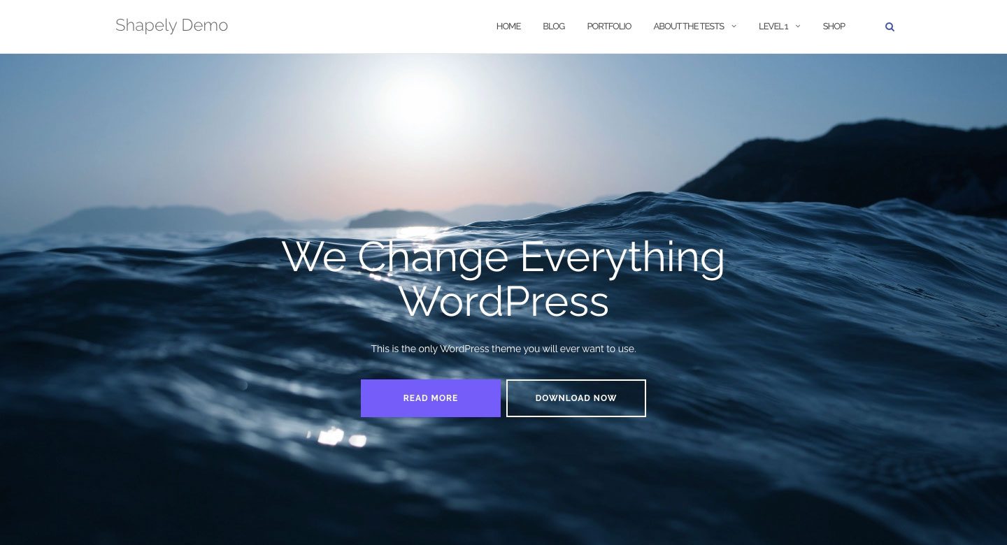
Shapely is the most popular Boostrap WordPress theme available. It’s a one-page design that comes with Bootsrap fully integrated. There are several homepage widgets, and support for major WordPress plugins such as WooCommerce, Jetpack, Gravity Forms, Yoast SEO, and more. Thanks to the Boostrap integration, Shapely is 100% responsive.
Illdy
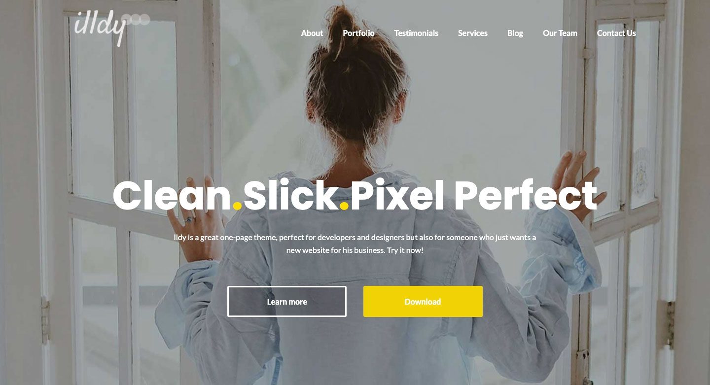
Illdy is a multi-purpose Bootstrap WordPress theme that utilizes a front-end visual editor. Like all Bootstrap-based themes, Illdy is fully responsive. It’s suited for creative businesses because of its built-in portfolio functionality.
Activello
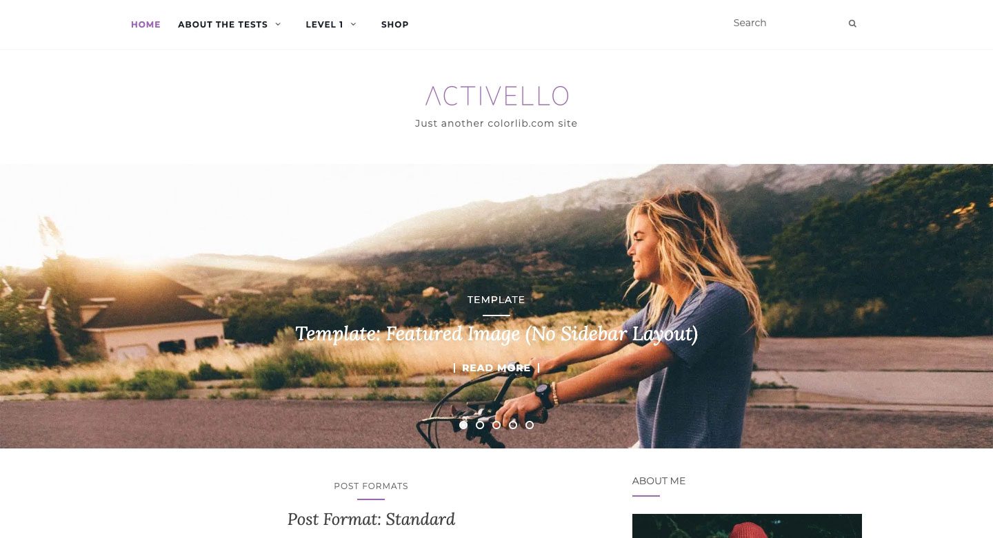
Activello features a full-screen slider on the homepage, which provides a stunning look when you first click on the page. It’s well-suited for bloggers and comes with support for most popular WordPress plugins. Additionally, Activello is compatible with Schema, which makes this theme very SEO-friendly.
Using a WordPress Bootstrap Plugin
For this tutorial, we’ll be using a plugin to build our Bootstrap page in WordPress. Both the plugins we’ll talk about enable the use of Bootstrap with Gutenberg blocks, but one offers an easier path than the other.
Bootstrap Blocks
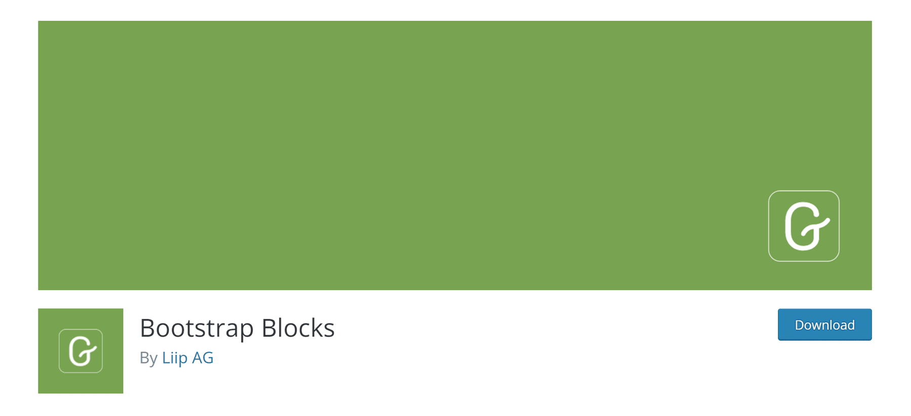
Bootstrap Blocks is a WordPress plugin that adds Boostrap Gutenberg blocks to the WordPress editor. The plugin requires quite a bit of customization to fully integrate with WordPress. It doesn’t include the Bootstrap library in the plugin. If you want to have that functionality, you’ll need to manually add code to your functions.php file. This plugin is suited more for the WordPress developer with a good amount of programming knowledge. If you already have familiarity with how core WordPress files work, and have a good concept of Bootstrap, this might be the way to go. However, there’s one thing you should keep in mind about this plugin. You’ll only gain access to a few components — containers, rows, columns, and buttons. If you want a more robust option without a lot of hassle, you’ll likely want to consider a different approach.
All Bootstrap Blocks
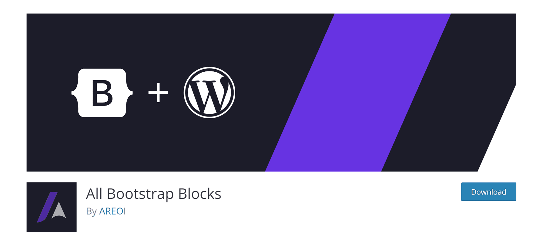
The All Bootstrap Blocks plugin has some really nice features. Not only does it incorporate the Bootstrap framework into WordPress for you, but it also gives you 37 very cool blocks to use alongside Gutenberg blocks. You’ll get features like columns and rows — which are the foundation blocks of Bootstrap. Additionally, there are modals, accordions, content cards, icons, and so much more. It’s almost like having a fully functional theme just by installing a plugin. There is a bit of a learning curve to get things to look just right, especially if you are used to a drag-and-drop visual builder. However, if you’ve been coding by hand with divs and columns, this will be a breath of fresh air.
How to Use Bootstrap in WordPress to Design a Page (Step by Step)
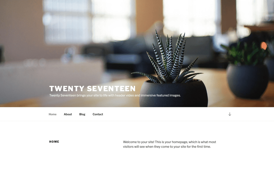
For this tutorial, we’re going to build a page in WordPress using the Twenty Seventeen theme and All Boostrap Blocks. We’re going to model our page after the camera product page available with an Elegant Themes subscription.
1. Modify the Twenty Seventeen Theme CSS for Bootstrap
Now, if you know anything about Twenty Seventeen, you’ll see that by default, there is a big header image, followed by a two-column layout. For our page layout, this simply won’t do. We’re going to need to make some changes to get our page to look like the camera product page.
The first thing we’ll need to do is remove the header image that comes standard on the theme. To do this, navigate to customizer in the black admin bar.
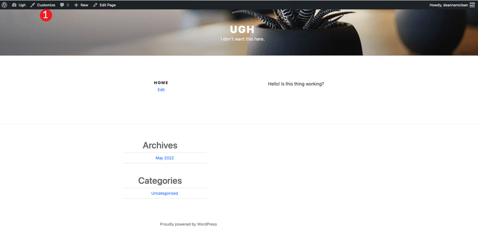
When the screen refreshes, click on the additional css section.
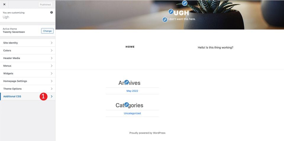
Finally, add in the following CSS:
/*Make page full width */
@media screen and (min-width: 1200px) {
    .wrap {
        max-width:100%!important;
        padding:0;
    }
}

@media screen and (min-width: 1200px) {
#primary .entry-content {
  width: 100% !important;
		}
}

.site-content {
	margin:0!important;
	padding:0!important;
}

/* Hide Menu Bar */

.site-branding {
    display:none;
}

/* Hide Page Title */
.page .panel-content .entry-title, .page-title, body.page .entry-title {
    display:none;
}

/*Hide Site Footer */
    .site-footer {
        display: none;
    }
}
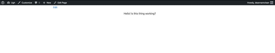
This will do a few things. First, it will make the width of the content fill the full width of the page. Secondly, it will remove any margin and padding on the page. Don’t worry, Bootstrap will control those. Additionally, it will remove the header and footer area of your site. Lastly, it will remove the page name from our soon-to-be masterpiece.
Note: If you want to create a footer for your page, you can omit the site-footer CSS rule above.
Once you click publish, your page should look like this:
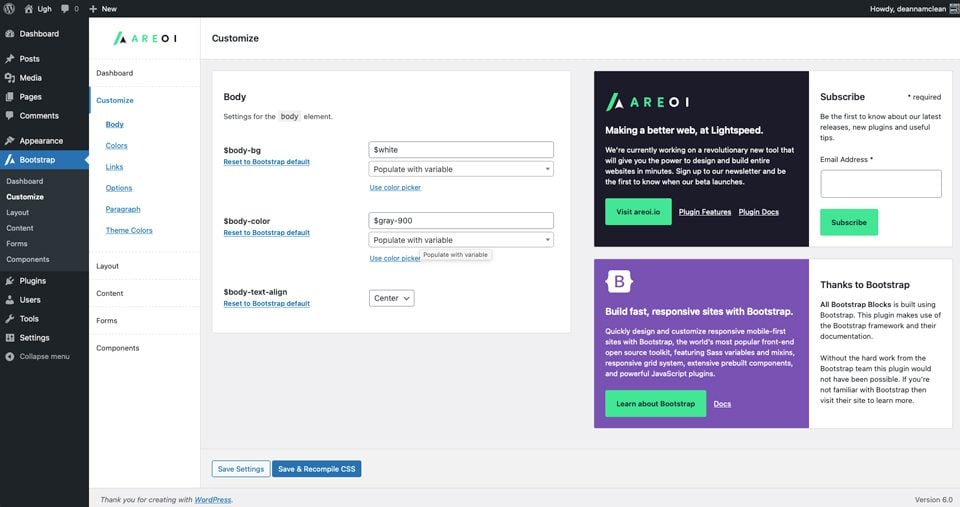
2. Install and Setup the Plugin
Now that we have our theme’s page all ready to go, you’ll need to install the All Bootstrap Blocks plugin. Once installed and activated, there are quite a bit of customization options to choose from. You can adjust colors, typography, links, and a lot more. To get started, head over to Boostrap > Customize. You’ll find tabs for customizing your layout, content, creating forms, and components.
3. Create a Page Layout With All Bootstrap Blocks
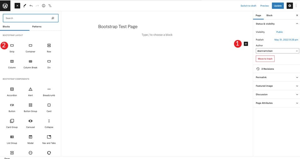
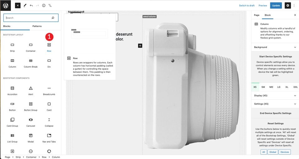
To get started, create a new page. Once your page is created, start with a strip block for the first block on the page. This will create a section that adds a container, row, and column.
Click on the + and click browse all. This will bring up a sidebar with the available modules.
Under bootstrap layout, choose strip.
When the content is added, you’ll see that a container, row, and column are visible inside the strip. Next, you’ll choose a heading and set it to H4.
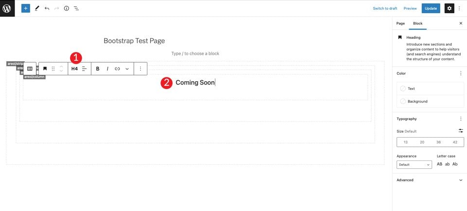
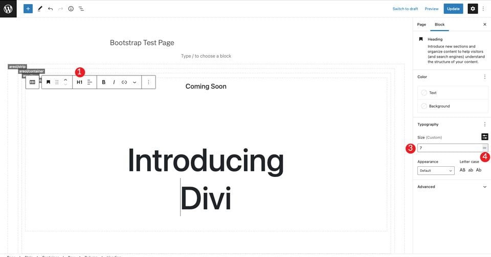
Click the + to add another heading under the h4 tag. Set it to H1, then set the size to 7em.
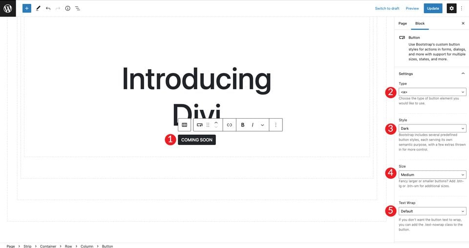
Next, add a Bootstrap button by clicking the +. Type “button” in the search bar. Set the button’s text. Next, set the style to dark, the size to medium, and leave text wrap as default.
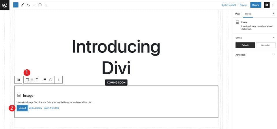
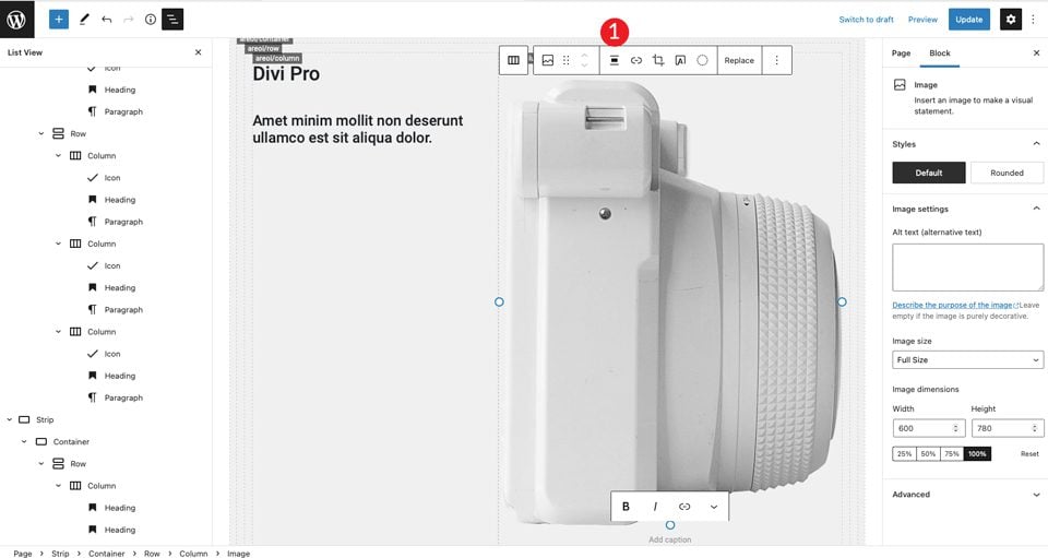
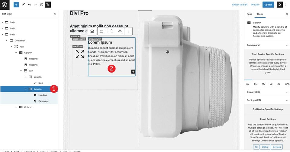
For the last item in the section, choose an image by clicking +. Add any image you like, but you can also right-click on the Divi layout example and save the large camera image to use in your layout. Click upload to insert the image.
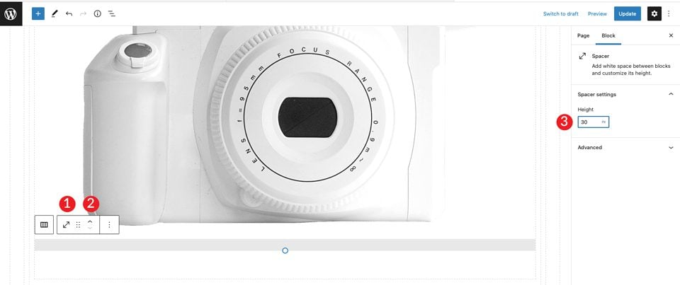
You’ll see that the image is directly underneath the button, but there’s not enough space between the two. To fix this, add a spacer. Click into the column underneath the image to bring up the +. Search for spacer. Add the spacer and give it 30px height. Next, click the up arrow to move it above the image.
4. Making Adjustments to the Container
After saving the page, open it in a new tab. You’ll notice that we still need to set the background color for the section and give it a bit of padding to bump it down from the top of the page.
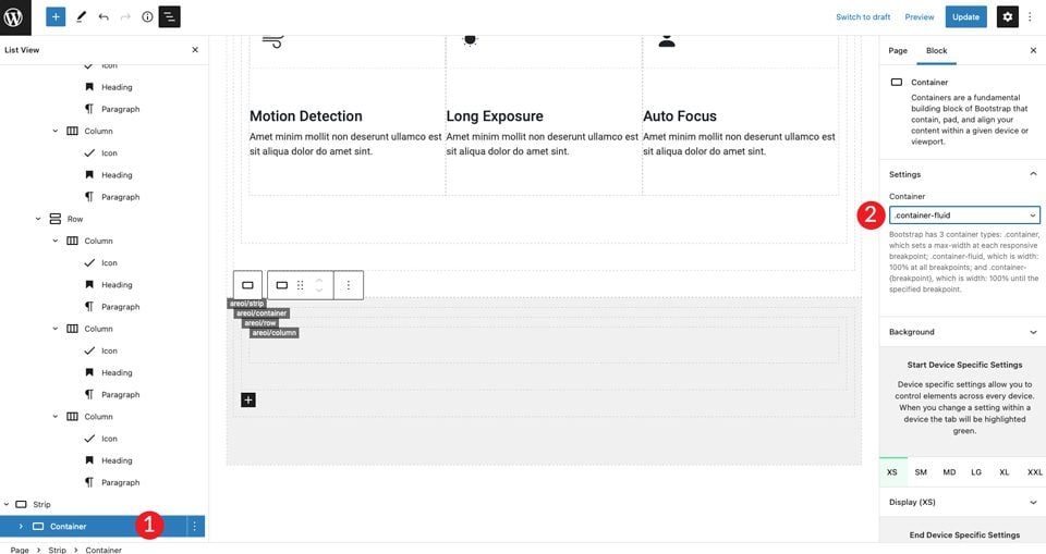
Head back over to the back end and click inside the container. You can either do this by selecting the menu near the top of the page, or by clicking inside the container itself on the page builder. Next, slide the display background toggle on. Set the horizontal alignment to center, then set the color to #c6e8ff.
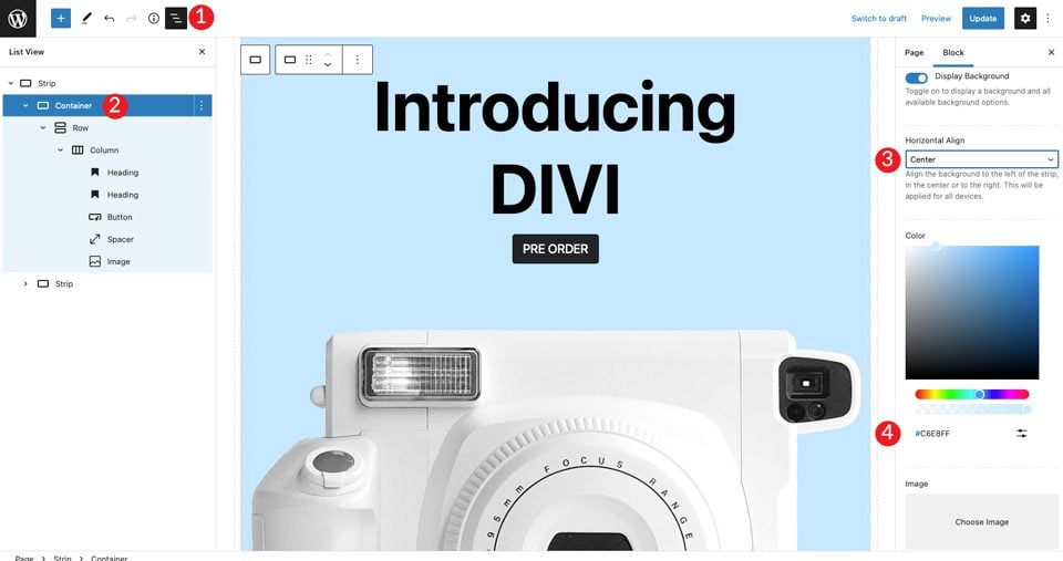
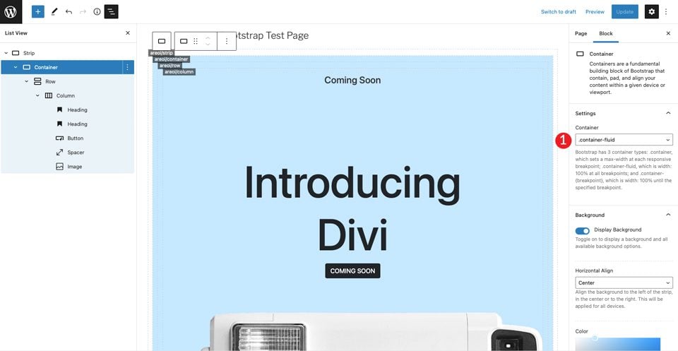
Next, set the container to container-fluid. This will make the container span the full width of the page.
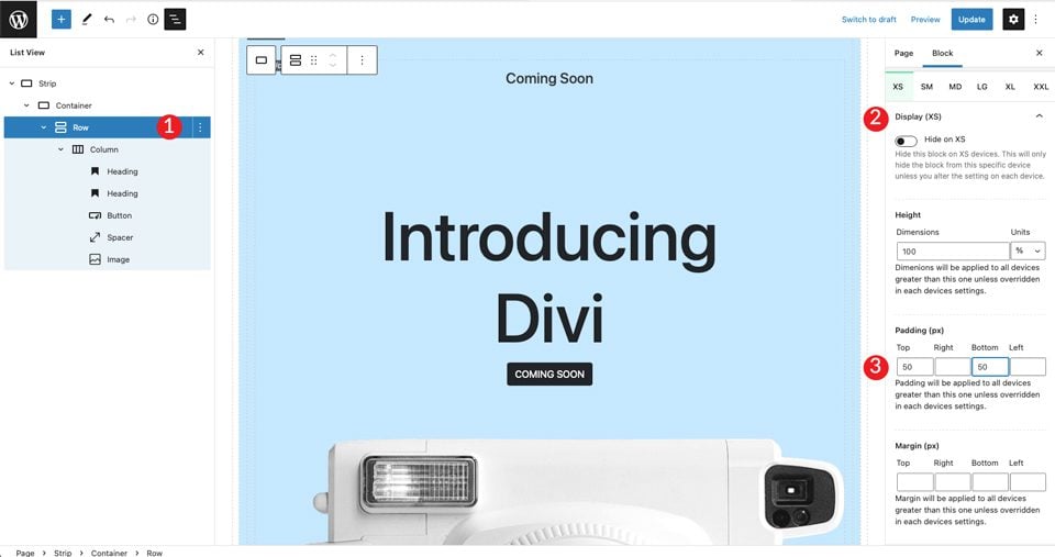
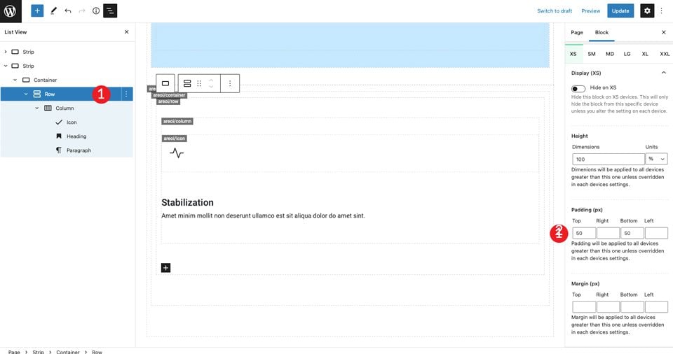
Finally, we’ll need to add some padding to the row. Click the dropdown menu on display. Set the padding to 50px top and bottom.
5. Create the Next Section
Next, we’ll create a section with icons and text. To get started, add another strip beneath the first one by clicking the +. The next step is to insert an icon into the layout. Click the +, then type icon into the search bar.
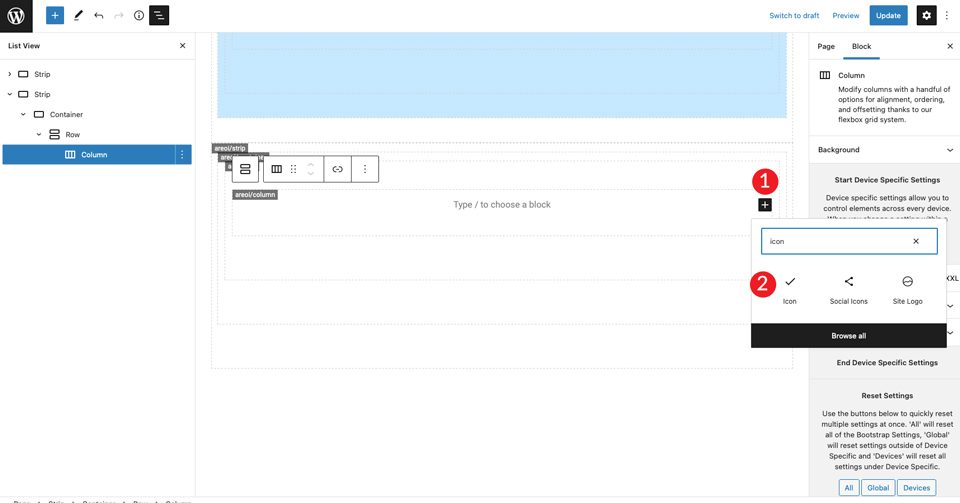
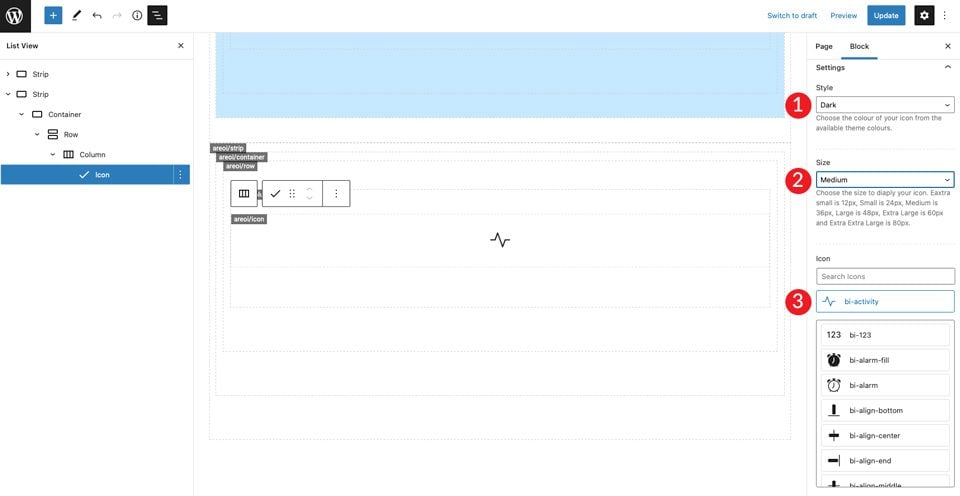
Select the icon module. Click the settings dropdown menu to reveal the icon choices. Choose dark as the style, then set the size to medium. Leave the default icon bi-activity as the icon selection.
Under the icon settings, set the horizontal align to start. This will align the icon to the left to match the rest of the column.
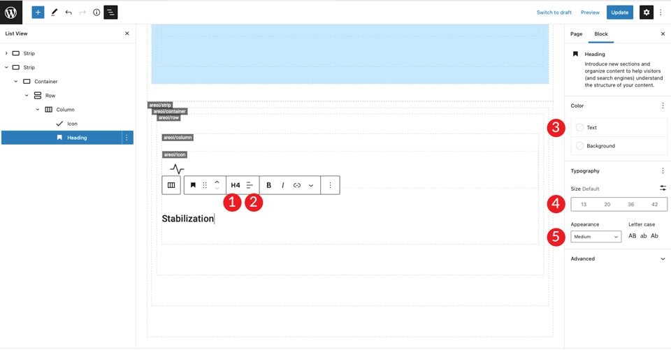
Add an H4 and type your headline. Next, set the text alignment to left, color to dark, and leave the size at default. Finally, choose medium for the appearance.
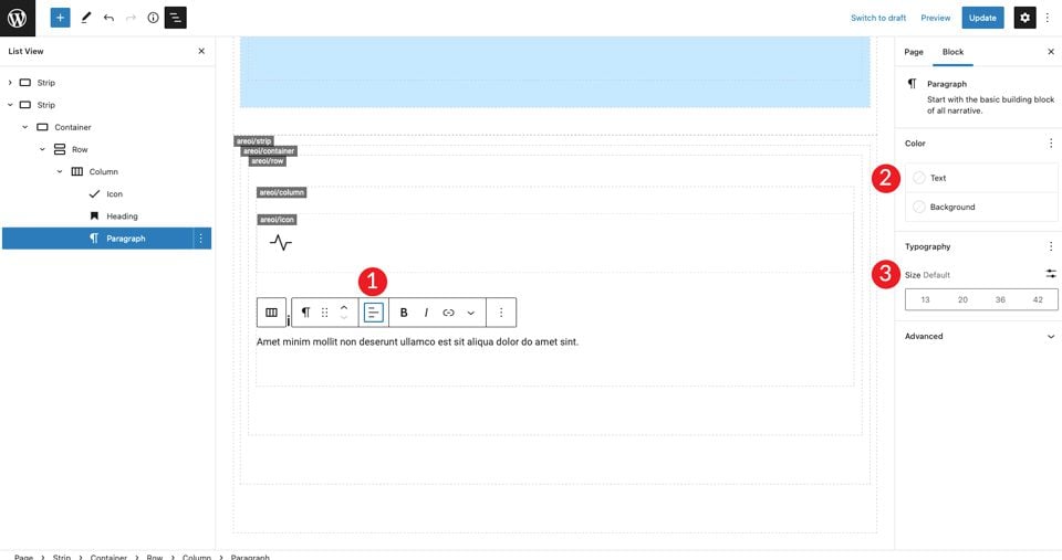
Click + to add paragraph text. Set the alignment to left, color to dark, and leave the size at default. Use the text of your choice.
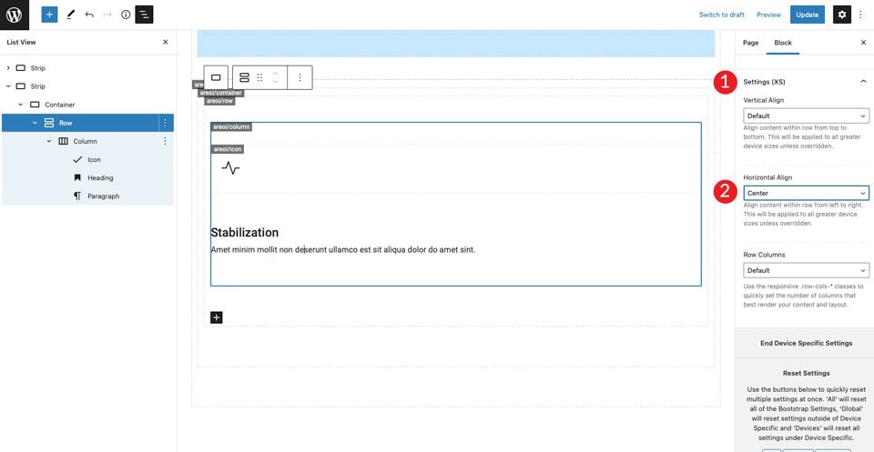
Save the page and view it in a new tab. You’ll notice that there isn’t any spacing above the icon. To fix this, click into the row settings to add 50px padding to the top and bottom.
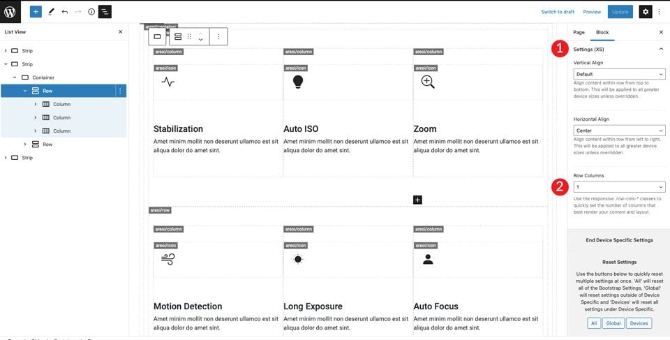
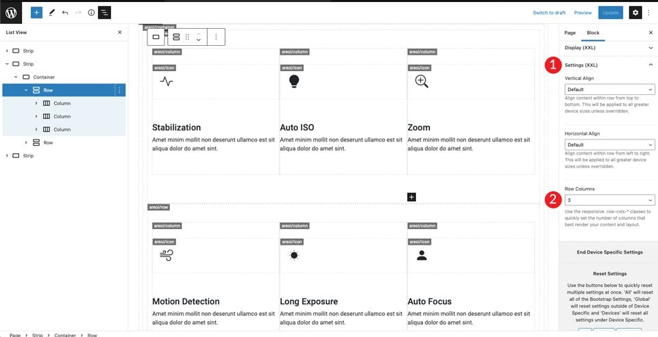
Lastly, under settings XXL, set the horizontal align to center. This will center the content in the middle of the page in all screen sizes.
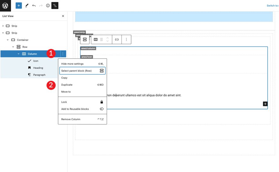
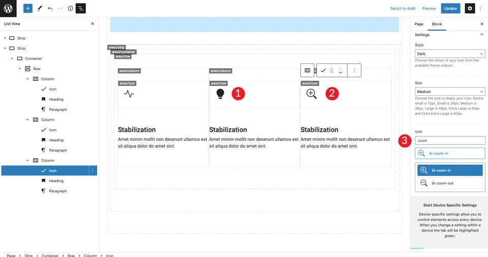
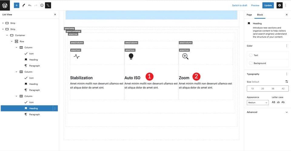
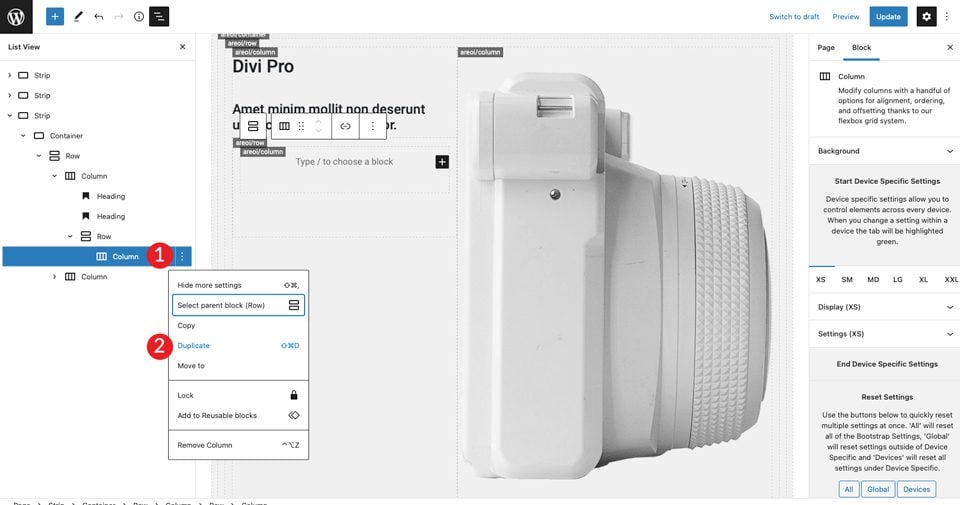
The next step is to duplicate the columns. This is a big time saver. You’ll only need to swap out the icon and text. To do this, click the settings of the columns, then click duplicate. Repeat this step once more to have a total of three columns.
Now three columns are centered on the page with a left alignment on the icon and text. Next, change the icon in the middle column. Click on the icon and choose bi-lightbulb-fill. For the icon in the third row, choose bi-zoom-in.
Next, change the headlines in the second and third columns.
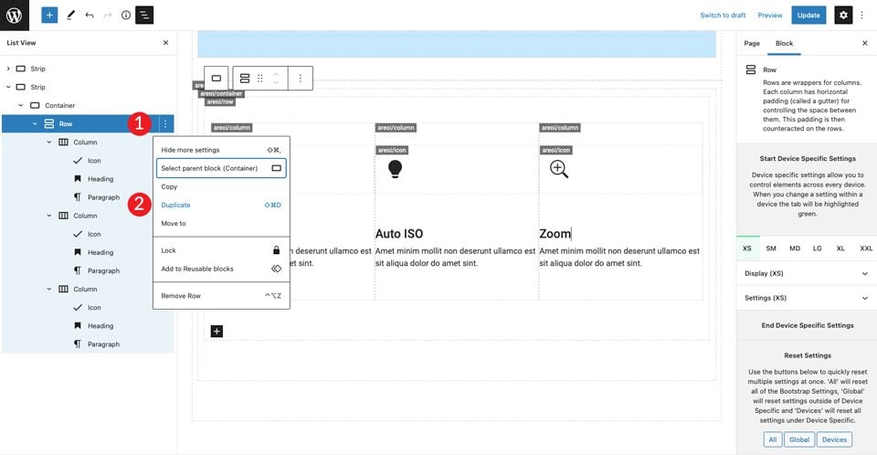
Duplicate the First Row
Now the first row of icons is complete, duplicate the row to create the second row of icon boxes.
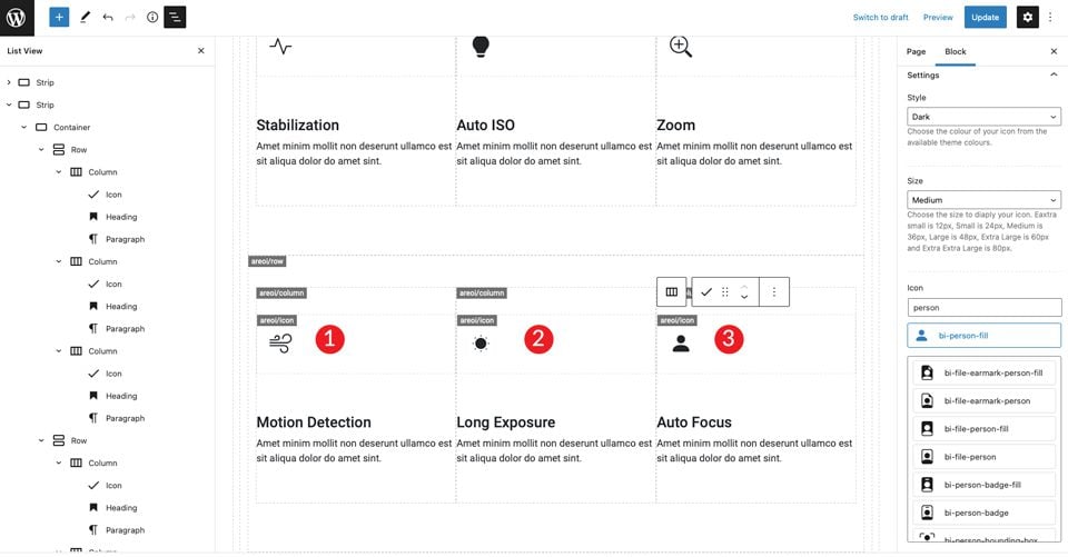
Repeat the steps above to change the headlines in all three columns, as well as the icons. For the icon in the first column, use bi-wind. The icon for the second column is bi-brightness-lo-fill, and the third icon to bi-person-fill. The last step of this row is to change the headlines.
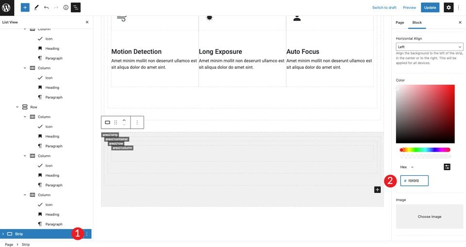
6. Create the Last Section
Start with adding a new strip. Under the settings, change the background color to #f0f0f0.
In the container settings, set the width to container-fluid. Also, add 50px top and bottom padding to the row.
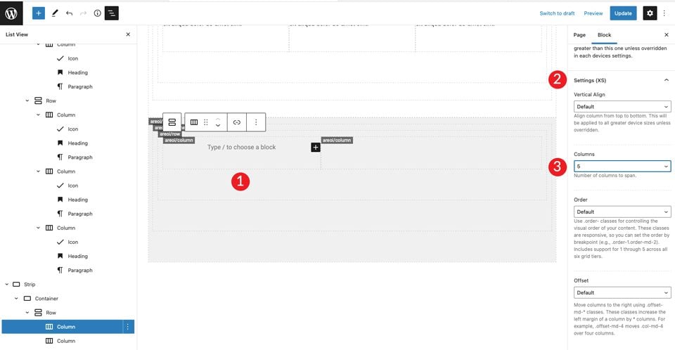
Duplicate the single column to make one more column. Next, adjust the column width on each column to adjust for the size requirements of the layout. For the first column, make it a width of 5.
For the second column, leave the column width as is. Next, add an H2 heading, followed by an H4 heading. Set both to align left.
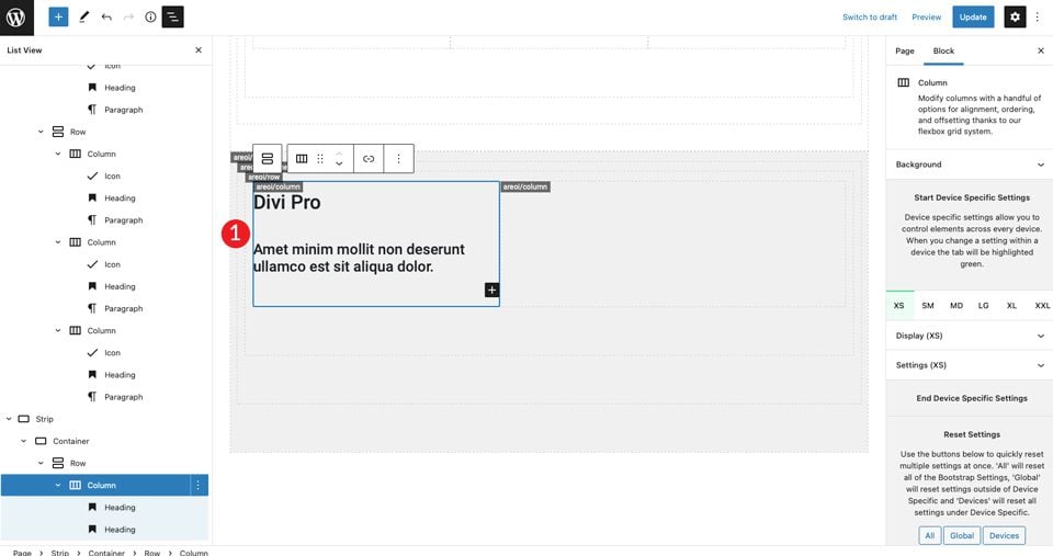
Add an image to the right column. Refer to our Divi layout to snag the image to import. Set the image to align with the center.
For the next step, insert two columns under the headings in the left column. Add the row module.
Duplicate the column within the newly created row.
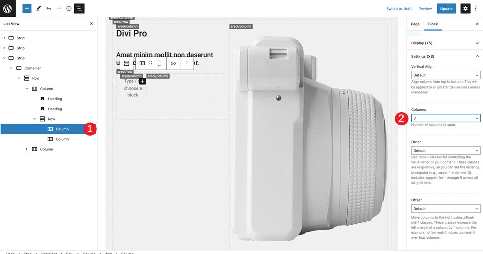
Click into the first column on the left and set the size to 3.
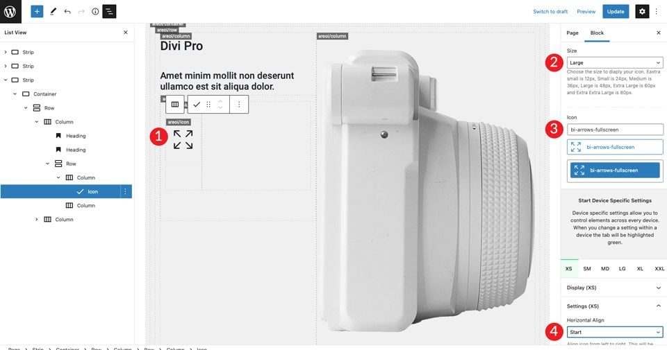
Now that we have our column structure in place, we can add an icon. Choose the bi-arrows-fullscreen icon and set the size to large. Set the style to dark. Be sure to align the icon to the left by setting the horizontal alignment to start.
For the right column, we’ll add an H4 heading, followed by a paragraph. Make sure to set the color to dark then left align each. Add a spacer underneath the H4 heading and give it a height of 30px.
Next, we’ll duplicate the interior row we created two times.
The final step is to change the icons in the second and third rows. For the first, choose the bi-card-image icon. The second icon will be bi-camera-fill.
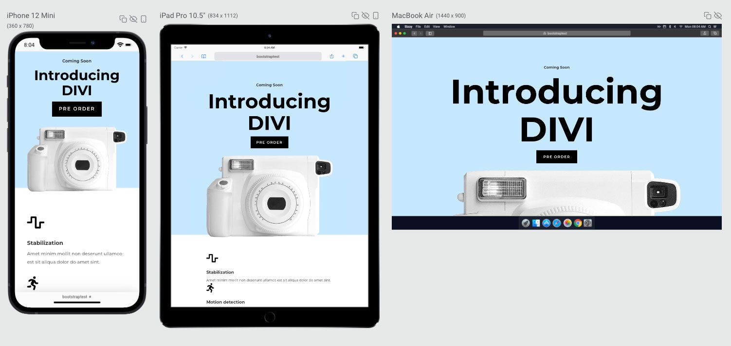
7. Optimize Page for Mobile Devices
One of the best things about Bootstrap is the ability to make your design responsive with ease. The page is complete, but there are a few steps left to make it ready for mobile devices. First, we’ll need to tell Bootstrap how many columns our sections should take up on smaller screens.
The first strip is already set to one column, so we don’t need to worry about that one. For the second strip, there is a small adjustment to make.
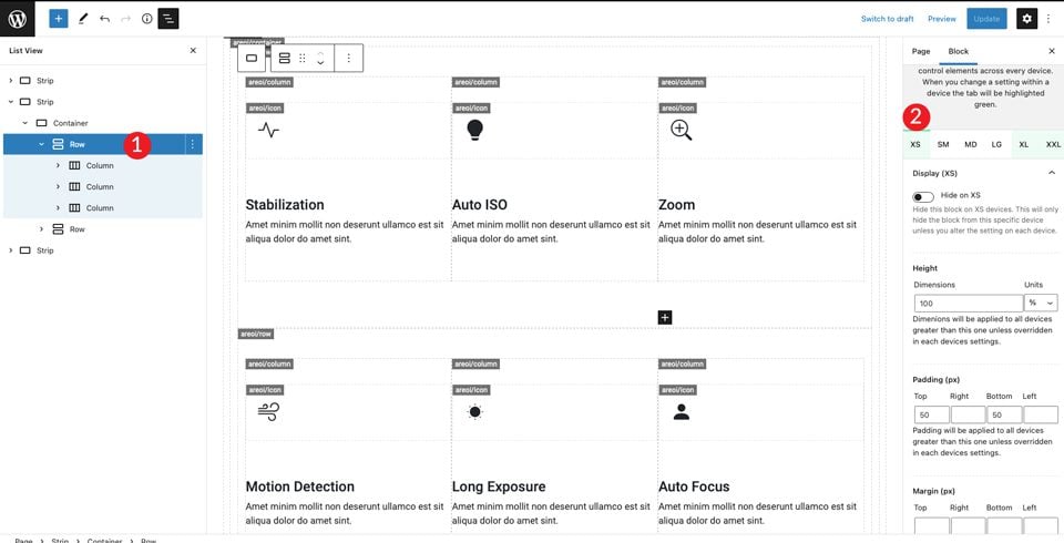
Scroll down to the settings (XS) section and set the columns to 1.
Next, switch over to XXL and set the columns to 3. This will tell Bootstrap to place all content in the row to display in one column on mobile, and three columns on larger screens.
You can tweak the other screen sizes to your liking, but these settings will make your layout look good on both larger and smaller screens.
Final Result
What About Using Bootstrap with Divi?
While Bootstrap is a good option when working with generic WordPress themes, it’s generally not the best option if you plan to use Divi. With Divi, you can design fully responsive, beautiful websites without the need for any Bootstrap integration. Divi comes standard with more than 40 modules, which allows for endless design possibilities. Additionally, Divi includes more than 200 full website packs with over 2,000 pre-made website layouts available to you.
If you plan to create your own look, Divi’s built-in Visual Builder makes it easy. You can see changes in real-time as you design your site on the front end. You can create and customize your pages effortlessly using modules, then edit colors, text, add background effects, and more. Divi allows you to save and manage your designs, as well as set global elements and styles.
WordPress Bootstrap Plugins Make it Easy to Use Bootstrap
While WordPress isn’t made to work with Bootstrap natively, they do work well together with a little help. If you are the hands-on type, you can bring Bootstrap into your WordPress site by creating custom page templates, but you’ll need to do a lot of coding. That being said, with the plugins available in the WordPress repository, integrating the two is a less daunting task. With the All Bootstrap Blocks plugin, you can take an ordinary plain Jane theme and create a WordPress site without all the time needed to code things manually. If you are looking for an easy way to integrate Bootstrap with WordPress, you should look into using a WordPress Bootstrap plugin.
Have you incorporated Bootstrap into your WordPress builds? If so, sound off in the comment section below.


Nice one, but you might also consider Understrap, which is a minimal starter theme based on Bootstrap. We use it for a lot of projects where we want to keep things minimal, no plus things at all.