
More and more newspaper and magazine publications are moving online, and their websites often require a little more thought and care than traditional sites. Editors have already been putting a lot of consideration and attention into the designs of their publications for centuries, so it’s only natural for them to want to bring the same level of quality to magazine web design.
However, style isn’t the only thing these publications need to be concerned about.
They also need to consider functionality and user experience. Therefore, it’s up to you as a web designer or editorial site owner to ensure these types of websites are as easy to use as they are to look at.
-
1
Top 10 Editorial and Magazine Web Design Tips
- 1.1 1. Use a Magazine-Style Theme
- 1.2 2. Know Your Audience and Design for Them
- 1.3 3. Use Bigger and Bolder Images
- 1.4 4. Use Multiple, Well-Designed Typefaces
- 1.5 5. Combine Big Images with Well-Chosen Fonts
- 1.6 6. Use a Grid System
- 1.7 7. Embrace White Space
- 1.8 8. Use Google’s Material Design
- 1.9 9. Use Elegant Microinteractions
- 1.10 10. Box Out Important Information
- 2 Final Thoughts on Magazine Web Design
Top 10 Editorial and Magazine Web Design Tips
So if you’ve been tasked with creating or updating a content-rich news or magazine website, here are 10 tips for improving your editorial and magazine web design craft
1. Use a Magazine-Style Theme
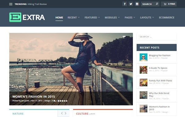
The Extra magazine WordPress theme
When it comes to magazine web design, this may seem obvious, but one of the best ways to improve the design of an online magazine is to use a theme designed specifically for this purpose. This is especially true if you’re using WordPress.
These magazine and news themes typically feature well-designed homepages that make it easy to display lots of different articles in one place, all without overwhelming the reader. Other useful features often include different ways to display the latest posts, easy grouping of content by category expansive menus, and much more.
If you’re using WordPress, then you will be spoilt or choice in this department, with many multipurpose themes on offer. Not to mention those that have been built especially for handling websites with lots of content that comes in a range of formats.
A great example of a theme like this is our Extra theme. It’s powered by the Divi Builder, making it easy to create custom layouts for the homepage of your site, as well as the category and inner pages. In the Extra theme package, you’ll find a large selection of pre-built page layouts that allow you to publish articles fit for a print magazine or newspaper.
Nexus is another example of a theme from our collection that can be used for a magazine web design. Although it’s not as new as the Extra theme, it still packs a punch by offering a simple way to build a clean, versatile editorial website. Extra makes a great choice for lifestyle and cultural editorials, but Nexus is still worth considering for tech and sports news websites.
Whether you’re carrying out a site redesign or starting from scratch, picking the right theme is an important step in the process. Make sure you choose one that gives you plenty of different ways to display your content and features a clean and easy to read design. You can also consider embedding rich magazine-style content into your theme using a service like Issuu. WordPress ships with an Issuu embed block that you can use to easily embed these magazine-like experiences.
2. Know Your Audience and Design for Them
Ensure your design is right for your audience
Staying on top of the latest web design trends is important, but it’s also important to remember that there’s more than one magazine web design style you can base the appearance of your site on. Getting to knowing your audience, or your client’s audience, is where every successful web design project begins, especially for editorial sites.
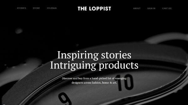
Cracked.com, a popular humor website, has a homepage design filled with rows and rows of articles, complete with humorous photos and headlines, such as “20 Rules of Movie Universes (That Never Happen in Real Life).” The Loppist, on the other hand, an online editorial for art and design, has a more elegant site design with one large background photo above the fold and minimal content underneath.
Neither style of magazine web design is right or wrong and they both work well for the content they are publishing and their target audiences.
These publications know the personalities of their audiences, which makes it easier to design home pages and article layouts to suit the different tastes and expectations of their readers.
3. Use Bigger and Bolder Images
Get creative with your images – image by Naghiyev / shutterstock.com
Editorials have used big and bold images in their magazines for decades, but the web has stuck to smaller images for the majority of its existence. In the past, this has been for more practical reasons, such as screen sizes and download speeds, than a simple matter of preference.
However, times are changing and the constraints of the internet are slowly falling away. Therefore, you shouldn’t overlook the power of using the right image at the right time. Don’t be afraid to make high-quality, well-optimized imagery the focal point of your news or magazine site design.
If you can’t take your own photos, use stock photos, but be more strategic in the way you choose them. Use quality sites like Shutterstock or iStock to find eye-catching, well-produced images that help convey the message of your article to your readers.
You can even use such royalty-free sites as Unsplash and Gratisphotography. In fact, there are plenty of places to find free, high-quality images for your project.
If you do decide to use stock images, try to stick to a style or theme for your article. For example, here at Elegant Themes, we typically prefer to use vector images, rather than illustrations or photographs.
Don’t be afraid to use these photos as large header images for specific articles. Get creative so you or your client can tell better stories by using the right visual effects. Every time you create a new post stop and think about whether or not its main image is worthy enough to be featured as a magazine cover.
Circling back to choosing the right WordPress magazine theme, the best ones will allow you to create page layouts that break free from the constraints of the WordPress post editor. This allows you to design layouts for your articles that combine text and images to great effect.
4. Use Multiple, Well-Designed Typefaces
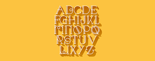
Don’t underestimate the power of typography – image by Oleksii Badusov / shutterstock.com
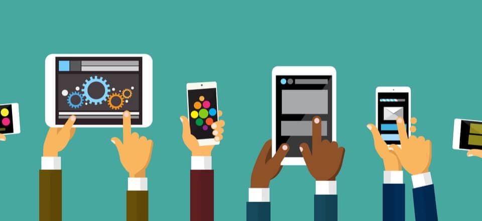
It’s still very important to use web-friendly fonts. More and more people are consuming news through mobile devices, meaning your fonts need to look great on a wide range of screen sizes. But that’s not all there is to worry about.
Feature images are among the best ways to encourage users to click through to an article. However, don’t underestimate the power of well-chosen typefaces. They may not be game-changing additions to the design of your site, but they do play a large role.
You should also consider using multiple fonts on a single page. Use one font for the title of your article, another for the headings, and a third for the paragraphs. Try experimenting with a mixture of fonts that compliment each other, as well as those that don’t.
Due to the range of devices being used to consume content today, there are some exciting typography trends emerging in 2016, so be sure to experiment with your website and see what works best with your content.
5. Combine Big Images with Well-Chosen Fonts
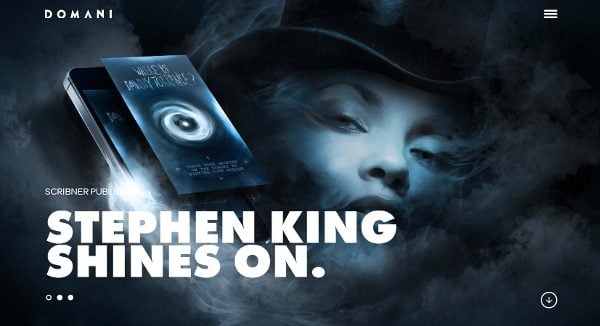
Experiment with combining images and text
When you combine big and bold images with well-designed fonts, you can create eye-catching visuals that will make editorial content come to life. Take a look at how Domani Studios does this on their homepage. You can use the same technique for the feature or header image of an article to make the overall message of a post stand out.
It doesn’t always need to be large, bold fonts, either. Play around with your designs to see what works best for your publication. For example, a lightweight script font might work better for a high-end, sophisticated fashion magazine.
6. Use a Grid System
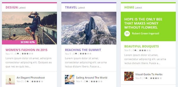
Grid layouts can be used to great effect
Editorial magazines have used grid systems in traditional publications for decades, so it’s only natural for web designers to incorporate this practice into their designs. A grid system is a structure for a page, typically the homepage of a website, that uses horizontal and vertical lines to display content in a way that’s visually appealing and easier for the user to consume.
You can use page builders to design your own grid systems, and that includes the Divi Builder. Check out Tom’s post on the best WordPress grid plugins if you’d like a simple way to improve your magazine web design.
The most visually appealing grid systems use more images than text, so be sure to use compelling thumbnails your audience would appreciate and would want to know the story behind when using grid systems.
7. Embrace White Space
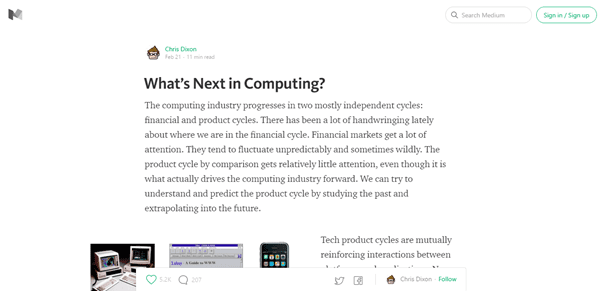
Don’t fear the white space
White space used to be a big no-no in the world of magazine web design and in online design in general. Designers, graphic designers in particular, stuck to a hard rule that advocated the use of every ounce of white space available because white space was “wasted space.” This creates a huge problem – clutter.
Without white space, all of that time you or your clients spend coming up with great headlines and designing eye-striking images can be wasted in the clutter these no white space designs deliver. Embrace white space and use it to show the reader where they should focus their attention.
Take Medium, for example. This site doesn’t display sidebars on articles and uses very few additional elements on the pages. Instead of getting distracted by advertisements, email opt-in forms and other elements, the reader’s attention has one and one thing only to focus on – the content.
8. Use Google’s Material Design
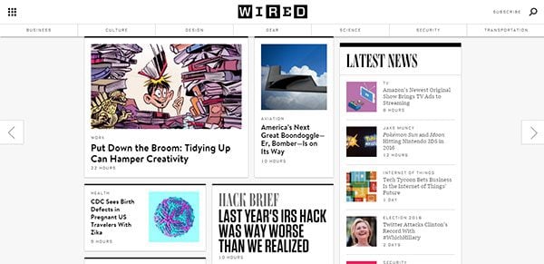
Get ready to embrace Google Material Design
If you read Randy Brown’s forecast for web design trends in 2016, you’ll know that Google’s Material Design is going to be a major player this year, and editorial designers should take notice.
Material Design, introduced by Google, namely for use on Android devices, in late 2014, is a fresh take on flat design. Basically, it gives typically flat elements an extra layer or two so they are not entirely flat, breathing new life into this popular design trend.
This turns elements into cards so they differentiate from each other. A great example of incorporating this into your magazine web design strategy is to use it for homepage elements, such as article lists. As you can see in the image above, Wired uses this design to visually separate the different articles on their homepage. The article cards even have a “lift” animation when you hover over them.
This magazine web design trend gives web designers the option to differentiate between two or more elements on a page, in a way that’s more visually appealing than the typical options offered by a standard flat design.
9. Use Elegant Microinteractions
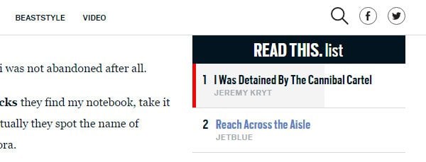
Example of microinteractions on the Daily Beast sidebar
In Dan Virgillito’s post about the five UX trends designers should be aware of in 2016, he mentioned two great examples of microinteractions that work great on editorial websites.
Microinteractions are tiny little interactions that help a user navigate a website. This could include a small button in the bottom, right-hand corner of a web page that takes a user directly to the top of the page when it’s clicked on.
An excellent example Dan gave is a progress bar that lets the user know how far along they are in an article. The Daily Beast uses this in their Read This List sidebar feature that accompanies every article. Adding this feature to your magazine web design is a great way to keep users engaged with your content for as long as possible.
10. Box Out Important Information
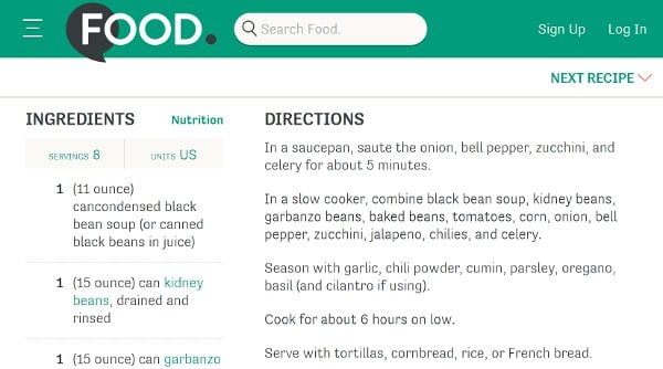
Use breakout boxes to entice readers
Certain publications may get a decent amount of use from boxing out important information and displaying it to the side of an article in a way that’s easier for the reader to digest. This practice is popular on cooking websites, providing an effective way to display lists of ingredients in the sidebars or close to the edge of the article.
It can also be used by creative websites as a way to display a list of materials a reader will need to complete a DIY project. Editorials can use these same practices if they produce how-to articles on their sites, but there are other ways to use them as well.
For example, publications that use the inverted pyramid method of writing may find it useful to display the main points and facts of an article in one of these boxes, but then use the entire article to elaborate on those points and facts.
Breaking out with some additional content can help you provide your readers with some easily digestible information to support your article and draw in anyone browsing your website.
Final Thoughts on Magazine Web Design
Style is one of the most important elements to be taken into consideration with this type of website, and for good reason. An entire publication, including every piece of content that is published, revolves around that style. That’s why it’s so important for you as a designer to keep functionality and the site’s overall user experience in mind when implementing that style.
Every time you incorporate a new design on an editorial site, consider how it will affect the site’s user experience. For example, background videos look great, but the benefits they can bring to a website quickly evaporate when it prevents a user with a modest internet connection from loading your content.
What are some of your favorite online magazine web designs? Let us know in the comments below.
Article thumbnail image by Dacian G / shutterstock.com


the speed of the website should also be noted, do not get website visitors to be slow and lazy to open webiste
Great Article
Using a Magazine theme is one of the best tip which I also follow
Thanks for the post
Great Article. Thanks for tips
Sorry all! I really dropped the ball on this one.
Thanks for taking the time to point out the issues and I will take them on board.
No worries, Joe! It happens! On the plus side, the principles you mentioned were great ones! I’d like to see more of your thoughts on this subject. I’ve been considering taking on a substantial project for an online magazine and a more in-depth article on this same topic would be AWESOME!
Hi Joe ,
Style is what readers see first on blog or magzines so if we are going to ignore Style theme of website then I think we are taking care of our magzine or blog. I always strugle for finding good theme but I found many time it be very time consuming and technical so I looks Designer and one whoi can give me better style for blog.
In my opinion, the style is the second part after the speed of your website. There is no point to see a great website, but can not be opened because it is too slow
Maybe this is just my opinion
A great is of a theme of this type
Some awful English … Should be…
A great them of this type
Richard, I was going to say a similar comment.
Pro: I really enjoyed the concept and topic of this post. It was interesting and useful to read. I feel as though it provided actionable steps and ideas for the readers, which is always important.
Con: Severe grammar abuse occurred in the making of this article! I get it, not everyone is a hardcore stickler for appropriate grammar, spelling, etc. and everyone makes mistakes. Even the best of the best bloggers have the occasional oops… it happens! But the important thing is that every effort is made to avoid obvious errors in your writing. The purpose being because grammatical errors just plain look bad, they reflect poorly on the site/blog/business, and they decrease the post’s flow by making it difficult to read. Unfortunately, the errors in this post are plentiful and, as a result, are very distracting and make it extremely hard to get through.
I’m normally a big fan of all Elegant Themes’ posts and this one had the right idea and topic choice, but the fact that there are more errors than not make it unshareable.
Because the topic is great, I wouldn’t toss that aspect of the post away, but I would DEFINITELY suggest that this be rewritten to remove the truckload of errors.
Agreed. And add links to the related sites mentioned. Make it easy on your readers.