
These days, everyone seems to be competing to achieve the most modern-looking designs. However, there’s something to be said for dipping into nostalgia from time to time. In some cases, a classic typewriter font can be the perfect element to add a little vintage style to your designs.
In this article, we’re going to show you 12 of our favorite typewriter fonts. Let’s go vintage!
12 Best Typewriter Fonts for That Classic Writer’s Look
For this roundup, we’ve focused on fun typewriter fonts that are easy to read. This way, you’ll be able to use them as part of any element within your designs, although they’re particularly well-suited for logos.
1. Postmark Typewriter
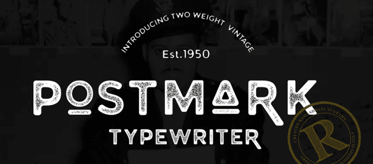
To kick things off, we have Postmark Typewriter, a rugged font that looks like it was spat out from the oldest typewriter you can find. This sans-serif font features thick lines (which makes it easy to read), and wouldn’t look out of place on a modern site, despite its heritage.
Price: Requires an Envato membership | More Information
2. Manson Font Family
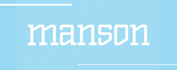
Next, the Manson Font Family looks like it came straight out of a typewriter from 3018. This serif font includes three different weights, the lightest of which would look right at home on a tech-related website. Also, as the font gets thicker, it gets more whimsical, which makes it a versatile option.
Price: $10 | More Information
3. Not My Type
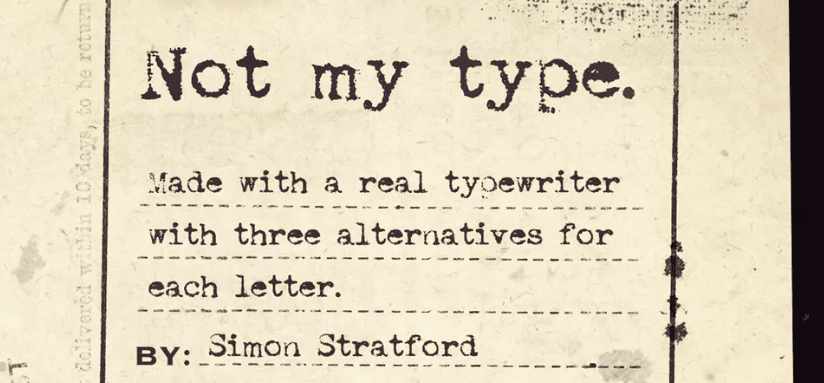
Not My Type is the kind of font you’d expect to see on an old postcard from World War II. It features faded borders, and there’s a marked difference between the thickness of its stems and strokes. In practice, this combination makes for an almost handwritten style, only more mechanical.
Price: Requires an Envato membership | More Information
4. Conspiracy

Conspiracy believers are often a bit ‘kooky’, and this font reflects their quirkiness perfectly. Although it looks like it came from a typewriter, you can notice the letters aren’t perfectly aligned, which gives the font a more carefree style. We wouldn’t recommend using it on a business site, but it wouldn’t look out of place at all on a blog or a portfolio.
Price: Free | More Information
5. Secret Typewriter

Secret Typewriter is both an excellent name for a font and a perfect description of this typeface’s style. Although this font is very easy to read, you’ll notice it features brushes over most of its letters, which make it look smudged. These imperfections are a perfect way to add a dash of style to a simple, elegant font that’s a great option for blogs.
Price: Free | More Information
6. Old Newspaper Types
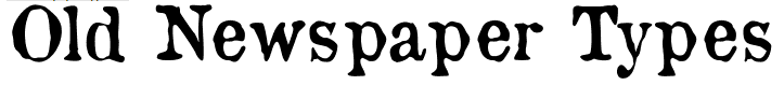
Old Newspaper Types straddles the line between a typewriter and a gothic font. Its squiggly lines make for a great addition if you want to add a little whimsy to your website. However, due to its unique style, we’d only recommend using it for headings since it doesn’t translate well to smaller sizes.
Price: Free | More Information
7. Badly Stamped
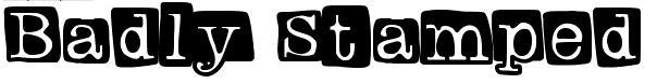
If you’ve ever wanted to use a font that looks like the letters from a ‘TV-approved’ ransom note, Badly Stamped has you covered. This is definitely not the kind of font you want to use for your site’s content or subheadings, but it makes a fantastic option for logos or for a header section.
Price: Free | More Information
8. Hammer Keys

Out of the fonts we’ve seen so far, Hammer Keys is the one that comes the closest to capturing the style of an old typewriter. The font’s style is thin and almost fragile, which doesn’t make it a good option for small text. However, despite this, Hammer Keys is the way to go if you’re looking for a near-precise replica of a vintage typewriter style.
Price: Free | More Information
9. Remington Riviera
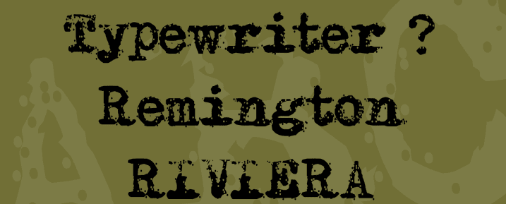
If you know your typewriters, you’ll recognize the Remington Riviera name. On top of being a stylish font, Remington Riviera is the name of a popular model of typewriter. The Riviera stood out thanks to the thick letters it produced, and this font replicates the style. Plus, it even adds a few smudges to complete the effect, and it’s an excellent option for a blog logo.
Price: Free | More Information
10. Traveling_Typewriter
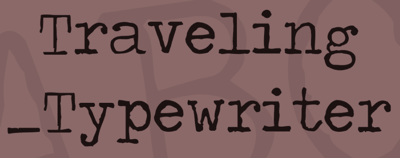
To continue the trend of fonts based on real typewriter models, we’ve got Traveling_Typewriter. This particular font face was modeled after the style of the Olympia Traveller de Lux typewriter. As the name implies, the Olympia was somewhat lighter and more compact than other typewriters of its era, although we still can’t imagine anyone lugging it around.
When it comes to style, Traveling_Typewriter also keeps things light. This font features thin stems, and the design is a bit wobbly. However, it looks and reads great even at small sizes, so you can still use it for your blog’s content.
Price: Free | More Information
11. Albertsthal Typewriter
This typewriter font features a rather unique style. It uses the same smudge technique we’ve seen in other entries so far. However, Albertsthal Typewriter kicks it up a notch. In some cases, its letters almost look like someone typed the same key twice. This can make it a bit harder to read at smaller sizes, but it’s still a stylish font you can use for newspaper designs or logos.
Price: Free | More Information
12. Avolajoin
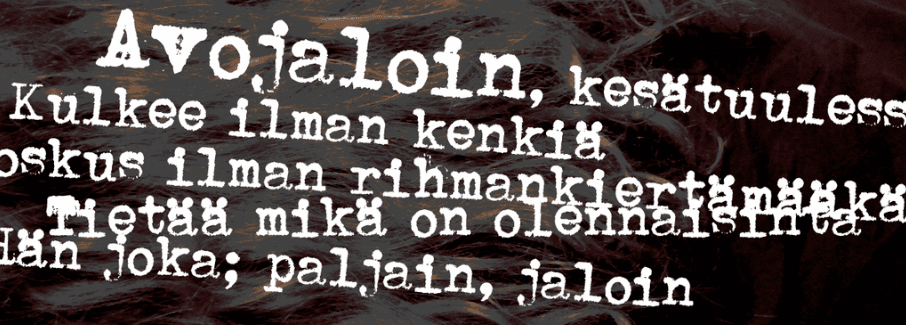
Avolajoin is a typewriter font that wouldn’t look out of place within the pages of a comic book. Its lines are thick and the borders of its letters are disseminated. The overall effect is excellent if you want to leave an impact with a title or within a design. However, the font isn’t that well-suited for small print.
Price: Free | More Information
Conclusion
Typewriter fonts are about as vintage as you can get when it comes to design. With the right font, you can add a dash of nostalgia to your website, and it sets the mood for the type of content visitors should expect.
In most cases, we recommend typewriter fonts for blog designs and personal websites. For example, Postmark Typewriter would look perfectly at place on a rugged travel website. The Manson font family, on the other hand, is modern enough you can get away with using it on a logo.
Are you planning on using a typewriter font for any of your upcoming designs? Tell us why in the comments section below!
Article thumbnail image by Julia Tim / shutterstock.com.


Are these fonts available for a Mac computer?