Earlier this month we introduced Divi 2.4, the biggest upgrade in Divi history and a giant leap forward for our most popular WordPress theme. There are so many great features to explore in this update that it was hard to describe them all on the release post, which is why we have decided to do a 2-week series of informational blog posts that will aim to teach you how to take full advantage of Divi 2.4 and its new options. In part eleven of this series, I will be exploring the upgraded Fullwidth Header module, complete with new Full Screen functionality!
The Fullwidth Header Module Gets A Huge Upgrade
Divi has always had a Fullwidth Header module. In Divi 2.4, however, this module has been greatly expanded with dozens of new options that make it one of the most versatile modules in Divi’s collection. There are over 20 different possible layouts that can now be created with this single module, and a myriad of new styling options that can be applied to each element (thanks to Divi’s new Advanced Design Settings). Where before you were limited to only two pieces of information in your header (Title and Subhead), the header has now been expanded to include various images, buttons and backgrounds (each of which can be arranged in different ways). To top things off, a new “Full Screen Mode” has been added to the header, which will force the header to extend the full height of the browser.
Exploring The New Options
There are a ton of new options available for the Fullwidth Header module. At first glance they can seem a bit overwhelming, so let’s go over each of the available options to better explain what they do.
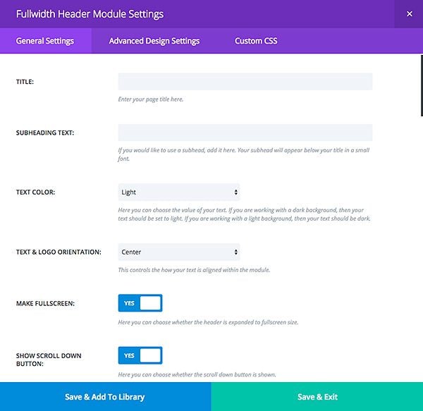
When you add a new Fullwidth Header module to your page, you will be greeted with the following settings:
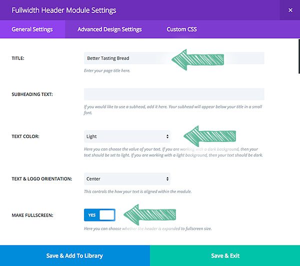
Title – Enter your header title here. This text will appear below your logo image and above your subhead text if defined.
Subheading Text – If you would like to use a subhead, add it here. Your subhead will appear below your title in a smaller font.
Text Color – Here you can choose the color value of your text. If you are working with a dark background, then your text should be set to light. If you are working with a light background, then your text should be dark.
Text & Logo Orientation – This controls the how your text is aligned within the module. You can choose between left, right or centered alignment.
Make Fullscreen – Here you can choose whether the header is expanded to fullscreen size. If this option is enabled, the header will always have a minimum height equal to the height of your browser window. This is a great way to add extra prominence to your header, making it idea for greeting new visitors on your homepage.
Show Scroll Down Button – Here you can choose whether the scroll down button is shown. When the scroll down button is clicked, it automatically scrolls users down to the next section on the page. It also gives an indication that more content exists below the header (since the “full screen” effect can often be deceiving).
Button Text – If you would like to display a button in your header, you can enter the text for your first button here.
Button URL – If you would like to display a button in your header, you can enter the URL for your first button here.
Background Image URL – Headers can have an optional background image applied, which will appear behind your text and header image.
Background Color – If you would like to give your header a background color, you can specify the color here.
Background Overlay Color – Choose a background overlay color, which will be placed on top of the background image and behind your text. Semi-transparent background overlays can create some interesting effects when placed above background images.
Use Parallax effect – If enabled, your background images will have a fixed position as your scroll, creating a fun parallax effect.
Logo Image URL – Logo images are displayed above your title text (if defined). As with all elements in the header, logos are optional.
Text Vertical Alignment – This setting determines the vertical alignment of your content. Your content can either be vertically centered, or aligned to the bottom.
Header Image URL – Headers can also have an optional header image. This is a larger image that is displayed separately from your title text and logo.
Image Vertical Alignment – This controls the orientation of the image within the module. It can be aligned independently of your logo and text, resulting in over 20 different possible layouts.
Creating Your Own Header Module
Now that we have familiarized ourselves with the new options available, let’s take a look at how these options can be combined to create some stunning headers. In this tutorial, I will be showing you how to create a header in the following style:
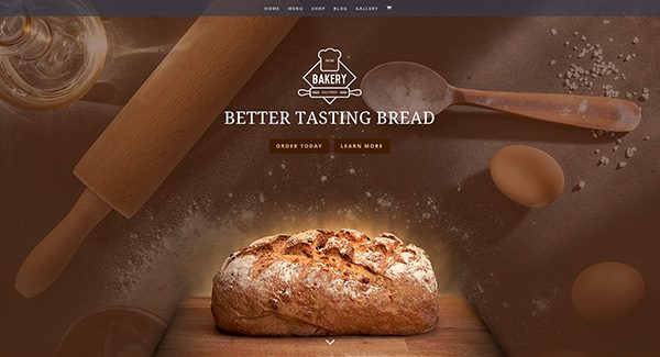
This configuration takes advantage of most of the new options added in Divi 2.4, and is a great example of how all of these elements can be successfully combined.
Getting Started – Selecting Your Images
In this example, I will be creating a homepage for a fictional bakery. At the top of the homepage, I want to quickly describe what our company is all about using some beautiful imagery and a bit of text. First things first, we need to decide on some great photos. Selecting images that go well together is the most important part of designing a beautiful header. The Fullwidth Header has 3 different images available to it:
- The Logo Image – This image is placed above your title text, and is typically a small logo to represent your company.
- The Background Image – The background image is placed behind your header content. It’s best to think of the background image as a textural element. We don’t want something too overpowering. It should compliment the rest of your header, but it’s not the main subject of the module.
- The Header Image – This is a larger image that is placed adjacent to your title text and logo. It can be placed to the left, right or below your text content.
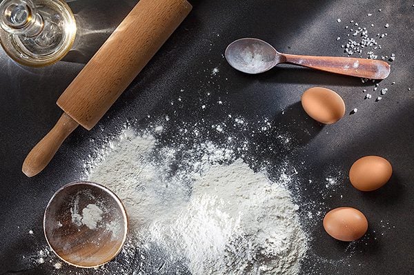
To get things started, I have selected a background image that goes well with my baking theme. This image is not too cluttered, and the lack of depth also makes for a more subtle appearance.
I have also uploaded my company logo image. This will be placed above my title text. It has been saved as a transparent PNG image so that the background image will be visible within the negative space of logo.
Next, I have selected an image to be placed below my text content. This is my main “Header Image.”
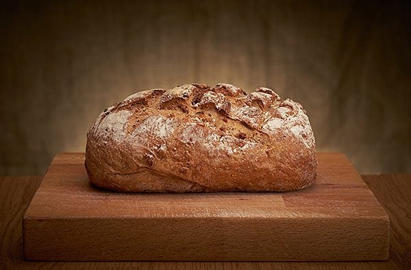
Since this image will be placed on top of my background image, I have decided to turn this photo into a transparent PNG as well (just like our logo). I used Photoshop and the eraser tool to fade out the edges so that the transparency can take full effect. Here’s what the image looks like after I finished fading it in Photoshop:
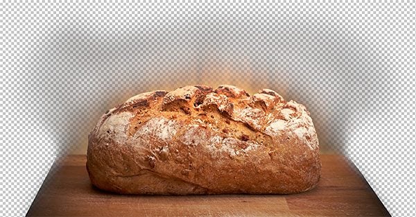
Now that we have our basic elements in place, we can start constructing our header!
Putting The Pieces Together
First of all, we need to add a new Fullwidth Header module to our page. To do that, add a new Fullwidth Section and click the “insert module” button. Locate and select the Fullwidth Header module.
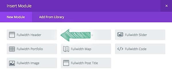
This will bring up the Fullwidth Module settings that we went over earlier. To start things off, I input some title text (“Better Tasting Bread”) and enabled the “Fullscreen Header” option. I also changed my text color to “light” since the background image I chose earlier is rather dark. We need to make sure that our text will be readable.
Next I added my background image by uploading the image that I chose earlier.
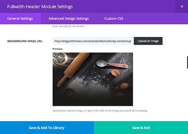
After saving, you can see what our header looks like so far. We have only a title and a background image, and the header has been set to extend the full height of the browser.
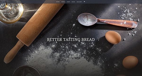
Things are looking pretty good so far! However, I am noticing that as I scroll down the page, the white color of the flour is clashing with the white color of the text. This is a very common problem with background images. It’s often difficult to find a background image that has a low enough contrast to never compete with your text. Luckily, we implemented a new featured called “Background Overlay” that solves this problem by adding a semi-transparent color on top of your background image to help tone it down. It can also be used to colorize your photos.
Since I am going for more of a brown color scheme on the page, I have chosen to place a semi-transparent brown overlay on top of my background image.

Once we save and apply the overlay color, you can see that overall color of the background image has now taken on a brown hue. Since only part of the background image can be seen through the new overlay color, it also lowered the contrast of the image and toned down the white of the flour.

Now things are starting to come together! Let’s continue to add the rest of our content to the header. Next up, I uploaded the logo image I chose earlier. I also filled in the “button text” and “button URL” settings. Buttons are placed below your header title, while the logo image is placed above it.
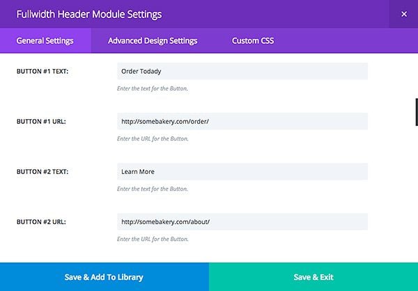
The logo, title, subhead, and buttons are always placed together (and in that order). All of these elements are optional. If you don’t want to use any of these items in your header, simply leave their setting fields blank. After uploaded our new logo and adding our two buttons, you can see the end result below. Since our logo image is a transparent PNG, the background image and overlay color are shown through the negative space. This is a great effect, and something you should consider using in your own designs.

There is only one piece of the puzzle left, the header image of the piece of bread we chose earlier. This is an important part of our header, since it will quickly let our visitors know exactly what our company does. Together with our title text and logo image, all of the important information necessary to understand what our website is about can be seen right away.
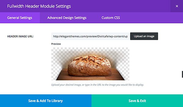
As mentioned earlier, I have used Photoshop to fade out the edges of the image and saved it as a transparent PNG (just like our logo). When combined with a background image and parallax affect, we can create the illusion that these two elements exist in the same space. With this finishing touch completed, our Fullwidth (and Full Screen) Header has been finished.
This Is Just One Example Of Countless Possibilities!
This example is just one of many different ways that the Fullwidth Header module can be used. By choosing different image and text orientations, the layout of the header can be drastically changed. Here is a spreadsheet of all the different layout possibilities just to give you an idea:
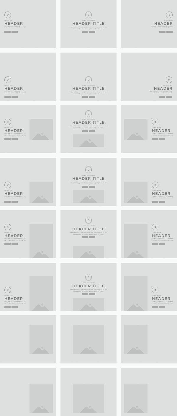
As you begin to experiment with different text and image orientations, combined with different styles of photos, you will start to see just how versatile this module has become.





Hi, is there a way to upload a high resolution image for mobile devices with retina display… Normally I would upload a big logo or image and adjust the max size of it on the advanced settings (while using image module)… but that option is not available on the fullwitdh header… is there a way to adjust that? When I upload the image the size I want, it looks ok on desktop but on mobile looks terrible… How can I adjust the max size of a logo or image on this module? Or how can I export my image on the exact size, that plays weel with retina devices? Thanks
What you may want to do is create two modules–one for desktop and one for mobile–with different image sizes. Then disable the desktop one for mobile (and the mobile one for desktop) by using the right-click disable feature in the builder. This is made even easier when you consider that all you have to do to get your second module is clone the first one and swap in your mobile optimized image.
Great thanks, time for update then 🙂
Hi
I want to change the font size inn the slider when viewed on phone. I have set the body font size to 38 so its easy readable on the site. But on the mobile the tekst is way to big and not easy to read.
Is there a way to change the font size on just the mobile?
Yes. In the latest version of Divi there are controls for desktop, tablet, and mobile devices. You can see it in action here http://www.elegantthemes.com/blog/theme-releases/divi-2-6
Can i move the position of the button on the Divi Full Width Sliders easily?
I’d like to leave them in the centre but move them up or down according to the background image.
Yes that is something you can easily adjust by changing the padding/margins of your elements within the header.
Hi, this is a great feature, but PLEASE add the possibility of a slider or a random image to the header module… Or a fullscreen feature to the slider… 🙂 Thanks for a great theme..
Oli, Iceland
I was just about to post/request this!
Hello Nick,
I want to bring the titel, the text and the button in a slider on the left side.
I have seen in your tutorial (divi version 2.4.) that it is below the function textcolor already the function text orientation.
But I can not find in my module but, although I have the version 2.5.9 Divi.!?!
Is there different slider modules in different languages?
Juri from Potsdam, Germany
Love the Divi theme since a web-developer set it up and set my website on it. However, I’d like to move the text on a slider picture to the bottom-left – is this possible?
Great set of new features – thanks ET! Curious as to how one might go about making the full width header module 50% of the screen? Have been trying to achieve this by adding CSS via the main element but haven’t quite got it working. Any suggestions?
Awesome tutorial and great product!!
I’m looking to reposition the Header Title text to be vertically aligned a bit higher on the page (somewhere between the center and the top)
Can someone recommend the custom css I would need to do this?
Also, if using a logo image above header title, how would I position that a little higher?
As always great posts! You guys give us inspiration and make us better every day. Images in this post needs to be fixed! Anyway, great job! Thank you!
BTW. Is the website link in this post “do follow”? 🙂
I’d like to see the images in this tutorial, please.
Me too, please. Images are still down 🙁
Hey all,
I’m working on my website and found that enabling full screen full-width doesn’t allow navigation links to work on mobiles. Basically the the navigation links are hiding behind the full screen overlay image.
The desktop and tablet option seem to work fine, the mobile verisimilitude is unusable. Can someone help out please?
Very nice tuts and well explained.
Does someone knows if it’s possible to have a “scroll up” button like the scroll down one? Could be useful..
Brand new to Divi but very excited to see how far you can go without having to tweak with dirty tricks 😉
Fred
Is it possible to have the slider fade instead of slide? That’s a pretty common slider option. Maybe I’m just not seeing the option. Thanks.
I was wondering that same thing? any ideas anyone?
Hi all,
I noticed on this demo that the menu is over the image. I watched all the video tutorials but couldn’t find how to have this effect. I want the same menu effect but just to be left aligned – logo on the left, menu items on the right and the menu the be OVER the header image with a bit of transparency and after a scroll to show the second menu with no transparency.
It would be great if this module would pick up the default post title. Just the same way the post header picks up the post title.
hello. How can I find out and edit the dimensions for the fullwidth header and background image? My current photos are a little too big and I want to shrink both down to make it fit better on the screen. Thanks!
Ho Nick, Great looking landing page. Do you have any recommendations for to the size of the background image. Thanks!
H iNick, Great looking landing page. Do you have any recommendations for to the size of the background image. Thanks!
hi everyone, I’m not sure if anybody else has this problem but the vertical alignment setting does not seem to work in IE. we had to do a little CSS hack to get the logo and subtitle positioned in the middle of the page.
Yes, we have that problem! Can you share the CSS you used to fix this, please?
Hi Nathan
Probably a simple solution that I’m missing somewhere but is there a way to make the button links open in a new window?
Thanks
Alan 🙂
This is probably a basic question, but how do I change the size and orientation of the text area of “full width header”?
I uploaded my background image, but now my text is layered over the image. I would like to make the text appear to the right of the image.
Thanks,
Brian
Instead of having your image be the background of the entire section, try putting it in an image module to the left of your text.
Sorry, I just read my post and its really confusing.
I do need the image to be set as background for the full width. That works fine.
However, my issue is I want my text to be on the “right side” of the image……..versus centered on the image.
Thanks!
Oh ok. Instead of one text module, you could create one text module and one divider module in the same row. That way you could place the text on whichever side you want and the other side will stay blank.
Cool Cool Cool
Hi Admin
I happy purchase this template
but I need some guide in order to using parallax
cause in theme option, I can’t find swicth to turn it on
I want to make my homepage like in Blog DEMO divi,
but to bad, I can’t find the way to use it optimally.
Thankss
Hi Robert! Sorry you’re having trouble. The best place for us to help you out with that is in our forum.
Using full width header module, how do i:
1) Get button URL to open youtube/wistia movie in full screen?
2) Get the button to open movie in a new tab?
What css do I need please?
tysm
It seems there are 2 different menu sections. One when you first land on the page (brownish) and a second one (beige with logo) when you scroll down. How is that done?
I would also like to know how to have the divi header expand and change background color when you scroll.
Hi I am working on a web site for a joint project. Is it possible to upload multiple logos? We will have 3 or 4.
Many thanks
It’s not possible upload multiple logos into the logo area without doing custom coding. Honestly though, it sounds like having multiple logos in the logo area would get very crowded and possibly confusing. Maybe you could do a page section and/or footer section with four logos instead?
Thank you very much for the suggestion – I will look at putting them in the footer.
Kate
Great theme. How can I add a signup box (as used in a landing page with name and email) instead of a button in the header? I want to use full width background image, but two column header section. LHS would be text field, RHS would be signup. Or, could I even have 3 columns in the header? Text, header imagine and signup block all sitting above background image? Thanks
The full-width header module is great, but there’s a pretty significant oversight.
When you add the logo to the module in the settings, there’s no ability to make the logo clickable. There just isn’t an option to do that.
I’ve posted it in the support forums and they’ve simply said, “Sorry, that would require a great deal of customisation which is outside the scope of the support forums.”
Why would you put the logo in the header and not make it a clickable link, it just doesn’t make sense. You might want to fix that.
Wonderful tutorial, thank you!
Hi! I am trying to get my header to look like the image in the spreadsheet that is all of the way on the right-hand side, three boxes down.
This image has the logo, header, text all justified left, but on the RIGHT hand side of the screen. Can you let me know how to do that?
Hi, I was just wondering what size the background image you used was?
You can place the VIEW function SCROLL DOWN BUTTON:
“Show button to scroll down” in the header image url?
You can place the function “View button to scroll down” in the header image url?
Great features but not mobile responsive?! How and why? It just crops the image which is no go when I’ve put text on the image – please can this be updated or let me know a workaround?
Many thanks
Emma
I want to put my photo as a header but it does not take its full size it is cut into the top and there is a white space between the photo and the menu bar thank you for helping me
Guys, I’ve had a chance to play with some of the new features and it looks like you’ve absolutely knocked it out of the park again with the latest update.
Using your video backgrounds and the new custom css options, i was able to achieve something I’ve been wanting to for ages – check out my new website header.
Your header is awesome! May I ask where you got the images/video to do this? Really cool website.
What is the best way to control the Height of the Fullwidth Header? I’m using it as a transparent overlay on the bottom of a Fullwidth Image and need it to be smaller.
Fabulous post Nick!! I just love these tutorials 🙂
Very informative.Really amazing features. Worth taking it ahead for demo.
This is a great post. Thank you for all the upgrades to this release. These blog posts are perfect. I am learning so much from them. In fact I am now realizing why some of the changes I was making were not working like they should. Mostly because I did not understand how they worked or expected them to work. Your posts have helped clarify many questions.
As stated by others, short videos of 30 to 60 seconds discussing specific uses of a module/row/section would be greatly appreciated.
Keep up the good work!
I’m having an issue with the background overlay. It’s completely covering my background image instead of being transparent.
really amazing features. Actually i was looking for such feature because going to make an education blog. and they have long banner which they want on top. so thanx for sharing such article.
Hi there.
I’m trying out a fullwidth header module, set to fullscreen, and I’d set the Divi header to ‘hide until scroll’.
Weirdly the Divi header remains visible… hence pushing the fullscreen header module off the bottom of the browser window by a height equal to the height of the Divi header.
Any ideas where I might be going wrong here?
Thanks in advance!
Ah. Adding another section below seems to have resolved it!
Hail,
Any chances to hide or dramatically change its size on mobile devices?
best regards.
I mean, for the logo. To hide or…
Divi 2.4 is great and I am getting to grips with all the new functionality. How can I easily go about putting in a dotted image overall on the full page header image…
I have tested a few of your demo pages in Internet Explorer 11 and anything with a full header doesn’t function as it should.
Have you guys tested in Internet Explorer 11?
Yes, I hate Internet Explorer as well, and I use Chrome myself. But unfortunately some people still do use Internet Explorer. I am not asking you to support IE 6,7,8,9,10. But I thought that you would have made sure the sites rendered correctly in Internet Explorer 11.
Are you guys going to update the theme so it works in Internet Explorer 11, or should we be telling clients that their sites won’t work correctly on Internet Explorer.
Does anyone know of a plugin, or can Nick and the team at Elegant Themes develop something that pops up if someone tries to browse the site using IE telling them to use Chrome, Firefox, etc.
I have the same issue and am concerned that – if I can’t find a work around, that anyone using IE – and they have significant market share – will not be able to view the site as intended. I may need to make a non divi version of the site and – somehow – create a redirect for IE users. Does anyone know a solution?
What problem are you having with the fullscreen header? We just finished a site and found the fullscreen header is “too tall” for the screen on Internet Explorer. The scroll-down icon is there, but it appears “under” the bottom of the window, so you have to scroll down to see the scroll-down indicator icon.
Is this the same problem? If so, do you have a solution?
I’m having issues with the header in IE as well, when using parallax.
Hey Kevin and Elan, we’d be happy to help you with these issues. However the best place for us to do that is via our support forum. You can check there to see if anyone else has had and resolved this issue or create a new ticket for your specific problem. We try to make sure that all new tickets are addressed within 24 hours of submitting them.
Great post. Is there any way to insert a video url (like in the video module) instead of an image in the full screen mode?
This update completely screwed up my custom CSS on my site. My main navigation doesn’t stretch all the way across the full-width of the page!!!!!!!!
If you have modified the theme, it’s always a good idea to test your changes before updating the theme. You can downgrade to Divi 2.3 if you don’t have time to adjust your Child Theme. It’s available in the members area.
Unfortunately, when using a background image with the full screen option, the width is cropped on mobile (image is not responsive). Had to to change to full width slider.
Sorry, I misunderstood your point. Also, I found the “Full Width Slider” when adding a full-width section.
A full screen height option on the slider would be helpful, yes.
I’ve just put this suggestion in the Forum in Theme suggestions…
A lot of times we want a big fullscreen slideshow as the main image/header in the homepage of the website.
With Divi we can either use:
1. Full width Header (but no slideshow) or
2. Full width Slider (But we don’t have the option/button to check “Make Fullscreen”)
Maybe combine these two or in option 1 add the option to add “slides” or in option 2 add the “Make Fullscreen” button”
Thanks and keep up the god work
Hi Fernando.
This is true. I have resolved this for now by using a static background image in the “Section” which automatically makes it full-width, then adding a slider in the section which only contains the words and button.
I am hopeful that the full width image slider just needs a small tweak (to make it cover the full-width) which will come out in an update, so that other slider plugins will not have to used.
Great tutorial – the combination of step-by-step description with the images really helps – you make an otherwise intimidating task easy. And it’s so cool – this is like the new sophisticated, cool look! Much appreciated!
Hi,
It might be off the topic, but is there any way we can create custom forms?
Thanks
Definitely a great piece of work. I was just wondering if there’s a way to have a video instead of a picture in the background. The sample layout including a video media is using the full-width slider module which has unfortunately less customization options (font style, text positioning, only one button).
So exactly where is the full screen module?
I can’t see it in either the default list of modules or the library pack modules. Is it hiding somewhere?
Sunil, it’s in the ‘full-width’ section as an module-option.
I have really enjoyed your series of posts on Divi. There is no way someone would ever appreciate the power and flexibility of Divi without these very informative posts.
Nice job. Thanks
What size background image should I use? Mine keep getting zoomed in and the sides cut off. I want the whole width of the image to display.
Same problem here. Suggestions?
On their live exemple the background image size is 1920 X 1280
If it was working as you shown it that would be amazing. Unfortunatly there is a few bugs. For example, everytime I load the page all of the elements drops about 200px down and end up being off center.
Maybe it is because of the hidden menu before scroll or something else but it’s unfortunate.
I can confirm the jumping each time you click any link. But the term unfortunate is too polite, I just couldn’t present such a nasty flaw to my potential clients or customers.
Also, after the jump there is the background coming through about the height of the menu between the menu and the image in the blog post “Beginner’s guide to …”, the only one where the image is right on the top of the post.
I hope the developers at Elegant Themes repair that jump bug right away. It’s quite beautiful to have such a full width and full browser window header.
So it would be a real pity to be unable to use it because it keeps jumping.
Though, if I think of it, everything jumps, not just the page with the full-width header. It’ the same with the “blog”, the “gallery” and the “cart” page. Where there is no such a header.
What’s going on, after all?
Oh this is perfect! I love seeing the amazing possibilities with Divi however, sometimes I struggle over how to recreate similar effects with my own site so thanks for this!
Thank you so much. This was excellent and extremely useful. I had not appreciated the power of the screen header. I now have 3 sites that require some modifications.
Thanks again!
Hi, Nick!
Thank you so for what you are doing!
This header is really great but i want to attract your attention on two things:
1. Imagine how great it would be if any section will get this magic button – fullscreen. It means so many possibilities.. forms and blurbs and midule on first screen
or page which scrolls screen by screen
Please think about this option in future
2. In this module there are so litle possibilities for customization – no padding for centered header, no transparent bagground for part of screen (with text and header) not for all screen and many other options.
Anyway thank you again!
Full screen slideshow you say? Add a Fullwidth Section and a Fullwidth Slider. Create a child theme, add this css code. Voila!
.et_pb_container {
height: 90vh !important;
}
Yes please!
I want the “fullscreen” button specially in the fullwidth slider module.
That can already be done right??? A fullwidth section can go anywhere on a page??
You could follow the same guidelines for this hack I did
http://s91585912.onlinehome.us/howididit/whatidid4.html
And do a copy for the fullwidth header option to the standard section.
You should go down to one theme, I bet you could make one theme do all what these themes can do. I challenge you Elegant Themes.
Maybe down to under 5. Explorable is a pretty unique theme.
Wow, this is amazing, high time to pally with a prodigy graphic designer for future site design with Divi! Thanks a million Nick this is very lucid!
Cheers!
This is a fantastic demonstration of your talent as a web and graphic designer..
Please, tell us where do you find all these beautiful images? I don’t believe that these images can be found on some common stock photography such as photodune or Shutterstock..
You might be surprised what’s available on stock photography sites these days! Try taking a look at shutterstock or istockphoto, I buy more graphics/illustrations from stock sites, but used to buy some aaaamazing images for a travel company I worked for.
Totally agree !
I think they have a pro photographer in their team so they can design about any topic.
Really inspiring !
Endless possibilities. Thanks!!!
This is just insane, these new features are everything that you need, all at the click of a button. Please keep the tutorials coming, there’s so much fabulous new stuff that they are defo needed.
Thank you so much guys. x
I LOVE this look… Did a quick one on my site in 15 minutes and already had 5 requests for new web designs. This is the best ever… Just wanna find out if there will be slider options for this in the future 🙂
Excellent visual and informative tutorial. Thanks for taking the extra time to put it together. -M
Hi – my logo doesn’t display in IE! Will this update fix this!? Also when you put custom font sizes onto individual text items (my home page header) they become no longer responsive – especially for phones – how can I correct this?
I can’t wait to try this out! Thanks!!!
P.S
you might wanna change “Last week we introduced Divi 2.4, ..”
It’s not last week anymore xD
This is a blog post.. a blog always has a date.. so count a week backwards. They don’t really had to have changed that. 🙂
this will look great on our website landing page 😉
I may have found a bug. Use a site title with quote marks in it. Save. View result. Looks fine. Now save the module to library and make it Global. View page. Surprise! The quote marks are replaced by 22%. Edit and change the quotes to & quot; (without the space of course). Save. View. Phew. It fixed the problem. Well. No. Now if you return to edit something else, you’ll find the field for the site title is now empty.
This is using the latest version of Divi that was released yesterday.
Hi,
Please open a new ticket in the Support Forum so we can take a look. Thanks!
Two thumbs up Nick !
Seems the sky isn’t the limit anymore at ET.
You just broke through it.
You guys are just incredible !
Good morning Nick and Team, When I use the “no menu until scroll” it adds like 110px in the header so the VH is moved down and the “down arrow” is hided below the fold.
Hi Facu,
Please install the latest update (2.4.4). If the issue persists, open a new ticket in the Support Forum so we can take a look. Thanks!
Confirmed, not resolved in 2.4.4, Will open a ticket, Thank you Dustin
Hi Facu!
Found this in the forum: “add this code to the Custom CSS > Main element within Fullwidth header module settings”
padding: 0 !important;
It works for me!
Great tutorial Nick, i’ve tried to do a similar layout but i can’t seem to get rid of the padding below the header image. I want it to site flush with the bottom of the fullwidth header module, like on your bakery demo.
any suggestions?
Choose “bottom” orientation for the image.
Hey Nick – when I choose “bottom” for the orientation of the image, I still get padding below the image. Any suggestions on why this might be or what I can do?
Hi Nick!
I wonder how I get rid of the social media icons that are “fixed” on my website to the left, wherever I click. I noticed you got them as well in this post. I completely forgot how I placed them there in the first place..
Thank you!
Those are your “monarch” social media icons. On the VERY bottom of each page you have an options box that says “Monarch Settings”. Click the checkbox that says “Override” and then deselect the “sidebar” box.
Wala – icons should be gone.
** You’ll have to do this for each individual page, or either go to your “plugins” tab, open the Monarch settings, and turn it off to update your entire site.
Hope that helps!
i´m sorry i failed the link is this http://www.elegantthemes.com/gallery/divi/