

Have you ever come across a website design that made you laugh out loud? I don’t mean just something on the website is funny, but the design of the site itself is funny because of how terrible it is.
It takes a lot of time and effort to learn how to properly design a website. There are many sites out there where the designers just haven’t learned these principles at all. Bless their hearts.
In this article, we’ll take a look at a few websites that are hilariously terrible. First, let’s look at a few of the design principles by which I’m using to judge these sites.
Design Principles
I’m looking at these sites with several design principles in mind. They include:
- Easy to understand navigation
- Proper use of color
- Proper use of animation
- An easy to use layout
- Pleasing to the eye
- Appropriate to the topic
- The design elements don’t get in the way of the content
- Great content that’s easy to find, navigate, consume, and share
Before I Make Fun of Your Website, Let Me First Say This
First, if you’re the designer of one of the sites I’ve focused on here, please don’t take offense at my remarks. I don’t intend to cause you any trouble or pain and I’m not making fun of you. I’m only using these sites as examples and I’m showing what’s wrong and how to fix it. I mean no disrespect. Some of these sites are designed by beginning designers. We all had to start somewhere. And before you ask to see my first attempts… no.
Also, I’m not looking for sites that are just old. Sites that haven’t been updated in years look terrible to us now, but they were designed using the design elements of their time. If I included an old design, it wasn’t just because it’s old – it’s because there’s something in the design that’s just plain terrible. Of course many of these sites have been around for a while, but their design is just plain, well… you’ll see.
On To the Websites
I scoured the ‘net for sites that made me make a sour face then giggle. Yep. A sour giggle. Although the web is filled with many examples of how not to make a website, I couldn’t possible include even a small percentage of them. These are the sites that stood out to me.
Subscribe To Our Youtube Channel
Blinkee.com
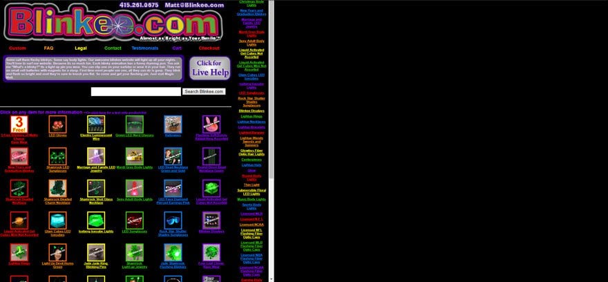
This site sells things that blink or glow in the dark. To get that point across, the site is dark with all of the items blinking. The basic theme is everything’s in the dark and flashing at you.
There are several issues here. For one, the images are too small. The products should be the focus of the site. For another, everything is animated. A few animations here are there is okay, but when everything is animated the site is too busy. Another problem is the colors. I like colors, but take a look at the text and see how long you want to read it against that black background.
Another issue is the frames. There are two frames on this site. Why? I don’t know. The frame on the left contains the content and the frame on the right is empty. Another issue is how small everything is. I had to zoom to 200% to make it look what I thought was a natural size.
All of the categories are listed to the right. Sometimes it takes you to another screen that shows the item in more detail. Other times clicking on a picture takes you to another screen with all the items in that category. There isn’t a good menu structure for easy navigation.
An eCommerce site should make you want to stay and look around. The items for sale should be front and center. This site focuses too much on its flashing-in-the-dark gimmick. The purpose of the store is to sell the items, but this web design just makes me want to leave.
High School Sports in Mississippi
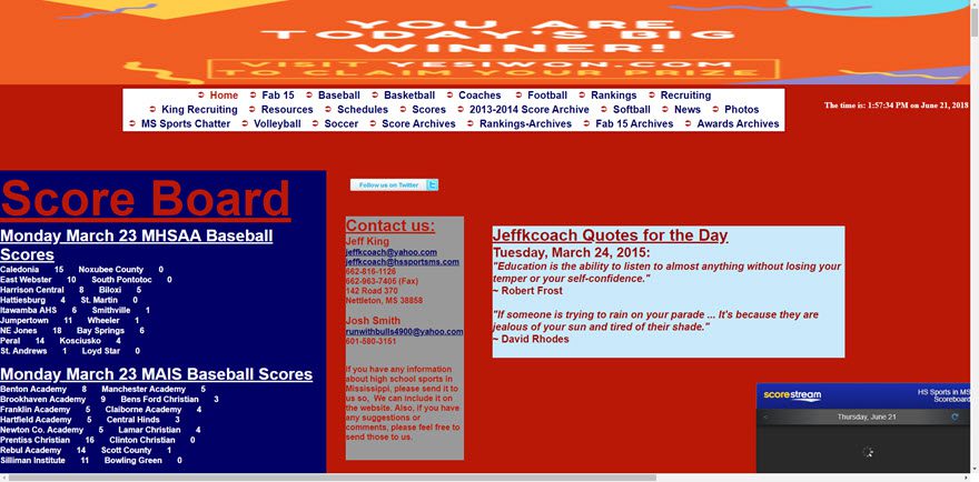
This snapshot is the default 100% zoom on my browser. At that setting I can’t see all of the width on my screen. In order to see the full width of the site, I had to go down to 67% zoom, and then all the text was too small to read. The color-combination hurts to look at. Never put dark red text over dark blue background. And then there’s blue text over the red.
Blocks of information are scattered all over the page and the page scrolls on and on while showing you almost nothing in the space except the score board. This layout just doesn’t work.
Here’s a zoomed-out look at the page:
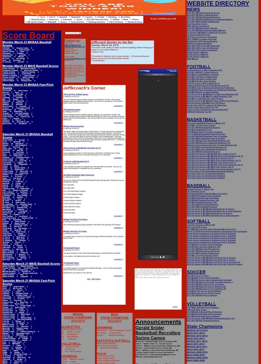
First of all, each one of these blocks could be its own page. You don’t have to provide all of the information on the homepage. The content itself is good. The navigation menu at the top is fine. But clicking on one of the links takes you to another page with a similar layout that contains individual boxes of information placed onto the page. This site needs WordPress with a magazine theme. You would have to search hard for a WordPress theme that would let you have a layout this bad.
US House of Representatives Judiciary Committee – At the Flick of a Switch
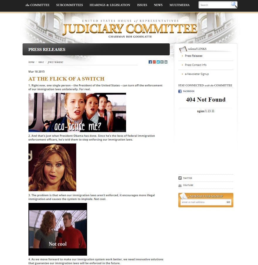
This bad design is not the complete website. The site itself does have a nice design. It has a nice clean layout with good navigation. It looks appropriate for the US House of Representatives. Within all of the pages of political jargon, there is a page that made me do a double-take.
I’m all for animation. I even use animated gifs on my own site. Animated gifs are cool, but the presence of Jenifer Lawrence asking “What?” on a page at the US House of Representatives Judiciary Committee made me ask “What?” Then I scrolled down to see Ariel bounding her chin in the palm of her hand, and several others with surprised looks, pointing, and bounding around. None of this animated gif craziness fits the topic on the page. And it only takes 20 seconds to go from annoying to beyond annoying. Try it out and you’ll agree.
The article is a 10-point numbered list. What’s it about? IDK. Something about legislation. I couldn’t read it. Maybe that was the point. In that case it worked. Designers design pages as well as layouts, and this goes to show that even a well-designed layout can be ruined by an inappropriately designed page. Nothing on this page fits the theme of the site. Looking at it make my eyes hurt.
They should have used a few gifs and even more jpegs. The text should be larger. That’s the content you want your visitors to read. It should stand out. As it is, it’s so small that it gets lost in the distracting gifs. The images should be further apart to give the text a little breathing room.
Suzanne Collins Books
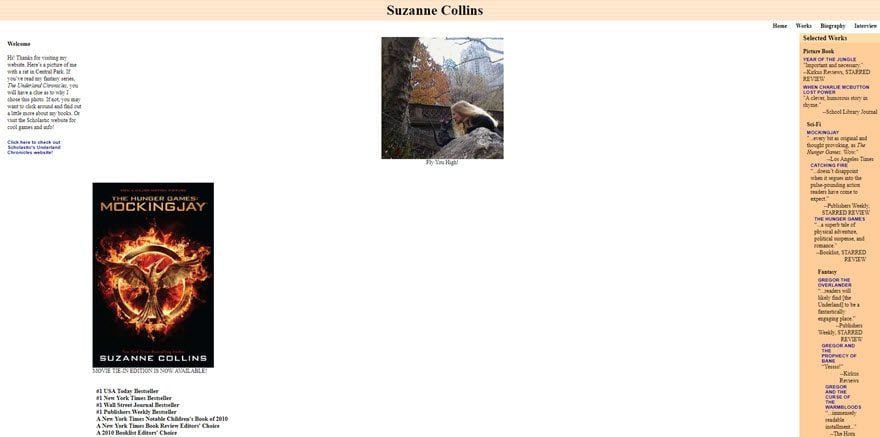
I love Suzanne Collins’ books (well, there is that ONE scene in the Hunger Games that makes me MAD. If you’ve read the books, you KNOW that scene! I’m not going to tell you what it is because, well, spoilers), but you can see why I don’t love her website. This site was designed for 200% zoom. Try it. At 200% zoom it looks like a blog. Zoom back at and you’ll see everything move to the outer edges of the screen. I like white space, but… ??
Clicking on the book cover does nothing. Missed opportunity right there. I clicked on Works and went to a similar screen with book covers, awards, and reviews, but no descriptions. I clicked on Mockingjay, but there was still no way to buy the book. I went back out and clicked on Gregor the Overlander: Book One. This took me to a page that did have a clickable book cover where I could buy the book. It also had a list of awards and reviews. There was a Word document that I could download called Children’s Choice Award Nominations. I completely understand why you would want the awards on your site, but why have it as a document for readers to download?
At the bottom of the page, in the right corner, is a list of online stores where you can buy her books. Instead of taking you to her author’s page, or a page with her books, or even including an affiliate link, the links just take you to the homepage of the store. Clicking Amazon goes to Amazon.com. That’s it. Another missed opportunity.
Patimex
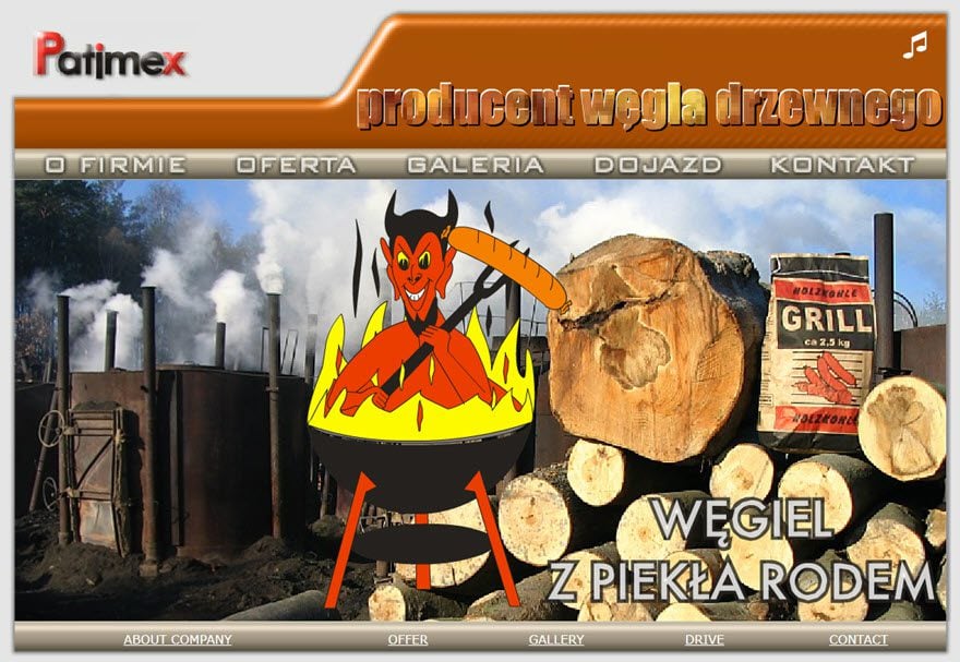
I almost didn’t include this one because at first it just seems like a jittery graphic is zooming in and out of the screen. Well there’s also words fading in and out, and then there’s the words above the menu are on fire. Well, that’s still not THAT bad. And then I saw the little musical note alerting me to the fact that there’s music on this site. I had my speakers muted so I hit the speaker button and immediately included this site on the list.
Any one of these by itself isn’t really that bad, but when you throw them all together, and then add that music… yeah, it’s THAT bad. Analyzing the design of the site really does raise a lot of questions. Why is the devil grilling himself in a floating BBQ? Why that music? Why? Seriously… why?
At least the navigation works fine. Well, except for the company’s logo, which does nothing but pulsate. Why have a pulsing logo that brings attention to itself, but then you can’t even click on it? And now I can’t get that tune out of my head! Thank you for that floating BBQ devil!
Yale University School of Art
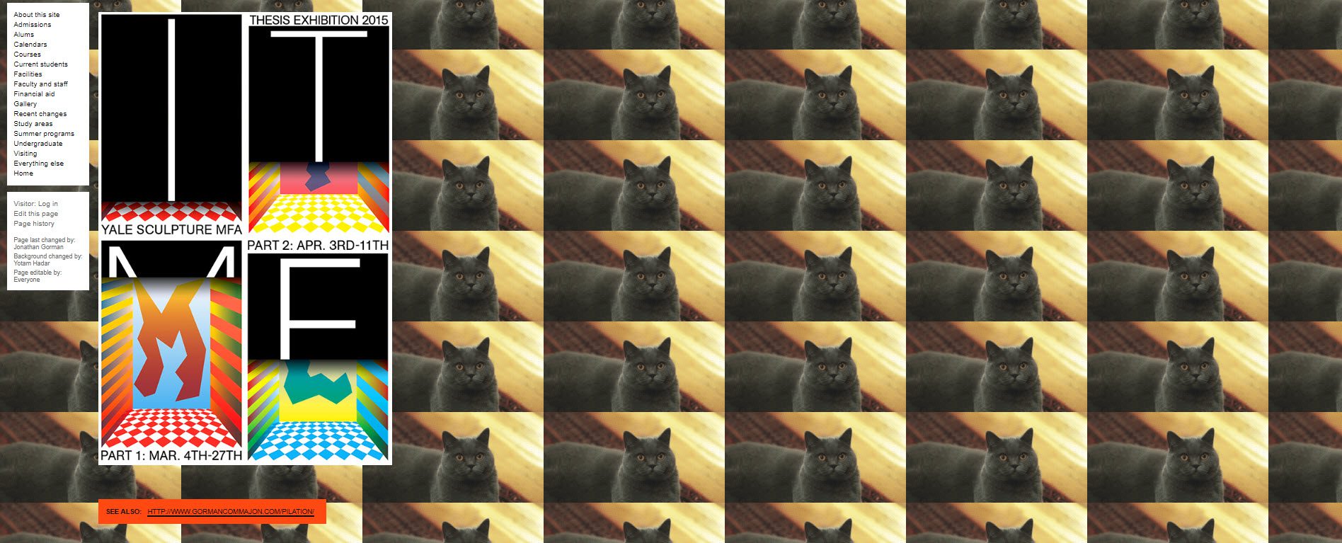
You would expect a college art school to have a nice website that reflected the kind of education you could expect to get from the college. In that regard, you would expect higher-level universities to look the best. This is Yale. Seriously. Yale University School of Art.
This website is made using Ruby on Rails, and it is actually a wiki that students and faculty can change to some degree. It gets updated quit often. Faculty adds lecture times, maps to classes, etc., but how does it get this background? When using a repeating photo as a background, its generally a rule that it should be subtle. The ever-repeating shouldn’t be too obvious. Well, this one is a little bit obvious. Also, the page content could be expanded to use the rest of the screen, but instead we’re left with only having content on just under half of the screen.
Navigation actually works as expected. The color-choice and the haphazard layout sometimes makes it difficult to follow, othertimes not. It all depends on who was the last editor.
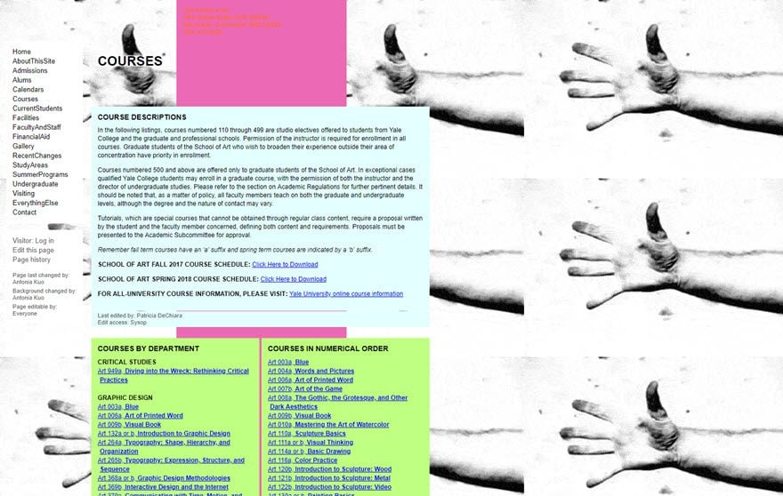
Maybe this website is itself a kind of art, and it’s covered classes. Let’s check to see:
Clicking on Courses takes you to a screen with a weird animated background (of course) and a list of all the classes. Maybe it’s all an elaborate joke? Maybe it’s art? Regardless, the list of classes is quite extensive, but there isn’t a single class on web design. Hey, I have an idea…
Ling’s Cars
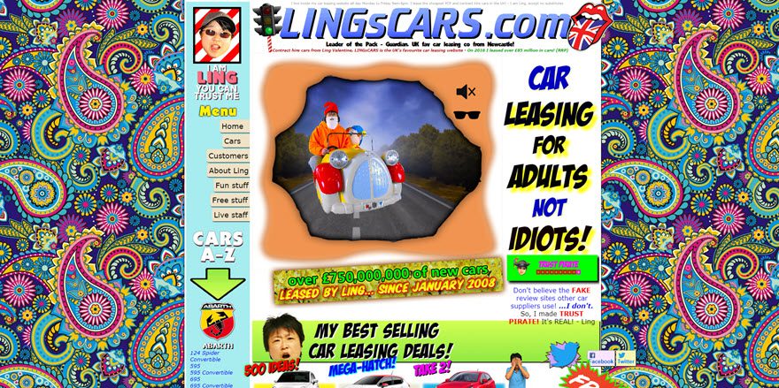
What did this site do to my eyes? Ouch! And why is that Mercedes pulsating at me? Is that a grown man in a kiddie ride from a convenience store? And the music… I couldn’t stop watching! And, is that a chicken? Depending on how recently the site has been updated (and yes, it does continue to be updated in this aesthetic), scrolling on down reveals the Titanic (why would you associate your site with a sinking Titanic?), a Dalek webcam (Daleks are cool), a missile, a Kentucky Fried Panda, and…other things.
It has fake ads, karaoke, a car quiz, a game you can play online, and who knows what else. The purpose of the site is to lease a car, but I didn’t look at a single car. I couldn’t see them. Though if you do feel like it, Ling has his own Trust Pirate so you know you’re getting a good deal. Of course the purpose of all of that craziness is just to get your attention. The problem is the craziness gets in the way of the site itself. All of those distractions harm the usability of the site.
One thing it’s not is boring. I think the word I’m looking for is random.
Penny Juice
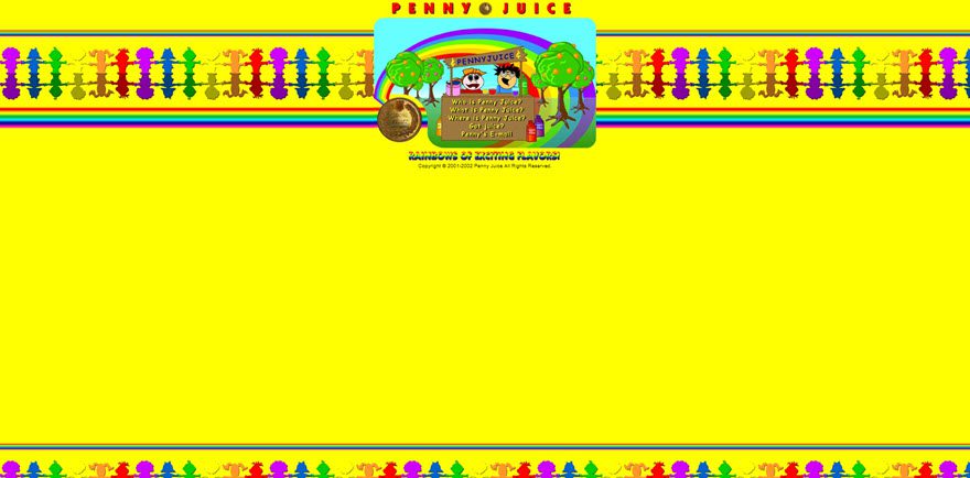
Penny Juice is a fruit juice concentrate that’s made specifically for childcare centers, preschools, etc. On the sparse main page, you see a simple menu up top, along with floating clouds behind the rainbow (floating outward, btw), spinning coins (?), and animated words. There’s a copyright notice of 2001-2002. Maybe that explains it.
All of this looks innocent enough until you click a link in the menu so you can visit a page on the site, then you monitor explodes.
Eye’s hurting… can’t read! The colors are actually a clever design element based on the flavors of Penny Juice:
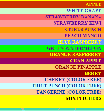
I get the design element/Penny Juice thing (it’s a rainbow of exciting flavors), but don’t. Just don’t. There are better ways to use clever marketing points in your website design. For one, you can use the colors along the side, diffused into the background so they don’t make your eyes bleed. They could be used as buttons in the menu. Just don’t use them behind text. Ever.
And especially do not use all of them at the same time on the same screen.
Nobody needs to see spinning pennies on the screen. Old design styles and copyright dates make readers wonder if the site has been updated. They question the prices and the information about the product. Visitors shouldn’t have concerns about your product just from looking at your website’s design. That’s the opposite of the effect you want.
Wrapping Up
Well, that was fun. Taking a quick look at hilariously terrible websites is a great, and fun, way to learn what not to do. Every now and then it’s a good idea to look around to see what you find annoying, and then find ways to improve on it. Learning what you like and don’t like will give you insights on what visitors want and on what your clients need.
Your turn! Do you know of a hilariously terrible website that should be on this list? Did I miss your favorite? Do you disagree with my assessment of a site? Do you have something to add? I’d like to hear about it in the comments below!
Article thumbnail image by Kakigori Studio / shutterstock.com


It’s Amazing how times have changed.
Cool to know about the worst and best part of the website
OMG, Blinkee! haha
I’m gonna go invest in my design now.
A good friend of mine actually does a lot of business with Blinkee. His loyal customers have learned their way around the site. Although, I do agree it’s hot mess.
Such an ugly website designs. Lots of important things are missing in these sites like design, usage of proper colors, layout and more.
Suzanne Collins’ site makes me sad. A professional author should have a beautiful, professional-looking website. Looking at her site, I thought it was a badly made fan page. Frankly, these days I bet some fans of her books would be able to build a better site for her than the one she has. She needs to update!
And that Yale School of Art website is just BAD. Shame on them! Even if they don’t have a web design program within their school, that’s no excuse for them not hiring someone to make a great-looking site for them (using their students’ and faculty artwork to draw people in to how great their art program is). The way it is now, I wouldn’t be very impressed or want to join their program, if I were a art student. Pull yourself together, Yale! Come on. You’re a big league school. (LOL.)
Thank god looks fine.. 😛
This is sad! Especially since one of the worst is from Mississippi – as am I!
The Jerusalem Restaurant in Denver used to have the worst website. It’s since been redesigned but here is a glimpse from the Wayback Machine.
http://web.archive.org/web/20050212012755/http://jerusalemrestaurant.com/
Wow, what a compilation. What’s truly amazing is that most of the sites on this list actually make “The World’s Worst Website Ever” look good! Check it out—http://www.theworldsworstwebsiteever.com/. I used to cringe every time I saw it; now I think it’s not actually that bad.
Scarred. I’m scarred. Time to blindfold myself and huddle in a dark corner so those images go away… :-).
This at least makes me feel good about my sites
ouch! my eyes my eyes
Wow!!! The Yale Art site… I went there today (April 27) and the background was full of dancing bears!
You should have searched for this site. Gives me a migrane: http://www.cvilleok.com/
(“Your URL”, yeah, right I’m gonna post it here….)
Just wanted to say great article, and very funny written! Really shouldn’t have read it when the kids are trying to fall asleep in the next room… Will be giggeling the rest of the evening!
Funny, but I also hate sites that interrupt your scrolling to jam an ad for subscribing to their newsletter down your throat….like this one. Glass houses.
Oh my God I thought this was a list of sites made in the past (as in screen shots from the past). I can’t believe these (especially an ART UNIVERSITY site) STILL look like that TODAY!!!
I can never feel bad now about any site I made even my very first site.
This surely has to be a contender – http://www.fabricland.co.uk/ !!
There is a strong concept behind Ling’s Cars website. You won’t forget it after you saw it, so I guess the design works in this case 🙂
I’ve visited the Ling’s Cars website before as the company is situated in my location, and the site is often passed around the web design industry in the area.
The website has been designed like this on purpose; its supposed to be bad. Its full of (poor) jokes and and puns as well as all web bad practice. Look at the HTML source for further strangeness.
The thing is that this all works alongside the marketing of the company, adverts, social media etc.
http://www.marketingdonut.co.uk/marketing/pr/pr-opportunities/how-i-use-publicity-stunts-to-promote-my-online-car-leasing-business
Hard to believe but the company is quite popular.
Holy moly… my eyes hurt! 🙂
wow..those are some ugly looking stuff!
and Yale University School of Art?!?
smh..
BEST. WORST. WEBSITE. EVARRRRR: http://www.industrialpainter.com
“A voyage… is about to begin… “
You haven`t seen the “Designer” of the site: http://superior-web-solutions.com/Broadband/Services/Services.html
Good Lord. “Custom Site Design” and “Innovative navigation systems”.
Flash is dead.
the logo, a okay. the rest was baaaaad
The intro has its own intro! WHOA!
Most companies or people don’t understand that design is important and for a company or business (doesn’t matter if author book pages, musicians or a big company) don’t want to pay money. That is my daily eperience. But if you show most people what a designer can do than these people are open and begin to understand. Desing is also psychology especially in the web. The perfect and easy to use template is not the medicine you need also a person who understand to use all the possibilities wisely. Thanks elegantthemes for divi which I am using most for webdesign.
I think to pay money once for a good design and concept is an investigation like a computer, a car or a desk which companies need for their work.
And this is a very good article 🙂
Nice article, but you did forgot to mention the king of bad websites..
http://www.arngren.net
ENJOY!
I agree with most of the sites as examples.
Except Lingscars, that site is literally pure brilliance. Coming soon we will be using it and I found it perfectly functional, straight forward, full of information that other sites don’t give and all the time being the most fun you can have browsing!
You sir, have just won the internet.
^ LOL!
Well, Brenda Barron. Thanks so much for the review of my site. No offence is taken. I am a Chinese, so my opinions are probably batshiiit insane to you.
However, unfortunately, you completely miss the point. …the point is I make money. This year (just finished Apr 2014 to Mar 2015) I made gross profit of over US$1.1million from LINGsCARS.com. I put in $ because many of your visitors may not understand what a £ is. That profit is because it is such a beautifully workable website. And my service is exceptional. And I have fun.
So Brenda, your comment “The problem is the craziness gets in the way of the site itself.” …is nonsense. You talk nonsense because you don’t understand business. It’s not at all crazy. It’s simply enjoyable. Please take the time and trouble to explain to your readers a more enjoyable way to run a website making USD $1m a year.
My website is clearly the UK’s favourite car leasing website – bar none. 🙂
Ling Valentine
Boss, LINGsCARS.com
First off, if this comment is from the real Ling V. … that is awesome.
Second, like Scott said in another comment, Ling’s web site is NOT bad web design. It is a very deliberate marketing strategy that leverages bad web design to attract new customers and build brand uniqueness.
I’d suggest removing it from your list and writing an article about why such a “hideous” web site has managed to succeed. Here’s an article someone else has written about it.
http://www.valuablecontent.co.uk/valuable-content-award-for-ling-valentine-lingscars-com/
@Nelson
You 100. Ling’s site should be featured as some of the best use of the marketing medium.
They remind me of the websites listed on Web Pages that Suck back in early 2000s. Can’t believe these dinosaurs are still exist.
Yes, I was “the world’s worst website” on Web Pages That Suck. …it just shows what pea-brains these reviewers and their troop of followers have, that they can’t see brilliance when it slaps them in the face and pokes them in the eyes and burrows into their ears like that monster maggot-thing from the old Star Trek movie.
They must have very wooden brains, not to appreciate fine website art.
Ling Valentine
Boss, LINGsCARS.com
I love Ling’s site. Retro, fun and engaging. The craziness is intentional. I been around the block. He’s got great branding going on there. I suspect his website compliments his other crazy marketing collateral. And, I agree, it really is a great example of advertising art.
Great article (albeit the spelling mistakes), wish there was a longer list…. 🙂
Ling is one hot chick…
I know. Thanks.
Ling
these are really ugly websites…
the kind of website you build when you’re learning html 🙂
and no… even then the websmaster must have a real “problem” to keep such a design (don’t even know if we can call that design) ^_^
Well, doing it yourself is no excuse for sloppy work. If you wanna do it yourself, teach yourself the basics and invest some money. Especially in cases like Suzanne Collins; authors, where the website as as much about building your brand as your books are.
I always do my own websites, and I also do my own images and covers. Not because I don’t wanna spend the money, but because I want them to reflect me and my style. But before I started doing it, I bought books to learn the basics of design, SEO and of course HTML, CSS, WordPress, PHP, etc.
Many people still seem to live in a pre-2000 world, where websites were merely a fancy accessory. Nowadays they’re the equivalent of a business card–which is what many people don’t seem to understand.
Expected a few of them to crash from traffic. Check back later.
Hi Brenda (quot)
I just spent a couple of minutes on Ling’s website and now I see pink stars and green rabbits jumping around my room.
The Penny Juice’s site filled me with sadness.
But the top was reached by the School of Art! Enrollments are flocking in, I’m sure.
Nice gallery!
Most of those sites above doesn’t seem to be in any way “failed first attempts”, they are cheap in the way “why hell no, I don’t need to pay 200-300 euro to this guy for a simple wordpress, I can do it myself” or having my 10 years old nephew who learned some HTML in school to do it.
Now that I think of it this is so terrible in any way possible, it is like they are made by people who learned once HTML and they never bothered to follow the changes or ask how it is done today, so they tried with a wordpad and an old textbook at hand to make those sites.
I mean seriously, you can just use wordpress and a simple theme to get above average results today.
I fail to see any excuse for those sites to exist…
BUTTTT websites like http://www.pennyjuice.com/ and… http://www.suzannecollinsbooks.com/ can be reproduced as is as a WordPress theme.
Some are more terrible than others. It is very ugly design … But come to be funny to watch.
A very good liost indeed, but it´s not complete with this classic netshop; http://www.arngren.net/
Ling’s Cars – Ling has been on UK TV, she’s just like her website, mad as a box of frogs – she drives around in a 6×6 rocket launcher truck! She’s also a very successful business worman. Makes you wonder if perhaps we’re doing it wrong 🙂
Is Ling the one from Dragons Den? If so she was actually losing money but didn’t realise it as she didn’t have a clue about cash flow and account management – she was all mouth but not good at business
Those are not so bad. This is bad: http://www.arngren.net
( OMG) this is everywhere I hate this one this will be good for my project for high school. It stings eyes. They are literally bleeding! [:(
MY EYES! MY EYES! OW!
(Heee.) That is one seriously bad site. Wow.
I second that. Nothing mentioned above comes close.
I third that.
Ouch!
All These sites are SOOOOO bad which makes them SOOOOOOO good at the same time.
Hello Brenda,
Now days Google giving priority to user experience in website rather than links. If your website is not meant for users it means you will face negative impact sooner in traffic.
Good website design is the first thing which users noticed before reading content on site.
Nice Article Brenda.
Best Regards
Sourabh Rana
http://www.facebook.com/blograja
bullshit, content is key. its a fact. without content you would never be found. content makes a website. a blog, a person etc. And as it happens Google as a spider see’s content before design so… you only click based on that.
There is a whole world of bad church website design, but the people at Evangel Cathedral have taken Flash to places it was really, really, never meant to go: http://evangelcathedral.net.
This is absolutely horrendous! Thanks for sharing (:
P.S.: That intro, though.
Whew! I was almost afraid to open this in case one of my websites made this list haha. Good article.
That’s one list that you don’t want to appear on Geno.
Some real horror stories there.
Same feeling but remembered that I used Divi for almost 2 yrs now! 🙂
:)) Patimex is so funny, but of course you are right Brenda, horrible designs.
I believe that those sites were made 5-8 years ago…
About patimex notice 2 things:
first – translating from polish: This is our archive site in retro style. We keep only the sentiment
second – 9.270.989 visitors to that joke 🙂
New website of this company is OK (www.wegieldrzewny.pl), but unnecessary – of sentiment – they left this eyesore.