

These 30 retro fonts cover decorative display faces, vintage serifs, scripts, and screen-inspired lettering. Each entry includes an example use and a free download link.
Art Deco And Theater
Geometric shapes and decorative details suit theater titles, signs, and invitations.
1. Limelight
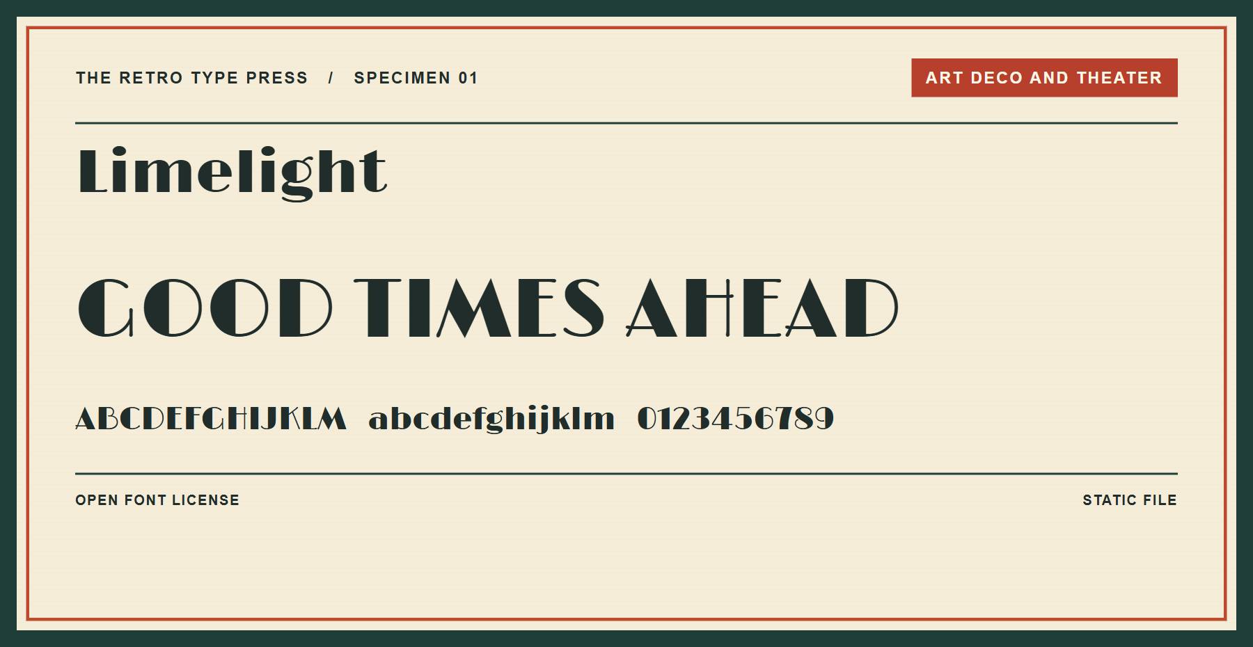
Limelight uses geometric shapes for a theatrical display face. Try it for a cinema event title or a menu cover.
Price: FREE ǀ Go to Limelight
2. Poiret One
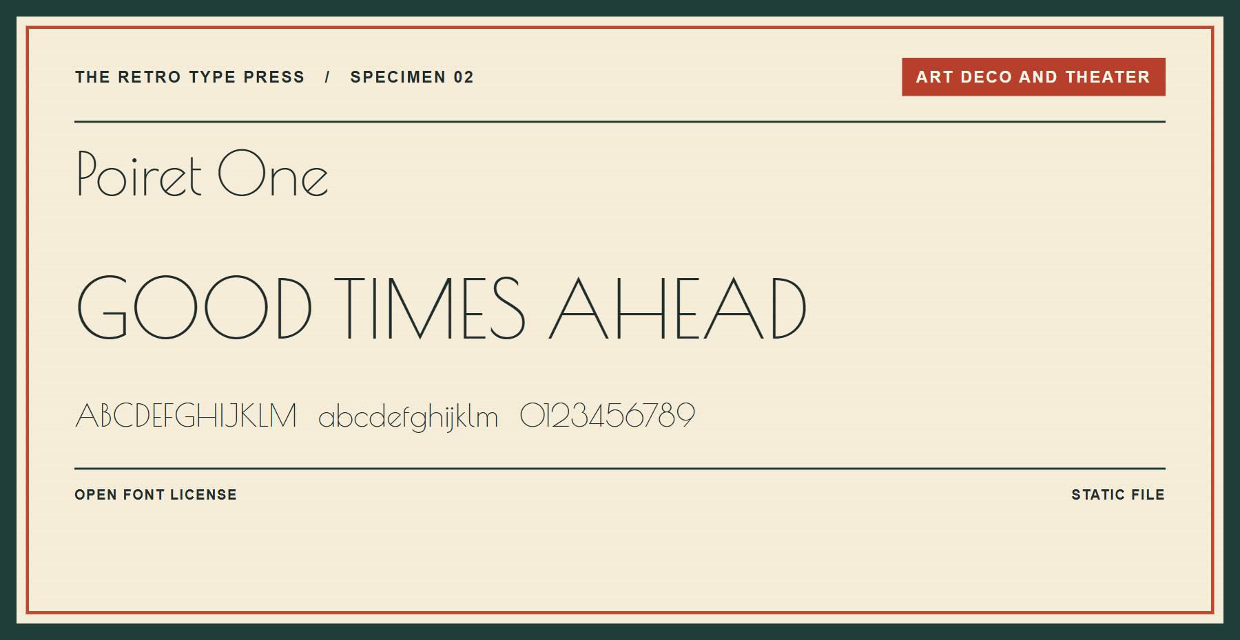
Poiret One has fine strokes and rounded shapes. Give it a high-contrast background when setting a short invitation or sign.
Price: FREE ǀ Go to Poiret One
3. Parisish
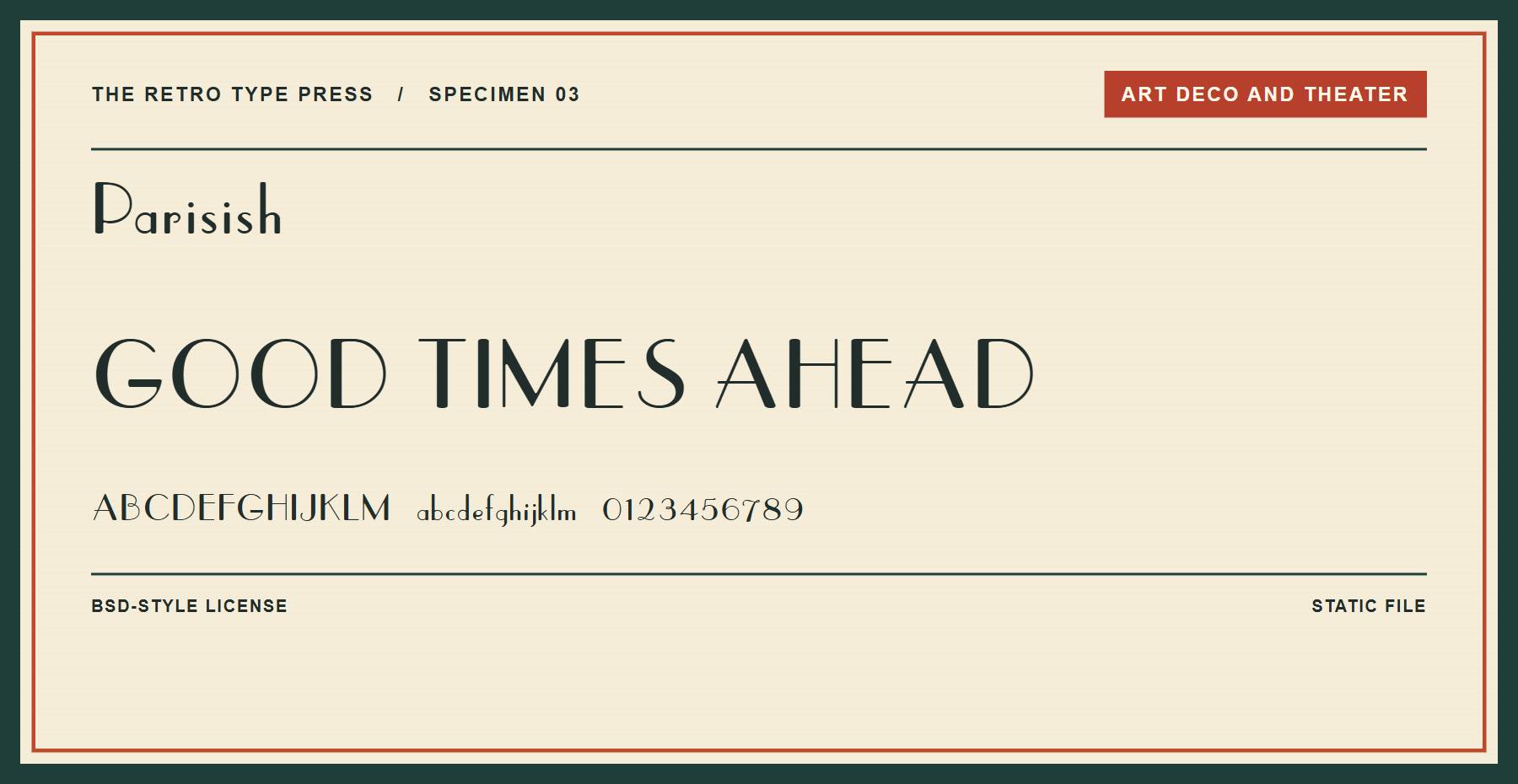
Parisish brings a decorative Art Deco style to a short headline. Its downloaded license permits commercial use and sets conditions for redistribution.
Price: FREE ǀ Go to Parisish
4. Fascinate
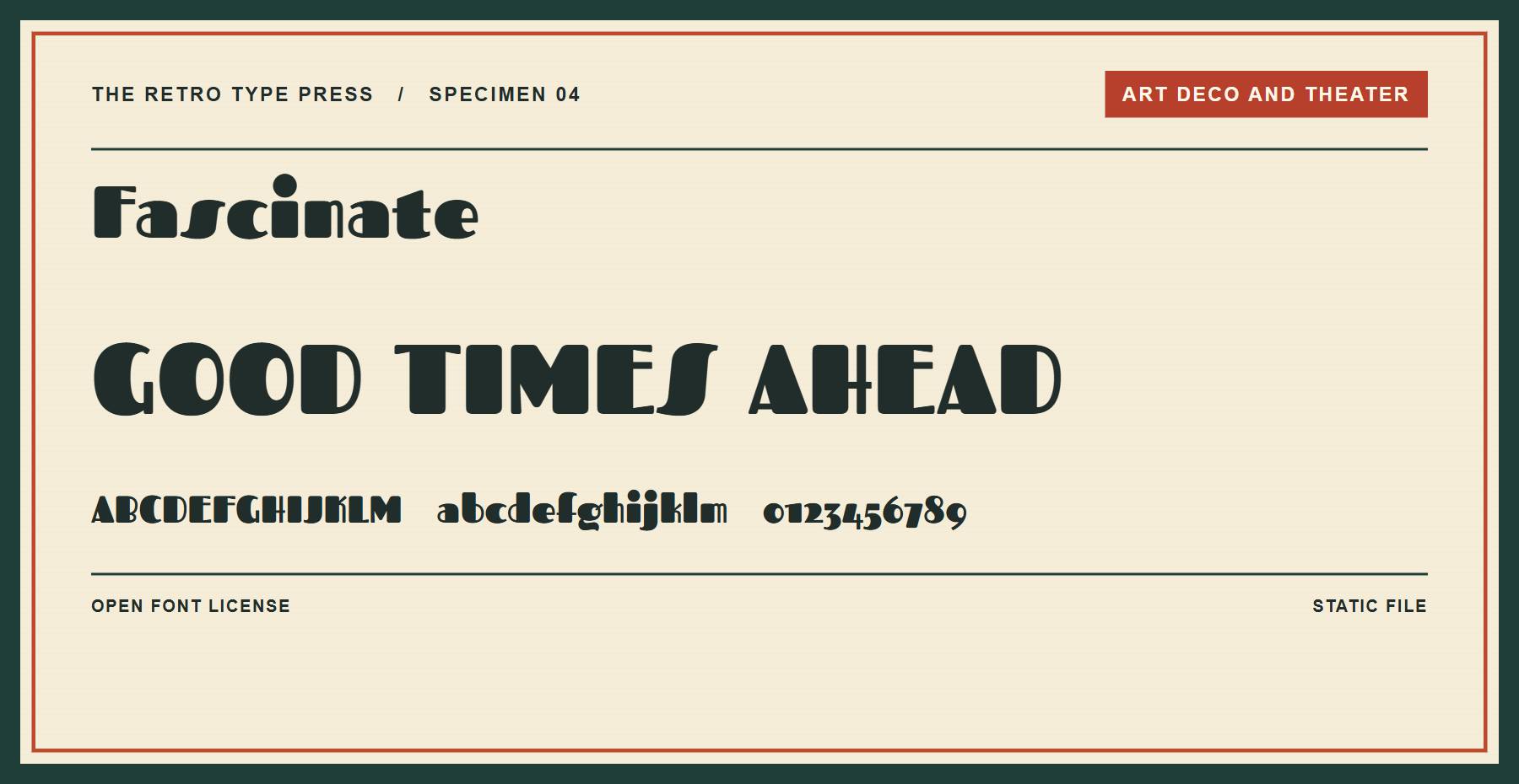
Fascinate is a bold decorative display face. Use it for a poster title and pair it with a quieter font for details.
Price: FREE ǀ Go to Fascinate
5. Monoton
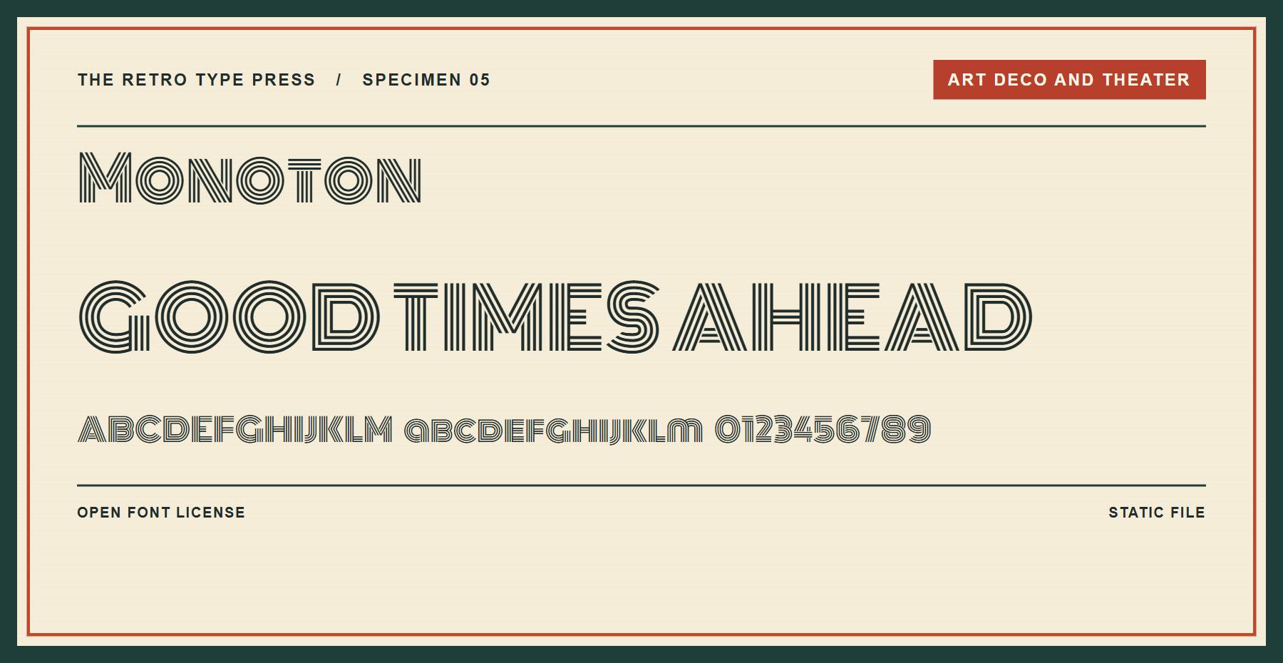
Monoton builds its letters from parallel lines, giving each character an outlined appearance. Set it large enough for those lines to remain distinct.
Price: FREE ǀ Go to Monoton
6. Bungee Shade
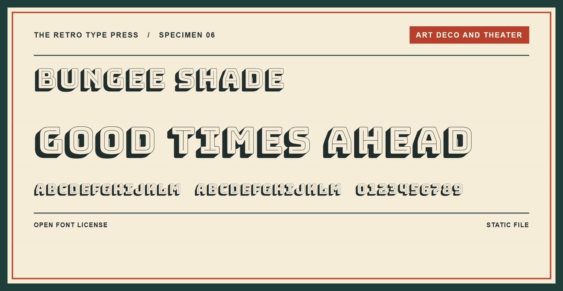
Bungee Shade adds a dimensional treatment to uppercase letters. Its wide forms suit a short sign or event title.
Price: FREE ǀ Go to Bungee Shade
Vintage Serifs And Posters
These serifs range from high-contrast editorial faces to heavy poster lettering.
7. Abril Fatface
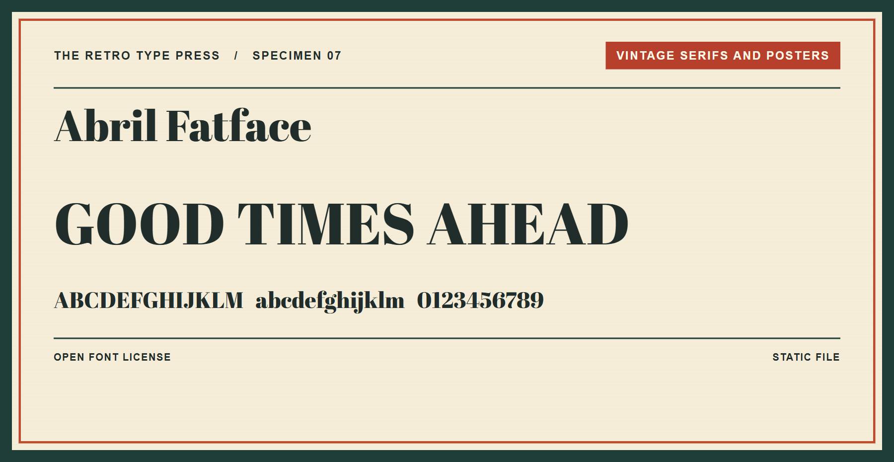
Abril Fatface has strong contrast between thick and thin strokes. It works well for a magazine-style headline above simpler body copy.
Price: FREE ǀ Go to Abril Fatface
8. Rye
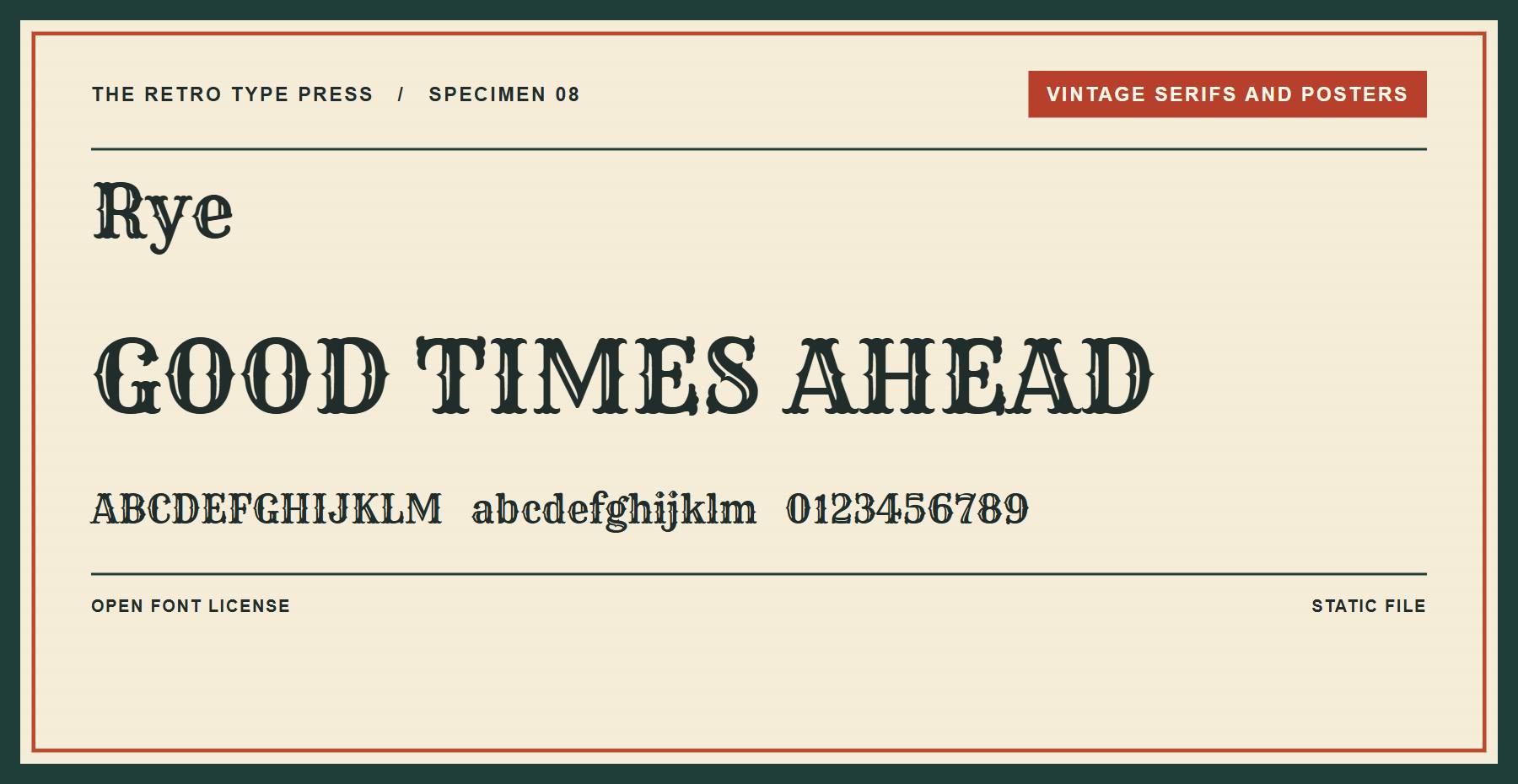
Rye combines decorative serifs with a Western poster feel. Its patterned strokes add detail to a short heading, so give the letters room.
Price: FREE ǀ Go to Rye
9. Alfa Slab One
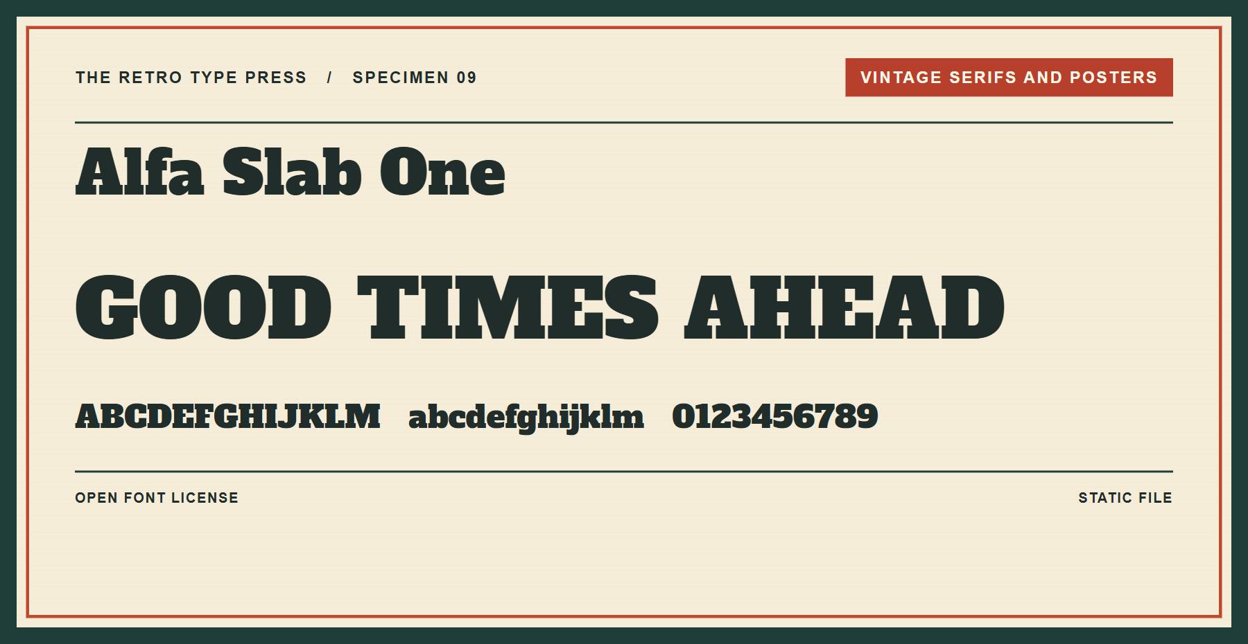
Alfa Slab One gives a headline substantial slab serifs. Try it for a product label or a bold poster title.
Price: FREE ǀ Go to Alfa Slab One
10. Ultra
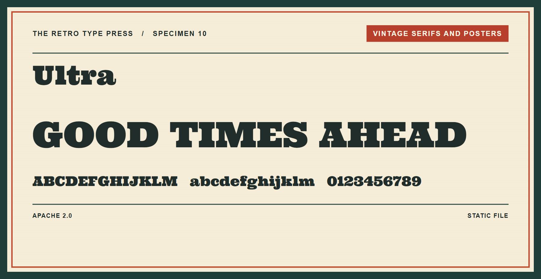
Ultra is a heavy serif with rounded forms. Its weight helps a few words hold their own on a poster.
Price: FREE ǀ Go to Ultra
11. Yeseva One
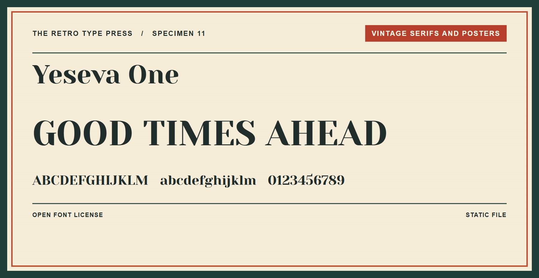
Yeseva One offers a display serif for an editorial heading. Pair it with a restrained sans serif for supporting text.
Price: FREE ǀ Go to Yeseva One
12. DM Serif Display
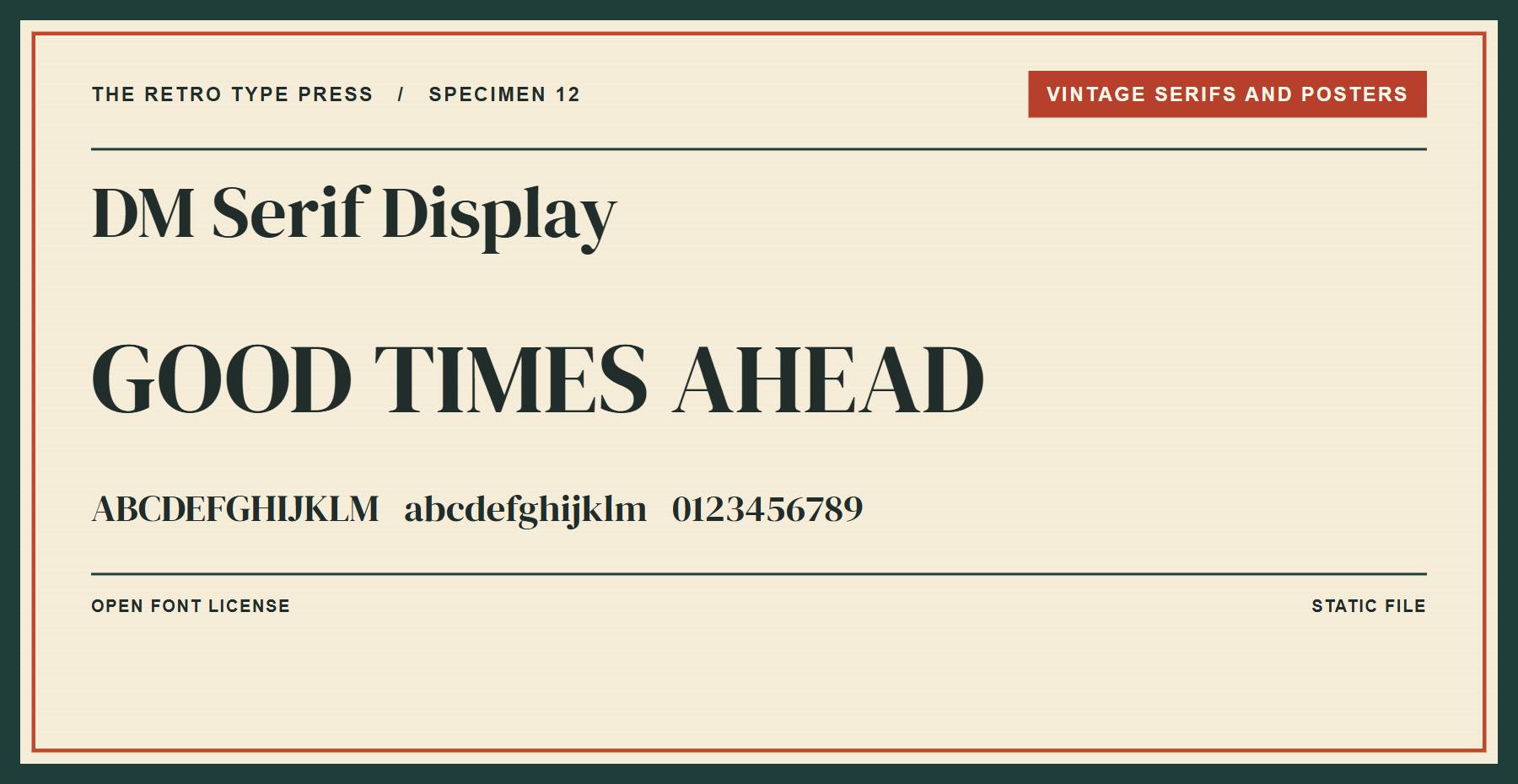
DM Serif Display has pronounced contrast between strokes. Try it on a product feature or a short editorial title.
Price: FREE ǀ Go to DM Serif Display
Editorial And Letterpress
Use these faces for editorial titles, typewriter effects, blackletter, and bold signs.
13. Playfair Display
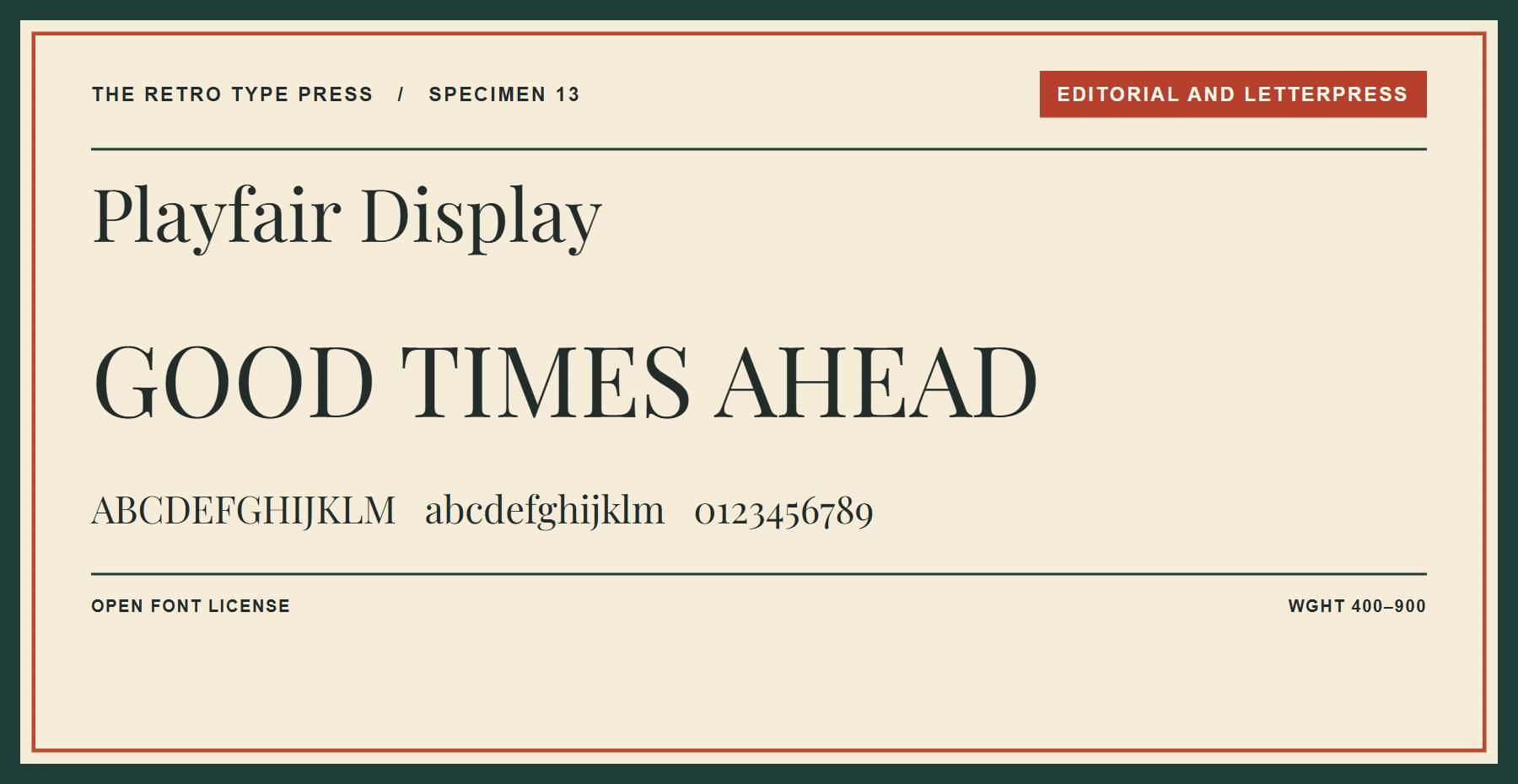
Playfair Display gives a headline high-contrast serif forms. Its variable weight axis runs from 400 to 900, so you can adjust the weight within one file.
Price: FREE ǀ Go to Playfair Display
14. Bodoni Moda
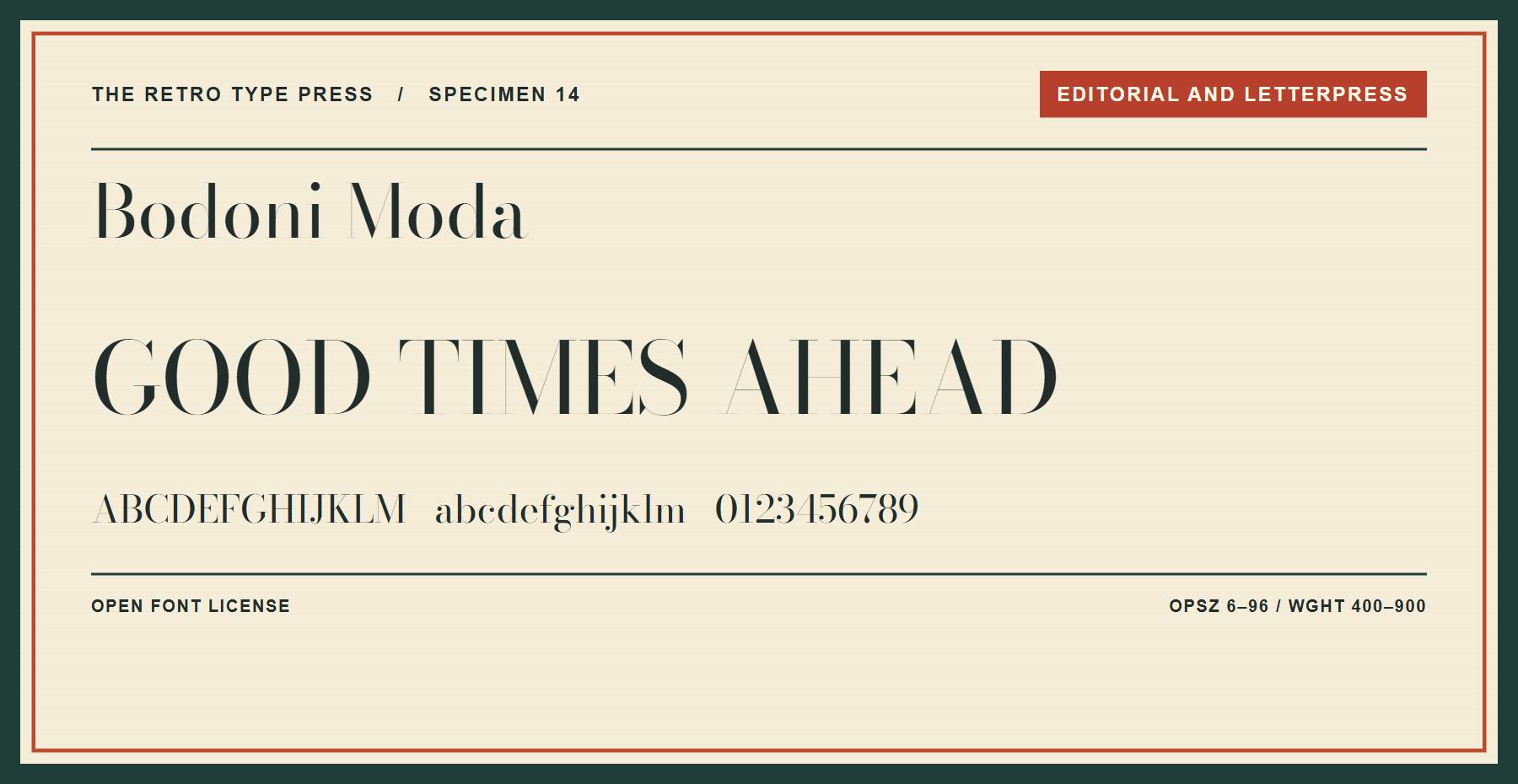
Bodoni Moda pairs high-contrast serifs with a variable file. Its weight axis runs from 400 to 900, and its optical size axis runs from 6 to 96. Check the thin strokes at the size your visitors will see.
Price: FREE ǀ Go to Bodoni Moda
15. Special Elite
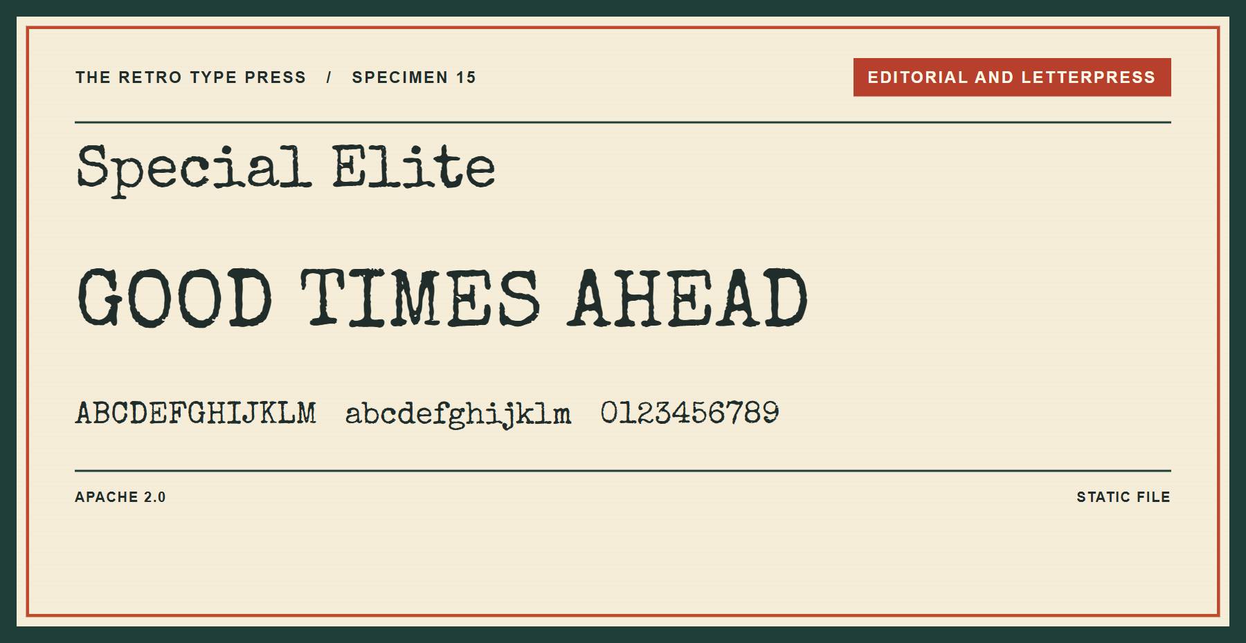
Special Elite recalls the uneven marks of a typewriter. Use it for a document-inspired title or a short label.
Price: FREE ǀ Go to Special Elite
16. UnifrakturMaguntia
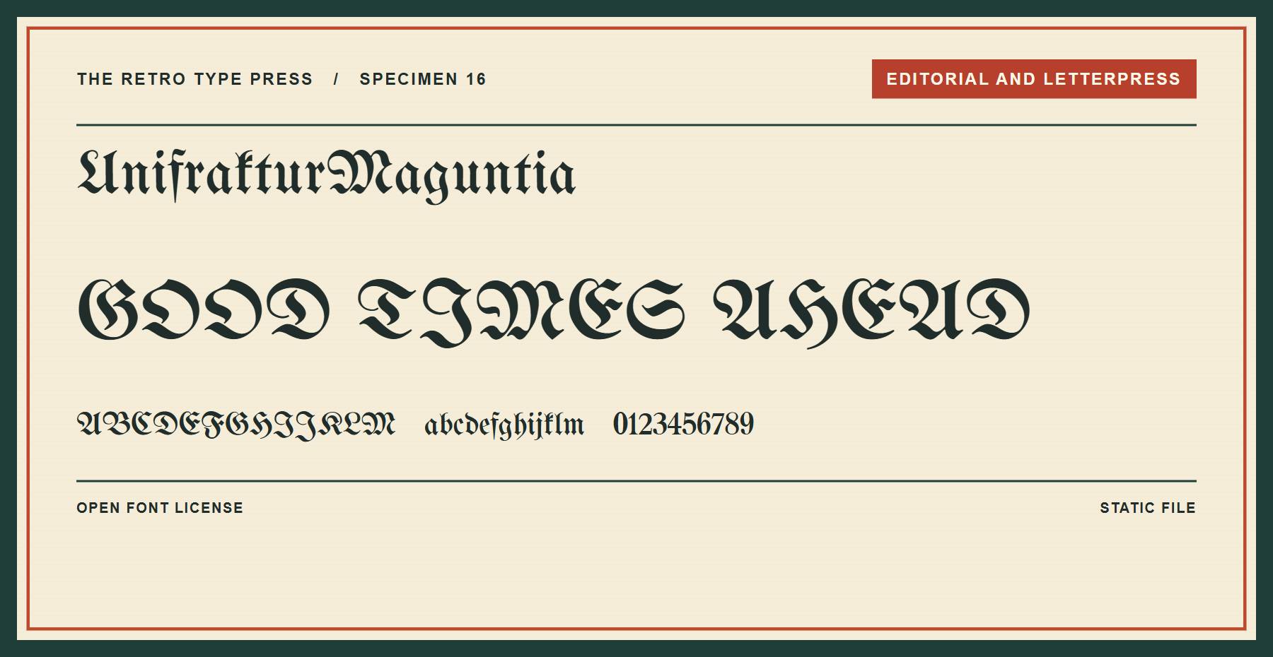
UnifrakturMaguntia offers blackletter forms for a historic or gothic title. Keep the passage short and test its legibility.
Price: FREE ǀ Go to UnifrakturMaguntia
17. Righteous
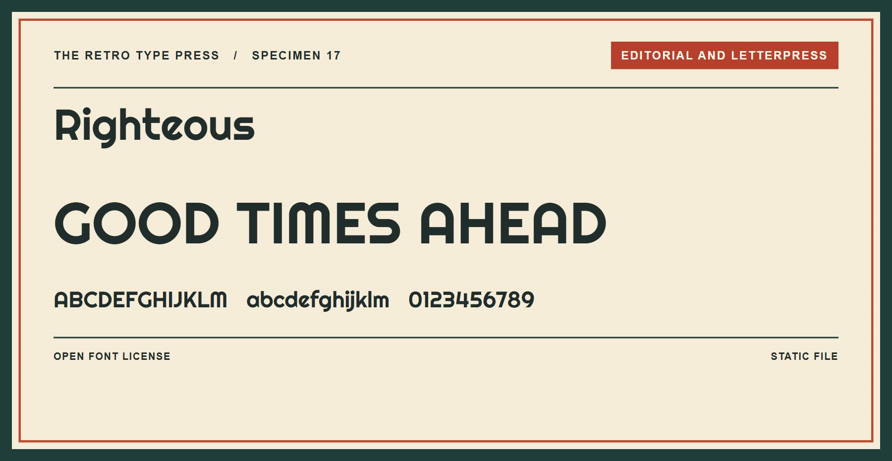
Righteous has rounded geometric display forms. Try it for a record-shop heading or a playful brand label.
Price: FREE ǀ Go to Righteous
18. Bungee
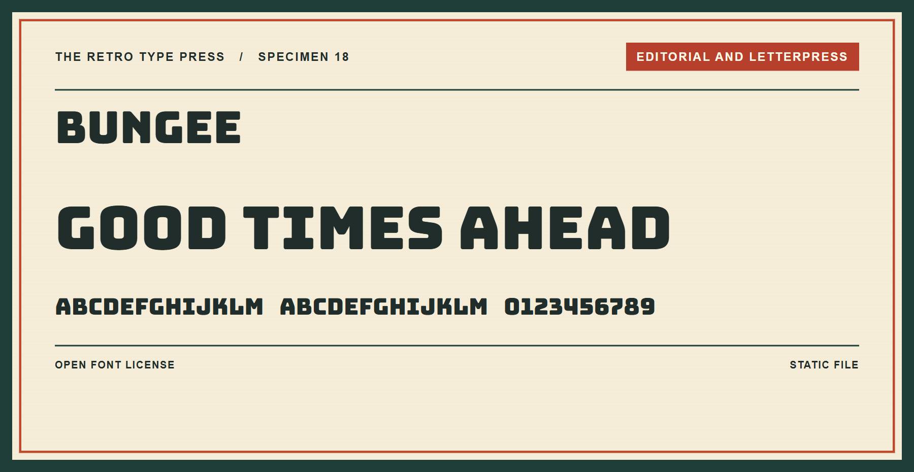
Bungee is a sturdy uppercase face for signs and short headings. Allow room for its wide letterforms.
Price: FREE ǀ Go to Bungee
Retro Scripts And Signs
Connected letters and brush-style strokes give short headings a hand-lettered look.
19. Dancing Script
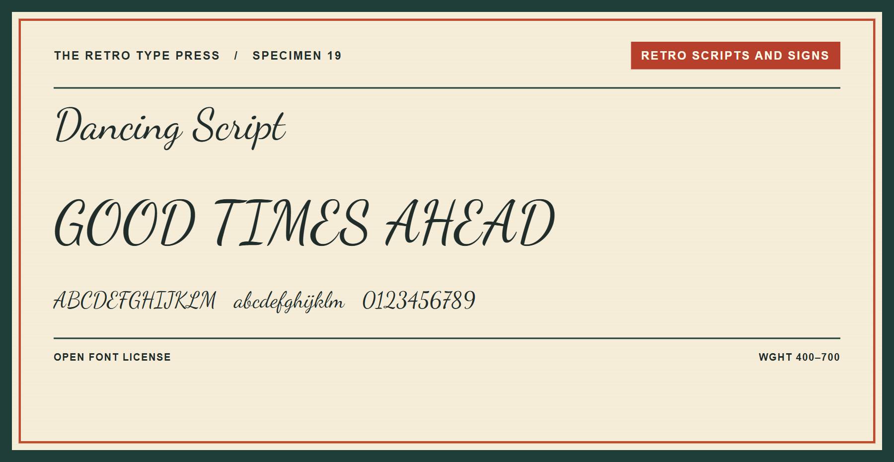
Dancing Script has connected, informal letterforms that suit a bakery heading or invitation. Its variable weight axis runs from 400 to 700.
Price: FREE ǀ Go to Dancing Script
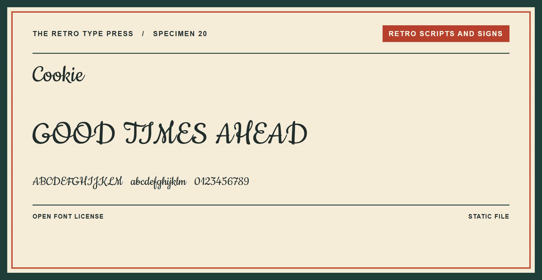
Cookie uses flowing brush-script forms. Try it for a cafe heading or a short promotional label.
Price: FREE ǀ Go to Cookie
21. Sacramento
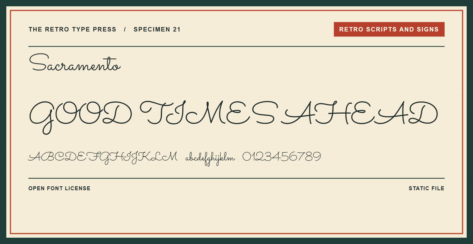
Sacramento is a light script for a signature-style heading. Use enough size and contrast to keep its fine strokes visible.
Price: FREE ǀ Go to Sacramento
22. Lobster
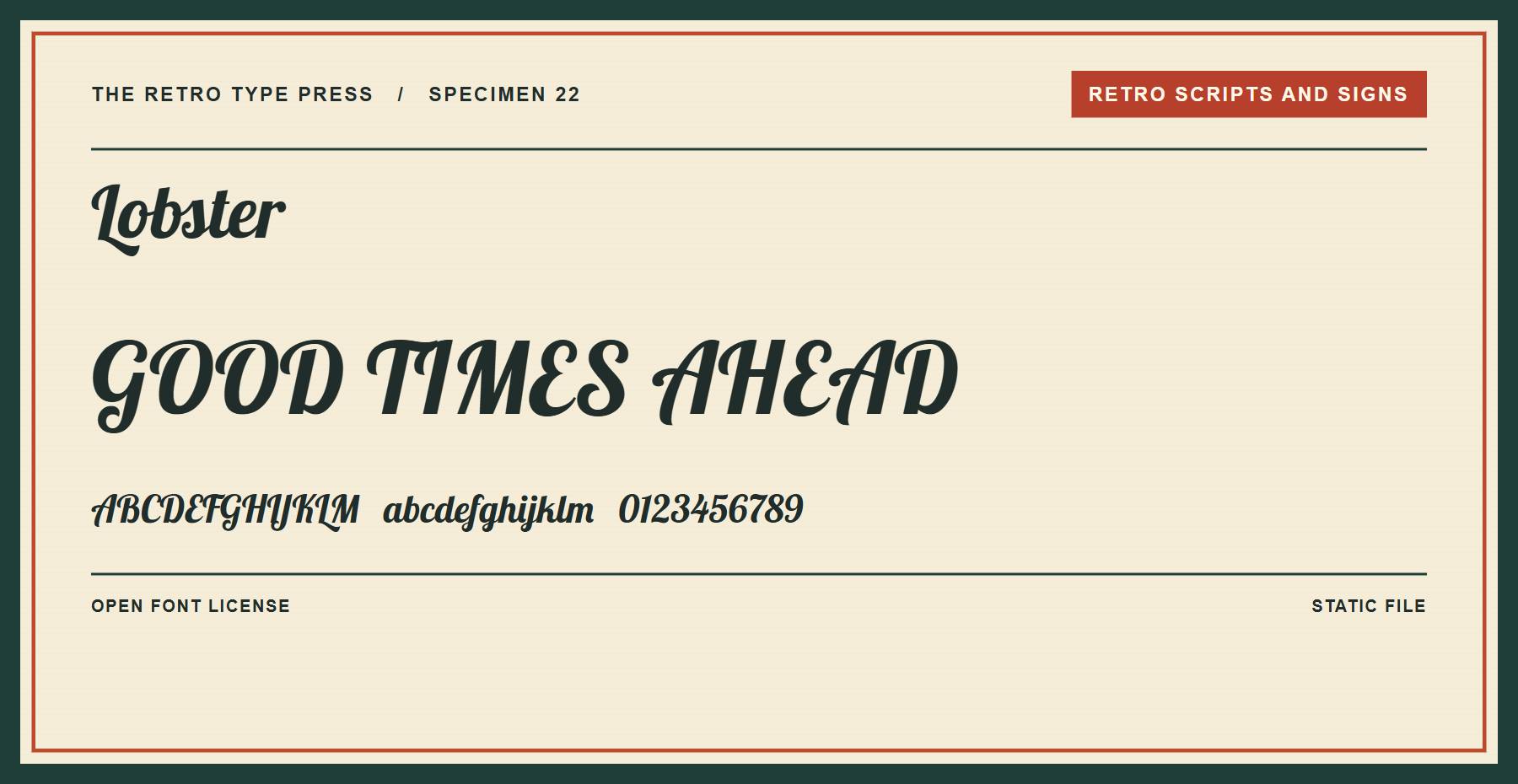
Lobster is a bold connected script for a sign or label. Pair it with a plain text face for longer details.
Price: FREE ǀ Go to Lobster
23. Pacifico
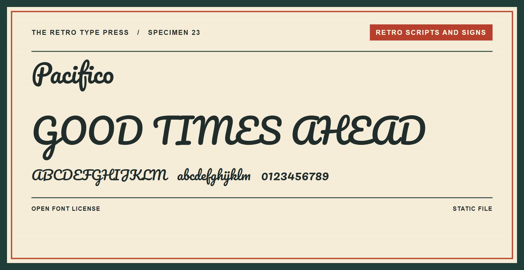
Pacifico offers a relaxed script for a casual shop heading. Its connected letters suit a short phrase.
Price: FREE ǀ Go to Pacifico
24. Oleo Script
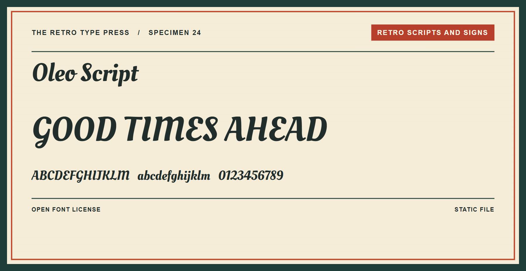
Oleo Script combines script shapes with sturdy strokes. Try it for a menu title or a packaging label.
Price: FREE ǀ Go to Oleo Script
More Scripts And Screen Fonts
These choices range from delicate script to pixel lettering for screen-inspired designs.
25. Tangerine
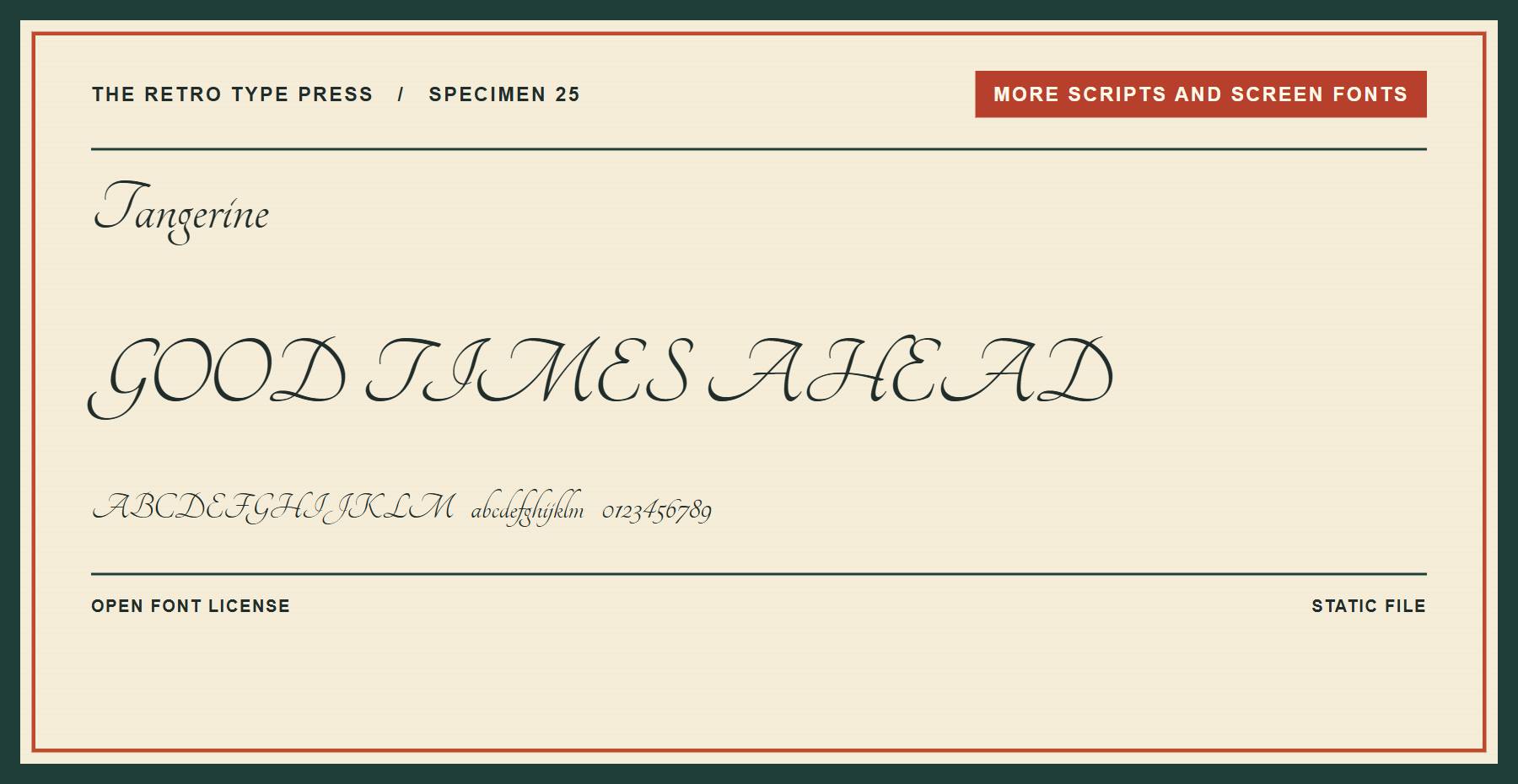
Tangerine is a fine formal script for invitations. Give its delicate strokes generous size and contrast.
Price: FREE ǀ Go to Tangerine
26. Satisfy
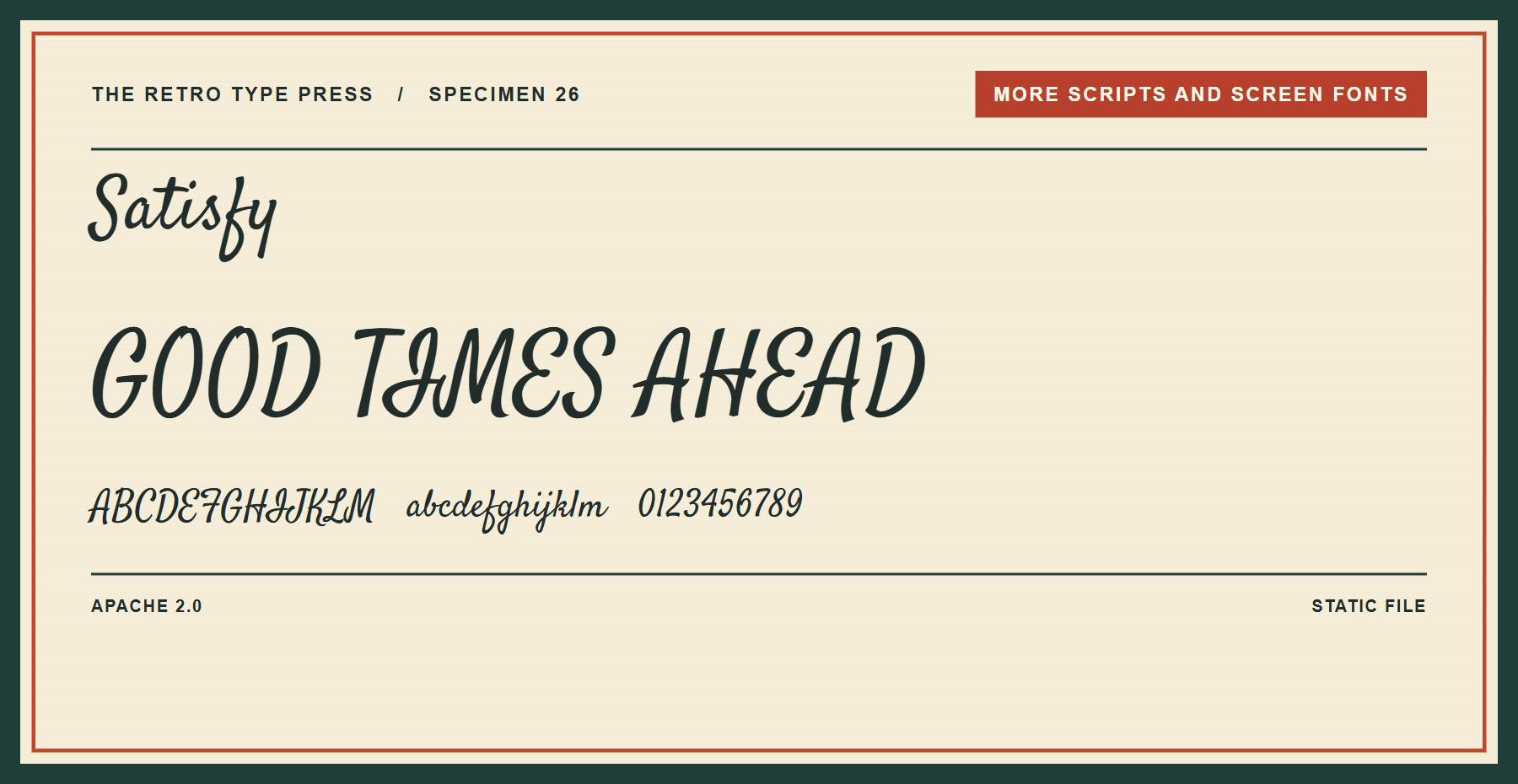
Satisfy offers a loose handwritten script for a short message. Try it on a greeting card or cafe graphic.
Price: FREE ǀ Go to Satisfy
27. Yellowtail
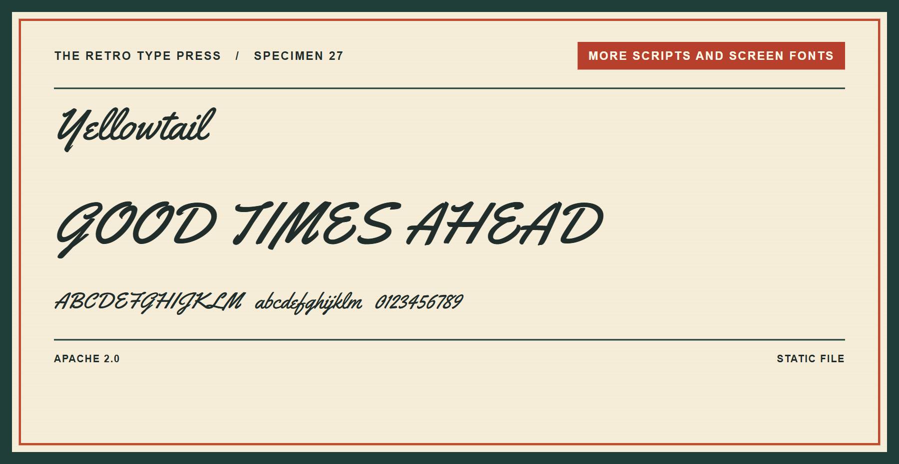
Yellowtail brings brush-style lettering to a sign or logo concept. Use it alongside a simpler face for supporting information.
Price: FREE ǀ Go to Yellowtail
28. Grand Hotel
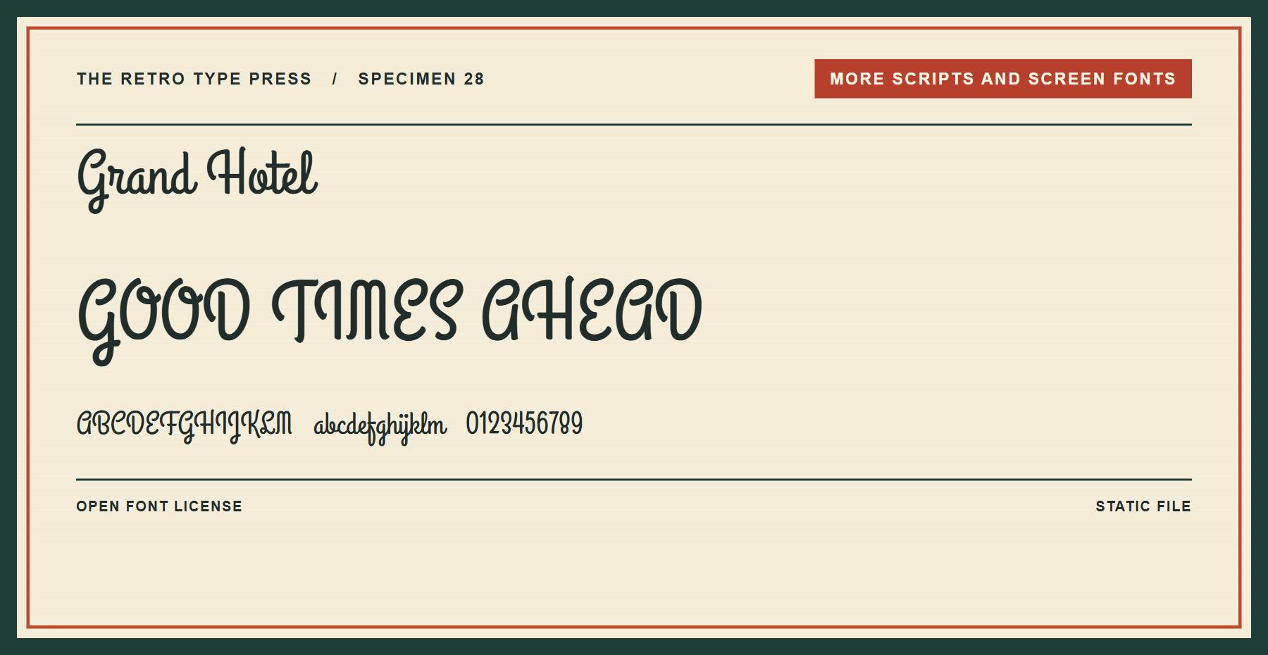
Grand Hotel is a connected script suited to a restaurant heading. Its narrow forms can fit a short title in a compact space.
Price: FREE ǀ Go to Grand Hotel
29. Press Start 2P
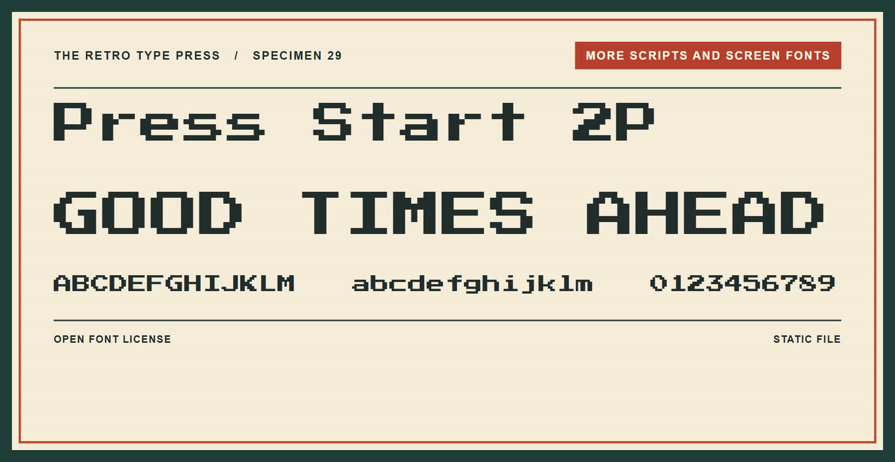
Press Start 2P uses pixel-style lettering reminiscent of arcade screens. Set short labels at a size where the blocky details remain clear.
Price: FREE ǀ Go to Press Start 2P
30. VT323
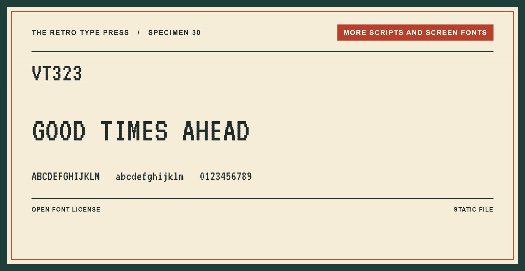
VT323 offers a pixel-inspired monospaced style for terminal-themed designs. Try it on a short game graphic or interface label.
Price: FREE ǀ Go to VT323
Using Variable Retro Fonts
A variable font puts a range of supported styles in one file. Three fonts here are variable: Dancing Script, Playfair Display, and Bodoni Moda. Explore variable fonts in Divi 5 for more ways to use them.
Choosing A Retro Font
Use decorative lettering for short headings, and check thin strokes and small details at the size visitors will see. Pair a distinctive display face with readable body text.
Use Your Fonts In Divi
In Divi 5, you can choose a font from a text setting’s dropdown or upload a custom font. For more typography ideas and pairings, explore the best Divi fonts.




For a limited time, the Graphic Pro Nex font you’re talking about is 5,8 € instead of 29 €, 80% off.
Elegantthemes are awesome. They are now comeup with these 30 retro fonts. Some of them are very latest. Dying to use Typewriter Revo.
Glad we could be of service, Amit. Typewriter Revo looks good, doesn’t it? 🙂
I am pretty new to Elegant Themes, and have to say I love the breadth of the blog postings. Your bloggers are showing me so many great tools and tips – I appreciate it!
Thanks for your kind words, Nancy!
Why does Elegant Themes insist on pushing all sorts of tricks and fancy stuff instead of offering the most commonsensical arrangement for me? I want to post posts that I have already created in Microsoft Word in various styles of a very famous font, Times New Roman. Why not allow that? Please do not say that this is already available on Elegant Themes. I know it isn’t. Please do not blame WordPress. Instead Elegant Themes should tell WordPress to make this simple and obvious way forward available. Thanks.
WordPress is open source with thousands of independent contributors worldwide developing and contributing things they want to see offered instead of expecting others to carry their water. Perhaps you could consider going in that direction to achieve your goal.
Elegant Themes ‘tell’ WordPress to do something? Sounds kinda silly.
Hello Phillip,
I think the issue lies with what you’re expecting WordPress to offer you. Font choices are based on the theme you choose, and there are plenty of themes that offer the Times New Roman font. In fact, we’ve also shown how to add these to any theme elsewhere (https://www.elegantthemes.com/blog/tips-tricks/how-to-use-google-fonts-on-your-wordpress-website).
You’ll run into issues if you’re looking to copy and paste text into the WordPress editor directly from a Word document. You’ll have to paste it as plain text, but that won’t save your stylings. This isn’t fixable by WordPress or Elegant Themes, sadly.
Unfortunately, I believe there are few people with your workflow, and with your exact requirements. However, there are workarounds, and hopefully we’ve pointed you in the right direction! Good luck. 🙂
I am referring to Use Any Font
I love MB Deco, it is such a retro timeless font….thanks for sharing these.
Thanks, Dockens!
For a Single Activation $0.00 purchase they still want my credit card info. Sounds shady.
Many thanks John for this cornucopia of great designs !
No problem, Schlomoh – glad you enjoyed them. 🙂
Great Collection of fonts, I’d like to suggest to add another great resource for font “Font Squirrel”.
There are a myriad of great resources for fonts. We’re certainly fortunate. 🙂
I agree. Font Squirrel is awesome!
Another font that I’ve always liked that can fit in with the retro style is Graduate, based off of varsity-style typefacing.
http://www.1001freefonts.com/graduate.font
Thanks for the addition, Ryan. 🙂