
The Divi Gallery Module is great place to showcase an image gallery on your website. By default, the gallery module will display the your images in a grid layout without much styling at all which is great for keeping the images as the primary design element. However, if you are looking to get a little creative, you can frame your images with different border designs to help make your image gallery standout. The Gallery module makes this process pretty easy to do and the results may surprise you.
In this tutorial, I’m going to show you how to create unique border designs for your image galleries using the Divi Gallery module.
Let’s get started!
Sneak Peek
#1 Polaroid Image Gallery
#2 Clean Grid Design
#3 Custom Background Image Behind the Entire Gallery
#4 Custom Background Image Behind Each Gallery Item
#5 Box Shadow and Border Combo
#6 Film Strip Border Design
What You Need to Get Started
Subscribe To Our Youtube Channel
For this tutorial, you will need the Divi theme installed and active. You will also need 12 images added to your media library to be used for the building the image gallery. For a Divi gallery module using a grid layout, the size of your images should be around 1500px by 800px if you plan on your images opening up in lightbox display so that it fills the screen nicely on most desktops.
Setting up your New Page
For starters, you will need to create a new page, give your page a title, and deploy the Divi Builder. Select the option “Build from Scratch” and then publish your page. Then click to build on the front end.
Saving a Divi Gallery module Template
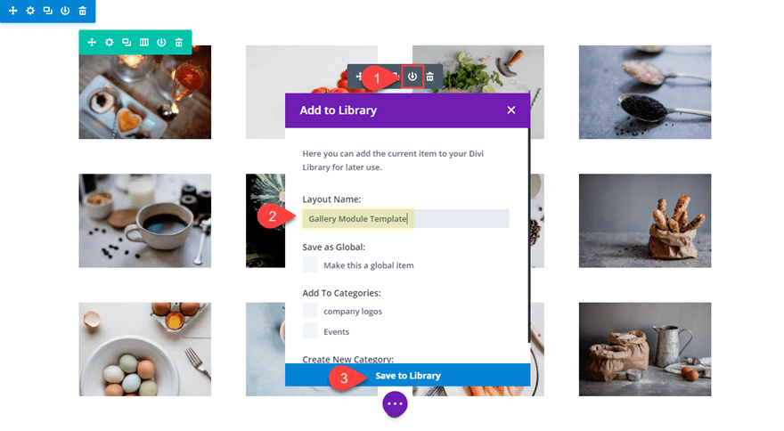
Since we are going to be designing 5 different border styles for the Divi Gallery module, it would be helpful to have a basic gallery module template saved to our library so that we don’t have to start from scratch each time we design a new gallery.
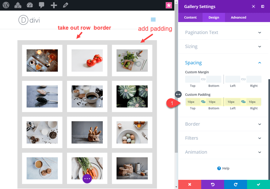
Create a new section with a one column row and then add the Gallery Module to the row.
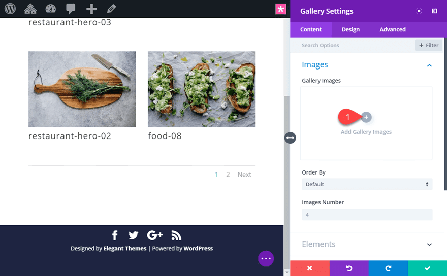
Divi will populate the gallery module with some images from your media gallery in a grid display like the following:
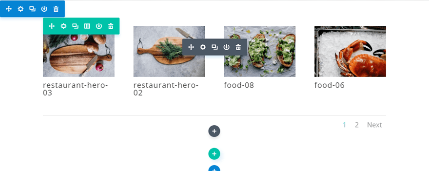
In the gallery module settings, click the gray plus icon to add 12 images to the gallery. I’m using images from the Restaurant Gallery Page Layout.
Then update the Divi Gallery Module settings as follows:
Images Number: 12
Show Title and Caption: NO
Show Pagination: NO
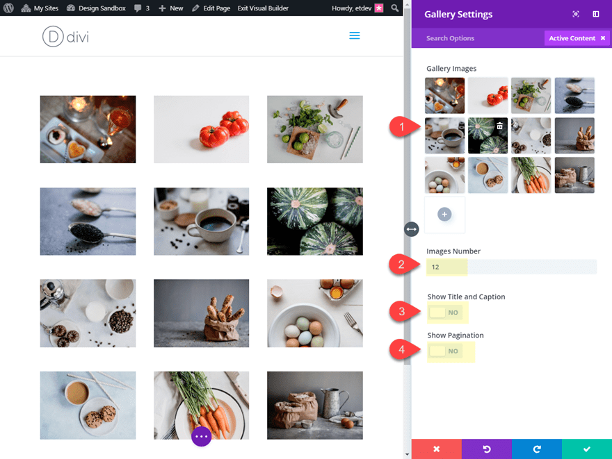
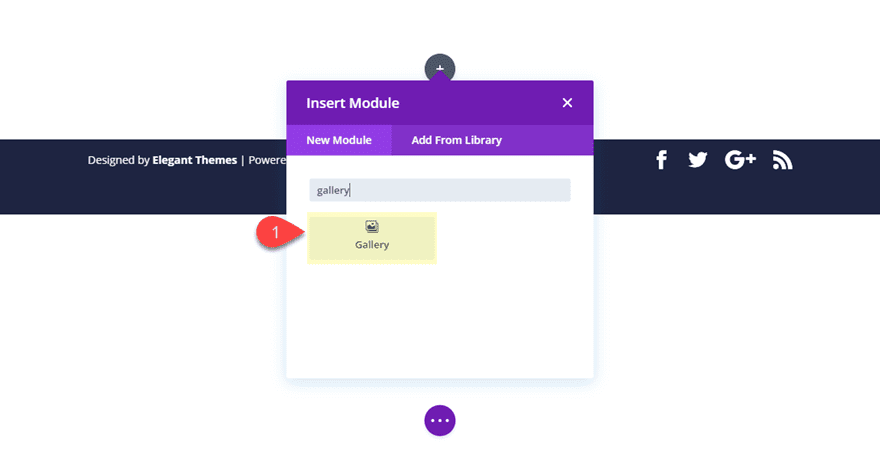
This will work as a good template moving forward. To save the Gallery module to your Divi Library, click the Save to Library icon in the gray module menu when hovering over the module. Then name the template “Gallery Module Template” and save it to the library.
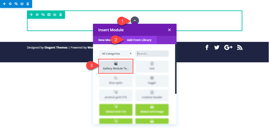
When you want to add the saved gallery module to your page, all you need to do is click to add a new module like normal. Then select the Add from Library tab in the popup and click on the gallery module with the name “Gallery Module Template”.
That’s it. Now let’s get to those border designs!
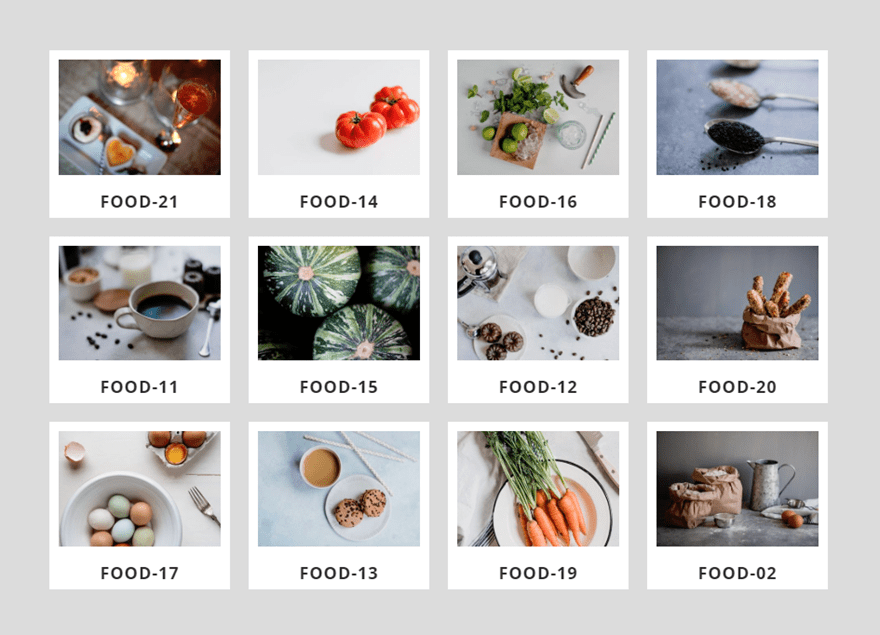
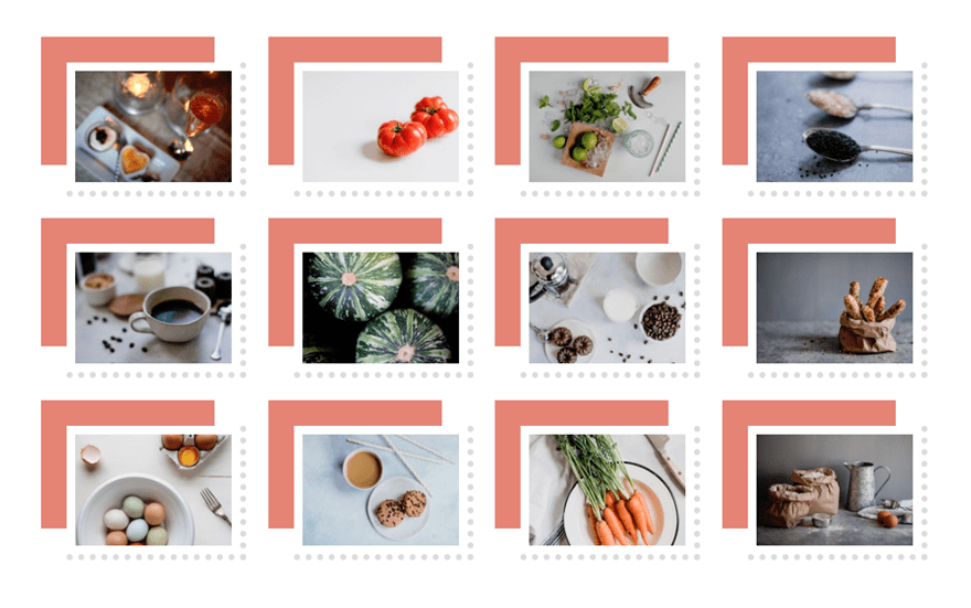
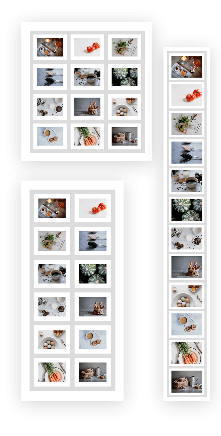
#1 Polaroid Image Gallery
This next design is a popular border for images that looks like a polaroid picture. This is a layout especially useful if you want to display your image titles.
Here’s how to do it.
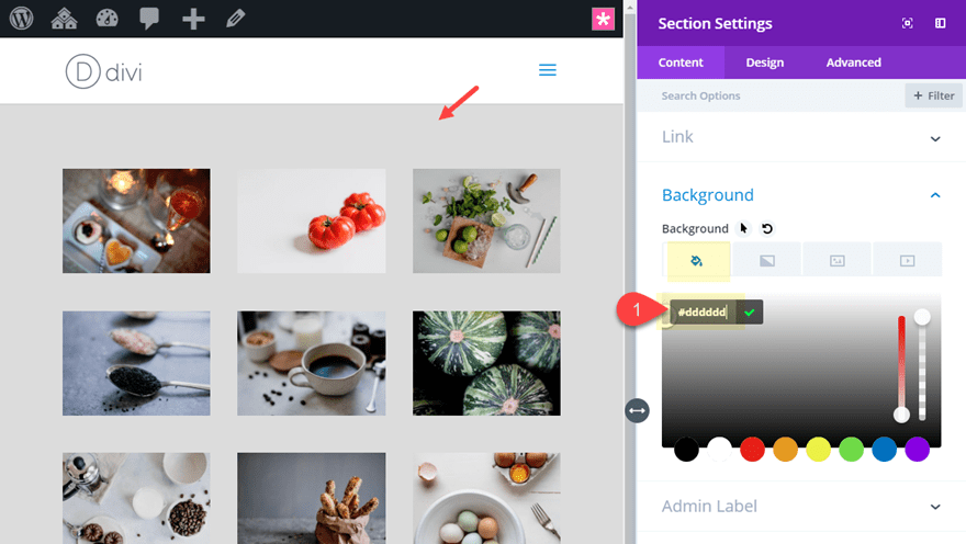
Section Settings
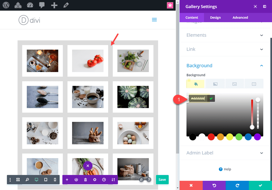
Create a new regular section with a one-column row. Then add the saved Divi Gallery Module Template from the library (explained above). Before editing the Gallery module, open the section settings and add a gray background color so that our white borders will pop a little.
Background: #dddddd
Row Settings
Next update the row settings with the following:
Gutter Width: 1
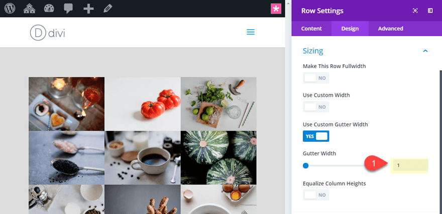
This will get rid of the default margin spacing between the images. We will add our own custom spacing later on.
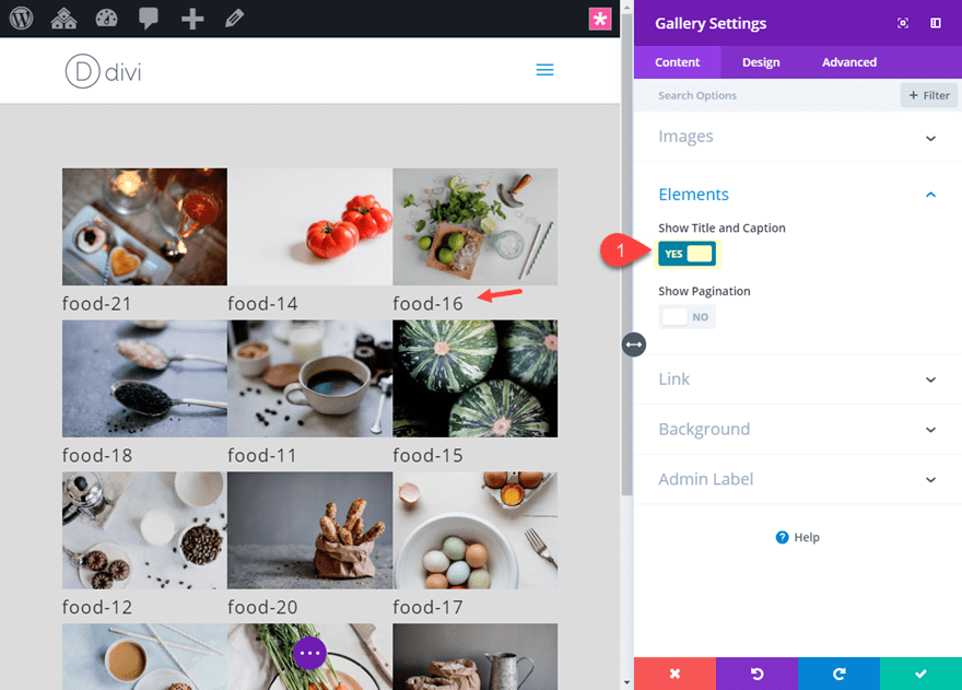
Gallery Module Settings
Open the Gallery module settings and update the following:
Show Title and Caption: YES
Title Font Weight: Bold
Title Font Style: TT
Title Text Alignment: Center
Title Line Height: 2em
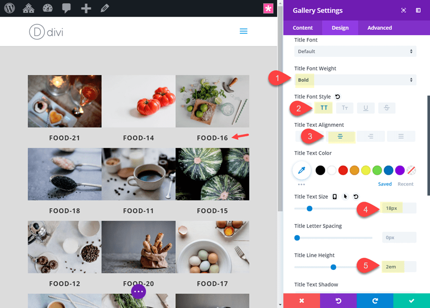
Image Top border width: 10px
Image Top border color: #ffffff
Image Left border width: 10px
Image Left border color: #ffffff
Image Right border width: 10px
Image Right border color: #ffffff
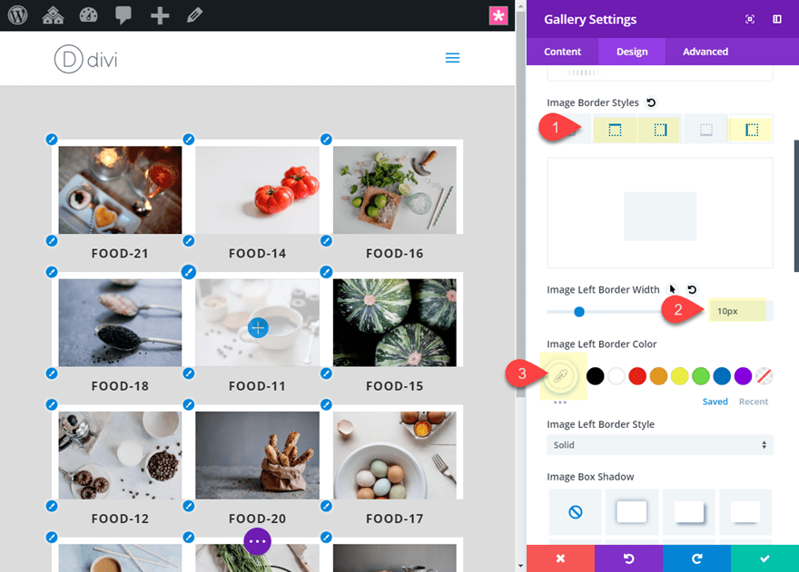
To create spacing between our images, add the following border to the gallery items:
Border Width: 10px
Border Color: #dddddd (matches the color of the section background)
To color the bottom portion of our polaroid border design, we need to add a white background to the module.
Background Color: #ffffff
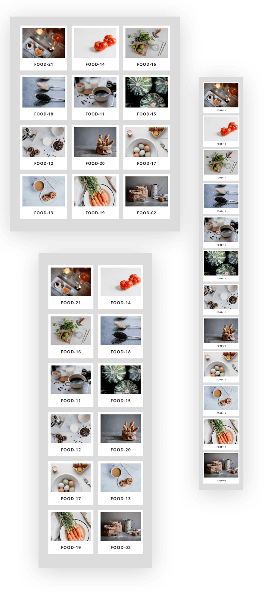
Final Result
Here is the final result of the polaroid border design.
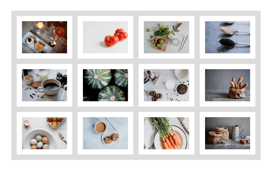
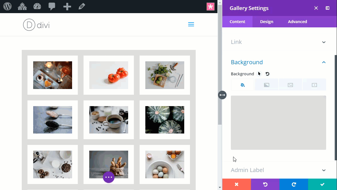
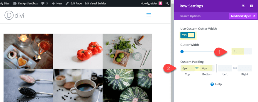
#2 Clean Grid Design
If you are looking for a simple and clean grid style for your images, this border design is nice option. It is well balanced and easy on the eyes.
Here’s how to do it.
Create a new regular section with a one-column row. Then add the saved Divi Gallery Module Template from the library (explained above).
Row Settings
Before editing the Gallery module, open the section settings and update the following:
Gutter Width: 1
Custom Padding: 0px top, 0px bottom
Border Width: 10px
Border Color: #dddddd
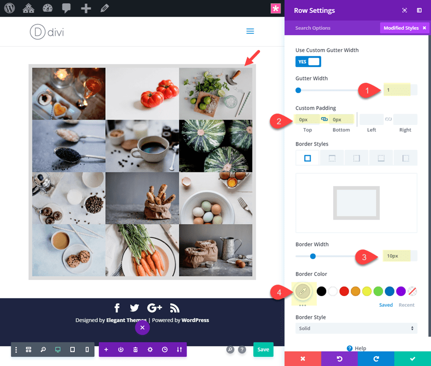
This row border is necessary to match the outer spacing of our gallery with the spacing between the images.
Gallery Module Settings
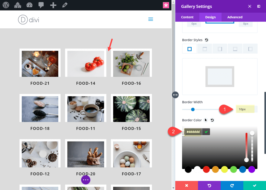
Now open the gallery module settings and add a border to your gallery items and your gallery images by updating the following:
Image border width: 20px
Image border color: #ffffff
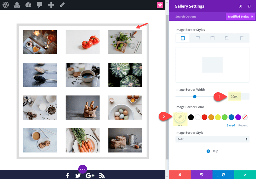
Border Width: 10px
Border color: transparent (this is important to show the background color)
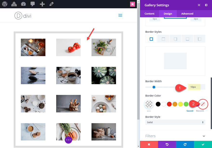
Now add a background color to the gallery module to complete the design.
Background color: #dddddd (this matches the row border color)
Because your gallery item border is transparent, it inherits the color of the background.
Final Design
Changing the Border Colors by Changing the Background Color
If you want to play around with different border colors, you can update the background color to whatever you want. But, you will need to take out the row border add the following spacing to the module:
Custom Padding: 10px top, 10px bottom, 10px left, 10px right
Now you can adjust the background color to whatever you want:
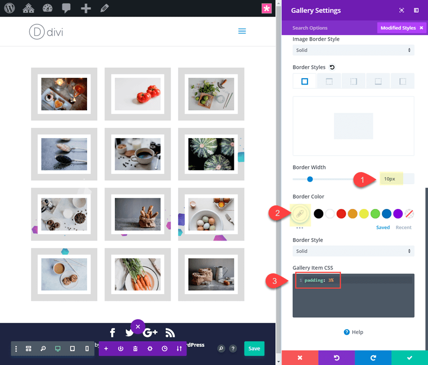
#3 Custom Background Image Behind the Entire Gallery
This design allows you to use a background image to serve as kind of a texture background for the borders of your images. This is a nice way to make each image border unique as it shows a specific area of the module background image. The setup is very similiar to the Clean Grid Design above.
Here’s how to do it.
Create a new regular section with a one-column row. Then add the saved Divi Gallery Module Template from the library (explained above).
Row Settings
Before editing the Gallery module, open the section settings and update the following:
Gutter Width: 1
Custom Padding: 0px top, 0px bottom
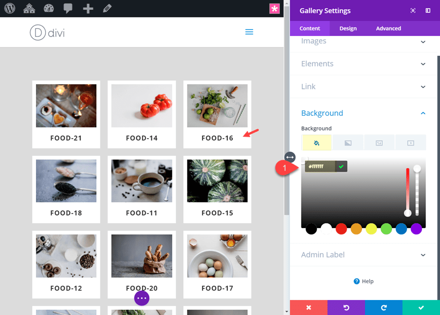
Gallery Module Settings
Now update the Gallery Module settings as follows:
Background Image: [add image] (you won’t be able to see it yet)
Background color: #dddddd (this only shows if you use a png background image with transparency)
Image Border Width: 10px
Image Border Color: #ffffff
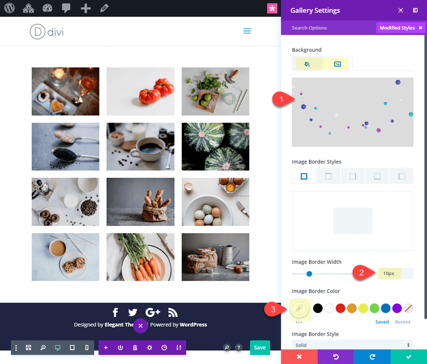
Border Width (for module): 10px
Border Color: #ffffff
Then add the following Custom CSS to the Gallery Item:
padding: 3%;
This creates the separation between the gallery items to complete the design.
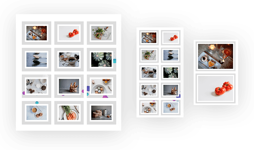
Final Result
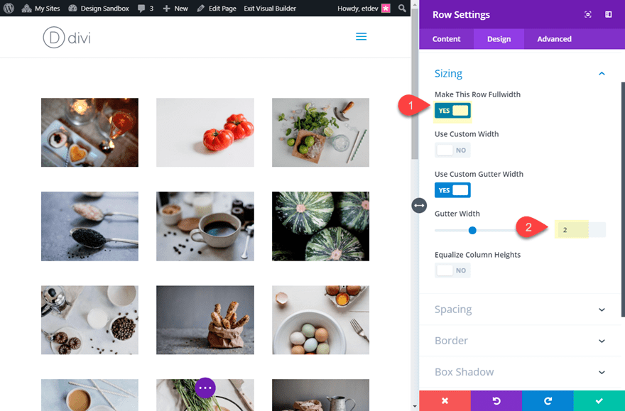
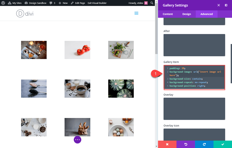
#4 Custom Background Image Behind Each Gallery Item
This design allows you to use a background image to serve as border for each of gallery items individually. You can create any custom image your want or use one of background images included in our premade layouts. I’m using one from the Meetup Landing Page Layout.
Here’s how to do it.
Create a new regular section with a one-column row. Then add the saved Divi Gallery Module Template from the library (explained above).
Row Settings
Before editing the Gallery module, open the section settings and update the following:
Make This Row Fullwidth: YES
Gutter Width: 2
Gallery Module Settings
Now update the Gallery Module settings as follows:
Image Border Width: 10px
Image Border Color: #ffffff
Then add the following custom CSS to the Gallery Item:
padding: 30px;
background-image: url("");
background-size: contain;
background-repeat: no-repeat;
background-position: right;
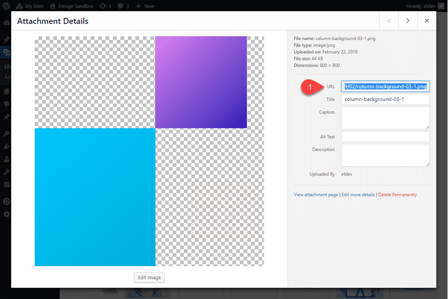
Next you will need to upload the custom background image you want to sit behind each of your gallery items. For this example, I’m using an image from one of our premade layout packs. Once the image is uploaded to the WordPress Media gallery, copy the image URL to your clipboard.
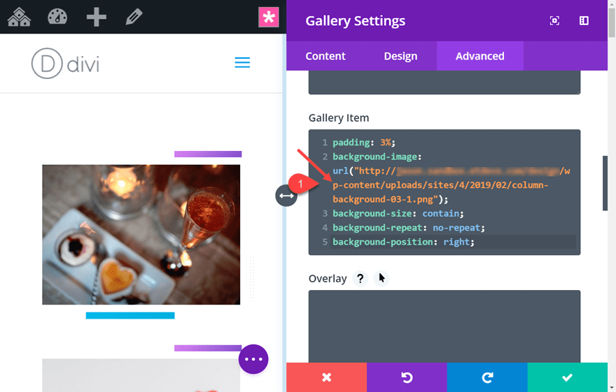
Now go back and open the gallery module settings and paste the URL in the custom CSS where it says “insert image url here”. Make sure you keep the url inside of the quotations.
Final Result
Here is the final result.

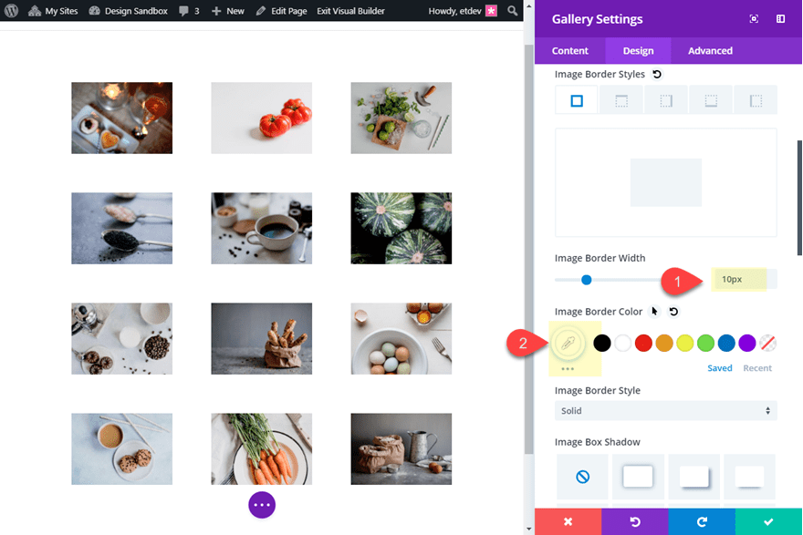
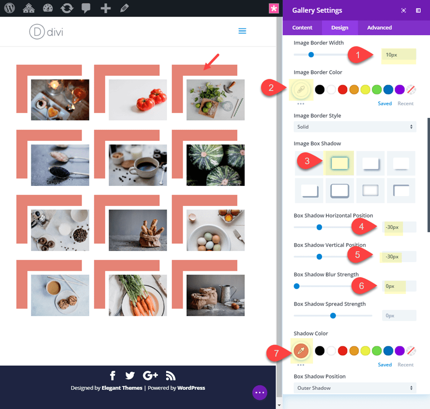
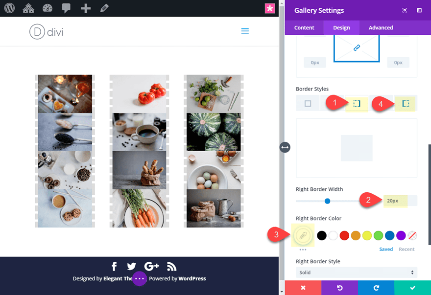
#5 Box Shadow and Border Combo
Box shadows are great for giving your gallery a custom flair. You can use box shadows on the Divi gallery module images to create a broken grid design that frames the images in a unique way. You can also combine the box shadow with border designs for all kinds of possibilites.
Here’s how to do it.
Create a new regular section with a one-column row. Then add the saved Divi Gallery Module Template from the library (explained above).
Add Image Border and Box Shadow
Open the Gallery settings and update the following:
Image Border Width: 10px
Image Border Color: #ffffff
Image Box Shadow: see screenshot
Box Shadow Horizontal Position: -30px
Box Shadow Vertical Position: -30px
Box Shadow Spread Strength: -10px
Shadow Color: #e08474
Add the Gallery Item Border
The box shadow design looks good as it is now. But, you can also add an additional border for your gallery item by updating the following:
Right Border Width: 7px
Right Border Color: #dddddd
Right Border Style: Dotted
Bottom Border Width: 7px
Bottom Border Color: #dddddd
Bottom Border Style: Dotted
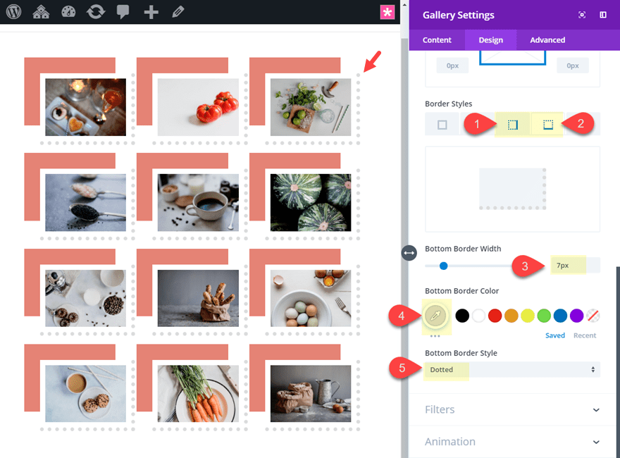
I added a dotted border style just to remind you of the different styles available. Feel free to use other styles (like solid or dashed).
Row Settings
To give your design more room, open the row settings and update the following:
Make Row Full Width: YES
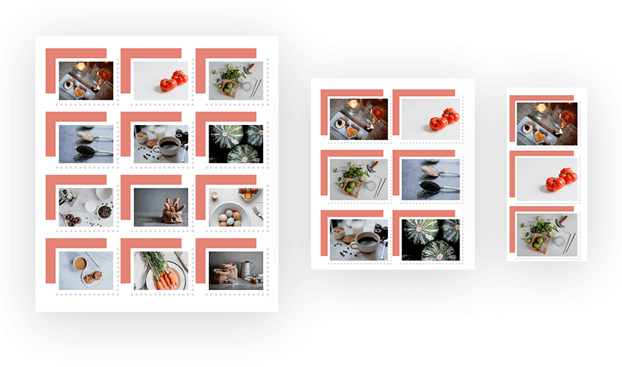
Final Design
Here is the final design.
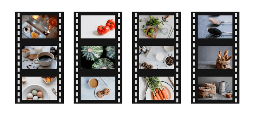
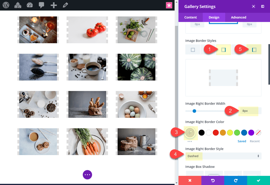
#6: Film Strip Border Design
For this last design, I thought I would show you something a bit more unique. This design uses a dashed border style only on the right and left side of the gallery items which divides each column of images in a way that resembles film strips.
Here’s how to do it.
Create a new regular section with a one-column row. Then add the saved Divi Gallery Module Template from the library (explained above).
Row Settings
Before editing the Gallery module, open the row settings and change the gutter width to 1.
Gutter Width: 1
This will get rid of the default margin spacing between your images.
Gallery Module Settings
Next, open the Gallery settings and update the following:
Add Dashed Image Borders
Image Right Border Width: 8px
Image Right Border Color: #dddddd
Image Right Border Style: Dashed
Image Left Border Width: 8px
Image Left Border Color: #dddddd
Image Left Border Style: Dashed
Add Gallery Item Border for spacing
Left Border Width: 20px
Left Border Color: #ffffff
Right Border Width: 20px
Right Border Color: #ffffff
Add Image Box Shadow
Image Box Shadow: see screenshot
Box Shadow Blur Strength: 0px
Box Shadow Spread Strength: -10px
Shadow Color: #222222
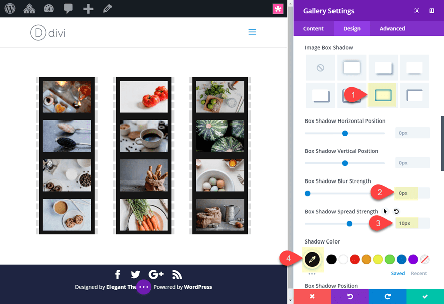
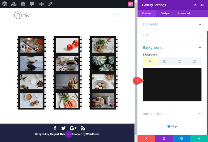
Add Background Color
Background Color: #222222
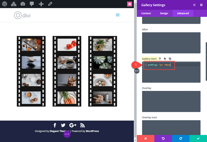
Then add the following custom CSS to the Gallery Item:
padding: 5px 10px;
The Final Result
Now check out the result.

Final Thoughts
I hope these six border design examples will provide some inspiration for creating some custom border designs for your images when using the Divi Gallery Module. Once you get a handle the settings available with the Divi Gallery module, all it takes is a little creativity. So have some fun exploring new design options of your own with different images, colors, and spacing.
I look forward to hearing from you in the comments.
Cheers!


For the #5 Box Shadow and Border Combo#5 Box Shadow and Border Combo I’ve done all the steps but the on mobile and tablet view the images are superimposed with the added edge. There’s no margin between the images, can you tell me the code to add to do this on mobile and tablet please ?
Awesome! can use this for sure! Thanks!
Film strip border design is my favorite.
I personally like the Polaroid image gallery border design. It is minimalistic yet nice to look at. Great blog by the way. Thanks for sharing these amazing designs!
Words best Theme for a reason.
I like the filmstrip look.
Nice! Why not add padding for “Gallery item” as an option (field/slider) in the module, instead of using custom css?
Love these different options!
The main issue I have with the gallery and/or portfolio display is that the examples always seem to show all horizontal / landscape style images. What happens when a client has both portrait / vertical style images AND horizontal ones. The gallery or portfolio never looks as clean and beautiful as these examples. The portrait style images always get cut off where you don’t want them cut off and they don’t look right.
Is there a way to address that AND use these beautiful border designs? Thanks!
I really like the filmstrip look. Can you use the filmstrip design horizontally with a scroll?
I like the photostrips version. Thanks!
Fantastic!
Thanks Barb!
ET has so many posts like this, but the truth is that the gallery module is VERY blah, no matter how to style it. ET would make a lot of money by just offering a high end gallery plugin. I’ve spent more on gallery plugins and updates for my site than I have on my Developers Membership with Elegant Themes.